
Even in 2021, web performance remains a problem. According to HTTP Archive, the average page requires a 2 MB download, makes more than 60 HTTP requests, and can take 18 seconds to load on a mobile device fully. Stylesheets account for 60 kB split over seven requests, so it’s rarely a top priority when attempting to address performance issues.
However, CSS does have an effect, however slight it may seem. Once you’ve addressed your JavaScript, learning to optimize CSS properly should be the next priority.
Let’s get to that!
How CSS Affects Page Performance
CSS looks innocent but can require some heavy processing.
CSS Is Render-Blocking
When your browser encounters a <link> tag, it halts other browser downloads and processing while fetching and parsing the CSS file.
JavaScript can also block browser rendering, but asynchronous processing is possible with:
- The
asyncattribute to download scripts in parallel, which are run immediately they are ready. - The
deferattribute to download in parallel, then run in order when the DOM is ready. - The
type="module"attribute to load an ES module (which behaves likedefer).
Assets such as images often require more bandwidth, but efficient formats are available, and they can be lazy-loaded (loading="lazy" attribute) without blocking browser rendering.
None of this is possible with CSS. The file is cached, so subsequent page loads should be faster, but the render-blocking process remains.
Large CSS Files Take Time to Process
The larger your stylesheet, the longer it takes to download and process into a CSS Object Model (CSSOM), which the browser and JavaScript APIs can use to display the page. Although CSS stylesheets are smaller than most other website files, they’re not immune from the “smaller is better” rule of thumb.
CSS Files Grow
It can be difficult to identify styles that are no longer used, and removing the wrong ones can wreak havoc on a site. Developers typically opt for the safest “retain everything” approach. Page styles, components, and widgets that are no longer used continue to exist in CSS. The result? The file size, complexity, and maintenance effort increase exponentially, making developers less and less likely to remove redundant code.
Stylesheets Can Reference Other Assets
CSS can reference other stylesheets using @import rules. These imports block the processing of the current stylesheet and load further CSS files in series.
Other assets, such as fonts and images, can also be referenced. The browser will attempt to optimize downloads, but when in doubt, it will fetch them immediately. Inlined base64-encoded files incur still further processing.
CSS Effects Rendering
Browsers have three rendering phases:
- The layout (or reflow) phase calculates the dimensions of each element and how it affects the size or positioning of elements around it.
- The paint phase draws the visual parts of each element onto separate layers: text, colors, images, borders, shadows, etc.
- The composite draws each layer onto the page in the correct order according to stacking contexts, positioning, z-indexes, etc.
If you’re not careful, CSS property changes and animations can cause all three phases to re-render. Some properties, such as shadows and gradients, are also computationally more expensive than block colors and margins.
CSS Performance Analysis Tools
Admitting you have a CSS performance problem is the first step on the road to recovery! Finding and fixing the causes is another matter.
The following tools and services (not ranked in any order) can help you identify styling bottlenecks in your code.
1. DevTools Network Panel
Web performance specialists spend considerable time in DevTools and the Network panel in particular. DevTools is native to most modern browsers, though we’ll be using Google Chrome in our examples.
DevTools can be opened from the browser menu, typically at More tools > Developer tools, or via the keyboard shortcuts Ctrl | Cmd + Shift + I or F12.
Switch to the Network tab and ensure Disable cache is checked to prevent cached files affecting the report. You can also change the throttling option to simulate slower mobile networks.
Refresh the page to view the download and processing waterfall chart:
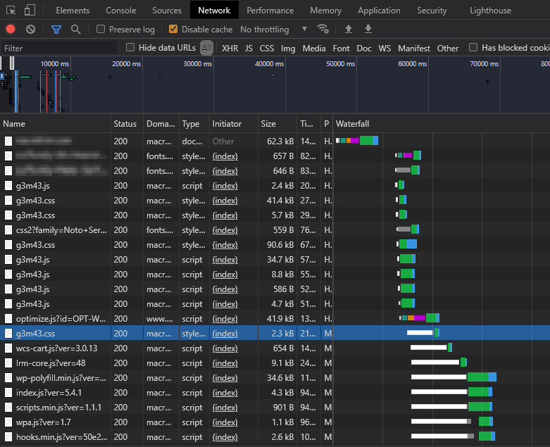
Any long bar is a cause for concern, but you should be especially wary of long blocked/stalled bars (shown in white). In this example, the highlighted row and all following rows could not start downloading until the render-blocking CSS and JavaScript files were processed at the top of the HTML page.
The Filter box allows you to show or hide specific assets:
larger-than:<S>: Limit to files larger than <S>, expressed as bytes (10,000), Kilobytes (1,000 kB), or megabytes (1 M)-larger-than:<S>: Limit to files smaller than <S>-domain:*<.yourdomain.com>: Show third-party requests that are not loaded from your primary domain. These are a major contributor to slow sites.
A high-performance page with optimized CSS typically has fewer assets loaded in parallel with short blocked/stalled bars.
2. WebPageTest
WebPageTest provides a similar network waterfall view, as well as many other performance charts:
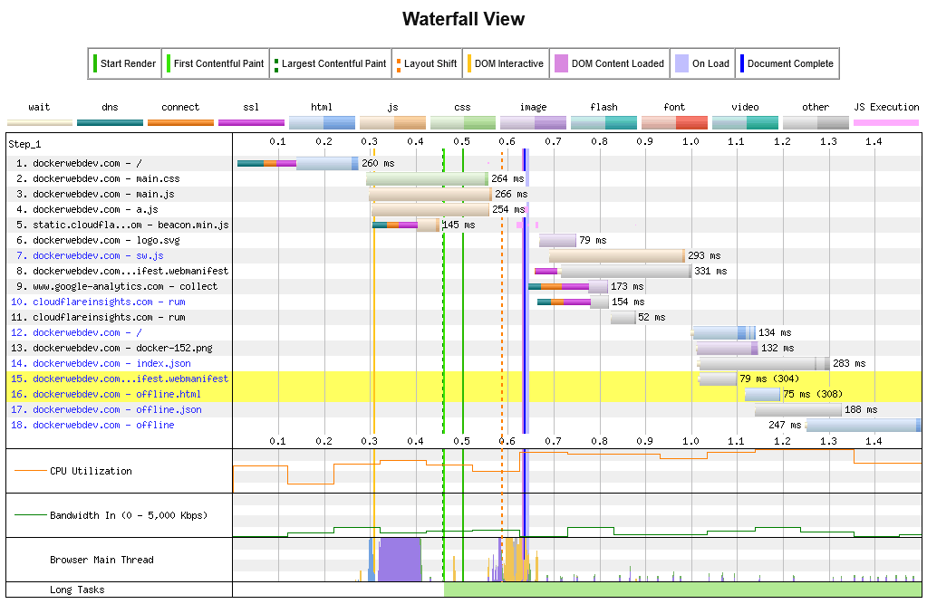
The service uses devices based in various global locations so you can assess real-world performance and CSS optimizations.
3. Chrome DevTools Lighthouse Panel
The DevTools Lighthouse panel is provided in Chromium-based browsers such as Chrome, Edge, Brave, Opera, and Vivaldi. You can generate Performance, Progressive Web App, Best Practices, Accessibility, and Search Engine Optimization reports for mobile and desktop devices.
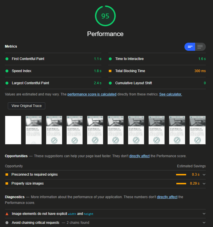
The tool makes improvement suggestions, including ways to optimize CSS. Not all may be practical or possible, but the most beneficial quick wins are highlighted.
4. Google PageSpeed Insights
PageSpeed Insights is the online version of Lighthouse. It has fewer features but can be used in any browser and provides some alternative insights.
For example, a treemap shows the largest JavaScript assets with a coverage metric, which indicates what proportion of code is used and unused:
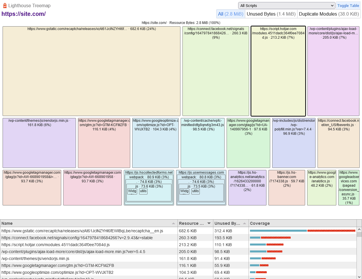
CSS is not displayed, but the quantity of JavaScript will have a bearing on the efficiency of styles.
Similar website speed testing tools include Pingdom Website Speed Test and GTmetrix.
5. Chrome DevTools Coverage Panel
The DevTools Coverage panel in Chromium-based browsers helps locate unused CSS (and JavaScript) code. Select Coverage from the DevTools More tools submenu, then refresh your page and browse your site/application:
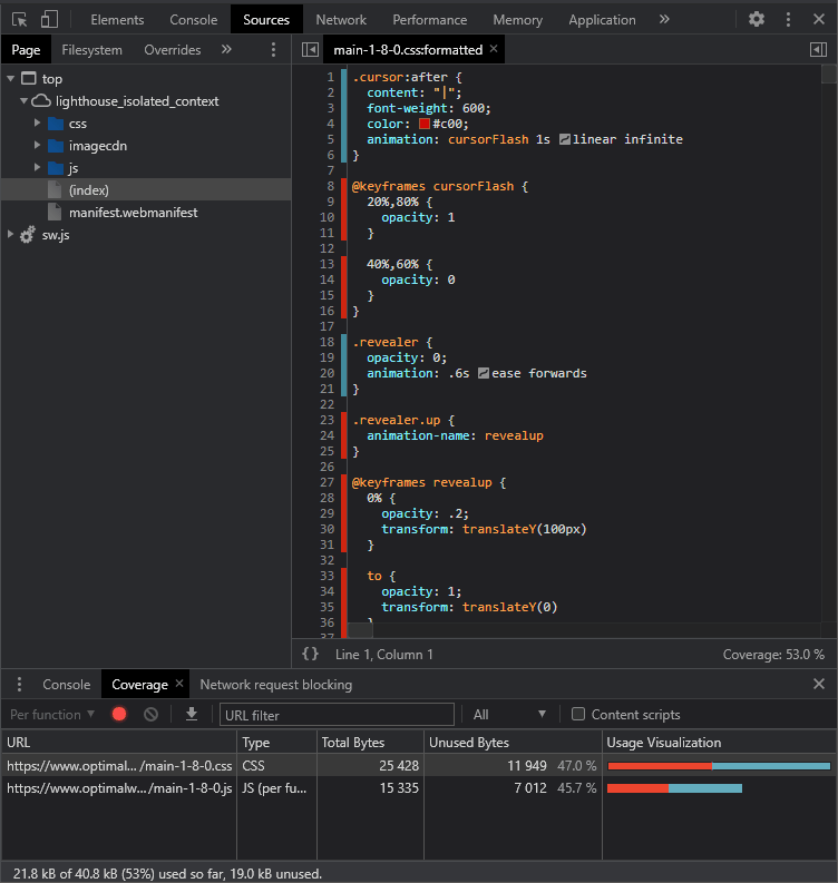
CSS and JavaScript assets are shown in the Coverage panel, with the proportion of unused code in red. Click any file to view its source with the unused code highlighted in red in the line number gutter.
A few things to take note of:
- The coverage metrics reset if you refresh or navigate to a new page, as is typical on a WordPress site. The unused code metric will only decrease if you’re browsing a Single Page Application that loads content without a page refresh.
- The tool can only account for CSS used up to a particular point in time. It cannot determine if a widget has not been viewed or has multiple JavaScript-bound states.
6. Chrome DevTools Real-Time Performance Monitor
Chromium-based browsers have a real-time Performance Monitor. Again, this is available from the DevTools More tools menu. The charts update as you navigate pages, scroll, and trigger animations:
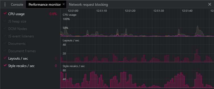
The following metrics are of particular interest to optimize CSS performance (the lower, the better):
- CPU usage: Processor utilization from 0% to 100%.
- Layouts/sec: The rate at which the browser has to re-layout the page.
- Style recalcs/sec: The rate at which the browser has to recalculate styles.
The other metrics may also be useful if CSS is struggling due to external factors (again, lower values indicate better performance):
- JS heap size: The total memory used by JavaScript objects.
- DOM Nodes: The number of elements in the HTML document.
- JS event listeners: The number of registered JavaScript event listeners.
- Documents: The number of resources, including the page, CSS files, JavaScript modules, etc.
- Document Frames: The number of frames, iframes, and JavaScript worker scripts.
7. DevTools Performance Report
The DevTools Performance panel allows you to record page activities for further analysis and help identify performance issues. The generated reports are complex, and many developers avoid them, but they provide valuable information.
The Performance panel’s settings icon allows you to set various options, such as slowing down the network and CPU. You can also disable JavaScript samples so that detailed call stacks are not recorded.
To start, click the circular Record icon, load and/or use your page, then click the Stop button to view the report:
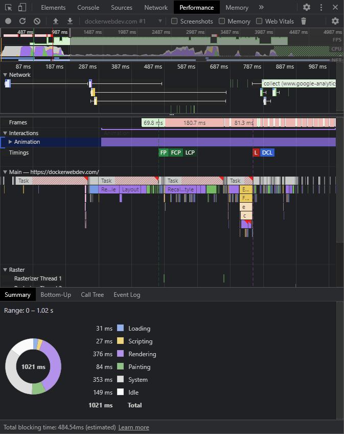
Nearly all these metrics will be of use to JavaScript developers, but CSS optimization issues may be especially evident from:
- Top red bar: This indicates the frame rate has dropped significantly, which may be causing performance issues. This is expected at the start of a page load, but excessive CSS animations could also be an issue.
- Summary chart: High loading, rendering, and painting metrics may indicate CSS problems.
Indirect CSS Performance Fixes
The following fixes won’t directly address CSS problems, but they can help you address some performance issues with relatively little effort.
Use a Good Host
Using a good host with servers physically closer to your users will bring immediate performance benefits. Hosting plans vary, but there are three primary types:
- Shared hosting: Your website is hosted on a physical server, possibly alongside hundreds of other sites. Disk space, RAM, CPU time, and bandwidth are shared. Plans are often inexpensive, but performance and availability are affected by other sites. Upgrading may be possible, but your site will generally remain on the same infrastructure.
- Dedicated hosting: Your site is hosted on one or more physical servers that you own. The hardware can be configured and upgraded according to requirements. Dedicated Hosting Plans are often expensive, and hardware failures remain problematic.
- Cloud hosting: Cloud hosting abstracts the hardware infrastructure into a set of services that can be accessed on-demand. Your site could be provisioned across a range of devices to make upgrades easy.
Cloud hosting plans and prices vary enormously. You could consider:
- Platform as a Service (PaaS) options, such as virtual web servers and databases, or
- Software as a Service (SaaS) options, which offer fully managed applications such as WordPress.
Switching hosts can boost performance. It’s unlikely to solve all your problems, but it’s a cost-effective solution to backend and bandwidth issues.
You could also consider using a content delivery network (CDN) or specialist image and video CDN that can distribute the load across multiple locations geographically closer to users.
Leverage Browser and Server Efficiency Features
Around 10% of sites do not activate gzip (or better) compression, which usually is the default server option. This reduces the size of CSS by 60% or more by compressing files before transmission. It won’t fix inefficient CSS, but the code will arrive sooner!
You should also activate HTTP/2 (or better), which sends data in a smaller binary format, compresses the headers, and can send more than one file on the same TCP connection.
Finally, ensure the browser can cache CSS and other files effectively. This is usually a matter of setting Expires, Last-Modified, and/or ETag hashes in the HTTP header.
Optimize Your CMS
Content Management Systems such as WordPress can be extended with themes and plugins that serve their own CSS. Where possible, you should speed up your CMS to:
- Remove unused plugins.
- Use leaner themes
- Enable caching to prevent excessive page regeneration.
Optimize Your Images
Images do not have the same processing and rendering overhead as HTML, CSS, and JavaScript, but they account for a large proportion of page weight and usable bandwidth. Consider:
- Removing unnecessary images.
- Resizing large images — perhaps to no more than 150% the maximum size they can ever appear on-screen.
- Using an appropriate image format — ideally a highly compressed option such as WebP or AVIF, but possibly SVG for logos and charts.
- Replacing images with CSS gradients or other effects.
- Adding width and height attributes to HTML
<img>tags or using the new CSS aspect-ratio property to ensure appropriate space is reserved on the page before the image downloads.
A specialist image CDN can handle some of this work for you. For more tips, check out our guide on how to optimize images for the web.
Remove Unused CSS
The fastest styles are those you never need to load or render! Try to remove/edit any CSS code you no longer need, such as that for legacy pages, widgets, or frameworks. This can be difficult on larger sites, and it’s not always clear whether a particular set of styles is essential or not.
The following tools analyze HTML and CSS usage at build time or by crawling URLs to identify redundant code. This is not always adequate, so additional configurations can be set to ensure styles triggered by JavaScript and user interactions are allow listed:
There is a better option: Split CSS into separate files with clear levels of responsibility and document accordingly. Removing unnecessary styles then becomes considerably easier.
Optimize CSS Loading Performance
Not all CSS is loaded equally. The humble <link> tag has a number of options and quirks that aren’t always logical.
Optimize Web Font Usage
Google Fonts and similar font foundries have revolutionized web fonts, but a few lines of font code can incur hundreds of kilobytes of bandwidth.
Here are our optimization suggestions:
- Only load the fonts you need: Remove fonts you’re not using and check whether new fonts are necessary.
- Only load the weights and styles you need: Most font foundries can limit the download to certain character sets (such as Latin only), weights (thicknesses), and italics (slants). Browsers can auto-render missing styles, although the results can be poor.
- Limit the characters required: Infrequently used fonts can be restricted to specific characters. For example, the title “CSS tutorial” in Open Sans can be defined by adding a
&text=parameter to the Google fonts query string:fonts.googleapis.com/css?family=Open+Sans&text=CStuorial - Consider variable fonts: Variable fonts define a large variety of styles, weights, and italics using vector interpolation. The font file is a little larger, but you require just one rather than several. The recursive font demonstrates the flexibility of variable fonts.
- Load fonts from your local server: Self-hosting fonts is more efficient than using a foundry. Fewer DNS lookups are required, and you can restrict the download to WOFF2, which all modern browsers support. Older browsers (I’m looking at you IE) can fall back to an OS font.
- Consider OS fonts: That 500 kB web font may look great, but would anyone notice if you switched to the commonly available Helvetica, Arial, Georgia, or Verdana? OS or web-safe fonts are an easy way to boost performance.
Use an Appropriate Font-Loading Option
Web fonts can take a few seconds to download and process. The browser will either:
- Show a Flash of Unstyled Text (FOUT): The first available fallback font is used initially but gets replaced once the web font is ready.
- Show a Flash of Invisible Text (FOIT): No text is displayed until the web font is ready. This is the default process in modern browsers, which typically wait three seconds before reverting to a fallback font.
Neither is ideal. The CSS font-display property and Google Font & display = parameter can select an alternative option:
- auto: The browser’s default behavior (usually FOIT).
- block: Effectively FOIT. Text is invisible for up to three seconds. There’s no font swap, but the text can take time to appear.
- swap: Effectively FOUT. The first fallback is used until the web font is available. Text is immediately readable, but the font swap effect can be jarring. Font Style Matcher can be used to define a similarly sized fallback.
- fallback: A compromise between FOIT and FOUT. Text is invisible for a short period (typically 100 ms), then the first fallback is used until the web font is available.
- optional: Similar to fallback, except no font swapping occurs. The web font will only be used if it’s available within the initial period. Your first-page view will likely show a fallback font, with subsequent views using the downloaded and cached web font.
Using swap, fallback, or optional can offer a perceived performance boost.
Avoid CSS @import
The @import at-rule allows CSS files to be included within others:
/* main.css */
@import url("reset.css");
@import url("grid.css");
@import url("widget.css");
This seems like an effective way to load smaller components and fonts. Unfortunately, each @import is render-blocking, and every file must be loaded and parsed in series.
Multiple <link> tags within HTML is more efficient and loads CSS files in parallel:
<link rel="stylesheet" href="reset.css">
<link rel="stylesheet" href="grid.css">
<link rel="stylesheet" href="widget.css">
That said, it’s better to…
Concatenate and Minify CSS
Modern build tools, CSS pre-processors such as Sass, and WordPress plugins can combine all partials into one large CSS file. Unnecessary whitespace, comments, and characters are then removed to reduce the file size to a minimum.
Multiple files are less of a performance problem with HTTP/2 and higher, but a single file requires just one header and can be gzipped and cached more efficiently.
Separate CSS files are only practical when you have one or more stylesheets that are changed frequently — perhaps several times per week. Even then, mostly static CSS code can still be combined into one file.
Kinsta customers can access the code minification feature in their MyKinsta dashboard to help with this. The feature allows customers to enable automatic CSS and JavaScript minification with a simple click. This helps speed up a site with zero manual effort.
Avoid Base64 Encoding
Tools can encode images to base64 strings, which you can use as data URIs in HTML <img> tags and CSS backgrounds:
.background {
  background-image: url('data:image/jpg;base64,ABC123...');
}
This reduces the number of HTTP requests, but it harms CSS performance:
- base64 strings can be 30% larger than their binary equivalent.
- browsers must decode the string before an image can be used, and
- altering one image pixel invalidates the whole CSS file.
Only consider base64 encoding if you’re using very small, infrequently changing images where the resulting string is not significantly longer than a URL.
That said, you can UTF8-encode reusable SVG icons, e.g.
.svgbackground {
  background-image: url('data:image/svg+xml;utf8,<svg xmlns="http://www.w3.org/2000/svg" viewBox="0 0 600 600"><circle cx="300" cy="300" r="150" stroke-width="3" stroke="#f00" fill="#ff0" /></svg>');
}
Remove CSS Hacks and IE Fallbacks
Unless you’re unfortunate and have a high proportion of Internet Explorer users, IE conditional stylesheets and hacks can be removed from your CSS. In most cases, IE users will still see something, especially if you use a mobile-first design that shows a simpler linear view by default. The result may not be pretty, and it won’t be pixel-perfect, but your development budget is better spent considering accessibility for all users.
Preload CSS Files
The <link> tag provides an optional preload attribute that can start a download immediately rather than waiting for the real reference in the HTML:
<!DOCTYPE html>
<html lang="en">
<head>
  <meta charset="UTF-8">
  <title>My page</title>
  <!-- preload styles -->
  <link rel="preload" href="/css/main.css" as="style" />
  <!-- lots more code -->
  <!-- load preloaded styles -->
  <link rel="stylesheet" href="/css/main.css" />
This is especially beneficial in WordPress and other CMS’ where a plugin could add a stylesheet further down the page.
Use Critical Inline CSS
Analysis tools may suggest you “inline critical CSS” or “reduce render-blocking style sheets.” This improves performance by:
- Identifying essential styles used by elements above the fold (those visible when the page loads)
- Inlining that critical CSS into a
<style>tag in your<head> - Loading the remaining CSS asynchronously to avoid render blocking. This can be accomplished by loading the stylesheet in a “print” style that the browser gives a lower priority. JavaScript then switches it to an “all” media style once the page has loaded (a
<noscript>ensures the CSS works is JavaScript is not available):
<style>
/* critical styles */
body { font-family: sans-serif; color: #111; }
</style>
<!-- load remaining styles -->
<link rel="stylesheet"
     href="/css/main.css"
    media="print"
   onload="this.media='all'">
<noscript>
  <link rel="stylesheet" href="/css/main.css">
</noscript>
Tools such as critical and criticalCSS can help to extract styles for in-view elements.
The technique noticeably improves performance and boosts audit scores. Sites or apps with consistent interfaces should be simpler to implement, but it may be more difficult elsewhere:
- A build tool is essential for all but the simplest sites.
- The “fold” is different on every device.
- Sites could have a variety of layouts requiring different critical CSS.
- Critical CSS tools can struggle with specific frameworks, HTML generated client-side, and dynamic content.
- The technique mostly benefits the first-page load. CSS is cached for subsequent pages, so additional inlined styles will increase page weight.
Use Media Query Rendering
A single concatenated and minified will benefit most sites, but sites that require a significant quantity of larger screen styles could split CSS files and load using a media query:
<!-- core styles loaded on all devices -->
<link rel="stylesheet" href="core.css">
<!-- served to screens at least 40em wide -->
<link rel="stylesheet" media="(min-width: 40em)" href="40em.css">
<!-- served to screens at least 80em wide -->
<link rel="stylesheet" media="(min-width: 80em)" href="80em.css">
This example presumes a mobile-first methodology. Mobile devices load core.css but may not need to download or parse the remaining stylesheets.
Use Progressive Rendering
Progressive rendering is a technique that defines individual stylesheets for separate pages or components. It can benefit very large sites where individual pages are constructed from an extensive range of components.
Each CSS file is loaded immediately before a component is referenced in the HTML:
<head>
  <!-- core styles -->
  <link rel="stylesheet" href="core.css" />
</head>
<body>
  <!-- header -->
  <link rel="stylesheet" href="header.css" />
  <header>...</header>
  <!-- primary content -->
  <link rel="stylesheet" href="main.css" />
  <main>
    <!-- widget styling -->
    <link rel="stylesheet" href="widget.css" />
    <div class="mywidget>...</div>
  </main>
  <!-- footer -->
  <link rel="stylesheet" href="footer.css" />
  <footer>...</footer>
</body>
This works well in most browsers. (Safari shows a blank page until all CSS is loaded, but it shouldn’t be noticeably worse than a single large stylesheet.)
Adopting Web Components also encourages the use of scoped styles which are loaded when the custom element is rendered.
Optimize CSS Performance
CSS techniques and properties place different strains on the browser, CPU, memory, bandwidth, and other resources. The following tips can help you avoid unnecessary processing and sluggish performance.
Adopt Modern Layout Techniques (Grid and Flexbox)
Float-based layouts are difficult to create, use numerous properties, require continual margin and padding tweaks, must be managed using media queries, and incur considerable browser processing. They were the only viable layout method for many years, but are no longer necessary. Use either:
- CSS Flexbox for one-dimensional layouts which could wrap to the next row. It’s ideal for menus, image galleries, cards, etc.
- CSS Grid for two-dimensional layouts with explicit rows and columns. It’s ideal for page layouts.
Both are simpler to develop, use less code, render faster, and adapt to any screen size without media queries.
Very old browsers will not recognize modern flexbox and grid properties, so each element becomes a block. Show them in a simple mobile-like linear layout: there’s no need to emulate the design with float-based fallbacks.
Replace Images with CSS Gradients and Effects
Where possible, opt for CSS code rather than images. Experiment with gradients, borders, radius, shadows, filters, blend modes, masks, clipping, and pseudo-element effects to reuse or replace existing images.
CSS effects use considerably less bandwidth, are easier to modify, and can usually be animated.
Avoid Overusing Expensive Properties
You may have terse declarative code, but some CSS requires more processing than others. The following properties trigger painting calculations which can be expensive when used in excess:
position: fixedborder-radiusbox-shadowtext-shadowopacitytransformfilterbackdrop-filterbackground-blend-mode
Use CSS Transitions and Animations When Possible
CSS transitions and animations will always be smoother than JavaScript-powered effects, which modify similar properties. They won’t be processed in very old browsers but, since those are likely to be running on less capable devices, that’s for the best.
However, avoid excessive animation. Effects should enhance the user experience without adversely affecting performance or causing motion sickness. Check the prefers-reduced-motion media query and disable animations when necessary.
Avoid Animating Properties Which Trigger a Re-Layout
Altering an element’s dimensions (width, height, padding, border) or the position (top, bottom, left, right, margin) can cause the whole page to re-layout on every animation frame. The most efficient properties to animate are:
opacityfilter: Blur, contrast, shadow, and other effectstransform: To translate (move), scale, or rotate an element
Browsers can use the hardware-accelerated GPU to render these effects in their own layer, so only the compositing stage is affected.
If you have to animate other properties, you may improve performance by taking the element out of the page flow with position: absolute.
Watch for Complex Selectors
Browsers will quickly parse the most complex CSS selectors, but simplifying them reduces file sizes and improves performance. Complex selectors are often generated when you create deeply nested structures in CSS preprocessors like Sass.
Indicate Which Elements Will Change
The CSS will-change property allows you to warn how an element will be changed or animated so the browser can make optimizations in advance:
.myelement {
  will-change: transform, opacity;
}
Any number of comma-separated values can be defined, but the property should only be used as a last resort to fix known performance issues. You should not apply it to too many elements, and be sure to give it sufficient time to initialize.
Consider CSS Containment
Containment is a new CSS feature that can improve performance by allowing you to identify isolated subtrees of a page. The browser can optimize processing by rendering — or not rendering — a specific DOM content block.
The contain property accepts one or more of the following values in a space-separated list:
none: Containment is not appliedlayout: The layout of the element is isolated from the rest of the page — its content will not affect other elementspaint: Children of the element are not displayed outside its boundarysize: The size of the element can be determined without checking child elements — the dimensions are independent of the content
Two special values are also available:
strict: All containment rules (except none) are appliedcontent: Applies layout and paint
A page has a <ul> list with contain: strict; applied. If you change the content of any child <li>, the browser will not recalculate the size or position of that item, other items in the list, or any other elements on the page.
CSS containment is supported in most modern browsers. There’s no support in Safari or older applications, but containment can be safely used in these because the browser will simply ignore the property.
React to the Save-Data Header
Save-Data is an HTTP request header indicating the user has requested reduced data. It may be labeled “Lite” or “Turbo” mode in some browsers.
When enabled, a Save-Data header is sent with every browser request:
GET /main.css HTTP/1.0
Host: site.com
Save-Data: on
The server can respond accordingly when Save-Data is detected. In the case of CSS, it could send a simpler mobile-like linear layout, use an OS font, switch to block colors, or load low-resolution image backgrounds.
Note the server should return the following header on modified requests to ensure minimal content is not cached and reused when the user switches off Lite/Turbo mode:
Vary: Accept-Encoding, Save-DataThe header can also be detected by client-side JavaScript. The following code adds a bestUX class to the <html> element when Save-Data is not enabled:
if ('connection' in navigator && !navigator.connection.saveData) {
  document.documentElement.classList.add('bestUX');
}
Stylesheets can then react accordingly without any server manipulation:
/* no hero image by default */
header {
  background-color: #abc;
  background-image: none;
}
/* hero image when no Save-Data */
.bestUX header {
  background-image: url("hero.jpg");
}
The prefers-reduced-data media query offers a CSS-only option as an alternative, although this is not supported in any browser at the time of writing:
/* no hero image by default */
header {
  background-color: #abc;
  background-image: none;
}
/* hero image when no Save-Data */
@media (prefers-reduced-data: no-preference) {
  header {
    background-image: url("hero.jpg");
  }
}
Summary
There are many options for optimizing CSS performance, but for new projects, consider the following practices:
- Use a mobile-first approach: Code the simplest mobile layout first, then add enhancements as the screen space and browser feature set increase.
- Split CSS into separate files with identifiable responsibilities: A CSS pre-processor or CMS plugin can combine CSS partials into a single file.
- Add a build step: Tools are available that can automatically lint code, identify problems, concatenate, minify, reduce image sizes, and more. Automation makes life easier, and you’re less likely to forget an optimization step.
- Document your stylesheets: A style guide with documented examples will make your code easier to pick up and maintain. You’ll be able to identify and remove old CSS without breaking a sweat.
Finally, learn CSS! The more you know, the less code you’ll need to write, and the faster your web application will become. It will make you a better developer regardless of whichever platforms and frameworks you use.
What other tips do you have for optimizing CSS performance? Please share them in the comments section!


Leave a Reply