
WordPress 5.9 Josephine is here! The first WordPress version of the year was initially scheduled for release on December 14, 2021. Due to several open issues and unresolved bugs, the final release had been delayed and has been finally released on January 25, 2022.
If you’re wondering what’s new in WordPress 5.9, the short answer is Full Site Editing (FSE).
And indeed, many 5.9 features are only available if you’re using a theme supporting Full Site Editing, such as the brand new default theme, Twenty Twenty-Two.
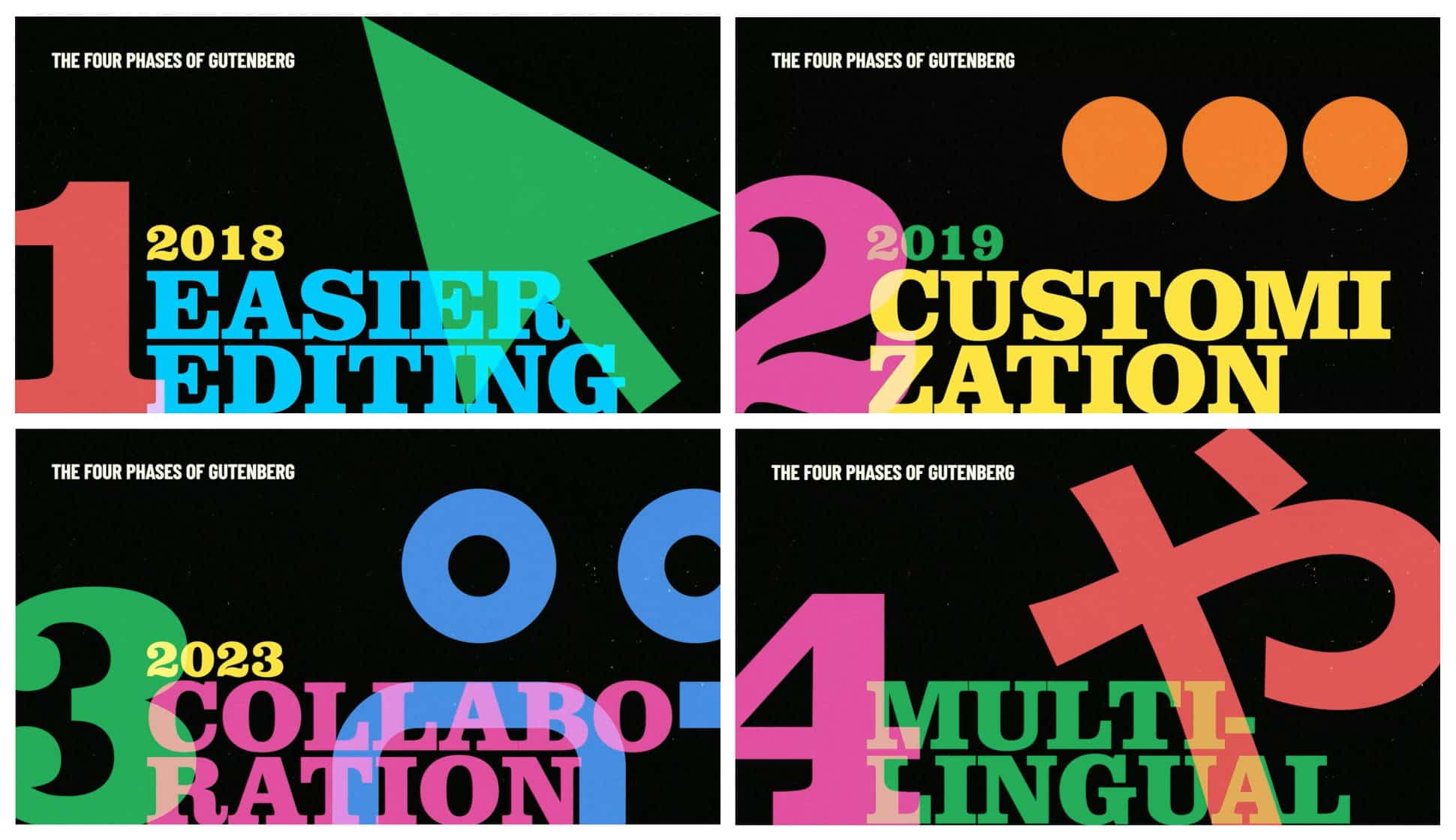
With WordPress 5.9, we get to the heart of the second phase of the Gutenberg roadmap: the Customization phase, which is mostly focused on Full Site editing, Block Patterns, Block Directory, and Block-based themes.
With 5.9, which is coming out next month, we are — I would say — at the MVP, the Minimum Viable Product of this customization phase of Gutenberg.
These words from Matt Mullenweg at 2021 State of the Word best summarize the key features of the new WordPress release.
That said, what’s new with the first WordPress release of 2022?
Let’s find out!
Global Styles: A Graphic Interface for theme.json
With the release of WordPress 5.8 in 2021, manipulating the theme.json file became the standard way for theme developers to customize editor settings and styles.
WordPress 5.9 takes things to the next level by introducing a graphic interface that allows users to customize style presets for their websites, either globally or at the block level, without writing a single line of code.
The Global Styles mechanism should significantly alter the way you’re used to customizing the appearance of your websites, as Global Styles affect several aspects of WordPress site design.
First off, the Global Styles interface replaces the Customizer and is now the only way to customize settings and styles with block themes. Similarly, complex theme option admin pages will no longer be needed. This provides a new standard way of configuring theme settings and styles and, at the same time, should streamline the theme development workflow.
With Global Styles, WordPress users gain more control over the presentation of their websites, both globally and per block type, beyond the context of individual pages or posts.
A new sidebar is now available in the site editor, at the top of which you’ll find a small preview panel and four components in the following order:
We can expect new components to be added over time.
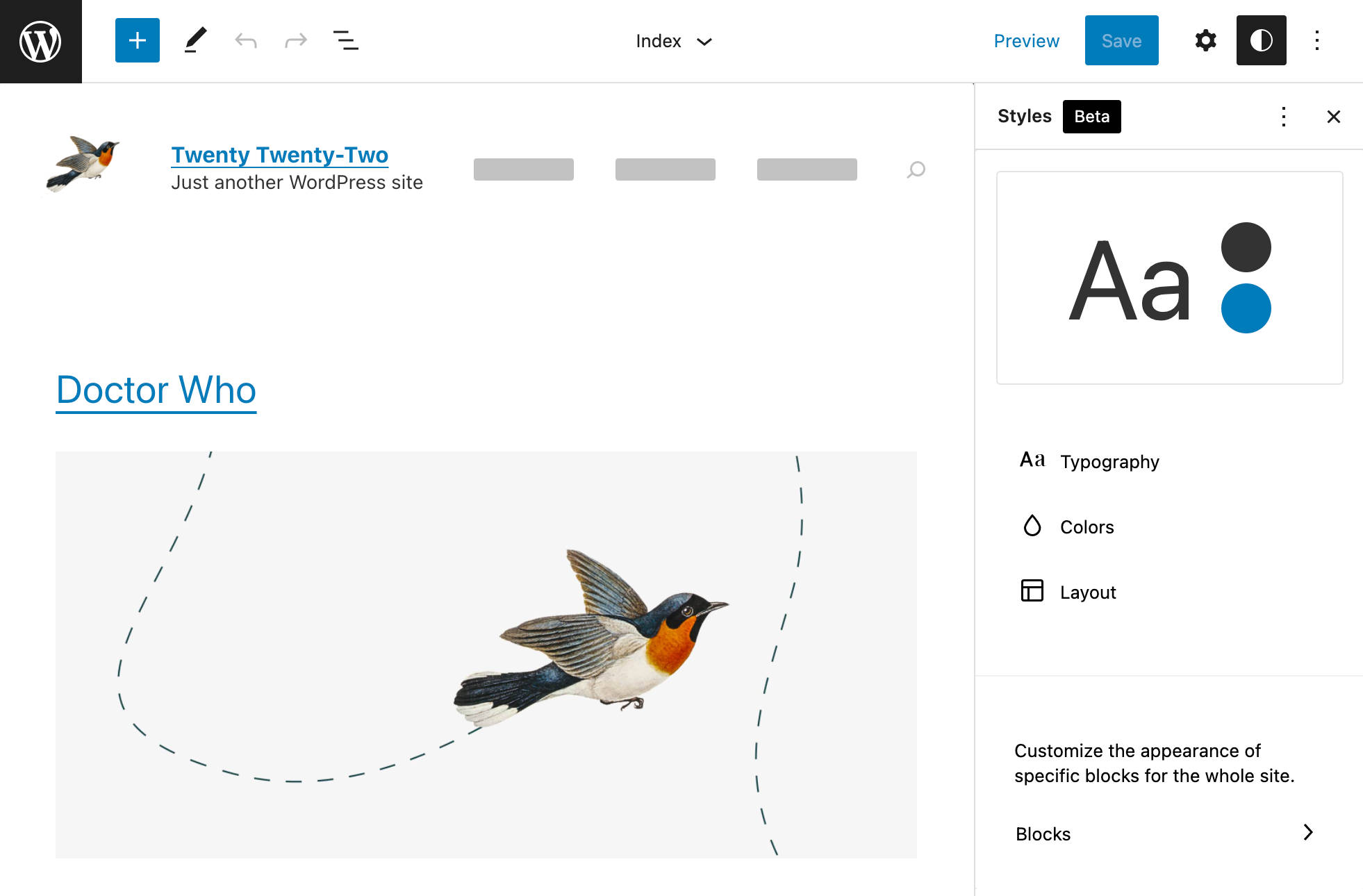
Let’s take a closer look at the new interface.
[CTA]
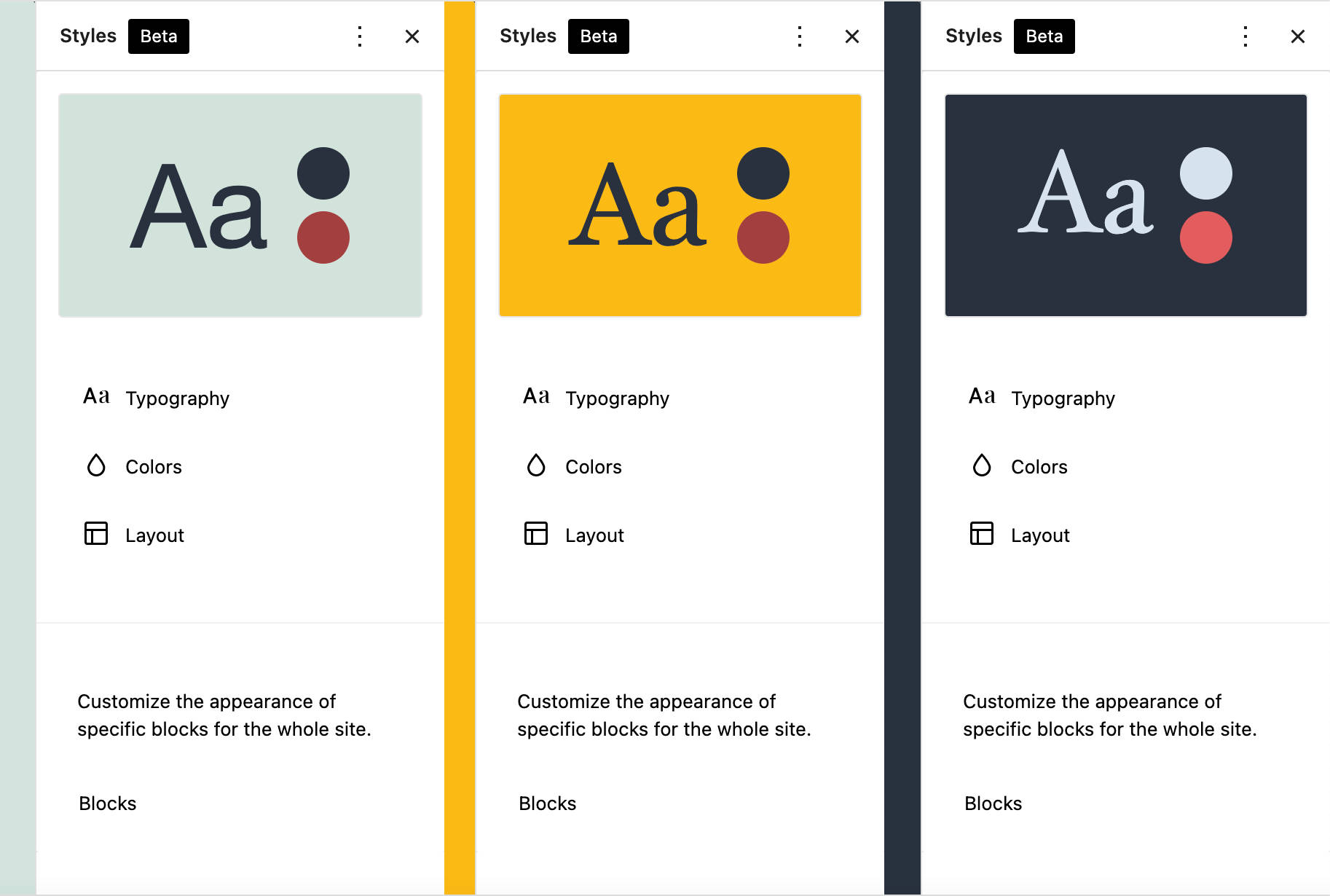
Style Preview
The first element in the Global Styles sidebar is a preview panel. This panel allows you to check the result of your customizations and is particularly useful when your changes apply to elements not visible in the site editor canvas.
The following image shows three different style combinations compared:
Typography
The Typography panel is where you control the typography of your website. Of course, the controls available in this panel depend on your theme.json settings.
For example, the Twenty Twenty-One Blocks (TT1 Blocks) theme declares the following typography properties:
"settings": {
	"typography": {
		"customLineHeight": true,
		"fontSizes": [],
		"fontFamilies": []
	}
}
The next image shows the resulting Typography settings in the Global Styles sidebar:
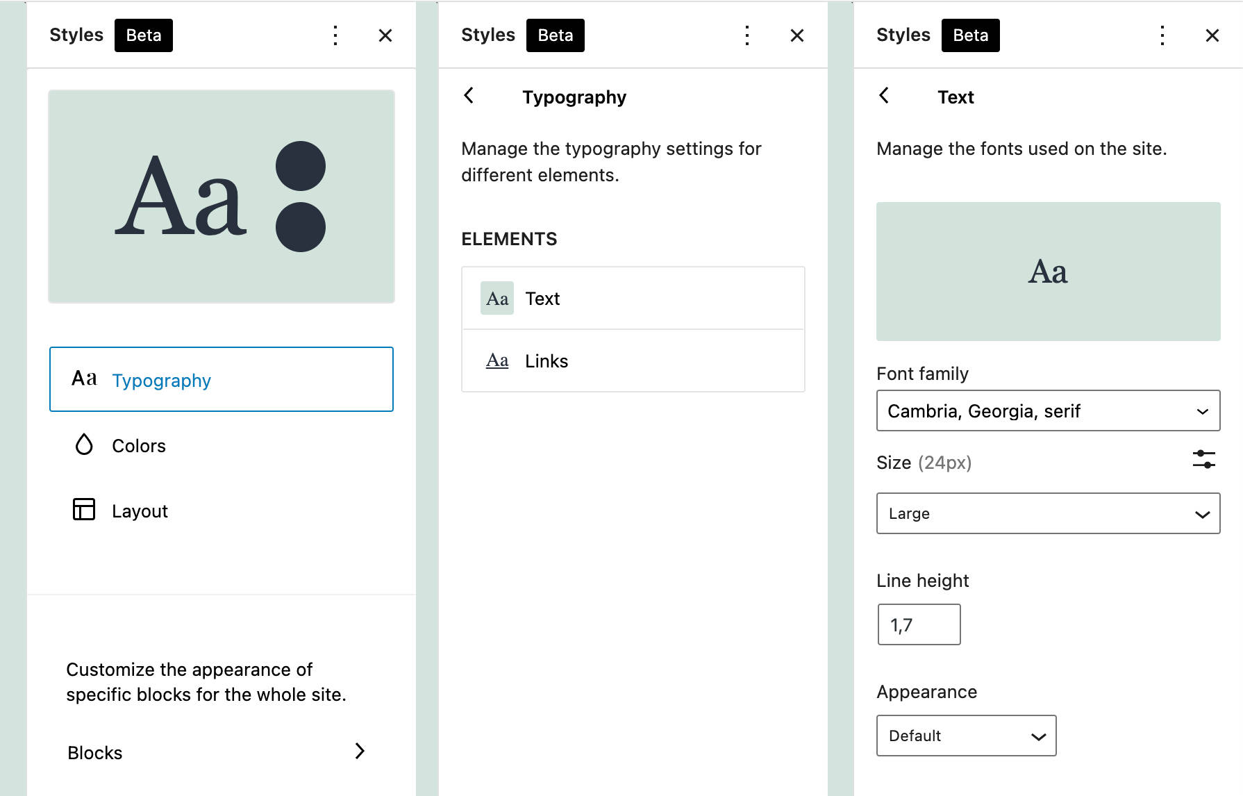
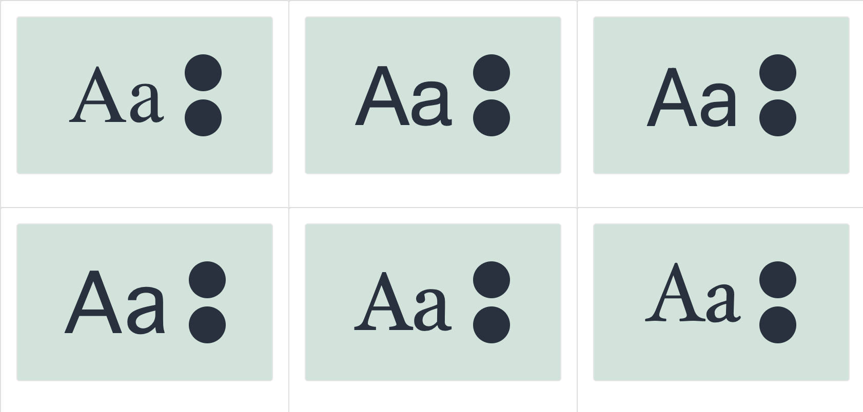
Let’s dive a bit deeper and see how the TT1 Blocks theme declares fontFamilies:
"fontFamilies": [
	{
		"fontFamily": "-apple-system,BlinkMacSystemFont,\"Segoe UI\",Roboto,Oxygen-Sans,Ubuntu,Cantarell,\"Helvetica Neue\",sans-serif",
		"slug": "system-font",
		"name": "System Font"
	},
	{
		"fontFamily": "Helvetica Neue, Helvetica, Arial, sans-serif",
		"slug": "helvetica-arial"
	},
	{
		"fontFamily": "Geneva, Tahoma, Verdana, sans-serif",
		"slug": "geneva-verdana"
	},
	{
		"fontFamily": "Cambria, Georgia, serif",
		"slug": "cambria-georgia"
	},
	{
		"fontFamily": "Hoefler Text, Baskerville Old Face, Garamond, Times New Roman, serif",
		"slug": "hoefler-times-new-roman"
	}
]
You can check these font families in the Global Styles preview panel:
Colors
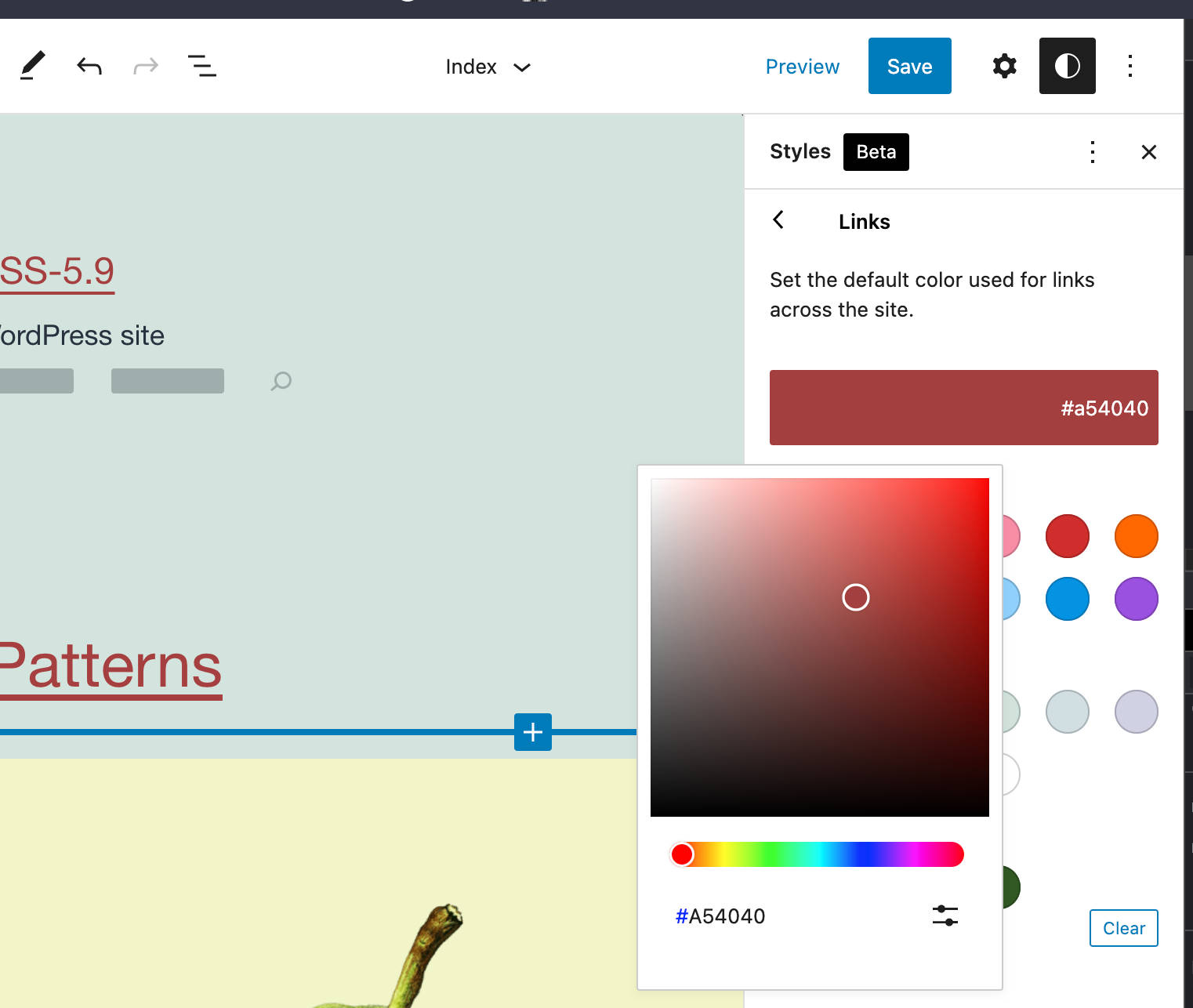
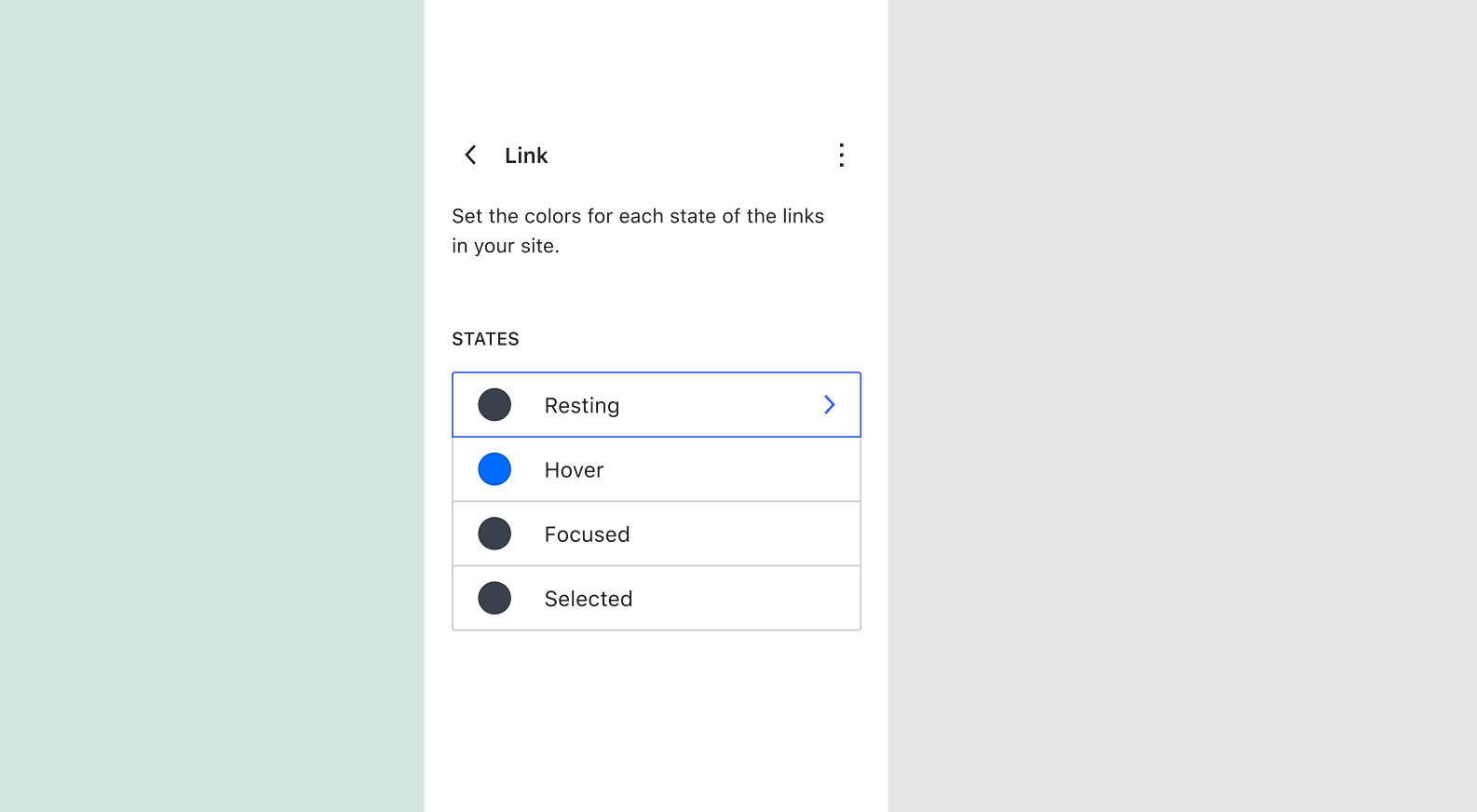
In the Colors section, you can view and edit color palettes and customize the color of several site elements.
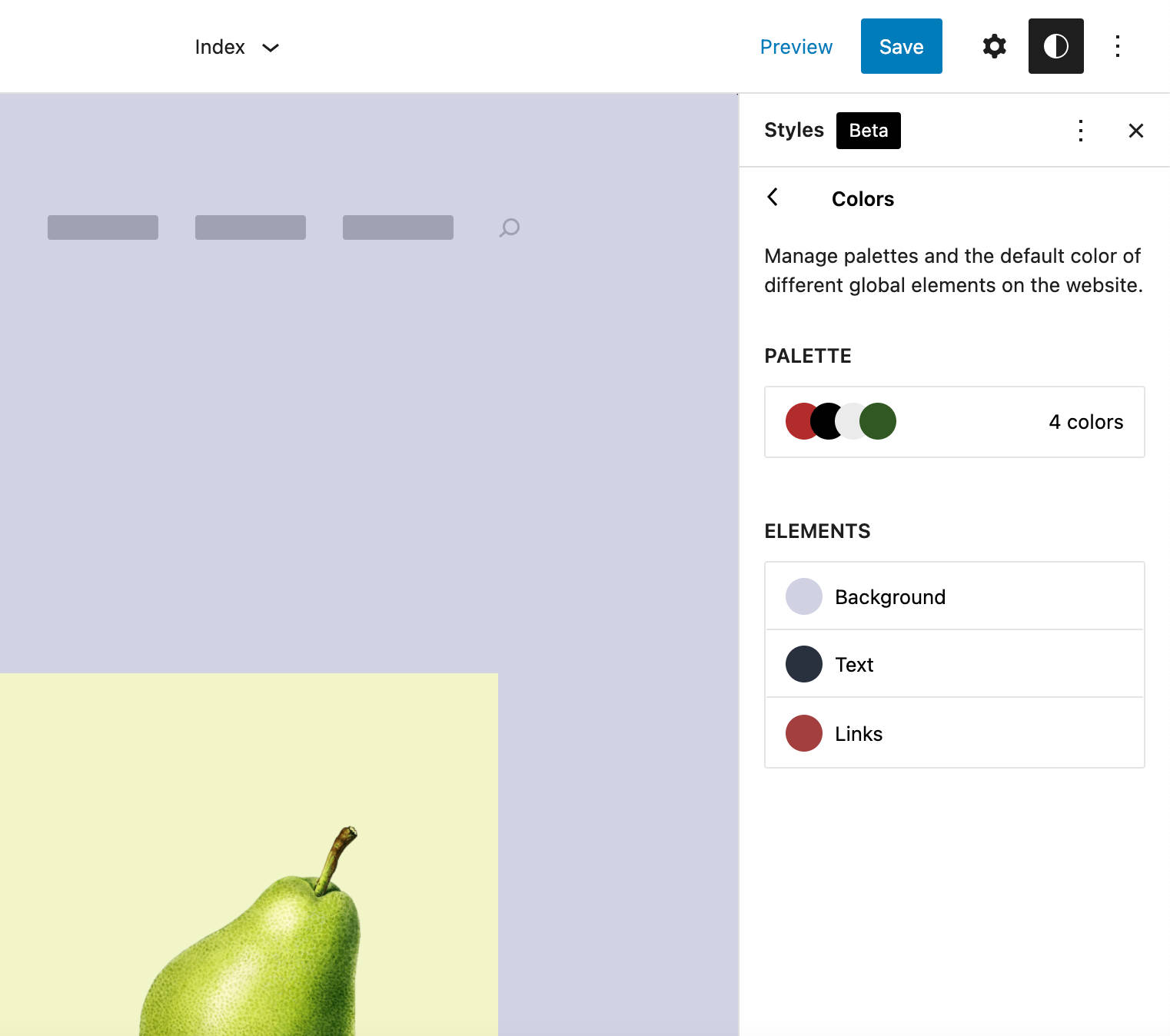
By clicking on those elements, you get access to a new panel where you can choose colors from three color palettes: Core, Theme, and Custom palette (read more in Default Colors, Theme Colors, and Custom Colors).
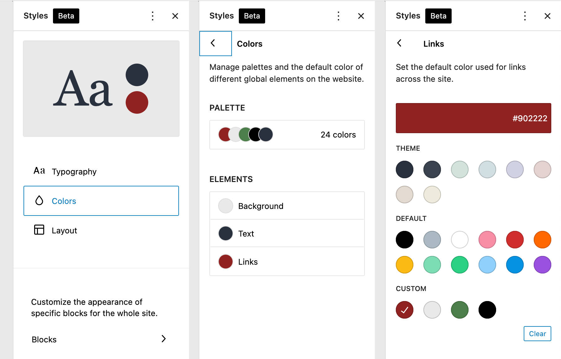
In this panel, you’ll be able to set and modify the color for the current element.
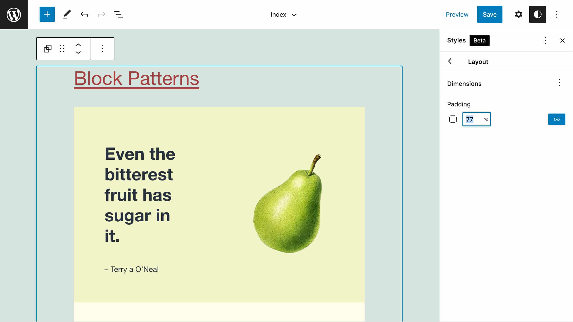
Layout
The last group of tools is meant for layout customizations. In the global context, this is limited to the site container.
Blocks
With the implementation of the Global Styles mechanism, it’s now also possible to change the appearance for specific blocks, such as Paragraph (typography and colors), Buttons (layout), and Column (colors and layout).
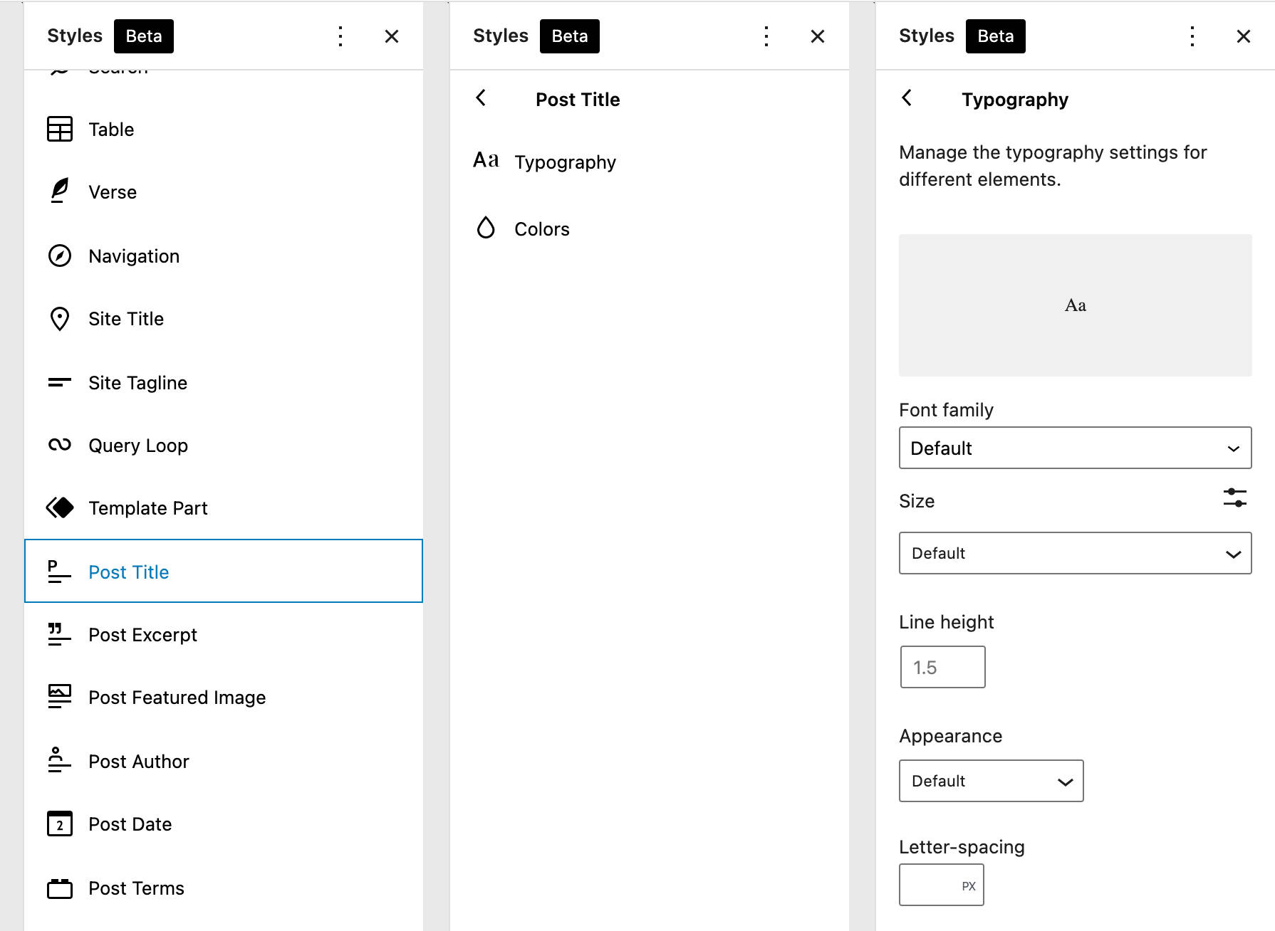
Note that block styles can be customized from the Global Styles interface only if the block declares support for specific functionality in the corresponding block.json file. For example, the core/post-title block currently supports the following styles:
"supports": {
	"align": [ "wide", "full" ],
	"html": false,
	"color": {
		"gradients": true,
		"link": true
	},
	"spacing": {
		"margin": true
	},
	"typography": {
		"fontSize": true,
		"lineHeight": true,
		"__experimentalFontFamily": true,
		"__experimentalFontWeight": true,
		"__experimentalFontStyle": true,
		"__experimentalTextTransform": true,
		"__experimentalLetterSpacing": true,
		"__experimentalDefaultControls": {
			"fontSize": true,
			"fontAppearance": true,
			"textTransform": true
		}
	}
},
Since the core/post-title block supports colors, spacing, and typography, you’ll find the corresponding entries in the Global Styles settings of the Post Title block.
The following image shows typography settings, which you can easily compare with the above code:
It’s worth noting that WordPress 5.9 only delivers the first implementation of the Global Styles interface. As Matias Ventura points out, we can reasonably expect further development of the new style control feature:
In the future, there will be flows built into the system allowing you to move from local styles to global — like making customizations to a button block and opting to apply them globally changes across all buttons of that type.
So we may see major improvements soon. The image below is just an example of what we might expect:
Additional improvements could include the ability for themes to provide alternative color palettes and multiple global style variations.
Last week I built a handful of Twenty Twenty-Two's color + font variations into super-simple child themes. They're really lightweight, and I love the idea of offering folks a drastically different site with one click.🎉https://t.co/dItIkvvhK9 pic.twitter.com/rB4CcTfW0A
— kjellr (@kjellr) November 15, 2021
Developers can dive deeper into the global styling mechanism in Global Settings & Styles (theme.json) support article. You’ll find additional examples in our introduction to the Twenty Twenty-Two default theme.
The Navigation Block
The Navigation block has been dubbed “one of the most impactful theme blocks,” and we’re not afraid to say that we agree.
The block has been in the embryonic phase for a while (see also Navigation Block Tracking Issue and Tracking Issue i2). Still, now that all pending issues and blockers listed as WordPress 5.9 must-haves have been fixed, we can finally start using one of the most powerful features merged into the core with WordPress 5.9.
[CTA]
A Quick Overview of the Navigation Block Interface
Using the new block might be a bit confusing at first, but once you get the hang of it, you’ll appreciate its full potential.
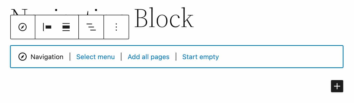
When you first add a Navigation block, the block placeholder provides three options for selecting an existing block-based menu, creating a menu with all pages, or starting fresh with an empty menu.
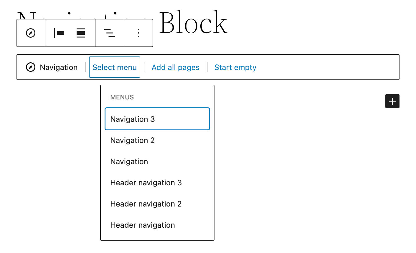
The new Navigation menu also allows you to import menus created through the Appearance Menus Screen that’s available with classic themes.
This means that if you’re transitioning from a classic theme to a block theme, you won’t have to rebuild your existing menus. You just need to pick one of your currently available “Classic Menus,” and it will be automatically converted into a block-based navigation menu.
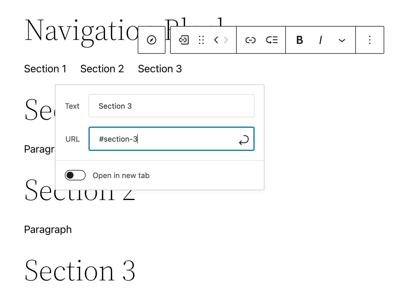
You can add the Navigation block anywhere on your pages. For example, you might find it useful in long-form articles to create a table of contents, allowing users to jump to specific content sections.
New Navigation Links are instantly added to the Navigation block by clicking on the plus (+) icon on the right side (see also Gutenberg 11.7 release notes), unless other types of blocks have already been added to the menu.
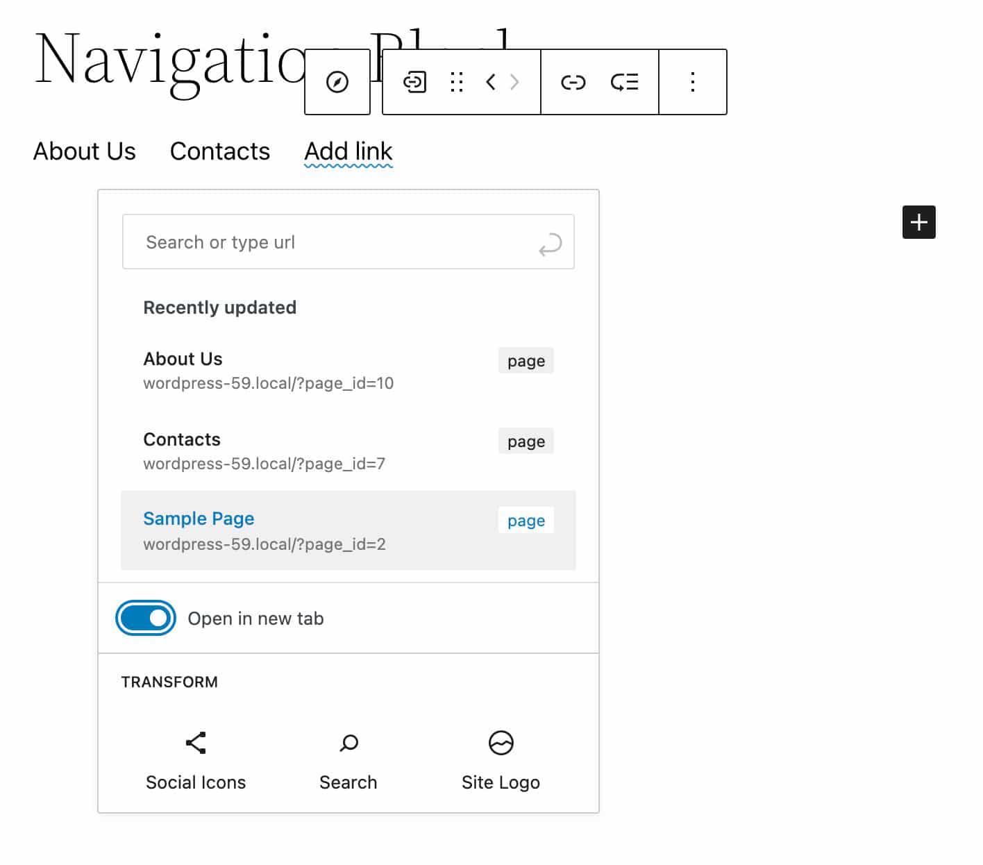
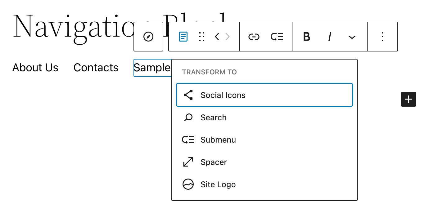
Clicking on the Edit button in the Navigation Link block toolbar converts a menu item to a custom link. This allows you to add, edit, reorder, and remove items individually.
You can also transform links to blocks by clicking on the Transform button in the block toolbar. This allows you to add specific blocks directly to the navigation menu.
Custom Link, Spacer, Site Logo, Home Link, Social Icons, and Search blocks are now exposed to users when adding blocks to navigation menus.
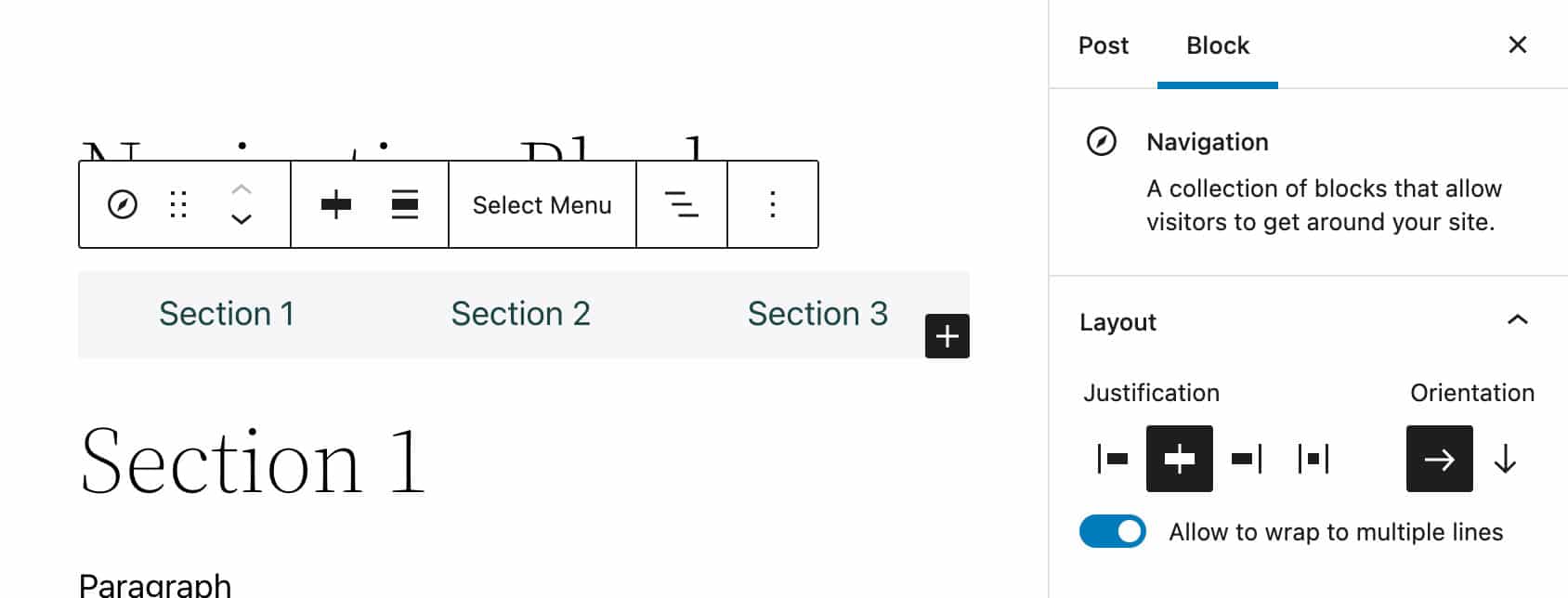
In the Settings sidebar, you’ll find a comprehensive set of options for controlling several aspects of your navigation menus.
The Layout panel includes controls for justification, orientation, and wrapping.
The Navigation block also features an improved Display settings panel with an option for an always-on burger menu.
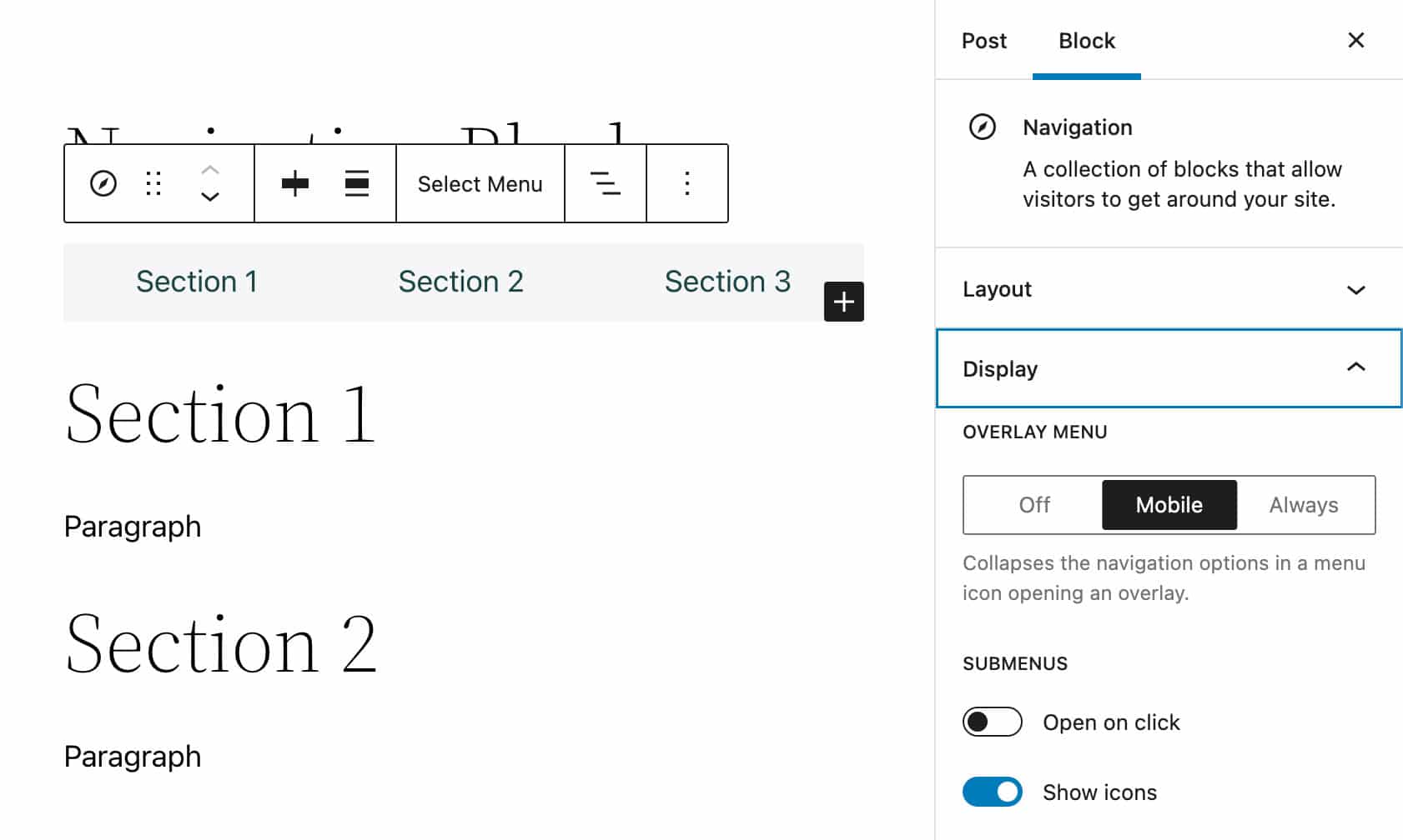
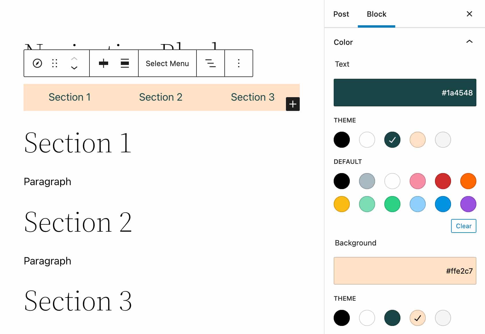
You can also customize text and background colors for your menus and submenus.
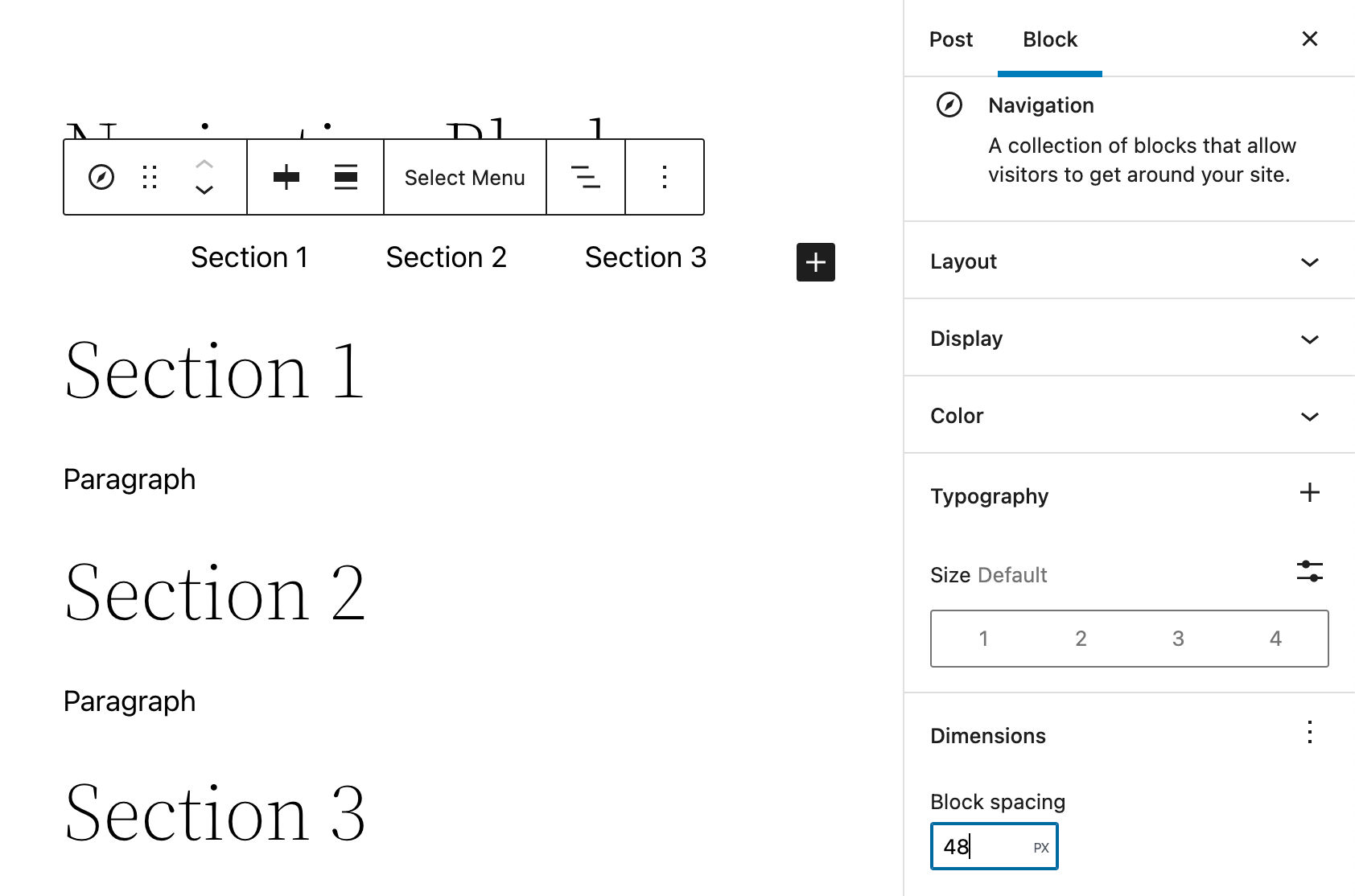
Another helpful addition recently added to the Navigation block is the Block Gap support, which adds the ability for users to control the distance between menu items.
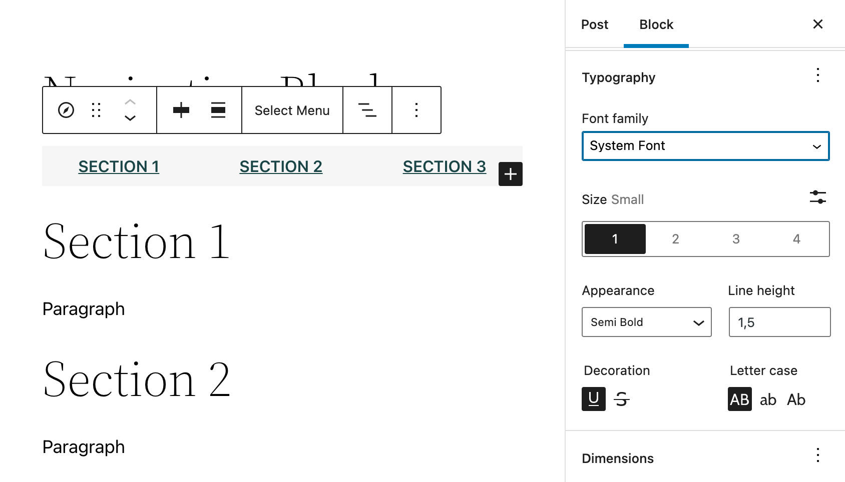
The Typography panel provides a set of controls for font family, appearance, line height, decoration, and letter case. All these controls can be toggled on/off from a dropdown menu that appears when you click on the ellipsis icon on the right.
The Navigation Block: Under the Hood
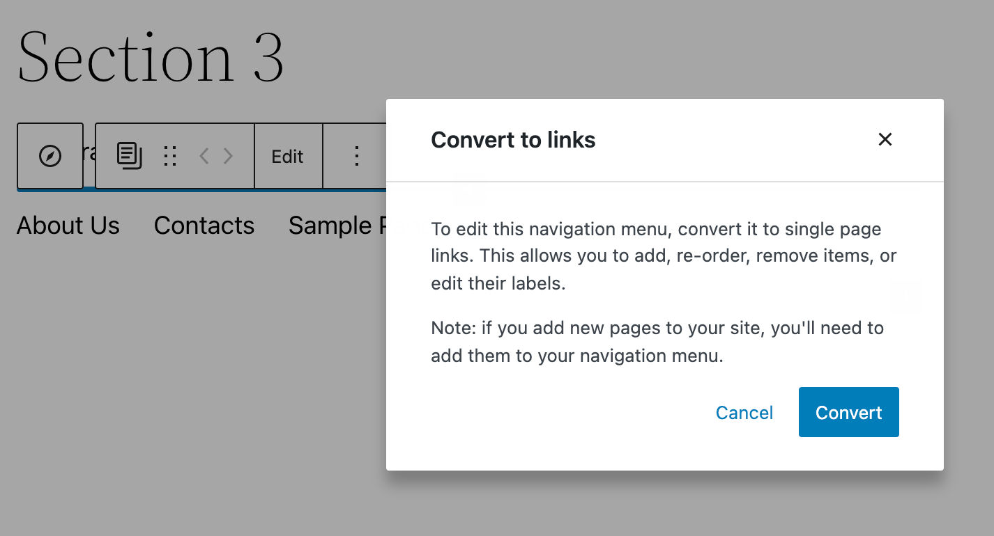
Navigation block data are stored in the database using a wp_navigation dedicated post type.
Why is this interesting for WordPress users, and how does it work?
Say you’ve created a navigation menu consisting of two custom links and a search box. With the Twenty Twenty-Two theme installed, the menu could look as shown in the following image:
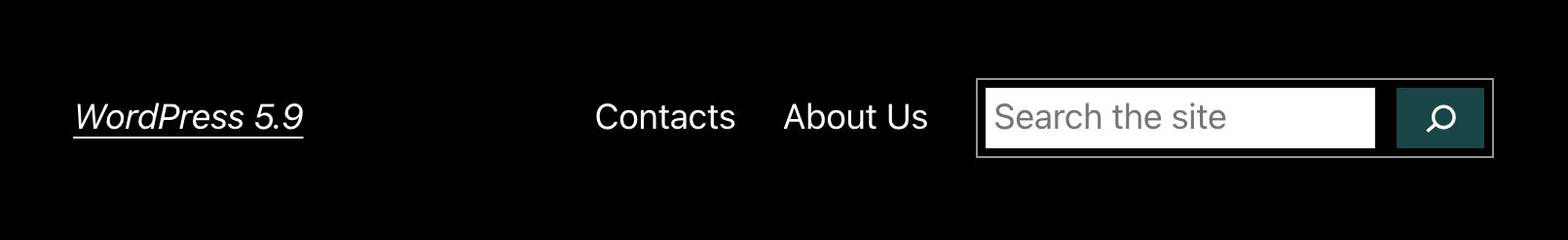
The Navigation block above is stored in the database as wp_navigation post type as follows:
<!-- wp:navigation-link {"label":"Contacts","type":"page","id":7,"url":"http://wordpress-59.local/?page_id=7","kind":"post-type","isTopLevelLink":true} /-->
<!-- wp:navigation-link {"label":"About Us","type":"page","id":10,"url":"http://wordpress-59.local/?page_id=10","kind":"post-type","isTopLevelLink":true} /-->
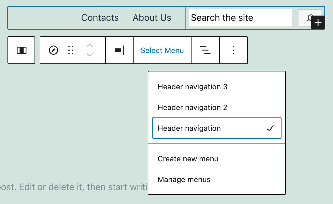
<!-- wp:search {"showLabel":false,"placeholder":"Search the site","buttonPosition":"button-inside","buttonUseIcon":true} /-->Storing the Navigation block content into the database enables users to use the same navigation menus across different block themes. If the menu is not immediately visible, you would just pick the desired navigation menu in the menu selector (see also issue #36087 and PR #36178).
The following image shows the above menu with the Twenty Twenty-One Blocks theme:
The Navigation block has gone through several iterations. You can dive deeper into each implementation in the Gutenberg 11.7 and 11.9 release notes.
You can also read more about the Navigation block in The new Navigation block dev note and Navigation block support article.
[CTA]
Image Galleries, Featured Images and Site Icons
Aiming to make images behave more consistently across different contexts, WordPress 5.9 delivers new features and improvements to several blocks. The Gallery Block has been completely revised, while various changes to the Featured Image and Site Icon blocks give users more granular control over respective images.
A Refactored Gallery Block
In WordPress 5.8, the ability to customize the appearance of images in galleries was somewhat limited. There was no way to change image style or apply a duotone filter.
Additionally, important features were missing from gallery images, such as adding custom links to individual images in a gallery.
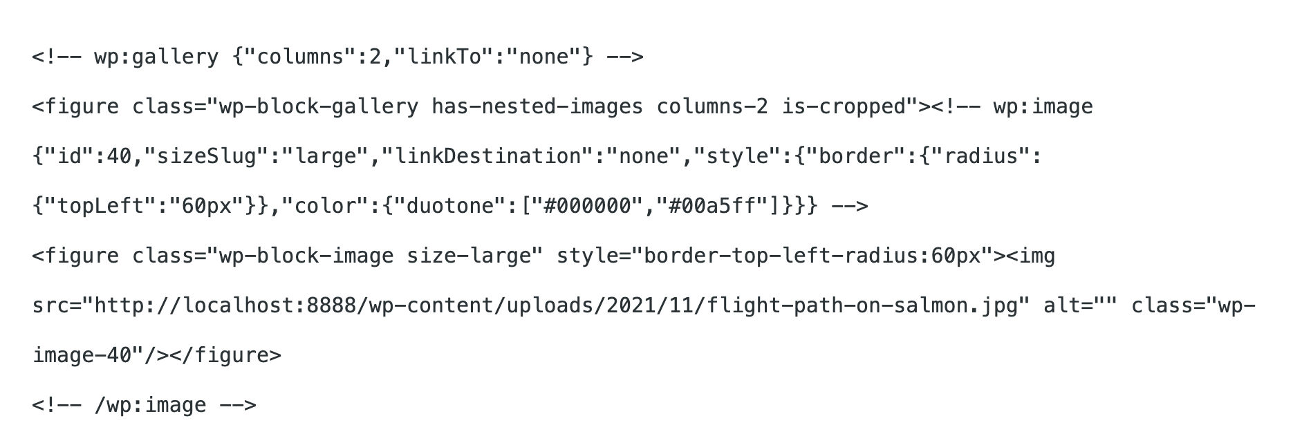
To better understand the reason for this asymmetry between images in the two different contexts of a single image and an image in a gallery, let’s take a look at the Gallery block in Code view in WordPress 5.8:
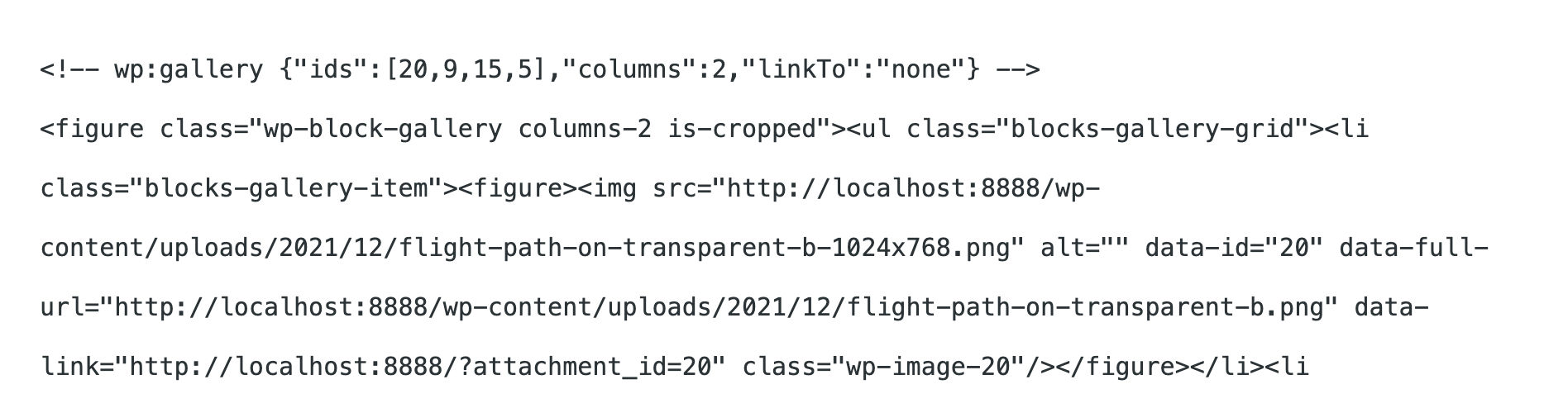
Note that image details are only stored in the Gallery block delimiter (see also What Is a Gutenberg Block?).
This made individual images behave differently from images in galleries.
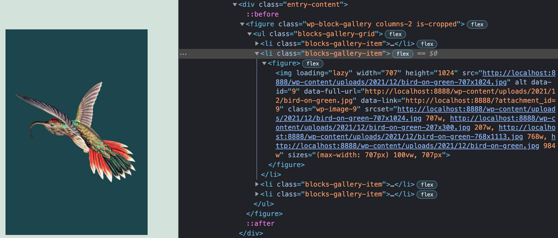
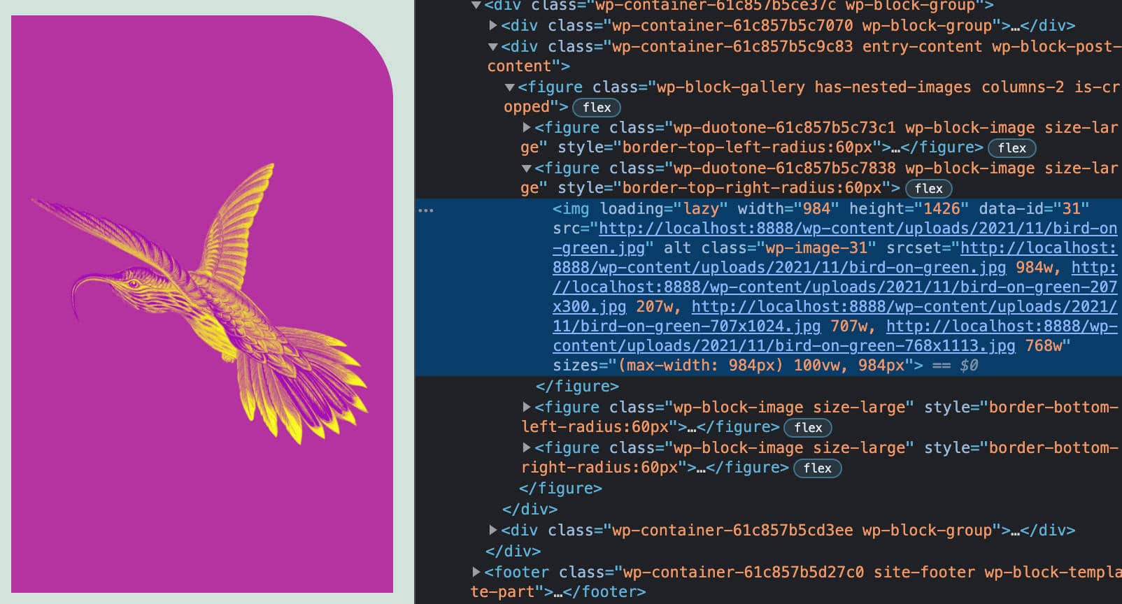
To make images behave consistently in the two different contexts, WordPress 5.9 introduces a completely refactored Gallery block, which now behaves like a container for a collection of figure elements instead of an unordered list of images.
In WordPress 5.9, gallery images are nested using the core innerBlocks APIs, and each image stores its own set of details, exactly like individual images.
That’s a great enhancement, since Gallery block images now support the same functionalities available in core Image blocks, such as image dimensions and duotone filters, as well as standard block features, such as drag-and-drop, copy, duplicate, and remove functionalities.
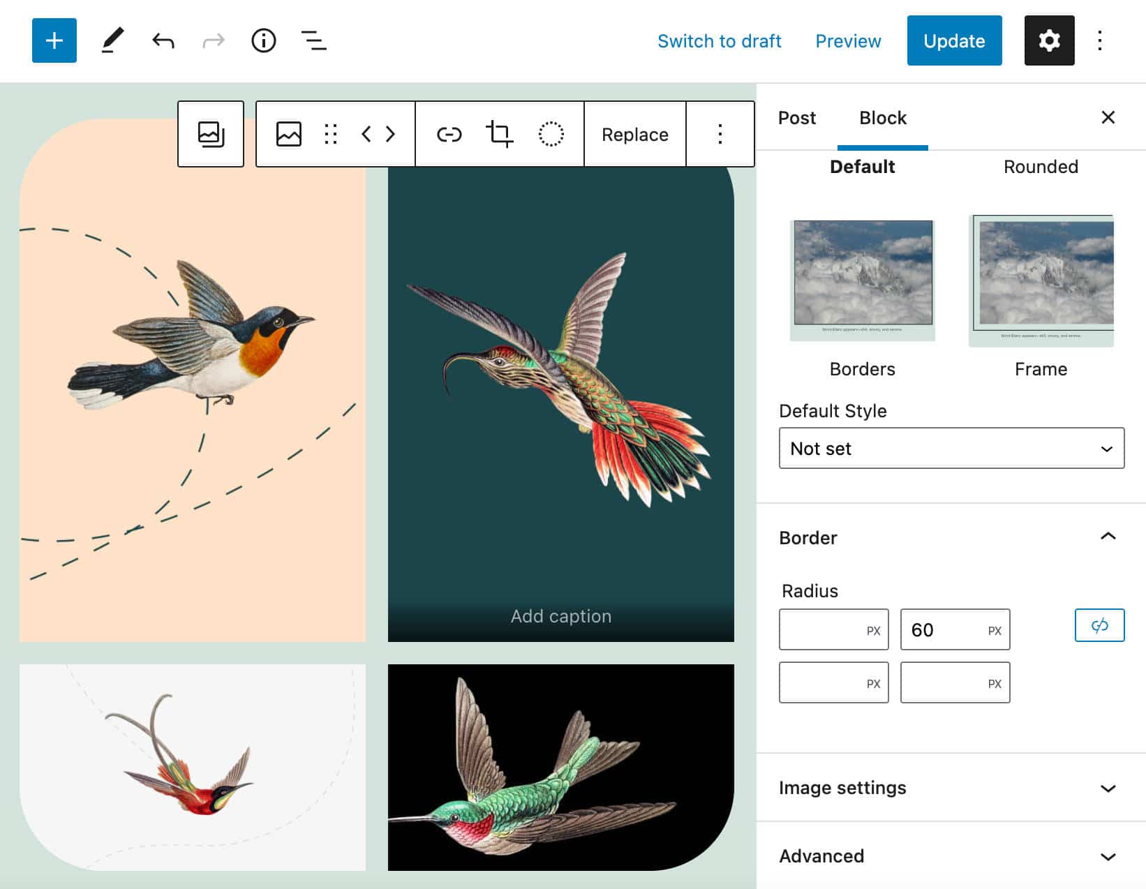
With the new Gallery block, you’ll be able to style images individually. This grants a wide array of customization opportunities.
The image below displays multiple pictures in a gallery, each with differently rounded corners:
You can also use different duotone filters on different images in the same gallery.
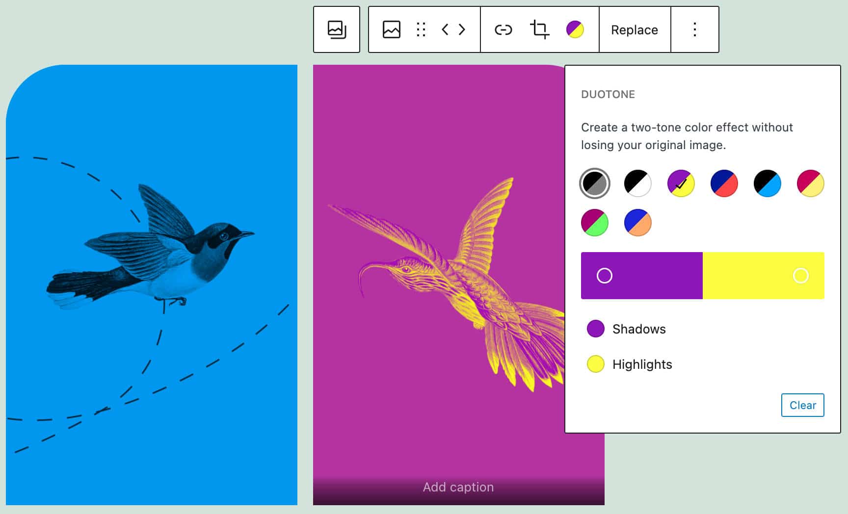
And, of course, you can assign a specific CSS class to each image, which gives you additional superpowers for adding whatever customization you need to your gallery images.
For a closer view of the new Gallery block, see also Gallery Block Refactor Dev Note, Upcoming Gallery Block improvements, and Gutenberg 11.4 release notes.
Featured Image Enhancements
Several improvements have also been brought to the Featured Image block.
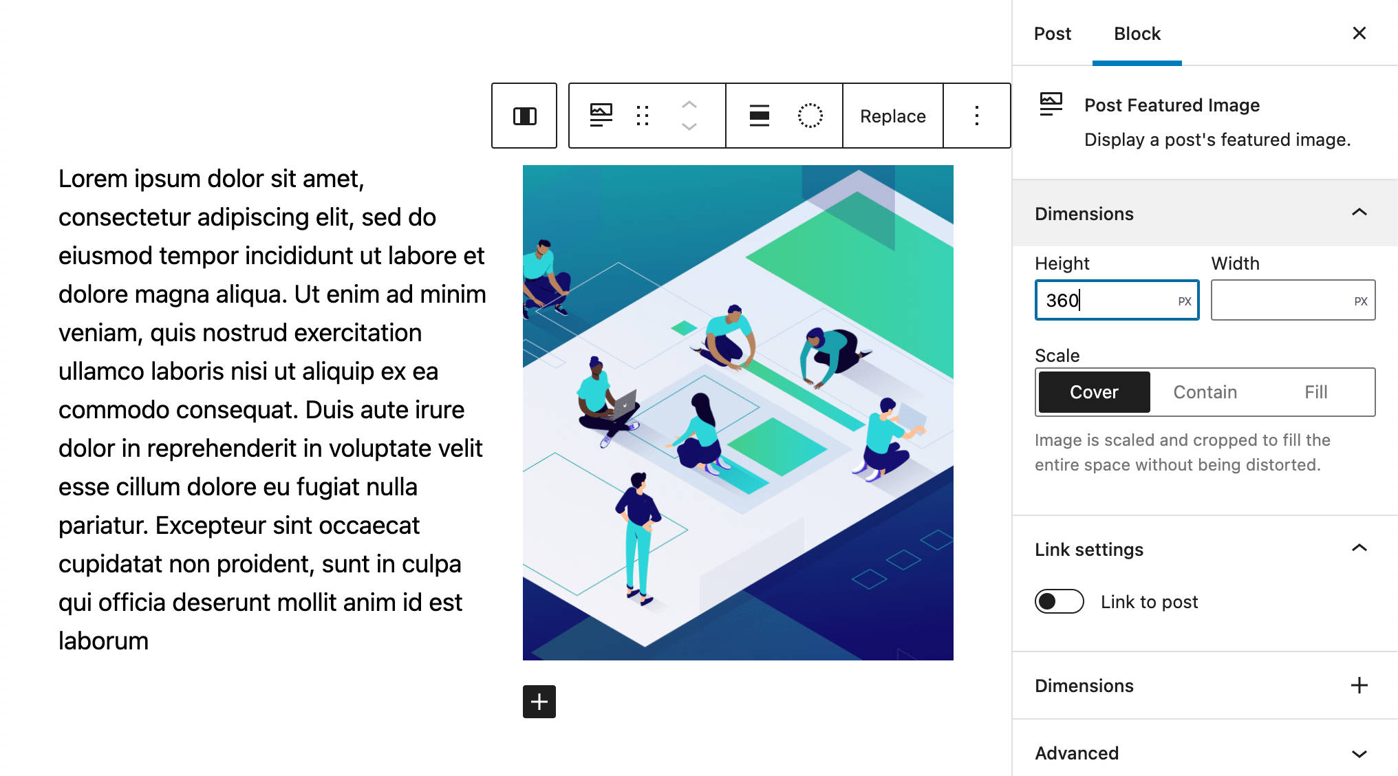
Basic Dimensions Controls
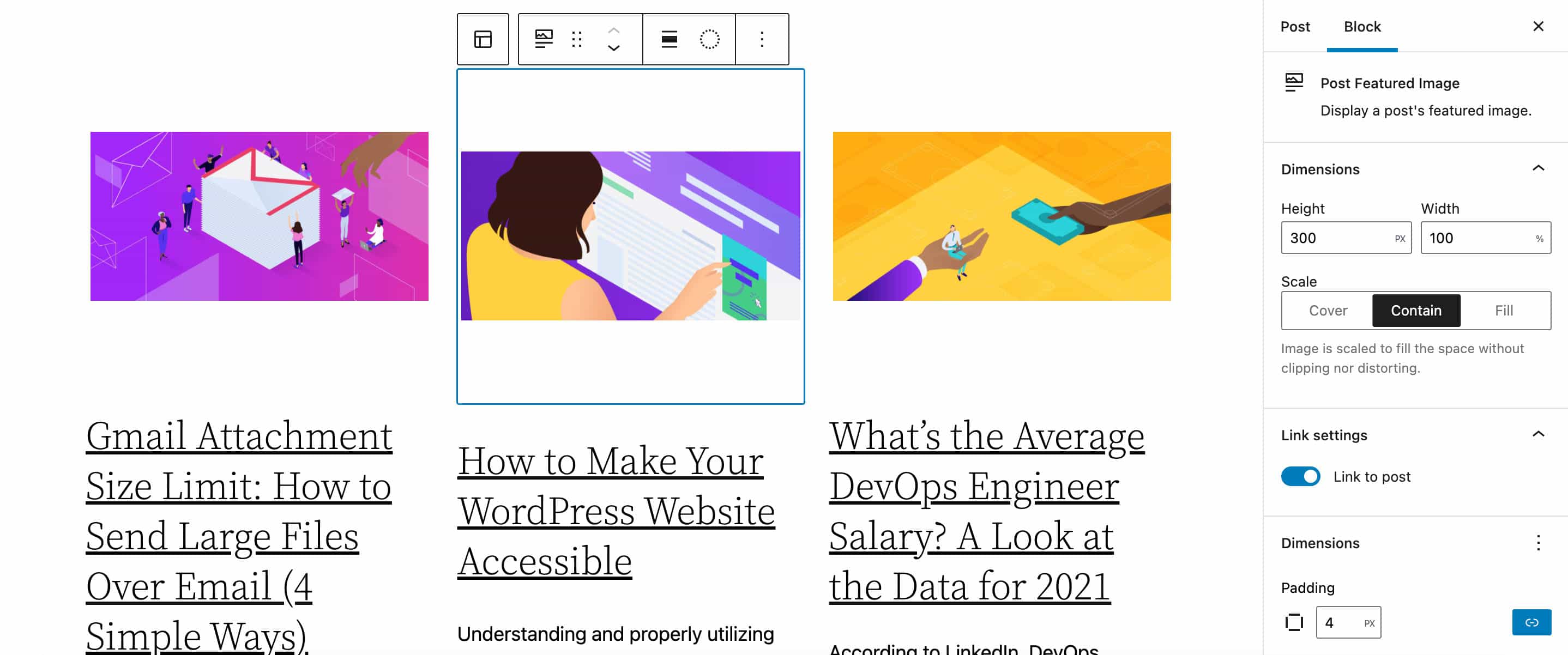
The Featured Image block now features a new Dimensions settings panel providing height, width, and scale controls.
Dimensions control also applies to featured images in Query Loop blocks, as shown in the following image:
Duotone Filters on Featured Images
We mentioned above that we can now apply the duotone filter in images wrapped in the new refactored Gallery block.
Now, starting with WordPress 5.9, duotone filters are also available in Featured Image blocks in any context, from post and page templates to Query Loop blocks.
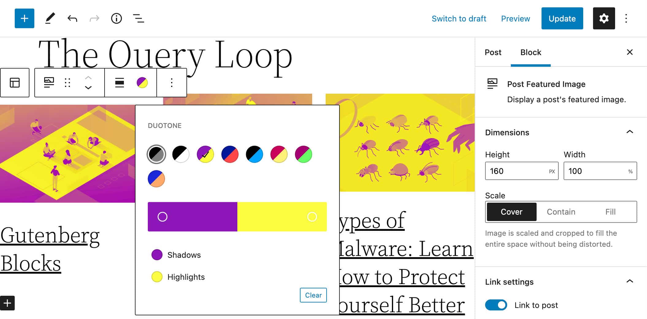
This feature opens the door to creative and consistent color combinations throughout the site.
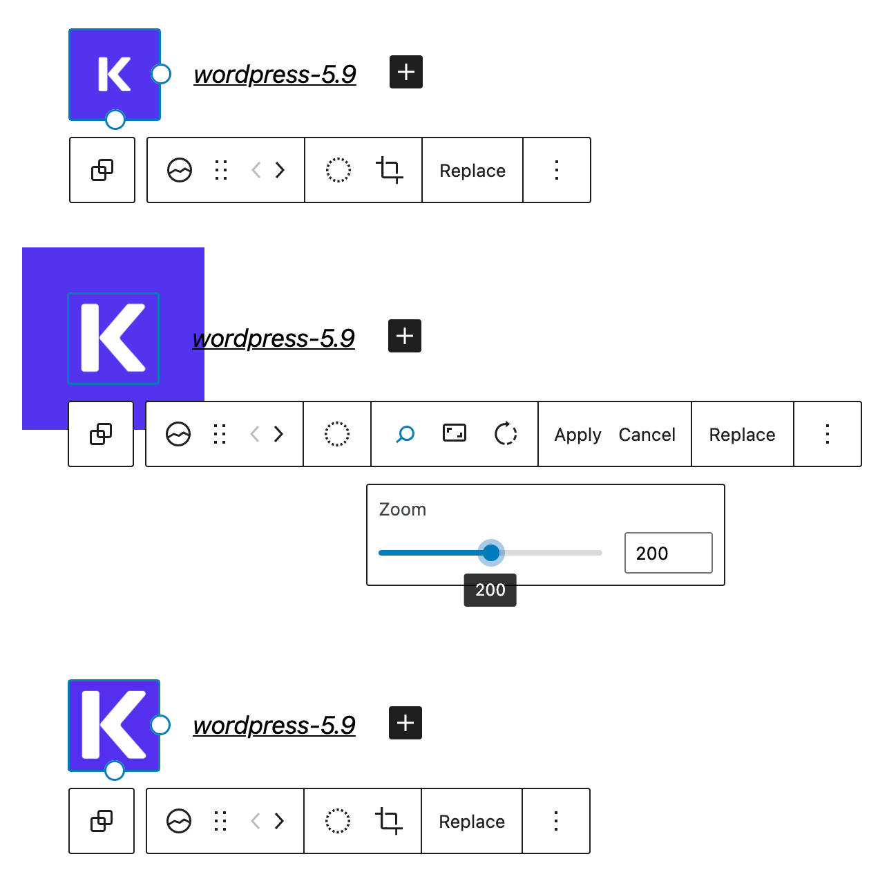
Image Cropping in Site Logo
Before WordPress 5.9 (and Gutenberg 11.6), logo images could only be edited before being uploaded. With WordPress 5.9, you can crop, zoom and rotate images used in the Site Logo block directly from the block toolbar.
New Design Tools, Blocks, and UI Enhancements
Eleven Gutenberg versions get merged into the core with WordPress 5.9, delivering so many features, enhancements, and bug fixes that it wouldn’t be possible to cover them all in a single article.
So we picked some of those that we found most worthy of attention. For a deeper overview of those features and improvements, you may also want to check the release posts for Gutenberg 10.8, 10.9, 11.0, 11.1, 11.2, 11.4, 11.5, 11.6, 11.7, and 11.9.
With that said, this section will cover the following changes:
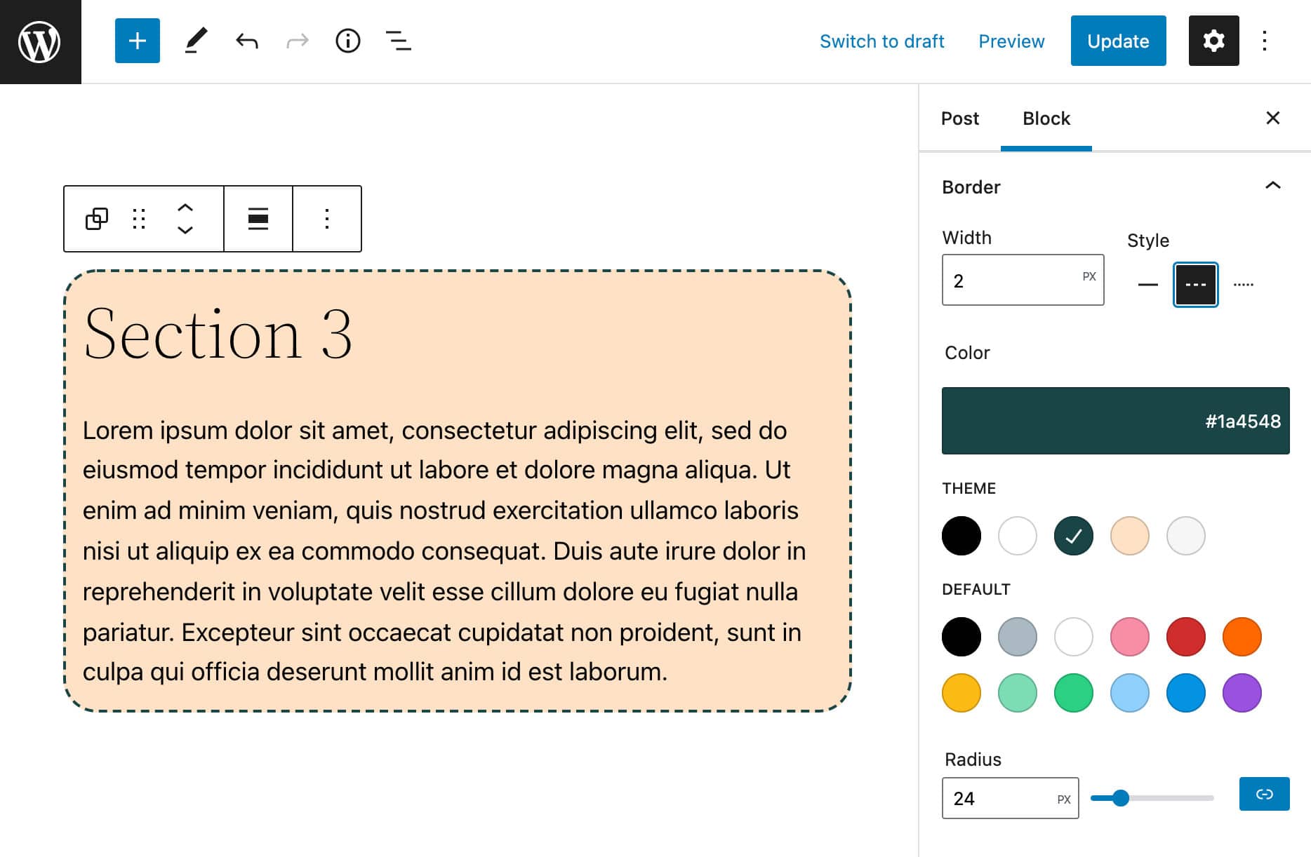
Border Supports UI
Starting with WordPress 5.9, when the theme.json declares border settings and a block declares border support via the Block Supports API, a new settings panel will provide controls for border radius, width, style, color, and units (see also Gutenberg 11.1).
The core Group block is a good example of this useful UI enhancement. The block.json file of the Group block now includes the following supports declarations:
{
	...
	"supports": {
		"align": [ "wide", "full" ],
		"anchor": true,
		"html": false,
		"color": {
			"gradients": true,
			"link": true
		},
		"spacing": {
			"padding": true,
			"__experimentalDefaultControls": {
				"padding": true
			}
		},
		"__experimentalBorder": {
			"color": true,
			"radius": true,
			"style": true,
			"width": true,
			"__experimentalDefaultControls": {
				"color": true,
				"radius": true,
				"style": true,
				"width": true
			}
		},
		...
	},
	...
}
This feature allows users to create awesome graphic effects on their websites with minimal effort. You can see it in action with the new Twenty Twenty-Two theme.
In a new post or page, create a new Group block and select it. You’ll see a Border panel in the block settings sidebar. Change the border width and style as needed and enjoy the result.
If you’re a theme developer and want to add this feature to your themes, open your theme.json file and declare border support as shown in the following code:
{
	"version": 1,
	"settings": {
		"border": {
			"customColor": true,
			"customRadius": true,
			"customStyle": true,
			"customWidth": true
		}
	}
}
Save the file and get back to your WordPress dashboard. In a new post or page, create a new Group block and select it. You should now see a Border panel in the block settings sidebar (see also this experimental theme.json).
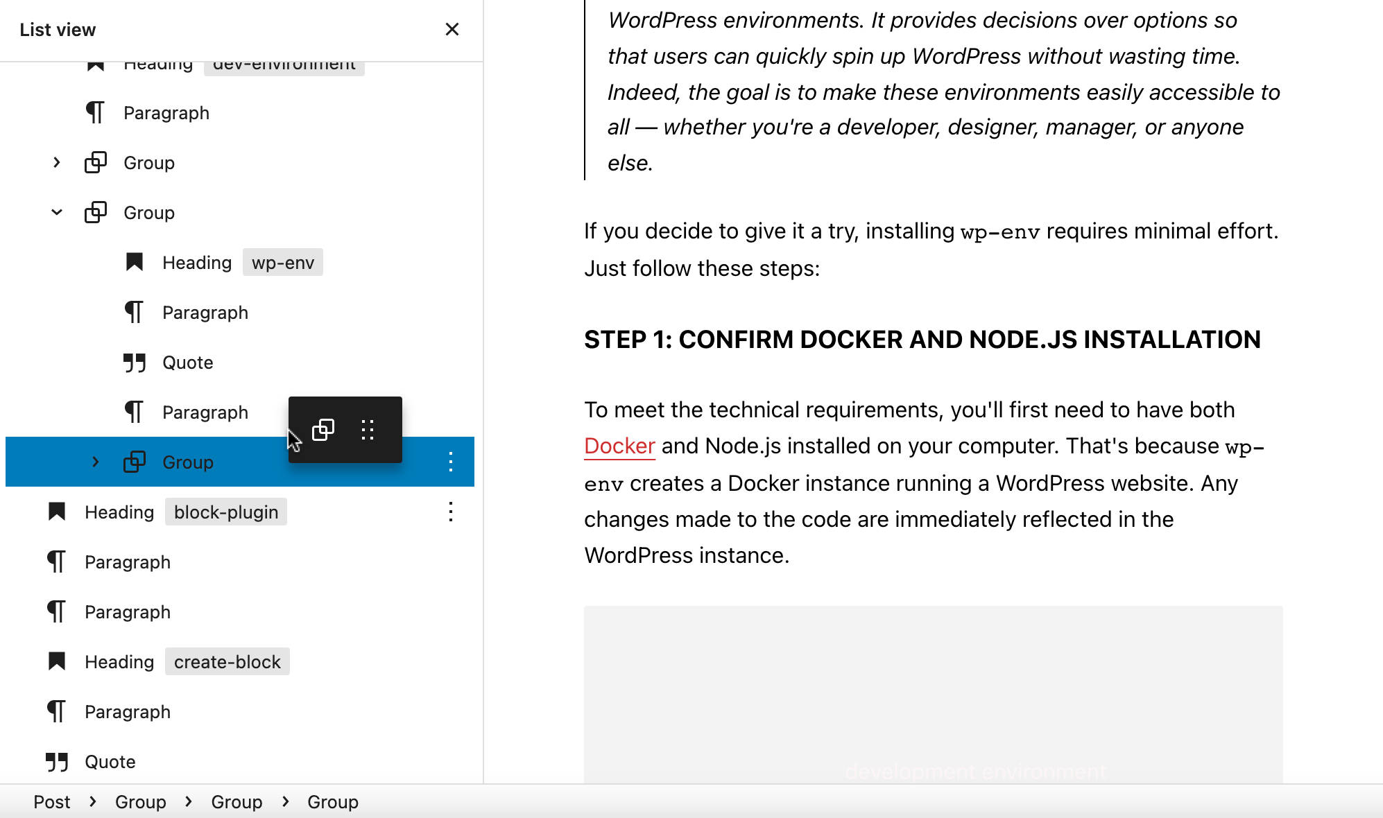
List View Improvements
With WordPress 5.9, the List View has been improved and now features drag and drop, collapsible sections, and HTML anchors.
Drag and Drop in List View
As mentioned in pull request #33320, drag-and-drop has been implemented in the List View but was disabled due to performance issues.
Starting with WordPress 5.9, drag-and-drop in List View has been re-implemented. You can again drag and drop blocks and groups of blocks anywhere in the List View. This is a great enhancement in the editor’s usability, as it allows you to quickly and easily move blocks and groups of blocks around your pages. It’s instrumental in long-form articles and pages, and managing complex structures of nested blocks.
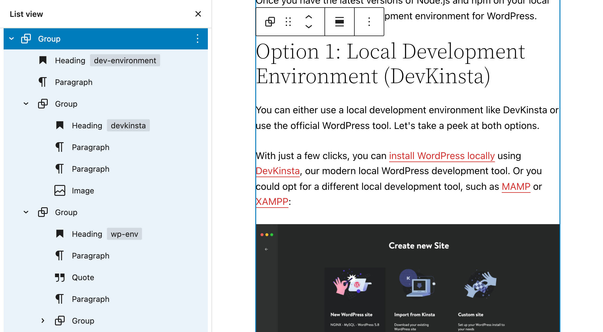
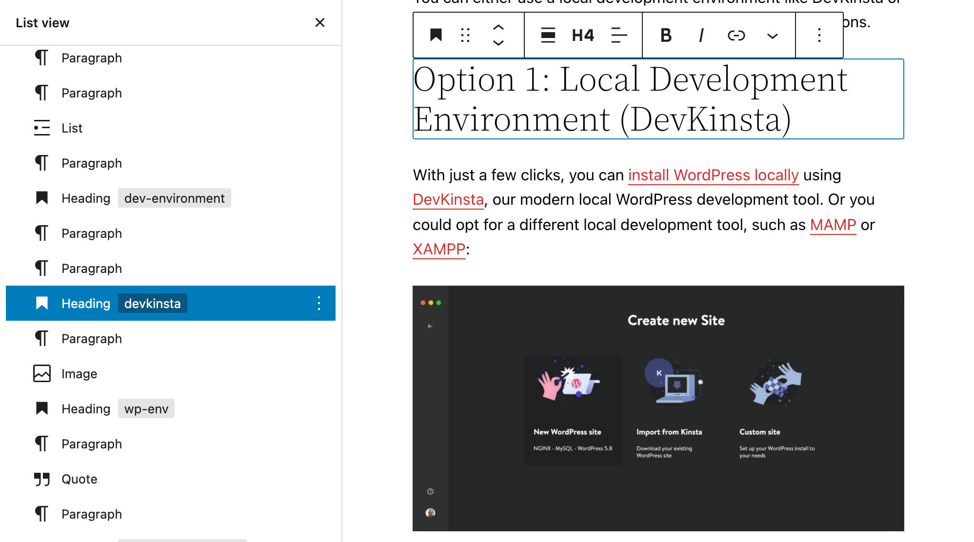
List View Collapsible Sections
Another significant improvement to the List View is the ability to expand/collapse sections of nested blocks. This allows you to easily navigate complex block structures, expanding single groups of blocks while leaving all the rest collapsed.
You can also expand and collapse List View sections using left and right arrows.
HTML Anchors on List View Items
Yet another helpful enhancement is the ability to add HTML anchors to your blocks in List View and see them at a glance.
Block Gap Spacing Control
First introduced in Gutenberg 11.4 and now merged into the core with WordPress 5.9, the new Block Spacing control allows you to set a custom distance between items within a block. Below, you can see a preview with different block spacing values in a Columns block with the Twenty Twenty-Two default theme:
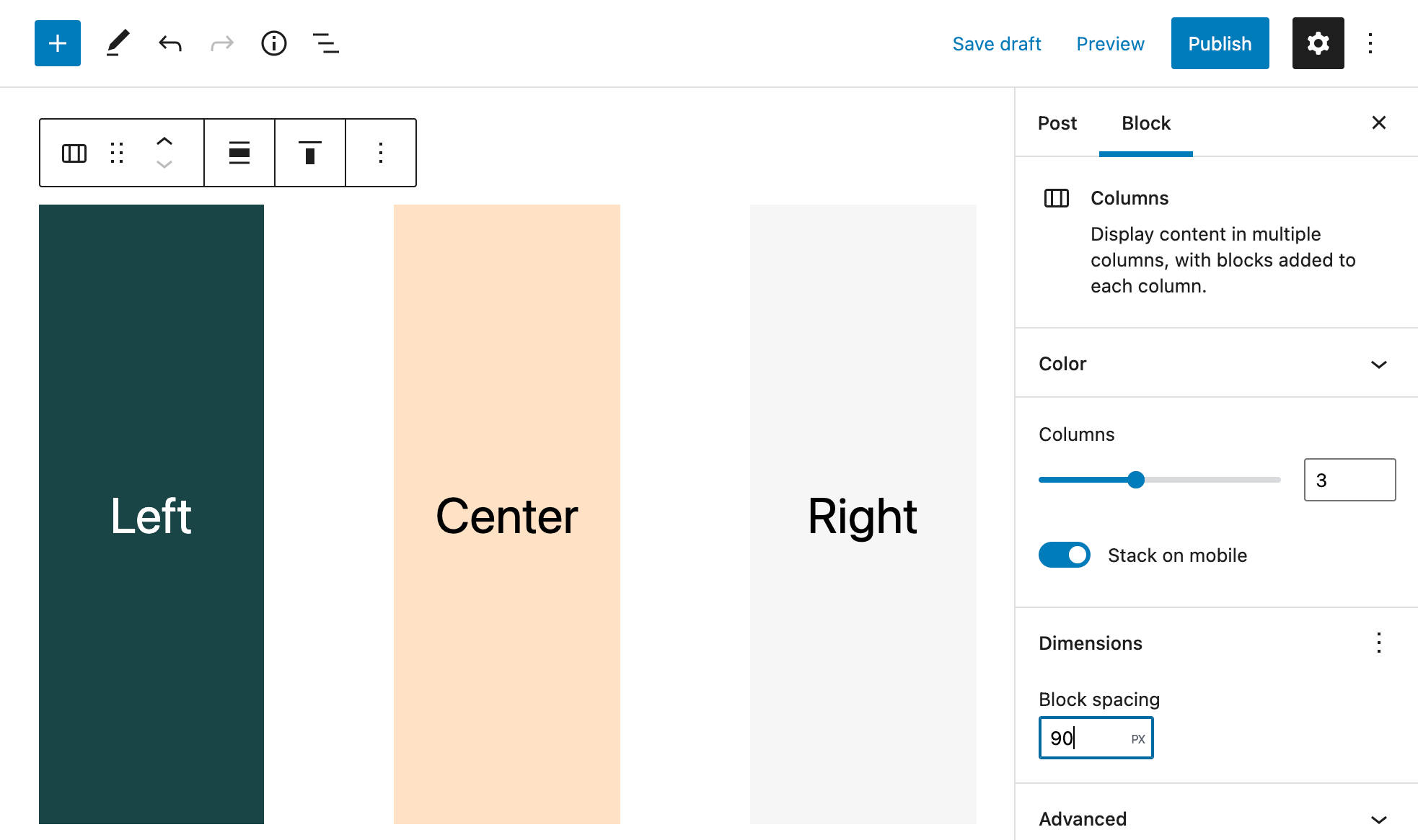
Gap Spacing is initially available for specific blocks, including buttons, images, columns, titles, and navigation, but support should be extended to more blocks in the future.
Themes should enable Gap Spacing in theme.json using the new appearanceTools property. You can read more about appearance tools in our deep dive into Twenty Twenty-Two. See also pull requests #33991 and #34630.
Rich URL Preview for Link Control
By taking advantage of the new REST url-details endpoint, the Link control now provides a rich URL preview showing details for a link target resource.
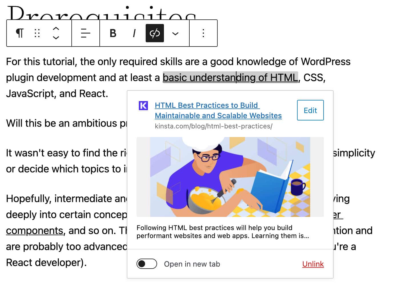
In its first implementation, this feature was only available in the Post Editor richtext component. At the time of this writing, it’s also available in the Site Editor, but not in Navigation and Widget editors.
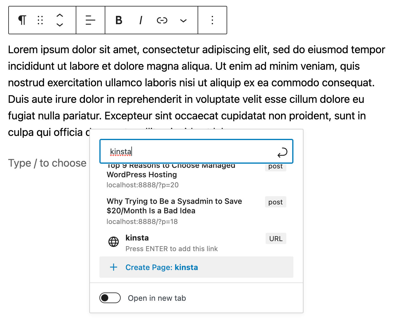
Create Pages from Link Popup
WordPress 5.9 also features an improved inline link UI, showing a brand new button to create new pages directly from the inline link popup. This feature is only available within the Post Editor.
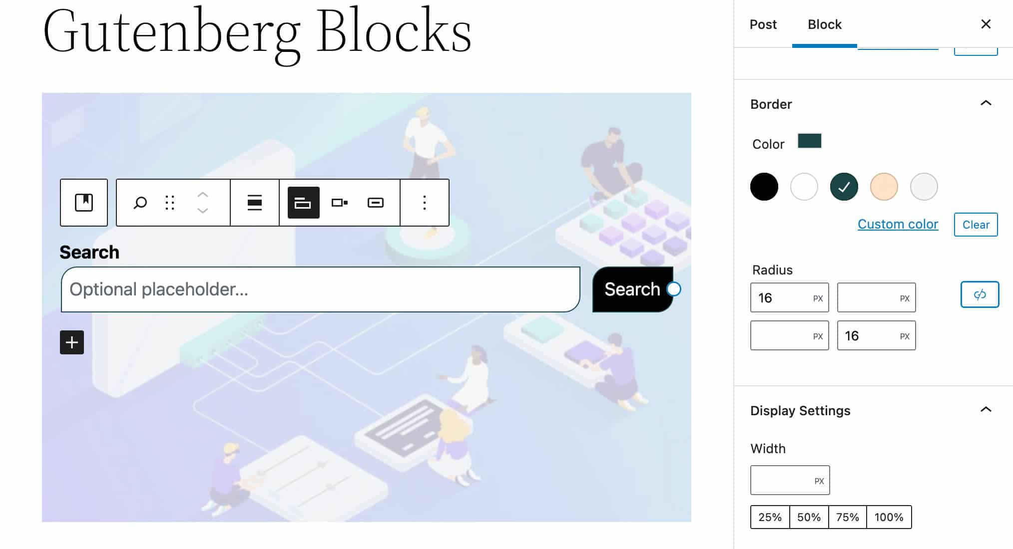
Improvements to the Search Block
The Search Block now shows up button and border color settings.
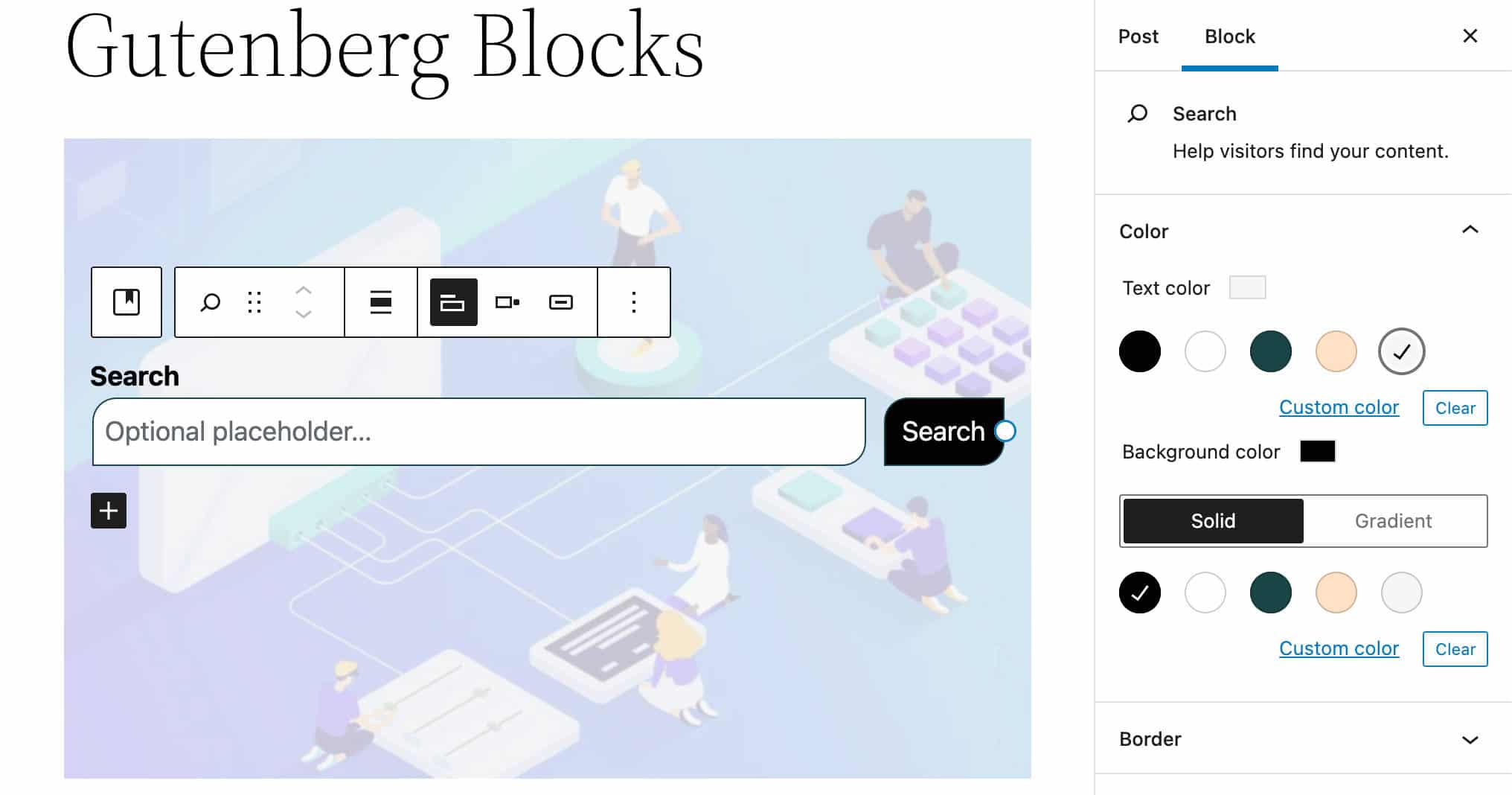
You can also now customize background and text color and border color and radius.
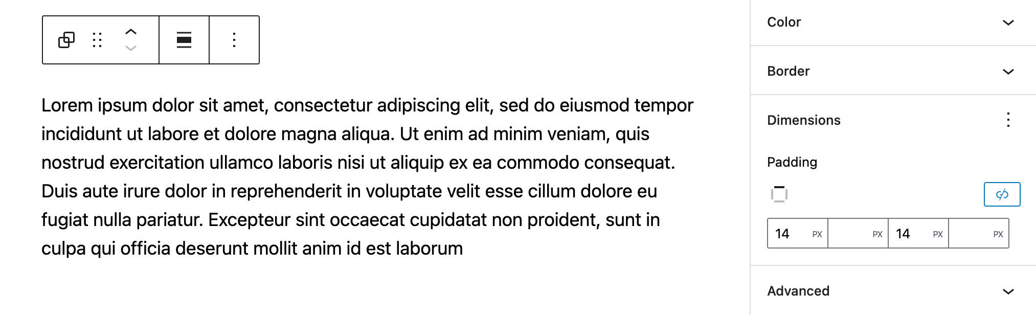
New Controls for Block Dimensions
A new Dimensions settings panel is now available for users to control the space occupied by a block on the page. The panel should include height, width, padding, margin, and possibly alignment controls, but not all attributes will be available for every block.
Block developers will find the <DimensionControl /> component documented on GitHub, but note that it’s still marked as an experimental feature and could be subject to breaking changes at the time of this writing.
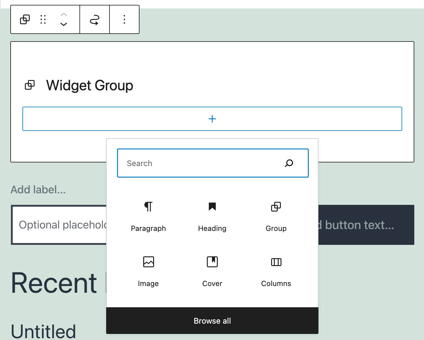
A New Widget Group Block Added to the Widgets Screen
A new Widget Group block is now available in the block-based widgets editor. The latest block allows you to add a group of blocks in a widget with a title in the classic themes’ Widgets Editor and the Customizer.
You can read more about the widgets editor in Block-Based Widgets Editor and Block Widgets in the Customizer.
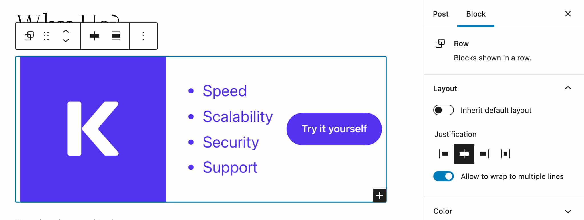
Flex Layout and the New Row Block
Originally introduced as an experimental feature with Gutenberg 11.2, flex layout has been extended to several blocks, including Social Links and Group blocks.
Some blocks, such as the Social Links block, now provide a set of toolbar controls and sidebar settings that allow you to customize the flex layout.
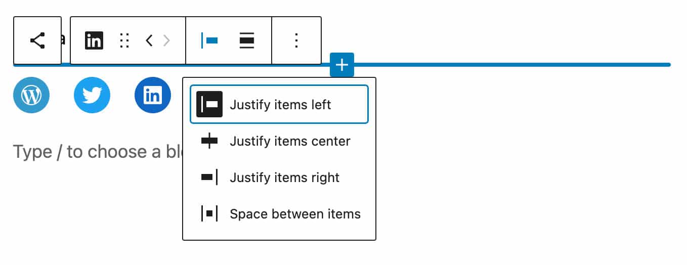
This same functionality is available in the Navigation block and Row block, a new variation of the Group block introduced with Gutenberg 11.5.
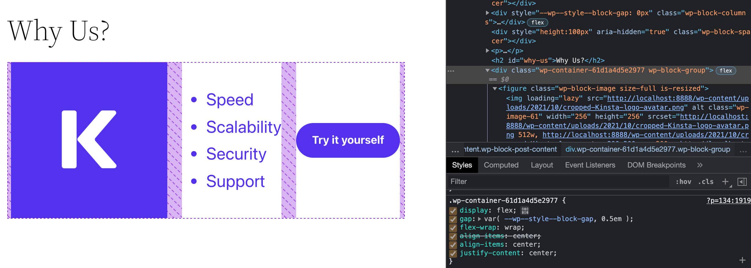
The following image shows the Row block with layout controls in the settings sidebar:
Below, you can see the same Row block on the frontend and in Chrome’s inspector tool.
Block Pattern Enhancements
First introduced with WordPress 5.5, block patterns allow WordPress users to include complex ready-to-use structures of nested blocks into their content with just a few clicks.
Now, WordPress 5.9 moves things a step forward toward design democratization & user empowerment by introducing a couple of enhancements to the block pattern system.
So, what’s new with block patterns in WordPress 5.9?
Featured Patterns from the Pattern Directory
The Block Inserter now displays Featured Block Patterns dynamically retrieved from the Pattern Directory, providing users a quick and easy way to find popular patterns to use in their content.
By the same token, as patterns get directly into the WordPress dashboard, WordPress developers should be encouraged to create and publish more and more patterns over time, resulting in increasingly advanced design capabilities for users.
A New Fullscreen Pattern Explorer
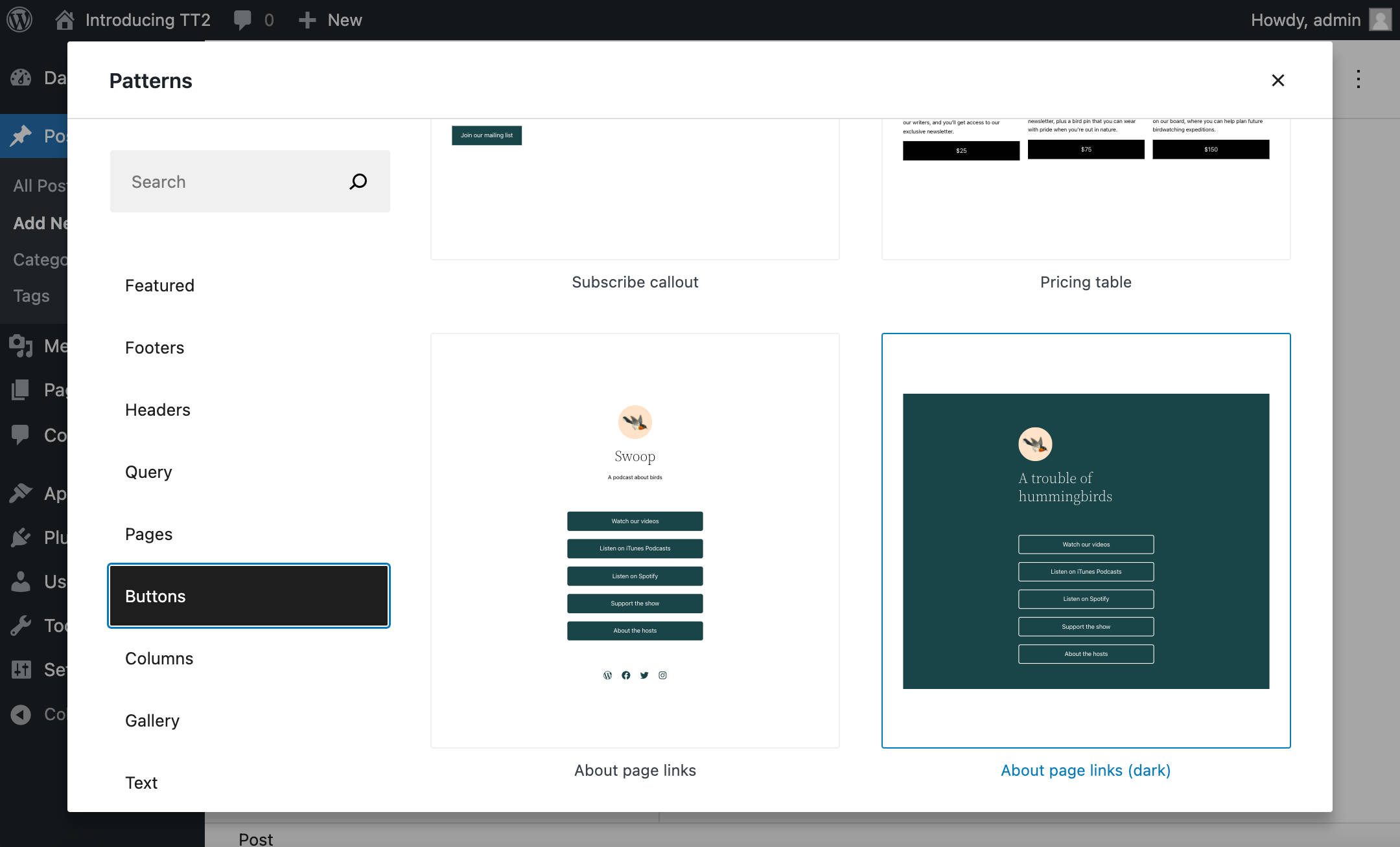
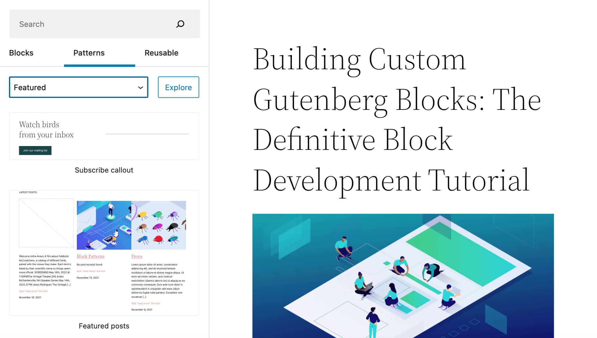
As the number of block patterns available in the Pattern Directory continues to grow and more themes use them, WordPress 5.9 introduces a new block pattern navigation interface: the Pattern Explorer.
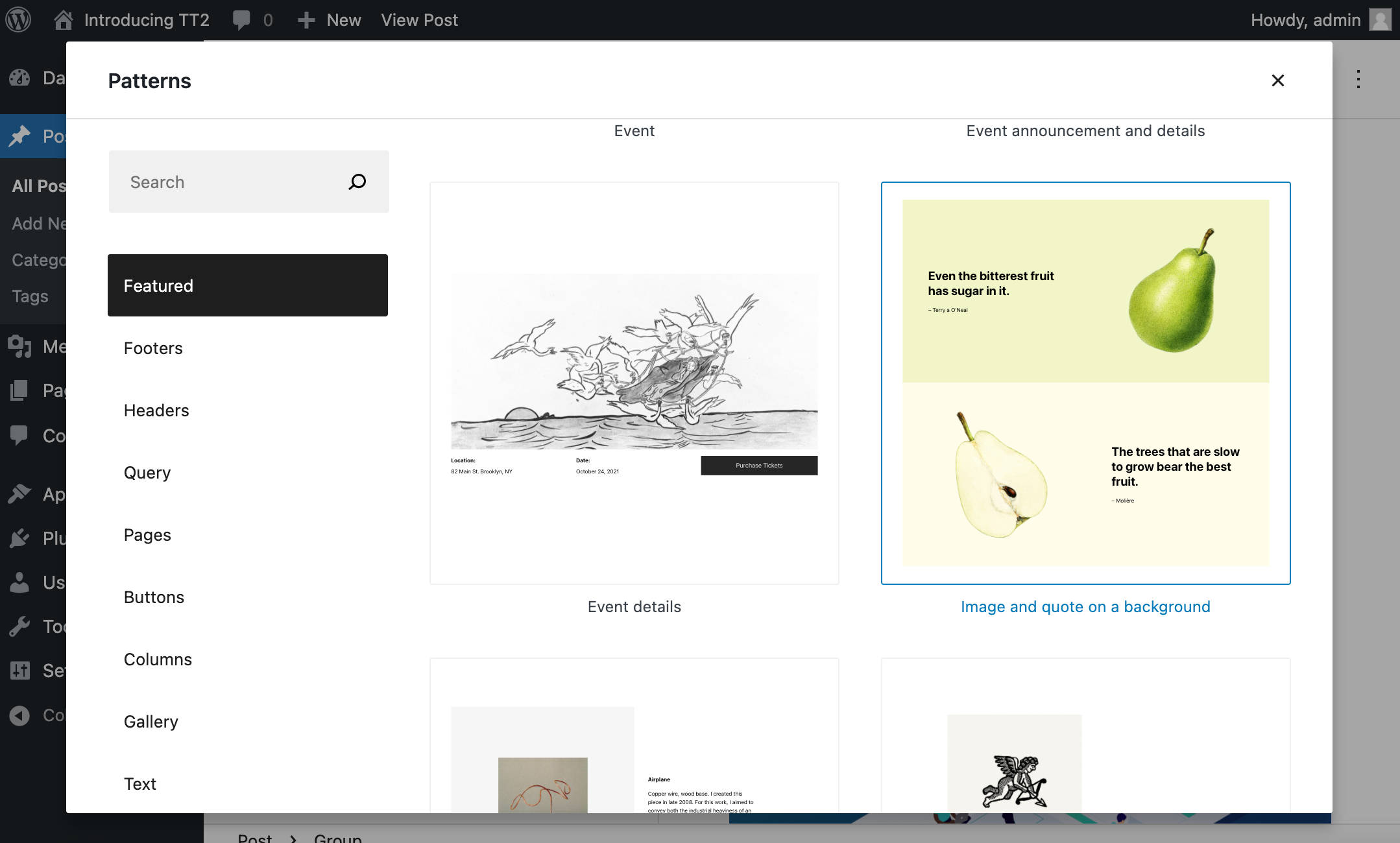
A new Explore button now opens a full-screen modal that allows users to browse, search for, and insert block patterns with just a few clicks. The result is an improved user experience.
You’ll also find additional notes and several block pattern examples in our deep dive into the Twenty Twenty-Two WordPress theme.
If you are interested and want to learn more, listen to Josepha Haden Chomphosy’s podcast Episode 16 and 21, and watch the Exploring WordPress 5.9 YouTube video from Anne McCarthy.
The Twenty Twenty-Two Theme and WordPress Block Themes
With WordPress 5.9, you no longer need to install the Gutenberg plugin to enable Full Site Editing on your WordPress website. You just need to allow a block theme to take advantage of all FSE features.
In addition, WordPress 5.9 has been bundled with a brand new default theme, Twenty Twenty-Two, and it’s a game-changer as Twenty Twenty-Two is the first default block theme ever.
Twenty Twenty-Two is a highly flexible and customizable theme. It provides a perfect sandbox to try out the new template editing flow, new blocks, interface enhancements, and all site editing features added to the core, starting with WordPress 5.9.
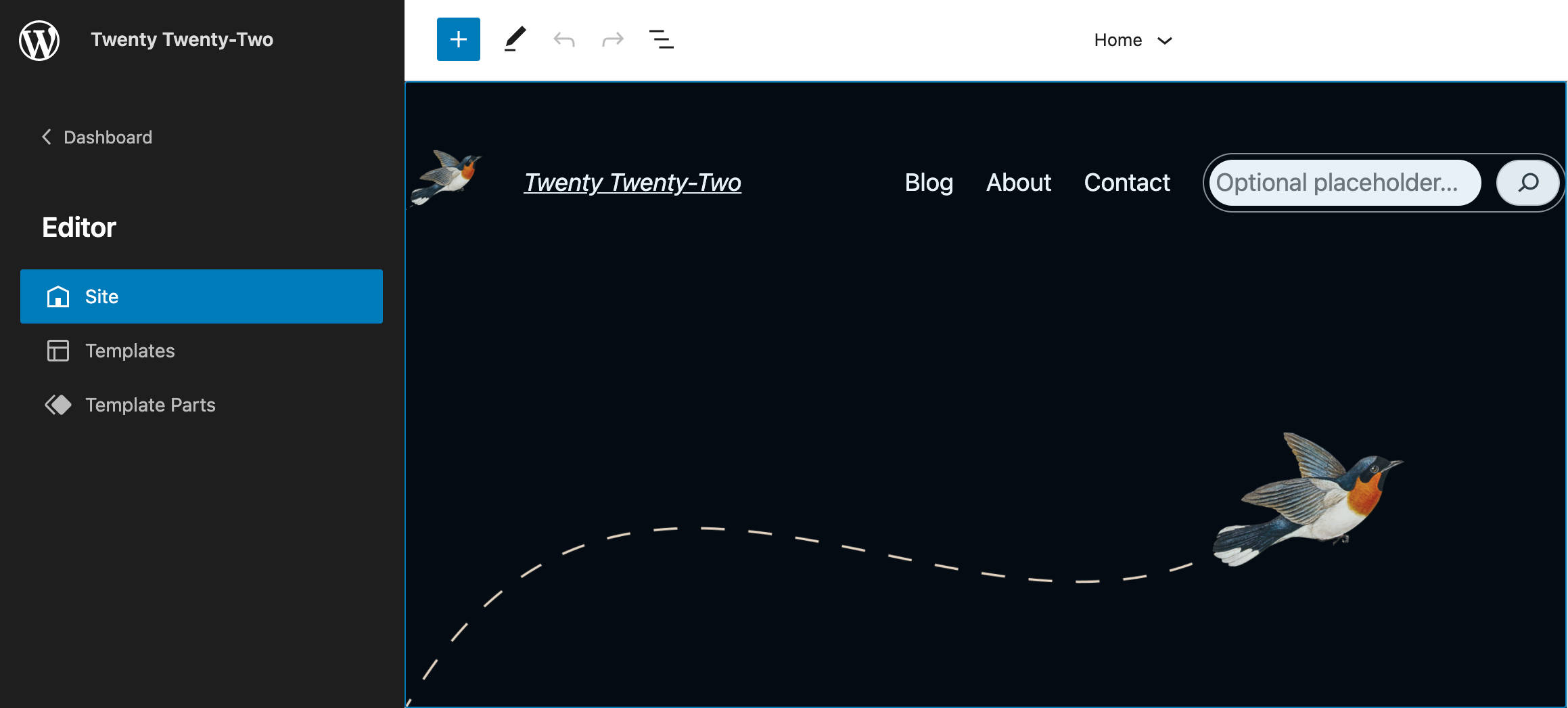
As mentioned above, all you need to do is install and activate a block theme, such as Twenty Twenty-Two. Once the theme is active, a new Editor (beta) menu item will appear in the WordPress dashboard admin menu.
The Site Editor interface now features a revamped Site Editing Flow. From the editing interface, you’ll be able to visually edit the site’s homepage, templates, and template parts, as well as access the Global Styles interface.
When you activate a block theme, you won’t find the Customizer. That’s because the Customizer doesn’t support block themes, which only use the Site Editor. That’s also the reason why you can’t preview inactive block themes.
So, as of WordPress 5.9, the access point to the Customizer is no longer available in the admin menu when a block theme is active (unless you’re using a plugin that makes use of it).
If you’re still tied to traditional themes and are worried about backward compatibility, rest easy: You can continue using your theme.
You currently have four different categories of themes to choose from:
- Block themes: Themes designed for FSE
- Universal themes: Themes that work with both the Customizer and the Site Editor
- Hybrid themes: Classic themes supporting FSE features like theme.json
- Classic themes: Themes with PHP templates, functions.php, etc.
Due to the impact that block themes will likely have on the WordPress ecosystem, we have an entire article covering Twenty Twenty-Two and WordPress block themes. Be sure to check it out for a more in-depth overview.
Performance Improvements
Here at Kinsta, we’re obsessed with website speed. That’s why we’re excited about the performance improvements coming with WordPress 5.9.
These improvements will affect several areas of the CMS, from the block editor to block themes, lazy loading, and more. Let’s dive in.
Block Inserter Enhancements
Since WordPress 5.9, block types, patterns, and categories are lazily rendered in the Block Inserter. The browser loads higher priority content first, giving the user a smoother editing experience and improved performance.
Further notable performance enhancements in the context of the block editor affect reusable blocks and List View.
Less CSS Loaded
As for the frontend, WordPress 5.9 drastically cut the amount of the CSS loaded by block themes, leading to pages loading significantly faster.
The main improvement that should be noted in this context is the introduction of the theme.json settings and styles mechanism, which prevents themes from using massive stylesheets, including hundreds of CSS declarations. The amount of CSS code a theme uses has now been reduced to a few CSS custom properties that any block type can reuse.
Lazy Loading Performance Improvements
Image lazy loading was first introduced in WordPress 5.5. Starting from WordPress 5.7, the lazy loading functionality was extended to iframes, allowing site owners to build faster websites and improve their SEO.
Anyway, following an analysis of the Largest Contentful Paint (LCP), it turned out that assigning the loading="lazy" attribute to all images and iframes on the page causes slight performance degradation.
Simply skipping the loading="lazy" attribute was not a solution because doing so would lead to losing the clear advantages of lazy loading.
The optimal solution would be to only omit the loading="lazy" attribute on images appearing above the fold. However, since the loading="lazy" attribute is assigned on the server-side, WordPress can’t determine which images are displayed above the fold exactly. It’s something that mostly depends on the active theme.
Now, as a trade-off solution, starting with WordPress 5.9, the loading="lazy" attribute is not applied to the first content image or iframe. An analysis conducted on 50 popular WordPress themes found that this solution leads to considerable performance improvements and pages loading up to 30% faster.
Felix Arntz explains how it works:
… to improve the performance out-of-the-box without requiring a developer to customize the behavior, WordPress will now skip the very first “content image or iframe” on the page from being lazy-loaded. The term “content image or iframe” here denotes any image or iframe that is found within the content of any post in the current main query loop as well as any featured image of such a post. This applies to both “singular” and “archive” content: In a “singular” context the first image or iframe of the (only) post is not lazy-loaded, while in an “archive” context the first image or iframe of the first post in the query is not lazy-loaded.
Theme developers can now use the new wp_omit_loading_attr_threshold filter to change the number of images/iframes to be skipped from lazy loading.
Multiple Stylesheets Per Block
Blocks and theme developers can register multiple stylesheets on each block and load styles from other blocks when needed. This enables loading stylesheets depending on the page content, preventing themes from loading huge stylesheets on every page.
According to Ari Stathopoulos:
Blocks will now be able to register multiple stylesheets, and load styles from other blocks when needed. Themes will be able to add styles on a per-block basis instead of loading monolithic stylesheets that are force-loaded anywhere. This has a greater impact on block themes where stylesheets loading is optimized based on the page & layout contents, but can also be used by classic themes.
Additional Features for Developers
In addition to the many features and UI enhancements discussed so far, WordPress 5.9 also introduces several features for developers.
A New Attribute to Lock Blocks
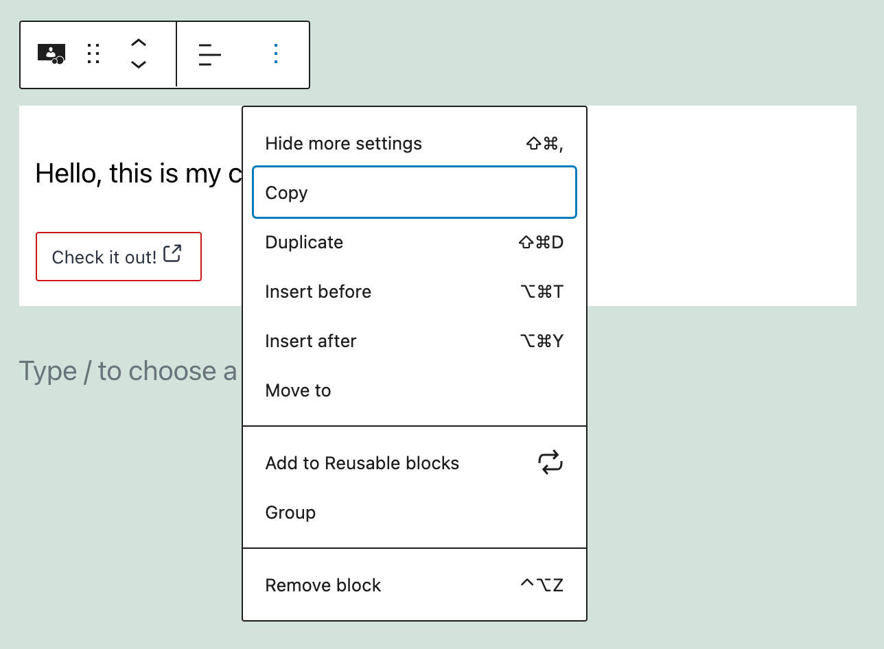
Block developers can now prevent users from moving or deleting individual blocks by adding a lock attribute in block settings:
{
	...
	"attributes": {
		"lock": {
			"type": "object",
			"default": {
				"move": true,
				"remove": true
			}
		}
	}
}
With this feature enabled, users can edit the block content, but cannot move the block around on the page or remove it from the editor canvas. The following image shows a custom block with a standard set of toolbar controls:
Defining the lock attribute, as seen in the code above, hides the block movers and the Move to and Remove controls from the block toolbar. The image below shows the final result on the screen:
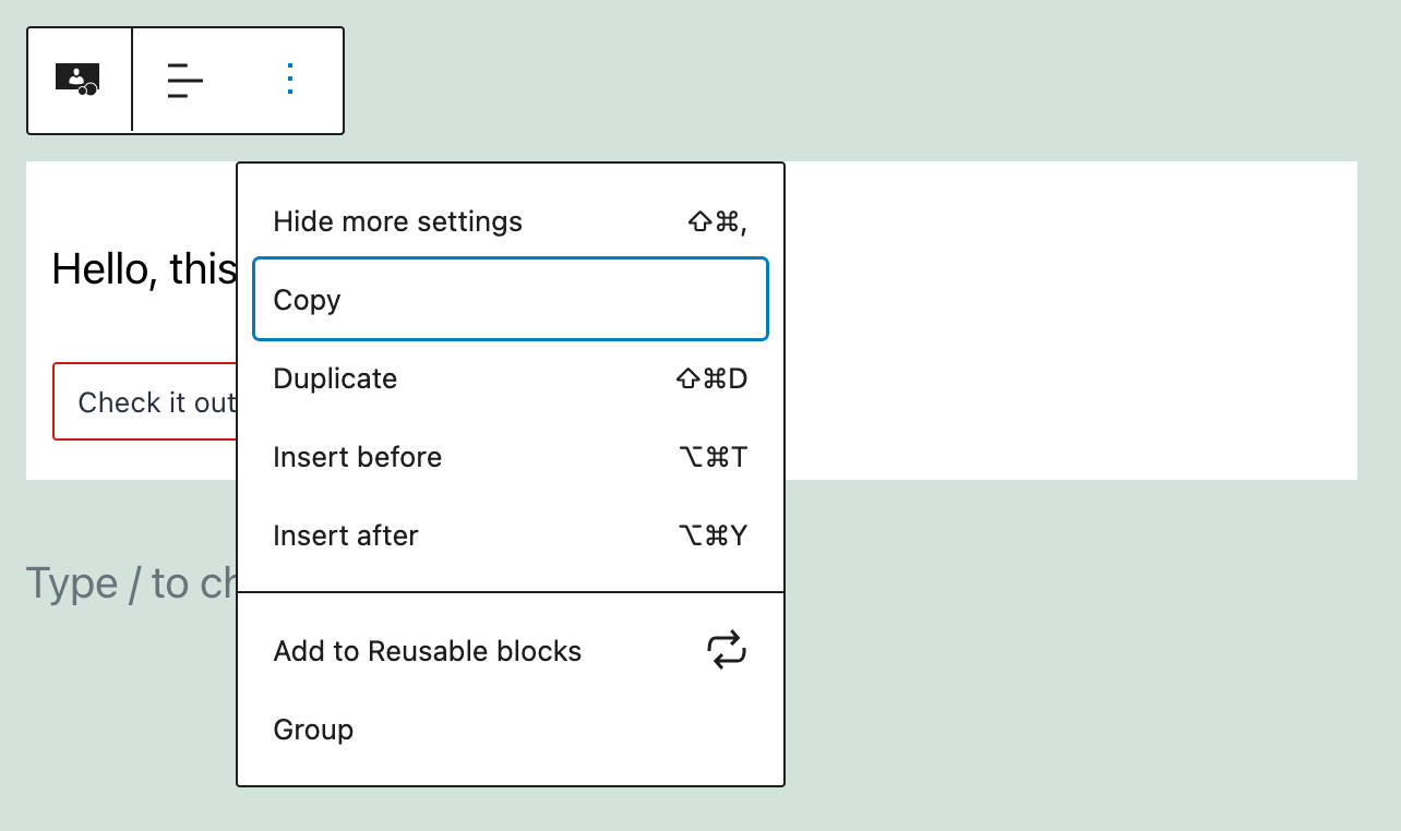
You can also lock a specific block in a block pattern. For an example, see also Locking Blocks in WordPress 5.9.
New API to Access Global Settings & Styles
WordPress 5.9 introduces a new PHP public API to read data from theme.json.
Reading Settings and Styles from theme.json
There are two new functions to read data from settings and styles sections declared in the theme.json:
wp_get_global_settings( $path = array() , $context = array() );
wp_get_global_styles( $path = array(), $context = array() );$pathis an array listing the path to the specified setting$contextis an array setting the context for those data. Developers can read from a specific block settings section — for example,array( 'block_name' => 'core/paragraph' ). Theoryginkey set tobaseallows ignoring custom data saved by the user.
The following sample code would return the contentSize setting value. In Twenty Twenty-Two, it would be 650px:
wp_get_global_settings( array( 'layout', 'contentSize' ) );By setting a context, you can retrieve styles for specific blocks. The following code shows how to retrieve the border radius value for the core/button block:
function get_global_styles() {
	return
	wp_get_global_styles(
		array( 'border', 'radius' ),
		array( 'block_name' => 'core/button' )
	);
}
The function above returns the required property value while considering default settings, theme settings, and user data. The custom value will be provided if the user configures the button border radius in the Global Styles interface.
To ignore user data, you would use the following code:
function get_global_styles() {
	return
	wp_get_global_styles(
		array( 'border', 'radius' ),
		array( 'block_name' => 'core/button', 'origin' => 'base' )
	);
}
Getting the Generated Stylesheet
WordPress 5.9 also introduces a new function to get the stylesheet resulting from default, theme, and custom styles:
wp_get_global_stylesheet( $types = array() );$types is a list of the styles to generate.
You can read more about the new API in New API to access global settings & styles.
More Features for Developers
Additional WordPress 5.9 changes for developers you may want to know about include:
- Block themes, a new way to build themes in WordPress 5.9
- Updates for Settings, Styles, and theme.json
- Theme-focused changes and filters in WordPress 5.9
- New Capability Queries in WordPress 5.9
- Miscellaneous Core changes in WordPress 5.9
- Miscellaneous block editor changes in WordPress 5.9
- Take more control over Inner Block Areas (as a block developer)
Summary
We’ll wrap up this article with a quick note on WordPress market share. WordPress currently powers over 65% of all the websites whose content management system is known and sits north of 43% of all websites.
These numbers are impressive, especially when compared to the closest competitors with less than 5% market share, like Shopify.
And this also means that you cannot overlook the evolution of the WP CMS. Each new version of WordPress brings new features, interface enhancements, performance improvements, and WordPress 5.9 is no exception. All you need to test the new features is a block theme, like the new Twenty Twenty-Two default theme, and you’ll be ready to go.
Over to you, now! Are you ready to make the switch to block themes and FSE? And what are your favorite changes coming with WordPress 5.9?

Carlo is a passionate lover of webdesign and front-end development. He has been playing with WordPress for more than 20 years, also in collaboration with Italian and European universities and educational institutions. He has written hundreds of articles and guides about WordPress, published both on Italian and international websites, as well as on printed magazines. You can find him on LinkedIn.


Quick question before I even look at 5.9 how can you disable anything new you don’t want? Every single major release has left us developers who not want fancy new stuff finding ways to disable everything. Their massive amount of performance improvements are laughable to say the least.
A lot to take in for a non-techie but a fantastic article, and if this is the way WordPress is going then all theme devs will need to adapt.
It offers the small business owner further opportunities for building out sites.
Very interesting developments