It’s very important to us that as our MyKinsta dashboard evolves that it remains free of clutter and is something you all enjoy using to manage your WordPress sites. With the launch of our new multi-user access and permissions, it was time for a cleanup. Therefore, we’ve made a few small and subtle changes to the navigation sidebar, as well as the user settings and billing screens.
Moving User Profile Settings and Logout
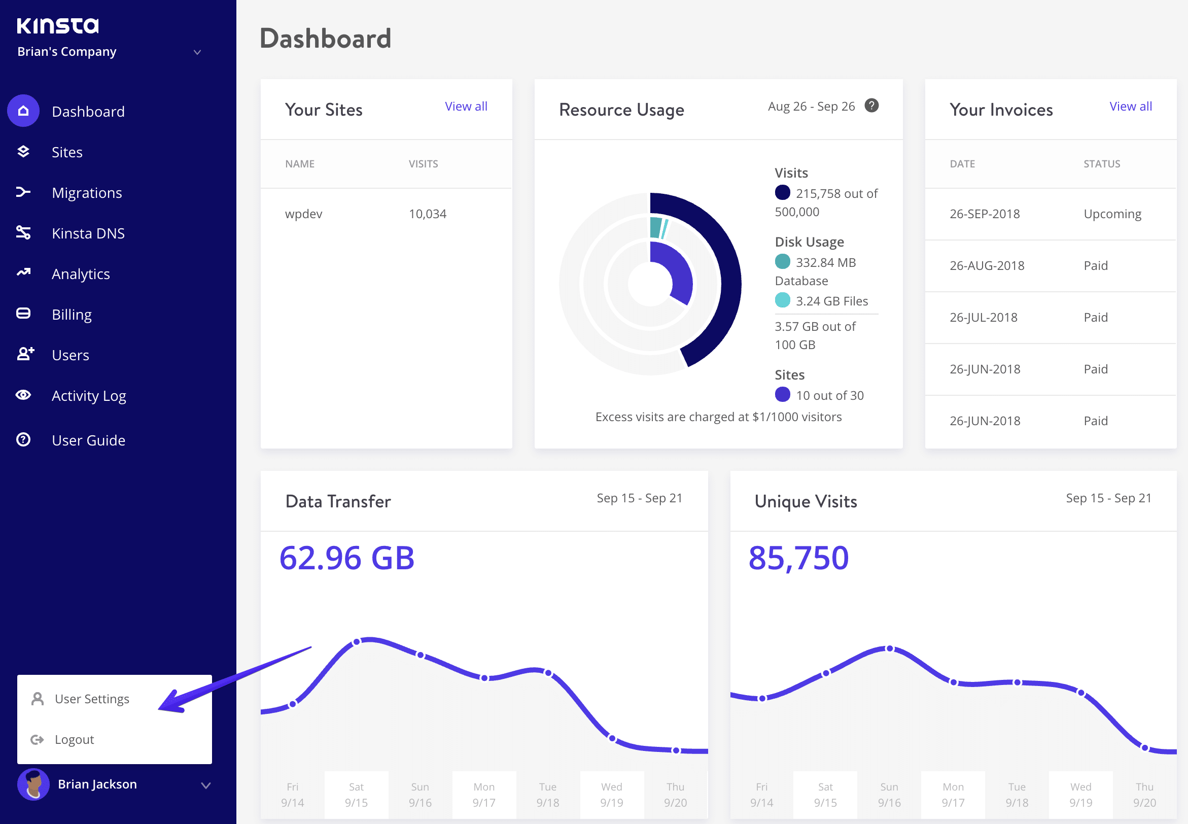
We always want you to have quick and easy access to different areas of the dashboard that are most important to you. When it comes right down to it, user profile settings and logout are not widely used. So the menu option previously called “Settings” can now be accessed by clicking on your user profile icon in the bottom left. The logout option has also been moved there.

Your user’s avatar has also been moved to the bottom left of the sidebar, removing any distractions from the main navigation.
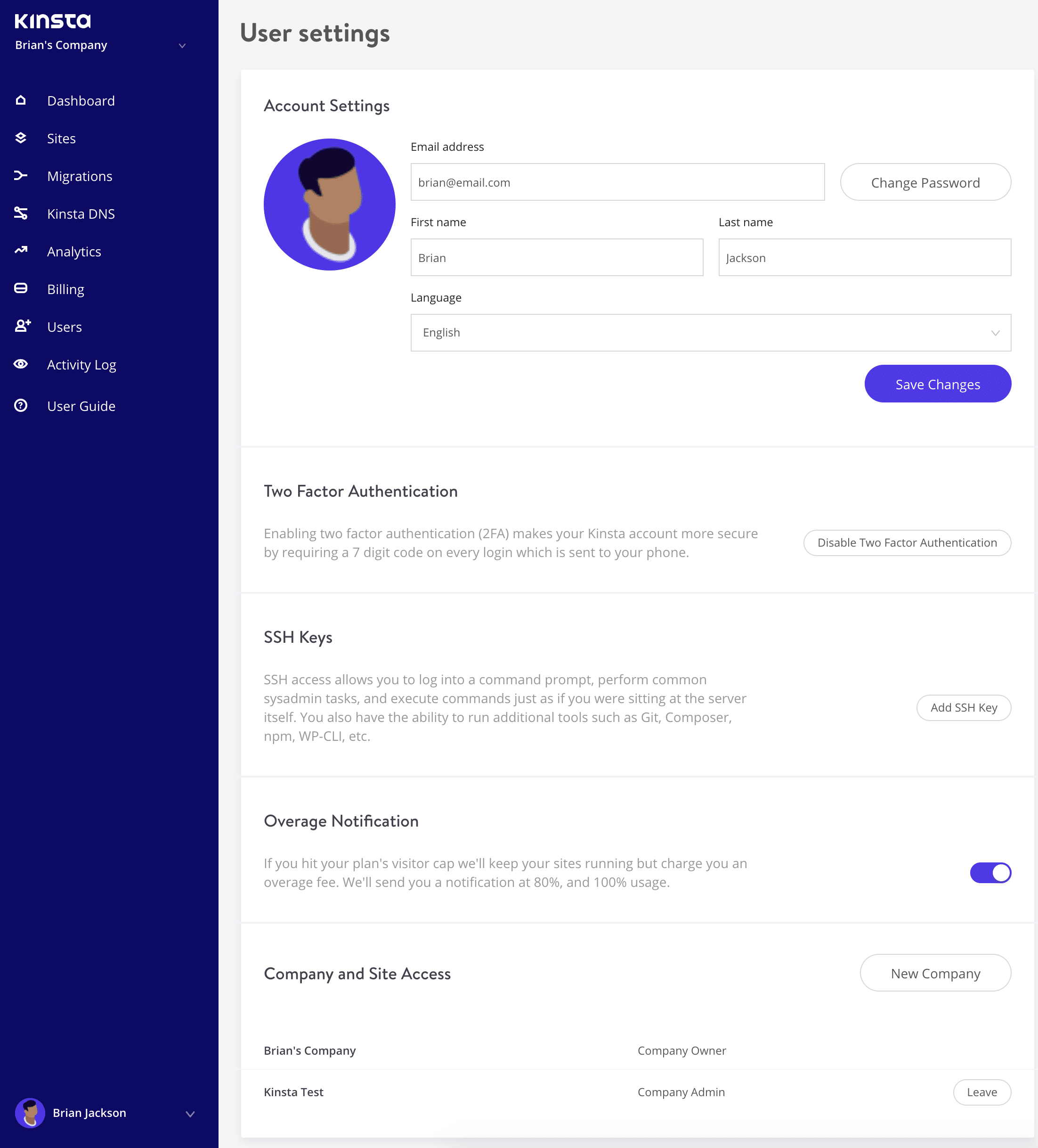
Redesigned User Settings Screen
The user settings screen has been completely redesigned. Previously you could update your company address here. This has now been moved to the billing section where it makes more sense. The ability to invite someone to your company is now housed in the new users menu, where you can assign different roles and fined-grained permissions.

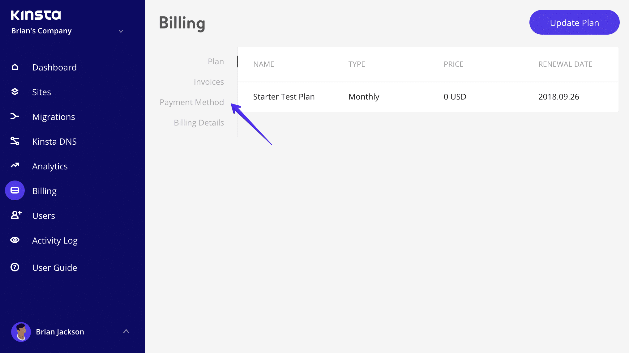
Redesigned Billing Screen
The billing screens have also been redesigned. They now have our new sub-navigation which we’ve already introduced to other areas of the Mykinsta dashboard such as site management and analytics. This ensures everything feels the same throughout and you can quickly toggle between the screens you need to access.
