In the spring of 2012, WordPress version 3.4 was released. In addition to introducing the Theme Customizer and the ability to auto-embed Tweets, version 3.4 also added a function developers could use to test if a website visitor was connecting from a mobile device like a smartphone or tablet.
That function — wp_is_mobile() — appeared at a time when the celebrated “Retina Display” Apple had unveiled for its iPhone 4 was a meager 640 x 960 pixels. When the iPhone 5 arrived a few months after WordPress 3.4, the phone’s display reached 640 x 1,136 pixels — still a long way from the displays of modern smartphones and tablets, which blur the lines between mobile and desktop screen real estate.
So, is wp_is_mobile() of any use today?
The purpose of the wp_is_mobile() function
In 2012, browser support for CSS media queries enabling responsive web design was still relatively new. (Really new for users of Microsoft’s Internet Explorer browser!) But enabling page layouts that adapt to varying viewport dimensions wasn’t the goal of wp_is_mobile().
The function makes no distinction between phones and tablets and is completely unaware of the available pixels in a visitor’s browser. Instead, wp_is_mobile() was conceived as a tool that would allow developers to optimize bandwidth when responding to mobile devices that were often underpowered and possibly in the hands of users who were paying their telecom providers for data transfers.
With phones and tablets today more powerful than many desktops available in 2012, throttling bandwidth may be less important, but there are still use cases for a function that simply divides the world in two: mobile devices and everything else.
The wp_is_mobile() function in action
The WordPress wp_is_mobile() function returns true when executed as the result of a request from browsers in most smartphones and tablets (including the Kindle). So, the classic example of the function generating different content streams in PHP looks like this:
<?php if( wp_is_mobile()){ ?>

    <p>This content is for mobile devices</p>

<?php } else { ?>

    <p>This content is for desktops (and laptops).</p>

<?php } ?>
If you really do need to optimize your website’s output for mobile devices (probably to minimize bandwidth requirements), the technique above could be used in theme files to output entirely different structures for mobile and desktop pages.
Device detection for granular content adjustments
CSS media queries and other techniques supporting responsive web design can help page layouts adapt to a wide variety of screen sizes and orientations. But they can’t help you communicate with your site’s visitors as mobile or desktop users.
For example, you know that desktop users will probably be using a mouse to “click” on elements of your site, while mobile users will “tap.” Desktop users might “right-click” on a link to begin opening the link in a new browser window. Meanwhile, mobile users might “press and hold” to start the same task. Just communicating with users about how to navigate your website (like in your help documentation) could mean you are using the wrong terminology half the time.
Here’s how we can combine wp_is_mobile() and WordPress shortcodes to support granular output of mobile or desktop content in a way that’s also easy for website editors to command.
We’ll use our mobile/desktop detection in conjunction with the WordPress add_shortcode() and do_shortocde() functions to create shortcode tools editors can apply in posts.
First, we’ll add this code to our theme’s functions.php file (after protecting it by creating a child theme):
/**
 * Add shortcodes
 */

// Create [desktop] shortcode
add_shortcode('desktop', 'show_desktop_content');
function show_desktop_content($atts, $content = null){
    if( !wp_is_mobile() ){
        return do_shortcode( $content );
    } else {
        return null;
    }
}

// Create [mobile] shortcode
add_shortcode('mobile', 'show_mobile_content');
function show_mobile_content($atts, $content = null){
    if( wp_is_mobile() ){
        return do_shortcode( $content );
    } else {
        return null;
    }
}
That creates the [desktop] and [mobile] shortcodes (and their closing tags) that we can use in any post or page content like this:
<h2>Password Help</h2>

To change your password, [desktop]click[/desktop][mobile]tap[/mobile] the cog icon.
On a mobile device, the content above will appear like this:

On all other devices, visitors will see this:

This technique makes it fairly easy to deliver content that is “aware” of how visitors interact with your WordPress site.
The wp_is_mobile() function and WordPress caching
You don’t need to have been using WordPress since 2012 to know that page caching is one of the most effective ways to improve performance. But basic WordPress caching can throw a monkey wrench into attempts to deliver differing content on requests for the same page.
A WordPress cache of an individual page is initiated by a client request. If that first request comes from a mobile device, the cached content will be tailored for mobile users if modified by wp_is_mobile(). And every subsequent request for that page will deliver mobile content — even to desktop users — until the cache is cleared.
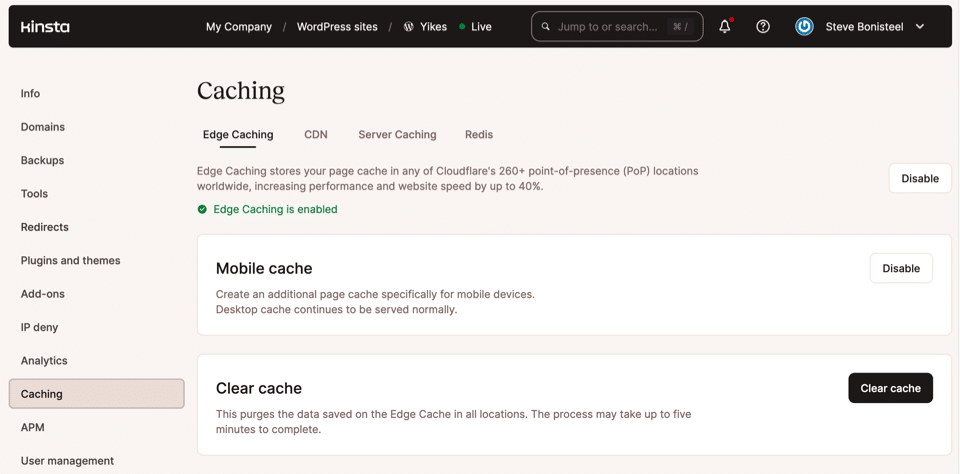
That’s why Kinsta’s Managed WordPress Hosting platform supports separate caches for mobile and desktop content — starting with the local cache of your NGINX web server and extending to Kinsta’s Edge Cache in 300+ Cloudflare PoPs around the world.
Enabling the caching of pages for mobile devices is accomplished with just a couple of clicks (or taps!) in the MyKinsta dashboard:

Summary
The WordPress function wp_is_mobile() may seem like a blast from the past, but you might find uses for its “mobile-or-desktop” detection that can help you create a better experience for all visitors to your website.
Don’t forget that you’ll need separate caches for the different content you generate if you want to get the best performance out of these mobile and desktop pathways.
Do you have a great idea for taking advantage of wp_is_mobile()? Let us know in the comment below.


