When it comes to web design, captivating visuals can make all the difference. Images play a crucial role in creating an engaging and memorable user experience.
But how do you take your images from ordinary to extraordinary? This is where image styling comes in. With the power of CSS at your fingertips, you can unleash your creativity and transform your images into captivating visual elements that leave a lasting impression.
In this article, we will dive into the world of CSS image styling, exploring many techniques and properties that will elevate your web design skills to new heights.
How To Add Images in HTML
Before you can style an image, you’d first add it to your HTML document. To do this, you can use the <img> tag. The <img> tag is a self-closing tag (it doesn’t require a closing tag). It has an src attribute that specifies the URL or file path of the image you want to display.
<img src="image.jpg" alt="Description of the image">You can also provide an absolute URL or a relative file path to the image.
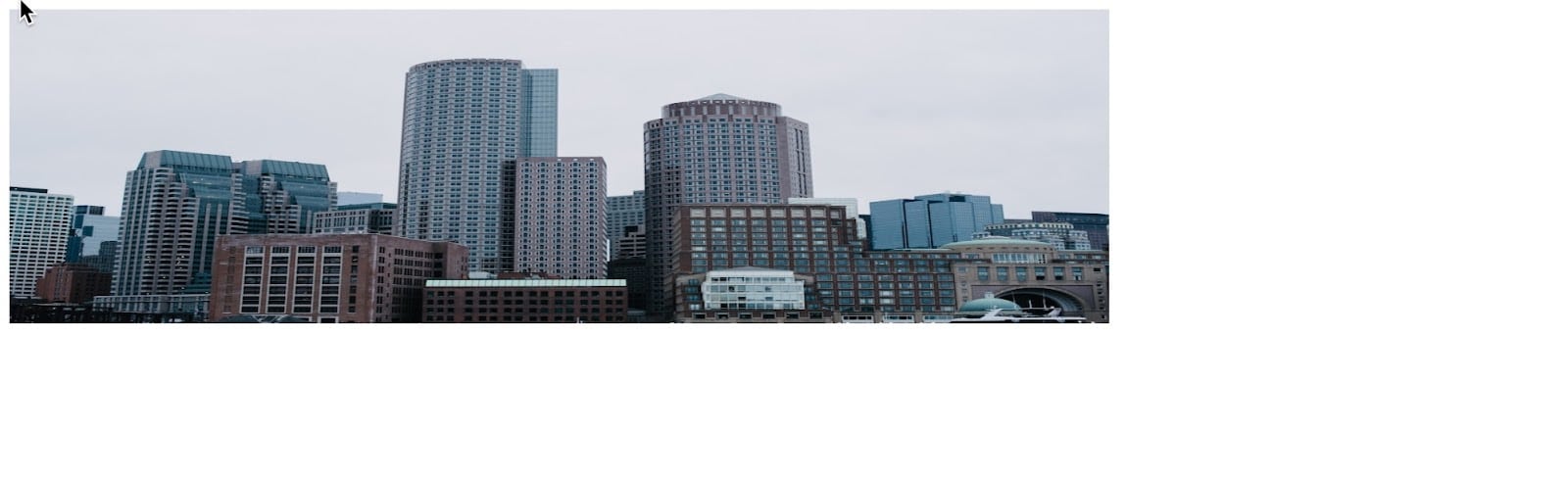
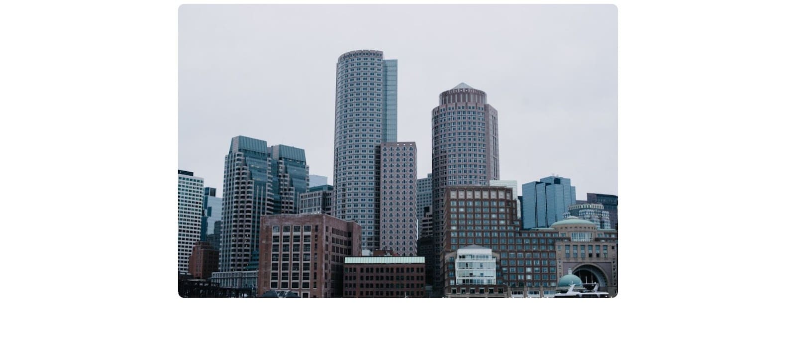
<img src="https://source.unsplash.com/tMHAmxLyzvA" alt="Boston city skyline">The alt attribute stands for alternative text and is essential for accessibility. The <img> tag also provides two optional attributes: width and height. These attributes allow you to specify the dimensions of the image in pixels.
<img src="image.jpg" alt="Description of the image" width="300" height="200">However, it’s generally recommended to avoid using the width and height attributes unless you need to maintain specific image dimensions. Instead, you can use CSS to control the size of the image, providing more flexibility in responsive design.
img {
  height: 200px;
  width: 700px;
}
Responsive Image Styling
Applying specific values for the width and height attributes to an image can lead to undesirable consequences, such as compressing or distorting the image. This is especially true if the specified dimensions don’t match the image’s original aspect ratio.
To avoid these issues and maintain proper image proportions, this is where responsive image styling comes into play. Responsive image styling ensures images adapt to different screen sizes, which is crucial for responsive web design.
You can achieve this by using the max-width property, which limits the maximum width of an image.
img {
  max-width: 100%;
  height: auto;
}
You can also use media queries to modify image styling based on different device breakpoints. Media queries allow you to apply specific CSS rules based on the device’s screen size, orientation, and other features. For example:
@media screen and (max-width: 600px) {
  .my-image {
    max-width: 50%;
  }
}
Using Object-Fit To Maintain Aspect Ratio and Avoid Shrinking
Sometimes, there are scenarios where you need to specify a specific width and height for an image. In such cases, you can utilize the CSS object-fit property to control how the image behaves within its specified dimensions.
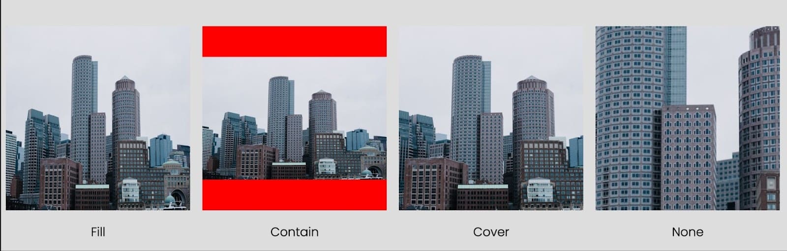
The object-fit property lets you specify how an image should fit inside its container while maintaining its aspect ratio. It can take several values, such as:
- fill: This value stretches or squishes the image to fit its container exactly, potentially causing distortion.
- contain: This value scales the image proportionally to fit within the container without cropping, maintaining the aspect ratio. It ensures that the entire image is visible within the container, potentially resulting in empty spaces.
- cover: This value scales the image proportionally to cover the container while maintaining the aspect ratio. It might result in cropping the edges of the image to ensure it fills the entire container.
- none: This value does not apply any scaling or cropping, and the image will retain its original size, potentially overflowing the container.
Here’s an example of using the object-fit property:
img {
  width: 300px;
  height: 300px;
  object-fit: cover;
}
Creating Rounded Corner Images With CSS
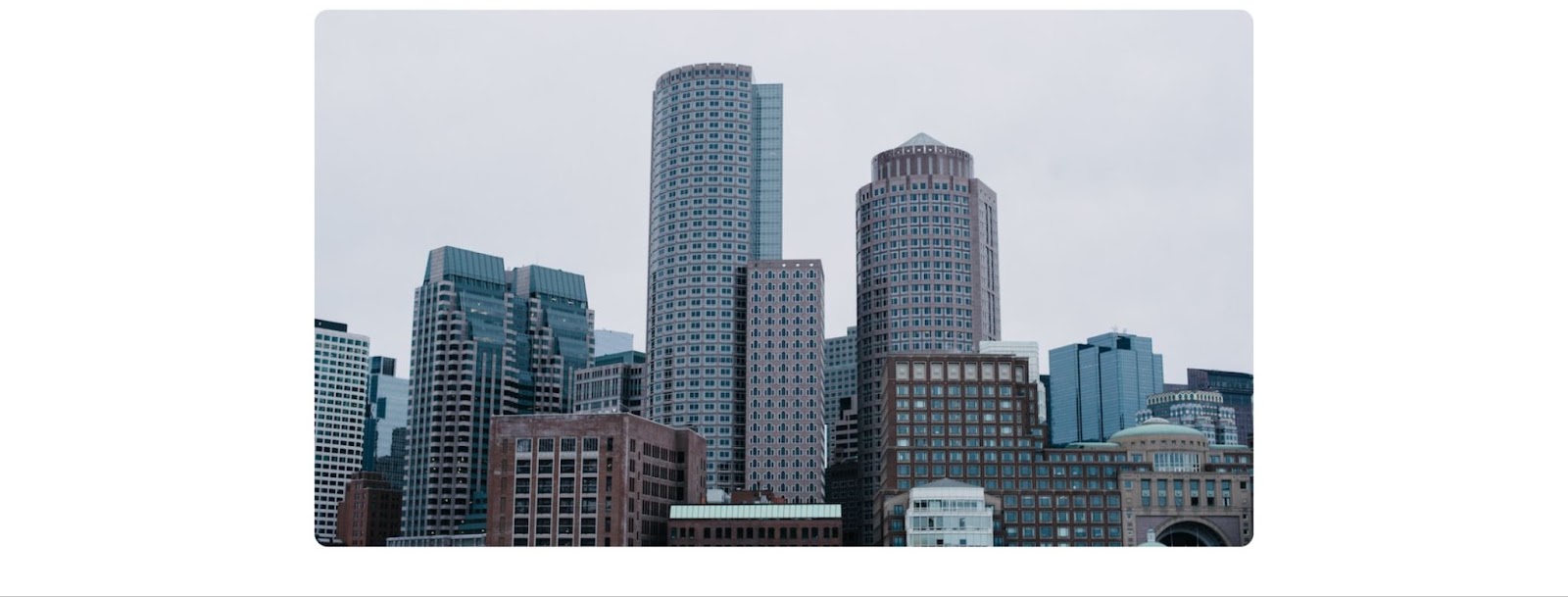
Adding rounded corners to images can give them a softer and more visually appealing look.
With CSS, you can easily achieve this effect by applying the border-radius property to the image.
Here’s how you can make rounded corner images:
img {
  border-radius: 10px;
}
In the above example, we set the border-radius property to 10px. Adjust the value to your preference to control the roundness of the corners. This value can use your preferred units such as rem, percentage, etc.
Creating Circular Images With CSS
To make your images perfectly circular, combine the border-radius property with equal width and height dimensions.
Here’s how to create circular images:
img {
  border-radius: 50%;
  width: 200px;
  height: 200px;
}
In the example above, the border-radius property is set to 50%, which creates a circle by making the border curve half of the width or height of the image.
You can also use the clip-path property. It enables you to define a clipping path for an element, creating unique shapes.
Here’s an example of an image clipped into a circle:
img {
  clip-path: circle(50%);
  width: 200px;
  height: 200px;
}
Centering Images With CSS
Aligning images in the center of their container is a common practice in web design. There are many ways to achieve this; one is to set the image’s display property to block and apply margin: 0 auto, which horizontally centers the image within its container.
img {
  display: block;
  margin: 0 auto;
  width: 700px;
}
Creating Transparent Images
You can use CSS to apply the desired transparency effect to make an image transparent. The opacity property allows you to control the transparency level of an element, including images.
A value of 1 represents full opacity (completely visible), while 0 represents full transparency (completely invisible).
img {
  opacity: 0.5;
}
The image’s opacity in the above code is set to 0.5, resulting in a semi-transparent effect. You can adjust the value of opacity to achieve the desired level of transparency.

Placing Text on Images
Placing text on images can create visually appealing and informative designs. To place text on top of an image, you can use a combination of CSS positioning and z-index.
Here’s an example:
 // HTML
<div class="image-container">
  <img src="https://source.unsplash.com/tMHAmxLyzvA" alt="Boston city skyline" >
  <div class="image-text">Welcome to Kinsta</div>
</div>

// CSS
.image-container {
  position: relative;
}


.image-text {
  position: absolute;
  top: 50%;
  left: 50%;
  transform: translate(-50%, -50%);
  z-index: 1;
  color: white;
  font-size: 20px;
  font-weight: bold;
}
In the code above, the image-container div serves as the container for both the image and the text overlay. The position: relative property is applied to the container to establish a positioning context. The image-text class is then used to position the text absolutely within the container using position: absolute, and the top, left, and transform properties to center it. The z-index property ensures that the text appears above the image, and you can further customize the text’s appearance with color, font size, and font weight.
Please note that the specific positioning values and styling can be adjusted to suit your design preferences and requirements.
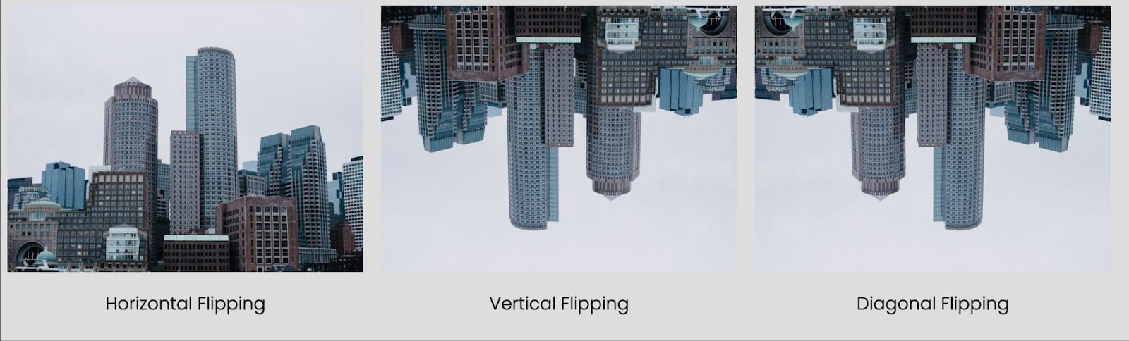
Flipping Images: Creating Mirrored Effects
Flipping images can add an interesting visual element to your web design. Whether you want to create a mirrored effect or flip an image vertically or horizontally, CSS provides simple techniques to achieve this effect.
Horizontal Flipping
To horizontally flip an image, you can use the transform property with the scaleX() function. The scaleX(-1) value flips the image along the horizontal axis.
img {
  transform: scaleX(-1);
}
Vertical Flipping
To vertically flip an image, you can use the transform property with the scaleY() function. The scaleY(-1) value flips the image along the vertical axis.
img {
  transform: scaleY(-1);
}
Diagonal Flipping
To create a diagonal flipping effect, combine the scaleX() and scaleY() functions within the transform property.
img {
  transform: scaleX(-1) scaleY(-1);
}
In the code above, the image will be mirrored horizontally and vertically, resulting in a diagonal flip effect.
Adding Filters to Images: Enhancing Visual Effects
Filters can transform the look and feel of images, allowing you to create unique visual effects. CSS provides a range of filter properties that can be applied to images, enabling you to adjust brightness, contrast, saturation, and more.
You can use the filter property to apply a filter to an image. This property accepts various filter functions, each altering different aspects of the image.
img {
  filter: brightness(150%);
}
In the above code, the brightness(150%) function is applied to the image. This increases the brightness of the image by 150%.
Commonly Used Filter Functions
Here are some commonly used filter functions:
brightness(): Adjusts the brightness of the image.contrast(): Modifies the contrast of the image.saturate(): Changes the saturation level of the image.grayscale(): Converts the image to grayscale.blur(): Applies a blur effect to the image.sepia(): Applies a sepia tone effect to the image.
You can experiment with different filter functions and values to achieve the desired visual effects. Combining multiple filters can also produce more intricate transformations.
Creating Hover Overlays on Images
Hover overlays on images can bring interactivity and visual interest to your website. When a user hovers over an image, an overlay effect can be applied, such as a color overlay or a text caption.
CSS provides several techniques to achieve hover overlays; one way is using CSS transitions. By transitioning specific properties of an element, you can smoothly animate changes when hovering over an image.
// HTML
<div class="image-container">
  <img src="image.jpg" alt="Description of the image">
  <div class="overlay"></div>
</div>

// CSS
.image-container {
  position: relative;
  display: inline-block;
}
.overlay {
  position: absolute;
  top: 0;
  left: 0;
  width: 100%;
  height: 100%;
  background-color: rgba(0, 0, 0, 0.5);
  opacity: 0;
  transition: opacity 0.3s ease;
}
.image-container:hover .overlay {
  opacity: 1;
}
In the code above, an .image-container element wraps the image and an .overlay element. The overlay is initially transparent (opacity: 0) and covers the entire image. When hovering over the .image-container, the .overlay opacity is transitioned to 1, revealing the color overlay.
To achieve the desired visual effect, you can customize the overlay by adjusting the background-color and opacity properties.
Summary
Styling images with CSS opens up a world of creative possibilities, allowing you to enhance your web pages’ visual appeal and interactivity.
As you style images with CSS, always keep in mind accessibility, responsiveness, and performance.
What’s the CSS image style you use the most? Which one interests you the most? Let us know in the comments.