The introduction of full site editing (FSE) in WordPress highlights the growing importance of the theme.json file. There is now a whole new hierarchy and structure to understand, along with the various properties to help you create your designs. In particular, the blocks property in theme.json is essential if you want to create modern, flexible WordPress themes with unique Blocks.
In this guide, we explore the ins and outs of the blocks property in theme.json so that you can work with, design, and style Blocks to create more dynamic and customizable WordPress experiences.
Understanding the blocks property in theme.json
Before we dive into the intricacies of the blocks property, let’s first understand its role within theme.json and WordPress theme development.
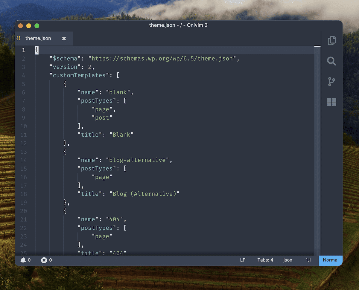
First, theme.json is the configuration file that lets you define global styles and settings for your themes. This “central hub” lets you control various aspects of your theme’s appearance and behavior, including typography, colors, and layout options. However, it can do more than simply give you programmatic cosmetic tweaks.
The blocks property lets you apply granular control over individual Block types rather than the site as a whole. You can define default styles, settings, and behavior for specific Blocks, which ensures consistency across your theme and flexibility for site owners.
The relationship between the blocks property and full site editing
FSE is a more visual approach to building your site with Blocks at the core. On the front end, you have most of the styling and customization options available to your overall site:
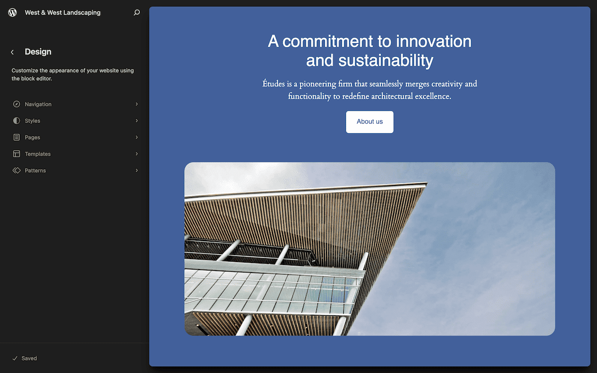
The blocks property is a crucial part of the theme.json file for a few reasons:
- It provides a standardized way to define block styles and settings.
- You’re able to create cohesive design systems from a programmatic base.
- You can offer greater control over the appearance of Blocks without the need for custom CSS.
- The property helps you create Block patterns and templates.
Developers can use the blocks property to create themes that make the most of full site editing.
How to structure the blocks property (and its syntax)
The standardization that the blocks property provides helps when it comes to structure and syntax. You’ll always nest it within the settings object:
{
"version": 3,
  "settings": {
    "blocks": {
      "core/paragraph": {
        "typography": {
          "fontSizes": [
            {
              "name": "Small",
              "slug": "small",
              "size": "13px"
            },
            {
              "name": "Medium",
              "slug": "medium",
              "size": "20px"
             }
           ]
…
The example above defines custom font sizes for a Paragraph Block. Breaking down the key components is simple:
- You nest the
blocksproperty under thesettingsobject. - Each block type has a namespace and name (
core/paragraphhere). - You then specify the Block’s settings within the object.
The settings include most of what is available for global styles. For instance, they can include typography, color, spacing, and many others.
Configuring global block settings
Let’s see how to define global settings and then look at how this impacts the blocks property. This is how you’ll establish a foundation of consistent design across your theme.
{
"version": 3,
  "settings": {
    "typography": {
      "fontSizes": [
        {
          "name": "Small",
          "slug": "small",
          "size": "13px"
        },
        {
          "name": "Medium",
          "slug": "medium",
          "size": "20px"
        }
…
In this example, we define the global font sizes available to all blocks. Within the WordPress Site Editor, you can find these options as part of the Typography > Elements > Text screen:
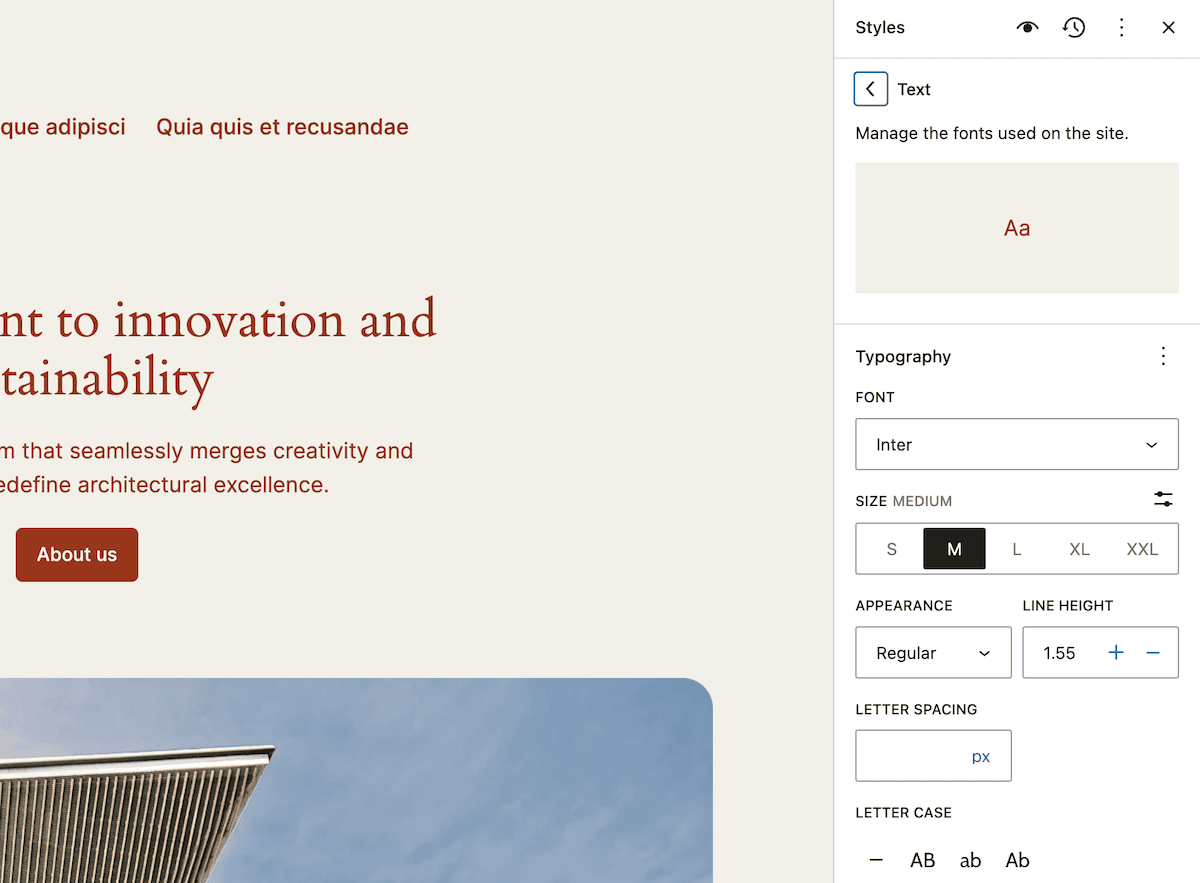
Each font size you define within theme.json correlates with one of the sizing options here:
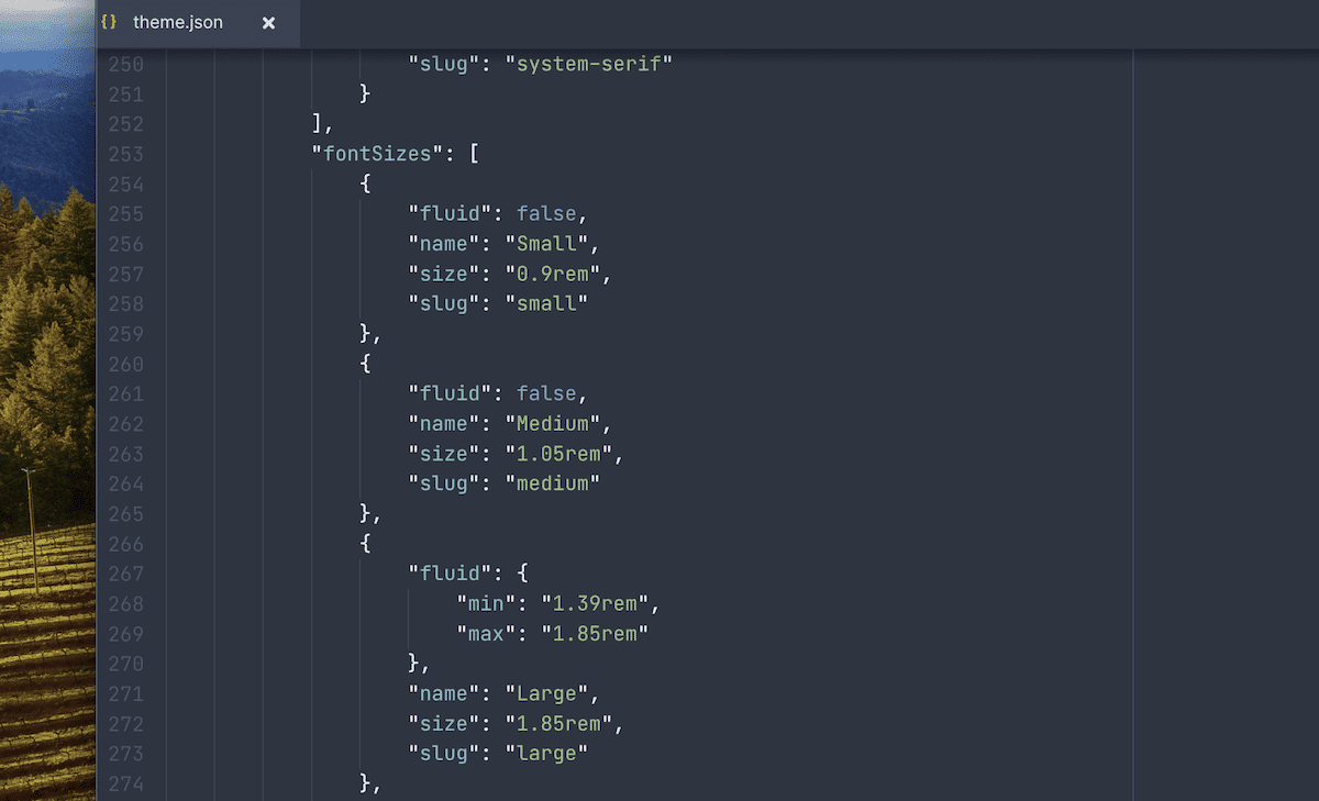
Of course, there are many other ways to customize your theme from here. The idea is to create a global design that works in 80% of use cases.
Using the blocks property, you can override those core Block styles to cover the final 20%. The Styles screen within the Site Editor also lets you customize the design settings for each Block:
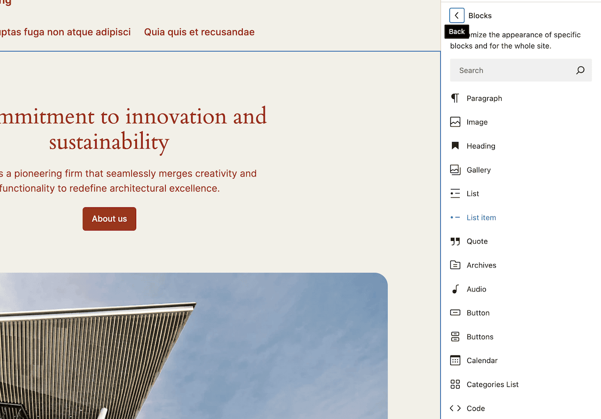
This is excellent for end users but of less value to a developer. We are focusing on using theme.json to work with the blocks property.
How to customize individual Block types
While global settings are important to help maintain consistency, the real power lies in the scope of the blocks property for customization. This granular-level setup lets you tailor the appearance and behavior of specific blocks to match your theme’s design, just like the Site Editor
Let’s look at an example of customizing the Heading Block for your theme:
{
"version": 3,
  "settings": {
    "blocks": {
      "core/heading": {
        "typography": {
          "fontSizes": [
            {
              "name": "Small",
              "slug": "small",
              "size": "20px"
            },
            {
              "name": "Medium",
              "slug": "medium",
              "size": "30px"
            },
            {
              "name": "Large",
              "slug": "large",
              "size": "40px"
            }
            ],
            "fontWeight": "bold"
            },
            "color": {
              "palette": [
                {
                  "name": "Heading Primary",
                  "slug": "heading-primary",
                  "color": "#333333"
                },
                {
                  "name": "Heading Secondary",
                  "slug": "heading-secondary",
                  "color": "#666666"
                }
              ]
…
You can see that the attributes reflect how you’d make global changes. Let’s summarize what we’re doing:
- We define specific font sizes for headings and assign them to size labels.
- The weight of the font for all headings will simply be bold.
- Those headings will also get a custom color palette.
This ensures that our headings will have a consistent look throughout the design. We also get to control these elements when we don’t know how the end user will apply them, which further benefits consistent design.
Using the right namespace and slug combination
When calling Block types, it’s crucial you use the correct namespace and slug combination. Without it, your changes won’t apply to the Blocks you want to target.
Each Block has a namespace and a slug. Core WordPress Blocks will typically have the core namespace. The slug will be the Block’s name:
…
"blocks": {
  "core/image": {
…
If you need to know the slug for a Block, you can look at its specific block.json file. You can find this within the wp-includes/blocks directory. Here, you’ll have various folders, each of which contains a block.json file. Within each, the namespace and slug for the Block should be near the top of the file:
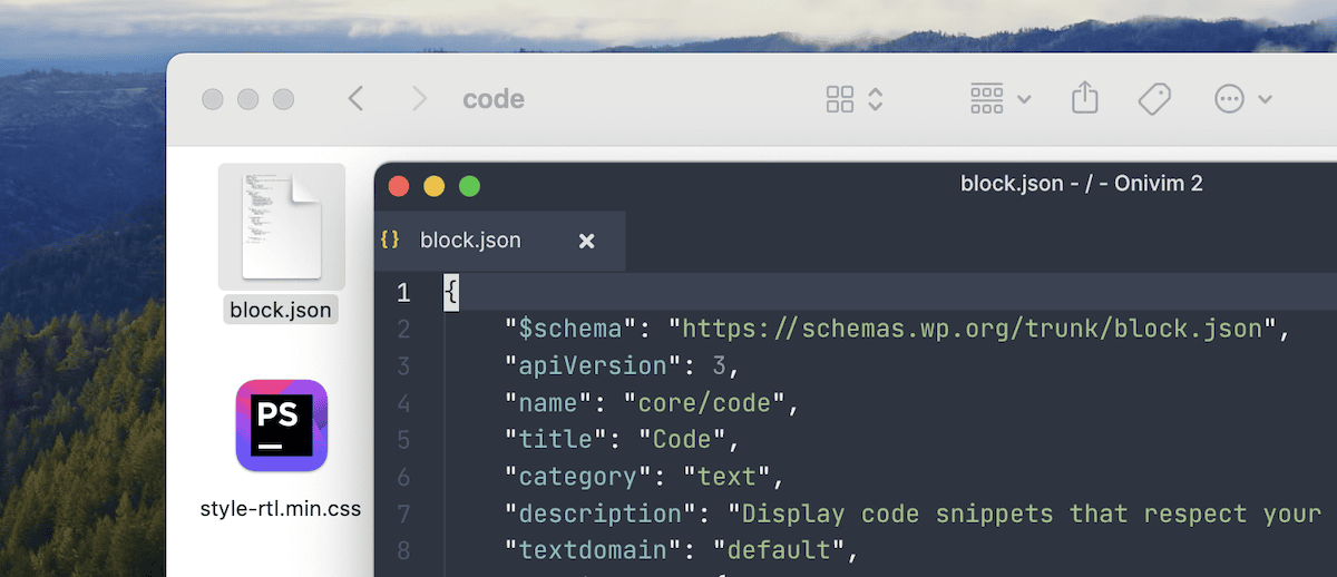
If you browse these directories, you’ll notice that the wp-includes directory has a theme.json file of its own. While this might seem confusing, it’s simple to explain.
Why theme.json includes customized Block settings by default
WordPress’ own theme.json file may seem odd at first, namely because it’s not a theme. However, this is no accident. The primary reason is to support backward compatibility with older versions of WordPress.
For instance, the Button Block sets a border radius:
…
"blocks": {
  "core/button": {
    "border": {
      "radius": true
     }
  },
…
Other Blocks will have similar settings to assist in consistency between different versions of WordPress. However, this can cause issues down the line if it’s something you’re not aware of.
If you try to define global settings and wonder why those changes don’t apply to specific Blocks, backward compatibility could be the answer. Of course, you can override these settings in your own theme.json file without a problem.
Developing custom Blocks with theme.json
The theme.json file is ideal for customizing existing Blocks, but its capabilities extend to custom Block development, too. You can leverage theme.json to define default styles and settings for any of your custom Blocks. This helps you deliver seamless integration with your theme’s design.
First, though, you have to build the Block itself. This is beyond the scope of this article, but in summary, there are a few facets:
- Scaffolding the Block. This involves setting up a local development environment and creating the file structure for the entire Block.
- Updating the
block.jsonfile. Here, you’ll need to change the Block identity and add supports. The latter are ways to declare the support for specific WordPress functionalities. For instance, you can handle alignment, implement anchor fields, work with various typography settings, and more. - Tweak the Block’s JavaScript files. Both
index.jsandedit.jsneed code to tell WordPress how the Block functions and to let it appear in the Site Editor.
You may also need to edit render.php, add static rendering, and a whole host of other tasks. At this point, you can apply any stylistic changes to theme.json as with any other Block. For now, let’s take a closer look at block.json.
The block.json file
This file is what the WordPress development team calls the “canonical” way to register Blocks for both the server and client side. The metadata you include here tells WordPress all about the Block type and its supporting files:
{
  "$schema": "https://schemas.wp.org/trunk/block.json",
  "apiVersion": 3,
  "name": "my-plugin/notice",
  "title": "Notice",
  "category": "text",
  "parent": [ "core/group" ],
  "icon": "star",
  "description": "Shows warning, error or success notices...",
  "keywords": [ "alert", "message" ],
  "version": "1.0.3",
  "textdomain": "my-plugin",
  "attributes": {
    "message": {
      "type": "string",
      "source": "html",
      "selector": ".message"
    }
  },
…
It’s akin to the metadata you’d place at the top of a PHP file for themes and plugins. While the file uses JSON data exclusively, you can still share code through PHP, JavaScript, and CSS:
…
"editorScript": "file:./index.js",
"script": "file:./script.js",
"viewScript": [ "file:./view.js", "example-shared-view-script" ],
"editorStyle": "file:./index.css",
"style": [ "file:./style.css", "example-shared-style" ],
"viewStyle": [ "file:./view.css", "example-view-style" ],
"render": "file:./render.php"
…
We come back to this later in the section on variations. To finish this section off, you need to know how to set your custom Block as a default in WordPress. There are a few ways to achieve this. The classic way is to register a custom post type and include the Blocks there. However, there are a couple of other methods.
For example, you could update an existing post type to add a Block template. Here’s a simple example:
…
function load_post_type_patterns() {
    // Define an initial pattern for the 'HypnoToad' post type
    $post_type_object = get_post_type_object( 'hypnoToad' );
    $post_type_object->template = array(
    array(
        'core/block',
…
One more way is to call the default_content hook and define the Block using markup:
function toad_content( $content, $post ) {
    if ( $post->post_type === 'hypnoToad' ) {
        $content ='<!-- wp:columns -->
        <div class="wp-block-columns"><!-- wp:column →
        <div class="wp-block-column"><!-- wp:paragraph -->
        <p></p>
        <!-- /wp:paragraph --></div>
        <!-- /wp:column -->
        <!-- wp:column -->
        <div class="wp-block-column"><!-- wp:paragraph -->
        <p></p>
        <!-- /wp:paragraph --></div>
        <!-- /wp:column --></div>
        <!-- /wp:columns -->';
    }
    return $content;
}
add_filter( 'default_content', 'toad_content', 10, 2 );
Of course, you won’t only use JSON, HTML, and PHP. You’ll also use other languages to help with design and interactivity. The good news is WordPress gives you an uncomplicated way to do so.
Using custom CSS properties for your Blocks
You can achieve a lot using the existing properties, attributes, and objects of theme.json, but it won’t cover every use case. The file gives you the custom property that will help you create relevant CSS properties:
{
"version": 3,
  "settings": {
    "custom": {
      "toad": "hypno"
    }
  }
}
In here, you give a key-value pair, which turns into a CSS variable on the front end:
body {
    --wp--custom--toad: hypno;
}
Note that the variable will use double hyphens to separate its elements. In general, you’ll always see --wp--custom--, which will then tag the key on the end. Sometimes, you’ll define variables and properties with camel case:
{
"version": 3,
  "settings": {
    "custom": {
      "hypnoToad": "active"
    }
  }
}
Here, WordPress will use hyphens to separate the words:
body {
    --wp--custom--hypno-toad: active;
}
Between the custom property and block.json, you have full scope to build your Blocks as you see fit, including any variations you may want to include.
A quick look at Block, style, and Block style variations
Before we move on to styling using the blocks property, let’s look at variations. You have a few different variation types for your designs, and the naming conventions could see you use the wrong type for your needs. Here’s a breakdown of the differences:
- Block variations. If your Block has alternative versions (think of a Block that will display many custom links set by the user), this is a Block variation. The Social Media Block is a good example of this.
- Style variations. These are alternative versions of
theme.jsonthat work on your global site. We don’t cover this here, but most Block themes offer them for various color palettes and typography settings. - Block style variations. This takes the core functionality of style variations and lets you create alternative designs for a Block.
You may wonder whether to use a Block variation or a Block style variation; the answer is uncomplicated. If the changes you want to make can happen within theme.json or using CSS, create a Block style variation. Anything else requires a Block variation.
Block variations
With Block variations, you’ll register them using JavaScript. Creating a file within a theme’s directory is a good idea, but it can go anywhere. It takes one line to register a variation within your JavaScript file:
const registerBlockVariation = ( blockName, variation )For the blockName, you’ll need to specify the namespace here, too, as you would with the blocks property. Within the variation object, you’ll add the name, title, description, whether the variation is active by default, and more. To load the file in the Site Editor, simply call the enqueue_block_editor_assets hook and enqueue your script within it.
Block style variations
When it comes to Block style variations, you have two options:
- Use the
register_block_style()function with PHP. - Create a
block-editor.jsJavaScript file, use theregisterBlockStyle()function similarly to Block variations and enqueue the script.
Once you register a Block style variation, you can target the Block using the variations property:
…
"styles": {
  "blocks": {
    "core/button": {
      "variations": {
        "outline": {
          "border": {
            "color": "var:preset|color|black",
            "radius": "0",
            "style": "solid",
            "width": "3px"
          },
…
This means you may not need any custom CSS at all—almost every aspect of a Block’s design is possible through the blocks property.
Styling a default Block using the blocks property from start to finish
To demonstrate how the blocks property works, let’s walk through a real-world example. Our site uses the Twenty Twenty-Four theme, and is using the default style variation:
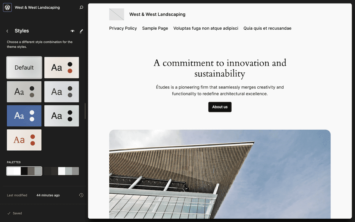
So far, this looks ideal to us — although the headings and body text seem too similar in color. We want to change one or both of the colors to differentiate them. As an end user or site owner, we can fix this within the Site Editor’s Styles sidebar. If you head to Blocks > Heading, you can click the Text element and change the color to something more suitable:
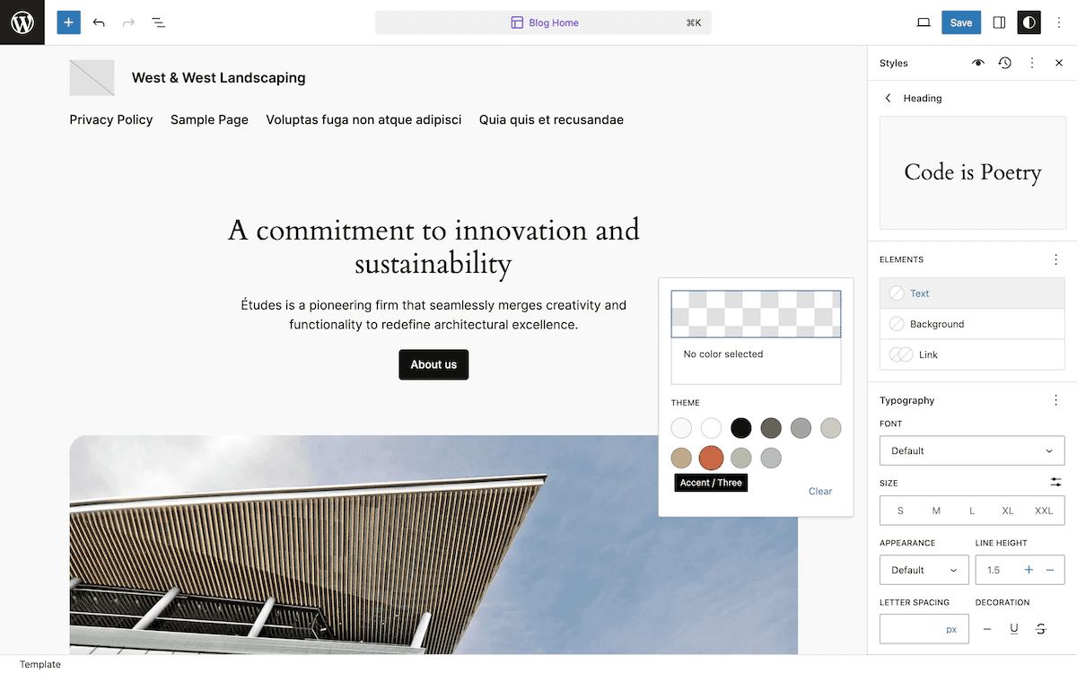
However, as a developer, you can do this within theme.json. Like any other theme, the best approach is to create a child theme to preserve any changes you make. A second advantage is that your theme.json file will look cleaner.
We’ll create a directory within wp-content/themes/ and call it twentytwentyfour-child. Here, add a valid style.css file and a blank theme.json file.
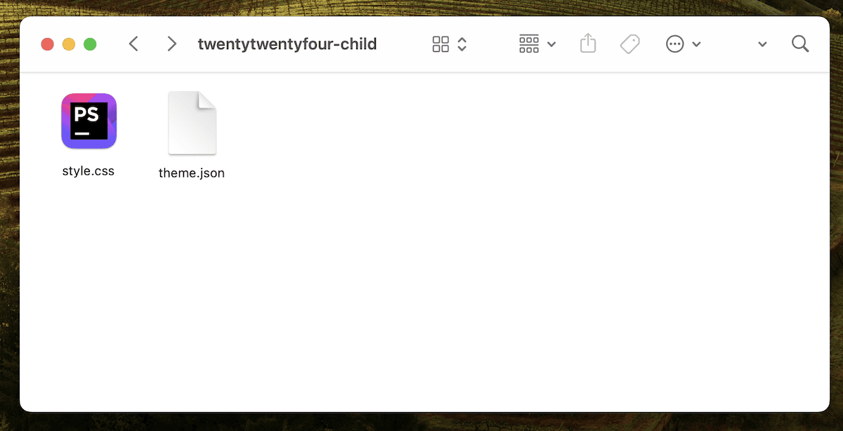
From here, you can open the JSON file and get to work.
Creating and populating a theme.json file for the child theme
The main difference between creating a parent and child theme with regards to theme.json is the file’s structure. You won’t need to state the schema or necessarily put everything within the settings object. In our case, we have to use the styles property:
{
"version": 3,
  "styles": {
    "blocks": {}
  }
}
Next, we need to find the namespace and slug for the Heading Block. The official Core Blocks Reference Guide lists all of these and will even tell us what attributes and properties the Block supports. The guide tells us we can tweak the background, gradient, link, and text values for the color property.
"blocks": {
  "core/heading": {
    "color": {}
  }
}
With the structure complete, we can begin to figure out how to restyle the text.
Finding a color scheme and applying the changes
Now, we need a color that suits our needs. The Twenty Twenty-Four default variation has an excellent palette, and checking it in a dedicated contrast checker gives us some ideas:
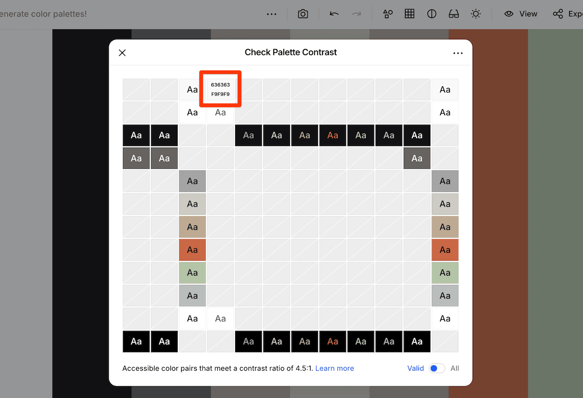
Next, we can add the color choice for our Block to theme.json. Because the parent Twenty Twenty-Four theme uses custom CSS properties to define palette styles, we can call this here too:
…
"core/paragraph": {
    "color": { "text": "var(--wp--preset--color--contrast)" },
…
If you need to know the name of a palette color, you can find it in the Site Editor from the color picker:
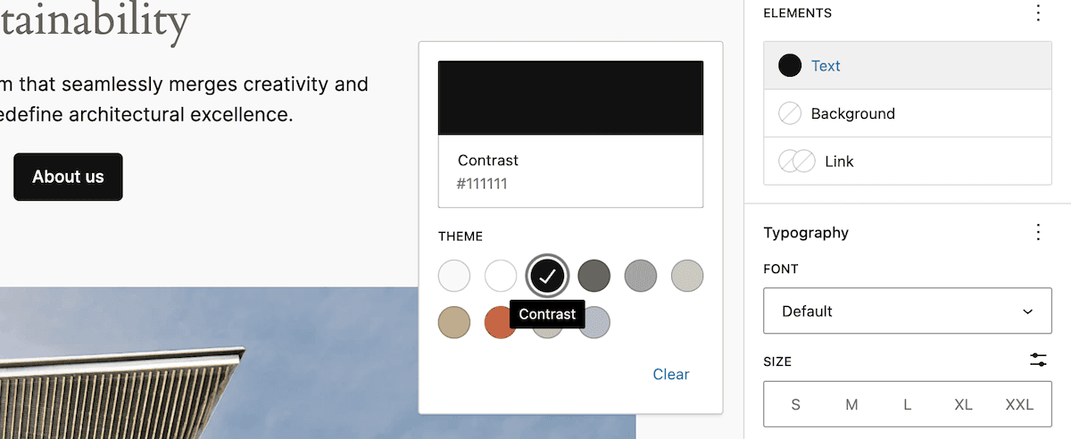
Once you save your changes, refresh your site, and you should see the new color scheme in place. If not, check that you’re nesting the blocks property within the right object, as this is a common sticking point.
As we look at the site, the text is less contrasting and easier to read. However, we still want to see some definition between the Paragraph Block and the surrounding headings. The theme’s default palette has some other, bolder colors. We’re going to try the Accent / 3 color for the Heading Block:
"blocks": {
  "core/heading": {
    "color": { "text": "var(--wp--preset--color--accent-3)" }
  },
  "core/paragraph": {
    "color": { "text": "var(--wp--preset--color--contrast)" }
  }
}
After saving the changes and refreshing the front end, you’ll see that the Heading Block has more definition:
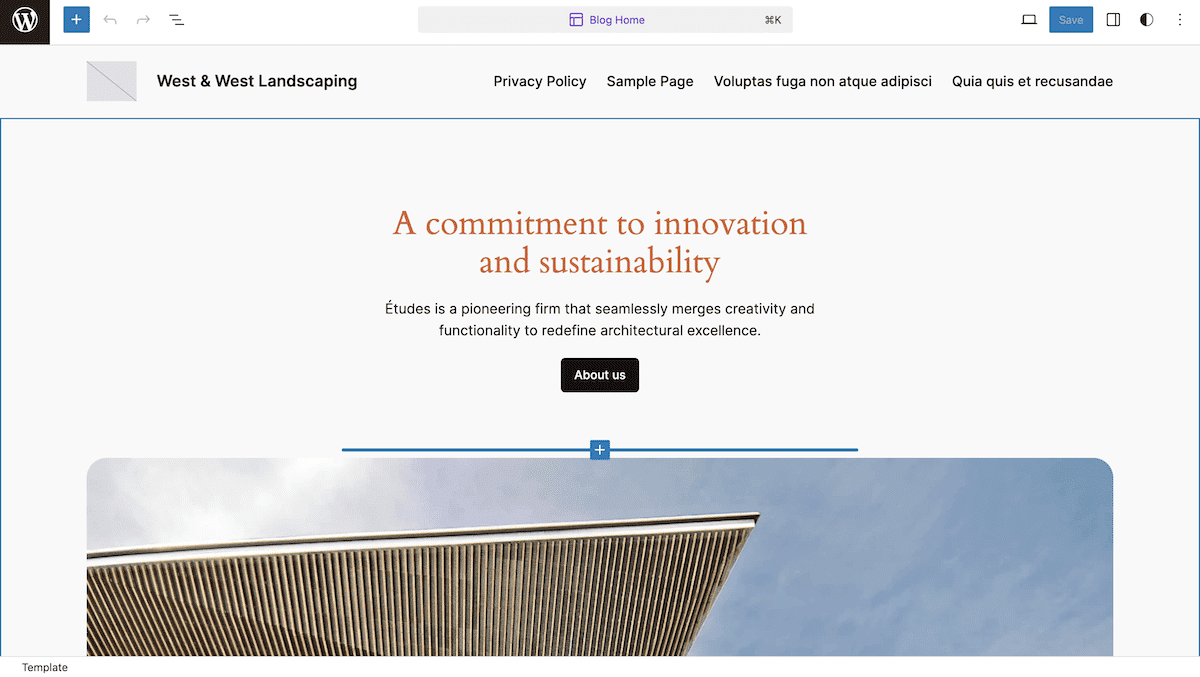
This doesn’t have to be the end of your editing. You can even customize the Site Editor’s options from theme.json.
Adding attribute options to Blocks
Each Block’s supports determine its options within the Site Editor. For instance, the Paragraph Block defaults to disabling the drop cap functionality.
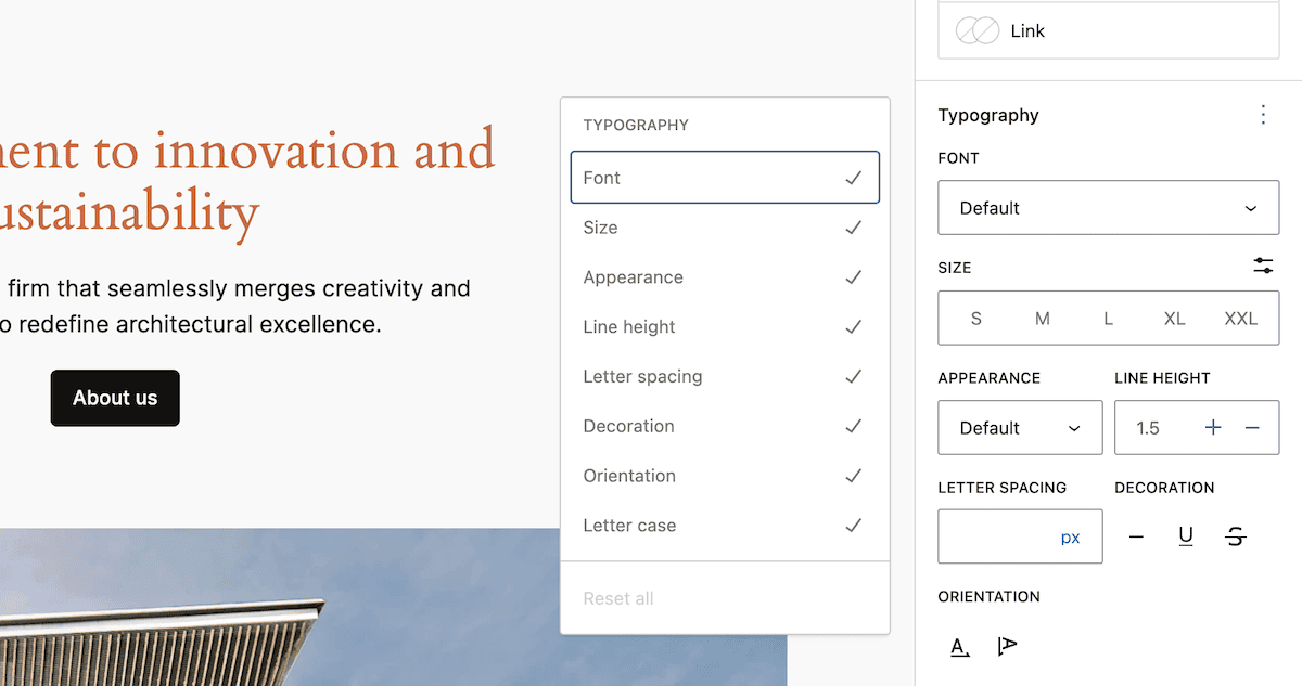
We can turn this back on within the theme.json file and blocks property. Looking at the reference material, we can leverage the typography property to enable drop caps:
…
"core/paragraph": {
  "color": { "text": "var(--wp--preset--color--contrast)" },
  "typography": { "dropCap": true }
…
Once we save those changes and refresh the editor, the option to toggle a drop cap will be available to you:
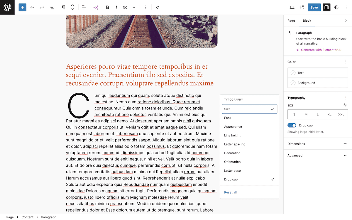
The theme.json file isn’t simply a configuration for design. It can also help add and remove functionality to the Site Editor.
How Kinsta’s managed hosting can support your WordPress theme development
The intricacies of theme development and theme.json rely on quality solutions throughout the development chain to take advantage of the potential for improved performance.
A local development environment is crucial, as this lets you create, manage, and tinker with WordPress sites on your local machine. DevKinsta can help there.
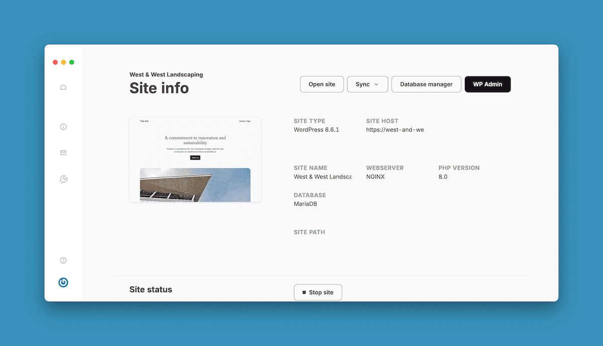
DevKinsta offers many benefits:
- It runs on Docker containers, which means you isolate your installation from the rest of your machine. As such, you can test your
theme.jsonconfigurations and custom Blocks without worry. - You can make rapid iterations to your
theme.jsonfile and see the results immediately in your local environment. - Creating multiple local sites to test your theme across different WordPress versions and configurations is a breeze.
What’s more, you won’t use any of your server’s resources until you’re happy and ready. Kinsta’s staging environments provide an ideal next step. You can create a copy of your production site quickly and even pull it down to your local environment to keep working.
This is a great way to carry out performance testing for your theme, especially when you combine the staging with Kinsta’s Application Performance Monitoring (APM) tool.
You can also leverage Kinsta’s Git integration across all of your environments. This lets you push and pull changes to repos and deploy from there, too.
Summary
Understanding the blocks property in theme.json is a necessary step for all theme developers. This can take a global design and make it more unique, cohesive, and relevant. Having full scope to work with individual core and custom Block settings helps every user leverage the capabilities of full site editing. In addition, having these options available in the Site Editor means end users can make their own changes without code while you present stellar default options.
Do you have any questions about using the blocks property with the theme.json file? Ask away in the comments section below!

