
Many people complain about the hurdles of getting started with building Gutenberg blocks and apps. The learning curve is steep, mainly due to the difficulty of installing and configuring the development environment. In addition, a solid knowledge of JavaScript, Node.js, React, and Redux are must-have ingredients for this fairly complex recipe.
The official WordPress Block Editor Handbook provides developers with a tremendous amount of information, but you may find yourself lost in that sea of details.
And it’s worth mentioning what Matías Ventura, lead architect of the Gutenberg project, reported in his interview with WP Tavern:
While there are folks that can learn it quickly, it’s still a big barrier for people. I think there are several layers to this; documentation could be an order of magnitude better in both organization and presentation. I hope we can do a lot more there.
With that in mind, we’ve decided to provide a step-by-step tutorial aimed at helping our readers get started with Gutenberg block development.
Sound interesting? Let’s dive in!
Gutenberg Block Development Prerequisites
For this tutorial, the only required skills are a good knowledge of WordPress plugin development and at least a basic understanding of HTML, CSS, JavaScript, and React.
Will this be an ambitious project? You bet it will be!
It wasn’t easy to find the right compromise between completeness and simplicity or decide which topics to include and which to leave out.
Hopefully, intermediate and advanced readers will forgive us for not delving deeply into certain concepts such as React state, Redux store, high-order components, and so on. These topics require additional space and attention and are probably too advanced for beginning block development (unless you’re a React developer).
For the same reason, we won’t be covering some of the more advanced topics related to Gutenberg block development, such as dynamic blocks and meta boxes.
With the knowledge you’ll gain by the end of this article, you’ll be able to start having fun and being productive right away.
Once you get going with block building, you’ll be poised to improve your skills further and build even more advanced Gutenberg blocks on your own.
What Is a Gutenberg Block?
Since it was first released in December 2018, the block editor has been greatly improved in all aspects: more powerful APIs, a more advanced user interface, improved usability, a ton of new blocks, the first implementations of Full Site Editing, and much more.
In short, even if Gutenberg is still under heavy development, it has come a long way — and today, the block editor is a full-fledged candidate as a reliable, functional page and site builder.
From a developer’s point of view, Gutenberg is a React-based Single Page Application (SPA) that allows WordPress users to create, edit, and delete content in WordPress. However, this should not make you think of an enhanced version of the traditional content editor.
We want to make this clear:
In Gutenberg, the content is divided into blocks, which are “bricks” that users can use to create posts and pages or their entire websites.
But what technically is a block?
We like WordPress’ definition:
“Block” is the abstract term used to describe units of markup that, composed together, form the content or layout of a webpage. The idea combines concepts of what in WordPress today we achieve with shortcodes, custom HTML, and embed discovery into a single consistent API and user experience.
Titles, paragraphs, columns, images, galleries, and all the elements that make up the editor’s interface, from sidebar panels to block toolbar controls, are React components.
So, what are React components? W3Schools provides the following definition:
Components are independent and reusable bits of code. They serve the same purpose as JavaScript functions, but work in isolation and return HTML via a
render()function.

While the editing experience delivered by Gutenberg is new compared to the classic WordPress editor, the way WordPress stores your pieces of content in the database doesn’t change at all. That’s because Gutenberg is an application that works within WordPress but doesn’t change the way the CMS works at its core.
Posts (and this includes posts, pages, and custom post types) created with Gutenberg are still stored in the wp_posts table, exactly as with the classic editor.
But in a post created with Gutenberg, you’ll find additional bits of information in the table that represent a fundamental difference between posts created via the Classic Editor vs Gutenberg.
These pieces of information look like HTML comments, and they have a specific function: delimiting blocks:

Block delimiters tell WordPress what block is to be rendered on the screen. They also provide values for block properties in a JSON object. Those props dictate the way the block should be rendered on the screen:

wp_posts table.Setting Up Your WordPress Development Environment
Setting up a modern JavaScript development environment requires a solid knowledge of advanced technologies such as Webpack, React and JSX, Babel, ESLint, etc.
Intimidated? Don’t be! The WordPress community has already come to the rescue by providing powerful tools that let you avoid a messy manual configuration process.
To keep things simple, we won’t cover transpiling in this article (which we nevertheless recommend familiarizing yourself with once you’ve learned the basics of block development). Instead, we’ll introduce two alternative tools you can use to quickly and easily set up a modern JavaScript development environment in few minutes. It’s up to you to choose the one you find most convenient for your project.
Setting up a JavaScript development environment to build Gutenberg blocks is a three-step process:
Let’s get started.
1. Install Node.js and npm
Before installing your development environment and registering your first block, you’ll need to install Node.js and the Node package manager (npm).
You can install Node.js and npm in several different ways. But first, you may want to check if the software is already installed on your machine.
To do this, launch the terminal and run the following command:
node -vIf the result is command not found, then Node.js is not installed on your computer, and you can proceed with the installation.
For this article, we’ve chosen the easiest installation option, which is the Node Installer. All you need to do is download the version corresponding to your operating system and launch the installation wizard:

Once you’ve installed Node.js, run the command node -v in your terminal again. You can also run the npm -v command to confirm that you have the npm package available.
You’re now equipped with the following tools:
- The
npxNode.js package runner. This allows you to run annpmcommand without installing it first. - The
npmNode.js package manager (see docs). This is used to install dependencies and run scripts.
The next step is to install the development environment.
2. Set Up Your Development Environment
Once you have the latest versions of Node.js and npm on your local machine, you’ll need a development environment for WordPress.
You can either use a local development environment like DevKinsta or use the official WordPress tool. Let’s take a peek at both options.
Option 1: Local Development Environment (DevKinsta)
With just a few clicks, you can install WordPress locally using DevKinsta, our modern local WordPress development tool. Or you could opt for a different local development tool, such as MAMP or XAMPP:

Option 2: wp-env
You can also opt for the official wp-env tool, which provides a local WordPress dev environment you can launch directly from the command line. Noah Alen defines it as follows:
Local WordPress environments are now as simple as running a single command.
wp-envis a zero config tool for painless local WordPress environments. It provides decisions over options so that users can quickly spin up WordPress without wasting time. Indeed, the goal is to make these environments easily accessible to all — whether you’re a developer, designer, manager, or anyone else.
If you decide to give it a try, installing wp-env requires minimal effort. Just follow these steps:
Step 1: Confirm Docker and Node.js Installation
To meet the technical requirements, you’ll first need to have both Docker and Node.js installed on your computer. That’s because wp-env creates a Docker instance running a WordPress website. Any changes made to the code are immediately reflected in the WordPress instance.
Step 2: Install @wordpress/env from the Command Line
With Docker and Node.js running on your computer, you can move on and install the WordPress development environment.
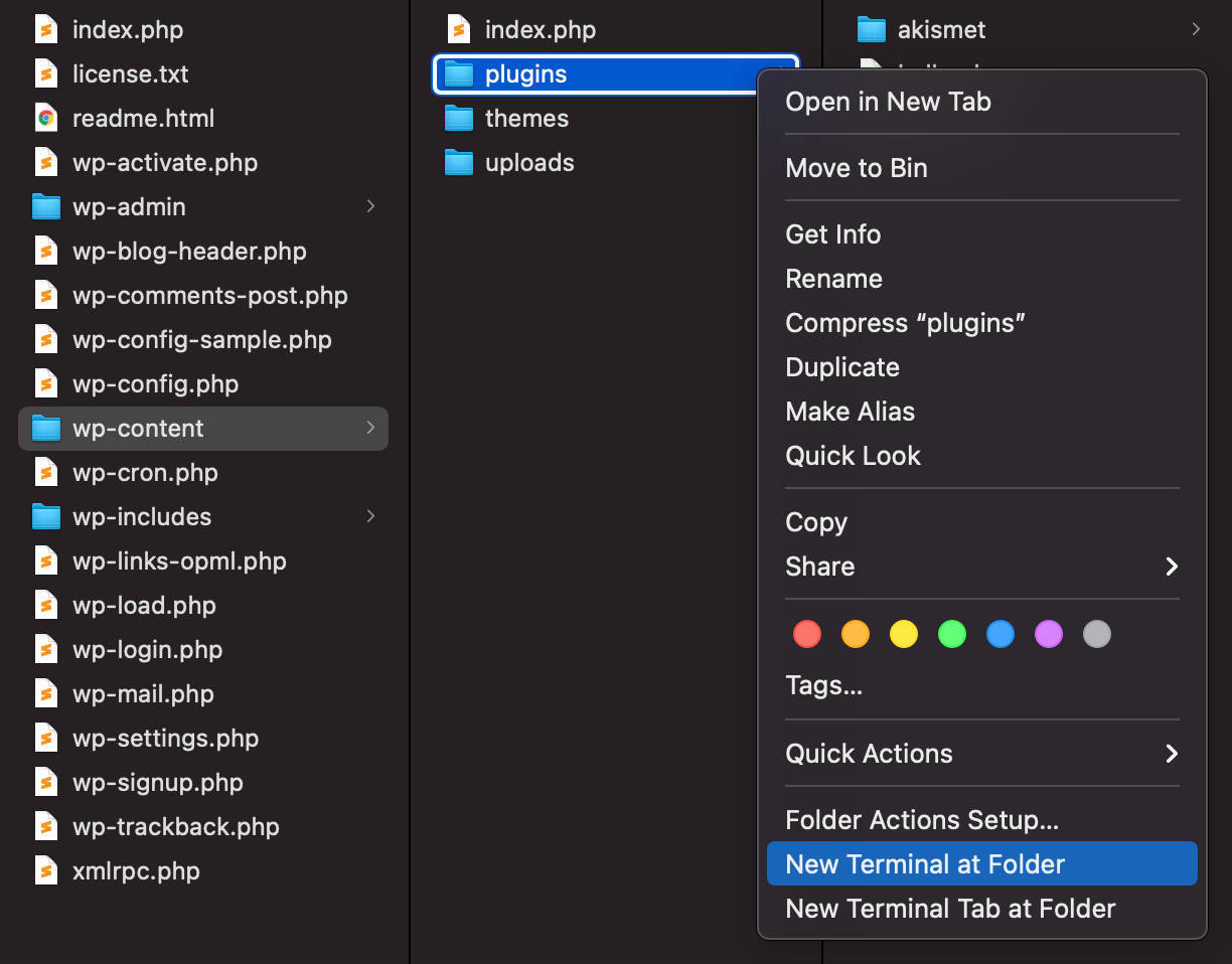
You can install wp-env either globally or locally. To do it globally, you’ll need to run the following command from within the plugins directory (more on this in the “Important” notice box below):
npm install -g @wordpress/envLet’s break that down:
npm installinstalls the package.-gappended to the command installs the specified package globally.@wordpress/envis the package you’re going to install.
To confirm that wp-env has been successfully installed, run the following command:
wp-env --versionYou should see the current wp-env version, which means you can now launch the environment using the following command from your plugin’s folder:
wp-env startYou can access the WordPress dashboard using the following address:
- http://localhost:8888/wp-admin/
The default credentials are as follows:
- Username:
admin - Password:
password
Set Up Your Block Plugin
Now you need a starter block plugin to build upon. But instead of manually creating a development block plugin with all necessary files and folders, you can simply run a dev-tool providing all files and configurations you need to get started with block development.
Again, you have a couple of options to choose from. Let’s take a look at each.
Option 1: Setting Up a Block Plugin With @wordpress/create-block
@wordpress/create-block is the official zero configuration tool for creating Gutenberg blocks:
Create Block is an officially supported way to create blocks for registering a block for a WordPress plugin. It offers a modern build setup with no configuration. It generates PHP, JS, CSS code, and everything else you need to start the project.
It is largely inspired by create-react-app. Major kudos to @gaearon, the whole Facebook team, and the React community.
Once your local environment is up and running, you can set up a starter block by simply running the npx @wordpress/create-block command, and it will provide all the files and folders you need to create the plugin scaffolding and register a new block.
Let’s run a test to see how it works.
From your Command Line tool, navigate to the /wp-content/plugins/ directory and run the following command:
npx @wordpress/create-block my-first-blockWhen asked to confirm, enter y to proceed:

The process takes a few moments. When it’s complete, you should get the following response:

And that’s it!
Now launch your WordPress development environment and go to the Plugins screen in the WordPress dashboard. A new plugin named “My First Block” should have been added to your plugin list:

Activate the plugin if needed, create a new blog post, scroll down the block inserter to the Widgets section, and select your new block:

Now go back to the terminal and change the current directory to my-first-block:
cd my-first-blockThen run the following command:
npm startThis enables you to run the plugin in development mode. To create the production code, you should use the following command:
npm run buildOption 2: Setting Up a Block Plugin With create-guten-block
create-guten-block is a third-party development tool for building Gutenberg blocks:
create-guten-blockis zero configuration dev-toolkit (#0CJS) to develop WordPress Gutenberg blocks in a matter of minutes without configuring React, webpack, ES6/7/8/Next, ESLint, Babel, etc.
Just like the official create-block tool, create-guten-block is based on create-react-app and can help you generate your first block plugin with no hassle.
The toolkit provides everything you need to create a modern WordPress plugin, including the following:
- React, JSX, and ES6 syntax support.
- webpack dev/production build process behind the scene.
- Language extras beyond ES6 like the object spread operator.
- Auto-prefixed CSS, so you don’t need -webkit or other prefixes.
- A build script to bundle JS, CSS, and images for production with source-maps.
- Hassle-free updates for the above tools with a single dependency cgb-scripts.
Note the following caveat:
The tradeoff is that these tools are preconfigured to work in a specific way. If your project needs more customization, you can “eject” and customize it, but then you will need to maintain this configuration.
Once you have a local WordPress website on hand, launch your Command Line tool, navigate to the /wp-content/plugins folder of your installation, and run the following command:
npx create-guten-block my-first-blockYou’ll have to wait a minute or two while the project structure is created and dependencies downloaded:

When the process is complete, you should see the following screen:

This next image shows the project structure with the terminal running in Visual Studio Code:

Now go back to your WordPress dashboard. A new item should be listed in the Plugins screen — it’s the my-first-block plugin:

Activate the plugin and go back to the terminal. Change the current directory to my-first-block, then run npm start:
cd my-first-block
npm start
You should get the following response:

Again, this enables you to run the plugin in development mode. To create the production code, you should use:
npm run buildActivate the plugin and create a new post or page, then browse your blocks and select your brand new Gutenberg block:

For a more in-depth overview or in case of errors, refer to the documentation provided by Ahmad Awais.
A Walkthrough of the Starter Block Scaffolding
Whichever of the two dev-tools — create-block or create-guten-block — you opt for, you now have a block scaffolding you can use as a starting point to build a block plugin.
But what exactly is block scaffolding?
Block scaffolding is a shorthand term that describes the supporting directory structure you need for WordPress to recognize a block. Typically that directory includes files like index.php, index.js, style.css, and others — which in turn hold calls like
register_block_type.
We opted for the official Create Block dev-tool, as it’s used in the Block Editor Handbook. But even if you’d decide to go with a third-party tool like create-guten-block, your experience won’t be too different.
With that said, let’s dive deeper into the create-block tool.
A Closer Look at the Create Block Dev-Tool
As we mentioned above, Create Block is the official command-line tool to create Gutenberg blocks. Running @wordpress/create-block in your terminal generates the PHP, JS, and SCSS files and code needed to register a new block type:
npx @wordpress/create-block [options] [slug][slug](optional) — used to assign the block slug and install the plugin[options](optional) — available options
By default, an ESNext template is assigned. This means that you’ll get the next version of JavaScript, with the addition of the JSX syntax.
If you omit the block name, the command runs in interactive mode, enabling you to customize several options before generating the files:
npx @wordpress/create-block
The image below shows the file structure of a block plugin created with the official Create Block tool:

With that said, let’s go through the main files and folders of our new block plugin.
The Plugin File
With the main plugin file you register the block on the server:
<?php
/**
 * Plugin Name:       Kinsta Academy Block
 * Plugin URI:        https://kinsta.com/
 * Description:       An example block for Kinsta Academy students
 * Requires at least: 5.9
 * Requires PHP:      7.0
 * Version:           0.1.0
 * Author:            Kinsta Students
 * License:           GPL-2.0-or-later
 * License URI:       https://www.gnu.org/licenses/gpl-2.0.html
 * Text Domain:       ka-example-block
 *
 * @package           ka-example-block
 */

/**
 * Registers the block using the metadata loaded from the `block.json` file.
 * Behind the scenes, it registers also all assets so they can be enqueued
 * through the block editor in the corresponding context.
 *
 * @see https://developer.wordpress.org/reference/functions/register_block_type/
 */
function ka_example_block_ka_example_block_block_init() {
	register_block_type( __DIR__ . '/build' );
}
add_action( 'init', 'ka_example_block_ka_example_block_block_init' );
The register_block_type function registers a block type on the server using the metadata stored in the block.json file.
The function takes two parameters:
- The block type name including namespace, or a path to the folder where the block.json file is located, or a complete
WP_Block_Typeobject - An array of block type arguments
In the code above, the __DIR__ magic constant returns the current folder. That means that the block.json file resides in the /build subfolder.
The package.json File
The package.json file defines JavaScript properties and scripts for your project. This is where you can install your project dependencies.
To better understand what this file is meant for, open it with your favorite code editor:
{
	"name": "ka-example-block",
	"version": "0.1.0",
	"description": "An example block for Kinsta Academy students",
	"author": "Kinsta Students",
	"license": "GPL-2.0-or-later",
	"homepage": "https://kinsta.com/",
	"main": "build/index.js",
	"scripts": {
		"build": "wp-scripts build",
		"format": "wp-scripts format",
		"lint:css": "wp-scripts lint-style",
		"lint:js": "wp-scripts lint-js",
		"packages-update": "wp-scripts packages-update",
		"plugin-zip": "wp-scripts plugin-zip",
		"start": "wp-scripts start"
	},
	"devDependencies": {
		"@wordpress/scripts": "^24.1.0"
	},
	"dependencies": {
		"classnames": "^2.3.2"
	}
}
The scripts property is a dictionary containing commands that are run at various times in the lifecycle of a package using npm run [cmd].
In this article, we’ll be using the following commands:
npm run build— create a (compressed) production buildnpm run startornpm start— create an (uncompressed) development build
dependencies and devDependencies are two objects mapping a package name to a version. dependencies are required in production, while devDependences are only needed for local development (read more).
The only default dev dependency is the @wordpress/scripts package, which is defined as “a collection of reusable scripts tailored for WordPress development.”
The block.json File
Starting with WordPress 5.8, the block.json metadata file is the canonical way to register block types.
Having a block.json file provides several benefits, including improved performance and better visibility on the WordPress Plugins Directory:
From a performance perspective, when themes support lazy loading assets, blocks registered with block.json will have their asset enqueuing optimized out of the box. The frontend CSS and JavaScript assets listed in the
styleorscriptproperties will only be enqueued when the block is present on the page, resulting in reduced page sizes.
Running the @wordpress/create-block command generates the following block.json file:
{
	"$schema": "https://schemas.wp.org/trunk/block.json",
	"apiVersion": 2,
	"name": "ka-example-block/ka-example-block",
	"version": "0.1.0",
	"title": "Kinsta Academy Block",
	"category": "widgets",
	"icon": "superhero-alt",
	"description": "An example block for Kinsta Academy students",
	"supports": {
		"html": false
	},
	"textdomain": "ka-example-block",
	"editorScript": "file:./index.js",
	"editorStyle": "file:./index.css",
	"style": "file:./style-index.css"
}
Here’s the full list of default properties:
apiVersion— the version of the API used by the block (current version is 2)name— a unique identifier for a block including a namespaceversion— the current version of a blocktitle— a display title for a blockcategory— a block categoryicon— a Dashicon slug or a custom SVG icondescription— a short description visible in the block inspectorsupports— a set of options to control features used in the editortextdomain— the plugin text-domaineditorScript— editor script definitioneditorStyle— editor style definitionstyle— provides alternative styles for a block
In addition to the properties listed above, you can (and probably will) define an attributes object providing information about data stored by your block. In your block.json you can set any number of attributes in key/value pairs, where the key is the attribute name and the value is is the attribute definition.
Take a look at the following example of attribute definitions:
"attributes": {
	"content": {
		"type": "array",
		"source": "children",
		"selector": "p"
	},
	"align": {
		"type": "string",
		"default": "none"
	},
	"link": {
		"type": "string",
		"default": "https://kinsta.com"
	}
},
We’ll dive deeper into the block.json file later in the article, but you may also want to check the Block Editor Handbook for more detailed information about block.json metadata and attributes.
The src Folder
The src folder is where the development happens. In that folder, you’ll find the following files:
- index.js
- edit.js
- save.js
- editor.scss
- style.scss
index.js
The index.js file is your starting point. Here you will import dependencies and register the block type on the client:
import { registerBlockType } from '@wordpress/blocks';

import './style.scss';

import Edit from './edit';
import save from './save';
import metadata from './block.json';

registerBlockType( metadata.name, {
	/**
	 * @see ./edit.js
	 */
	edit: Edit,

	/**
	 * @see ./save.js
	 */
	save,
} );
The first statement imports the registerBlockType function from the @wordpress/blocks package. The following import statements import the stylesheet along with the Edit and save functions, and a metadata object from the block.json file.
The registerBlockType function registers the component on the client. The function takes two parameters: a block name and a block configuration object.
The Edit function provides the block interface as rendered in the block editor, while the save function provides the structure that will be serialized and saved into the database (read more).
edit.js
edit.js is where you’ll build the block admin interface:
import { __ } from '@wordpress/i18n';
import { useBlockProps } from '@wordpress/block-editor';
import './editor.scss';

export default function Edit() {
	return (
		<p {...useBlockProps()}>
			{__('My First Block – hello from the editor!', 'my-first-block')}
		</p>
	);
}
First, it imports the __ function from the @wordpress/i18n package (this package contains a JavaScript version of the translation functions), the useBlockProps React hook, and the editor.scss file.
Following that, it exports the React component (read more about import and export statements).
save.js
The save.js file is where we build the block structure to be saved into the database:
import { __ } from '@wordpress/i18n';
import { useBlockProps } from '@wordpress/block-editor';

export default function save() {
	return (
		<p {...useBlockProps.save()}>
			{__(
				'My First Block – hello from the saved content!',
				'my-first-block'
			)}
		</p>
	);
}
editor.scss and style.scss
Apart from the scripts, two SASS files reside in the src folders. The editor.scss file contains the styles applied to the block in the editor’s context, while the style.scss file contains the styles of the block for display in the frontend as well as in the editor. We’ll dive deeper into these files in the second part of this guide.
The node_modules and build Folders
The node_modules folder contains node modules and their dependencies. We won’t dive deeper into node packages as it is beyond the scope of this article, but you can read more in this article on where npm installs the packages.
The build folder contains the JS and CSS files resulting from the build process. You can dive deeper into the build process in ESNext syntax and JavaScript Build Setup guides.
The Project: Building Your First Gutenberg Block
It’s time to get our hands dirty. This section will teach you how to create a plugin providing a CTA block named Kinsta Academy Block.
The block will consist of two columns, with an image on the left and a text paragraph on the right. A button with a customizable link will be placed below the text:

This is just a simple example, but it allows us to cover the basics of Gutenberg block development. Once you get a clear understanding of the basics, you can go ahead and create more and more complex Gutenberg blocks with the help of the Block Editor Handbook and any other of the vast resources available out there.
Assuming that you have the latest version of WordPress running on your local development environment, here’s what you’re going to learn from here on:
- How to Set Up the Starter Block Plugin
- block.json at Work
- Using Built-In Components: The RichText Component
- Adding Controls to the Block Toolbar
- Customizing The Block Settings Sidebar
- Adding and Customizing an External Link
- Adding Multiple Block Styles
- Nesting Blocks With the InnerBlocks Component
- Additional Improvements
Ready… set… go!
How to Set Up the Starter Block Plugin
Launch your command-line tool and navigate to the <strong>/wp-content/plugins folder:</strong
Now, run the following command:
npx @wordpress/create-blockThis command generates the PHP, SCSS, and JS files for registering a block in interactive mode, allowing you to add the necessary data for your block easily. For our example we’ll use the following details:
- Template variant: static
- Block slug: ka-example-block
- Internal namespace: ka-example-block
- Block display title: Kinsta Academy Block
- Short block description: An example block for Kinsta Academy students
- Dashicon: superhero-alt
- Category name: widgets
- Do you want to customize the WordPress plugin?: yes
- The home page of the plugin: https://kinsta.com/
- Current plugin version: 0.1.0
- <strong>Plugin author: your name</stron
- License: –
- Link to the license text: –
- Custom domain path for translations: –
Installing the plugin and all dependencies takes a couple of minutes. When the process is complete, you’ll see the following response:

Now, run the following command from the <strong>/wp-content/plugins folder:</strong
cd ka-example-block
Finally, from within your plugin’s folder (ka-example-block in our example), you can start development with:
npm startNow open the Plugins screen to find and activate the <strong>Kinsta Academy Block> plugin:</stron

Create a new post, open the block inserter, and scroll down to the <strong>Design category. Click to add the Kinsta Academy Block:</stron

block.json at Work
As we mentioned earlier, the server-side block registration takes place in the main <strong>.php file. However, we won’t define settings in the <strong>.php file. Instead, we’ll be using the block.json file.</strong</strong
So, open block.json again and take a closer look at the default settings:
{
	"$schema": "https://schemas.wp.org/trunk/block.json",
	"apiVersion": 2,
	"name": "ka-example-block/ka-example-block",
	"version": "0.1.0",
	"title": "Kinsta Academy Block",
	"category": "widgets",
	"icon": "superhero-alt",
	"description": "An example block for Kinsta Academy students",
	"supports": {
		"html": false
	},
	"textdomain": "ka-example-block",
	"editorScript": "file:./index.js",
	"editorStyle": "file:./index.css",
	"style": "file:./style-index.css"
}
Scripts and Styles
editorScript, editorStyle, and style properties provide the relative paths to frontend and backend scripts and styles.
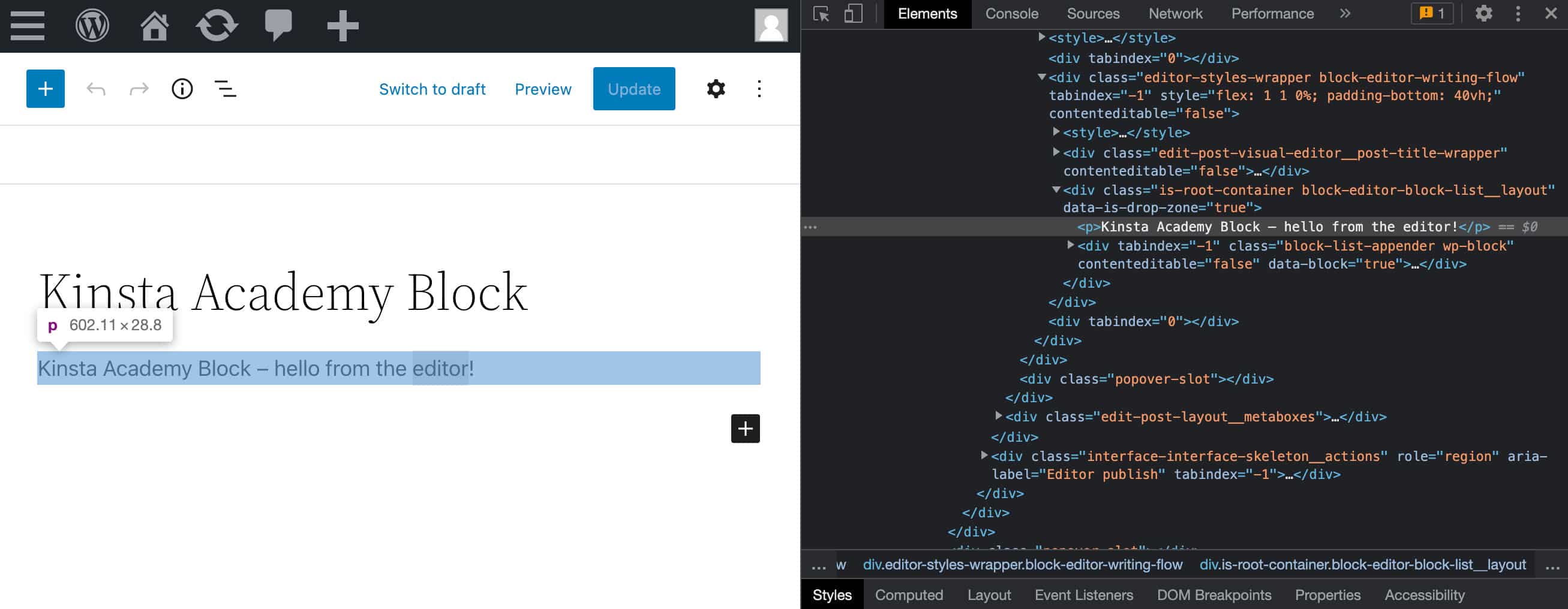
You don’t have to manually register the scripts and styles defined here because these are automatically registered and enqueued by WordPress. To prove that, launch the browser inspector and open the <strong>Network tab:</stron

As you can see from the image above, our index.js script residing in the build folder has been regularly enqueued without having to add any PHP code.
UI Labels
The title and description properties provide the labels needed to identify the block in the editor:

Keywords
As we mentioned earlier, you can accurately configure your block settings using properties and attributes. For example, you can add one or more keywords to help users search blocks:
"keywords": [
		"kinsta",
		"academy",
		"superhero"
	],
If you now input “kinsta”, “academy” or “superhero” in the quick inserter, the editor will suggest you the Kinsta Academy block:

Localization
If you are wondering how the localization of the strings in the JSON file happens, here is the answer:
In JavaScript, you can use now
registerBlockTypeFromMetadatamethod from@wordpress/blockspackage to register a block type using the metadata loaded from block.json file. All localized properties get automatically wrapped in_x(from@wordpress/i18npackage) function calls similar to how it works in PHP withregister_block_type_from_metadata. The only requirement is to set thetextdomainproperty in the block.json file.
Here we are using the registerBlockType function instead of registerBlockTypeFromMetadata, as the latter has been deprecated since Gutenberg 10.7, but the mechanism is the same.
Using Built-In Components: The RichText Component
The elements that make up a Gutenberg block are React components, and you can access these components via the <code>wp global variable. For example, try to type wp.editor into your browser’s console. This will give you the full list of the components included in the wp.editor module.</cod
Scroll through the list and guess what components are meant for by their names.
Similarly, you can check the list of components included in the wp.components module:

Now go back to the edit.js file and take a closer look at the script:
import { __ } from '@wordpress/i18n';
import { useBlockProps } from '@wordpress/block-editor';
import './editor.scss';

export default function Edit() {
	return (
		<p { ...useBlockProps() }>
			{ __(
				'Kinsta Academy Block – hello from the editor!',
				'ka-example-block'
			) }
		</p>
	);
}
This code generates a static block with simple, non-editable text. But we can change things easily:

To make the text editable you’ll have to replace the current <p> tag with a component that makes the input content editable. For that, Gutenberg provides the built-in RichText component.
Adding a built-in component to your block is a 5 step process:
- Import the required components from a WordPress package
- Include the corresponding elements into your JSX code
- Define the necessary attributes in the block.json file
- Define event handlers
- Save data
Step 1: Import the Required Components from a WordPress Package
Now open the edit.js file and change the following import statement:
import { useBlockProps } from '@wordpress/block-editor';…to:
import { useBlockProps, RichText } from '@wordpress/block-editor';This way, you’re importing the useBlockProps function and RichText component from the @wordpress/block-editor package.
useBlockProps
The useBlockProps> React hook marks the block’s wrapper element:
When using API version 2, you must use the new
useBlockPropshook in the block’seditfunction to mark the block’s wrapper element. The hook will insert attributes and event handlers needed to enable block behavior. Any attributes you wish to pass to the block element must be passed throughuseBlockPropsand the returned value be spread onto the element.
To put things simply, useBlockProps automatically assign attributes and classes to the wrapper element (the p element in our example):

If you remove useBlockProps from the wrapper element, you’d have a simple text string with no access to block functionality and style:
As we’ll explain later, you can also pass to useBlockProps an object of properties to customize the output.
RichText
The RichText component provides a contenteditable input, allowing users to edit and format the content.
You’ll find the component documented on GitHub at gutenberg/packages/block-editor/src/components/rich-text/README.md.
Step 2: Include the Corresponding Elements Into Your JSX Code
...

const blockProps = useBlockProps();

return (
	<RichText
		{ ...blockProps }
		tagName="p"
		onChange={ onChangeContent }
		allowedFormats={ [ 'core/bold', 'core/italic' ] }
		value={ attributes.content }
		placeholder={ __( 'Write your text...' ) }
	/>
);
Let’s comment on the code line by line:
tagName— the tag name of the editable HTML elementonChange— function called when the element’s content changesallowedFormats— an array of allowed formats. By default, all formats are allowedvalue— the HTML string to make editableplaceholder— placeholder text to show when the element is empty
Step 3: Define the Necessary Attributes in the block.json File
Attributes provide information about the data stored by a block, such as rich content, background color, URLs, etc.
You can set an arbitrary number of attributes within an attributes object in key/value pairs, where the key is the attribute name and the value is the attribute definition.
Now open the block.json file and add the following attributes prop:
"attributes": {
	"content": {
		"type": "string",
		"source": "html",
		"selector": "p"
	}
},
The content attribute allows to store the text typed by the user in the editable field:
typeindicates the type of data stored by the attribute. The type is required unless you define anenumproperty.sourcedefines how the attribute value is extracted from the post content. In our example, it’s the HTML content. Note that if you don’t provide a source property, data are stored in the block delimiter (read more).selectoris an HTML tag or any other selector, such as a class name or an id attribute.
We will pass the Edit function an object of properties. So, go back to the edit.js file and make the following change:
export default function Edit( { attributes, setAttributes } ) { ... }Step 4: Define Event Handlers
The RichText element has an onChange attribute, providing a function to call when the element’s content changes.
Let’s define that function and see the whole edit.js script:
import { __ } from '@wordpress/i18n';
import { useBlockProps, RichText } from '@wordpress/block-editor';
import './editor.scss';

export default function Edit( { attributes, setAttributes } ) {
	const blockProps = useBlockProps();

	const onChangeContent = ( newContent ) => {
		setAttributes( { content: newContent } )
	}

	return (
		<RichText
			{ ...blockProps }
			tagName="p"
			onChange={ onChangeContent }
			allowedFormats={ [ 'core/bold', 'core/italic' ] }
			value={ attributes.content }
			placeholder={ __( 'Write your text...' ) }
		/>
	);
}
Now save the file and go back to your WordPress dashboard, create a new post or page and add your custom block:

Add some text and switch to Code view. Here is what your code should look like:
<!-- wp:ka-example-block/ka-example-block -->
<p class="wp-block-ka-example-block-ka-example-block">Kinsta Academy Block – hello from the saved content!</p>
<!-- /wp:ka-example-block/ka-example-block -->
As you can see, if you switch to the Code Editor, the content of your block has changed. That’s because you have to modify the save.js file to store user input in the database when the post is saved.
Step 5: Save Data
Now open the save.js file and change the script as follows:
import { __ } from '@wordpress/i18n';
import { useBlockProps, RichText } from '@wordpress/block-editor';

export default function save( { attributes } ) {
	const blockProps = useBlockProps.save();
	return (
		<RichText.Content
			{ ...blockProps }
			tagName="p"
			value={ attributes.content }
		/>
	);
}
That’s what we are doing here:
- Import the
RichTextcomponent from theblock-editorpackage. - Pass several properties through an object argument to the
savefunction (in this example, we are only passing theattributesproperty) - Return the content of the
RichTextcomponent

You can read more about the RichText component in the Block Editor Handbook and find the full list of props on Github.
Now let’s take it a step further. In the next section, you’ll learn how to add controls to the block toolbar.
Adding Controls to the Block Toolbar
The block toolbar contains a set of controls allowing users to manipulate portions of block content. For each toolbar control, you’ll find a component:

For example, you could add a text alignment control for your block. All you need to do is import two components from the @wordpress/block-editor package.
We’ll go through the same steps as the previous example:
- Import Required Components From WordPress Packages
- Include the Corresponding Elements Into Your JSX Code
- Define the Necessary Attributes in the block.json File
- Define Event Handlers
- Save Data
Step 1: Import BlockControls and AlignmentControl Components from @wordpress/block-editor
To add an alignment control to the block toolbar, you need two components:
BlockControlsrenders a dynamic toolbar of controls (undocumented).AlignmentControlrenders a dropdown menu that displays alignment options for the selected block (read more)
Open the edit.js file and edit the import statement as shown below:
import {
	useBlockProps,
	RichText,
	AlignmentControl,
	BlockControls
} from '@wordpress/block-editor';
Step 2: Add BlockControls and AlignmentControl Elements
Go to the Edit function and insert the <BlockControls /> element at the same level as <RichText />. Then add and <AlignmentControl /> within <BlockControls />:
export default function Edit( { attributes, setAttributes } ) {
	const blockProps = useBlockProps();
	return (
		<>
			<BlockControls>
				<AlignmentControl
					value={ attributes.align }
					onChange={ onChangeAlign }
				/>
			</BlockControls>
			<RichText
				{ ...blockProps }
				tagName="p"
				onChange={ onChangeContent }
				allowedFormats={ [ 'core/bold', 'core/italic' ] }
				value={ attributes.content }
				placeholder={ __( 'Write your text...' ) }
				style={ { textAlign: attributes.align } }
			/>
		</>
	);
}
In the code above, <> and </> are the short syntax for declaring React fragments, which are how we return multiple elements in React.
In this example, AlignmentControl has two attributes:
valueprovides the current value for the elementonChangeprovides an event handler to run when the value changes
We have also defined additional attributes for the RichText element (check the full list of attributes with examples)
Step 3: Define the align Attribute in block.json
Now go to the block.json file and add the align attribute:
"align": {
	"type": "string",
	"default": "none"
}
When done, go back to the block editor, refresh the page and select the block. You should see an error message within you block.

The reason is that we haven’t defined our event handler yet.
Step 4: Define the Event Handlers
Now define onChangeAlign:
const onChangeAlign = ( newAlign ) => {
	setAttributes( {
		align: newAlign === undefined ? 'none' : newAlign,
	} )
}
If newAlign is undefined, then we set newAlign to none. Otherwise, we use newAlign.
Our edit.js script should be complete (for now):
export default function Edit( { attributes, setAttributes } ) {
	const blockProps = useBlockProps();
	const onChangeContent = ( newContent ) => {
		setAttributes( { content: newContent } )
	}
	const onChangeAlign = ( newAlign ) => {
		setAttributes( {
			align: newAlign === undefined ? 'none' : newAlign,
		} )
	}
	return (
		<>
			<BlockControls>
				<AlignmentControl
					value={ attributes.align }
					onChange={ onChangeAlign }
				/>
			</BlockControls>
			<RichText
				{ ...blockProps }
				tagName="p"
				onChange={ onChangeContent }
				allowedFormats={ [ 'core/bold', 'core/italic' ] }
				value={ attributes.content }
				placeholder={ __( 'Write your text...' ) }
				style={ { textAlign: attributes.align } }
			/>
		</>
	);
}
Now you can go back to the editor and align the block content. Your block should now proudly display an Alignment Toolbar.

But if you save the post, you’ll see that the content of your block is not aligned on the front end as it is in the block editor. That’s because we need to modify the save function to store block content and attributes in the database.
Step 5: Save Data
Open save.js and change the save function as follows:
export default function save( { attributes } ) {
	const blockProps = useBlockProps.save();
	return (
		<RichText.Content
			{ ...blockProps }
			tagName="p"
			value={ attributes.content }
			style={ { textAlign: attributes.align } }
		/>
	);
}
Finally, to make the code more readable, you can extract the individual properties from the attribute object using the destructuring assignment syntax:
export default function save( { attributes } ) {
	const blockProps = useBlockProps.save();
	const { content, align } = attributes;
	return (
		<RichText.Content
			{ ...blockProps }
			tagName="p"
			value={ content }
			style={ { textAlign: align } }
		/>
	);
}
You can do the same in the edit.js file.
Now save the file and switch to the Code Editor. The block code should look something like this:
<!-- wp:ka-example-block/ka-example-block {"align":"right"} -->
<p class="wp-block-ka-example-block-ka-example-block" style="text-align:right">This is my first editable <strong>Gutenberg</strong> <em>block</em> 😎</p>
<!-- /wp:ka-example-block/ka-example-block -->
And that’s it! You have just added an alignment control to your block’s toolbar 🤓
You can read more about block toolbar controls in the Block Editor Handbook.
Customizing The Block Settings Sidebar
You can also add controls to the block Settings Sidebar (or even create a new sidebar for your application).
The API provides an InspectorControls component for that.
The Block Editor Handbook explains how to use the Settings Sidebar:
The Settings Sidebar is used to display less-often-used settings or settings that require more screen space. The Settings Sidebar should be used for block-level settings only.
If you have settings that affect only selected content inside a block (example: the “bold” setting for selected text inside a paragraph): do not place it inside the Settings Sidebar. The Settings Sidebar is displayed even when editing a block in HTML mode, so it should only contain block-level settings.
Again:
- Import Required Components From WordPress Packages
- Include the Corresponding Elements Into Your JSX Code
- Define the Necessary Attributes in the block.json File
- Define Event Handlers
- Save Data
Step 1. Import InspectorControls and PanelColorSettings Components from @wordpress/block-editor
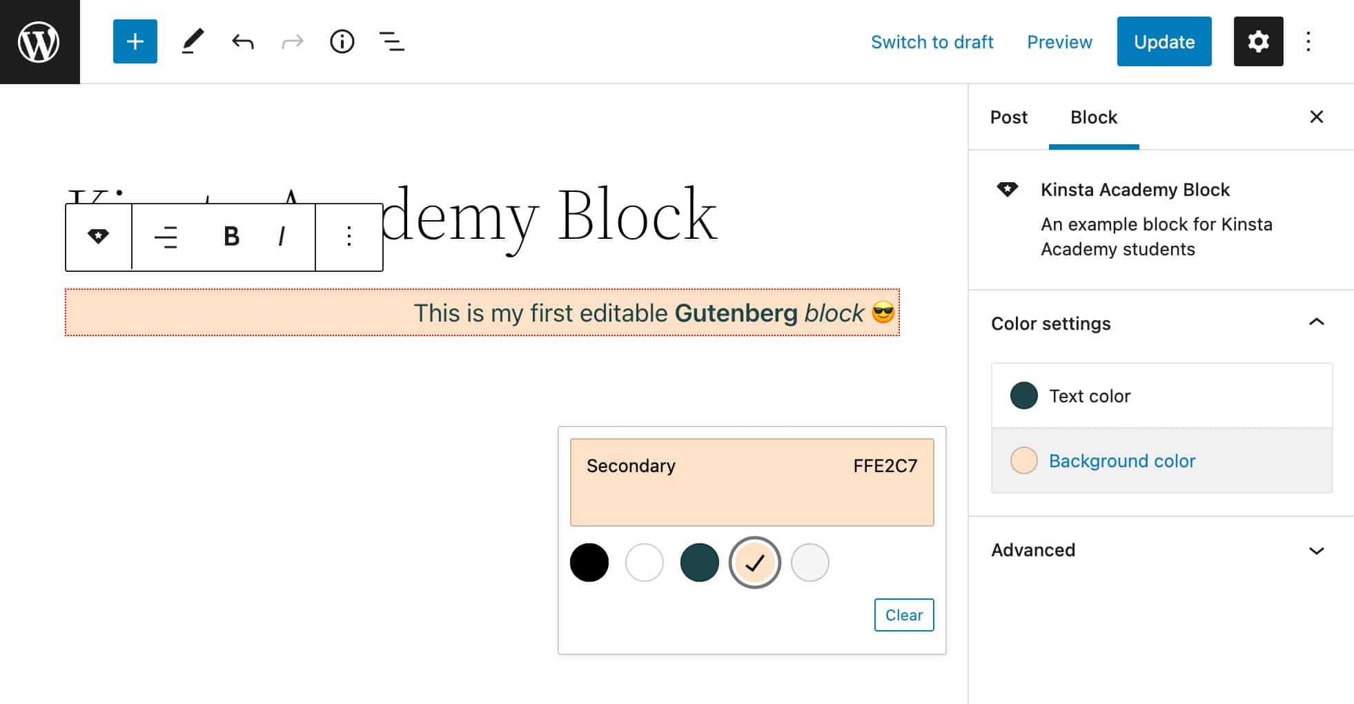
You can add several controls to allow users to customize specific aspects of the block. For example, you can provide a color control panel. To do so, you will need to import the InspectorControls and PanelColorSettings components from the block-editor module:
import {
	useBlockProps,
	RichText,
	AlignmentControl,
	BlockControls,
	InspectorControls,
	PanelColorSettings
} from '@wordpress/block-editor';
Step 2: Include the Corresponding Elements Into Your JSX code
Now you can add the corresponding elements to the JSX returned by the Edit function:
export default function Edit( { attributes, setAttributes } ) {
	const blockProps = useBlockProps();

	const { content, align, backgroundColor, textColor } = attributes;

	const onChangeContent = ( newContent ) => {
		setAttributes( { content: newContent } )
	}
	const onChangeAlign = ( newAlign ) => {
		setAttributes( {
			align: newAlign === undefined ? 'none' : newAlign,
		} )
	}
	return (
		<>
			<InspectorControls>
				<PanelColorSettings
					title={ __( 'Color settings', 'ka-example-block' ) }
					initialOpen={ false }
					colorSettings={ [
						{
						  value: textColor,
						  onChange: onChangeTextColor,
						  label: __( 'Text color', 'ka-example-block' )
						},
						{
						  value: backgroundColor,
						  onChange: onChangeBackgroundColor,
						  label: __( 'Background color', 'ka-example-block' )
						}
					] }
				/>
			</InspectorControls>
			<BlockControls>
				<AlignmentControl
					value={ align }
					onChange={ onChangeAlign }
				/>
			</BlockControls>
			<RichText
				{ ...blockProps }
				tagName="p"
				onChange={ onChangeContent }
				allowedFormats={ [ 'core/bold', 'core/italic' ] }
				value={ content }
				placeholder={ __( 'Write your text...' ) }
				style={ { textAlign: align, backgroundColor: backgroundColor, color: textColor } }
			/>
		</>
	);
}
Note that we have also updated the style attribute of the RichText element:
<RichText
	 { ...blockProps }
	 tagName="p"
	 onChange={ onChangeContent }
	 allowedFormats={ [ 'core/bold', 'core/italic' ] }
	 value={ content }
	 placeholder={ __( 'Write your text...' ) }
	 style={ { textAlign: align, backgroundColor: backgroundColor, color: textColor } }
/>
Step 3: Define the Necessary Attributes in block.json
Now define the backgroundColor and textColor attributes in the block.json file:
"attributes": {
	"content": {
		"type": "string",
		"source": "html",
		"selector": "p"
	},
	"align": {
		"type": "string",
		"default": "none"
	},
	"backgroundColor": {
		"type": "string"
	},
	"textColor": {
		"type": "string"
	}
},
Step 4: Define the Event Handlers
Now you need to define two functions to update backgroundColor and textColor on user input:
const onChangeBackgroundColor = ( newBackgroundColor ) => {
	setAttributes( { backgroundColor: newBackgroundColor } )
}

const onChangeTextColor = ( newTextColor ) => {
	setAttributes( { textColor: newTextColor } )
}
Step 5: Save Data
One last step: Open the save.js file and change the script as follows:
export default function save( { attributes } ) {
	const blockProps = useBlockProps.save();
	const { content, align, backgroundColor, textColor } = attributes;
	return (
		<RichText.Content
			{ ...blockProps }
			tagName="p"
			value={ content }
			style={ { textAlign: align, backgroundColor: backgroundColor, color: textColor } }
		/>
	);
}
Save the file and check the block in the editor. You may find an unwelcome surprise: an error message letting you know that the block contains unexpected or invalid content.

This happens because the save.js file is changed and the code saved in the database does not match the code used in the editor.
To fix this, refresh the page, delete any instance of your block and add it again to your post:
Make your changes, save the post, and view it on the front end. Now the changes you made in the block editor should be reflected on the front site.

Adding and Customizing an External Link
In this section, you’ll add new components to your block type:
- An
ExternalLinkcomponent allowing users to add a customizable link to your custom block - Several sidebar controls allowing users to customize link settings
Step 1. Import Components from @wordpress/components
Now you need to import several components from @wordpress/components. Open your edit.js file and add the following import statement:
import {
	TextControl,
	PanelBody,
	PanelRow,
	ToggleControl,
	ExternalLink
} from '@wordpress/components';PanelBodyadds a collapsible container to the Settings Sidebar.PaneRowproduces a generic container for sidebar controls.TextControlprovides a text input control.ToggleControlprovides a toggle enabling users to enable/disable a specific optionExternalLinkis a simple component to add an external link.
Step 2. Include the Corresponding Elements Into Your JSX Code
You will first add the ExternalLink element at the same level as RichText in a div container:
<div { ...blockProps }>
	<RichText
		...
	/>
	<ExternalLink
		href={ kaLink }
		className="ka-button"
		rel={ hasLinkNofollow ? "nofollow" : "" }
	>
			{ linkLabel }
	</ExternalLink>

</div>
The ExternalLink component is not documented, so we referred to the component itself to get the list of available attributes. Here we’re using href, className, and rel attributes.
By default, the rel attribute value is set to noopener noreferrer. Our code will add the nofollow keyword to the rel attribute of the resulting a tag when the toggle control is on.
Now you can add link settings to the block sidebar.
First, you’ll add a PanelBody element inside InspectorControls at the same level as PanelColorSettings:
<InspectorControls>
	<PanelColorSettings
	...
	/>
	<PanelBody
		title={ __( 'Link Settings' )}
		initialOpen={true}
	>
	...
	</PanelBody>
</InspectorControls>
Here’s what we’re doing with this:
- The
titleattribute provides the panel title. initialOpensets whether or not the panel is initially open.
Next, we’ll add two PanelRow elements inside PanelBody, and a TextControl element inside each PanelRow:
<PanelBody
	title={ __( 'Link Settings', 'ka-example-block' )}
	initialOpen={true}
>
	<PanelRow>
		<fieldset>
			<TextControl
				label={__( 'KA link', 'ka-example-block' )}
				value={ kaLink }
				onChange={ onChangeKaLink }
				help={ __( 'Add your Academy link', 'ka-example-block' )}
			/>
		</fieldset>
	</PanelRow>
	<PanelRow>
		<fieldset>
			<TextControl
				label={__( 'Link label', 'ka-example-block' )}
				value={ linkLabel }
				onChange={ onChangeLinkLabel }
				help={ __( 'Add link label', 'ka-example-block' )}
			/>
		</fieldset>
	</PanelRow>
</PanelBody>
The code above should now look pretty straightforward. The two text controls allow users to set link label and URL.
We’ll also add an additional PanelRow with a ToggleControl to switch on/off a specific option, such as whether to include an attribute or not:
<PanelRow>
	<fieldset>
		<ToggleControl
			label="Add rel = nofollow"
			help={
				hasLinkNofollow
					? 'Has rel nofollow.'
					: 'No rel nofollow.'
			}
			checked={ hasLinkNofollow }
			onChange={ toggleNofollow }
		/>
	</fieldset>
</PanelRow>
Step 3: Define the Necessary Attributes in block.json
Now define the kaLink, linkLabel, and hasLinkNofollow attributes in the block.json file:
"kaLink": {
	"type": "string",
	"default": ""
},
"linkLabel": {
	"type": "string",
	"default": "Check it out!"
},
"hasLinkNofollow": {
	"type": "boolean",
	"default": false
}
Nothing more to add here! Let’s move on to defining the event handling functions.
Step 4: Define the Event Handlers
Get back to the edit.js file, add the new attributes to the attributes object, and add the following functions:
const { content, align, backgroundColor, textColor, kaLink, linkLabel, hasLinkNofollow } = attributes;

const onChangeKaLink = ( newKaLink ) => {
	setAttributes( { kaLink: newKaLink === undefined ? '' : newKaLink } )
}

const onChangeLinkLabel = ( newLinkLabel ) => {
	setAttributes( { linkLabel: newLinkLabel === undefined ? '' : newLinkLabel } )
}

const toggleNofollow = () => {
	setAttributes( { hasLinkNofollow: ! hasLinkNofollow } )
}
These functions update the corresponding attribute values on user input.
Step 5: Save Data
Last, we have to update the save function in save.js:
export default function save( { attributes } ) {

	const { content, align, backgroundColor, textColor, kaLink, linkLabel, hasLinkNofollow } = attributes;

	const blockProps = useBlockProps.save( {
		className: `has-text-align-${ align }`
	} );

	return (
		<div
			{ ...blockProps }
			style={ { backgroundColor: backgroundColor } }
		>
			<RichText.Content
				tagName="p"
				value={ content }
				style={ { color: textColor } }
			/>
			<p>
				<a
					href={ kaLink }
					className="ka-button"
					rel={ hasLinkNofollow ? "nofollow" : "noopener noreferrer" }
				>
					{ linkLabel }
				</a>
			</p>
		</div>
	);
}
Note that here we have used a regular a element instead of ExternalLink.
You can see the result in the image below.

Adding Multiple Block Styles
In a previous section, you learned how to add a block toolbar control allowing users to align the user input. We can add more style controls to the block toolbar, but we can also provide a set of predefined block styles the user can choose from with a single click.
For this purpose, we’re going to use a useful feature of the Block API: Block Styles.
All you need to do is define the block.json styles property and declare the corresponding styles in your stylesheets.
For example, you can add the following array of styles:
"styles": [
	{
		"name": "default",
		"label": "Default",
		"isDefault": true
	},
	{
		"name": "border",
		"label": "Border"
	}
],
With this, you’ve just added a default style and an additional style called border. Now go back to the block editor:
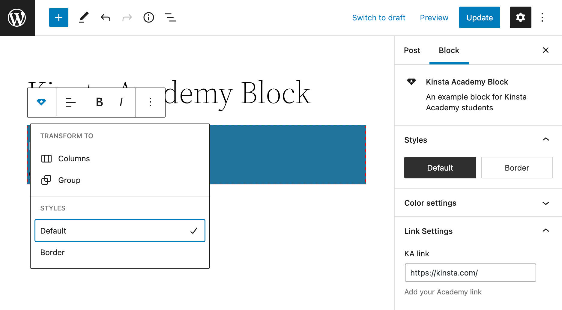
The styles will be available to the user by clicking on the block switcher and then looking for the Styles panel in the Block Settings Sidebar.
Select a style and check the classes applied to the p element. Right-click on the block and Inspect. A new class has been added with a name structured as follows:
is-style-{style-name}If you checked the “Border” style, then an is-style-border class will be added to the p element. If you checked the “Default” style, then an is-style-default class will be added instead.
Now you only have to declare the CSS properties. Open the editor.scss file and replace the current styles with the following:
s">.wp-block-ka-example-block-ka-example-block {
    padding: 4px;
}
Now you can do the same with style.scss. As we mentioned above, styles defined in style.scss are applied both on the front end and in the editor:
s">.wp-block-ka-example-block-ka-example-block {
	&.is-style-default{
		border: 0;
        background-color: #FFE2C7;
	}
	&.is-style-border{
		border: 2px solid #000;
        border-radius: 16px;
        background-color: #F6F6F6;
	}
}
And that’s it! Refresh the page, and have fun with your new block styles:

Nesting Gutenberg Blocks With the InnerBlocks Component
Although fully functional, our custom block is still not very appealing. To make it more engaging for the audience, we could add an image.
This may add a layer of complexity to our block, but fortunately, you don’t need to reinvent the wheel because Gutenberg provides a specific component you can use to create a structure of nested blocks.
The InnerBlocks component is defined as follows:
InnerBlocksexports a pair of components which can be used in block implementations to enable nested block content.
First, you’ll need to create a new .js file in the src folder. In our example, we’ll call this file container.js.
Now you’ll need to import the new resource into the index.js file:
import './container';Go back to container.js and import the necessary components:
import { registerBlockType } from "@wordpress/blocks";
import { __ } from "@wordpress/i18n";
import {
	useBlockProps,
	InnerBlocks
} from "@wordpress/block-editor";
The next step is defining a template providing the structure inside which the blocks will be placed. In the following example, we define a template consisting of two columns containing a core Image block and our custom block:
const TEMPLATE = [ [ 'core/columns', { backgroundColor: 'yellow', verticalAlignment: 'center' }, [
	[ 'core/column', { templateLock: 'all' }, [
		[ 'core/image' ],
	] ],
	[ 'core/column', { templateLock: 'all' }, [
		[ 'ka-example-block/ka-example-block', { placeholder: 'Enter side content...' } ],
	] ],
] ] ];
The template is structured as an array of blockTypes (block name and optional attributes).
In the code above, we used several attributes to configure the Columns and Column blocks. Specifically, the templateLock: 'all' attribute locks Column blocks so that the user won’t add, reorder or delete existing blocks. templateLock can take one of the following values:
all—InnerBlocksis locked, and no blocks can be added, reordered, or removed.insert— Blocks can only be reordered or removed.false— The template is not locked.
The template is then assigned to the InnerBlocks element:
<InnerBlocks
	template={ TEMPLATE }
	templateLock="all"
/>
To prevent any compatibility issue, we also added a templateLock attribute to the InnerBlocks component (see also issue #17262 and pull #26128).
Here is our final container.js file:
registerBlockType('ka-example-block/ka-example-container-block', {
	title: __( 'KA Container block', 'ka-example-block' ),
	category: 'design',

	edit( { className } ) {

		return(
			<div className={ className }>
				<InnerBlocks
					template={ TEMPLATE }
					templateLock="all"
				/>
			</div>
		)
	},

	save() {
		const blockProps = useBlockProps.save();
		return(
			<div { ...blockProps }>
				<InnerBlocks.Content />
			</div>
		)
	},
});
Additional Improvements
Our block is fully functional, but we could improve it a bit with some small changes.
We assigned the backgroundColor attribute to the paragraph generated by the RichText component. However, we may prefer to assign the background color to the container div:
So, change the edit.js file and save.js divs as follows:
<div
	{ ...blockProps }
	style={ { backgroundColor: backgroundColor } }
>
...
</div>
This will allow the user to change the background of the entire block.
On the other hand, a more relevant change involves the useBlockProps method. In the original code, we defined the constant blockProps as follows:
const blockProps = useBlockProps();But we can use the useBlockProps more effectively passing a set of properties. For example, we can import classnames from the classnames module and set the wrapper class name accordingly.
In the following example, we assign a class name based on the value of the align attribute (edit.js).s
import classnames from 'classnames';

...

export default function Edit( { attributes, setAttributes } ) {
	...

	const onChangeAlign = ( newAlign ) => {
		setAttributes( {
			align: newAlign === undefined ? 'none' : newAlign,
		} )
	}

	const blockProps = useBlockProps( {
		className: `has-text-align-${ align }`
	} );
	...
}
We’ll do the same change in the save.js file:
import classnames from 'classnames';

...

export default function save( { attributes } ) {
	...
	const { content, align, backgroundColor, textColor, kaLink, linkLabel, hasLinkNofollow } = attributes;

	const blockProps = useBlockProps.save( {
		className: `has-text-align-${ align }`
	} );
	...
}
And that’s a wrap! You can now run the build for production:
npm run buildSummary
And here we are, at the end of this incredible journey! We started with the configuration of the development environment and ended up creating a complete block type.
As we mentioned in the introduction, a solid knowledge of Node.js, Webpack, Babel, and React is essential for creating advanced Gutenberg blocks and positioning yourself in the market as a professional Gutenberg developer.
But you don’t need to have established React experience to start having fun with block development, though. Block development could give you motivation and goals to gain increasingly broad skills in the technologies behind Gutenberg blocks.
This guide, therefore, is far from being complete. It’s merely an introduction to a wide variety of topics that will help you get started building your very first Gutenberg blocks.
For this reason, we recommend you deepen your knowledge by carefully reading online documentation and guides. Among the many resources available out there, we recommend the following:
- Official Create a Block Tutorial for beginners
- Official Block Tutorial for intermediate developers
- Dynamic Blocks
- How to Create Dynamic Blocks for Gutenberg
- Meta Boxes
- Creating a Sidebar for Your Plugin
If you’re just starting with WordPress development, you may want to understand the basic concepts of frontend development. Here is a quick list of resources that may help you get started:
- How to Install WordPress Locally (free ebook)
- The Real Value of Managed WordPress Hosting (free ebook)
- What Is JavaScript?
- HTML vs HTML5
- How to Edit CSS in WordPress
- What Is PHP?
- The WordPress Hooks Bootcamp: How to Use Actions, Filters, and Custom Hooks
And remember that the complete code of the examples of this guide is available on Gist.
Now it’s your turn: Have you developed any Gutenberg blocks? What are the main difficulties you have experienced so far? Let us know about your experience in the comments!

Carlo is a passionate lover of webdesign and front-end development. He has been playing with WordPress for more than 20 years, also in collaboration with Italian and European universities and educational institutions. He has written hundreds of articles and guides about WordPress, published both on Italian and international websites, as well as on printed magazines. You can find him on LinkedIn.

