Looking for newsletter examples to help you master the power of email?
Email marketing isn’t something you can afford to ignore in 2026 — email subscribers are up to 19 times more likely to become paid customers than visitors from organic search.
And it makes sense, right? After all, they’re returning, interested, potential buyers, not just random visitors.
But if you want to harness that power, you need to create a newsletter worth reading every week. Only with the right newsletter content, design, and delivery can you create a newsletter that attracts an audience and drives sales.
In this post, we’ll cover 19 newsletter examples in different categories that accomplish exactly that and explain, in detail, why they work so well.
Key Elements of a Good Newsletter
There’s no single formula for the perfect newsletter.
You have to consider your target audience, industry, and what’s worked well for you in the past.
But there are some elements that great email newsletters usually have in common. They include:
- A logo
- Clear CTAs
- A compelling, relevant subject line
- Great featured images
We’ll go through each of them, starting with the logo.
Start With the Logo (Branding Is Crucial)
You put a lot of work and thought into your newsletter, and you want every subscriber to associate it with your brand and company.
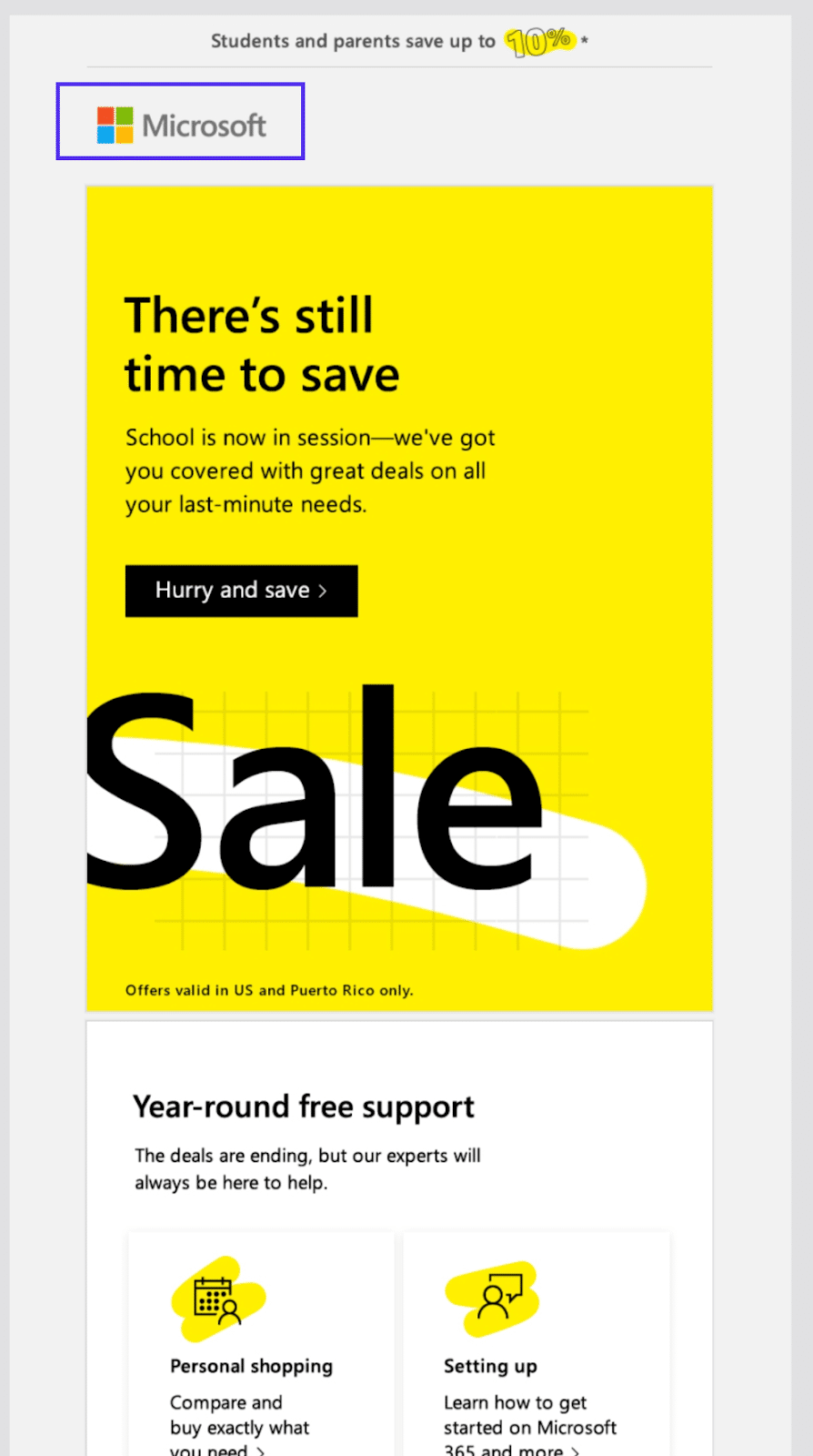
Big brands like Microsoft or Apple understand that every interaction with a potential customer is an opportunity for branding their company, and they don’t neglect email communication.
None of these giants shy away from having their logos plastered right at the very top of all their promotional emails.
There are other ways you can brand your email newsletters, like using brand colors and writing in a consistent voice.
Clear CTAs Drive Sales
The return on investment (ROI) of email marketing is a whopping $42, according to the latest email marketing statistics. But that’s only if you can use your emails to build relationships and drive sales.
A call to action (CTA) is what turns an email recipient from a passive reader into someone who takes action, like buying your product.
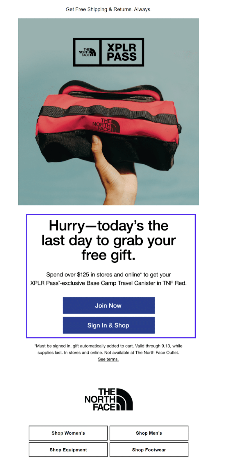
These are crucial, mainly if the goal of an email is to promote a product or service rather than build the relationship further.
Relevant, Compelling Subject Lines (and Subject Matter)
Every subject line (and the newsletter’s subject) should be compelling to the audience that signed up to receive it.
But that means something very different for someone who signed up to receive a 20% off coupon for an ecommerce site compared to someone who signed up for an informational newsletter on the state of the SaaS industry.
So keep your audience in mind when crafting both subjects and subject lines. What benefit were they looking for when they first signed up for your newsletter?
If you have a wide variety of subscribers who signed up for various reasons, you should segment these audiences if you want to maximize engagement.
For example, you can categorize your subscribers based on which landing pages they signed up through. This can be an easy way to deliver more relevant emails to each individual.
List segmentation is just one of many great recommendations for email marketing best practices.
Professional Featured Images (or GIFs) Boost Engagement
Trying to grab a reader’s attention with text alone can be challenging. The best newsletters know how to use featured images (or even GIFs) to draw you in.
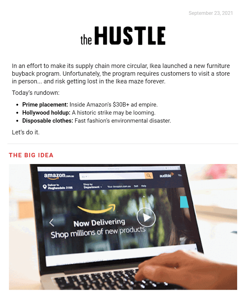
Email marketing software, like Mailchimp or other popular alternatives, can be beneficial when creating newsletter campaigns. There are a lot of great options to choose from.
5 Product Update Newsletter Examples That Grab Your Attention
Letting customers know about a new product, feature, or upcoming event is an essential use of email newsletters.
A successful product update newsletter grabs the readers’ attention and explains why they should care about the latest product release.
Here are five we love.
1. Samsung
Samsung recently released its Samsung Z Flip3 and Fold3 foldable phones. This newsletter announces the new products and offers a few special deals.

Why It Made the Cut
The newsletter grabs your attention with a high-quality image and large, catchy headline. Each section has a clear CTA.
While the newsletter has several sections, it puts the most critical content and the main CTA button (the product announcement and “Buy Now” button) above the fold.
2. Starbucks
Starbucks fans eagerly await the arrival of the Pumpkin Spice Latte and other fall drinks every year. This newsletter lets subscribers know the time has come.

Why It Made the Cut
This email engages the reader by giving them a choice. Instead of just providing the information, it asks them to think: summer or fall?
The newsletter also has a fun layout with pop colors, and the Starbucks label is clear to see at the top.
3. Kinsta
Hey, that’s us!
Our latest email newsletter leads by announcing the launch of our Selective Push feature and then provides a curated selection of our blog and video content.
We’ll show you some more examples of content promotion email newsletters in a bit.

Why It Made the Cut
The Kinsta branding doesn’t stop after the logo. The color and style of the email are recognizable to anyone familiar with the brand.
There’s something for everyone in this email. If a reader isn’t interested in the product feature update, they may be drawn to the Kinsta website to learn more about malware or how to send large attachments.
4. Subaru
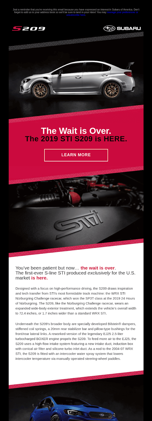
Subaru announced the Subaru STI S209 with this sleek email design. The subject line was, “Wait… how many S209 are being made?”
Why It Made the Cut
First of all, the subject line alone is compelling. What’s the answer? Is it a small number? Should you hurry if you want to buy an S209?
The newsletter design has a polished, high-tech look and uses high-quality photographs. The email copy enforces the idea that you should act quickly to get this exclusive product.
5. Lenovo
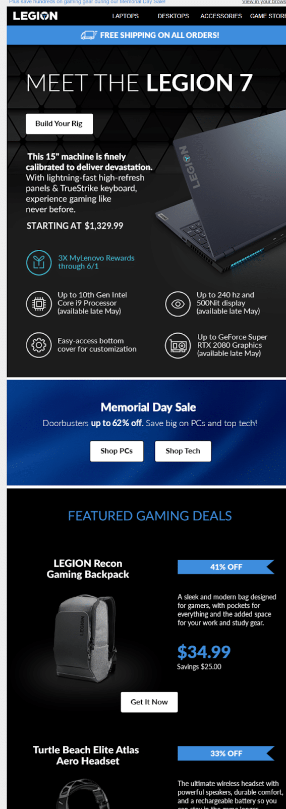
Like the Subaru email above, Lenovo chose bold color against a black background to announce the Legion 7.
Why It Made the Cut
It’s an attractive, modern email design with good images.
The email features several other products, but the Legion 7 specs, free shipping offer, and CTA are all near the top. “Build Your Rig” is a neat CTA that will appeal to readers that like customizing their laptops.
6 Ecommerce Newsletter Examples That Drive Sales
If you’re sending emails to promote your ecommerce business, competition is stiff. Your subscribers get a heap of ecommerce emails each day urging them to buy this or that.
You have to stand out from the crowd.
The following six email newsletters on our list show you how to create a compelling ecommerce email newsletter.
1. Warby Parker
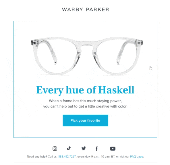
This email newsletter from Warby Parker is a lesson in email marketing minimalism. You don’t need five pages of long-form copy to sell a consumer product.
With the right visuals, you can let the product speak for itself.
Why It Made the Cut
Warby Parker understands that looks are important when making a purchasing decision about glasses.
That’s why it jumps at every opportunity to feature the designs the company is most confident about in its marketing emails.
The company also makes full use of GIFs to either showcase a whole line of different products, or like here, showcase a single frame in every possible color.
2. Fleur and Bee
Fleur and Bee is a skincare company committed to making natural, ethical products. To Fleur and Bee and its customers, being vegan, cruelty-free, and environmentally friendly is vital to having conscious, glowing skin.

Why It Made the Cut
With this email, Fleur and Bee stay true to the brand. The attractive main image creates the impression that the product shown is made of simple, natural ingredients, and the copy emphasizes the company’s values.
A promo code over the CTA is always an excellent way to invite a few more clicks.
3. Tattly
Tattly sells temporary tattoos — but not the ones you remember from childhood. Tattly tattoos are designed by professional artists who get a cut of every sale.
This email newsletter announced the final day of Tattly’s “Laboryay” sale.

Why It Made the Cut
This email does a great job of creating urgency. You can’t miss the fact that it’s the LAST DAY to get your Tattly.
The bright colors grab your attention, and the artistic photos are on-brand for a company focused on high-quality wearable art.
4. Peloton
Peloton has a remarkably consistent brand look and feel, and this email newsletter is no exception.
Like Subaru and Lenovo — other brands looking to convey that their product is sophisticated, powerful, and high tech — Peloton has gone with a black background and high-contrast text.

Why It Made the Cut
Peloton draws you in with the promise that you’re saving big money on this bike.
Not only is the slashed price the first thing you see, but the membership price with $0 down and $0 APR are also emphasized in large font.
The email then creates a sense of urgency by telling you that delivery appointments are filling up fast. The whole newsletter design is beautiful with appealing aspirational photos.
5. Brooks Running
It’s hard to make a picture of shoes look interesting, but Brooks does it.
This email advertises running shoes and sports bras and offers some helpful tools.

Why It Made the Cut
The image is more than a picture of the product. It’s intriguing and artistic. The colors add to the appeal and go along with the glossy look of the shoes.
This email doesn’t just show you products. It offers an online shoe finder and bra finder to help you find the right fit.
If these valuable tools don’t convince you to check out the Brooks website, maybe you’ll give the company a call to get extra tips from a guru, as advertised at the bottom of the email.
6. TUSHY
Do you know what a TUSHY Travel is?
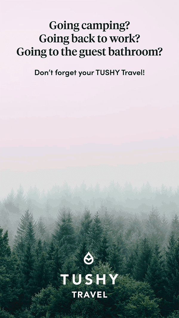
This email doesn’t tell you. But it does have a great GIF of the product dancing across the screen. And if you still don’t get it, you’re going to want to click and find out.
Why It Made the Cut
The text of this email is just 18 words (not including the clever unsubscribe prompt at the bottom), but it’s very effective.
The reader can’t help but watch the animation of the bright pink portable bidet. For subscribers not familiar with the product, it’s sure to attract interest. For those who already know about TUSHY, the fun email makes the company more memorable.
5 Newsletter Examples That Promote Content
Email newsletters can be a great way to share your content. Some email newsletters also curate content from around the web to share with readers.
The important thing is to keep your audience in mind. What are they interested in reading? Why will subscribing to your company newsletter be valuable to them?
These five email newsletters provide relevant, valuable information to their target readers.
1. Dwell
Dwell is a magazine and online hub for home design enthusiasts and professionals. This recent newsletter from Dwell presents shopping guides, featured products, and top articles from the website.

Why It Made the Cut
Social proof gets clicks. People are interested in what’s popular and well-liked by others.
That’s why Dwell made an excellent choice when it kicked off this newsletter with “The Top 15 Products Dwell Readers Bought in September.”
The ranked list of top Dwell articles in September and October has the same effect. Other people like these articles, so you should read them too.
Plus, the email is well-designed with quality photos.
2. Moz
The Moz Top 10 isn’t as flashy as some of the email newsletters on this list, but it gives the people what they want — the most valuable SEO and marketing tips on the internet.
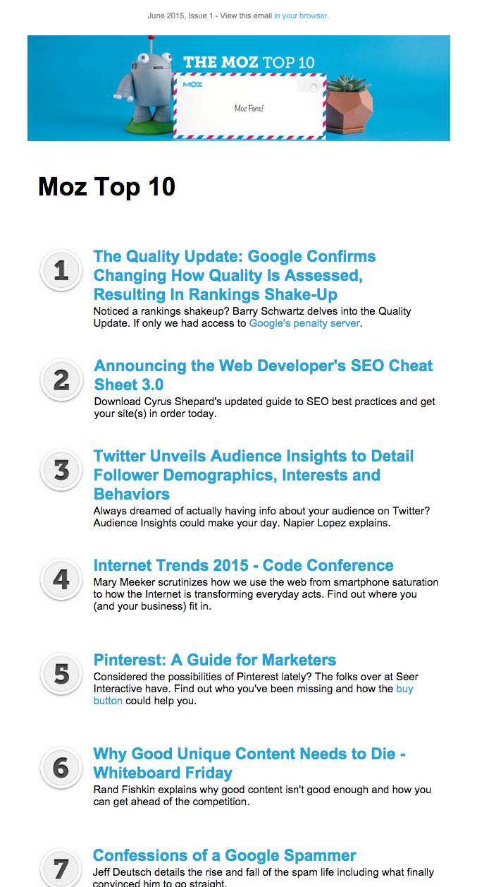
This email design is simple and straightforward. If you’re interested in SEO and online marketing, you’re sure to find something worth clicking. Every link is relevant and valuable to the typical Moz reader.
Moz proves that bells and whistles don’t always make an email better.
3. ASPCA
The American Society for the Prevention of Cruelty to Animals is a nonprofit organization working for animal welfare since 1866.
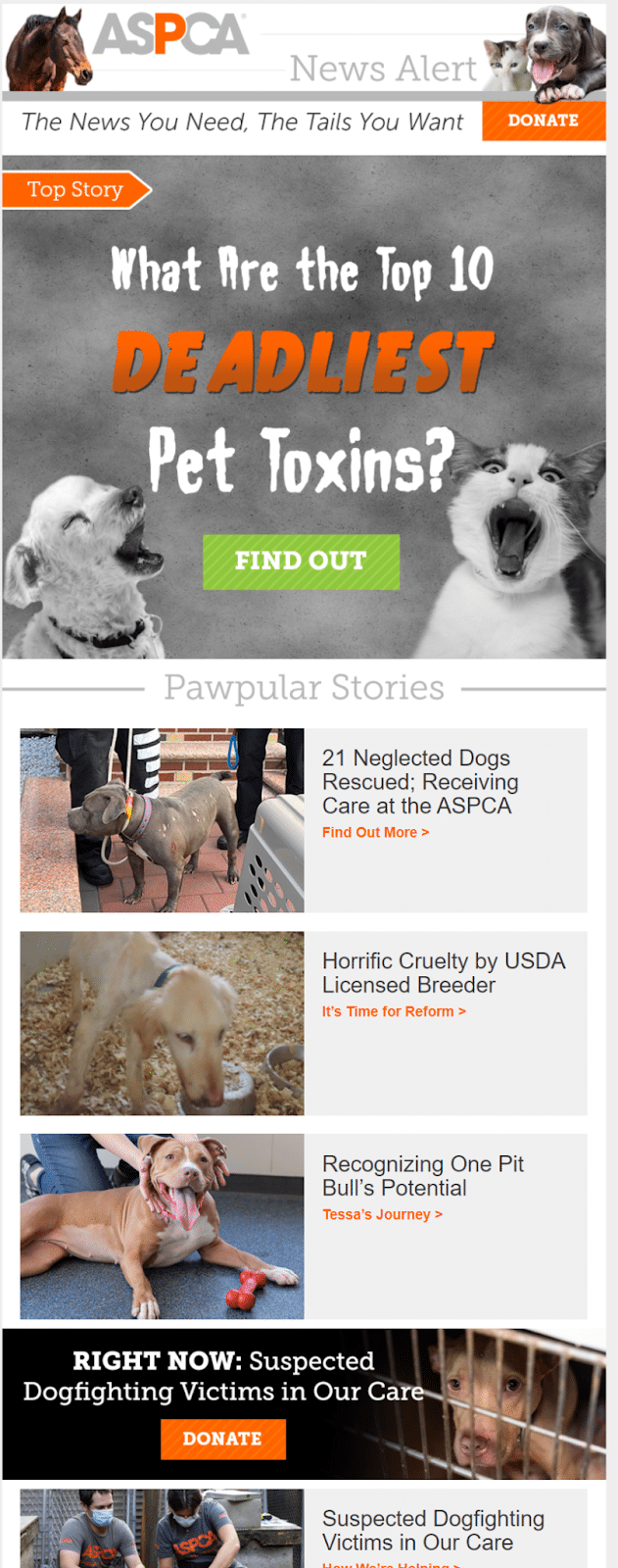
The topic is serious, but this Halloween-themed email newsletter is fun.
Why It Made the Cut
We know this newsletter’s subscribers are animal lovers, so the cute lead image is a good start. Readers are also sure to smile at phrases like “pawpular” and “the tails you want.”
The ASPCA is a nonprofit, so asking for donations is always essential. The donation button on this email is at the very top in bold orange. The CTA to read the first blog post is also noticeable and above the fold. The newsletter provides a variety of content and a special offer.
This email newsletter has a clean layout and matches the ASPCA’s brand colors.
4. National Geographic
National Geographic is known for its breathtaking photos, and this email newsletter lives up to the standard.
It also asks a question designed to make you pause and think: planet or plastic?

Why It Made the Cut
It’s a beautiful email from top to bottom. The image, which at first looks like an iceberg but is a floating plastic bag, invites readers to take more than a glance.
The newsletter content is focused on a single theme and makes a strong case for clicking the CTA: it might help save the planet.
The email’s final section asks subscribers to engage with National Geographic’s social media.
5. The Daily Skimm
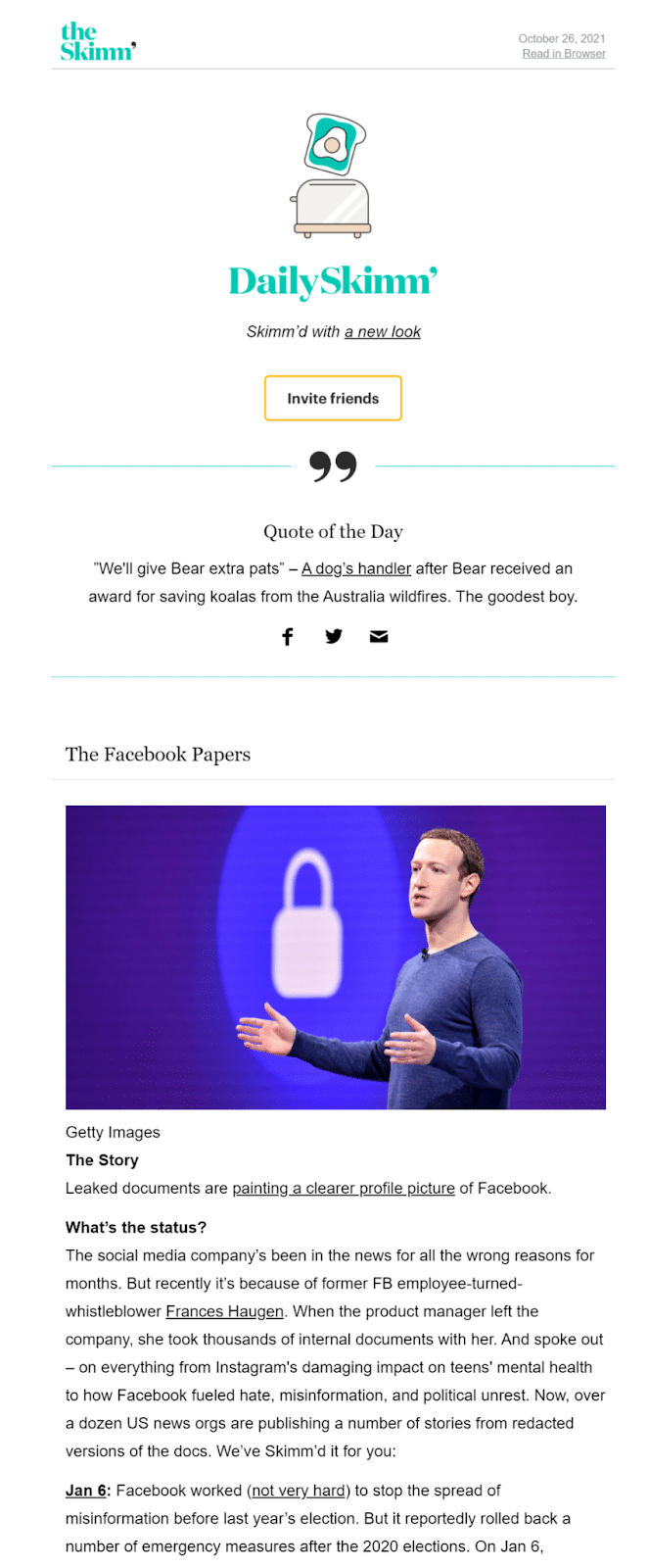
The Daily Skimm is a daily digest of news stories explained in a simple, readable, and sometimes humorous way.
Why It Made the Cut
The Daily Skimm has a consistent and recognizable brand voice.
Each Daily Skimm covers quite a few news stories, but it’s not too much for a single email because the text is broken into manageable pieces with clever headlines.
Where to Find Further Inspiration — Without Signing Up for Hundreds of Newsletters
If you don’t want to go through the trouble of setting up a throwaway email account and signing up for hundreds of newsletters, we’ve got a juicy insider tip for you that will help you get access to newsletters from thousands of brands without the hassle.
Milled is a search engine for email newsletters. You can type in the brand name (or category) and explore newsletters in various industries, languages, and countries.
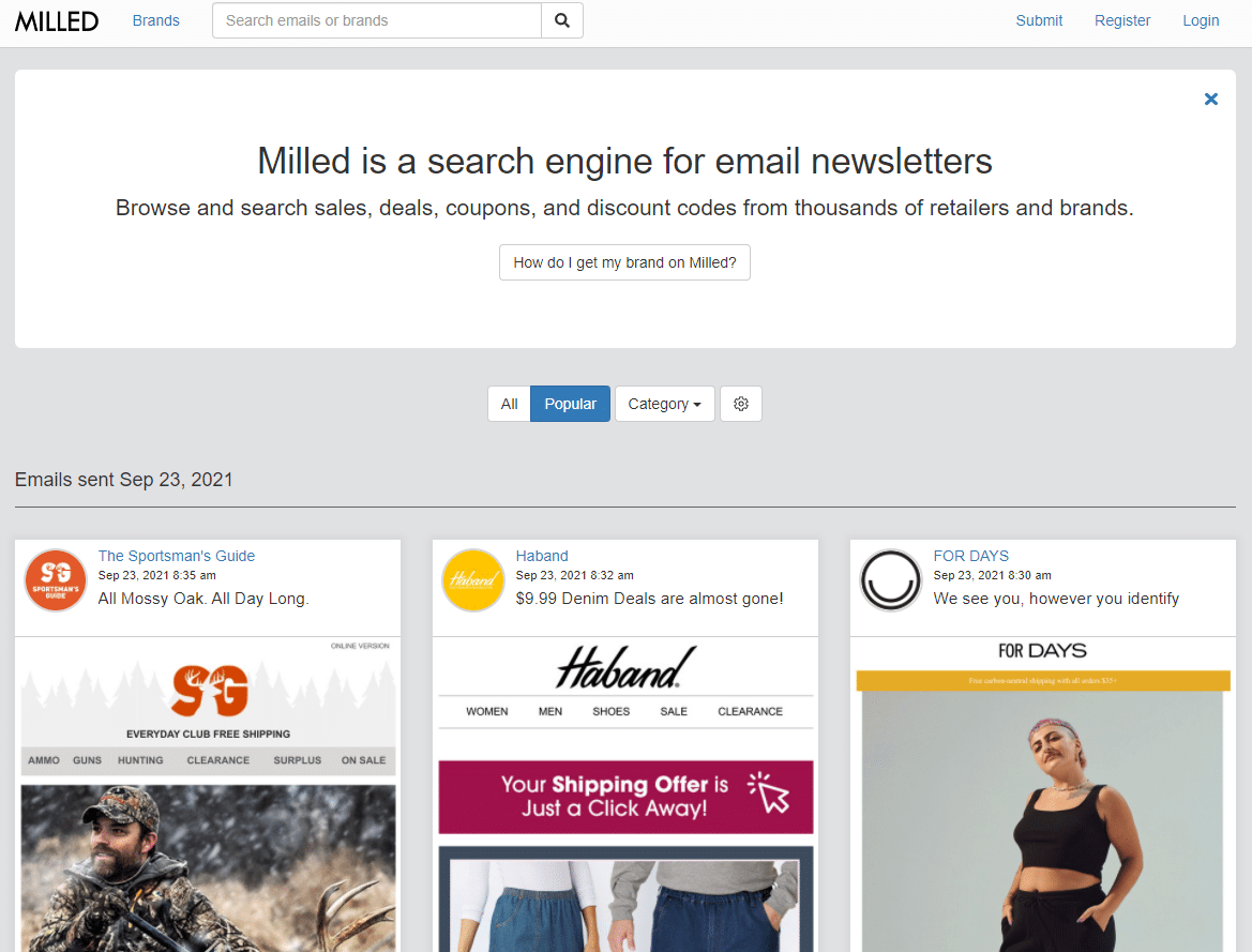
You may even be able to find direct competitors (although ideally, you should be subscribed to their newsletters already).
Really Good Emails is another email database. The site doesn’t include just any old marketing emails. They’re all (you guessed it) really good emails.
It’s a great place to find newsletter ideas for your brand.
Summary
Whether you’re trying to sell a tech gadget or build your profile as a professional consultant, many of the same elements are required for creating a successful newsletter.
Explore what your competitors are doing, follow good design practices, include essential newsletter elements, and never forget who your target audience is.
Use their language, speak to their problems, and offer them the solutions they need. An email newsletter isn’t just something you should throw together.
Newsletters are an invaluable marketing channel that you can use to build your brand and business. Learn from these newsletter examples, and create something even better for your audience.

