
Since the introduction of web fonts in 2009, web designers have enjoyed a rich set of typographical palettes. These fonts were largely used through the CSS @fontface at-rule, giving designers a way to break free from web-safe (system) fonts.
A variety of font file formats were (and are) available from large font foundries, most notably Google Fonts.
At that time, using web fonts meant working with separate files for each weight and style. For example, filenames like the following made it clear how the font would display in use:
Roboto-Italic.woff2
Lato-BoldItalic.woff2
OpenSans-SemiBold.ttf
WorkSans-ExtraBold.ttf
Each variation had to be loaded as its own file. This increased page weight, required more HTTP requests, and added complexity when choosing and applying fonts in a design.
The rise of variable fonts
In 2016, a major breakthrough in digital typography arrived: variable fonts. Developed collaboratively by Google, Apple, Adobe, and Microsoft, they quickly moved into the mainstream.
The distinguishing feature of a variable font is that it can contain any of the following, each of which is known as an axis:
| Axis | CSS Property |
| weight | font-weight |
| style | font-style: italic |
| slant | font-style: oblique |
| stretch | font-stretch |
| Optical Size axis (opsz) | font-variations-setting |
The most widely used file format is .woff2 (Web Open Font Format), a highly compressed format that became a W3C Recommendation in 2018. While formats such as .ttf and .otf can be used as a variable font, the most efficient format is .woff2. All modern browsers support variable fonts.
For clarity here, we’re making a distinction between “web fonts” and “variable fonts.” In practice, though, you’ll often see variable fonts lumped in with web fonts.
Why use variable fonts?
There are three standout reasons to reach for variable fonts in your projects:
- Better Performance: Instead of calling multiple separate font files (Regular, Bold, Italic, etc.), one variable font file can cover them all. That means fewer HTTP requests and faster load times.
- Design Flexibility: Variable fonts give you fine-grained control. For instance, instead of being locked into
font-weight: 500or600, you could set a custom value like532. - Responsive Typography: Because variable fonts can adapt smoothly, you can create typography that responds across devices. A good example: using
font-weight: clamp()to scale weight between viewports, without the abrupt “jumps” you’d get with static font files.
How WordPress uses variable fonts
With the release of WordPress 6.1 in November 2022, variable font support was added to the theme.json system. The first demonstration of this was in the Twenty Twenty-Three theme.
Customizing a theme with variable fonts
When working with a child theme of TT5, we begin by enqueuing both the parent and child theme styles.
To ensure our custom fonts appear consistently in both the editor and on the front end, we also enqueue a fonts.css file that includes the necessary @font-face declarations.
<?php
// enqueue parent and child styles
add_action('wp_enqueue_scripts', function() {
   wp_enqueue_style(
       'parent-style',
       get_template_directory_uri() . '/style.css'
   );

   wp_enqueue_style(
       'child-style',
       get_stylesheet_uri(),
       array('parent-style'),
       wp_get_theme()->get('Version')
   );

   // enqueue custom fonts
   wp_enqueue_style(
       'child-fonts',
       get_stylesheet_directory_uri() . '/fonts.css',
       array(),
       wp_get_theme()->get('Version')
   );
});
As always, how you enqueue scripts depends upon the theme itself. There’s no single standard method.
To make sure we have set up our child theme correctly, we run this test in styles.css:
body { background: #0000ff; }Adding fonts with theme.json
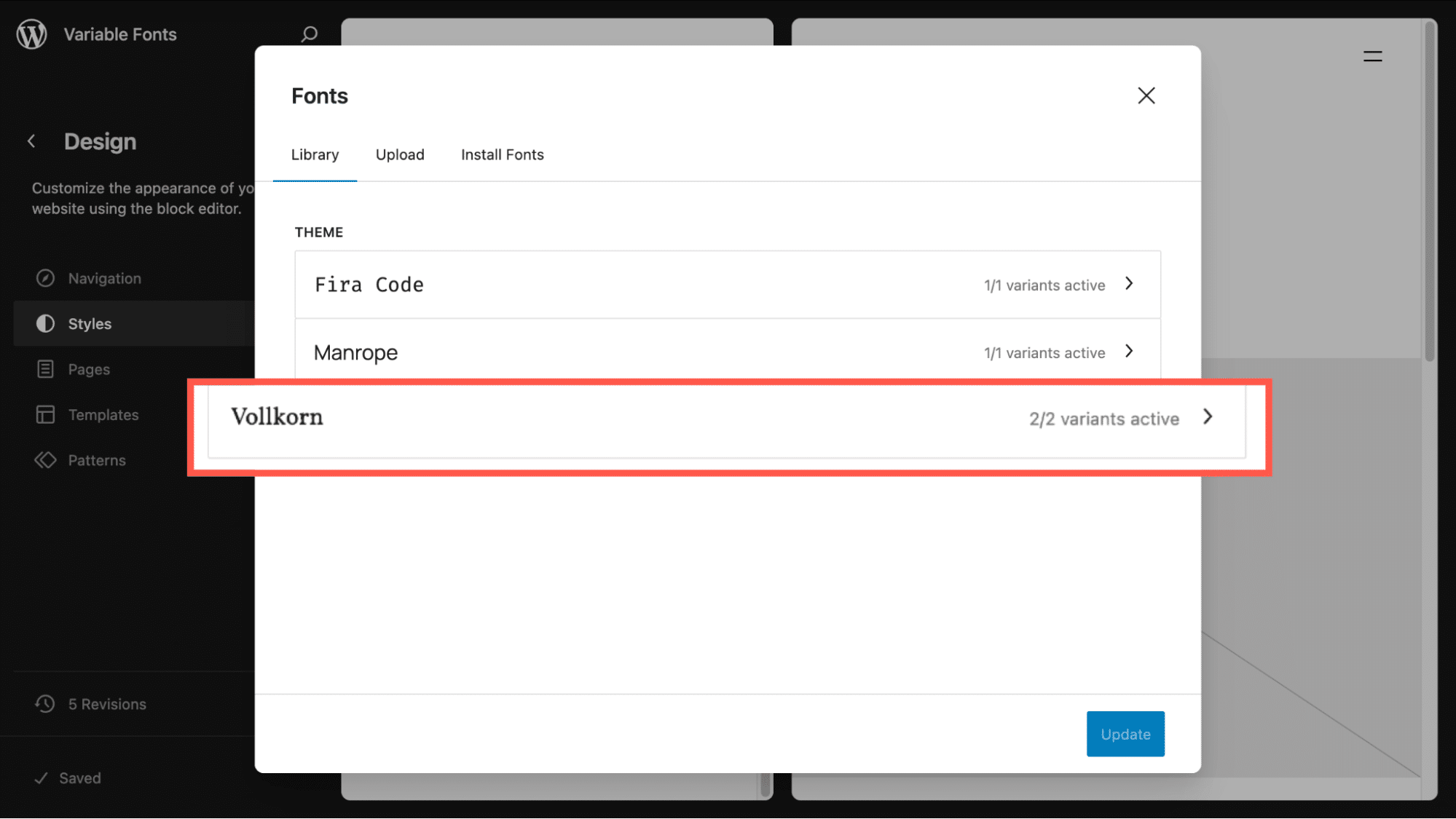
TT5 already includes two variable fonts by default: Manrope and Fira Code. For this example, let’s add Vollkorn and make it the default heading font at weight 600.
Here’s the relevant part of theme.json:
{
  "$schema": "https://schemas.wp.org/wp/6.7/theme.json",
  "version": 3,
  "settings": {
    "appearanceTools": true,
    "typography": {
      "fontFamilies": [
        {
          "name": "Manrope",
          "slug": "manrope",
          "fontFamily": "Manrope, sans-serif",
          "fontFace": [
            {
              "fontFamily": "Manrope",
              "src": ["file:../twentytwentyfive/assets/fonts/manrope/Manrope-VariableFont_wght.woff2"],
              "fontWeight": "200 800",
              "fontStyle": "normal"
            }
          ]
        },
        {
          "name": "Fira Code",
          "slug": "fira-code",
          "fontFamily": "\"Fira Code\", monospace",
          "fontFace": [
            {
              "fontFamily": "\"Fira Code\"",
              "src": ["file:../twentytwentyfive/assets/fonts/fira-code/FiraCode-VariableFont_wght.woff2"],
              "fontWeight": "300 700",
              "fontStyle": "normal"
            }
          ]
        },
        {
          "name": "Vollkorn",
          "slug": "vollkorn",
          "fontFamily": "Vollkorn, serif",
          "fontFace": [
            {
              "fontFamily": "Vollkorn",
              "src": ["file:../twentytwentyfive/assets/fonts/vollkorn/Vollkorn-VariableFont_wght.woff2"],
              "fontWeight": "400 900",
              "fontStyle": "normal"
            },
            {
              "fontFamily": "Vollkorn",
              "src": ["file:../twentytwentyfive/assets/fonts/vollkorn/Vollkorn-Italic-VariableFont_wght.woff2"],
              "fontWeight": "400 900",
              "fontStyle": "italic"
            }
          ]
        }
      ],
      "customFontSize": true,
      "fluid": true
    }
  },
  "styles": {
    "typography": {
      "fontFamily": "var:preset|font-family|manrope"
    },
    "elements": {
      "heading": {
        "typography": {
          "fontFamily": "var:preset|font-family|vollkorn",
          "fontWeight": "600"
        }
      }
    }
  }
}
The result is the appearance of the Vollkorn font across the site.
Several things to note:
- You may wish to copy over the Manrope and Fira Code files to your child in the event that TT5 is updated with new paths to the files.
- It may seem that the code for those fonts is redundant, since they’re already registered by the parent theme. However, declaring them in your child theme is important. This ensures they show up correctly in the Font Library UI and remain available even if the parent theme updates with new file paths or changes.
- We are referencing two different Vollkorn files.
Ensuring fonts load correctly
Sometimes fonts won’t display properly on the front end until you declare them in CSS. Here’s a typical styles.css:
/*
Theme Name: TT5 Child
Template: twentytwentyfive
Version: 1.0
*/

/* Ensure fonts are loaded and applied */
body {
  font-family: 'Manrope', -apple-system, BlinkMacSystemFont, 'Segoe UI', Roboto,
               Oxygen-Sans, Ubuntu, Cantarell, sans-serif;
}

code,
pre {
  font-family: 'Fira Code', 'Courier New', monospace;
}

h1,
h2,
h3,
h4,
h5,
h6 {
  font-family: 'Vollkorn', 'Times New Roman', serif;
}
And in fonts.css, we declare the font files using @font-face. This ensures the browser knows which fonts to load and apply. If you want to truly preload critical fonts (for example, your primary heading font), you can also add a <link rel="preload"> to the site’s <head> via WordPress hooks. For most cases, the @font-face rule with font-display: swap provides a good balance of performance and user experience.
/* Preload critical fonts for better performance */
@font-face {
font-family: 'Manrope';
src: url('../twentytwentyfive/assets/fonts/manrope/Manrope-VariableFont_wght.woff2')
format('woff2');
font-weight: 100 900;
font-style: normal;
font-display: swap;
}
@font-face {
font-family: 'Fira Code';
src: url('../twentytwentyfive/assets/fonts/fira-code/FiraCode-VariableFont_wght.woff2')
format('woff2');
font-weight: 100 900;
font-style: normal;
font-display: swap;
}
@font-face {
font-family: 'Vollkorn';
src: url('../twentytwentyfive/assets/fonts/vollkorn/Vollkorn-VariableFont_wght.woff2')
format('woff2');
font-weight: 100 900;
font-style: normal;
font-display: swap;
}
@font-face {
font-family: 'Vollkorn';
src: url('../twentytwentyfive/assets/fonts/vollkorn/Vollkorn-Italic-VariableFont_wght.woff2')
format('woff2');
font-weight: 100 900;
font-style: italic;
font-display: swap;
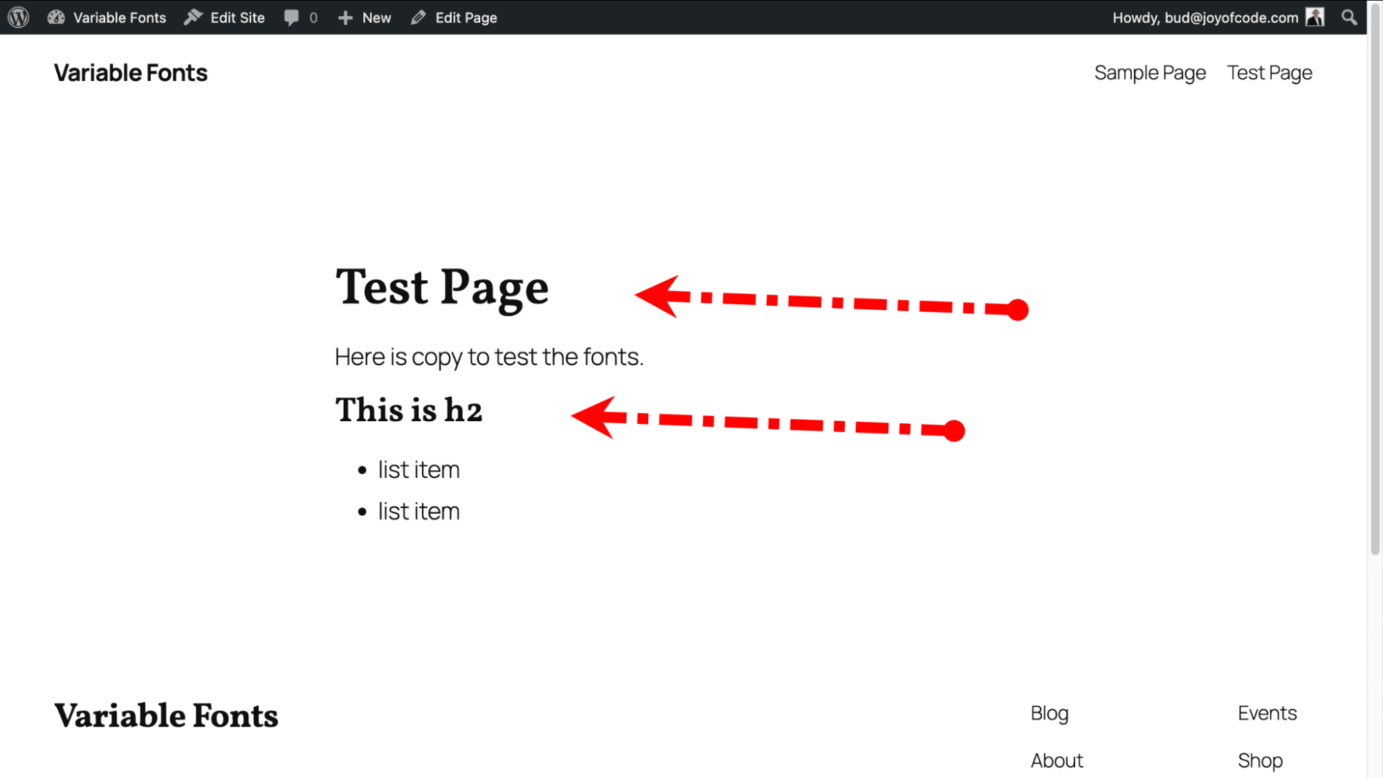
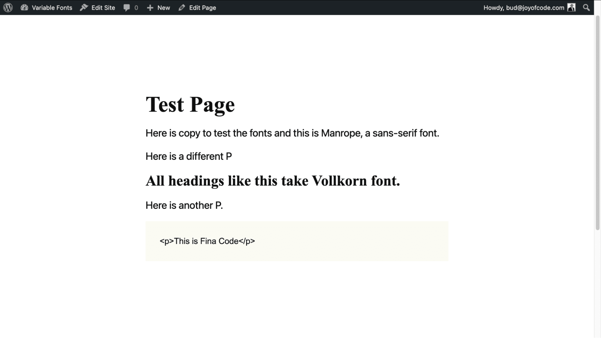
}The result is a page where the headings, by default, are Vollkorn with a font weight of 600.
If you prefer, you can include the @font-face at-rules in styles.css. This would also remove the need to enqueue the fonts.css file.
Making it easy for users to choose font weights
One of the biggest advantages of variable fonts is that weights aren’t limited to fixed steps like 400 or 600. You can use any value between 100–900. The catch is that WordPress doesn’t provide a UI for choosing these custom weights out of the box.
To solve this, we created a minimal plugin called Font Weight Options. It adds a settings page under Appearance > Font Weight, where you can define custom weights for body text, headings, and code blocks.
Here’s a trimmed-down look at the core logic:
<?php
/**
 * Plugin Name: Font Weight Options
 */

class Font_Weight_Options {
    public function __construct() {
        add_action( 'admin_menu', array( $this, 'add_admin_menu' ) );
        add_action( 'wp_head', array( $this, 'apply_font_weights_frontend' ) );
    }

    public function add_admin_menu() {
        add_theme_page(
            __( 'Font Weight Settings', 'font-weight-options' ),
            __( 'Font Weight', 'font-weight-options' ),
            'manage_options',
            'font-weight-settings',
            array( $this, 'render_admin_page' )
        );
    }

    public function apply_font_weights_frontend() {
        $weights = get_option( 'fwo_font_weights', array(
            'body' => 400,
            'headings' => 600,
            'code' => 400,
        ) );

        echo "<style>
            body { font-weight: {$weights['body']} !important; }
            h1, h2, h3, h4, h5, h6 { font-weight: {$weights['headings']} !important; }
            code, pre { font-weight: {$weights['code']} !important; }
        </style>";
    }
}

new Font_Weight_Options();
The snippet above shows the core logic. We’ve published the full source code on GitHub Gist if you’d like to see the complete plugin, including the settings form and validation.
The full version adds:
- Default values on plugin activation
- A simple admin settings form with number fields (100–900)
- Validation to keep values in range
- Output of the weights in both the block editor and the frontend
The result is this new page in our WP Admin, which lets users set font weight values for our three fonts. We chose three “non-standard” values.
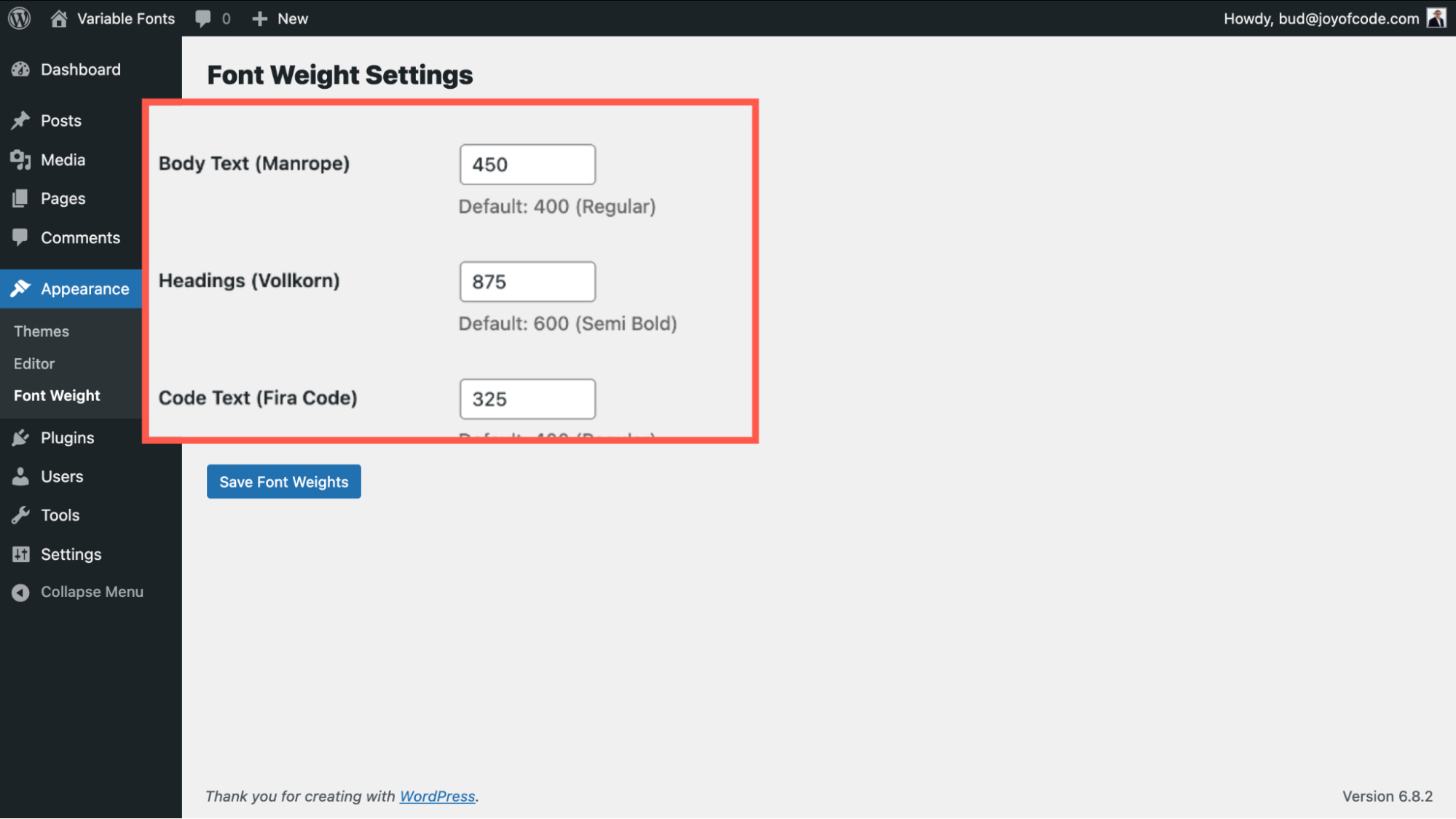
The result is a page with these corresponding font weights that render as anticipated in the page editor and front end.
A kinder, simpler way to add a single variable font
If you found that overwhelming, we have an alternative that is not fully featured but is a quick way to get any type of font into your theme.
Users can easily add Google Fonts via the Font Library. If that’s your preference, have a look at our article on 15 Best Google Fonts by the Numbers (Plus Tips on Using Them), which will help.
But what if you prefer something other than a Google Font? There are many ways to get properly licensed, open source fonts for your projects. We turned to GitHub to get SourceSans3VF-Upright, an Adobe Font.
Our goal is to use this as an optional font that will display correctly in the editor and frontend.
The font file is placed in our child theme’s /assets/fonts folder. From there we created functions.php.
<?php
/**
 * Enqueue parent and child theme styles.
 */
function twentytwentyfive_kinstachild_enqueue_styles() {
    // Parent theme style.
    wp_enqueue_style(
        'twentytwentyfive-style',
        get_parent_theme_file_uri( 'style.css' ),
        array(),
        wp_get_theme()->get( 'Version' )
    );

    // Child theme style.
    wp_enqueue_style(
        'twentytwentyfive-child-style',
        get_stylesheet_uri(),
        array( 'twentytwentyfive-style' ),
        wp_get_theme()->get( 'Version' )
    );
}
add_action( 'wp_enqueue_scripts', 'twentytwentyfive_kinstachild_enqueue_styles' );

/**
 * Enqueue child theme styles in the editor.
 */
add_action( 'after_setup_theme', function() {
    add_editor_style( 'style.css' );
} );As in the prior example, our theme.json file needs to refer to the Manrope and Fira Code from the parent. Omitting those would remove them from our theme.
{
  "$schema": "https://schemas.wp.org/wp/6.7/theme.json",
  "version": 3,
  "settings": {
    "typography": {
      "fontFamilies": [
        {
          "name": "Manrope",
          "slug": "manrope",
          "fontFamily": "Manrope, sans-serif",
          "fontFace": [
            {
              "src": [
                "file:../twentytwentyfive/assets/fonts/manrope/Manrope-VariableFont_wght.woff2"
              ],
              "fontWeight": "100 900",
              "fontStyle": "normal",
              "fontFamily": "Manrope"
            }
          ]
        },
        {
          "name": "Fira Code",
          "slug": "fira-code",
          "fontFamily": "\"Fira Code\", monospace",
          "fontFace": [
            {
              "src": [
                "file:../twentytwentyfive/assets/fonts/fira-code/FiraCode-VariableFont_wght.woff2"
              ],
              "fontWeight": "100 900",
              "fontStyle": "normal",
              "fontFamily": "\"Fira Code\""
            }
          ]
        },
        {
          "name": "Source Sans 3",
          "slug": "source-sans-3",
          "fontFamily": "\"Source Sans 3\", sans-serif",
          "fontFace": [
            {
              "src": [
                "file:./assets/fonts/SourceSans3VF-Upright.woff2"
              ],
              "fontWeight": "100 900",
              "fontStyle": "normal",
              "fontFamily": "Source Sans 3"
            }
          ]
        }
      ]
    }
  }
}
Remember, you still need a basic styles.css file to include the essential metadata telling WordPress you are working with a child theme.
Summary
Whether you go with a fully customized setup or a quick integration, variable fonts in WordPress offer a powerful way to elevate your site’s typography. They improve performance, reduce complexity, and give you responsive, flexible design options that simply aren’t possible with traditional static fonts.
To unlock their full potential, you may need to create a custom UI that exposes the variable axes (like weight, slant, or optical size) and gives site owners more control.
If you’re building a WordPress site on Kinsta’s hosting platform, you’ll also benefit from their performance-first infrastructure, making it even easier to serve modern assets like variable fonts efficiently.

Bud Kraus has been working with WordPress as an in-class and online instructor, site developer, and content creator since 2009. He has produced instructional videos and written many articles for WordPress businesses.