You might think that email is a dying medium, but according to a report by Campaign Monitor, their customers sent 13 billion more emails in 2020 than in 2019, over 100 billion in total. Making your emails stand out from the crowd is no easy task with all this competition.
Good email design can help you break the ice with potential readers and grab their attention right off the bat.
With the right design, you can capture your reader’s imagination, get them engaged, and push them to press “buy now” on your product or service.
If you’re not quite sure what constitutes good design — don’t worry. That’s what we’ll cover in this guide. Specifically, we’ll teach you how to improve your email designs and even show you 26 examples to inspire you.
What Makes an Email Design Good?
Over 90% of the United States population currently uses email. So, of course, there’s no one perfect style of email design that will appeal to everyone.
However, a few universal concepts can help you consistently design effective emails. We like to call them “the three Cs.”
- Clear: the objective of the email is evident straight away
- Captivating: the email grabs the reader’s attention and piques their interest
- Creative: the email is unique and stands out from other marketing emails
Let’s look at an award-winning example to see what the three Cs look like in real life.
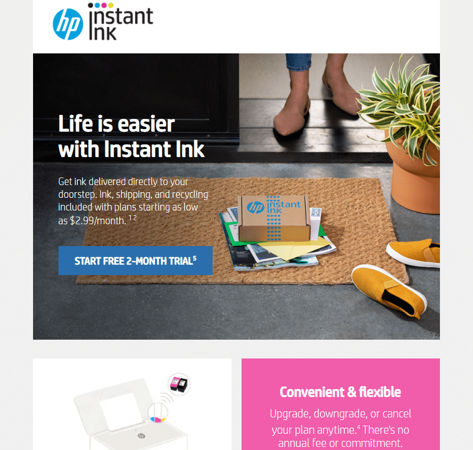
This marketing email from HP Instant Ink won an IAC Award for “Best Technology Email Message Campaign” in 2021.
The logo for Instant Ink and the headline emphasize the idea of ink shipped to your home.
It’s captivating — with a mix of illustrations, colors, and a great featured image, it grabs your attention.
It’s creative — not focusing on the ink cartridges, but the fact that the service delivers to your doorstep.
You don’t need the most amazing idea of all time to create a good design. Start by evaluating your existing emails and finding things to improve.
You should consider:
- How your emails stack up against the three “C’s”
- Your Click-Through Rate (CTR). For reference, the average CTR ranges from 2.6% to 2.34%
- Whether your emails help you meet your goals
- Whether your emails drive traffic to your website
When creating new emails and campaigns, keep building on what you’ve learned.
We’ve also got you covered with tips and best practices you can start using right away if you’re starting from scratch.
11 Crucial Email Design Best Practices
Here are eleven best practices all email marketers should follow. You can also consider email marketing best practices when you are concentrating on the marketing side of email.
1. Craft a Strong Subject Line
The subject line is your chance to make a first impression on your reader and has a unique effect on open rates. While the average email open rate ranges from 18-22%, some marketers get their open rates as high as 57% by only optimizing the subject line.
Basically, subject lines are crucial. To optimize them, use concise and descriptive language and include a statistic, number, or “hook” to catch the reader’s eye. You should also avoid “spammy” words like “free” or “easy money.”
2. Stay On-Brand
Your email’s design impacts how consumers view your brand, so it’s crucial to consider each design element carefully. Design elements include logos, colors, fonts, layout choices, videos, images, and infographics.
For best results, match your design to your audience. For example, if you need to target a B2B audience, you could use professional design elements like muted colors and clean fonts. A B2C product may use more “casual” branding.
3. Keep It Simple and Focused
Complicated email layouts may confuse readers, and when readers feel confused, they click the “back” button. You should embrace a simple, clean, and minimalistic design in your emails.
You should also use the same layout and branding in every email, so the reader knows what to expect.
4. Spur Engagement
To generate engagement from readers, including a strong Call-to-Action (CTA) in every email. Select your anchor text carefully, make your CTA button large, and place it strategically to optimize your conversions.
5. Give Your Content Room to Breathe
If you fill every square inch of the reader’s screen, they won’t know where to look. Use separators and white space to draw their eyes to your content and emphasize critical components like your CTA or product image.
6. Follow an Information Waterfall
An information waterfall (sometimes called an information pyramid) presents your most important information and your least important information at the bottom.
7. Use Responsive emails
Have you ever opened an email without being able to see entire sections or images? If you use fixed sizes, varying device screen sizes will warp your design. That’s why responsiveness is essential. Use responsive web design principles to adapt your design to the optimal proportions for different window and screen sizes.
8. Ensure Accessibility
If you want to maximize your reach — and satisfy accessibility guidelines and laws — it’s essential to consider how people with dyslexia, color blindness, or vision impairments may perceive your email marketing. To make your email designs accessible, use dyslexia-friendly fonts, alt text, colorblind-friendly colors, and plain text that screen readers (like the KNFB reader) can read aloud.
9. Optimize for Performance
As the average person only views an email for 11 seconds, you need to focus on performance to get results. Ideally, your email should load quickly and work on all devices (as in 2021, 54.8% of internet traffic comes from mobile devices).
You should also track your conversions to measure the effectiveness of your marketing efforts and any new tactics you try.
10. Include an Unsubscribe Link
Many regulations mandate the use of an unsubscribe link. The Federal Trade Commission’s 2003 CAN-SPAM rule (Controlling the Assault of Non-Solicited Pornography And Marketing (CAN-SPAM)) is one of these regulations.
To ensure people can unsubscribe without issue, always include a link that’s clear, easy to use, and displayed prominently.
11. Use Email Authentication
Email authentication allows your email marketing tool to send emails as your domain (so they come from “yourwebsite.com,” not “via mcsv.net”). Using email authentication will make your emails look more professional.
Examples of Good Email Design
Building a creative and high-quality design from scratch isn’t an easy task, even if you’re a naturally creative individual. Thankfully, you don’t have to start from zero.
This section will break down 26 examples of good email designs, highlighting what we love about them.
Welcome Emails
Welcome emails are the first thing a customer receives from you when they sign up for your mailing list. Making a good introduction is essential to building a lasting and engaging relationship.
Ipsy
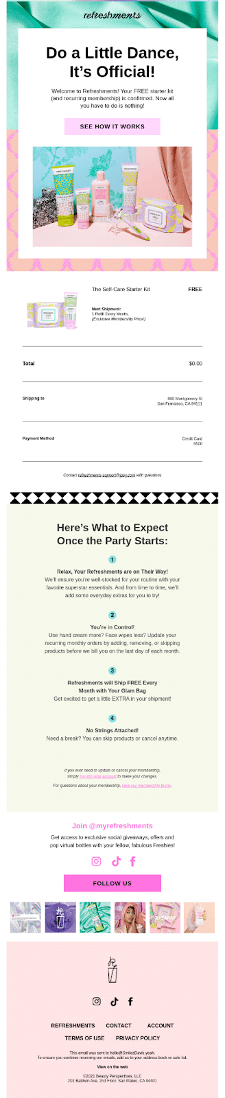
Ipsy’s welcome email is an A+ example of a great introduction. Here’s what we like about it:
- Ipsy’s named its email newsletter “refreshments” (which makes it feel more like a hobby club than marketing emails)
- Ipsy’s email offers the reader a free self-care starter kit
- Ipsy matched the colors in the background, image, and product packaging
Under Armor
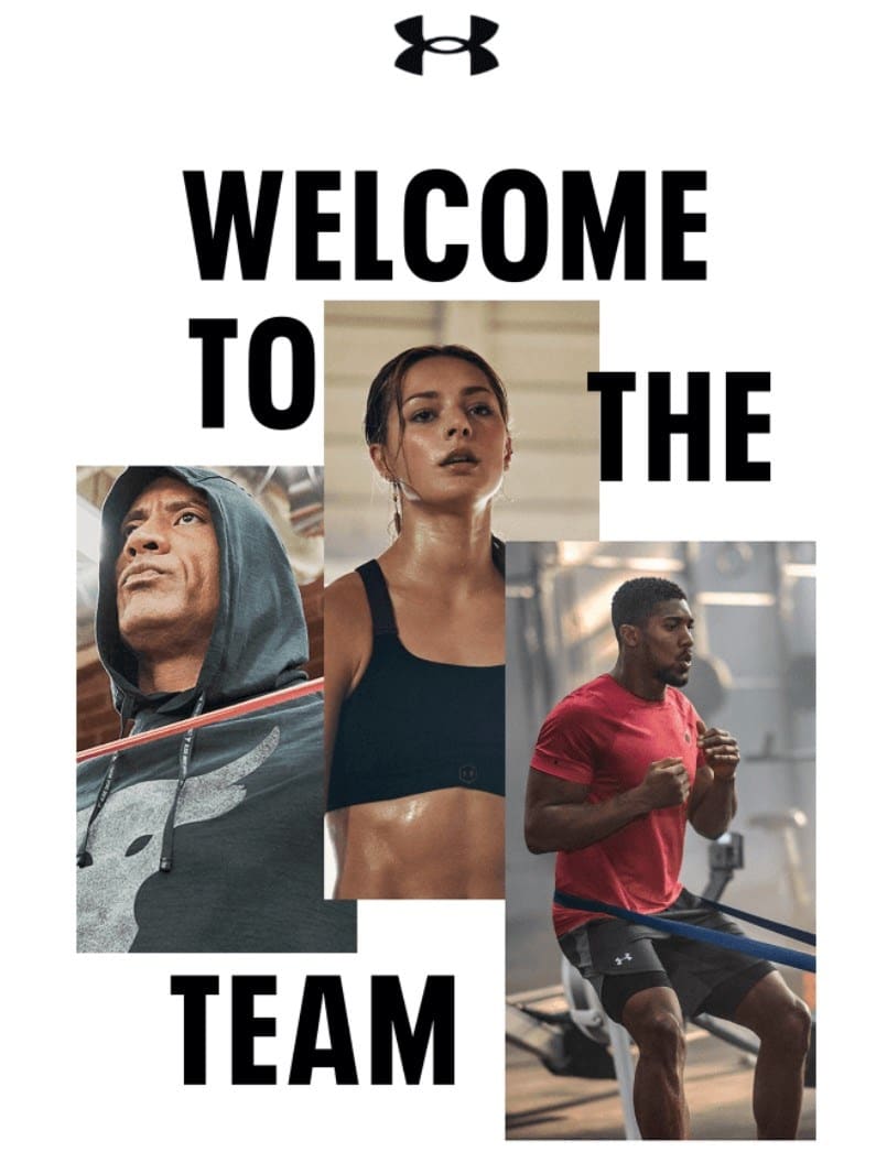
Under Armor’s welcome email works because the marketing team has chosen images and text themed around its product. Here are some more things we love:
- Under Armor’s logo is the first thing you see
- The colors in the images match and make the email pop
- The visual hierarchy of the email makes it look interesting
Beefree.io
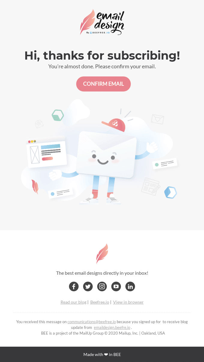
Though not technically a welcome email, this BeFree confirmation email is so good we had to feature it here. Why? The email perfectly showcases what’s possible with BeeFree’s design software. Here are some more things we like:
- The animation is adorable
- The pastel colors are pretty but don’t look childish
- BeeFree includes links to its social media
- BeeFree used its software to create the email design
Peloton
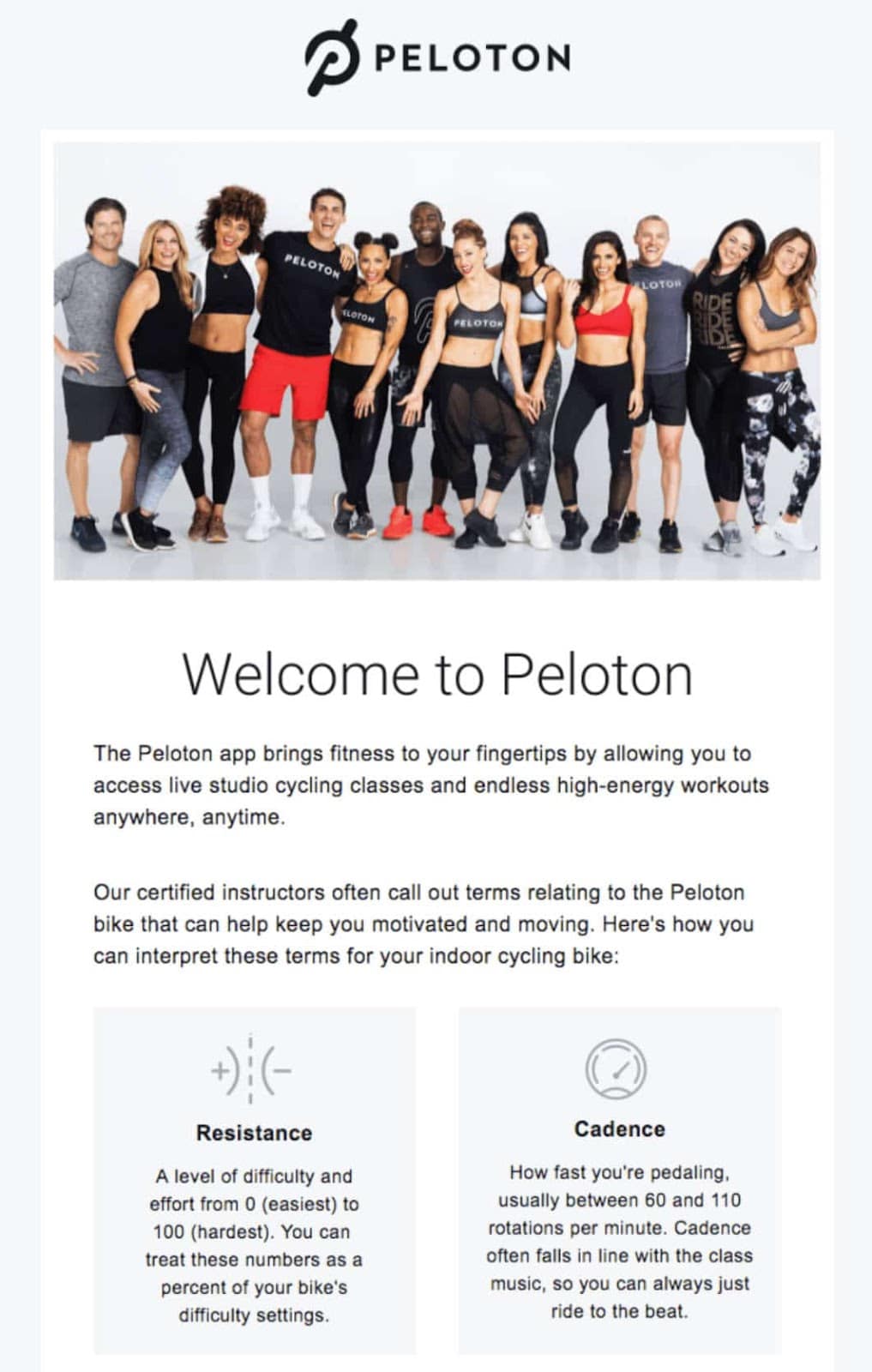
Peloton’s welcome email contains several text sections, but it doesn’t look crowded because they’ve used white space effectively. We also like it because:
- Peloton used symbols to draw the reader’s eye to the “resistance” and “cadence” sections
- Peloton starts its email with an image that gives it a community feel
- The email explains what the Peloton app does and teaches the reader how to use it
Evernote
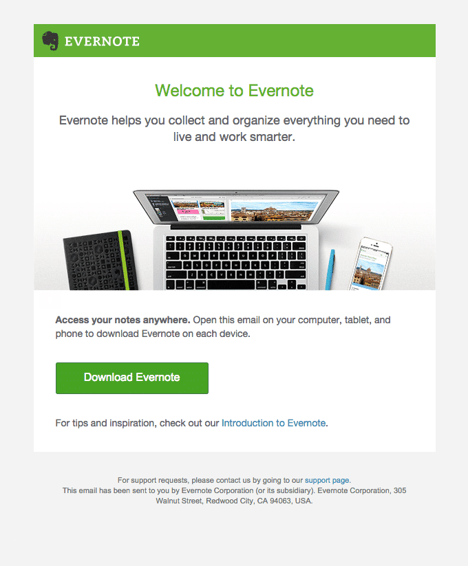
Evernote’s welcome email serves two purposes: welcoming the subscriber and helping them download the free Evernote App. We also like it because:
- The email includes a link to Evernote’s introductory resources
- Evernote’s CTA button is green and matches Evernote’s brand color
- Evernote included a link to customer service for customers who have trouble installing the app
Cart Abandonment Emails
Cart abandonment emails are auto-generated emails you send to customers within 24–72 hours after they abandon their cart. As re-engaging the potential customer is the primary goal of these emails, they need to grab the reader’s attention.
American Giant
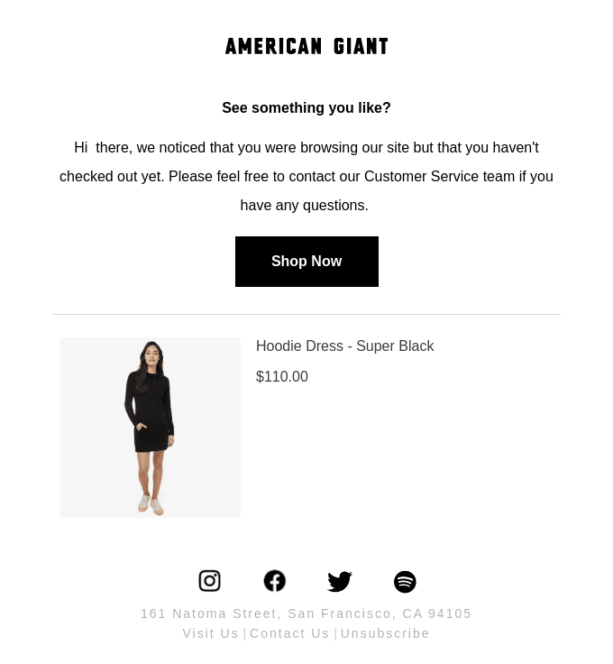
American Giant’s cart abandonment email is an excellent example of a stylish black and white design that looks lively. We also like it because:
- American Giant shows the reader the item in their cart
- American Giant links to its social media
- The email uses preheader text effectively
Gerry’s
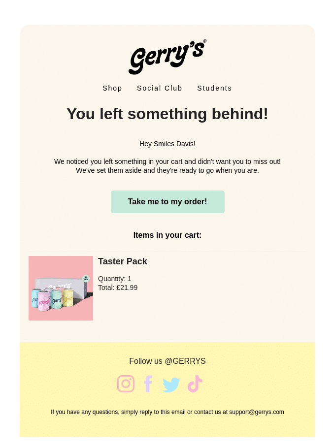
Gerry’s email is the colorful opposite of American Giant’s. Here’s what we like:
- The header reminds the reader of their abandoned cart in a creative way
- The email addresses the recipient by name
- The colors are fun but not overwhelming
Stetson
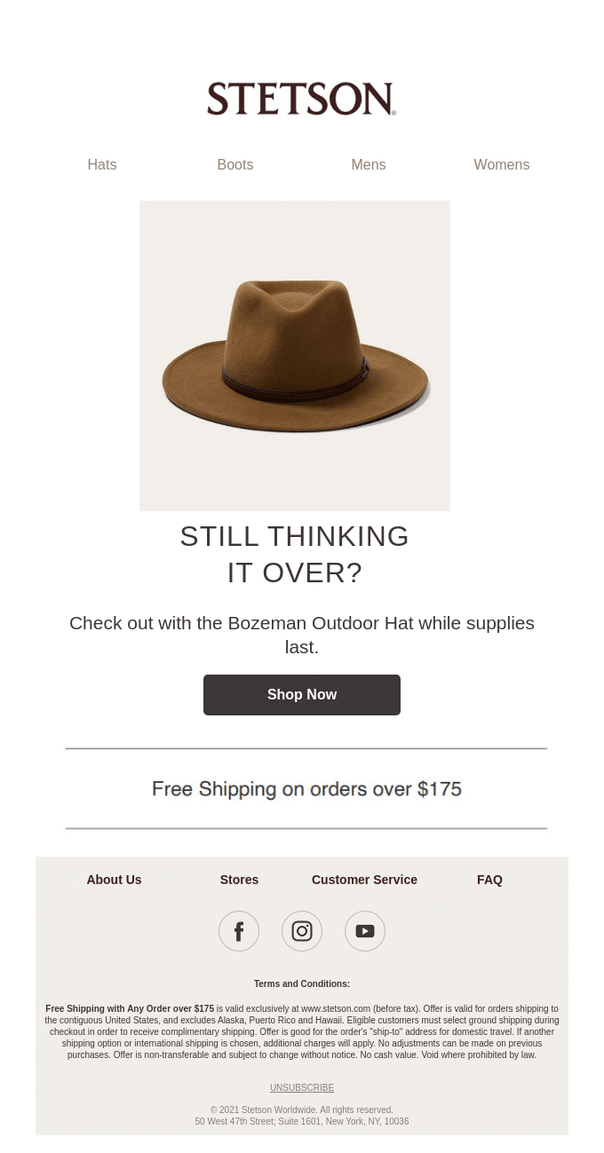
Stetson’s email has a customer-friendly twist that makes it work: the offer of free shipping. Here are some more things we like:
- Stetson used its brand colors throughout the email
- The email links the reader back to relevant store categories
- The CTA indicates scarcity by stating “while supplies last”
Newsletters
Newsletters are regular emails that update your customers about new products and services, your latest content, and charity work. Naturally, they need to be informative yet engaging.
Shuka Design Bureau
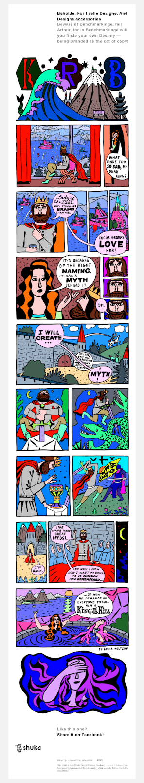
This email from Shuka Design Bureau is an excellent example of a creative newsletter. Here’s what we love:
- The email features an eye-catching comic
- The copywriting fits the theme of the comic
- The comic uses bright colors and a distinct art style
Email on Acid
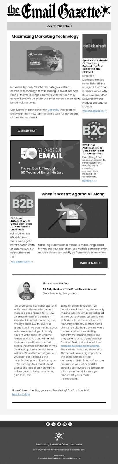
Email on Acid’s newsletter also takes a unique approach. We like:
- The email’s newspaper theme
- The use of white space to break up the text
- That it’s a great example of how email can play a role in effective content marketing
- The black-and-white color scheme
Increment
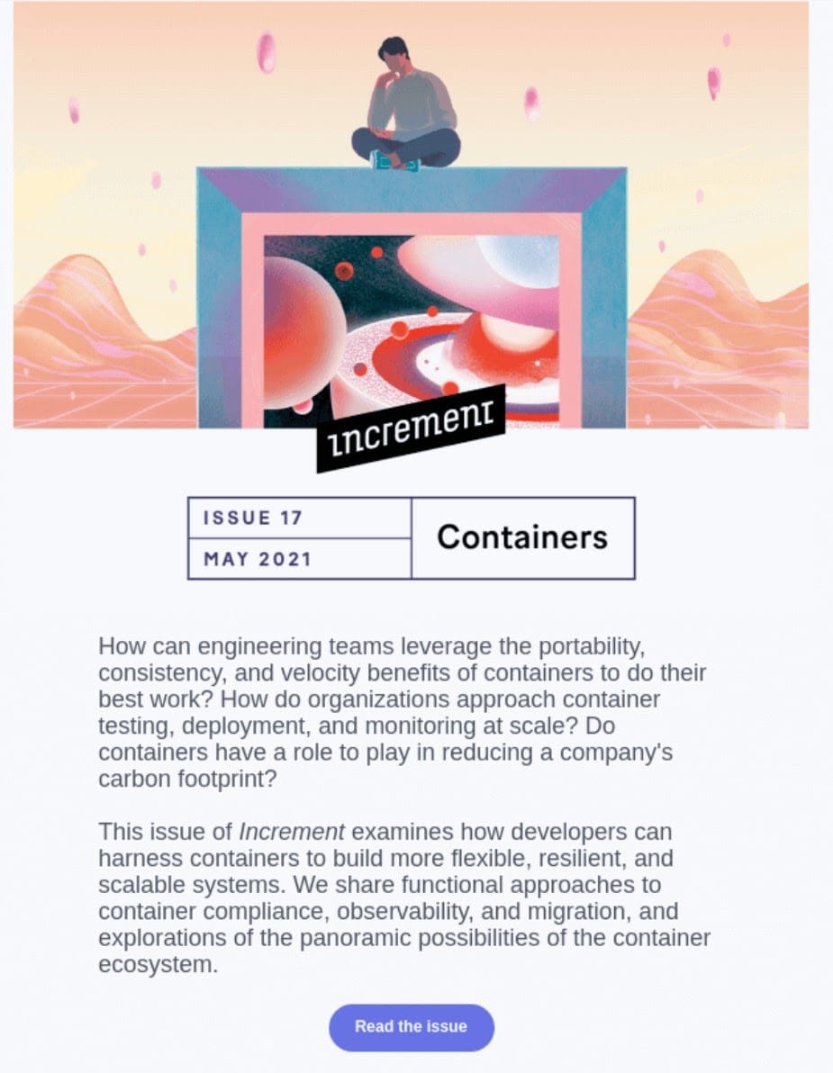
Increment has taken a sleeker approach to its newsletter design. We love:
- The way Increment uses questions to incentivize the reader to click “Read the Issue”
- That Increment has named this issue of its newsletter “Containers” to give it a theme
- How the trippy space-themed header image aligns with the theme
Holiday Emails
Holiday emails capture the reader’s attention and incentivize them to purchase using a special celebratory offer. It’s all about capturing the essence of the holiday with your email and promotion.
BarkBox
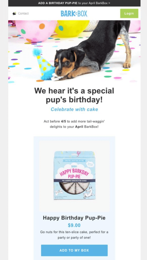
BarkBox’s “happy birthday” email up-sells customers by offering them a unique product (a birthday cake for dogs). We love how unique this approach is, as well as:
- Fun language like tail-waggin delights
- The way it makes the offer’s price, time limit, and expectations clear
Gantri
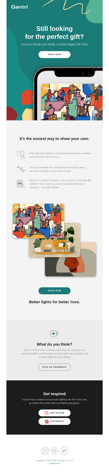
Gantri’s email cleverly presents the reader with a problem (“still looking for the perfect gift” and positions the Gantri card as a solution). We also like that:
- The email highlights the benefits of the Gantri card
- The placement of the CTA right under the problem-focused header
Judy
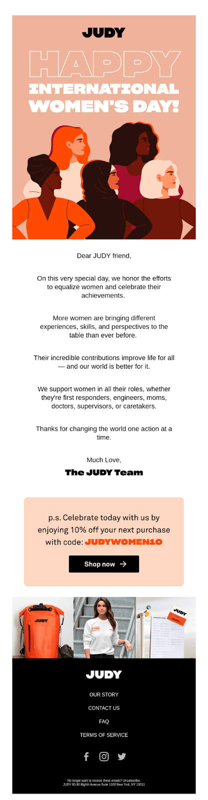
Judy’s email takes a different approach than BarkBox or Gantri, as Judy’s email aims to build a relationship with readers. We love it because:
- The large font size and design emphasize the header
- The email includes women of different backgrounds in the header picture
- It uses white space to highlight the text
RXBAR
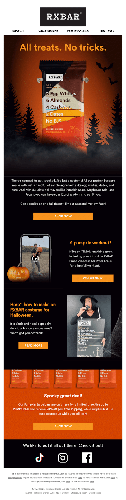
RXBAR’s Halloween email is spooky and fun. We like that:
- The heading uses a fun spin on “trick or treat”
- The email includes relevant links at the top
- The design uses iconic Halloween imagery like Frankenstein’s nails, bats, and pumpkins
Emails for Digital Products
Emails for digital products are particularly effective in sales, as customers receive access to your service shortly after signing up through your CTA link. Their focus is often to compel people to purchase on the spot.
Postable
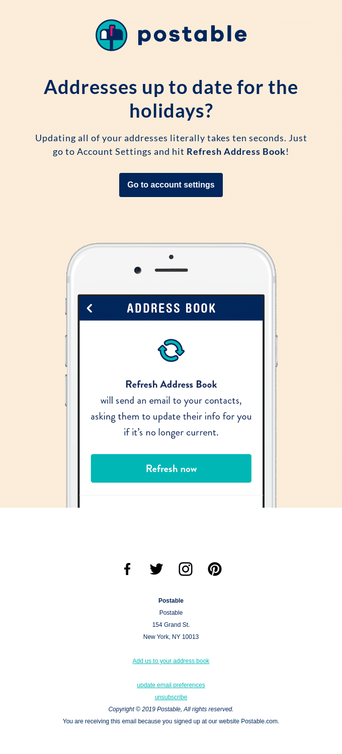
This email from Postable works because it addresses the reader’s problem: outdated addresses during the holidays. We also like it because:
- Postable’s CTA is the first thing the reader sees
- The email includes a graphic of the Postable app
- Great use of white space to highlight the main objective — getting a user to update their address
MarkUp
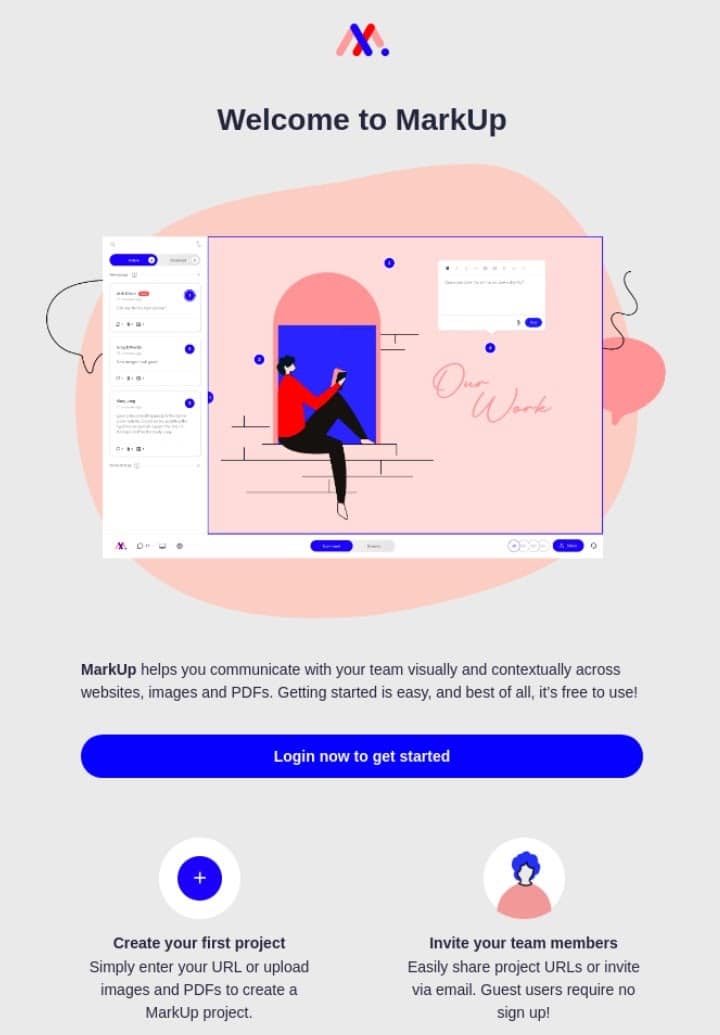
This email from MarkUp is excellent because it teaches readers how to use MarkUp while selling them the software. We also love it because:
- MarkUp used icons to accentuate the copy
- MarkUp’s software is the first thing you see
- The CTA is above the fold
Typeform
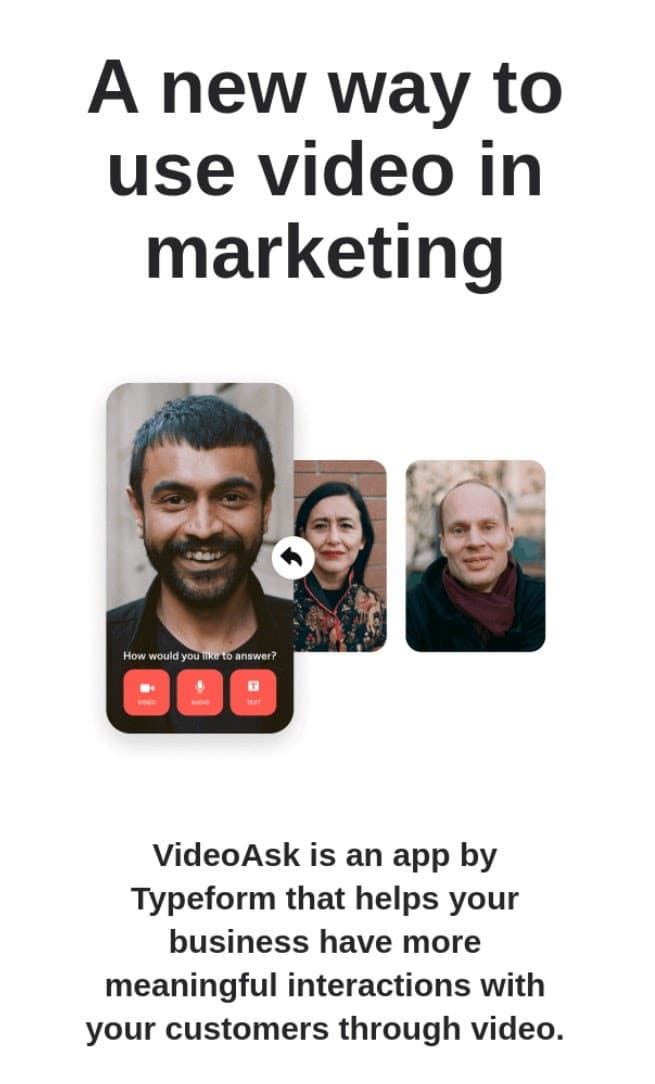
Typeform’s email works because it opens with the company’s Unique Selling Point (USP) – “a new way to use video in marketing.” We also like that:
- Typeform shows examples of its video marketing
- The email uses an accessible font
- The image uses hierarchy to grab the reader’s eye
Sales Emails
Sales emails offer subscribers an exclusive discount to incentivize them to purchase. Naturally, they need powerful CTAs.
GoPro
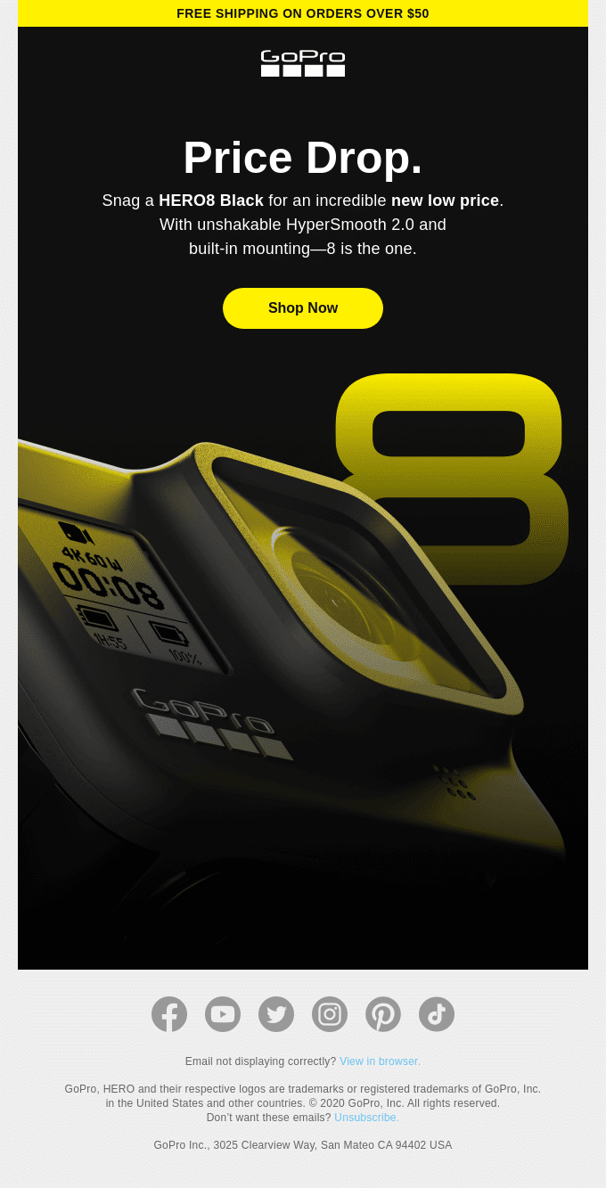
The CTA in this email from GoPro works well because the hierarchy of the text makes it the second thing viewers will read after “price drop.” We also like it because:
- GoPro used matching a matching color scheme throughout the email
- A massive product image highlights the product
- The email contains two offers: free shipping and a lower price
MCM
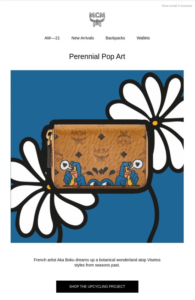
This sales email from MCM is excellent because it uses an image instead of a chunk of text to advertise the bag. We also like that:
- The featured image blends illustration and photography
- The CTA button stands out
- The email includes shop links in the header
Modern Mammals
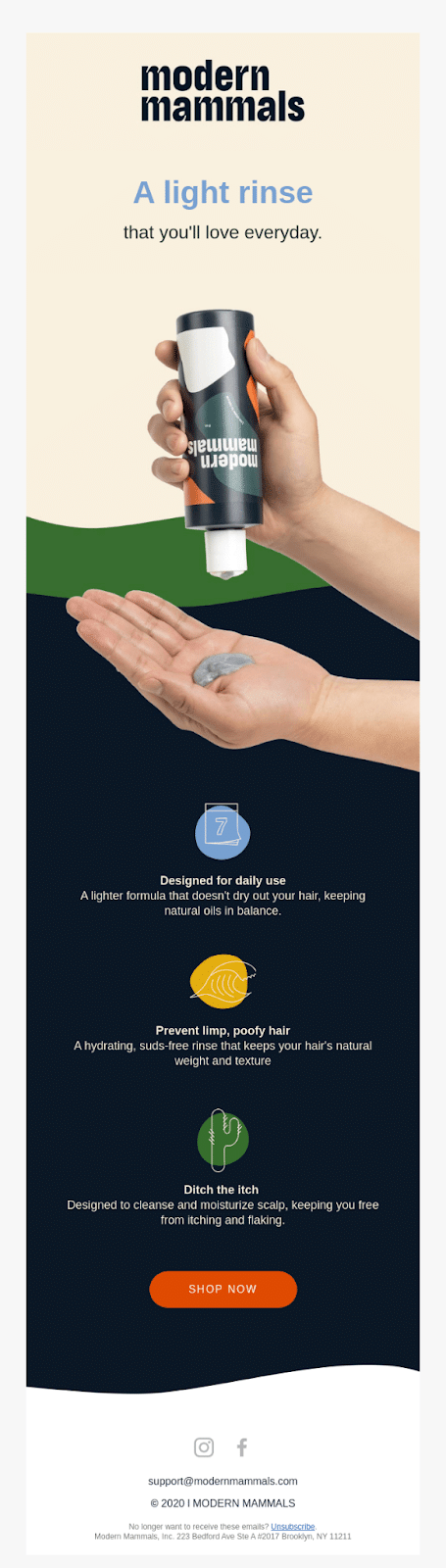
This sales email from Modern Mammals works well because it shows the product in action over a static shot. We also like it because:
- The email uses multiple font colors for emphasis
- The background picture matches the product packaging
- The text emphasizes the product’s USP
Testimonial & Review Emails
Testimonial and review emails ask the reader for a favor, and thus, they need to leverage loyalty to incentivize the reader to leave a review.
G2
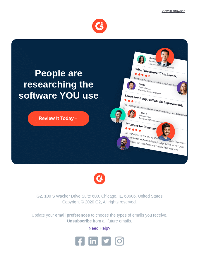
G2’s “review it today” email is persuasive because it makes the reader feel like they can help others with their review. We also like that:
- G2 shows a range of reviews in the pictures (not just positive ones)
- G2 keep the email brief
- The CTA is descriptive
Target
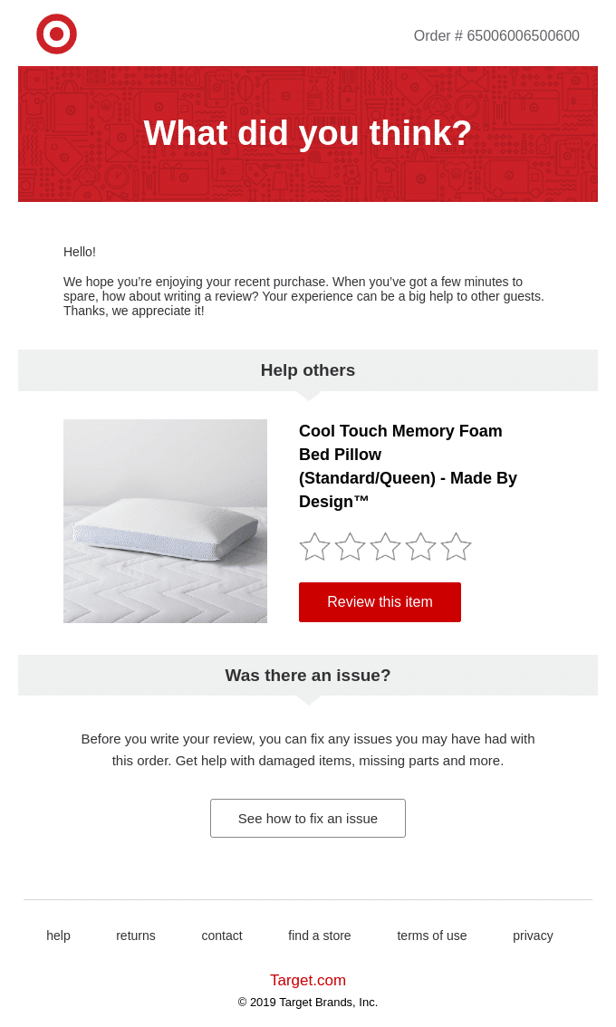
Target’s email works because it’s personalized to each customer — asking for a review and helping unhappy customers contact support. We also like that:
- The email uses headers as separators between content blocks
- The two CTA buttons are different colors for clarity
- It shows the reader’s purchase with an image
Bite
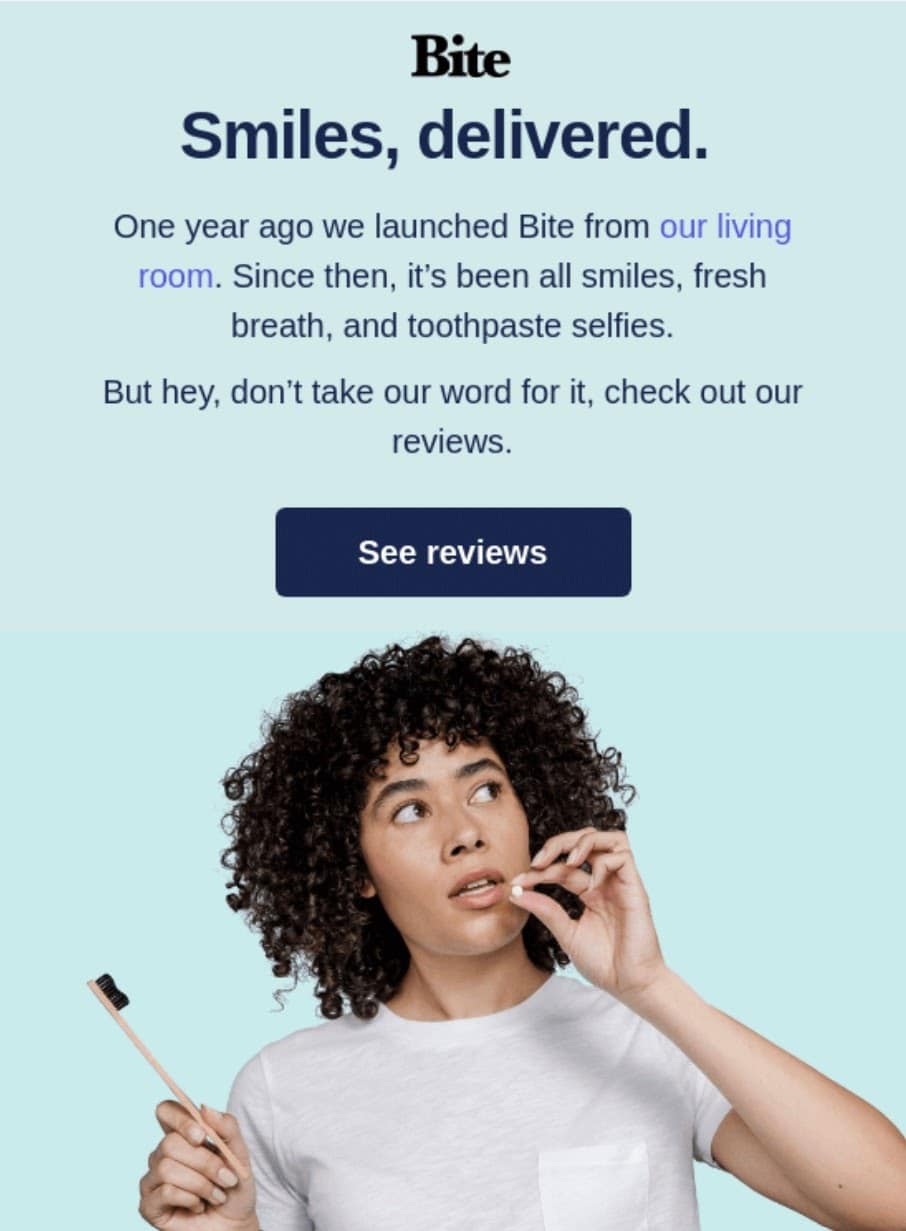
This review email from Bite takes a unique approach, as it offers to show the reader reviews from other customers. We also like that:
- Bite used multiple shades of green to create a hierarchy
- Bite links to its “about us” page
- Bite includes its product in the picture
Branding Emails
Branding emails tell readers the “ABC” of your business, including your brand identity, mission, and USP. Naturally, they need to generate a deep interest in your brand.
Thinx
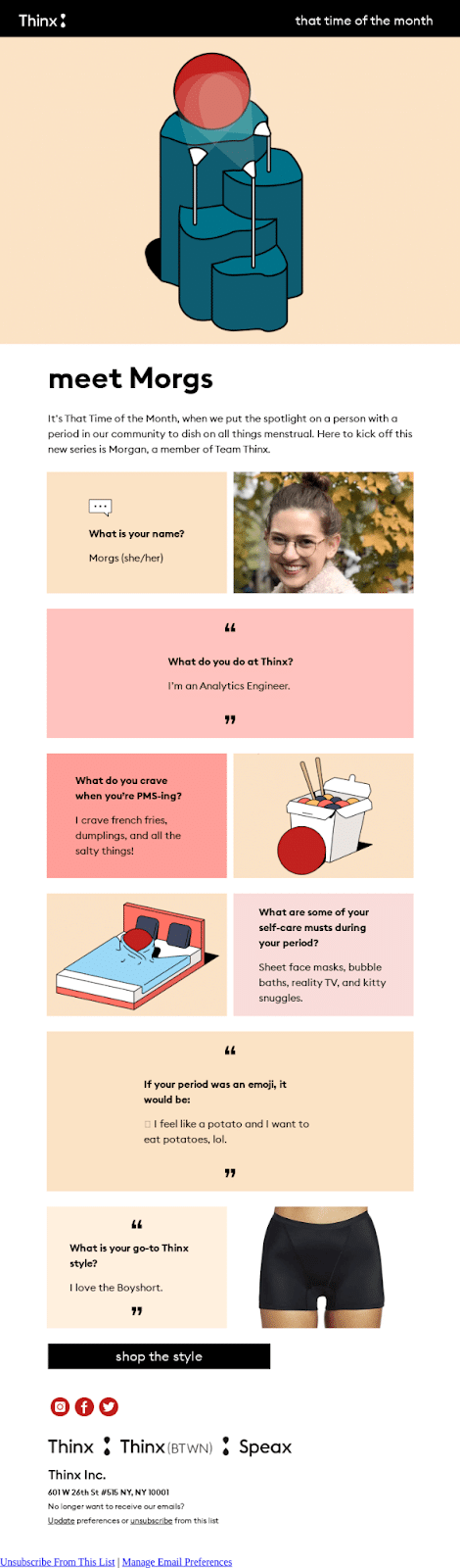
This branding email from Thinx captures the reader’s attention by introducing them to an employee (Morgs). We also like that:
- Thinx used a suitable matte color palette
- Thinx themed the email’s copywriting around its product and mission
Wisp
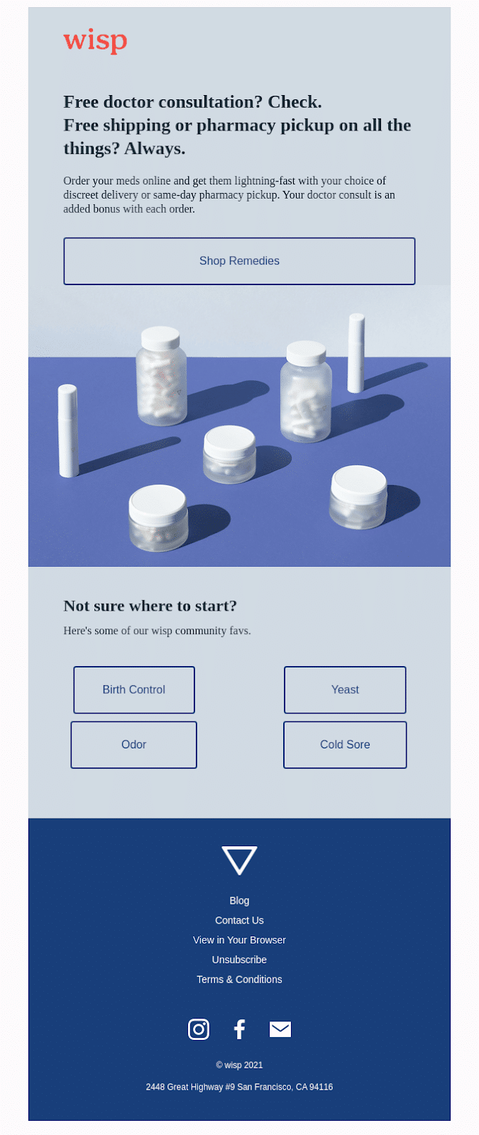
This branding email from Wisp works because it helps potential customers navigate their offerings. We also like that:
- Wisp uses questions to grab the reader’s attention
- Wisp links to its “community favs”
- Wisp uses an image that blends into the email’s background
How to Create Your Own Email Design
Now that you’ve seen twenty-six examples of good email design, you’re ready to put your newly trained eye for design to work. Here are three ways to create your email design:
1. Use Email Marketing Software
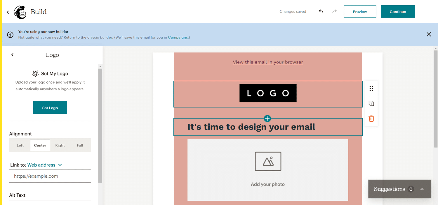
Many popular email marketing software tools have in-built templates that you can use. This includes Mailchimp, Constant Contact, SendinBlue, Drop, and HubSpot.
You can easily use their templates and drag-and-drop builders to create your unique design.
Pros:
- Easy and quick
- You can change the text, images, and critical parts of the template
- You know your design will work on desktop and mobile devices
- You can use the same templates multiple times
- You usually won’t need to pay extra
Cons:
- These templates are made for a broad target audience (so they may not match the rest of your branding)
2. Use a Dedicated Email Design Tool
Email design software tools offer email templates and unique features to create a unique design. Stripo, Chamaileon, BeeFree, and Postcards are all great options.
Pros:
- Very easy for people without a design background to use
- These tools have hundreds of templates (so it’s easy to find one that suits your needs)
- Full customizability — change the layout, colors, images, style, and text
- Many templates are mobile device-friendly
Cons:
- You may need to pay for access to these tools
- You’ll need to download your template and import it into your email marketing software (or use an integration where available)
3. Create a Custom Design
Finally, you can create a custom email design from scratch with a tool like Adobe InDesign, VivaDesigner, Scribus, or simply code it with HTML and inline CSS.
Pros:
- Your design will be unique
- Full flexibility
- You can ensure your design is mobile-friendly and your images are high-quality
Cons:
- Design software is expensive
- Very time-consuming
- You need a strong design background
Summary
As of 2020, there were over 4.03 billion email users worldwide, and people sent and received 319.6 billion emails daily. Naturally, standing out in your subscribers’ inboxes is tricky.
That’s why good email design is crucial. Grabbing your audience’s attention is the first step towards nurturing your relationship with leads, increasing revenue, and upselling customers efficiently.
To master good email design, make sure you:
- Use white space for emphasis
- Develop high-quality visuals to grab the reader’s attention
- Use clear copy — especially in your header and CTA
- Use a top-down approach to prioritize content
- Get creative
We’d like to hear everything you know about good email design. Which of these designs did you like the most, and how do you create unique emails for your brand? Please tell us in the comments below.