When it comes to web design, the visual appeal of your content plays a vital role in capturing and retaining your audience’s attention. One aspect of design that can significantly impact the overall aesthetics and readability of your website is text styling.
Text styling goes beyond just choosing a font and font color. It involves carefully combining various CSS properties to achieve the desired effect, such as utilizing text outlines to make your text visually striking.
In this article, we delve into the art of styling the outline of texts using CSS and explore how it works alongside the various options you can use.
Understanding Web Texts
Web text is text that is displayed on a web page. Fonts play a vital role in displaying text on the web. These fonts are essentially vector-based graphics, which means pixel data do not limit them and can be rendered at various sizes while maintaining their sharpness and clarity.
One fascinating aspect of fonts being vector-based graphics is the ability to apply strokes or outlines around individual characters. Like how you can draw a stroke around a shape in vector programs such as Adobe Illustrator, CSS provides the means to achieve the same effect on web text.
2 Methods To Add Text Outline With CSS
When it comes to adding an outline effect to your text using CSS, there are two methods you can employ. Let’s explore and see the downside of these methods and how to use them.
1. Using the text-stroke Property
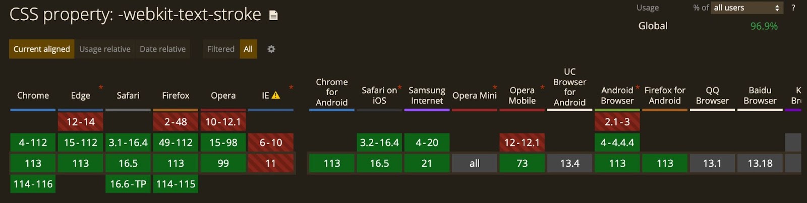
The text-stroke is a CSS property you can use to add an outline to your texts. It allows you to specify the outline’s width and color. This property is only supported by WebKit-based browsers, and for you to use it, you must add the -webkit- prefix.
For example, let’s add stroke to an h1 heading text—“Welcome to Kinsta”:
<h1>Welcome to Kinsta</h1>This is how the text-stroke property will be used with the -webkit- prefix:
h1 {
  -webkit-text-stroke-width: 3px;
  -webkit-text-stroke-color: black;
}
-webkit-text-stroke-width and -webkit-text-stroke-color specify the stroke’s width and color, respectively. It sets the width to 3px and color to black.

These two properties above can be combined with the shorthand property -webkit-text-stroke, which simultaneously specifies the stroke color and width.
h1 {
  -webkit-text-stroke: 3px black;
}
This will give the same output.
Support For text-stroke Property
According to caniuse, there is no support for the text-stroke property on the Internet Explorer browser.
If you use the text-stroke property to set the outline of your texts, and if a user makes use of an unsupported browser, then such text may not be visible if its color matches the background color.
To fix this, you can use the -webkit-text-fill-color property to set a color for the text and set a fallback color with the color property:
h1 {
  color: black;
  -webkit-text-fill-color: white; /* Will override color (regardless of order) */
  -webkit-text-stroke: 3px black;
}When a browser does not support the text-stroke property, it uses the color set by the color property.

Another option will be to confirm that the browser supports the -webkit-text-stroke property before adding the style.
@supports (-webkit-text-stroke: 3px black) {
  h1 {
    -webkit-text-fill-color: white;
    -webkit-text-stroke: 3px black;
  }
}
2. Using the text-shadow Property
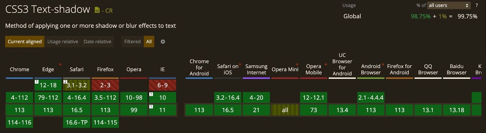
If you don’t want to handle support differences, you can use the text-shadow property, which has support for all the latest versions of popular browsers.
For the text-shadow property, we’ll use four shadows, each to the top right, top left, bottom left, and bottom right.
h1 {
  color: #fff;
  text-shadow:
    3px 3px 0 #000,
    -3px 3px 0 #000,
    -3px -3px 0 #000,
    3px -3px 0 #000;
}
In this example, we use four shadows to create a text outline effect. Each shadow has a 3-pixel offset from the text, and the color is set to black (#000). This effect is similar to that generated by the first method.

By applying shadows to all four corners of the text, we achieve a well-defined outline. Feel free to adjust the pixel offsets, shadow colors, or text colors to suit your specific design preferences.
This method gives you an added advantage as you can adjust the horizontal and vertical shadows according to what suits the text. You can also add a little blur radius:
h1 {
  color: #fff;
  text-shadow:
    3px 3px 2px #000,
    -3px 3px 2px #000,
    -3px -3px 0 #000,
    3px -3px 0 #000;
}
One limitation of using text shadows is that you may encounter a discontinuous stroke effect when the shadow length exceeds 1 pixel (you’ll see this if you compare it with the text-stroke method).
Combining text-stroke and text-shadow Properties
You can combine both properties to achieve a visually stunning effect that combines a perfect text outline with a subtle blur and additional effects offered by the text-shadow property. This combination allows for a versatile and customizable approach to enhancing your text’s appearance.
h1 {
  -webkit-text-stroke: 1px black;
   color: white;
   text-shadow:
       3px 3px 0 #000,
     -1px -1px 0 #000,
      1px -1px 0 #000,
      -1px 1px 0 #000,
       1px 1px 0 #000;
}
You can also do away with having to add individual shadows to each corner and apply a general shadow with one line:
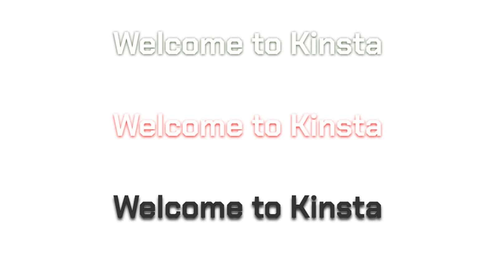
#heading-1{
	color: white;
	-webkit-text-stroke: 1px #F8F8F8;
	text-shadow: 0px 1px 4px #23430C;
}

#heading-2{
	color: white;
	-webkit-text-stroke: 1px #F8F8F8;
	text-shadow: 0px 2px 4px red;
}

#heading-3{
	color: #333;
	-webkit-text-stroke: 1px #282828;
	text-shadow: 0px 4px 4px #282828;
}
Summary
Both the text-stroke and text-shadow properties offer valuable options for adding outlines to your text. The choice between them depends on browser compatibility, desired effects, and the level of control you require for your design.
Experiment with different techniques and find the best approach to create captivating and visually appealing text outlines. You can combine Kinsta’s hosting capabilities with your complete project for an engaging online presence.
Share your experience! Did you use any other approaches not covered in this article? Let us know in the comments.