Most WordPress users don’t realize how far the block editor has come. Core blocks like Cover, Group, Columns, and Image now include enough built-in design controls to create layered depth, cinematic scroll effects, bold typography, and polished layouts that previously required custom CSS or page builders.
For example, with nothing more than a Cover block and a few design toggles, you can build a full-screen hero section with a fixed-background image, centered text, and a scrolling depth effect that looks like it came from a premium theme.
This guide focuses on those kinds of “magic effects,” showing you how to combine WordPress’s native layout tools to create high-impact visuals while keeping your site lightweight and fast.
The upside of staying native
When you build using core blocks, rather than piling on dozens of extra plugins or relying on a heavyweight page builder, you get several distinct advantages:
- Fewer plugins means fewer update headaches and a smaller attack surface for security.
- Better performance is possible because native blocks are optimized for the editor and the front-end, and hosting platforms like Kinsta can cache and serve them efficiently.
- You’re future-proofing. Since WordPress core evolves and supports blocks natively, you’re less reliant on a particular third-party plugin staying up to date.
- It also results in cleaner markup. Core blocks generally output streamlined HTML/CSS (rather than bloated builder wrappers), which helps with load times, accessibility, and SEO.
All of this is to say that if you’ve been thinking, “I need to install a separate fancy plugin or page builder to get animations, parallax or hero sections,” it’s time to think differently. Leveraging the design features built into the core editor (think layout controls, gradients, duotone filters, block styles, and patterns), you can create high-end results while keeping your site lean and maintainable.
In the next section, we focus on one of your most valuable design tools: the Cover block. We also demonstrate how you can use it as a foundation for layered, “magic” visual effects.
The Cover block is an untapped resource
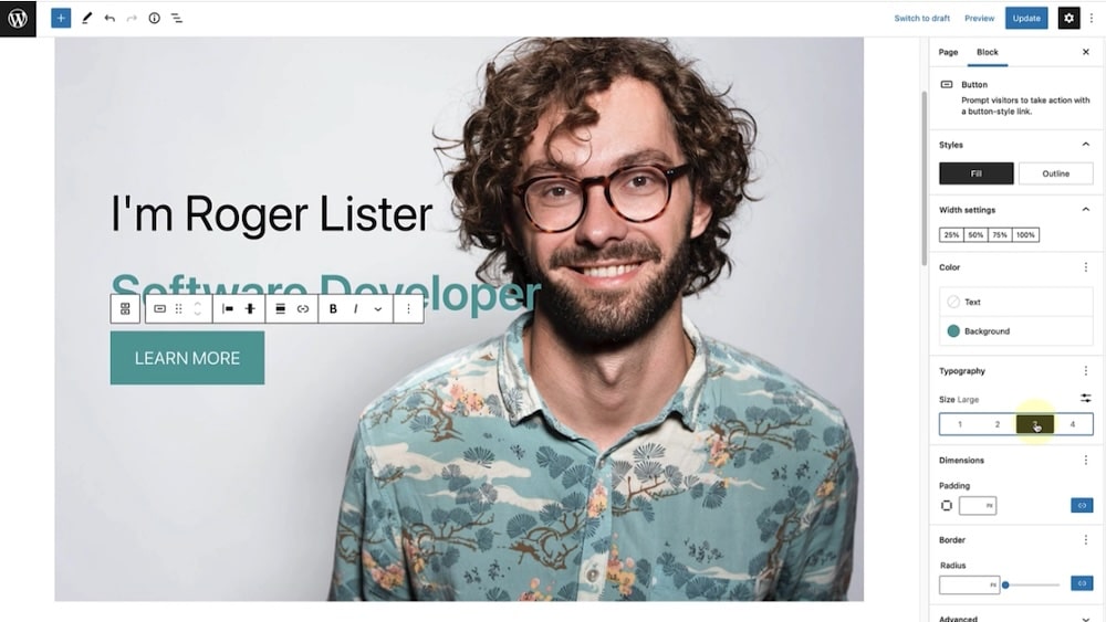
When you’re aiming for that “magic” in your layout, the kind that feels premium and polished, the Cover block is one of your strongest tools. It combines full-width visuals, text overlays, and flexible positioning in a single container, all built natively into WordPress.
The Cover block lets you set a background image, video, or a solid color, and then drop other blocks inside it. Instead of just an image, you get a layered section: background media, overlay, and content. That layering is what gives you depth and visual interest.
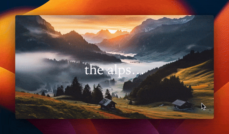
For example, you can use it as a hero banner, a large CTA section, or even a full-screen background for a storytelling segment.
How to use it for depth and to simulate a parallax effect
One of the most compelling tricks is layering multiple Cover blocks or using their built-in settings to simulate parallax or depth.
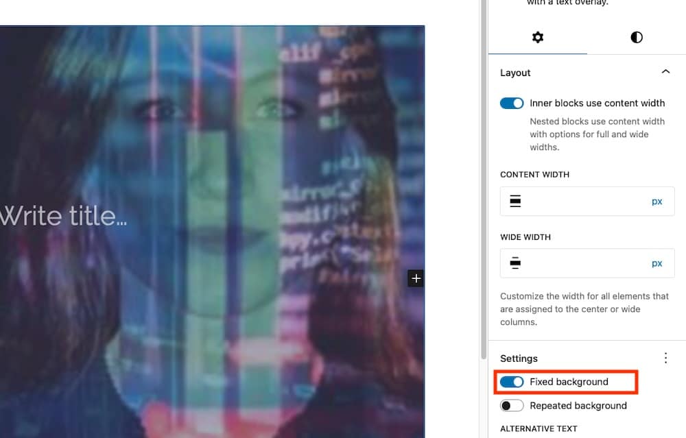
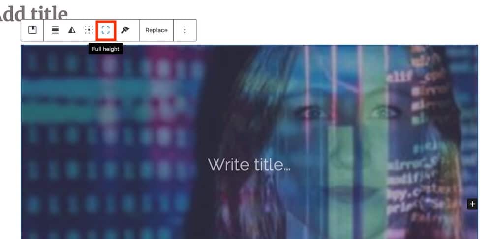
To do this, insert a Cover block, set the background, then go into its sidebar settings and enable Fixed background. This makes the background stay in place while the foreground content scrolls.
Use the “Toggle full height” option so the Cover block occupies the full viewport, which is great for hero sections.
If you stack several Cover blocks one after another (each full viewport height), you can create a series of immersive sections where each one visually “hits” as you scroll.
And from there, you can continue to layer. Inside the Cover block, you might place a Group block that holds a heading, paragraph, and button. Alternatively, you might recolor the overlay to ensure your text stands out. Using the focal point picker is another option to make sure mobile viewers still see the “right” part of the image.
A few Cover block tips
Experimenting with the Cover block is a great way to expand what’s possible on your website. Here are a few tips to make even more of this useful tool:
- In the block toolbar, the alignment settings (wide, full width, left/center/right) and content position (top/center/bottom) let you control how your content sits over the background.
- In the sidebar, media settings like Fixed background and Repeated background are available. When Fixed background is off, the Focal Point Picker helps you add emphasis to your designs.
- Overlay isn’t to be underestimated, either. To keep your text readable over an image, either a semi-transparent color overlay or duotone filter will help.
Use scroll snap to build cinematic effects
Scroll snap isn’t a native setting in the block editor, but you can achieve it with a tiny amount of CSS applied through the Styles panel or the Additional CSS area in your theme. This keeps everything lightweight and still lets you build premium storytelling effects using only core blocks.
Have you ever seen a web page where each section clicks perfectly into place as you scroll, like flipping through a high-end editorial or a polished magazine spread? That effect is often achieved with a CSS effect called scroll snap, and you can replicate it using core blocks in WordPress without needing a slider plugin or anything of the sort.
Scroll snap lets you define how the browser should lock (or “snap”) the viewport to particular child elements as a user scrolls. With just a few CSS properties, most notably scroll-snap-type on the container and scroll-snap-align on the children, you can create a guided, smooth scroll experience.
How to enable scroll snap using core blocks
According to Pootlepress tutorial, here’s a clear, step-by-step workflow you can follow in the block editor:
- Use a Group block (or a Cover/Section container) as the parent container for all your sections. In its Advanced settings, add a custom class: .scroll-snap-container.
- Now go to Appearance > Customize > Additional CSS or your block theme Styles and apply settings like this:
.scroll-snap-container {
  height: 100vh; /* full viewport height */
  overflow-y: scroll; /* enable scrolling on that container */
  scroll-snap-type: y mandatory;
}
The y axis means vertical scroll and mandatory means the browser will force a snap to each child.
- For each child section (for example, a Cover block inside the container), either in its Advanced > Additional CSS class or targeting the block type, apply:
.wp-block-cover {
  scroll-snap-align: start;
  height: 100vh; /* ensure each section fills the viewport */
}
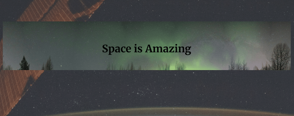
The output looks like this:
Scroll snap creates a guided, story-like experience that draws visitors through your content one section at a time. Instead of endlessly scrolling, users move deliberately from one “scene” to the next, like turning pages in a digital magazine. This controlled flow keeps their attention focused, which is especially effective for portfolios, hero sequences, and product landing pages where you want each section to stand out.
And because scroll snap relies entirely on native CSS, it delivers that cinematic, high-end effect without the bloat of JavaScript sliders or heavy animation libraries. The result is a smooth, performance-friendly design that looks sophisticated yet stays fast and responsive across devices.
A few things to watch for
The scroll snap effect can make a big difference in how your content is perceived. But you need to pay careful attention to site performance and overall UX as you implement it. Here are a few things to note:
- Make sure each section is lightweight: Big background images or autoplay videos in each “snap” section can slow things down. Use WebP images, compress video, and lazy-load where possible.
- Check mobile scroll performance: Snapping can feel awkward or forced on phones if not tuned, so test thoroughly.
- Layer content smartly: Because you’re using multiple Cover or Group blocks set to full viewport height, it’s easy to create deep visuals, but that depth should not compromise load times or accessibility.
- Ensure your hosting supports good front-end performance: When each viewport-sized section has rich visuals, load and render speed matter a lot.
Font Reverse and creative typography tricks
Typography is one of the simplest ways to make a layout memorable, and in the block editor, you can do it without adding heavy plugins.
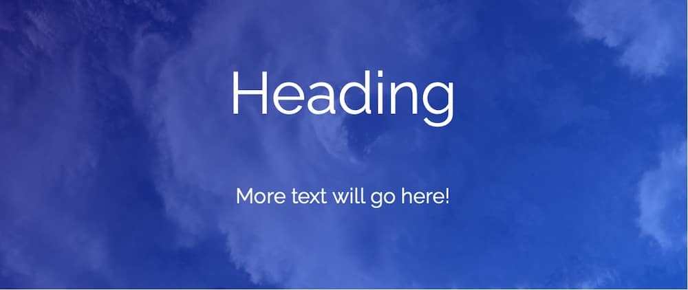
A technique some designers call “Font Reverse” flips the usual hierarchy: instead of dark text on a light background, you place light text over an image or gradient overlay. This gives a bold, integrated feel, especially when you combine the Cover block with Heading and Paragraph blocks.
You can take this further with CSS blend modes. For example:
.wp-block-heading {
  mix-blend-mode: overlay;
}
That snippet allows the heading to visually merge with the underlying background, creating an effect like a movie poster with no external font plugin or animation library required. Just keep contrast and readability in mind.
Making text readable without extra overlays
WordPress’s built-in duotone filters offer an elegant way to boost legibility: you can apply them to your background images (or even videos) inside a Cover or Image block, giving a section a unified visual tone.
Then combine that with the Cover block’s overlay controls. Pick a semi-transparent black, white, or brand-accent color to sit between the background and your text for maximum readability.
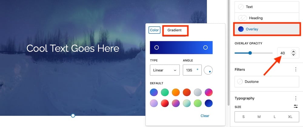
Another visual trick is to apply a gradient overlay behind the text. In the Cover block settings, select Overlay > Gradient, then apply a subtle effect (for example, black at 40% opacity fading to transparent) so your image still shows through while your headline clearly stands out.
These small design touches help your headings and calls-to-action pop without cluttering your layout or hurting performance.
Accessibility and design balance
Great typography shouldn’t come at the cost of readability. Keep these guidelines in mind:
- Maintain at least a 4.5:1 color contrast ratio between text and background.
- Use heading levels correctly (H1, H2, H3) for structure and SEO.
- Avoid using blend modes for essential text on busy images and instead consider fallback colors for dark mode or high-contrast themes.
When done right, your text becomes both art and message, which captivates your visitors while keeping your site lightweight, accessible, and fast.
Motion, depth, and storytelling
Static pages can look polished, but motion gives your design energy. With a few creative touches inside the block editor, you can introduce subtle movement and depth that make your site feel immersive.
Using the Cover block for cinematic “hero” sections
If you’ve ever wanted that full-screen, scroll-driven hero effect seen on agency sites or product pages, you can get close using only the Cover block.

You can use the same full-height Cover blocks introduced earlier to create cinematic hero sections that feel alive. Pair a striking background image or video with a centered heading and call-to-action, then experiment with subtle motion, such as the Fixed background option, to give your page a sense of depth and movement.
Adding animation with custom block styles
Core blocks don’t include animation controls out of the box, but WordPress’s built-in support for custom CSS classes makes it easy to add them. For example, you can create a simple fade-in effect using this snippet in Appearance > Customize > Additional CSS:
.fade-in {
  opacity: 0;
  animation: fadeIn 1s ease forwards;
}

@keyframes fadeIn {
  to {
    opacity: 1;
  }
}
Then assign the fade-in class to your Cover, Image or Group block. If you prefer a pre-built solution, you can also integrate a lightweight library such as Animate.css while still monitoring performance and testing across devices.

Building multi-layered visual depth
If you want to go further than a single background, try layering blocks for extra impact. For example, place a Cover block as your background image or video, then inside it, nest a semi-transparent Group block to hold your text and buttons.
Next, optionally place Image blocks or other decorative elements above it using custom CSS or theme-supported absolute positioning, if your theme allows.
This approach creates a clear design hierarchy with foreground elements that “pop” while backgrounds add context, movement, and depth. And if you’re working in a full-site editing block theme that supports position controls (introduced in WordPress 6.2+), you can set a section (typically via a Group block) to “sticky,” so it remains in view while other content scrolls underneath, adding a subtle storytelling flow across your page.
Plenty of agencies and creators now build immersive, scrolling homepages using only core blocks.
For example:
- Story-based portfolios that combine fixed-background hero images with minimal text overlays.
- Landing pages that transition from one full-screen section to another using scroll snap (as described earlier).
- Product showcases that use soft fade-ins or slide-up animations triggered by scroll.
All of this works beautifully on high-performance hosting like Kinsta, where optimized caching and CDN delivery ensure smooth scrolling, even for media-rich sections.
Moving beyond the Cover block
Once you’ve mastered the Cover block, it’s time to think bigger. The real magic happens when you start combining WordPress’s other core blocks like Group, Columns, Stack, Image, and Video to create layouts that feel intentionally designed, not cobbled together. These blocks provide you with structural control and visual flexibility, allowing you to experiment without relying on external design plugins.
With a layout in place, you can start making refinements. Here are a few more things you can do:
Use gradients, borders, and spacing to create modern depth
Core design tools have evolved dramatically since the early Gutenberg days. Now you can fine-tune:
- Gradients: Apply subtle linear or radial gradients as section backgrounds to create visual flow.
- Borders and radius controls: Add rounded corners or framed effects for a soft, modern look.
- Padding and margin controls: Adjust spacing precisely without custom CSS.
These native styling features let you produce highly polished layouts right inside the editor.
Apply duotone filters for consistency and tone
If you’re mixing multiple image or video blocks, duotone filters help unify the visual tone of your site. For example, applying a warm sepia filter across all visuals can make a mixed gallery feel cohesive. You can also create brand consistency by using duotones that echo your color palette.
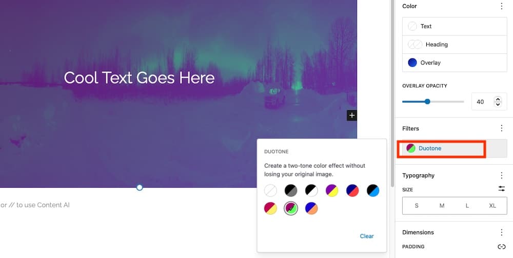
These filters aren’t just aesthetic; they help improve text contrast and focus attention where it matters most.
Conclusion
Lightweight elements like Cover, Group, Columns, and Image blocks already give you a strong foundation, but the real key is balancing design with speed. Use optimized formats like WebP, compress and shorten background videos, enable lazy loading, limit excessive block nesting, and rely on patterns or templates to keep pages efficient.
At this point, you can build several cinematic effects with nothing more than core blocks. The final ingredient is performance—because these effects shine only when pages render smoothly.
Even the most impressive effects rely on the environment powering them, which makes hosting part of your design toolkit. Kinsta helps maintain smooth scrolling and instant rendering through a combination of:
- Edge caching, which serves content from data centers closer to your visitors.
- HTTP/3 and CDN delivery, reducing latency for image-heavy pages.
- PHP threads and optimized databases, ensuring your dynamic content (like block transitions or animations) executes without delay.
That means your site looks and feels fast even with large, full-viewport sections and cinematic visuals. Check out Kinsta today.