
Gutenberg has evolved into a powerful and highly customizable editor. Beyond its robust out-of-the-box features, WordPress developers can now leverage a rich set of APIs to create personalized online experiences.
This article explores two lesser-known yet powerful WordPress development features: Style Variations (also known as block styles) and Block Variations.
While their utility might seem obscure at first, you’ll be surprised how useful they are and how a small investment of time will allow you to integrate them into your workflow seamlessly.
You’ll get a hands-on understanding of what they are and how to use them through a real-world project. You can implement this project on your WordPress site by simply copying and pasting the code from this tutorial and eventually adding customizations.
Before we dive into the project, let’s quickly review the prerequisites:
- Local WordPress development environment: While any will suffice, we highly recommend DevKinsta, Kinsta’s local development suite. It is easy to use and offers many settings and tools for quickly launching and managing a local WordPress site.
- Node.js and npm: These are essential, as the block editor is built on React and requires a build process.
- Basic frontend development skills: It will be beneficial to have a basic understanding of Node.js, JavaScript (with React), PHP, and CSS.
While this project isn’t overly complex, be prepared to write some code. The complete code is also available on GitHub.
Let’s get started!
Block styles Vs. Block variations
Block Styles and Block Variations are two powerful WordPress features for developers. Although their names sound pretty similar, they differ in purpose and usage.
Block Styles, also known as style variations, are pre-built sets of CSS styles that allow you to change how a block looks with a single click. After registering a block style, a button appears in the block sidebar to assign a pre-built set of styles to the block. You can switch the styles on and off and preview the block in the editor in real-time.
Style variations do not alter the block’s attributes. They only modify the appearance of a block by assigning a CSS class to the block’s wrapper element.
Block variations are a more powerful tool because they let you create a preconfigured version of a block with attributes and inner blocks. They also show up in the editor’s block inserter. Essentially, a block variation appears to the user as if it were a standalone block, completely independent of the block upon which it is built.
Block variations allow for customization of a block’s appearance, initial settings, and structure.
With all that in mind, let’s utilize these tools to take Gutenberg blocks to the next level!
An animated Polaroid effect on a core Image block
Now, let’s dive into our project! We’re going to extend the core Image block with a Gutenberg plugin to:
- Implement a Polaroid Style Variation: Users can apply a nice Polaroid effect to their images with a single click from the block’s settings sidebar.
- Add a Hover Animation: We will enhance Polaroid-style images with a subtle hover animation.
- Create an “Animated Polaroid” Block Variation: This will allow users to quickly insert pre-configured Polaroid images with a hover effect directly from the block inserter.
Are you ready? Let’s set up our plugin!
Environment setup
Before we begin, we need to set up a WordPress development environment with Node.js. We assume you have already installed your local WordPress development environment and the latest versions of Node.js and npm. If you need help, check out our tutorial on how to build a Gutenberg plugin to add functionality to the block editor.
Step 1 – Create the basic plugin structure
For this tutorial, we’ll name our plugin Image Hacker.
Navigate to your plugins directory and create a new image-hacker folder. Within this folder, create a new image-hacker.php file (your plugin’s main file) and a src subfolder, where you are will build out the plugin’s features.
Here is the basic structure of your plugin:
/wp-content/plugins/
└── /image-hacker/
	├── image-hacker.php
	└── /src/
Step 2 – Create the PHP code
Next, you need to make sure that WordPress recognizes your plugin. Open image-hacker.php and add the following code:
<?php
/**
 * Plugin Name: Image Hacker
 * Description: Adds an animation effect to the core Image block
 * Version:     1.0.0
 * Author:      Your Name
 * License:     GPL-2.0-or-later
 * License URI: https://www.gnu.org/licenses/gpl-2.0.html
 * Text Domain: image-hacker
 */

if ( ! defined( 'ABSPATH' ) ) {
	exit; // Exit if accessed directly.
}
Step 3 – Install dependencies
In your command line tool, navigate to your plugin’s directory and run the following command:
npm init -yThis command initializes a new package.json file with your project’s dependencies and scripts.
Next, you need to install WordPress scripts and build tools such as webpack and Babel:
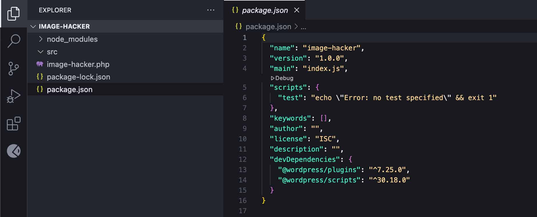
npm install @wordpress/plugins @wordpress/scripts --save-devThis command adds a node_modules folder with node dependencies and a package-lock.json file. The image below shows the current structure of your project in Visual Studio Code:
Next, open your package.json and update the scripts property as follows:
{
	"name": "image-hacker",
	"version": "1.0.0",
	"main": "index.js",
	"scripts": {
		"build": "wp-scripts build",
		"start": "wp-scripts start"
	},
	"keywords": [],
	"author": "",
	"license": "ISC",
	"description": "",
	"devDependencies": {
		"@wordpress/plugins": "^7.25.0",
		"@wordpress/scripts": "^30.18.0"
	}
}
Note that devDependencies versions may be different depending on the actual versions installed in your environment.
Step 4 – Create your plugin’s source files
Next, navigate to the src folder and add the following files:
index.jsstyle.scsseditor.scss
The plugin structure should now look like this:
/wp-content/plugins/
└── /image-hacker/
	├── /node-modules/
	├── image-hacker.php
	├── package.json
	├── package-lock.json
	└── /src/
		├── index.js
		├── style.scss
		└── editor.scss
In your WordPress admin panel, navigate to the Plugins screen and activate the Image Hacker plugin.
Step 5 – Enqueue assets in your plugin’s file
Next, you need to include plugin assets in the main plugin’s file. Add the following to image-hacker.php:
/**
 * Enqueue block editor assets.
 */
function image_hacker_enqueue_editor_assets() {
	$asset_file = include( plugin_dir_path( __FILE__ ) . 'build/index.asset.php');

	// Enqueue the script with our modifications
	wp_enqueue_script(
		'image-hacker-script',
		plugins_url( 'build/index.js', __FILE__ ),
		array( 'wp-plugins', 'wp-edit-post' ),
		filemtime( plugin_dir_path( __FILE__ ) . 'build/index.js' )
	);

	// Enqueue the editor-only styles
	wp_enqueue_style(
		'image-hacker-editor-style',
		plugins_url( 'build/editor.css', __FILE__ ),
		[],
		filemtime( plugin_dir_path( __FILE__ ) . 'build/editor.css' )
	);
}
add_action( 'enqueue_block_editor_assets', 'image_hacker_enqueue_editor_assets' );

/**
 * Enqueue frontend and editor assets.
 */
function image_hacker_enqueue_assets() {
	$asset_file = include( plugin_dir_path( __FILE__ ) . 'build/index.asset.php');

	// Enqueue styles for both frontend and editor
	wp_enqueue_style(
		'image-hacker-style',
		plugins_url( 'build/style-index.css', __FILE__ ),
		[],
		filemtime( plugin_dir_path( __FILE__ ) . 'build/style-index.css' )
	);
}
add_action( 'enqueue_block_assets', 'image_hacker_enqueue_assets' );
Here is what this code does:
- The
enqueue_block_editor_assetsaction hook enqueues theindex.jsscript and theeditor.cssfile. - The
enqueue_block_assetsaction hook enqueues thestyle.cssfile.
Note that this code includes .js and .css assets located in you plugin’s /build/ folder. This means that, to make it work, you need to run the build command in your command line tool:
npm run buildAlso note that when you import a file called style.scss into index.js, the compiled CSS file will not be named style.css but rather style-index.css.
Register block style
You have completed the setup of your development environment. Now, you can move on to the exciting part of the project and register your block style variation.
There are several ways to register block styles, and the one you choose depends on your goals and personal preferences. We will follow the JS approach as we build a Gutenberg plugin. Open your /src/index.js file and paste the following code:
// Import the function to register block styles.
import { registerBlockStyle } from '@wordpress/blocks';

// Import the function to run code only when the DOM is ready.
import domReady from '@wordpress/dom-ready';

// This line tells the build process to include and compile our SCSS file.
import './style.scss';

/**
 * Use domReady to run code only when the DOM is ready.
 */
domReady(() => {
	// Register our new style variation for the core image block.
	registerBlockStyle('core/image', {
		name: 'polaroid',
		label: 'Polaroid',
	});
});
registerBlockStyle with domReady ensures that the style variation is only registered when the DOM is fully loaded. See also the official documentation.
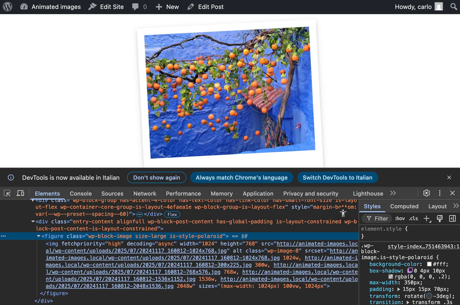
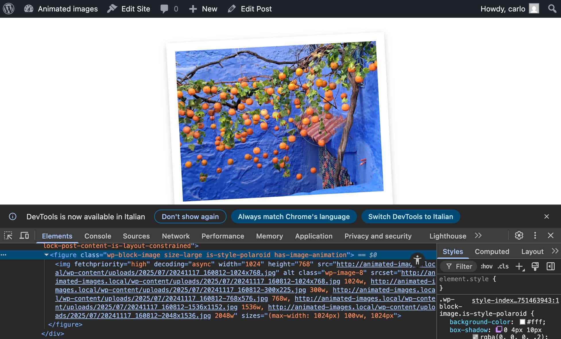
When the Polaroid style is selected, WordPress automatically adds the class .is-style-polaroid to the block wrapper.
The next step is providing the CSS for your style variation. Open your /src/style.scss and add the following code:
.wp-block-image.is-style-polaroid {
padding: 15px 15px 70px 15px;
background-color: white;
box-shadow: 0 4px 10px rgba(0, 0, 0, 0.2);
max-width: 360px;
transform: rotate(-3deg);
transition: transform 0.3s ease-in-out;
figure {
margin: 0 !important;
}
img {
display: block;
width: 100%;
height: auto;
}
figcaption {
position: absolute;
bottom: 15px;
left: 0;
right: 0;
text-align: center;
font-family: 'Permanent Marker', cursive;
color: #333;
font-size: 18px;
}
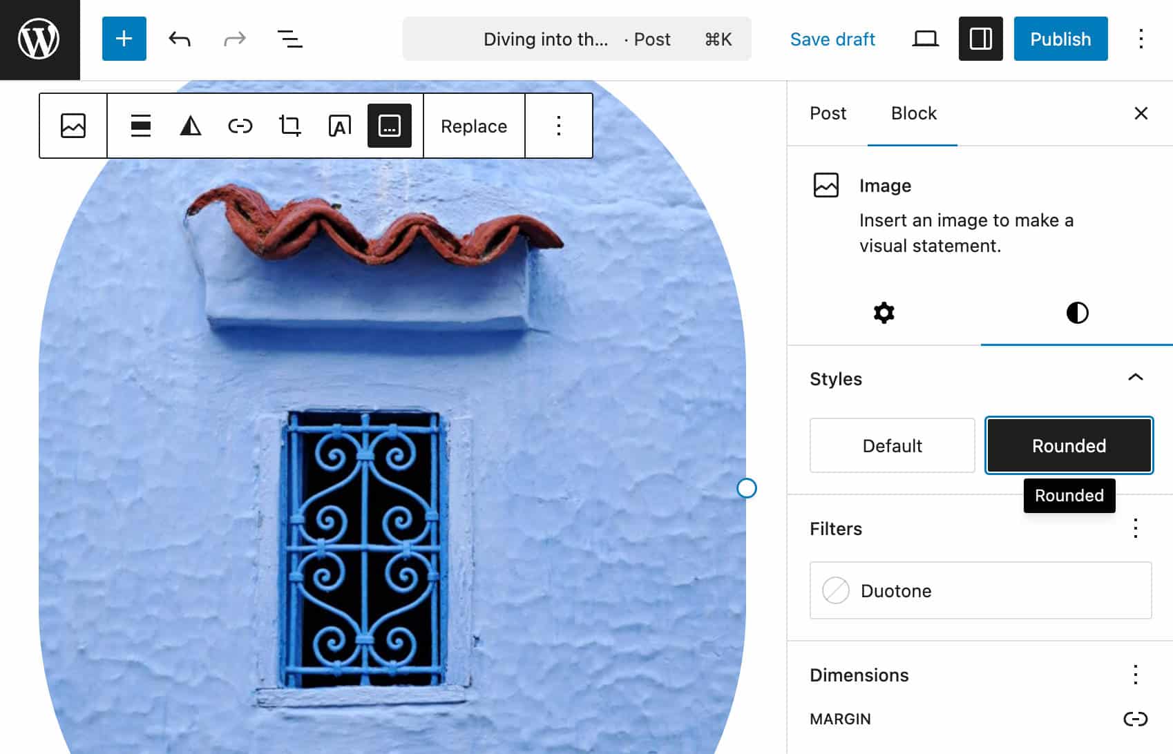
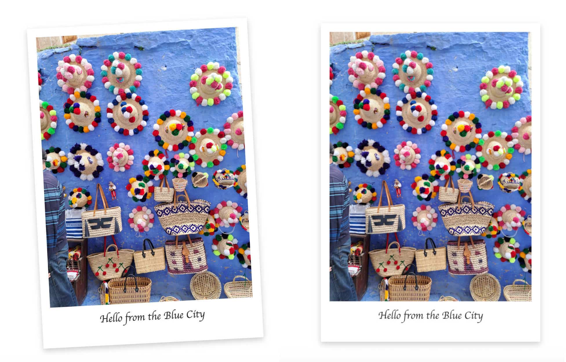
}Save your code, run npm run build, and hop over to your WordPress dashboard. Create a new post or page and add an image. With the image selected, click the Styles label in the block sidebar and select Polaroid.
Add a caption, save the post, and check the result on the frontend. You should see a Polaroid-style image with a nice italicized caption.
Build the logic
The next step is to build the logic to animate the image. We will create a simple animation using the CSS transform property. To start, add the following block to your src/style.scss:
.wp-block-image.is-style-polaroid.has-image-animation:hover {
	transform: rotate(0deg) scale(1.05);
}
This code ensures that the hover effect is only applied if the block is a Polaroid image and has a has-image-animation class applied from the toolbar toggle.
Now, you need the logic to add the CSS class to the image container, which is a figure element. To do that, you need a few filters and callback functions.
First, add the following line to your src/index.js file:
import { addFilter } from '@wordpress/hooks';Step 1. Add a new attribute to the Image block
You will use addFilter to manipulate the core Image block. First, you add a new imageAnimation attribute to the Image block:
function addImageAnimationAttribute( settings, name ) {
	if ( name !== 'core/image' ) {
		return settings;
	}
	settings.attributes = {
		...settings.attributes,
		imageAnimation: {
			type: 'boolean',
			default: false,
		},
	};
	return settings;
}

addFilter(
	'blocks.registerBlockType',
	'image-hacker/add-image-animation-attribute',
	addImageAnimationAttribute
);
The callback function addImageAnimationAttribute takes two arguments:
settings– An array of current block attributesname– Specify the name of the block whose attributes you want to modify.
The function then returns the updated array of attributes.
Step 2. Add a toggle control to the Image block
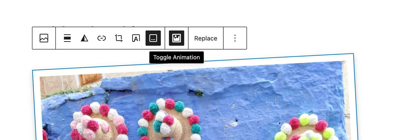
Next, you’ll need to add a control to the Image Block Toolbar to enable the animation.
First, add the following imports to the index.js file:
import { createHigherOrderComponent } from '@wordpress/compose';
import { Fragment } from '@wordpress/element';
import { BlockControls } from '@wordpress/block-editor';
import { ToolbarGroup, ToolbarButton } from '@wordpress/components';
import { __ } from '@wordpress/i18n';
Then add the following code to the end of the file:
const withPolaroidControls = createHigherOrderComponent((BlockEdit) => {
	return (props) => {
		if (props.name !== 'core/image') {
			return <BlockEdit {...props} />;
		}

		const { attributes, setAttributes, isSelected } = props;
		const { imageAnimation, className, lightbox } = attributes;

		return (
			<Fragment>
				<BlockEdit {...props} />

				<BlockControls>
					<ToolbarGroup>
						<ToolbarButton
							icon="format-image"
							label={__('Toggle Animation', 'image-hacker')}
							isActive={imageAnimation}
							onClick={() =>
								setAttributes({ imageAnimation: !imageAnimation })
							}
						/>
					</ToolbarGroup>
				</BlockControls>
			</Fragment>
		);
	};
}, 'withPolaroidControls');

addFilter(
	'editor.BlockEdit',
	'image-hacker/with-polaroid-controls',
	withPolaroidControls
);
Here’s what this code does:
- The
createHigherOrderComponentfunction creates a higher-order component (HOC) that wrapsBlockEdit, which is the main component responsible for displaying blocks in the editor. - The HOC intercepts the component and checks whether it is an Image block. This ensures that all your edits only apply to the Image block.
- We use the destructuring assignment to pull out the required properties and attributes from the
propsandattributesobjects. - We use
BlockControls,ToolbarGroup, andToolbarButtoncomponents to add a Toggle Animation button to the block toolbar. isActivesets the default state ofimageAnimationonClicktoggles theimageAnimationvalue.
Now you have an attribute and a button. However, if you click on the button, nothing happens.
Step 3. Add the CSS class to the wrapper element
The next step is to apply the has-image-animation class to the figure element wrapping the image. To do that, you need a filter that allows you to assign the CSS class to the image in the frontend.
Append the following code to the index.js file:
function addAnimationFrontendClass(extraProps, blockType, attributes) {
	if (blockType.name === 'core/image' && attributes.imageAnimation) {
		extraProps.className = `${extraProps.className || ''} has-image-animation`;
	}
	return extraProps;
}

addFilter(
	'blocks.getSaveContent.extraProps',
	'image-hacker/add-animation-frontend-class',
	addAnimationFrontendClass
);
This code dinamically adds the CSS class has-image-animation to the figure element when the imageAnimation attribute is set to true.
Let’s try to understand what happens in detail.
addFilterhooks into the editor’s processes to modify data or behavior.blocks.getSaveContent.extraPropsis the specific hook we are targeting.extraPropsis a special hook that lets you add extra HTML attributes to the wrapper element.image-hacker/add-animation-classis the unique name of your filter.addAnimationFrontendClassis the name of the callback function that executes every time theblocks.getSaveContent.extraPropshook runs. This function takes 3 arguments:extraProps: An object containing the properties of the block’s wrapper element, such asclassName.blockType: An object with block details, such as itsname(core/image).attributes: An object of block attributes
- The function’s logic ensures the code only runs when
blockType.name === 'core/image'andattributes.imageAnimationistrue. - If both conditions are true, the function returns a new
propsobject withhas-image-animationappended to the existing class object.
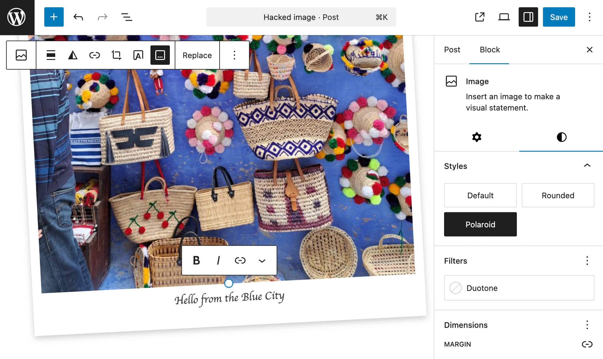
Now, you can try it yourself. Add an image to your content, select the Polaroid style from the block sidebar and click on the Toggle Animation button in the block toolbar. Save your post and check the result on the frontend. Your image should rotate when you hover over it.
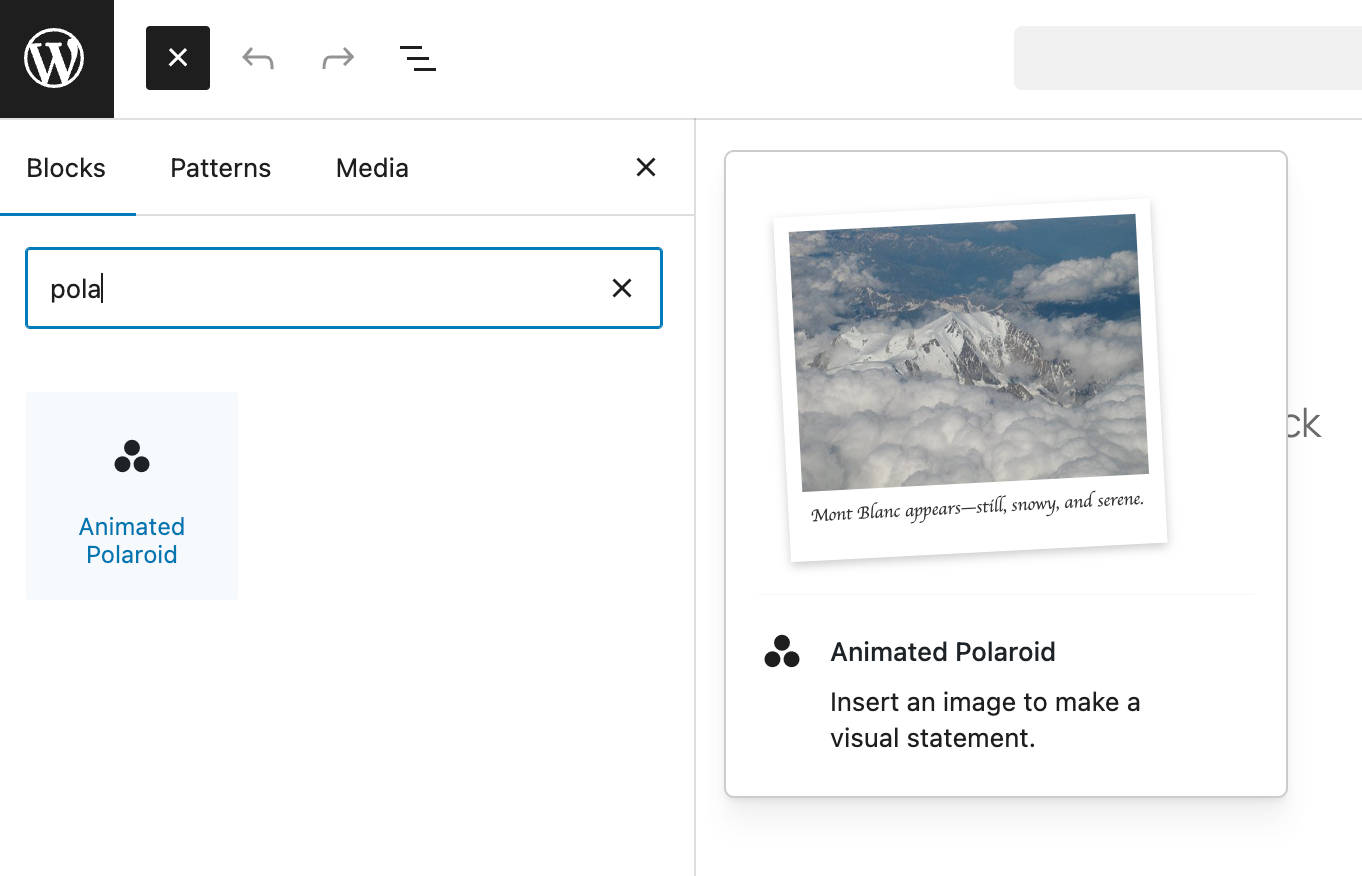
Register block variation
Block variations are preconfigured versions of a block, with a set of attributes and nested blocks. WordPress treats block variations as independent blocks, making them available in the block inserter and marking them with a custom icon.
You can use a block variation to create a new version of the Image block with the Polaroid-style applied by default.
The first step is to import the registerBlockVariation function into your /src/index.js file:
import { registerBlockStyle, registerBlockVariation } from '@wordpress/blocks';Then you add a call to the registerBlockVariation function inside domReady(), right below registerBlockStyle:
domReady(() => {
	// Register a style variation for the image block.
	registerBlockStyle('core/image', {
		name: 'polaroid',
		label: 'Polaroid',
	});

	// Register a block variation of the image block
	registerBlockVariation('core/image', {
		name: 'animated-polaroid',
		title: 'Animated Polaroid',
		icon: 'image-filter',
		attributes: {
			className: 'is-style-polaroid',
			imageAnimation: true,
		},
		scope: ['inserter'],
	});
});
The registerBlockVariation function creates a variation for an existing block. It accepts two arguments: the name of the block and an object defining the variation. (See also the introduction to block variations and the Block Variations API documentation.)
Save your file, run the build to apply your changes, and then return to your WordPress admin. Create a new post and search for the Animated Polaroid block in the block inserter.
Testing and debugging
Let’s do some testing. Add one or more images to a new post. Select the Polaroid style for each image, enable animation, and add links. Also, run tests with the Gallery block.
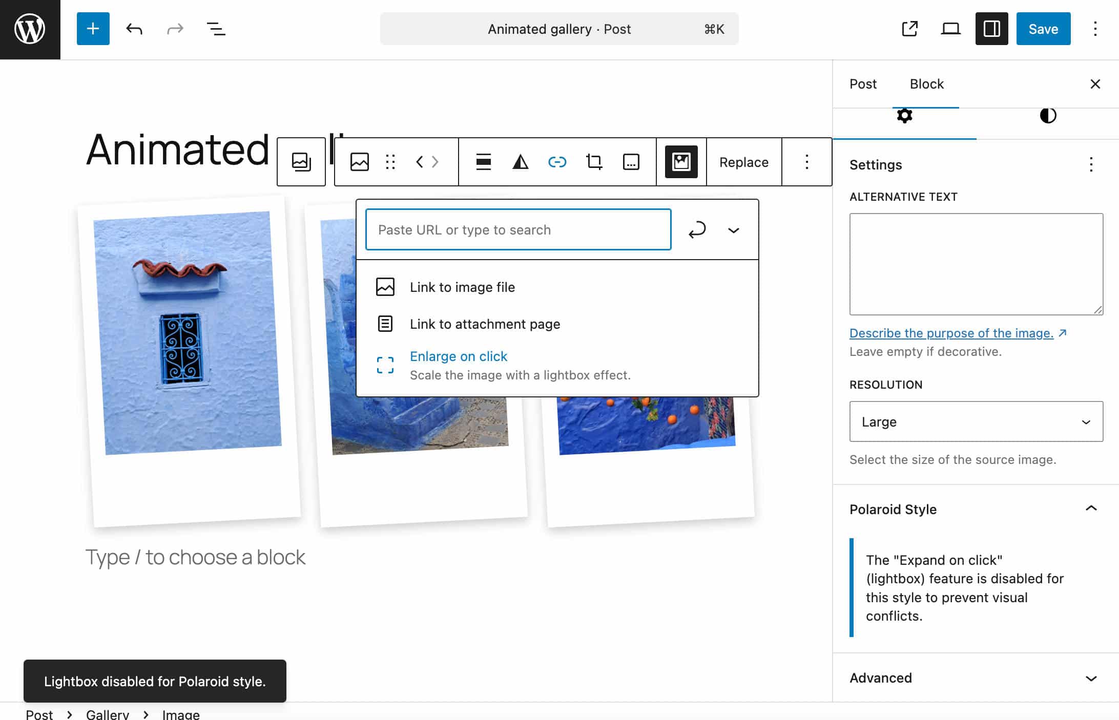
Everything seems to be working as expected. However, adding a link with a lightbox effect to an image with the Polaroid style does not produce a nice result.
This strange behavior seems to be due to a compatibility issue between the WordPress lightbox and CSS transitions.
To avoid a long, complex debugging process, you may want to disable the Enlarge on click option and add a warning to notify users that the lightbox is disabled.
You first need to import some additional resources. Below is the complete list of resources imported from the /src/index.js file:
import { registerBlockStyle, registerBlockVariation } from '@wordpress/blocks';
import domReady from '@wordpress/dom-ready';
import { addFilter } from '@wordpress/hooks';
import { createHigherOrderComponent } from '@wordpress/compose';
import { Fragment, useEffect } from '@wordpress/element';
import { InspectorControls, BlockControls } from '@wordpress/block-editor';
import { PanelBody, Notice, ToolbarGroup, ToolbarButton } from '@wordpress/components';
import { __ } from '@wordpress/i18n';
import { useDispatch } from '@wordpress/data';
import './style.scss';
We added the following imports:
useEffectfrom@wordpress/element. (See docs)InspectorControlsfrom@wordpress/block-editor(See docs).PanelBodyandNoticefrom@wordpress/components(See docs).useDispatchfrom@wordpress/data. (See WordPress Developer Blog)
Now change the withPolaroidControls function as follows:
const withPolaroidControls = createHigherOrderComponent((BlockEdit) => {
	return (props) => {
		if (props.name !== 'core/image') {
			return <BlockEdit {...props} />;
		}

		const { attributes, setAttributes, isSelected } = props;
		const { imageAnimation, className, lightbox } = attributes;

		const isPolaroid = className?.includes('is-style-polaroid');

		const { createNotice } = useDispatch('core/notices');

		useEffect(() => {
			if (isPolaroid && lightbox?.enabled) {
				// Disable the lightbox to prevent the conflict.
				setAttributes({ lightbox: { ...lightbox, enabled: false } });

				// Show the user a temporary 'snackbar' notice.
				createNotice(
					'warning', // The type of notice (info, success, warning, error)
					__('Lightbox disabled for Polaroid style.', 'image-hacker'),
					{
						type: 'snackbar',
						isDismissible: true,
					}
				);
			}
		}, [isPolaroid, lightbox]);

		return (
			<Fragment>
				<BlockEdit {...props} />

				<BlockControls>
					<ToolbarGroup>
						<ToolbarButton
							icon="format-image"
							label={__('Toggle Animation', 'image-hacker')}
							isActive={imageAnimation}
							onClick={() =>
								setAttributes({ imageAnimation: !imageAnimation })
							}
						/>
					</ToolbarGroup>
				</BlockControls>

				{isSelected && isPolaroid && (
					<InspectorControls>
						<PanelBody title={__('Polaroid Style', 'image-hacker')}>
							<Notice status="info" isDismissible={false}>
								{__(
									'The "Expand on click" (lightbox) feature is disabled for this style to prevent visual conflicts.',
									'image-hacker'
								)}
							</Notice>
						</PanelBody>
					</InspectorControls>
				)}
			</Fragment>
		);
	};
}, 'withPolaroidControls');useEffectis a React Hook that “lets you synchronize a component with an external system.” The code is executed after the component has been rendered and each time a value in the dependency array[isPolaroid, lightbox]changes. The check only runs when the user applies or removes the Polaroid style or activates or deactivates the lightbox. (See React documentation.)- The condition
if (isPolaroid() && lightbox.enabled)ensures that the code only executes if the image has the Polaroid style and the lightbox option is enabled. - If the condition is
true, the lightbox is disabled, and a temporary warning notice appears. (See also Notices data reference.) - The condition
isSelected && isPolaroidgenerates a new panel in the image block toolbar to notify users that the lightbox is disabled. Unlike the snackbar, this panel displays a permanent warning.
Summary
In this tutorial, we dove into some of the most exciting and powerful developer features of the WordPress block editor through the lens of a real-world project: we extended the core Image block with functionalities not available out of the box, with custom styles and animation effects.
We followed a progressive enhancement approach, crafting a block style variation for the Image block. This allows users to give their images a classic Polaroid look easily.
Next, we added a dedicated button to the Image block’s toolbar, allowing users to create a captivating hover animation effect.
Finally, we wrapped it all up by creating a block variation preconfigured with the Polaroid style and animation settings applied by default.
We hope the insights and techniques you’ve gained from this tutorial will empower you to create some truly surprising customizations for Gutenberg’s core blocks!
Happy coding!

Carlo is a passionate lover of webdesign and front-end development. He has been playing with WordPress for more than 20 years, also in collaboration with Italian and European universities and educational institutions. He has written hundreds of articles and guides about WordPress, published both on Italian and international websites, as well as on printed magazines. You can find him on LinkedIn.

