WordPress 6.6 “Dorsey” is out. The new version focuses on refining and enhancing several features introduced in previous versions. However, plenty of additions take the core one step further along the path of phase 3 of WordPress development.
A total of 299 Core Track tickets are included in WordPress 6.6, along with 392 enhancements, 462 bug fixes, and 46 accessibility improvements for the Block Editor.
Among the many new features coming with WordPress 6.6, block pattern overrides are the ones we like the most. Initially planned for release with WordPress 6.5, then postponed to 6.6, the pattern overrides are the second implementation of the Block Bindings API and give us a better idea of what’s coming with future WordPress releases.
However, pattern overrides are only one of many great additions to the upcoming WordPress release. So, let’s begin our journey to discover the most exciting new features and enhancements coming with WordPress 6.6.
Synced pattern overrides
The first implementation of the Block Bindings API was for connecting block attributes and custom fields. With WordPress 6.6, a second iteration unlocks an enhancement of synced patterns named Synced Pattern Overrides.
There are two types of block patterns:
- Synced block patterns
- Standard (not synced) block patterns
The difference between the two types is that all changes made to a synced pattern apply to every occurrence of a pattern on your entire website. In contrast, changes to a standard block pattern only affect a specific pattern instance.
Synced pattern overrides are somewhere in the middle between the two extremes. Thanks to the Block Bindings API, you can now build block patterns that keep the same structure everywhere on your website and change in sync with the customizations made to the pattern structure and style in the site editor. However, you can change the content of the pattern on an individual instance without affecting other instances of the same pattern on the site.
Let’s find out how Pattern overrides work.
First, you need a synced pattern. You can build it from scratch in the post editor or find existing synced patterns in the site editor’s Patterns section.
Step 1: Go to Patterns and duplicate one of the existing patterns, such as the Hero pattern of the Twenty Twenty-Four default theme. Add a name and set the copy as Synced pattern.
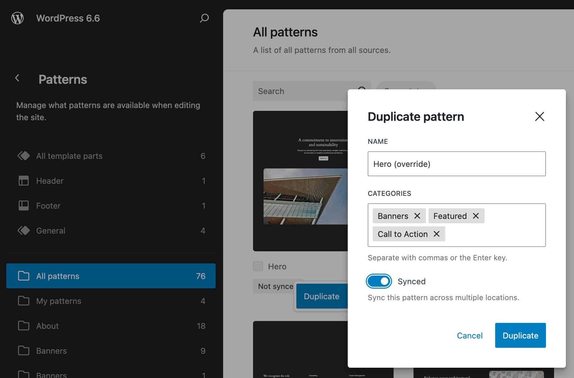
Step 2: Navigate to the My patterns section and find your new synced pattern. Open it in the site editor and select all the blocks you need to override individually.
Go to the block settings sidebar and scroll down to the Advanced section. Here, you’ll find a button, Enable Overrides.
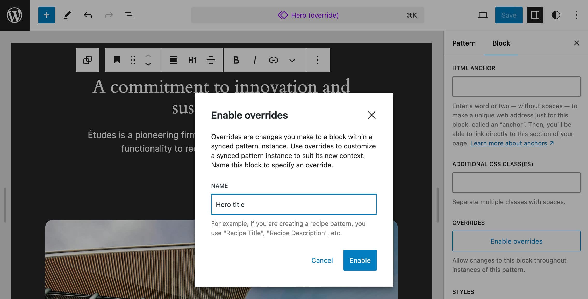
When you click the button, you are prompted to add a name and set the type of pattern.
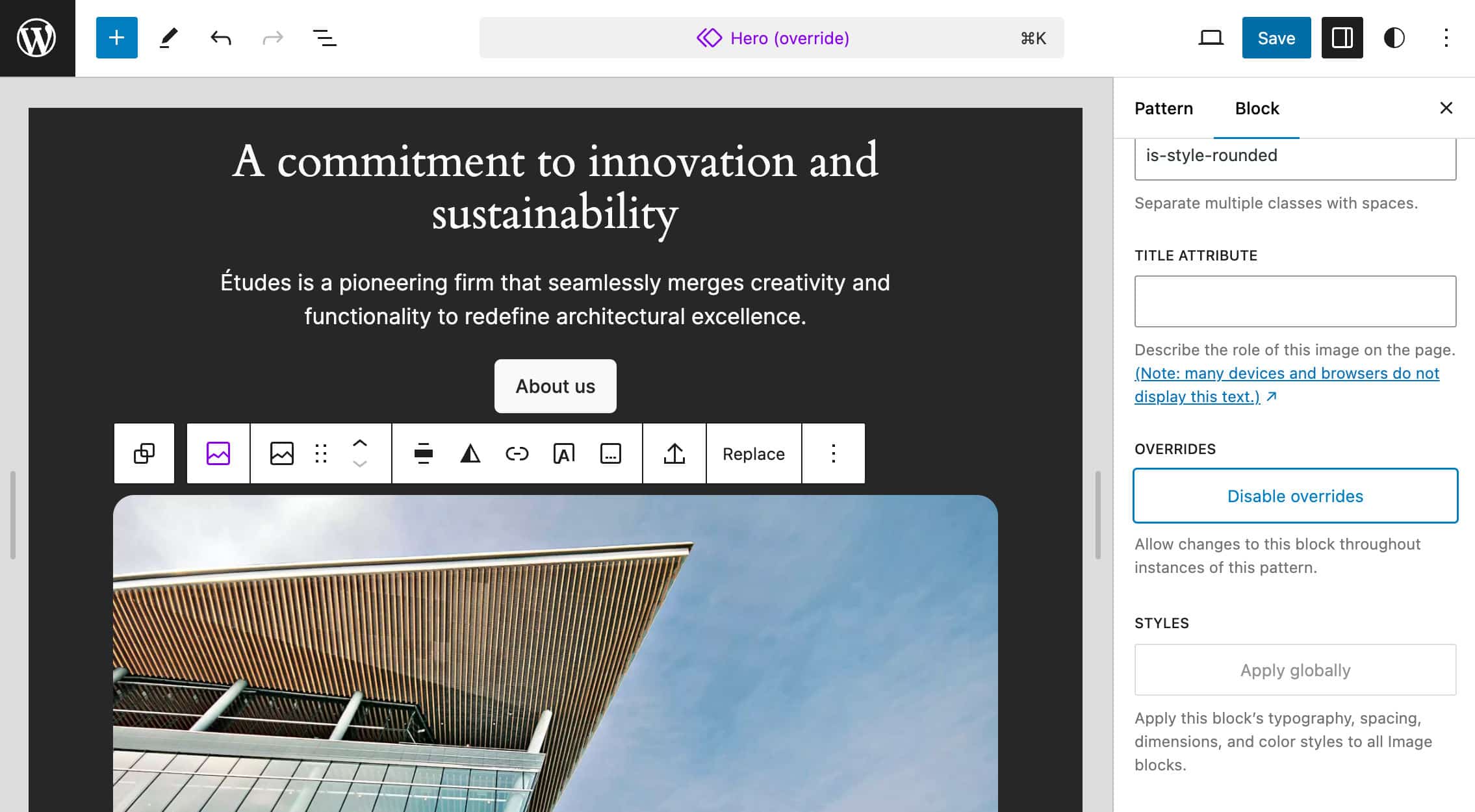
Step 3: Repeat the same process for each block you want to override. When done, create a new post or page and include your custom pattern.
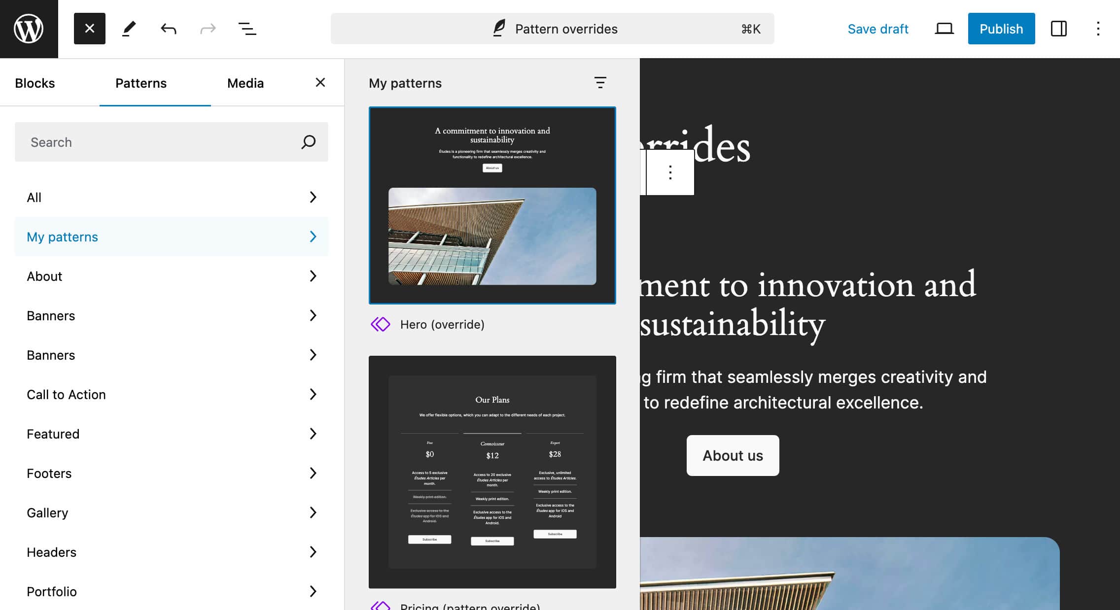
Step 4: Change the content of the blocks to override and save the post. Finally, check the result on the front end.
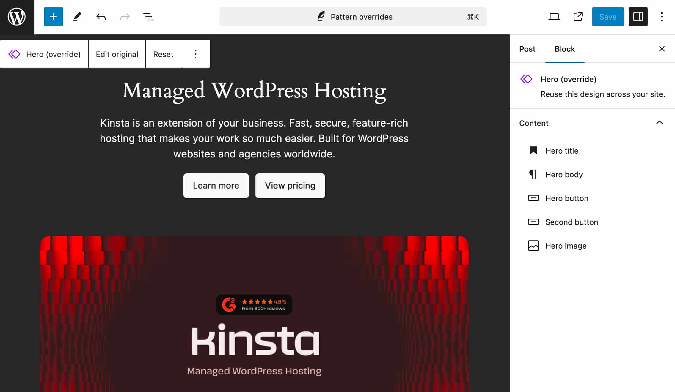
And you are done. You can add any number of these patterns anywhere on your website, and each new instance shows the same original content but is ready for your customization.
Now, let’s check the code of these patterns. Navigate back to the Patterns section of the Site Editor. Select My Patterns and add your pattern. Then, open the Options menu and select Code Editor to view the code of the pattern.
In our example, the code should look something like the following:
<div class="wp-block-group">
	<!-- wp:heading {
		"textAlign":"center",
		"level":1,
		"metadata":{
			"bindings":{
				"__default":{
					"source":"core/pattern-overrides"
				}
			},
		"name":"Hero title"
	},"fontSize":"x-large"} -->
		<h1 class="wp-block-heading has-text-align-center has-x-large-font-size">A commitment to innovation and sustainability</h1>
	<!-- /wp:heading -->
	...
</div>
In the block delimiter, you will notice the metadata.bindings property. This makes the Heading block editable. The __default binding instructs WordPress to connect all supported attributes to a specific source, which is "core/pattern-overrides".
The same property applies to all blocks you need to make editable. See, for example, the Button block:
<div class="wp-block-buttons">
	<!-- wp:button {
		"metadata":{
			"bindings":{
				"__default":{
					"source":"core/pattern-overrides"
					}
				},
			"name":"Hero button"
			}
		} -->
	<!-- /wp:button -->
	<div class="wp-block-button">
		<a class="wp-block-button__link wp-element-button">About us</a>
	</div>
	...
</div>
Now, let’s return to the post editor and switch to Code editor. The code should be similar to the following:
<!-- wp:block {
	"ref":261,
	"content":{
		"Hero title":{
			"content":"Managed WordPress Hosting"
		},
		"Hero body":{
			"content":"Kinsta is an extension of your business. Fast, secure, feature-rich hosting that makes your work so much easier. Built for WordPress websites and agencies worldwide."
		},
		"Hero button":{
			"text":"Learn more",
			"url":"https://kinsta.com/wordpress-hosting/",
			"linkTarget":"",
			"rel":""
		},
		"Second button":{
			"text":"View pricing",
			"url":"https://kinsta.com/pricing/",
			"linkTarget":"_blank",
			"rel":"noreferrer noopener"
		},
		"Hero image":{
			"id":268,
			"alt":"",
			"url":"http://wordpress.kinsta.cloud/wp-content/uploads/2024/06/homepage-featured-image.jpg"
		}
	}
} /-->
Here, you won’t see any blocks but only a reference to the block pattern and a set of properties for each block that are set as editable.
Again, you can add any number of block patterns anywhere on your website, and these patterns will match the same structure and design you built in the Site Editor.
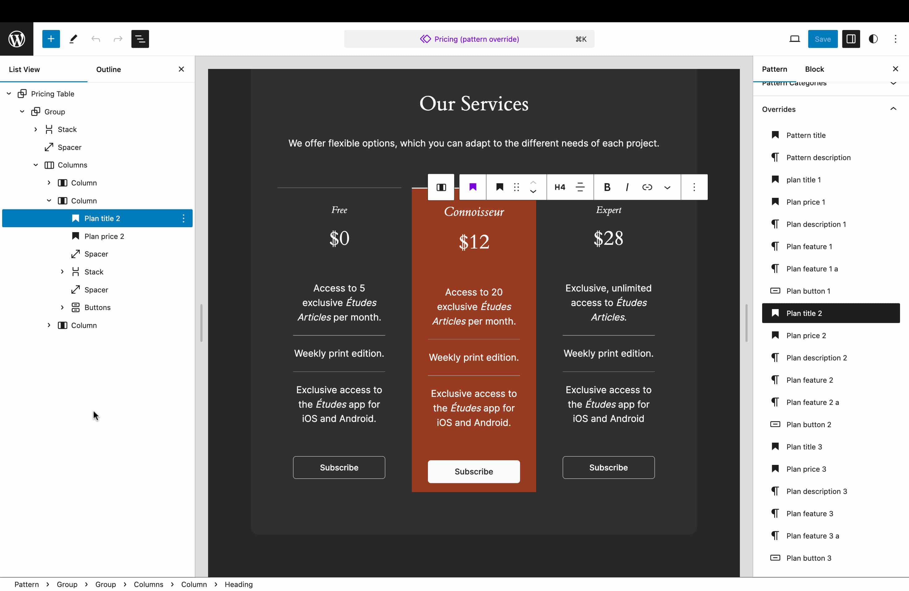
Then, you can change the content of the editable blocks individually, keeping the structure the same.
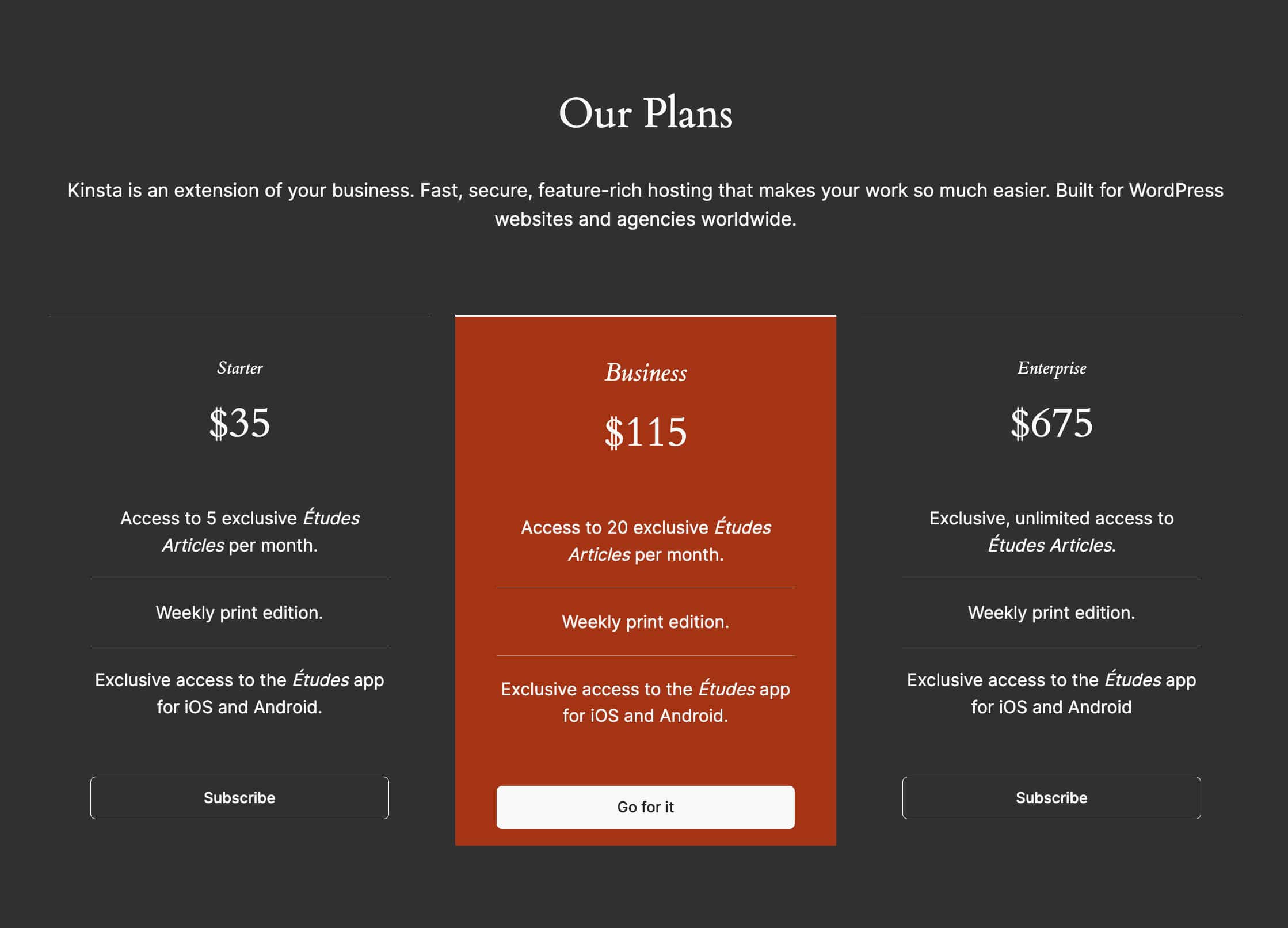
As pattern overrides are an implementation of the Block Bindings API, we can override only supported blocks: Heading, Paragraph, Image, and Buttons.
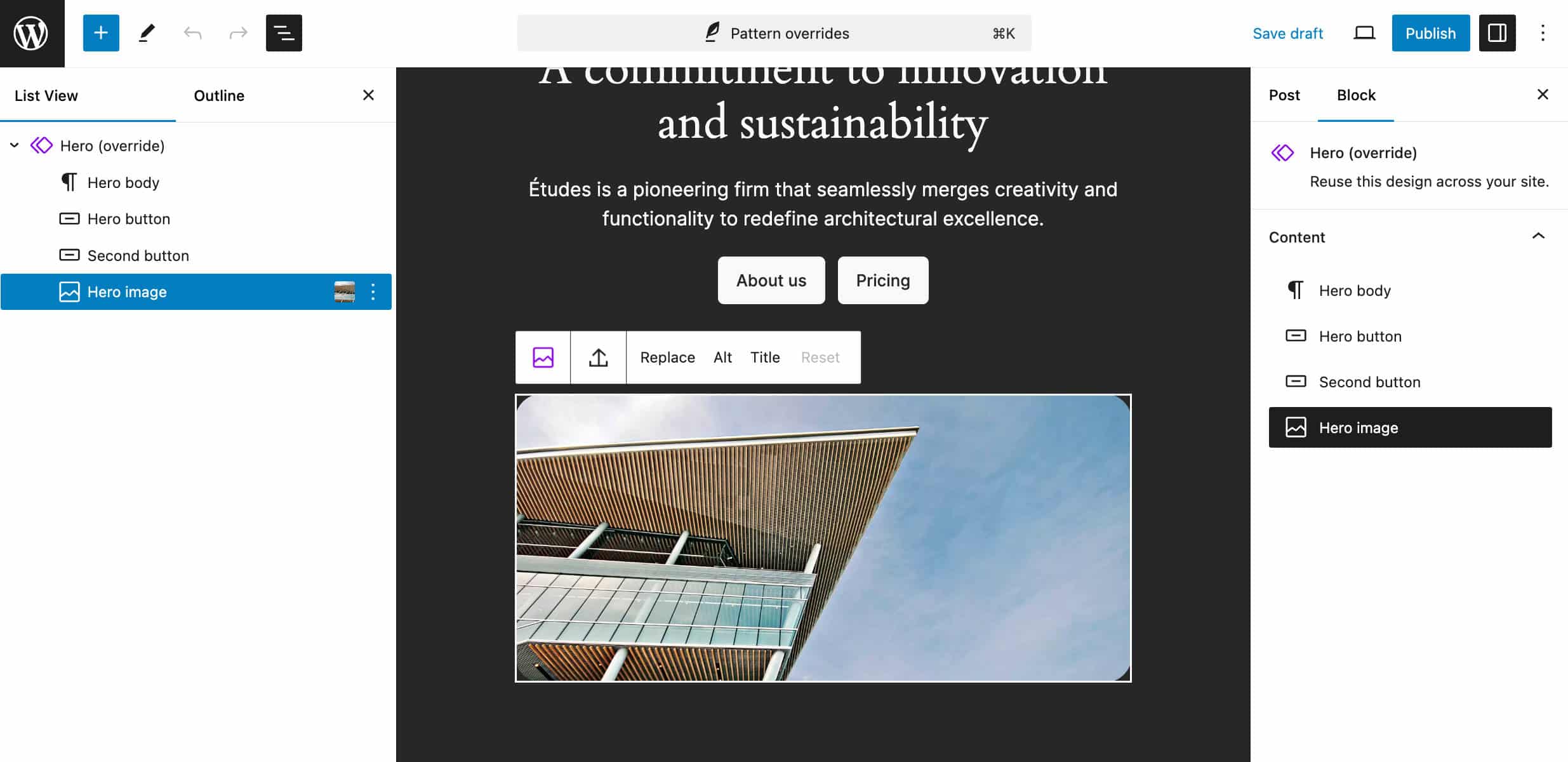
You can dive deeper into pattern overrides in this WordPress TV video and this blog post by Nick Diego.
Pattern overrides are subject to future improvements and additions. The discussion continues on GitHub here and here.
Edit custom field values from connected blocks
WordPress 6.5 introduced custom fields as data source (core/post-meta) for block attributes, allowing users to connect custom field values to blocks. WordPress 6.6 brings new enhancements to this feature, such as the ability to edit custom field values directly from the connected block.
You can try it yourself by registering a new set of custom fields from a plugin or the functions file of your theme, making sure to set show_in_rest to true when registering the post meta. Here is an example:
register_post_meta(
	'post',
	'book_title',
	array(
		'show_in_rest' => true,
		'type' => 'string',
		'single' => true,
		'sanitize_callback' => 'sanitize_text_field'
	)
);
Once done, create a new post or page and add a new custom field with the same name. Add one of the supported blocks (i.e., a Heading block) to the canvas, switch to the Code editor, and modify the block as shown below:
<!-- wp:heading
{
	"metadata":{
		"bindings":{
			"content":{
				"source":"core/post-meta",
				"args":{
					"key":"book_title"
				}
			}
		}
	}
} -->
<h2 class="wp-block-heading"></h2>
<!-- /wp:heading -->
Save the post/page and check the result. Now, you can edit the Heading content directly from the block. The custom field value should reflect your changes.
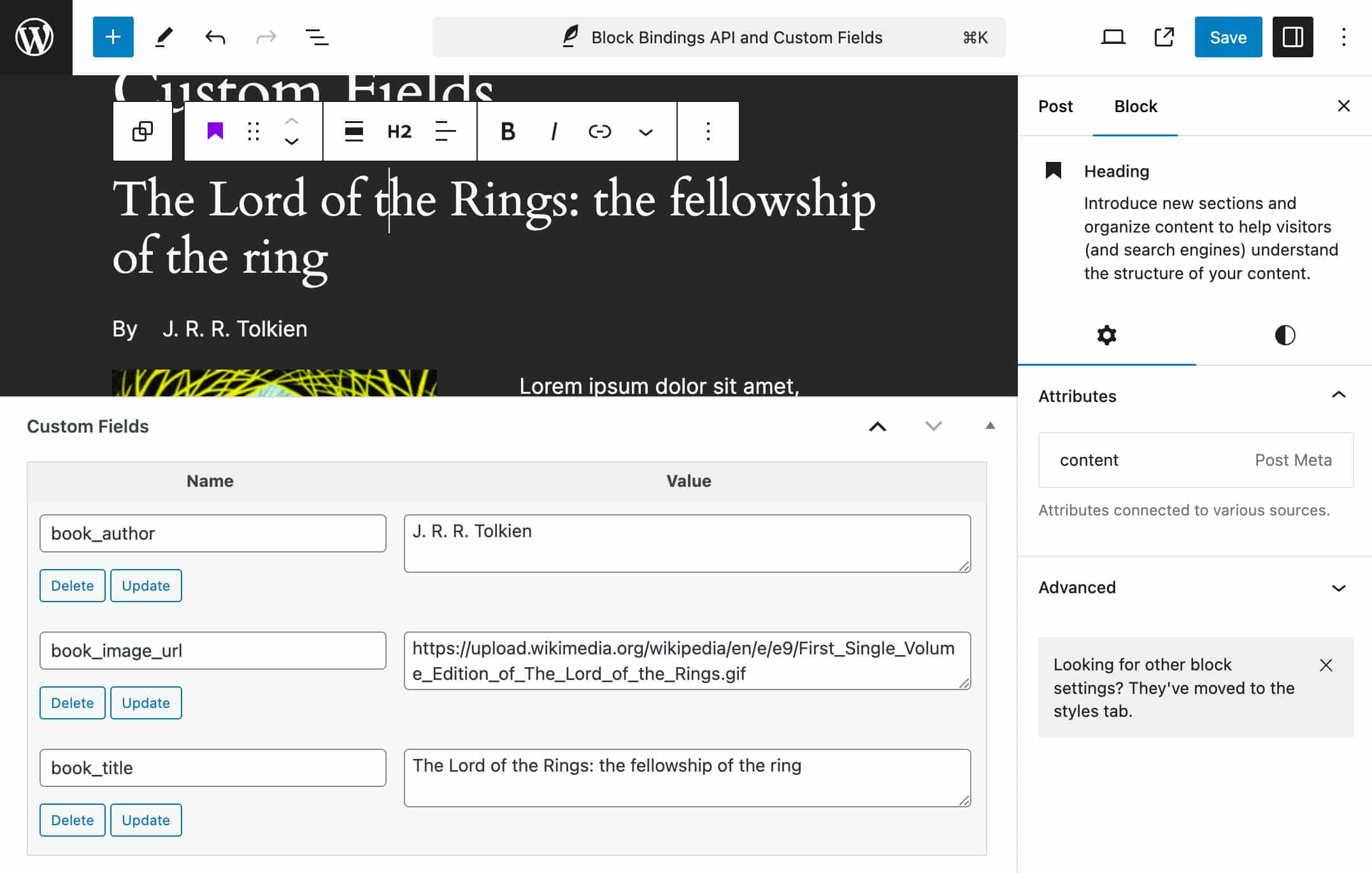
In addition, a new panel now provides info about the block attributes connected to custom fields, displaying the block attributes linked to custom fields.
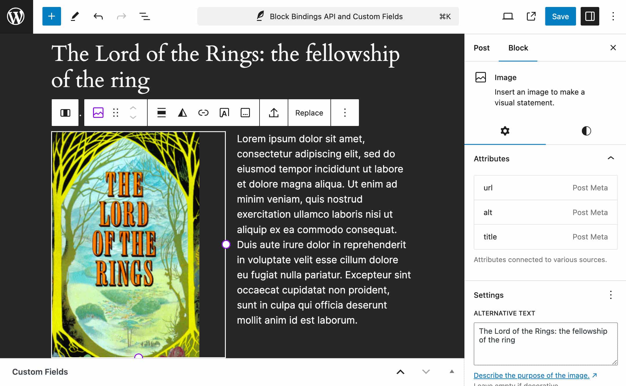
This feature comes with some related functionalities:
- You can update custom field values from a query loop.
- If multiple blocks are connected to the same custom field, they share the same custom field value and change in sync with it.
- Users can edit custom fields only in posts they are allowed to.
Final note: As mentioned earlier, blocks supporting the Block Bindings API are still limited to the following:
| Block | Attributes |
| Image | url, alt, title |
| Heading | content |
| Paragraph | content |
| Button | url,text, linkTarget, rel |
Data Views enhancements
Introduced with WordPress 6.5, Data Views is an improved UI for collections of templates, patterns, posts, media, and more. The new interface plays an essential role in phase 3 of the development roadmap – Collaboration – and as such, we may expect more enhancements with future WordPress releases, “including workflow improvements for assigning folks to review posts or creating custom views to streamline processes.” As of WordPress 6.6, the new interface only exists in the Site editor, but it should extend to more admin sections with future releases.
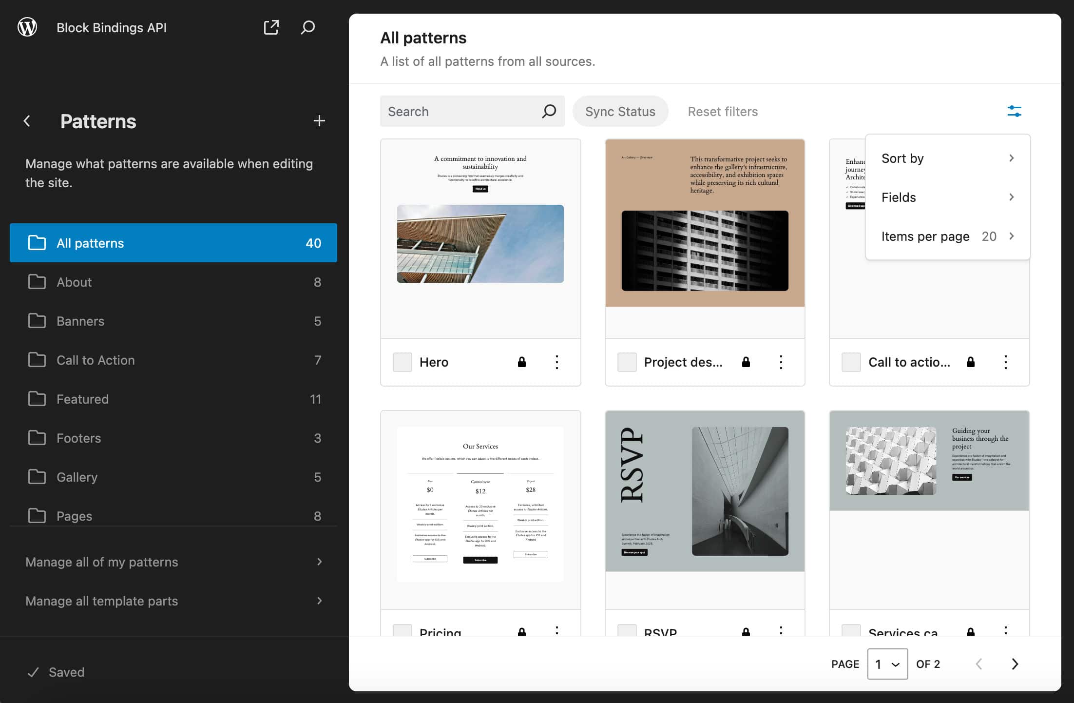
WordPress 6.6 introduces new layouts for the management pages. Template part management has been removed and integrated into the Patterns section, while the Site Editor’s Patterns menu has been rearranged into two sections, with the template parts on top and the patterns below.
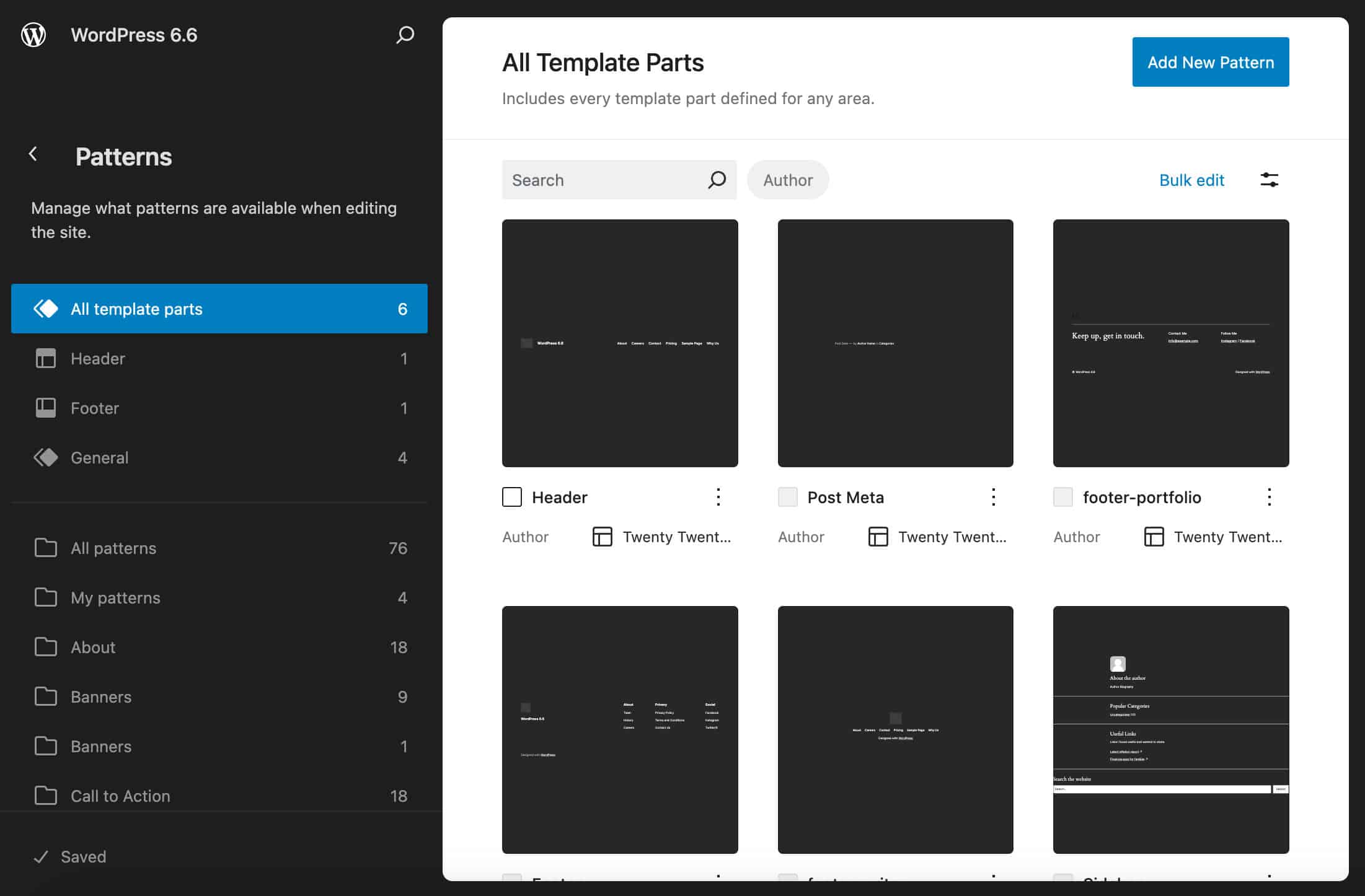
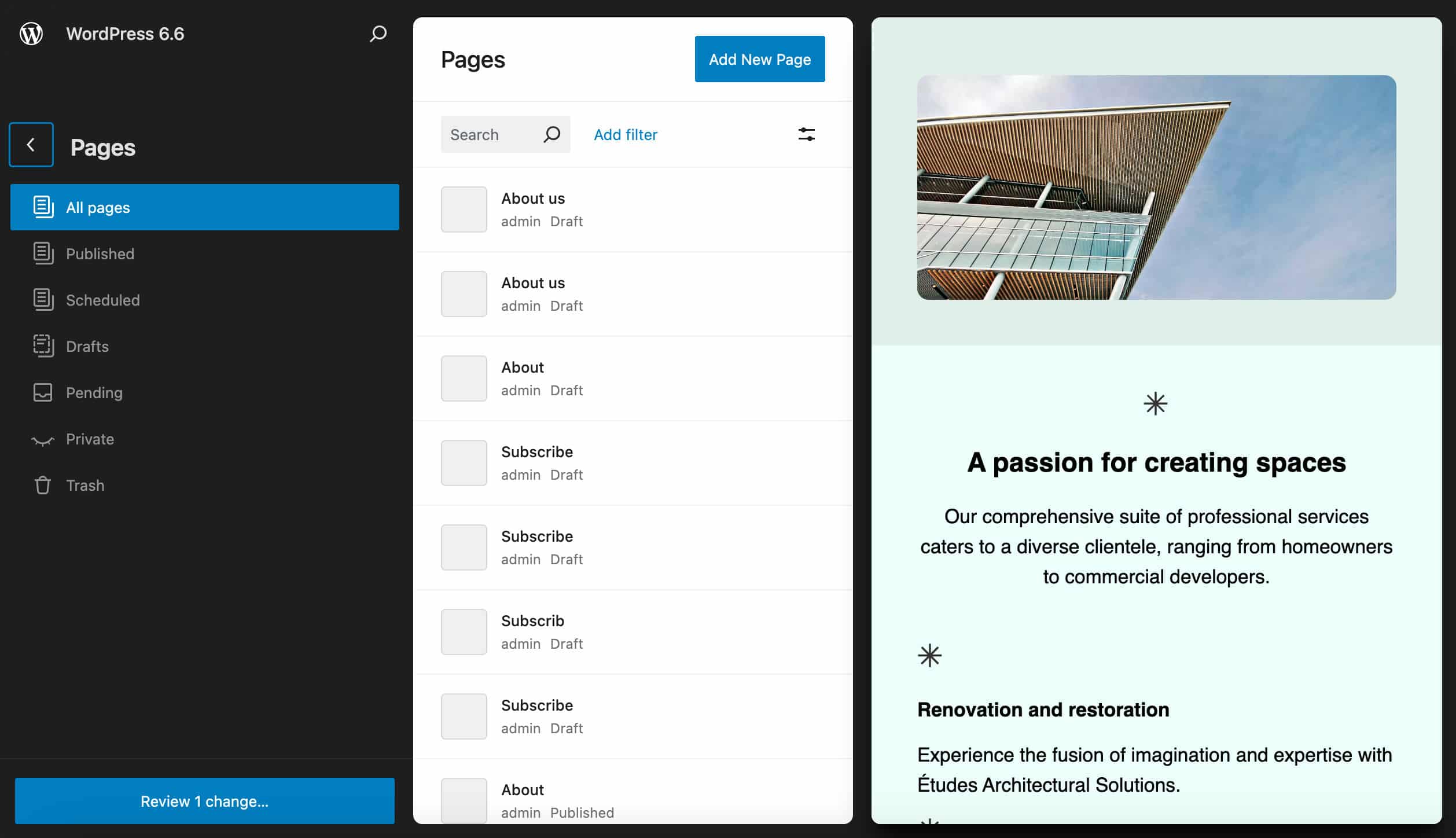
For pages, a new panel provides a list of pages and allows to preview any page with a single click.
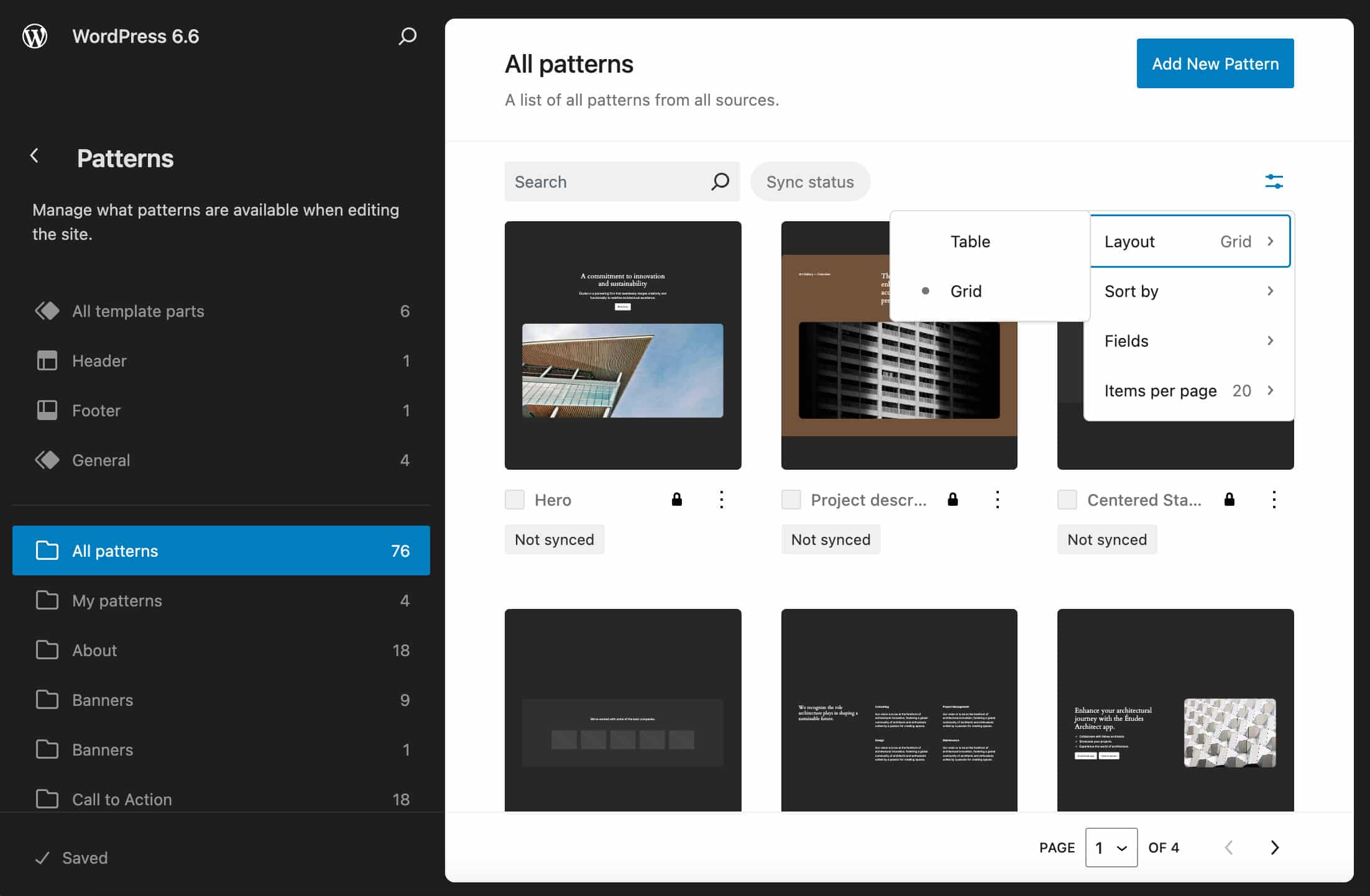
You will also see new layout options available in the View options menu. (The icon in the top right corner.)
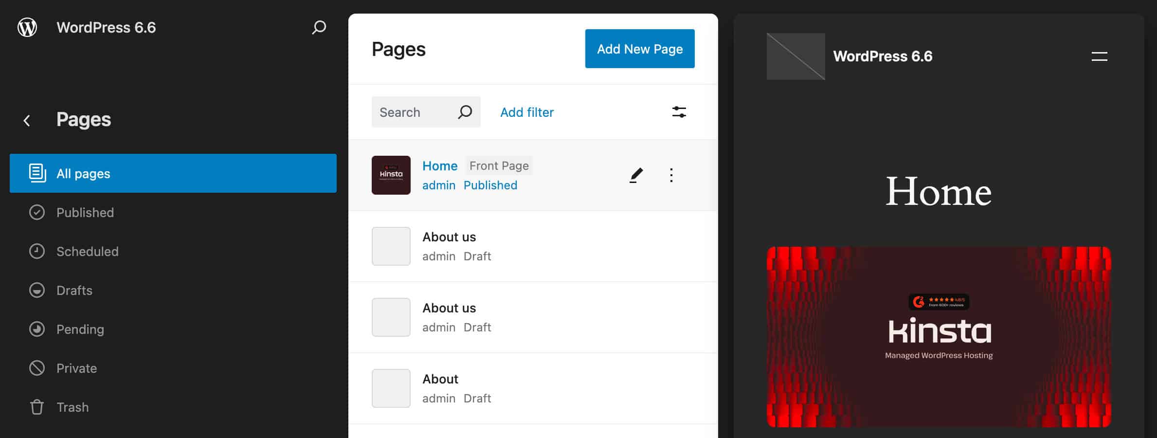
Alongside these more extensive changes, Data Views are affected by other minor enhancements improving the interface and making it more functional and informative, such as a new bulk edit feature and a badge on the Front page or Posts page.
WordPress 6.6 takes Data Views one step further, but we are still at an early stage. In the future, we will see the introduction of an extensibility API to allow developers to act directly on views. For a more in-depth look at the future of Data Views, check Data Views Update – June 2024 by Anne McCarthy.
Other improvements to the Block Editor
WordPress 6.6 brings 8 Gutenberg releases into the core – from 17.8 to 18.5 – with many improvements to the interface, the React library, the Block API, and much more. Here are just a few:
A new publish flow
With 6.6, the post/page settings sidebar has been cleaned up and made lighter and more consistent. With this iteration, the unification process between the post and site editor makes a step forward, and both editors now have the same publish flow.
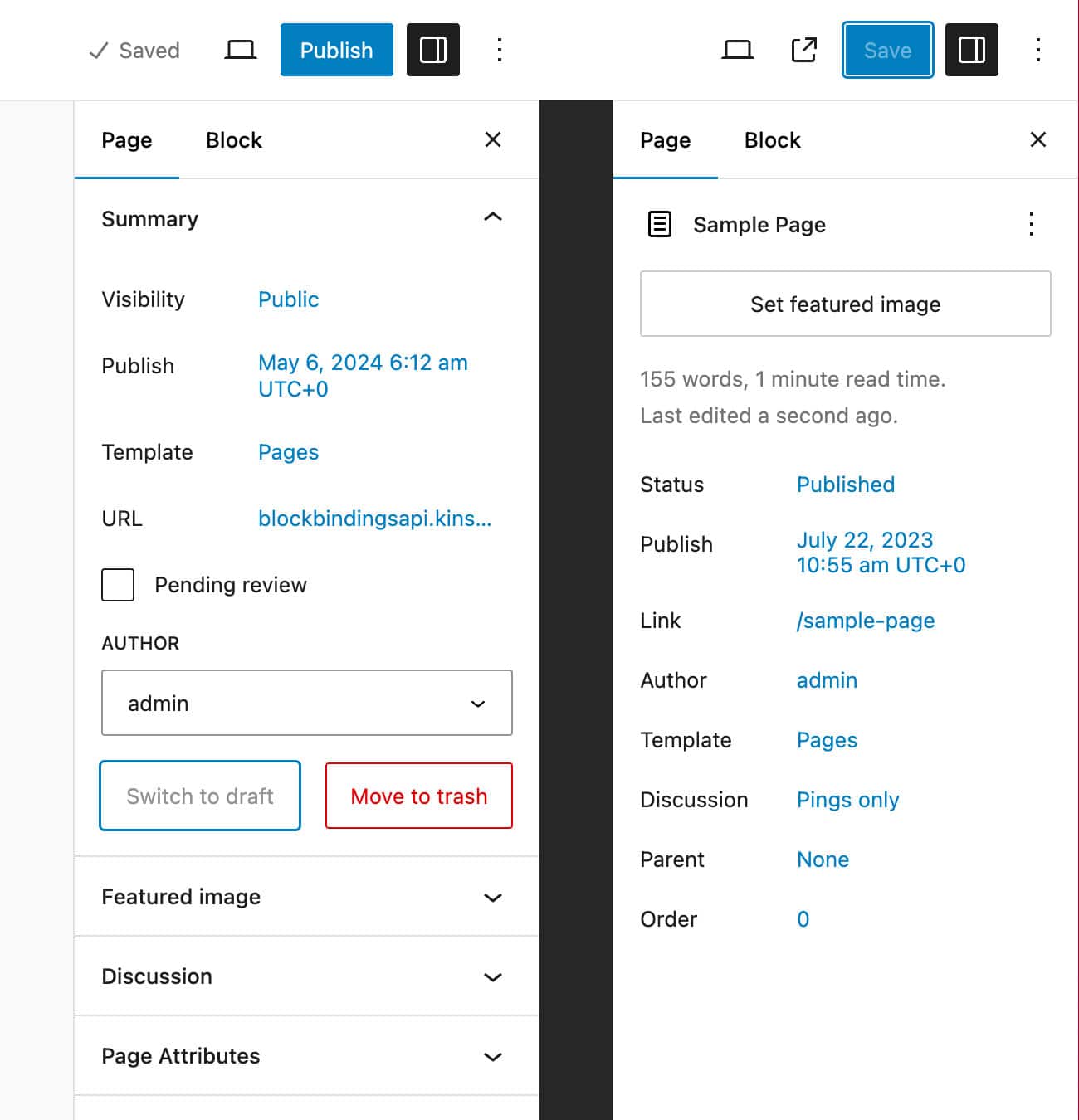
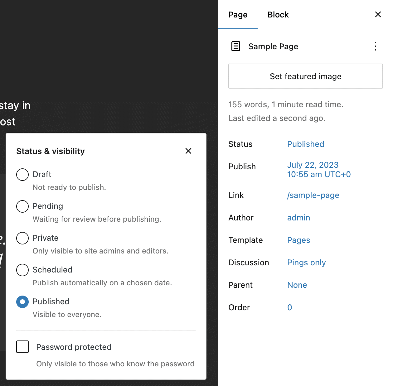
The publishing experience has been standardized, and a new Status & visibility panel allows you to set the post/page status in a more convenient position.
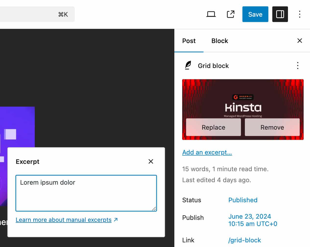
Other changes affect the Featured image and Excerpt controls, which moved to the top of the sidebar and the improved Actions menu in the top right corner.
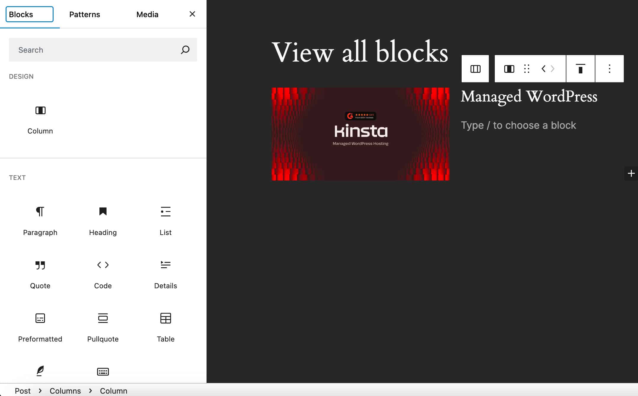
View all blocks
In previous versions of WordPress, when you selected a block, the block inserter showed only the block you were allowed to add to the selected block. For example, with a Column selected, you could only see the Column block in the block inserter because you could only add a Column.
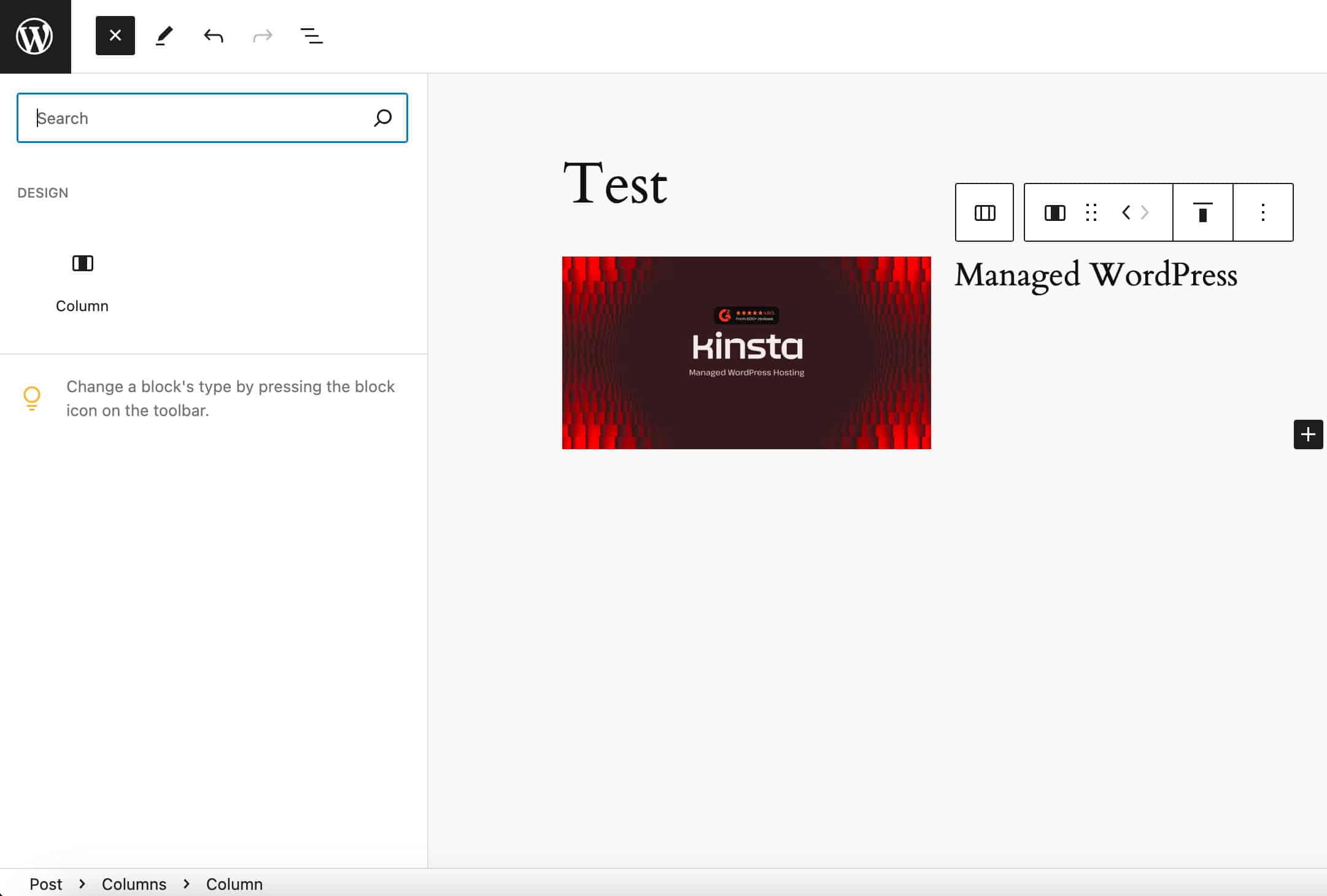
Starting with WordPress 6.6, the block inserter shows two groups of blocks: blocks you can add into the selected block and blocks you can add below the selected block.
A keyboard shortcut to group blocks
Now, you can group a selection of blocks with ⌘ + G on MacOS or Ctrl + G on Windows.
Block patterns in Classic themes
Starting with WordPress 6.6, classic themes support the same pattern interface as block themes. So, if you use classic themes on your WordPress website, you will enjoy the same rich experience in pattern management as block themes.
The following images compare the Patterns screen in WordPress 6.5 and the Patterns admin section in WordPress 6.6.
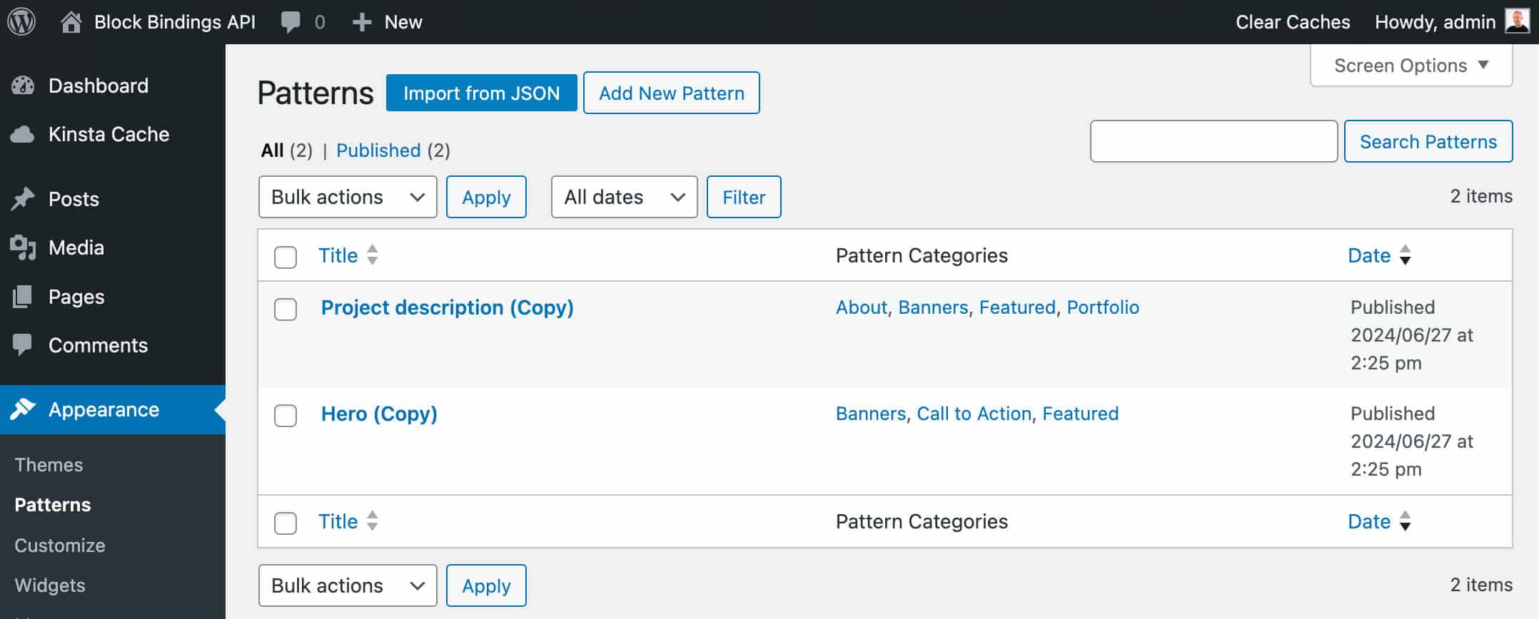
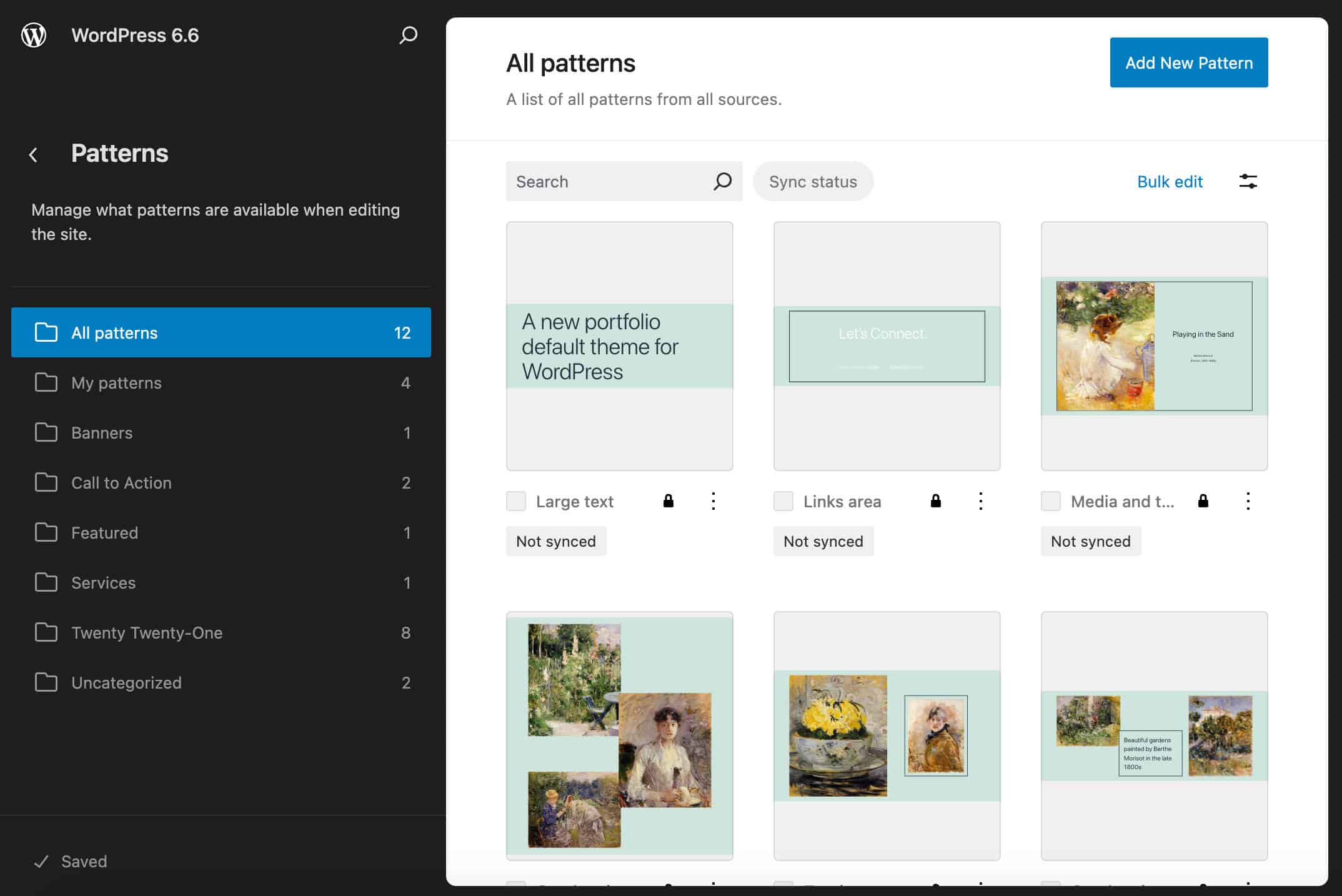
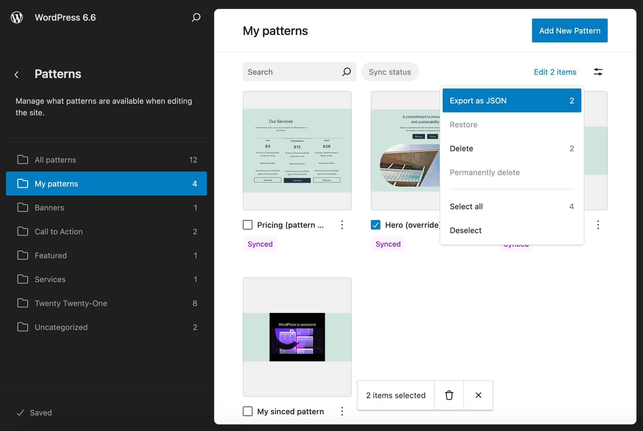
You can now edit, duplicate, rename, export as JSON, and delete patterns like you are used to with block themes.
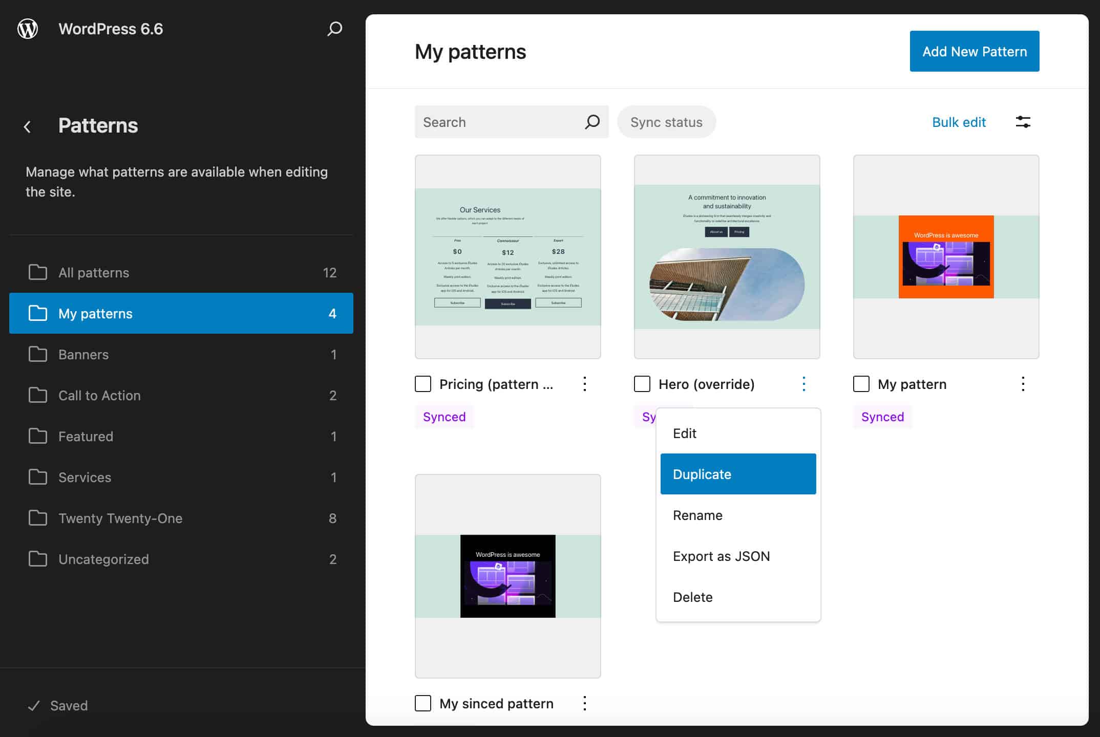
You can perform bulk actions by selecting patterns individually or clicking on the Bulk edit button. Sorting and filtering functions are also available.
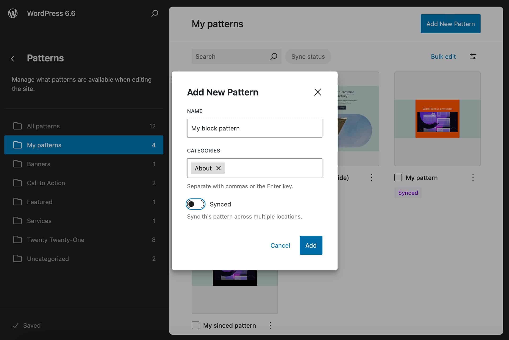
You can also create patterns like you create them in block themes. Click on the Add new pattern button in the top right corner, and you’ll be prompted to fill out the form with pattern details.
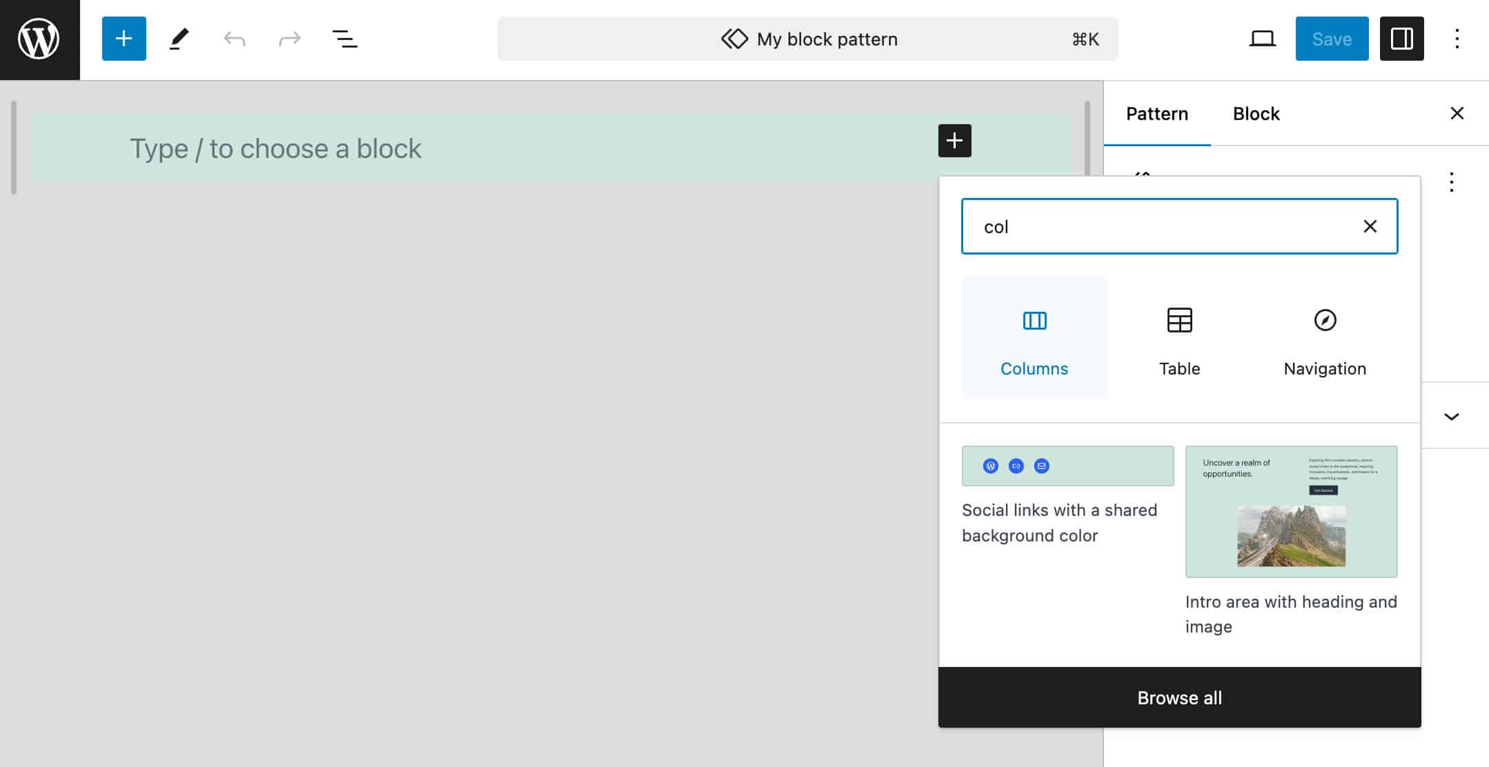
Then, you can build or edit your pattern in the Site editor as usual.
This update gives classic theme users more power, unlocks new capabilities, and makes the editing experience more consistent across classic and block themes.
New tools and features for designers and theme developers
WordPress 6.6 brings so many powerful features and enhancements for designers and theme developers, and we are happy to share the ones we liked the most here. Designers have more powers when it comes to styling their pages, thanks to section styles, site-wide background images, a brand new shadow editor, and a grid layout variation. And more tools provide even more flexibility to theme authors. Let’s dive in.
Theme.json v.3
WordPress 6.6 also brings a new theme.json version that now is version 3. The new version changes the way to override pre-defined properties. Now, to change the default values of fontSizes or spacingSizes, you need to set defaultFontSizes or defaultSpacingSizes to false under settings.typography or settings.spacing.
To recap:
- With
defaultFontSizesordefaultSpacingSizesset totrue, default font sizes and spacing sizes are shown in the editor, and themes are not allowed to create presets using the default slugs.defaultFontSizesis set totrueby default. - With
defaultFontSizesordefaultSpacingSizesset tofalse, default font sizes and spacing sizes are not visible in the editor, and themes can use the default slugs.
Check the dev note for a more extensive overview of Theme.json version 3.
CSS specificity in WordPress 6.6
With WordPress 6.6, CSS specificity changes, and it’s now easier to override core styles while maintaining support for global styles.
Until 6.6, it was often difficult to override core styles, and theme developers had to elaborate complex CSS rules to achieve the desired results. With 6.6, the Core Block Styles and Global Styles (theme.json) have been modified by wrapping the existing selector within :root :where(...) to reduce the specificity of core styles to 0-1-0 and make it uniform to also support the new section styles.
As an example, the .wp-block-image.is-style-rounded img has been updated to :root :where(.wp-block-image.is-style-rounded img).
Block developers who opt into global styles are encouraged to make the same changes to their styles to make them customizable through the Styles interface in a predictable way. So, if you have a custom block with the following style:
.wp-block-custom-block {
	padding: 0;
}
You should wrap it in :root :where():
:root :where(.wp-block-custom-block) {
	padding: 0;
}
This would allow users to override block padding through the Global Styles interface.
Theme developers are encouraged to do the same so that block styles can be configurable through the Global Styles interface.
See also the dev note for a more in-depth overview of CSS specificity in WordPress 6.6.
Section styles
WordPress 6.6 allows you to style individual sections of a post/page without having to reapply the same styles to several blocks one by one. This means that you can select several blocks and child blocks and assign a style variation to the entire selection.
This is possible thanks to the extension of block style variations that now support styling of inner blocks and elements and take advantage of the reduced styling specificity for Global Styles.
Block style variations can be defined and manipulated through Global Styles only if you have registered them with one of the following methods:
- Using theme.json partials within the theme’s /styles directory
- Using the
register_block_stylefunction - Defining block style variations under
styles.blocks.variationsin your theme.json
Let’s dive in.
Defining block style variations using theme.json partials
Like theme style variations, block style variations can have their own theme.json partial under the /styles directory of your theme.
The difference between the two types of variations is that block style variations have a new top-level blockTypes property, which is a non-empty array of block types supporting the block style variation. Also, a new slug property has been added “to provide consistency between the different sources that may define block style variations and to decouple the slug from the translatable title property.”
The dev note provides the following example of theme.json partial:
{
	"$schema": "https://schemas.wp.org/trunk/theme.json",
	"version": 3,
	"title": "Variation A",
	"slug": "variation-a",
	"blockTypes": [ "core/group", "core/columns", "core/media-text" ],
	"styles": {
		"color": {
			"background": "#eed8d3",
			"text": "#201819"
		},
		"elements": {
			"heading": {
				"color": {
					"text": "#201819"
				}
			}
		},
		"blocks": {
			"core/group": {
				"color": {
					"background": "#825f58",
					"text": "#eed8d3"
				},
				"elements": {
					"heading": {
						"color": {
							"text": "#eed8d3"
						}
					}
				}
			}
		}
	}
}
Defining block style variations programmatically via register_block_style
The register_block_style function provides a second way to register block style variations. You can use it in your theme’s functions.php this way:
register_block_style(
	array( 'core/group', 'core/columns' ),
	array(
		'name'			=> 'light',
		'label'			=> __( 'Light' ),
		'style_data'	=> array(
			'color'		=> array(
				'background'	=> '#973C20',
				'text'			=> '#d2e3c8',
			),
			'blocks'   => array(
				'core/group'	=> array(
					'color'		=> array(
						'background'	=> '#739072',
						'text'			=> '#e3eedd',
					),
				),
			),
			'elements' => array(
				'link'   => array(
					'color'  => array(
						'text' => '#ead196',
					),
					':hover' => array(
						'color' => array(
							'text' => '#ebd9b4',
						),
					),
				),
			),
		),
	)
);
Now, when you select a Group or Columns block, the Styles panel of the block sidebar shows a button for the registered section style.
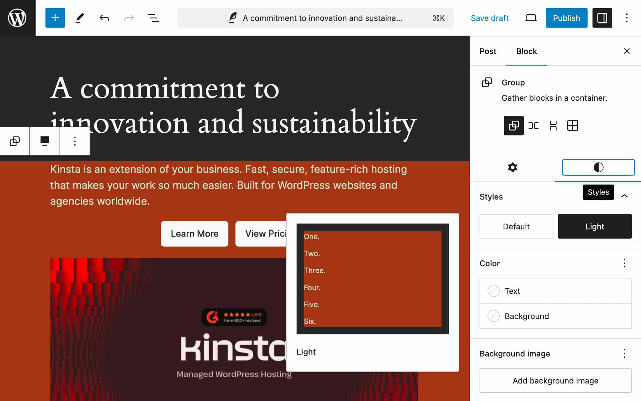
You will find a deeper overview and more examples of Section style variations in Styling sections, nested elements, and more with Block Style Variations in WordPress 6.6 by Justin Tadlock, in the dev note from Aaron Robertshaw, and in Block Styles: Extend block style variations pull request.
Defining block style variations using Theme style variations
Although it is currently possible to use the theme.json styles.variations property, this method is available only temporarily and should be deprecated soon. For a more in-depth description, check this section of the dev note.
Color and typography presets
You can now change the color palette and font families of your theme from the Global Styles interface by selecting one of the available presets.
If your current theme supports color and typography presets, they appear under Colors and Typography settings in Global Styles.
The following images show two color palettes provided by Twenty Twenty-Four.
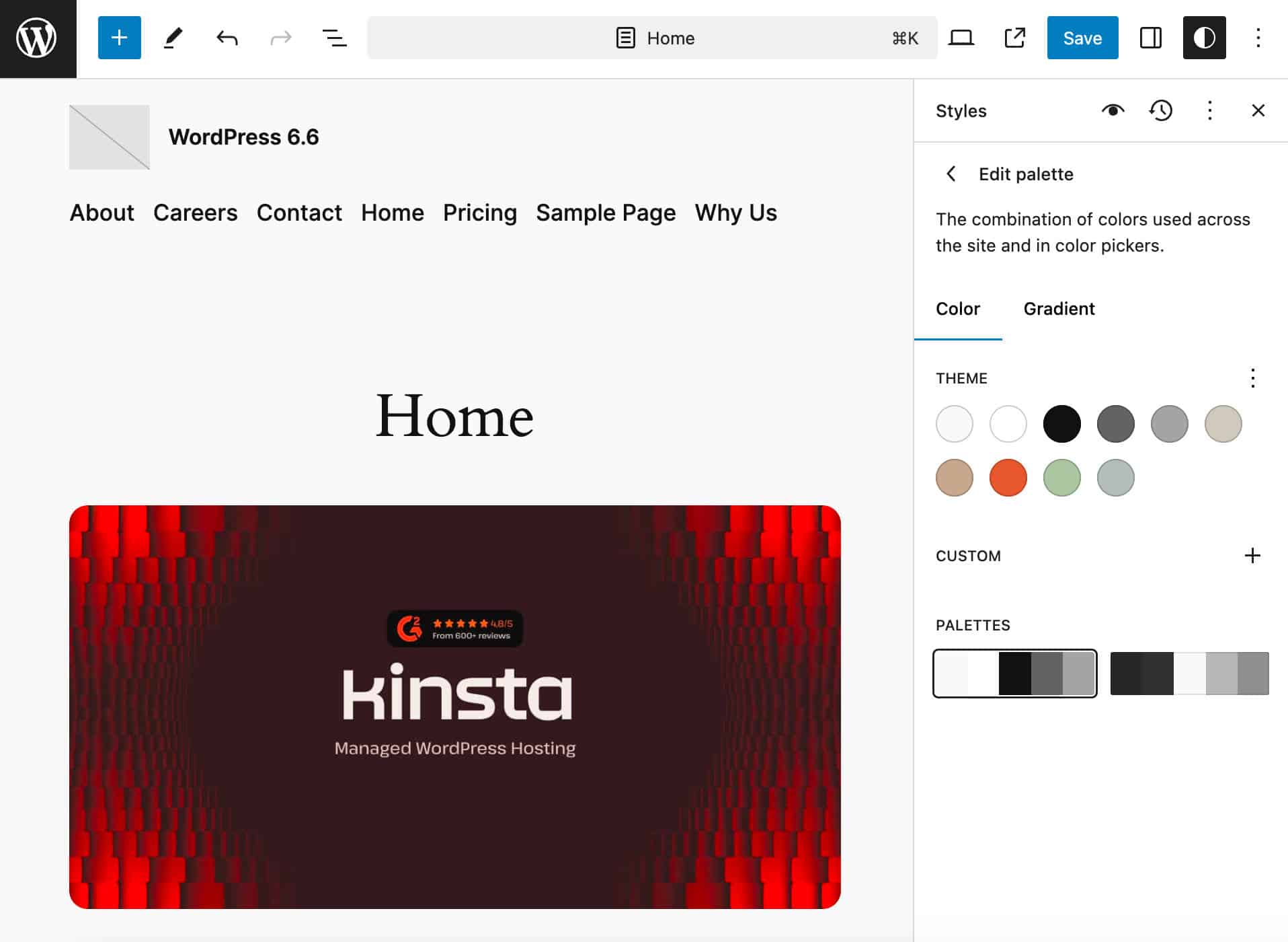
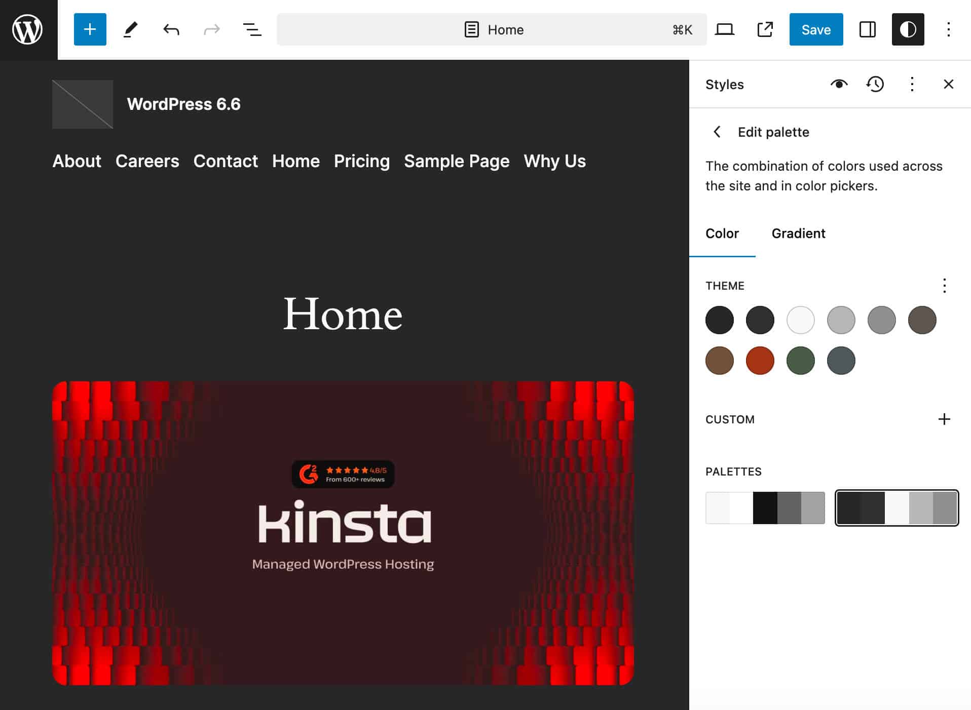
To add this functionality to your themes, you need to create style variations that only include colors and typography. The styles thus defined will be extracted and used to generate presets.
On this feature, see also Core Editor Improvement: Upgrade your designs and Create individual typography and color variations…
Site-wide background images
Starting with WordPress 6.6, you can define site-wide background images in theme.json and the Site Editor.
A site-wide image is the value of a background-image property set on the body element at the site level and appears on every website page.
In the theme.json, to define a site-wide background image, you can use the backgroundImage.url under the styles.background property:
{
	"styles": {
		"background": {
			"backgroundImage": {
				"url": "https://example.com/bg.png"
			}
		}
	}
}
In the example above, we set an absolute path to the image, but you can also define background images using paths relative to the theme root this way.
{
	"styles": {
		"background": {
			"backgroundImage": {
				"url": "file:./assets/bg.png"
			}
		}
	}
}
Then, you can use the following image props:
backgroundPositionbackgroundSizebackgroundRepeat
If you are not a theme developer, you can use site-wide background images through the Styles panel of the Site editor. In WordPress 6.6, you’ll find the appropriate controls under Styles > Layout.
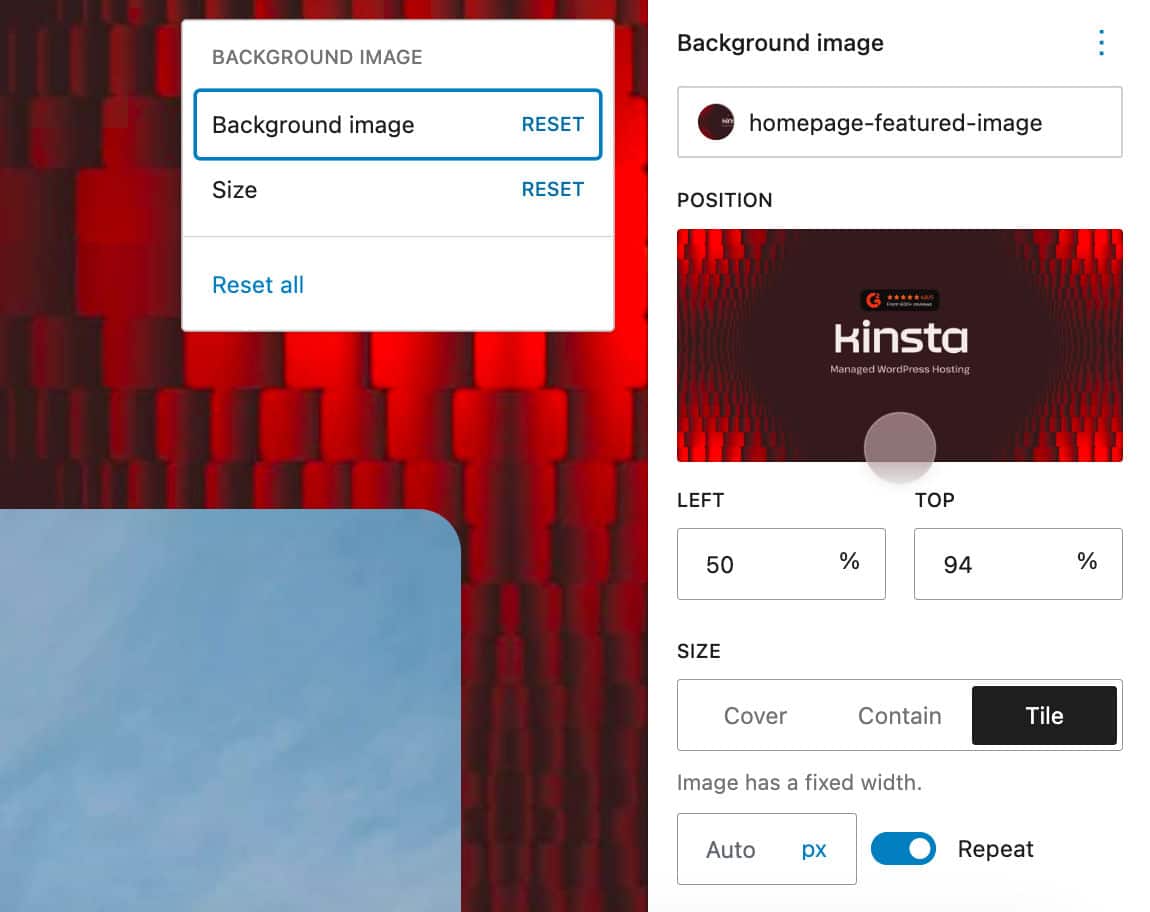
This is the first iteration for background images. For a closer view of how it works, its limitations, and what’s next, check the dev note Site-wide background images in WordPress 6.6.
Grid layout variation
A new layout variation of the Group block allows you to display elements within a group as a grid.
You can try it out by adding a Group block to the editor’s canvas and picking the Grid layout in the block settings panel.
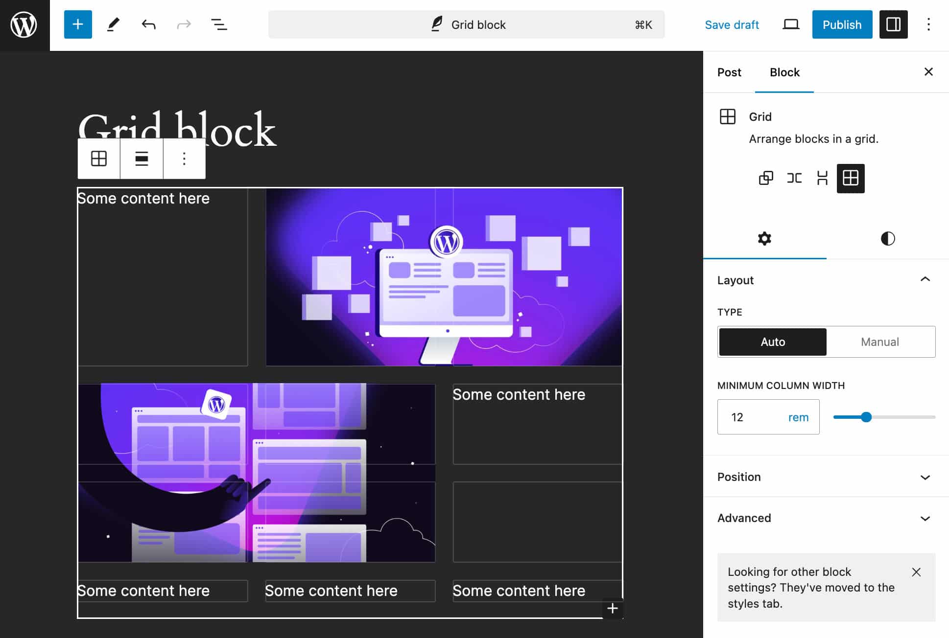
Grid layout comes in two types:
- Auto generates the grid rows and cols automatically
- Manual allows you to set the number of columns you want to add to the grid
Add content to the grid elements and resize them using the handles. You can also adjust the Minimum column width or the number of columns depending on the type of grid selected.
Negative margins
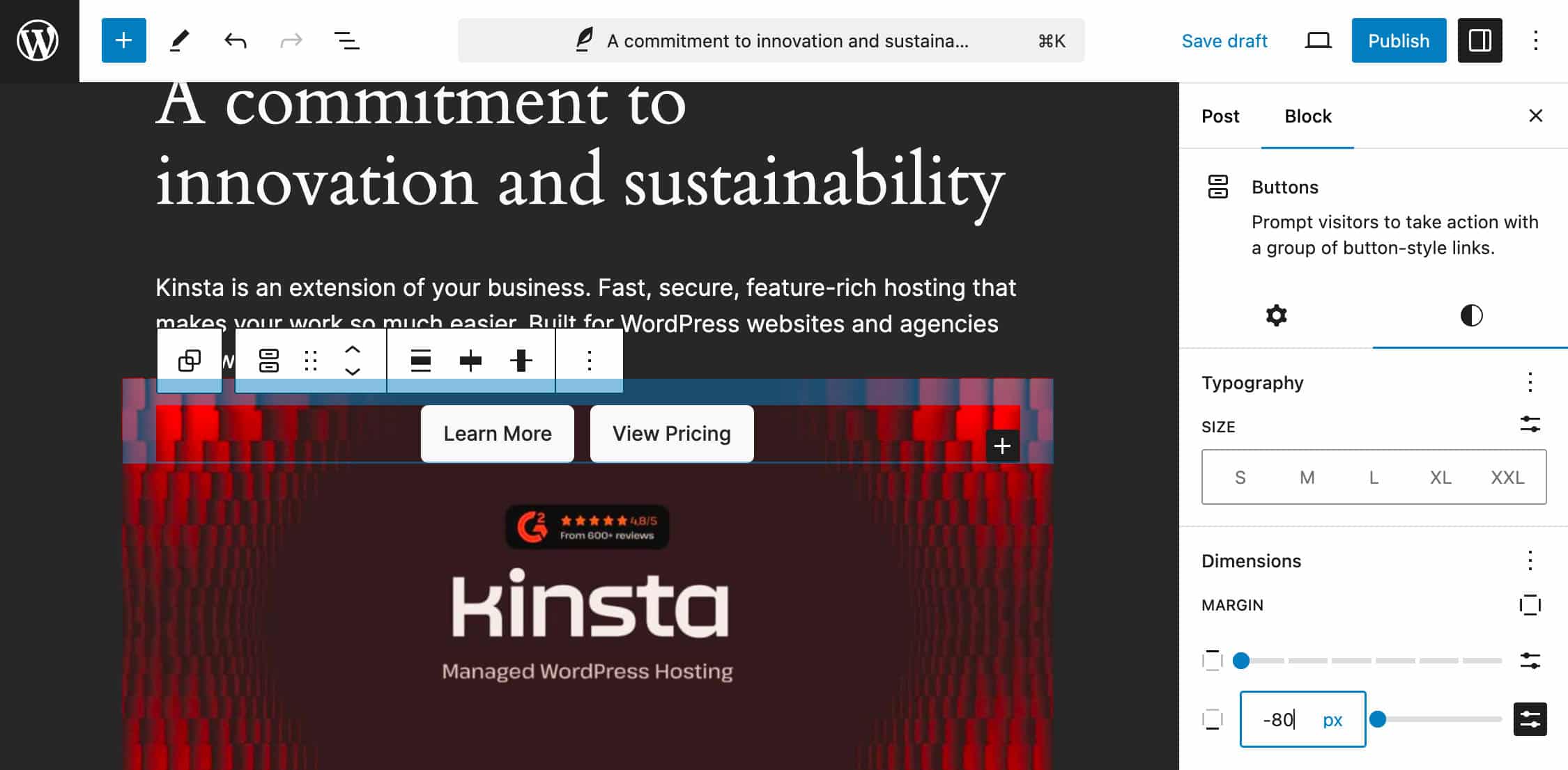
You can now set negative margins for all blocks supporting margin controls. Before WordPress 6.6, this feature was only available in theme.json, while now it’s easy to apply negative margins to elements to create overlapping effects.
Note that, as of WordPress 6.6, you should manually add the negative value, as shown in the following image.
Custom shadows
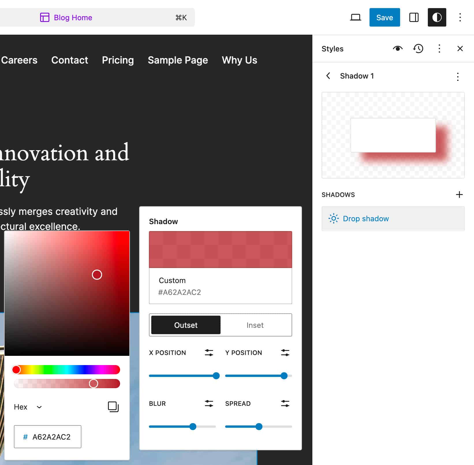
With WordPress 6.6, you can create and edit custom shadows within the Global Styles interface. To create your custom shadows, navigate to the Site Editor and select Shadows from the Global Styles menu. Here, you will find a Custom panel. When you click on the + button, a new element gives you access to a set of controls to customize your shadow or rename/delete it.
Custom aspect ratio presets
Now, theme developers can define custom aspect ratio presets by setting the settings.dimensions.aspectRatios option in theme.json.
Additional changes for developers
However, the changes for developers are not limited to themes. Other additions and improvements affect the React library and various APIs.
Options API: Disabling autoload for large options
Before WordPress 6.6, a large number of options were loaded automatically at every page load. To prevent the default behavior, developers had to pass either "yes"/true or "no"/false to the third parameter of add_option() or update_option() functions. However, as this parameter was optional, with a default value of "yes", large amounts of unnecessary data were therefore loaded on each page, with a negative impact on site performance.
To prevent this behavior, WordPress 6.6 introduces a few changes to the Options API:
To allow WordPress to determine whether an option is to load on the current page, the default value for the $autoload parameter of add_option() and update_option() has been changed from "yes" to null. The parameter now accepts one of the following values:
true: load the option on every page to avoid an additional DB query.false: never autoload the option to avoid data to load on every page.null: maybe autoload, meaning that the autoload value should be determined dynamically. By default, options autoload unless they contain large values.
The database values changed accordingly, and now the autoload value for each option will be one of the following:
on: must be autoloaded on every page. It’s added with an explicittruevalue.off: must not be autoloaded and only used on a single admin page. It’s added with an explicitfalsevalue.auto: rely on WP default autoloading behavior. In WP 6.6, it should autoload, but the behavior may change in the future.auto-on: should be autoloaded. It’s dynamically set totrue.auto-off: should not be autoloaded. It’s dynamically set tofalse.
Along with these changes, WordPress 6.6 introduces several functions and filters:
- The
wp_autoload_values_to_autoload()function returns all database values that should be autoloaded. - The
wp_autoload_values_to_autoloadfilter allows to edit the list of options that should autoload. - The
wp_default_autoload_valuefilter sets the value of an option where no explicit value has been set. - The
wp_max_autoloaded_option_sizefilter modifies the threshold above which options will not autoload by default. The default value is 150000. (150kb)
This change is particularly useful for complex websites with many plugins and deserves attention from plugin developers. For a more thorough overview, we recommend checking custom aspect ratio presets.
Improvements to the React library
Two major changes apply to the React library. First, WordPress 6.6 includes React 18.3, which adds warnings for deprecations and other changes to help developers prepare for React 19 once it becomes stable.
Second, developers can now use the new React JSX transform, which was first introduced with React 17.
For a closer view of these changes, see Preparation for React 19 Upgrade and JSX in WordPress 6.6 dev notes.
Improvements to the Block API
WordPress 6.6 also brings several technical changes to the Block API, including the following:
- Unified Extensibility APIs
- Improvements to active block variation detection
- Social Links block changes in WordPress 6.6
Auto roll-back for plugins
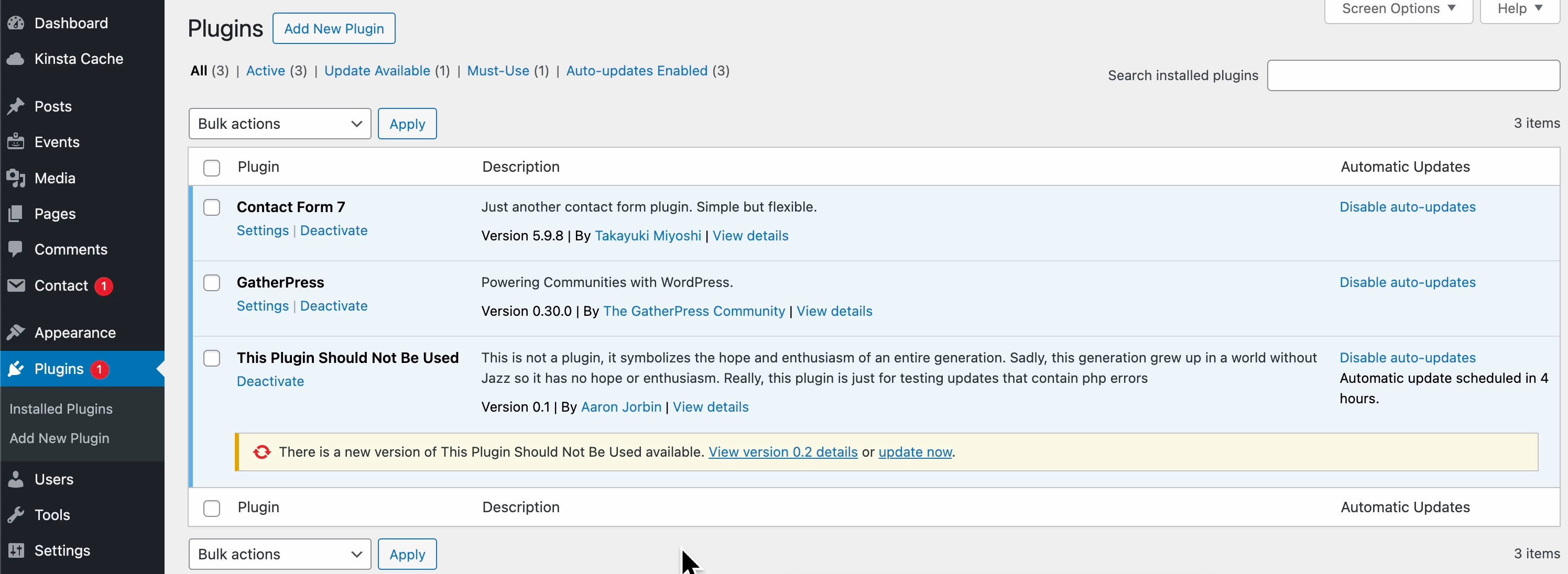
As of WordPress 6.6, if you have plugin auto-updates enabled on your WordPress website, if a plugin fails to update, WordPress will automatically roll the plugin back to its previous version without crashing the site.
This will keep both the plugin and the website running as usual. After the update, you will see that the plugin still waits for an update on the Plugins screen.
In addition, when WordPress detects an error when updating a plugin, it also sends the site administrator an email listing the plugins that failed to update and those that are up to date.
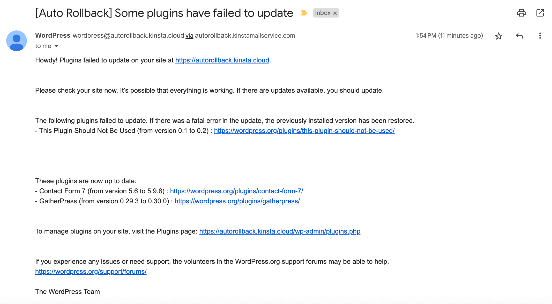
At that point, you can retry the update in a staging environment, wait for a new plugin release that fixes the problem, or contact the developer for support.
Summary
In this long post, we explored many exciting features and changes coming with WordPress 6.6, from block pattern overrides to enhancements to Data Views, new features for theme developers, and the unification of editing experiences in Site and Post editors. But there is much more that we did not cover in this article.
If you want to dive even deeper, you shouldn’t miss a series of excellent resources from WordPress core contributors, which we referred to during our testing of WordPress 6.6. Among the many resources, we suggest WordPress 6.6 Source of Truth by Anne McCarthy, the Learn WordPress Online Workshops on Meetup, the WordPress Developer blog, the dev notes published on the Make WordPress Core blog, and the regular updates by Birgit Pauli-Haack on Gutenberg Times, just to name a few.
Now, it’s up to you. Have you tested WordPress 6.6 features yet? What feature or change did you like the most? Drop a comment below and join the conversation.

