
Mobile users expect instant loading and app-like experiences, yet most WordPress themes only offer basic responsive breakpoints. Standard mobile optimization techniques, like media queries and fluid grids, often fall short when it comes to offline access, native-like performance, or handling variable connection speeds.
WordPress-specific strategies can help bridge the gap between traditional server-side rendering and mobile performance expectations.
This guide covers several infrastructure-level optimizations that can transform your WordPress theme into a high-performance mobile experience that rivals native applications.
Mobile WordPress development: the current terrain
WordPress theme development can be challenging when mobile optimization demands more control than what WordPress core offers. For example, the Block Editor doesn’t natively support container queries, which makes it difficult for components to respond to their actual container dimensions instead of just the viewport size.
Loading device-specific assets also requires custom implementations. WordPress doesn’t provide a built-in way to serve different resources based on device capabilities.
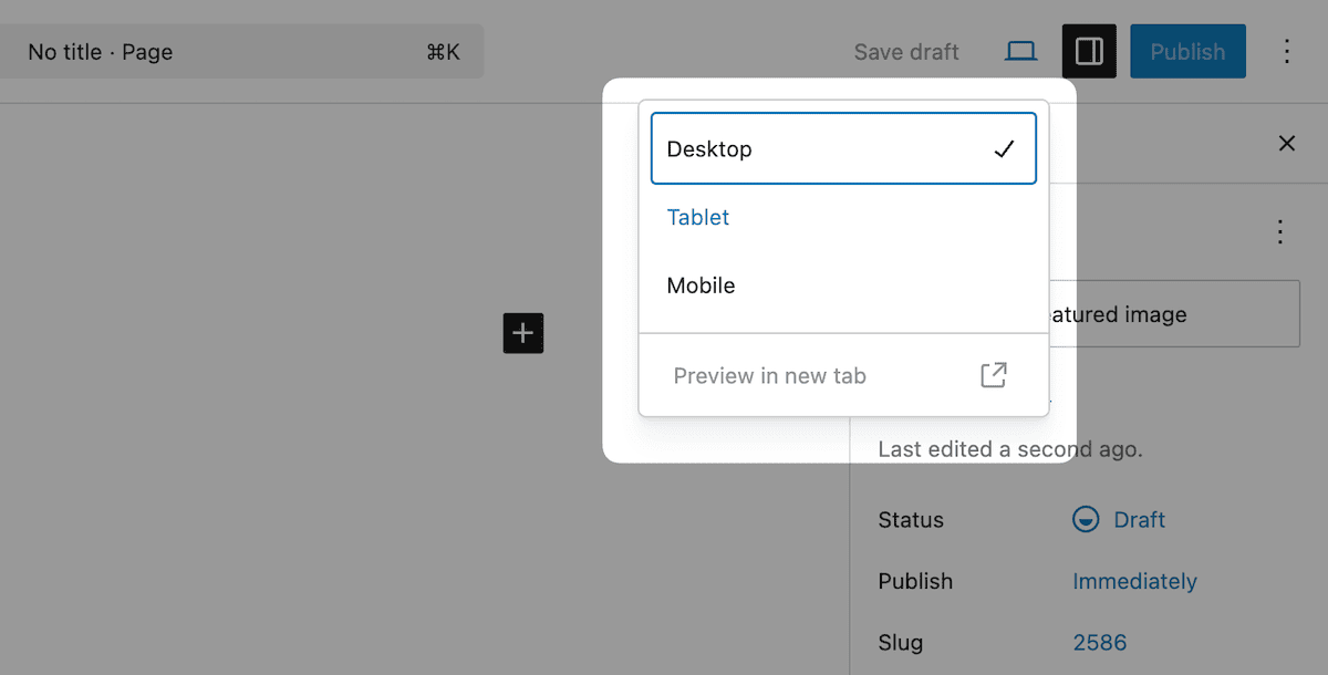
Additionally, the Block Editor lacks the granular responsive controls that modern mobile experiences require. While it includes desktop, tablet, and mobile preview modes, these offer limited customization options and don’t support custom breakpoints — a key part of mobile-first development.
WordPress prioritizes broad compatibility over cutting-edge mobile features. Its server-side rendering approach needs optimization to deliver instant loading on mobile.
As a result, developers often need to navigate both PHP and JavaScript architecture while integrating progressive web app (PWA) functionality and caching strategies. All this without breaking core functionality.
Core technical strategies for WordPress mobile theme development
Technical implementations for responsive, adaptive, and separate theme approaches each require different strategies. The server-side requirements will differ given your choice of approach and how it leverages WordPress core.
Responsive design leverages WordPress’ existing asset enqueueing system while extending the CSS through custom properties and container queries. This approach works within WordPress’ template hierarchy and lets themes adapt across devices.
Adaptive design requires server-side device detection and conditional content serving. WordPress supports this via the wp_is_mobile() function or third-party device detection libraries, letting you serve different markup depending on the client device. You can create device-specific templates or modify existing ones using conditional logic.
function wp_is_mobile() {

    if ( isset( $_SERVER['HTTP_SEC_CH_UA_MOBILE'] ) ) {
        // This is the `Sec-CH-UA-Mobile` user agent client hint HTTP request header.
        // See <https://developer.mozilla.org/en-US/docs/Web/HTTP/Headers/Sec-CH-UA-Mobile>.
        $is_mobile = ( '?1' === $_SERVER['HTTP_SEC_CH_UA_MOBILE'] );

    } elseif ( empty( $_SERVER['HTTP_USER_AGENT'] ) ) {
        $is_mobile = false;

    } elseif (
        str_contains( $_SERVER['HTTP_USER_AGENT'], 'Mobile' ) ||       // Many mobile devices (all iPhone, iPad, etc.)
        str_contains( $_SERVER['HTTP_USER_AGENT'], 'Android' ) ||
        str_contains( $_SERVER['HTTP_USER_AGENT'], 'Silk/' ) ||
        str_contains( $_SERVER['HTTP_USER_AGENT'], 'Kindle' ) ||
        str_contains( $_SERVER['HTTP_USER_AGENT'], 'BlackBerry' ) ||
        str_contains( $_SERVER['HTTP_USER_AGENT'], 'Opera Mini' ) ||
        str_contains( $_SERVER['HTTP_USER_AGENT'], 'Opera Mobi' )
    ) {
        $is_mobile = true;

    } else {
        $is_mobile = false;
    }

    /**
     * Filters whether the request should be treated as coming from a mobile device or not.
     *
     * @since 4.9.0
     *
     * @param bool $is_mobile Whether the request is from a mobile device or not.
     */
    return apply_filters( 'wp_is_mobile', $is_mobile );
}
<p>Separate themes involve maintaining entirely different theme directories for mobile and desktop. WordPress allows device-based theme switching, but it must be handled carefully to avoid disrupting SEO and content workflows.
If you take this route, managing your codebase becomes critical. You’ll need a systematic approach to asset loading, shared components, and content structure. Establishing consistent naming conventions, versioning, and modular logic helps keep the experience aligned across devices.
<p>WordPress’ limitations also impact mobile optimization architecture. For instance, the asset enqueueing system doesn’t natively adapt to conditional loading, and its caching layers aren’t granular enough for mobile-specific strategies.
What’s more, you have to optimize the Block Editor’s React-based architecture and WordPress’ PHP theme optimization separately.
How to achieve specialized responsive design for your WordPress themes
<p>Container queries are a modern, excellent way to implement responsive design. It lets components respond to a container’s dimensions rather than the viewport size.
While WordPress doesn’t natively support container queries, you can implement them using techniques that build on WordPress’ existing responsive capabilities.
Setting up the polyfill
First, you need to establish a progressive enhancement baseline that functions without JavaScript. The CSS Container Queries polyfill provides broad browser support while maintaining fallback behavior for unsupported browsers:
.responsive-component {
    container-type: inline-size;
    container-name: card-container;
}

@container card-container (min-width: 300px) {
    .card-content {
        display: grid;
        grid-template-columns: 1fr 2fr;
        gap: 1rem;
    }
}
This allows your theme components to adapt to the space available rather than assuming viewport dimensions. This creates more resilient designs that work across various layout contexts within the Block Editor.
Defining custom breakpoints
<p>WordPress themes benefit from a consistent breakpoint system that works across both CSS and JavaScript. Define breakpoints using CSS custom properties to keep your logic centralized and maintainable:
">root {
    --breakpoint-sm: 576px;
    --breakpoint-md: 768px;
    --breakpoint-lg: 992px;
    --breakpoint-xl: 1200px;
}

.component {
    /* Mobile-first base styles */
    padding: 1rem;
}

@media (min-width: 768px) {
    .component {
        padding: 2rem;
        display: grid;
        grid-template-columns: repeat(auto-fit, minmax(250px, 1fr));
    }
}
Using viewport-relative units
Viewport-relative units provide powerful tools for creating fluid mobile experiences that adapt across device sizes. Modern CSS units such as dvh (dynamic viewport height) and <code>svw (small viewport width) can address mobile browser quirks where viewport dimensions change based on interface element visibility:</cod
.hero-section {
      min-height: 100dvh; /* Accounts for mobile browser chrome */
      padding: 2rem max(1rem, 5vw);
}

.mobile-optimized-text {
      font-size: clamp(1rem, 4vw, 1.5rem);
      line-height: clamp(1.4, 1.2 + 0.5vw, 1.6);
}
Rendering modular, mobile-first components
Creating modular mobile-first components within WordPress themes requires careful consideration of the Block Editor’s rendering pipeline. Components must function independently while supporting WordPress’s dynamic content loading:
">function render_responsive_card_block($attributes, $content) {

    $wrapper_attributes = get_block_wrapper_attributes([
        'class' => 'responsive-card',
        'data-container-query' => 'true'
    ]);

    return sprintf(
        '<div %1$s>
            <div class="card-media">%2$s</div>
            <div class="card-content">%3$s</div>
        </div>',

        $wrapper_attributes,
        $attributes['media'] ?? '',

        $content
    );
}
Your browser developer tools are ideal for debugging container queries and viewport units, while tools such as Percy or Chromatic can enable visual regression testing across multiple breakpoints and content scenarios.
For WordPress, the content variability is the key to a responsive implementation. Its dynamism means you have to handle unknown content lengths, varying media aspect ratios, and dynamic element counts while maintaining consistent, responsive behavior across all scenarios.
Where React fits into WordPress’ mobile performance
<p>WordPress’ dependency extraction prevents React duplication through externalizing packages. When you build custom Blocks, React and other WordPress dependencies will load from the global <code>wp> object rather than being bundled with individual Blocks:
import { useState } from '@wordpress/element';
import { Button } from '@wordpress/components';

function OptimizedMobileBlock() {
    const [isExpanded, setIsExpanded] = useState(false);

    return (
        <div className="mobile-optimized-block">
            <Button
                onClick={() => setIsExpanded(!isExpanded)}
                aria-expanded={isExpanded}
            >
                Toggle Content
            </Button>

            {isExpanded && (
                <div className="expandable-content">
                    {/* Content loaded conditionally */}
                </div>
            )}
        </div>
    );
}
To optimize these blocks for mobile, implement lazy loading> patterns that align with how WordPress renders blocks. You can load heavier components conditionally, based on device type or user interaction:
import { useEffect, useState } from '@wordpress/element';
import { useSelect } from '@wordpress/data';

function MobileOptimizedGallery({ attributes }) {
    const [shouldLoadFullGallery, setShouldLoadFullGallery] = useState(false);
    const isMobile = useSelect((select) => {
        return select('core/viewport').isViewportMatch('<; medium');
    });

    useEffect(() => {
        if (!isMobile) {
            setShouldLoadFullGallery(true);
        }
    }, [isMobile]);

    return (
        <div className="gallery-container">
            {shouldLoadFullGallery ? (
                <FullGalleryComponent {...attributes} />
            ) : (
                <MobileThumbnailGallery {...attributes} />
            )}
        </div>
    );
}
Reducing the JavaScript payload size requires you to use WordPress’s build system with care and manage your dependencies. The @wordpress/scripts package provides tools for analyzing bundle sizes and identifying optimization opportunities:
// webpack.config.js customization for mobile optimization

const defaultConfig = require('@wordpress/scripts/config/webpack.config');

module.exports = {
    ...defaultConfig,
    optimization: {
        ...defaultConfig.optimization,
        splitChunks: {
            cacheGroups: {
                mobile: {
                    test: /[\\/]mobile[\\/]/,
                    name: 'mobile-specific',
                    chunks: 'all',
                },
            },
        },
    },
};
Conditional script loading based on the device lets themes serve appropriate JavaScript bundles for different contexts. This approach works with WordPress’ script dependency system:
function enqueue_mobile_optimized_scripts() {

    $is_mobile = wp_is_mobile();
    $script_asset = include get_template_directory() . '/build/index.asset.php';

    if ($is_mobile) {
        wp_enqueue_script(
            'theme-mobile-scripts',
            get_template_directory_uri() . '/build/mobile.js',
            $script_asset['dependencies'],
            $script_asset['version'],
            true
        );

    } else {

        wp_enqueue_script(
            'theme-desktop-scripts',
            get_template_directory_uri() . '/build/desktop.js',
            $script_asset['dependencies'],
            $script_asset['version'],
            true
        );
    }
}

add_action('wp_enqueue_scripts', 'enqueue_mobile_optimized_scripts');
Even with these tools in place, mobile optimization should always prioritize performance. Everything — from build tooling to block behavior — needs to serve a faster, more efficient experience for users on mobile.
Mobile performance optimization techniques for WordPress
Improving mobile performance in WordPress involves both server-side and client-side techniques. Critical CSS, lazy loading, service workers, and real user monitoring all play a role.
Inline critical CSS
Critical CSS extracts only the styles needed to render above-the-fold content. This improves perceived load speed while deferring the rest of the stylesheet. You can automate this process using tools that analyze page output and generate the necessary styles.
Here’s an example of how to inline critical CSS and defer the full stylesheet:
function inline_critical_css() {

    $critical_css_file = get_template_directory() . '/assets/css/critical.css';

    if (file_exists($critical_css_file)) {
        $critical_css = file_get_contents($critical_css_file);
        echo '<style id="critical-css">' . $critical_css . '</style>';

        // Async load full stylesheet
        echo '<link rel="preload" href="' . get_stylesheet_uri() . '" as="style" onload="this.onload=null;this.rel=\'stylesheet\'">';
    }
}

add_action('wp_head', 'inline_critical_css', 1);
Native image lazy loading
<p>WordPress-optimized image loading leverages the platform’s native lazy loading capabilities and extends the functionality when you need it. The native implementation provides performance with minimal overhead:
function optimize_image_loading($attr, $attachment, $size) {

    // Add loading="lazy" to images by default
    $attr['loading'] = 'lazy';

    // Add fetchpriority="high" for above-the-fold images
    if (is_admin() || wp_is_mobile()) {
        $attr['fetchpriority'] = 'high';
    }

    return $attr;
}

add_filter('wp_get_attachment_image_attributes', 'optimize_image_loading', 10, 3);
Service workers for offline support
Implementing service workers lets you leverage offline functionality and caching strategies within WordPress’ existing infrastructure. However, your service workers must handle WordPress’ dynamic content appropriately:
// service-worker.js
const CACHE_NAME = 'wp-theme-v1';
const OFFLINE_URL = '/offline/';

self.addEventListener('install', event => {
    event.waitUntil(
        caches.open(CACHE_NAME).then(cache => {
            return cache.addAll([
                '/',
                '/wp-content/themes/your-theme/assets/css/style.css',
                '/wp-content/themes/your-theme/assets/js/app.js',
                OFFLINE_URL
            ]);
        })
    );
});

self.addEventListener('fetch', event => {
    if (event.request.mode === 'navigate') {
        event.respondWith(
            fetch(event.request).catch(() => {
                return caches.open(CACHE_NAME).then(cache => {
                    return cache.match(OFFLINE_URL);
                });
            })
        );
    }
});
Custom lazy loading for dynamic content
In addition to native image lazy loading, you can build a lightweight lazy loader for dynamic content and third-party widgets:
class WordPressLazyLoader {
    constructor() {
        this.observer = new IntersectionObserver(this.handleIntersection.bind(this));
        this.initializeLazyElements();
    }

    initializeLazyElements() {
        document.querySelectorAll('[data-lazy-load]').forEach(element => {
            this.observer.observe(element);
        });
    }

    handleIntersection(entries) {
        entries.forEach(entry => {
            if (entry.isIntersecting) {
                this.loadElement(entry.target);
                this.observer.unobserve(entry.target);
            }
        });
    }

    loadElement(element) {
        const content = element.dataset.lazyContent;
        if (content) {
            element.innerHTML = content;
            element.removeAttribute('data-lazy-load');
        }
    }
}

new WordPressLazyLoader();
<p>WordPress mobile optimization also aligns with general performance monitoring. This involves both automated monitoring and user experience tracking that accounts for WordPress’ performance characteristics.
How you can leverage Kinsta’s infrastructure for mobile WordPress optimization
Kinsta’s Edge Caching improves mobile performance by reducing latency, as cellular connections often have higher ping times. Implementing mobile-specific edge caching involves configuring cache rules that account for user behavior patterns.
Edge caching
Mobile users navigate the web differently than desktop users, often following more linear patterns. You can optimize your caching for these through smart prefetching for mobile-specific content paths.
The following works directly with Edge Caching through setting appropriate cache headers and prefetch directives:
function mobile_cache_optimization() {
    if (wp_is_mobile()) {
        // Add mobile-specific cache headers that integrate with Kinsta's Edge Caching
        header('Cache-Control: public, max-age=3600, s-maxage=86400');
        header('Vary: User-Agent');

        // Prefetch critical mobile resources
        echo '<link rel="prefetch" href="' . get_template_directory_uri() . '/assets/css/mobile.css">';
        echo '<link rel="prefetch" href="' . get_template_directory_uri() . '/assets/js/mobile.js">';
    }
}

add_action('wp_head', 'mobile_cache_optimization', 1);
You can also configure the Kinsta CDN for mobile optimization by setting up cache policies for different content types. You also need to ensure mobile-specific assets receive priority treatment.
Kinsta CDN
Image optimization through Kinsta CDN can lessen the bandwidth limitations and varying connection speeds that impact the user’s experience. The CDN’s automatic WebP conversion and responsive image serving make sure mobile devices get images at an appropriate size:
function kinsta_mobile_image_optimization($attr, $attachment, $size) {
    if (wp_is_mobile()) {
        // Prefer smaller image sizes for mobile - works with Kinsta's CDN optimization
        $mobile_sizes = ['medium', 'medium_large', 'large'];
        if (in_array($size, $mobile_sizes)) {
            $attr['sizes'] = '(max-width: 768px) 100vw, 50vw';
        }
    }

    return $attr;

}

add_filter('wp_get_attachment_image_attributes', 'kinsta_mobile_image_optimization', 10, 3);
Kinsta’s HTTP/3 support is also a benefit, as connection overheads impact perceived performance. The greater packet loss and connection migration handling make it valuable for mobile devices that switch between different network connections. Kinsta sites get this functionality automatically.
The APM Tool
Performance monitoring using Kinsta’s APM tool helps you spot mobile performance bottlenecks that desktop testing might not show. Slower JavaScript execution, limited memory, and variable connection speeds all count.
Tracking real user metrics will give you insights into how mobile users experience your WordPress site. This code integrates with the APM Tool:
function mobile_performance_tracking() {
    if (wp_is_mobile() && function_exists('kinsta_apm_enabled')) {
        // Add mobile-specific performance markers that integrate with Kinsta APM
        echo '<script>
            if ("performance" in window) {
                performance.mark("mobile-content-start");
                window.addEventListener("load", function() {
                    performance.mark("mobile-content-end");
                    performance.measure("mobile-load-time", "mobile-content-start", "mobile-content-end");
                });
            }
        </script>';
    }
}

add_action('wp_head', 'mobile_performance_tracking');
Summary
Container queries, React optimization, caching strategies, and infrastructure-level enhancements all play a role in effective WordPress mobile optimization. When combined, these techniques help you deliver a mobile experience that feels as fast and fluid as a native app, without sacrificing WordPress’ flexibility.
If you’re ready to implement these strategies, Kinsta’s Managed Hosting for WordPress provides the performance foundation you need. Features like staging environments make testing easier and safer. You can validate mobile optimizations across devices and network conditions before pushing changes live, helping you catch issues early and deliver a better user experience with confidence.
You can try Kinsta risk-free for 30 days and see how our infrastructure supports your mobile performance goals. And if you have any questions along the way, our expert support team is always here to help.
</cod