
In 2016, mobile traffic historically surpassed desktop traffic for the first time. And if you’ve been keeping up with Google’s algorithm changes over the past few years, you might have noticed a mobile-dominant trend. Conveniently, just after mobile traffic grew beyond desktop traffic totals, Google announced that their search engine indexing would transition to mobile-first.
While Google confirmed that the announcement wasn’t immediate and would roll out slowly as testing was underway, it’s been over a year and a half since the original announcement. As of March 26th, 2018, Google has officially announced the beginning of the mobile-first indexing rollout. This presents serious changes to the status quo of indexing.
Currently, most sites are barely optimized properly for desktop, let alone mobile, where 21% of small business sites aren’t “optimized.” 😧 If Google suddenly flipped the proverbial switch to mobile-first indexing, the vast majority of sites dominating the competition would face an SEO Great Depression, potentially destroying their current modus operandi.
So, what does mobile-first indexing really mean? When does it take effect and how can you prepare? In this post, we’ll explain mobile-first and how you can prepare your site for the changes to avoid potential disasters.
What is Mobile-First Indexing?
Previously Google’s crawling, indexing, and ranking systems have used the desktop version of websites. Mobile-first indexing means that Googlebot will now use the mobile version of your WordPress site for indexing and ranking. This helps improve the search experience for mobile users. Be aware that you may also see more traffic in your logs from Googlebot Smartphone.
With any Google announcement, it’s sometimes hard to read between the lines. Heck, we didn’t even have confirmation of the top two ranking factors for over a decade. Getting a straight answer from Google is as rare as a full solar eclipse. Mobile-first indexing is a pretty simple concept, but people often define it in unnecessarily complex ways.
Let me break it down simply for you: Google has noted that the majority of people worldwide are browsing on mobile devices and are therefore visiting the mobile versions of websites. But currently, their entire indexing system looks at the desktop version of a site first when assessing quality and relevance for users.
That’s a huge, potentially damaging, disconnect for Google that could cause searchers to abandon the platform. How so? If most people are using mobile devices to browse, yet Google indexes desktop versions for relevance and quality, it’s likely that mobile users are getting a sub-par experience.
And remember the previous statistic: 21% of small business mobile sites aren’t optimized. That means that many Google users are inevitably visiting low-quality mobile sites. Google and business sites can’t afford to let that happen anymore. Not when 85% of users won’t return to your site or brand after having a poor mobile experience.
Big jump in # of top sites using mobile-friendly design the past few months (via meta viewport tag) but a surprisingly huge chunk of the web isn't responsive (or uses less popular mobile-friendly schemes) via @builtwith https://t.co/zozrmHkfi4 pic.twitter.com/OlxHug4pYx
— Cyrus SEO (@CyrusShepard) March 26, 2018
And it wouldn’t be uncommon for traffic drops to happen if Google didn’t address this massive disconnect. In 2013, Google suffered a mere five-minute outage in service, resulting in global traffic drops of 40% and a $545,000 net revenue loss.
Data shows that Alphabet Inc (the parent company of Google), earns over $3,200 in revenue every second. That means that a single five-minute outage of services in 2018 would produce a net loss nearly doubling what Google faced back in 2013:
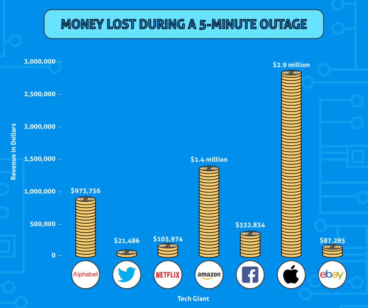
It’s safe to say that Google is damage-proofing its current model, looking to prevent any potential catastrophes from happening in terms of both revenue and market share.
For these reasons, Google will slowly roll out changes to make mobile sites first priority when it comes to indexing content for relevance and quality. Google will still index your desktop site versions, but they’ll give mobile the first priority.
Mobile is more important than ever. Just recently, at the end of 2017, industry experts started to notice mobile-first testing and rollouts for a few sites. Google Webmaster Analyst Gary Illyes announced this information to the public crowds at the SMX East conference.
And as of March 26th, 2018, Google has officially announced the beginning of the mobile-first indexing rollout. But rest assured, it will be slow and steady. Meaning you don’t have to worry about waking up to a potential internet doomsday where your rankings and traffic vanish overnight.
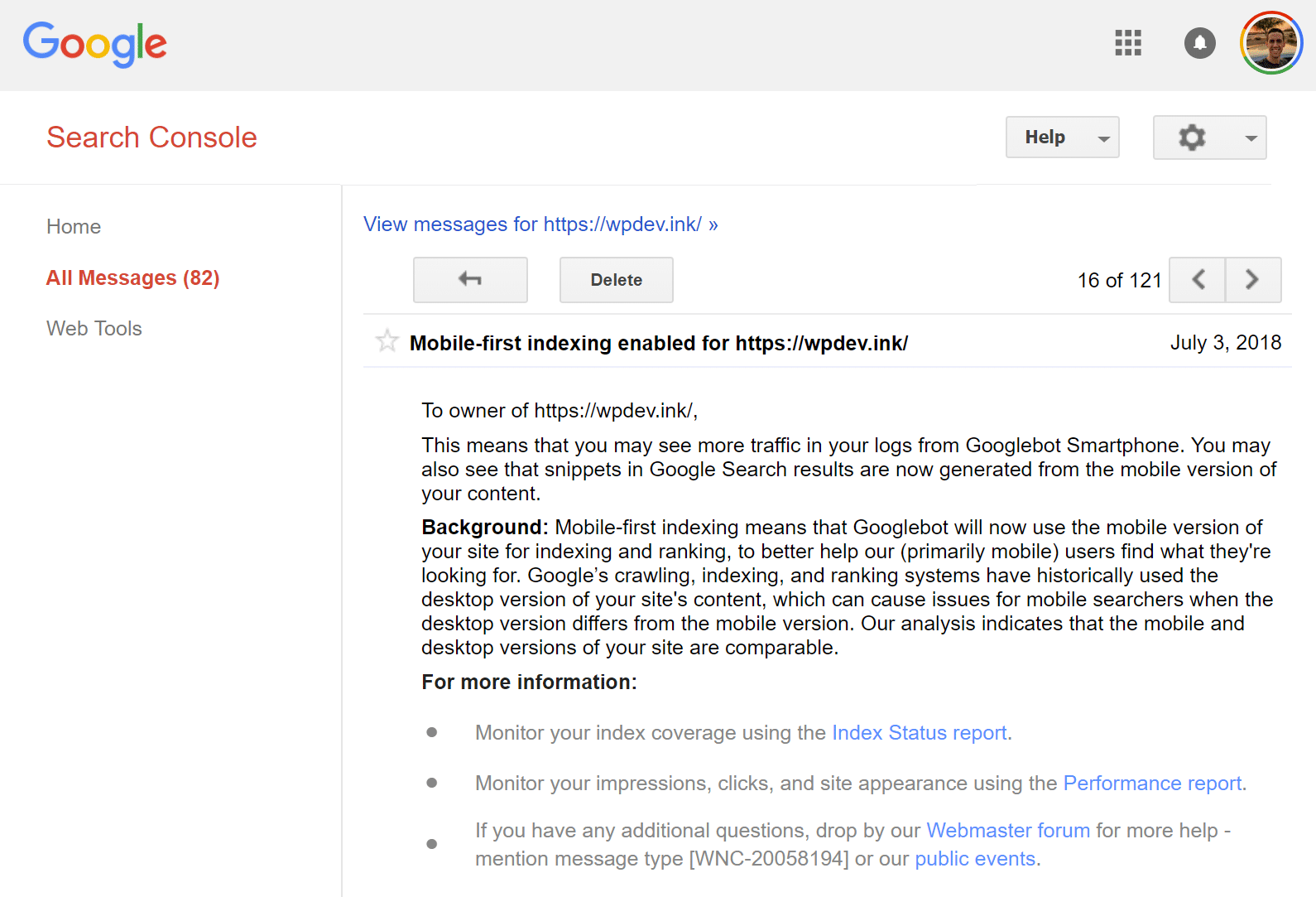
John Mueller, a Google Webmaster Analyst, has also said that users will be informed via Google Search Console when their site has been moved. You can see an example of this email below.
But that also doesn’t mean you can sit around waiting for the rollout to happen on your site. It’s coming whether you are prepared or not. Here’s how you can know if your site is ready and what changes you’ll need to make to stay afloat in this changing landscape.
Make Your Site Mobile-Friendly or Responsive ASAP
According to the Google press release, there are a few conditions to be aware of with mobile indexing. First off, Google made it clear that sites using mobile-friendly or mobile-responsive protocols that are up-to-date would fair well with this update.
If your site is mobile-friendly or mobile-responsive, meaning your content dynamically updates between desktop and mobile, you won’t have to make any fundamental changes to your site. While that doesn’t mean that you shouldn’t be concerned about improving your mobile site, it means that you have less work to do.
So, how do you know if your site is mobile-friendly or responsive? One of the easiest ways is simply using Google’s Mobile-Friendly test tool.

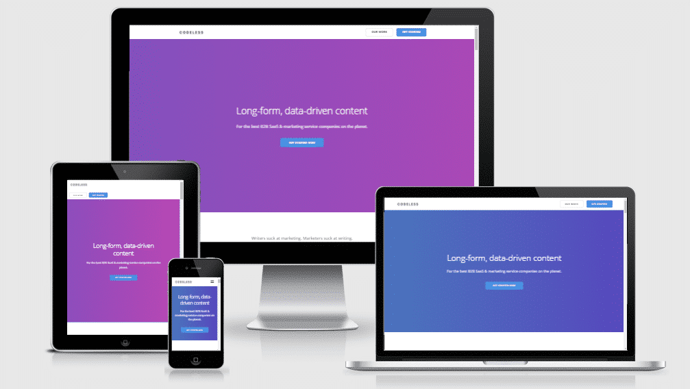
You can also run your website through a third-party tool such as Responsive Design Tool. When you enter your website into the search bar, the tool will show you what your mobile site looks like on mobile, tablet, and desktop:
If you currently have separate mobile and desktop sites where you have to make updated changes, your site isn’t mobile responsive. For example, if the content and markup are different on each site, Google recommends that you make changes.
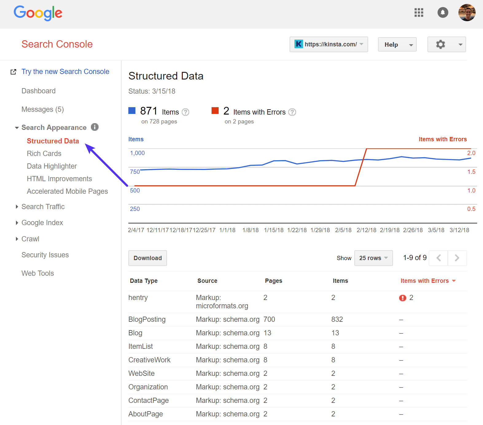
For starters, ensure that you serve structured markup for both your mobile and desktop site versions. You can double-check these efforts using the Structured Data Tool. Run your URL through the structured data tool, and it will send your data directly to your Google Search Console account under “Search Appearance → Structured Data.”
From here, see if your structured data can be crawled without error and if sitemaps update accordingly. If you find problems, the search console will give you the exact steps that you need to take to fix the issues.
With the new mobile-first index update coming fast, your site has to be mobile responsive or friendly. But if your site isn’t, don’t panic. You can resolve this quickly without breaking the bank or overhauling your entire website.
Utilize a Responsive WordPress Theme
One of the great benefits of using WordPress is that almost every theme sold today is responsive out of the box. However, if you’re running an older theme or are behind on updates, it could very well be your WordPress theme isn’t mobile-friendly yet. Here are a few things to do.
First, make sure your WordPress theme is fully up to date. Sometimes developers will rebuild the code on older themes or move them to frameworks to ensure they are mobile-friendly. If you are jumping multiple versions, we always recommend taking a backup first and then testing the new version on a staging site.
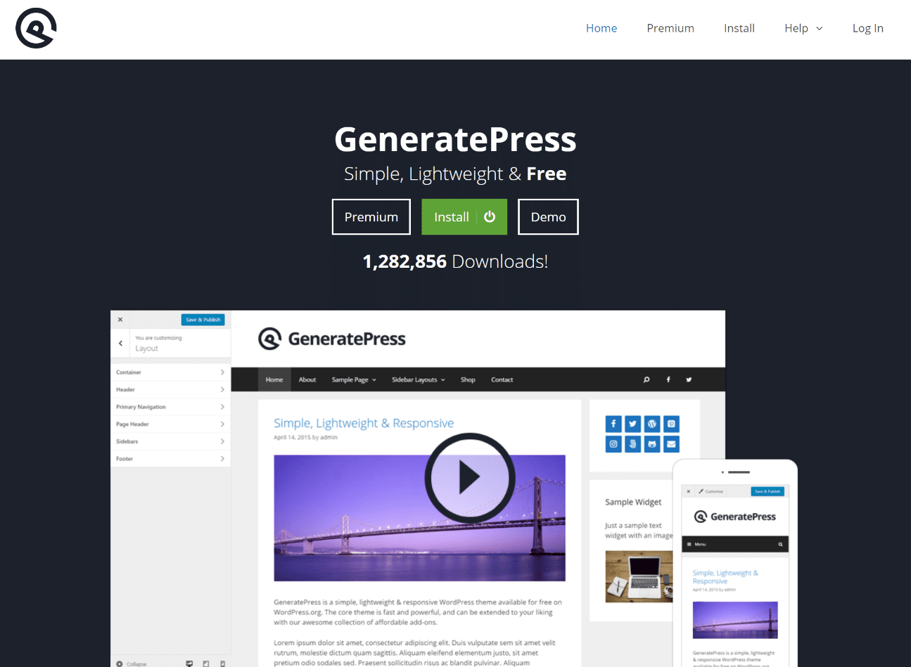
Second, if you’re using an out of date WordPress theme or the developer is no longer around, then it might be time to move to a new one. There are plenty of great free and premium WordPress themes to choose from. You could go with a lightweight, fast, and responsive theme like GeneratePress or OceanWP. These allow you to build just about any website and even support eCommerce shops.
Here are a few theme providers we also recommend checking out:
- MyThemeShop
- CyberChimps Themes
- Elegant Themes
- MH Themes
- Proteus Themes
- ThemeForest marketplace
- Pixelgrade
- Themeisle
- Meridianthemes
- Macho Themes
- Premiumcoding
- Anariel Design
Hire a WordPress Developer to Make Your Site Mobile-Friendly
Perhaps you have a custom-built WordPress theme or site and can’t move to a new WordPress theme. In this case, you might have to fork over a little cash and hire a WordPress developer to make sure it’s mobile-friendly. This could involve moving your site to a new framework or even refactoring all your base code. Make sure to get an estimate from a couple of places before proceeding. Depending on your site, this could be a small or very large undertaking. A few companies we recommend include:
Use a WordPress Mobile Plugin
If you’re in a pinch, you can also use a WordPress mobile plugin. While we recommend this as a last resort, it can be one of the easiest ways to ensure your site is mobile-friendly right away.
Some of the top WordPress plugins for mobile optimization currently are WPtouch, Jetpack, and OBox Mobile. With over five million downloads, WPtouch is one of the most updated, supported, and trusted plugins for optimizing mobile experiences.

Currently active on over 200,000 sites and chosen as Google’s top pick for mobile solutions, it’s a safe and effective bet. The cheapest plan starts at $79.00, but you can customize your features a la carte if you want to tweak plans and pricing. WPtouch works by adding a mobile theme for visitors to your WordPress site.
It creates an instant mobile-friendly version that will dynamically pull content between your desktop and mobile sites. Within the dashboard, you can customize their pre-built themes to better suit your current desktop branding, too:
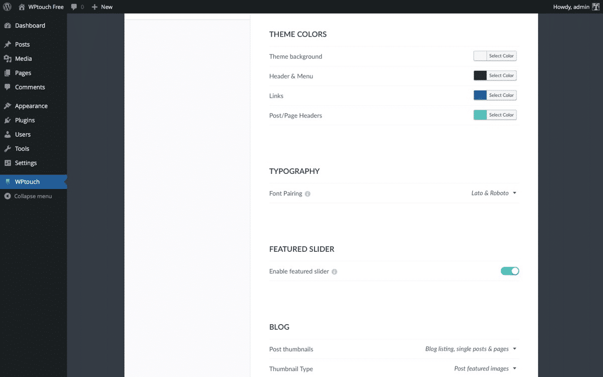
WPtouch is one of the easiest ways to ensure that your mobile site gives a better user experience for the upcoming mobile-first index.
Focus on Improving Site Speed
When it comes to optimizing your site for mobile-first, speed is one of the most important factors to focus on. Speed plays a major role in everything from usability to bounce rates and determining whether or not potential buyers will return to your site.
In fact, bad mobile experiences will lead the majority of users to never return. According to the latest Google page speed report, the average time a mobile site took to load in 2018 was 15 seconds. 🐌 Can you imagine waiting nearly half a minute to load a single page? Astounding.
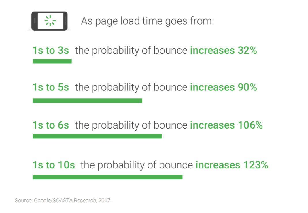
As you can imagine, users demand (and deserve) better. According to the same page speed report, 53% of mobile site visitors leave pages that take longer than a measly three seconds to load.
Slow mobile experiences aren’t killing conversions. They’re preventing you from even getting a chance to convert prospects. As page load times increase by just a few seconds, the likelihood of someone bouncing climbs exponentially.
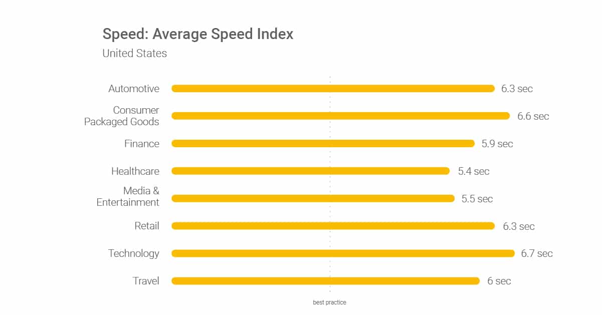
If your mobile website takes more than ten seconds to load, you could be losing almost all of your potential customers and clients. And I have news for you: Your website is likely too slow. According to Google, the average site in every single industry is too slow.
Reducing your bounce rate should always be of top priority. One of the best ways to do that is by improving your site speed. You want to give users an actual chance to consume your content rather than leave in a fit of rage.
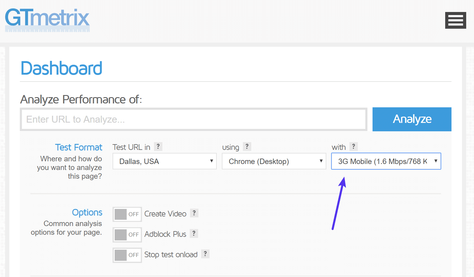
You can utilize GTmetrix, WebPageTest, or Chrome DevTools to see how fast your site loads over a 2G or 3G mobile connection.
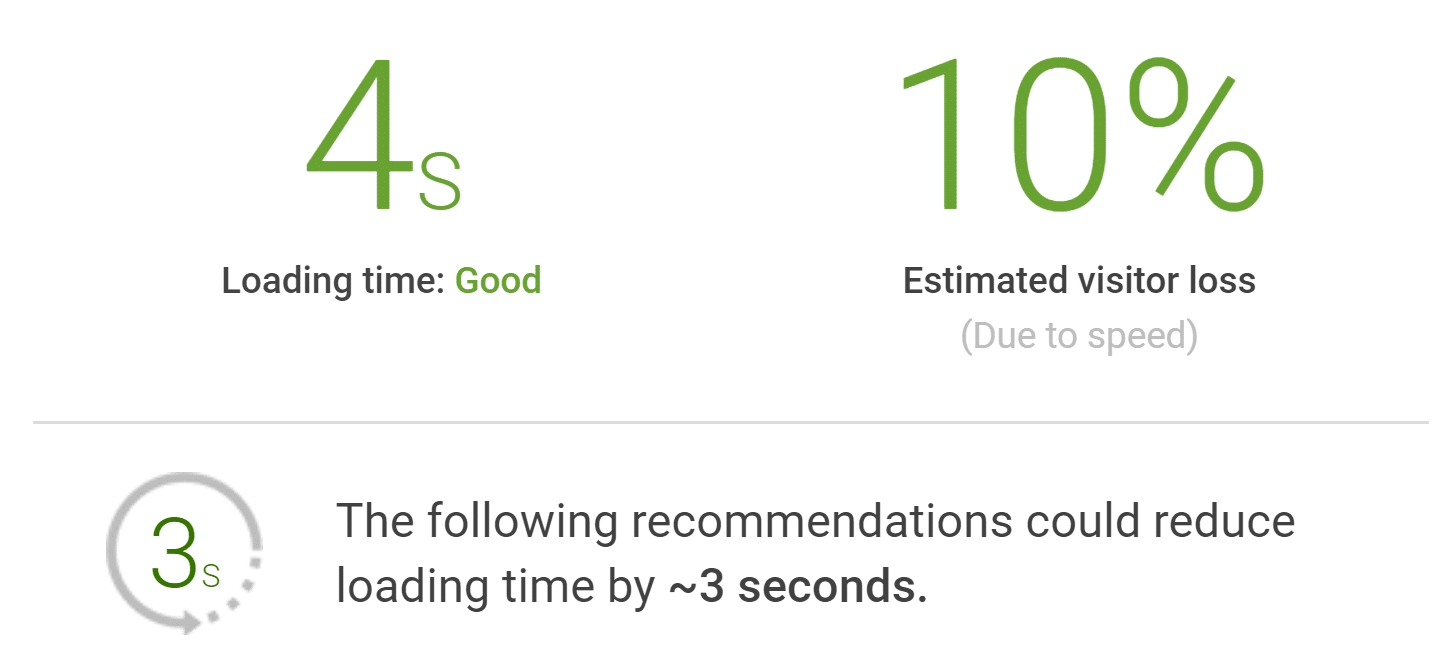
With Google’s Test My Site tool, you can scan your current mobile site and get direct insights into what steps are needed to improve your site speed. Running your site through the tool will generate a free version of your report that it will send directly to your inbox. The report covers your current site speed benchmarked against those of your competitors. It will also show you your current potential visitor losses:
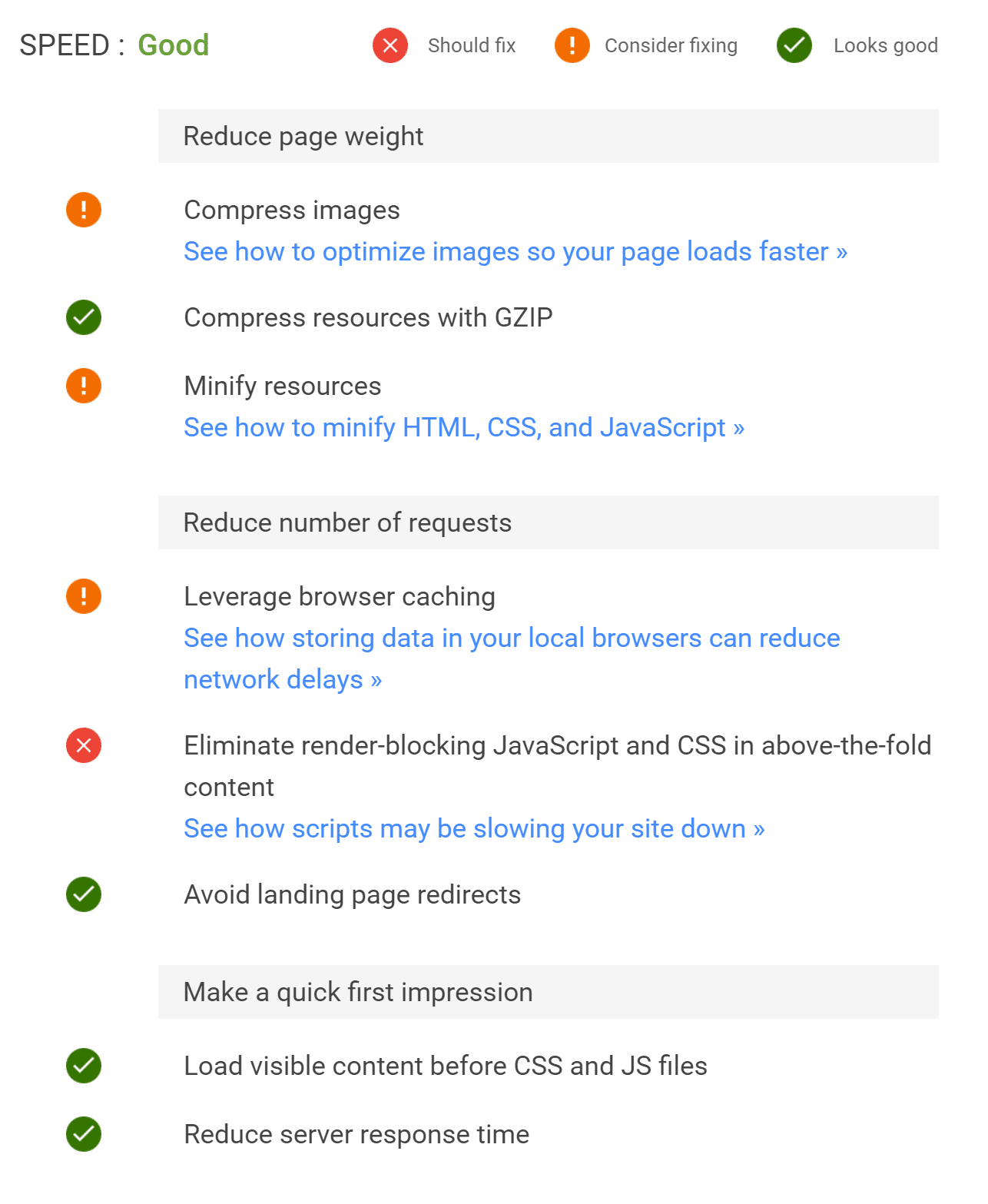
On top of benchmark data, Google gives you direct, actionable ways to make your site faster. It even estimates the amount of time each task could take off of your overall load times:
Click on any of the “See how” tips, and you’ll get step-by-step tutorials on how to fix any of these issues on your site. Before simply forwarding them to your developer, check out some of our tutorials you can follow to quickly fix them yourself:
- How to compress images
- How to enable GZIP compression
- How to fix the leverage browser caching warning
- Eliminate render-blocking Javascript and CSS
- How to fix the “specify a cache validator” warning
- How to reduce TTFB
- How to combine external CSS
After making the changes suggested, run your site back through the tool and compare the results. You should see dramatic improvements that will set your site up for success in the upcoming mobile-first world. Remember, you most likely won’t be able to fix everything. The most important value to is your site’s overall load time.
Make sure to also choose a fast host like Kinsta. We scored top tier again in the 2018 performance benchmarks from ReviewSignal.
Implement Google AMP
If you’re still struggling with the speed of your site, you might also want to look into implementing Google AMP. Google AMP (Accelerated Mobile Pages Project) essentially offers a way to serve up a stripped-down version of your current web page without all the things that slow it down, such as JavaScript, bloated CSS, etc. There are third-party plugins which now make this process pretty easy.

However, we recommend proceeding with caution depending on the type of site you have. Due to the fact that Google AMP is a big change, this can impact everything from conversion rates to CTAs. These, of course, can be set back up but will require some work. If you’re running a WooCommerce site and get a lot of mobile customers, make sure you test everything!
We ended up removing Google AMP from the Kinsta site after testing. However, this isn’t to say we won’t be testing it again in the future. Google is making improvements on a regular basis to this technology.
Make Mobile Your Top Priority
With mobile traffic dominating the online browsing landscape and Google adjusting accordingly, now is the time to shift your own internal focus. And while site speed is a direct step you can take to improve your site for the mobile-first index, it’s not the end-all-be-all.
If you want to find true success with a mobile site, it has to become your priority. That means that you have to go beyond dynamic optimization and responsiveness. Your entire site should cater to the mobile user. Everything from the structure to the design and elements you use.
Users browse very differently on mobile than they do on desktop. So more often than not, simply mimicking a desktop site for mobile devices won’t fully optimize the user experience. On mobile, screens are smaller, computing power is limited, and users are often on the go.
Typical page elements and high-resolution images are going to bog down the mobile user experience. Having a deep site architecture can cause awful mobile experiences, forcing users to click through dozens of tabs to reach the content they need:

Resolving these types of issues obviously requires serious thought. It may even necessitate a massive redesign of your site structure. But Google’s impending mobile-first index should be the straw that breaks the camel’s back.
If your current site structure is deep and difficult to navigate on mobile, you should heavily consider testing the user experience on mobile. See which sections are difficult to activate and where common drop-off points are.
With mobile-first, you should seek to simplify the experience of mobile users on your site. Instead of creating a complex desktop site first and a mobile site second, flip the script. HubSpot tested this back in 2015 when they decided to simplify everything on their mobile site.
First, they started with content landing pages. They took them down in size and limited the amounting of scrolling, pinching, zooming, and clicking a user had to do:
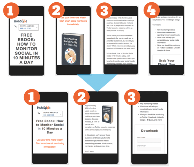
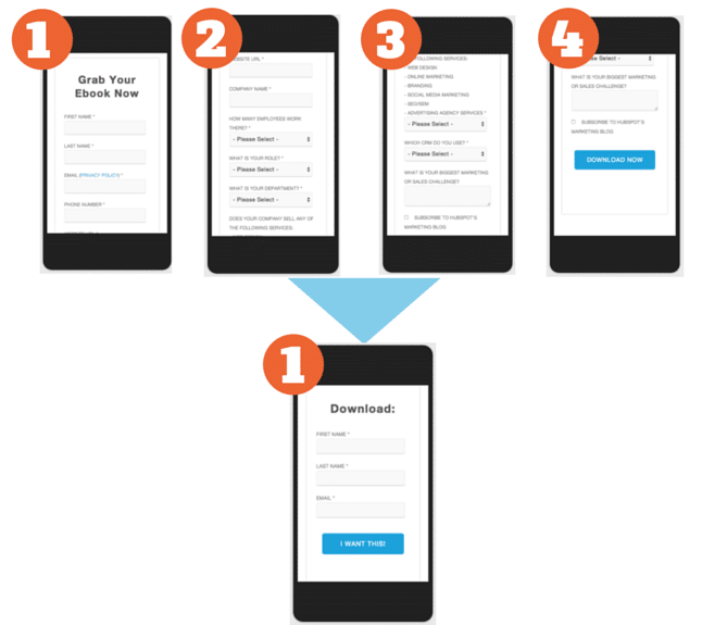
Then, they tackled the forms that accompanied these pages:
After they updated their landing pages and their subsequent forms so that they were condensed and simple on mobile, they achieved a 27% average decrease in mobile bounces. Combining the simplification of content and site architecture with responsive design lowered the bounce rate another 10.7%.
On mobile, you have to fine-tune everything from responsive design to speed, architecture, and the user experience. And the only way to do that is by truly putting mobile-first in your priorities.
Another important thing to note is that with mobile-first indexing, content which is collapsed or hidden in tabs will not be treated differently than visible content (as it may have been previously), since this type of screen real estate management is actually a mobile best practice. More about this here.
Check out these additional tips on designing content for the mobile-first index.
Track Mobile Keywords
Worried about your SEO with the new mobile-first index? While everything we mentioned above can help improve your SEO, you might also want to keep track of your keyword rankings on mobile vs desktop. This is especially important for those of you with a separate mobile domain, such as m.example.com.
If content is the same on desktop and mobile, but reordered, does that matter? "How the page is structured matters for ranking".
The main content is the most important thing. If it changes for mobile, you will rank differently.@methode #Pubcon
— Marie Haynes (@Marie_Haynes) February 21, 2018
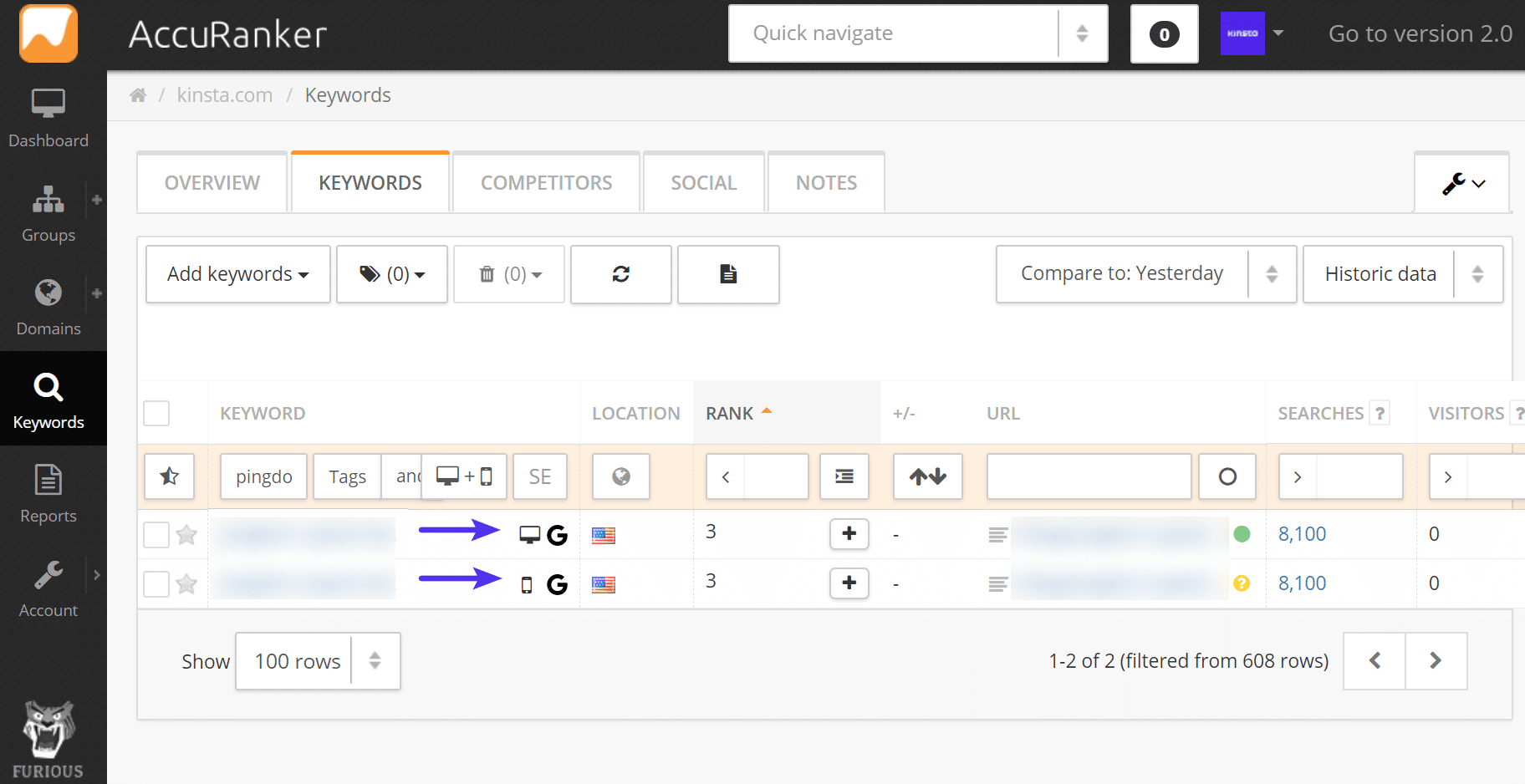
You can easily do this with a tool like Accuranker or SEMrush. Now is a good time to implement this, before it happens, so you can effectively monitor how your site is impacted by the new change from Google.
Additional Tips from Google
Here are some additional tips as recommended by Google:
- Make sure the mobile version of your site also has the important, high-quality content. This includes text, images (with alt-attributes), and videos – in the usual crawlable and indexable formats.
- Metadata should be present on both versions of the site. This includes things such as titles, meta descriptions, headers, etc. Check out our SEO checklist.
- Check hreflang links on separate mobile URLs. When using link rel=hreflang elements for internationalization, link between mobile and desktop URLs separately. Your mobile URLs’ hreflang should point to the other language/region versions on other mobile URLs, and similarly, link desktop with other desktop URLs using hreflang link elements there. If you follow our WordPress multilingual guide you should be good to go!
- Ensure the servers hosting the site have enough capacity to handle potentially increased crawl rate. This doesn’t affect sites that use responsive web design and dynamic serving, only sites where the mobile version is on a separate host, such as m.example.com.
- No changes are necessary for interlinking with separate mobile URLs (m.-dot sites). For sites using separate mobile URLs, keep the existing link rel=canonical and link rel=alternate elements between these versions. Glenn Gabe dives into some additional issues seen with separate mobile domains and canonical tags.
Conclusion
Less than two years ago, mobile traffic overtook desktop traffic worldwide and Google let us know they were going to make changes to how things were indexed. And it’s now here! Google has started rolling out the new mobile-first index as of March 26th, 2018.
If your site hasn’t been moved yet there is still time to get ahead of the curve. Focus on making your site mobile-friendly and responsive, improving speed, and putting mobile-first in everything that you do on your site.
Have any other mobile-first index tips we missed? Let us know below in the comments.

Brian has a huge passion for WordPress, has been using it for over a decade, and even develops a couple of premium plugins. Brian enjoys blogging, movies, and hiking. Connect with Brian on Twitter.