Add as a preferred source on Google

With WordPress 7.2 launching in December, a new default theme is on the way. Marking a departure from tradition, it drops the usual calendar-year naming scheme in favor of a more meaningful name.
Dubbed Ipsum, this new addition is a minimalist, lightweight, and modular block theme built for Full Site Editing (FSE) and strictly aligned with modern Block Editor standards.
As the name suggests, Ipsum streamlines the blogging experience and works out of the box the moment you start writing. Its design is understated in every detail, from subtle dotted underlines to the bundled typography and a curated set of style variations, focused on accessibility and readability.
Don’t let its minimalist nature fool you, though. Ipsum provides the ideal blank canvas to bring your creative vision as a blogger to life. Let’s dive into the latest default theme and explore how to get the most out of it using native WordPress features.
Ipsum: A minimalist theme with accessibility in mind
Ipsum features a minimalist design with a strong focus on readability.
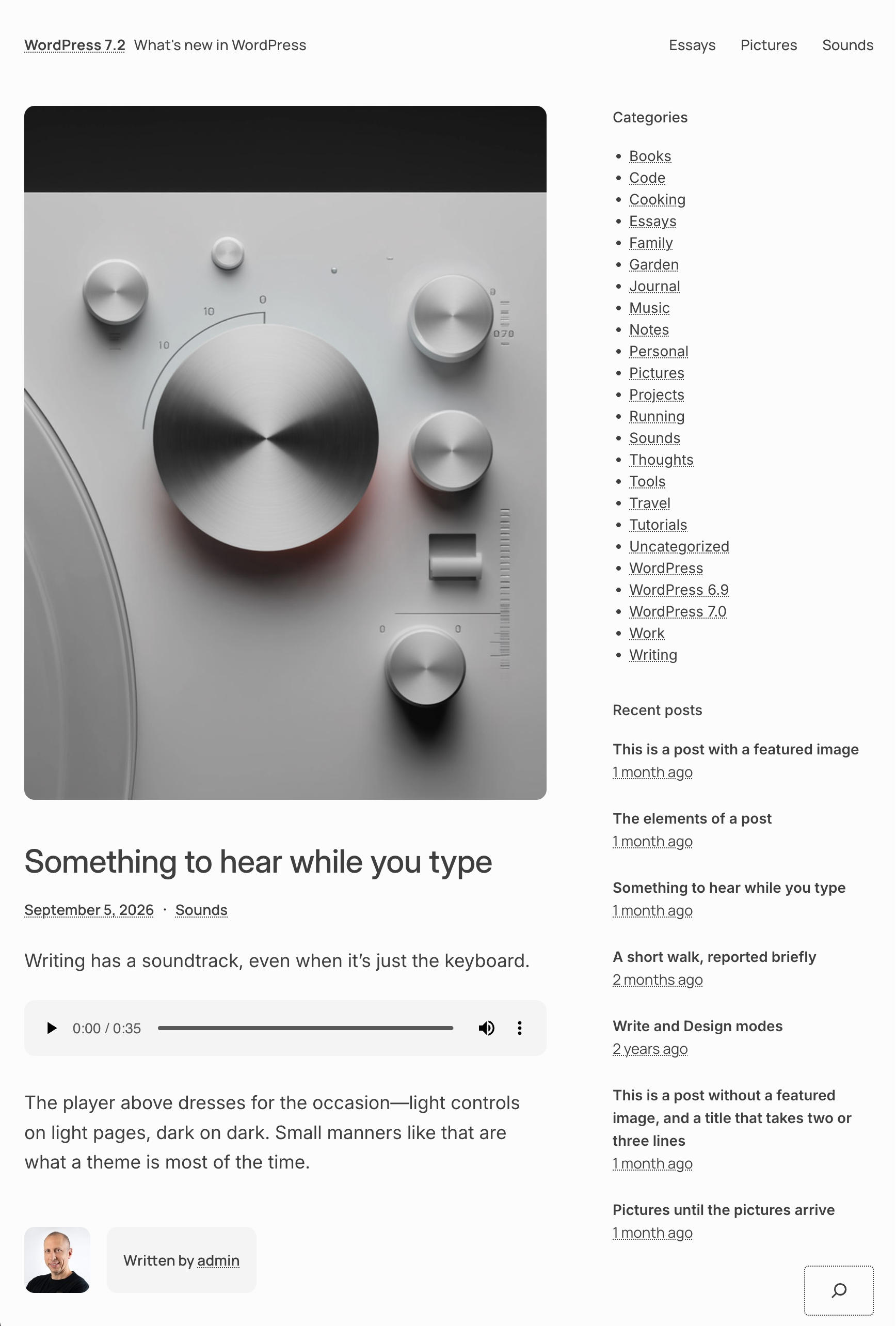
The new default theme defines six shades of gray with high-contrast combinations alongside a single accent color. The default background (#fcfcfc) and body text (#000000bf) achieve a contrast ratio (CR) of 10.26:1, easily earning a WCAG AAA rating.
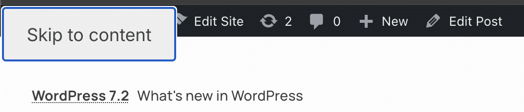
Ipsum supports native WordPress keyboard navigation, displaying a “Skip to content” link on every page. This allows users navigating with the Tab key to jump straight to the main content without having to cycle through header navigation links.
The theme also highlights focused links with its accent color, letting keyboard users quickly identify the active element.
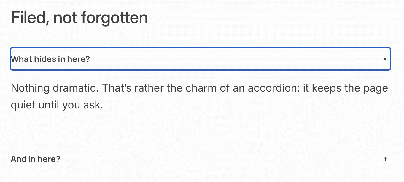
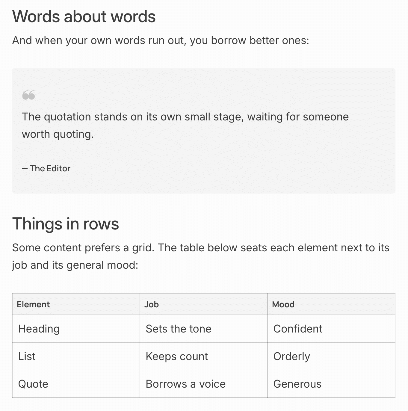
Typography plays a major role in making Ipsum easy on the eyes, offering five preset font sizes and supporting fluid typography.
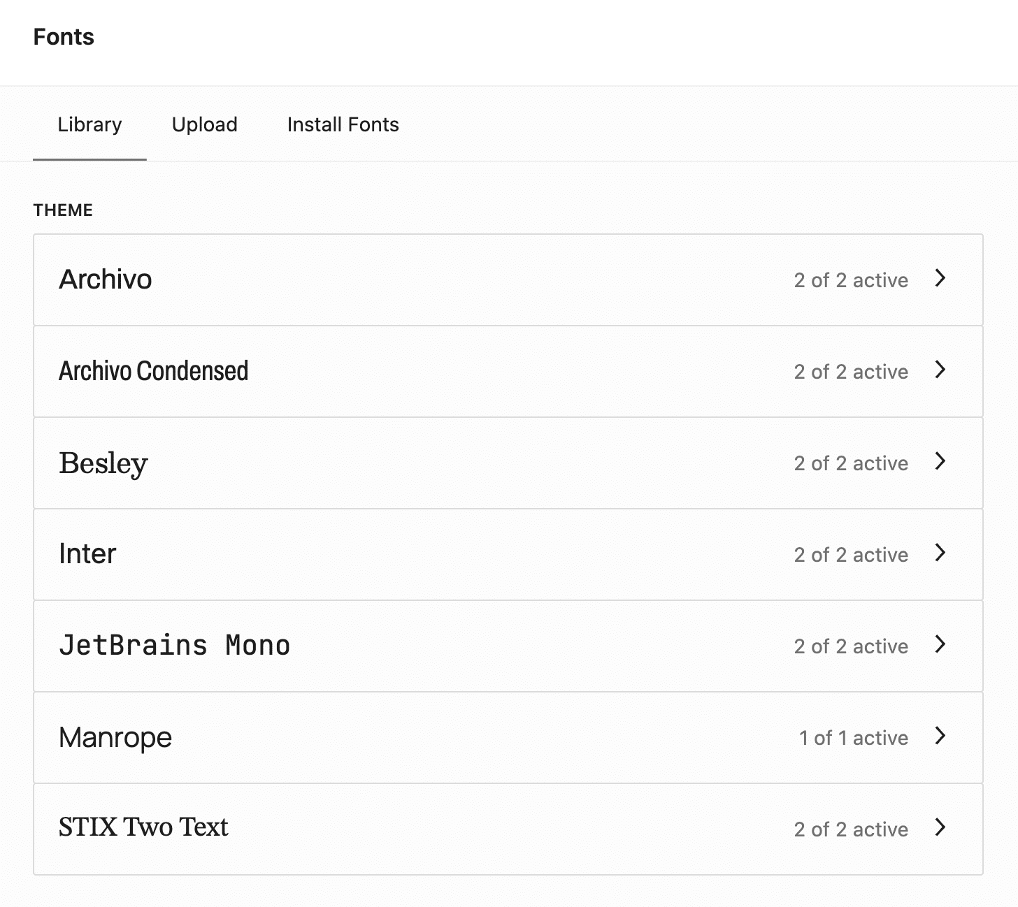
Links are distinguished only by a subtle dotted underline. While aligned with the theme’s minimalist aesthetic, this might make them hard to spot depending on the page’s color conditions.
That said, links remain easy to identify during keyboard navigation thanks to the accent-colored focus outline.
Now, let’s take a closer look at Ipsum’s specific features.
Templates and patterns
Ipsum includes a built-in set of templates that delegate page layouts to internal patterns. As an example, here is the markup of the page.html template:
<!-- wp:pattern {"slug":"ipsum/hidden-page"} /-->This single line of code calls the hidden pattern hidden-page.php, which controls the layout and sets the required metadata:
/**
 * Title: Pages
 * Slug: ipsum/hidden-page
 * Template Types: page
 * Inserter: no
 *
 * @package Ipsum
 * @since Ipsum 1.0
 */
The theme registers custom template variants, such as index-sidebar and archive-sidebar, directly via PHP so you can select them in the Site Editor.
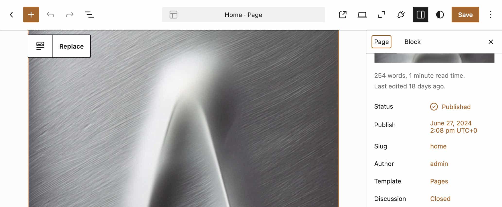
As of now, roughly 60 patterns are available to help you build and format your content.
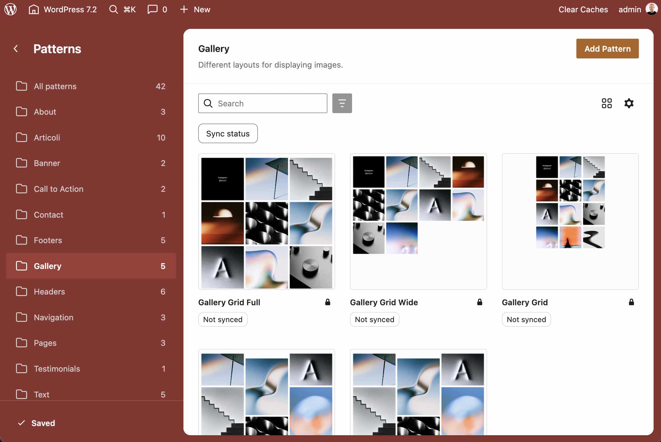
While some of these patterns are reserved (hidden) for the theme’s core templates, the majority are fully accessible for you to use in your pages.
Dynamic content with the Block Bindings API
An interesting technical detail for developers is how patterns implement the Block Bindings API. For example, the archive-full.php pattern uses bindings as follows:
<!-- wp:paragraph
{
	"metadata":{
		"bindings":{
			"content":{
				"source":"ipsum/comments-cta"
			}
		},
		"name":"<?php echo esc_html_x( 'Comments CTA', 'Name of the comments call to action paragraph', 'ipsum' ); ?>"
	},
	"style":{
		"typography":{
			"fontStyle":"normal","fontWeight":"600"
		}
	},
	"fontSize":"small","fontFamily":"manrope"
}
-->
<p class="has-manrope-font-family has-small-font-size" style="font-style:normal;font-weight:600"><?php esc_html_e( 'Join the conversation', 'ipsum' ); ?></p>
<!-- /wp:paragraph -->
The underlying binding source is registered in the theme’s functions.php file:
if ( ! function_exists( 'ipsum_comments_cta_binding' ) ) :
	/**
	 * Returns the comments call to action for the current post.
	 *
	 * @since Ipsum 1.0
	 * @param array    $source_args    Block binding source arguments.
	 * @param WP_Block $block_instance The block instance.
	 * @return string The call to action text.
	 */
	function ipsum_comments_cta_binding( $source_args, $block_instance ) {
		$post_id = $block_instance->context['postId'] ?? get_the_ID();

		if ( get_comments_number( $post_id ) > 0 ) {
			$text = __( 'Join the conversation', 'ipsum' );
		} else {
			$text = __( 'Be the first to comment', 'ipsum' );
		}

		return '<a href="' . esc_url( get_comments_link( $post_id ) ) . '">' . esc_html( $text ) . '</a>';
	}
endif;

if ( ! function_exists( 'ipsum_register_block_bindings' ) ) :
	/**
	 * Registers the comments call-to-action block binding source.
	 *
	 * @since Ipsum 1.0
	 * @return void
	 */
	function ipsum_register_block_bindings() {
		register_block_bindings_source(
			'ipsum/comments-cta',
			array(
				'label'              => __( 'Comments call to action', 'ipsum' ),
				'get_value_callback' => 'ipsum_comments_cta_binding',
				'uses_context'       => array( 'postId' ),
			)
		);
	}
endif;
add_action( 'init', 'ipsum_register_block_bindings' );
In short, the ipsum/comments-cta binding source dynamically returns either “Join the conversation” or “Be the first to comment”, depending on whether the current post already has comments.
Fluid typography and typography presets
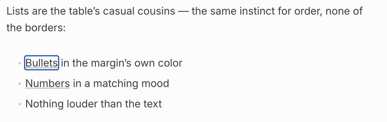
Ipsum’s theme.json registers a handful of font families provided as variable fonts in .woff2 format. These cover sans-serif (Manrope, Inter, Archivo, Archivo Condensed), serif (Besley, STIX Two Text), and monospace (JetBrains Mono), with Inter serving as the default body typeface.
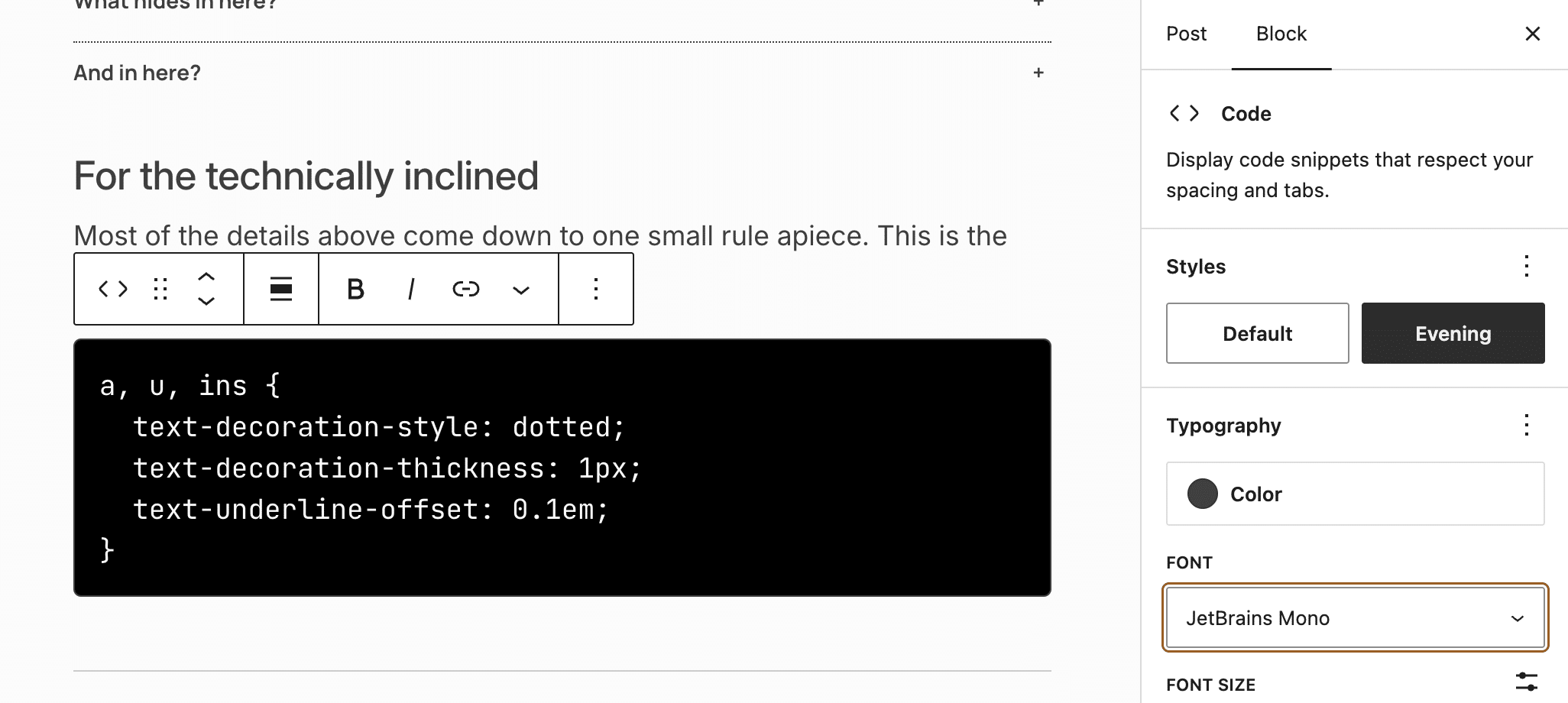
Fonts are hosted locally, removing third-party dependencies like Google Fonts and giving site owners more control over font loading.
The theme.json defines both fixed and fluid font sizes, automatically converted into dynamic CSS clamp() functions:
"fontSizes": [
	...
	{
		"fluid": {
			"max": "1.75rem",
			"min": "1.5rem"
		},
		"name": "X-Large",
		"size": "1.75rem",
		"slug": "x-large"
	},
	{
		"fluid": {
			"max": "2.1875rem",
			"min": "1.625rem"
		},
		"name": "2X-Large",
		"size": "2.1875rem",
		"slug": "2-x-large"
	}
],
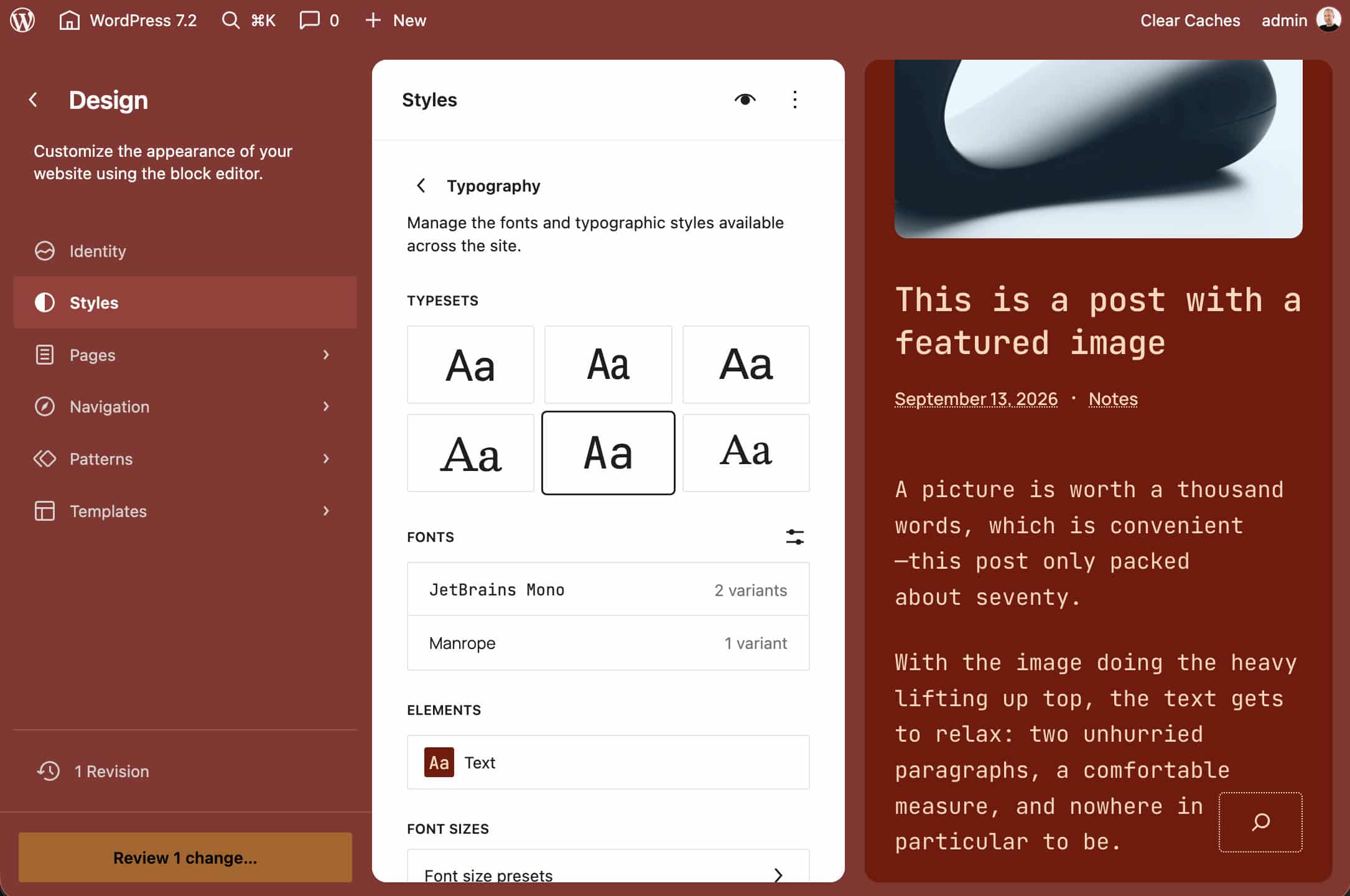
Ipsum also includes five typography presets you can select directly from the Site Editor’s Global Styles panel.
Each preset overrides the fontFamilies array to swap typeface combinations without affecting the site’s active color scheme.
Style variations
7 Global Style variations provide different combinations of color palette, default duotone filter, and typography.
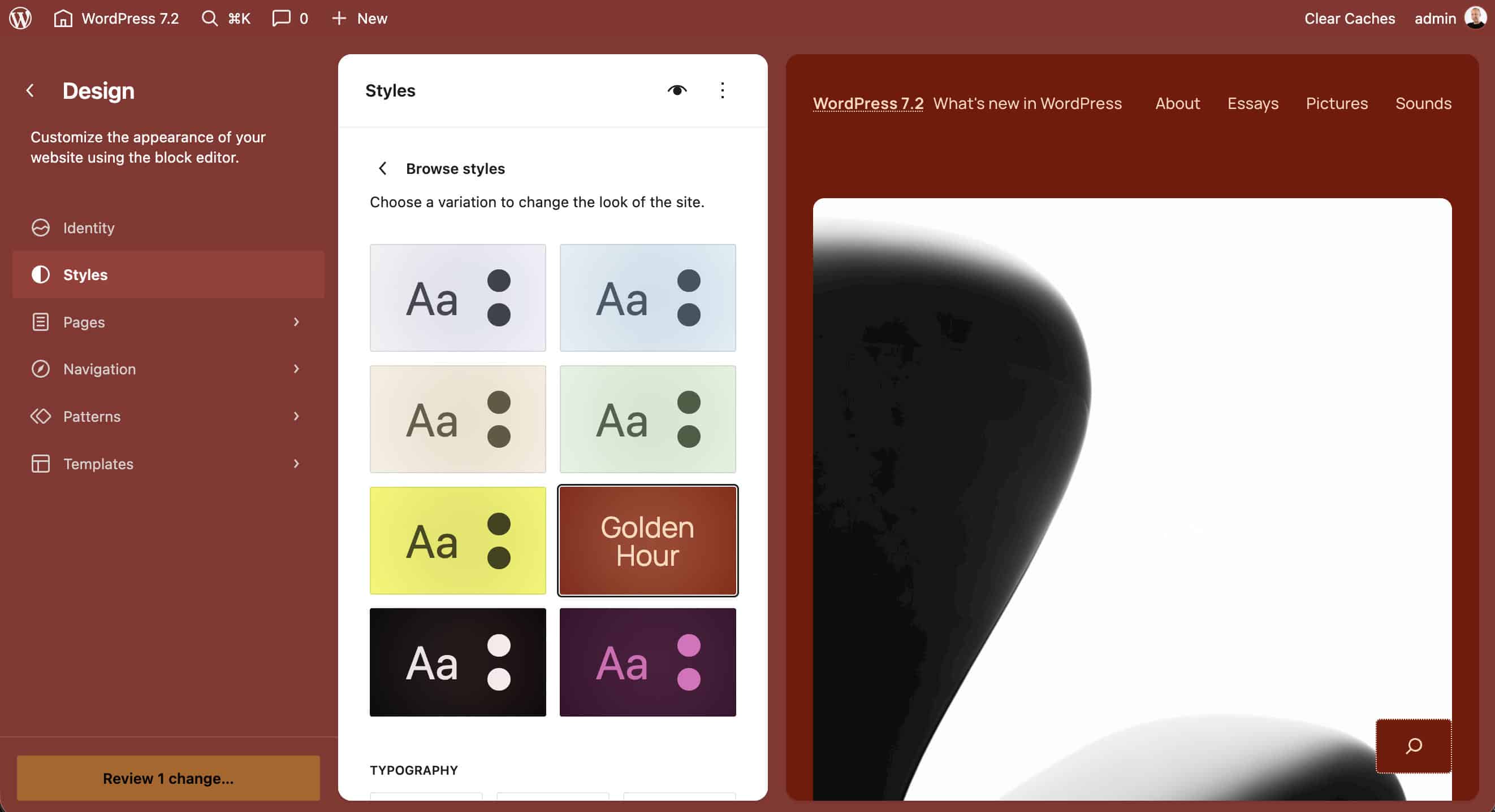
To see how a style variation is defined, the code below registers the Golden Hour variation. It defines the Peach on maroon duotone filter, introduces a new color palette, and sets the Manrope font family for the site’s overall typography.
{
	"$schema": "https://schemas.wp.org/trunk/theme.json",
	"version": 3,
	"title": "Golden Hour",
	"settings": {
		"color": {
			"duotone": [
				{
					"colors": [
						"#7a1000",
						"#ffd9bd"
					],
					"name": "Peach on maroon",
					"slug": "duotone-1"
				}
			],
			"palette": [
				{
					"color": "#7a1000",
					"name": "Color 1",
					"slug": "theme-1"
				},
				{
					"color": "#ffd9bd",
					"name": "Color 2",
					"slug": "theme-2"
				},
				{
					"color": "#ff8c52",
					"name": "Color 3",
					"slug": "theme-3"
				},
				{
					"color": "#ffd9bd40",
					"name": "Color 4",
					"slug": "theme-4"
				},
				{
					"color": "#ffd9bd1a",
					"name": "Color 5",
					"slug": "theme-5"
				},
				{
					"color": "#fff1e8",
					"name": "Color 6",
					"slug": "theme-6"
				}
			]
		},
		"custom": {
			"controlScheme": "dark"
		}
	},
	"styles": {
		"blocks": {
			"core/post-featured-image": {
				"filter": {
					"duotone": "var:preset|duotone|duotone-1"
				}
			}
		},
		"elements": {
			"heading": {
				"typography": {
					"fontFamily": "var(--wp--preset--font-family--manrope)",
					"fontStyle": "normal",
					"fontWeight": "500"
				}
			}
		},
		"typography": {
			"fontFamily": "var(--wp--preset--font-family--manrope)",
			"fontStyle": "normal",
			"fontWeight": "400"
		}
	}
}
The remaining global style variations follow the same structure with different combinations of colors and font families.
Block style variations
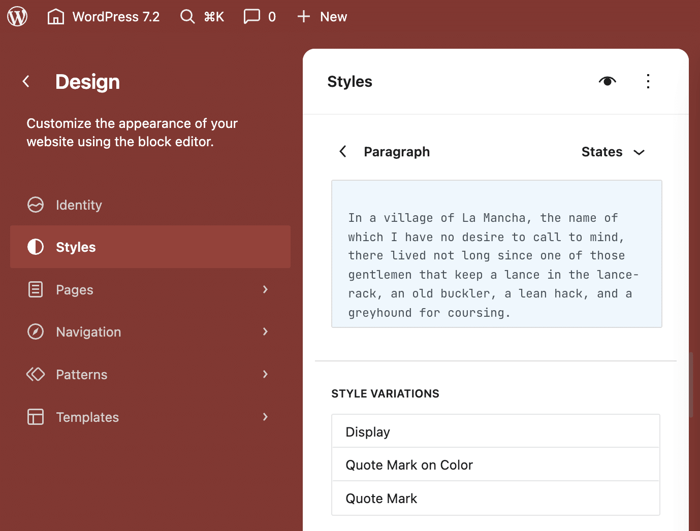
Ipsum also includes style variations for a handful of blocks. Some of these variations are registered via JSON files stored in the theme’s styles/blocks/ directory. Other variations are registered in the functions file.
You can view and customize block style variations in the Site Editor’s Global Styles panel under the Blocks & Elements section.
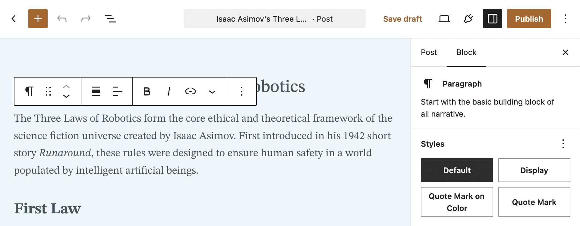
Variations are available in the Block Settings sidebar within the Post Editor for you to apply them to individual blocks with a single click.
Customizing Ipsum with a child theme
The best way to extend a WordPress theme is to create a child theme. In the following example, you’ll learn how to do it by introducing an asymmetrical Bento grid archive layout on top of Ipsum.
These are the steps to follow:
- Step 1: Set up the child theme
- Step 2: Create the Bento archive pattern
- Step 3: Create the Bento grid pattern
- Step 4: Build the Bento stylesheet
- Step 5: Register the custom template
Step 1: Set up the child theme
First, create a new folder for your child theme under wp-content/themes/, and name it ipsum-child or similar. Inside this folder, add two files: style.css and functions.php.
The style.css file contains the metadata that WordPress uses to identify and manage the theme. Start by adding the following code:
/*
Theme Name: Ipsum Child
Theme URI: https://example.com/
Description: A custom child theme for the Ipsum default theme
Author: Your Name
Author URI: https://example.com
Template: ipsum
Version: 1.0.0
Text Domain: ipsum-child
License: GNU General Public License v2 or later
License URI: http://www.gnu.org/licenses/gpl-2.0.html
*/
Ipsum uses get_stylesheet_directory_uri() to register the theme stylesheet in functions.php. When a child theme is active, this function points to the child theme directory, so WordPress skips loading the parent stylesheet.
In Ipsum’s specific case, to avoid losing the parent theme’s styling, you need to enqueue it properly inside your child theme’s functions file.
That said, add the following code to your child theme’s functions file:
<?php
/**
 * Ipsum Child functions and definitions.
 *
 * @package Ipsum_Child
 * @since Ipsum Child 1.0.0
 */

if ( ! function_exists( 'ipsum_child_styles' ) ) :

	function ipsum_child_styles() {
		wp_deregister_style( 'ipsum-style' );
		wp_register_style(
			'ipsum-style',
			get_template_directory_uri() . '/style.css',
			array(),
			wp_get_theme( get_template() )->get( 'Version' )
		);

		wp_enqueue_style(
			'ipsum-child-style',
			get_stylesheet_uri(),
			array( 'ipsum-style' ),
			wp_get_theme()->get( 'Version' )
		);
	}
endif;
add_action( 'wp_enqueue_scripts', 'ipsum_child_styles', 20 );
The code snippet above re-registers the ipsum-style handle using get_template_directory_uri() to restore the parent stylesheet. Then, it enqueues the child stylesheet right after it.
With the child theme configured, the next step is building the Bento grid archive pattern.
Step 2: Create the Bento archive pattern
To display an archive formatted as a Bento grid, we will reuse code already available in the parent theme.
For the pattern’s structure, we will use a few Ipsum built-in patterns:
archive-photographic.phpfor the grid query.archive-columns.phpfor the title, date, no results message, and pagination.hidden-archive.phpfor the template wrapper layout.
Inside your child theme directory, create the patterns/ and templates/ folders and add the following files:
patterns/archive-bento.phppatterns/hidden-archive-bento.phptemplates/archive.html
Your child theme structure should now look like this:
ipsum-child/
├── style.css
├── functions.php
├── patterns/
│   ├── archive-bento.php
│   └── hidden-archive-bento.php
└── templates/
    └── archive.html
Next, copy the code from the parent theme’s hidden-archive.php pattern and paste it into your child theme’s hidden-archive-bento.php. Then update the header metadata, text domain, and pattern slug call as follows:
<?php
/**
 * Title: All Archives Bento
 * Slug: ipsum-child/hidden-archive-bento
 * Template Types: archive, category, tag
 * Inserter: no
 *
 * @package Ipsum_Child
 * @since Ipsum Child 1.0.0
 */

?>
<!-- wp:template-part {"slug":"header"} /-->

<!-- wp:group {"tagName":"main","metadata":{"name":"<?php echo esc_html_x( 'Body', 'Group block defining the main content area', 'ipsum-child' ); ?>"},"layout":{"type":"default"}} -->
<main class="wp-block-group"><!-- wp:group {"metadata":{"name":"<?php echo esc_html_x( 'Section Title', 'Group containing the archive title', 'ipsum-child' ); ?>"},"layout":{"type":"constrained"}} -->
<div class="wp-block-group"><!-- wp:query-title {"type":"archive"} /--></div>
<!-- /wp:group -->

<!-- wp:pattern {"slug":"ipsum-child/archive-bento"} /--></main>
<!-- /wp:group -->

<!-- wp:template-part {"slug":"footer"} /-->

<!-- wp:template-part {"slug":"search-bar","className":"sticky-bottom"} /-->
Essentially, we adapted the parent’s hidden-archive.php pattern to our ipsum-child/hidden-archive-bento pattern.
Step 3: Create the Bento pattern
Now we need to build the actual Bento pattern inside patterns/archive-bento.php. Here again, we will leverage code already available in Ipsum.
Below is the complete code for the archive-bento.php pattern, annotated with the origin of each code snippet:
<?php
/**
 * Title: Archive Bento Grid
 * Slug: ipsum-child/archive-bento
 * Categories: posts
 * Block Types: core/query
 * Viewport width: 1280
 * Description: A bento grid of posts: one large card, wide and tall cards, and small cards, repeating every ten posts.
 *
 * @package Ipsum_Child
 * @since Ipsum Child 1.0.0
 */

?>

<?php
/**
 * Query Loop
 * Origin: archive-columns.php.
 * Changed: perPage, name, text domain.
 */
?>
<!-- wp:query {"query":{"perPage":10,"pages":0,"offset":0,"postType":"post","order":"desc","orderBy":"date","author":"","search":"","exclude":[],"sticky":"","inherit":true,"taxQuery":null,"parents":[],"excludeCurrent":null},"metadata":{"categories":["posts"],"name":"<?php echo esc_html_x( 'Archive Bento Grid', 'Name of the Archive Bento Grid query', 'ipsum-child' ); ?>"},"align":"wide","layout":{"type":"default"}} -->
<div class="wp-block-query alignwide"><!-- wp:post-template {"className":"bento-grid","style":{"spacing":{"blockGap":"var:preset|spacing|30"}},"layout":{"type":"grid","columnCount":4}} -->

<?php
/**
 * Post Template
 * Origin: archive-photographic.php.
 * Changed: gap, columns.
 * New: class bento-grid.
 */

/** Card
 * Origin: hero-colophon.php, cta-membership.php.
 * New: name, justifyContent stretch.
 */
?>
<!-- wp:group {"metadata":{"name":"<?php echo esc_html_x( 'Bento Card', 'Name of the group holding a bento card', 'ipsum-child' ); ?>"},"className":"is-style-crop-contents","style":{"border":{"radius":{"topLeft":"10px","topRight":"10px","bottomLeft":"10px","bottomRight":"10px"}},"spacing":{"padding":{"top":"var:preset|spacing|40","bottom":"var:preset|spacing|40","left":"var:preset|spacing|40","right":"var:preset|spacing|40"},"blockGap":"var:preset|spacing|30"}},"backgroundColor":"theme-5","layout":{"type":"flex","orientation":"vertical","justifyContent":"stretch"}} -->
<div class="wp-block-group is-style-crop-contents has-theme-5-background-color has-background" style="border-top-left-radius:10px;border-top-right-radius:10px;border-bottom-left-radius:10px;border-bottom-right-radius:10px;padding-top:var(--wp--preset--spacing--40);padding-right:var(--wp--preset--spacing--40);padding-bottom:var(--wp--preset--spacing--40);padding-left:var(--wp--preset--spacing--40)"><!-- wp:post-featured-image {"isLink":true,"sizeSlug":"large"} /-->

<?php
/** Featured image
 * Origin: archive-standard.php
 * Changed: removed padding.
 */
?>
<?php
/** Title and Meta
 * Origin: archive-columns.php.
 * Changed: removed selfStretch, gap.
 */ ?>
<!-- wp:group {"metadata":{"name":"<?php echo esc_html_x( 'Title and Meta', 'Name of the group holding the post title and meta', 'ipsum-child' ); ?>"},"style":{"spacing":{"blockGap":"var:preset|spacing|20"}},"layout":{"type":"flex","orientation":"vertical"}} -->
<div class="wp-block-group"><!-- wp:post-title {"isLink":true,"fontSize":"large"} /-->

<?php
/**
 * Post Title and Post Date
 * Origin: archive-columns.php.
 */ ?>
<!-- wp:post-date {"isLink":true,"style":{"typography":{"fontStyle":"normal","fontWeight":"400"}}} /--></div>
<!-- /wp:group --></div>
<!-- /wp:group -->
<!-- /wp:post-template -->

<?php
/** No results
 * Origin: archive-columns.php.
 * Changed: text domain only.
 */ ?>
<!-- wp:group {"metadata":{"name":"<?php echo esc_html_x( 'No Results Wrapper', 'Name of the group shown when a query has no results', 'ipsum-child' ); ?>"},"layout":{"type":"constrained"}} -->
<div class="wp-block-group"><!-- wp:query-no-results -->
<!-- wp:paragraph -->
<p><?php esc_html_e( 'No posts have been published in this section yet.', 'ipsum-child' ); ?></p>
<!-- /wp:paragraph -->
<!-- /wp:query-no-results --></div>
<!-- /wp:group -->

<?php
/**
 * Pagination
 * Origin: archive-columns.php.
 * Changed: text domain only.
 */ ?>
<!-- wp:group {"metadata":{"name":"<?php echo esc_html_x( 'Pagination Wrapper', 'Name of the group wrapping the pagination', 'ipsum-child' ); ?>"},"align":"wide","style":{"spacing":{"margin":{"top":"var:preset|spacing|60"}}},"layout":{"type":"constrained"}} -->
<div class="wp-block-group alignwide" style="margin-top:var(--wp--preset--spacing--60)"><!-- wp:query-pagination {"paginationArrow":"arrow","layout":{"type":"flex","justifyContent":"space-between"}} -->
<!-- wp:query-pagination-previous /-->

<!-- wp:query-pagination-next /-->
<!-- /wp:query-pagination --></div>
<!-- /wp:group --></div>
<!-- /wp:query -->
In the code above, we reused and recombined the built-in building blocks provided by Ipsum.
Here are the main changes:
- Query block: In the Query Loop, we updated the
perPageparameter to10. This is crucial for the Bento grid’s visual rendering, as the CSS rules in the next step target a repeating 10-item cycle (10n) and dynamically repeat an alternating sequence of large, wide, tall, and compact cards. - Post Template block: We added the custom CSS class
bento-gridto target the grid via CSS and apply the asymmetrical layout. - Group block: The Group block uses a vertical flex layout, while the CSS sets each card to fill its grid area and allows the featured image to expand within the available space.
- Text Domain: All strings were updated to use the
ipsum-childtext domain.
With these changes, the pattern’s block structure is complete. Now we just need to define the CSS properties that will shape its visual layout.
Step 4: Build the Bento stylesheet
Open the child theme’s style.css file and paste the following code:
.bento-grid {
	grid-auto-flow: dense;
	grid-auto-rows: minmax(18rem, auto);
}

.bento-grid > li:nth-child(10n + 1) {
	grid-column: span 2;
	grid-row: span 2;
}

.bento-grid > li:nth-child(10n + 6) {
	grid-column: span 2;
}

.bento-grid > li:nth-child(10n + 7),
.bento-grid > li:nth-child(10n + 8) {
	grid-row: span 2;
}

.bento-grid > li > .wp-block-group {
	height: 100%;
}

.bento-grid .wp-block-post-featured-image {
	position: relative;
	flex: 1 1 0;
	min-height: 8rem;
	margin: 0;
}

.bento-grid .wp-block-post-featured-image img {
	position: absolute;
	inset: 0;
	width: 100%;
	height: 100%;
	object-fit: cover;
}

@media (max-width: 781px) {
	.bento-grid.is-layout-grid {
		grid-template-columns: repeat(2, minmax(0, 1fr));
	}

	.bento-grid > li:nth-child(n) {
		grid-column: auto;
		grid-row: auto;
	}

	.bento-grid > li:nth-child(10n + 1),
	.bento-grid > li:nth-child(10n + 6) {
		grid-column: span 2;
	}
}

@media (max-width: 480px) {
	.bento-grid.is-layout-grid {
		grid-template-columns: minmax(0, 1fr);
	}

	.bento-grid > li:nth-child(n) {
		grid-column: auto;
		grid-row: auto;
	}
}
Here is a breakdown of this stylesheet:
grid-auto-flow: dense: Enables dense packing in CSS Grid. Each grid row has a minimum height of18rem..bento-grid > li:nth-child(10n + 1): The grid pattern targets a 10-post cycle (10n). The first item in the loop (10n + 1) becomes the main hero card, spanning 2 columns and 2 rows.li:nth-child(10n + 6): The sixth post spans two columns. The seventh and eighth posts each span two rows..wp-block-post-featured-image img: The featured image is positioned absolutely inside a zero-basis flex wrapper (flex: 1 1 0) withobject-fit: cover. This ensures the image adapts cleanly to the grid row.
The media queries redefine the grid’s column count for smaller screens.
Step 5: Register the custom template
Next, open templates/archive.html and add the following code:
<!-- wp:pattern {"slug":"ipsum-child/hidden-archive-bento"} /-->The templates/archive.html file name follows the standard WordPress template hierarchy and overrides the parent theme’s default archive template when no more specific template takes precedence.
If you want to replace the index page layout as well, simply copy the same code into a templates/index.html file.
The code inside simply calls the hidden-archive-bento wrapper pattern, keeping the template structure clean and modular.
It’s time for testing. Upload your child theme and activate it. Then hop over into the next section.
The result
Your templates are now ready to use across your site’s archives. You can also add the Bento pattern to static pages, setting inherit to false and configuring the required query parameters, if needed.
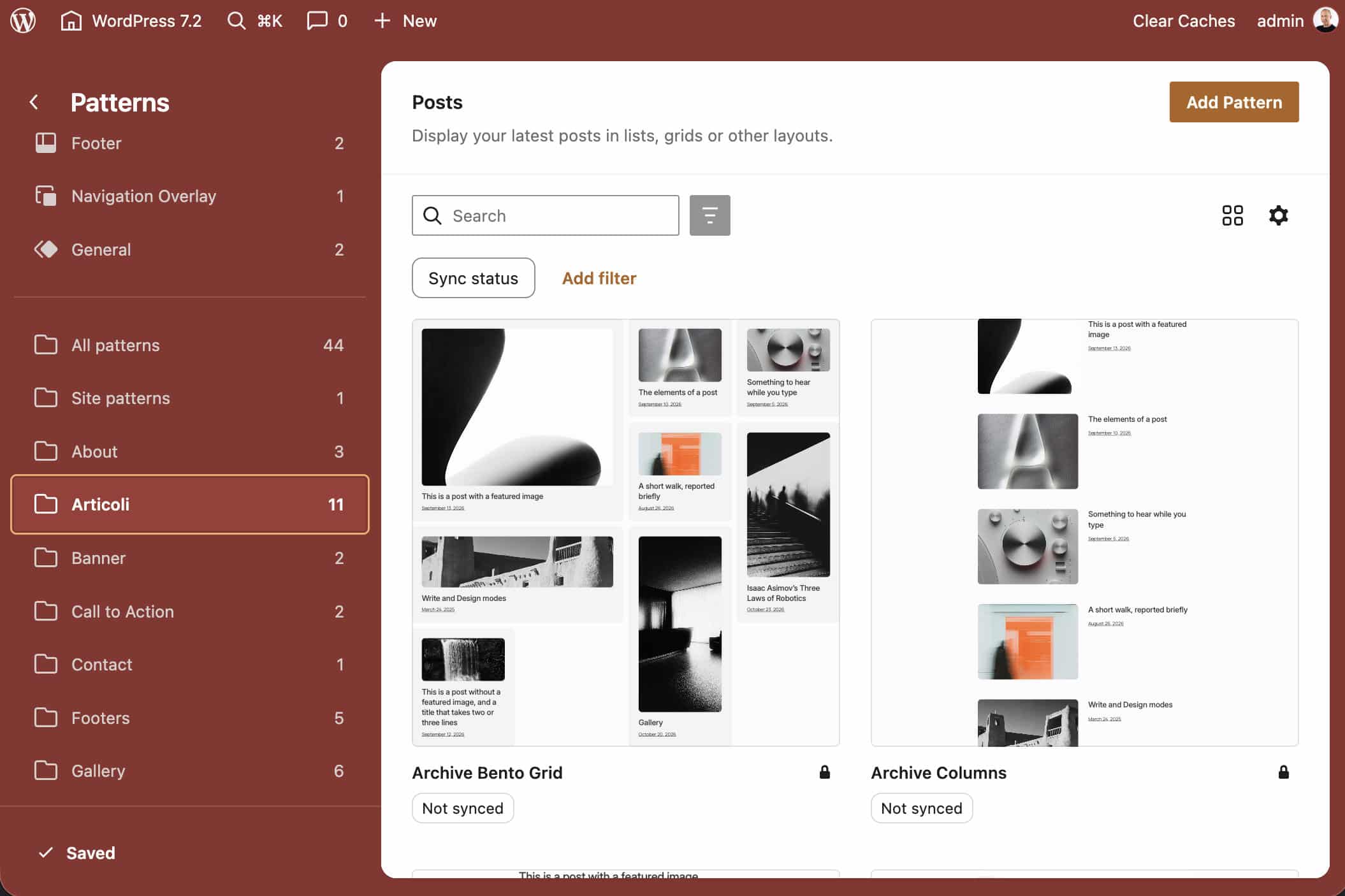
As mentioned, to apply the same layout to the site’s index page, you’ll also need to create a templates/index.html file with the same pattern reference.
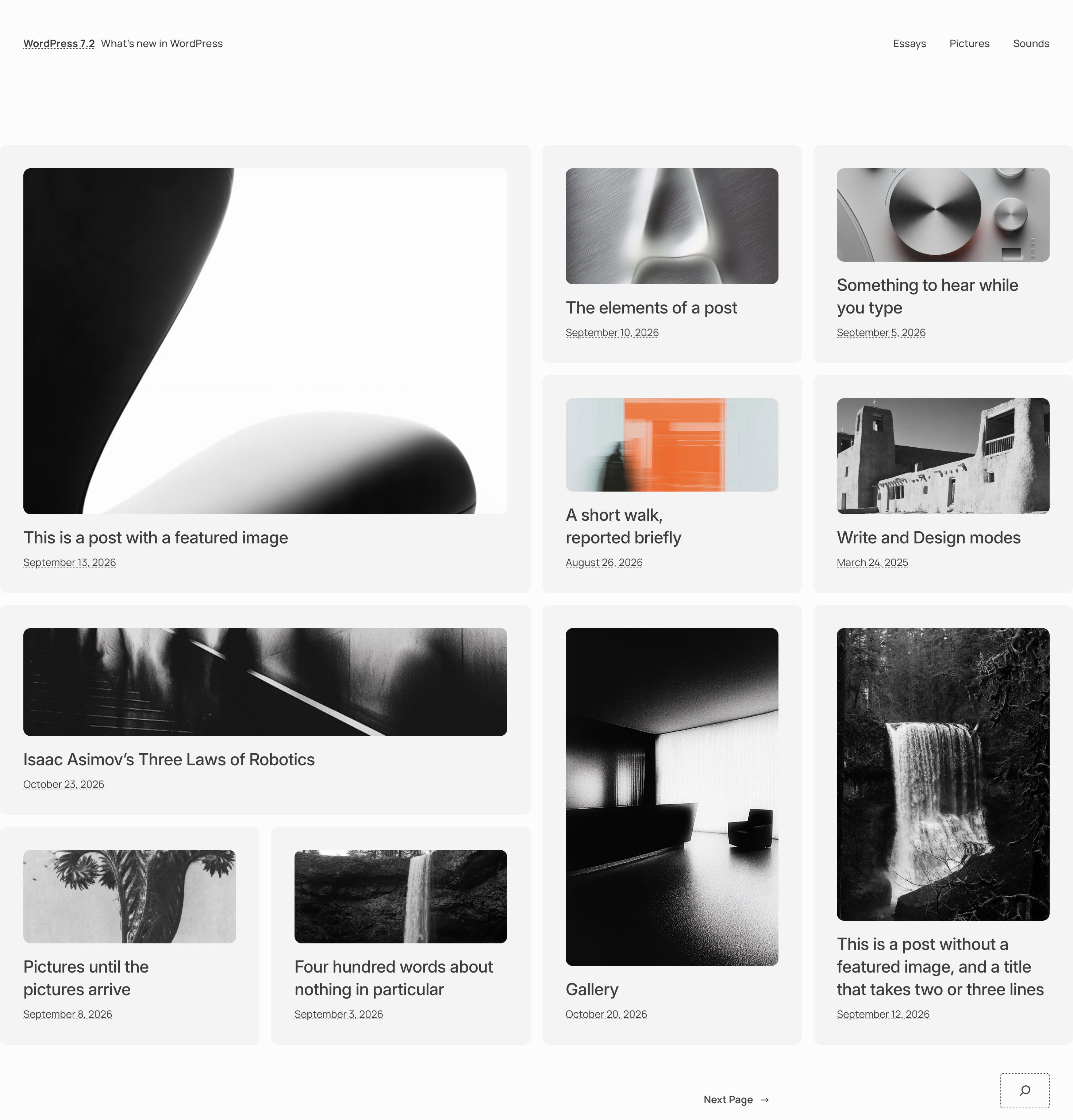
The final image shows the home page of our staging site featuring a nice Bento Grid layout.
A lightweight and accessible theme
Ipsum brings together modern WordPress editing features, reusable patterns, and flexible styling options in a deliberately minimal design. Once you understand how its patterns and templates fit together, you can extend the theme well beyond its default blogging layouts. The Bento Grid featured in this guide is just one example of what you can build with a child theme on top of Ipsum.
If speed and performance are your top priorities, remember that code is only half the equation. Fast websites also depend on caching, optimizations, site configuration, and hosting infrastructure. Check out our plans and find the one that best fits your site’s needs.

Carlo is a passionate lover of webdesign and front-end development. He has been playing with WordPress for more than 20 years, also in collaboration with Italian and European universities and educational institutions. He has written hundreds of articles and guides about WordPress, published both on Italian and international websites, as well as on printed magazines. You can find him on LinkedIn.