There are numerous valuable web development resources, be it books, videos, online courses, and more. Learning how to use a browser’s Inspect Element tool is one such powerful ability. It’s an invaluable learning tool — one that’s right under your fingertips and always accessible.
With the Inspect Element feature, you get to see the website’s inner workings. Although you can only see frontend markup such as HTML, CSS, and sometimes JavaScript, it gives you a way to see precisely how the developers built a website.
In this post, we’re going to show you how to use the Inspect Element tool and some of the related technologies, features, and functionality you’ll come across. First, let’s give you a formal introduction to the Inspect Element tool itself.
Introducing the Inspect Element Tool
In the web’s early days, there was only one way to look at a website’s code — the View Source feature.
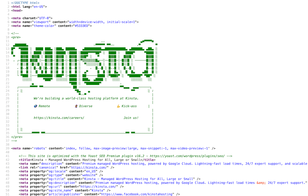
This situation was prevalent in the days before we had Cascading Style Sheets (CSS) and JavaScript in abundance. Web developers used HTML for all site elements, including content, design, and… well, everything.
Once the web started to evolve, and the underlying technologies increased in power, it was necessary to develop better tools. Firefox’s Firebug was an early solution for finding out how a website performed and worked under the hood:

After a while, that functionality found its way into almost all browsers. Today, we know that feature as the Inspect Element tool:
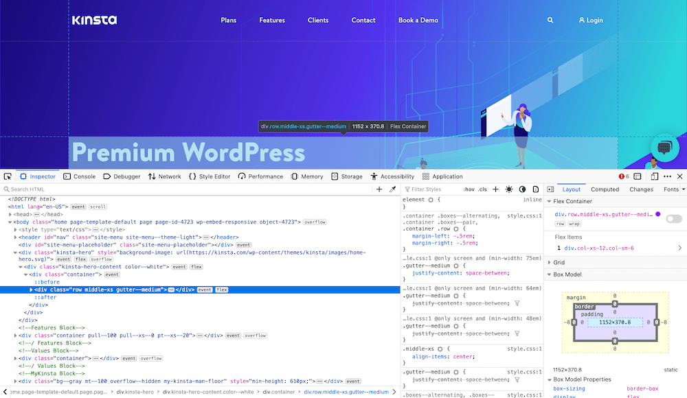
It’s a powerful way to see the underlying technology and code of a website. As such, you can find it in a few different places — often through a toolbar menu, right-clicking on a page and selecting the option, or with a keyboard shortcut.
While the Inspect Element tool’s primary focus is on the HTML and CSS of a page, there’s more you can do with it.
Touring the Inspect Element Panel
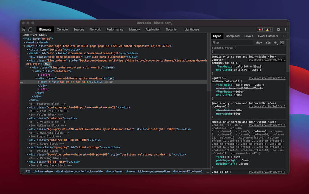
The Inspect Element tool is much more than a way to display code. There are often several panels to access:
- Inspector — This is called Elements in some browsers. It’s the main screen in the Inspect Element tool and shows you the page code, along with element-specific CSS. You’ll also find further details on a site’s “grid system” and other aspects.
- Console — This is a frontend warning log for a site, and it’s a place you can also enter code snippets to perform a quick test of an idea.
- Network — Here, you’ll see the requests made to and from a server, such as all POST and GET requests.
- Performance — Of course, a site has to be performant. As such, there’s a dedicated tool to help you gauge some essential site metrics. Some browsers do better than others here.
- Memory — This panel lets you see how a site uses memory, and again, some browsers offer extensive metrics.
- Application — Within this panel, you can see a whole range of information on the site’s cache, background services, and more.
On top of this, there are more panels you can add:
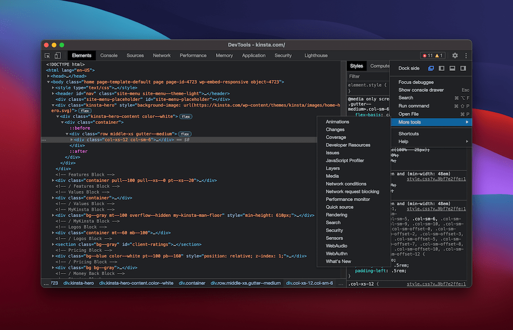
There are simple panels, such as Media, and more complex ones like the JavaScript Profiler and the Performance monitor. In a nutshell, the Inspect Element tool’s name is doing a disservice to all functionality under the hood. It has immense power and should be central to any web developer’s workflow.
Why You’d Want to Use Inspect Element?
The Inspect Element tool is almost the only “nailed-on” solution you’ll need to have at your side during development. We’ll get into the technical details as to why throughout the rest of the article. First, though, it’s worth talking about your motivation for using Inspect Element.
There are a few reasons why you’d want to use the tool:
- You can browse other websites for inspiration on how to work on yours.
- You’ll learn how other sites or developers achieve specific techniques.
- It gives you a license to experiment on your site without consequences.
- In most Inspect Element tools, you get the opportunity to debug the sites.
- It’s good to find out more about the website in question.
In short, learning about web development involves looking at good examples of websites and finding out what makes them tick.
The Inspect Element tool lets you check out the exact HTML and CSS used on a site, giving you a great chance to implement those aspects and techniques in your work.
How to Find Your Browser’s Inspect Element Tool?
The good news is that finding the Inspect Element tool is straightforward. In most cases, you’ll right-click on a page and select Inspect or Inspect Element.
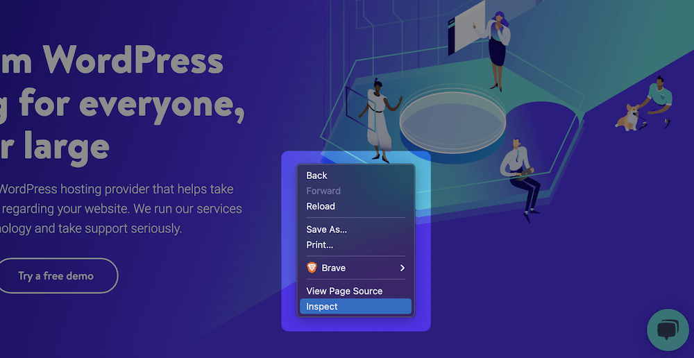
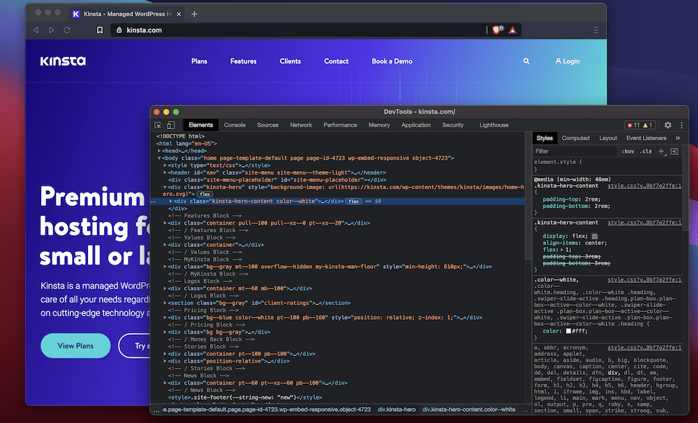
By default, it’ll open the tool in a split window. It often defaults to the right-hand side. But you can customize this to your liking and even pop the tool out into its window.
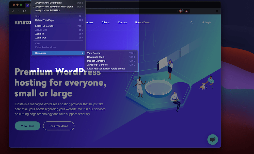
Of course, you can also access Inspect Element from the browser toolbar or through a keyboard shortcut. The exact location will vary depending on the browser. For example, in Firefox, you’ll find the Web Developer Tools in the Tools > Browser Tools menu. In contrast, Brave (and other Chromium-based browsers) have the Developer Tools option in the View > Developer menu.
The keyboard shortcuts are often similar cross-browser: Command + Shift + C (Control + Shift + C for Windows). This shortcut makes it quick to bring up the tools you need to work with straight away.
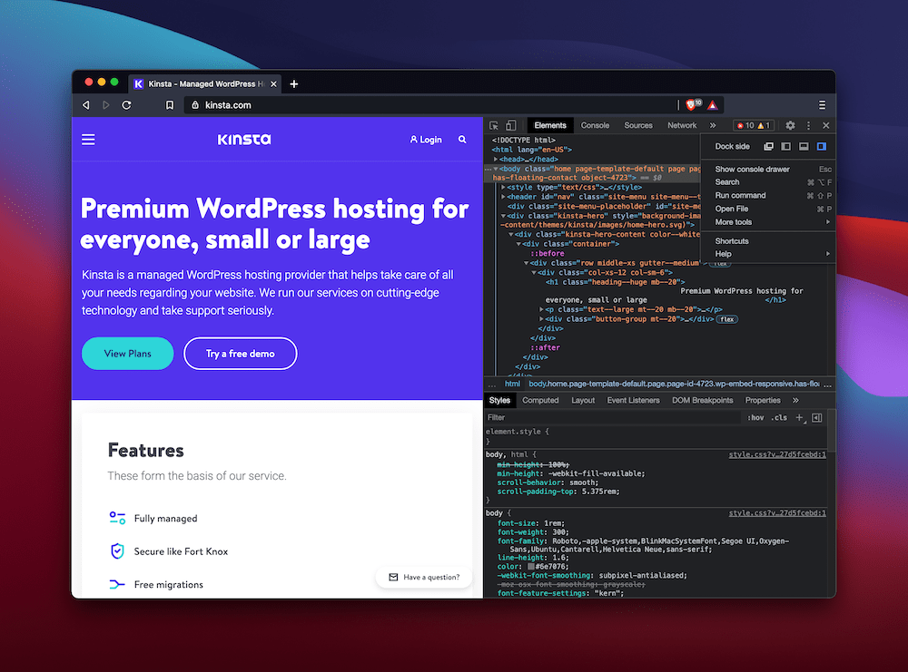
If you’ve never opened the Inspect Element tool before, it’s often displayed on the right-hand side of your menu, as we mentioned earlier. To change this, click on the traffic light menu in the Inspect Element’s toolbar. Here, you can switch the side the “dock” is displayed:
Note that Firefox also uses a “triple pane” view by default, which helps you to get as much information in the Inspect Element tool as possible:
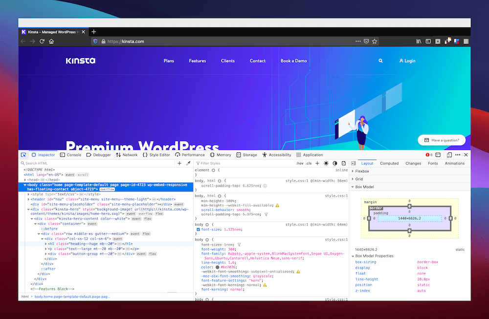
Now that you have the tool open, it’s a good idea to find out what you can do with it. We’ll talk about this next.
3 Situations for Using the Inspect Element Tool
We’ve touched on some ways you’ll use the Inspect Element tool, but we can go further than this to offer some use cases. Let’s discuss these in brief.
1. Searching for Specific Elements on a Webpage
The primary goal of the Inspect Element tool is in its name — inspecting website elements. To do this, you’ll head to the desired webpage and then choose your method of opening the development tools.
Once the panel is open, you’ll click the arrow that acts as a selector for your desired element:

From here, you can hover over any element on the page, and you’ll see it highlighted in the Inspector/Elements window:
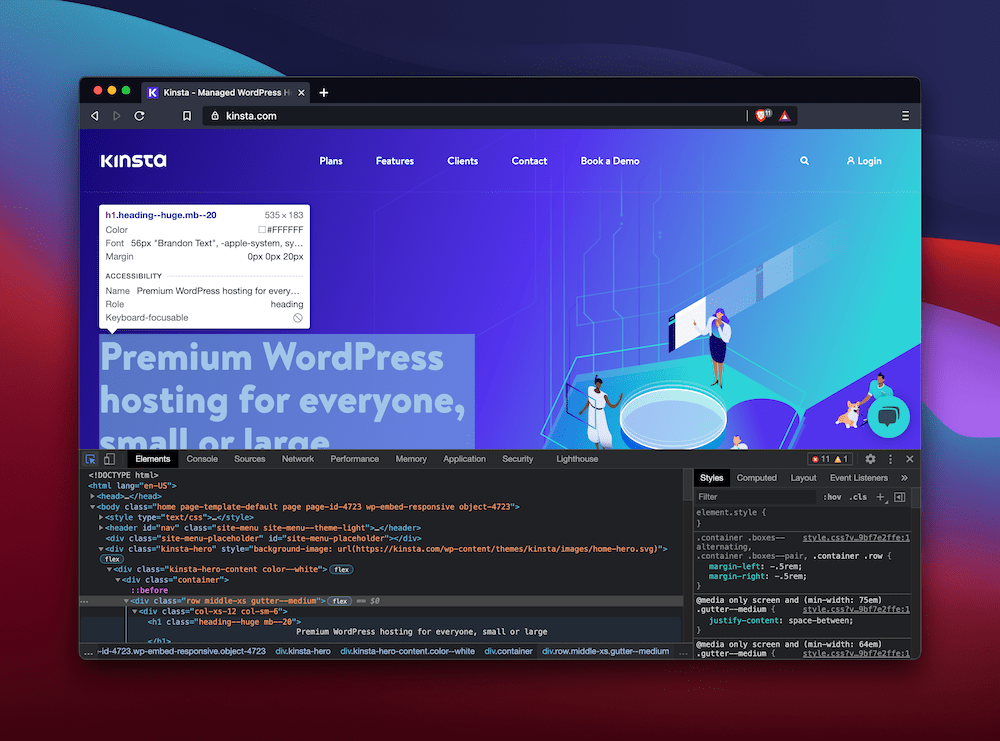
It’s a simple process — one of the reasons why the Inspect Element tool is so valuable and popular with web developers.
2. Emulating a Target Device, Display, and Browser
The Inspect Element also functions as a device emulator of sorts. In other words, you’re able to see how a website looks on a specific device. The options are numerous:
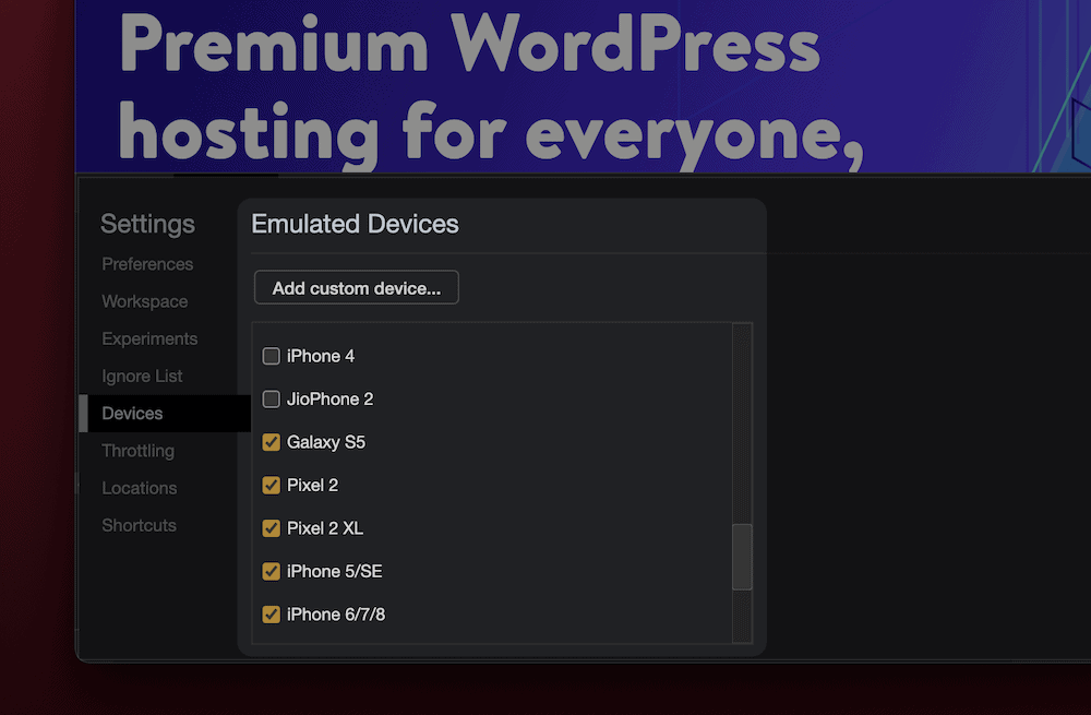
This emulator will be great for judging whether your mobile-first strategy or responsive design is accurate and working. It’s invaluable and also more cost-effective than having 200 devices floating around your desk.
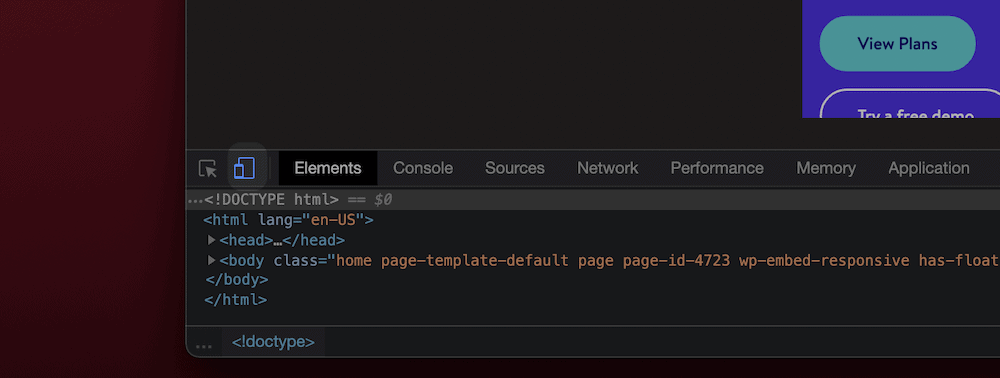
You’ll often access device emulation from a small icon somewhere on the Inspect Element panel:

Clicking this icon will display your site as it looks on the device you’ve selected:
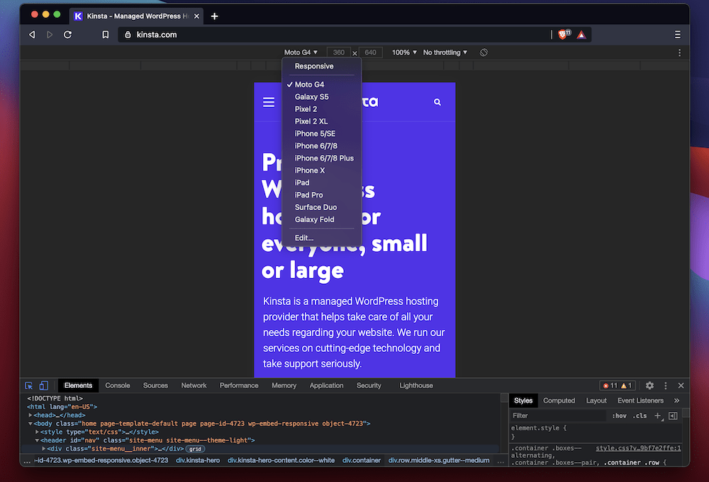
We’ll dig into this in more detail later, but it’s a rock-solid way of making your designs consistent across devices.
3. Ascertaining the Performance of Webpage
The Inspect Element tool can also help you judge the speed and performance of a website through the Performance panel:
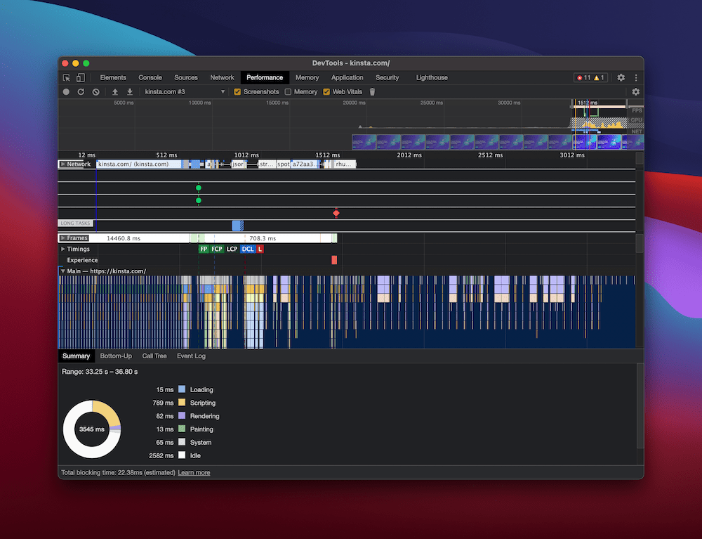
This feature works by “recording” the loading times of specific elements and scripts. Chromium-based browsers perform brilliantly at offering this information. You’ll record the page as it loads, and then view the results in a timeline format.
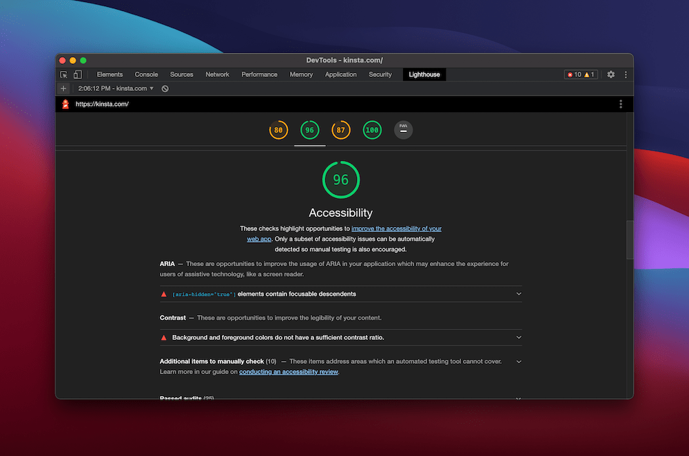
It’s an excellent way to ascertain whether a page is performant on a general level. From there, you’ll want to use a tool such as Google PageSpeed Insights or Lighthouse to work on your site’s performance further. Chromium-based browsers will have a Lighthouse report generator built-in:
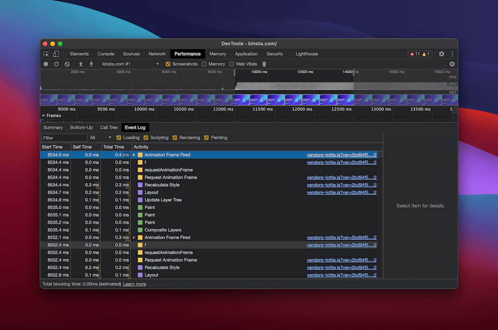
You’re also able to see a summary of the performance testing within a few other tabs. For example, you can view a Call Tree, an overall summary, and an Event Log:
It’s conceivable that you wouldn’t need any other tool to judge how your website performs or works. Learning how it works in practice is something we’ll discuss next.
Tricks and Tips for Using the Inspect Element Tool
We’ve already talked about how the Inspect Element tool is more powerful than it may appear to be at first glance. Let’s take a look at some tricks and tips to get the best out of its feature set, starting with the basics.
1. Changing Element Properties, Values, and States
So far, we’ve only touched on the concept of using the Inspect Element tool to make temporary changes to a site. Let’s discuss how to do this in more detail.
The steps are straightforward. First, use the arrow icon to select your chosen element. You’ll see an overlay that highlights the various components as you hover over them:
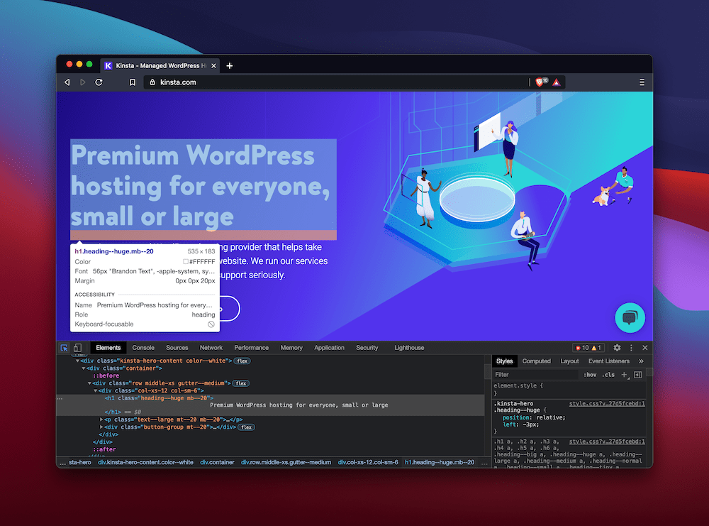
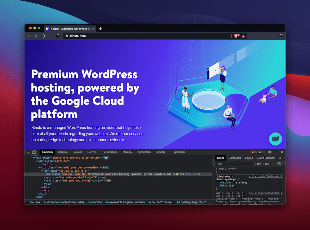
Once you get to your desired element, you can double-click almost anywhere you see a tag within the Elements panel and type in a change. For example, we want to change the original hero text on the Kinsta homepage to something different:
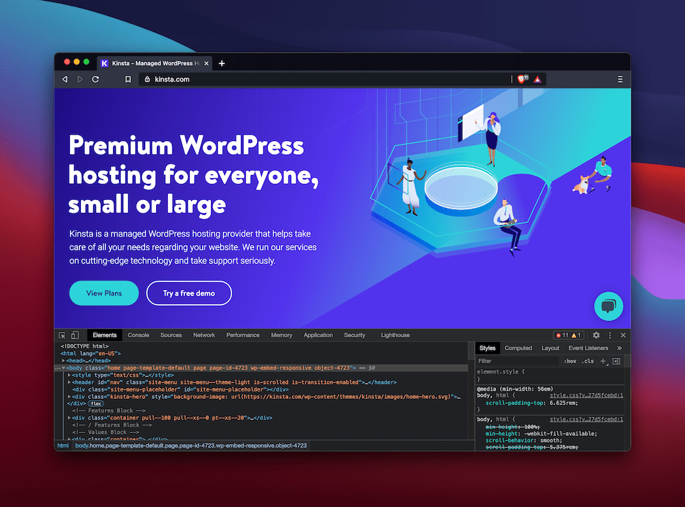
You can also work with CSS in the same way as HTML. For example, take the call to action (CTA) buttons on the Kinsta home page:
If you select the button using the pointer, you can see its related CSS in the right-hand Styles panel:
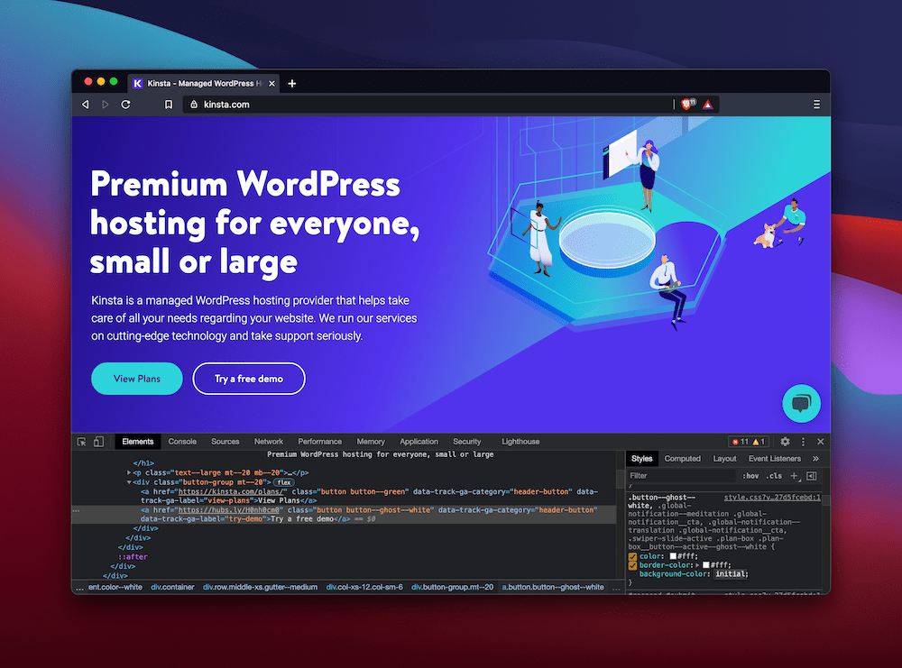
As with HTML elements, you can change values and add your CSS in too:

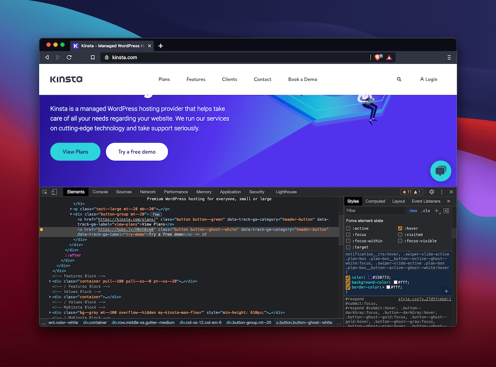
Of course, for elements such as buttons, you may want to work with its various states. In this case, the :hover state is worth changing too. To do this, click the :hov link in the Style panel. Choosing this will bring up a list of element states, and you can select those you want to see the hover-state CSS for:

The webpage will show how the state looks without you having to act. Here, we’ve changed the hover colors to differentiate it from the default button state:
You can even take image URLs and swap them out for others. On the Kinsta home page, we show a screenshot of the MyKinsta dashboard:
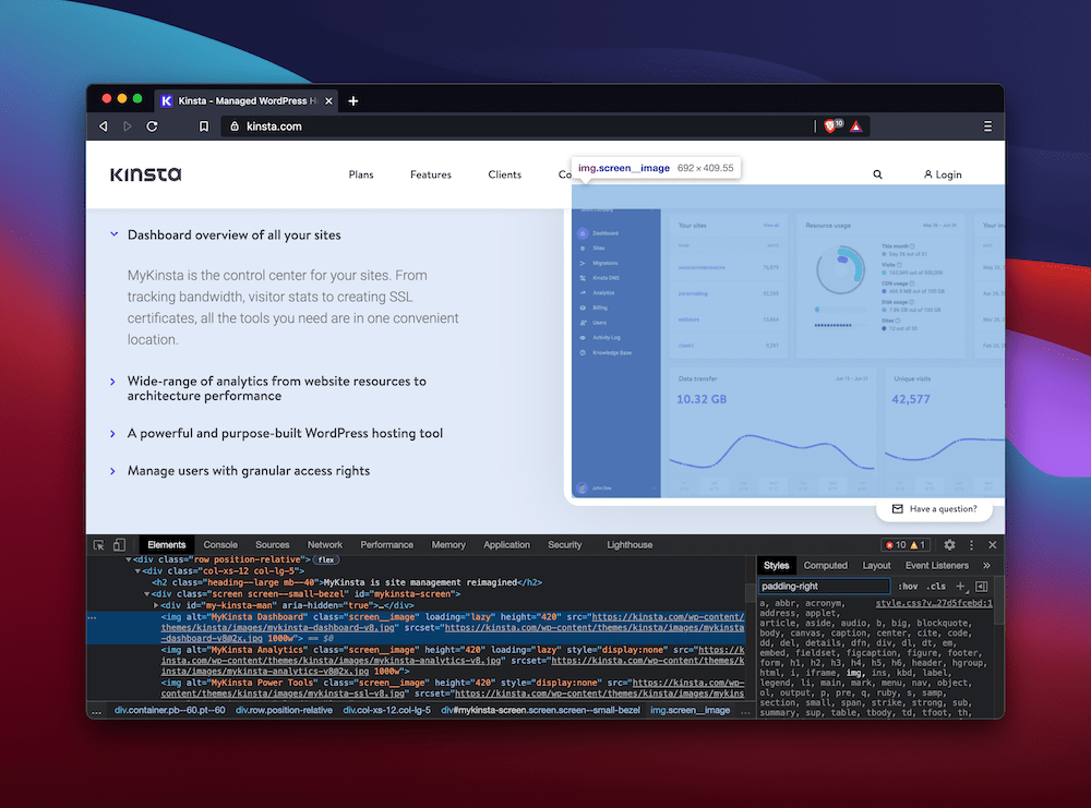
Through locating the element and changing the source URL of the image, you’re able to test out other pictures in its place:
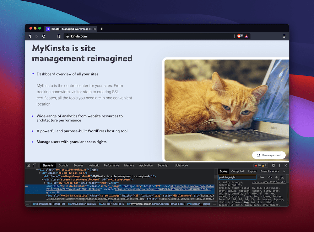
As you’d expect, these changes aren’t permanent, and with a quick refresh of the page, you can get things back to normal. As an alternative, you can also copy the HTML and CSS over to your editor and include them in your code to make those changes permanent.
2. Searching for Elements
It could be that before you can alter an element, you need to find it. The Inspect Element tool has straightforward search functionality that can help you find any aspect of a webpage.
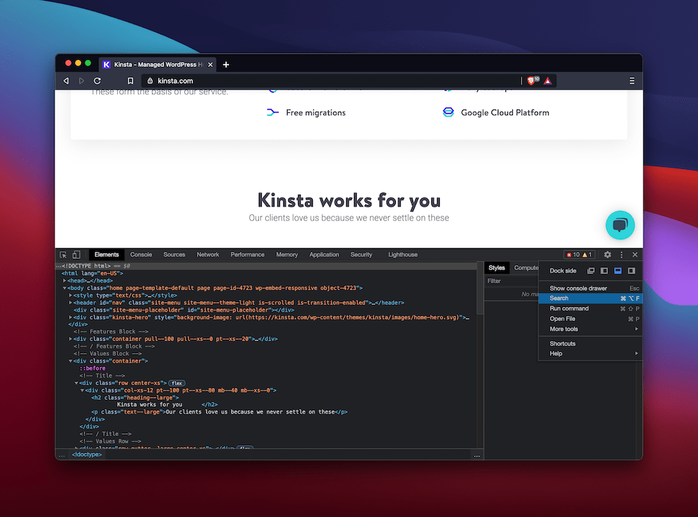
That said, it’s tough to find if you don’t know where to look. The “official” way in Chromium-based browsers is to head to the “traffic light” menu on the right-hand side of the page and select the Search option:
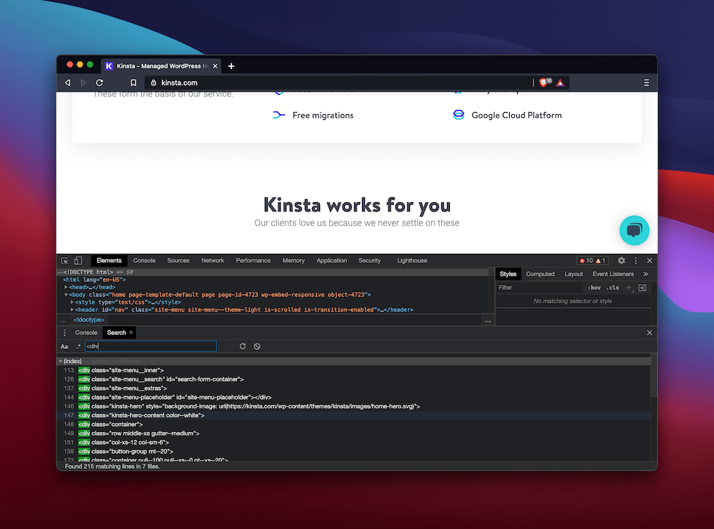
Using this will open the Console panel, along with a Search tab. From here, type your desired tag into the text box, and you’ll see a list of associated elements on the page:
Note that in other browsers, you may find the functionality elsewhere. For example, Firefox includes a search box at the top of its Inspector panel:
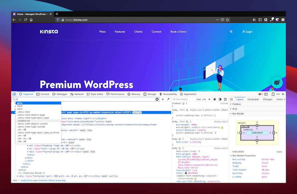
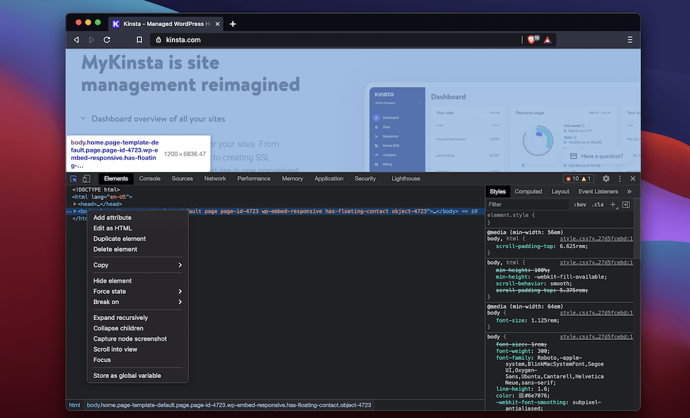
Here’s another quick tip: You can carry out recursive expansion of the various nodes and elements by right-clicking within the Elements pane, and choosing Expand recursively:
If you take a look at the Styles panel, you’ll also spot a Filter text box. This field lets you filter by CSS properties, making it a great companion to the global search functionality:
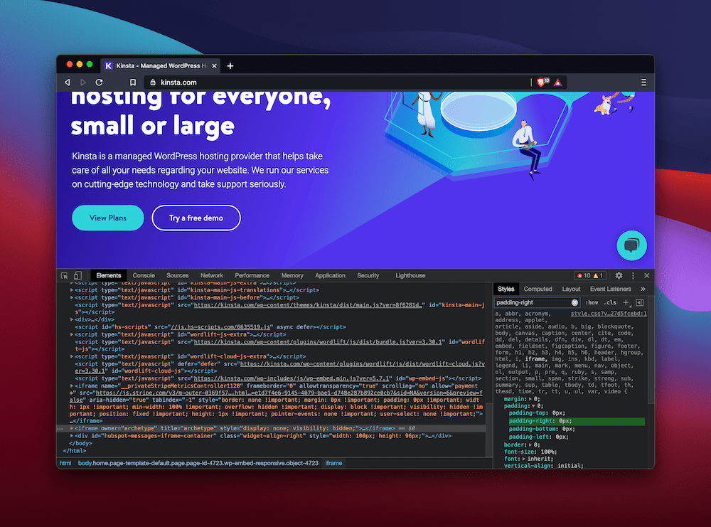
On the whole, it shouldn’t be tough to find what you need with two dedicated filter and search tools.
3. A Quick Primer on the Box Model
One of the best ways the Inspect Element tool can help you learn more about how CSS properties act upon elements is the visual “box model” panel.
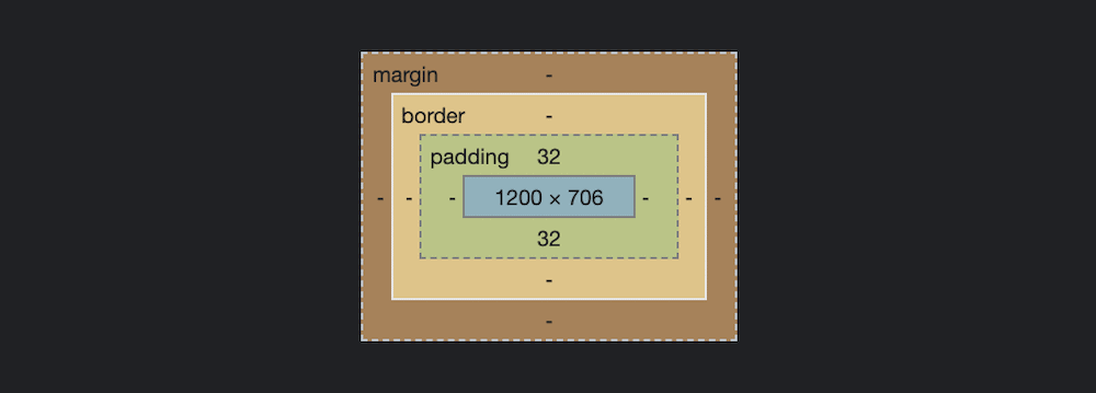
This overview gives you a representation of how a specific box (such as “element” or “div”) appears on the screen. In other words, it’s an overview of how the margins, padding, border, and content combine to become the section you see on-screen.
Explaining the complete CSS box model and how it interacts with a webpage’s HTML is beyond the scope of this article, though Mozilla has a fantastic guide to the ins and outs of the concept.
You’ll often find the Box Model panel within the Layout or Computed sections of the right-hand pane of the Inspect Element tool:
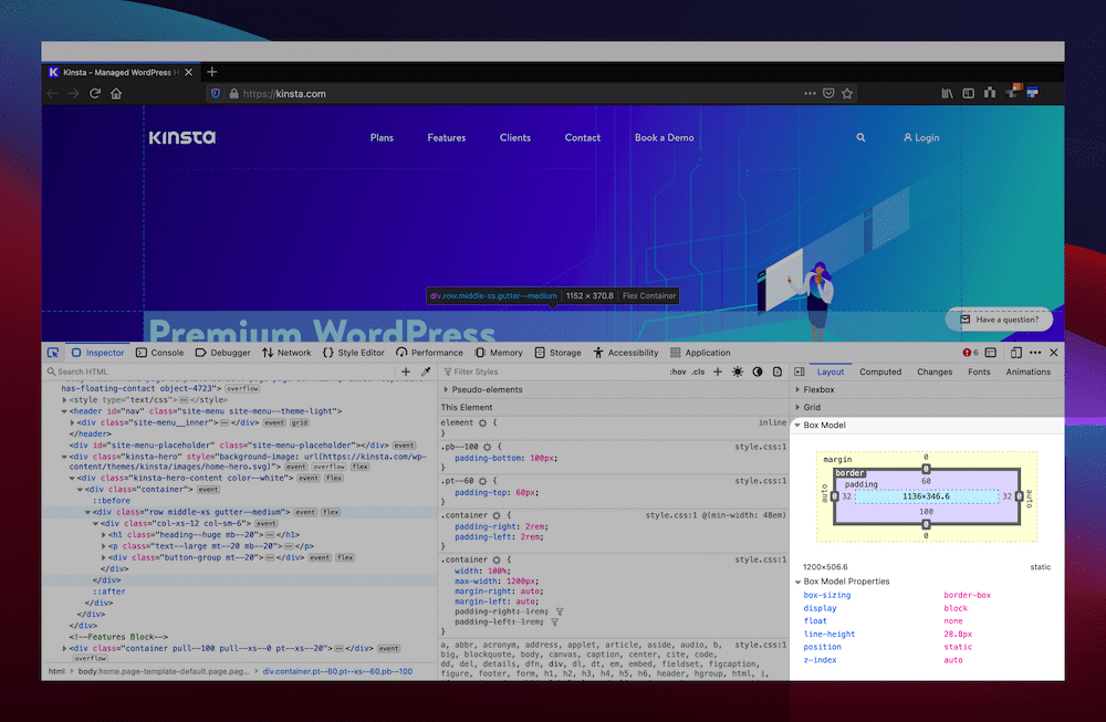
As with any elements and properties, you can also change the values and settings of a particular box. There will also be a list of other properties to help you position the box, set a z-index, apply float and display settings, and much more.
While working with the box model, you may also benefit from seeing the grid system in play on the page. To do this, take a look at the Layout panel — the options you need will be under the Grid menu:
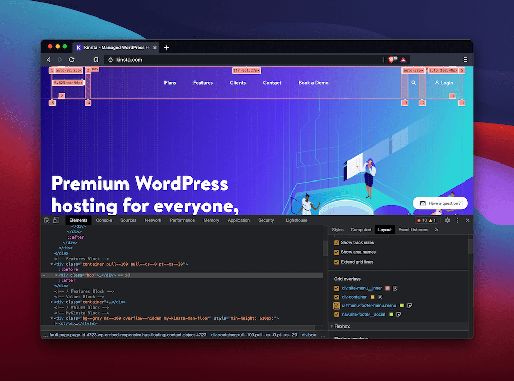
Clicking your desired display settings and then choosing a relevant overlay will show it on-screen, allowing you to make more accurate decisions using the box model to manipulate site elements.
4. Emulating Devices Using Inspect Element
They’ve turned from buzzwords into integrated lexical terms, but “responsive” and “mobile-friendly” are key web development factors. As such, the Inspect Element tool tackles this facet through a couple of features.
In most browsers, the Inspect Element tool will have a mobile device icon along the top toolbar:
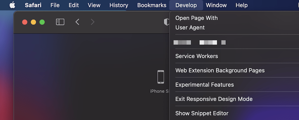
Safari, however, is different. Instead, there’s an Enter/Exit Responsive Design Mode toggle in the Develop menu:
Regardless of how you get there, once you choose the option, the webpage will display as though you’re viewing it in on a smaller device:
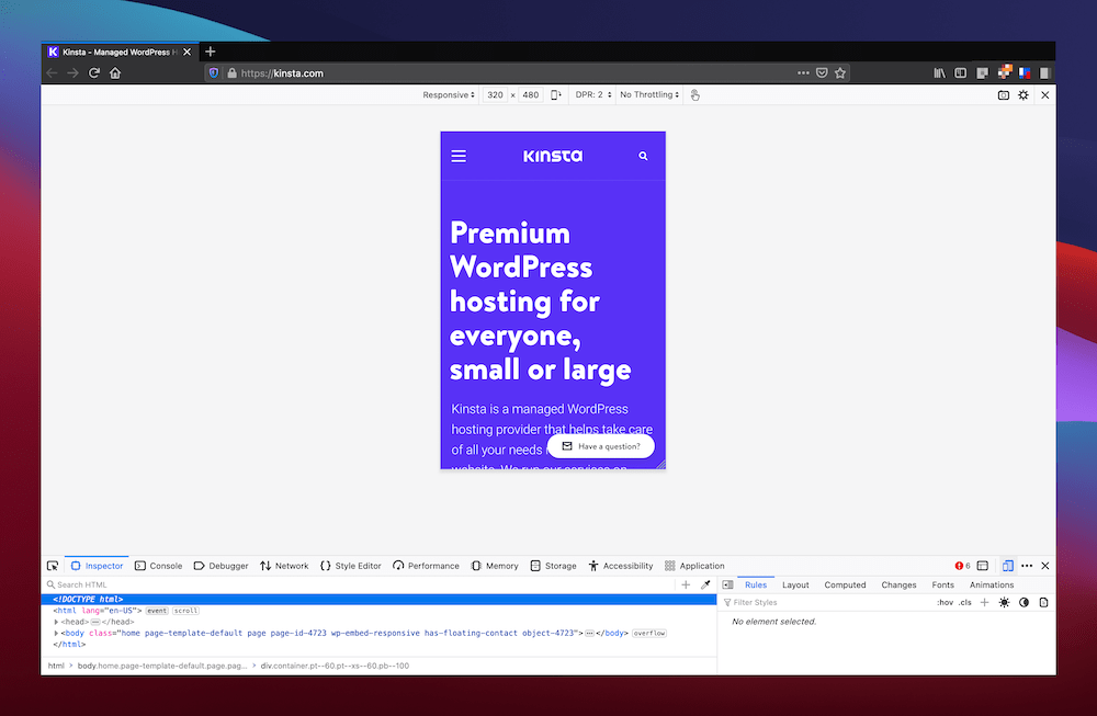
While Safari only gives you the choice of different Apple devices, other browsers dig in to provide you with the tools you need to design with mobile-first principles. For example, you can choose the viewport’s orientation, as well as which device you’d like to emulate:
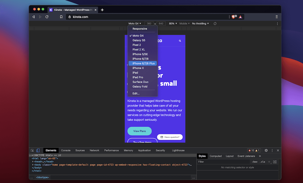
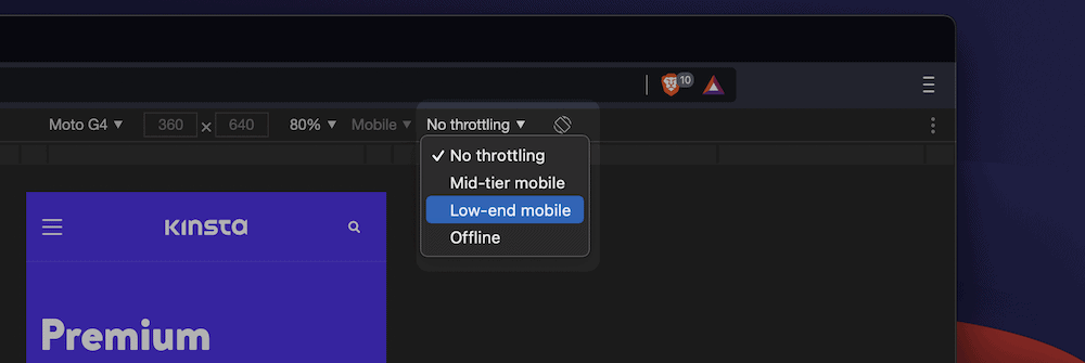
There are two other interesting features here. First, you can choose an emulated network speed. Safari doesn’t include any options for this, and Chromium-based browsers offer a small, general choice of network throttling:
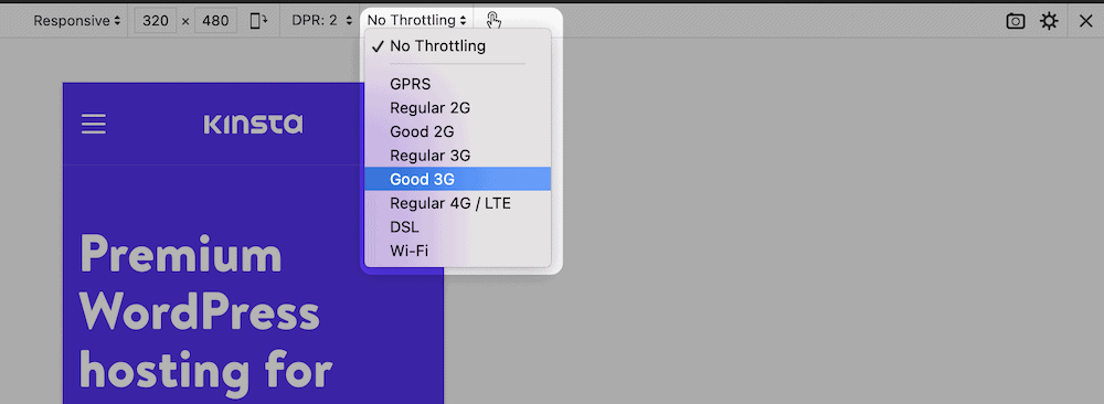
Firefox does the best here, with a decent selection of network choices to pick from:
To round things out, you’re able to simulate haptic feedback and sensor recognition too. It’s the default in Chromium-based browsers, and in Firefox, you have to toggle it on:

Firefox falls behind here, as Chrome, Brave, and others show your cursor as a small “fingertip-like” overlay. The functionality isn’t perfect for any browser, though it’s a reliable way to determine how your site might act on other devices.
This sort of testing often falls by the wayside for many web developers. That said, there’s no excuse now when browsers offer comprehensive solutions like this.
5. Keyboard Shortcuts When Using the Inspect Element Tool
Most browser keyboard shortcuts are often the same across browsers. That’s good news if you flit between various tools to test your sites.
Here’s a quick list of some of the most popular (and valuable) shortcuts:
| Open the Inspect Element tool | Command + Shift + C for Mac, Control + Shift + C for Windows |
| Move between nodes | Up and Down arrows |
| Expand the selected node | Right arrow |
| Collapse the selected node | Left arrow |
| Recursively expand and collapse nodes | Option + Click for Mac, Alt + Click for Windows |
| Move inside a node to work with attributes | Enter or Return |
| Step forward through a node’s attributes | Tab |
| Step backward through a node’s attributes | Shift + Tab |
| Hide or show the selected node | H |
| Edit and stop editing a node as HTML | F2 |
| When a CSS property is selected, increment the value by one | Up arrow |
| When a CSS property is selected, decrement the value by one | Down arrow |
| When a CSS property is selected, increment the value by ten | Shift + Up arrow |
| When a CSS property is selected, decrement the value by ten | Shift + Down arrow |
| When a CSS property is selected, increment the value by 0.1 | Option + Up arrow for Mac, Alt + Up arrow for Windows |
| When a CSS property is selected, decrement the value by 0.1 | Option + Down arrow for Mac, Alt + Down arrow for Windows |
Of course, there are many more shortcuts available. Mozilla has exceptional documentation for Firefox, while Chrome, Brave, Edge, and others share shortcuts. Apple is less helpful with Safari developer shortcuts, as there is no defined list within their help pages. Instead, we suggest reading through the official documentation for Safari’s developer tools.
Summary
Web development is no longer just HTML. There are many technologies involved. Even sticking with the holy trinity of HTML, CSS, and JavaScript, you’ll still need to see how a website pulls all of these components together.
The browser’s Inspect Element tool is one of the best ways to look under the hood of a website and find out in explicit detail how it works. While it’s fantastic as a learning aid, it can also help you test changes to your site and find how it functions on different devices and mobile networks.
Do you use the Inspect Element often? If so, what are your favorite features? Share your opinions in the comments section!


