CSS isn’t just about making sites look pretty anymore. It’s evolved into a tool that brings websites to life with movements and interactions that were once thought to be impossible.
So this guide is all about getting you up to speed with three powerful features in particular: transitions, animations, and transforms. Understanding and using these advanced techniques is essential for web designers and developers who have moved beyond the CSS basics and aim to create websites that stand out — and stand the test of time.
As you journey through this guide, you’ll gain valuable skills to elevate your web projects beyond the ordinary. And hopefully, walk away with some inspiration, too.
Advanced CSS transitions
Advanced CSS transitions make UI elements interactive, engaging, and pleasing to the eye. Imagine you’ve got a button on your site. Normally, it’s just sitting there, but with CSS transitions, when someone hovers over it, it smoothly changes color or maybe grows a bit in size.
The concept revolves around the idea of interpolation – smoothly transitioning between different states of a CSS property.
To create these effects, there are several CSS properties that you need to get familiar with:
- Transition properties: These include specifying the property you want to animate (like
background-colororopacity), setting the duration of the transition, and deciding on thetransition-timing-function(likeease-inorlinear), which dictates how the transition progresses over its duration. - Timing functions: These are a must as they control the acceleration and deceleration of the transition. One of the most versatile options here is the
cubic-bezierfunction. This function allows for creating custom speed curves, giving you complete control over the pacing of your transition. It can be a bit tricky at first, but tools like cubic-bezier make it easier to visualize and create these curves.
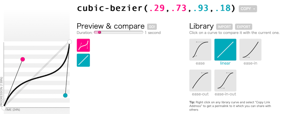
Here’s a simple example to illustrate how you might use this in your CSS:
.my-element {

transition-property: opacity;

transition-duration: 0.5s;

transition-timing-function: cubic-bezier(0.17, 0.67, 0.83, 0.67);

}
In this snippet, .my-element will change its opacity with a unique speed curve defined by the cubic-bezier function. This curve dictates a specific kind of movement, like starting slow, speeding up, and then slowing down towards the end.
Using transition-timing-function with custom values, you can make your web elements move in a way that feels more natural, more dynamic, or just plain different from the standard. It’s a great tool to add some personality and finesse to your web animations.
When it comes to advanced techniques, here are a few to consider:
- Juggling multiple properties: Why settle for animating just one thing? CSS lets you line up several properties and animate them all at once. This is perfect for adding layers to your animation.
- Synced up animations: You can also line up different properties to move at the same pace, creating a more coordinated effect.
- Nested transitions: Apply transitions to elements within a container. This way, when you interact with the container, the child elements behave as you prefer.
Make sure these animations don’t just look good but also run smoothly, especially on less powerful devices. Using properties like transform and opacity is a smart move because they’re easier on your browsers and shouldn’t affect performance too heavily.
Also, a heads-up to your browser with the will-change property helps it get ready for the action, ensuring everything runs smoothly.
This is just a final note on ensuring this works everywhere: browsers can be picky. Using vendor prefixes helps make sure your cool transitions work across different browsers. It’s a bit of extra work, but tools like autoprefixers can handle this for you, keeping things hassle-free.
Transformations in CSS
CSS transformations offer a great way to add more interest to your web designs. They can be used for moving things around, of course, but they can change the whole feel of a page. The transform property is your main player here.
It’s versatile and can shift elements from one spot to another, like sliding a picture across the screen or changing its size – think making something look closer or farther away, just like zooming in or out on a photo. And if you want to get a bit fancy, you can even make elements spin around.
The really impressive bit here is when you add 3D transformations into the mix. With functions like translate3d, scale3d, and rotate3d, elements can jump off the screen, creating a more immersive experience right within the browser.
Take, for instance, the flipping card effect. It’s a neat feature where one side of a card shows certain information, and when it flips, new content is revealed on the other side. This interactive element can really capture the attention of your visitors.
The key to nailing this effect is using the backface-visibility property effectively. This ensures that the back of the card remains hidden until it’s meant to be seen.
But why stop there? When you blend these transformations with transitions and animations, you can get so much more out of your CSS. You can have a button that elegantly grows in size when hovered over or an icon that playfully moves around the screen. These dynamic changes add a fluid quality to your webpage elements, making the user experience even more engaging.
Designmodo offers several beautiful examples of this in action. First, you can see the CSS for 3D transforms broken down. Then, you can see the code in action:
Container queries
Container queries are another aspect of CSS worth exploring. They let you style elements based on the size of their container rather than just the whole screen size. Think of it like this: you’ve got a box, and you want the stuff inside to look good no matter how big or small the box is. Container queries are perfect for that.
They’re super handy when you want different parts of your webpage, like sidebars or cards, to change their look depending on how much space they have. Each component gets to decide its own style, independent of the rest of the page.
Here’s a quick rundown on how to use them:
- Set up the container: First, tell CSS which part of your page is a container. You do this with properties like
container-typeandcontainer-name. - Write your queries: Just like media queries, but for containers. You write a rule that says, “Hey, if my container is at least this wide, then make these style changes.”
This is what the basic code for this would look like:
@container (min-width: 300px) {

.component {

/* styles */

}

}
In this example, styles within the .component class will be applied when its container reaches a minimum width of 300px.
Now, container queries can be used in various scenarios, such as:
- Responsive sidebars and footers: Adjusting the width and layout of sidebars or footers based on the container size.
- Responsive cards: Changing the layout or style of cards in a grid or flexbox layout based on the width of their container.
While container queries are supported by major browsers, including Chrome, Firefox, Safari, and Edge, it’s still a good practice to use them as a progressive enhancement. Start with basic styles for non-supporting browsers and enhance for those that support container queries.
Using Flexbox for vertical alignment
Flexbox is an incredibly handy tool in CSS, especially when it comes to vertical alignment. While it’s been around for a while, it’s still super relevant, especially for aligning items along the cross-axis (which, depending on your layout, can be vertical).
Using align-items for vertical alignment
The align-items property in Flexbox is your go-to for aligning items vertically within a container. It works when your flex container has a flex-direction of rows. This property allows you to control how all the children of a flex container are aligned along the cross-axis.
For instance, if you have a bunch of items in a flex container and you want them all to be centered vertically, you’d use align-items: center;. Here are the key options you have with align-items:
flex-start: Aligns items to the start of the container.flex-end: Aligns items to the end of the container.center: Centers items in the container.baseline: Aligns items based on their baseline.stretch: Stretches items to fill the container (default behavior).
Using align-self for individual control
While align-items is great for aligning all items in a container, sometimes you want to align just one item differently. That’s why align-self is so useful. This property lets you override the align-items value for individual flex items. It accepts the same values as align-items.
For example, suppose you have a flex container with align-items: center; but there’s one item you want to align to the start. You can apply align-self: flex-start; to that specific item. It’s a great way to have precise control over the alignment of individual items.
It can be most helpful to see this in action, however.
Let’s say you’re designing a navigation bar with a logo, some links, and a search bar. You want the links to be centered, the logo to align to the top, and the search bar to align to the bottom.
Here’s how you could do it:
.nav-container {

display: flex;

flex-direction: row;

align-items: center;

}

.logo {

align-self: flex-start;

}

.search-bar {

align-self: flex-end;

}
In this example, the .nav-container is a flex container with its items generally centered. The logo and search bar, however, break away from this general rule, aligning themselves to the start and end of the container, respectively.
Modern color functions in CSS
Modern color functions in CSS have evolved significantly, offering more sophisticated ways to define and manipulate colors in web design. Let’s delve into some of these functions:
1. rgb() and rgba()
The rgb() function is a traditional way to define colors using the Red, Green, and Blue channels. Each channel can be a value between 0 and 255. The rgba() variant adds an alpha channel for opacity, with 1 being fully opaque and 0 being fully transparent.
It should look something like this:
.example {

color: rgb(255, 0, 0); /* Red */

background-color: rgba(255, 0, 0, 0.5); /* Semi-transparent red */

}
2. hsl() and hsla()
hsl() represents colors in terms of Hue, Saturation, and Lightness, making it more intuitive to select color variations. Like rgba(), hsla() includes an alpha channel for opacity. Like this:
.example {

color: hsl(120, 100%, 50%); /* Green */

background-color: hsla(120, 100%, 50%, 0.3); /* Semi-transparent green */

}
3. oklch() and oklab()
oklch() and oklab() are more recent additions to CSS color functions. They are based on the CIELAB color space, which is designed to be perceptually uniform. This means that changes in color values correspond more closely to changes perceived by the human eye.
Now, specifically:
oklab()is used for defining colors in a perceptually uniform space.oklch()is similar but uses cylindrical coordinates (lightness, chroma, and hue).
These functions allow for more accurate and intuitive color manipulation, especially for tasks like creating smooth color gradients. Here’s what that might look like in code form:
.example {

color: oklch(75%, 0.25, 250); /* A color in oklch */

background-color: oklab(0.623, 0.172, -0.079); /* A color in oklab */

}
Implementing advanced color schemes
With these functions, especially the more advanced oklch() and oklab(), you can implement intricate color schemes that are visually consistent and appealing. They offer more control over how colors are rendered and perceived, ensuring that your designs are both aesthetically pleasing and accessible.
When you combine these color functions with CSS features like custom properties (CSS variables) and calculations, you can develop dynamic and flexible color systems that adapt to different themes, states, and environments.
As web standards and browser support for these functions continue to change, embracing these modern color functions can significantly enhance the visual design and user experience of your web projects.
Curve text around images
The CSS shape-outside property offers a creative way to wrap text around images, contributing to more dynamic and visually interesting layouts and more advanced image styling.
It allows you to define a shape around which inline content should wrap. This is useful for wrapping text around images in a non-rectangular shape, creating layouts that are more organic and visually engaging than the standard rectangular text wrapping.
How does it work?
You can define various shapes like circles, ellipses, and polygons, or even use an image’s alpha channel to dictate the shape.
The shape-outside property typically applies to floated elements. And when you float an image and apply a shape-outside, the text wraps around it according to the defined shape.
Here’s a basic example of using shape-outside with a circle:
.image {

float: left;

shape-outside: circle(50%);

width: 200px;

height: 200px;

margin-right: 15px;

}
In this example, the .image class is applied to an image element. It’s floated to the left, and the shape-outside: circle(50%); creates a circular shape around which the text will wrap. Using shape-outside effectively can open up new possibilities within your designs since it allows text to flow around complex shapes, making it possible to create magazine-like layouts and visually rich web pages.
CSS blend modes
CSS blend modes offer a powerful way to mix colors and images, creating unique visual effects that can enhance your designs as well. These blend modes allow you to create engaging text effects, image overlays, and intricate background patterns. To use background-blend-mode, let’s talk about what it does first. This property is used to define how an element’s background images and color should blend together. For example, if you have a background image and a background color, you can blend them using different blend modes like multiply, screen, overlay, etc. This is what the code might look like:
.element {

background-image: url('image.jpg');

background-color: blue;

background-blend-mode: multiply;

}
Now mix-blend-mode works by blending the content of an element (including images and text) with its background. This is particularly useful for text effects or overlaying an image over another. Like this:
<

.element {

mix-blend-mode: screen;

}
Popular blend modes
For your reference, here are a few of the most popular blend modes you’d need to know to use this effect properly:
- Multiply: Multiplies the colors of the blend layer and the base layer, resulting in a darker color.
- Screen: Makes the colors lighter, opposite of multiply. It’s useful for creating light effects.
- Overlay: Combines multiply and screen blend modes. Light parts of the picture become lighter, and dark parts become darker.
- Darken and lighten: Selects the darker or lighter color, respectively.
- Color dodge and color burn: Lighten or darken the base color to reflect the blend color.
- Difference and exclusion: Used for creating more artistic and inverted color effects.
Adapting to user preferences
Adapting to user preferences in web design is a critical aspect of creating accessible and user-friendly websites. CSS media queries for preferences like prefers-color-scheme and prefers-reduced-motion play a significant role in this process.
Let’s explore these concepts.
prefers-color-scheme
This media query is used to detect if the user has requested the system use a light or dark color theme. It’s a convenient way to implement a dark mode within a website’s design.
You can use prefers-color-scheme to specify different styles for light and dark modes.
For example:
/* Default light mode styles */

body {

background-color: white;

color: black;

}

/* Dark mode styles */

@media (prefers-color-scheme: dark) {

body {

background-color: black;

color: white;

}

}
In this snippet, the default styles apply to light mode, while the styles inside the @media query apply when the user prefers a dark color scheme.
prefers-reduced-motion
This media query is designed to detect if the user has requested the system minimize the amount of animation or motion it uses. It’s essential for users who experience motion sickness or have vestibular disorders.
You can use prefers-reduced-motion to reduce or remove animations and transitions:
/* Standard animations */

.animate {

transition: transform 0.3s ease;

}

/* Reduced motion */

@media (prefers-reduced-motion: reduce) {

.animate {

transition: none;

}

}
Now here, you’ll see that animations are disabled when the user has indicated a preference for reduced motion.
Incorporating prefers-color-scheme and prefers-reduced-motion into your CSS is a step towards a more inclusive and user-friendly web, ensuring that your site is accessible and comfortable for a wide range of users with different needs and preferences.
Use :is() And :where() pseudo-selectors
The :is() and :where() pseudo-selectors in CSS are advanced tools for managing specificity and simplifying complex selector chains. Let’s explore how they work and see some real-world examples.
:is() pseudo-selector
This selector allows you to target multiple elements with a single rule and reduces the repetition of similar selectors. The specificity of the :is() pseudo-class is the specificity of the most specific selector in its arguments.
/* Selects any paragraph or heading inside an article */

article :is(h1, h2, h3, p) {

color: blue;

}
:where() pseudo-selector
This one is similar to :is(), but it has a key difference. :where() always has a specificity of zero. This makes it useful for overriding styles without increasing specificity. In use, it might look something like this:
/* Selects any paragraph or heading, but with no added specificity */

:where(article, section) p {

margin-bottom: 1em;

}
Using :is() and :where(), you can craft more flexible and maintainable style sheets, especially when dealing with complex designs. For instance, these pseudo-selectors might be beneficial if you need to:
- Simplify nested selectors: They can simplify deeply nested selectors or grouped selectors, making your CSS more readable and easier to maintain.
- Override styles:
:where()is great for creating base styles that can be easily overridden without worrying about specificity. - Reuse styles: Both pseudo-selectors allow for more modular and reusable styles, as you can group various elements under a single rule.
For a practical application of this in action, imagine a navigation menu with different sections. You can use :is() to uniformly style all links in the menu, regardless of their nesting level, as follows:
nav :is(ul, ol, div) > li > a {

padding: 10px;

color: white;

}
Summary
From the elegance of CSS transitions that bring user interfaces to life to the power of 3D transformations, hopefully, you now have a better understanding of some of the more advanced CSS techniques available to you in 2026 and beyond.
This guide illuminates these advanced techniques and underscores their importance in crafting responsive, user-friendly, and visually appealing web designs. And no matter which you decide to use, remember to prioritize accessibility and CSS performance in all that you do.
Do you use any of these advanced CSS techniques currently? Have recommendations for others to try? Please feel free to let us know.