Unresolved mobile usability issues can have a significant impact on your website’s traffic. A common problem Google Search Console may warn you about is the “Clickable elements too close together” error, which likely means that your site is complex for mobile users to navigate.
More than 4.32 billion people access the internet from their mobile devices. Hence, it’s crucial to resolve this clickable elements error as soon as possible. Thankfully, there are multiple ways you can do so and make your website more mobile-friendly.
In this article, we’ll explain what the “Clickable elements too close together” issue is, discuss why it happens, and walk you through three methods you can use to fix it. We’ll also explain what the “Content wider than screen” error is and how you can resolve it.
Let’s get to work!
Prefer to watch the video version?
What the “Clickable Elements Too Close Together” Error Is
In a nutshell, mobile usability errors can make your WordPress site inaccessible and more challenging for mobile users to navigate. You can use Google Search Console’s Mobile Usability report to test your site.

There are six main types of mobile usability issues you may come across, which are:
- Uses incompatible plugins
- Viewport not set
- Viewport not set to “device-width”
- Text too small to read
- Content wider than the screen
- Clickable elements too close together
As part of this report, Google Search Console will check all of your website’s clickable elements, such as buttons and links. The purpose of this is to verify whether mobile users can comfortably interact with your website’s elements using only touch, rather than using a keyboard or mouse.
If Google Search Console determines that your tappable elements pose a challenge for mobile users, it will include the “Clickable elements too close together” error in your summary report.
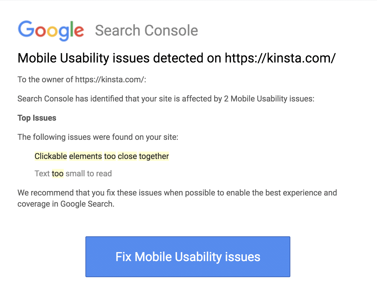
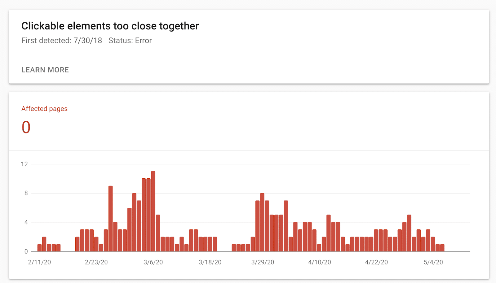
If you click on the error, it will bring you to the details and status page. On this screen, you can learn more about the issue, including the affected pages.
Essentially, the clickable elements error is a warning indicating that the tappable elements on your WordPress site are too small for mobile users to interact with comfortably.
Alternatively, it could mean they are large enough, but positioned too close to neighboring elements. If buttons, links, and other clickable items cluster too close together, users risk tapping the wrong ones, which hurts the User Experience (UX).
Although having clickable elements too close together is classed as a mobile usability error, resolving this issue can also improve the accessibility of your site. For example, people with dexterity issues may appreciate some additional space between interactive elements. In contrast, users with vision-related problems may find it easier to interact with large, clearly defined buttons and links.
Why the “Clickable Elements Too Close Together” Error May Appear
Various factors can result in the “Clickable elements too close together” issue. Sometimes, it’s just because Google couldn’t request the necessary resources during rendering. If that’s the case, then you can try using the mobile-friendly test and see if it passes. If it does, you can probably ignore it.
This issue may also result from your website’s design. For example, if you try to squeeze too many interactive elements onto a single web page, you may see this mobile usability error.
Another reason for the clickable elements error is that there’s a problem with the mobile responsiveness of your site’s design. Your website should be flexible and automatically adapt to suit the visitor’s specific device to provide the best possible UX. However, if your site isn’t responsive, that could result in usability issues.
More specifically, if your website isn’t responsive, parts of it may appear stretched, shrunken, or warped on specific screens. On devices with smaller screens, tappable elements can appear cramped or distorted.
Identifying some of the standard and potential reasons for this error to occur can help you better understand why your site is encountering mobile usability issues. It’ll also help you determine how to fix the problem.
How to Fix the “Clickable Elements Too Close Together” Error (3 Methods)
If mobile users struggle to navigate your website, what’s keeping them from navigating away from it? Preventing this issue is essential to resolve all mobile usability issues as quickly as possible. Let’s take a look at three methods you can use to fix the “Clickable elements too close together” error and provide a better UX to your mobile users.
1. Use the YellowPencil Visual Customizer WordPress Plugin
YellowPencil Visual Customizer is a frontend WordPress plugin that enables you to edit your website’s CSS and theme files without any coding.

This plugin is handy for modifying your tappable targets’ size, such as making your buttons bigger. You can also create more space between clickable elements by changing the margins and spacing between them.
You can download the YellowPencil plugin for free or purchase a Regular or Extended license. To use it, first install and activate it on your WordPress site by browsing to Plugins > Add New, searching for the plugin, and then clicking on Install Now > Activate.

Next, navigate to YellowPencil > Customizations. Under the Customizations tab, select Let’s start!

The visual customizer interface will load and prompt you to select the page triggering the mobile usability error.

You can either apply your changes to this specific page or across your entire website. If many pages are presenting the clickable elements error, you may want to select Global.
Make your selection, and then click on Continue. You can now work your way through your web page, selecting each tappable element. YellowPencil will display a panel of editing options for that element.

For example, in the below screenshot, we selected Padding and added 10 pixels on all sides to increase the space between the tappable targets:

The Size and Position settings also help resolve the “Clickable elements too close together” error. Although it isn’t necessary, if you want to edit the CSS code directly, you can do so through the left panel.
Then you can move on to the next element that’s causing mobile usability issues and repeat the process. When you’re happy with your changes, click on the green Save button.
2. Ensure That All Tappable Targets Are at Least 48px
It’s impossible to create a single, static design that looks good and functions correctly across all devices. Instead, it would be best if you aimed to create a flexible layout by defining all of your tappable targets using device-independent pixels (dpi). Elements that are defined using dpi can automatically scale to size based on the user’s screen size.
On a mobile device, the minimum recommended touch target is 48×48 pixels. It equates to about 9 mm, which is sufficient for the average person’s finger pad.
Therefore, if you’re struggling to figure out exactly which elements are the source of the issue, it may help look into each element’s dpi. If it’s below the recommended touch target (e.g. 24px), you can increase the padding to bring it to 48px.
You can check the computed value of a tappable area using Chrome DevTools or Firefox DevTools, depending on which browser you prefer. We’ll use Chrome as an example.
To check the dpi value of one of the clickable elements on your WordPress site, open it in a Chrome browser tab and navigate to the page presenting the “Clickable elements too close together” error. Right-click on the page and select Inspect.

Clicking Inspect will open up Chrome DevTools. Along the top, click on the icon displaying mobile devices, which will bring you to the Toggle device toolbar screen.

In the left preview panel, you’ll see a mobile device emulation of your site. If you hover over and click on any of the tappable elements, you can view the computed value to the right:

If required, you can then adjust an element’s sizing by directly editing your CSS and site files or using a plugin such as YellowPencil.
3. Check the Input Method
If you’re trying to fix the “Clickable elements too close together” error, it may help check the input method. It refers to the method or device a user is using to view and interact with your site. More specifically, you can see whether they’re using a smartphone, tablet, or other devices.
For example, touch is considered an imprecise input method. As we just discussed, using CSS to increase the size of your touch targets or add extra padding can make tappable targets easier for visitors who are using touch devices to interact with your website.
However, determining a user’s device isn’t an exact science. This technique uses what’s known as the “pointer” to check the user’s primary input method, which can have one of two values:
- Coarse: The device’s primary input method is touch.
- Fine: The input method is a mouse and trackpad.
Note that if touch is the user’s primary input method, this suggests that the person is viewing your website on a smartphone or tablet.
However, the presence of a touchscreen doesn’t guarantee that someone is using a mobile device. They could be accessing your site using a large, touchscreen-enabled laptop, or they might have connected a Bluetooth device to their smartphone.
If the pointer returns a coarse value, you can adjust the tappable target’s size using CSS. To do so, you can place the following in the CSS file of your WordPress theme (or by using a plugin such as YellowPencil):
.container a {
  padding: .2em;
}
@media (pointer: coarse) {
  .container a {
    padding: .8em;
  }
}
After you adjust your CSS, you can tell Google to recrawl your website to determine whether this has fixed the issue.
Alternatively, you can ask Google to recrawl individual URLs using the URL Inspection Tool. After submitting your URL via this tool, select Request indexing. The Inspection tool will then test the URL for any obvious indexing issues.
Assuming that Google finds no issues, the page will then qualify for indexing.

Alternatively, if you have a large number of URLs, you can submit a sitemap. For each page that requires reindexing, update its <lastmod> tag with the last modification date. You can then submit this sitemap using Google’s sitemap report tool.

In most instances, your sitemap will go through immediately. However, it may take Google some time to crawl all of the URLs in your sitemap, depending on factors such as site size, traffic, and activity. There’s also no guarantee that Google will crawl every single URL in your sitemap.
What the “Content Wider Than Screen” Error Is
As you might recall, Google Search Console may warn you about various mobile usability errors. On top of “Clickable elements too close together,” your summary report could also include the “Content wider than screen” issue.

This issue will appear in the same place in your Google Search Console as the “Clickable elements” error. Similarly, it has a variety of potential causes.
How To Fix “Content Wider Than Screen” Error
Why the “Content Wider Than Screen” Error May Appear
This error occurs when your site design expands horizontally, forcing mobile users to swipe sideways to view the “offscreen” content. To provide a good user experience, you should avoid horizontal scrolling wherever possible.
You’re more likely to encounter the “Content wider than screen” issue if you use absolute values in your CSS declarations. Since inflexible layouts can result in the “Clickable elements” error, it’s not uncommon to encounter these two errors in the same Mobile Usability report.
How to Fix the “Content Wider Than Screen” Error (5 Methods)
If your report includes the “Content wider than screen” error, you can use some simple methods to resolve it. Let’s take a look at five of the most common options.
1. Avoid Using Absolute Variables in CSS Declarations
One of the best ways to fix the “Content wider than screen” error is to avoid using absolute variables in your CSS declarations. Your content shouldn’t require a specific viewport to display and function correctly.
Therefore, instead of using absolute values, you should opt for relative width and position values for your CSS elements. Using relative values wherever possible, you can create flexible layouts that scale to suit a range of screen sizes.
2. Assign Images a Maximum Width
An image with fixed dimensions can appear larger than the viewport and, in turn, trigger the “Content wider than screen” error. To ensure that your images scale based on the screen’s dimensions, it’s best to assign all images a max-width of 100%.
It will force the image to shrink to fit the available space. Even if you use max-width, you should still use the width and height attributes in your <image> tag, as modern web browsers use this information to reserve space for images as they load. Using the <image> tag, you can avoid layout shifts when your images finally appear on the screen.
3. Use Meta Viewport Tags
By default, mobile browsers render the page at desktop screen width, which is usually around 980px. The browser will then try to optimize your page by increasing the font size and scaling your content to fit the current screen dimensions.
Unfortunately, this default behavior can result in inconsistencies. Some users may need to zoom in to read and interact with your content, which is why you may be seeing this error.
Instead of relying on this default behavior, you should give the browser instructions on how to control the page’s dimensions and scale. You can do this by inserting a meta viewport tag into the head of your document.
4. Use Modern CSS Layout Techniques
You can also fix the “Content wider than screen” error by switching up your site’s layout. To help you create more flexible layouts, you may want to consider implementing techniques like Flexbox, CSS Grid Layout, or Multiple-Column Layout (Multicol).
5. Use CSS Media Queries Where Appropriate
Media queries can make it easier to change styles based on the user device, including touchscreens. Therefore, if you’re still dealing with the “Content wider than screen” error at this point, we recommend using CSS media queries where appropriate.
After making these changes, it’ll be time to test to see whether you’ve successfully resolved the “Content wider than screen” error. You can do this by re-running the Mobile Usability report and validating the fix using the steps we discuss in the next section.
How to Verify and Validate Your Error Resolution
Regardless of which of the above errors you’re dealing with or the methods you use to fix it, it’s essential to determine whether your changes have resolved the problem. You can do this by re-running Google’s Mobile Usability tests.
To do so, navigate back to your Mobile Usability report and locate the “Clickable elements too close together” error. Next, select the Validate fix option.
Note that you can repeat these same steps if you’re trying to verify and validate your error resolution for “Content wider than screen.” Google will then crawl your website, and you will receive a message letting you know that it’s in the process of validating the change.

If you’ve resolved the error, then Google Search Console will display a “Passed” message and an accompanying green checkmark. On the other hand, if the fixes you employed are not validated, you’ll have to revisit the error to implement an alternative solution.
Summary
Unresolved mobile usability errors can result in a poor user experience and may cause a noticeable drop in your website’s traffic. By taking steps to resolve usability errors, you can ensure that your website is mobile-friendly and accessible to a larger set of people.
In this post, you learned how to fix the “Clickable elements too close together” error using three methods:
- Modify your website using a frontend CSS style editor plugin (like YellowPencil).
- Use Chrome DevTools to ensure that all tappable targets are 48 dpi or larger.
- Check the input method and adjust your CSS accordingly.
Do you have any questions about fixing the “Clickable elements too close together” error? Let us know in the comments below!