16.2% of high-tech companies are turning their priority over to customer engagement. 15.5% plan to increase investment in improvements in customer experience. What does that tell you?
That tells you user experience is leaving the domain of designers and becoming a mainstay for any business with an online presence, whether they’re brand new or have been on the block for years. This is probably why so many big-name companies are turning to usability testing to ferret out problems and improve on their products and websites.
- Sales Hacker used user feedback to increase engagement, breed loyalty, and improve their content strategies with user-provided insights.
- An online sports gambling operator, Stan James (now Unibet), used the results of usability testing to double their conversion rate from 1.5% to 3% month-to-month.
- The list of successes goes on and on. Feel free to check out more case studies.
So if you’re not already on the usability train, it’s time to board. In this guide, we’ll take you step-by-step through everything you need to know to conduct website usability testing.
- Step 1: Determine Metrics and Create Task Analyses
- Step 2: Identify Best Test Type
- Step 3: Find Valid Participants
- Step 4: Decide When, Where, and Who
- Step 5: Rinse and Repeat
Step 1: Determine Metrics and Create Task Analyses
First, you need to figure out your metrics. Usability testing can unearth a whole host of issues, but if it’s not being targeted to determine specific metrics, it’s not going to be an effective use of your time – or dime.
There are three indicators typically agreed upon in usability testing:
- Efficiency
- Effectiveness
- Satisfaction
Here’s a quick breakdown of what these metrics usually entail:
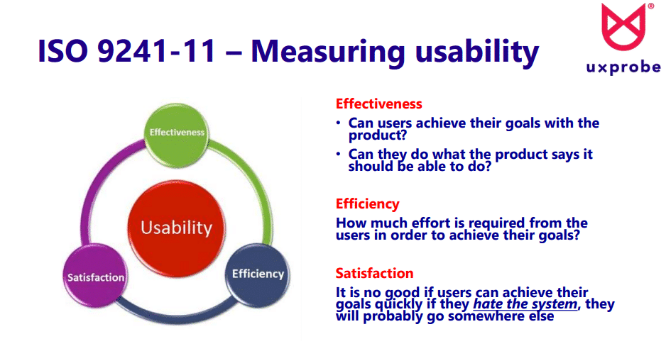
While on its face, these three measures seem simple, they’re each their own nesting doll of questions, and there are no universal answers.
- What are the user’s goals?
- What steps must be taken to meet those goals?
- How is the effort being measured?
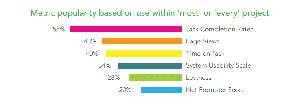
Fortunately, there’s an easy way to answer these questions by building what is called a task analysis. Task analyses are popular because they allow you to measure two of the most popular metrics in usability directly: task completion rates and time on task.
Here’s how it works. You begin with an overarching goal. In the below example, the goal is to take daily medication.
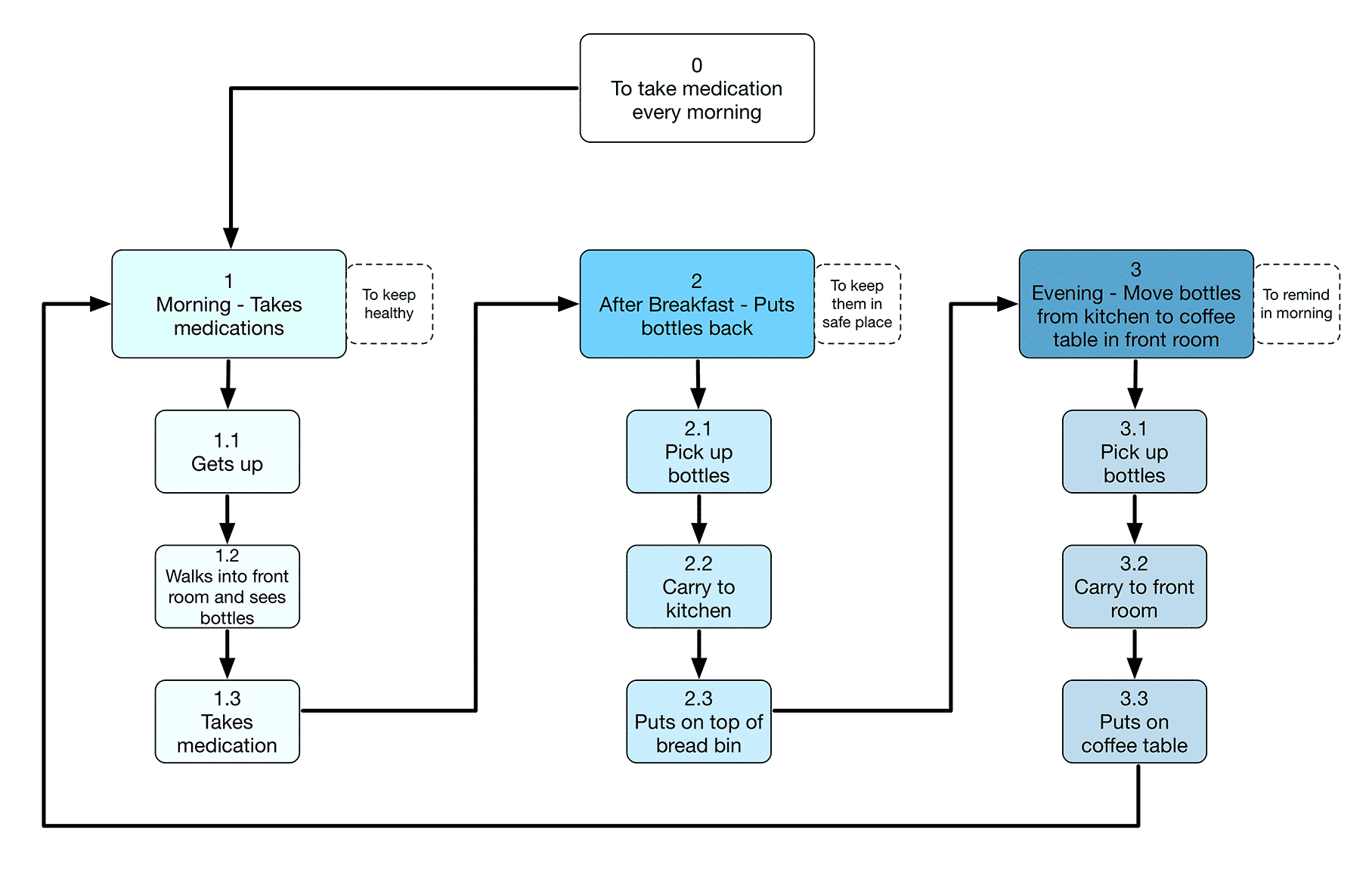
You then break the goal down into the steps needed to complete the objective. These are also called subtasks. No step is too small.
When done, you have a theoretical picture of the path a user takes to complete a goal. You can then use your task analysis to set baseline effectiveness and efficiency metrics. Let’s try making one of our own.
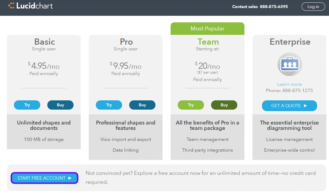
To start with, head over to Lucidchart. Sign up for an account by clicking the “Sign up free” button in either the top right corner or middle of the screen. You’ll be taken to this page and given the opportunity to start a trial. For now, scroll down until you see the blue “start free account” button and select that.
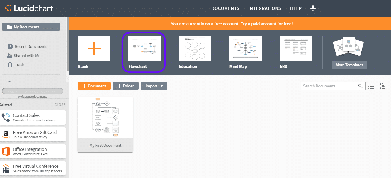
After completing the sign-up, you’ll come to this dashboard screen. There are a lot of templates to choose from, but for task analysis, it’s often easiest to start with a flowchart. Choose the second option to get a look at the available flowchart templates.
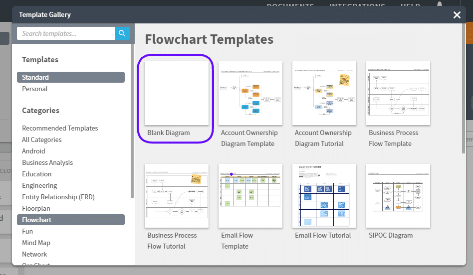
Choose the first option, “blank diagram.”
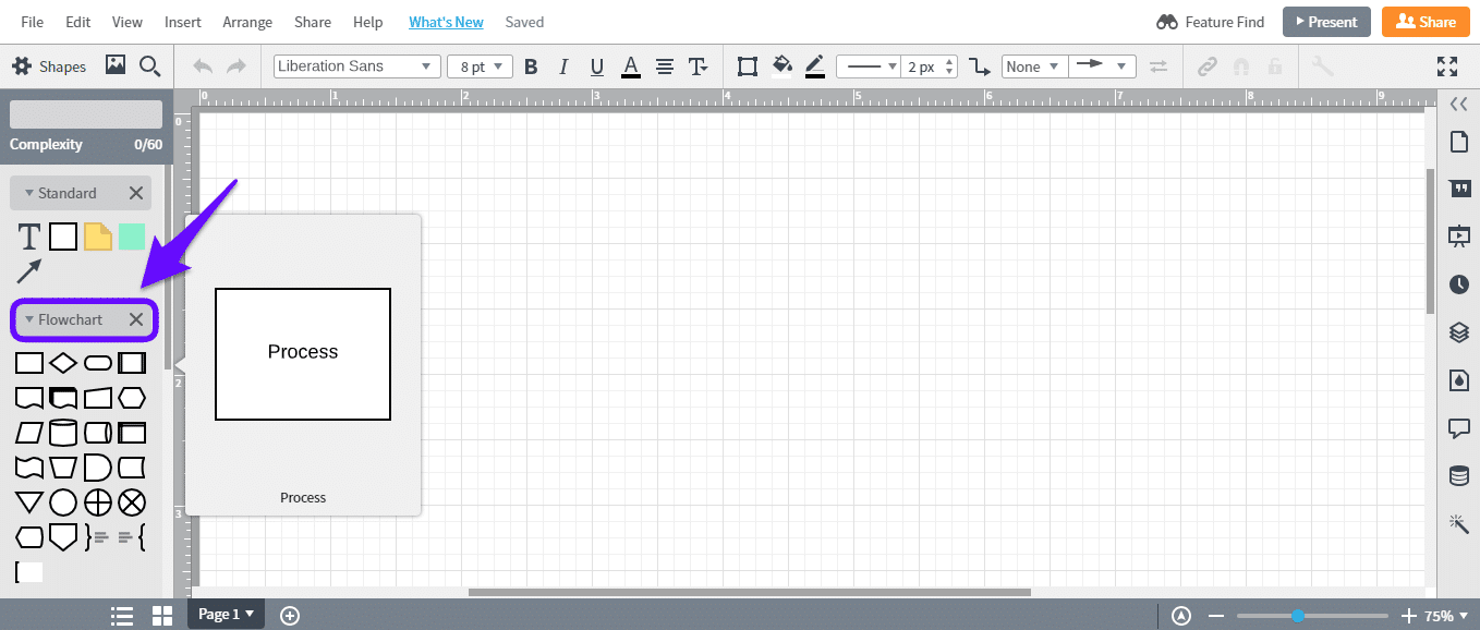
The next page will feature a blank canvas. Use the left-hand panel to add shapes. If you’re not sure which shape to use, hover over the option until you see a pop-up.
In most cases, a task analysis only uses a square (process) and diamond (decision) shape, but as you build more complicated task flows, it may be useful to review the other shapes.
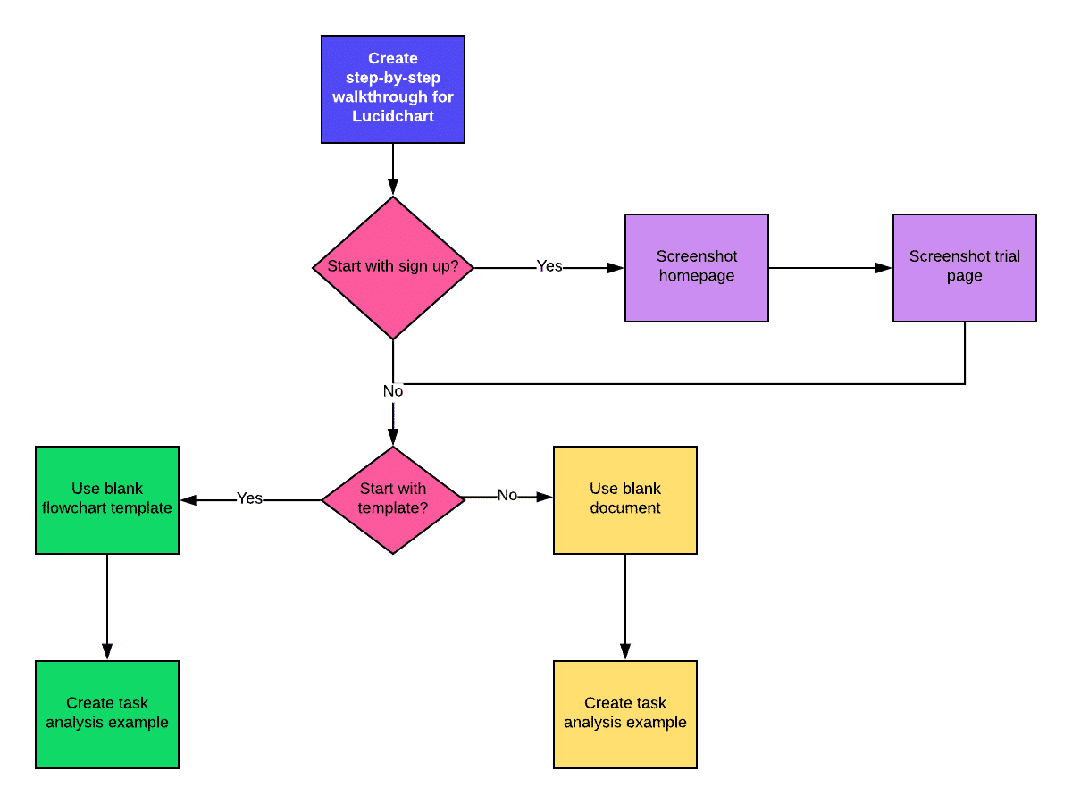
Start putting down shapes to build your task. Here, we’re starting with a simple task flow for building this walkthrough. To add text, double-click somewhere within the shape boundaries and start typing.
When you’re ready to connect shapes, click on the white circles on the sides and drag your mouse to the next shape. If it’s a diamond (decision) triangle, it’ll automatically add “yes” and “no” to your lines.
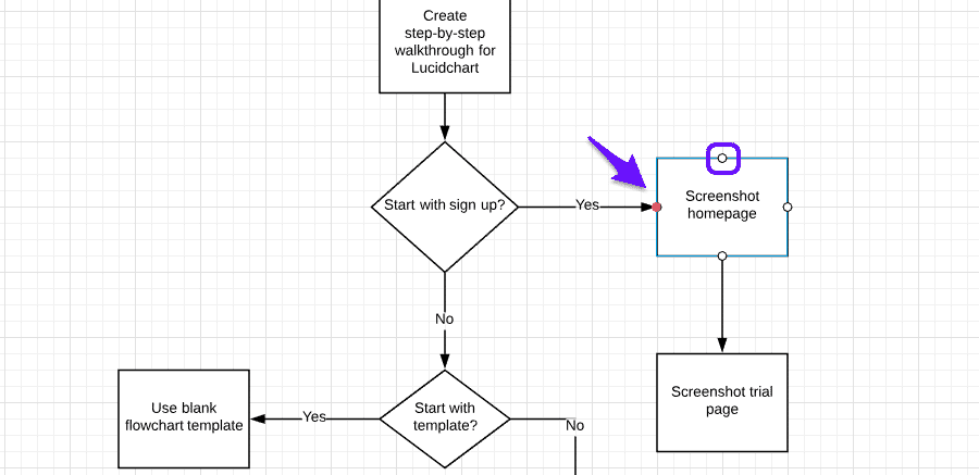
Note that if you need to move a shape, the lines will automatically reposition to stay connected, so don’t be afraid to reorganize your chart as you build it out.
If you want to change the color, font, stroke, arrow style, or lines, use the top panel highlighted above.

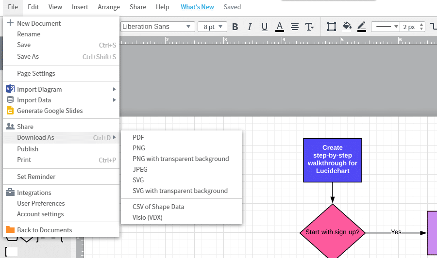
After you build your task flow, go up to “file” to see your share and download options. You can export your task flow with a transparent background, as a vector graphic (SVG), or as a PDF, among other options.
And there you have it! You now have a task analysis to use when conducting tests and setting up your metrics. Chances are that you’ll amend your task analysis once you’re actually in testing, but having at least two or three tasks ahead of time allows you to guide your usability tests.
After you’ve built your tasks, it’s time to figure out the best test type for your website.
Step 2: Identify Best Test Type
Usability testing can take many forms and range in terms of difficulty and investment requirement. What type of test is best for your website depends on the metrics and tasks you’ve built out in the first step.
Below, we’ll cover three common types of usability tests and what they’re suited for, as well as some honorary mentions.
1. Card Sorts
By far the easiest and fastest usability test around, a card sort is an instrumental test for site architecture.
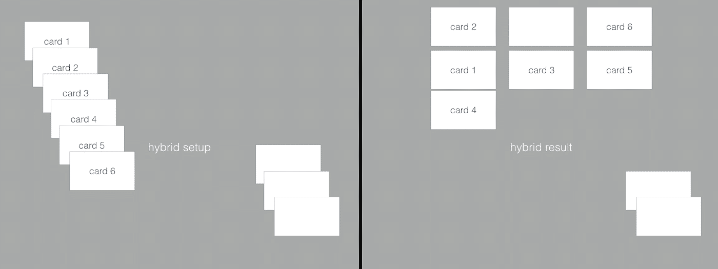
If you remember playing card matching games, card sorts are similar. Here’s how it works. A card sort can be “open,” in which users create their categories for sorting cards into, “closed,” in which all categories are predefined and inflexible. Alternatively, as seen in the above illustration, a card sort can be a “hybrid” where users are free to add their own categories but also have the use of predefined categories.
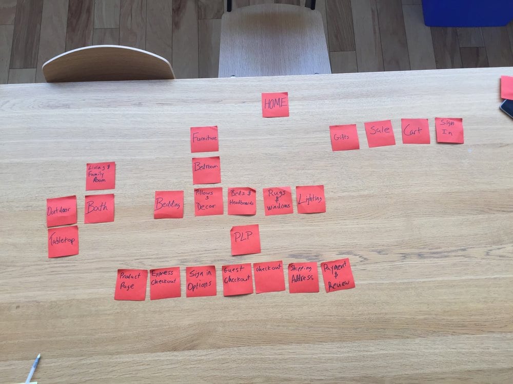
Users order the remaining cards, usually individual web pages or steps in a process, under the categories that fit their mental model best. Most experts recommend sticking with 30 to 60 cards. Performing a card sort is excellent for seeing how your users’ mental models match your site’s architecture and task process. It can reveal any significant issues early on in the testing process, as it did for Pottery Barn’s redesign (as seen below).
You can conduct card sorts remotely or in person. The most significant benefit of using a card sort test is the speed at which the test can be conducted, although the analysis stage itself can be time-consuming.
However, because card sorts only allow for limited user intervention and feedback, they should not be considered for those who want to test the satisfaction or effectiveness of a site. Instead, card sorts should be considered your front line test for efficiency, while other metrics seem better left to more robust types of usability testing, such as the field study.
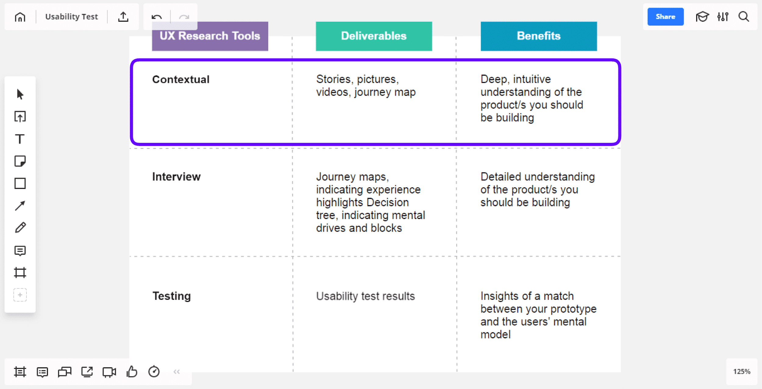
2. Field Studies
A field study for usability testing is exactly what it sounds like. You travel to the location of your users’ natural use habitat – where they’re most likely to be using your website – and have them walk you through their process while watching their screen in a semi-structured interview.
This study is also called a contextual inquiry.
Don’t worry, the awkwardness of staring over someone’s shoulder fades pretty quickly. 😉
Field studies are much more time-intensive than card sorts, but they’re ideal for testing tasks and getting direct user feedback. For those who want to dig deepest into usability issues, field studies are the way to go. Contextual inquiries are the first strategy deployed by user experience design studio MELEWI for enterprise or “limited-users” products.
Avik Ganguli, a UX design consultant at MELEWI, explains:
The MELEWI Contextual Enquiry Sprint is designed to get embedded directly in the user’s context: observing what the participants did, what they nearly did, and what they didn’t do.
You can see how MELEWI categorizes and explains the benefits of embedding in the contextual side of a usability study below.
Note that field studies can be conducted remotely, but will often lose out on data richness. Nicole Fenton and Jamie Albrecht of 18F, the digital services agency within the US government, highlight this point:
…For example, contextual inquiry is most valuable when you can observe people in their typical physical environment. Don’t skip out on face-to-face time between your users and fellow researchers.
3. Eye Tracking
If you’ve ever seen a heat map of a website, you’re already familiar with the output for eye-tracking tests.
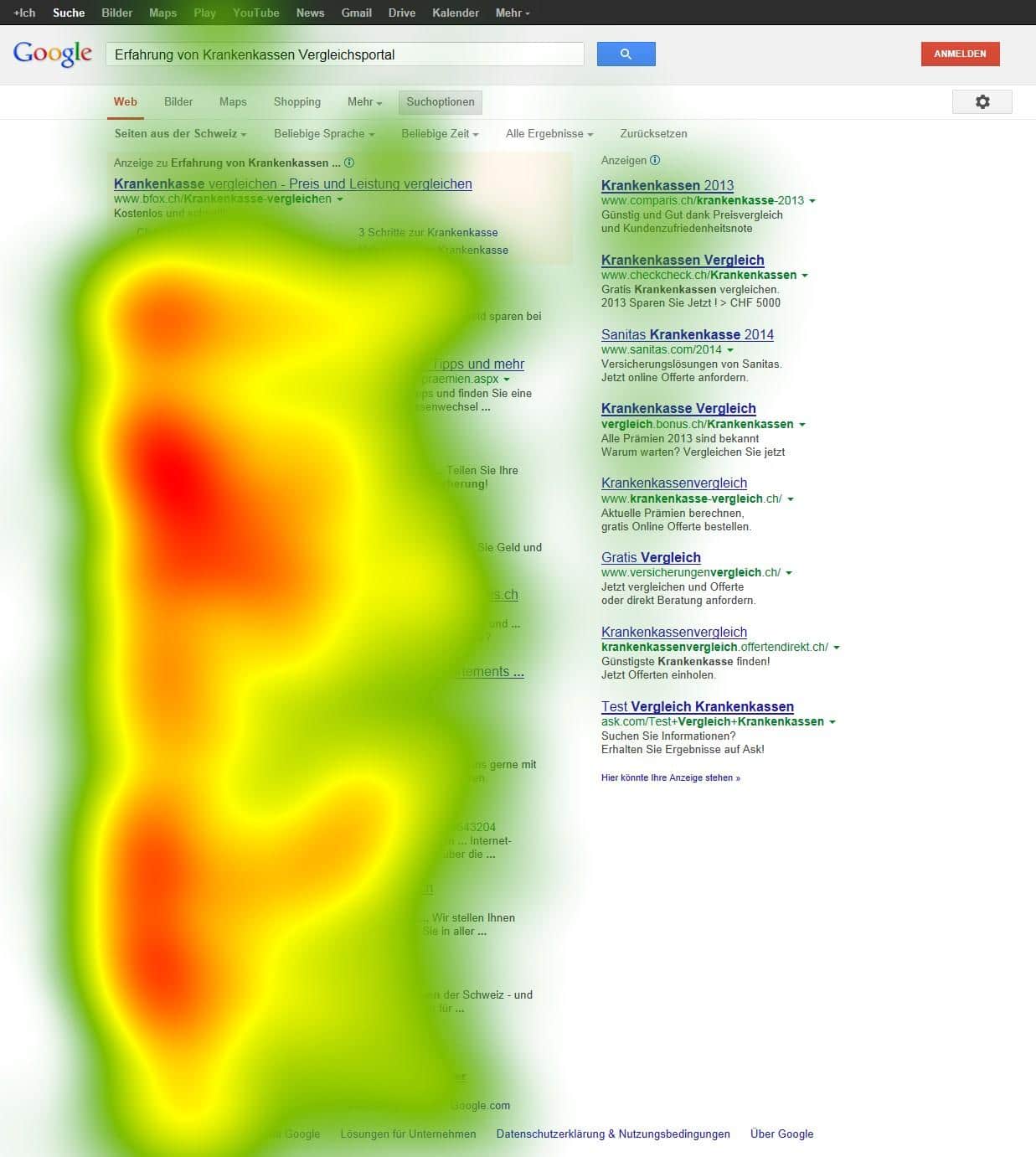
Eye-tracking studies are used to determine where a user is looking on the page and in what order. The deeper the color of the heat map, the more time the user spent looking at that section of the screen.
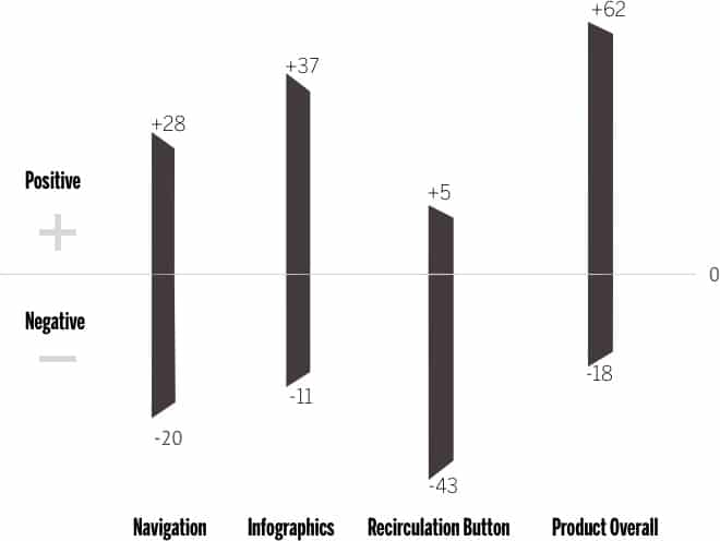
It makes eye tracking great for determining where and when users are disengaging from your website. It also highlights when content is irrelevant, as it did for e-commerce site Pronto.
By revealing the areas that Pronto’s users cared about most, the eye-tracking study enabled Pronto to redesign a homepage that increased its leads by 24% and click-throughs by 17%.
Like the previous tests, eye tracking can be done in person with specialized equipment or remotely with a web camera. However, remote testing is not without its pitfalls.
Here are the pros and cons of using a webcam for eye tracking:
This type of usability test isn’t as rewarding as a field study of user satisfaction but can yield rich data for efficiency and effectiveness. It can also help point out navigation issues by highlighting where users’ eyes skip over or miss, essentially putting your website through the lens of your users’ eyes. Based on the feedback you can improve your design, site structure, website navigation, call to actions, and so on.
Honorary Mentions
Card sorts, field studies, and eye-tracking aren’t the only usability tests in the game.
Focus groups, A/B tests, and surveys are all viable forms of user testing that can reward feedback but should not be considered for any major redesigns.
Now, after identifying the best types of tests for your goals, you have to find people to test. It may surprise you how many you need.
Step 3: Find Valid Participants
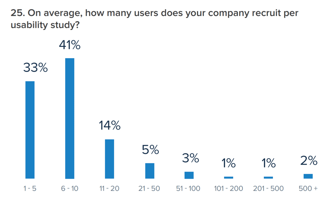
How many users do you need to conduct a usability test? The industry standard is around five. According to a survey from UserTesting, 33% of companies recruit five or fewer users and 41% recruit between six and ten.
The key to sourcing users for your usability testing is ensuring they’re valid approximations to real users. Not validating design changes with your unique user base can have some drastic impacts. That’s what the designers behind Icons8 discovered after rolling out a redesign and losing almost half their users.
It’s also why here at Kinsta we made user feedback a direct part of our redesign process.
That being said, there are times when finding representative users is too time-consuming or expensive for the goals of the test. In those instances, internal testers can be useful. Referred to as “dogfooding” (as in, eating your own dog food), this method of testing allowed The Boston Globe to get valuable qualitative feedback about new navigation features. Check this out:
So, internal testing definitely has its uses, but only when your need for quick feedback outweighs concerns about external validity. For valid tests that reward both quantitative and qualitative data, you need users as close to your own users as possible.
One potential way to reach these users is through a quick survey sent out to your business’s email list to screen potential participants. If you couple the survey with an incentive, even one that isn’t guaranteed like a lottery, your participation rates will go up, and you’ll get a pool of real users of your products to test.
Even just a $5 incentive can seriously boost your participation rates, Gallup research finds.

You can use survey platforms like SurveyMonkey and Google Forms, or if you’re using a WordPress site, you can use form builders to capture information from potential participants. We are big fans of Hotjar and use it at Kinsta.
That said, there are many reasons that real website users may not be viable. For that, there are paid platforms where you can source proxy users for a small fee. Let’s take a look at some of them.
UserTesting
Used by some of the biggest names in the design industry and beyond, UserTesting offers a testing platform for usability professionals, marketers, business owners, game developers, and more.
Robust and fully-featured, this testing platform can connect you with user proxies and have results delivered in as little as two hours. Note that this is one of the only platforms where you can arrange for live testing.
Userlytics
Used by Google, Userlytics is another robust platform with middle-of-the-road prices and unparalleled quality. Providing recorded videos, the testing panel for Userlytics is over 200,000 users strong, making it a cinch to find ideal user proxies.
What sets Userlytics apart from its competition is its range of customizability. Uniquely offering branch logic, tests through Userlytics can be structured to carry out multiple, divergent task flows.
Now, it’s time to run your test – which means it’s time to decide where, when, and who will be involved.
Step 4: Decide When, Where, and Who
You can take a breath at this step: the hard part is over. From here, you just need to make a few more decisions before carrying out your test. These decisions are:
- Remote or in person?
- Moderated or unmoderated?
Check out how it breaks down in the industry:
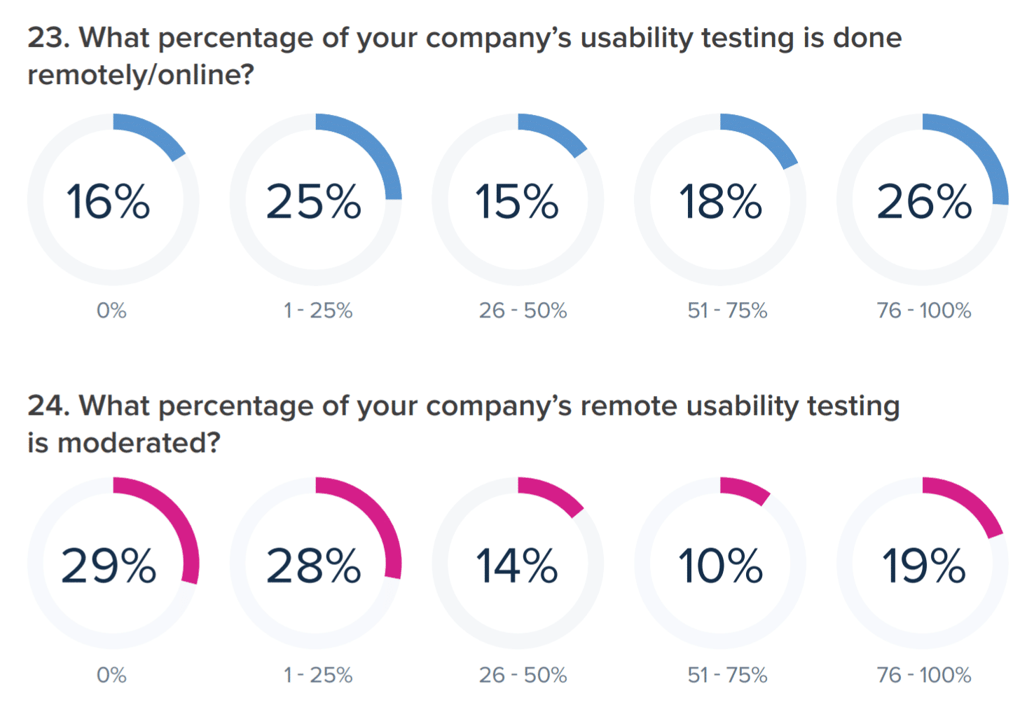
As you can see, remote and moderated testing is used evenly across the industry, though moderated testing is on the decline. If you source your user testers from the platforms mentioned in the previous section, these decisions are already made for you, and you can skip down to step five.
If not, let’s back up for a moment: what exactly is moderated testing, and why should you use it?
Moderated testing refers to having a moderator or tester present who can answer questions and guide the user. This puts more control in your hands, but it adds significant logistical challenges for both the testers and the users, especially if you’re conducting tests in-person.
Because moderating a usability test is its own art form, moderated tests are best carried out with a usability specialist, as you can see below.

Typically, moderated tests are only necessary for incomplete interfaces or in instances where security is a primary concern. Unmoderated tests, on the other hand, are more flexible, as the user needs only to log in and perform the designated tasks at their convenience.
Note that remote tests can be both moderated and unmoderated, depending on your platform and objectives.
For in-person tests, a designated usability lab or the user’s natural environment (as we saw in the field study) is ideal to avoid artificial conditions.
Use the following free platforms for remote tests:
Skype
If you remember MELEWI from our earlier sections, Skype is their tool of choice for remote usability tests. The most significant benefit of Skype is its familiarity to users and native screen-sharing. However, the downside of this platform is the lack of built-in screen recording.
Google Hangouts
Available for any user with a Google account, Google Hangouts is another free platform with screen-sharing abilities. However, only certain types of Google Workspace accounts can record video natively. The advantages of Hangouts over Skype come down to preference and what your users are more comfortable with. Both perform similar functions and will require a screen recorder if you’re not set up with a Google Workspace Enterprise account.

Zoom
Rounding out our list of platforms for remote usability testing is Zoom. This platform has a significant advantage over either Skype or Hangouts: it provides native screen and video recording. In fact, we use Zoom here at Kinsta.
However, it also has a large disadvantage. If your video meeting involves more than one other user, there’s a 40-minute time-limit for free accounts.
Note that you should always record tests whenever possible. You’ll need the recordings to review the findings with your team, and they’re helpful for keeping the focus on the people, rather than the data, at the center of your usability tests.
Time for our last step: iterating.
Step 5: Rinse and Repeat
Iterative testing is the key to great usability, though there’s some argument about its role in innovation. What does iteration mean in a design context? It means your process is never over: after creating a website, you continuously test, tweak, and improve on that website endlessly.
So, once you’ve conducted your tests and gathered your results, it’s time to review, implement, and then do it all over again. Enginess, a digital consultancy, illustrates the value of iterative design nicely:
…a living project that you should regularly tweak and improve upon as you go, rather than building it in one fell swoop and being done for good.
With that in mind, how you review and implement the results of your usability testing will vary significantly based on what type of data you’ve gathered and what your original goals were. Unlike chemistry lab, usability testing tends to reward a mixed bag of quantitative (“hard”) and qualitative (“soft”) data.
They’re both important. How they’re used will change from project to project, website to website. That said, qualitative data tends to be the most friendly for data visualization. One of the most popular modes of visualization is through a journey map.
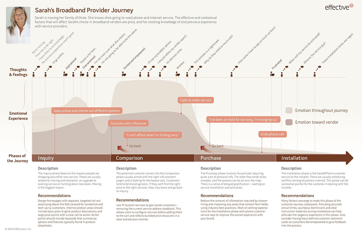
A journey map provides a visual overview of the different steps your user testers take throughout their journey on your website. If done well, it includes emotional parameters as well as usability issues, but that, like your review process, will ultimately be determined by the type of test you’ve conducted.
Journey maps are especially useful at the conclusion of usability tests because they help unveil hidden insights. After creating a few journey maps, the trends start to become more apparent, and areas of potential improvement are easier to visualize.
Plus, having a unified piece of information to share among team members makes the iteration process much easier. So, what are you waiting for? Head back to the first step to keep pushing your website’s usability higher. The sky’s the limit.
Summary
Usability testing is an absolute must-have for any business with an online presence, but it’s a broad field. The three metrics generally agreed upon for usability testing are satisfaction, efficiency, and effectiveness. Which of these metrics matter most to you will determine the best type of usability test to run for your website.
After you narrow down the type of test that suits your needs best, it’s time to find valid participants. Avoid internal testing if you can and look for close proxies if your own customers aren’t a viable solution. Next, decide between moderated and unmoderated, then between remote or in-person testing. Each has its own uses and restrictions, so consider your options carefully.
Once your usability testing concludes, go back and review the results to see what changes your website needs. Then implement those changes and do it all over again: iteration is the difference between “meh” usability and face-melting usability stardom.
The next time you’re considering a redesign or want to improve your users’ experience, refer back to this guide for the ultimate step-by-step to website usability testing.

Brian has a huge passion for WordPress, has been using it for over a decade, and even develops a couple of premium plugins. Brian enjoys blogging, movies, and hiking. Connect with Brian on Twitter.