
What causes the large discrepancy between what some WordPress developers charge compared to others? Answering this question requires consideration for the reason behind why you want a website in the first place.
Some developers focus on the literal final product: the combination of code that results in a pleasant enough website design.
But developers with marketing savvy concern themselves with more than just building something that looks nice. They act as consultants to clients who are looking to accomplish specific goals with their websites.

With this in mind, hiring someone to build a website who doesn’t seem interested in/doesn’t ask questions about your end goals is a red flag. It’s important to call out the fact that even the most beautiful web design may not be ideal when it comes to getting visitors to convert into customers.
That said, 94% of people judge your credibility based on your website’s design.
So, instead, you need to focus on using your design to offer the ideal user experience. You must make it easy for visitors to find the information they sought by visiting your website in the first place while guiding them towards goal conversion activities.
These web design best practices focus on the intersection between creating a beautiful website and one that serves your business.
Prefer to watch the video version?
What Defines Web Design Best Practices?
To be sure, everyone and their mom has opinions about what constitutes a well-designed website.
But let’s rein in everyone’s opinions by deferring to the experts.
According to Orbit Media, you can group web design best practices into these three basic categories of standards:
- Brand standards: You might be more familiar referring to this same concept as “branding”, “style guides”, or “mood boards”. These standards include anything that has to do with how a website looks and involves the use of colors, typography, and elements that are specific to the particular business.
- Coding standards: Websites should be built according to the programming standards agreed upon by W3C, the international community that works together to develop web standards.
- Accessibility standards: Access to information is a basic human right, which has been recognized by the UN Convention on the Rights of Persons with Disabilities. Besides that, making your site accessible has positive effects — not just on sales but SEO as well. W3C shares a basic list of standards you need to follow to design an accessible website. We’ll detail more related web design best practices later in this article.
Let’s look at how to develop web design practices based on each of these standards:
Brand Standards
Websites that lack consistent branding can be stressful to interact with and cause confusion. As such, it should come as no surprise that some 38% of visitors have said that they will stop engaging with a website if the content or layout is unattractive.
Keeping in mind that looks aren’t everything, here are some basic design principles to consider for creating a website that people want to use:
Balance
Balance is the principle of design that prescribes how to effectively distribute visual elements. In general, a balanced design looks clean and natural and has good symmetry (although that’s not necessarily a condition of balance).
You can incorporate balance in web design in terms of the page layout.
Centering text or other elements across the page is an easy way to do so. In general, web pages are built on a grid system, which creates a form of balance. You can use the CSS float property to position elements and balance them across the page.
Balance can be achieved in 3 ways:
1. Symmetrical design
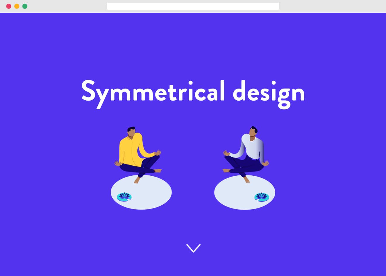
Arranging elements in an even fashion across the web page. For example, if you have a heavy element on the left, you should have a heavy element on the right. As mentioned, centering is the easiest way to achieve symmetry, but it can sometimes come across as flat or boring.
To avoid making the page look monotonous, you can create balance using different elements, such as balancing a large image with a block of text. There is also a type of symmetrical balance called radial balance, where objects radiate from a central point.
2. Asymmetrical design
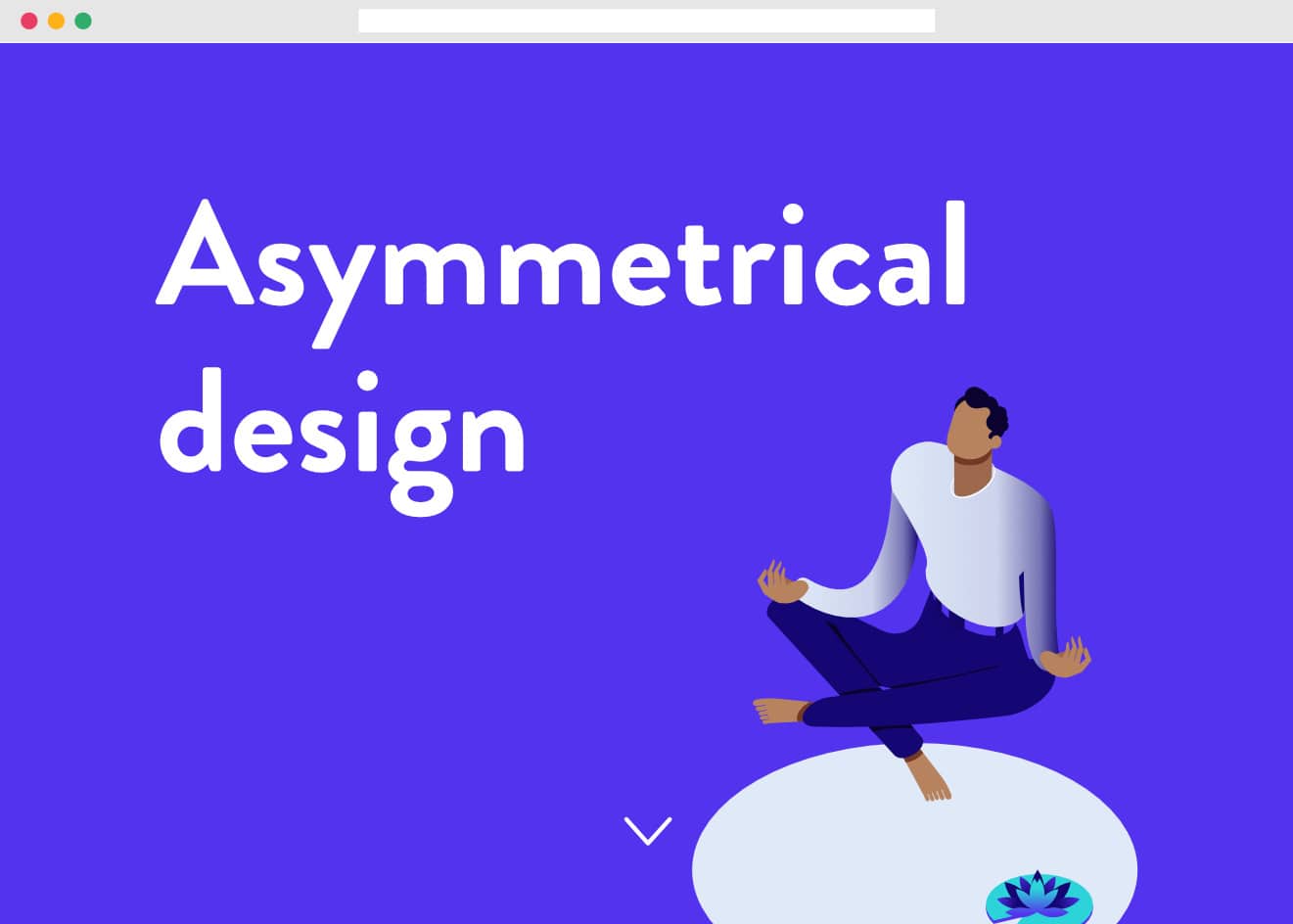
More challenging to do well, asymmetrical design involves the uneven distribution of elements on a page. For example, you may have a large element in the center, which is balanced by a smaller one further away.
You may use other elements of design, such as color or texture, to balance an asymmetrical design.
3. Off-balance
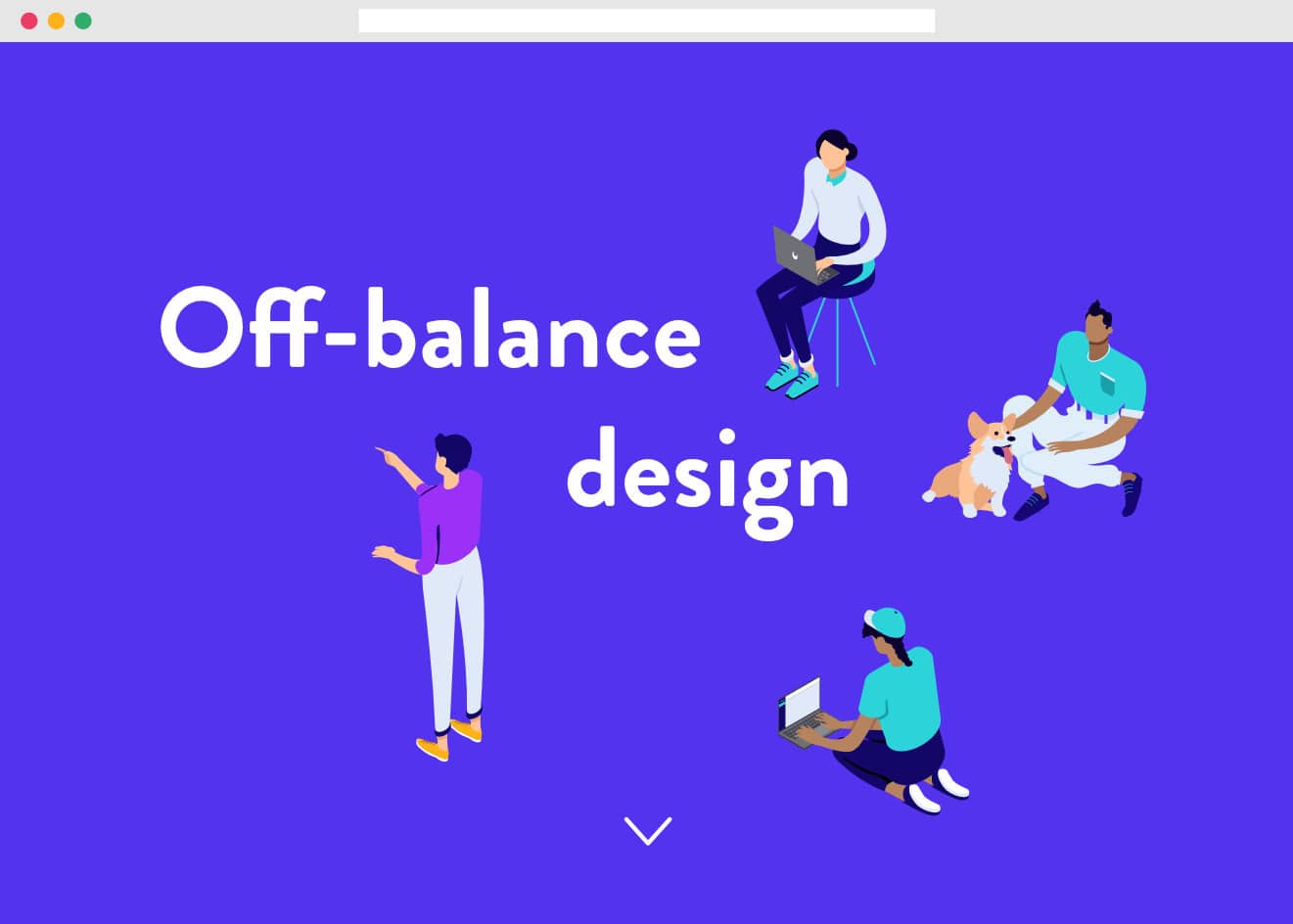
These types of designs suggest motion and action, which can make people uncomfortable. If your website intends to make people think, then an off-balance design is for you.
Composition
The term composition refers to the placement and organization of design elements.

The Rule of Thirds is commonly used to create balanced composition, especially with photos.
Spacing
Elements should be evenly spaced so that users can differentiate sections or blocks.
You should also introduce negative space or the space between and around the subject of an image. Negative space can reduce visual noise, increase readability, and bring balance.
You can introduce negative space by adding margins and padding around your design elements.
Focal Point
Create an area of focus where you want to draw attention. It should be the most important part of your page, and ideally, each page should focus on just one major focal point.
Color
Color is an important design element when it comes to branding. Ideally, you’re coming into the web design process with an understanding of the website color scheme you want associated with your brand.
For web design specifically, it helps to start with a mood board for your brand.

Choose a primary and secondary color (the secondary color can complement or contrast the primary color), and a lighter and darker hue for each. Limit your use of color so that various accents don’t become an eyesore.
Adobe Color provides an excellent free tool for testing various combinations of colors to create a working palette for website elements.
Also, when deciding on color, it is important to consider those who are colorblind, which includes up to 4.5% of the world’s population.
There are three types of color blindness (total color blindness, two-color vision, and deficient color vision) so make sure that your design is still usable in consideration of those who may not be able to differentiate colors.
Contrast
While choosing color, it’s important to be conscious of color ratios and contrast.
Color contrast refers to the difference in light between the foreground and background. Using sufficiently contrasting colors allows website visibility to be easily distinguished. In general, use high contrast color options — like black text on a white background — to make your site readable.
The contrast ratio is the numerical value assigned to the difference in contrast between page elements.
The World Content Accessibility Guidelines (WCAG) 2.0 recommends a contrast ratio of 4.5:1 for normal text. WebAIM shares a few predetermined combinations that fit the ideal contrast ratio to help you visualize this web design best practice.
To help navigate using this ratio, make sure that when you design your website, you’re envisioning all audiences (including those with accessibility issues). It’s easier to do this versus planning to address these issues after the fact.
Consider all aspects of the website people will be interacting with, including headers, footers, menus — all of which need to be easily visible to be usable.
Some tools you can use to check color contrast ratios include:
- Color contrast checker by Level Access.
- Contrast Ratio.
- WCAG 2.0 AA & AAA color contrast checker tool, which is based on the WCAG 2.0 guidelines.
Typography
Site typography is another important branding consideration.
While there are many different sources for finding potential fonts to use on your website, you’ll want to first consider the options that will display consistently regardless of what fonts the end user has installed on their computer.
Google Fonts offers a wide variety of free web-safe fonts that you can count on to display properly, regardless of the user’s installed fonts/programs. Make sure you include fonts in your mood board to see if they match your color aesthetic.
If you’re having trouble coming up with combinations, Google Fonts can suggest popular pairings. You can also use a site like FontPair to get suggestions.
Try to limit the font weights you use, as having to load too many files can contribute to slow page speed. On that note, consider hosting Google Fonts locally to introduce additional performance benefits.
When it comes to selecting typographic elements based on web design best practices, as a general rule of thumb, use sans-serif fonts for headings and serif fonts for content. At a minimum, don’t use decorative fonts for body content, as it will be difficult to read.
Also, don’t be tempted to use a wide variety of different fonts on your website. A good rule of thumb is to use one font for your logo, another for your menus/headings, and one more for body content. On that note, try pairing fonts that complement each other, such as those from the same font family.
Element Hierarchy
Hierarchy refers to the arrangement of design elements that showcase relative importance. This is achieved by manipulating elements such as visual contrast, size, and placements to call attention.
For instance, content must be broken down into logical blocks so that users can distinguish sections from each other.
You can do this through the use of content headers, which not only make it easy for users to skip to the parts that they want to read, but also break large amounts of text into readable chunks so that screen readers are able to determine the context of each section.
If you’re looking for some helpful visual illustrations of these design concepts and more, The Tilda Publishing blog covers some of the most common web page design mistakes and how to fix them.
Web Best Design/Formatting Practices
According to research by Orbit Media, there are some common web design standards observed in the top 50 marketing websites.
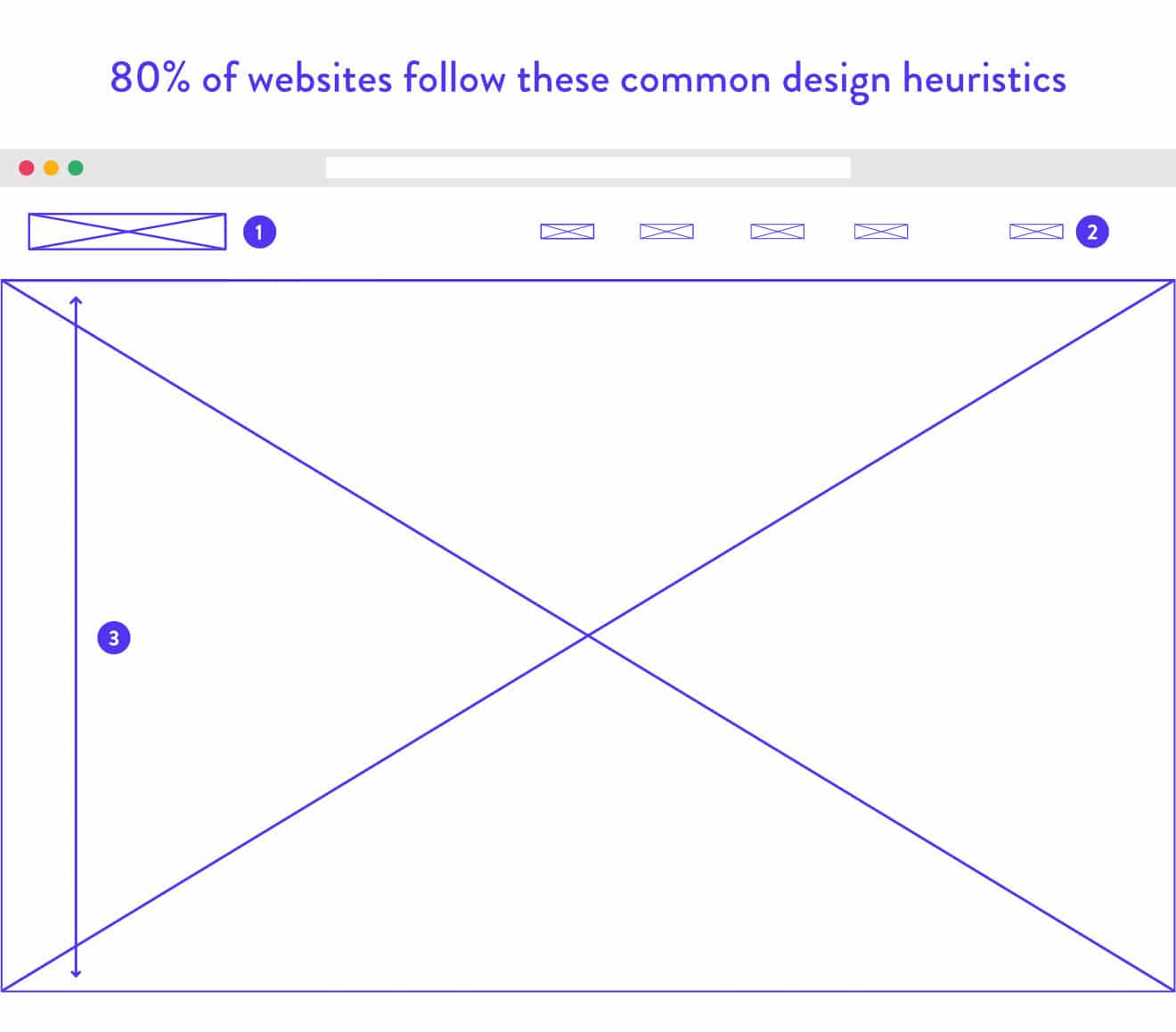
By ‘standards’, they mean 80% of websites use a similar design approach:
- Logo in the top left corner.
- Main horizontal navigation across the top of each page.
- Value proposition high on the homepage located “above the fold”. Note that most web designers will tell you that there is no standard pixel height for browsers, and technically no “fold”. But, in general, important design elements should appear high on pages that are generally visible to the majority of visitors, even without scrolling.
Here are some web design best practices for common site elements:
Images
Web design best practices for using images could inspire many volumes of advice but let’s focus on the bare minimum in this discussion of web design best practices:
- Adding ALT text. Images cannot be processed using screen readers unless ALT text is used. Adding ALT text also contributes to SEO, but some people use ALT text only to supplement their keyword strategy. A more helpful use of ALT text would be to describe the image — though you could certainly satisfy search spiders and screen readers at the same time with the right approach.
- Using images featuring human faces tends to be more effective than other graphics or animations. It makes people more likely to engage with the image, as humans are drawn to what they perceive as real empathy and emotions.
- Use responsive images, which grow or shrink depending on the browser size. This helps with both site speed and SEO.
- Never forget about favicons. Favicons are the small icons that show up next to the website title and in search results as well. It helps brand recognition and enhances the site’s UX.
Website Navigation
Users expect to be able to easily find the content they’re seeking on a site. Thus, it is important for website navigation to be simple and straightforward.
Website navigation is a general term that refers to the internal link architecture of a website. Don’t forget that the main purpose of navigation is to help users easily find relevant content on your website.
Your site’s internal link architecture forms the basis of your sitemap, which helps search engines access your content easier. It’s been found that having a well-designed site where content is easy to find positively affects the website traffic you’ll get from search engines (along with a higher chance of getting Google sitelinks).
Menu Navigation
There are several aspects that make up website navigation, but your top/main menu should be a primary focus as it will be one of the first things users interact with when they visit your website.
There are different website menu design heuristics but the most popular ones include:
Navigational menu
Ideally, this is located at the front and center of a website. This might involve the use of a dropdown menu if there are several categories. However, dropdown menus are not recommended, especially when it comes to technical SEO (they’re harder to crawl). Additionally, it has been found that most people dislike dropdown menus.
This is because the human eye works faster than the hand, and so people find it annoying when they’ve already decided what to click on and something else drops down — which can lead to a decrease in visits to pages.
Hamburger menu
Primarily used for a mobile-optimized design, a hamburger menu is usually located at the top left or right side of the page. It appears as a square with three lines that can be expanded with a click. However, many designers despise the hamburger menu, which has inspired web developers to consider new ways to make mobile website navigation fun and functional.
Here are a few tips for designing navigation based on web design best practices:
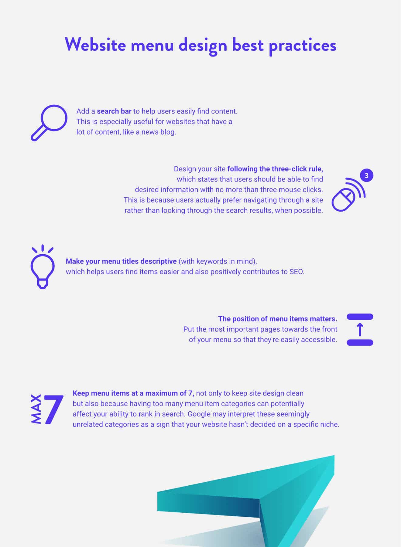
- Add a search bar to help users easily find content (here’s how to improve the WordPress search functionality). This is especially useful for websites that have a lot of content, like a news blog.
- Design your site following the three-click rule, which states that users should be able to find desired information with no more than three mouse clicks. This is because users actually prefer navigating through a site rather than looking through the search results, when possible.
- Make your menu titles descriptive (with keywords in mind), which helps users find items easier and also positively contributes to SEO.
- The position of menu items matters. Put the most important pages towards the front of your menu so that they’re easily accessible.
- Keep menu items at a maximum of 7, not only to keep site design clean but also because having too many menu item categories can potentially affect your ability to rank in search. Google may interpret these seemingly unrelated categories as a sign that your website hasn’t decided on a specific niche.
For a more convenient format, here’s a handy infographic:
Coding Standards
With so many websites created and consumed globally, there certainly is a need for a standardized set of coding principles. Some aspects of these web standards include:
SEO
SEO can be used to increase the number of visitors to your site organically (without the use of ads). Since it’s too complicated to adequately dig into SEO in one small subsection of an article, check out our SEO checklist and our tips for the best SEO plugins for WordPress to familiarize yourself with this aspect of web design best practices.
Note that the following coding standards tips work hand-in-hand with SEO.
Mobile Responsiveness
Responsive design is concerned with creating a great user experience, regardless of what device or browser is used to access your website.
It is more important today than ever to design your website to be responsive, as more than 60% of internet users access the internet via their mobile phones, and half of ecommerce transactions are done through mobile platforms. Adding to that, Google’s new search algorithm also prioritizes mobile-friendly sites.
Having a responsive site not only helps users navigate your site easier, but also contributes to increased engagement and conversions. Users recommend brands with whom they have a positive mobile-responsive site experience, and conversely, would not only stop purchasing from brands with a bad mobile site experience but will also actively discourage others from doing so.
However, despite the demand for a responsive site, an estimated 91% of small businesses don’t have one. They should — as designing a mobile-responsive website certainly pays off. 62% of companies have reported an increase in sales after designing a mobile-responsive site.
Read up on Kinsta’s resource on how to make your site more mobile-friendly, which includes a list of the best WordPress mobile plugins to download, and make sure to check out this curated list of the best WordPress themes, where you could browse through plenty of responsive themes.
Google also offers some tips for how to design a responsive website.
Website Security
Another important coding practice? Creating secure programs and websites that users can trust with their sensitive personal information. Contrary to popular belief, hackers don’t actively seek out specific websites to hack, which is why even small websites are vulnerable to attack.
As a whole, WordPress is generally secure, but it helps to take extra precautions to keep your website secure against attacks.
Here are some of the best website security practices:
- Get an SSL certificate, which is especially important for sites that deal with payments and personal information. The SSL certificate encrypts information sent out over networks so that hackers have a hard time decoding it. Besides that, it is an industry-standard. Chrome alerts visitors when the site they are visiting doesn’t have an SSL certificate. In addition to this, Chrome is now deprecating legacy TLS versions and started showing additional warnings.
Enabling HTTPS (part of installing an SSL certificate) is also an official Google ranking factor. - Keep your login credentials secure. Several attacks are caused by hackers trying to forcefully gain access to a website. It helps to have a separate/hidden login page (use the WP Hide Login plugin) and to limit the number of login attempts. Use the Login LockDown plugin, which records the IP address and timestamp of every failed login attempt and locks down the login function if the number of failed attempts from the same IP range is reached in a short period of time. Also, create a secure password that’s more than 6 characters and is a mix of both upper and lowercase letters, numbers, and special characters. Change your password often. You can also use two-factor authentication for logging in if you’re looking for extra security.
- Keep the WordPress core, plugins and themes updated. Don’t forget to download plugins or themes from a reputable source. A good sign is if the plugin/theme has multiple installations and has recently been updated. You should also read reviews to decide for yourself if the plugin is trustworthy. On that note, download a WordPress security plugin such as Wordfence or Sucuri, as 73.2% of the most popular WordPress installations that are vulnerable can be detected using free automated tools. Here’s a more in-depth list of the best security plugins. Kinsta Automatic Updates can help you update all your themes and plugins appropriately.
- Use a secure web host. For those not in the know, it may not seem like your web host has anything to do with site security, but 41% of attacks occur through a security vulnerability on the hosting platform. Look for a hosting provider that includes features such as: server-side firewall and encryption, NGINX or Apache web servers, antivirus and anti-malware software, on-site security systems, and the availability of SSL certificates and a CDN.
For more information about WordPress security, check out our comprehensive resource about how to keep your WordPress site secure.
Page Speed
About half of users expect a site to load in 2 seconds or less, and if it takes longer than that, 40% of people won’t hesitate to bounce from the page, (likely) never to return.
Besides website visits, page speed is important as it also affects conversion and revenue. For every second of added page load speed, sales will drop by up to 27%. Increasing website speed can prevent the loss of 7% of possible conversions.
Here are some ways to make your web pages load faster:
- Use a content delivery network (CDN), which takes static files like images, CSS, and JavaScript, and delivers them on the servers closest to the user’s physical location.
- Consider how you use images. The average website uses 1.8MB of images, which represents 60% of a site’s size. To help with that, reconsider how you lay out your webpage. If you want to keep page speed fast, try to reduce the number of large images used in your design and make sure to optimize them.
- If your website needs to use lots of large images, use plugins that include functionality for GZIP compression, caching, or image optimization, such as WP Rocket and Imagify. They can help make your files smaller (without sacrificing quality) so that they load faster.
- Consider the number of plugins and files you keep on your WordPress database since they can also affect page load speed. Clean up those that you don’t use. While you’re at it, keep your PHP, WordPress core, and plugins updated to their latest versions.
Check out our comprehensive resource for website speed optimization.
Accessibility Standards
The internet was designed to work for all people, regardless of the specific hardware, software, language they use, their ability or location. However, many sacrifice accessibility for a beautiful design.
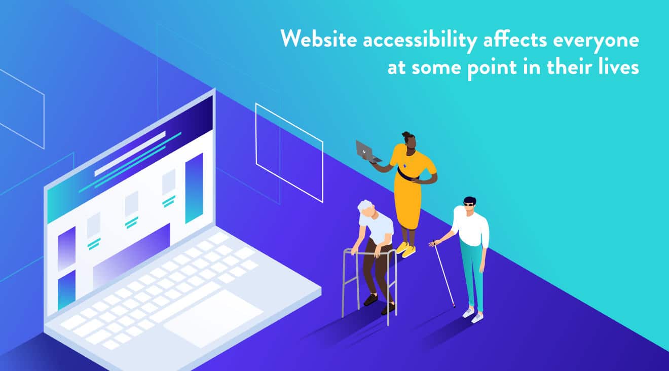
Accessibility refers to the practice of making your website usable by everyone.
Besides those with disabilities that affect access, W3 says that website accessibility is also beneficial for:
- Those using devices with small screens, different input modes, etc.
- The elderly.
- People with “temporary disabilities” including a broken limb, lost glasses, or a medical condition.
- Users with “situational limitations”, such as those accessing the Internet on devices in bright sunlight or in an environment where they cannot listen to audio, such as public transportation.
- Individuals with a slow Internet connection.
Accessibility should be everyone’s concern, as we’re all affected by it in some way.
Reasons to Make Your Site Accessible
Still not sure it’s worth spending your time on accessibility in this discussion of web design best practices?
Consider these reasons:
- It’s an ADA requirement. The Americans with Disabilities Act (ADA) was passed in 1990 to protect the civil rights of those with disabilities from discrimination. It covers things like transportation, telecommunication, employment, and even building codes. Since this law was passed nearly 30 years prior — a time when the internet was not as ubiquitous — lawmakers are seeking to amend it.
- It fosters inclusivity. A survey by the Pew Research Center shows that people with disabilities are three times less likely to go online than their counterparts without disabilities, which is a shame since statistics show that about 30% of professionals have a disability, with 62% of those with disabilities “flying under the radar” for fear of negative bias.
- It will help you win more business. By being more inclusive, you’ll bring in a network of people with disabilities, which represents $7 trillion in disposable income
- SEO benefits. Search engines reward websites that are accessibility-compliant in order to encourage more websites to be accessible.
How to Make Your Website More Accessible
An easy way to make your website more accessible is to install the WP Accessibility plugin, which adds accessibility features including:
- A toolbar where users can resize fonts and view your site in high contrast and grayscale.
- Comparing color contrast to check if it fits the standard of the ADA.
- Removing title attributes from images inserted into content. Most screen readers aren’t able to sense this and read the anchor text instead.
- Enabling skip links, which are internal page links that allow users to skip directly to the content, which is useful for people using screen readers.
A few additional steps to take:
- Add subtitles or a transcript if your site produces media such as audio, audiobooks, videos, podcasts, and so on, to benefit the deaf/mute, as well as people who want to consume your content but cannot consume media in public.
- Create keyboard-accessible links and menus for people who have motor disabilities and can only use a keyboard (not mouse) to navigate your site. Dropdown menus are discouraged, but you can remedy that by assigning shortcuts for each dropdown item (such as: press “1” for the homepage, “2” for the about page, etc.).
- Lastly, test your site for website accessibility. The Web Accessibility Initiative does not endorse any specific tool but instead offers a list of tools you can use to audit your efforts.
Final Thoughts: Web Design Best Practices For Your Next Website Project
Good websites shouldn’t be defined by objectively good design. Just as important is site usability, ease of navigation, and accessibility. Armed with these web design best practices, you have everything you need to create something that looks and functions well.
Just keep in mind that these are web design best practices. It’s likely that you won’t be able to follow each one exactly, depending on the nature of your website. But before you can break the rules, it helps to at least be aware of why they exist.
Did we miss anything important? Share your web design best practices in the comments below!
Suggested reading: Best Web Design Courses Online

Maddy Osman creates engaging content with SEO best practices for marketing thought leaders and agencies that have their hands full with clients and projects. Learn more about her process and experience on her website, The Blogsmith and read her latest articles on Twitter: @MaddyOsman.

