
Twenty Twenty-Three is the brand new default WordPress theme being launched with WordPress 6.1.
It is a minimalist theme with no images or additional functionality. It gives its best as a starter theme to build templates and style variations and also test all the features introduced with the latest versions of WordPress. The theme could be seen as a real development and testing environment, although the minimalist style, responsiveness, and lightness make it a good option for creating blogs and websites suitable for a wide variety of purposes.
In his introduction to Twenty Twenty-Two theme, Kjell Reigstad wrote about the future of default themes:
Innovations like theme.json, block templates, and block patterns are making theme development far simpler, and are providing new ways for users to customize their sites. There’s reason to believe that the community can leverage all this to build more frequent and diverse theme and customization solutions for our users in the coming years.
And Channing Ritter made the following proposal:
What if, instead of emphasizing the theme itself, we highlighted an opinionated set of style variations designed by members of the community? We could use Twenty Twenty-Two as the basis for a new theme that’s stripped back and minimal — a blank canvas to let a diverse range of style variations shine.
And that’s what’s happening with the new Twenty Twenty-Three default theme. The community has been called to actively participate in designing the default WordPress theme, and we like that because it makes the new theme the result of genuinely participatory work.

But before uncovering the style variations coming in bundle with the new WordPress default theme, let’s find out the basic features of Twenty Twenty-Three and what it can be fit for.
Page Layouts and Styles
As mentioned above, Twenty Twenty-Three is a stripped-down version of Twenty Twenty-Two. What is striking about the new default theme is its simplicity and lightness. Twenty Twenty-Three is flexible and perfectly suited to Gutenberg’s latest site editing features, such as template editing, Global Styles variations, Fluid Typography, and block patterns.
So, it will be no surprise that in the screenshots shown in this article, you will see minimal pages without any bells and whistles but perfectly suited for customization and testing.
To give you an example of that, the image below shows single post pages with and without featured images.

The following image compares the home page with an archive page.

Even if the new theme is a simplified version of Twenty Twenty-Two, compared with the previous default theme, Twenty Twenty-Three presents some key differences.
First, the size of the headings has been reduced and the default serif font has been replaced by a system sans serif font.

Also, a different color palette has been applied. You can see the new Twenty Twenty-Three palette definition in the following code from the theme.json:
{
	"settings": {
		"appearanceTools": true,
		"color": {
			"palette": [
				{
					"color": "#ffffff",
					"name": "Base",
					"slug": "base"
				},
				{
					"color": "#000000",
					"name": "Contrast",
					"slug": "contrast"
				},
				{
					"color": "#9DFF20",
					"name": "Primary",
					"slug": "primary"
				},
				{
					"color": "#345C00",
					"name": "Secondary",
					"slug": "secondary"
				},
				{
					"color": "#F6F6F6",
					"name": "Tertiary",
					"slug": "tertiary"
				}
			]
		},
	}
}
But the main feature of the new default theme is its set of style variations. Twenty Twenty-Three comes with ten global style variations, each of which showcases a different combination of colors, font family, and font sizes.
You’ll find the corresponding JSON files in the Twenty Twenty-Three styles folder.
Full previews of page templates, styles, and Style Variations of Twenty Twenty-Three are available on Figma.

Twenty Twenty-Three Typography
In a minimal theme like Twenty-Three, typography plays a key role in making the text readable, the site appealing, and ultimately provides visitors with a rewarding browsing experience, regardless of device and screen size.
For this purpose, Twenty Twenty-Three comes with a new set of font families and uses Fluid Typography introduced with WordPress 6.1.
Typefaces
Twenty Twenty-Three features a new set of typefaces that are used in style variations and characterized by simplicity and variety:
- System Font –
var(--wp--preset--font-family--system-font) - IBM Plex Mono –
var(--wp--preset--font-family--ibm-plex-mono) - Inter –
var(--wp--preset--font-family--inter) - Source Serif Pro –
var(--wp--preset--font-family--source-serif-pro) - DM Sans –
var(--wp--preset--font-family--dm-sans)
IBM Plex Mono is part of the IBM Plex font set, the new corporate IBM typeface released under SIL Open Font License (OFL). You can see a preview of it on Adobe Fonts and IBM websites.

Inter is a free and open source font family crafted and designed for computer screens by Rasmus Andersson. You can preview and download the font family on Rasmus Andersson’s website or Google Fonts.

Source Serif Pro is a typeface from Adobe Originals and you can use it for free with an Adobe Fonts account (read more about Adobe font licensing).

DM Sans is another typeface licensed under the SIL Open Font License (OFL), which was commissioned by Google from Colophon Foundry, and designed by Colophon Foundry, Jonny Pinhorn, and Indian Type Foundry.

Fluid Typography and Spacing
Twenty Twenty-Three uses Fluid Typography and Spacing Presets introduced with WordPress 6.1.
The new default WordPress theme provides a great example of fluid typography implementation within WordPress themes and you can use it as a template for adding support for this feature in your themes.
The following code shows settings.typography.fluid and settings.typography.fontSizes[] property definitions in the theme.json:
"settings": {
	...
	"typography": {
		"fluid": true,
		"fontSizes": [
			{
				"fluid": {
					"min": "0.875rem",
					"max": "1rem"
				},
				"size": "1rem",
				"slug": "small"
			},
			{
				"fluid": {
					"min": "1rem",
					"max": "1.125rem"
				},
				"size": "1.125rem",
				"slug": "medium"
			},
			{
				"size": "1.75rem",
				"slug": "large",
				"fluid": false
			},
			{
				"size": "2.25rem",
				"slug": "x-large",
				"fluid": false
			},
			{
				"size": "10rem",
				"slug": "xx-large",
				"fluid": {
					"min": "4rem",
					"max": "20rem"
				}
			}
		]
	}
}
The typography.fluid setting adds support for fluid typography while typography.fontSizes[].fluid sets the minimum and maximum font size value.
In addition to Fluid Typography, Twenty-Three also supports fluid spacing.
Before WordPress 6.1, it was only possible to set custom spacing values in the editor. This means that before WordPress 6.1 theme authors were not able to specify fixed values for padding, margin, and gap. This resulted in several limitations. For example, it was not possible to easily transfer spacing settings between different themes or to maintain spacing values when copying and pasting content and block patterns between different sites.
Themes can declare Fluid Spacing support using the new spacing.spacingScale and spacing.spacingSizes settings (read more in Theme.json: Add spacing size presets). In Twenty Twenty-Three this is done with the following settings:
"settings": {
	"spacing": {
		"spacingScale": {
			"steps": 0
		},
		"spacingSizes": [
			{
				"size": "clamp(1.5rem, 5vw, 2rem)",
				"slug": "30",
				"name": "30"
			},
			{
				"size": "clamp(1.8rem, 1.8rem + ((1vw - 0.48rem) * 2.885), 3rem)",
				"slug": "40",
				"name": "40"
			},
			{
				"size": "clamp(2.5rem, 8vw, 6.5rem)",
				"slug": "50",
				"name": "50"
			},
			{
				"size": "clamp(3.75rem, 10vw, 7rem)",
				"slug": "60",
				"name": "60"
			},
			{
				"size": "clamp(5rem, 5.25rem + ((1vw - 0.48rem) * 9.096), 8rem)",
				"slug": "70",
				"name": "70"
			},
			{
				"size": "clamp(7rem, 14vw, 11rem)",
				"slug": "80",
				"name": "80"
			}
		],
		"units": [
			"%",
			"px",
			"em",
			"rem",
			"vh",
			"vw"
		]
	}
}
The video below shows Fluid Typography in action in Twenty Twenty-Three.
You can check typography and spacing presets in Design Specification.
Templates and Template Parts
With Twenty Twenty-Three, you’ll see in action all the features and site editing improvements coming with WordPress 6.1.
That’s particularly true with templates and template parts.

When you launch the Site Editor with Twenty Twenty-Three running on your website, you’ll see a list of eleven templates and four template parts.
The image below shows the 404 template in the site editor.

You’ll find the corresponding HTML files in Twenty Twenty-Three’s templates and parts folders.

The image below displays the Comments template part in editing mode:

You’ll find custom templates and template parts defined in the theme.json.
Custom Templates
In addition to default templates, Twenty Twenty-Three provides the following custom templates:
- Blank
- Blog (Alternative)
- 404
- With Featured Image
- With Cover Block
These templates are defined in the theme.json as follows:
{
	"customTemplates": [
		{
			"name": "blank",
			"postTypes": [
				"page",
				"post"
			],
			"title": "Blank"
		},
		{
			"name": "blog-alternative",
			"postTypes": [
				"page"
			],
			"title": "Blog (Alternative)"
		},
		{
			"name": "404",
			"postTypes": [
				"page"
			],
			"title": "404"
		},
		{
			"name": "with-featured-image",
			"postTypes": [
				"page",
				"post"
			],
			"title": "With Featured Image"
		},
		{
			"name": "with-cover-block",
			"postTypes": [
				"page",
				"post"
			],
			"title": "With Cover Block"
		}
	],
}
Template Parts
Template parts are defined as follows.
{
	"templateParts": [
		{
			"area": "header",
			"name": "header",
			"title": "Header"
		},
		{
			"area": "footer",
			"name": "footer",
			"title": "Footer"
		},
		{
			"area": "uncategorized",
			"name": "comments",
			"title": "Comments"
		},
		{
			"area": "uncategorized",
			"name": "post-meta",
			"title": "Post Meta"
		}
	]
}
Global Styles and Style Variations
As mentioned above, starting with WordPress 6.0, theme authors can bundle multiple sets of styles with their themes, enabling users to switch between style variations without changing their theme.
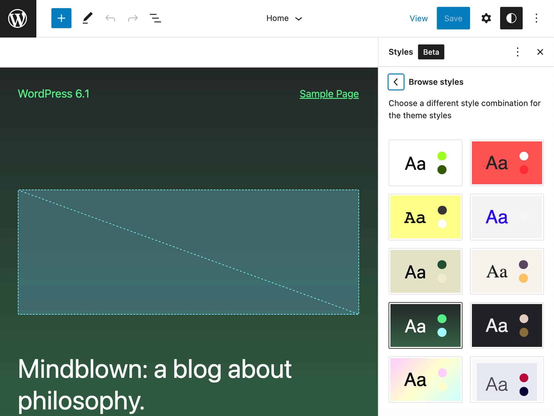
This great WordPress feature is the main characteristic of the new default theme, as Twenty Twenty-Three provides ten pre-built style combinations to choose from.
You can browse these styles in the Global Style interface of your Site Editor. Here you can
- Switch global style from the Browse styles panel.
- Customize typography settings – text, links, headings, and buttons
- Edit default colors or change the color of specific elements
- Customize the layout of the main content area
- Customize the appearance of specific elements

It’s worth noting again that in the creation of so many style variations, community involvement was crucial. After the Twenty Twenty-Three project kickoff, 38 submissions were received from 19 contributors spanning 8 different countries (you can explore all projects on GitHub).
Out of 38, 10 style variations have been selected:
- Pitch is a dark version of the default style that uses Inter font family by Rasmus Andersson.

- Canary uses a single type size and a narrow column width. It also uses an interesting border-radius effect.

- Electric uses a bold color for all the typography across the site.
- Pilgrimage is a colored dark version of the base theme.
- Marigold is a soft and pleasant variation of the basic style.
- Block-Out features a duotone effect on images.
- Whisper showcases some custom elements, like the border around the edge of the page, button styles, and unique link underlines.
- Sherbet has a unique bright and colorful look

- Grapes was selected for its pleasing combination of color palette and font type.
- Aubergine is an eye-catching split-color background that is darker.
The coolest thing about style variations is that you don’t necessarily have to be a front-end developer to create your styles.
If you feel comfortable with coding, you can choose one of the .json files found in the Twenty Twenty-Three styles folder and use it as a template to build your style variation.
But if coding isn’t your thing, you can use the official Create Block Theme plugin, which you can download for free from the WordPress.org plugin directory.
First, install and activate the plugin, then navigate to the style editor. Once here, customize colors, typography, and layout according to your preferences and save your changes.

Once you’re happy with your changes, find Create Block Theme under Appearance in the WordPress admin menu.

Check the last item down in the list: Create a style variation. You will be asked to assign a name to your style variation. Enter the name and click on Create Theme. This will create a new .json file in the theme’s styles folder.

Now you can further customize your style and even export it to other WordPress installations.
The Create Block Theme plugin is a valuable tool for taking full advantage of the theme and template creation features available with the latest versions of WordPress. While you’re at it, you might take a look at all the other options:
- Export Twenty Twenty-Three
- Create child of Twenty Twenty-Three
- Clone Twenty Twenty-Three
- Overwrite Twenty Twenty-Three
- Create blank theme
- Create a style variation

Summary
While at first glance the new default WordPress theme may look like a kind of featureless empty box, on closer inspection, it is much more than that, as it allows you to make the most of the latest WordPress site editing features.
In Twenty Twenty-Three, you will see many templates and template parts to customize, a set of 10 style variations to use as the basis for creating unique websites, and support for all the new features available in WordPress 6.1, starting with Fluid Typography and Improved Template System.
With Twenty Twenty-Three, the feeling is that the difference between site appearance and functionality is now stark. The only function of the theme is to regulate the appearance of the site, leaving the addition of functionality to the plugins. And from this point of view, Twenty Twenty-Three does a great job, offering WordPress users all the latest Gutenberg site editing features. Customizing the look of a website has never been easier.
Up to you now. Have you already used the new theme in a test environment? Have you tried creating custom style variations yet? Share your thoughts with us in the comments below.

Carlo is a passionate lover of webdesign and front-end development. He has been playing with WordPress for more than 20 years, also in collaboration with Italian and European universities and educational institutions. He has written hundreds of articles and guides about WordPress, published both on Italian and international websites, as well as on printed magazines. You can find him on LinkedIn.

