WordPress 5.0 is just around the corner, and many of us feel excited and worried at the same time. Gutenberg brings a great change in how we use WordPress, and there is definitely some concern regarding what will happen to our websites if we should update our installations without previously testing it. But don’t worry, we have a post about how to disable the Gutenberg WordPress Editor (even if it’s just temporarily) in order to prevent unsupported themes and plugins from breaking our websites.
You may be surprised to know that we are already using WordPress 5.0. Actually, we are! As Matt stated on Make WordPress blog:
If we keep the 5.0 release to strictly 4.9.8 + Gutenberg, we will have a release that is both major and a non-event in terms of new code. It’s all battle-tested. In some ways, 5.0 is already de facto out in the wild, with some forward-looking hosts already installing and activating Gutenberg for new installs.
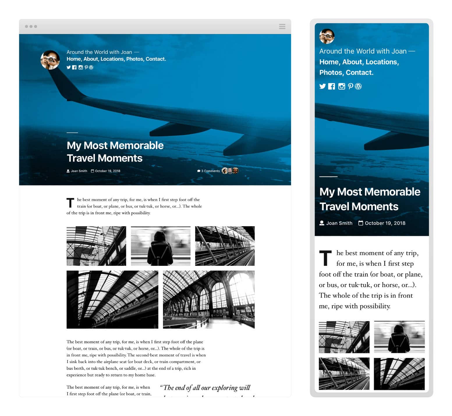
This means that we already have WordPress 5.0 running on our servers: it’s just WordPress 4.9.8, with Gutenberg in the core. Actually, that’s not all, because WordPress 5.0 comes with an additional entry, which is the brand new Twenty Nineteen default theme.
So let’s dive in and see what’s new.
- About Gutenberg and Twenty Nineteen
- Installing Twenty Nineteen
- The Look and Feel of Twenty Nineteen
- Theming for Gutenberg: A Developer’s Approach
About Gutenberg and Twenty Nineteen
Some of you may dislike Gutenberg. Moreover, the debate over the new editor is far from being over, but consider the declared scope of Gutenberg:
These custom blocks change how users, developers, and hosts interact with WordPress for building rich web content easier and more intuitive, democratizing publishing and work for everyone, regardless of technical ability.
This is what Gutenberg aims to, and Twenty Nineteen brings things a step forward, being built with Gutenberg and for Gutenberg. It’s a minimal, typography-driven blogging theme with a single-column layout, and can be used to build a wide range of websites, going from personal blogs to small business websites.
Writing about Twenty Nineteen mostly means we are writing about Gutenberg. In Twenty Nineteen Gutenberg allows users not only to create rich content but even to build their entire websites in the editor. According to Allan Cole on Make WordPress blog,
Gutenberg grants users an unprecedented level of freedom to customize their site’s layout and design. In order to fully achieve their vision, users will need a new generation of flexible themes, built to take advantage of the creative freedom that Gutenberg offers.
With that in mind, WordPress 5.0 will launch with a brand new default theme: Twenty Nineteen
In the Twenty Nineteen theme, Gutenberg is more than a content builder, it’s a site builder, and WordPress users will be allowed to build their entire websites taking advantage of blocks. And if Gutenberg isn’t your thing yet, most of the popular page builder plugins are also adding support for Gutenberg.
(Suggested reading: An Introduction to the Twenty Twenty Theme)
Installing Twenty Nineteen
Twenty Nineteen should follow the release plan of the new WordPress major release. However, WordPress 5.0 should be released on November 19th, and it’s possible that a working version of Twenty Nineteen won’t be ready by that date. See all possible release dates for WordPress 5.0. Anyway, the theme is available for download on Github, and will stay there until it’s merged into core.
Twenty Nineteen is based on both the _s and gutenberg-starter-theme and comes with Sass inside. Once you’ve got the .zip package, extract the theme and upload/move the theme folder onto the /wp-content/themes directory of your development installation. You can also upload it from your WordPress dashboard.
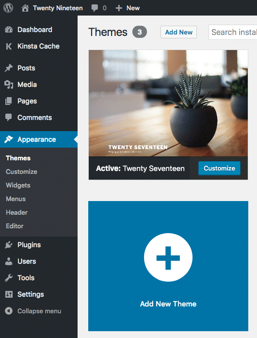
Kinsta clients can install it on their staging environments. If you’re not with Kinsta, you can still install it on your local machine.
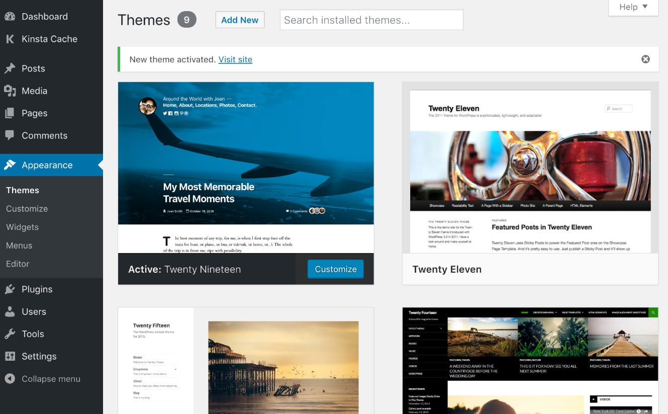
The Look and Feel of Twenty Nineteen
The single-column layout emphasizes the content and best fits to full and wide width blocks. The theme now supports a footer sidebar and comes with three navigation menus: the Primary menu and the Social Links Menu, both positioned in the page header, and the Footer Menu, located in the footer.

The blog page looks like a regular blog page with featured images enabled. Single posts and pages show best the potential of the current version of Gutenberg as site builder.
Since it is totally based on Gutenberg, Twenty Nineteen’s features mostly depend on Gutenberg’s development cycle and on the availability of blocks. We can add widget blocks, shortcode blocks, galleries, HTML code, and so on. However, all these blocks are far from covering all our needs. But luckily we have several plugins that allow us to add new blocks to Gutenberg, like Atomic Blocks, Advanced Gutenberg and Stackable. There are even projects like the Gutenberg Cloud which have sprouted up.
If you’d think that the theme looks too minimal, consider that Twenty Nineteen is still a work in progress. We’re not sure whether it will be merged into the core by the time WordPress 5.0 will be released, and we can expect several additions and bug resolutions in the next future. Moreover, there are a lot of issues that are still unresolved, and features that need to be implemented. Now Twenty Nineteen supports submenus but not Custom Headers and Video Headers. Anyway, we may expect additional features to be added in a reasonable lapse of time.
If you’re interested in the state of the theme, check out the full list of issues on Github.
Theming for Gutenberg: A Developer’s Approach
Out of the box, Gutenberg provides basic support for block styles in themes, and theme developers are free to override Gutenberg’s default styles with their custom styles. But developers can also completely omit custom styles and decide to rely exclusively on Gutenberg to style blocks on the front of the site.
Having an editor that looks and feel like the resulting content improves the writing experience of the author, and allows everybody to feel comfortable with the UI.
Anyway, some Gutenberg’s styles and presentational features require themes to expressly add support for them, and this can be done by calling add_theme_support in the functions.php file when the after_setup_theme action is triggered. Here is an example of a feature implementation:
function mytheme_setup() {
    // Add support for Block Styles
    add_theme_support( 'wp-block-styles' );
}
add_action( 'after_setup_theme', 'mytheme_setup' );
Below is listed a selection of these Gutenberg features, some of which are also supported by Twenty Nineteen. You’ll find the full list of features in Gutenberg Handbook.
Adding Support for Gutenberg Block Presentation Styles
One of the goals of the team behind Gutenberg was to build a flexible system for styling within themes, and to get as close as possible “to visual parity between front-end and the editor”. The purpose is to give the user an accurate preview of the content as it will look like on the front-site.
To achieve that goal, the team had to separate presentational styles and structural styles. By default, presentational styles are not loaded on the front-end, in order to avoid to affect the site appearance. Anyway, new themes can take advantage of Gutenberg’s presentational styles by simply enabling them with the following registration (see the Handbook for further details):
// Add support for Block Styles
add_theme_support( 'wp-block-styles' );
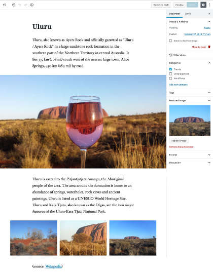
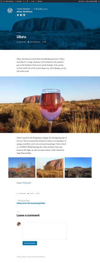
As you may expect, Twenty Nineteen supports Gutenberg’s block styles. The single post page looks on the front-end much like the editing post page, with the sole difference of the featured image, which displays on a desktop as a background image covering the whole viewport. The image below shows Gutenberg in action on the back-end.
And here is the same post on the front site.
Wide and Full Alignments
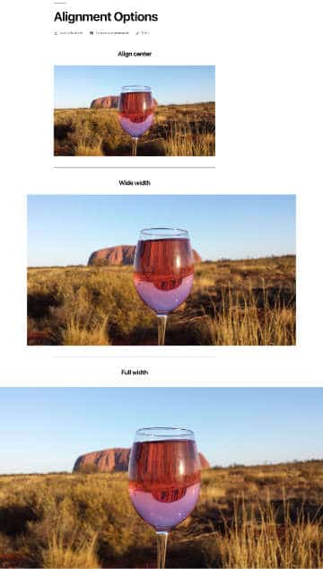
Gutenberg also provides two additional alignment options: wide and full-width alignment, but you can select Wide or Full-width alignment only if your theme supports them. If it does, Gutenberg shows two additional alignment icons.

The image below shows Align center, Wide width and Full-width images in Twenty Nineteen.
Theme developers can add support for Wide and Full-width alignments by enabling them in the functions file with a single statement:
// Add support for full and wide align images
add_theme_support( 'align-wide' );
Once we’ve added support for Wide and Full-width alignments, we should provide the CSS declarations for two additional CSS classes: alignfull and alignwide. Twenty Nineteen provides the following styles:
.entry-content > *.alignwide,
.entry-summary > *.alignwide {
    margin-left: auto;
    margin-right: auto;
}

@media only screen and (min-width: 768px) {
    .entry-content > *.alignwide,
    .entry-summary > *.alignwide {
        margin-left: calc(1 * (100vw / 12));
        margin-right: calc(1 * (100vw / 12));
        max-width: calc(10 * (100vw / 12));
  }
}

.entry-content > *.alignfull,
.entry-summary > *.alignfull {
    margin-top: calc(2 * 1rem);
    margin-right: 0;
    margin-bottom: calc(2 * 1rem);
    margin-left: 0;
    max-width: 100%;
}

.entry-content .wp-block-image.alignfull img {
    width: 100vw;
    margin-left: auto;
    margin-right: auto;
}
Note: Be careful when using this option, because it may cause issues if you switch theme (read more on this topic on Github).
Editor Style
The Editor Style is a feature introduced with WordPress 3.0 allowing theme developers to add custom styles to the TinyMCE editor. Gutenberg also supports this feature, but it works differently from the Classic Editor, which loads styles directly into the iframe of the editor. Gutenberg adds specific CSS selectors, as it doesn’t use an iframe.
We can add support for editor styles as follows:
// Add support for editor styles
add_theme_support( 'editor-styles' );
// Enqueue editor styles
add_editor_style( 'style-editor.css' );
This feature is also supported by Twenty Nineteen. You can dive deeper into this topic in Editor Style in Gutenberg.
Block Color Palettes
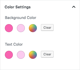
Gutenberg provides a generic color selector in the editor’s Color Settings panel. Theme developers can enhance this tool by adding custom color palettes allowing users to quickly pick up the right color for block background and text. This is a two-step process:
First, we have to provide an array of colors:
add_theme_support( 'editor-color-palette', array(
    array(
        'name' => __( 'hot pink', 'themeLangDomain' ),
        'slug' => 'hot-pink',
        'color' => '#f865b0',
    ),
    array(
        'name' => __( 'classic rose', 'themeLangDomain' ),
        'slug' => 'classic-rose',
        'color' => '#fbcaef',
    ),
) );
Then we have to declare the corresponding styles in the theme’s stylesheet:
.has-hot-pink-background-color {
    background-color: #f865b0;
}

.has-hot-pink-color {
    color: #f865b0;
}
Class names start with has-, followed by the color slug in kebab case, and ending with the context, which can be color or background-color. Currently, Twenty Nineteen doesn’t support block color palettes, but we can easily change this with a child theme.
Instead, if you’d want to disable a custom color palette, you have to add the following line to your theme’s or child theme’s functions file:
add_theme_support( 'disable-custom-colors' );Block Font Sizes
A theme can also override Gutenberg’s default set of font sizes. Here is an example of the code you should add to the functions file:
add_theme_support( 'editor-font-sizes', array(
    array(
        'name' => __( 'extra-small', 'themeLangDomain' ),
        'shortName' => __( 'XS', 'themeLangDomain' ),
        'size' => 10,
        'slug' => 'extra-small'
    ),
    array(
        'name' => __( 'small', 'themeLangDomain' ),
        'shortName' => __( 'S', 'themeLangDomain' ),
        'size' => 12,
        'slug' => 'small'
    ),
    array(
        'name' => __( 'regular', 'themeLangDomain' ),
        'shortName' => __( 'M', 'themeLangDomain' ),
        'size' => 16,
        'slug' => 'regular'
    ),
    array(
        'name' => __( 'large', 'themeLangDomain' ),
        'shortName' => __( 'L', 'themeLangDomain' ),
        'size' => 26,
        'slug' => 'large'
    ),
    array(
        'name' => __( 'larger', 'themeLangDomain' ),
        'shortName' => __( 'XL', 'themeLangDomain' ),
        'size' => 36,
        'slug' => 'larger'
    ),
    array(
        'name' => __( 'huge', 'themeLangDomain' ),
        'shortName' => __( 'XXL', 'themeLangDomain' ),
        'size' => 56,
        'slug' => 'huge'
    )
) );
The new font sizes will be added to the font size picker in Gutenberg’s Text Settings.
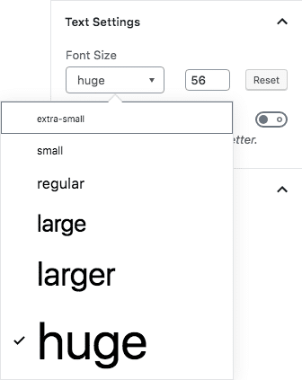
Following, we have to declare the corresponding styles in the theme’s stylesheet. The class name should begin with has-, followed by the the font size name in kebab case, and ending with -font-size.
.has-huge-font-size {
    font-size: 56px;
}
Twenty Nineteen does not provide specific font sizes and relies on Gutenberg’s defaults.
Note: Remember that, in order to make all this code work, you should hook it through the after_setup_theme action.
Summary
Twenty Nineteen could work well for personal blogs, and you could think of it more like a white canvas than a fully functional WordPress theme. A so minimal approach could be a bit limiting when it comes to building websites for business and e-commerce, but don’t worry: new features should be implemented shortly, and we could see a more powerful version of Twenty Nineteen soon.
In the meanwhile, you could also have a look at some themes that are already supporting Gutenberg. Atomic Blocks, GeneratePress, Gutentype, and Divi to name a few, but many others should come soon. With WordPress 5.0 approaching so fast, supporting Gutenberg is not an option, and theme developers should embrace the new WordPress editor as soon as possible to keep ahead of the competition.
Have you installed Twenty Nineteen or any theme supporting Gutenberg? We’d love to hear your thoughts in the comments below.

