We love the web. We’d all have had to find different careers if it weren’t for Sir Tim Berners Lee’s amazing invention! Despite our passion, though, the web can be an unpleasant place.
Dark patterns can be unintentional. A marketer or developer may have thought they were doing the right thing but didn’t appreciate the issues and downsides of a feature they implemented. The worst dark patterns are intentional. A page tricks you into doing something you didn’t intend because the UI or wording manipulates your actions. Users are increasingly wise to the most dubious techniques, but someone, somewhere, will fail to spot they’ve been duped until it’s too late.
When used well, the web can save time, travel, and energy. On the flip side, dark patterns waste millions of work hours and kilowatts. We won’t shame any particular sites (they know who they are), but we’ll illustrate improvements and alternative options where possible.
These are our pet peeves.
Unintuitive User Interfaces
These are the most common dark patterns you’ll come across. It takes time and consideration to create a great user experience… and you can spoil all that effort very quickly with these obtrusive dark patterns.
“Install Our App!”
Some sites and social networks prompt you to install their app — typically when clicking an email alert about a new message or follower. The link opens in a web page with two buttons:
- A huge “Use Our App” button. Clicking it leads to the AppStore, where you must approve, download, install, then launch the site’s native app (presuming it’s supported on your phone). You must then log in, get the password wrong, request a reset, open the link, create a new password, and access the system. You’ve possibly forgotten why you were there, so head back to the original alert and start again.
- A microscopic “continue in mobile web” link to perform the action.
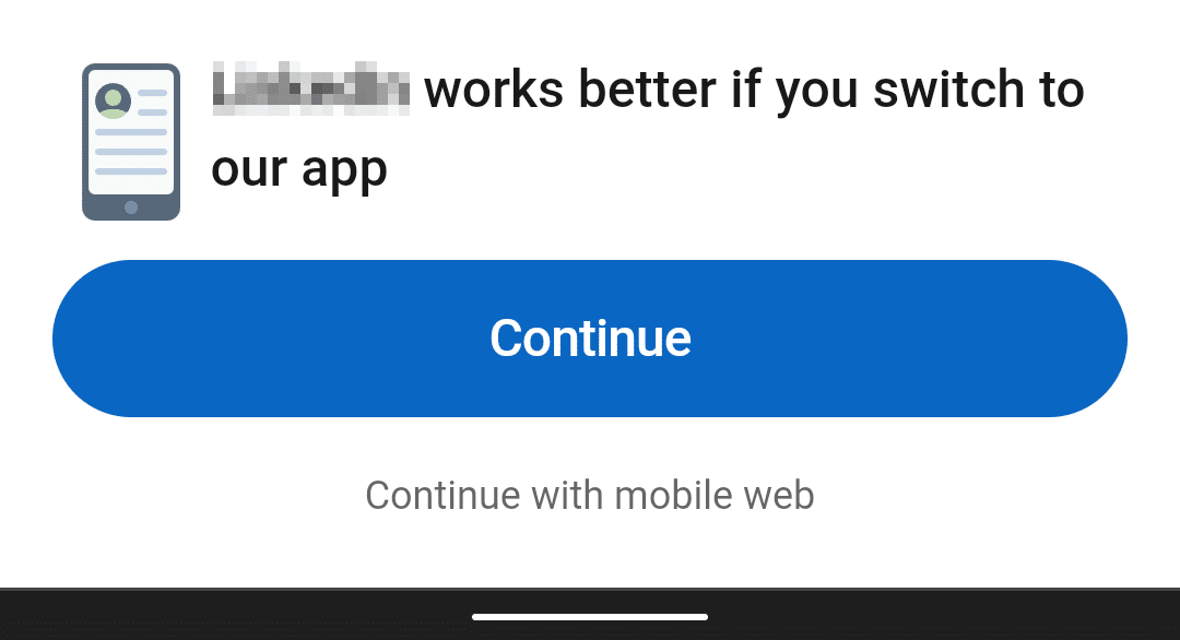
Perhaps the app is glorious and has had millions spent on it, but it’s rare to find one with more functionality than the website. Of course, an app can collect more personal data than a web system, so it gets a more intrusive promotion.
Promote an app by all means, but doing it at the start of every interaction annoys users. Some will install the app to stop the nagging, but others will leave. Would it be more effective to offer the app when the user’s been using the site for a while?
“Would You Like to Receive Notifications?”
In a word: No.
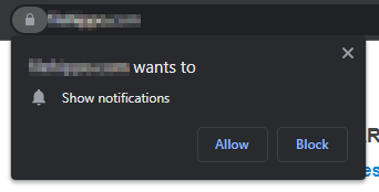
Newsletter sign-ups, web-based push notifications, “let’s chat” widgets, and survey prompts could be useful, but their implementations are universally awful.
Sites often prompt you to subscribe the moment you access for the first time following a web search. At that point, you have no idea whether the content is relevant, whether it’s any good, or whether the site is somewhere you’d consider visiting frequently. It’s unsurprising to discover most people click “No.”
There’s nothing wrong with offering notifications or newsletters, but it’s best to ensure a user has engaged with the site first. Perhaps display a prompt at the end of the article or after they have visited a few times. It’s less intrusive, less distracting, and more likely to succeed.
Finally, please don’t prompt users to sign-up for a newsletter when they click a link in the newsletter! It will drive them away faster than it will draw them in.
Quirky Navigation
Header bars and drop-down menus may be boring, but people understand them. We don’t want to stop UI evolution and design inventiveness, but some navigation controls are weird and illogical.
Please reconsider your design if you need to prompt users with “click here” tooltips or other help methods. Good UIs need no explanation.
Unnecessary Scroll-Jacking
Showing animations or updating active menu items when the page scrolls can be an engaging experience. It’s less useful when:
- Animations are overused. Animating too many elements distracts the viewer — highlighting every item means nothing is brought to the user’s attention. A few subtle effects to focus on important messages works better.
- It breaks the context. Scrolling should not lead to unexpected actions such as content disappearing, modal dialogs, form submissions, redirects to other pages, etc.
Animation can also cause motion sickness and vertigo, so consider using the CSS prefers-reduced-motion media query to disable effects.
Please stop creating infinite-scrolling pages! Links to related content are useful, but auto-loading random content without the user’s consent wastes bandwidth. It makes it difficult to bookmark either page, making it impossible to reach contact details and other information in the page footer.
Unnecessary Multi-Page Articles
We’ve all seen “articles” which contain a paragraph of text followed by a link to the next page. These pages are generally link bait without substantial content — but you won’t discover that until you’ve waded through a multitude of advertisements and page impressions.
Asking web marketers to stop this practice is futile, but perhaps they’ll reconsider if developers educate people not to succumb to this nonsense!
Manipulative Marketing
The web is the world’s biggest market, with a capacity to sell an infinite variety of physical and digital products. Users will return again and again… unless you choose to resort to dark patterns for boosting sales.
Subscription Struggles
Unsubscribing from notifications or newsletters should be as simple as subscribing, if not simpler. Asking users to jump unsubscription hurdles leads to frustration and a loss of faith in the site. There’s no credible reason to request that users fax their original birth certificate, three proofs of address, and the latest medical records.
Disguised Ads
Advertisements are over-used on many sites, but the worst examples:
- Look like a menu or option;
- Pretend to be news or information articles from the originating site; or
- Show UI controls such as a large “DOWNLOAD” button on a page about a software product.

Sites cannot always determine what ad design is used, but they do control the placement. Placing ads in prominent locations to confuse people may increase advertising revenues but will those users return?
Auto-Adding Products to Shopping Carts
Seeing a list of related or recommended products can be useful. Adding them to the user’s cart without their consent is another matter. How many people will find it helpful?
- At best, a small proportion of users will notice the extra item and decide to keep it.
- A larger proportion will remove it.
- Some will not notice until delivery, then complain and demand a refund.
These activities increase sales at the expense of customer support, goodwill, and ongoing return purchases. Dealing with complaints and refunds can offset any short-term increase in profitability.
Hidden Shopping Costs
It isn’t enjoyable to spend time choosing a product, signing up, entering your delivery details, and posting your payment information to discover the price has risen above competing sites. The summary page now shows hidden costs such as delivery, insurance, handling, and we-hope-you-won’t-notice-this charges.
Pricing should be clear and honest, or customers will lose faith in the ecommerce service. When delivery costs vary significantly, prompt the user to enter their country or zip code before committing to buying.
Artificial Stock Scarcity and Availability Timers
It’s useful to know when an item is in stock, but some ecommerce sites stretch credibility. The more information they give, the less believable they become:
“BUY NOW! 2 items in stock, 15 were bought in the past 3 minutes, and 597 people are viewing this page.”
These high-pressure tactics become more suspicious when applied to digital or high-value items such as cars and vacations.
Users soon realize these messages are worthless when items remain in stock over many days. Will they continue with their purchase when the site’s marketing messages cannot be trusted?
Opt-Out Shaming
Even certain large ecommerce companies indulge in silly shaming techniques. They’ll present a sign-up question followed by a large “Agree” button and a smaller opt-out link such as:
- “No — I don’t want unlimited free delivery.”
- “No — I don’t care about the plight of endangered fluffy animals.”
- “No — I do want to see the planet burn.”
Does this practice work? Perhaps. But does it establish an honest relationship with the customer and increase trust in the site?
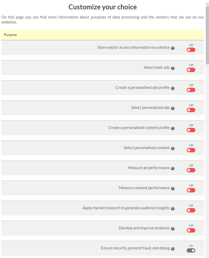
Complex Cookie Cancellations
The EU’s General Data Protection Regulation (GDPR) requires sites to show an opt-out notice for non-essential cookies and similar tracking technologies. It’s flawed, but the legislation is well-meaning and a legal requirement throughout Europe. Other countries may have similar rules, although they’re usually less stringent.
Most users will opt-in and move on without thinking (which partly defeats the point of the legislation). Opting out should be just as easy, yet some sites require you to:
- wade through pages/tabs of jargon before finding the options;
- click dozens of checkboxes even though this breaches GDPR rules; and
- wait for up to a minute while they “save your preferences” (to what?).
It may persuade some users to hit “agree to all,” although others will abandon the site or switch to reading mode to hide the cookie notice. At best, making opt-outs difficult gives the impression the site has something to hide. At worst, this dark pattern is on the fringe of legality and could lead to fines or increased lawyer costs.
Terrible Technology
Technologies such as HTML are usable, accessible, and backward-compatible out of the box. It takes special effort to throw away those benefits.
Breaking Browser Functionality
The back button was the web’s biggest contribution to user interfaces. It’s practical and understood by anyone with minimal technical experience. Yet sites break it by opening new windows/tabs, expiring the previous page, or telling users not to use browser controls.
There are no technical reasons to break browser functionality. Attempting to circumvent the controls is a design problem that confuses users and makes a web system less usable.
Other problems to avoid:
- Do not disable the right-click or long-tap menus.
- Do not disable copy or add further “useful” text.
- Do not break bookmarking in your Single Page App by failing to update the URL.
But the worst of all these issues is next up on our list.
Disabling Paste on Password Fields
Disabling paste for any reason is unnecessary. Disabling paste on a password field is obnoxious, but you’ll encounter this restriction on large sites — they should know better. I’ve seen it employed by major international banks.
The practice is probably implemented for dubious security reasons. If the user cannot paste, it stands to reason that they can’t reuse a password from elsewhere. Unfortunately, it also prevents people from using a password manager application. It’s no longer possible to generate highly secure, long, random strings which are impractical to type.
Besides, developers can disable paste restrictions with some DevTool tinkering. Others would struggle, and they’re more likely to use weak passwords. Never disable paste — it’s less work for you and improves system security.
Silly Password Restrictions
“Your password must be between 8 and 12 characters and requires at least one uppercase character, a number, and a symbol — but please don’t use ` ‘ ” / \ or ;”
There’s no good reason for implementing strict password restrictions. Ask yourself:
- Is the system storing the password as plain text in a database rather than hashing it?
- Has a security expert suggested stopping people from using easy passwords such as password, qwerty, or 123456? This is true, but it also prevents people from using more complex passwords and provides a handy template for brute-force cracking.
A single rule enforces strong passwords: a long minimum length. Every additional character exponentially increases complexity and cracking times.
Mobile Content Jump
Reading content on a smartphone can be a frustrating experience. You’re engrossed in an article when the content jumps off-screen, and you lose your place. You then spend several seconds frantically scrolling up and down. Or worse, you’ll click a link or button the moment it moves, and an unexpected action occurs. Some readers will lose their momentum, give up, and leave before you can convert them to a customer.
Content jumping occurs when an image or iframe (typically an advertisement) loads above the viewport scroll point. Once the content has loaded, the browser can determine its dimensions and place it on the page. Therefore, a 500px height image (shown at full size) pushes the content down by the same amount.
Google’s Cumulative Layout Shift (CLS) metric measures content jumps and penalize sites accordingly. This was a complex problem, but several technical solutions are now available:
- Add width and height attributes to HTML
imgandiframeelements or use the CSSaspect-ratioproperty to reserve space on the page before the asset loads. - Set dimensions for container elements enclosing slower-loading assets such as ads, images, and social media widgets.
- Request larger images as early as possible and consider using preload links in your HTML
head. - Optimize web font usage and use similarly-sized fallbacks to minimize layout shifts.
- Avoid inserting elements toward the top of the page unless it’s a DOM update triggered following a user action such as a click.
- Use CSS containment to optimize the rendering of content blocks. It may be possible to define elements that will not affect the sizing or position of others.
When Social Sign-On Sucks
Technologies such as OAuth allow users to quickly register on a site using another account like Google, Facebook, Twitter, LinkedIn, or Github. Implemented well, it’s a practical option that provides a slicker sign-up process, saves time, and leads to higher conversions.
If poorly implemented, a site will subsequently demand you enter your email, personal details, and even a password “for their records.”
Not all providers will pass user information, so avoid OAuth if your site requires these details to be functional. OAuth should never become an unnecessary step that slows down the registration process.
Poor Web Performance
According to the HTTP Archive, the average web page takes seven seconds to load on a desktop device and twenty seconds on mobile. A single page view makes 70 HTTP requests, downloads more than 2MB of data, and emits 1.3g of CO² into the atmosphere (see the Website Carbon Calculator). This is an average — many sites are worse.
No one sets out to make a slow site, but adding features often outranks performance improvements. Given it’s possible to create a playable Quake clone in 13Kb, you have to question why two paragraphs of marketing waffle on an “About us” page requires a download that’s 154 times larger!
Addressing performance requires a combination of techniques, but you need to remember just one key point: don’t send so much stuff!
Sneaky Social Media Widgets
Social media widgets such as “Like” buttons look innocent but:
- Each one adds hundreds of kilobytes of JavaScript code which impacts page performance.
- The code is a security risk since it runs with the same permissions as the site’s JavaScript.
- The widgets implement user tracking even when they are not activated. This could lead to legal issues in some territories.
- Almost no one uses them: you’ll be lucky to see 1% user engagement.
The widgets are also unnecessary. Most social media sites provide standard links which retain sharing without any risk to performance, security, or privacy, e.g.
-
- Email:
mailto:?subject=[title]&body=[url]
<li
- Email:
>Facebook: https://www.facebook.com/sharer.php?u=[url]
- Twitter:
https://twitter.com/share?url=[url]&text=[title]
<li>LinkedIn: https://www.linkedin.com/shareArticle?url=[url]&title=[title]
- Reddit:
https://reddit.com/submit?url=[url]&title=[title]
</li</li
Where [url] is the current page URL and [title] is the main heading. A standard <a> link works fine, but you can enhance it to open the page in a pop-up window if you want them to behave identically to the standard buttons.
CAPTCHAs
CAPTCHA is short for Completely Automated Public Turing test to tell Computers and Humans Apart. It helps prevent bots or other machines from accessing web systems. You’re often asked to enter the text shown in an indecipherable image or click squares that contain bicycles. (Does a bike mounted on a car count? What about that tricycle? Is there a bike behind that wall!?)
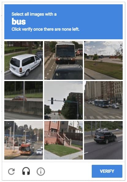
CAPTCHAs have three fundamental problems:
- They’re purposely difficult for non-disabled humans with perfect vision. How are those with visual or other impairments expected to cope?
- They have to become more complex as bots and AI techniques improve.
- They place the onus for access security on users — not the site owners or developers, the primary beneficiaries.
CAPTCHAs are overkill on most websites. You could consider alternative options to CAPTCHAs that cause less human effort:
- Hidden honeypot fields block form submission when bots add data.
- Check that keyboard events such as
inputorkeydownare triggered appropriately. - Check the time it takes to complete and submit a form — bot activity is often instantaneous.
- Create a two-stage submission process that asks the user to confirm their data or an additional question before submitting.
These will stop most bots. It’s possible to bypass any of the techniques, but it requires additional development effort specific to your site. Few bot developers will bother when there are thousands of other sites with known vulnerabilities.
Summary
The web is a great place, but a few dubious practices can ruin that perception. Of course, you can be conned anywhere, but the web allows perpetrators to reach thousands of people with little cost or effort. And when big multi-billion businesses use dark patterns recklessly, it’s downright shameful!
Sites use dark patterns because they work. But it’s short-term thinking. Visitors always become wise to nefarious techniques and may never return.
Do the right thing, build trust in your brand, and you’ll retain customers without having to resort to dark patterns.
Got any other thoughts on dark patterns you’ve encountered? Please share them in the comments section below!