If you clicked on this article, you’re probably in the following situation: you have a critical dataset to analyze, but you don’t know any good data visualization tools.
Thankfully, you’ve come to the right place.
In this article, we’ll teach you everything you need to know about data visualization tools, including what they are, why you should use them, and 11 potential tools we recommend trying.
Ready? Let’s start!
What Is Data Visualization?
Data visualization is the process of creating a visual representation of a data set’s trends, patterns, and critical insights. A data visualization tool is software that helps you create a visualization.
Though you may not work with data every day, you’ve likely used many different types of data visualizations before. Some of the most popular visualizations include:
- Pie charts, which show percentage breakdowns
- Tables, which show data that’s too complicated for text
- Timelines, which offer a sequence of events over time
- Histograms, which show the distribution of a dataset made up of continuous or discrete data
- Gantt charts, which show the timeline of a project
- Box-and-whisker plots, which offer a dataset’s five-number summary (which includes the minimum, first quartile, median, third quartile, and maximum figures)
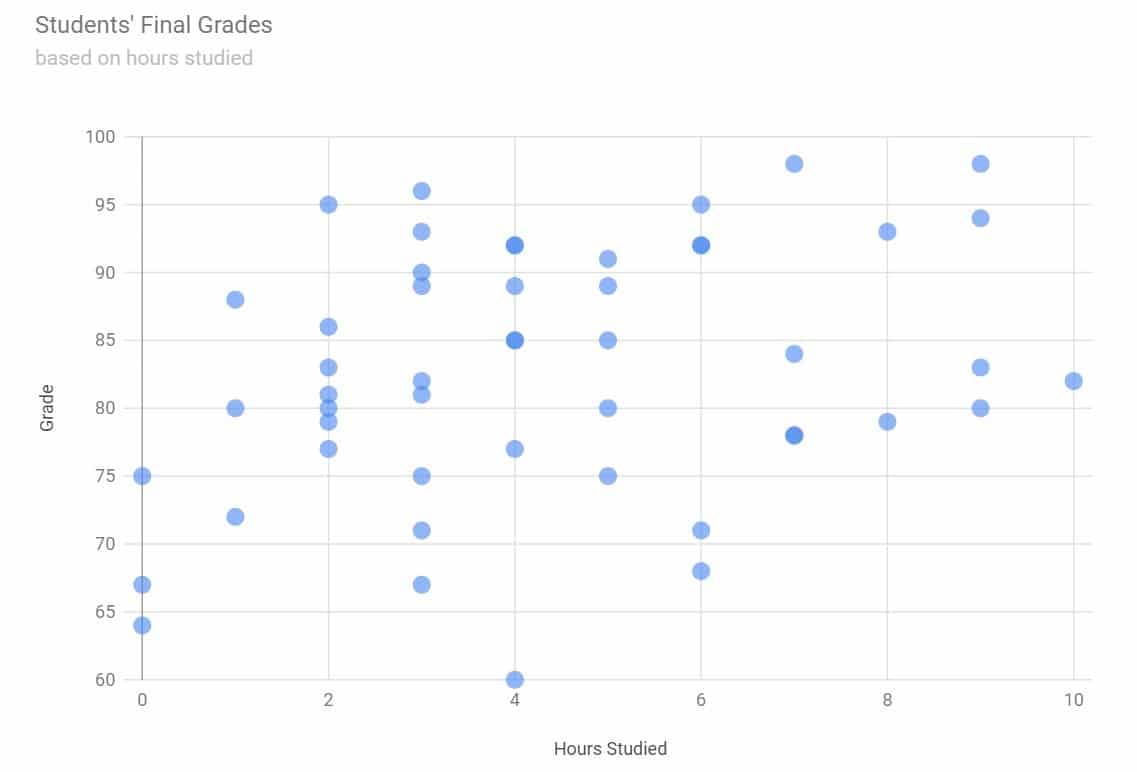
- Scatter plots, which show a relationship between two sets of data (like height vs. weight)
- Bar charts, which show the distribution of data in two categories (like the results of A/B tests)
There’s no “one” way to create a data visualization, though the general process of creating one looks like this:
- Step 1: Gather your dataset
- Step 2: “Clean” your data to ensure it’s consistent and error-free
- Step 3: Export your dataset into your data visualization software
- Step 4: Use the software to generate visualizations
- Step 5: Assess the reliability and validity of your visualization and use the chart as you please
When discussing data, it’s important to note that “reliability” and “validity” are separate things. “Reliability” refers to how well your data and the methodology behind it measures the thing you’re evaluating, while “validity” refers to how accurate your data itself is.
Why Data Visualization Is Important
Data visualizations are very useful, as they can help you:
- Discover BI Insights: Business Intelligence (BI) insights are vital pieces of information that inform your decisions.
For example, if you analyzed your email open rate, it’d be a BI insight to say that your click-through rate (CTR) was higher on emails sent through MailChimp instead of GetResponse. The insight will likely influence which platform you use.
- Convey Complicated Or Detailed Results To Others: Visualizations can help you explain what your data says to your boss, investors, coworkers, or the media — as they reduce complex data into easily digestible graphics.
For example, if you were doing A/B testing on your WordPress site, you could use data visualization to display results for both the “A” and “B” outcomes so that they are easy to understand.
- Analyze And Understand Hidden Trends In Your Business Data: While some trends are obvious by looking at a dataset, many datasets are too large to interpret without visualizations.
For example, if you were analyzing your ad retargeting results from a whole year, a data visualization would show you seasonal spikes that you likely couldn’t notice by looking at week-on-week results.
- Compare Figures In Big Data Sets Quickly: You don’t have to own a big business to generate a lot of data.
Many businesses track data like their website conversion figures. These datasets contain results from hundreds of visitors, so analyzing the data manually would be extremely time-consuming.
Common Features of Data Visualization Tools
Although every data visualization tool is different, most tools share some common (and very helpful) features. This section will briefly describe these features and why they are essential when selecting your ideal tool.
Data Importing API
Many tools include an Application Programming Interface (API) that allows you to import data from your data collection tool to your visualization tool. APIs speed up the visualization process, as you’d need to download your data, upload it to your tool, and format it manually without an API.
Chart Templates
Chart templates are pre-set designs that you can use to create an attractive visualization quickly. These are perfect if you aren’t a graphic designer or a data analyst, as you simply insert your data into the chart.
Most chart templates will also let you customize your chart’s colors, fonts, and headers.
Interactive Charts
Interactive charts react when you interact with them, meaning you can highlight key figures, trends, or variables without creating different visualizations for each analytic.
Version History
Version history allows you to view and restore old versions of your data visualizations — meaning you can undo a mistake without losing your data.
Mobile Optimization
As the name suggests, mobile optimization allows you to alter the presentation of your visualizations to suit mobile devices.
Top 11 Data Visualization Tools
If you search for “data visualization software,” you’ll find hundreds of different options. That’s a lot of options to choose from, so to help you narrow it down, we’ve compiled a list of our top 11 tools in this section.
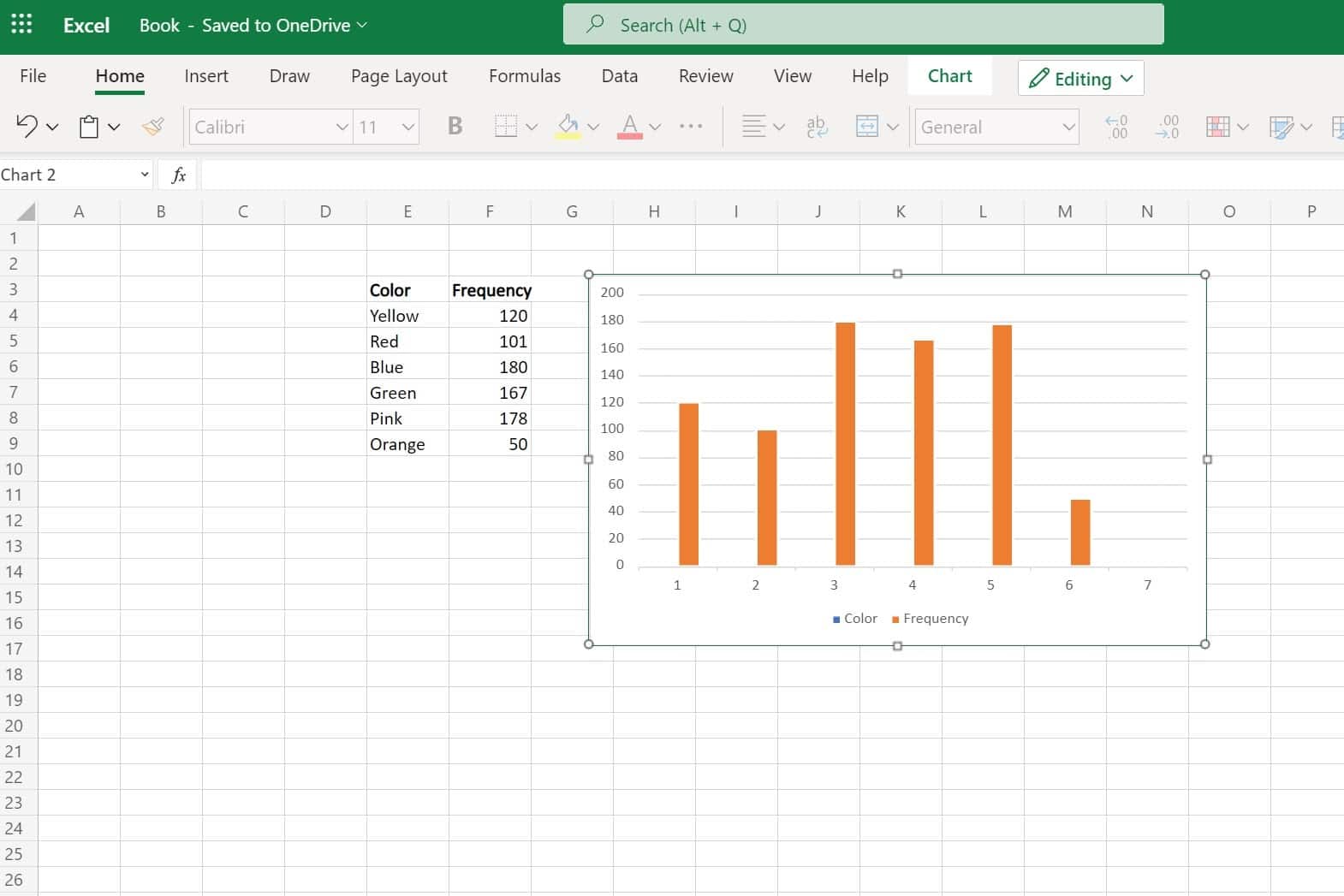
1. Microsoft Excel
Microsoft Excel is the oldest (and likely best known) program on this list. Launched by Microsoft in 1987, Excel allows you to create tables, charts, and roughly 20 other visualizations.
Top Features
- Power Pivot: An add-in that you can use to create data models and perform analysis on large data sets
- Inbuilt formulas
- Autofilter: A program that can sort your data automatically
Pros
- Available in Windows, macOS, Android, and iOS devices
- You can customize your visualization’s font, color, and features
- It comes with many Microsoft packages (so you may already have it on your computer)
- Allows you to import and export data quickly and in many file types
- Includes version history
Cons
- Can be expensive
- Difficult to use on large datasets if you aren’t a data scientist
- Not designed for teams
Pricing
One license for Microsoft Excel costs $159.99 per year or $6.99 a month if purchased with Office 365.
What It Looks Like In Practice
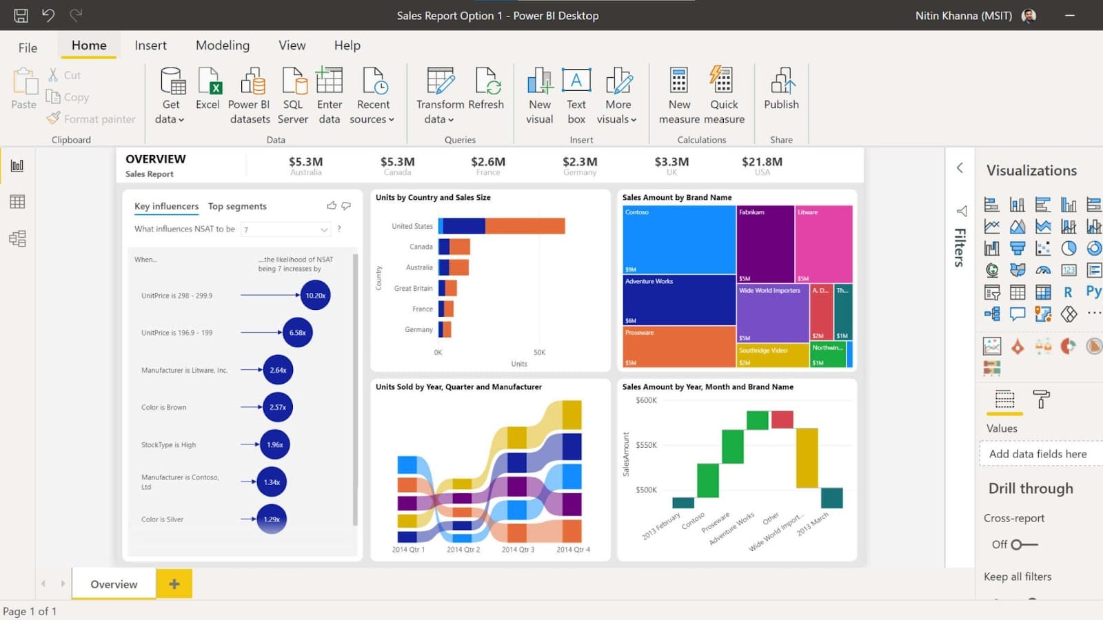
2. Microsoft Power BI
Microsoft Power BI is Excel’s younger and brighter cousin. Power BI allows you to create data visualizations individually or within reports.
Top Features
- Microsoft AI: An artificial intelligence (AI) program that can prepare and analyze data automatically
- Fully customizable dashboards
- Real-time visualizations
Pros
- Includes many chart templates and pre-set reports
- Has Machine Learning capabilities
- Can analyze data from Dynamics 365, Excel, SharePoint, Salesforce, and Azure SQL DB (among other sources)
- Great for teams
- Can create an interactive data visualization
- Very cyber secure
- Available on desktop and mobile devices
Cons
- Best suited for people who have analyzed data before or who use Excel frequently
- Can only handle up to 2 GB of data at a time (so not suited to extensive data sets)
Pricing
It costs $13.70 per user per month for Power BI Pro or $27.50 per user per month for Power BI Premium. Power BI also offers “per capacity” plans for large organizations.
What It Looks Like In Practice
3. Google Charts
Google Charts is a web-based tool that can create simple visualizations from small and large datasets. You can build visualizations to publish onto your website with Google Charts.
Top Features
- Cross-browser compatibility: Your visualizations will work on other (non-Microsoft) browsers like Safari, Mozilla Firefox, and Google Chrome
- Interactive charts
Pros
- You can use it to create many different types of visualizations
- Beginner-friendly
- You can use it to analyze data from any SQL database
- You can customize your visualizations with CSS editing
Cons:
- You’ll need a basic understanding of JavaScript to publish your visualization onto your website
Pricing
Google Charts is currently entirely free to use.
What It Looks Like In Practice
4. Tableau
Tableau is a powerful and well-known data visualization tool that allows you to analyze data from multiple sources at once. Salesforce owns Tableau.
Top Features
- Ask Data: A tool that can answer basic questions about your data
- Explain Data: An AI tool that explains why your dataset has outliers (outliers are data points that are abnormally different from other data points)
- Tableau Prep: A self-service data preparation tool that can create visualizations according to your instructions
Pros
- Includes a wide range of chart templates
- Can handle large volumes of data
- Can import data from a wide range of places
Cons
- It may take some time to learn to use
- Tableau Public makes your data visible to other users
Pricing
The public version of Tableau is currently free. However, Tableau also offers Viewer, Creator, and Explorer plans that start from $12, $35, and $70, respectively. It also provides enterprise plans.
What It Looks Like In Practice
5. Zoho Analytics
Zoho Analytics is a data visualization tool loved by over 2 million users — including employees at big brands like HP, Hyundai, and Suzuki.
Top Features
- Multi-user collaboration: You can grant other users permission to view and edit your visualizations
- Mobile BI app: Available on Android and iOS devices
- Automatic reports
Pros
- Includes a wide range of pre-set templates
- You can embed Zoho visualizations into your website with little or no code
- Integrates with over 500 apps (including Google Ads, Salesforce, and many social media platforms)
- It’s easy to learn Zoho Analytics as Zoho has produced video tutorials, webinars, and a product tour for users
Cons
- Zoho Analytics is best suited to people with a basic understanding of analytics and data analysis (or with the time to learn)
Pricing
Zoho Analytics offers Basic, Standard, Premium, and Enterprise plans ranging from $24–$455 a month.
What It Looks Like In Practice
6. Datawrapper
Datawrapper is an easy-to-use tool perfect for creating charts, tables, and maps for websites. Initially, Datawrapper developers built the tool for news websites, but many organizations now use it.
Top Features
- Built-in color blindness checker: Makes your visualizations color-blind friendly
- Mobile-friendly
Pros
- You can create an unlimited number of visualizations on the free account
- Easy to learn to use as Datawrapper has produced over 100 “how-to” articles
Cons
- You can only import data from a few sources
- Datawrapper’s premium plans are more expensive than competing tools
Pricing
Datawrapper offers a free plan, a custom plan for $5,990 a year, and enterprise plans.
What It Looks Like In Practice
7. Qlik Sense
Qlik Sense is a data visualization tool designed for large businesses and people who want to use augmented analytics to analyze data. Qlik Sense is the successor to “QlikView” — a similar (but smaller) visual analytics tool.
Top Features
- Visual and Advanced Data Prep: Can clean and sort your data automatically
- Insight Advisor: An AI program that can help you analyze your data and understand any BI insights you find
- Interactive charts
Pros
- Works online and offline on mobile devices
- Perfect for teams
- Scalable for large businesses
Cons
- Best suited to people with experience in data analytics
Pricing
Qlik Sense offers Qlik Sense Business for $30 per user per month and enterprise plans.
What It Looks Like In Practice
8. FusionCharts
FusionCharts is a popular Google Charts alternative. FusionCharts allows you to create visualizations to embed into web pages. Over 28,000 businesses worldwide currently use it — including tech giants like Google, Apple, and IBM.
Top Features
- Integrations: Works with JavaScript frameworks like Angular, Ember, React, and jQuery
- Compatibility: Works with server-side programming languages Java, PHP, Ruby on Rails, and Django
- Live data dashboard
Pros
- Offers over 100 different types of charts and over 2,000 choropleth maps
- Beginner-friendly
- Great user interface (UI)
- You can export charts quickly and easily
- Handles large data sets
Cons
- More expensive than many other data visualization software options
- Not available on iOS or Android devices
Pricing
FusionCharts offers the Basic package from $499 annually, the Pro package from $1,299 annually, and the Enterprise package from $2,499 annually.
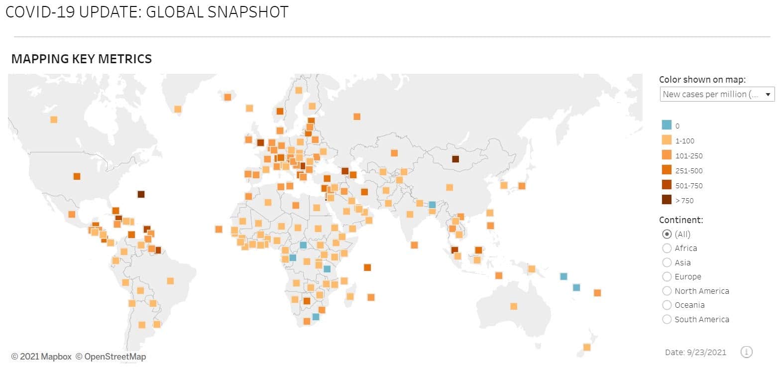
What It Looks Like In Practice
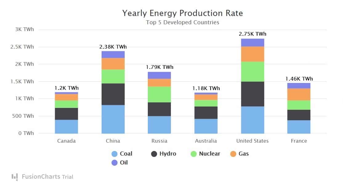
This image shows what a visualization created with FusionCharts looks like.
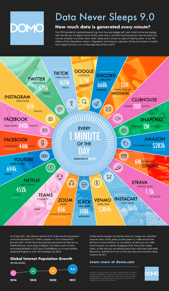
9. Domo
Domo is a BI tool geared toward businesses with complicated or large datasets. Organizations like eBay, ESPN, Cisco, and Emerson all use Domo.
Top Features
- Real-time analytics
- Interactive charts
- Buzz: Domo’s built-in chat app that allows you to communicate with your team
- App Dev Studio: An built-in program that allows you to build visualizations with HTML, Javascript, and CSS
Pros
- Extensive library of report and chart templates
- Domo has a natural language query function that can answer basic questions about your data
- Domo can analyze data from 1,000+ data sources
- Domo offers alerts that will go off when you hit a predetermined goal
Cons
- Not beginner-friendly
Pricing
Domo’s pricing is organization-specific — so you’ll need to contact the sales department for a quote.
What It Looks Like In Practice
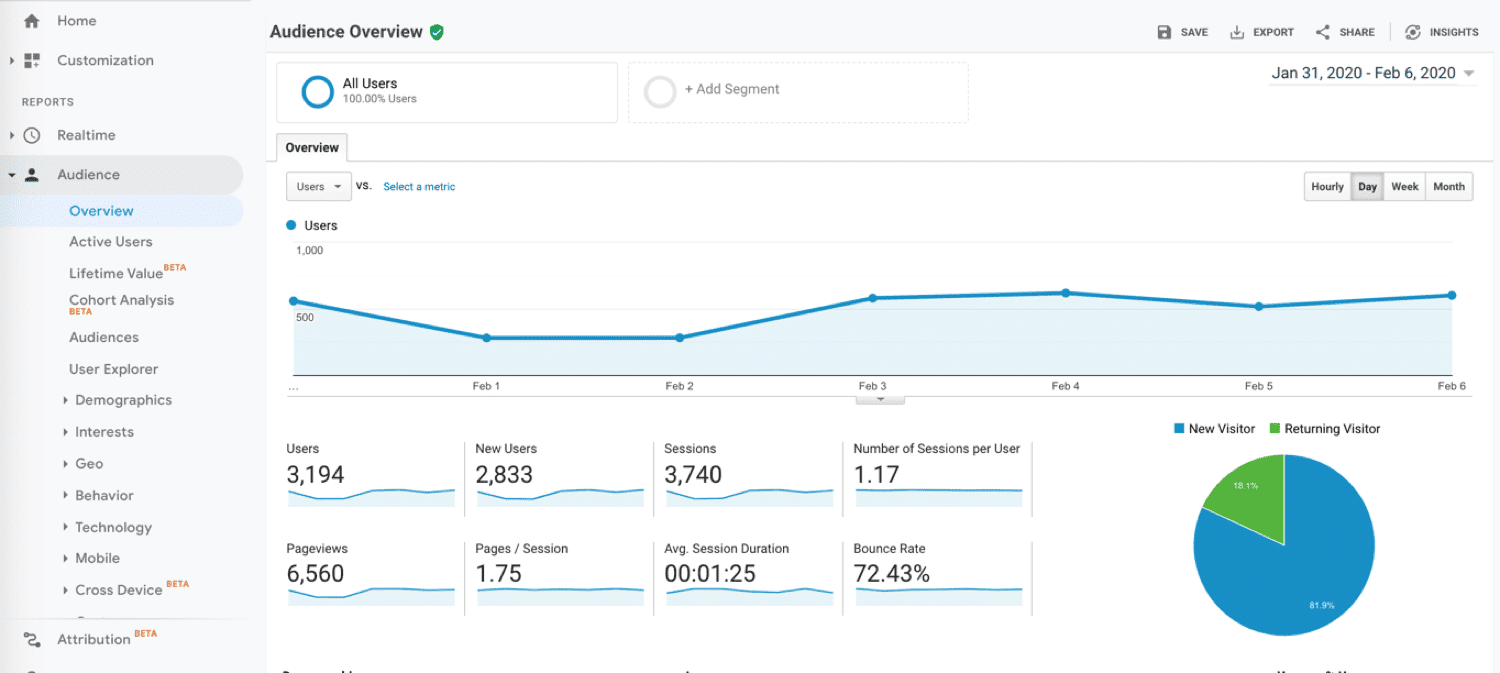
10. Google Analytics
Google Analytics is a tried-and-true BI tool that’s perfect for small, medium, and large businesses looking to analyze their website activity. Google Analytics can track critical figures like bounce rate, average session duration, and pages per session.
Top Features
- Integrations: Works with Google Ads, Google Search Console, and WordPress
- Real-time report: Shows you your website’s current activity
- Interactive dashboard
Pros
- Easy to set up
- Google Analytics collects and analyzes data on your audience, conversions, audience acquisition, and their behavior automatically
- You can export your data into other programs for further analysis
Cons
- Only suitable for analyzing web traffic data
- Only offers a few pre-set visualizations
Pricing
Google Analytics is currently free. However, Google also offers Google Analytics 360, which is organization-specific.
What It Looks Like In Practice
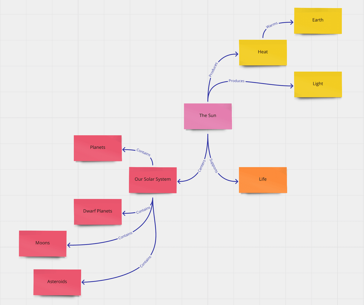
11. Visme
Visme is an intuitive program that can create data visualizations and infographics. Visme is perfect for anyone looking to make simple charts with sleek and aesthetically pleasing designs.
Top Features
- Graph maker
- Data widget library
- Animations
- Microsoft Office integration
Pros
- Visme offers many chart and infographic templates
- You can download your charts as multiple file types
- Works offline and online
- Allows you to customize your chart’s fonts, colors, backgrounds, and design
Cons
- Visme is best suited for businesses with small and medium-sized datasets
- All projects are public on VIsme’s Basic plan
- Visme is not available on Android or iOS devices
Pricing
Visme offers the Basic plan for free, the Personal plan for $15 a month, the Business plan for $29 per user per month, and enterprise plans. Visme also offers discounts for students, teachers, and non-profit organizations.
What It Looks Like In Practice
Decision-Making: What to Look For When Choosing a Tool
While we covered 11 potential data visualization tools you could use in the previous section, everyone’s ideal tool will look different. So how do you choose the right one for you?
When selecting a data visualization solution for your business, check:
How Well It Meets Your Needs
As every business uses different data, you need to check if the tool meets your needs specifically. To do this, ask yourself:
- Does the tool work with the type of data we need visualizations for?
- Does it integrate with our data collection software or Customer Relationship Management (CRM) system?
- Does it fit our skill set (i.e., if you are a beginner data analyst, is it beginner-friendly?)?
- Will it work on our devices and website?
Pricing
Price is a huge factor to consider when investing in new software. Before you click “sign up,” ask yourself:
- Can we afford the tool?
- Is the tool a good value for us?
- Is there a cheaper tool that can provide the same value?
Future-Compatibility
While the tool may meet your business needs today, will it still be helpful to you one year from now? As many tools use subscription-based pricing, you may lock yourself into a contract you’ll regret if you sign up for a tool that doesn’t scale with your business.
To assess the future compatibility of your tool, ask yourself:
- Can the tool handle a higher volume of data?
- Can we use the tool to track our key performance indicator (KPI) results?
- Will we still use the tool one year from now?
- Can it measure all of our website marketing strategies?
Data Before Visualization: Tips for Maximizing Your Data
Ultimately, your data visualization tool is just that — a tool. If the reliability and validity of your data are low, your visualizations won’t turn out well (no matter what tool you use).
So how do you ensure your data is high-quality? We recommend you:
- Identify and delete duplicate records before creating data visualizations
- Define your data formats clearly, so you don’t have data in multiple formats (like “10/2/2010” and “October 2, 2021”)
- Collect data over a long period (as collecting very short-sighted data could give you an inaccurate picture of your data)
- Identify outliers and account for them so that they don’t alter your visualizations
- Clearly define your data metrics (for example, “we define daily conversion rate as the percentage of leads that become customers from midnight day one to midnight day two”)
- Store your data in a secure, cloud-based location
- Identify data gaps and incorrect data, and fix them before creating your visualizations
- Collect data with high-quality tools
Summary
Data visualization tools are a game-changer, as they help you create high-quality visualizations quickly. Creating data visualizations has many advantages, as they allow you to:
- Generate BI insights
- Explain data to others in an engaging manner
- Spot trends in datasets that span a long period
- Easily understand complicated or large datasets
While your perfect tool will depend on your price and needs, we believe the top tools include Power BI, Tableau, and Google Charts.

Head of Content at Kinsta and Content Marketing Consultant for WordPress plugin developers. Connect with Matteo on Twitter.