
Although a bit later than originally planned, we’re getting a new WordPress default theme. Its name is Twenty Twenty-Two!
The new WordPress default theme comes with the WordPress 5.9 release. We were curious to learn more about the new theme, so we installed and tested Twenty Twenty-Two on a local development environment running WordPress 5.9.
We’ll show you our results before wrapping up our thoughts to bring you an in-depth overview of the ins and outs of the new WordPress theme.
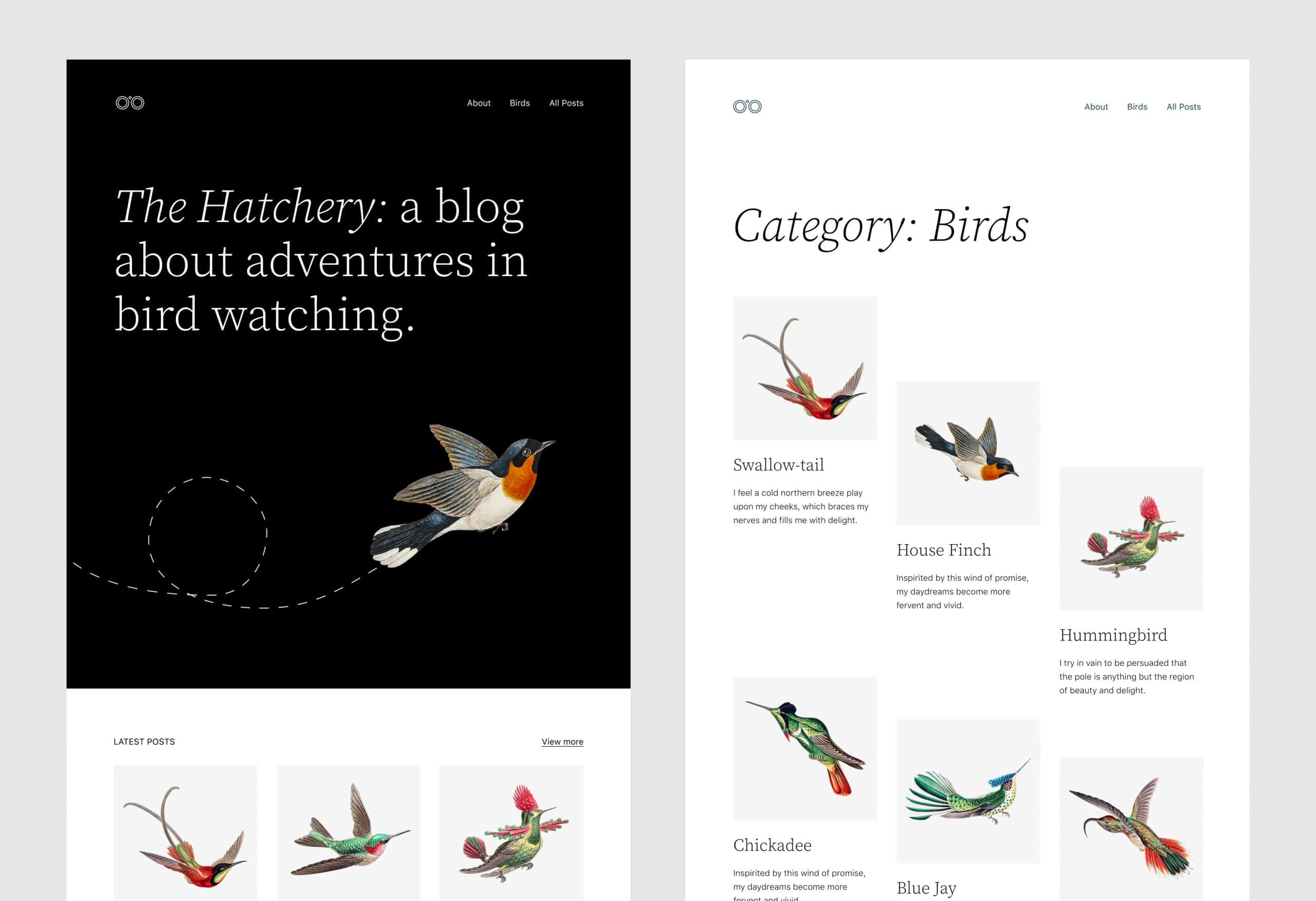
Twenty Twenty-Two has been designed to be the most flexible, lightweight, and customizable default theme ever. It provides a great playground for testing blocks, patterns, and templates.
Being a block theme, it will help you better explore Full Site Editing, Global Styles, Navigation blocks, and the new image galleries, which are the most awaited features coming with WordPress 5.9.
We have to say right away that Twenty Twenty-Two is the first default block theme!
One of the most ambitious goals of the new theme is to empower users. With so many patterns and templates available out the box, users can build complex layouts with only a few clicks. The rest is just style customization.
From a technical point of view, writing about Twenty Twenty-Two is not much different from writing about the latest and most powerful features coming with WordPress 5.9. But Twenty Twenty-Two provides us with a magnifying glass to better appreciate the new site editing features and get a better idea of the platform’s future.
So here we are to introduce you to the new theme.
First, we’ll explore the new site editing flow that users will experience with WordPress 5.9 and Twenty Twenty-Two.
After that, we’ll dive into the main block theme features implemented in Twenty Twenty-Two. You’ll get to know Global Styles, block patterns, templates, and template parts.
But there’s a lot more to say about Twenty Twenty-Two and WordPress block themes. So, as a bonus chapter, we’ll provide a quick overview of how to extend Twenty Twenty-Two’s features by taking advantage of the theme.json file.
Twenty Twenty-Two Brings a New Site Editing Flow
Several Full Site Editing features come into the core with WordPress 5.9. Site owners using the latest WordPress version with a block theme such as Twenty Twenty-Two installed will soon be able to:
- Create and edit posts and pages using more blocks and patterns
- Customize the settings and styles defined in the theme.json file through the Global Styles interface
- Create and edit templates for pages and posts
- Create and edit template parts for header, footer, and other template areas
With all these features merged to the core, WordPress core contributors have been discussing the evolution of the information architecture and redesigned the whole Site Editing Flow.
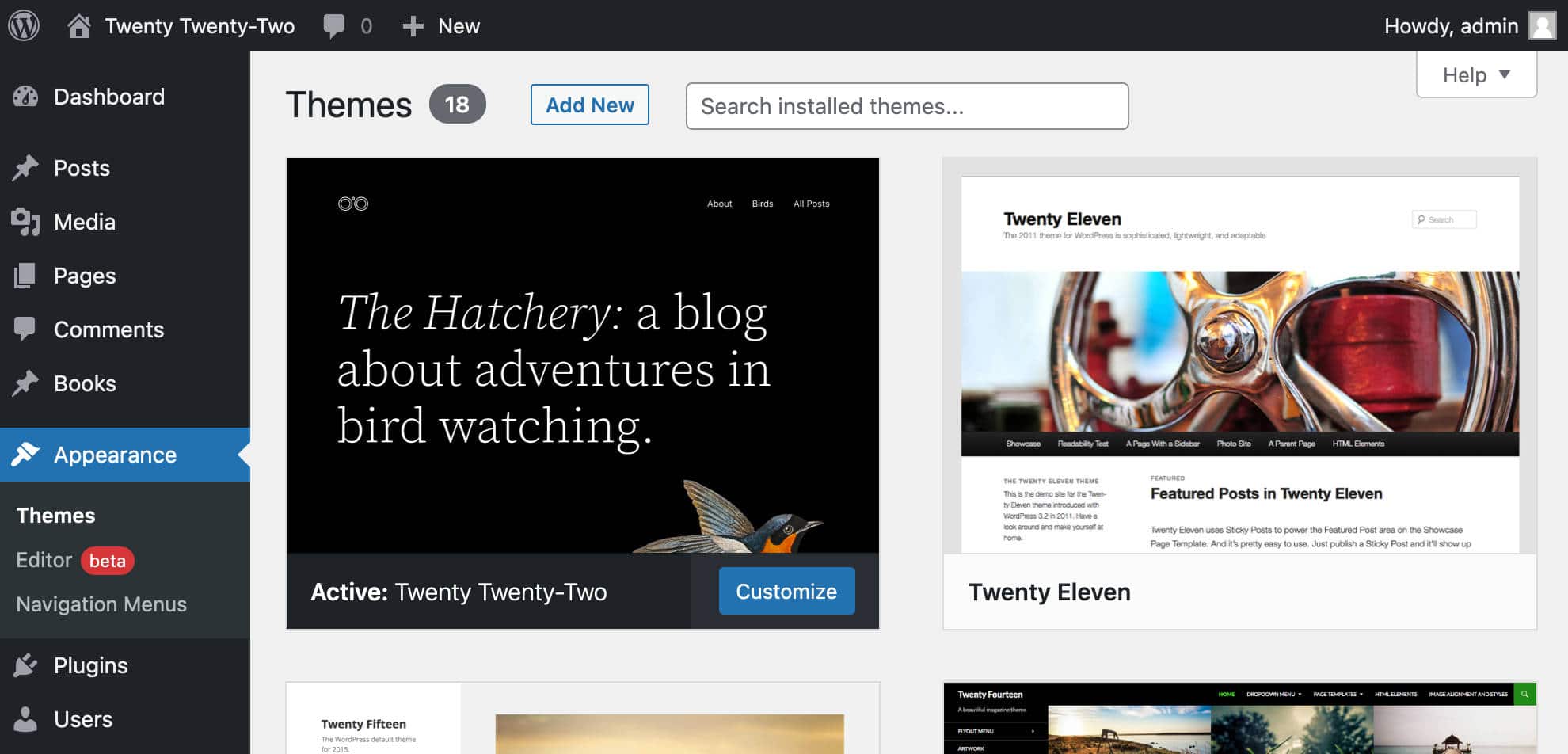
The first thing you might notice once you’ve activated Twenty Twenty-Two is that the entry point to the site editor is no longer located in the main menu of your WordPress dashboard, but has been moved under the Appearance menu.
Bringing the template and style editing features under the same Appearance menu should streamline the editing experience. It should make it easier to understand that the features you are accessing relate to the presentation of your pages.
The Editor menu item opens the site’s homepage template. Depending on your reading settings, this can be either your latest posts page or a static page.
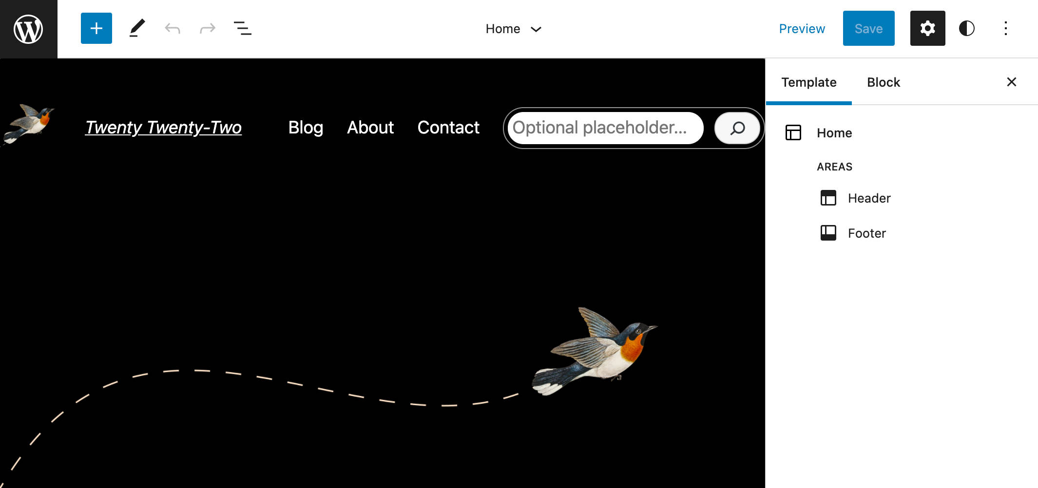
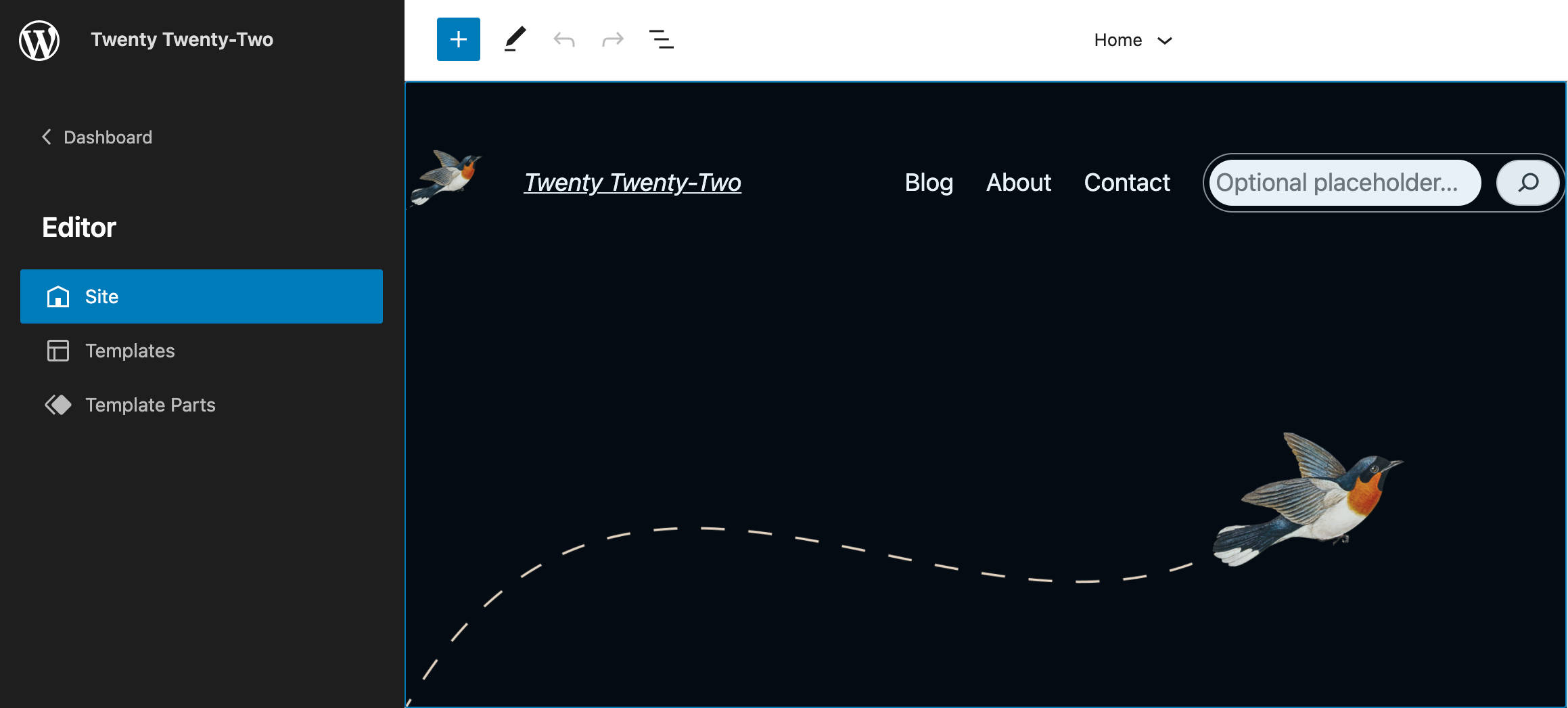
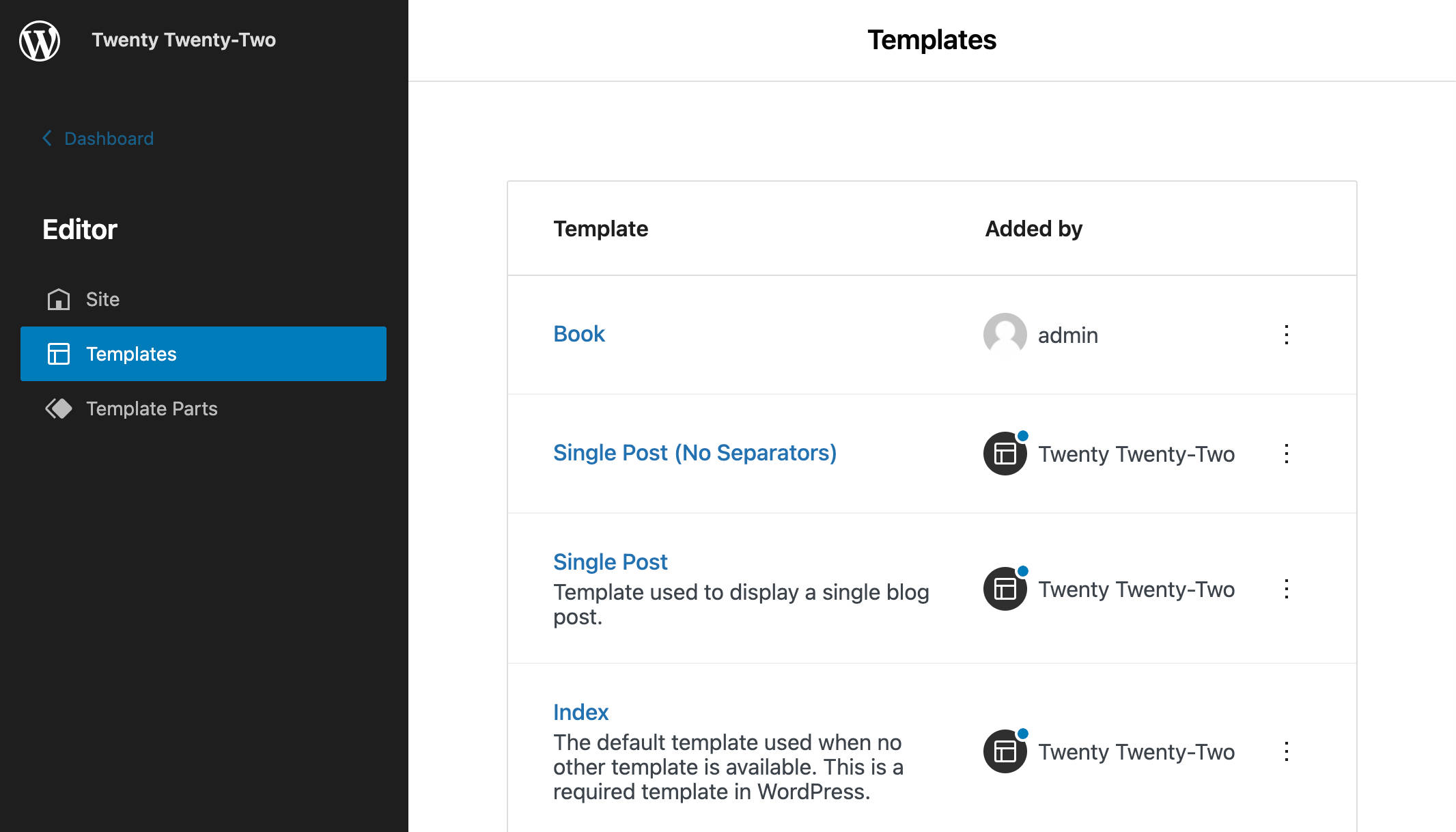
Now, clicking on the WordPress icon in the upper left corner displays a new site editor navigation menu, including three menu items: Site, Templates, and Template Parts.
Let’s take a closer look.
The Site option opens the homepage template (latest blog articles or static home page).
From the Templates menu item, you’ll get a list of the available templates. You can click on any template in the list to launch it in the editor.
As of this writing, Twenty Twenty-Two provides 11 templates.
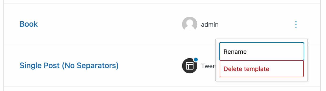
Clicking on the ellipsis (︙) icon on the right lets you clear your customizations.
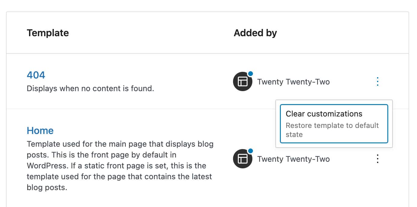
Unlike theme templates, custom templates can only be renamed or removed (but you can edit custom templates in the post editor).
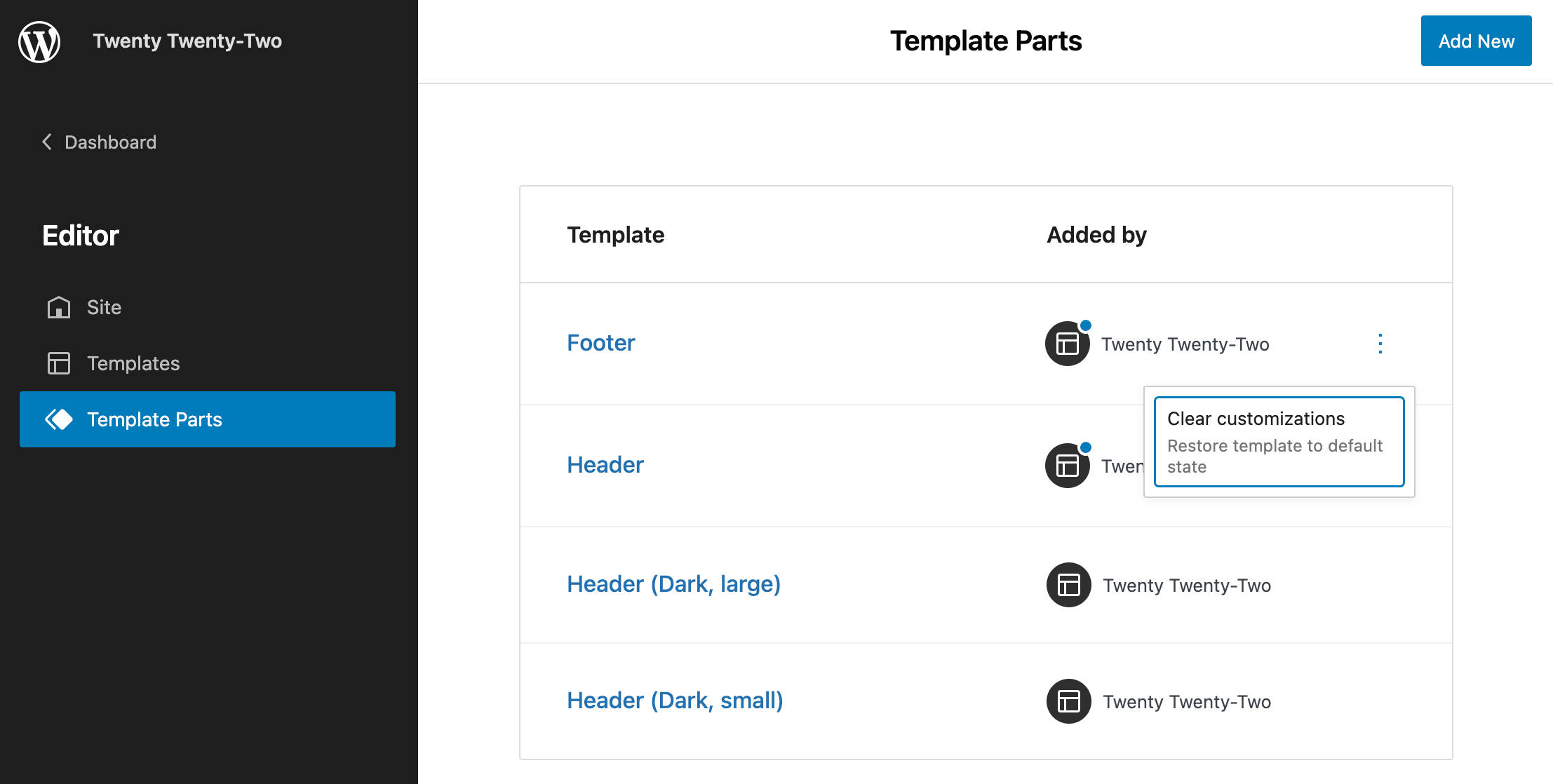
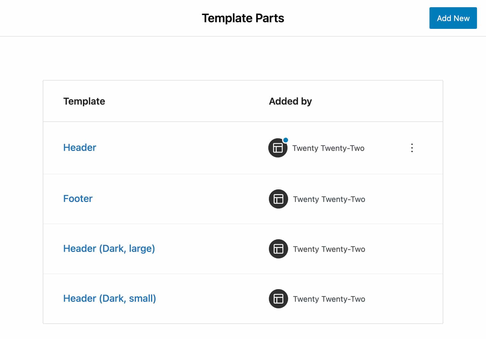
The Template Parts menu item lists the available template parts you can open in the editor for your customizations.
You’ll find four template parts added to Twenty Twenty-Two by default. Hovering the cursor over a modified template displays a tooltip letting you know that the template has been customized.
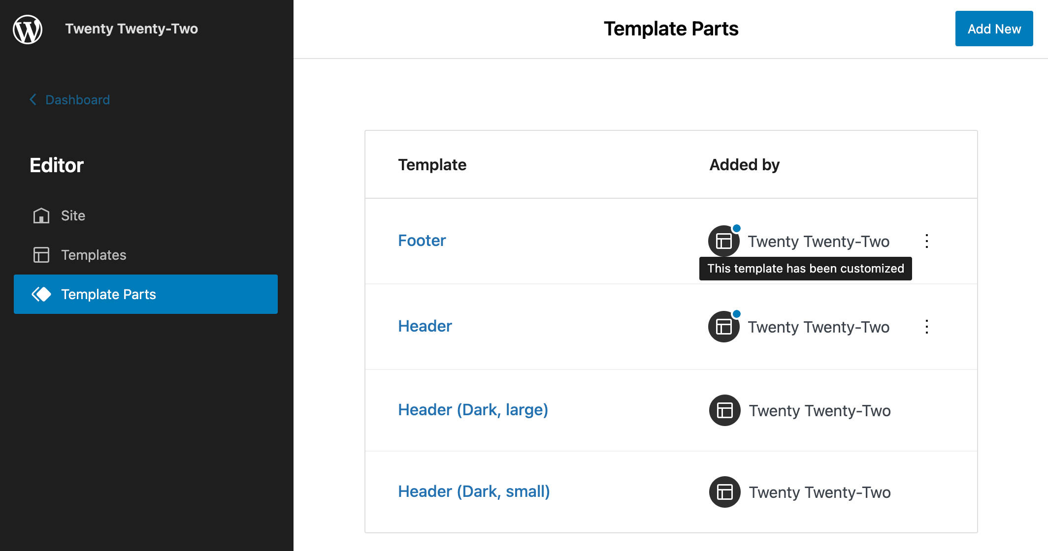
You can clear these customizations by clicking on the ellipsis (︙) icon on the right.
Editing Templates and Template Parts
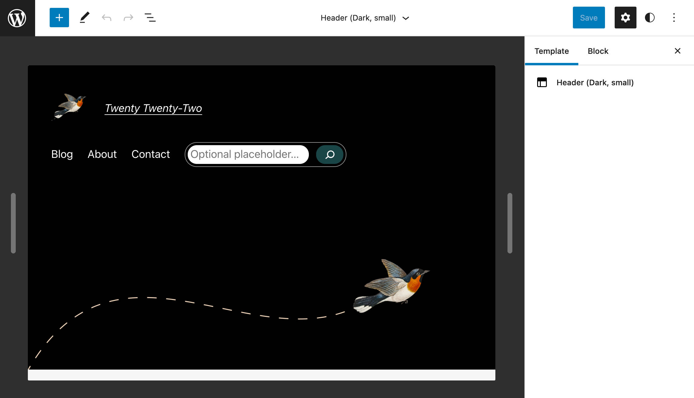
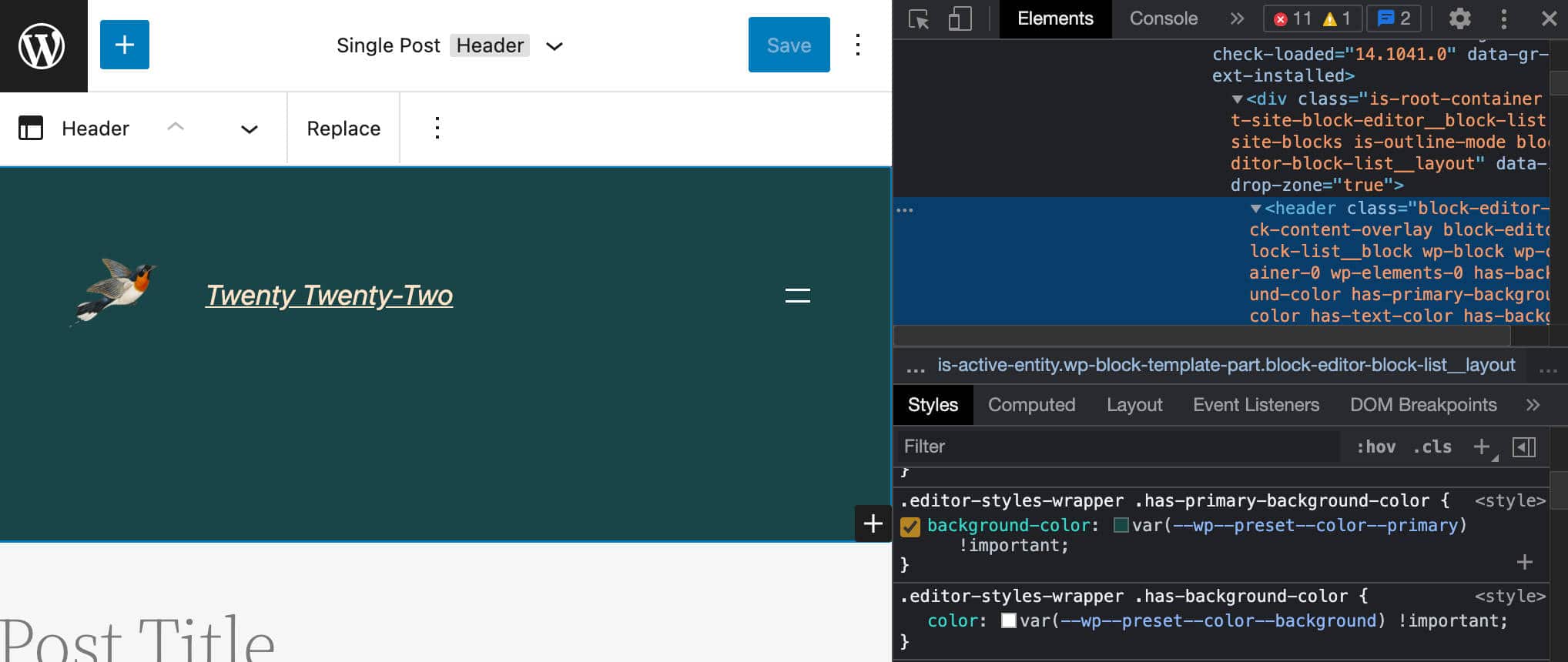
The Editor provides the interface to customize the structure of your templates and template parts.
Here you can easily add or edit blocks and patterns, and your changes will be automatically applied to every page that uses that template.
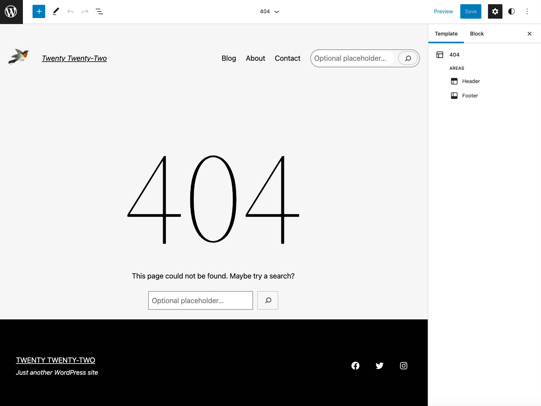
The image below shows the 404 page template in the editor. It’s a pretty simple template, including only a heading, a paragraph, and a search box. Still, it gives us a good understanding of how the UI works.
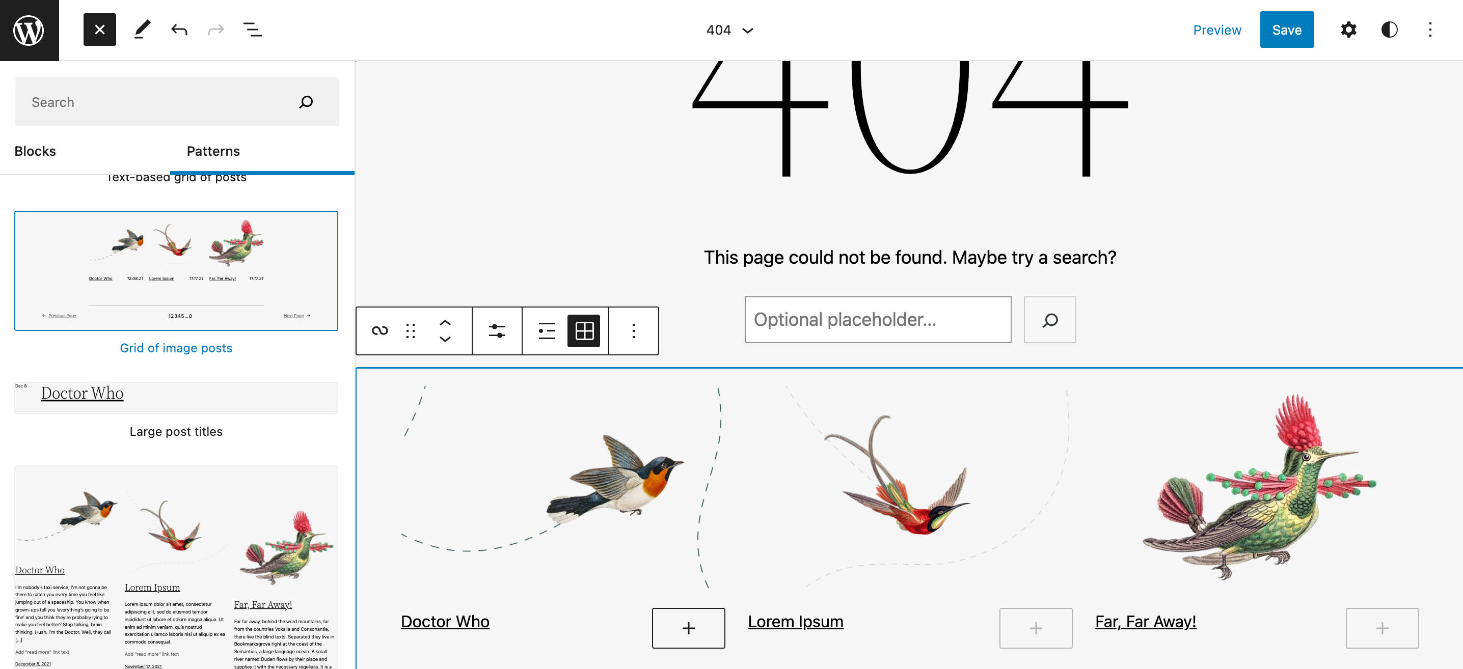
Here, you can make edits and customize templates to fit your needs best. For example, you may want to add a Grid of image posts pattern to increase your visitors’ engagement and invite them to browse the content of your website.
The header dropdown at the top of the template editor displays a list of the available Template areas. The same list appears in the Template tab in the Settings sidebar.
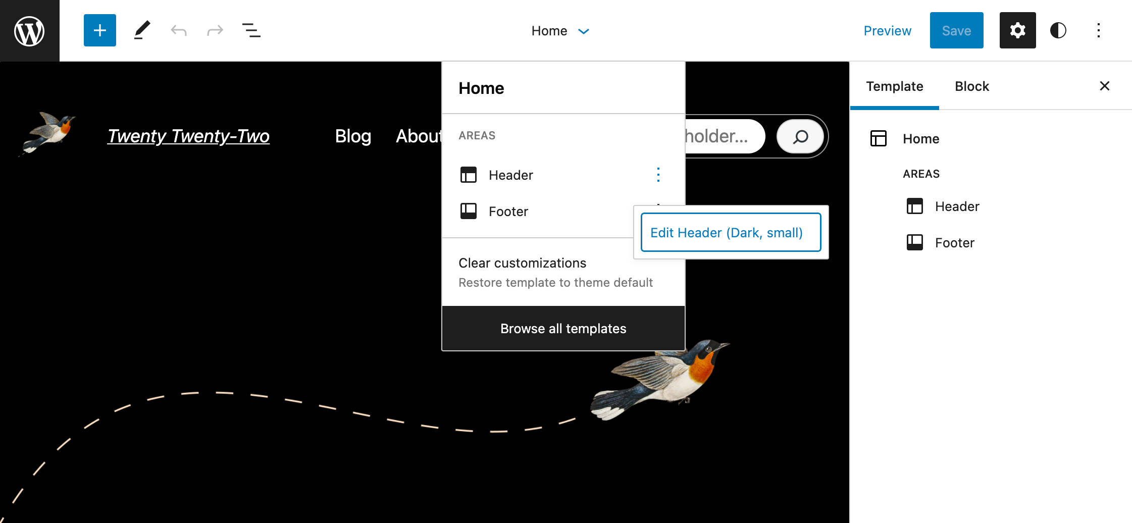
By clicking on any template area (e.g. Header), you’ll be directly brought to the template part you want to edit.
If you click on the ellipsis icon on the right, you’ll access the Isolated template part editor.
The template part editor also provides a pair of draggable handles, allowing you to check how the template behaves at different screen resolutions.
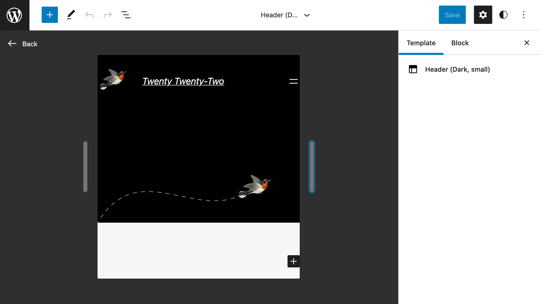
Once you’re happy with your changes, save your edits and go back to the main template editor to check the final result.
If you want to dive deeper into the new information architecture, you might want to check the following articles:
Twenty Twenty-Two at Its Core: A Quick Overview of theme.json
To fully understand how Twenty Twenty-Two and block themes (like Bricksy) work, let’s take a glance at the new theme configuration and styling mechanism based on the theme.json file.
Introduced with WordPress 5.8, this new mechanism allows theme developers to configure the editor and add feature support from a central configuration point.
In Twenty Twenty-Two, the theme.json file has the following structure:
{
	"version": 2,
	"settings": {},
	"styles": {},
	"customTemplates": {},
	"templateParts": {}
}
Let’s have a quick look at each section.
Version
The version field describes the specification version, which is currently 2.
Settings
The settings section defines settings at the global or block level. Settings defined at top-level affect all blocks, but blocks can individually override global settings. In Twenty Twenty-Two you’ll find the following settings:
{
	"settings": {
		"appearanceTools": true,
		"color": {
			"duotone": [...],
			"gradients": [...],
			"palette": [...]
		},
		"custom": {...},
		"spacing": {...},
		"typography": {
			"dropCap": false,
			"fontFamilies": [...],
			"fontSizes": [...]
		},
		"layout": {...}
	}
}
Settings defaults are called presets and are used to generate CSS custom properties and class names based on a specific naming convention:
- CSS custom property:
--wp--preset--{preset-category}--{preset-slug} - CSS class name:
.has-{preset-slug}-{preset-category}
Once a theme has defined its presets, the corresponding CSS custom properties can be used to style blocks and elements in the styles section.
Styles
The styles section is where themes define block and element default styles. See, for example, the following Twenty Twenty-Two styles for the core Button block:
{
	"version": 2,
	"styles": {
		"blocks": {
			"core/button": {
				"border": {
					"radius": "0"
				},
				"color": {
					"background": "var(--wp--preset--color--primary)",
					"text": "var(--wp--preset--color--background)"
				},
				"typography": {
					"fontSize": "var(--wp--preset--typography--font-size--normal)"
				}
			}
		}
	}
}
You’ll notice the CSS custom properties used in the property declarations.
Custom Templates
The customTemplates section is where a theme declares its custom templates. The name and title fields are required. Themes can also declare what post type can use the template by setting the postTypes property.
Twenty Twenty-Two provides four custom templates:
{
"version": 2,
"customTemplates": [
{
"name": "blank",
"title": "Blank",
"postTypes": [
"page",
"post"
]
},
{
"name": "page-large-header",
"title": "Page (Large Header)",
"postTypes": [
"page"
]
},
{
"name": "single-no-separators",
"title": "Single Post (No Separators)",
"postTypes": [
"post"
]
},
{
"name": "page-no-separators",
"title": "Page (No Separators)",
"postTypes": [
"page"
]
}
]
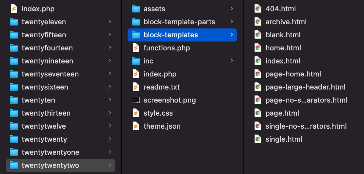
}You’ll find the corresponding .html files in the block-templates folder.
Template Parts
The templateParts section includes template part definitions:
{
	"version": 2,
	"templateParts": [
		{
			"name": "header",
			"title": "Header",
			"area": "header"
		},
		{
			"name": "header-large-dark",
			"title": "Header (Dark, large)",
			"area": "header"
		},
		{
			"name": "header-small-dark",
			"title": "Header (Dark, small)",
			"area": "header"
		},
		{
			"name": "footer",
			"title": "Footer",
			"area": "footer"
		}
	]
}
The name and title fields are required. Themes can also declare an area term, where the template part will be rendered in the editor.
Template parts .html files are located in the template-parts folder.
Now that you know more about Twenty Twenty-Two’s theme.json, we can explore the theme’s features and the new editing interface more thoroughly.
Let’s dive into Twenty Twenty-Two’s Global Styles.
Global Styles in Twenty Twenty-Two
If you look at Twenty Twenty-Two’ style.css, you might be surprised to notice that it contains a minimal number of CSS declarations. The reason is that styles are declared in the theme.json file in block-based themes.
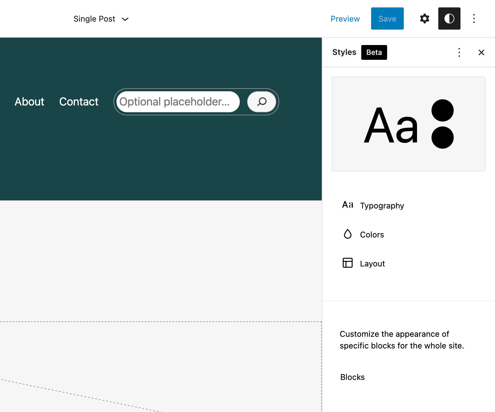
WordPress 5.9 will bring things a step further, introducing a new feature that enables block theme users to customize the appearance of site elements from a user interface called Global Styles.
The Global Styles interface can be accessed from the new Styles icon placed in the upper right corner of the Editor (see also The Global Styles Interface).
Clicking on that icon displays a new Styles sidebar including three separate panels:
- A Preview panel, showing a preview of your customizations
- A Global Styles panel providing access to specific groups of controls for Typography, Colors, and Layout
- A Blocks item providing access to block-level style settings
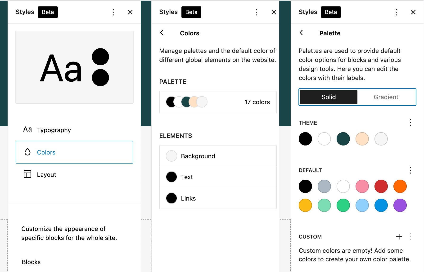
Twenty Twenty-Two’s Color Palette
The Colors panel can help you edit the available palettes and assign or change colors for Background, Text, or Links.
In the Palette panel, you can customize the Theme or Default palettes and even create your custom palette.
Have you found the code that generates the color controls yet?
If not, open Twenty Twenty-Two’s theme.json in your favorite code editor. You’ll find the following color palette declarations:
{
"version": 2,
"settings": {
"color": {
"palette": [
{
"slug": "foreground",
"color": "#000000",
"name": "Foreground"
},
{
"slug": "background",
"color": "#ffffff",
"name": "Background"
},
{
"slug": "primary",
"color": "#1a4548",
"name": "Primary"
},
{
"slug": "secondary",
"color": "#ffe2c7",
"name": "Secondary"
},
{
"slug": "tertiary",
"color": "#F6F6F6",
"name": "Tertiary"
}
]
}
}
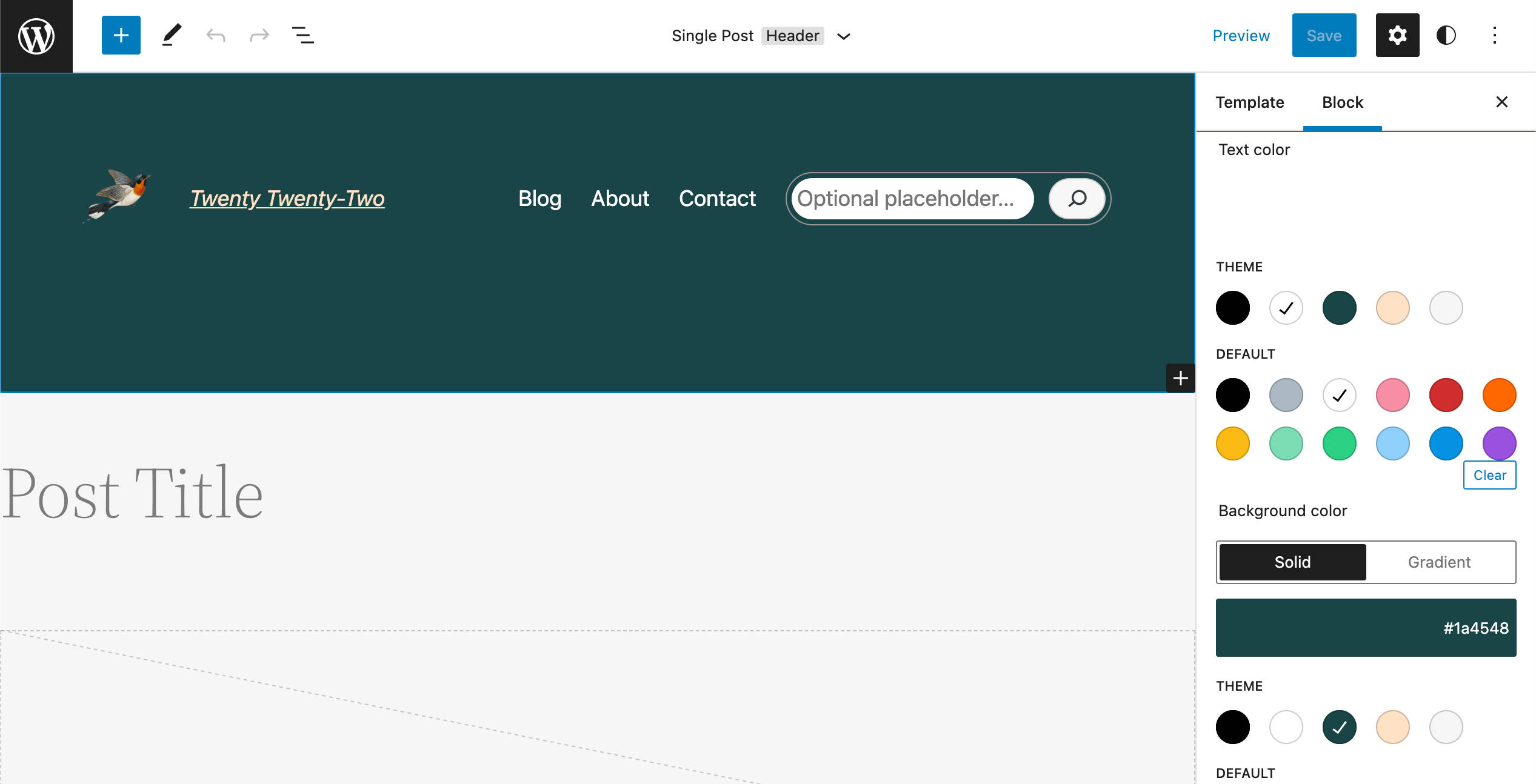
}The image below shows how the code above matches the Twenty Twenty-Two’s color palette.
Now let’s assume that you want to change the default background color for a particular block. Picking a different color for the block’s background will simply assign a different CSS variable to the element’s background-color property. The image below provides an example of that:
And that’s all! You won’t need to add a single line of custom CSS code to the Customizer or create a child theme for that.
But let’s keep exploring Twenty Twenty-Two’s Global Styles with some additional examples.
Typography Settings
The Typography panel is where you can customize typography styles for your website’s Text and Links elements at the global level.
Each item provides access to a group of controls for you to customize font family, size, and line-height.
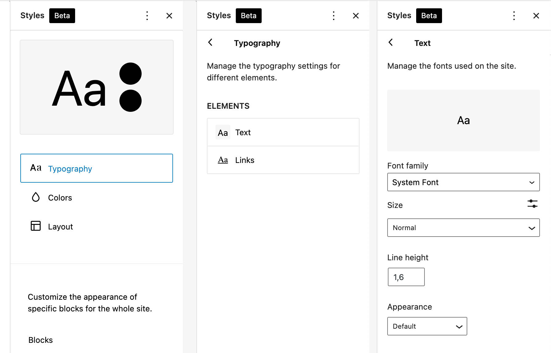
Are you wondering what code generates these controls?
Open Twenty Twenty-Two’s theme.json and find the typography section. You’ll see the following settings:
{
"version": 1,
"settings": {
"appearanceTools": true,
"typography": {
"dropCap": false,
"fontFamilies": [
{
"fontFamily": "-apple-system,BlinkMacSystemFont,\"Segoe UI\",Roboto,Oxygen-Sans,Ubuntu,Cantarell,\"Helvetica Neue\",sans-serif",
"name": "System Font",
"slug": "system-font"
},
{
"fontFamily": "\"Source Serif Pro\", serif",
"name": "Source Serif Pro",
"slug": "source-serif-pro"
}
],
"fontSizes": [
{
"name": "Small",
"size": "1rem",
"slug": "small"
},
{
"name": "Normal",
"size": "1.125rem",
"slug": "normal"
},
{
"name": "Medium",
"size": "1.75rem",
"slug": "medium"
},
{
"name": "Large",
"size": "clamp(1.75rem, 3vw, 2.25rem)",
"slug": "large"
},
{
"name": "Huge",
"size": "clamp(2.5rem, 4vw, 3rem)",
"slug": "huge"
}
]
},
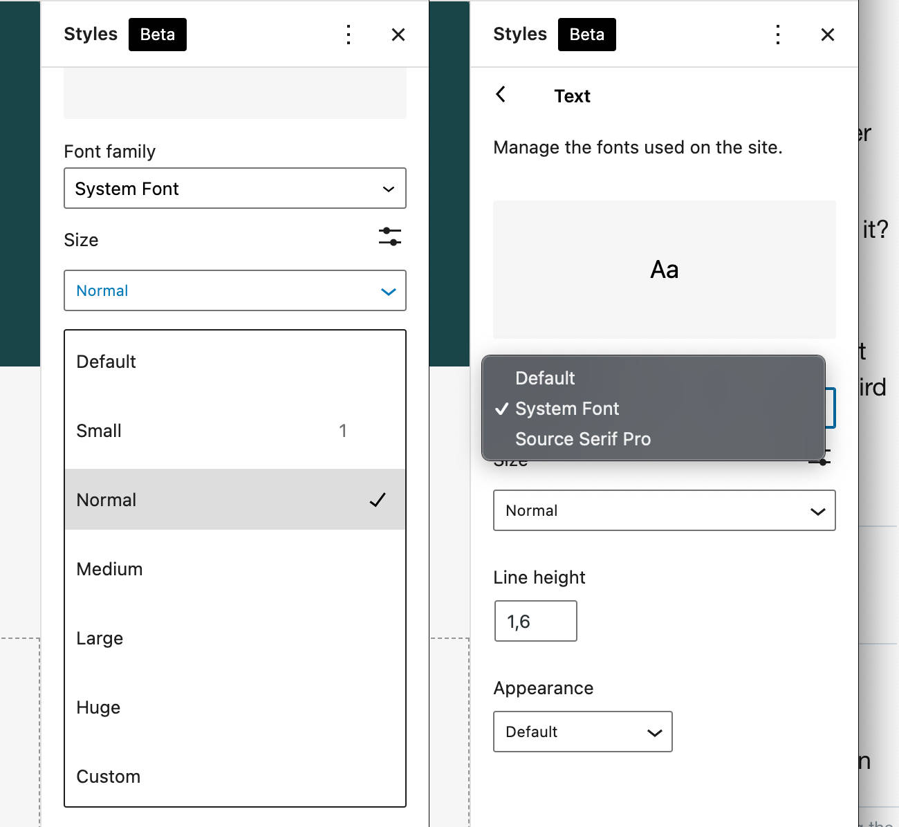
}You may expect to see two font families and five font sizes from the code above. And you’d have guessed right.
Here’s how the code above translates to Global Styles Typography settings:
You may guess what setting generates the Line height control. In Twenty Twenty-Two, you won’t find a specific setting for that because it’s enabled by the appearanceTools property, which is a shortcut for several setting declarations (see next section).
Layout and Appearance Tools
The last element in the Global Styles sidebar is the Layout. At the time of this writing, it only includes a padding control.
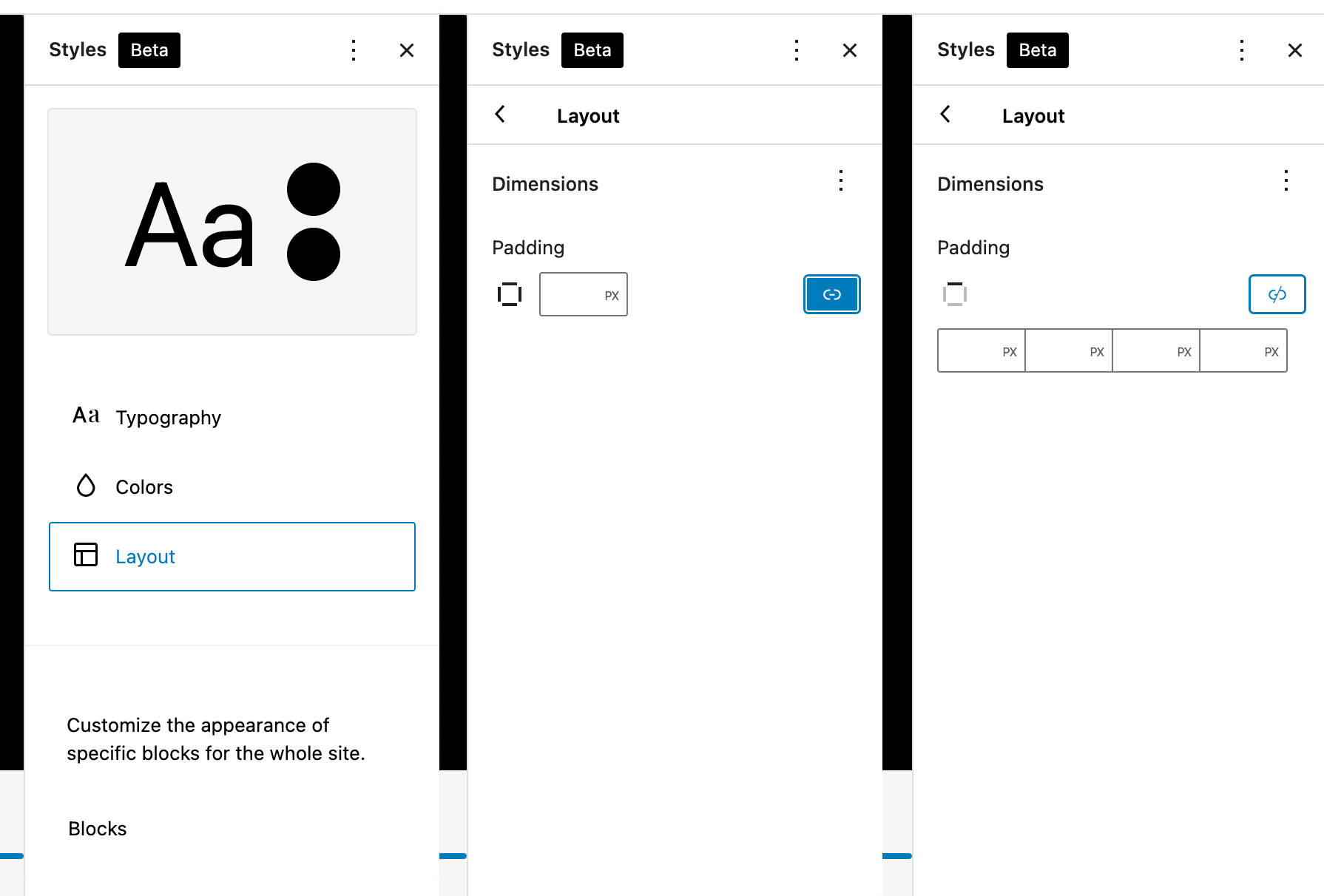
In Twenty Twenty-Two, the Layout panel is enabled by the appearanceTools setting property, a boolean that can be used to enable several settings at once:
{
	"settings": {
		"appearanceTools": true
	}
}
"appearanceTools": true simply replaces the following block of declarations:
{
	'settings': {
		'border': {
			'color': true,
			'radius': true,
			'style': true,
			'width': true
		},
		'color': {
			'link': true
		},
		'spacing': {
			'blockGap': true,
			'margin': true,
			'padding': true
		},
		'typography': {
			'lineHeight': true
		}
	}
}
OK — you now hopefully understand how the settings declared in the theme.json file match the corresponding Global Styles controls.
There’s still one piece of our puzzle missing to get the complete picture of the new WordPress default theme: block patterns.
Twenty Twenty-Two Block Patterns
One could say that Twenty Twenty-Two is mostly a collection of patterns — and it pretty much is. In Twenty Twenty-Two, you’ll find tons of ready-to-use block patterns that you can choose from to build amazing and unpredictable structures of nested blocks for your web pages.
The key term here is user empowerment. And that fits because, with block patterns, you can build all sorts of things, from an appealing portfolio to a single-page promotional website, even if you don’t have any knowledge of HTML or CSS!
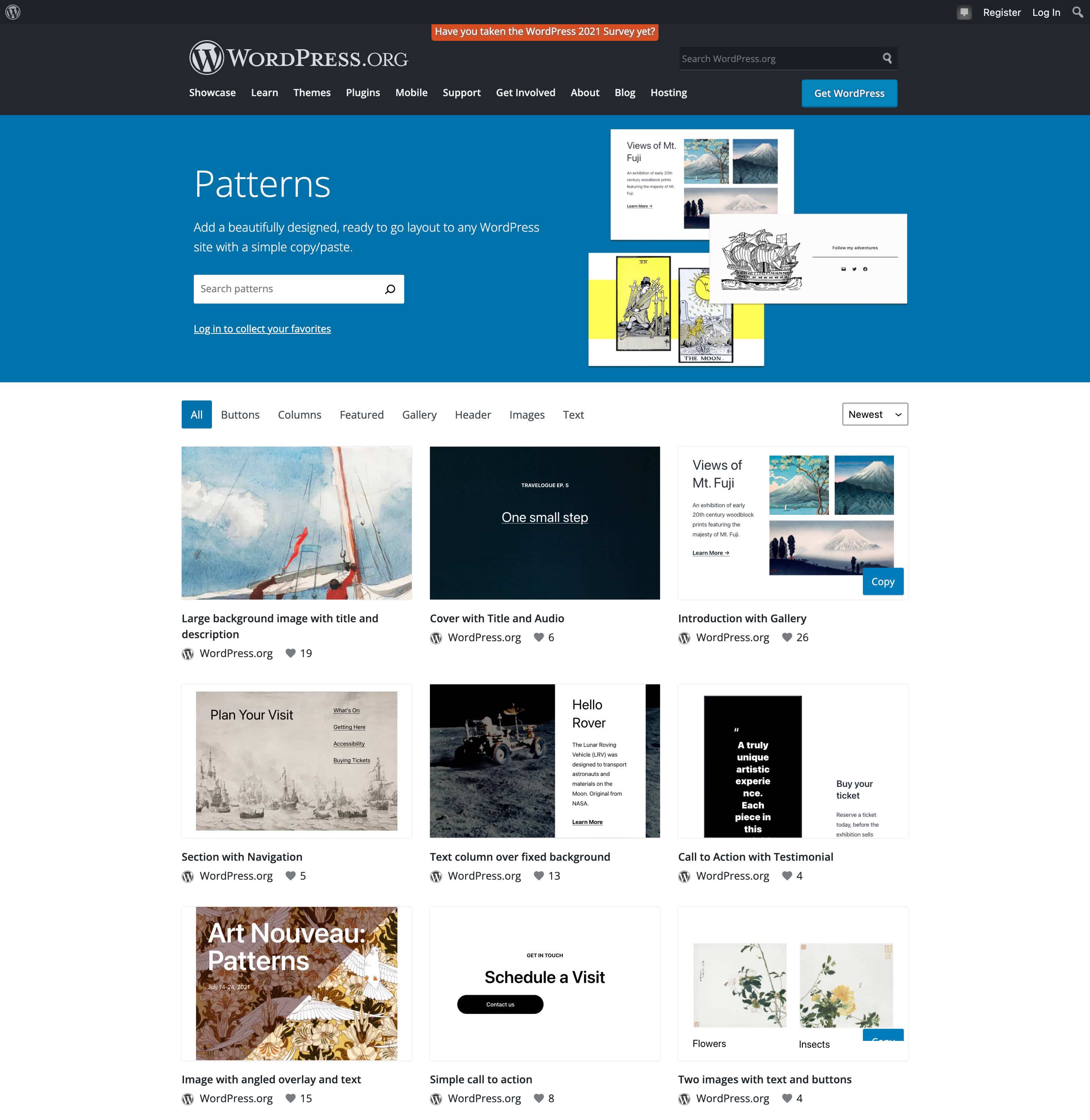
And WordPress 5.9 brings significant improvements to the pattern system with the new Pattern Explorer, a tool that allows you to browse patterns in a full-screen modal.
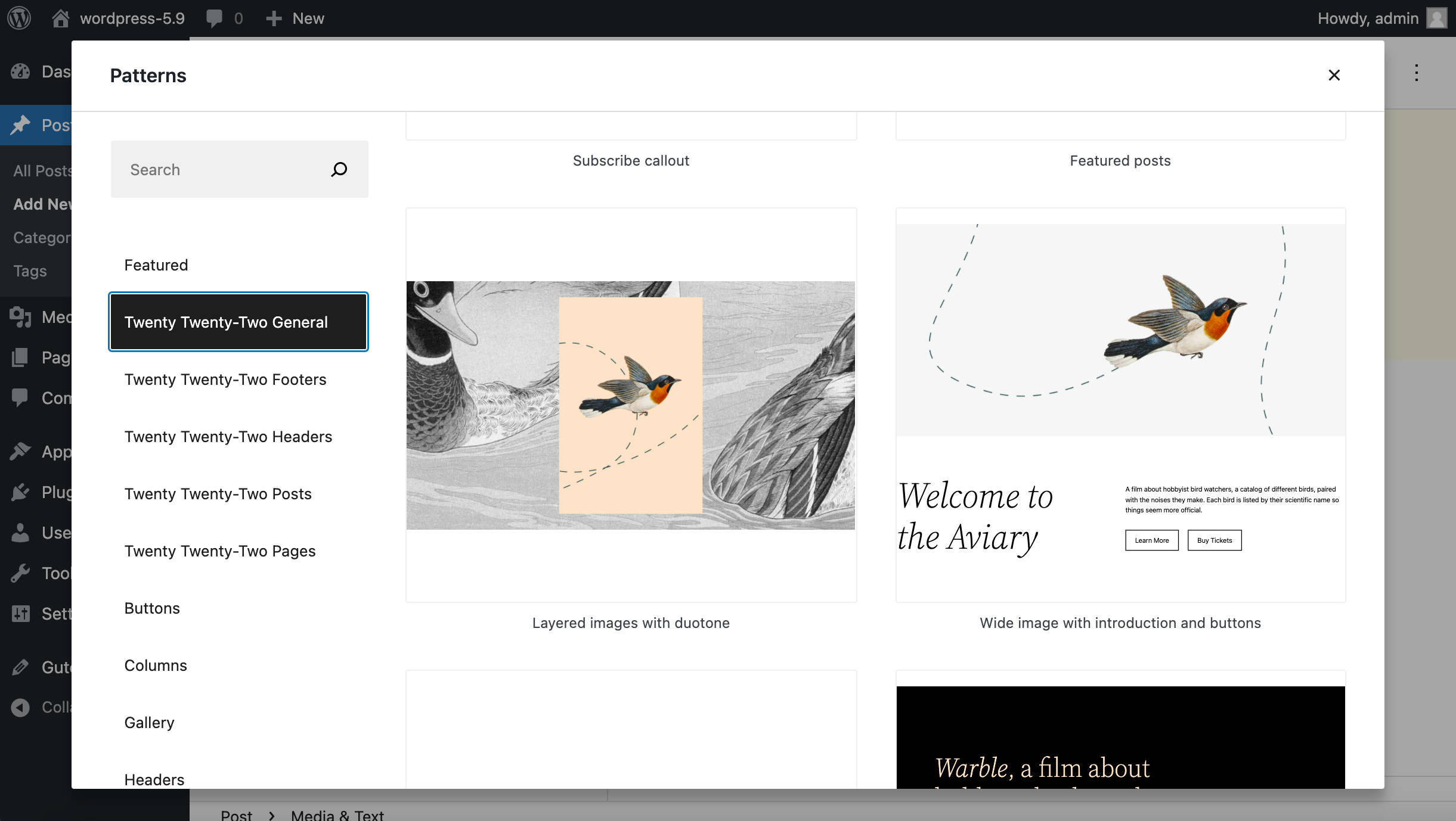
The new tool also enables you to quickly and easily import block patterns directly from the Pattern Directory. This opens up new possibilities for both WordPress users and developers, so its usage is likely to increase considerably in the future.
Twenty Twenty-Two includes plenty of patterns (over 65) across five categories.
This solid set of patterns pairs perfectly with templates and template parts coming with the new default theme, making for a truly amazing editing experience.
If you haven’t had a chance to experiment with block patterns yet, we’ll show you why they’re considered such powerful tools with a simple example.
Suppose you want to remove the default footer from the Index and Single Post templates and replace it with a different Twenty Twenty-Two block pattern.
Launch the Site Editor from the Appearance menu or the WordPress frontend toolbar button to customize the Index template.
Click on the Index button to display the header dropdown showing the list of template areas available on the page. Click on the ellipsis button next to Footer and then on Edit Footer.
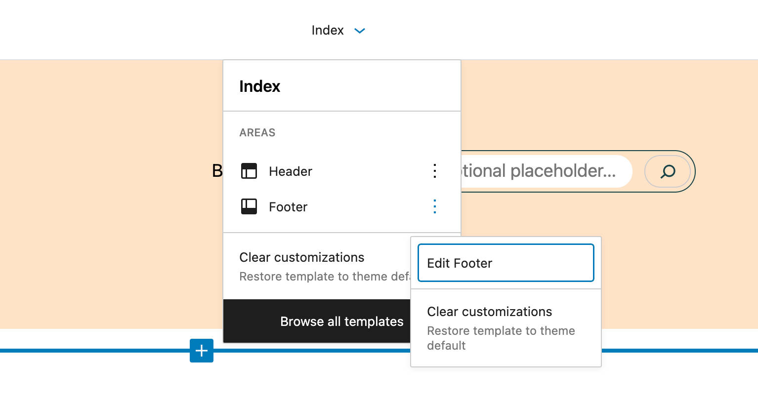
As mentioned above, this will launch the isolated template part editor.
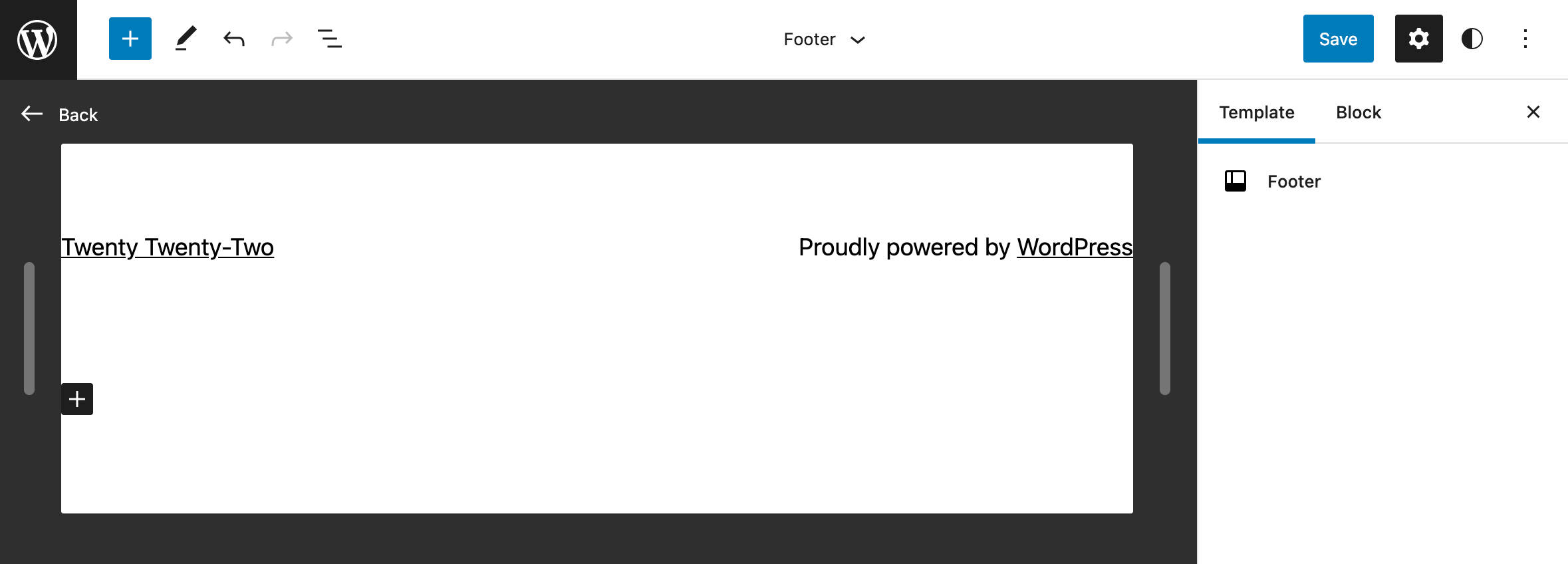
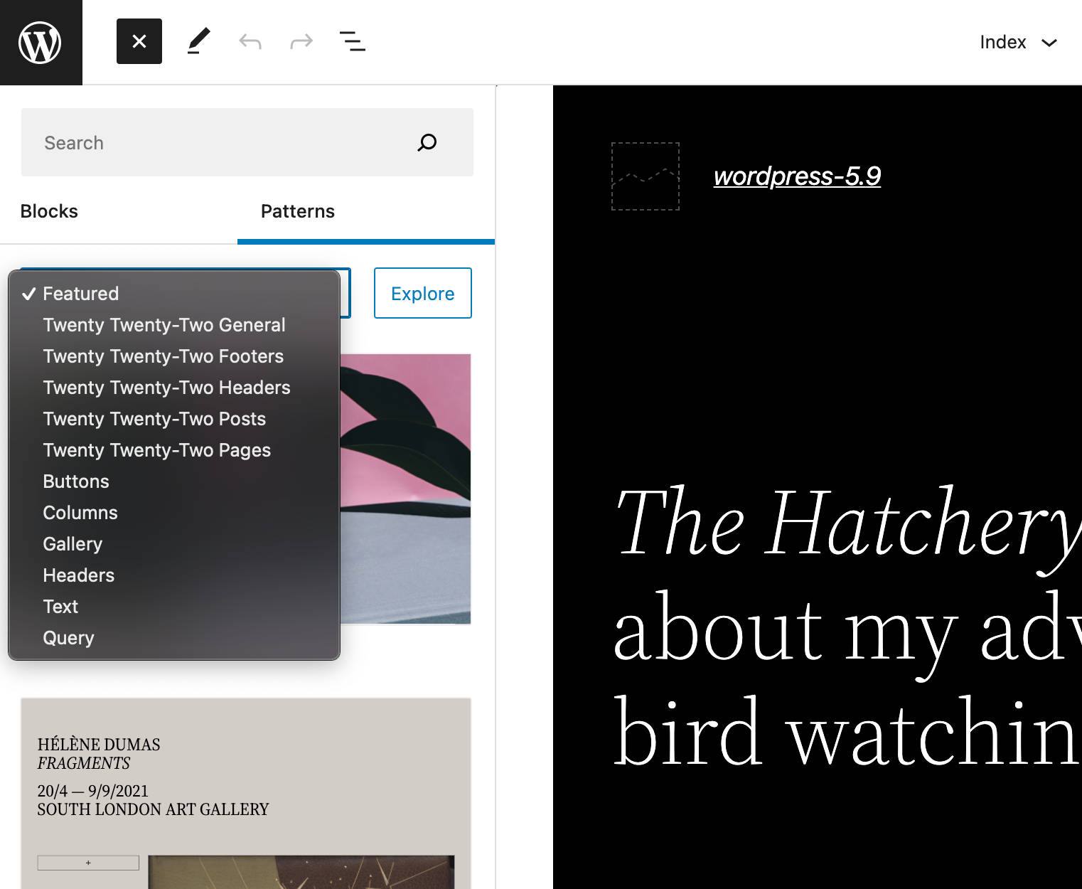
Now open the block inserter and click on Patterns.
Launch the new Pattern Explorer tool, select the Twenty Twenty-Two Footers category, and pick the footer of your choice.
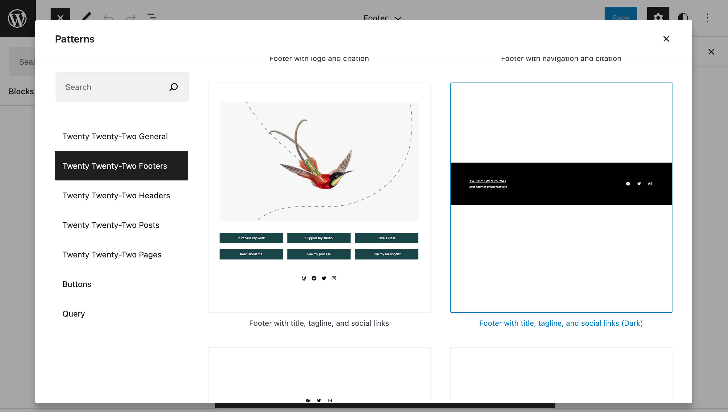
Now add and edit the blocks according to your needs.
Save the header and recheck your site when you’re happy with your changes.
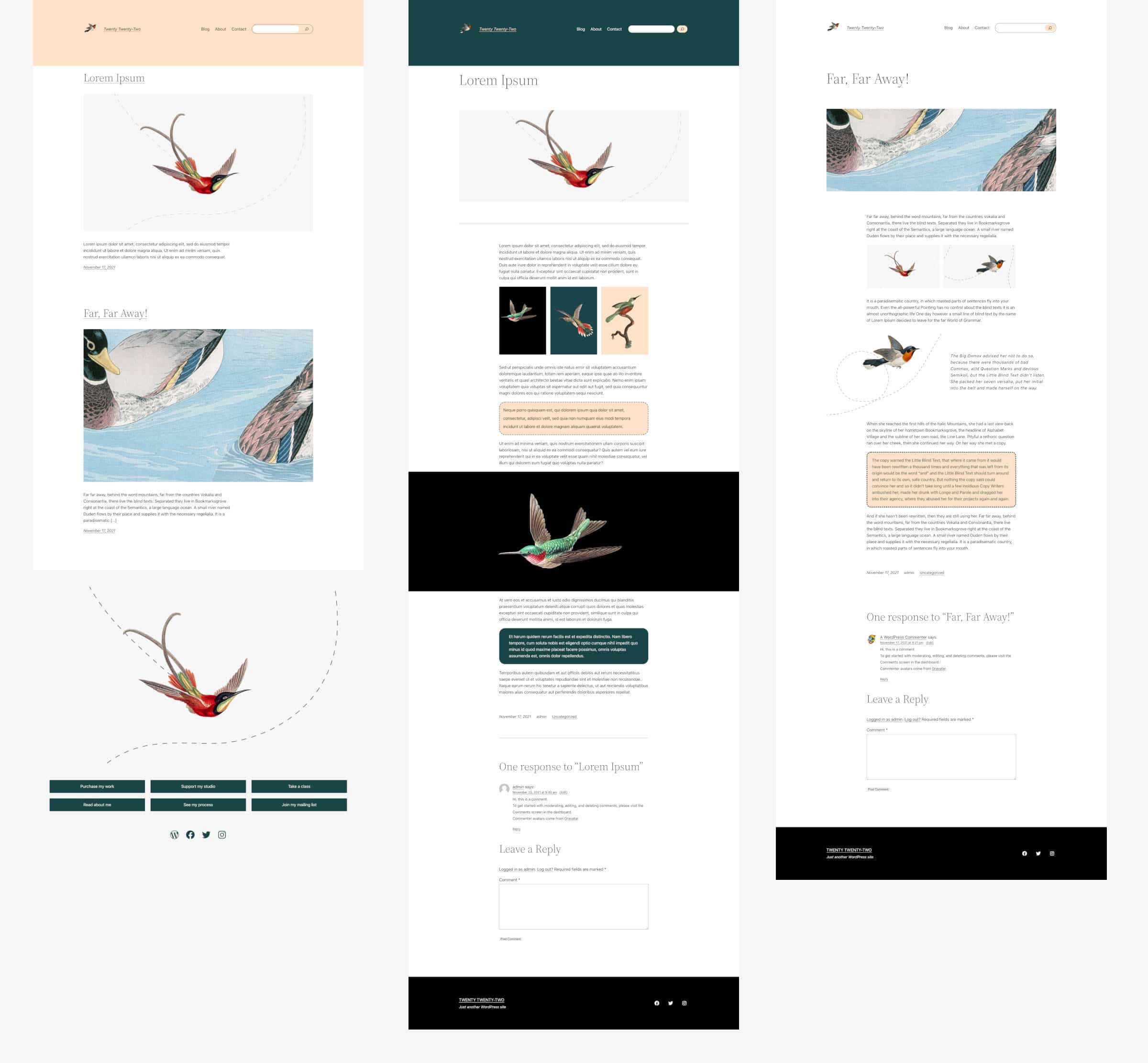
The image below compares three templates (Index, Single Post, and Single Post with no separators) with different header and footer customizations:
Extending Twenty Twenty-Two With a Child Theme
Creating a child theme for a block theme is quite different from creating a child theme for a classic theme.
But once you have a good understanding of a block theme’s structure, you won’t find it difficult to create a child theme for Twenty Twenty-Two or any other block theme.
So let’s figure out how to customize the look and feel of your Twenty Twenty-Two-based website.
1. Setting Up a Child Theme for Twenty Twenty-Two
In your /wp-content/themes directory, create a new folder and name it whatever you like (according to theme development standards). In this example, we called the child theme folder twentytwentytwo-child.
Now you need a style.css file. Open your favorite code editor and create the following stylesheet:
/*
Theme Name: Twenty Twenty-Two Child
Theme URI: https://example.com/
Author: Your name
Author URI: https://example.com/
Description: A child theme for TT2.
Requires at least: 5.8
Tested up to: 5.9
Requires PHP: 5.6
Version: 0.2
License: GNU General Public License v2 or later
License URI: http://www.gnu.org/licenses/gpl-2.0.html
Text Domain: twentytwentytwo-child
Template: twentytwentytwo
Tags: one-column, custom-colors, custom-menu, custom-logo, editor-style, featured-images, full-site-editing, block-patterns, rtl-language-support, sticky-post, threaded-comments

Twenty Twenty-Two Child WordPress Theme, (C) 2021 WordPress.org
Twenty Twenty-Two Child is distributed under the terms of the GNU GPL.
*/
As always, you can edit fields according to your needs.
Your child theme is now available for preview. You can activate it in the Appearance > Themes admin screen.
2. Customizing Global Settings
Since WordPress 5.9, child themes with a theme.json file inherit the parent theme’s settings. If the child’s theme.json defines a set of styles, then those styles apply on top of its parent’s styles.
So we can create a theme.json file that includes only a small custom block of setting and style definitions rather than redefine all our original choices.
How to Declare a Custom Color Palette
When building a child theme for Twenty Twenty-Two, the easiest task is replacing the color palette. All you need to do is define a new color palette in your child’s theme.json as shown below:
{
"version": 2,
	"settings": {
		"color": {
			"palette": [
				{
					"slug": "foreground",
					"color": "#FFFFFF",
					"name": "Foreground"
				},
				{
					"slug": "background",
					"color": "#001F29",
					"name": "Background"
				},
				{
					"slug": "primary",
					"color": "#D6FDFF",
					"name": "Primary"
				},
				{
					"slug": "secondary",
					"color": "#FDFCDC",
					"name": "Secondary"
				},
				{
					"slug": "tertiary",
					"color": "#FED9B7",
					"name": "Tertiary"
				},
				{
					"slug": "accent",
					"color": "#E94435",
					"name": "Accent"
				}
			]
		}
	}
}
Save your file and go back to the site editor. The color palette defined above should have replaced the default Twenty Twenty-Two’s color palette.
The colors will be shown in order on the palette itself, and their names should follow the best practices and naming conventions discussed on Github.
You can read much more about theme.json color options in this in-depth overview by Carolina Nymark.
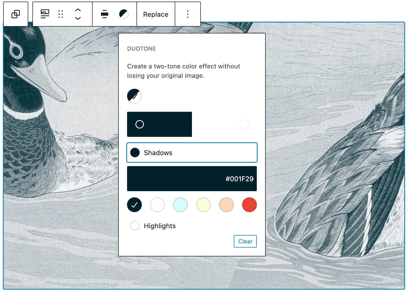
How To Declare Custom Duotone Filters
You can also replace the default duotone colors with your custom set of filters.
To do that, simply add the following code to your child’s theme.json settings at the same level as the palette property:
{
"version": 2,
	"settings": {
		"color": {
			"palette": [...],
			"duotone": [
				{
					"colors": [
						"#001F29",
						"#FFFFFF"
					],
					"slug": "default-filter",
					"name": "Default filter"
				}
			]
		}
	}
}
Save your file and check the result in the block editor. You should only see a single duotone filter.
3. Customizing Block Styles
As we mentioned earlier, with WordPress 5.9, you can now customize theme.json settings and styles from the Global Styles interface.
Block styles can be customized from the Global Styles interface only if the block declares support for specific functionality in the corresponding block.json file. But you can override default block settings in your child theme’s theme.json.
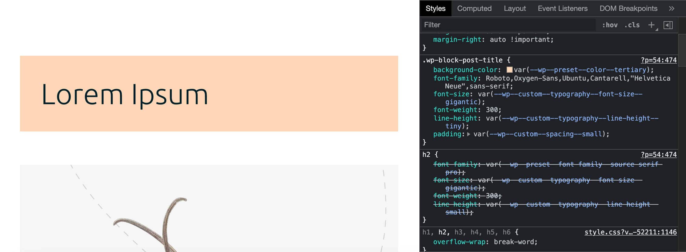
Now suppose you want to override Post Title and Group block styles. All you need to do is define the styles you want to add or override, as shown below:
{
"version": 2,
	"settings": {...},
	"styles": {
		"blocks": {
			"core/post-title": {
				"typography": {
					"fontFamily": "Roboto,Oxygen-Sans,Ubuntu,Cantarell,\"Helvetica Neue\",sans-serif"
				},
				"color": {
					"background": "var(--wp--preset--color--tertiary)"
				},
				"spacing": {
					"padding": "var(--wp--custom--spacing--small)"
				}
			},
			"core/group": {
				"spacing": {
					"margin": {
						"top": "0",
						"bottom": "0"
					}
				}
			}
		}
	}
}
In the example above, we changed the font family, background color, and padding values for core/post-title, as well as the top and bottom margins for core/group.
The image below shows the result as it would look on the public site:
And that’s it for the review!
We won’t dive any deeper into child themes for now as it would go beyond the scope of this post. In the meanwhile, you’ll find more examples of Twenty Twenty-Two child themes on Github.
Summary
While taking a closer look at the new WordPress default theme Twenty Twenty-Two and its features (which make it the most flexible default theme ever released), we unveiled the new information architecture introduced with WordPress 5.9. We even got a sneak peek at the new Global Styles interface.
There are many exciting new features on the way, and it seems clear that the new editing environment is getting more robust, reliable, and functional over time.
While many new WordPress features are on the way, others are disappearing or decreasing in importance. Many users are left wondering what will happen to the Customizer and how to best maintain backward compatibility with existing themes.
However, you shouldn’t expect to suddenly leap from traditional themes to block themes in a single bound. We currently have four different types of themes to choose from:
- Block themes: Themes designed for FSE
- Universal themes: Themes that work with both the Customizer and the Site Editor
- Hybrid themes: Classic themes supporting FSE features like theme.json
- Classic themes: Themes with PHP templates, functions.php, etc.
So, fear not for now — there are still plenty of solutions to choose from if you don’t feel ready to switch to block themes yet.
And now it’s up to you! Are you ready to make the big leap and start using block themes right now? Share your thoughts with us in the comments below.

Carlo is a passionate lover of webdesign and front-end development. He has been playing with WordPress for more than 20 years, also in collaboration with Italian and European universities and educational institutions. He has written hundreds of articles and guides about WordPress, published both on Italian and international websites, as well as on printed magazines. You can find him on LinkedIn.