Words are the backbone of the Internet, despite the proliferation of media. This means the typefaces you choose for your site will be a crucial aspect of your layout and design.
WordPress typography can evoke moods, help with branding, and more. Full site editing (FSE) in WordPress puts customizing this typography in the hands of users — and the theme.json file helps developers build WordPress themes that leverage this.
This article explores WordPress typography for both FSE and theme.json. However, the discussion also includes key contexts such as the technology you use, the technical considerations to bear in mind, and setting the evolution of how we use typefaces in design.
Typography on the web: a quick history
If you look back at early web designs, you can see that, despite the variety in layouts, typefaces have had a consistent presentation. This is part availability and part necessity. In a nutshell, without the technology we have now, words on the web can only use fonts available on your computer.
A mid-to late-’90s “web surfer” would have only a handful of predictable typefaces: Times New Roman, Arial, Helvetica, Georgia, and Verdana. The latter two are Microsoft commissions that render well for the web regardless of the era.
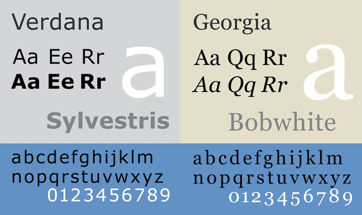
This primitive selection is consistent and dependable but lacks flexibility. Services such as Google Fonts and Adobe Fonts use the WOFF file format to give you access to a font library of thousands, with a straightforward embedding process.
This gives you greater scope to improve readability, create distinctive designs, and tailor the user experience (UX) for your site. Drawbacks include potential performance hits (such as a content layout shift), reliance on third-party services to display the most crucial element on your site, and privacy concerns.
This leads many web designers to forgo font libraries and reconsider using system fonts. The faster processing and control you have over applying a “system font stack” that prioritizes native typefaces and also uses fallback options is a solid approach.
WordPress and typography
WordPress places a strong emphasis on typography to help you create engaging and readable content. Throughout its history, the WordPress default themes all use font pairings that strike a balance between aesthetics and functionality.
Current default themes use system font stacks for a clean, modern, and performant presentation. Older default themes use pairings such as Noto Sans and Noto Serif (for Twenty Fifteen) and Montserrat and Merriweather (for Twenty Sixteen).
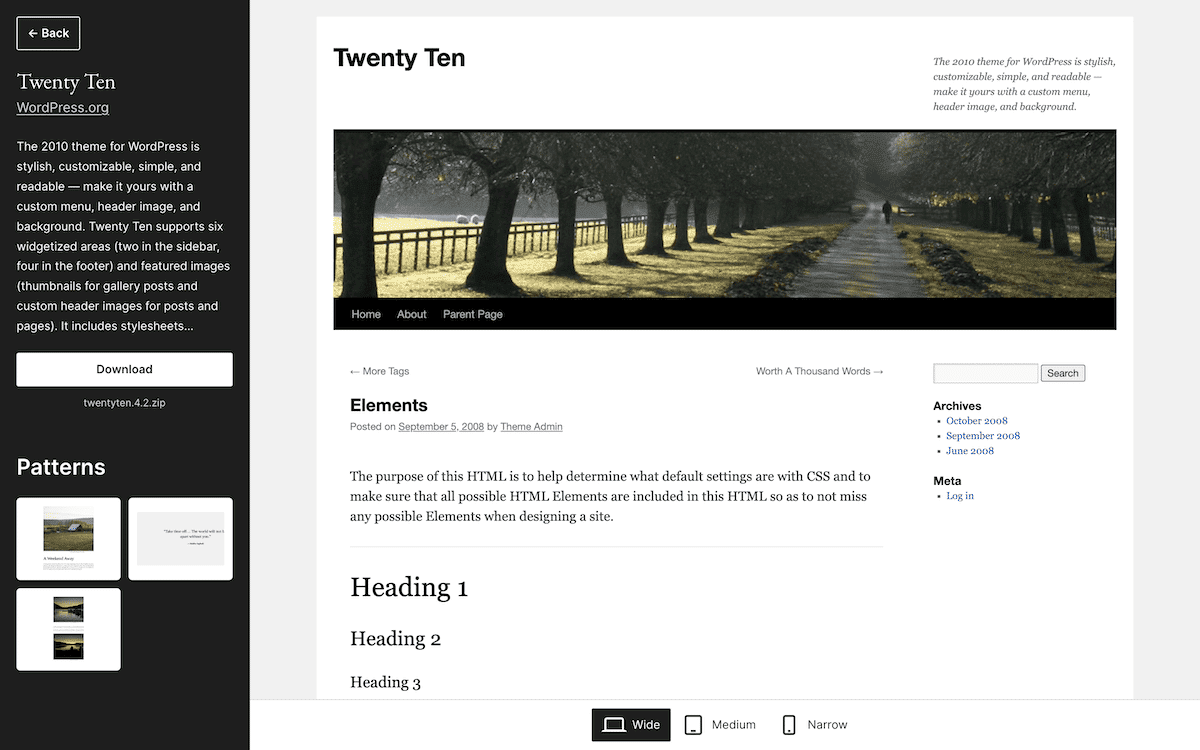
To showcase this typography “circle of life”, Twenty Sixteen uses Helvetica and Georgia as fallback options. The Twenty Ten default theme only uses Helvetica, Arial, and Georgia:
While these choices set the tone for WordPress design within each theme, they can also inspire you to pay close attention to how you use typography — something WordPress FSE helps with.
A quick primer on full site editing and theme.json
FSE and theme.json are central to how you manage typography in WordPress, so understanding each is essential. FSE leverages the Block Editor and adds more functionality to become the Site Editor.
This unifies your site design options in a number of ways:
- You use the editing approach of Blocks for the entire site, not just your content.
- A template library is part of the setup, so you can edit these using the same tools as your content.
- Styling also happens within the Site Editor and offers a global settings scheme.
- Site editing doesn’t need any code in order to implement any of the available options. This bridges the gap between development and end-user design.
You can consider the theme.json file to be a development version of FSE. You need JavaScript Object Notation (JSON) knowledge to work with the file, but this is within the capabilities of most site owners. It’s a central configuration file for managing your global styles and settings.
Each setting uses a key/value pair of option:value, and you can implement this in a number of ways:
- Defining global color palettes.
- Setting up font families and sizes.
- Configuring Block-specific styles.
- Managing spacing and layout preferences.
Leveraging theme.json lets you create more consistent and customizable themes without the need for custom CSS (although this is also possible). The adaptability and flexibility of theme.json means this is a key component of developing themes for WordPress. The optimal approach is to use both in different ways for all of your theme design — and typography is no exception.
Setting up typography within the WordPress Site Editor
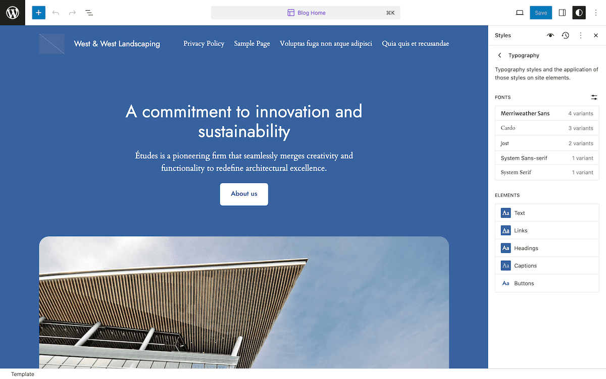
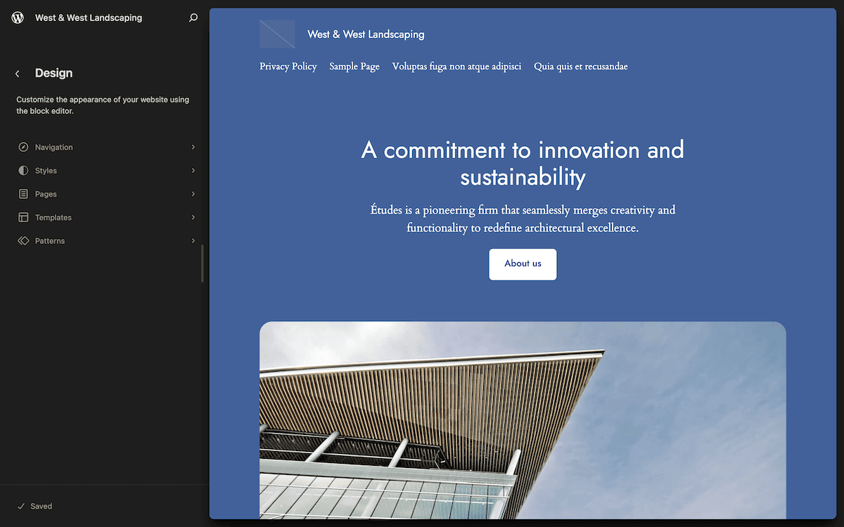
If you know how to use the Block Editor, you can also use the Site Editor. Within WordPress, navigate to the Appearance > Editor screen. This displays the home screen for the Site Editor:
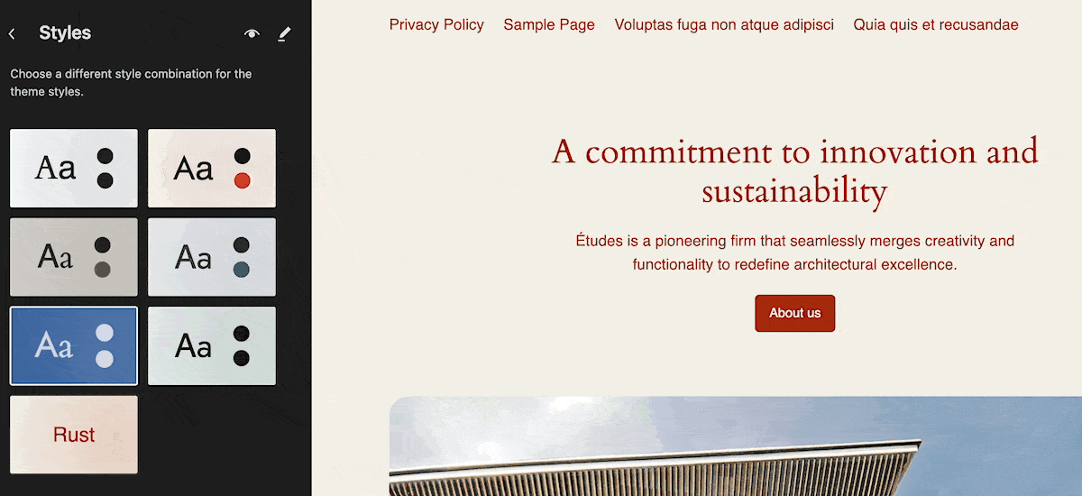
The Styles screen in the left-hand navigation gives you some global design options that include typography changes:
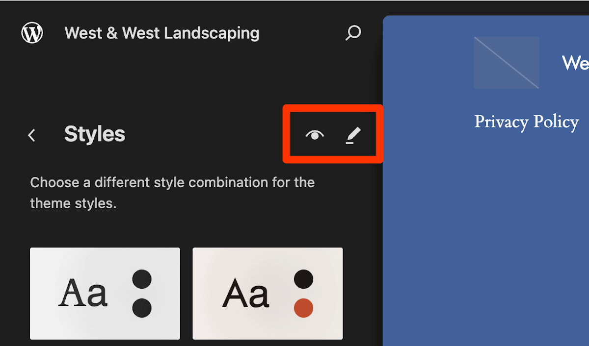
For most use cases, individual settings for various typography aspects will give you greater value. There are two small icons at the top of the Styles screen that will open further options: the Style Book and the Edit Styles pencil icon.
In addition, you can set typography options at an element level and for each Block.
The Font Library
The Edit Styles > Typography screen displays the Font Library, although it doesn’t have this explicit name within the Site Editor. This lets you handle fonts and typefaces in a few ways:
- You can upload and manage custom typefaces.
- There’s an option to use Google Fonts directly within WordPress.
- Create font collections using PHP.
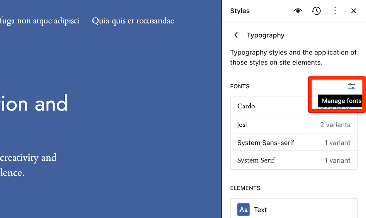
To access the Font Library from the Typography section in the Site Editor sidebar, click the Manage fonts icon:
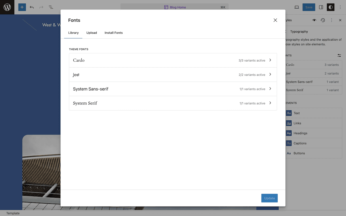
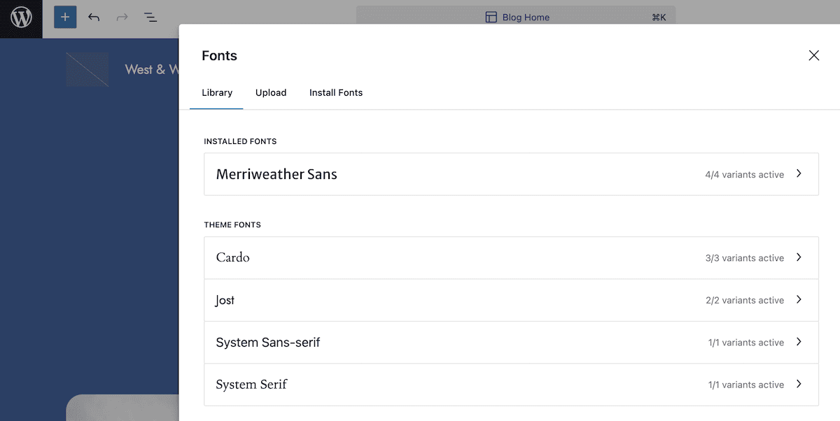
Here, the Library tab shows you the current registered typefaces for your theme and indicates which ones are active:
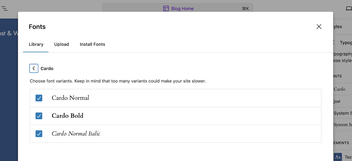
Clicking through any of these lets you activate or deactivate individual fonts:
On the Upload tab, you use a drag-and-drop uploader dialog to install your own fonts in TTF, WOFF, WOFF2, and OTF formats.
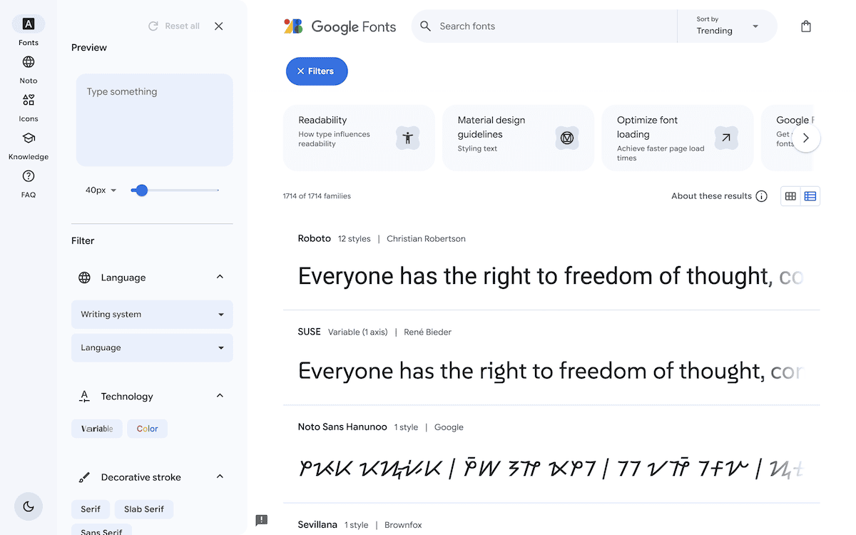
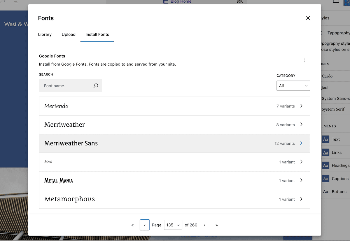
The Install Fonts tab connects to Google Fonts, so you can leverage that library within your theme. Note that this approach downloads and serves fonts from your site, rather than a Google CDN:
Here, select the fonts you want to install from the comprehensive list, then click the Install button. Once the success notification displays, those fonts will show on the Library tab:
This lets you use the fonts as you would any other on your site. Now, you have to customize them to fit your needs.
The Style Book
One of the dangers of choosing and setting typefaces is that you don’t know how it will look in combination with color schemes, layouts, and formattings. The Style Book is invaluable, as it lets you preview your typography settings across different elements.
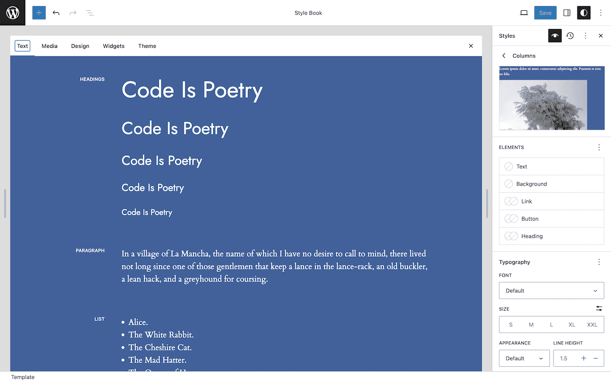
Choosing the eye icon will open the Style Book, and there are five tabs here:
- Text: Go here to work with paragraphs, headings, lists, and other elements that focus on text.
- Media: Here, you can adjust images, video, and audio design presentations.
- Design: This section collates structural design facets, such as columns, separators, and buttons.
- Widgets: There are two elements to this screen: dynamic generations, such as lists of archives and comments. You also work with the search bar, social media icons, and tag clouds here.
- Theme: This focuses on your site header elements, such as the title, tagline, navigation, and logo.
If you click on an element in the Style Book, you have various options to play with in the sidebar. You’re working with the typography settings for each Block here rather than dedicated elements:
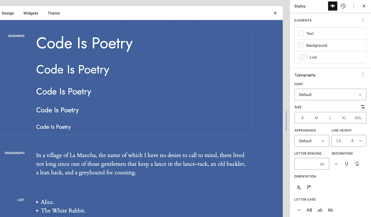
You can arrive at the same screens through the Styles > Blocks section from the Site Editor homepage. Regardless, the options you see let you customize the typography (and more) of each Block in granular detail.
Tuning typography options within the Site Editor
For all Blocks and elements, you have the same core options available to you. Here’s an overview of each option within the panel.
Font type and size
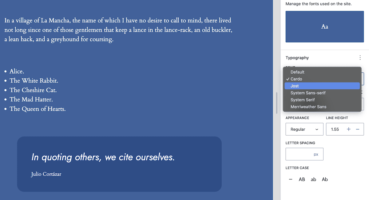
The Font drop-down menu is straightforward: choose the font you want to apply to the specific element or Block:
The Size presets have the least customization within the Site Editor. You choose a size from a range between Small and Extra Extra Large:
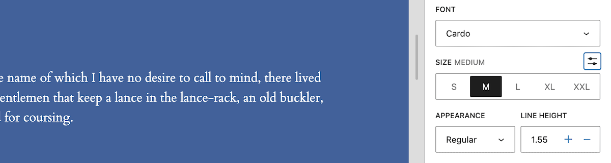
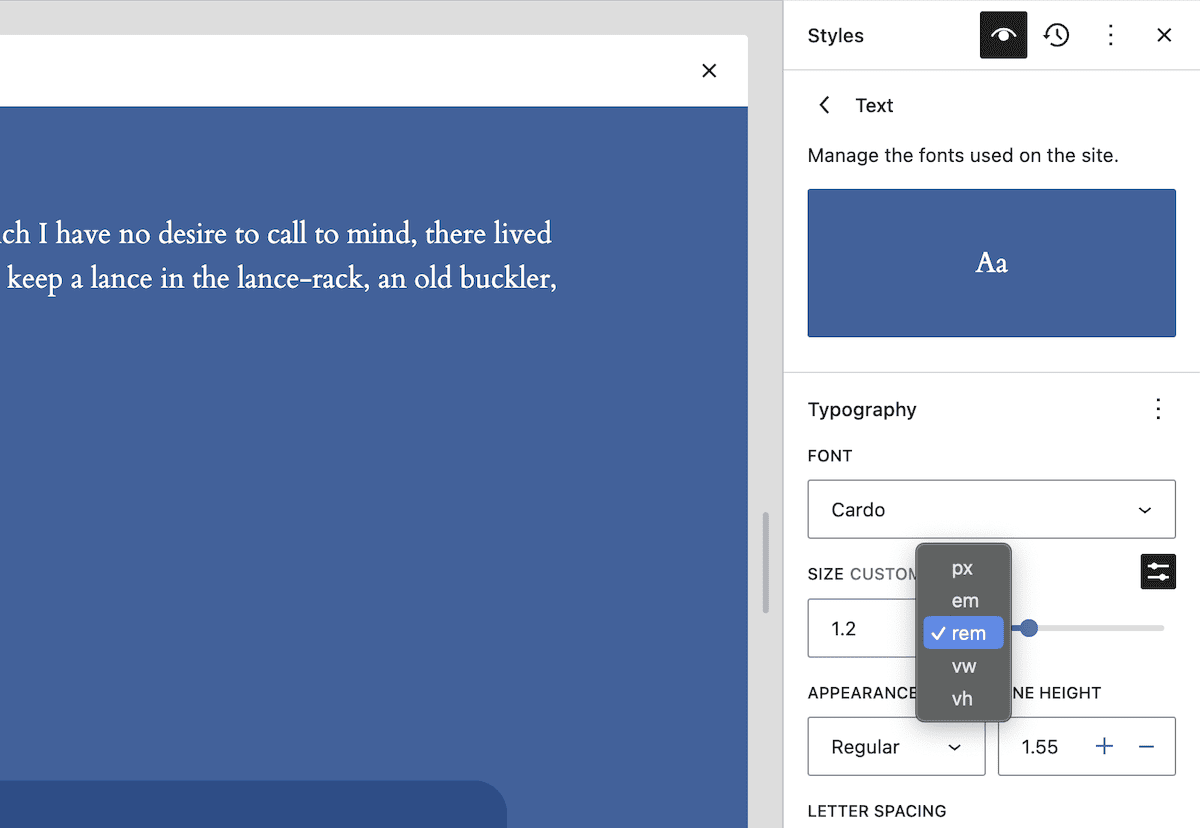
If you edit theme.json, you can change these preset values — but can’t from the Site Editor. The Set Custom Size button gives you a way to set a custom size using an array of sizing units:
There are more ways to adjust typography within the Site Editor, including methods that you typically use CSS for.
Appearance, line height, and letter spacing
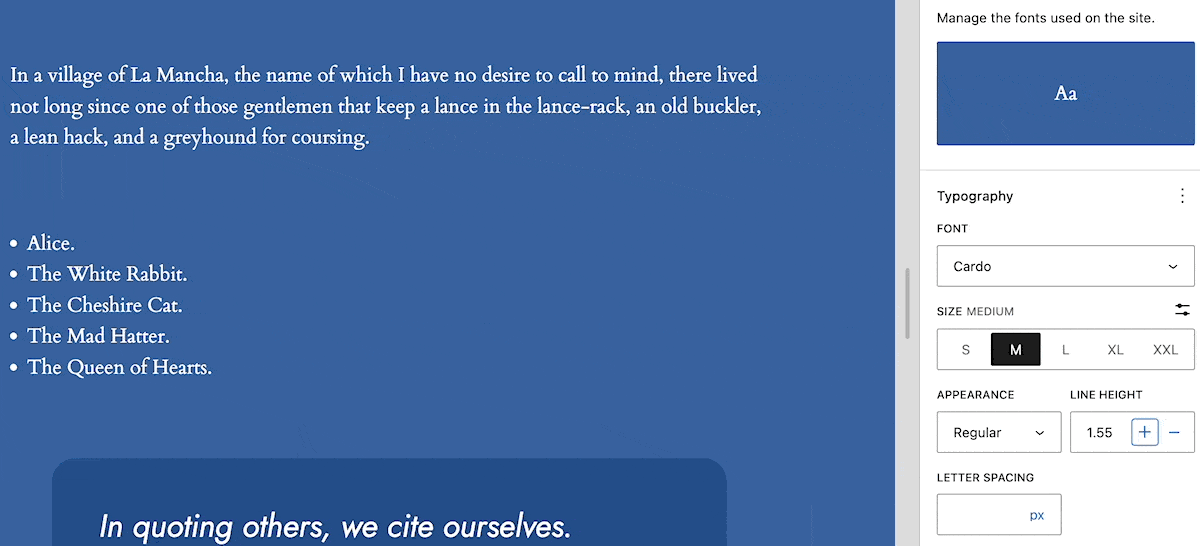
The Appearance drop-down menu seems simple: choose a font weight from an extensive list and it will apply to your text. However, you won’t often have all of the available fonts for each weight.
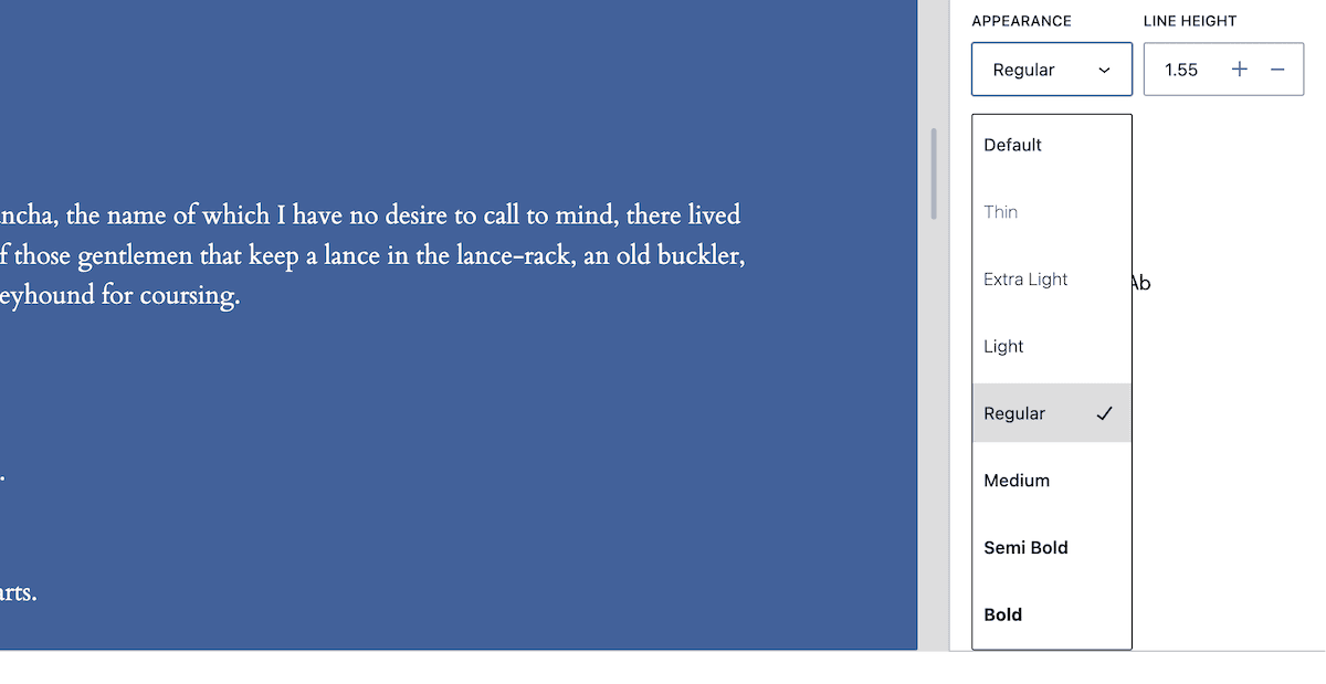
Our testing shows that WordPress doesn’t filter this list to show only available font weights. In addition, it will apply a ”nearest match” if you select a weight without a matching font. For example, we use Cardo Normal, Cardo Bold, and Cardo Bold Italic for our example site. Choosing Semi Bold, Bold, Extra Bold, or Black uses only Cardo Bold:
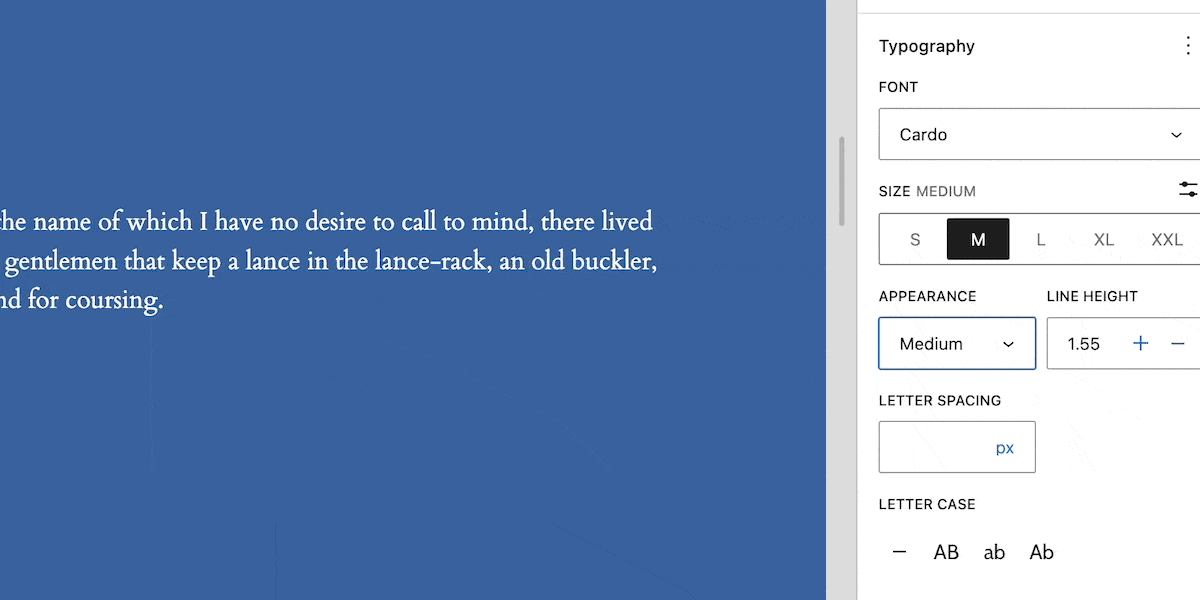
Line height doesn’t use presets and balances your font choice, appearance, and size. This value puts more space between each line and it’s often a practical implementation when text looks bunched up:
Letter spacing is similar, and it follows the CSS custom of adding itself to the natural spacing that’s present:
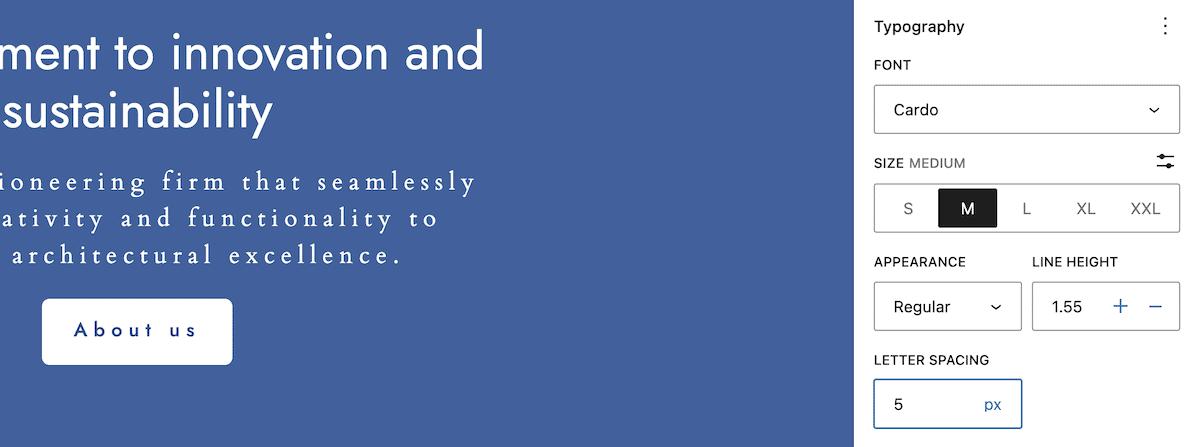
As with custom font sizing, you can select different units of measurement. Choosing a relative value is often the preferable approach here. WordPress sets letter spacing to a CSS default of “normal.” This lets the browser choose the value and, in our experience, this is ideal.
It’s a typical practice to use small positive letter spacing values — often no more than 0.12rem/em — and hardly any negative spacing.
The final set of choices – letter case – lets you choose to make text upper, lower, or sentence case. You can also remove the casing. This is great for consistency when it comes to type, as you don’t need to specifically use a specific case when creating content.
How to use theme.json to define your WordPress theme’s typography
The Site Editor is great for site users without technical knowledge. The theme.json file is how you ensure the Site Editor gives users what they need to customize their sites. It’s the configuration file that is the development base for your theme.
We aren’t going into the structure and formatting of the entire theme.json file, but we are looking at how to define, set, and apply typography within.
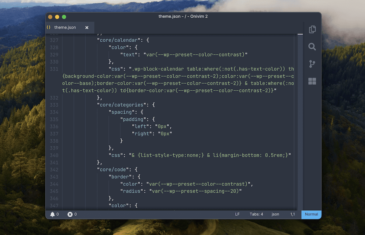
Understanding the theme.json structure and defining global settings
You use JSON to define all elements within theme.json, which includes typography. The typography element nests under the settings object within that file. From there, you nest further elements, properties, and objects to build your site’s typography:
{
  "version": 3,
  "settings": {
    "typography": {
      "fontFamilies": [
        {
          "fontFamily": "-apple-system,BlinkMacSystemFont,\"Segoe UI\",Roboto,Oxygen-Sans,Ubuntu,Cantarell,\"Helvetica Neue\",sans-serif",
          "slug": "system-font",
          "name": "System Font"
        }
      ],
      "fontSizes": [
        {
          "slug": "small",
          "size": "13px",
          "name": "Small"
        },
        {
          "slug": "medium",
          "size": "20px",
          "name": "Medium"
        }
      ]
    }
  }
}
All of these elements follow a similar pattern. The defaults — and easiest to understand — are global settings. These nest in a straightforward way, but you can also define typography settings for individual Blocks:
"styles": {
  "blocks": {
    "core/paragraph": {
      "typography": {
        "fontFamily": "var(--wp--preset--font-family--primary)",
        "fontSize": "var(--wp--preset--font-size--medium)",
        "lineHeight": "1.5"
      }
    },
    "core/heading": {
      "typography": {
        "fontFamily": "var(--wp--preset--font-family--secondary)",
        "fontWeight": "700"
      }
    }
  }
}
This uses the blocks property and a specific namespace for each Block you want to target. While it adds two more nesting layers, there’s no alternative to this approach. Regardless, you have a lot of properties to play with.
Registering fonts
You have the same level of customization for typography as you do within the Site Editor interface — more in some instances. At a core level, you nest your font stack to the fontFamilies property, then give it a slug and name:
fontFamilymaps to thefont-familyCSS value, and will be the stack of typefaces you wish to use in your theme.nameis what you see in the Site Editor when selecting a font, so it will be human-readable.slugappends to a custom CSS property for further use.
For system fonts, this is straightforward:
…
  "typography": {
    "fontFamilies": [
    {
      "name": "Primary",
      "slug": "primary",
      "fontFamily": "Charter, 'Bitstream Charter', 'Sitka Text', Cambria, serif"
    },
    {
      "name": "Secondary",
      "slug": "secondary",
      "fontFamily": "system-ui, sans-serif"
      }
Registering custom web fonts requires that you use the fontFace property and define some attributes:
…
"name": "Secondary",
"slug": "secondary",
"fontFamily": "'Open Sans', sans-serif",
  "fontFace": [
    {
      "fontFamily": "Open Sans",
      "fontWeight": "300 800", // This is a range of font weight values.
      "fontStyle": "normal", // This has to be a valid CSS font-style value.
      "fontStretch": "normal", // This also needs to be a valid CSS font-stretch value.
      "src": [ "file:./assets/fonts/open-sans.woff2" ] // This is an array of URLs for custom fonts, and can support multiple formats.
    },
…
Once you have registered fonts, you select them from the various drop-down menus within the Site Editor.
Note that there are a few ways you can register typefaces for your theme. You have the Font Library within the Site Editor interface, typical PHP enqueuing, and the Create Block Theme plugin:

This is a boilerplate for building a theme, but also lets you register and define typography too. Once you register fonts in whatever way is comfortable (we recommend the Font Library), you can begin to look at sizing.
Setting font sizing and presets within theme.json
Another core task with typography is setting font sizes. This uses the fontSizes property and lets you define presets for the Site Editor:
"settings": {
  "typography": {
    "fontSizes": [
      {
        "slug": "small",
        "size": "12px",
        "name": "Small"
      },
      {
        "slug": "x-large",
        "size": "32px",
        "name": "Extra Large"
      }
    ]
  }
}
As with other typography settings, WordPress will generate a custom CSS property for each preset using the slug you provide:
body {
--wp--preset--font-size--small: 12px;
--wp--preset--font-size--x-large: 32px;
}
WordPress disables fluid typography by default, but you can turn this on using boolean values. It’s an option you can set at a global level…
{
  "version": 2,
    "settings": {
      "typography": {
        "fluid": true
      }
    }
}
…or for each preset and size you define:
{
  "name": "Medium",
  "size": "1.25rem",
  "slug": "md",
  "fluid": {
    "min": "1rem",
    "max": "1.5rem"
  }
},
The min and max values let you determine the range of scalability for each fluid font size you define.
Implementing advanced typography features
The theme.json provides a full complement of options, on par with what you can find in the Site Editor. This lets you customize the typography on your site to a set of defaults that make sense for your theme:
"styles": {
  "typography": {
    "letterSpacing": "0.02em",
    "textTransform": "uppercase",
    "textDecoration": "underline",
    "lineHeight": "1.55rem",
    "fontStyle": "normal"
  }
}
You can choose to enable or disable these options. Each option takes a boolean value, which means you have some customization options for the Site Editor, too. There are a few customizations you can make that go beyond the Site Editor’s offerings:
customFontSizeis on by default, and lets users input custom font sizes — but you can disable it if you want to tightly control the available options.dropCapdefaults to false, but if you enable it, the user has the option to enable drop caps for the initial letter of any Paragraph blocks.textColumnsenables a “columns” option for any text within a Block, and this is off by default.writingModeenables options to change the text orientation within the Site Editor. You can give users a choice between horizontal and vertical text.
The scope of theme.json means you should work there first, especially when building a theme. The options in the Site Editor will let you or your users refine WordPress typography.
How to implement typography using theme.json: a practical example
FSE makes design and development with WordPress easier than ever before. What’s more, some of the general process of selecting and implementing those typefaces is more straightforward. Some of this is due to design trends, but the tools exist to plug gaps where you don’t have a graphic designer available to help.
We can start with your core typeface selections.
1. Pair complimentary typefaces
There’s a reason so much writing goes into how to choose fonts and typefaces. It’s because it can be a tricky task. For instance, you have to consider the branding of the site, its purpose, and what you want to convey.
However, thanks to current design trends, there’s much less work to do here. This is because your body text can use system fonts — specifically the primary operating system (OS) typeface. The only task for you is to choose something that works alongside it.
This isn’t a tutorial on pairing typefaces, but we have some tips to pass on:
- OS typefaces for the body copy will typically be sans-serif. This means looking for either a serif typeface or another sans-serif that looks different, unique, and stands out.
- Keep things simple, and maybe consider only using the OS font if it works with the design.
- Test out different combinations, as you can get a feel for which typefaces work together (and which don’t).
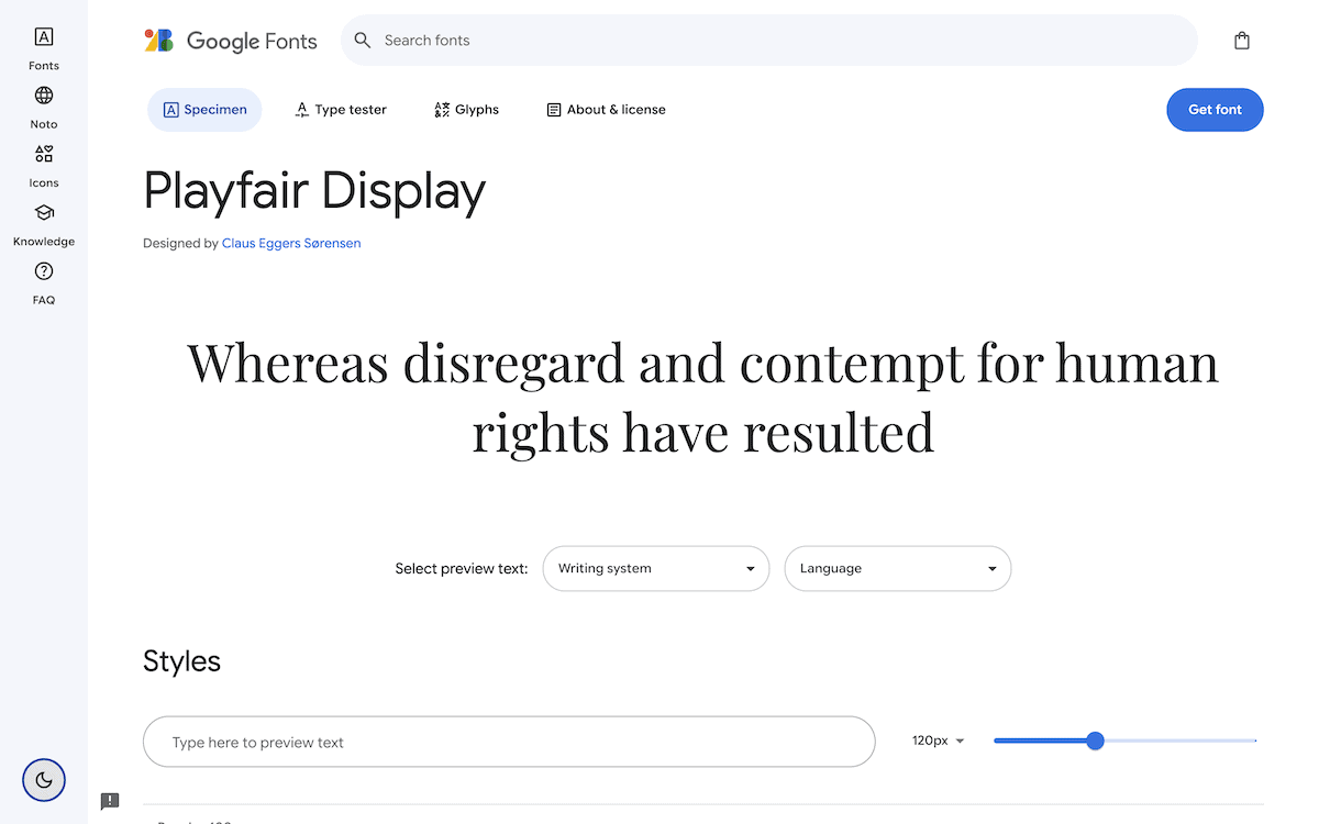
A good pair for a system font stack is Playfair Display, a serif Google Font:
With a pair of fonts, you have to consider their size, not only on the page but in relation to one another.
2. Find the right absolute and relative sizing
Choosing font sizing is also crucial, as the wrong absolute sizes can ruin your UX/UI. It’s also an area where you may want to stick to the defaults. However, we encourage you to experiment here, as each pairing will have its own “space” for the typefaces.
Typescale is an excellent tool that can help you create the right WordPress typography, whatever your need:
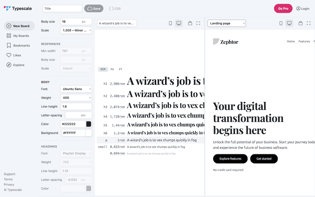
One of the best aspects of the tool is the scale choices. It essentially does lots of work for you in choosing complimentary font sizes. We select a Major Third scale here, with a factor of 1.2 and a base size of 16px:
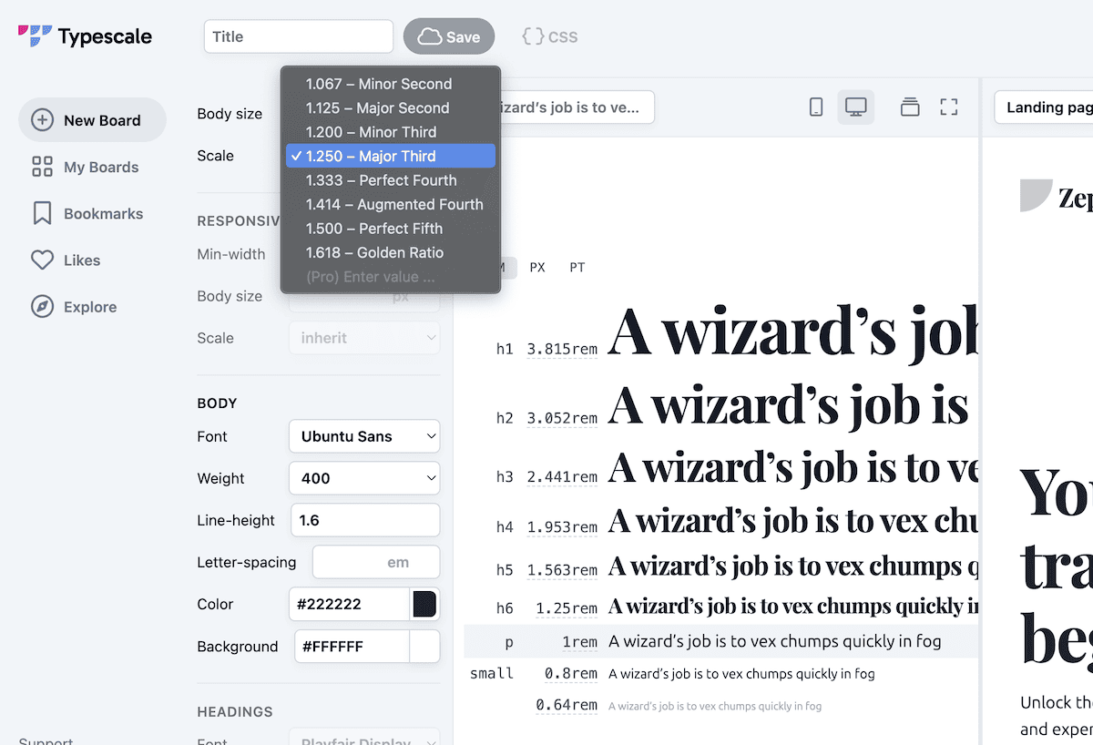
Looking in the middle panel, you will see the resulting sizes for each heading and paragraph and can choose from a number of units of measurement. Note that Typescale also lets you change the letter spacing, line height, font weight, and more: all customizable within theme.json.
3. Applying defaults within theme.json
Once you have the right typefaces and sizing, you can implement them within your theme.json file. Here’s an example of what a typical theme.json file will look like:
{
  "version": 3,
  "settings": {
    "typography": {
      "fontFamilies": [
        {
          "fontFamily": "-apple-system, BlinkMacSystemFont, \"Segoe UI\", Roboto, Oxygen-Sans, Ubuntu, Cantarell, \"Helvetica Neue\", sans-serif",
          "slug": "ubuntu-sans",
          "name": "Ubuntu Sans"
        },
        {
          "fontFamily": "\"Playfair Display\", serif",
          "slug": "playfair",
          "name": "Playfair Display"
        }
      ],
      "fontSizes": [
        {
          "slug": "small",
          "size": "13px",
          "name": "Small"
        },
        {
          "slug": "medium",
          "size": "16px",
          "name": "Medium"
        },
        {
          "slug": "large",
          "size": "20px",
          "name": "Large"
        },
        {
          "slug": "x-large",
          "size": "25px",
          "name": "Extra Large"
        },
        {
          "slug": "huge",
          "size": "31px",
          "name": "Huge"
        }
      ]
    }
  },
  "styles": {
    "typography": {
      "fontFamily": "var(--wp--preset--font-family--system)",
      "fontSize": "var(--wp--preset--font-size--medium)",
      "lineHeight": "1.8"
    },
    "blocks": {
      "core/paragraph": {
        "typography": {
          "fontSize": "var(--wp--preset--font-size--medium)"
        }
      },
      "core/heading": {
        "typography": {
          "fontFamily": "var(--wp--preset--font-family--playfair)",
          "fontWeight": "700"
        }
      },
      "core/post-title": {
        "typography": {
          "fontSize": "var(--wp--preset--font-size--huge)"
        }
      }
    }
  }
}
You can apply also these typefaces to any Block, and even think about styling each heading in a unique way. Look to create a consistent and hierarchical WordPress typography system that will form the foundation of your theme’s design. It will ensure a cohesive look across your site, while the Site Editor will give you better flexibility and customization.
Kinsta’s role in your WordPress theme development workflow
Kinsta’s high-performance hosting offers plenty to help you run an efficient and speedy website. However, it also offers robust development tools, including DevKinsta, a local development environment that runs on Docker containers.

It’s important to make sure your WordPress typography works before you push live. This is where Kinsta’s staging environments will be essential. In particular, Selective Push will be something you use a lot. This lets you push specific files and folders — any asset you wish — rather than everything at once.
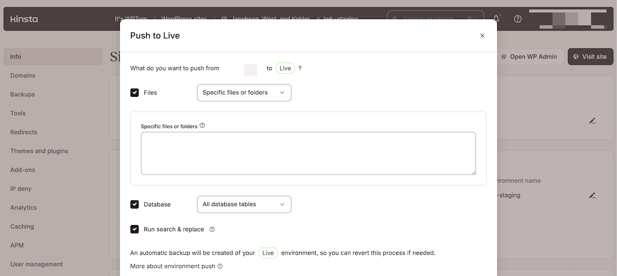
This way, you can make discreet design changes by pushing singular files (such as theme.json). In addition, you can minimize the risk of damaging parts of your site’s design you are happy with, and you can make more frequent, incremental updates to your site’s typography.
Summary
FSE is maturing, and theme.json is central to the whole approach to WordPress editing. Typography is a critical factor, and WordPress provides developer-level tools and access to elements that would previously require a grounding in CSS and PHP.
Between the Site Editor’s intuitive interface, and the adaptability of theme.json, you can create typography that enhances your site’s aesthetics, resonates with your branding, and gives a boost to the overall user experience.
We’d love to hear about your experiences with WordPress typography and whether FSE holds the key to success for you. Share your thoughts with us in the comments below.