There are 1052 different Google Font families available for free (at the time of writing this article). That’s a lot of choices! So it’s no wonder you need help finding that needle in a haystack with a list of the best Google Fonts.
We’ve got it for you, and then we’ll also share some best practices for using Google Fonts in WordPress.
Choosing a font is more than just an aesthetic choice — it can have a substantial effect on your site’s bounce rates and conversion rates, especially if you choose a font that’s hard to read. Therefore, it pays to take a little time to pick the perfect Google Fonts family for your website, rather than using the first font that you come across.
If you need even more fonts, look at our post on 50+ Modern Fonts to Use on Your WordPress Website.
Check Out Our Video Guide to The Best Google Fonts
Why Use Google Fonts?
There are thousands of font repositories on the internet, so what exactly makes Google Fonts so special?
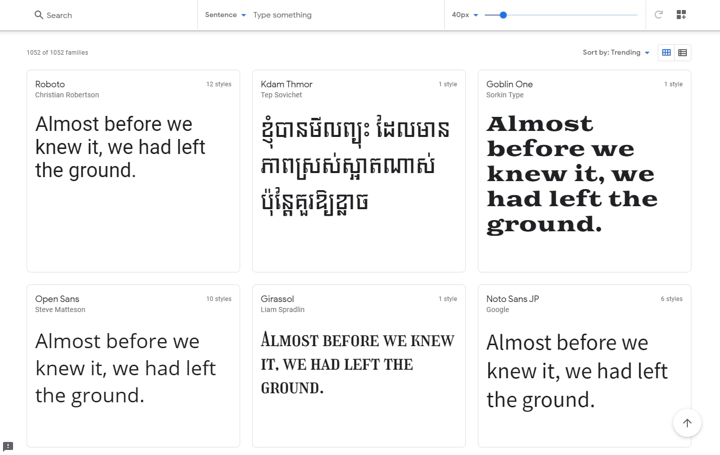
Firstly, it’s free! On top of that, Google Fonts are maintained and delivered by Google, which means they’re guaranteed to be safe. Of course, there are plenty of dodgy websites where you can download free fonts, but who knows what else you’ll pick up with those files?
The quality of fonts on such websites can sometimes be questionable as well.
Google has curated a selection of over a thousand high-quality fonts. When you’re not a graphic designer with a perfect eye for typography, it’s a safer choice.
Secondly, there are no convoluted licensing restrictions. All fonts in the Google Fonts catalog are open source and free to use in commercial projects. You can download or embed them on your site, and you can even use them in print projects.
Though there’s no unified license, most fonts in the repository use the Open Font License.

Other “free fonts” are rarely free and come with a whole host of confusing licensing restrictions that could land you in hot water if you make a mistake.
And finally, it’s effortless to add Google Fonts to your website using the Google Fonts API. Alternatively, you can download them individually and upload them to your web server via FTP/SFTP.
While Google Fonts tend to be simple and perhaps not as flashy as some paid fonts, it certainly beats web-safe fonts that come preinstalled with major operating systems, the same fonts everyone has seen thousands of times before.
What to Look For in a Google Font?
If there’s one thing you should learn when designing a website, it’s how to choose a Google Font that’s suitable for your project. Good typography will make or break your site.
It may seem like an unimportant detail, but it can be the difference between someone leaving your site early or sticking around to become a loyal reader or customer.
Choosing the right font is something graphic designers spend years mastering, but keeping a few principles in mind, you can pick a beautiful font for your website.
- Fits Your Brand: This may be the most critical aspect. The best websites have a font that shows off their personality while still being readable and fitting in with the current design. For instance, Apple and Iron Maiden use vastly different fonts, but they both fit their brand.
- Readability: The second most crucial principle is readability. A zany fantasy or grungy font may certainly fit your brand, but if your visitors can’t read it, they’ll be quick to leave. Therefore, your fonts must be professional and legible.
- Font Classification: While there are hundreds of ways to classify a font, these are the five main types: serif, sans-serif, script, monospace, and decorative. A script or serif font conveys elegance, while monospace fonts are popular on tech sites. Knowing these classifications will give you a better starting point in your search.
- Display or Body Font: Display fonts are for large sizes, headers, or print projects. They can afford to be less legible for the sake of unique design. Body fonts’ primary directive is readability, as they’ll make up the bulk of your site.
- Mood and Intent: Just like any artistic work, artists design fonts for specific moods and settings. Most fonts will come with notes on how they were designed and how you can use them. Use them to decide whether the font suits your project.
The 10 Best Google Fonts (According to the Wisdom of the Crowds)
So, how do you develop a list of the best Google Fonts when so much of this is subjective? We don’t want this entire list to be biased, so we’re going to go with the data to build a list of the most popular Google Fonts.
We’ll use Google Fonts analytics to trust the wisdom of the crowds. With over 50 trillion total font views, Google has just a little bit of data to pull from.
Then, we’ll go a bit beyond the raw popularity numbers and choose some up-and-coming HTML fonts that are gaining popularity.
Ready? Let’s dive in!
1. Roboto
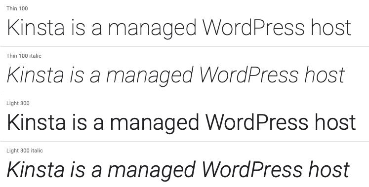
The long-running #1 spot and Kinsta’s font of choice, Roboto is a sans-serif offering from Christian Robertson that Google developed as the system font for Android. It’s now massively popular, comes in 12 different styles, and makes multiple appearances on Google Fonts’ analytics.
For example, Roboto is the most popular font. But Roboto Condensed is also the sixth most popular font, and Roboto Slab also makes an appearance at number 12!
2. Open Sans
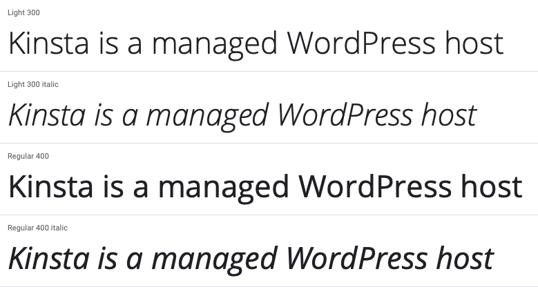
Open Sans Condensed is a highly legible font commissioned by Google and inspired by its predecessor Droid Sans. Google uses Open Sans on some of its websites and its print and web ads. Open Sans Condensed, its sister font here, also holds the thirteenth most popular spot on Google Fonts.
3. Lato
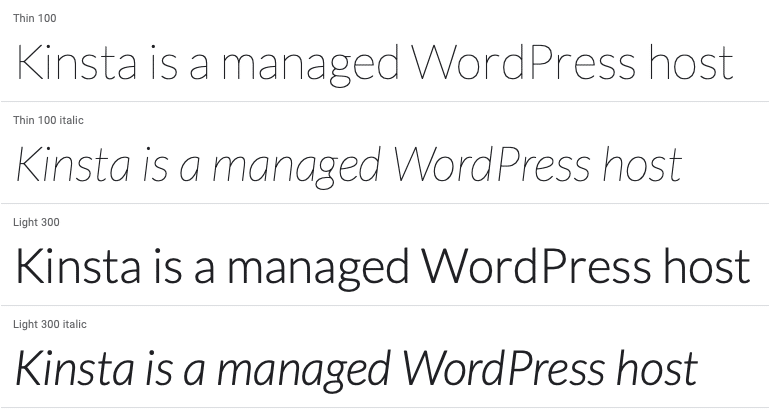
Lato is another popular choice from Łukasz Dziedzic. It has quite the story behind its design, balancing conflicting goals, resulting in a unique, lightweight sans-serif font.
4. Montserrat
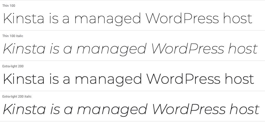
Montserrat is a sans-serif font from Julieta Ulanovsky, who lives in the eponymous Montserrat neighborhood of Buenos Aires. With 18 different styles ranging from light to heavy, you have quite a lot of choice.
5. Oswald
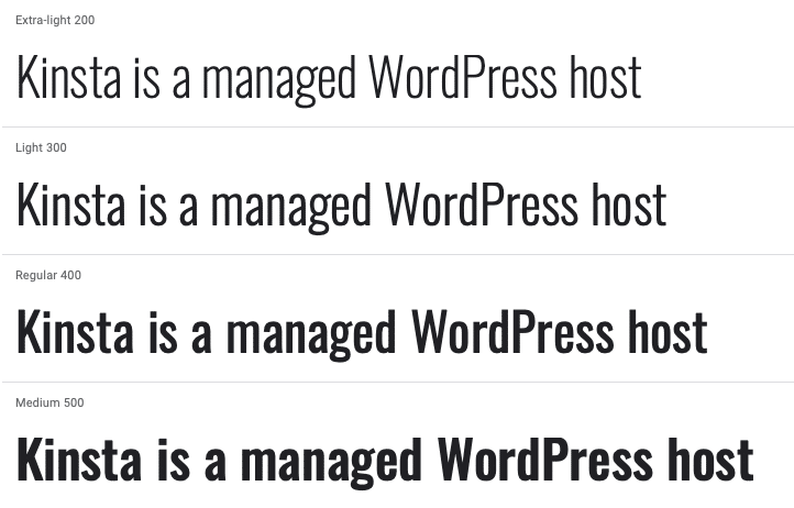
Oswald is a sans-serif font originally developed by Vernon Adams. It was designed with the distinct Alternate Gothic style in mind, made evident by its bold strokes.
6. Source Sans 3
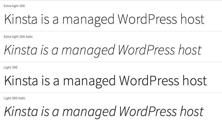
Source Sans 3 is a sans-serif font created for Adobe and Adobe’s first open-source font. Made by Paul Hunt, its light lettering makes it clean and legible.
7. Slabo 27px/13px

Slabo is a serif font developed by John Hudson of Tiro Typeworks. This font is specifically designed for certain sizes — either 27px or 13px, depending on your needs.
8. Raleway
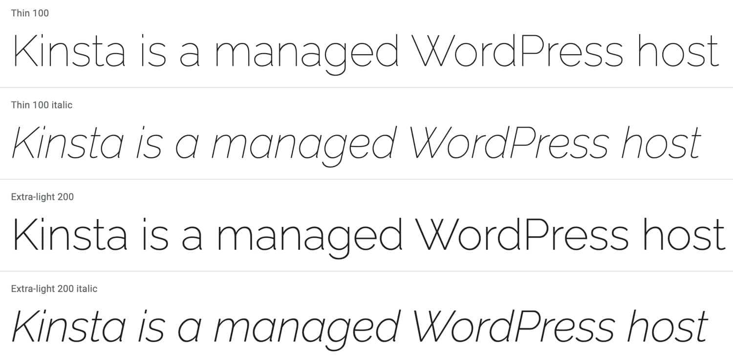
With 18 different styles, Raleway is another large-family sans-serif font, initially created by Matt McInerney. If you like Raleway and are looking for something unique, Raleway Dots offers similar styling with a dotted approach that can work for big headlines.
9. PT Sans
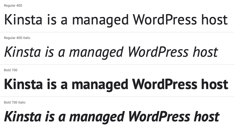
PT Sans was developed for the Public Types of Russian Federation and, as such, includes both Latin and Cyrillic characters. There are also several other fonts in the PT family, including some serif options.
10. Merriweather

Merriweather’s name evokes the idea of a pleasant design, and that’s exactly what its designers intended. While not quite as popular, Merriweather Sans is a sister project that pairs exceptionally well with it.
5 Bonus Fonts + Up-And-Comers
By the numbers, the ten fonts above are the most popular Google Fonts. But only showing the most popular options does a disservice to great up-and-coming fonts that haven’t gotten the exposure to show up on the analytics.
Here are some of our favorites that didn’t make an appearance at the top of the analytics.
11. Noto Sans / Serif
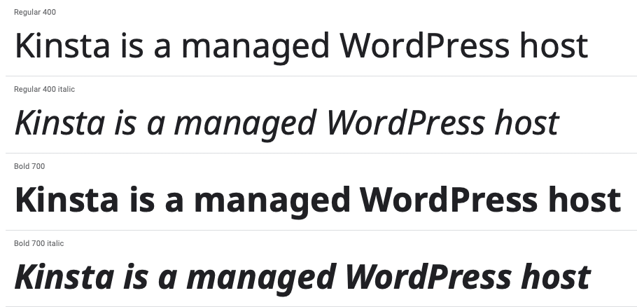
Noto is a Google-commissioned font that comes in both serif and sans-serif versions. It’s receiving regular updates, and there are now well over 100 Noto fonts, with more coming all the time!
Noto’s goal is to cover all the alphabets and characters from various languages while its distinct design harmonious across hundreds of different font families. These derivatives include the popular Noto Sans KR and Noto Sans JP.
12. Nunito Sans
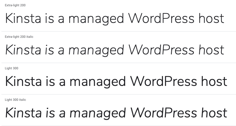
Nunito Sans is a sans-serif option that’s rapidly growing in popularity. Its use tripled between 2018 and 2019, and it only gets more popular every year.
13. Concert One

Concert One is a rounded grotesque typeface that makes a stellar option for headlines. Its unconventional design is sure to draw eyes.
14. Prompt
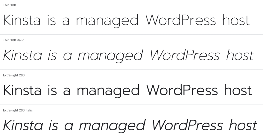
Prompt is a sans-serif offering from Thai communication design firm Cadson Demak. It is loopless (the Thai equivalent of sans-serif) and includes both Thai and Latin characters.
15. Work Sans
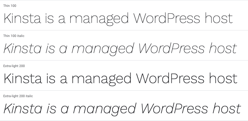
Work Sans is a sans-serif font optimized for use on screens. The designers recommend using the middleweight styles for anything from 14px-48px.
How to Create the Best Google Fonts Combinations?
If you thought trying to choose one font from Google Fonts was hard, wait until you try to pair them up on your site! Thankfully, this isn’t a problem you have to solve (unless you want to). You can use a couple of ways to come up with the best Google Fonts combinations.
First, the Google Fonts website itself will suggest popular pairings if you scroll down the page:
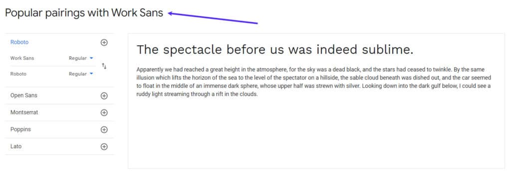
Beyond that, you can also use a site like Font Pair to get more suggestions.
Best Practices for Using Google Fonts on WordPress
Once you find the perfect fonts for your project, here are some best practices for using Google Fonts on WordPress.
Limit the Number of Font Weights You Use
Some of these fonts — like Montserrat and Raleway — come with 18 different font weights. While that’s good for giving you options, you don’t want to load all 18 weights on your WordPress site because it will slow your load times down.
Following this guideline is very important!
For most fonts, a good rule of thumb is to use three weights as a maximum:
- Regular
- Italic
- Bold
Many WordPress sites we see nowadays are even skipping italic and just going with two different font weights.
If you’re embedding Google Fonts yourself, you can choose exactly which weights to include. First, visit a font page and then click Select this style next to the ones you want.
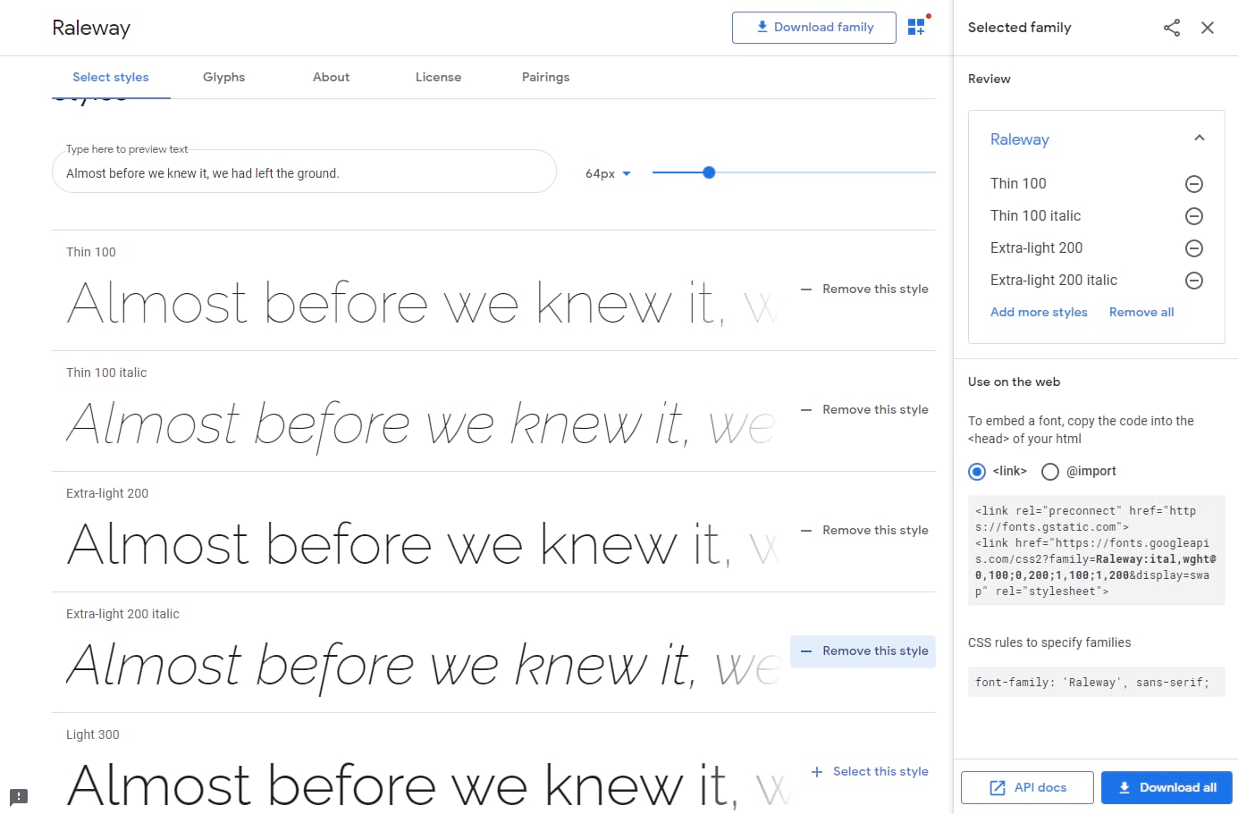
Most WordPress themes today include easy ways to choose which Google Fonts and weights you want to use. But not all theme developers are focused on performance. So in some cases, it might be better to disable Google Fonts in your theme and add them yourself.
Variable fonts are also starting to become popular and are supported by all modern browsers. These are awesome because it allows one font file to transform with different properties. Google Fonts has plenty of variable fonts to choose from, and you can even narrow down your search to those specifically.

Consider Hosting Google Fonts Locally
As an alternative to serving up fonts from Google’s server, you can also host fonts locally, offering performance benefits. However, remember that most Google fonts are probably already cached in people’s browsers. So we recommend doing your performance tests.
If you’re using a premium font other than Google fonts, like the “Brandon” font we use on our Kinsta site, hosting them locally (and serving them from your CDN) is the best route. For more on this topic, check out our posts on how to host fonts locally.
Pick a Font That Will Get Updates
Fonts are just like WordPress plugins and themes — over time, they receive updates and improvements to make them even better. And while the stakes are nowhere near as dire as WordPress plugins, it can still be beneficial to pick a font that receives regular updates. For example, the Noto family from Google has gotten regular updates since 2014.
Because most of the fonts on this list are popular, it’s probably a good bet that any font on this list will receive regular updates and improvements. And if you decide to go off-list, making sure whichever font you choose is popular enough to get attention is never a bad idea.
Don’t Forget About Accessibility
According to the World Health Organization, according to data collected in 2015, an estimated 253 million people live with vision impairment: 36 million are blind, and 217 million have moderate to severe vision impairment. In addition, the number of people with some form of impairment has risen to 2.2 billion.
When using Google Fonts, you get to control how it looks with CSS, such as color and size. So don’t forget to follow the Web Content Accessibility Guidelines (WCAG) 2.0. That will ensure your content is easily accessible to everyone.
Following these guidelines will make content accessible to a broader range of people with disabilities, including blindness and low vision, deafness and hearing loss, learning disabilities, cognitive limitations, limited movement, speech disabilities, photosensitivity, and combinations of these. – Web Content Accessibility Guidelines (WCAG) 2.0
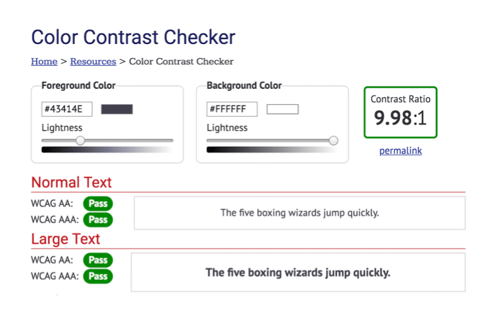
One critical guideline is the color contrast. Our font was a little too light on an older design of the Kinsta website, and visitors voiced their concerns as it made it hard to read. The last thing you want to do is publish amazing content, only to have it become a strain on people’s eyes!
You can use a tool like the Color Contrast Checker from WebAIM to see if your font colors pass the official recommendations. For example, you can see that the colors on our blog posts now passed the test. 👍
How to Add Google Fonts to WordPress?
With a font or two picked out, the final step is to add it to your website. Thanks to Google Fonts, this task is even easier than usual.
Suppose you want to get a font onto your website. In that case, you have three options: installing a plugin such as Easy Google Fonts or Google Fonts Typography, using the Google Fonts API to upload the font to your site, or manually downloading it and hosting it on your website.
If you need to know how to change your fonts in WordPress, we’ve written up a detailed guide to help you out.
Summary
Google Fonts are fantastic and used by millions of websites. They make the web more pleasant, open, swift, and accessible through solid typography and iconography principles.
To ensure a better overall experience for your visitors, we recommend you follow best font practices such as limiting font weights, hosting fonts locally (if needed), and sticking to accessibility guidelines.
Now over to you — what are your favorite fonts and font pairs from Google Fonts? Let us know below in the comments, and don’t forget to read our in-depth guide on WordPress fonts!

