
Choosing the right font for your website is always an important decision. And while there may be aspects of site development that are more important overall, font selection does rank up there.
Think about it: the HTML fonts you choose will determine how site visitors experience all of your written content. Choose poorly and people will have a hard time reading the messages you’re trying to get across. Basically, not good.
Though you’ll usually want to select non-script fonts for body text and your main content, you should ensure they’re web safe, too. However, cursive fonts can add a touch of elegance to your site’s design.
Before we get into a healthy list of cursive font options, let’s first discuss where script or cursive fonts come from as well as a few examples of best use cases.
A Brief History of Script Typefaces
Cursive fonts are formally referred to as script typefaces and they’ve existed for several hundred years. We’re talking long before typewriters and word processing here. Rather, script typefaces are inspired by physical cursive handwriting that was used around the 18th century. This type of curlicue, scroll-laden handwriting you’d find in manuscripts written with a quill and ink.
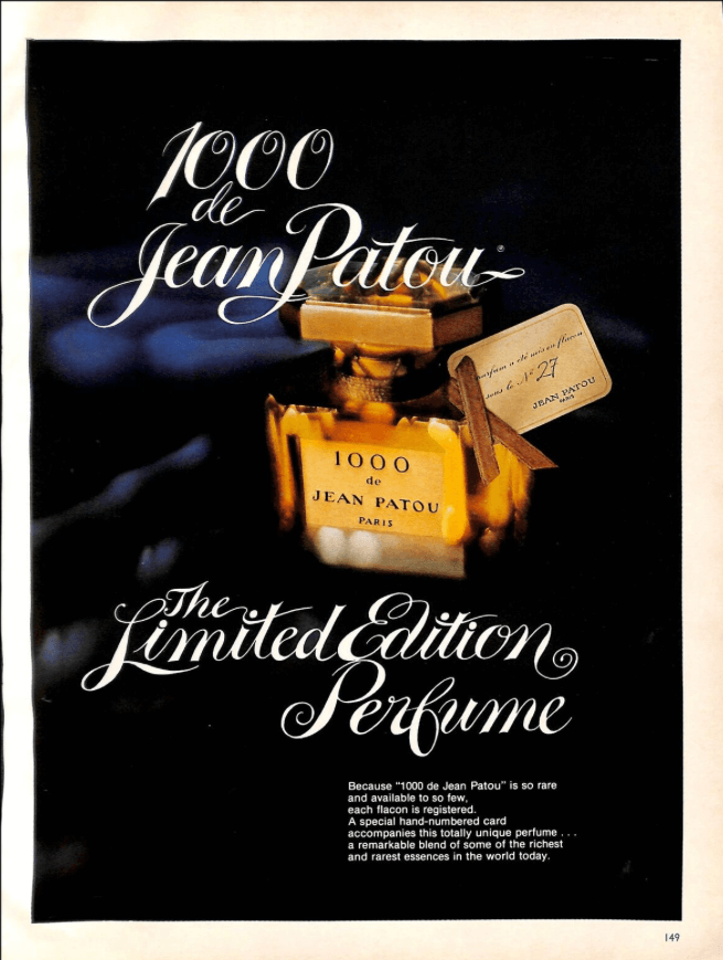
During this period of time, British aristocracy was quite fond of calligraphy, which was made entirely possible by the use of a pointed nib. This elegant lettering was then engraved onto copper plates, which could be used in printing. This same style found a revival in the 1970s, where script flourishes dominated advertising across every niche.
Brush scripts, on the other hand, found their beginnings in Asia. Calligraphy was created using a brush, which resulted in a feathery, delicate style of writing.
When replicated in digital format nowadays, brush script fonts mimic this lightweight style, which carries numerous imperfections and brushstrokes, lending it for use in anything that needs a personal or authentic touch.
The script typefaces as we know them today found in printed materials and online were developed in the 20th century and are often a bit more relaxed than their predecessors. They’re more casual and easier to read than both cursive handwriting and early examples of script typefaces.
Of course, some script fonts are still rather illegible. For instance, Gaelic style script typefaces are blocky yet maintain elements of cursive on some occasions making it difficult to read. Likewise, calligraphy fonts can go heavy on the flourishes at times, obscuring the letters.
Script typefaces have been used in a variety of ways in the modern era. From wedding invitations to ads, script is no stranger to printed materials. And it makes sense why.
The use of a script typeface automatically adds a sense of style and sophistication to what you’re making. It also adds authenticity. Though not written by hand, it imitates cursive handwriting which immediately creates associations in your mind with a personal touch.
When to Use Cursive Fonts
We’ve already mentioned a few potential use cases but let’s take a moment to explore further when and where to use cursive fonts on your website. Of course, any time you want to convey elegance, a cursive font will serve you well. But there are a few specific situations where their use is both expected and encouraged:
- Formal situations: Any time you want to exude class or sophistication, a script font can work well. Wedding invitations are a great example. Certificates, awards, other formal documents, as well as magazine headers all can benefit from their use.
- Official marketing materials: Similar to the above, company letterhead, website headers, and blog post titles may find cursive fonts to be fitting.
- Luxury brands: It makes more sense for a company or brand that deals in the luxury niche to use equally luxurious or sophisticated fonts.
- Headers and titles: Cursive fonts are best used in short bursts. They just aren’t very legible when used for body text. It’s hard on the eyes and also poor on accessibility, so stick to using them for titles instead.
- One at a time: Only use one script font on your website. It’s much too messy to try to use more than one. Remember, a script font is most often used for titles or to call attention to a specific line of text (like a subheader or tagline). Using multiple cursive or script fonts across your site will just look garish, so don’t do it.
With all of this in mind, let’s now dive into our list of the best cursive fonts for making your site look fancier and more professional.
The Best Cursive Fonts
Before you start your next project, you’ll definitely want to consider one of these cursive fonts, which are well-suited for adding elegance and style to your WordPress site headers, titles, and more.
1. Dancing Script
Dancing Script is a lovely cursive font that is quite relaxed and could be used in a wide number of places on your website. It’s slightly informal but could easily be used for site headers and title graphics for professional sites, blogs, publications, and more.
2. Allura
Allura is another cursive font option that offers a bit more flourish. Definitely a wedding invitation sort of font that could be used on a wedding website, even. Or, it would work nicely for a logo or site title.
3. Tangerine
And then there’s Tangerine. This font has a real classic feel with less of a slant to each letter and more of a pseudo-printed look. It walks a fine line between true cursive and merely a fancy script font but would still serve fancier sites well.
4. Cookie
Cookie is still another option that offers a sophisticated font for any type of website. The lines are thicker in this font, which makes it suitable for logos and titles.
5. Herr Von Muellerhoff
Another option is Herr Von Muellerhoff. This font is a bit more difficult to read but it’s also very elegant and could be used to add stylistic flourishes throughout your site. It’s a great choice for a tagline or title.
6. Precious
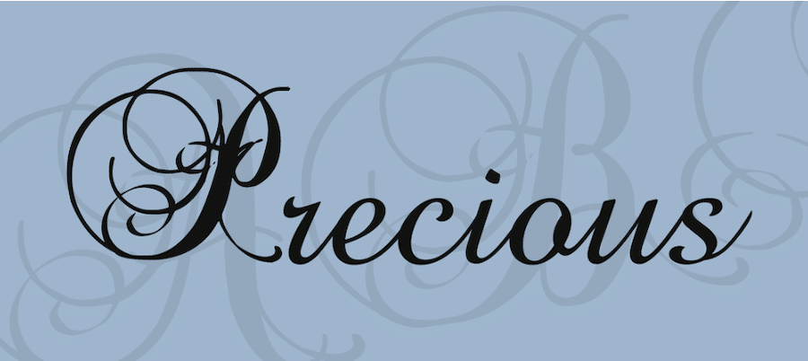
Precious is a beautiful font with tons of flourishes and curlicues that make it perfect for titles and website headers. It especially stands out in its capital letters, which feature all kinds of accents that make it stand out and imitate the lettering of an illuminated manuscript.
7. Scribble
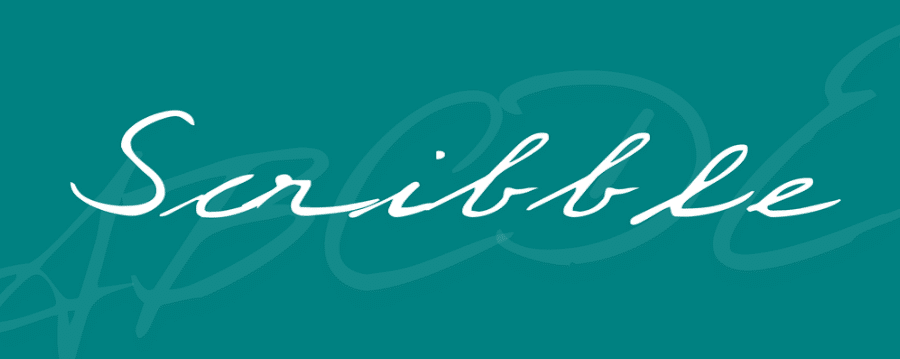
Scribble is another great choice, this time on the more informal side. This font closely mimics real handwriting, offering a subtle cursive that doesn’t include a bunch of flourishes. Instead, it emphasizes widely spaced letters and the look of someone taking pen to paper.
8. La Sonnambula
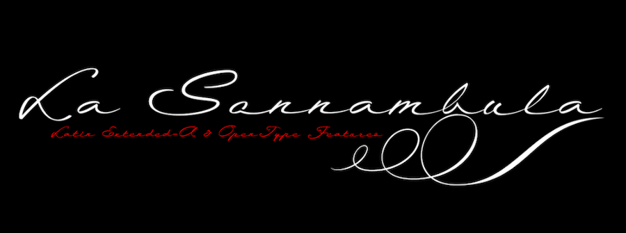
La Sonnambula is another choice worthy of consideration. This font still offers a casual look without an abundance of flourishes but it also maintains a bit of fancier appeal, as though written with a calligraphy pen.
It has the look of a restaurant logo or menu, making it a great choice for a number of situations.
9. Popsies
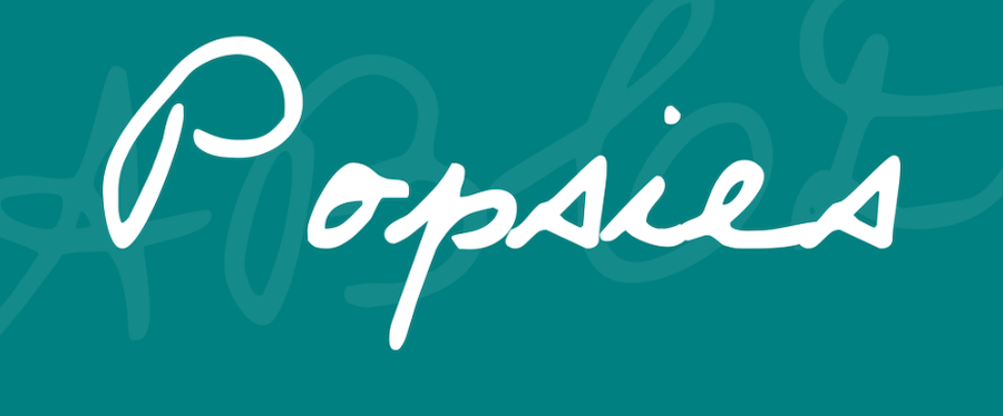
The Popsies font is another cursive option that could offer a bit of a personal touch to your site’s design. A fantastic choice if you need to simulate a handwritten signature in your content or want to make your blog subheadings look handwritten.
Overall, a lovely option to break up your standard body text.
10. Agatha
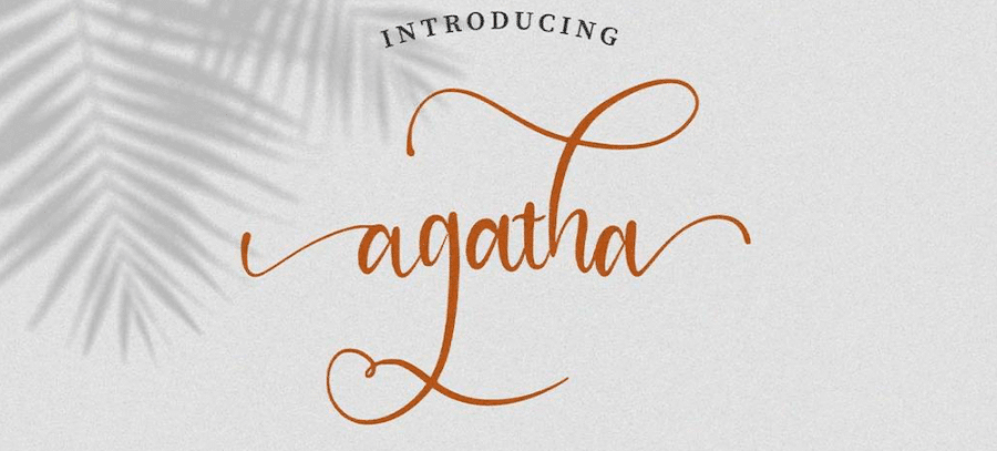
Agatha is still another fairly casual cursive font but leans more heavily into the flourishes and scrolls.
Instead of featuring rigid, calligraphic flourishes, this font has loopy ones that extend far beyond the traditional end of each letter. It could serve as another good choice for showcasing a signature on your site.
11. 18th Century Kurrent
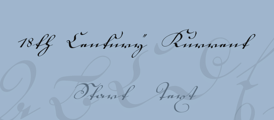
You could also select 18th Century Kurrent to add some cursive flourishes to your site. Granted, this font is quite hard to read but it does have a certain style to it that makes it attractive. It could easily be used in a subtle banner design where the text is transparent and used in the background.
Basically, it’s best used when you want a cursive text look but the text doesn’t need to be read.
12. Self Deception
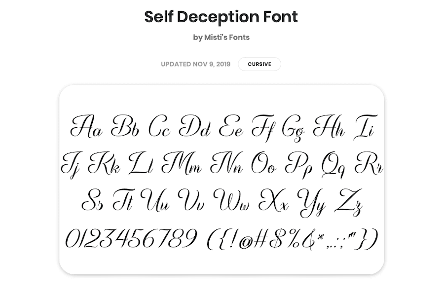
Self Deception is another lovely cursive font choice worthy of your consideration. The design is loopy (in a good way) and delicate. A nice combination of thin and thick strokes make this font look authentic, too.
13. Lemon Jelly
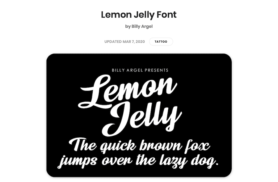
Now the Lemon Jelly font offers a bolder take on the cursive font. The lines are thick and pronounced.
The composition of each letter is fairly standard but there’s a unique flow from letter to letter that makes this font a good choice for logos, in particular.
14. Lovely Coffee
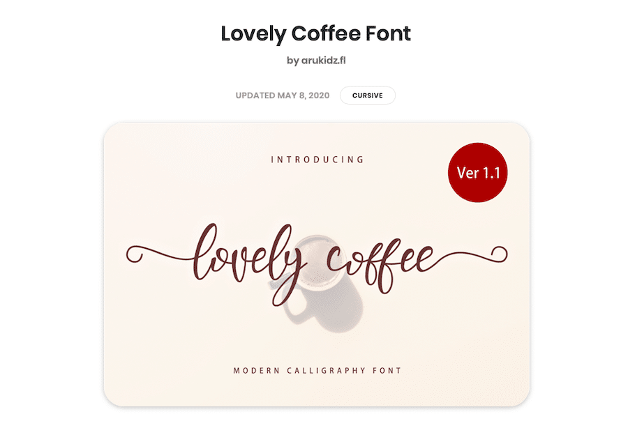
Or perhaps Lovely Coffee is more your style. This font is reminiscent of the hand lettering you’ll often find on home decor signs and such. But that’s precisely its appeal. The font itself is quite relaxed but it has a place in formal use cases, too
15. The Scientist
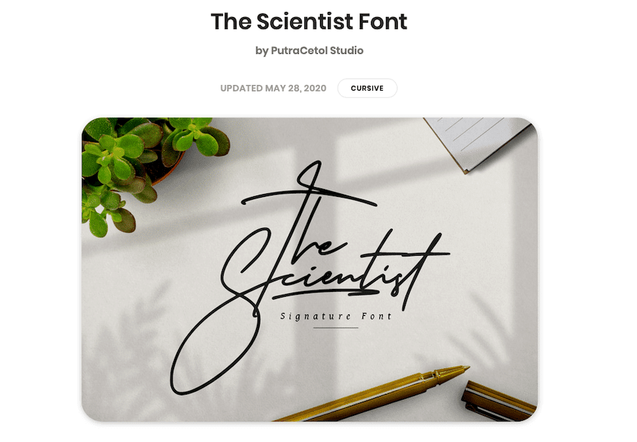
The Scientist font is another one that’s a bit hard to read but it makes a real impact. This font has a lot of ligatures and interesting style elements that make it stand out and make it a solid choice for showcasing signatures, headers, titles, or subsections.
It could also work on any site where you want to convey a classic or old-fashioned appearance.
16. Attraction
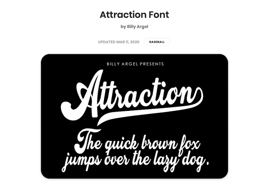
Attraction is bubbly and bold and looks like it came straight off of a sports team logo. The cursive is decisive, clear, and interesting to look at. Though still not suitable for body text, this font would work for pretty much anything else on your website.
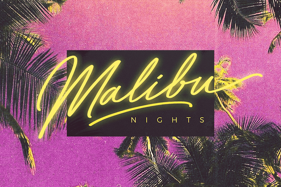
17. Streetwear
Streetwear is another cursive font that offers a classic feel. This time, it leans heavily into the retro vibe, where it is obviously inspired by 1970s fashion and sports typefaces. It’s fun to look at and definitely evokes a certain vintage mood.
18. Cadency
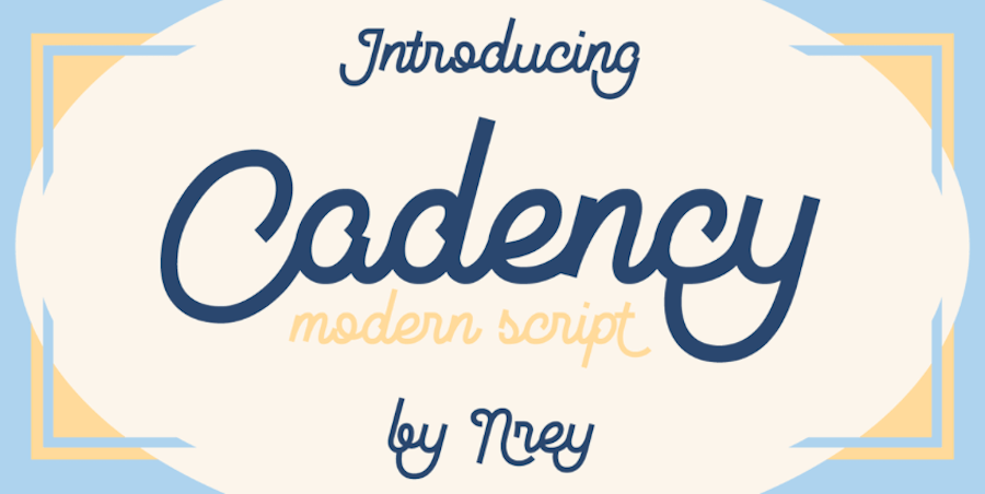
Or you could opt for Cadency, a more modern cursive font that leans into the loopy, curvy look while maintaining a sense of whimsy. It’s bold and includes sharp ends that make it work fantastically for headers, titles, and other text that needs to demand attention.
19. Bayshore
Then there’s Bayshore, a font that is clearly inspired by the 1980s in every way. It’s described as a monoline font that includes a hand-drawn look with plenty of flairs. It’s quite reminiscent of the lettering used in the 1980s hair care products and TV shows. It would work great for retro logos.
20. Retro Vibes
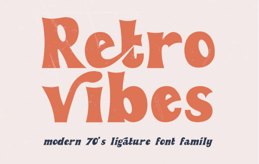
Retro Vibes isn’t technically cursive but it’s definitely script and it includes 50 ligatures that give it a decidedly cursive adjacent vibe. This font looks like it jumped straight off of a 1970s magazine cover and looks great while doing it. Check out our retro fonts post for more great examples of retro-style fonts.
21. Harlott
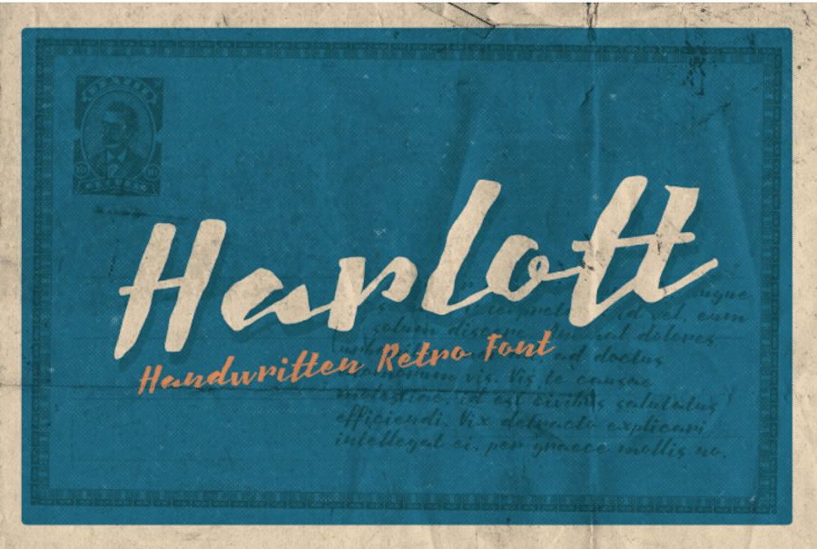
Harlott is still another cursive font choice, but this one is quite different than all the others featured here so far. It features a retro style but is reminiscent of calligraphy or hand lettering on an old document. It’s suitable for any spot you want to draw attention to a bit of important text.
22. Shalma
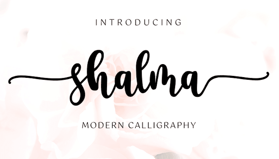
Shalma is another solid font choice, this time with a calligraphic bent. This font is another that looks very similar to home decor signs you can find on Etsy. It’s simultaneously bold and delicate; feminine and declarative.
23. Maghrib
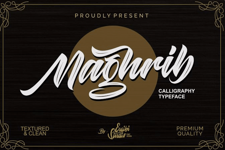
Maghrib offers another great font choice that can add the look of real brush strokes and texture to your logos or headers. It would look great featured across the top of your site’s header. It’s bold and familiar yet includes a few special touches that make it stand out.
24. Tomatoes
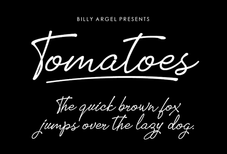
Tomatoes is another option that can offer a different sense of style to your website. The lines are light and delicate, offering lots of whitespace around every letter. Ligatures offer tons of variation as well, just like you’d get from the varying pressure of using an ink pen.
25. Amsterdam
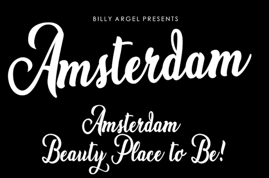
Amsterdam is another lovely cursive font that combines elements of classic typography with modern typefaces. It has flourishes aplenty, creating an immediate look of elegance to any text you set to this font.
26. Make Summer Fun
Make Summer Fun is delightfully light and airy and looks quite reminiscent of a teacher’s cursive on a handwriting worksheet. This is an ideal choice for any site related to education, children, crafts, art, or pets.
Though really, in the right context it could work for just about any commercial site as well.
27. Lovtony
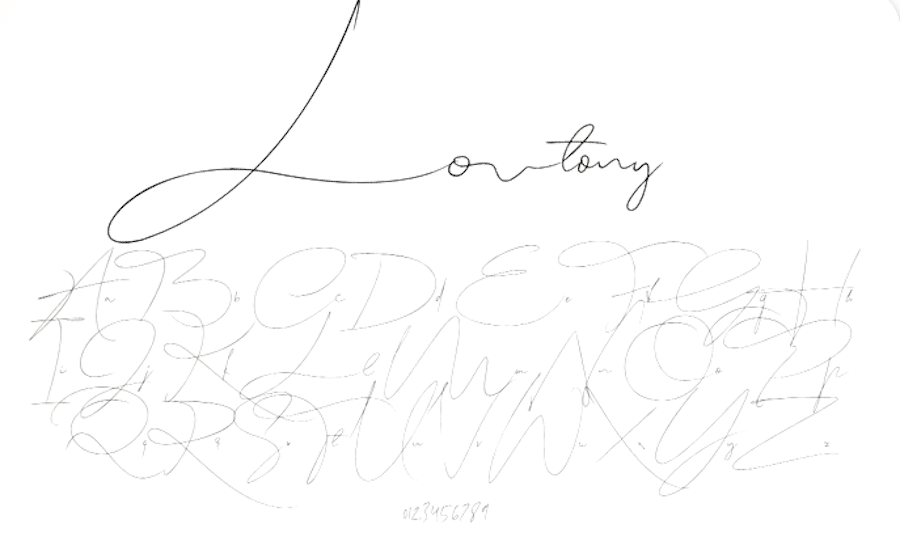
Lovtony is probably the first font on this list that could be described as “chicken scratch,” but honestly I mean that in a good way.
It’s light, includes long drawn outlines, and would look fantastic for creating a word-centric design, banner, or header. It would also look great for signing an opening statement on your site’s homepage or about page.
28. Feeling Lonely
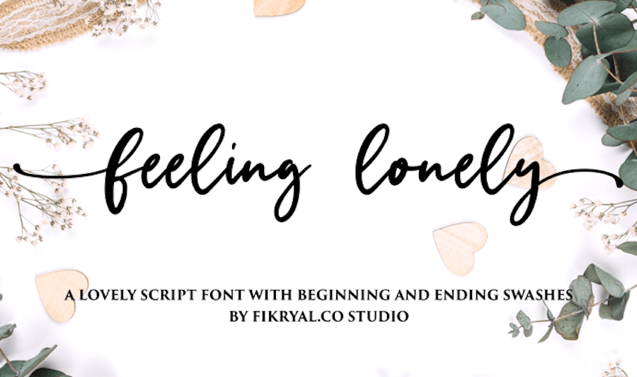
Don’t let its name fool you, the Feeling lonely font is a lovely option, too. As far as cursive fonts go, it’s pretty standard but it does feature beautiful flourishes at the beginning and end of words, extending the length of your compositions and creating a truly flowy look.
29. Unicorn Confetti
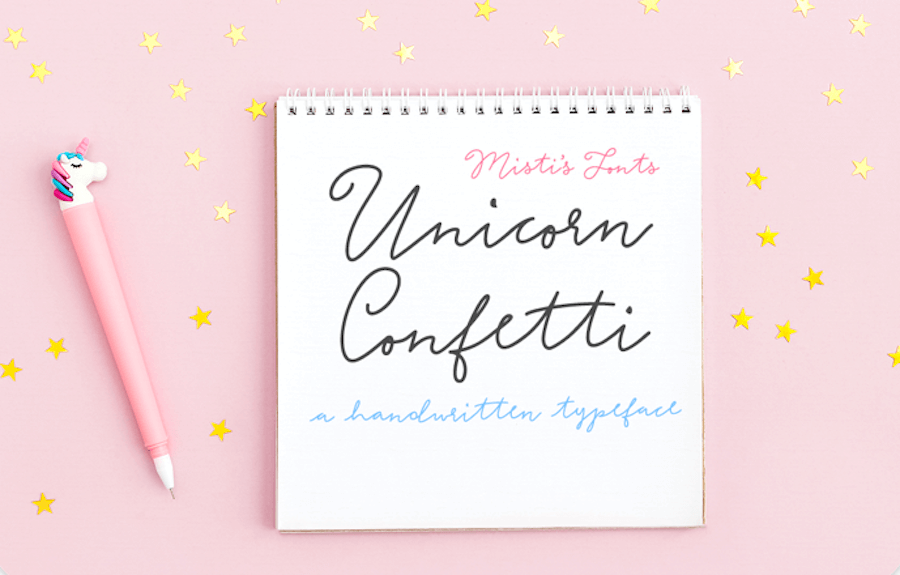
Unicorn Confetti is another cursive font on our list that has thinner lines and a delicate feel. However, the positioning of the letters gives it a bit of whimsical look — though perhaps that’s just the name of the font impacting my impression of it.
It truly looks handwritten and would suit most site designs well.
30. Hamster Script
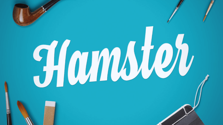
The Hamster Script is a chunkier cursive font that mimics real handwriting but with a super bold typeface. With squared-off edges and the look of hand-lettered sign paintings, this font has a lot going for it. It could be used for any sort of banner, sign, or title for most site types.
31. Glory Culture
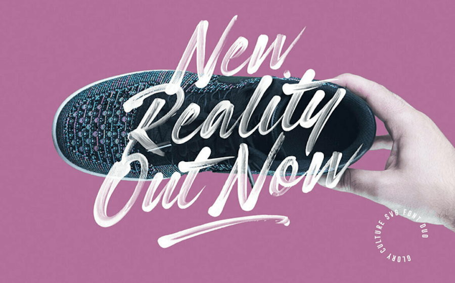
Glory Culture offers another cursive font choice that offers a fully brush style script with the hand-painted brush strokes still visible. The variation in opacity within the brush strokes is built-in via transparency and offers a unique look that can add a personal touch to your site’s headers and titles. It’s a great choice for logos, too.
32. Berrylicious
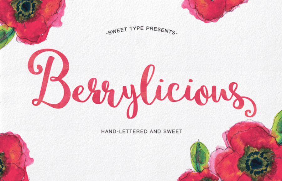
Berrylicious is another cursive font that embraces the hand-lettered brush stroke look to create a fully authentic style. With lots of variations in letter heights and plenty of flourishes before and after words, it could serve you well in any number of situations where a hand-lettered look is required.
It’s also still quite readable, making it a solid choice for social media graphics, too.
33. Shathika
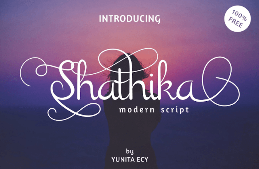
Shathika is the last cursive font on our list and it doesn’t disappoint. It offers a calligraphic look with loads of flourishes and frills in ligatures to create a truly beautiful look.
This one adds immediate sophistication to anything you apply it to. It summons thoughts of royalty a bit, too.
Summary
As you can see, there are tons of cursive fonts out there that look fantastic, add real beauty to your projects, and lend a sense of sophistication to any part of your website it’s applied to. And while cursive or script fonts won’t work for every aspect of your site — body text is a no-no — it still has plenty of applications, including titles, logos, banners, headers, subheaders, signatures, and more.
Cursive fonts aren’t new, either. Created in the twentieth century, they have their roots in the letterpress. And with so many modern fonts capable of mimicking the engraved letterpress look digitally, it’s no wonder why people opt for cursive fonts for adding authenticity, a vintage vibe, and an overall classy look to a project.
With the collection of fonts above in hand, you can hopefully settle on one for your website quickly. Best of luck!
Suggested reading: Email Typography: 8 Best Fonts for Email.