
WordPress 6.2 “Dolphy” has been released and it’s time for us to explore what’s new with the first release of 2023.
With WordPress 6.2, we enter the final stage of Phase 2 of the long-term Gutenberg development roadmap, and the block editor officially leaves the beta phase.
This release mainly focuses on improving the interface and streamlining the editing experience.
A new approach to navigating between templates and template parts has been introduced, as well as the ability to import widgets into block themes, a new distraction-free writing mode, a scaled block settings experience, and tons of big and small improvements to existing blocks, performance, and usability.
But if there’s anything that leaps forward in terms of functionality and usability, it’s the Navigation block. Since it was first released, the Navigation menu has gone through several iterations that have significantly streamlined the editing process over time. With WordPress 6.2, development continues, and in this article, we’ll show you how easily you can now manage a navigation menu.
Check Out Our Video Guide To Find Out What’s New In WordPress 6.2
Improved Editing Experience
WordPress 6.2 brings an improved editing experience, with the entire site structure placed at the center. You can now manage navigation menus more easily, push style changes from a single block to Global Styles, and effortlessly navigate between templates and template parts with colorized template parts and reusable blocks.
But there’s much more. Let’s explore in detail the main additions and changes to the editor’s interface.
A Revamped Site Editor Interface and Browse Mode
With WordPress 6.2, several improvements to the editor interface come to the core. The first and most interesting update affects the Site Editor interface. Thanks to a new Browse Mode, it is now easier to navigate through templates and template parts.

The new interface also allows you to add a new template or template part directly from the editor’s sidebar by simply clicking on the plus (+) icon located at the right of the menu title.

According to Ryan Welcher, Wp Core and Documentation contributor, “[T]he work on this feature is ongoing and will continue to improve as new Gutenberg versions are released.”

The workflow now is smoother and more seamless. To start editing the current template/template part, just click on the Edit button in the left menu, or on the template preview in the middle of the page.

Distraction Free Mode
WordPress 6.2 introduces a new Distraction Free editing mode, which cuts the clutter from canvas and allows you to focus on the content of the page.

You can activate this feature in the options panel that shows up by clicking on the ellipsis (three dots) icon in the upper right corner.
Once Distraction Free mode is activated, extraneous sidebars and toolbars disappear, leaving on the screen only the content you are working on.
Tabbed Block Inspector
WordPress 6.2 introduces a new Block Inspector aimed at bringing order to the sidebar by dividing settings controls into separate panels.
Block settings are now divided into tabs to separate style settings from other block settings.
If available, the Block Inspector tabs will be displayed in the following order:
- List View: Includes controls for managing a block’s children, such as submenus and links in the Navigation block
- Settings: Includes configuration settings not related to the appearance of the block
- Appearance: Includes settings that are specifically related to the styling of the current block, such as typography and colors

This is a notable improvement in the usability of the interface, especially for advanced blocks with many configuration options like the Group Block or Navigation Block.
Note that:
- The new Inspector only shows a tab when it contains elements to display.
- If the Settings tab only contains the Advanced panel, it’s moved to the Appearance tab.
- If the Block Inspector has only one tab, then it displays as it was before WordPress 6.2.
Check out the dev note for a closer view of the new Block Inspector.
Colorized Template Parts and Reusable Blocks
To more easily differentiate them from groups and blocks, Template Parts and Reusable blocks are now highlighted in a different color in List View, Block Inserter, Block Toolbar, and in the editor canvas.

This happens in both the Site Editor and the post editor, as shown in the image below.

A Revamped Block Inserter
The Block Inserter is affected by several changes that significantly improve the overall editing experience.
First, a new interface design improves navigation between pattern and media categories and provides larger previews for patterns and media items.

When media exist on the site, a Media tab shows up in the Block Inserter to simplify media insertion within the content. You can drag and drop images/media or simply click on your media to add it to the content.

Inside the tab, an Open Media Library button brings you to the WordPress Media Lybrary.
Openverse Integration in the Block Inserter
Openverse is a tool that aims to share openly licensed or public domain works for use by anyone. Now, with WordPress 6.2, Openverse is integrated into the Block Inserter.
To access this new feature, click on the Media tab of the Block Inserter. This shows a panel with a search field and image previews directly taken from the Openverse repository.

For the technical details, see the Openverse integration pull request.
Migrate Widgets to Block Themes
Starting with WordPress 6.2, users running a site using a classic theme who decide to switch to a block theme can migrate their existing widget areas to the new theme, converting them into template parts.
Let’s find out how it works.
First, create a widget area in a classic theme. For example, you could activate Twenty-Eleven and add a calendar to Footer Area One.

Now change the theme to Twenty Twenty-Three. Open the Site Editor, choose a template to edit, and add a template part.

In the block sidebar, select the widget area to import from the Import Widget Area drop-down menu.

And that’s it. Now you can manage your previous widget area like any other template part.

Document Details and List View Combined
Before WordPress 6.2, there were two separate buttons in the Editor toolbar for Details and List View. In the following image, you can see the document details popover in WordPress 6.1, including the number of words, number of characters, reading time, and the number of headers, paragraphs, and blocks, as well as the Document Outline.
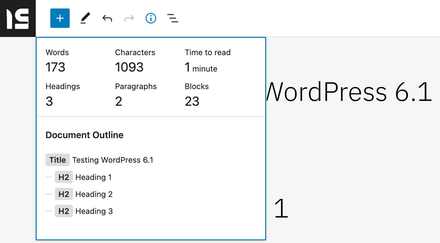
Starting with WordPress 6.2, List View and Details have been moved to a single Document Overview panel divided into two tabs: List View and Outline.

This change should provide an easier way to manage the document.
Extended Block Capabilities
With WordPress 6.2, the capabilities of several core block types have been extended. This is particularly true for the Navigation block, which is affected by several changes and improvements to the editing experience.
Let’s take a look at the main changes in detail.
List-Based Editing for Navigation Block
With the release of WordPress 6.2, it’s possible to change the arrangement of Navigation Block elements from a list view in the block settings sidebar.

Clicking on the menu item will bring you to the settings sidebar of the selected Page Link, where you will be able to edit the link details, including label, URL, description, link title, and link rel.

This change greatly simplifies the editing experience of navigation menus, allowing you to add, arrange, and delete items in your menu, or even create new Navigation menus.
Lock Navigation
Another improvement to the Navigation block is the ability to lock menu editing in a more granular way. Now you can Restrinct editing, Disable movement, and Prevent removal, whereas with WordPress 6.1, only Restrinct editing and Disable movement options were available.
In addition, the selected options can also be applied to the inner blocks (links and submenus).

Add/Remove Captions From the Block Toolbar
A new Add/Remove caption button allows users to control captions from the block toolbar for several blocks (Audio, Video, Image).
If you have already set a caption, it will be automatically included when you add the image to your content.

Improvements to Page List Block
Two improvements involve the Page List block.
First, the Page List block can now be expanded to show the list of pages in the List View panel.

In addition, a new option in the block sidebar now allows you to set a starting page and display only pages descending from it in the block.

New Group Block Placeholder
Now the Group Block placeholder displays a variation picker when the block is added to the page content.

Sticky Positioning Block Support
WordPress 6.2 introduces a new position block support feature, starting with sticky positioning.
This new feature currently applies only to Group blocks, to which it is opted in by default.
Theme developers can enable sticky positioning on their themes using the appearanceTools feature in theme.json. If you want more granular control over appearance tools, you can also set the settings.position.sticky prop to true.
You can enable sticky positioning in the Position panel of the Inspector control sidebar.

With sticky positioning turned on, the HTML tag gets an is-position-sticky class, and some CSS rules apply to the corresponding element:
.wp-container-6 {
    top: calc(0px + var(--wp-admin--admin-bar--position-offset, 0px));
    position: sticky;
    z-index: 10;
}
Sticky positioning only works for Group blocks at the root of the document. While this may prevent confusion and errors for users, you could find built-in sticky positioning a bit tricky at the moment (and you may want to check different methods to add a sticky header to your WordPress website). However, according to the dev note,
… in manual testing, feedback indicated that without additional UI or UX work, it could be confusing for users attempting to create sticky headers if they accidentally set a non-root block to sticky, or for example, a block within a header template part to sticky. The decision was to scale back the feature to just the root blocks for 6.2 to allow more time to explore a suitable solution for nested blocks.
The positioning feature is only available for individual blocks, so you won’t find it in Global Styles.
Additional Improvements to Block Editing Experience
Some other notable upgrades to block editing include the following:
- You can now drag and drop images onto an empty paragraph to replace it with an Image block.
- Typography controls have been grouped into panels. This makes the Styles interface more consistent with the Settings interface and improves its usability, as you can now show and hide controls as in the block settings interface.

Typography controls in WordPress 6.1 vs. WordPress 6.2 - It is now possible to modify the letter spacing of the heading blocks directly in the Global Styles interface.
- You can now set the background, link and text color of the Calendar block.
- Two new Banners and Footers block pattern categories have been introduced to better reflect the structure of web pages.
- It’s now possible to autocomplete links in any block using the
[[shortcut. Before this change, blocks had to explicitly declare support for link autocompletion using__experimentalSlashInserter. - A new
control+option+1–6keyboard shortcut allow you to transform a paragraph into a heading. - The Page List block now supports all typography options, including font family, font size, appearance, line height, letter spacing, decoration, and letter case.

Page List block typography settings in WordPress 6.2
Enhanced Design Tools
Many of the new features and improvements introduced with WordPress 6.2 enhance the CMS’s styling and design capabilities. Below is a list of the most interesting design-related features coming with 6.2; we’ll detail each further down.
Style Book
WordPress 6.2 introduces a new Style Book feature that allows users to preview any block that can be used on their websites without having to add those blocks to a template/template part. You can launch the Style Book by clicking on the Open Style Book button (the eye icon) that now shows up in the Styles header within global styles.
This opens an interface showing a preview of every core and third-party block by category.

The new Style Book interface simplifies the design process by making previews of every block style available in a single centralized location.
From a technical point of view, the new interface is generated by a new StyleBook component added to @wordpress/edit-site to display a preview of every registered block in an iframe (see also PR #45960).
The same interface also provides previews of individual blocks. As an example, the following image shows the preview of a customized calendar widget.

Developers can hide a block from being inserted and previewed in two ways. First, you can set supports.inserter to false in block.json:
{
    "supports": {
        "inserter": false
    }
}
Another way to hide the block preview is to avoid the example property, which is used to create a preview of the block in the Inspector Help Panel (read more here).
Shadows in Global Styles
With WordPress 6.2, it is now possible to add and customize shadows to some blocks using Global Styles or theme.json (as of this writing, the shadow feature is only available for the Button block).
First, in themes supporting this feature, you can add shadows from the Global Styles interface.
To see it in action, activate the Twenty Twenty-Three theme, navigate to Styles > Blocks > Button, and click on the Shadow button.
A Shadow pop-up allows you to select a shadow from the theme presets.

Theme developers and advanced users can also add a shadow to blocks using theme.json. The following definition adds a 4px black shadow to Button blocks:
"styles": {
    "blocks": {
        "core/button": {
            "shadow": "4px 4px #000000"
        }
    }
},
You can also define presets to give theme users the ability to select one from the Styles interface:
"settings": {
    "shadow": {
        "presets": [
            {
                "shadow": "4px 4px #FF0000",
                "name": "Red",
                "slug": "red"
            },
            {
                "shadow": "4px 4px #00FF00",
                "name": "Green",
                "slug": "green"
            },
            {
                "shadow": "4px 4px #0000FF",
                "name": "Blue",
                "slug": "blue"
            }
        ]
    },
}
Once defined, your presets appear in the Shadow panel in the block Styles.

You can also pick the value of a preset and use it as block defaults:
"styles": {
    "blocks": {
        "core/button": {
            "shadow": "var(--wp--preset--shadow--blue)"
        }
    }
}
New Minimum Height Dimension Control
Starting with WordPress 6.2, the Dimensions panel of the block settings sidebar for the Group and Post Content blocks now provides a new Minimum Height control enabled by default in themes using the appearanceTools feature.

This new control allows users to set a minimum height for Group and Post Content blocks and can be used to render the footer at the bottom of the page, even with little content.
Combined with the new vertical alignment tools, it also allows to vertical align inner elements at the top/center/bottom of the page.
Developers can add support for minimum height to themes by adding the minHeight setting to theme.json:
{
    "settings": {
        dimensions: "minHeight": true
    }
}
You can also use the appearanceTools property:
{
    "settings": {
        "appearanceTools": true
    }
}
The new minHeight property can also be used to set a specific value directly in theme.json:
{
    "styles": {
        "blocks": {
            "core/post-content": {
                "dimensions": {
                    "minHeight": "80vh"
                }
            }
        }
    }
}
Block developers can add the supports.dimensions.minHeight property to their block.json file and set its value to true. For static blocks, the CSS min-height rule will be stored as an inline style, while for dynamic blocks it will be included in the style attribute returned by get_block_wrapper_attributes.
Custom CSS in the Styles Panel
One of the features missing in the Site Editor compared to the Theme Customizer was the ability to add custom CSS styles. WordPress 6.2 fills the gap and now the Global Styles interface includes a text field to add custom CSS rules that will not be overwritten when you update your theme.

You can add custom styles either on a per-block basis, from the block style panel, or by clicking on the More Styles actions button in the Styles toolbar. This displays a pop-up menu showing an Additional CSS element.

To support custom CSS, a new styles.css property has been added to theme.json.
Custom CSS rules can completely override any custom styles set in theme.json. If you don’t want this to happen, you may want to consider including the style sheet using the existing enqueuing methods.
You can also add per-block custom CSS in theme.json using the styles.blocks.block.css property:
"styles": {
    "blocks": {
        "core/button": {
            "css": "background: #FF0000"
        }
    }
}
You can also use & for nested elements and pseudo-selectors.
For a closer view at the new custom CSS feature, see also Custom CSS for global styles and per block.
Copying and Pasting Styles Between Blocks
A new group in the Options menu of the block’s toolbar now displays two buttons to Copy styles and Paste styles. Before this addition, it was only possible to copy styles, but it was not clear how to paste styles.

To try this new feature, add a new block, such as a heading. Change the style and choose Copy styles from the block Options menu.

Then select another block and choose Paste style. The copied styles will be automatically applied to the second block.

Note that this feature is only available on secure (https) sites in supporting browsers. For additional details, see the pull request.
Apply Block Changes Globally
WordPress 6.2 also introduces an Apply globally button under the Advanced panel for individual blocks that allows you to push your block style changes to Global Styles and apply those changes across the entire website.

Thanks to this new feature, applying block typography, spacing, dimensions, and color styling to all blocks of that type is now as easy as pressing a button (see also this pull request).
Improved Design Experience With Spacing Visualizers
Spacing Visualizers allow you to preview the amount of margin or padding that is being applied to a block. With WordPress 6.2, this feature is enhanced with a couple of additions that improve the editing experience.
First, Spacing Visualizers now show up as soon as you hover over margin or padding control.
Second, the Spacing Visualizer now automatically hides the block toolbar as soon as you hover over the spacing setting so that you can preview the new margin and padding settings free of the block toolbar clutter.

These are small but significant changes that affect a good number of core blocks.
Changes for Developers
WordPress 6.2 also brings many new features for developers: new APIs, bug fixes, performance improvements, and much more. Let’s dive into the most appealing additions.
A New HTML API
WordPress 6.2 introduces the HTML Tag Processor, an HTML5-spec-compliant parser that provides a safe way to find specific HTML tags and add, remove, or update attributes via PHP. The HTML Tag Processor is the first component in a new HTML processing API.
The new API makes it easy to perform previously complex tasks that often required the use of regular expressions.
In the following example, we simply add the alt attribute to an img tag:
$html = '<img src="/my-image.jpg" />';

$p = new WP_HTML_Tag_Processor( $html );

if ( $p->next_tag() ) {
    $p->set_attribute( 'alt', 'Hello WordPress 6.2' );
}

echo $p->get_updated_html();
This code would produce the following img tag:
<img alt="Hello WordPress 6.2" src="/my-image.jpg">The $p->next_tag() method moves to the next available tag in the HTML. It also accepts a tag name, a CSS class, or both to find specific tags, as shown in the example above.
To edit HTML tags, you have first to select the target tag:
$p->next_tag();Once you have selected the target tag, you can use the API methods to perform several operations:
$p->get_tag()$p->set_attribute()$p->get_attribute()$p->remove_attribute()$p->add_class()$p->remove_class()
You can set a style attribute:
$html = '<a href="https://example.com">example.com</a>';

$p = new WP_HTML_Tag_Processor( $html );

if ( $p->next_tag( 'a' ) ) {
    $p->set_attribute( 'style', 'text-decoration: wavy underline purple;' );
}

echo $p->get_updated_html();
You can also add or remove a class or an attribute. In the following code, we add a custom class to an h1 tag:
$html = '<div><h1>Page Title</h1></div>';

$p = new WP_HTML_Tag_Processor( $html );

if( $p->next_tag( 'h1' ) ) {
    $p->add_class( 'title' );
}

echo $p->get_updated_html();
You can then echo or return the updated tag using the $p->get_updated_html() method.
For a closer view at the new HTML API, check this interactive PHP tutorial from Adam Zieliński, WordPress Core committer.
Patterns API and a New template_types Property
The Patterns API allows WordPress developers to “create pre-designed blocks of content that can be easily inserted into posts, pages, custom post types, and templates”.
With WordPress 6.2, the Patterns API now includes a new template_types property to allow you to specify which templates a certain block pattern can be used in.
Jorge Costa highlights that this is a backend-only update and there is currently no corresponding UX functionality. However, we can expect to see evolved implementations of this feature with WordPress 6.3:
The first usage, in thinking for WordPress 6.3, is to show the user some patterns that make sense on a template when the user starts creating a template. Users can start from a pattern instead of “blank” or the fallback template.
On the technical side, the register_block_pattern() function has been modified to include a new template_types parameter, which is an array of strings containing the names of the templates the block pattern is intended for.
The REST API was also modified to return the template types of a block pattern if at least one has been defined.
React v18.0 and Concurrency Mode
WordPress 6.2 also ships a new version of the React library, now updated to version 18.0. The new version comes with new APIs, features, improvements, and bug fixes. One of the main features coming with React v18.0 is the introduction of the concurrency mode, “a new behind-the-scenes mechanism that enables React to prepare multiple versions of your UI at the same time”.
One of the main characteristics of Concurrent Mode in React is that it’s interruptible:
React guarantees that the UI will appear consistent even if a render is interrupted. To do this, it waits to perform DOM mutations until the end, once the entire tree has been evaluated. With this capability, React can prepare new screens in the background without blocking the main thread. This means the UI can respond immediately to user input even if it’s in the middle of a large rendering task, creating a fluid user experience.
The main benefit is that the UI responds to user input immediately, in concurrence with the job it’s still running in the background.
However, concurrency also introduces potential pitfalls that developers should be aware of. For a more in-depth overview of Concurrent Mode in React in WordPress 6.2, check out the examples provided in the dev note.
Additional Changes for Developers
Other notable changes that developers should take note of include the following:
- WordPress 6.2 introduces a new JavaScript filter that can be used to filter block settings before the editor is rendered on the screen. The new
blockEditor.useSetting.beforefilter also allows developers to modify settings based on the block location, current user role, neighboring blocks, and more. For additional information and examples of usage, see Customize settings for any block in WordPress 6.2. - A new
skipBlockSupportAttributesprop has been introduced to exclude attributes and styles related to block supports in theServerSideRendercomponent. - A new theme.json API now allows to style existing core block variations from theme.json.
- Google Fonts are now included locally and not fetched from Google addresses in bundled themes from Twenty Twelve to Twenty Seventeen.
But that’s not all. WordPress 6.2 introduces many features, improvements, and bug fixes that we did not mention here for the sake of brevity. For a more comprehensive overview, check out the WordPress 6.2 Field Guide.
Summary
WordPress 6.2 gets us closer to the end of Phase 2 of the Gutenberg project named Customization. But, as Matias Ventura points out, this doesn’t mean work on customization is complete. As always, we can expect additional improvements to the editor based on feedback from the community.
In this post, we explored some of the major features, improvements, and bug fixes coming with WordPress 6.2. But there is much more in 6.2. With ten versions of the Gutenberg plugin into the core — from 14.2 to 15.1 – we’re going to see a new Browse Mode, a Tabbed Block Inspector, Widgets to Block Themes migration, new APIs, and tons of enhancements and bug fixes. And there will also be improvements to accessibility and internationalization.
And if you love WordPress and want to acquire new WordPress development skills or test and make contributions to the CMS, be sure to take DevKinsta, Kinsta’s completely free local WordPress development suite, for a test drive.
Now, over to you: Have you already tested the new version in your development environment? What features do you like most in WordPress 6.2? Share your thoughts in the comments section below.

Carlo is a passionate lover of webdesign and front-end development. He has been playing with WordPress for more than 20 years, also in collaboration with Italian and European universities and educational institutions. He has written hundreds of articles and guides about WordPress, published both on Italian and international websites, as well as on printed magazines. You can find him on LinkedIn.

