Mobile vs. Desktop Market Share and Usage Statistics
There are 5.1 billion people on the internet, and they’re increasingly turning to mobile devices to browse and shop online. In the mobile vs. desktop war, the two have gone head to head. Who’s winning?
Since the surge of sales for smartphones, tablets, and other mobile devices began, mobile browsing has grown more common. Mobile and desktop internet usage are now almost equal, though mobile has overtaken desktop in prevalence.
Despite how common mobile devices are, many websites still fail to take more than basic measures to improve mobile experiences and functionality.
And while mobile traffic may take the majority, desktop computers are hardly on their way out. You need to balance both devices to optimize your site and digital marketing.
What Percentage of Internet Traffic Is Mobile?
When it comes to mobile vs. desktop traffic, the former has been on an upward trend for a long time. In 2015, mobile traffic was at 31% — and even back then, website owners were scrambling to make their sites responsive and cater to mobile users.
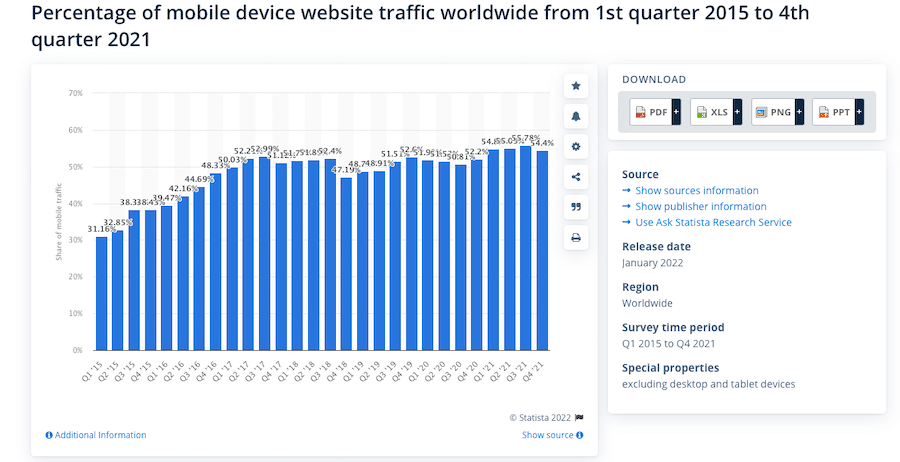
Mobile vs. Desktop Traffic
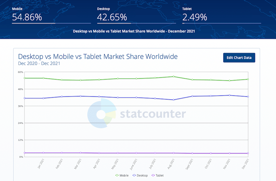
To look at a similar market share metric, 55% of worldwide online visits come from mobile, 43% from desktop, and 2% from tablet. Experts predicted mobile internet would eventually overtake desktop, and it looks like they were right.
How does desktop vs mobile traffic look between regions? Here’s the data:
- US: Web traffic is nearly 49% mobile vs. 48% desktop. Another study indicates that 63% of online traffic came from smartphones or tablets, making it even more prevalent.
- Canada: Unlike the US and UK, Canada prefers desktop computers, with 56% usage vs. almost 39% mobile share.
- South America: South America stands at 50% mobile usage and close to 49% desktop usage.
- Europe: In all of Europe, traffic still comes from nearly 51% desktop devices, but mobile is close behind at 46%. In addition, mobile traffic data usage in Western Europe has increased by 569% since 2016. In Central and Eastern Europe, the numbers are similar at 568%.
- UK: The UK is similar to the US, with mobile vs. desktop usage both standing at 47%.
- Africa: In Africa, mobile vastly eclipses desktop at 64% and almost 34%, respectively. Keep that in mind when targeting users from this continent.
- India: India has extremely high mobile traffic at close to 74%, compared to only 26% desktop usage.
- Asia: Mobile usage is also very high in Asia at almost 64%, with desktop computers at only 34%.
- Oceania: In countries like Australia, New Zealand, Papua New Guinea, and Fiji, mobile internet usage is lagging behind at only 42%, with desktop at 53%.
Ecommerce is also getting a surge in the mobile market. Mobile commerce makes up 72.9% of total ecommerce sales. Every site needs to be responsive, but online stores are missing out on a lot of money if they fail to optimize for mobile.
There isn’t any indication of mobile traffic slowing down either. It’s hard to say when it will stop, but phones are clearly a major part of today’s internet browsing and will only continue to eclipse other devices.
That’s not to say that desktop computers will become obsolete. There are some things that phones just can’t do thanks to their smaller screens, less powerful processors, and touch-based controls.
Even with phones being so prevalent, many sites are still unresponsive and poorly optimized for them, making browsing on a desktop that much more convenient. And while many people browse primarily on their phones while out during the day, they often come home to a laptop or desktop.
While mobile-first design is important, mobile-only design is a bad idea if you want to retain your loyal visitors and customers. Make sure the user experience is seamless, whether a visitor is browsing on their mobile device or desktop.
How Much Time Do Online Users Spend on Mobile vs. Desktop?
Online traffic is one thing, but what about general screen time spent on devices? Using social media apps, working offline, or playing games are also common ways of spending time. There’s also the question of how long people spend consecutively browsing.
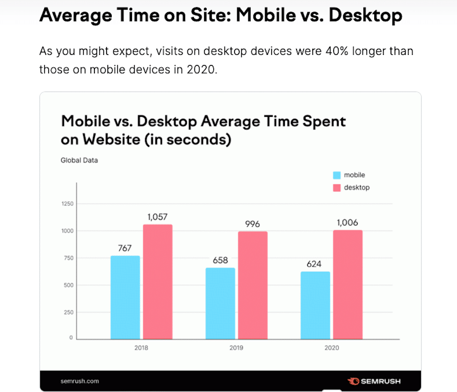
Attention spans online are universally shortening, but mobile users, in particular, spend 40% less time on a website.
People are often more impatient when browsing on their phones. If a site takes too long to load, they’re not going to wait more than a few seconds. And even then, they spend much less time browsing the same site.
As the internet speeds up and more companies begin vying for internet users’ time and money, these numbers may lower even more. It can be hard to keep people’s attention, especially mobile users.
What about general device usage time? According to DataReportal, Americans spend 4 hours a day on their desktop and 3 hours a day on their phone.
Worldwide, DataReportal notes that the numbers are similar: 7 hours total, with 3 hours and 16 minutes spent on the phone. The countries with the highest screen time (9–10 hours a day) are the Philippines, Brazil, and Columbia. The lowest (4–5 hours a day) are Japan, Denmark, and China.
People tend to spend longer consecutive sessions on desktops, which leads to more time spent on the same website.
In contrast, people spend shorter sessions on their phones but pick it up dozens of times throughout the day. They may play a game, scroll social networks, or ask a question on Google, then put their mobile device down.
Activities like waiting for coffee, downtime at work, or looking up nearby restaurants lead to a lot of time spent on the phone, but only in shorter bursts.
The increase in mobile traffic is due to how most people will only sit at their computers for an hour or so, but those few spare minutes stolen on their phones throughout the day add up.
What Users Want Most From Mobile vs. Desktop Sites Today
If you’ve ever browsed on your phone, you’ve likely encountered a mobile website that works poorly. Maybe it just doesn’t make an attempt to be responsive, the text is hard to read, or the buttons are just too small to press. Either way, you likely didn’t spend much time on that site.
Entirely non-responsive sites are rarer these days, especially as WordPress makes up 43% of the internet, and most of its themes are responsive by default. And site owners are realizing that mobile is overtaking desktop traffic and going out of their way to make their sites responsive.
While most sites are doing the bare minimum, poorly optimized mobile sites are still common — they’re navigable on mobile but annoying to browse due to bad UI. Too many websites fall into this trap.
So what can you do to promote better mobile UX? What are the biggest pitfalls in mobile web design? Here are a few of the hottest issues:
- Slow page speed
- Non-responsive design
- Poor readability, small text, horizontal scrolling
- Bad UI — too small or cluttered
- Confusing mobile navigation
- Cluttered or complicated website design
One of the biggest mobile problems is slow load times. Over half of sites are abandoned on mobile if they take more than 3 seconds to load. Mobile devices are usually less powerful than desktops, and the connection is often not as reliable. That makes maximum website optimization necessary.
Data centers all over the world and a fast CDN can help increase load speed for mobile users.
But a fast site won’t be enough if it isn’t responsive. It’s not good enough to design for specific screen sizes — it’s better to create a site that will adapt to any size, whether a larger screen or smaller.
Make sure UI elements are large and clickable. That doesn’t just improve mobile usability and functionality but accessibility for users with disabilities. Tiny buttons that are hard to see or touch are frustrating— especially when they come from pop-ups that get in the way of your content.
Pay attention to navigation. As we mentioned, make your navigation UI elements large, keep the number of pages short, and eliminate any clutter.
Finally, as a general rule:
Mobile users like things simple, so an efficient design all around is the best way to appeal to them. Keep your design and content short and sweet for on-the-go browsing. Try to eliminate unnecessary scrolling and make your business information immediately accessible.
That’s especially true for ecommerce websites. Remember, mobile users’ intent is often to find information quickly. Keeping your design simple and putting important information at the forefront is the best way to reach them.
Mobile vs. Desktop: Optimizing for User Experience
Creating a website that works well on mobile requires a lot of thought and planning, possibly even an entire redesign. But mobile devices have overtaken desktop computers in web traffic, and there’s no turning back.
While there are regions where desktops are used more, worldwide, mobile devices are becoming more common. Optimizing for mobile is no longer optional — at least not if you want to keep your users happy.
Keep mobile devices in mind when designing your website, especially for UI and readability. Website speed is another common problem affecting phone users.
Fixing these problems isn’t always easy, but you’ll be rewarded with happier users, lower bounce rates, and higher conversion rates.
And if you need stellar hosting to serve as a backbone for your website — whether users view it on desktops or mobile devices — Kinsta has your back with Managed WordPress Hosting solutions suited to businesses of all sizes.