WordPress 5.8 “Tatum” is here and it is a momentous release. Aside from the incredible number of features, improvements, and bug fixes, WP 5.8 introduces a new way of building websites by bringing the first features falling under the broader project known as Full Site Editing.
Apart from Full Site Editing, WordPress 5.8 brings tons of changes and enhancements to several areas of the CMS.
WordPress users not using the Gutenberg plugin will find features and improvements coming from nine Gutenberg releases altogether (for a dive deep into each release, see Gutenberg 9.9, 10.0, 10.1, 10.2, 10.3, 10.4, 10.5, 10.6, 10.7).
An important new feature for users serious about their sites’ performance is the WebP format support.
Developers will surely love IE11’s removal from the list of supported browsers, the new block configuration and styling mechanism based on theme.json, the improved block registration system based on block.json, and the many API improvements coming with the second WordPress release of 2021.
So, sit tight because it’s going to be a lengthy roundup of features and enhancements that pave the path for new powerful site-building tools expected to release in the coming months.
Full Site Editing Features in WordPress 5.8
The vision behind Full Site Editing is to provide a collection of tools and features allowing WordPress users to build an entire website using blocks. With Full Site Editing, we’ll see many blocks available to create any element on the page, from navigation menus to site branding, sidebar widgets, templates, and much more.
Even if WordPress 5.8 introduces several features falling under the scope of Full Site Editing (FSE), don’t expect to see a fully-featured visual site building environment. FSE is still a work in progress, and the release of WordPress 5.8 opens a sort of public beta phase. According to Josepha Haden Chomphosy:
Full site editing is a collection of projects and together they represent a big change, arguably too much for a single release. The most important context to share is that it isn’t shipping as the full, default experience for users. One of the clearest pieces of feedback from the Phase One merge process was that there wasn’t enough time for our extenders (agencies, theme authors, plugin developers, site builders, etc.) to prepare for the upcoming changes.
With that in mind, this merge process won’t be an on/off switch. The focus now is not on a full and nuanced user experience, but more of an open public beta within WordPress 5.8.
So WordPress 5.8 doesn’t introduce a perfect and complete FSE experience right now. Instead, we’ll see new features being added and improved over time, starting right from version 5.8. For the same reason, we may presume that WordPress 5.8 won’t have a dramatic impact on the way we’re used to building websites.
At the time of this writing, site owners and admins still have to consciously opt for FSE by installing a block theme, such as Twenty-Twenty One Blocks (the block-based version of Twenty-Twenty One), and activating the Gutenberg plugin.
Full Site Editing encompasses a range of separate sub-projects, including Site Editor, Global Styles, Query block, Navigation block, Templates, block themes, and much more. But the closest thing to Site Editing in WordPress 5.8 is the Template Editing Mode and the corresponding Theme Blocks available to use in that mode, as we’ll see later in this article.
Next, let’s dive into some FSE features merged into Core with WordPress 5.8.
Template Editing Mode
Template Editing Mode provides a way to create post/page templates using blocks. It’s a great way to reduce the complexity of site-building, allowing users to take advantage of several site editing features from outside of the site editor interface while getting used to working with blocks. This is also great for users who don’t use block-based themes but still look for an easy way to create and edit templates from the block editor’s UI.
Customizing themes has never been so easy in WordPress before. Now you don’t need to build a child theme to create your custom templates anymore. With WordPress 5.8, Template Editing is not limited to block themes but is also available for you to use with classic themes, although you have to opt-in to enable it for classic themes.
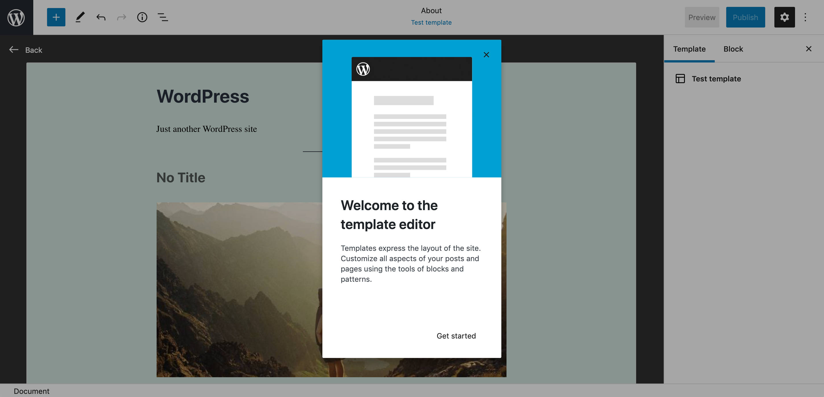
To create a new template, you just need to enable Template Editing Mode in the Settings sidebar. A new Template panel is now available for users to switch editing mode (see the Gutenberg 10.5 release note).
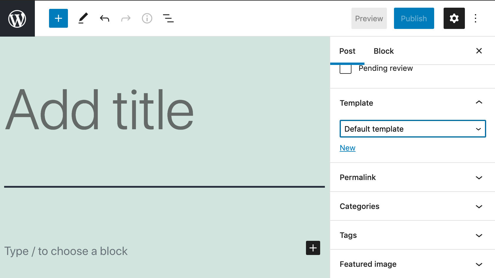
From the Template panel, you can create a new template or edit an existing one.
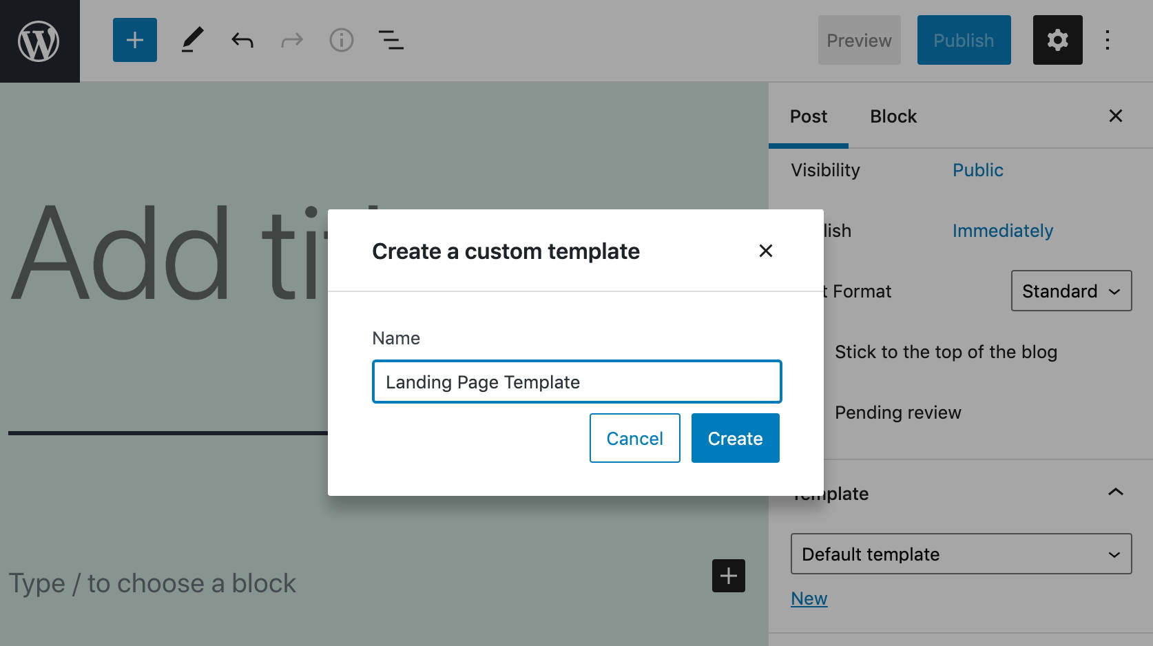
To create a new template, click on New. Then enter a template name in the modal and click on Create, and you’re ready to go.
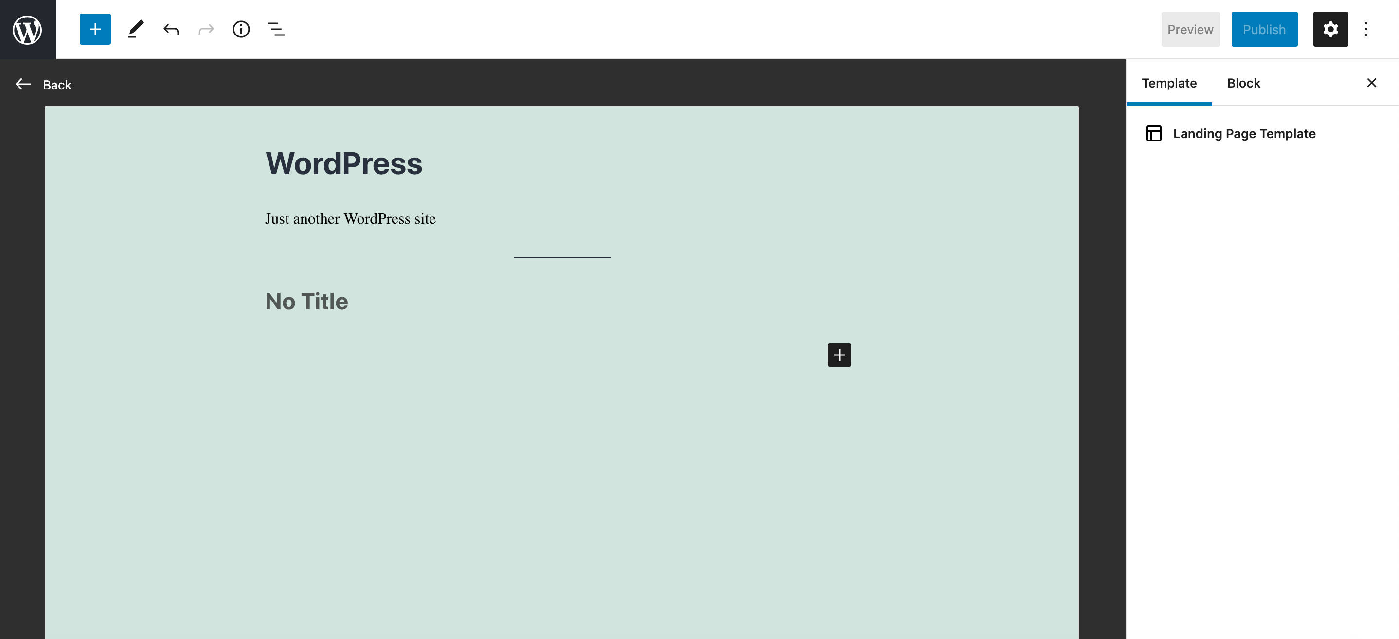
In Template Editing Mode, you can build your templates using all the available blocks, including FSE blocks like Site Title, Site Tagline, Login/out, and many more.
Once you’re happy with your edits, you can switch back to Post Editing mode and save the template separately from the post/page content, as shown in the image below:
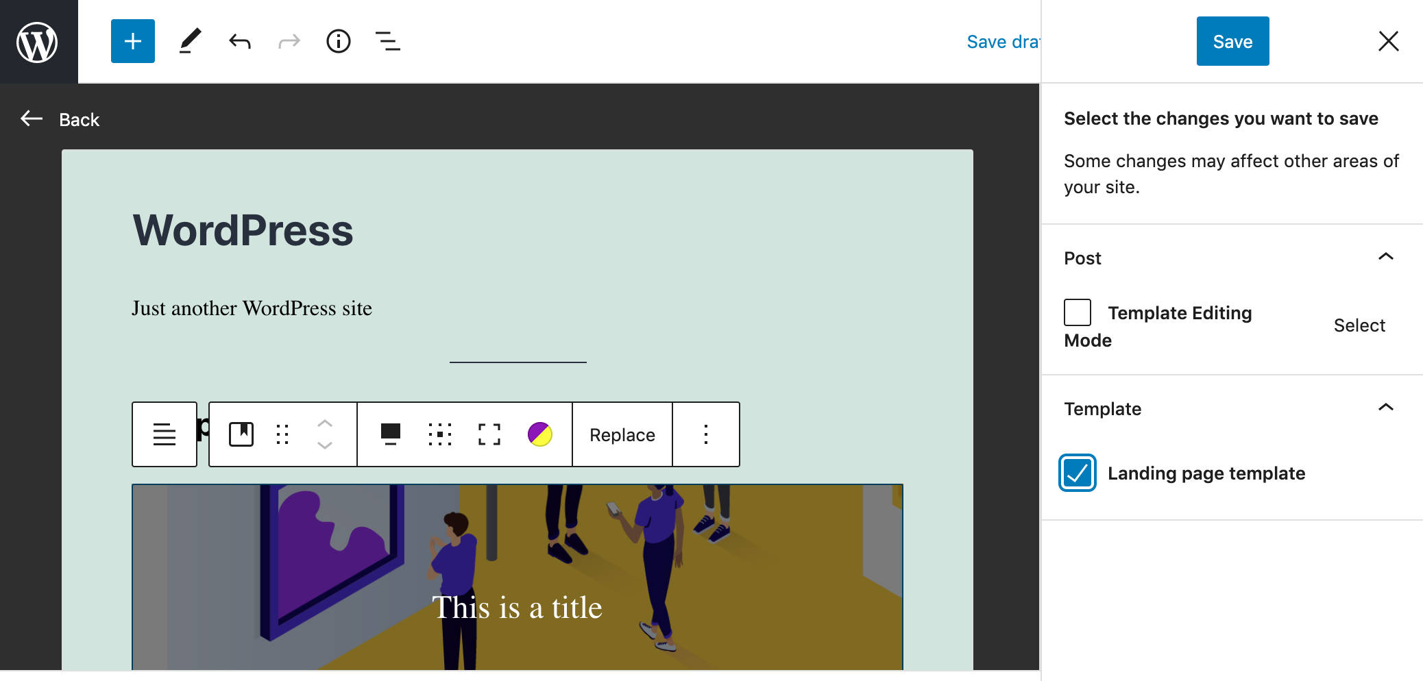
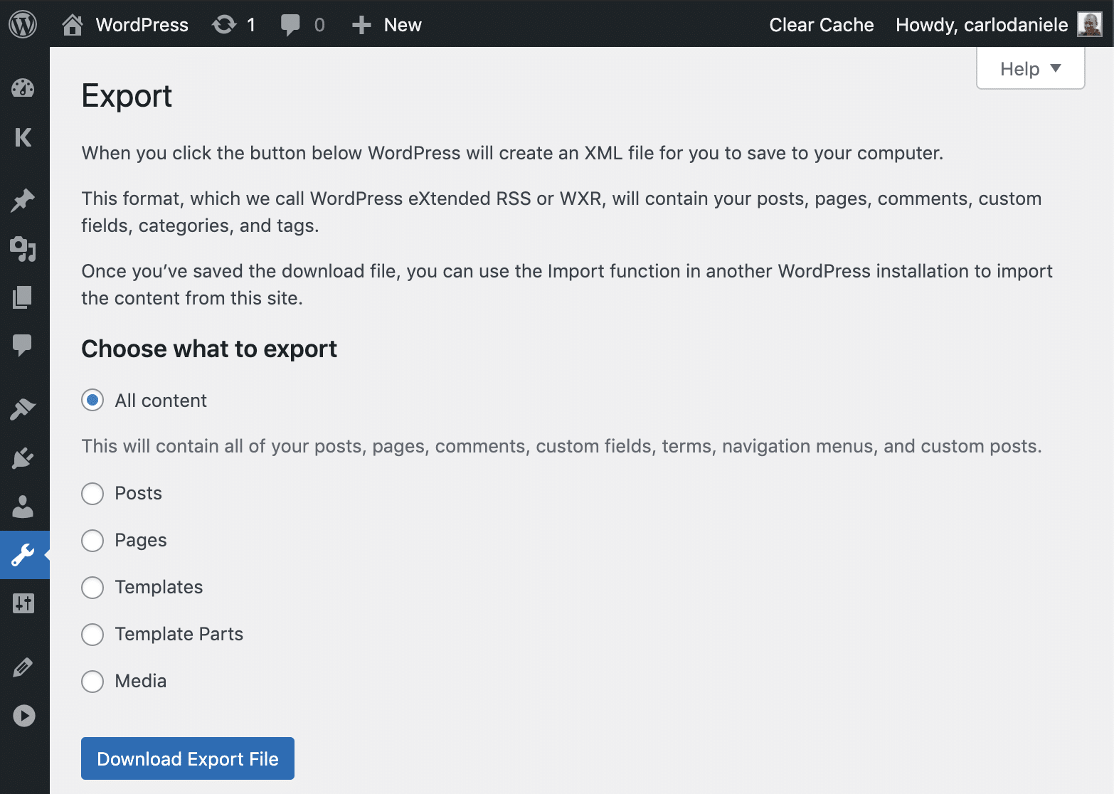
Templates are stored in your WordPress database as custom post types named wp_template. Not only does this allow you to edit a template from the editor interface, but it also makes it easy to import or export them at will. You can also use a template across different websites (at the time of this writing, this feature is only available if you activate the Gutenberg plugin).
Template Editing Mode is still a little buggy at the time of this writing, as reported in this call for testing and this experiment from Justin Tadlock.
But all it takes is a little patience and waiting for the major issues to be fixed to fully understand how Template Editing Mode will change the way you customize the look and feel of your websites.
Users will no longer need developer skills to gain complete control over the layout and website’s overall appearance.
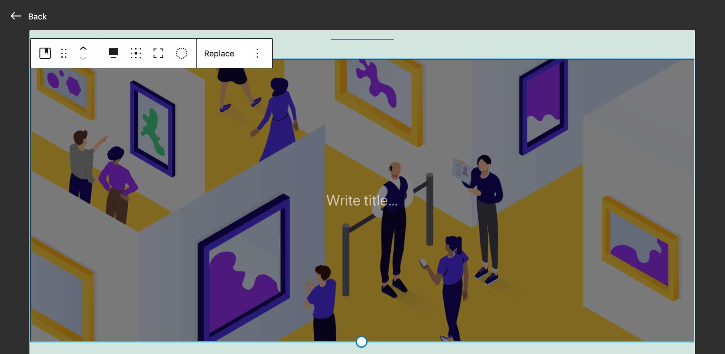
Template Editing Mode was at first available for both block themes and classic themes. After a thoughtful discussion in the 5.8 leads channel, it was decided to make the template editor opt-in for classic themes and opt-out for block themes (see also pull #32858).
According to Carolina Nymark:
Initially, template editing was enabled for all themes. Theme developers raised concerns that they could not update all their existing classic themes to support this new feature. With a late change, the release squad and editor team choose to change the template editing to be opt-in for classic themes.
To opt-in in classic themes, now developers should add theme support:
add_theme_support( 'block-templates' );Classic themes using theme.json can opt-out by removing theme support:
remove_theme_support( 'block-templates' );For a more detailed overview of how Template Editing Mode works in WordPress 5.8 and some useful examples of usage, make sure to watch this video from Anne McCarty:
Theme Blocks
As mentioned earlier, FSE is not a single feature but a complete set of site-building features not solely related to the site editor. Template Editing Mode is just an example of that. But together with Template Editing, WordPress 5.8 also brings many theme blocks that can show information dynamically retrieved from the database. Some of these blocks can also be used in non-FSE contexts (see issue #28744).
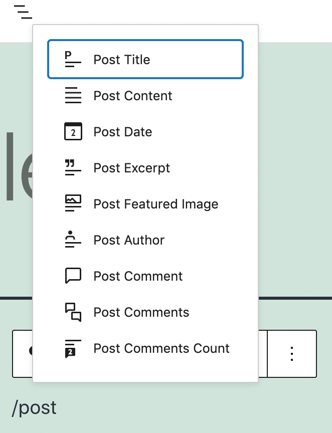
Theme Blocks bring template tag functionalities to classic themes, and you can use them the same way as regular blocks. For instance, you can add post tags or the post’s featured image anywhere in the post content or template. To get an idea of the number of theme blocks added to the core with WordPress 5.8, just type /post in the block placeholder:
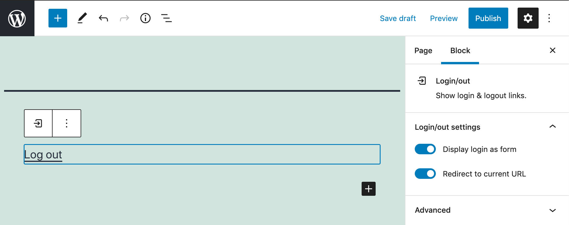
A helpful theme block available with WordPress 5.8 is the Login/out block, which provides login and logout links. It can optionally display the login form instead of a link. Site admins can also customize the redirect target (see PR #29766).
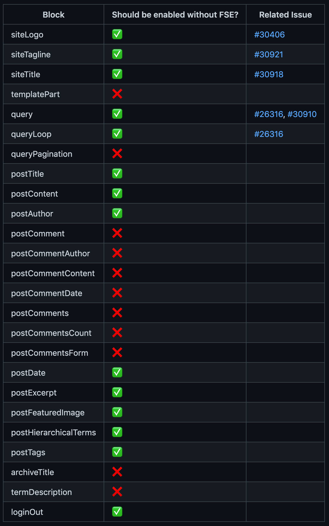
For a closer view of FSE blocks, see the “Enabling Full Site Editor blocks in classic themes” issue on Github.
The Query Loop Block
How many times have you found yourself in a situation where you need to display a customized list of blog posts or custom post types? Think about products, events, real estate… Of course, you have tons of plugins to choose from for that, but the ability to create highly customized queries often requires developer skills to grapple with the WordPress Loop.
With the introduction of the Query Loop block in WordPress Core, site owners and admins can create lists of posts and CPTs without writing complex code or hiring a developer, at least in the most common use cases.
So, what does the Query Loop Block do?
In short, it does the same work as the WordPress Loop, but in the visual context of the block editor.
The Query Loop block performs a query based on the user’s settings over the WordPress database, loops through each retrieved post, and displays data on the page.
After intensive development, this block has reached its current structure and now consists of two nested blocks: the Query and Post Template blocks.
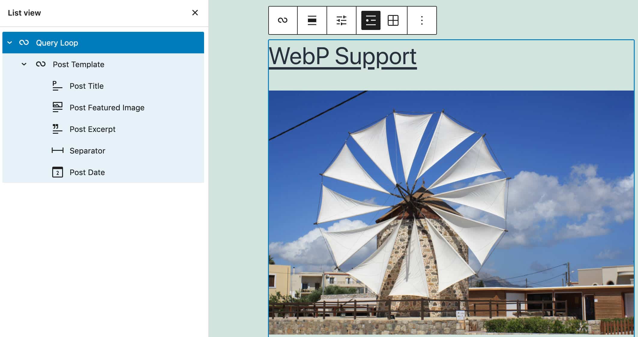
Being an advanced feature, the Query Loop block requires some configurations.
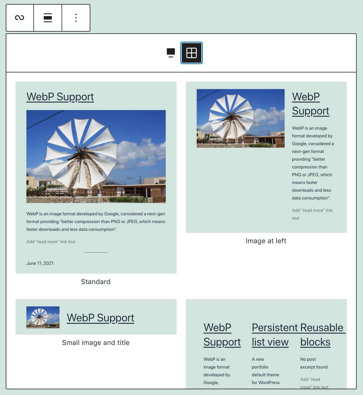
First, you can choose between different block patterns listed in Carousel and Grid view. Once you’ve picked your pattern, simply click on Choose, and the Query Loop block will generate your custom list of posts.
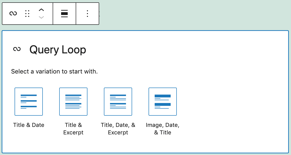
If you click on Start blank, you will see a list of four Core block variations: Title & Date; Title & Excerpt; Title, Date & Excerpt; and Image, Date & Title (see Offering Patterns on Block setup).
Once in place, selecting the Query Loop block will display the block settings sidebar, where you can build your query. You can either inherit the query from the URL or customize the query arguments: the type of posts to be included in the list, the display order, and whether or not to have sticky posts.
You can also set several filters, choosing from categories, authors, and keywords.
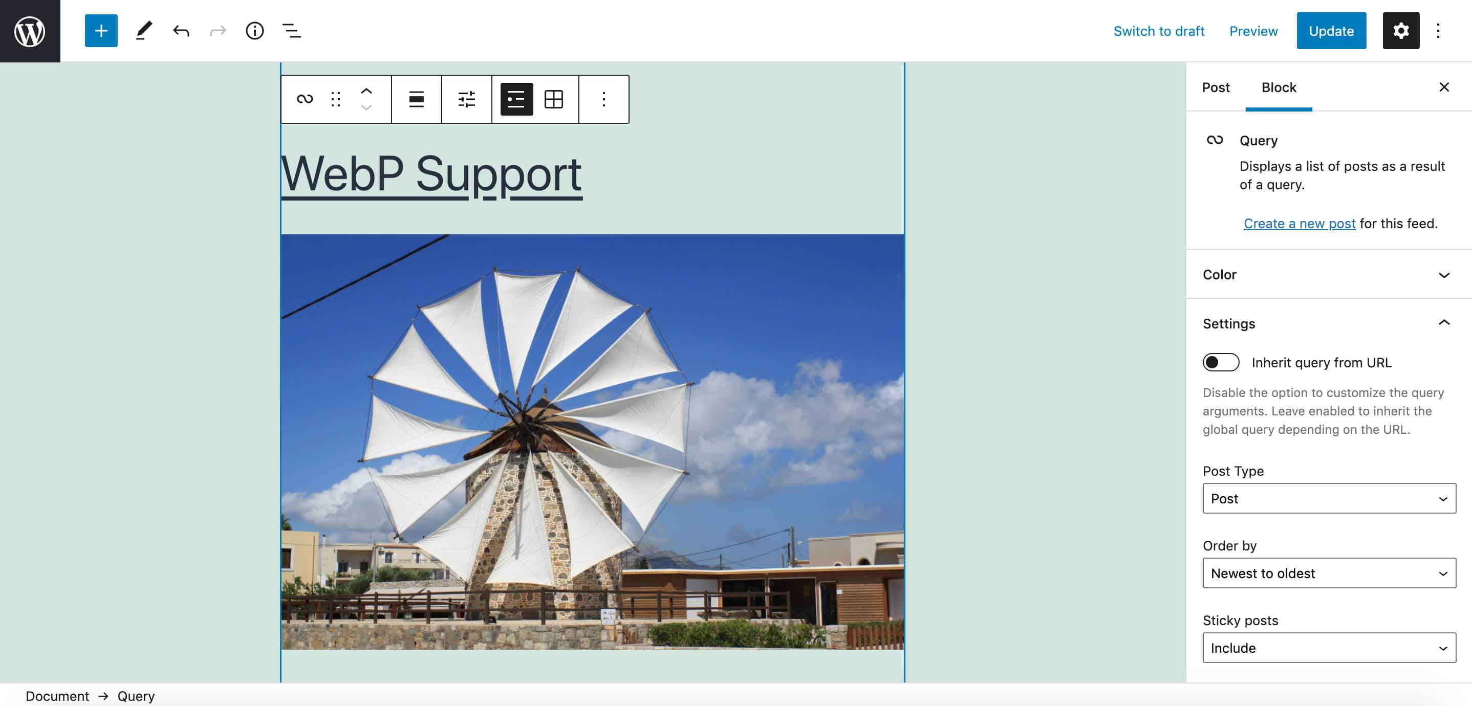
Additionally, a Display settings button in the block toolbar provides more settings to control the number of items per page, the offset, and the maximum number of pages to show.
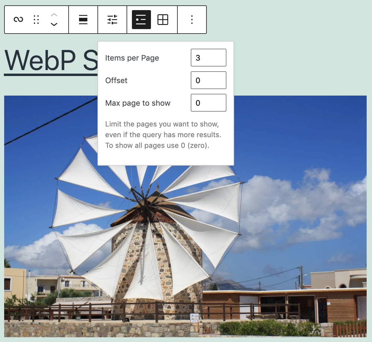
Yes, the Query Loop block is a powerful tool, allowing site owners to create highly customized lists of posts and custom post types.
But if you walk through the WP_Query class parameters, it’s clear that the level of customization possible using the code is far more granular than what is possible using the Query Loop block.
Nevertheless, it is indeed a valuable and flexible tool that lends itself to many use cases, and we’ll most likely see further enhancements in the future.
Persistent List View in the Post Editor
Another FSE feature extended to the Post Editor is the Persistent List View. Before WordPress 5.8 (and Gutenberg 10.7), the List View was displayed in a popover. When moving the focus outside the popover, the list would disappear.
Conversely, the Site Editor displayed the List View in a sidebar containing the entire block tree.
With WordPress 5.8, the List View is now displayed in a sidebar in the Post Editor, allowing users to navigate the block tree more quickly and precisely.
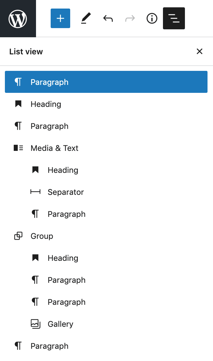
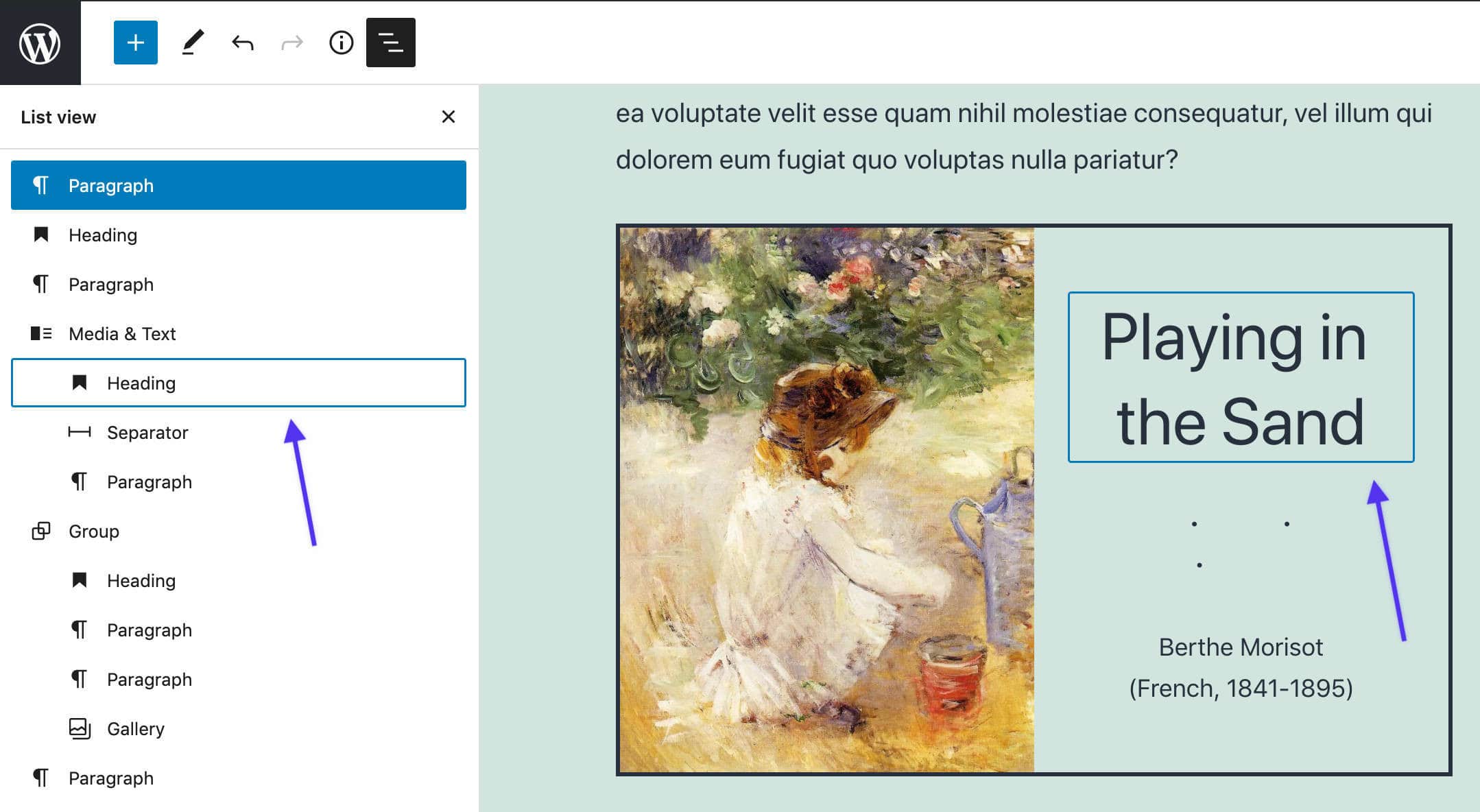
Clicking on an item in the List View highlights the list item and moves the focus to the corresponding block in the Post Editor canvas. Additionally, if you hover over the items in the List View, both the item and the corresponding block in the Post Editor get highlighted.
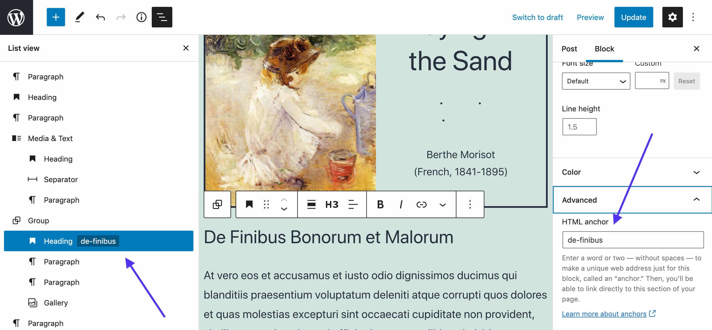
Last, adding an anchor to a block will also appear next to the corresponding item in the list view.
With all these enhancements to the List View, navigating complex documents should be a lot easier.
Block-Based Widgets Editor and Block Widgets in the Customizer
The block-based widgets editor is a wide project aiming to bring the interface of the block editor to classic-theme widgets.
The new widgets editor offers many advantages to the vast majority still using classic themes. At the same time, it allows them to get acquainted with the block interface before it becomes standard for all WordPress users.
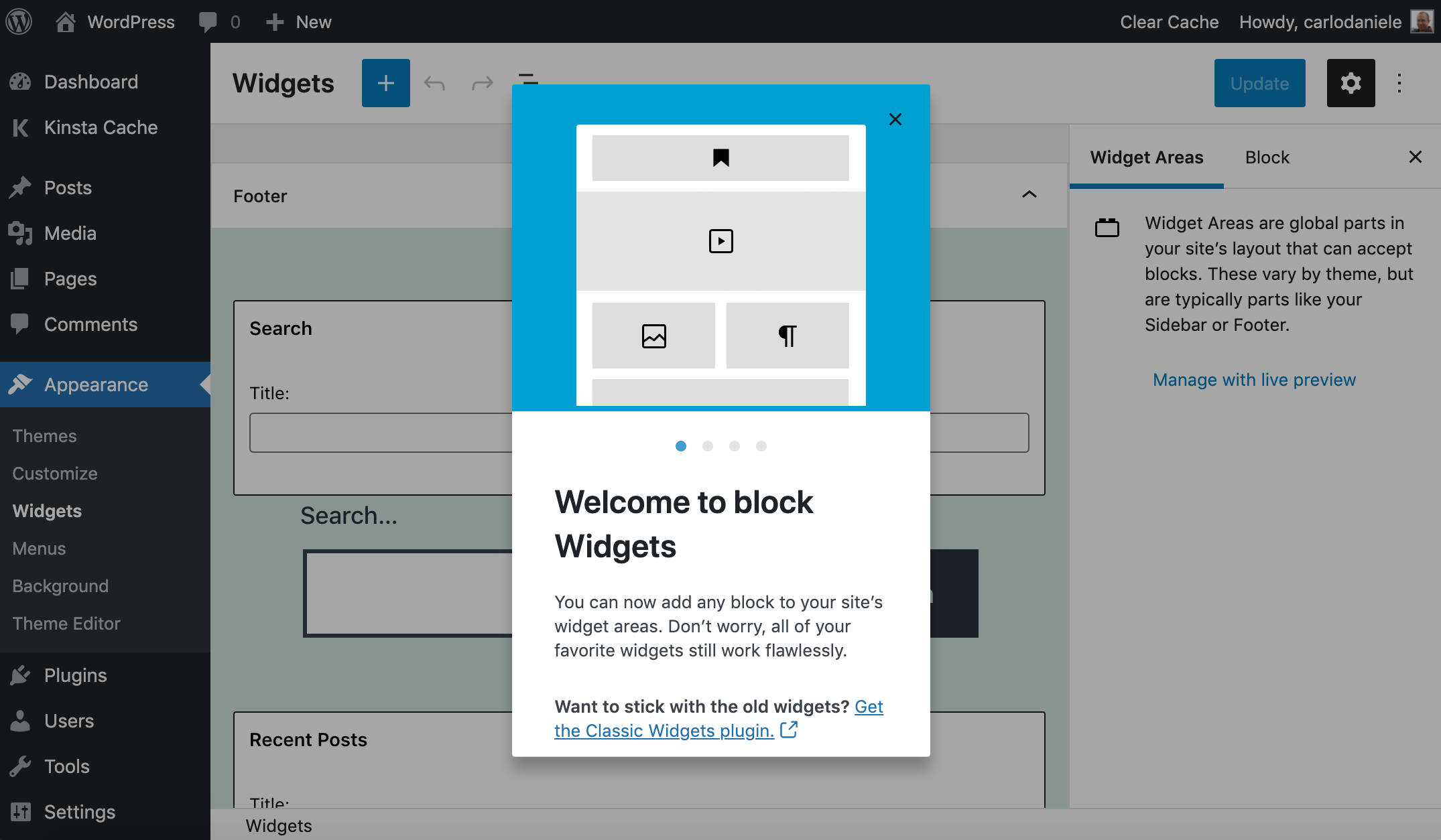
As Anne McCarty points out, block-based widgets provide several advantages, including the following:
- You can now create layouts in sidebars, headers, and footers using columns, separators, spacers, and other design blocks.
- Widgets now support rich text editing by default, without the need for users to add custom code or embed a third-party HTML editor with a plugin.
- Many shortcode-based widgets are now available as blocks, streamlining the editing experience.
Andrei Draganescu also emphasizes the advantages we can get from being able to edit widgets from a block-based interface:
The main benefit of upgrading the widgets functionality to blocks comes from the ability to directly edit widgets using the familiar block interaction that you use when editing a page or post on your site. Being able to use blocks opens up tons of new creative possibilities, from no-code mini layouts to tapping into the vast library of core and 3rd party blocks to create content.
You don’t have to worry that your widgets might stop working with WordPress 5.8 because the community has worked hard to ensure backward compatibility so that “existing widgets and third-party widgets will continue to work and can be used alongside blocks” (see Block-based widgets editor in WordPress 5.8).
But again, to prevent any compatibility issues on your existing WordPress installation, don’t forget to test the new version in a staging environment before updating your live site.
For those of you who opt out of using the block-based widgets editor right now, it’s still possible to restore the classic widgets screen in three different ways:
- You can install the official Classic Widgets plugin, which restores the previous interface of the widgets screen. The plugin “will be supported and maintained until at least 2022, or as long as is necessary”.
- Theme developers can disable the block-based widgets editor by removing theme support as usual:
remove_theme_support( 'widgets-block-editor' ); - A new
use_widgets_block_editorfilter can be used as well:add_filter( 'use_widgets_block_editor', '__return_false' );
See also Restoring the classic widgets editor in Widget Block Editor Overview.
Block Widgets to the Customizer
As part of the same project, WordPress 5.8 also brings block widgets to the customizer.
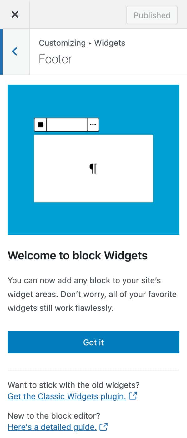
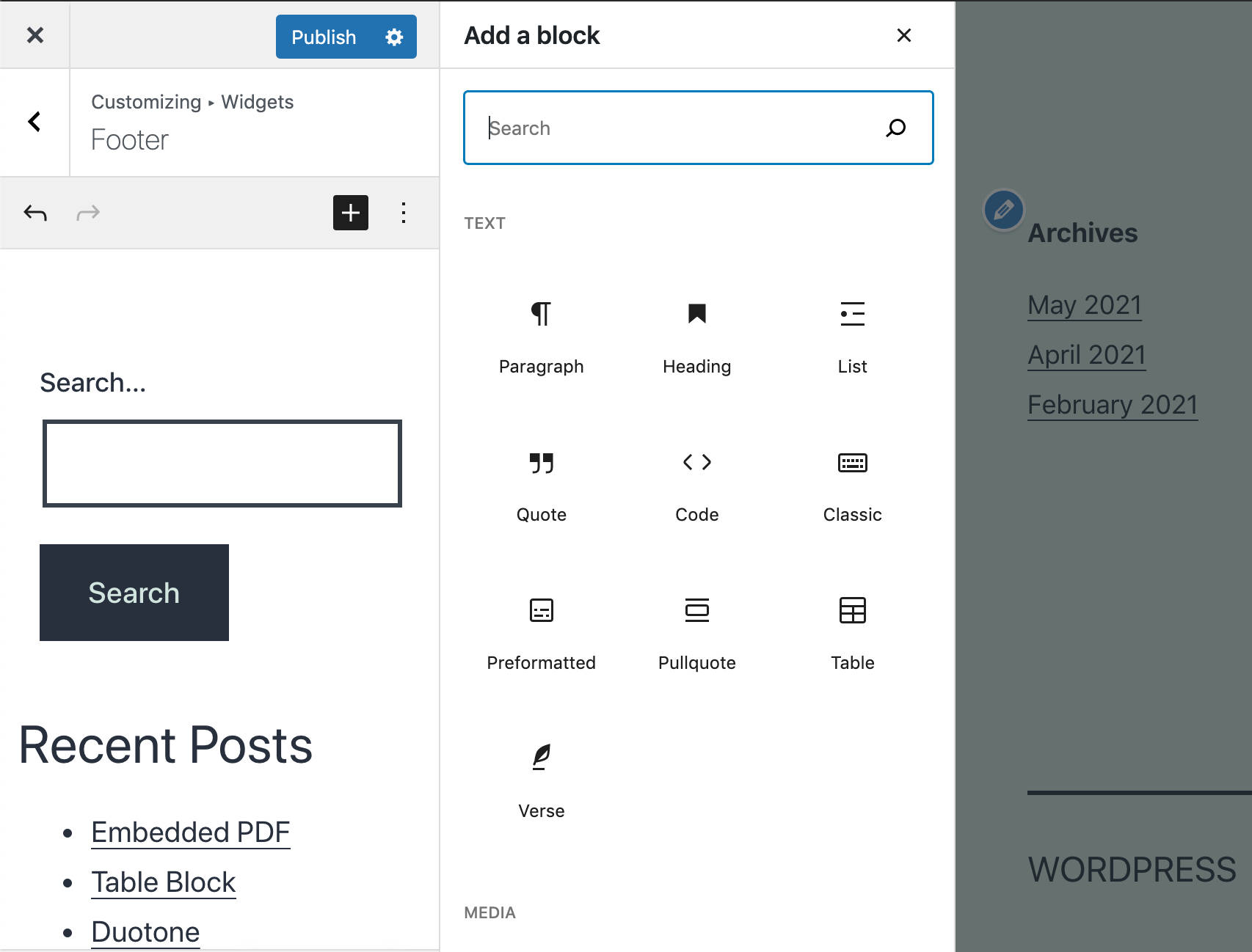
Adding a block-based widget in the customizer is pretty straightforward. You can launch the customize widgets inserter by clicking on the plus icon in the top right corner of the widgets panel.
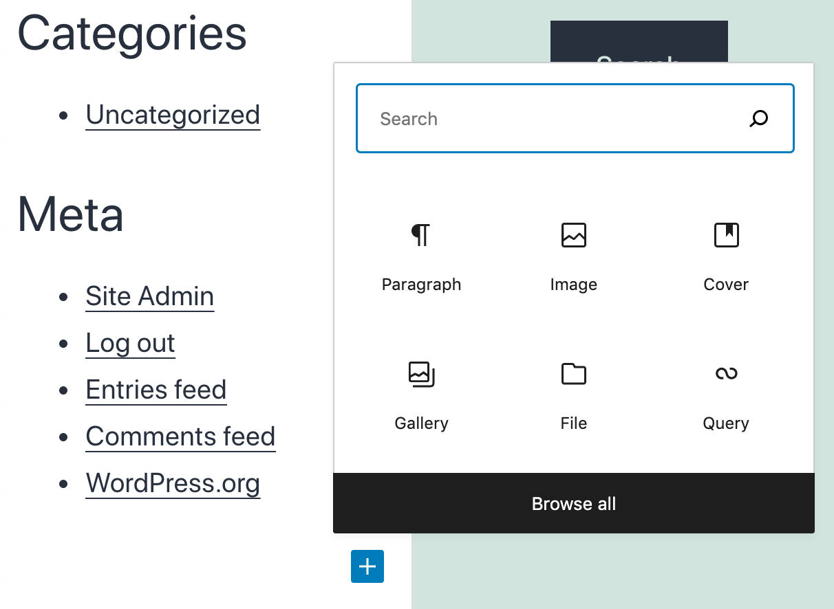
You can also launch the quick inserter from the bottom of the widgets panel, as shown in the following image.
At the time of this writing, the new widget editing interface still requires improvements and bug fixes, but the possibilities for customization are virtually unlimited.
Basically, starting with WordPress 5.8, you’ll have the power of the block editor in the customizer, and you’ll be able to build highly customized sidebars with no hassle.
The block-based widgets editor dev-note provides a more in-depth overview of the block-based widgets editor, with examples and resources for developers.
Block Editor Features and Improvements
In addition to the first FSE implementation, WordPress 5.8 also brings new features and enhancements to several elements of the block editor, which significantly improve the overall editing experience.
These changes include:
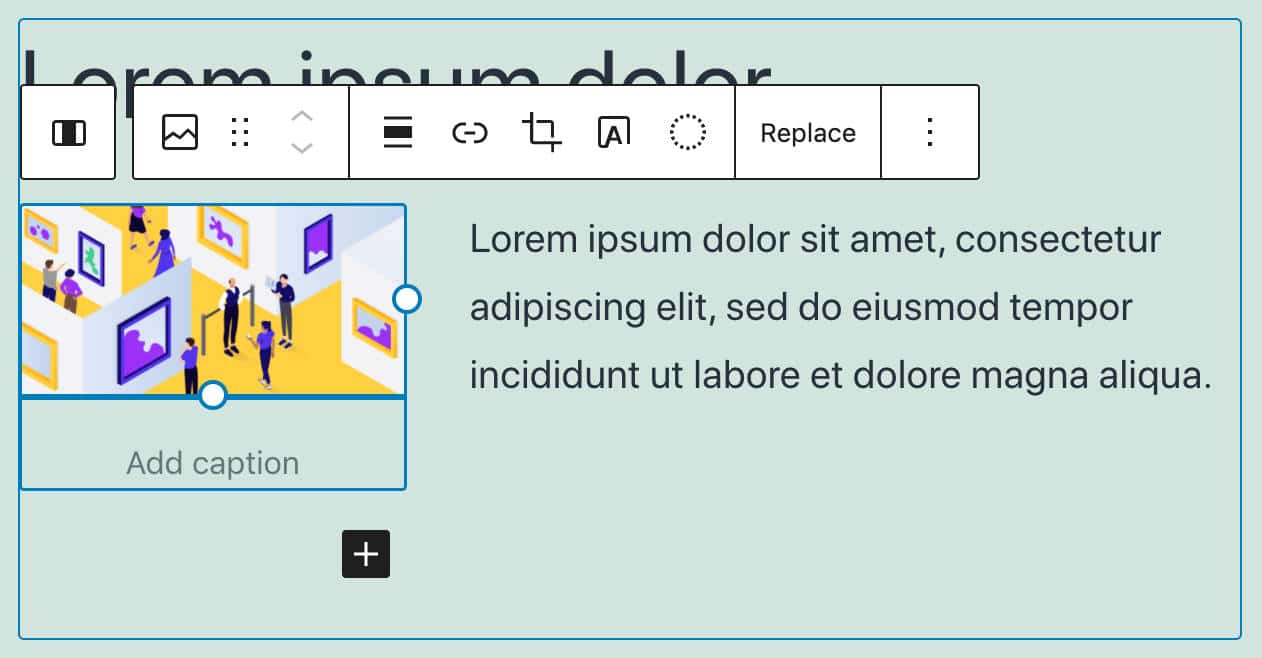
Media & Text Block Enhancements
Transforming a block into a columns block has been possible for a while now. However, all blocks transformed into columns blocks with a single column. This could lead to suboptimal results for the media & text block, for which a single column is usually not suitable.
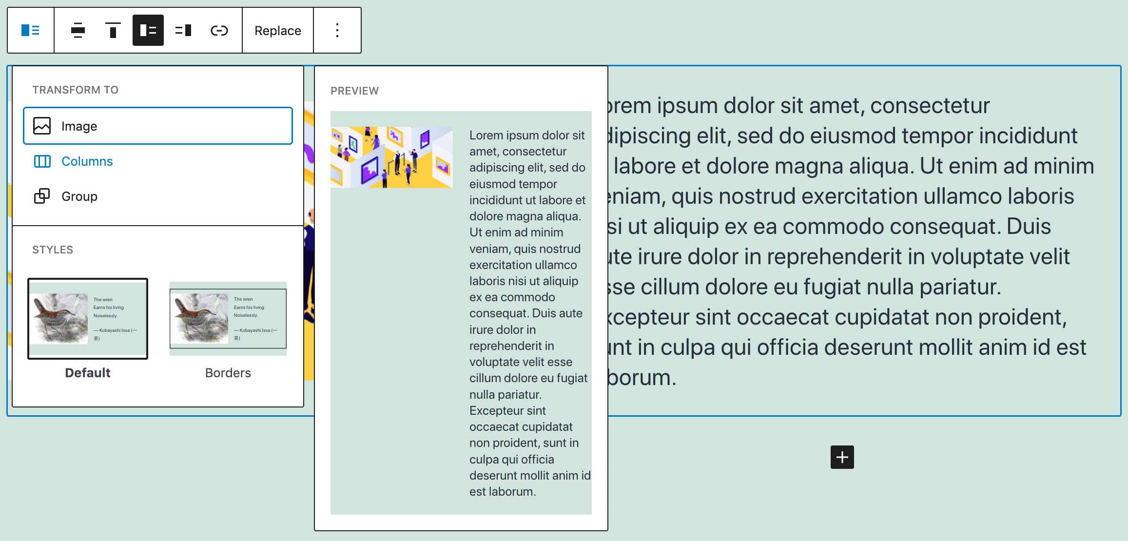
Starting with WordPress 5.8 (and Gutenberg 10.2), transforming the media & text block into a columns block automatically adds two columns: one for the image and another for the text.

Reusable Blocks Improvements
Reusable blocks allow the user to save a block or a group of blocks to reuse later in any post or page of a website. This is useful mostly for users who repeatedly include the same block or group of blocks into different posts/pages.
With WordPress 5.8, reusable blocks are visually clearer, making them easier for WordPress users to manage.
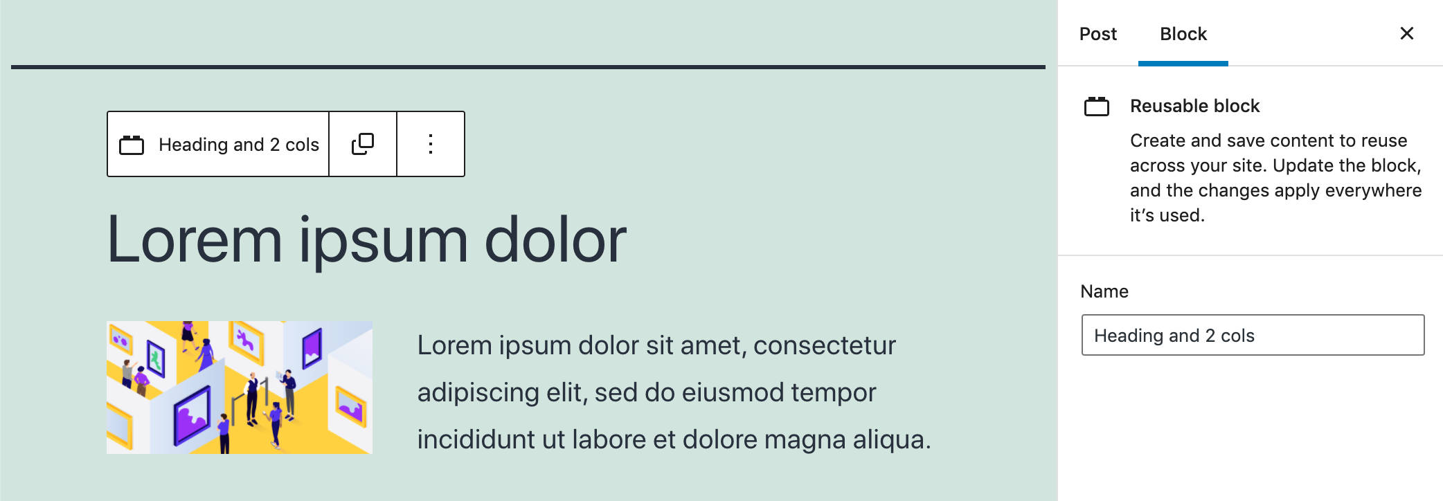
Here’s a quick list of reusable block improvements users will find after updating their websites to WordPress 5.8:
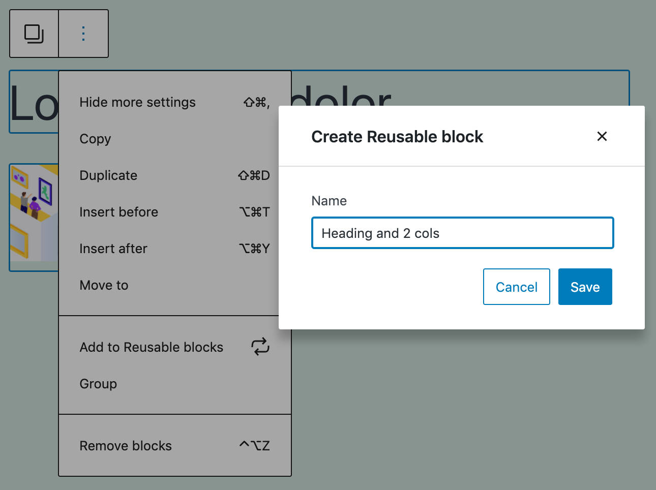
- When creating a reusable block, a modal now allows users to assign a name to the block.
- The reusable block’s name is now displayed in the block toolbar, navigation list, and breadcrumbs.
- When a child block is selected, reusable blocks are now outlined. This marks a significant improvement in usability as it allows you to identify the parent block and its content easily.
- It’s now possible to modify the block name in the sidebar inspector.
Normalized Block Toolbars
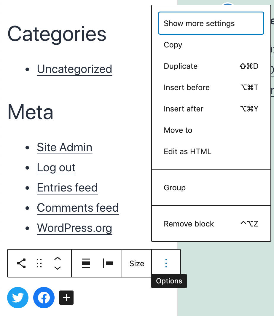
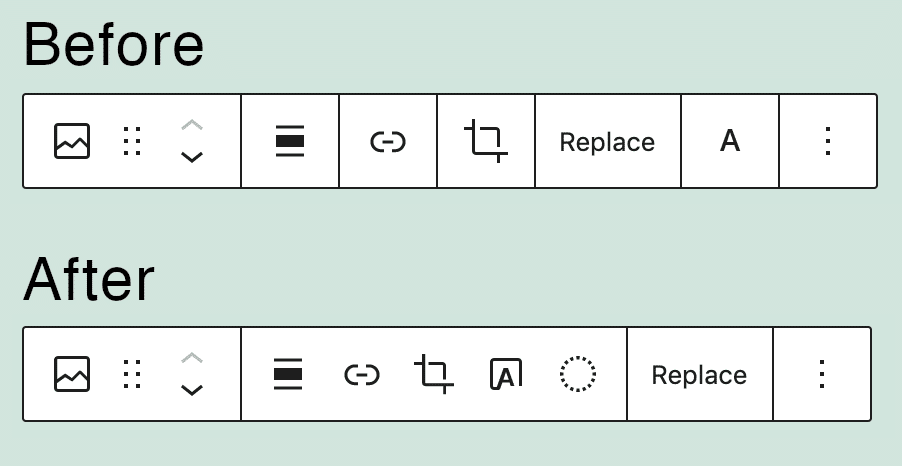
Several block toolbars have been rearranged to provide a consistent UI across blocks and improve the user experience. Now, toolbar controls are grouped following the “meta, block-level, inline” semantic order.

Since Gutenberg 10.1 and Gutenberg 10.3, a whole set of block toolbars has been normalized. These include an image, button, buttons, list, heading, paragraph, quote, audio, file, media & text, video, and more.
According to Matias Ventura:
The semantic groupings we have in the toolbar — meta, block level, inline — should also have a visual representation with the borders. Right now separate block level controls have different representations, including cases like Navigation where every single one has borders.

So, since WordPress 5.8, the block toolbar groups controls in segments surrounded by borders. In addition:
- The Meta segment contains block-type controls, such as the block switcher, the drag handle, and the mover control.
- The Block level segment contains specific block tools affecting the whole content, such as alignment in a paragraph block or linking in an image block.
- The Inline level/Other segment contains inline transformation tools, such as inline formatting in a text block.
- The More menu includes additional tools.
The image below compares the Image block toolbar in WordPress 5.7 and 5.8:
Top Toolbar Improvements
With top toolbar mode enabled in previous WordPress versions, the top toolbar and the block toolbar were displayed side by side, as shown in the following image:
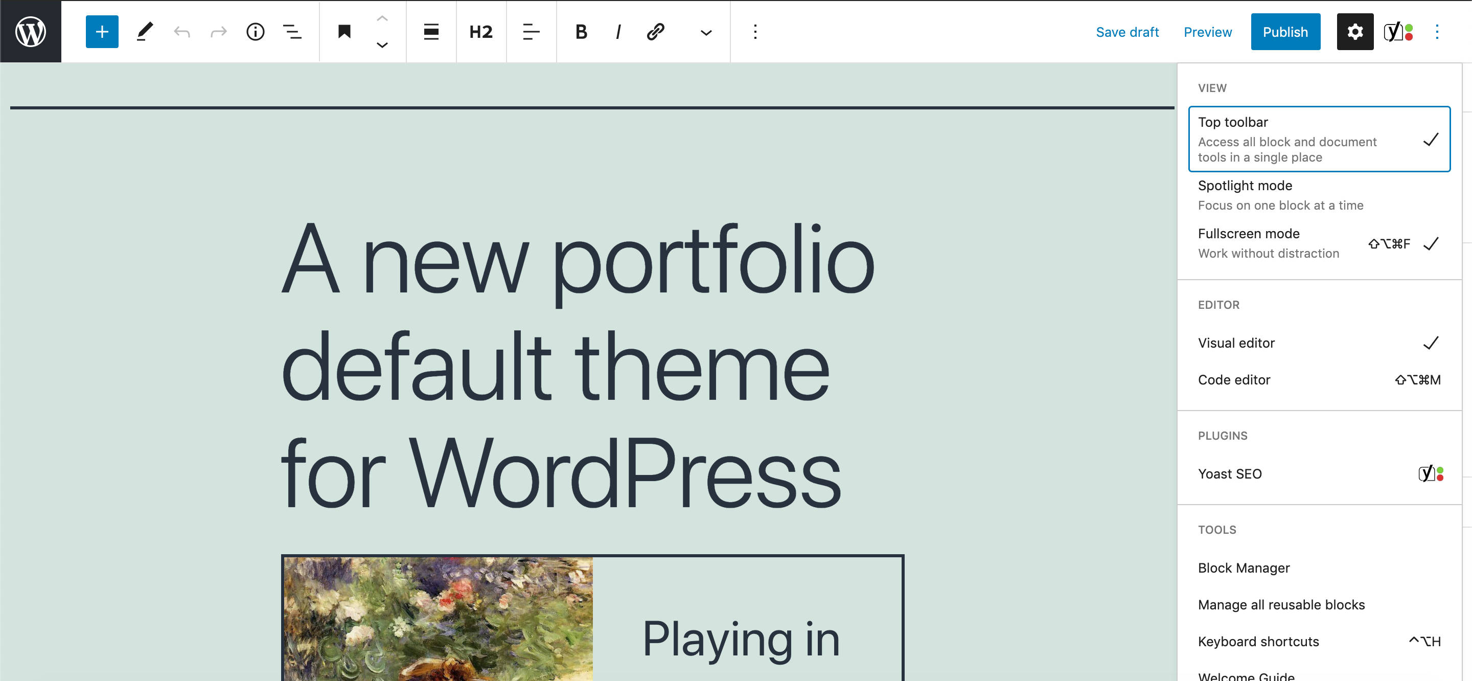
With WordPress 5.8, enabling the top toolbar view will fix the block toolbar at the editor’s top, just below the top toolbar. This happens independently from the browser width and should significantly improve the user experience.
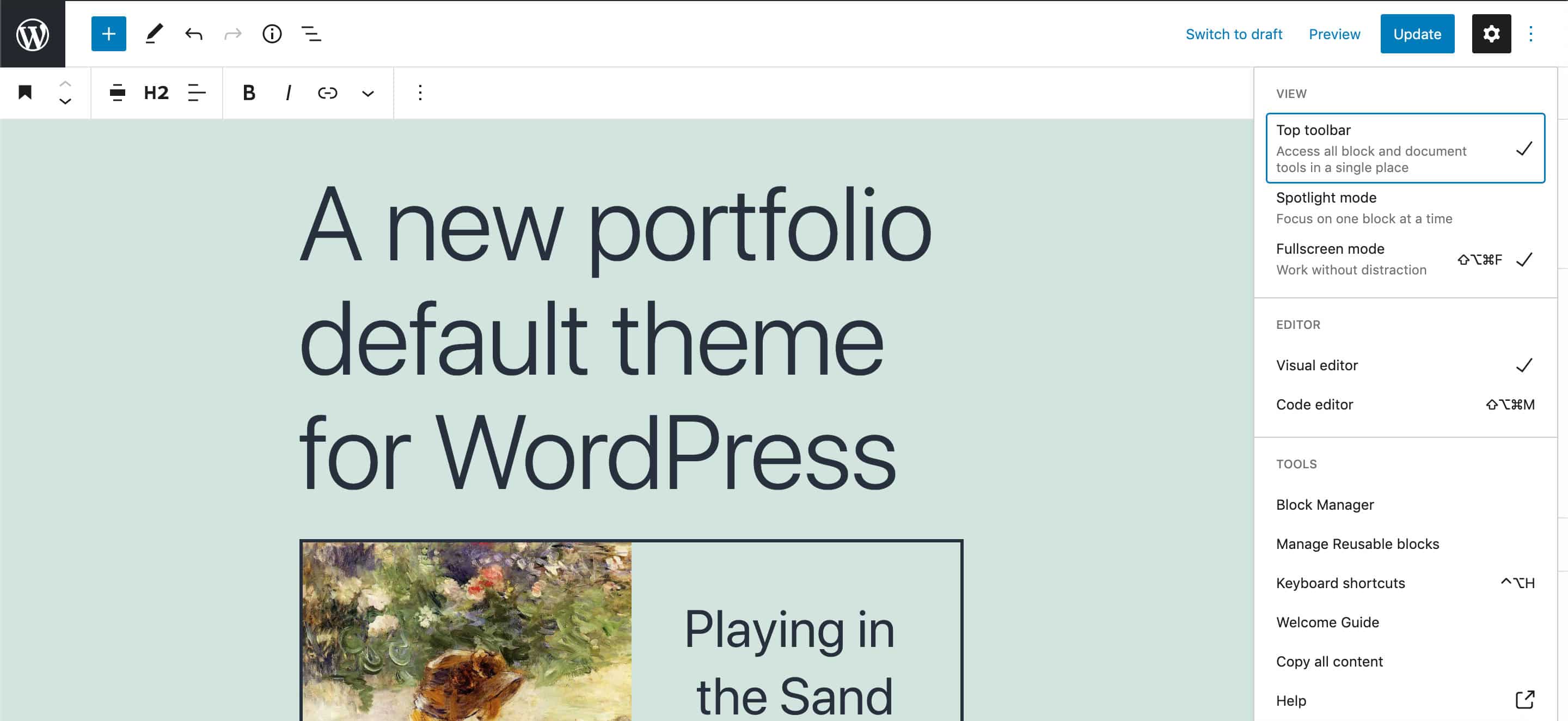
This enhancement also brings changes for developers as it unifies toolbar APIs under the <BlockTools /> component (see PR #31134).
Embedded PDFs
When a PDF file is added to the document through the file block, a new sidebar toggle allows you to enable/disable an embedded PDF version (see PR #30857).
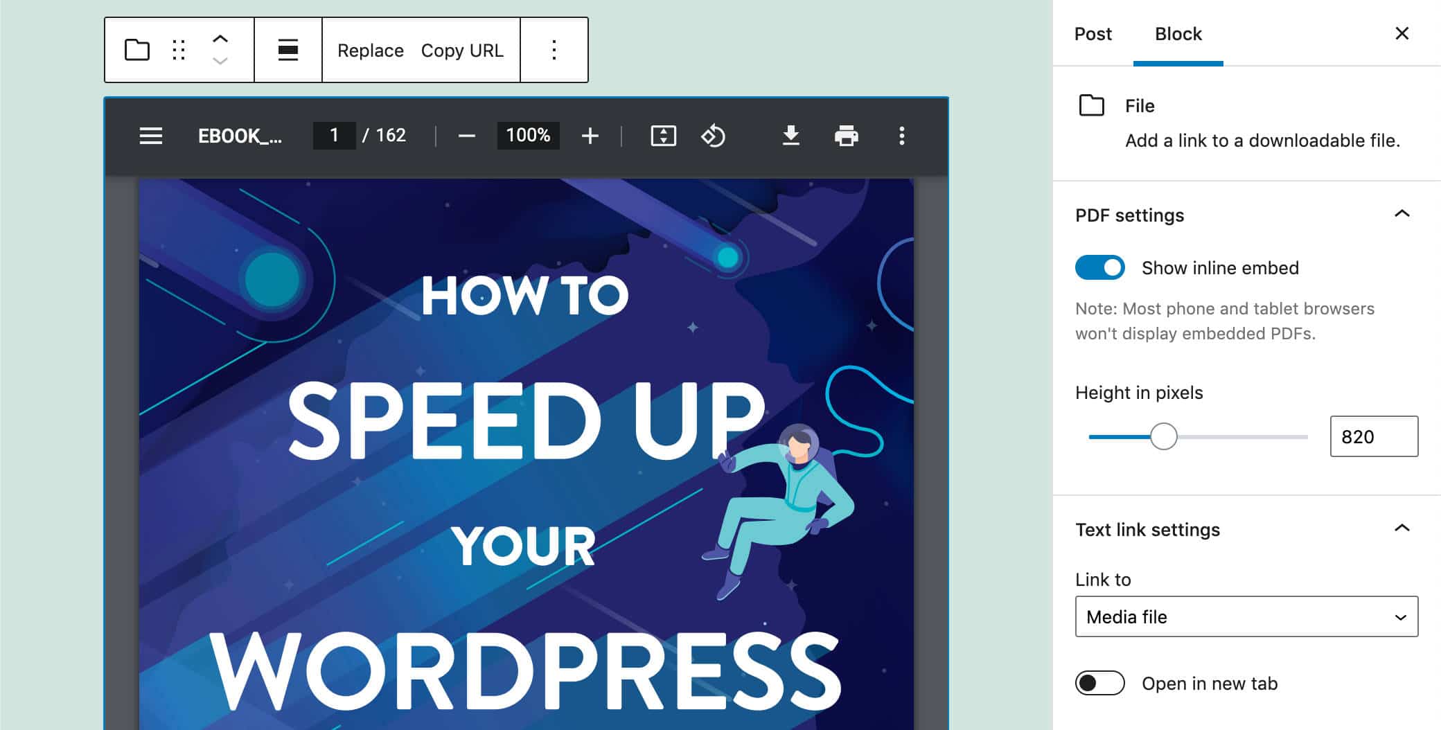
You can either drag the file directly onto the editor canvas or simply select it from the library. It’s also possible to manually adjust the height of the PDF viewer or by using the sidebar control.
All major web browsers support the PDF viewer, except for mobile browsers.
Duotone Block Support
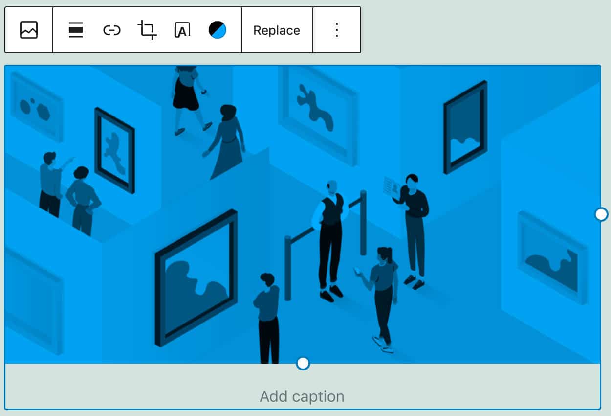
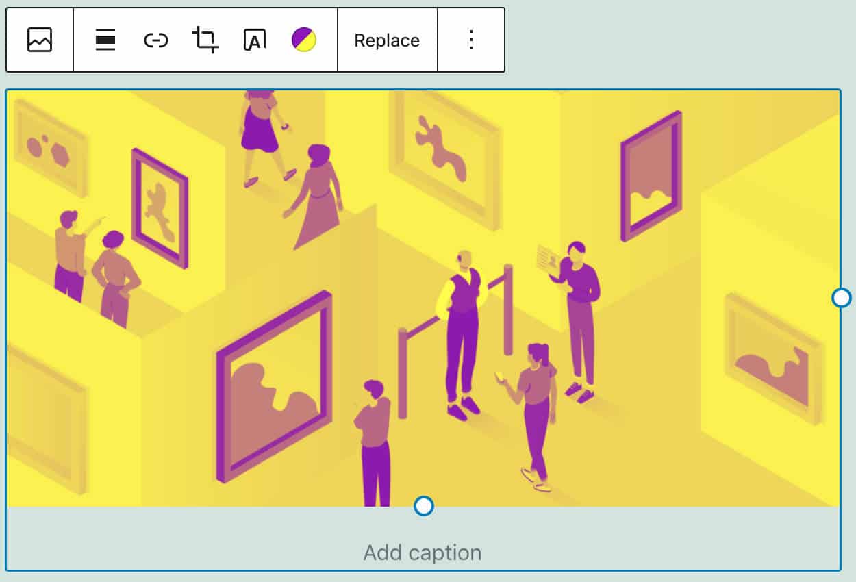
One of the most interesting features merged into Core with WordPress 5.8 is the duotone filter, first introduced with Gutenberg 10.6.
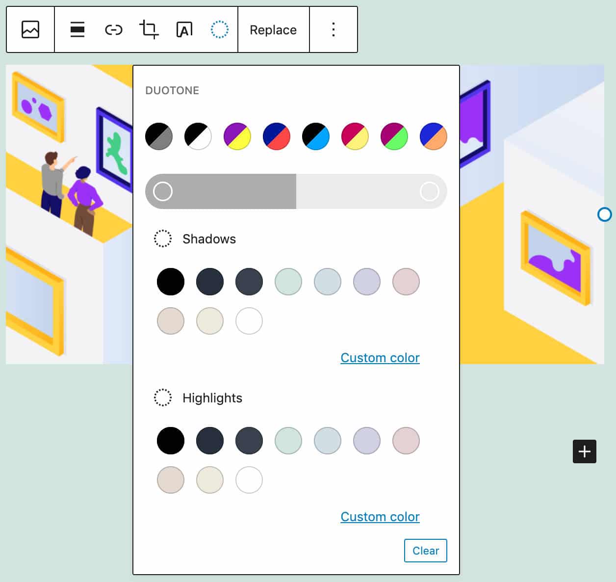
Available as a “block supports” feature, the duotone filter is enabled by default in core image and cover blocks. In the cover block, though, it doesn’t work with fixed backgrounds.
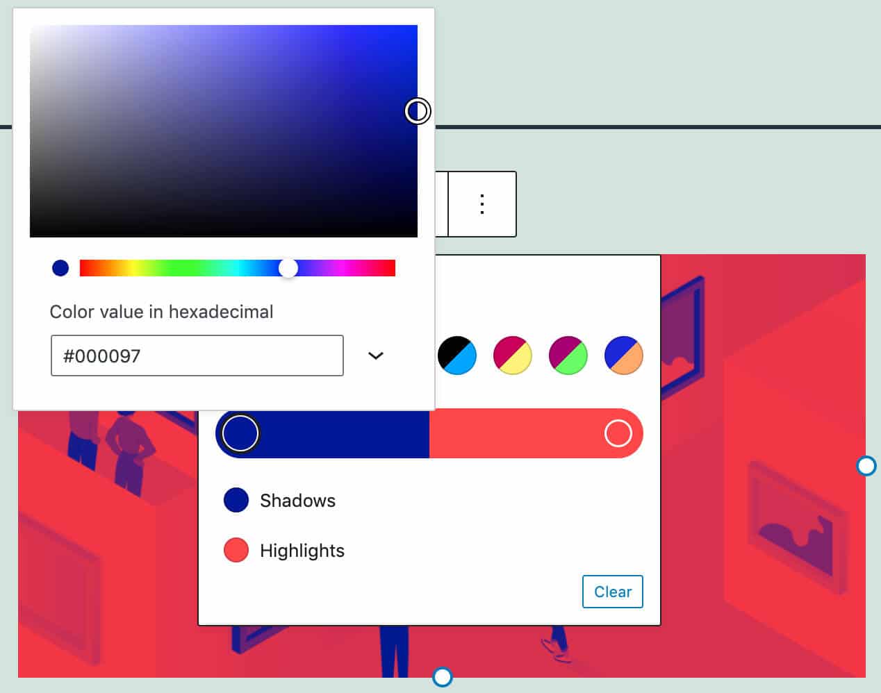
Image and cover block toolbars now display an Apply duotone filter control showing a duotone picker with many presets to choose from.
Two subcontrols permit customizing shadows and highlights separately. The effect is applied with an SVG filter hidden with inline styles and applied using a specific class name.
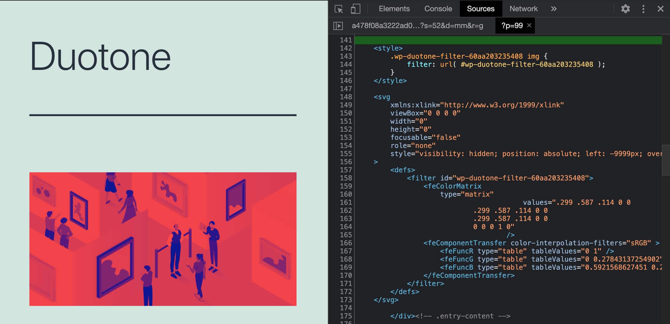
The new tool comes in pair with a new color.__experimentalDuotone property, allowing developers to add the duotone filter to blocks or parts of blocks in their block.json file (more on this in color object reference):
supports: {
	color: {
		__experimentalDuotone: '> .duotone-img, > .duotone-video',
		background: false,
		text: false
	}
}
When a block declares support for color.__experimentalDuotone, a style attribute can be used to set custom default colors:
attributes: {
	style: {
		type: 'object',
		default: {
			color: {
				duotone: [
					'#FFF',
					'#000
				]
			}
		}
	}
}
Below you can see the same image with two different duotone effects applied:
Developers can define duotone presets in the theme.json file (see next section), as shown in the following snippet:
{
"version": 1,
"settings": {
	"color": {
		"duotone": [
			{
				"colors": [ "#000", "#7f7f7f" ],
				"slug": "black-and-white",
				"name": "dark-grayscale"
			}
		],
	...
You can read more about duotone filters in Coloring Your Images With Duotone Filters.
Table Block Colors and Borders
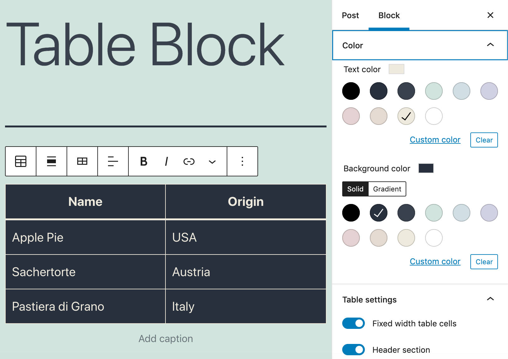
WordPress 5.8 also brings a couple of enhancements to the Table block, including better control over table background and foreground colors.
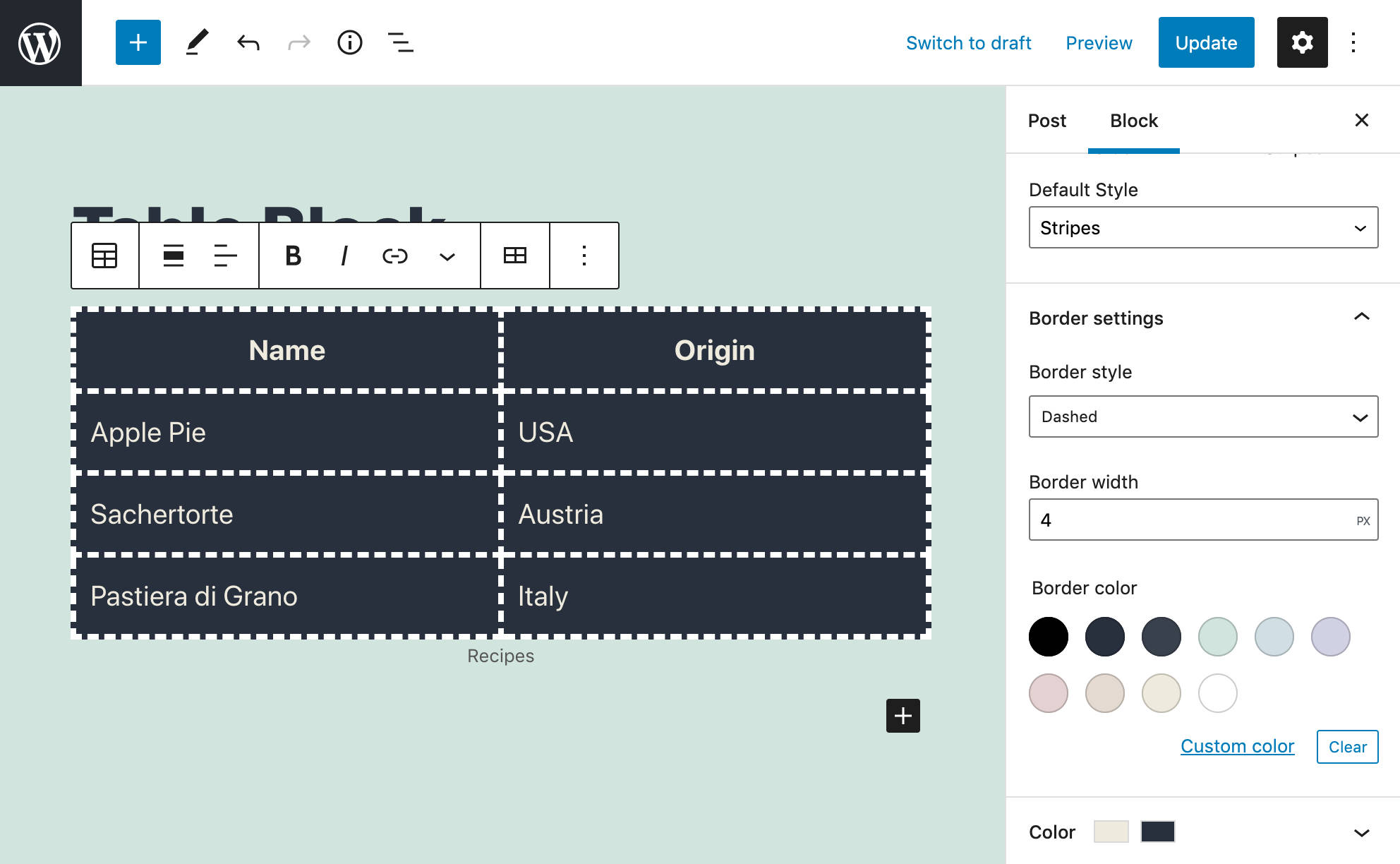
Another addition to the Table block is the border block support, which gives users the ability to control border color, style, and width.
If the active theme supports the new feature, a new border settings panel provides three new controls for user customizations.
Developers can add border block support to their themes by adding the following code to the theme.json file:
"border": {
	"customColor": true,
	"customStyle": true,
	"customWidth": true
}
Improvements to the Block Inserter
In WordPress 5.8, the block inserter has been enhanced with several additions (PR #26938 and #21080):
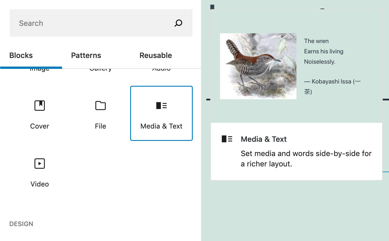
1. Two-dimensional keyboard navigation on the block inserter. Now we can navigate between blocks more precisely and intuitively.
- Pressing arrow up (↑) and arrow down (↓) moves the focus to the row above or below.
- Pressing Tab or Shift + Tab allows moving the focus between the search box, the tab list, and the first item of each category.
2. A new “Theme” category for template parts and variations now appears in the inserter in Full Site Editing (see PR #30020).
3. Multiple words in the autocomplete phrase matcher are now allowed (see PR #29939).
Additional Block Editor Improvements
WordPress 5.8 brings tons of additional small and medium changes worth a few lines here. Among these enhancements, we’d mention the following:
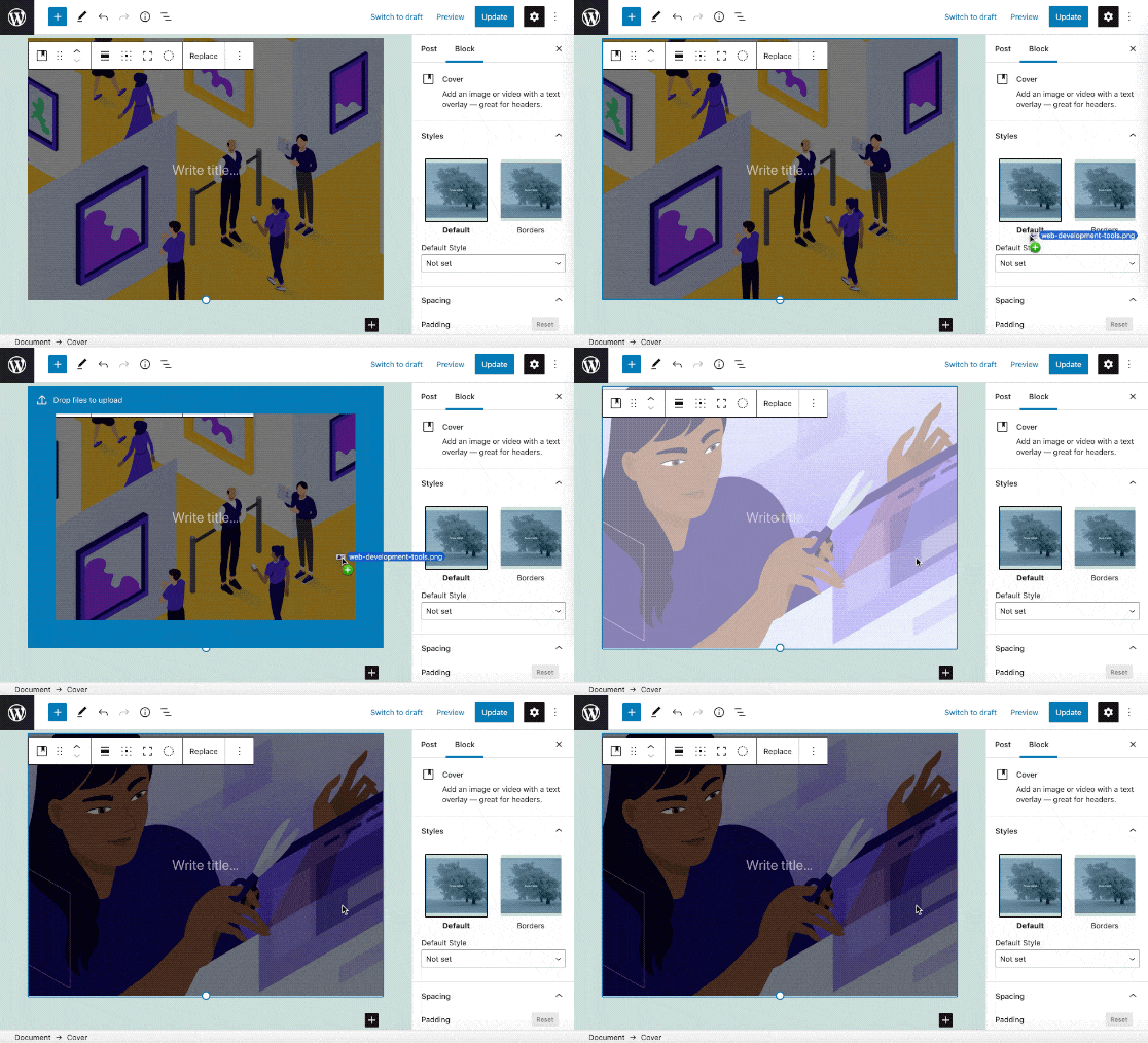
Drag and Drop Support in Cover Blocks
Now you can drag and drop images from your desktop to replace a cover block’s background (see Gutenberg 10.3 and PR #29813).
Enhanced Publishing UI
Since WordPress 5.8, the publishing UI shows the site icon and title to make it clearer where you’ll publish your posts or pages (Gutenberg 10.4).
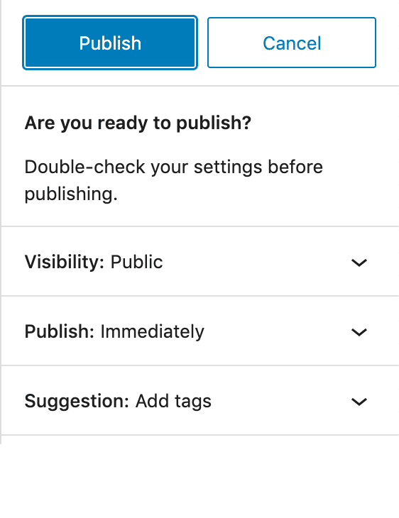
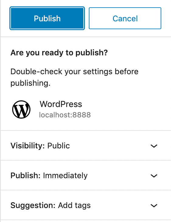
This enhancement is beneficial if you’re working in full-screen mode or on mobile devices.
Block Settings and Styles With theme.json
With WordPress 5.8, the theme.json file becomes “a central point of configuration,” providing a new way for theme developers to customize editor settings and styles.
Using a theme.json file, themes can set custom presets and/or add support for new features, such as duotone and table borders (see Global Settings & Styles).
According to André Maneiro:
This new mechanism aims to take over and consolidate all the various
add_theme_supportcalls that were previously required for controlling the editor.
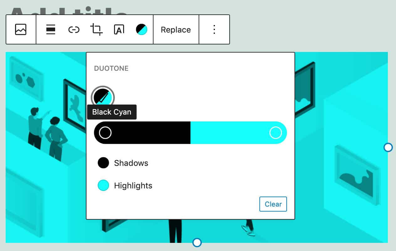
For example, you can globally set a custom duotone preset with the following code:
{
	"version": 1,
	"settings": {
		"color": {
			"duotone": [
				{
					"colors": [ "#000", "#0FF" ],
					"slug": "black-cyan",
					"name": "Black Cyan"
				}
			],
This would overwrite default presets, and you’ll see only one duotone option:
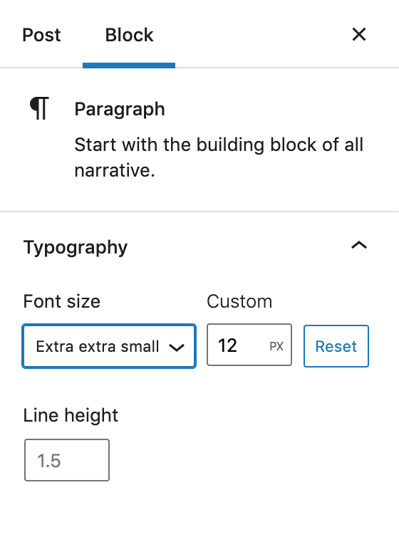
The new mechanism provides a way to control settings either globally or on a per-block basis. For example, you can add a custom 12px font size globally by adding the following preset to your theme.json file:
{
	"version": 1,
	"settings": {
		"typography": {
			"customLineHeight": true,
			"fontSizes": [
				{
					"slug": "extra-extra-small",
					"size": "12px",
					"name": "Extra extra small"
				},
				{...}
This results in a new font size available for users to utilize with any text in their content.
If you only want to customize the paragraph block, your code will be slightly different:
{
	"version": 1,
	"settings": {
		"blocks": {
			"core/paragraph": {
				"typography": {
					"fontSizes": [
						{
							"slug": "extra-extra-small",
							"size": "12px",
							"name": "Extra extra small"
						},
						{
							"slug": "extra-small",
							"size": "16px",
							"name": "Extra small"
						},
						{
							"slug": "small",
							"size": "18px",
							"name": "Small"
						},
						{
							"slug": "normal",
							"size": "20px",
							"name": "Normal"
						},
						{
							"slug": "large",
							"size": "24px",
							"name": "Large"
						}
					]
				}
			}
		}
	}
}
That’s it! You’ve just set your custom font size presets to the paragraph block.
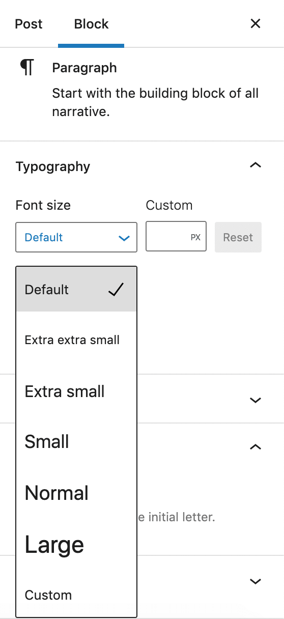
Core blocks have been updated to follow the new mechanism, while third-party blocks can adapt to the new mechanism using the React useSetting hook (read more about this function in the dev-note and API documentation):
const isEnabled = useSetting( 'spacing.margin' );The new mechanism based on the theme.json file does not apply only to block settings. In fact, starting with WordPress 5.8, it will no longer be necessary to create editor styles and enqueue them. It will be enough to declare presets inside the theme.json file; the engine will generate the classes and automatically enqueue them both to the editor and the frontend.
The engine will also generate the corresponding CSS Custom Properties.
In the previous example, we set five fontSizes presets for the paragraph block. For those presets, the following CSS Custom Properties will be generated:
p {
	--wp--preset--font-size--extra-extra-small: 12px;
	--wp--preset--font-size--extra-small: 16px;
	--wp--preset--font-size--small: 18px;
	--wp--preset--font-size--normal: 20px;
	--wp--preset--font-size--large: 24px;
}
Once you have set the paragraph font size in your theme.json file, the corresponding p element takes the has-{preset-slug}-{preset-category} class.
This means that a paragraph with an extra-extra-small font size will get the has-extra-extra-small-font-size class:
<p class="has-extra-extra-small-font-size">Lorem ipsum dolor...</p>And here is the CSS declaration block:
p.has-extra-extra-small-font-size {
	font-size: var(--wp--preset--font-size--extra-extra-small) !important;
}
For a closer view of the setting and styles with theme.json, make sure to check the dev-note and API documentation.
Also, check Anne McCarty’s FSE call for testing for more useful reading and an exciting challenge for developers who want to explore the new theme.json features.
Block API Enhancements
Block API enhancements coming with WordPress 5.8 deserve special attention from plugin developers.
Using the block.json file is now encouraged as the canonical way to register block types and provides several advantages:
- Regarding performance, if the theme supports lazy loading of assets, registering block types through the block.json file will automatically optimize resource enqueueing. That’s because the resources specified by the
styleandscriptproperties will be enqueued on the frontend only when the block is detected. This allows for the development of more efficient plugins, reducing page size, and preventing several of the problems covered in this article on how to disable WordPress plugins from loading. - The block.json file simplifies server-side block registration by allowing the Block Types REST API Endpoint to list the block.
- The block.json file is also required if you decide to submit your block plugin to the WordPress Plugins Directory.
Changes to the register_block_type Function
Since WordPress 5.8, the register_block_type function has been enhanced to read metadata from the block.json file. Now, the first parameter accepts the path to the folder where the block.json file is located.
The function can be used as shown in the following example:
function create_custom_block_init() {
	register_block_type( __DIR__ );
}
add_action( 'init', 'create_custom_block_init' );
It returns the registered block type or false on failure.
As you may notice, the function register_block_type is now used the same way as the register_block_type_from_metadata function, which previously was the only function available to register a block type by reading the metadata from the block.json file. As explained by Greg Ziółkowski:
We decided to consolidate the pre-existing functionality available with
register_block_type_from_metadatamethod intoregister_block_typeto avoid some confusion that it created. It’s still possible to use both functions, but we plan to use only the shorter version in the official documents and tools from now on.
Once the block is registered on the server, you only need to register settings on the client using the same block name in your index.js file.
For a more in-depth overview of block API enhancements introduced by WordPress 5.8, make sure to check the dev-note by Greg Ziółkowski.
WebP Support in WordPress 5.8
Here at Kinsta, we’re obsessed with site speed and WordPress performance. That’s why WebP format support in WordPress 5.8 is such exciting news for us.
Considered a next-gen format, WebP is an image format developed by Google that provides “better compression than PNG or JPEG, which means faster downloads and less data consumption.”

WebP is a modern image format that provides superior lossless and lossy compression for images on the web. Using WebP, webmasters and web developers can create smaller, richer images that make the web faster.
WebP lossless images are 26% smaller in size compared to PNGs. WebP lossy images are 25-34% smaller than comparable JPEG images at equivalent SSIM quality index.
Starting with WordPress 5.8, you can use the WebP image format the same way as JPEG, PNG, and GIF formats. Just upload your images to your Media Library and include them in your content.
In a previous article, we took an in-depth look at the WebP format and the tools available to use it in WordPress. Now, due to the support for WebP images in WordPress 5.8, things change a bit. As the WebP format is supported out of the box, you don’t need to install third-party plugins to upload WebP images in WordPress, at least in the most common use cases.
Note that, even though you can now upload your WebP images to WordPress using the Media Library, WordPress does not support automatic image conversion to WebP format. To enable that feature on your website, you’ll need a third-party WebP WordPress plugin.
How To Use WebP Images in WordPress
You can convert your images to WebP in many different ways:
- You can use Google’s precompiled WebP utilities and library for Linux, Windows, or Mac OS X.
- Mac users can install a package manager such as the Homebrew WebP package or the Macports WebP package.
- You can use an image editing tool supporting WebP, such as Squoosh by Google Chrome Labs, the batch image converter XnConvert, a popular image editor like GIMP, and many others.
- You can install a WebP WordPress plugin for better overall control over WebP images in WordPress.
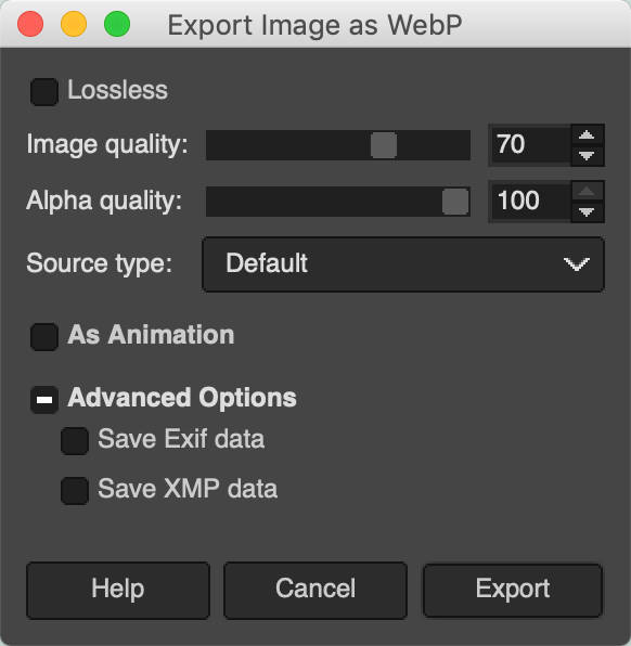
If you opt for a command-line tool, you can encode and decode your images using cwebp and dwebp utilities. For example, the following command executes a basic JPEG to WebP conversion:
cwebp [options] original_image.jpg -o compressed_image.webpYou can also run a bulk conversion of your images using Bash and cwebp (example by Jeremy Wagner):
find ./ -type f -name '*.png' -exec sh -c 'cwebp -q 75 $1 -o "${1%.png}.webp"' _ {} \;
The command above converts all .png images to .webp format with a compression factor of 75.
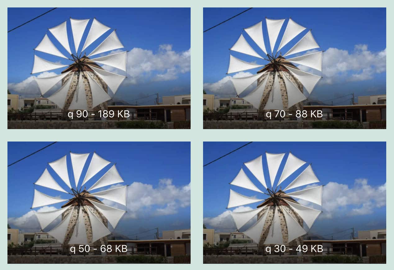
Once you have your WebP images, you can simply upload them using WordPress Media Library. Below you can see a 127 KB JPEG image before conversion in the Media Library:

The compressed WebP image size is 42% smaller than the original JPEG image!
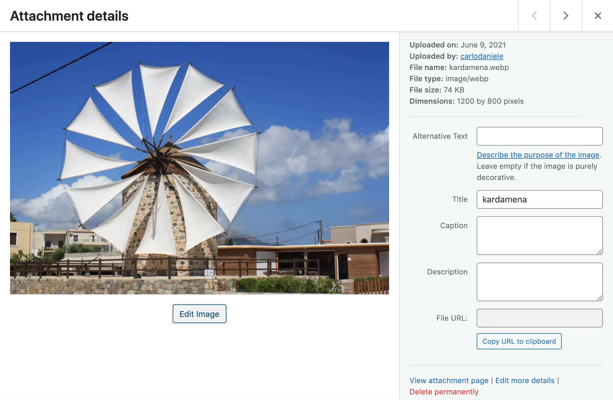
Last, WebP images have the same editing features as JPEG, PNG, and GIF images. You can crop, rotate, flip and scale them, and apply changes to the image sizes of your choice.
Caveats About WebP in WordPress 5.8
According to Adam Silverstein:
WebP images support lossy and lossless compression, as well as an animated format and support for transparent images. In WordPress, the lossless WebP format is only supported when the hosting server uses Imagick (the PHP library) until LibGD adds support. In addition, animated and alpha formats are not yet supported for resized images (when you upload images in these formats lossy images are created instead).
If your web host does not support WebP images, you’ll see an error message when trying to upload them. If you’re not sure if your web host supports the Imagick library, the Site Health tool Info tab includes an Imagick library field providing that piece of information.
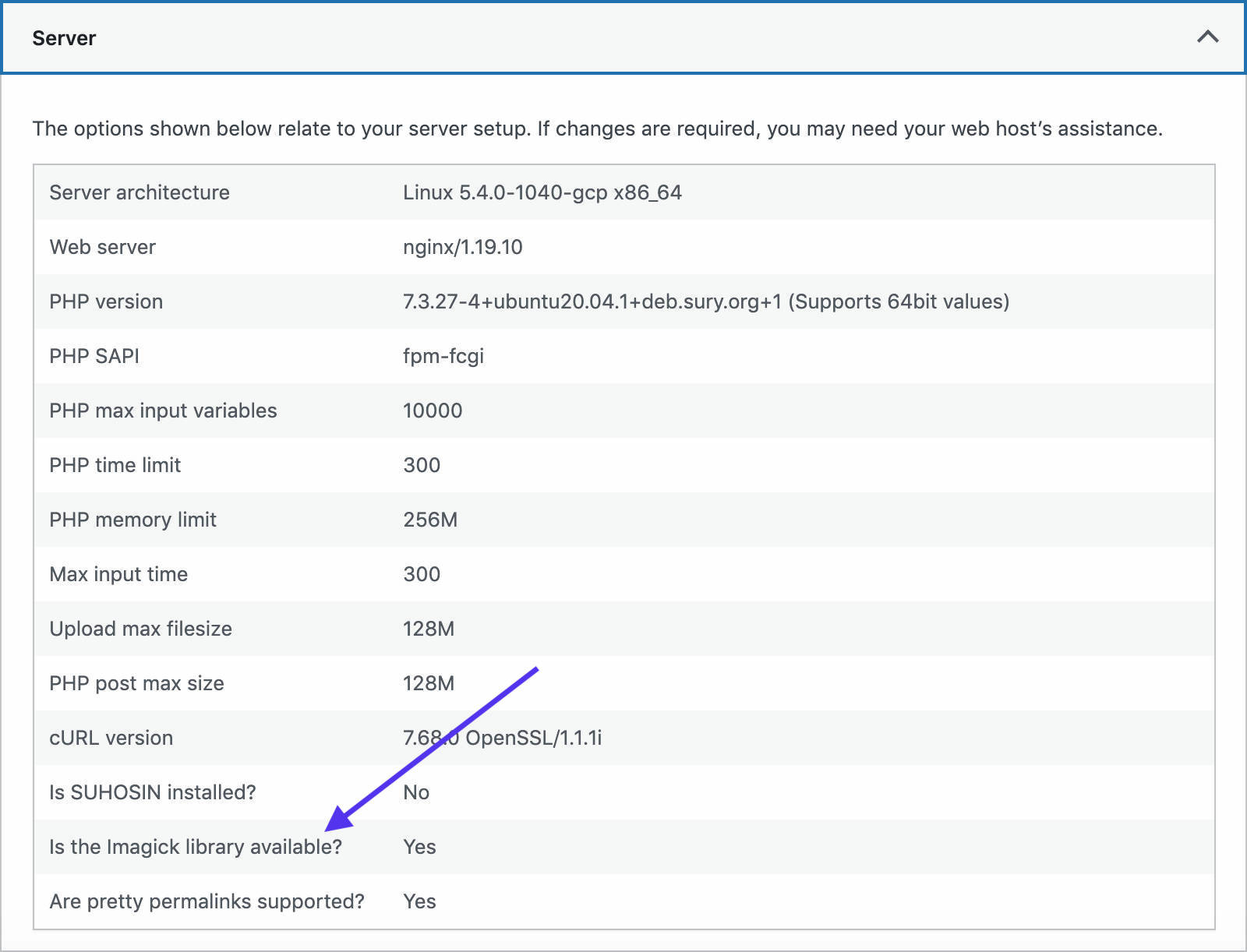
With WebP support, WordPress 5.8 also introduces two additional fields to the Media Handling section in Site Health: Imagick version and ImageMagick supported file formats.

If WebP is not listed among supported file types, you’ll need to reach out to your web host for support.
The dev-note provides additional information about WebP support in WordPress 5.8, helpful FAQs, and further resources.
If you’re interested in image optimization, you may also like the following tutorials:
- How to Optimize Images for Web and Performance
- Why and How to Use Lossy Compression on Your WordPress Images
- How to Use WebP Images on WordPress (And Shrink Image File Sizes up to 35%)
- 15 Best Image File Types
- Everything You Need to Know About WordPress Image Sizes
Additional Features for Developers
You’ll find dozens of exciting features for developers in WordPress 5.8. In this article, we’ve paid more attention to the ones that should have the most significant impact on your development work. But there are indeed many new features that are worthy of attention, including the following:
Block Supports API
WordPress 5.8 adds new block supports flags allowing developers to customize registered blocks with the latest block features.
In addition to the experimental duotone block support mentioned earlier (color._experimentalDuotone), WordPress 5.8 also adds support for link color. To take advantage of this feature, just add the following flag to your block metadata:
supports: {
	color: {
		link: true;
	}
}
You can set default values using attributes, as shown in the following example, or set your presets in theme.json:
attributes: {
	style: {
		type: 'object',
		default: {
			color: {
				link: '#FF0000',
			}
		}
Additional Block API changes include:
fontSizeandlineHeightsupports become stable.spacingsupport has been expanded, and now you can controlmarginandpadding, as well as individually controltop,right,bottomandleftsizes.
You can read more about Block Supports API in WordPress 5.8 in Block supports API updates dev-note.
For a closer view of how to use Block Supports API, see Block Supports API official documentation.
Site Health Custom Tabs
Two new hooks now allow developers to add their custom tabs to the Site Health interface and customize available screens.
The site_health_navigation_tabs filter is an associative array of tab IDs and labels to register a new tab in the Site Health screen. You can use the filter by adding the following example code to your theme’s functions file or custom plugin:
function kinsta_site_health_navigation_tabs( $tabs ) {
	$tabs['kinsta-site-health-tab'] = esc_html_x( 'Kinsta', 'Site Health', 'text-domain' );

	return $tabs;
}
add_filter( 'site_health_navigation_tabs', 'kinsta_site_health_navigation_tabs' );
The image below shows the new Site Health tab:
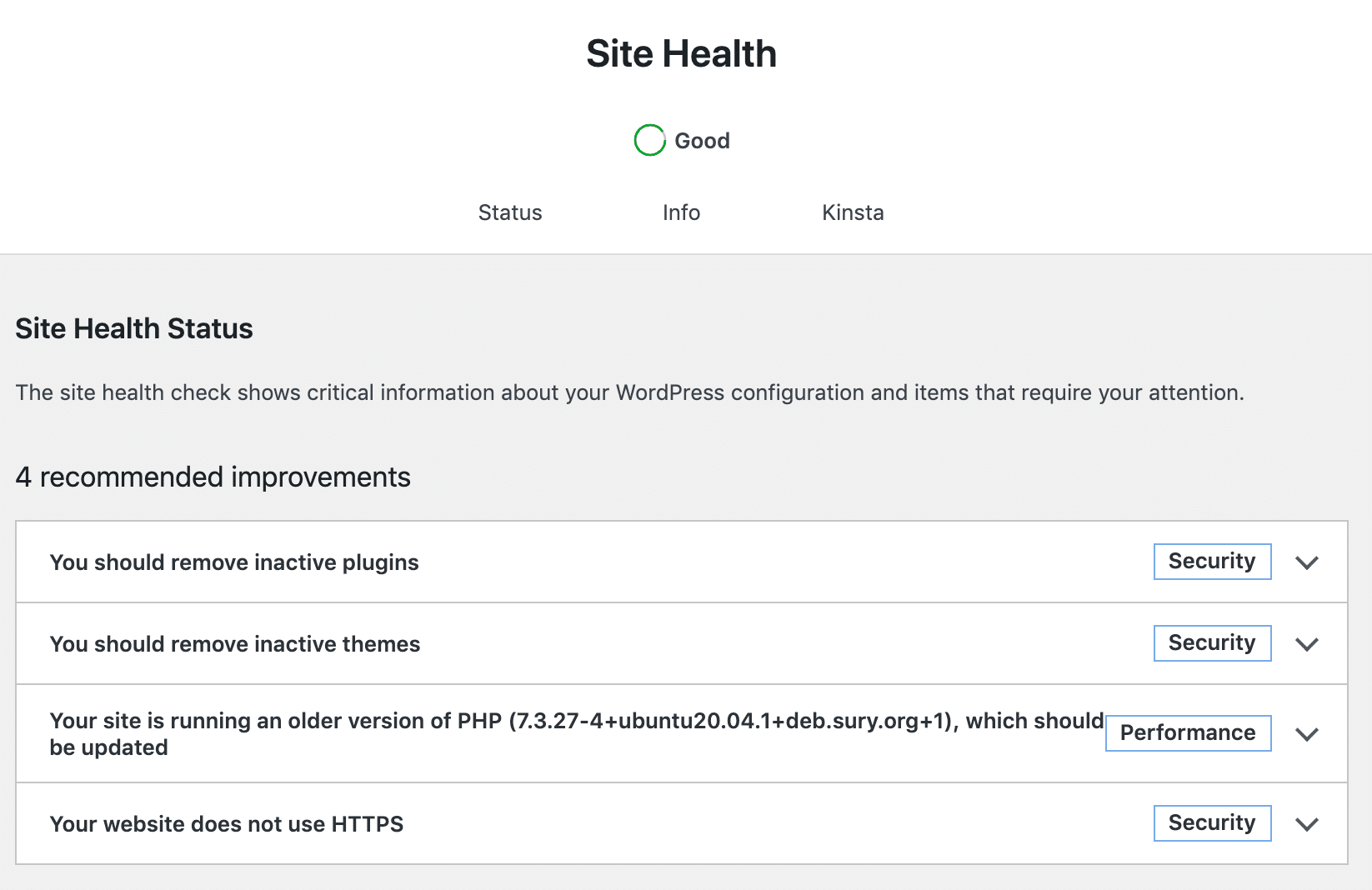
Thanks to the site_health_navigation_tabs filter, it’s also possible to reorder tabs or remove one or more items.
The site_health_tab_content action triggers when a user visits the Site Health screen, except for the default Status screen. You can use this hook as shown in the following snippet (example from dev note):
function kinsta_site_health_tab_content( $tab ) {
	// Return if this is not your tab.
	if ( 'kinsta-site-health-tab' !== $tab ) {
		return;
	}

	// Include the interface, kept in a separate file just to differentiate code from views.
	include trailingslashit( plugin_dir_path( __FILE__ ) ) . 'views/kinsta-site-health-tab.php';
}
add_action( 'site_health_tab_content', 'kinsta_site_health_tab_content' );
First, it detects if the current tab is your custom tab, then it loads your Site Health screen content from a .php file. The site_health_tab_content action also allows developers to extend the default Info tab adding pieces of information specific to their plugins or themes.
Block Editor API Changes to Support Multiple Admin Screens
With WordPress 5.8, the post editor isn’t the only admin screen using the block editor anymore (the widgets screen is an example).
Core contributors found several hooks defined on the server depending on the $post object. This object is not present in the site edit, widgets, and navigation screens. Moving forward, several filters have been deprecated and replaced with context-aware substitutions.
Additionally, a new WP_Block_Editor_Context class representing the current block editor context and various methods has been introduced.
These changes improve these screens with new capabilities and enable developers to add their customizations.
For a comprehensive list of Block Editor API changes related to admin screens, see the dev note from Greg Ziółkowski.
Additional Features and Enhancements
There are so many new features and changes for developers brought by WordPress 5.8 that it would be impossible for us to mention them all in this article. But we’ve collected a list of dev-notes not covered here for your further reading:
- Dropping support for Internet Explorer 11
- Block-styles loading enhancements in WordPress 5.8
- Blocks in an iframed (template) editor
- On layout and content width in WordPress 5.8
- Introducing “Update URI” plugin header in WordPress 5.8
- Various Block Editor API removals in WordPress 5.8
- REST API Changes in WordPress 5.8
- Miscellaneous developer-focused changes in WordPress 5.8
- Miscellaneous block editor API additions in WordPress 5.8
Summary
WordPress 5.8 marks a milestone on the road to Full Site Editing. But the second WordPress release of the year brings much more than FSE. Users and developers will find tons of improvements to the block editor, a new theme.json mechanism, a more powerful Block API, WebP image format support, and much more.
We’ve been particularly impressed by the improvements, both small and large, to the block editor and its UI. We love the improved navigability between blocks, the revamped block toolbar, the enriched clarity of the interface, and the enhancements to several blocks.
These small changes improve the editing experience little by little, and, without almost realizing it, we find ourselves using better and more robust software. That’s WordPress!
Over to you now! What are your thoughts about Full Site Editing? And what are your favorite changes coming with WordPress 5.8?

