
Twenty Twenty-One is the new WordPress default theme coming with WordPress 5.6. If you are waiting for a fully featured WordPress theme you may be a little disappointed.
Twenty Twenty-One is a minimalist theme that looks and acts as a highly customizable blank canvas. Like its predecessors, the new default theme will mostly rely on the Block Editor for page building.
In this post, we’ll go through the most interesting features of the Twenty Twenty-One theme and we’ll show you how to customize the look and feel of a WordPress website with a simple Twenty Twenty-One child theme.
Ready? Let’s dive in!
A First Look at Twenty Twenty-One WordPress Theme
Like Twenty Twenty, the new default theme coming with WordPress 5.6 isn’t built from scratch, but it’s based on a theme coming from the community.
Twenty Twenty-One has been developed upon a new Automattic’s theme, the Seedlet theme, which provides a clean and well-ordered structure of nested CSS custom properties. Due to the large usage of CSS properties in the theme’s stylesheet, building child themes upon Twenty Twenty-One is quick and easy.

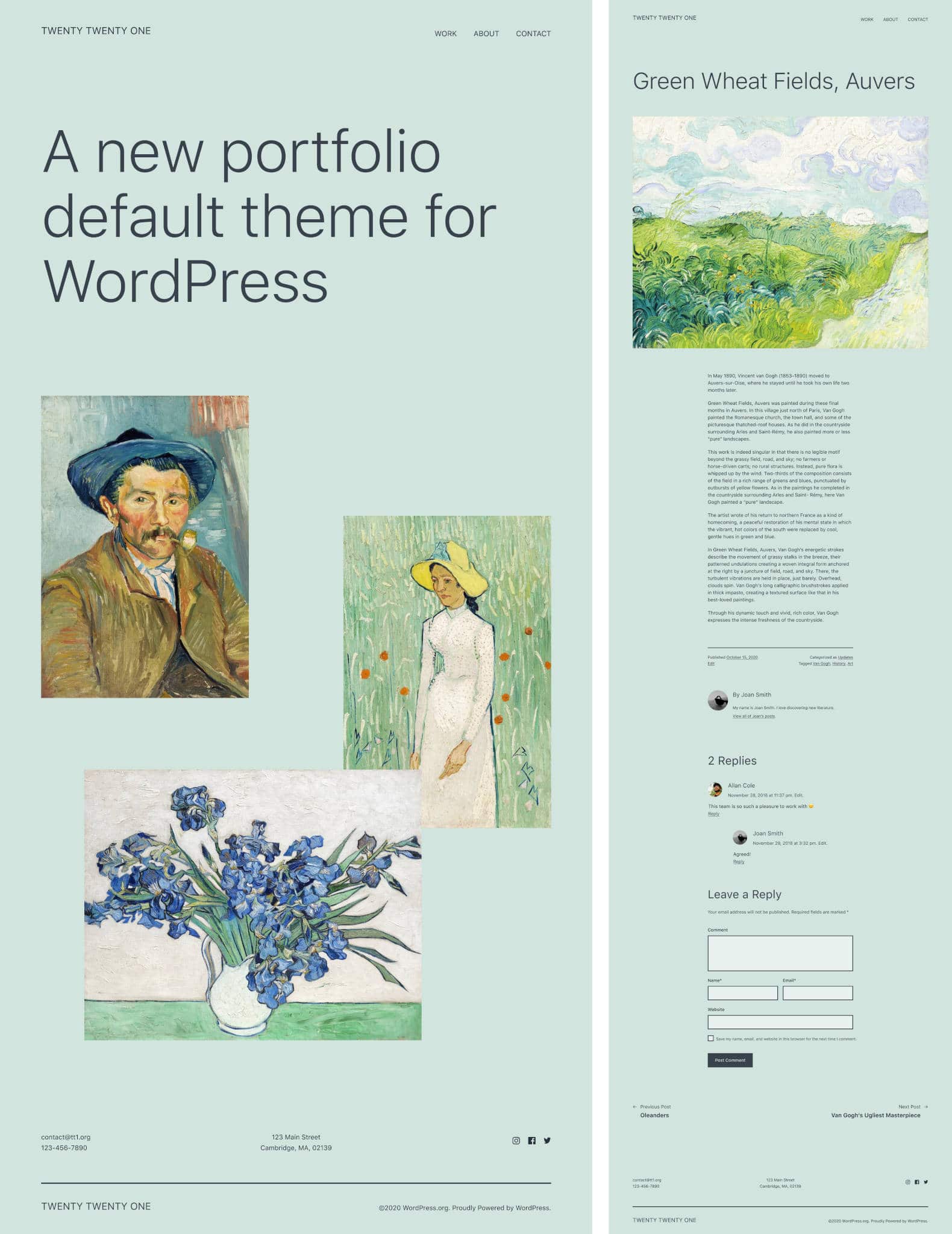
Twenty Twenty-One is a highly accessible, minimalist WordPress theme with a single column layout, a footer sidebar, and two menu locations: Primary navigation and Footer navigation.
The new theme uses a system font stack. This should have several benefits for both users and developers:
- First and foremost, using a system font stack brings benefits to UX and performance because native fonts are already supported by the majority of operating systems and don’t require extra load time.
- Second, they look neutral, so they can be smoothly merged into any kind of design.
- Third, as they don’t require additional font files to be loaded, it’s easier for users and developers to customize the layout of a website using Twenty Twenty-One.
The Twenty Twenty-One theme uses a minimal color palette based on pastel green background colors and two shades of grey as foreground colors. The theme provides several additional pastel color palettes.
On this point, Mel Choyse-Dwan, Default Theme Design Lead, explains:
We’ll be bundling the theme with some additional color palettes, including both a white and a black color scheme. Why pastel green? Pastels and muted colors are pretty in right now

How To Install Twenty Twenty-One
At the time of this writing, Twenty Twenty-One is under active development and is not yet available for download in the WordPress Theme Directory. But you can grab an in-progress version of the theme on Github.
The Github repository will be deprecated once the theme is merged into core, and you’ll find it in the Theme Directory. As Twenty Twenty-One follows the WordPress 5.6 release schedule, you may want to save the following dates:
- 20 October 2020: Beta 1
- 27 October 2020: Beta 2
- 2 November 2020: Beta 3
- 12 November 2020: Beta 4
- 17 November 2020: RC 1
- 1 December 2020: RC 2
- 7 December 2020: Dry run for release of WordPress 5.6
- 8 December 2020: Target date for the release of WordPress 5.6
To get the Twenty Twenty-One theme up and running, follow these steps:
- Get the zip package from GitHub.
- Upload your package to your development installation from the WordPress dashboard or via SFTP.
- Browse to Appearance → Themes and click on the Activate button on the theme’s preview image.
- Go to Appearance → Customize to configure Twenty Twenty-One.
You can now start running your tests either on a staging website or on your local environment.
Not ready to run your tests?
No worries, we have dissected the theme and we’ll show you what you could expect from Twenty Twenty-One.
Twenty Twenty-One’s Theme and Block Features
Just like Twenty Twenty, the new default WordPress theme is not a fully-featured theme, but a minimalist theme that relies on the block editor for page building. The theme also aims at providing great accessibility. In the words of Mel Choyce-Dwan:
Lastly, we’d love to make the theme meet relevant guidelines from WCAG 2.1 level AAA. We loved the idea when +make.wordpress.org/accessibility/ brought it up, and would appreciate any and all guidance from our community a11y experts to help make this possible.
The theme supports a good number of theme and block features including the following:
Theme features:
- Automatic feed links
- Title tag
- Post formats
- Post thumbnails
- HTML5 elements
- Custom logo
- Selective refresh for widgets
- Custom Background
- Two navigation menus
- One sidebar
Block Features:
- Default block styles
- Editor styles
- Dark editor styles (dark background)
- Align wide
- Block font sizes
- Block color palettes
- Block gradient presets
- Starter content
- Responsive embeds
- Custom line-height
- Experimental link color
- Experimental custom spacing
- Custom-units (removed in WordPress 5.6)
The following list includes the features that may be more relevant when building a website based on Twenty Twenty-One.
Navigation Menus
Twenty Twenty-One supports two menu locations, the Primary Navigation, located in the header’s top right corner, and the Footer Navigation.

If added to the Footer menu, social links are automatically detected and converted to SVG icons for the supported social media.
Post Formats
Twenty Twenty-One supports nine post formats: link, aside, gallery, image, quote, status, video, audio, chat. You can pick your post format in the Status & Visibility panel of the editor’s settings.

To have a look at how the Twenty Twenty-One theme handles post formats, navigate to the template-parts/excerpt folder and pick template. For example, open the excerpt-image.php file in your favorite code editor. In that file you’ll see the following code:
/**
 * Show the appropriate content for the Image post format.
 *
 * @link https://developer.wordpress.org/themes/basics/template-hierarchy/
 *
 * @package WordPress
 * @subpackage Twenty_Twenty_One
 * @since 1.0.0
 */

// If there is no featured-image, print the first image block found.
if (
	! twenty_twenty_one_can_show_post_thumbnail() &&
	has_block( 'core/image', get_the_content() )
) {

	twenty_twenty_one_print_first_instance_of_block( 'core/image', get_the_content() );
}

the_excerpt();
The code is self-explanatory, but let’s take a closer look:
has_blockdetermines whether a post or a string contains a specific block type (the core image block in this example).twenty_twenty_one_print_first_instance_of_blockis a Twenty Twenty-One template function that prints the first instance of a block in the content and then breaks away.
So, if a site viewer requires an archive of posts of the ‘image’ format, WordPress will display an image at the top for each post in the archive. Following the same logic, you can dive into any post format by checking the corresponding template parts.
Site Identity and Custom Logo
Twenty Twenty-One provides support for a 300×100 px custom logo. You can find Custom Logo settings in the Site Identity panel.
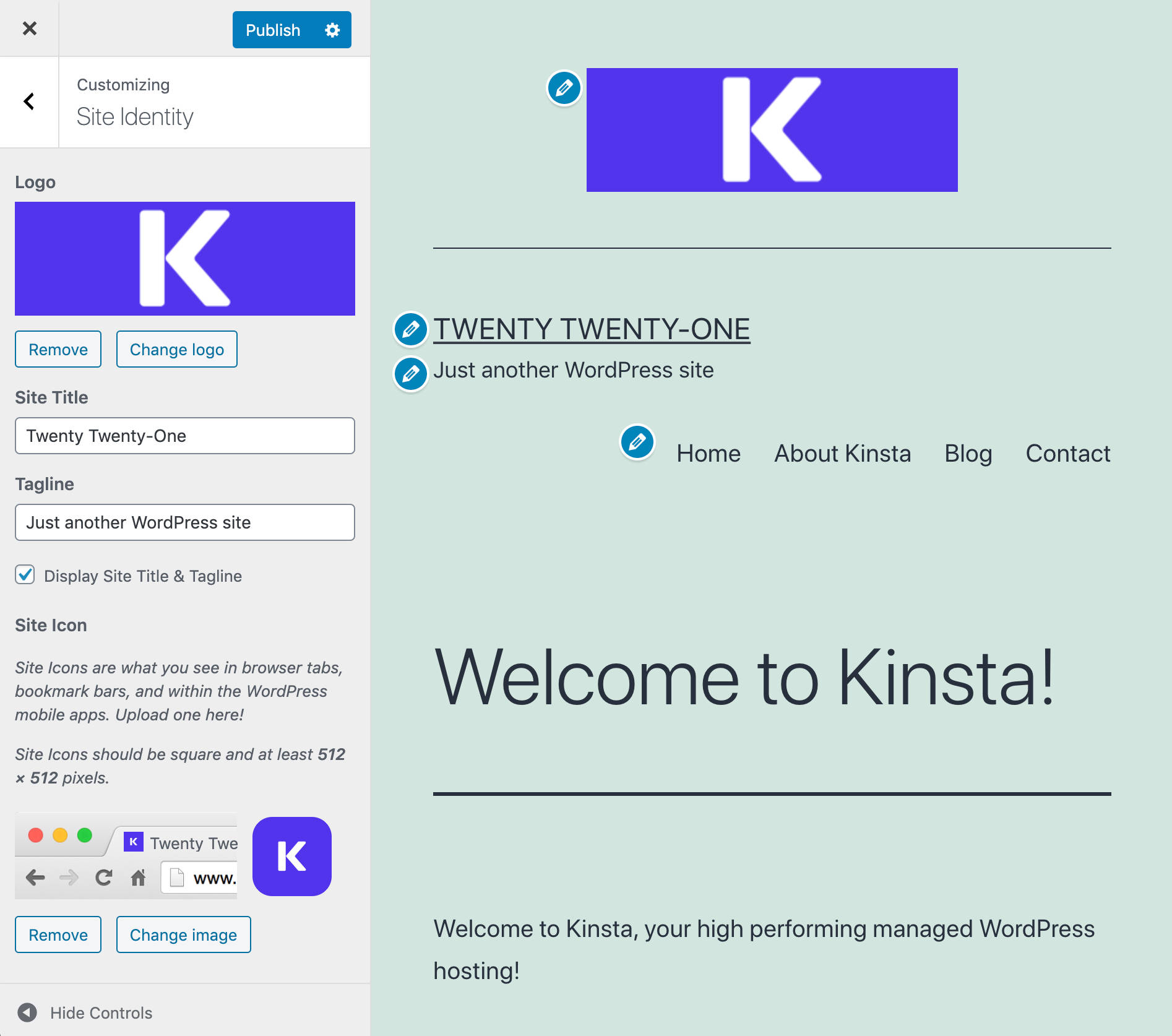
This screen includes:
- Custom logo
- Site Title
- Tagline
- Site Icon
Editor Font Sizes
Twenty Twenty-One supports the following font sizes:
- Extra small – 16
- Small – 18
- Normal/Medium – 20
- Large – 24
- Extra large – 40
- Huge – 96
- Gigantic – 144
In the theme’s stylesheet, sizes are set in rem units.

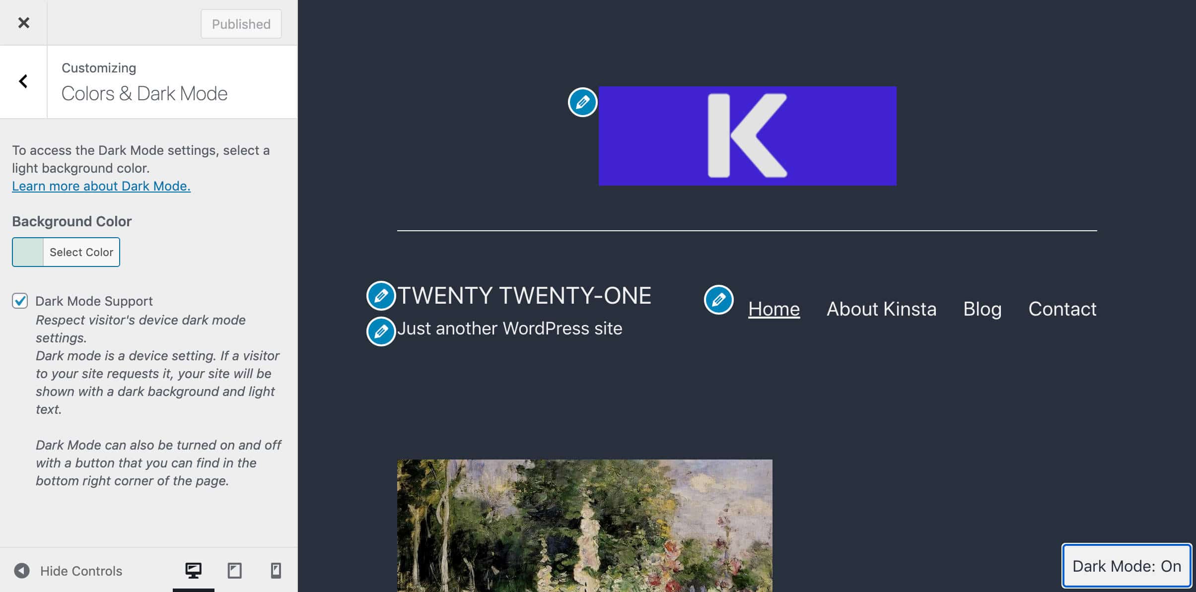
Color Settings
The Theme Customizer provides a Colors & Dark Mode panel including two options:
- A simple color picker with 10 predefined color palettes.
- A checkbox to toggle the dark mode on/off.
The image below shows a light yellow background color with a dark gray text.

Background color defaults to a pastel green ('#d1e4dd'), but site admins can easily switch between the following background color alternatives:
- Black =
'#000000'; - Dark gray =
'#28303D'; - Gray =
'#39414D'; - Green =
'#D1E4DD'; - Blue =
'#D1DFE4'; - Purple =
'#D1D1E4'; - Red =
'#E4D1D1'; - Orange =
'#E4DAD1'; - Yellow =
'#EEEADD'; - White =
'#FFFFFF';
The same colors are available as block color palettes in the editor’s block settings.
Additionally, Twenty Twenty-One supports several gradient presets for blocks supporting this feature. The image below shows the default gradients in the Columns block settings.

From an accessibility point of view, Dark Mode support is an absolute novelty for a default theme.
Let’s dive a little deeper!
Dark Mode Support in Twenty Twenty-One Theme
Following a discussion on the #core-themes Slack channel, Mel Choyce-Dwan introduced Dark Mode support for Twenty Twenty-One.

At first, it was not clear how this feature could have been implemented in Twenty Twenty-One if added as a theme feature or as a separate project shipping in a plugin.
There were five possible options to choose from:
- Allowing site owners to disable dark mode support and site visitors to toggle the dark mode on/off while viewing the site.
- Allowing site owners only to disable dark mode support (no option for site visitors to toggle dark mode on/off).
- Enabling dark mode support as “always on” while allowing site visitors to toggle it while viewing the site.
- Enabling dark mode support as “always on” and preventing site visitors from toggling the dark mode on/off.
- Not supporting dark mode at all
After a thoughtful discussion, Dark Mode was added to the theme. Now:
- Dark Mode support is available as an opt-in feature for site owners.
- The toggle button has been removed from the editor’s interface and is only available in the Customizer.
- The Dark Mode toggle button is located in the bottom right corner (left on RTL) and disappears when the site viewer scrolls down the page.
- With Dark Mode enabled, site viewers can switch it on/off depending on their personal preferences, and regardless of their OS/browser settings.

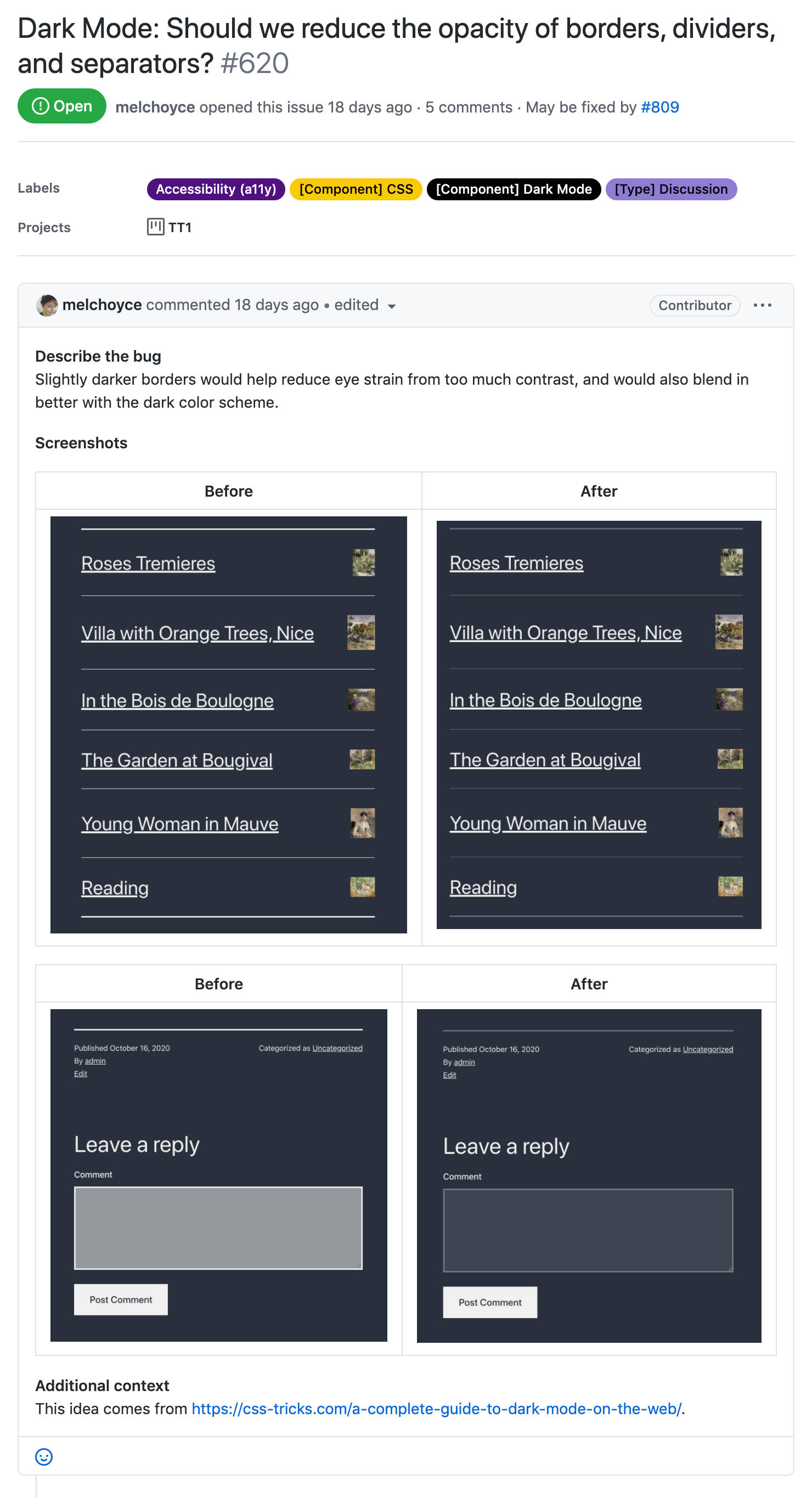
Even if Dark Mode is considered an accessibility improvement, it’s not obvious that your site pages would be more accessible in every context.
The biggest concerns relate to dark logos and transparent images. Switching from a default light template to a dark background color could lead to readability issues that may decrease usability and ruin the appearance of your website.
For example, a dark logo on a light background may disappear entirely if your readers enable Dark Mode on their side. Similar concerns relate to image brightness and contrast and opacity of borders, dividers, and separators.
For this reason, if you are planning to provide Dark Mode support for your website, you should also take into account how your website will look with a dark background.
Theme contributors are aware of these issues and the discussion continues on Github. For a closer view of Dark Mode usability issues and an opportunity to get involved in the discussion, check the full list of issues on Github.
Dark Mode preferences are stored in the LocalStorage and can be viewed in the browser’s developers tools.
In Google Chrome, launch Chrome WebTools and click on the Application tab. Find the Storage section and expand the Local Storage menu.

To be honest, Dark Mode is not a common thing in the context of websites today. However, as a new WordPress default theme now supports dark mode we could expect a change in this specific area of accessibility since WordPress is the most used CMS software.
Developers who want to dive deeper into the techy stuff shouldn’t miss this in-depth guide on dark mode on the web.
Styles and CSS Custom Properties
That being said, it’s time now to explore the most interesting features of Twenty Twenty-One for theme developers.
Let’s start with CSS Custom Properties.
As mentioned above, Twenty Twenty-One is based on Seedlet, a two-column theme, with a footer sidebar and three menu locations. The styling of Seedlet is completely based on CSS custom properties and this makes it easier for theme developers and advanced users to build child themes upon Automattic’s theme.
The same is for Twenty Twenty-One. The new default theme comes with a single column layout, a footer sidebar, and two menu locations. The stylesheet mirrors the system of nested custom properties provided by Seedlet and this makes Twenty Twenty-One a perfect canvas to build child themes and highly customized websites.
CSS custom properties (also known as CSS variables) are special entities containing specific values that can be reused everywhere in your stylesheet.
So, if you need to change a specific color accent in your document, you don’t need to run a global search to find out any occurrence of that color throughout the stylesheet. You just need to set a different property value within the :root block.

As an example of simple customization, say you want to set a custom background color. You don’t need to build a child theme for that. You just need to include two CSS declarations into the code editor of the Additional CSS panel:
:root {
	--global--color-beige: #e6d7c1;
}

body {
	background-color: var(--global--color-beige);
}
CSS custom properties are safe to use as they are supported by all major browsers, as shown in the image below from Can I Use:

If you want to dive deeper into CSS custom properties, check out the MDN documentation.
Twenty Twenty-One Block Patterns
Twenty Twenty-One provides several patterns for the Block Editor. In a previous blog post, we defined block patterns as predefined block layouts allowing users to quickly add complex structures of nested blocks to their pages.
WordPress 5.5 introduced a handful of block patterns and more should come with WordPress 5.6. Moreover, Twenty Twenty-One comes with its own set of block patterns.
In Twenty Twenty-One, block patterns are defined in inc/block-patterns.php file. Twenty Twenty-One patterns vary from simple patterns like the Large Text pattern, which contains a single H2 element, to more complex patterns, such as Overlapping Images and Text and Media and Text Article Title.

Currently, the theme provides the following patterns:
- Large Text
- Links Area: A huge text followed by social networks and email address links.
- Media and Text Article Title: A Media & Text block with a big image on the left and a heading on the right. The heading is followed by a separator and a description paragraph.
- Overlapping Images: Three images inside an overlapping columns block.
- Two Images Showcase: A Media & Text block with a big image on the left and a smaller one with a bordered frame on the right.
- Overlapping Images and Text: An overlapping columns block with two images and a text description.
- Portfolio List: A list of projects with thumbnail images.
- Contact Information: A block with 3 columns displaying contact information and social media links.

The availability of so many block patterns is great for both users and developers. Users will be allowed to quickly and easily add complex blocks of code to their posts and pages, developers can use those patterns as useful templates to build upon when coding their own.
The Twenty Twenty-One Blocks Experiment
Twenty Twenty-One Blocks is a separate block-based experimental version of the Twenty Twenty-One theme. Its purpose is to share and keep everyone updated on what’s happening on the Full Site Editing experiment, giving everyone a chance to dive into the new FSE features before they become part of WordPress Core.
It’s unlikely that we’ll see this experimental version merged into core with WordPress 5.6. According to Carolina Nymark,
The theme will need Gutenberg and the Full Site Editing experiment to be enabled. It will not be part of Core, but once complete it will be available in the theme directory.
At the time of this writing, Twenty Twenty-One Blocks requires the Gutenberg plugin. Once installed and activated both the theme and the plugin, a Site Editor menu item appears in your WordPress admin menu (you don’t need to activate the Full Site Editing experiment anymore).

Now, click on the new Site Editor menu item to open the full-site editing interface and start editing any element on the page using the block editor.

Here we won’t dive into the technical stuff. Suffice to say that classic themes and block-based themes are structurally different.
The image below shows the content of the Twenty Twenty-One Blocks folder:

You’d notice the experimental-theme.json file and the block-templates and block-template-parts folders.
The main difference between traditional WordPress themes and block-based themes is that block-based themes include templates that are entirely composed of blocks.
For example, open block-template-parts/header.html in your code editor. You should see the following code:
<!-- wp:spacer {"height":70} -->
<div style="height:70px" aria-hidden="true" class="wp-block-spacer"></div>
<!-- /wp:spacer -->

<!-- wp:columns {"align":"wide"} -->
<div class="wp-block-columns alignwide"><!-- wp:column -->
<div class="wp-block-column"><!-- wp:site-title /-->

<!-- wp:site-tagline /--></div>
<!-- /wp:column -->

<!-- wp:column -->
<div class="wp-block-column"><!-- wp:navigation {"orientation":"horizontal","itemsJustification":"right"} -->
<!-- wp:navigation-link {"label":"Home","url":"#"} /-->

<!-- wp:navigation-link {"label":"Blog","url":"#"} /-->

<!-- wp:navigation-link {"label":"Work","url":"#"} /-->

<!-- wp:navigation-link {"label":"Contact","url":"#"} /-->
<!-- /wp:navigation --></div>
<!-- /wp:column --></div>
<!-- /wp:columns -->

<!-- wp:spacer {"height":70} -->
<div style="height:70px" aria-hidden="true" class="wp-block-spacer"></div>
<!-- /wp:spacer -->
As you can see, the classic header.php template file has been replaced by an .html file containing several blocks.
You can grab the in-progress version of the Twenty Twenty-One Blocks theme from the theme-experiments project on Github.
If you’re a theme developer, the official documentation provides all you need to know about block-based themes.
If you’d love to contribute to the Full Site Editing Experiment, submit your feedback here.
How To Build a Child Theme on Twenty Twenty-One
Default WordPress themes are great starting points to learn the basics of theme development and get you started with building custom child themes.
Default themes follow the guidelines of the official WordPress Coding Standards and are compliant with web standards.
Is there any better place to learn to code?
Child themes are a great WordPress feature that allows you to customize the layout, functionalities, and structure of your pages. With the following examples, we’ll dive into each aspect of theme customization.
Setting up Your Child Theme
Building a WordPress child theme is a 3-step process:
1. Create the Child Theme Folder
Create a new folder in wp-content/themes and name it as you want. But remember that it should be a unique name. The Child Themes handbook recommends using the same name as the parent theme, with -child appended to the end.
So we could name the new folder twentytwentyone-child.
2. Create a style.css File
Now move to your child theme directory and create a new style.css file including the following code:
/*
Theme Name: My Twenty Twenty One Child Theme
Theme URI: https://example.com
Description: A child theme for Twenty Twenty One.
Author: Your Name
Author URI: https://example.com/
Template: twentytwentyone
Version: 1.0
License: GNU General Public License v2 or later
License URI: https://www.gnu.org/licenses/gpl-2.0.html
*/
The information header allows WordPress to properly handle your child theme.
- Theme Name: The unique name for the theme.
- Theme URI: Where users can find the code or documentation for the theme.
- Description: Descriptive text to help users understand what the theme does.
- Author: Your name
- Author URI: The author’s website.
- Template: The folder where the parent theme is stored. Use the folder name and not the theme name. Without this line, your theme won’t work as a child theme.
- Version: The version number
- License: The license, which must be GNU.
- License URI: The link to information on the license.
Below that text, you can add your CSS blocks of declarations, as I’ll show you in a moment.
3. Create a functions.php File
With Twenty Twenty-One, you’ll also need a functions.php file. So, create your own in the child theme’s directory, open it in your code editor, and add the following code:
<?php
/* enqueue scripts and style from parent theme */

function twentytwentyone_styles() {
	wp_enqueue_style( 'child-style', get_stylesheet_uri(),
	array( 'twenty-twenty-one-style' ), wp_get_theme()->get('Version') );
}
add_action( 'wp_enqueue_scripts', 'twentytwentyone_styles');
As the Twenty Twenty-One theme uses get_template_directory() to load its stylesheet, you need to enqueue the child theme’s stylesheet using the wp_enqueue_scripts action.
After that, save your files, open your WordPress dashboard, browse to Appearance -> Themes, and activate your Twenty Twenty-One’s child theme.
Let’s now add our customizations.
How To Add Custom Styles
When it comes to customizing the layout of your WordPress website, you have several options to add your custom CSS code. The Customizer’s Additional CSS panel could be enough for small changes.
But a child theme would be a better option if you have to make advanced customizations, or you need to export your code to different WordPress websites.
Let’s give it a try with simple customization: changing the default font stack.
Say you want to load a different font stack, or simply add your favorite font to the default Twenty Twenty-One font families.
How do you do it?
Here I will show you how to change the default font for H1 headings, but you can change the font family for any text element of your website.
First, open Thenty Twenty-One’s style.css file and find the following block of CSS:
h1,
.h1,
h2,
.h2,
h3,
.h3,
h4,
.h4,
h5,
.h5,
h6,
.h6 {
	clear: both;
	font-family: var(--heading--font-family);
	font-weight: var(--heading--font-weight);
}
As you can see, the font family for headings is set in the --heading--font-family variable.
Now go to the :root{} block and find the following declaration:
--heading--font-family: var(--global--font-primary);--heading--font-family depends on the --global--font-primary variable, which is defined at the very top of the :root{} block:
:root{
	/* Font Family */
	--global--font-primary: var(--font-headings, -apple-system, BlinkMacSystemFont, "Segoe UI", Roboto, Oxygen-Sans, Ubuntu, Cantarell, "Helvetica Neue", sans-serif);
	...
}
Now we know what to change!
Copy the --global--font-primary declaration from the parent’s stylesheet and paste it to your child’s style.css. Then, change the property name and value as shown below:
:root{
	/* Font Family */
	--global--font-primary-child: var(--font-headings, Ubuntu, -apple-system, BlinkMacSystemFont, "Segoe UI", Roboto, Oxygen-Sans, Cantarell, "Helvetica Neue", sans-serif);

	--global--font-family-child: var(--global--font-primary-child);
}
Once you’ve declared your custom font stack, you can use it wherever you want in your stylesheet. H1 headings in our example:
h1,
.h1 {
	font-family: var(--global--font-family-child);
}
Save your child’s style.css and reload the page. You should see Ubuntu as the new default font family for your page’s headings.

Now that you know how to customize Twenty Twenty-One’s style with a child theme, we can explore more advanced features.
How to Add New Block Patterns
In this example, we’ll build a custom block pattern including a two-column block with a rounded image on the left, an H4 heading, and a paragraph on the right.
You can build your pattern directly in the Block Editor or customizing the code of an existing block pattern.
If you choose to build your pattern in the Block Editor, you simply need to add necessary blocks to a post or page draft, then switch to the Code Editor and copy the corresponding code.

We can now register our pattern in the child theme’s functions.php file:
add_action( 'init', function(){

	register_block_pattern_category(
		'custom-patterns',
		array( 'label' => esc_html__( 'Custom patterns', 'twentytwentyone-child' ) ) );

	register_block_pattern(
	'twentytwentyone-child/custom-bio-pattern',
	array(
		'title'			=> __( 'Author Bio', 'twentytwentyone-child' ),
		'description'	=> _x( 'A block with 2 columns that displays an avatar image, a heading and a paragraph.', 'Block pattern description', 'twentytwentyone-child' ),
		'content'		=> '<!-- wp:columns {"verticalAlignment":null} --> <div class="wp-block-columns"><!-- wp:column {"verticalAlignment":"center","width":"33.33%"} --> <div class="wp-block-column is-vertically-aligned-center" style="flex-basis:33.33%"><!-- wp:image {"id":29,"sizeSlug":"large","linkDestination":"none","className":"is-style-rounded"} --> <figure class="wp-block-image size-large is-style-rounded"><img src="' . esc_url( get_stylesheet_directory_uri() ) . '/assets/images/Kinsta-logo.png" alt="Kinsta" /></figure> <!-- /wp:image --></div> <!-- /wp:column --> <!-- wp:column {"width":"66.66%"} --> <div class="wp-block-column" style="flex-basis:66.66%"><!-- wp:heading {"level":4} --> <h4>About Kinsta</h4> <!-- /wp:heading --> <!-- wp:paragraph --> <p>Kinsta was founded in 2013 with a desire to change the status quo. We set out to create the best hosting platform in the world, and that’s our promise. We don’t settle and are here to stay.</p> <!-- /wp:paragraph --></div> <!-- /wp:column --></div> <!-- /wp:columns -->',
		'categories'	=> array( 'custom-patterns' ),
	)
	);
});
The code above registers the Custom patterns category and the Author Bio pattern.
Note the code we used to build the img element:
<img src="' . esc_url( get_stylesheet_directory_uri() ) . '/assets/images/Kinsta-logo.png" alt="Kinsta" />The get_stylesheet_directory_uri() function provides the URI of the child theme’s directory (the image was previously added to the child theme’s assets folder).
Save your changes and create a new post or page.
Now you should find the new pattern in the block inserter.

Customizing a Template File
If you want to create a new template file for a specific archive, or single post/page, you’ll need to create a new .php template according to the WordPress Template Hierarchy.
But if you only want to edit an existing template (or template part), you just need to copy the original template from the parent theme and paste it into the corresponding position of your child theme (read more about this topic in our extended guide to child themes).
Say you want to customize the “Proudly powered by WordPress” text. You have several options to remove or customize that line. For our example, let’s change it manually.
To do so, copy the footer.php template file from the parent’s folder and paste it into the root of your child theme. When done, open your child theme’s footer.php in your code editor and find the following code:
<div class="powered-by">
	<?php
	printf(
		/* translators: %s: WordPress. */
		esc_html__( 'Proudly powered by %s.', 'twentytwentyone' ),
		'<a href="' . esc_attr__( 'https://wordpress.org/', 'twentytwentyone' ) . '">WordPress</a>'
	);
	?>
</div><!-- .powered-by -->
Now, you can make your changes. Let’s say you want to give credits to your web host, just replace the a element as shown below:
<div class="powered-by">
	<?php
	printf(
		esc_html__( 'Proudly powered by %s.', 'twentytwentyone' ),
		'<a href="https://kinsta.com/">Kinsta</a>'
	);
	?>
</div><!-- .powered-by -->
To remove that text, just comment out or delete the div.powered-by element:
<!-- <div class="powered-by">
	<?php
	printf(
		/* translators: %s: WordPress. */
		esc_html__( 'Proudly powered by %s.', 'twentytwentyone' ),
		'<a href="' . esc_attr__( 'https://wordpress.org/', 'twentytwentyone' ) . '">WordPress</a>'
	);
	?>
</div> -->
And that’s it. Now, moving from the simple examples above, you can make more exciting customizations and bring your website powered with the Twenty Twenty-One theme to the next level.
Summary
The Twenty Twenty-One theme is the third attempt to allowing people without advanced technical skills to build websites. It’s a minimalist, well-performing, and accessible WordPress theme that also fits a wide range of use cases. WordPress sites powered by the Twenty Twenty-One theme come in all shapes and sizes. To find out if a theme is using Twenty Twenty-One, check out our handy WordPress theme detector tool.
Designed with the block editor in mind, the new default theme is easy to customize for both users and developers.
Your turn now: Did you install the Twenty Twenty-One theme yet? What’s your experience with it? Share your thoughts in the comments section!

Carlo is a passionate lover of webdesign and front-end development. He has been playing with WordPress for more than 20 years, also in collaboration with Italian and European universities and educational institutions. He has written hundreds of articles and guides about WordPress, published both on Italian and international websites, as well as on printed magazines. You can find him on LinkedIn.

