Just a few years ago, designers could create a single rigid website version and call it a day. That’s no longer the case. Now, they need to take into account innumerable smartphones, wearables, tablets, and other smart devices — and so do you.
This is especially true for ecommerce businesses. Most brands can no longer afford to focus on a single device. More than 58% of internet traffic comes from mobile devices, while desktop devices account for 40%. Close to 60% of ecommerce sales are made through mobile.
The share of mobile traffic will only keep growing, which means that designers also have to cater to different user needs and browsing styles. A mobile user is less patient — they want website content to be bite-sized and easy to process. On the other hand, a PC user is usually ready to spend more time studying a specific offer.
The question is, how do you make sure that your design looks great on any screen and covers various user needs? Is responsive design the only way to go? Wouldn’t adaptive design be a better choice in some cases? And how are responsive and adaptive designs different, exactly?
Let’s find out.
Responsive vs Adaptive Design: What’s the Difference?
Before we go any further, we should define what we’re dealing with.
Responsive design makes your content respond to the user’s screen size and adjust accordingly. With responsive design, you create a single layout and make its individual elements flexible to ensure they’ll be displayed properly on different screens.
Think of responsive design as a set of rules telling your content how to behave. You can use CSS media queries to specify target device types and set breakpoints, meaning conditions such as the maximum or minimum width of the screen. Breakpoints determine when your layout should change.
Adaptive design, in turn, means that your content adapts to the user’s device parameters but in a predetermined way. You have not one but multiple ready-to-go layouts to account for different screen sizes, orientations, and so on. You decide how your content will be displayed in the user’s browser based on their device type.
In short, with responsive design, you dictate how your content should react, whereas with adaptive design, you also determine the end result. Whichever one you choose, you will be able to create a smooth, seamless experience for both smartphone and desktop users. And that, in turn, will improve your search engine rankings.
This side-by-side comparison will help you understand the key differences between responsive and adaptive design:
| Responsive design | Adaptive design |
| One layout caters to different screen sizes | Multiple templates displayed based on the screen size |
| Relative units are more favorable | Absolute units are more favorable |
| Flexible, fluid layout | Fixed, static layouts |
| Targets all possible devices | Targets most popular devices |
| Broader focus | Higher precision |
Both approaches are absolutely viable; they help you follow common web design principles and create a customer-friendly website. The main difference between responsive vs adaptive design is how they’re executed.
The Pros and Cons of Responsive Web Design
Let’s start with the pros of responsive design:
- You don’t need advanced coding skills. If you use a drag-and-drop website builder like Squarespace, you’ll end up with a responsive website by default. You can easily find lightweight, fully customizable, responsive WordPress themes, too.
- Responsive design is king. It’s become incredibly common, and almost every UX designer is familiar with it. Bootstrap, the most popular CSS framework, is mostly used for designing responsive, mobile-first websites.
- You can make the most out of the available screen real estate. Responsive layouts give you more control and allow you to manage white space more efficiently. As a result, your design will never look cluttered or empty.
- It’s more affordable. As already mentioned, you can create a basic responsive website by yourself using code-free tools. Alternatively, you can hire a freelancer or an agency, even if you have a limited budget. Check out our trusted list of agency clients to find a reliable partner.
- Responsive pages require less maintenance. Even if there’s a new gadget on the market and everyone is suddenly using it, with a responsive website, you have nothing to worry about. You may need to make some changes, but you won’t have to redesign your whole layout.
- Responsive design means speedy delivery. One layout simply takes less time to design than six, meaning your new website could be up and running in a matter of days.
Now for the cons of responsive design:
- You create fewer targeted experiences. You inevitably lose some degree of personalization when trying to account for all existing devices.
- Responsive design requires a lot of planning and experimentation. It’s not a hands-off approach — you still need to test your design on various viewport sizes before it goes live. Allocate some time for fixing inconsistencies because they’ll inevitably pop up.
Responsive Design: Examples and Use Cases
Responsive design use cases are seemingly endless because of how versatile and approachable responsive design is. Any personal and commercial websites can benefit from being responsive and flexible, as you’ll see from the examples described here.
This responsive design from Los Sundays, a tequila brand, looks equally stunning on PC and mobile. The designer cleverly prioritized content for different viewports and made sure that the typography remained bold but not overpowering.

The hypnotic parallax effect can only be seen — and thus appreciated — on bigger screens. Here, users get an aesthetically pleasing yet speedy, lightweight experience when accessing the page from a smartphone.
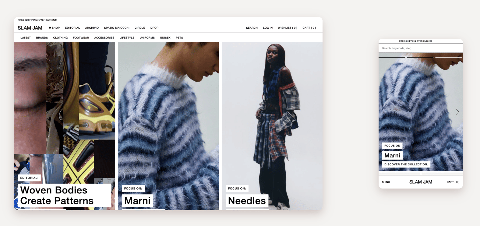
The same can be said about the next example from Slam Jam, an online apparel shop. The website smoothly transforms once you switch to a device with a smaller screen. The products are displayed in two columns instead of four, and the menu moves to the bottom to make the search bar more accessible. The carousel allows users to discover new products without having to zoom in and out.
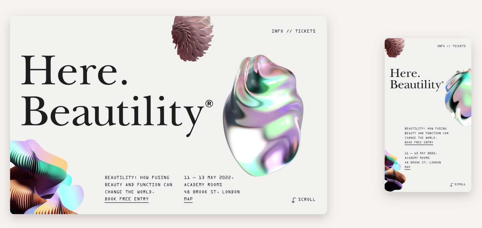
Our next example taken from Here Design proves that responsive pages laden with content and special effects can also load at a reasonable speed and look great on any device. Even on small screens, this page feels just as harmonious, and the animations are displayed without any awkward delays, glitches, or inconsistencies.
The Pros and Cons of Adaptive Web Design
Don’t draw any conclusions just yet — there are plenty of successful businesses that utilize adaptive design and thrive in doing so.
Adaptive design has multiple pros:
- Adaptive sites are usually speedy. Load time is critical for SEO, user experience, and conversion rates, and it takes less time to pull one slick, dedicated page version. Combine adaptive design with fast managed hosting, and you’ll get a lightning-quick website.
- It’s a tailor-made, high-precision approach. You have complete control over your layout’s look and feel because it’s static. You’re the one who decides which devices to target. This enables you to design more personalized experiences for your users and take their preferences into account.
- You can integrate ads more easily. It’s easier to configure ads when you know the exact sizes and proportions of the elements surrounding them.
- Adaptive design is useful for retrofitting an existing website. You can create separate mobile and tablet versions and leave your main site version as is.
- You can tweak individual templates instead of recoding the entire site or page. Making changes to your design is less painful when it’s made up of individual static layouts, especially when you need to fix a minor issue.
You should also be aware of the cons of adaptive design:
- You can’t guarantee that your design will be displayed as intended. What if your visitor is using a device you didn’t account for? In that case, the outcome will be less predictable.
- Adaptive websites are more expensive. You’ll need a team of developers to design and support your website, which means higher set-up fees and operating expenses. Meanwhile, the average web designer’s salary is around $57k, and their rate of pay can be as high as $114k.
- It’s less popular. You’ll have a hard time finding intuitive learning materials and up-to-date guides on adaptive design. Since responsive design is all the rage, most web design courses focus on it.
- Designing separate experiences is cumbersome and labor-intensive. Each layout has to be pixel-perfect, so, naturally, your designers will spend more time working on and testing them.
- It isn’t beginner-friendly. Most popular visual website builders give you tools for creating a uniform responsive design, but you’ll rarely find a simple service that allows you to build separate mobile, PC, and tablet versions. That’s because adaptive design requires more expertise and skill.
Adaptive Design: Examples and Use Cases
An adaptive site may be a better choice for ecommerce businesses whose target audiences prefer to shop using a mobile app. These businesses aim to create highly targeted experiences for their audience because they’ve gathered enough data to understand their shopping habits and preferences, and they want to encourage app downloads.
To see the world’s most visited adaptive website, just head to Amazon. From a desktop computer, you get a great experience. The homepage is relatively busy but not overwhelming, and you can instantly find what you’re looking for.
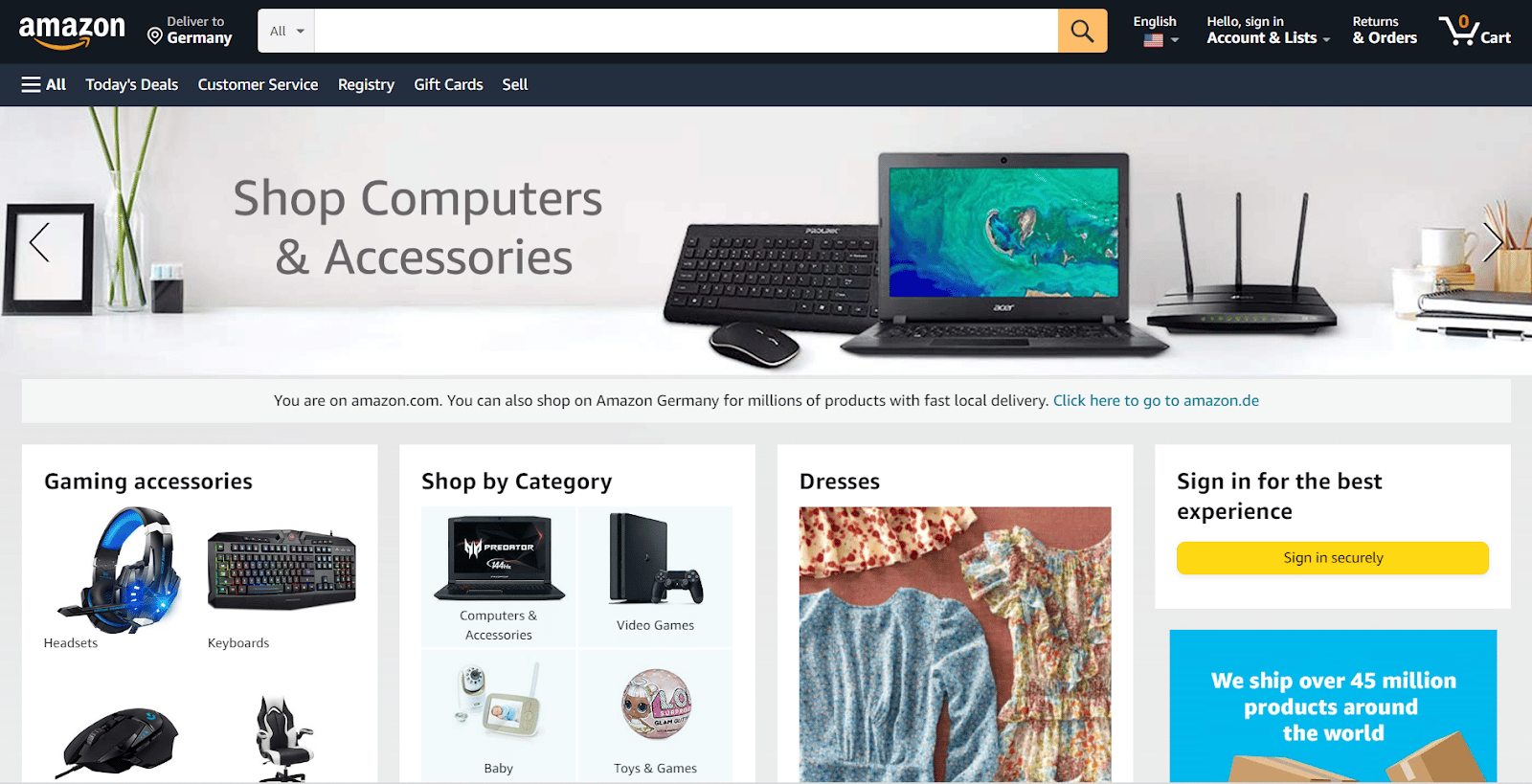
However, here’s what happens if you try to resize your browser window:

You can only see a fraction of the desktop content because this uncommon browser width wasn’t accounted for.
Does this approach hurt Amazon? Not in the slightest. Its sales have quadrupled in recent years because its mobile website version and app both offer a very straightforward, fast, and convenient shopping experience.
A company as big as Amazon can afford to ditch the “one size fits all” approach and be a bit conservative with its website design to keep it familiar and instantly accessible to millions of customers worldwide, including elderly people and users with vision problems.
Also, if you look closely, Amazon’s website is partially responsive — it has additional and existing elements added or taken away, depending on the viewport.
Ryanair, a popular low-cost European airline, also has an adaptive website that makes booking cheap flights a breeze. Its interface looks slightly conservative but not outdated, and it scores 82/100 on the Pingdom Speed Test Tool, which is a good result.
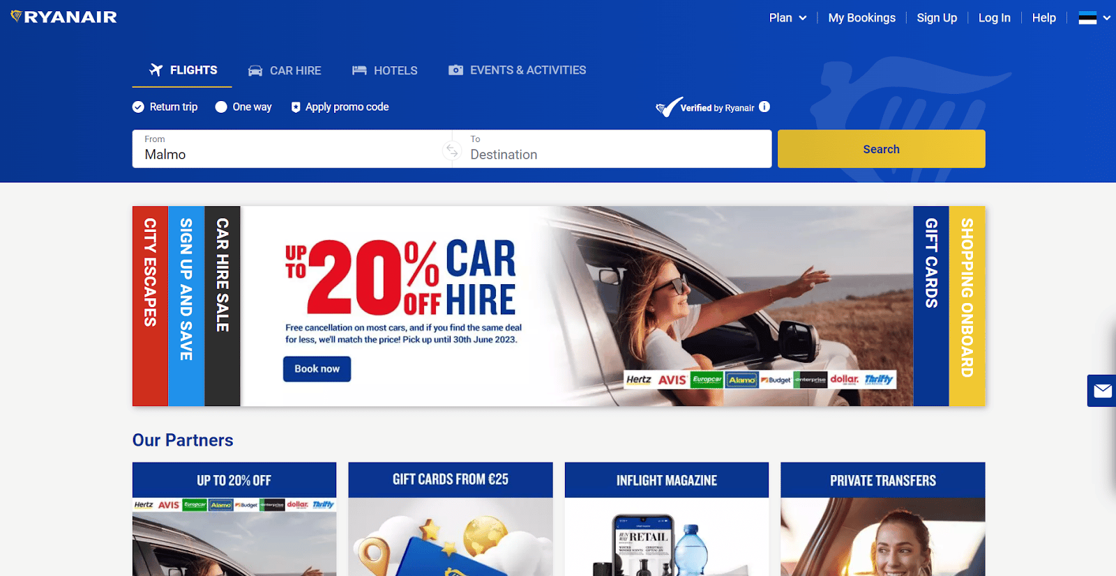
Having a somewhat rigid website doesn’t stop the carrier from breaking traffic records time after time because most travelers prefer to book their flights from a desktop device or using the Ryanair mobile app.
Making too many changes to this website would mean confusing users who are already accustomed to the current look. Instead of switching to a more trendy, responsive version, Ryanair intentionally chooses to leave its website design intact, instead focusing on keeping its ticket prices as low as possible.
How To Choose Between Responsive vs Adaptive Design
Just because one approach is more ubiquitous than the other doesn’t mean that you have to adopt it. Don’t lose sight of the big picture — your main goal is to make your website intuitive, accessible, inviting, and visually cohesive. To do this, you’ll need to take a holistic approach and turn to web design best practices.
Follow these steps to determine which design strategy would work best for you:
- Consider your target audience and their needs first. Keep in mind that a user’s intent isn’t based on the device they’re using. Conduct user research to find out how real-life users interact with your interface. Does it make sense for you to optimize the design for specific devices?
- Focus on your specific use case. For example, if you sell modern art prints, you should focus on creating immaculate desktop experiences for your users since they’ll want to look at the prints on a big screen before purchasing anything.
- Don’t go overboard with a mobile-first approach. It’s easy to oversimplify mobile layouts in an attempt to remove all possible frictions from your user journey and apply the same logic to a desktop version. However, a plain, single-column design with a hamburger menu is likely to look too dull on a desktop screen.
- Assess your resources and constraints. Before you even consider investing in adaptive layouts, figure out your budget, current needs, and long-term goals. Is it crucial for your brand to have a state-of-the-art website that will look fantastic even on an ultra-large smart TV? Or do you just need a reliable workhorse to sell products to your existing audience — an audience who will buy from you no matter what?
- Make your load speed a priority. Commercial websites may or may not have embellishments, but they must load fast to avoid an increase in bounce rate. More than half of users will abandon a website if it takes more than three seconds to load.
- Run competitor analysis. Chances are, your main competitors have already conducted user studies and have it all figured out. Don’t just copy their approach; instead, try to analyze which user segments they’re catering to and why.
Responsive design isn’t a trend anymore — it’s gradually becoming a golden standard of web design, and its few disadvantages are soon to be a thing of the past.
For example, Webflow, a visual website builder, makes responsive pages up to 10 times faster by automatically optimizing uploaded images, which solves one of the main issues with responsive websites: their load speed.
It’s possible to use the best of both worlds — combining responsive and adaptive strategies to address different search behaviors. In doing so, adaptive layouts can have media queries, while responsive websites can include adaptive elements. It’s safe to say that the responsive vs adaptive dilemma isn’t as relevant anymore — an ideal website design is a skillful blend of the two.
How To Tell Whether a Website Is Responsive or Adaptive
First, check what happens when you resize your browser window from a desktop computer. A responsive website will seamlessly adjust to your viewport size — you’ll notice how flexible it is immediately.
An adaptive website won’t change until you reach a certain breakpoint or switch to another device. Until then, some of its content will be hidden rather than resized, and you’ll have to drag the horizontal scroll bar to see it.
Alternatively, you can look for media queries in the home page source code by clicking CTRL + U on Windows or Option + Command + U on Mac. You can also right-click on the page and select “View Page Source” from the dropdown menu.
An easy way to see how a website behaves on various screens is to simulate mobile devices with Google Chrome Device Mode. Open the website you want to test, and press CTRL + Shift + I on Windows or Command + Option + I on Mac to open the developer tools.
Summary
You might have heard that search engines prioritize responsive sites just because they’re
responsive. That’s not entirely true. An adaptive website can be just as SEO-friendly as a responsive one. Google does say that it prefers mobile-friendly websites that provide a positive user experience, but it doesn’t limit you to just one way of achieving that.
There are many methods of making your website work flawlessly on mobile. For example, you can try WordPress mobile plugins — you don’t even need to be a coder to use some of them. If you do have developer skills, make sure to use our WordPress staging environments to test your website changes in a stress-free way before they go live.
There are mobile plugins that can turn your WordPress site into an app, which is a fantastic way of delivering a tailored experience without spending a fortune on a brand-new adaptive website. If you already have mobile sites, you can drastically improve their look and usability with plugins like WP Mobile Menu.
Whichever approach you choose, remember that cross-platform design requires you to create blazing-fast experiences for your users, regardless of when or how they’re accessing your resource. Choosing the right hosting is half the battle — it can make your website faster and more secure by default, and you won’t have to worry about unplanned downtimes or low bandwidth.


