How to Make Data More Human
Listen on
Duration
Episode Summary
In this episode of Reverse Engineered, Jon Penland welcomes Giorgia Lupi of Pentagram to discuss information design, her humble beginnings with a weekly newspaper column creating visual data, and how that led into her career today helping brands showcase data.
As an information designer, Giorgia has a passion for finding and looking at data through the lens of how it can be better interpreted and explained to others.
Giorgia uses that ability to take datasets, big or small, and transform them into stories that stakeholders care about. While data visualization has picked up a lot of steam in recent years, Giorgia’s on a mission to humanize the collection and interpretation of data to be more helpful overall.
Key Insights:
- Information design is a broader way to describe many types of design projects that deal with data. Giorgia says, “It’s about making data and information, both quantitative and qualitative, accessible for many different types of clients.” At the end of the day, we see and interact with data on a daily basis, but information design takes it one step further by thinking about the most compelling way to communicate to critical stakeholders. Data has been around for ages, but society now has a need for visual data that extends beyond the basic bar chart.
- Never underestimate the power of good storytelling. Even in Giorgia’s early information design days, when her projects were done manually, the goal was the same: to display information clearly to the intended audience. When her data work came out once a week in the newspaper, she says, “The reward that kept us going was every Sunday you could walk into a cafe in Milan and see people pouring into your visualization.” Even small datasets have storytelling potential, and creative agencies and media companies can benefit from this perspective.
Today’s Guest: Giorgia Lupi, Partner at Pentagram
Giorgia Lupi’s projects with data don’t end at the office. She has also worked on wide a range of personal projects. “Dear Data” was a year-long analog data drawing project with Stefanie Posavec which was acquired by the Museum of Modern Art (MoMA).
- Company: Pentagram
- Where to find Giorgia: Twitter | LinkedIn | Personal Website

Episode Highlights
People Care About Good Storytelling
Giorgia points out that everyone uses storytelling methods, whether it’s audio, visual, text only, or a blend.
When she and her Accurat partners first got started by following their passion, they were all intrigued about the potential of data to tell stories.
When you’re offering something new or relatively unknown, Giorgia recommends looking for a foot-in-the-door project to help build your portfolio and flesh out your offer more clearly. The Italian newspaper Corriere Della Sera gave Giorgia and her partners an early column where the concept was a different way to tell stories. They combed through data sets weekly to build on this initial idea and gained exposure and practice along the way.
Forced Repetition Makes You Better
If you’re working on a concept or in an industry that’s iterative in nature, that’s a good thing. This gives a chance to practice and get better at the offering, but it also allows room for the concept to evolve over time. Forced repetition was key to refining and delivering on the weekly task of producing a column and learning how to work with data.
Build Your System Slowly First, Then Automate It
While that manual process was slow, it was a crucial lesson in building proficiency before automating something. To get into data visualization with a full set of libraries and tools available without having spent the time with the data manually skips a step. It can even lead to shortcuts that might not be the best way to represent the data. That’s a bigger lesson to not rush to automation as the first way to handle things. It’s okay to start slow and steady so that you really know the system you need when it’s time to build it.
“And then we started to figure out how to automate things to become more sustainable over time,” Giorgia says. “Obviously, you find software and plugins and scripts that can automate things.”
Know When You’re Made Yourself Redundant
When Giorgia was offered Partner at Pentagram, she knew the timing was right.
After eight years or so, Accurat had grown to the point where great talent was taking over some of those day-to-day aspects. Giorgia says, “In the company at that point, it was more theirs in a way than mine.” While it was amazing to sit in the room and have other people lead, this was also a clue that it was time for her to move on to her next chapter. “I could make this leap with a light heart because I knew that Accurat was in such good hands, and also that I wouldn’t really cut my connection as I knew there would be room for collaboration at Pentagram.”
Pave a Path as an Innovator
It’s not always easy to be one of the first to do something. But, whether it’s being the only female employee or speaker in the room or trying to carve out the niche of information design, Giorgia saw this as a way to lead others. “I felt that I needed to keep going to make more space. I felt like women have a lot to say in a design field.”
Giorgia took that same approach to help her customers better understand new and effective ways of doing things. “I have also found myself on a mission to demystify data.”
Data Is More Human Than You Think
For Giorgia, data is primarily human-made and is always up to interpretation. Someone decided what to collect and leave out. When working with brands, Giorgia is always asking them to consider the goal and types of data they’re collecting.
Giorgia is also fascinated by ways to remove technology from the equation and get to the very core of what data means in our life. That’s what led her to the project now on display at MoMA with postcards traded back and forth of a year of human data. She and Stefanie Posavec took what might be considered mundane weekly topics and turned them into visual data. “Context,” she says, “is just as important as the numbers when working with data.”
Giorgia hopes to continue leading the conversation around data humanism and for better ways of collecting, evaluating, and sharing data.
Transcript
[00:00:05] Jon Penland: Hey everyone, my name is Jon Penland and Reverse Engineered is brought to you by Kinsta, a premium managed hosting provider. In today’s episode, I’m speaking with Giorgia Lupi, partner at Pentagram. Giorgia, welcome to Reverse Engineered.
[00:00:19] Giorgia Lupi: Hi, Jon. It’s a pleasure to be here and hi everybody.
[00:00:22] Jon Penland: Yeah, it’s an honor to have you on the show. So, to get us started, can you introduce yourself to our listeners?
[00:00:28] Giorgia Lupi: Sure. My name is Giorgia Lupi, I’m Italian, but I live in New York. I moved here nine years ago and I define myself as an Information Designer and I’m sure we’ll get into the definition of that, and I’m a partner at Pentagram, who’s a big design agency with offices in London, New York, Berlin, and Austin, where we are 25 partners, practicing designers, with a pretty unique structure.
[00:00:53] Jon Penland: So, you’re a partner at Pentagram and you describe yourself as an Information Designer. And I want to start by focusing on your professional career where you’re at right now. So, can you just tell us a little bit about Pentagram?
[00:01:05] Giorgia Lupi: Sure. So, you might know Pentagram for things that you actually have on and use and see every day because Pentagram is primarily a branding agency, so designing branding identities, brand identities, graphic design of many different kinds and imagine that my partners way before I joined designed, like, visual icons, such as the MoMA logo, the Metropolitan Museum of Art logo, logos for products like MasterCard, Shake Shack, Citibank, and I can go on and on, and environmental graphic and signages for places like the World Trade Center. So, really if you think about it and that’s really all my partners before I joined, visually shaping our culture and our relationship with brands and products. So, that is Pentagram and it’s a pretty unique place because every partner is a practicing designer, so we don’t have CEOs, CFOs, we’re all equal partners, everyone running their own business and so, dealing with their own clients, their whole financial issues, sharing over it, and you know, some other resources that we can talk about, and managing our own teams in a way, and we do that because we really feel that it really reflects our conviction that great design cannot happen without passion and above all, really personal commitment, and so we are committed to make it happen. And two years and a half ago I joined Pentagram, bring in the discipline of information design, and so using data as the language to communicate to the broader partnership. So, that’s in a nutshell, what I’m doing now.
[00:02:43] Jon Penland: Yeah. So, Pentagram, a brand we may not have heard of, but we’ve definitely seen the work that your organization does, and a bit of a unique structure as you described with the partner model, where every partner is actually responsible for producing work and working with clients than an entire sort of profit center under themselves, or a book of business under themselves.
[00:03:04] So, let’s focus in on what it is that you do then a little bit. Can you describe information design, what does that mean? What does that look like at Pentagram?
[00:03:12] Giorgia Lupi: Absolutely. So, information design is a broader, let’s say, way to describe many types of design projects that deal with data, and making data and information quantitative and qualitative, accessible for many different types of clients. So, another way of saying that I do data visualizations, but not only data visualization like the charts that you can see in newspapers and magazines, really sometimes use these data even to brand product.
[00:03:40] I designed, for example, a fashion collection with the patterns that were embroidered and sewed, were really representations of data points that could tell stories. So, where the brand decided to communicate to their customers through their very product, using the language of data, or have been working with non-profits organizations, such as United Nations, The World Health organization, The Gates Foundation, to actually help them communicate to critical stakeholders.
[00:04:07] And, there’s a New York siren that we can hear in the background, Jon, let me know this is bothering or not.
[00:04:13] Jon Penland: It’s fine. No problem.
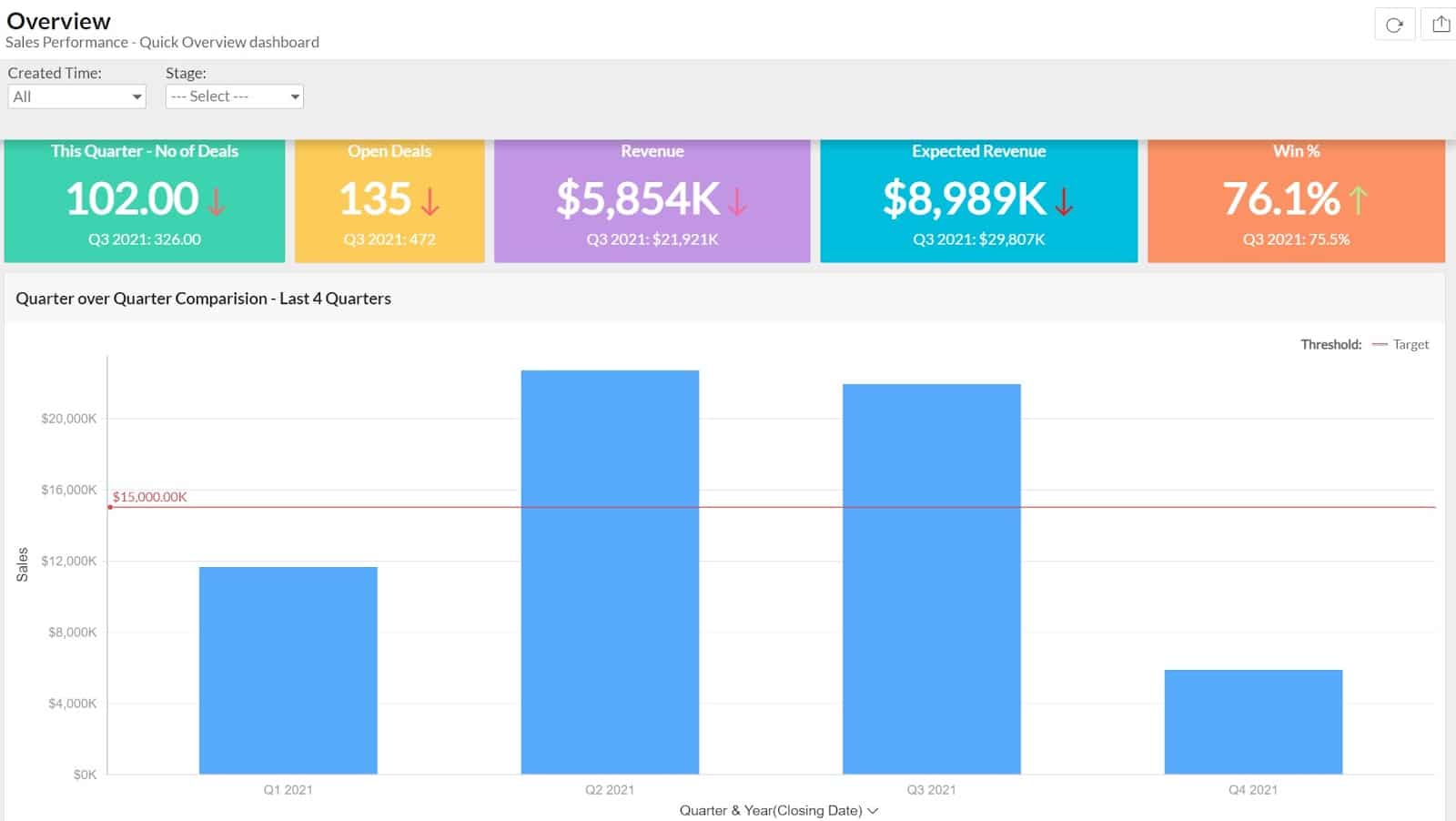
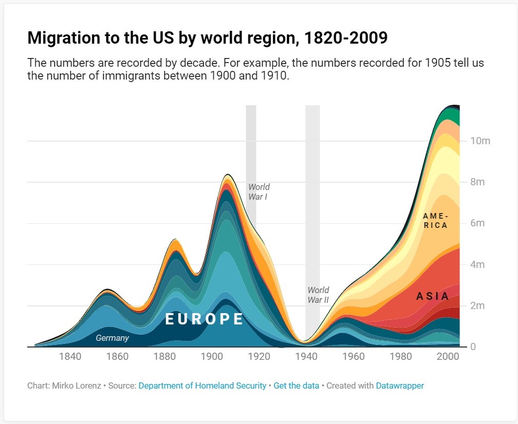
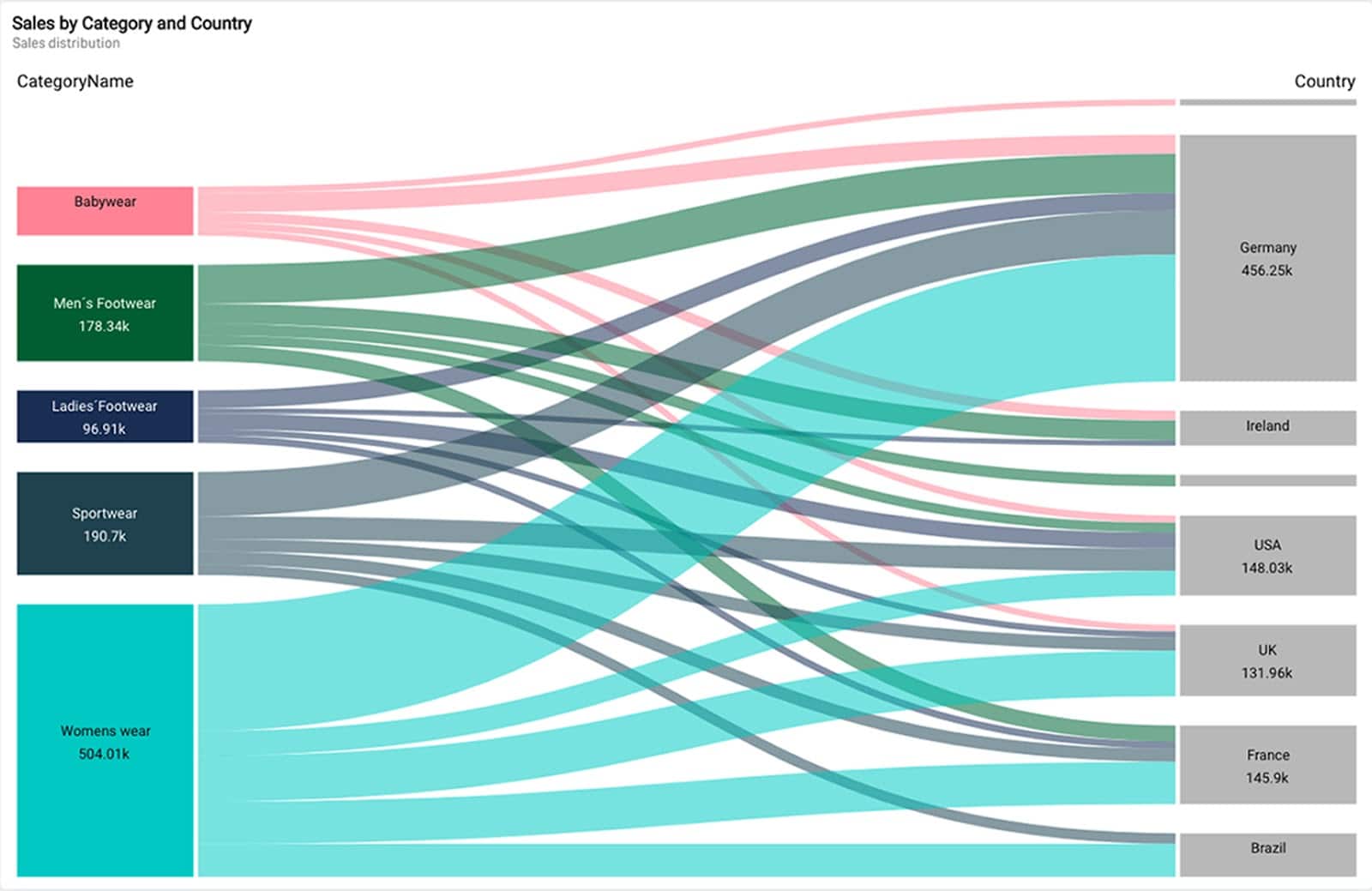
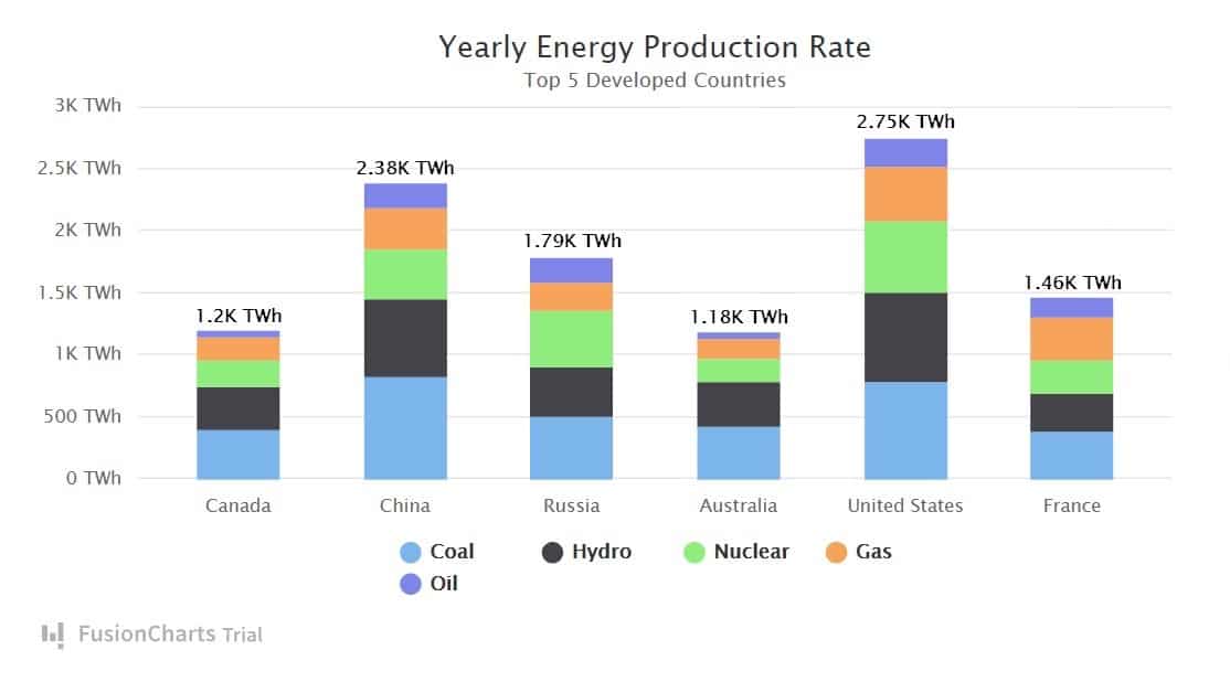
[00:04:16] Giorgia Lupi: It’s fine. So, I’ve been working also with non-profits, such as the United Nations, The World Health Organization, and The Gates Foundation, helping them communicate with critical stakeholders about data in a compelling way, where the reason why these organizations sometimes hire us and hire me, and not only work with their internal graphic design department working with data, is really to try and go beyond the bar charts that everybody keeps seeing and bar charts that are, I mean, there’s nothing really wrong with that language, but sometimes you really need to make the charts very unique and very unique to the data they represent. And, that’s why we come to the table. Other things that I’ve done are murals with data, for cultural institutions such as the Museum of Modern Art or the Milan Triennial, so really, really, like, spanning across many different medias, we’ve been working on campaigns that are, like, with data and data visualization, but again, where the visual representation of data is the way that customers or users or visitors access information.
[00:05:17] Jon Penland: Yeah, there are two different directions I want to go in this conversation and we’ve touched on both of them. One is thinking about conceptually, what it is that you do working with data visualizing, telling stories through data, and then the second piece is I do want to talk about your career a little bit, because what you do is, is really quite unique and interesting.
[00:05:36] So, I want to stick on the career path for just a bit, and then we’ll come back to the specific conversation about data visualization and that area. So, prior to Pentagram, I know you founded and ran for a while, a visual, a data visualization company called Accurat. Can you tell us a bit about that company? What, what does Accurat do and what’s your connection to them today?
[00:06:01] Giorgia Lupi: Sure. So, in 2011 together with other two partners, we founded Accurat, and as happy we were in our, I’d say mid, late-twenties. And so, as in many cases, when you start working and you start being passionate about a topic, and we all were really intrigued about the potential of data to tell stories, to be really honest, we didn’t really have a business plan.
[00:06:23] We didn’t know if we wanted to be a small boutique working on very experimental projects or if we wanted to grow as a company. But, I really feel that at the time, and it was in Italy, in Milan, we were really the only company that besides, I say probably one or two freelancers, could use data to tell compelling stories.
[00:06:41] And, I just wanted to also just share how I got there. I’m an architect. I have a Master in Architecture, but I’ve always been really, really intrigued by urban mapping and, like, the discipline of information design and to tell stories about geographies and places. And then, I got really fascinated about trying to use these language, which is actually abstracting our reality through maps and diagrams, not only to tell geographic stories but, like, really, to possibly tackle any aspects of our society in a way.
[00:07:12] And, everything started with a collaboration with the main Italian newspaper Corriere della Sera, and their cultural, someday cultural supplement called La Lectura, where a very, I would say visionary editor at the time, said, “Why don’t we open a column where what you guys are doing can be the beginning for a different way to tell stories?” And so, we had one page every Sunday where we would look for data in cultural topics, like, really looking for data on Wikipedia and then matching with other sources, or sometimes even just, like, really going through books and then crafting our data sets and then use the language of data visualization to help readers get access to the information that we add. Really went through combining two data sets with a legend to understand, you know, how to build these charts. And so, that was really the beginning when we understood that there’s potential. Obviously working with newspapers and magazine don’t bring a lot of money, but it got to the point where we’re getting the portfolio, we built our own way to deal with data.
[00:08:24] And, I think I was really lucky because one of my partners up way at the time, who we still really collaborate with, is a sociologist, so we were coming to the language of data, not from a statistician point of view or computer science, but really, like, thinking about stories and then design.
[00:08:28] And, that really shaped everything that Accurat started doing. People start to see, you know, in Italy, what we did, and so bigger clients, such as a few important Italian banks, for example, starting to ask us if we were available for hire, and then we said, “Yes, of course,” and then we started to build a team.
[00:08:46] And so, obviously then, in the course of the next 10 years, things started to become bigger and the company started to grow and we needed to figure really out how to, how to grow a company once more. I don’t, I don’t define myself as an entrepreneur, even though I’ve always been an entrepreneur myself, but I really think that, like, the interesting thing for me there was designing the company’s evolution in a way. So, Accurat right now is still up and going, and it’s an office with, I think right now they’re, like, 35 people, so, you know, just not a, not a super big company, but also pretty, pretty good scale.
[00:09:19] And, right after we founded Accurat, one of my partners who also was my partner in life at the time, and I moved to New York, for other, like, let’s say personal reasons, and we started to see if we could find American clients for our company. And really, really, I really think that we followed our intuition in 2011, 2012, being at the intersection of design and data technology, felt a compelling place to explore.
[00:09:46] So, that is, that is the beginning of Accurat. Then, when I got after the partnership with Pentagram, I submitted to my partners at Pentagram that having Accurat for me was an asset, and so I still collaborate with people that I actually trained, as a, let’s say an extended, an extended part of my team.
[00:10:05] And I, I know I could speak for hours about this, but, like, I want to give you a chance to ask some questions.
[00:10:10] Jon Penland: Yeah. Well, the story about the newspaper column is, is really interesting to me from a skill development, career development perspective. Because what I feel like I see there, there’s obviously the exposure angle, right? Which is that your work is getting in front of a lot of viewers every single week. But the other value that I, that I see there is, sort of, this forced repetition, right?
[00:10:35] Like, there a while where I was a freelance writer, and before that I considered myself a writer, but it was purely a matter of I wrote when I felt like writing or I wrote when I felt like I had something to say, but when I transitioned to freelance writing, which I did for about three years, that forced repetition, right? Like, I now had to write to make a living.
[00:10:59] Giorgia Lupi: Yeah.
[00:11:00] Jon Penland: I grew as a writer tremendously during that period. And so, I’m curious how you think about that opportunity. Do you feel like that was a core part of you becoming who you are today, that specific opportunity and the repetitiveness of that task?
[00:11:14] Giorgia Lupi: Absolutely. Absolutely. I mean, really, you hit a point here. I think, like, first of all, like, we’ve done it for two years. So, for two years, almost every Sunday there’ve been some intervals, almost every Sunday we would deliver, actually we would deliver that on Thursday because the cycle of that newspaper would be
[00:11:29] topic approved on Monday, looking for data visualizing, like, really fast-paced in delivering them on Thursday. With Thursday night, I remember for that period, always been in the places where, you know, yeah, we would go home, but we knew that there was going to be edits and things to do overtime. So, it really shaped, I think, the way that we all in the company saw our week cycle. Like, first of all, doing it for two years, it’s, is practice.
[00:11:53] I mean, really, it’s like, if you think about, like, building skills as practicing, that is, like, a lot of practice forced with external deadlines. And, I think the reward of every time, really, just really, I think that the reward kept us going because every Sunday, really, you would walk in a cafe in Milan or whatever, and you would see people really pouring physically into your visualization, so there was also that part of, actually, like, really seeing people in track with that. And, in terms of really building the skills even more, because in the beginning, we, to be really honest, we didn’t even really know how to ethically address data in a way in which we wouldn’t manipulate the story, so we found our way to, all of the time, be more and more faithful to the data, but also be more transparent of our, say, editorial choices that we can get into what I think that data really is, that it’s not necessarily these objectives, true, but is always subject to any interpretation.
[00:12:47] So, I think we also started to build our approach and, like, my personal vision of data as a, for lack of a better word, storytelling material, more than necessarily, like, the absolute truth that we need to make, to base our decisions upon. And then, really building visual skillset in the beginning, everything was done manually.
[00:13:06] So, imagine, like, passing from a spreadsheet that we built to manually positioning elements with, you know, we use Adobe Illustrator, but really, like, building our grids and then we started to figure out how to automate things because, you know, to become more sustainable over time. So, definitely, the repetitive part of that for sure shaped a lot of what I do now and how I see the world of data in my practice.
[00:13:29] Jon Penland: Yeah, that sort of, forced practice really can’t be skipped as a step in the process of becoming truly proficient at something because you’re talking about things, like, moving from manually positioning data points to automating some of those tasks, and those are the sorts of things that only happen because you get three weeks in and you’re like, “I cannot continue to have this task consume all of my Monday to Thursday. I also have to make money.” Right?
[00:13:56] Giorgia Lupi: Yeah. So, it’s, like, an optimization process, but I really believe that, especially in how it has been shaping my career for me, it was fundamental to start doing it manually because then, you know, obviously, you find softwares and plugins and scripts that can automate things. Well, the risk of that getting to, I mean, this is very specific to my field, but get into data visualization with a full set of libraries available and tools available, without having really spent time manually with your data, I think mentally gets you through shortcuts that are not necessarily the best way to represent data. So, one thing is knowing that you would do it like these manually, and then you automate it, and another thing is, like, completely different approach, which I think can be misleading is, “Okay. I have this data and I have this set of tools that I can use. Let’s link it.” Without passing from what would you really brain, what would your brain do, you know?
[00:14:48] Jon Penland: Right. Yeah. To put it in a different context, the world that I live in, I interact with a lot of software developers or web developers, and, and the thing that I think of is using a library, like, a JavaScript library rather than learning JavaScript itself, right? So, it’s like, the difference between learning JavaScript, and then progressing to those libraries that make you faster and more proficient as opposed to skipping forward and not really understanding what’s happening under the hood, and you’re going to be much more effective in the longterm if you take the long path and really understand the nuts and bolts before you move forward to the tools to make you more efficient.
[00:15:26] Giorgia Lupi: I totally agree.
[00:15:27] Jon Penland: Yeah. So, eventually, you got to a point where you decided to go to Pentagram and to move away a little bit from Accurat, although you’re still closely connected and still work with them, but, what was your motivation in making that move over to Pentagram?
[00:15:43] Giorgia Lupi: I guess, you know, as many big decisions, I mean, at least from my life, from my experiences, many of the big changes, I mean, it’s not that I was planning on it, it’s not that I was looking for necessarily a new chapter, but at the same time, I found myself in a moment where I think I was lucky enough, where at Accurat because my partners in business at Accurat now, you know, we started three partners and then we became four, whereas, we’re a lot focused on the business aspect of it at a certain point and we really wanted to make it a company, and I think I’ve been very very lucky to be the only, let’s say, creative director, design director among guys. But so, the company was pretty self-sufficient and I think at the point after eight years, nine years, I have worked with the designers and now we’re leading the design teams in the company to a point where really, I don’t know if it happened to you, but you feel almost useless.
[00:16:34] You feel, you know, I’m just amazed by sitting in this meeting and having these people lead, and I, kind of, feel like the company at that point, it was more theirs in a way than mine, and I felt that I already made a place where, you know, I was getting some visibility for talks and for the philosophy that I called it a humanism behind my work, and I was really intrigued by that part by exploring, you know, what can data be, and, I think, I was starting to work on self-initiated projects that would go a little bit beyond the B2B application of data and data visualization, but really using data as a communication tool. And, well, being asked to join Pentagram, which if you think about it as one of the companies that again, you know, shaped our visual culture, and so it really can speak to a broad, broad audience for the type of project they do.
[00:17:51] When they offered me the partnership, right away I felt that there was really a great opportunity. And also, imagine that, you know, we’re in a world where all of us as customers know that the brands and the companies we love and use every day are collecting data about us and from us, and I think that, really, also something that is very compelling to me at Pentagram right now is to being at the intersection of data, design, and brands. Like, I’m looking forward to working with brands and I’m already, kind of like, experimenting that, can really own it and be transparent and say, “Yes, I’m collecting data from your customer, but, like, you know, I will give you an experience back through design, through something that can really make you understand gaining size, figure out where you are.” So, it really just, you know, felt the right thing to explore. And, I think, once more, I could make this leap in these jump with a light heart because I knew that Accurat was such in good hands, and also that I wouldn’t really tease and cut my connection with Accurat, but I shaped the partnership with Pentagram saying, you know, “I really think that there’s a value for me to continue collaborating.” So that’s why.
[00:18:35] Jon Penland: Yeah, it’s interesting, internally at Kinsta, one of the ideas that we talk about within the executive team is that one of your primary responsibilities as a manager is to, sort of, hire and train yourself out of your job, right? Like, your goal should be to try and steer, your goal should be to try and replace yourself. Ultimately, the ideal is to get to a point where you do sit in that meeting and go, “Why am I even here?” Right? And, that can be a difficult place, right? But in a really…
[00:19:01] Giorgia Lupi: It’s scary sometimes.
[00:19:01] Jon Penland: It can be scary. It can be scary, right? It’s kind of like, a choice to be, like, “I’m going to choose to be okay with this, right?” And, recognize that I’m bringing value in different ways and that my value is no longer simply delivering, delivering on these specific responsibilities.
[00:19:17] So, you have, you have a very specialized skill set at this intersection of data, design, and communication. We’ve talked about this a little bit already, but can you talk to us about the journey that led you to develop this unique combination of abilities and expertise?
[00:19:36] Giorgia Lupi: Yes, of course. I think it’s interesting because when I answer these questions is always in retrospect, in hindsight, right?
[00:19:44] But when you’re on the path of the journey, I just, I want us to be really honest and transparent. I followed my intuition. I followed my, I mean, one thing that I find misleading is saying that I followed my passion.
[00:19:56] I really followed my curiosity. I, sort of like, don’t even know what that passion is really, but I really followed what I was curious about and obsessed about and obsessed with, and just try to pursue some more project of that kind, really developing this practice. I also want to say that there’s something that I’m thinking about right now, that again, in retrospect, I’ve always been a data collector. There’s this anecdote that I remember very vividly from when I was child, where, and also my mom keeps telling me, that I would spend hours and hours in my grandmother’s tailor’s store. So, she was a state seamstress, every day reorganizing her, like, tools, such as buttons, threads, ribbons, all of the pieces of fabrics according to rules that I would make up for myself, so, by size, by colors, if a button has two holes or four holes, if a piece of fabric was a certain kind. And, I remember that every day, I felt that her table was a blank canvas for me to just experiment with ways of organizing and categorizing based on visual properties, which, I mean, it can be, kind of like, a long stretch to say, but I feel that I’ve always been so intrigued by the intersection overlapping between rigor and science and logics and rules and visual impression.
[00:21:06] So, I guess that’s, kind of like, the background, and this is also why when I needed to decide what to do for college, at that time, architecture felt the right way to not decide and to just, like, still have some, sort of like, scientific boundaries and then also express myself creatively.
[00:21:23] So, until I found that data and usually deal of analyzing the world through this lens, one subject at a time, could become something that I could use for work and could become something that can help me produce visuals. I mean, I’m not really answering your question ’cause this is not the developing of my career, but this is the motivation and what really kept me going.
[00:21:43] And, I think that one thing that was also particular when I started doing that visualization, when I started, like, doing public speaking, was also that there were, we were really, really, really only a few women in a predominantly male-dominated field, in a way, because everything there was tech and data, conferences that even, talking about, like, not so long ago, but 10 years ago, I would be invited to speak that, I mean, really I found myself being like the 1%. Also as I’m, in the US I was an immigrant with an accent and everything, and there’s something also that felt that I needed to keep going to, like, make more space for, I don’t know, I felt that, like, really women have a lot to say, in a design field, like, really also, you know, in a broader, like, technological data in, in design field.
[00:22:29] And, I remember when I got the first comments from younger women saying, “Oh, it’s amazing that, you know, you can do that,” I, kind of, felt that that was also something that wanted, you know, made me keep going in a way.
[00:22:40] Jon Penland: Yeah. So you, so you, kind of, look back and you, and you realize, you add this early proclivity to thinking about data and visualization and organization of visual elements, and that led you into, kind of, a personal interest in architecture when you got into college and you didn’t really know what to study, but this is a way to keep the, keep pursuing what I’m interested in, right, while earning a degree. And then, eventually, you find yourself founding a company and, and there is this repetitive weekly cadence to putting out this, this information design. And, it sounds like, you know, I’m painting in very broad strokes here because these are the pieces of the story I know, but it sounds like you just, sort of, stepped through one step at a time and took the next step that makes sense, and again, you’ve done the same thing here at Pentagram.
[00:23:27] Giorgia Lupi: Absolutely. And, I mean, I don’t know if you were hoping for a more structured and planned out answer, but that’s really what happened and what really, one step at a time, following what I felt was right to do. But I think also in parallel, like, seeing the potential of working in the data field and, like, thinking about data critically, because I feel that, you know, probably if data wasn’t such a, I mean, really a contemporary material or something that felt really, like, you know, that we’re producing data more and more, I don’t know if I would have felt so compelled to just keep exploring. I don’t know. I’m fascinated by the potential of this material that, like, we feel is hovering around us that we produce every day, and I, I feel that sometimes, especially working with big companies, I have also found myself on a mission to demystify data and to help people understand what data really is. And, this is something that can be, can sound as I’m going to say it so obvious and banal, but think about the fact that data doesn’t exist first.
[00:24:25] Data is primarily human-made, and it, if it comes from a sensor, well, a human being designed the sensor and decided what to collect and what to leave out, and I think that sometimes, you know, companies that just deal with their IT department collecting a bunch of data, just start to forget that and be like, “Oh, we have this data we need to visualize.”
[00:24:43] And I’m, like, all the time, like, “Wait a second. So, what’s the goal? Maybe we should collect different data.” And in any case, data is always subject to interpretation. And, I think the more that I said it to also develop a philosophy around data, the more I felt that these, like, taking it a step by step and doing what I felt really compelled to do visually and creatively also had a longer, I would say, breath in terms of, you know, this can really become something that can help us build a better future in a way. Not that I want to sound like I’m on a grandiose mission, it’s just really what keeps me interested.
[00:25:15] Jon Penland: Sure. Yeah. I think, I think your story, where you’re building on your interest and you’re working hard and taking the next logical step, I think that’s a very normal way for careers to develop. I think, you know, the vast majority of people don’t start being able to say, “This is where I end up,” There, there are some folks who do, like, maybe if you want to become a surgeon, right? Like, there’s a very defined path to get there. A lawyer, there’s a very defined path to get there. But for those of us who operate in less easily-defined spaces, well, and even a lawyer, like, there are a lot of specializations and probably the same is true for a surgeon.
[00:25:52] So, probably my example, there is not even accurate. I think a lot of folks end up wherever they end up through a series of taking the next logical step, but I do think that a lot of times there might be habits or ideas or practices that help prepare you for the next step. So yeah, do you, are there, are there any habits or practices that you feel prepared you for the next step?
[00:26:23] Giorgia Lupi: That’s really an interesting question. Yes. I, well, personally, I think I also have this curse that can be, a good thing and a curse sometimes, that I always want more and I want to explore more and one day I get to a point I’m like, “All right. I’m done. What’s the next step?” to the point that, like, even when, you know, I had some, nice opportunities such as, for example, to give my a TED talk, which was a thing that I was dreaming about.
[00:26:48] I really remember these, like, things that, like, my ex-husband at the time felt like, “Giorgia, you need to stop.” Like, right after the evening that I gave my TED talk, I was super nervous, done. I was not out yet. We went out to dinner and then really I looked at him in the eyes, staring and saying, “And now, what’s next?” And he’s like, “Really? You just need to stop. Just like, enjoy for a second.”
[00:27:09] Jon Penland: Take your breath.
[00:27:10] Giorgia Lupi: In any case, I don’t know if it is, isn’t happy, it is out of practice, but it’s probably a, you know, something that I have, that I’m really so driven to the next step, to the point that sometimes, I mean, it becomes hard to just keep pace with what your mind, with what you want to do, do.
[00:27:25] I also think that, I mean, I like working very, very much, and so another habit to practice that I developed is, like, working on self-initiated projects that I want to explore, even besides my clients, and these are because I like this, actually, serial aspects of producing series of things. These self-initiated projects tend to be painstakingly laborious.
[00:27:49] So, for example, one thing that I started to do and I’ve done for one year is using my personal data every day, every week and for one year, to get to know another human being and, like, drawing personal data on postcards that we would send across the ocean where there was no technology involved. And, that was for example, really an experiment around one main question, like, that is like, “What, what is the most human nature of data?
[00:28:13] How can we remove technology from the equation and get really, really to the very core of what data means in our life, if we want to be active about it?” So, I think, and that was really, really a laborious project that took up pretty much of all of my evenings and weekends for one entire year. So, then shape the next path, of, you know, my professional paths because then, you know, people were intrigued by your data, and I started to apply some of the principles that I’ve learned, into professional projects. So, I think one habit in practice is if I have an idea that I’m curious about exploring, given if there’s not a client or a project that a moment that is demanding me to do it, I’ll try to make time. And, it’s not finding time, it’s making time to do it. I think, really, we go back to the idea that it takes time, it takes work, it takes patience, it takes practice, it takes, it takes the time.
[00:29:03] Jon Penland: Yeah. I think what I’m hearing is it does take time but, but the other thing I’m hearing is not just doing your specific job, but looking for ways to stretch outside of that in ways that develop new skills, new aptitudes, new opportunities. And so, you talked about the TED talk, you talked about the postcard project, which turned into a book.
[00:29:24] If you want to tell our listeners about the book?
[00:29:27] Giorgia Lupi: Sure. Well, the project is called Dear Data, and again, it’s the collection of these 52 plus 52. ‘Cause I got to know another information designer, her name is Stefanie Posavec, who lived across the Atlantic. We met at a conference and we were both talking about this quality of drawing with data as a way to really understand what’s in the data and to get closer to the human nature, of the numbers themselves, and we just, like, saw, and we had so many similarities, both only children, both expats, she’s American and lives in London, I’m Italian, I live in New York, and we just felt that we needed to collaborate. But, you know, how do you do it if you live across the Atlantic and we definitely didn’t want technology to be involved.
[00:30:06] And so, we came up with this project where we would get to know each other through collecting personal data about weekly-shared mundane topics about, you know, the activities we did, the thoughts we have, our apologies, laughter, the sounds around us. Like, really, as if in 52 weeks you could paint a portrait of the other person, their surroundings and their habits and doing it completely manually.
[00:30:27] And, the front of the postcard was to data drawing, and the back of the card was the address of the other person and the legend, so how to interpret this drawing. And, the book is not only a collection of these 52 endeavors, but it’s really also the explanation of what went into the data collection, what are some of the bigger ideas that we got out from this year of labor, which for example, some of the ideas are that context is as important as the numbers when you work with data.
[00:30:56] So the qualitative aspect that shaped where and how and why that action that you count as data happened is really as important as the number of, for example, the data voids, moment that you don’t count, or as important as moment as you count. So, really once more, the first little project that, like, made me reflect into ideas that then, you know, are in the book.
[00:31:17] And also, we published a second book, which is because, then the project got, kind of, viral and people started to do it, they started to ask for workshops, to learn how to just, like, develop this skill, which felt very approachable. I mean, you didn’t need to be a statistician or a computer programmer to start working with data.
[00:31:32] And so, we developed a second book that is called Observe, Collect, Draw, that is, sort of like, a workbook for learning how to do it in your life and giving you the tools to even use it, either use it as a, let’s say, personal practice of observing and reflecting, or as design skills that in any design project you can use.
[00:31:50] It was a great collaboration, Stefanie. Stefanie and I are really friends right now. And, if you think about it, we got to know each other only through our data ’cause in that year, no texts, no emails were allowed. We only decided on the topic and we wouldn’t communicate. So, again, a very, very radical experiment.
[00:32:07] Jon Penland: Yeah, it’s really a fascinating book. I haven’t seen the book, but I’ve seen a lot of the different screenshots. A lot of it is available, like, I think of the modern, or the Museum of Modern Art, I think they have some of the graphics on the website and whatnot.
[00:32:19] Giorgia Lupi: Yeah. The Museum of Modern Art acquired the collection, so the posts, or the physical postcards are there, which was, sort of like, you know, like, separating yourself from your baby.
[00:32:30] Jon Penland: For sure. Some of them were really just very fascinating and, you know, I don’t know a better word to describe them than human. Things like, “How often did you complain and what were the things you complained about?” Right? Or, or, “How many doors did you go through?” Right? And, like, “Who opened the door?” and these types of things.
[00:32:49] So, there were these really just very human data points that really tell you something about you, like, “How many times did your boyfriend open the door for you?” Right? As opposed to, “How many times did you do it yourself?” So one of the things that you, you talk about a lot and actually on your website you mention is, is this phrase “data humanism” and as I, as I saw these postcards, that’s sort of, the idea that’s evoked for me. So, you’ve gone so far as to call yourself on your website an advocate for data humanism. What does that mean? What does it mean to advocate for data humanism?
[00:33:26] Giorgia Lupi: It’s advocating for, well, for everybody to really be able to understand what data really is. And, also this is the first time that I’ll bring this up in this conversation, but I like to say data are and not data is. I feel that there’s something about like, thinking about data as plural, as in multiplicity of data point that makes us think about data in a different way, as opposed to this entity that is, like, one of a kind. And, data humanism for me means reconnecting numbers to what they stand for, which are always abstracted representations of our lives, as we’ve seen in Dear Data, anything that becomes on a dataset gets collected from our life, our actions, our transactions, our medical records, networks that a human being designed, they are connected.
[00:34:10] So, there’s always getting back to the handmade and human-made. And, to me, data humanism is both a premise that I would really want everybody to, to think about when they start thinking about data, and always, and also, a sort of like, a visual for a future Renaissance, where again, instead of saying data-driven design, we will say design-driven data because we will design the way that we will collect data to be more faithful to how people understand them, where people can relate to data because they will see themselves in there as opposed to only see a dry statistic. And, if you think about the past year and a half with the COVID-19 pandemic, we pass, I mean, this is a crucial moment in time, I mean, to think, to I think advocate not only for data humanism but for people to learn to speak data because, forgive me for my broken English and saying speak data, but I like it.
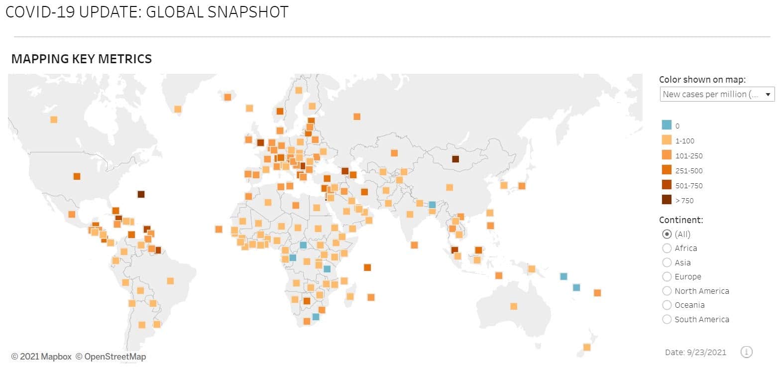
[00:35:03] You know, with the COVID-19 pandemic we pass from a population where only a few of us cared about data and deeply were, you know, involved with data, to a population where, like, really maps and charts have been our daily vitamins with terms like “flattening the curve” have become colloquial, and you could, like, really say them to your cousin or everybody. And, we really, we every day used, and still are using charts and maps to make critical decisions about how to act in our lives. So, I think it’s really, really a crucial moment to advocate for people to literally not only understand how to read a chart, but to ask themselves critical questions about how these data have been collected.
[00:35:44] What is the context? What is the missing part of it? And so, then a humanism is really just a series of ideas and projects around this premise, so that, there’s that.
[00:35:53] Jon Penland: Yeah. So, if I’m understanding it correctly and I just want to make sure I do understand it correctly, your thinking about data is, starts with the recognition that data exists because humans collect it, and that has implications about the way that that data was collected. And, if we aren’t thoughtful about how the data was collected, then we’ll be blind to what is missing, and we may be blind to directions that data will lead us that are driven by the collection mechanism or the connect, the collection method. Is that, is that reasonable?
[00:36:38] Giorgia Lupi: It is really reasonable. I mean, Jon, I wish you could be, like, with me all the time to translate my ideas from a designer point of view to a, to a broader take on that. It, this is absolutely what it is. And again, once more I am a designer. I come from a design perspective and I think developing this idea through projects and through actually really working with data this way,
[00:36:58] but I really think that again, it’s a moment in time where we need to recognize and always take into account the very nature of data where things, like, missing data are as important as data points, but we really don’t see them. Imagine the beginning of the pandemic, where we had these charts about hospitalizations and, and cases like that were, like, right now we’re understanding how little we knew, how these, like, curve that we saw, you know, going from March to, I don’t know, May, it really probably started in January. We just didn’t know it.
[00:37:30] Why didn’t we put this uncertainty there? Why do we design charts that when public see them, they take it as the truth, because you say, like, 52.7, this is a number that I have, we don’t know, we didn’t know, and only right now they’re starting to understand this uncertainty and to actually start to render it and how we represent data, but that should really always be the case when there’s this unknown, for example. And again, once more, how did the data have been collected? Like, what is the sample of the population? These things need to be transparent and people need to start really just asking themselves these questions before just, you know, blindly believe in trust or chart.
[00:38:12] Jon Penland: Yeah. So, data humanism does speak to that beginning part of the process where data is being collected and being thoughtful about what that collection mechanism is and what data’s missing and, and then the second part is, is the telling the story, and, and I’ve seen you describe your profession as telling stories with data, and I think intuitively most people think of data as something that can inform a story, or that can make a specific point, but that the data is not the story, so, what do you mean when, when you say that you’re telling stories with data?
[00:38:49] Giorgia Lupi: I think that’s another interesting way of seeing it. I think we have these ideas that stories are linear with a beginning to an end, with a character, and with a certain development, and so, maybe this is how we think about stories. I see data visualization, which is the way that I translate data into stories, let’s say, as a potential non-linear way to enter stories, because especially if you can embed context and every data point that you represent is not only this drawing number, but it has, to say, colors and dimensions that are according to the why, the whom, the connection between two data points,
[00:39:27] I think that graph is in and on itself a fascinating sort of like even, like, almost like a visual recap of a book, and it can. Be an entry point and then cover more. So, to me, it’s really that it is telling a story, and, my goal with charts that I build is never to have a story that has a beginning or an end, but it’s something that I hope will make people curious to know more, to learn more, to go and discover more, so, like, opening questions, and, this is why I think that, in any case, we can tell stories with data, but really even just on the easiest example, think about Dear Data. I mean, we have told each other the stories of our weeks, the stories of our feelings, the stories of our lives for a year through data only, so it’s about making sure that you collect data over a certain amount of time and you know, that you can take into account again, all of the aspects that make an action, say, all of the time that I pick up my phone, not only in action, but something that tells something about myself, they’re for a story.
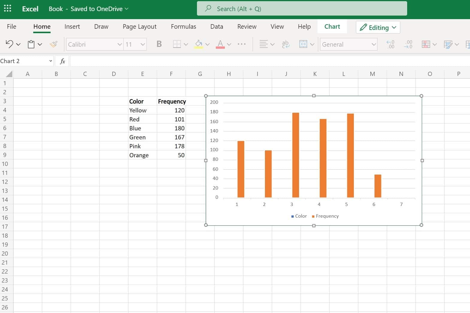
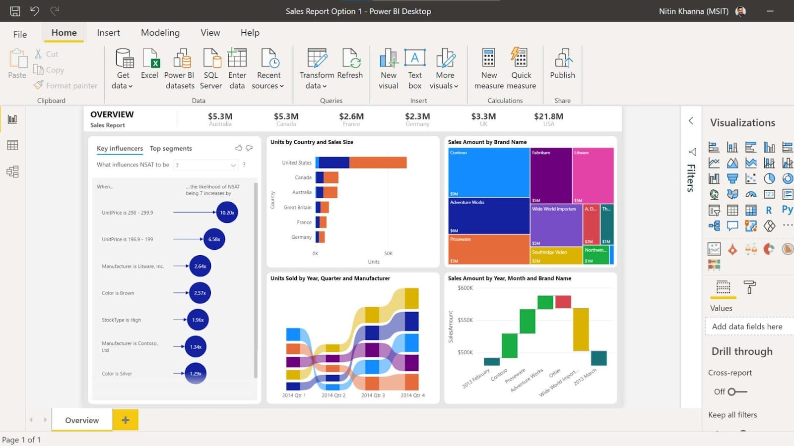
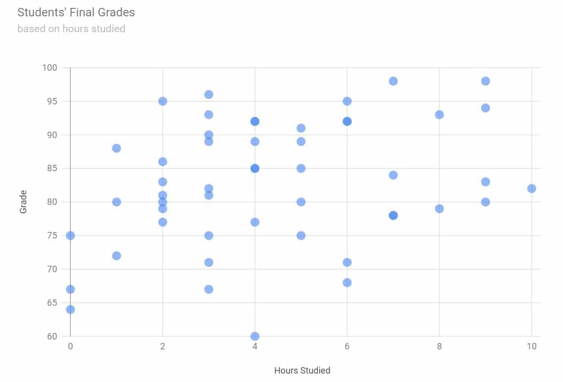
[00:40:28] Jon Penland: Yeah, one of the things you’ve talked a lot about data visualization to, kind of, compare and contrast what you do with maybe a more simplistic approach to presenting data in a simple pie chart or something like that, and that’s going to be very difficult for listeners to understand without being able to see visually.
[00:40:46] So, one of the things we will make sure to do is include some sort of a link in the show notes to say, go check out some of Giorgia’s work so you can understand what it is we’re talking about.
[00:40:55] Giorgia Lupi: Absolutely. In fact, usually, I think, you know, I like giving talks because I have, like, all of the visual aids behind me and when people start seeing it, you know, they, they really, but I think, you know, yeah, if we can put things on the, on the note, that’ll be great.
[00:41:09] Jon Penland: Yeah, we’ll make sure to add a couple of links or at least a link somewhere to direct people so that they can see some of these sorts of visualizations.
[00:41:19] Giorgia Lupi: But maybe there’s something that we can say about, you know, just for the, you know, the listeners to picture that maybe there’s, we can do it right now to say, imagine that the projects that I’m doing are like, imagine a beautiful pattern, a pattern that can be a wallpaper, a pattern that can be a pattern, a beautiful pattern that you like on your shirt,
[00:41:37] it can be a pattern on a packaging. Well, imagine if all of the decisions about the lengths of a line, the number of lines, the collars, the combination of these elements that you see as a pattern wear the representation of a data point. So, this is, this is my work. Like, imagine, like, if you need a picture of my work, I think that’s a good way to talk about it.
[00:42:00] Jon Penland: Right. Absolutely. So, it’s taking rather than a single metric or a single measurement and trying to represent that simply, it’s taking multiple measurements and trying to show them in relationship to each other, which requires a very unique approach each time because it’s going to be different every single time because the data is different every single time.
[00:42:25] Giorgia Lupi: And, this is what’s really, I think, intriguing for me about my work. Like, every single project immerses me in a different world. I learn about the topic and then I see the data and every time there’s this, like, translation part that needs to make, or the translation is different every time, and I think, I mean, I’m, I’m really excited about what I do. I’m having a lot of fun.
[00:42:46] Jon Penland: Yeah. What’s been your experience about the acceptance of these really unique and rich data visualizations you’ve created. Do you find that most people get the story you’re trying to tell or are there times where the data are just too complex and viewers struggle to find the story?
[00:43:03] Giorgia Lupi: Yeah. It’s a good point. There’s a, there’s a balance, obviously, between being, like, super straight forward and, like, being denser and richer and create, let, not create, and render complexity. So, there’s a few considerations around that. I think, in general, data visualization shouldn’t be seen, at least in my perspective, as a simplification of the world, because the world is complex. Our reality is nuanced, rich, and complex. So, I see data visualization as giving access to complexity as opposed to dumping it down. I also think that it really depends on the goal of the project. I always say that if I needed to design for a pilot to land the plane, well, probably it wouldn’t require him to read the legend. I will do green, red, just that you need to know community decision-making.
[00:43:48] Jon Penland: Right.
[00:43:49] Giorgia Lupi: That’s the one end of the spectrum. But when you are able to work, for example, in entertainment, like, you know, on a Sunday cultural supplement of a magazine that people will take their time reading on a Sunday or for a mural in a museum that definitely can tell an important story, but you know, people have the time to really engage with that, and also, for example, in all the interactive experiences that I’m designing, I mean, it really requires people to engage. So, when you have that potential, that opportunity because of the clients you work with, because of, you know, the type of projects you work on, I think you can go, and I usually go for denser representations that again, can be entry points for people to discover more.
[00:44:30] I also think that layering is really important. I like to think about my project as, and I really find these, this thing that I, that I say, where people understand, like, a project that I do as a visualization should be compelling, both for a Bart Simpson of the world and Lisa Simpson of the world.
[00:44:47] So, with the same realization for how you layer it up, a Bart Simpson of the world might just want to get a quick peek and say, “Oh, okay, this is what it’s about. It’s time. There’s a data point. Cool. I understand. Want to move away.” The same piece I would love for Lisa Simpson to start from the same entry point and then nerd out into details and figure out the connections and figure out the little things.
[00:45:09] So, and because I always put a legend, which is so crucial in my work and that can hopefully really guide people on how to read it, I think, to me, that’s, that’s how I see it. And, you know, listen very few things are for everybody, I don’t necessarily think that my projects are for everybody. I think I’m lucky that I get, like, self-selected clients that know that they want to explore with more dense and complex charts if they hire me. And, there’s definitely value and very simple data visualization, especially for immediate decision-making purposes. But also another thing that I want to say is we as a human being, we were not born knowing how to read a bar chart or how to read pie charts.
[00:45:47] Somebody taught us. And, I think that if we wanted to pick the complexity of the world through data, we need to explore with new visual languages that can be taught, and not all of the things that I’ve done will become, you know, as popular as a bar turtle pie chart, but I’m already seeing people starting to enrich the charts with some context, and it’s about, you know, advocating a population to be more familiar with these languages.
[00:46:11] Jon Penland: Yeah, that’s really interesting. Early on in that answer, you alluded to the idea that the world is complex and that that means that data sets and data visualizations will necessarily be complex, and you can look at layering and make sure that they’re understandable to folks who are in different places and looking for different things.
[00:46:32] But I think there’s a very human tendency, maybe not universal, but for a lot of folks to prefer the simple, the straightforward. And, I think, you know, maybe there’s something there about, you know, sort of the natural inclination to a bar chart or a pie chart, and, and I view it as, view as just, I, kind of, view it as personally problematic because I do think the world is a deeply complex place, and I think when we try to…
[00:47:02] Giorgia Lupi: To simplify too much, and I’m sorry to interrupt you, I think, I mean, you know, I’m really thinking about what you saying and thinking about, you know, imagine that there’s somebody at a company that comes to a designer that designs charts and says, you know, “I want a very simple presentation with data that my boss can bring in a second and make critical decisions about a company, but I need that like really intuitive.”
[00:47:22] Do they, do we really think that these important people make decisions on their company based on a simple chart? No, they will go and bring a 50-page report anyway. Hopefully, hopefully, otherwise, I think there’s, like, a thing going on there.
[00:47:34] Jon Penland: There’s a different problem.
[00:47:36] Giorgia Lupi: Yeah. So again, there, there’s an in-between, and I, again, I’m not saying that everybody should adopt the Dear Data approach, but there’s an in-between, I think, and this is what I, I would like to strike the balance in.
[00:47:50] Jon Penland: Yeah. Well, I think what I, what I’m trying to hit at here is that I think it’s important not to oversimplify a complex topic. And, I, and I think when we over-simplify, apply a complex topic, I watched your TED talk, and in that, in that TED talk, you, you throw up some of the visualizations from the 2016 Presidential Election in the United States and how misleading those were.
[00:48:14] And, and I think, I think that perhaps is a bit of a symptom of oversimplification of complex data and how it can lead to wrong conclusions.
[00:48:25] Giorgia Lupi: It is. I also think, absolutely. In that specific case, I also think that the way that we have, and I think we’ve done a little better, like, hit has been a little better in the current, like, previous elections, by, into 2020 elections. But I think that in that case, when we saw all of these charts right below the ad line, where we had an 82 and 18, like, these sharp numbers were alluding to what’s, a level of certainty that was not what was going on. We were still talking about polls. And so, in that specific case, it was a simplification for sure, even though there’ve been outlets such as like 5, 38, that if you scroll, scroll down and wanted to go deep, you could, and they really great, but the headlines and the charts, but really these two numbers that because of how they’ve been rendered the whole time they felt so certain. And, that’s what it isn’t. I mean, maybe there’s some sort of, like, balance between, you know, saying, “We think that today the numbers are 82% versus, you know, 18, but this is the buffer, this is the fuzzy and fluid part in between.” So they, at least people know that there’s a needle to swing.
[00:49:36] Jon Penland: Right. So, as we, sort of, move towards a conclusion in this conversation, I want to make sure we try and drive this conversation home in a practical direction for our listeners. And, I, and I think we can do that by speaking directly to two different groups of listeners. So, the first group would be anyone who’s in design.
[00:49:55] So, I’m thinking of folks who work at design agencies, or maybe they work in marketing or in design for a specific company, and they’re sitting here going, “All right. Okay. I can get on board with the idea of visualizing data in new ways.” What advice would you give them to begin learning about visualizing data in more rich ways?
[00:50:16] Giorgia Lupi: Yeah. So, obviously, it depends on the context, the goal of the project where you’re working. I think in any case, the advice that I would give is when you are presented the data in form of a tab, a spreadsheet, any, any kind of data points that you’re collecting, that you’re seeing, that are not already in a visual form, just ask yourself, “Is a bar chart and a pie chart the best way to represent what is in the data?”
[00:50:43] What if, for example, I just started simply to think about data points over time, plotting them and seeing what happens and seeing, you know, maybe there are some contexts in this particular moment in time they need to be added. It’s not about necessarily producing beautiful charts. It’s about understanding that the context that we have around the data collection is as important to be represented as the numbers themselves.
[00:51:07] And then asking themselves questions about, “Is this 52, 53, 54.7 very, very sure certain or do we have, you know, some missing data and gaps there? Represent the missing data points?” So, I think before even thinking about, “Oh, let’s build a beautiful chart for the sake of building something beautiful,” It’s truly about starting to think about the fact that these visual models, which is pie chart, bar charts, the things that you usually use, are there to simplify the job, but maybe there’s, again, an in-between the passes from, like, really understanding what is in there.
[00:51:39] And then, you know, to be able to then translate it into visual there’s a lot that you can just read about information design in general, and then even Gestalt principles of how our brain perceives shapes and quantities and location, so that’s, kind of like, that matches into design and applying this skill set of a designer to build effective communications and hierarchies with data.
[00:52:00] And, in general, I mean, I think that if then, we’re talking to folks who work at creative agencies and design agencies and they’re doing communication projects, I think the advice that I would give is start thinking as data, even small datasets, potentially as a storytelling material. So, if you’re building a pattern and you’re building it for a company that, I don’t know, is really a focus on building good practices around climate change,
[00:52:29] I don’t know, start to think about incorporating weather temperature data. Start to think about data as a tool that you have to enrich every graphic with a meaning. Don’t want to say that everybody and every graphics in the world should have data behind it, but, you know, it’s another way to think about it.
[00:52:44] Jon Penland: Sure. So, it sounds like the first step really is to stop and think more carefully about the data you’re trying to visualize. Right? Like, maybe there is, maybe there isn’t a deeper story to tell here, but you’ll never know that if you don’t stop and think about this data more deeply.
[00:52:58] Giorgia Lupi: Absolutely.
[00:52:58] Jon Penland: Rather than starting with the design and working the data into it.
[00:53:01] Okay. So, that’s the first group. The second group I want to speak to is basically everybody else. So, this is folks like myself. I’m not doing design work, but I do consume data visualizations created by others, probably every single day. What would be the takeaway for somebody like myself who’s not doing any sort of design work, but is consuming data visualization all the time?
[00:53:25] Giorgia Lupi: For sure. So, I think in that case is, well, first of all, try to really, like, spend a little time understanding the chart ’cause I feel that sometimes we just, like, overlook it and we scroll and, you know, a chart is as important as an article. So, just like, spend some time with it and just ask yourself questions about, you know, what is it you’re seeing?
[00:53:43] What is the source? You know, these data are there, but they’re being collected somewhere. So, who collected them? First of all, and we’re seeing something based on a percentage, what is the percentage about? What is the group of people that this data is talking about? What is the timeframe that has been collected and the more you just approach a chart with questions, the more, I think, you get, well you will get answers for yourself because maybe you will look at the sources or you will understand that, you know, “All right, this is a part of the reality that they started representing, but maybe there’s something that is not representing,” and it’s okay.
[00:54:14] But, you know, it’s better to have data than to not have data, but it’s also good to know that, you know, if we’re talking about the positive cases of COVID in New York, and we’re not really talking about the amount of tests that has been done in the same chart is incomplete, which is okay if we don’t have the other number, but it’s about understanding that still, there’s something that we don’t know there.
[00:54:33] So, I think it’s truly about asking critical questions, starting from the considerations that these data have been collected by a human being or devices designed by human beings. So, I guess that’s really the biggest takeaway. Yeah.
[00:54:47] Jon Penland: Yeah. So, the takeaway for those of us consuming data is really to be aware of this concept of data humanism, where we recognize the human element that went into collecting and presenting and analyzing data. Yeah. Great. All right. So, as we draw this conversation to a close, I have two wrap-up questions for you.
[00:55:08] So, the first, what is one resource you would recommend to our listeners? It could be a book, a blog, a newsletter, anything. Okay.
[00:55:16] Giorgia Lupi: The Data Visualization Society, it starts with the website, but then, you know, you sign in and if you’re a Slack user, it’s a very, very active Slack team and then full of channels with resources, resources about really, I would say it, literacy, resources about even just really how to read COVID charts because there’s a whole, you know, I’ll use a bunch of charts that are about
[00:55:40] COVID, there’s a lot of even, just, the channels that are about vintage infographic, and so the starting of the infographic data art, data as physical manifestations. So, I would definitely say, I mean, there are books that can help, but, like, you will find all of them there. The Data Visualization Society founders, I’ve been asked to be on the board so I consult them sometimes, but the founders have been doing really a great job to create that as a really, a repository of everything data and visualization. So, Data Visualization Society, if you Google that, you’ll find it.
[00:56:13] Jon Penland: Awesome. And then, second, where can our listeners go to connect with you or to learn more about Pentagram?
[00:56:21] Giorgia Lupi: Sure. Well, pentagram.com is the website of my company, and if you want to know more about me and my specific board, you can look on the Pentagram website for Giorgia Lupi, or I still have my website where I collect work that is only done by me and my team, which is giorgialupi.com, where Giorgia is with an I. G I O R G I A. And I’m Giorgia Lupi in, on Instagram, Twitter, all places.
[00:56:46] Jon Penland: Perfect. Well, Giorgia, it has been fantastic to have you on Reverse Engineered. Thank you for taking some time out of your day to hang out with us.
[00:56:54] Giorgia Lupi: Thank you, Jon. It was just a great conversation, and I hope that it was inspiring for the listeners. So, thanks for having me.
[00:57:00] Jon Penland: And, thank you to our listeners. That’s all for today’s podcast. You can access the episode show notes at kinsta.com/podcast. That’s K I N S T A.com/podcast. If you enjoyed this episode, don’t forget to subscribe to Reverse Engineered and leave us a review on Apple Podcasts or the platform you’re listening on right now. See you next time.