It isn’t enough to just market your product to consumers. You need to earn their trust too.
One way to do this is by explaining who you are and what your company is about. The easiest and most effective way to achieve this is with an About Us page.
You’ve probably stumbled on a bunch of About Us pages, but how do you know which ones are most effective?
In this post, we’ll share some of the most effective About Us pages for specific niches and explain why they are so impactful.
Before we dive in, let’s look at an overview of About Us pages and dissect a commonly-used template for them.
What Is an About Us Page?
An About Us page exists to share a business’ story and history and provide a deeper connection with customers.
Consumers want to know the team behind the brand they are supporting. An About Us page provides the perfect real estate to pull back the curtain and reveal who is working behind the scenes.
Most importantly, though, an About Us page facilitates trust between the consumer and the business.
More than 33% of consumers say that “trust” is a core factor when deciding which businesses to support.
With an About Us page, you can begin to form an emotional relationship with customers and engage with them on a deeper level.
So how can you create one that resonates? Let’s look at some of the components you need to include in your About Us page.
How to Write an About Us Page
The best About Us pages share the company and founders’ stories. It’s a chance to pull back the curtain on the business and showcase the people who make it happen.
Some of the most effective About Us pages:
- Connect the consumer to the business on a deeper level
- Provide contextual insight into why the founders created the business
- Share the business’s core values, mission, beliefs, and vision
- Answer any questions that consumers may have about the business
How can you accomplish those objectives through your About Us page? First, let’s look at a commonly-used About Us page template that drives success.
About Us Page Template
There are four main components to an About Us page:
1. Share the story of why the company was founded
This is your chance to focus on your company’s “why.” It could be what sets you apart from other competitors on the market.
Share the moment you gained the inspiration for your business and what motivated you to start it.
2. Highlight your background and your founding team’s role
Who are you? Why are you the right person to lead your company at this time? Share your background and personal story. That’ll connect you to your customers.
3. Document the evolution of the company
State everything from the obstacles to the product enhancements. Bring your new customers up to speed. Where is the company today? How is it different from where it was before?
4. Document the mission and vision
What is your company trying to solve? Where is it going? End the About Us page by detailing the steps you’re taking to transform the business into your ultimate vision.
With these four components, you’ll create a stellar About Us page that will wow prospects and convert new customers.
Combining these elements with the right website builder and proper page design will help you transform a visitor into a customer.
It’s important to remember what your customers want, too.
Users in your target audience want to see your mission statement, social proof, and an example of using your product. These elements on your About Us web page will build trust with the target audience.
Now, let’s look at some companies that championed those components and brought them to life.
30 About Us Page Examples (by Industry)
No matter what industry you’re in, you could use an About Us page on your site.
While the four components listed above are necessary for every About Us page, different industries sometimes take different approaches.
Below, you’ll find 30 of the best About Us pages categorized by industry. Learn from their successes and adapt some of their strategies when creating your own.
Technology Companies
HubSpot, Buffer, and Vidyard are three examples of technology companies with amazing About Us pages.
HubSpot
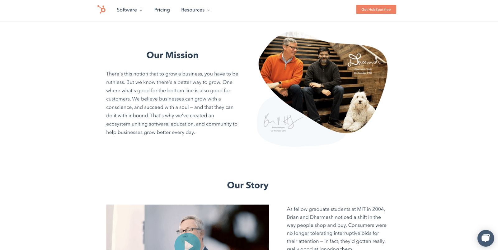
HubSpot’s About Us page opens with its mission and flows directly into the company’s story. In addition, this page features a video from the CEO that discusses his initial interactions with Hubspot’s founder and his vision for the company moving forward.
By including a video on the About Us page, HubSpot engages browsing prospects in a new medium they may be eager to consume.
Buffer
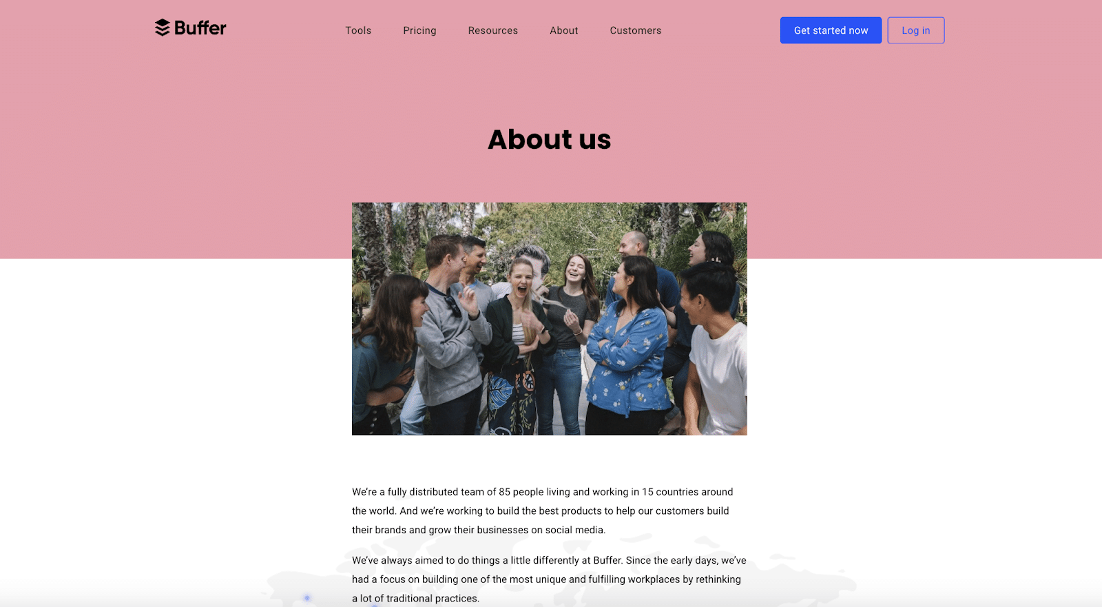
Buffer’s About Us page focuses on the team behind the tech. A catchy headline doesn’t greet you as you click onto the page. Instead, you see a photo of Buffer‘s team members who contribute to creating its product.
This is a great way to shine a line on the entire organization and embody a truly collaborative mindset. Instead of focusing solely on the founders, businesses can highlight the team that powers the product daily and makes the magic happen.
Vidyard
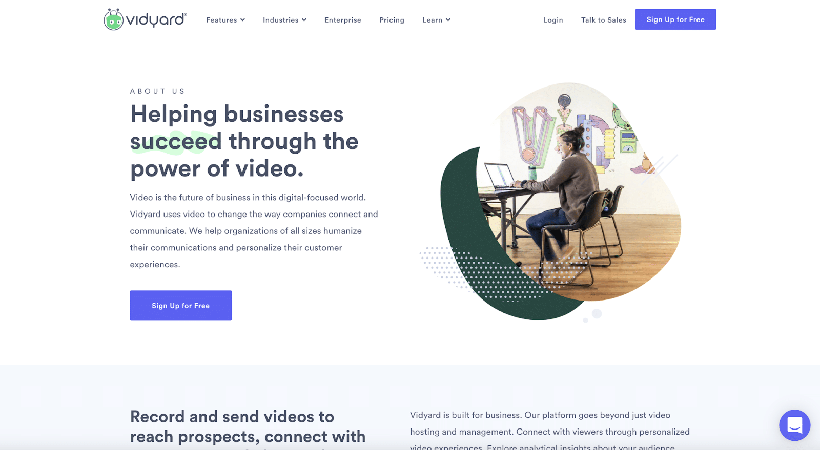
Vidyard’s About Us page leads with a headline highlighting its mission and flows directly into the core functions of its product. The page has a product demo video that you’ll stumble across as you stroll, revealing additional use cases. Finally, the leadership team is featured.
This high-level approach to an About Us page places the primary focus on the products’ benefits with a secondary focus on the team. If your product is complex, this may be an approach that you should consider.
Consumer-Packaged Goods (CPG) Industry
RXBAR, The Sill, and Hydrant are three examples of consumer-packaged goods (CPG) companies that effectively use an About Us page to tell their stories.
RXBAR
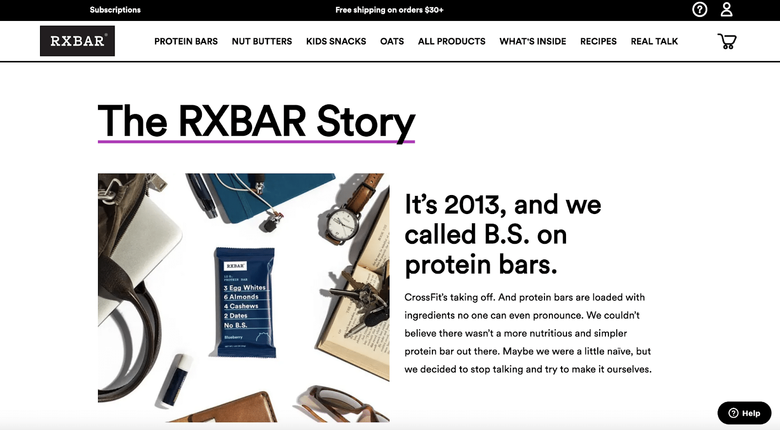
RXBAR positions its About Us page around the company’s history, dating back to 2013. The bold headline draws the reader in by highlighting the company’s conception.
“It’s 2013, and we called B.S. on protein bars,” it says.
The reader continues to discover more about the brand and the company’s evolution with a “Then and Now” slider. A slider is an excellent multimedia option to consider. It takes the consumer through your company’s history without taking up too much space on the page.
The Sill
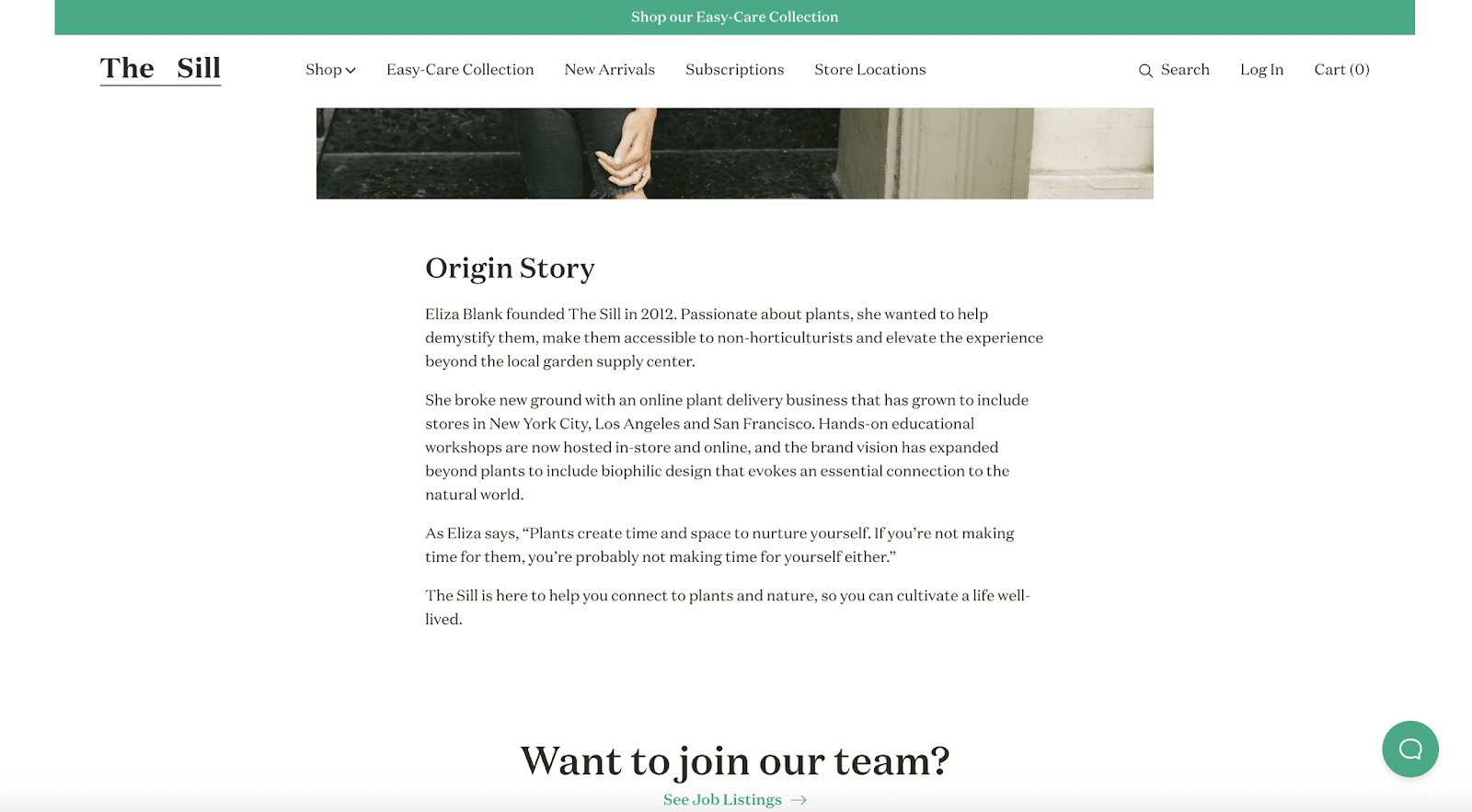
The Sill, a direct-to-consumer plant company, has a simple but effective About Us page. It focuses mainly on the company’s origin story, highlighting basic facts about its founders and evolution. Then, it invites consumers to apply for an open role.
This is effective because it’s simple and straight to the point. It shows that About Us pages don’t have to be packed with information. Instead, you can straightforwardly introduce yourself and your company and still effectively get your point across.
Hydrant
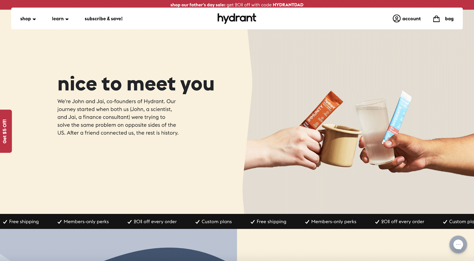
Hydrant’s About Us page opens with an inviting image of two people toasting while holding the product in their hands. After reading the copy, one might guess that those hands belong to John and Jai, the company’s two founders.
The page is broken into three sections, making it easy to digest in chunks. This format is a perfect way to set up your page because it guides the reader slowly down in a way that isn’t overwhelming.
Each section is designed to hook the reader and bait them into reading a little more. Finally, the page ends with John and Jai’s signature, giving it a personal touch from the founders, who you feel like you can now call friends.
Insurance
The Zebra, Lemonade, and Clearcover are three companies in the insurance industry that are paving the way with amazing About Us pages.
The Zebra
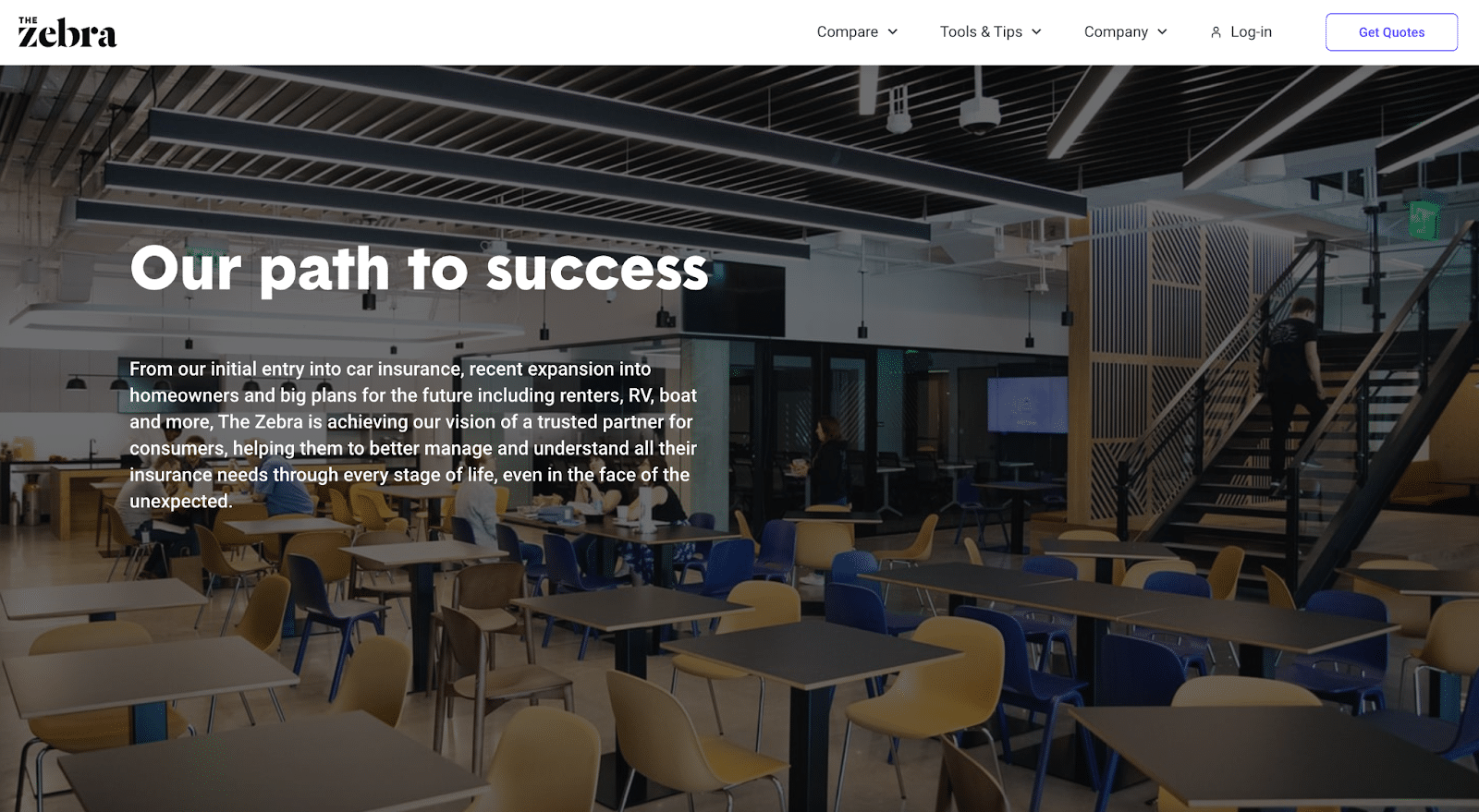
The Zebra’s About Us page focuses on the future almost as much as it does the past. The company opens with the headline, “Our path to success.” The paragraph about the business is concise, and the page immediately flows into a section about the company culture.
With a culture and leadership section, The Zebra focuses on people creating the company rather than itself. This is a subtle shift from some of the other About Us pages. Approximately two-thirds of The Zebra’s About Us page is devoted to company culture and the leadership team.
Lemonade
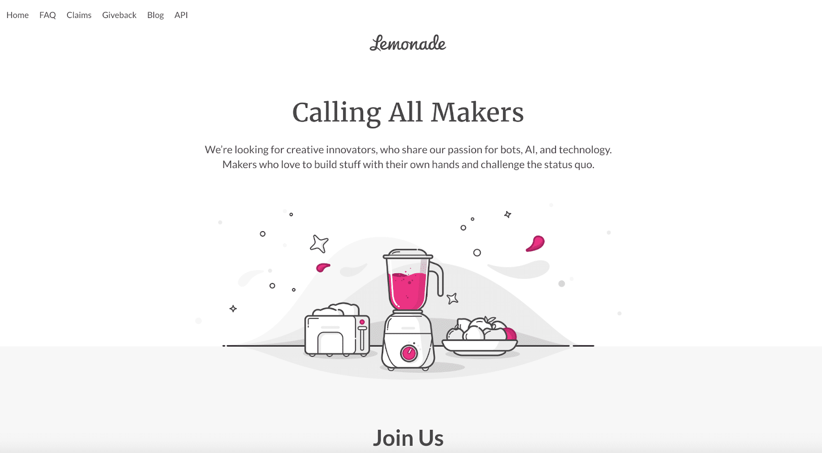
Lemonade’s About Us page is centralized around its “makers.” Through this messaging, the company highlights that all of its employees are proactively building the product and are “makers” in their own right.
Lemonade has minimal information on its About Us page, but that’s on par for its branding. For example, the company uses excess white space on its landing pages to illustrate a pink pop dash. This page is no different.
With only two lines of text and an illustration, Lemonade provides a high-level look at its company and those building it.
Clearcover
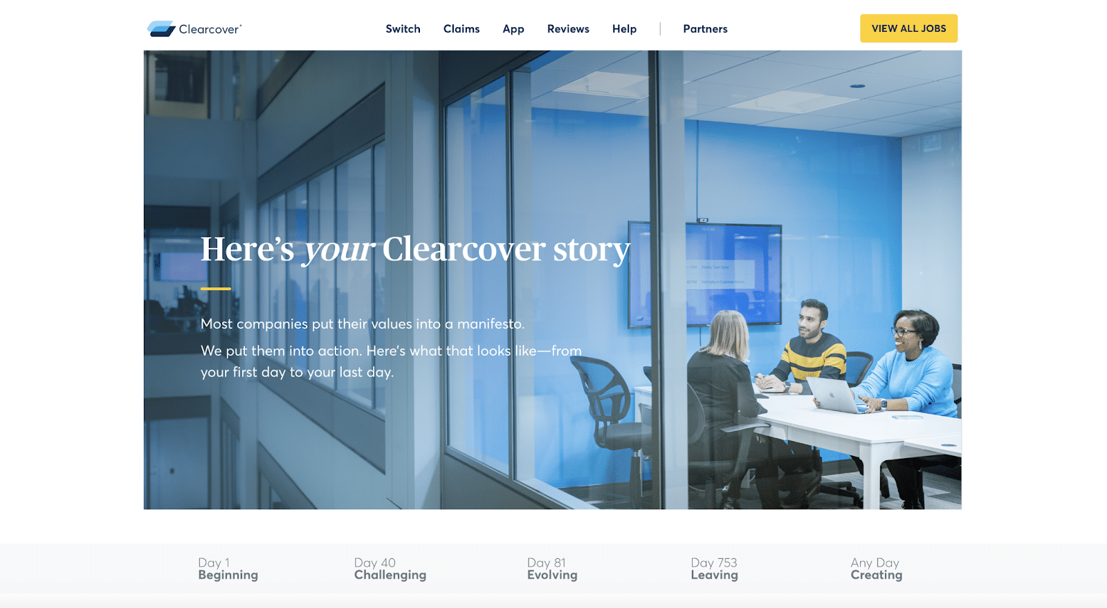
Clearcover uses a traditional About Us page template to guide the reader through the company’s history. The page focuses solely on the company’s story, dividing it into five core parts: the beginning, challenging, evolving, leaving, and creating portions.
With interactive chapter markers, you can drive engagement on the page and let the reader jump around to the sections and topics they wish to read. This interactive element can increase the time the consumer spends on the page and their information.
Fintech
Dave, Chime, and Riskified set the standard for engaging About Us pages in the fintech industry. Let’s take a look at why.
Dave
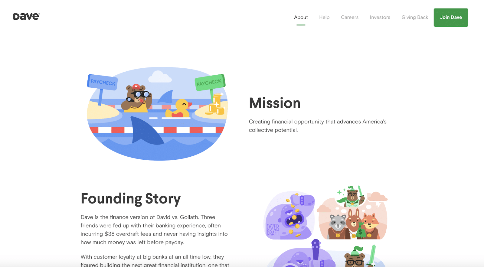
Dave, a banking company designed with humans in mind, offers an About Us page that includes simplified text and engaging illustrations.
The alternating sections are formatted in a two-column layout, making it easy for the reader to jump back and forth from different topics like its mission, founding story, and more. Plus, the illustration style is beautifully inviting (and on-brand), making the user want to keep scrolling down the page to view more.
Chime
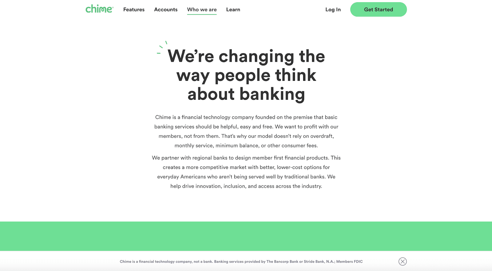
Chime’s About Us page relies heavily on copy to contrast Dave’s. Chime uses an explanatory approach by sharing its partnerships with regional banks and highlighting the value proposition that separates it from competitors.
This is not a surprising approach for a company like Chime. The fintech industry has many regulations, and Chime wants its customers to understand why its tech is different.
By focusing on the messaging and eliminating all excess content from the page, you can drill down on the critical points of your company and brand.
Riskified
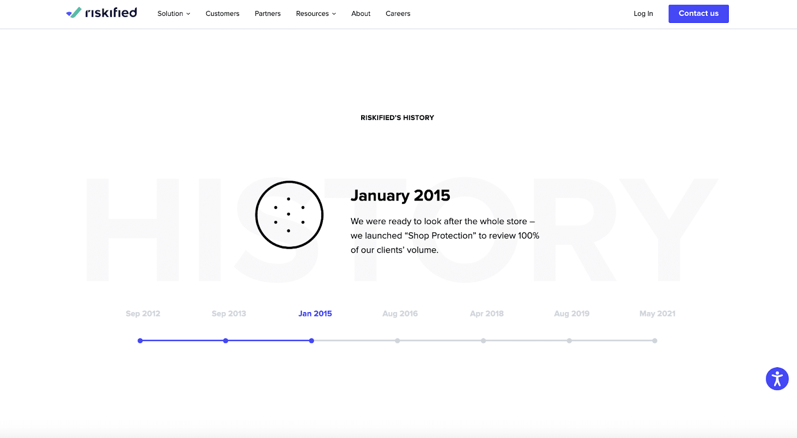
Riskified highlights its history on its About Us page uniquely and engagingly. It can be a task to try and consolidate your company’s history into bite-sized chunks. Even worse, if you spell everything out, the About Us page can drag on forever.
Riskified featured an interactive timeline that highlighted seven key milestones in its evolution. The viewer can toggle back and forth and receive a new illustration with a one-sentence description of a core company milestone. This is a great way to engage and educate your potential customers simultaneously.
Healthcare
Wheel, Clear, and Healthgrades lead the healthcare industry regarding About Us pages.
Wheel
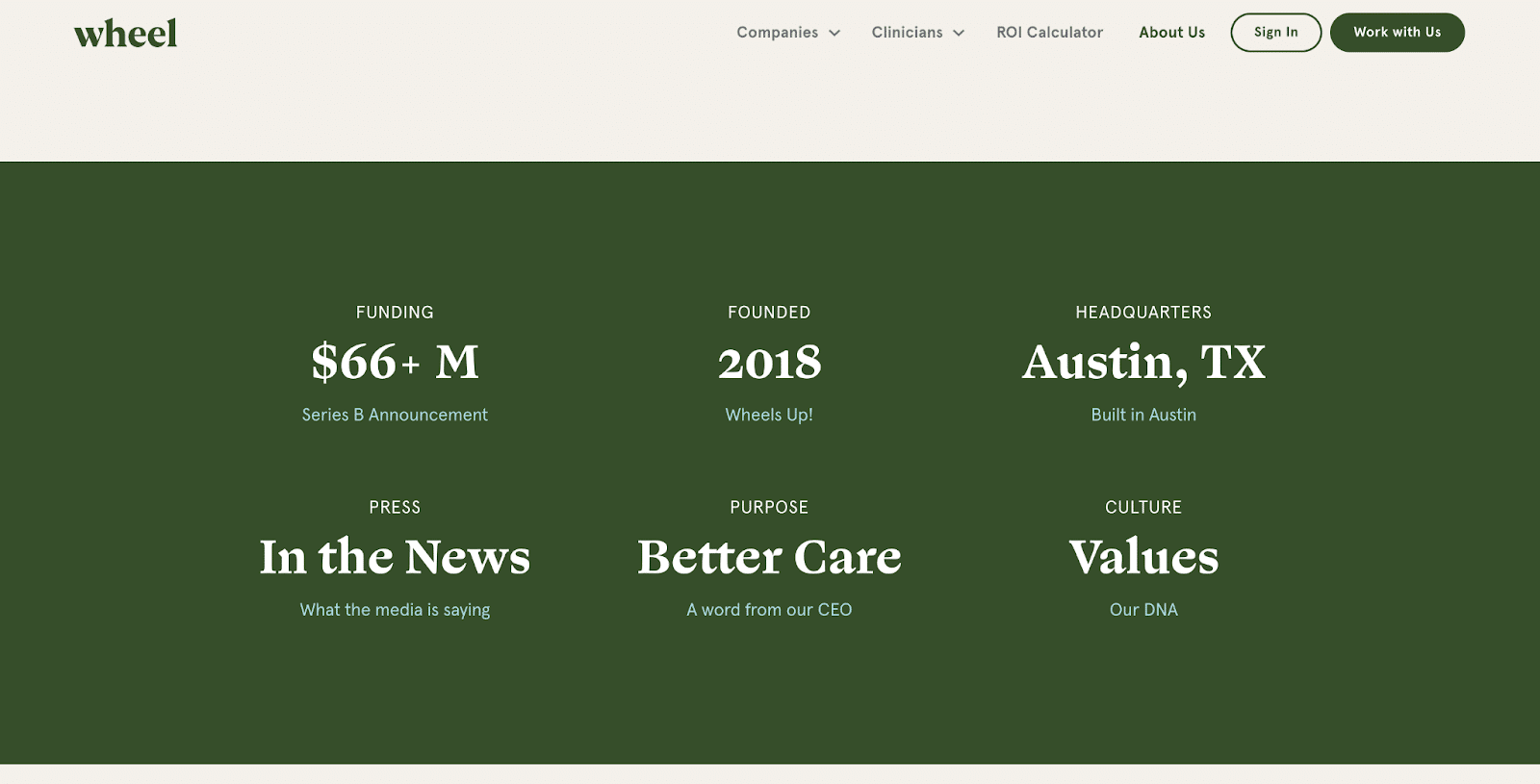
Wheel’s About Us page breaks down everything you need to know into bite-sized chunks. This format highlights the critical details you need to know about the company. Everything from its funding success to headquarters location is neatly packed into its section.
Consider using this format for the essential details you think every consumer should know about your business. By simplifying some of the basic information into these sections, you can leave room for a more engaging narrative on another part of the page.
Clear
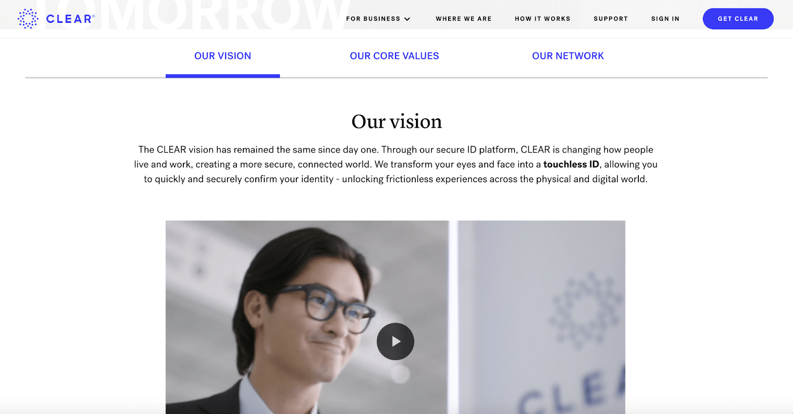
Clear’s About Us page focuses on three distinct parts: the vision, core values, and network. Clear uses a company video to introduce the business and what is still to come.
Feature a video prominently at the top of your About Us page. Videos are engaging, and consumers like to watch them. In addition, you don’t scare off the consumer with long blocks of texts. You can draw them in with a video and invite them to stay for a while.
Healthgrades
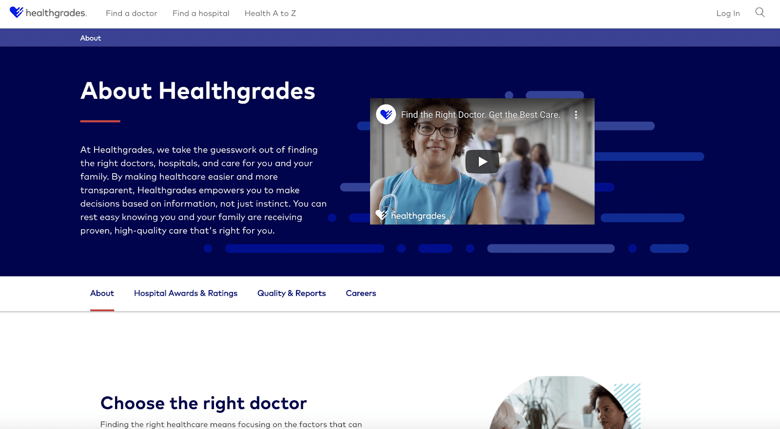
Healthgrades’ About Us page uses a built-in navigation bar to enable the user to toggle through four subheaders: About, Hospital Awards & Ratings, Quality & Reports, Careers. This secondary navigation bar simplifies the About Us page, so it doesn’t extend too far.
It keeps users engaged when they don’t have to scroll to get new content continuously. The consumer may toggle back and forth between some subpages and learn a little more than they would have if it were simply a static landing page.
Pets
BarkBox, Wag, and Ollie are the leading pet supplies and pet care companies with memorable About Us pages.
BarkBox
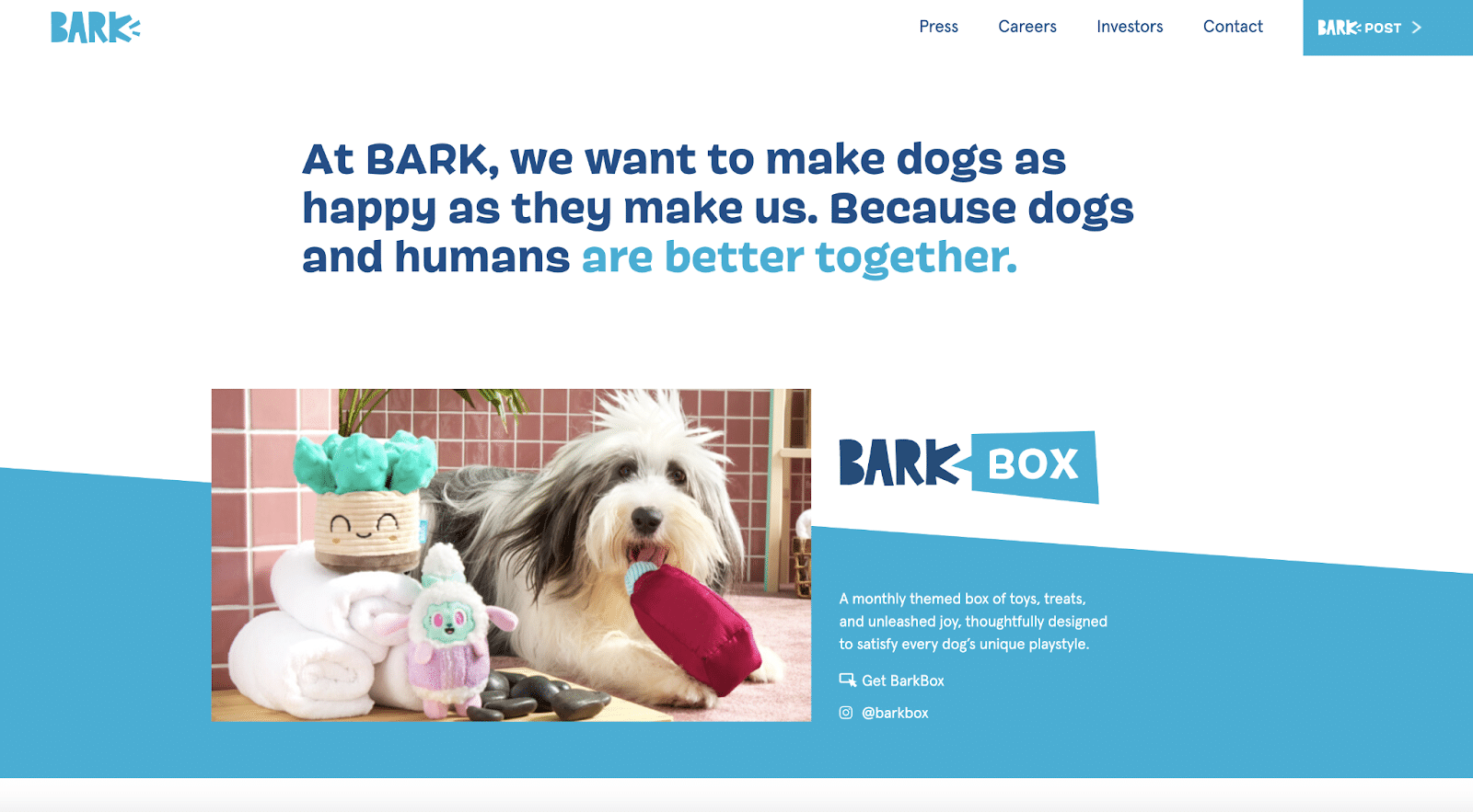
BarkBox’s About Us page uses memorable imagery of dogs. The company keeps the page simple by highlighting the different business verticals it offers. Each has its designated section with corresponding text and images.
This About Us page shows that you don’t have to dive too deep into your company’s story if you don’t think it’s needed. BarkBox has many different properties, so it uses this space to ensure its customers understand what is being offered.
Wag
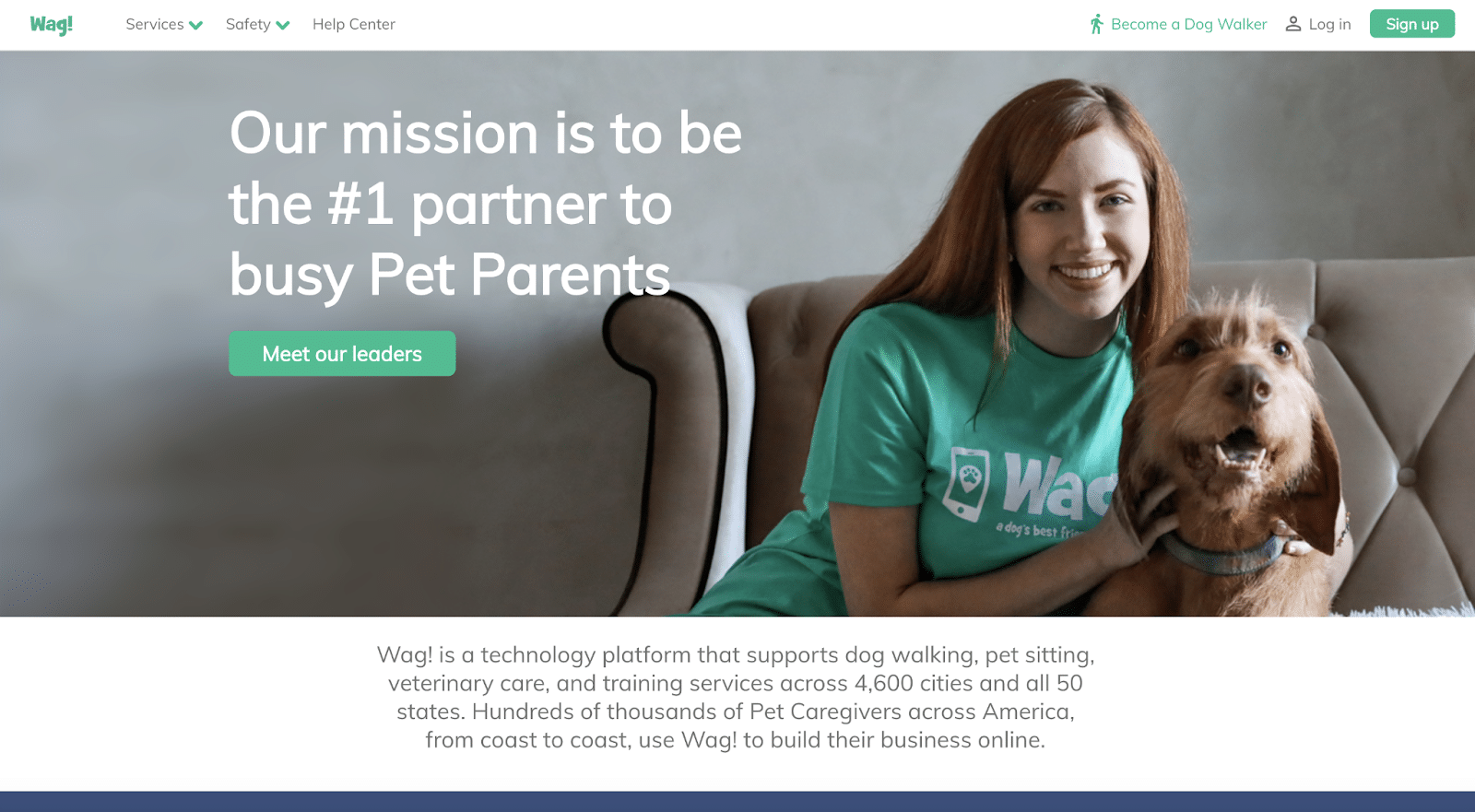
Wag has a straightforward layout on its About Us page featuring a hero image with a woman and her dog, a headline, a short description, and a call-to-action asking viewers to “Meet our leaders.” This is a simple approach that would give the consumer everything they need to understand the basics of the company.
Wag’s About Us page is an effective reminder that you don’t have to go overboard with your About Us page content. Instead, concentrate on giving a high-level overview of your company and emphasizing a few key points.
Ollie
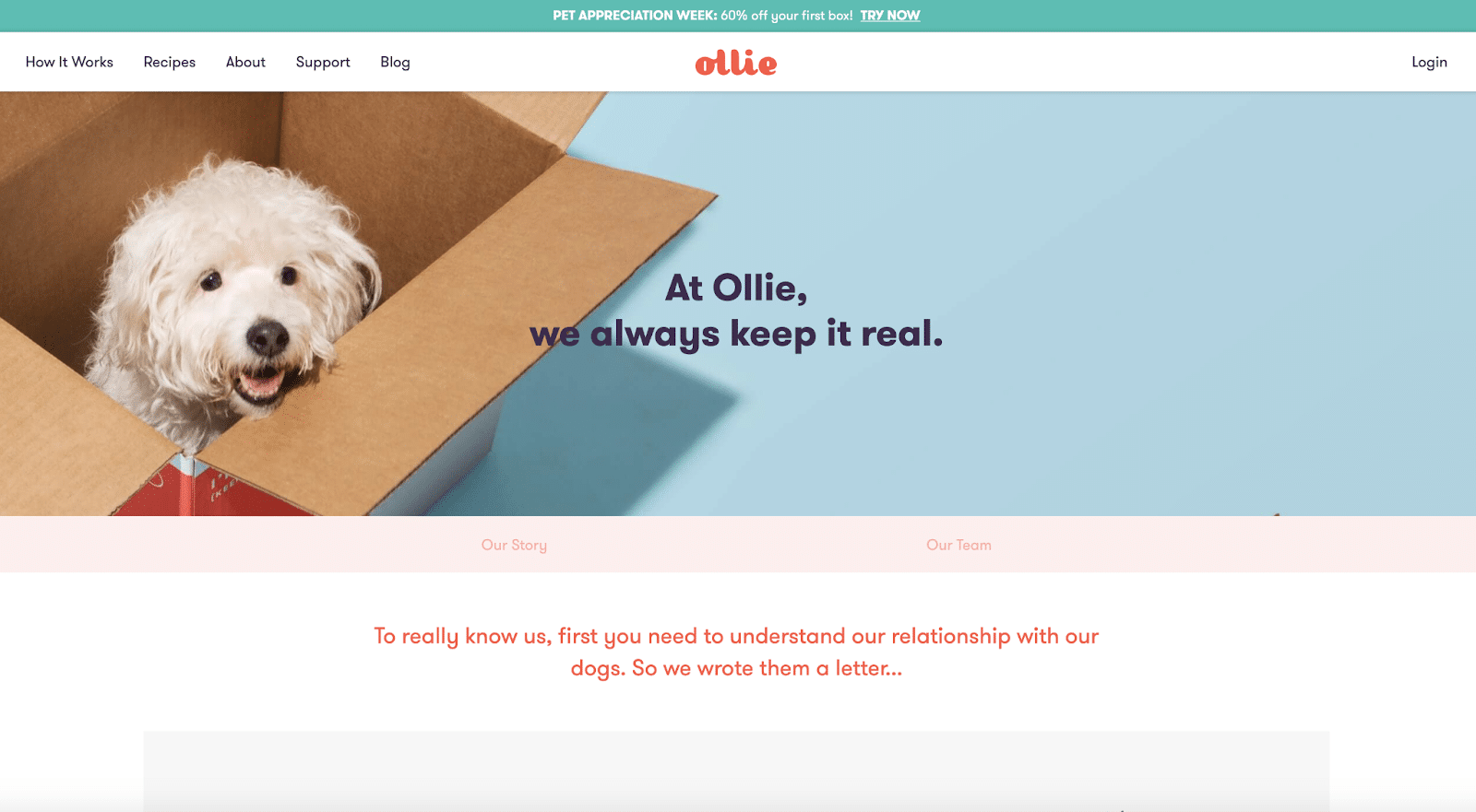
Ollie’s About Us page utilizes a secondary navigation bar to split the content into distinct sections: Our Story and Our Team. Additionally, each page uses motion graphics to engage the reader and draw their attention to different areas featuring essential information.
Find new ways to draw the reader down the page and continue reading. One way to accomplish this is with subtle motion graphics, Javascript, or GIFs. Even the slightest motion will attract the readers’ eye and make them want more.
Transportation
Lyft, Uber, and Bird all take different approaches in sharing their stories.
Lyft
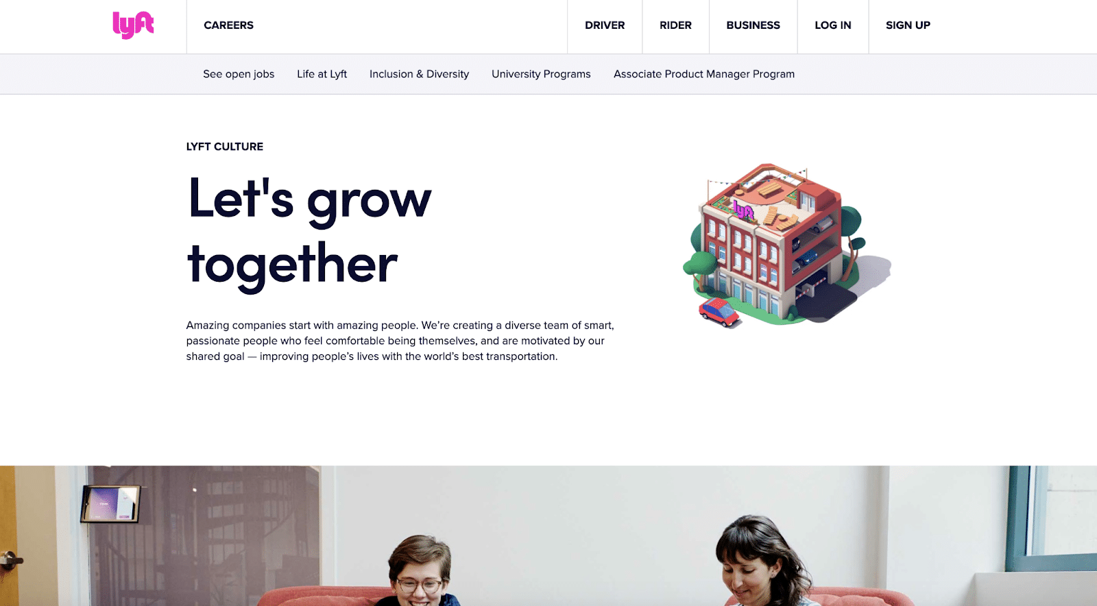
Lyft’s About Us page focuses on the team powering the company behind the scenes. The page is offensive to new drivers and new internal team members to join the organization. This is different from most About Us pages that we’ve seen.
This strategy is used by larger organizations that will often be hiring for many positions at any given point in time. Lyft is an organization that is always recruiting, so focusing its About Us page on the team makes sense.
Uber
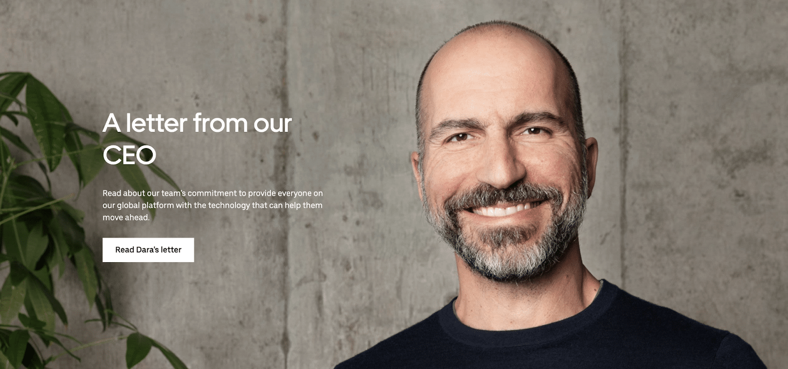
Uber’s About Us page highlights a letter from its CEO. In addition, the CEO’s profile photo is featured as the hero image of the page. Since most people worldwide are familiar with the Uber brand, the company uses this page to chart its roadmap.
By publishing this letter from the CEO, Uber gives consumers a glimpse into how the company is evolving.
Bird
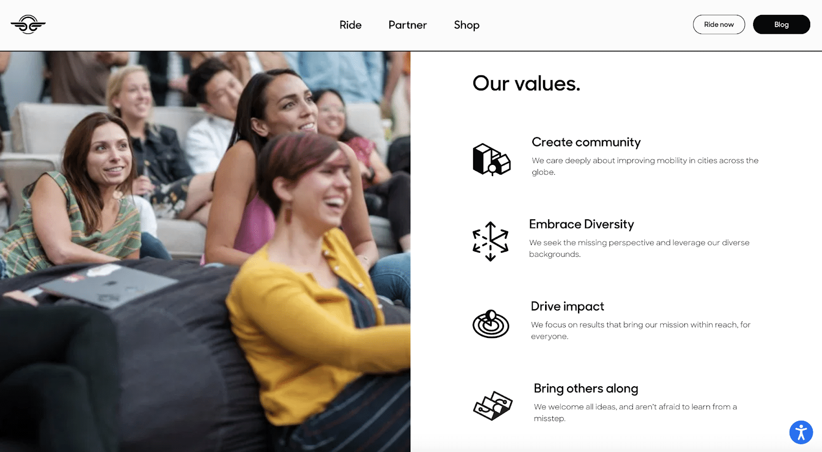
Bird’s About Us page is structured around the company’s core values. Bird outlines its values by creating a unique icon that corresponds with each pillar of the company.
The use of iconography on your About Us page is an effective strategy. Distinct icons can be memorable and help break down the text into bite-sized ideas.
Music
Spotify, Mighty Audio, and WaveXR have unique About Us pages as leading music tech companies.
Spotify
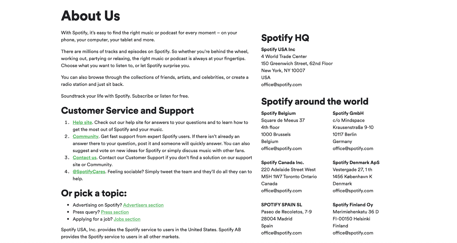
Spotify’s About Us page consists of only text and no images. Most of the content on this page is addresses, customer service emails, and a brief company description.
Spotify’s direct approach on its About Us page shows that you can just include the basics or core company information, as long as you’re a global, world-renowned brand.
Mighty Audio
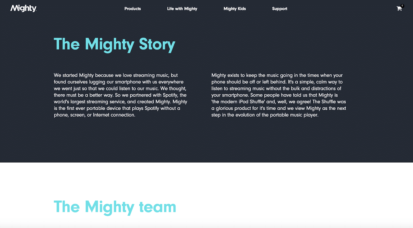
Mighty Audio shares its story with two chunks of block text before highlighting the team on its About Us page. The contrast of a dark background and the light blue header text pops.
Consider how you can involve contrasting colors on your page to ensure that the most important information stands out.
WaveXR
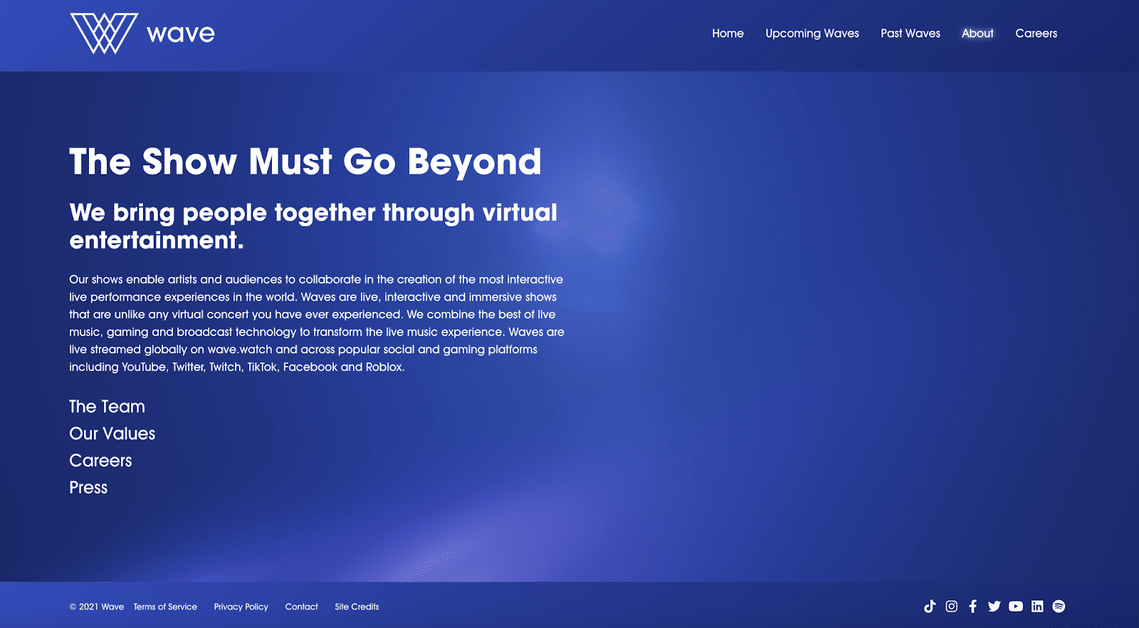
WaveXR divides its About Us page into four distinct parts: the team, values, careers, and press. The page opens with a brief company description and then invites the reader to click on one of those four subheads to learn more.
It is always a good idea to include press mentions on your About Us page. Press can help build social proof and boost the credibility of your business. Consumers can learn about your company through any relevant news stories you receive.
Billing
Chargebee, ReCharge, and Cedar are prime examples of adequate About Us pages in the billing space.
Chargebee
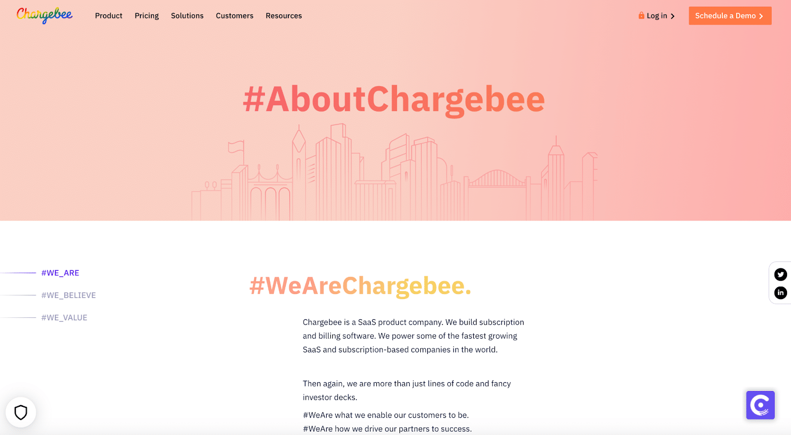
Chargebee uses social media hashtags to connect its About Us page with social media. Headers greet consumers with a hashtag, encouraging social shares on Twitter.
Consider how you can convince your consumers to share your About Us page on social media. Highlighting a branded hashtag is an excellent place to start.
ReCharge
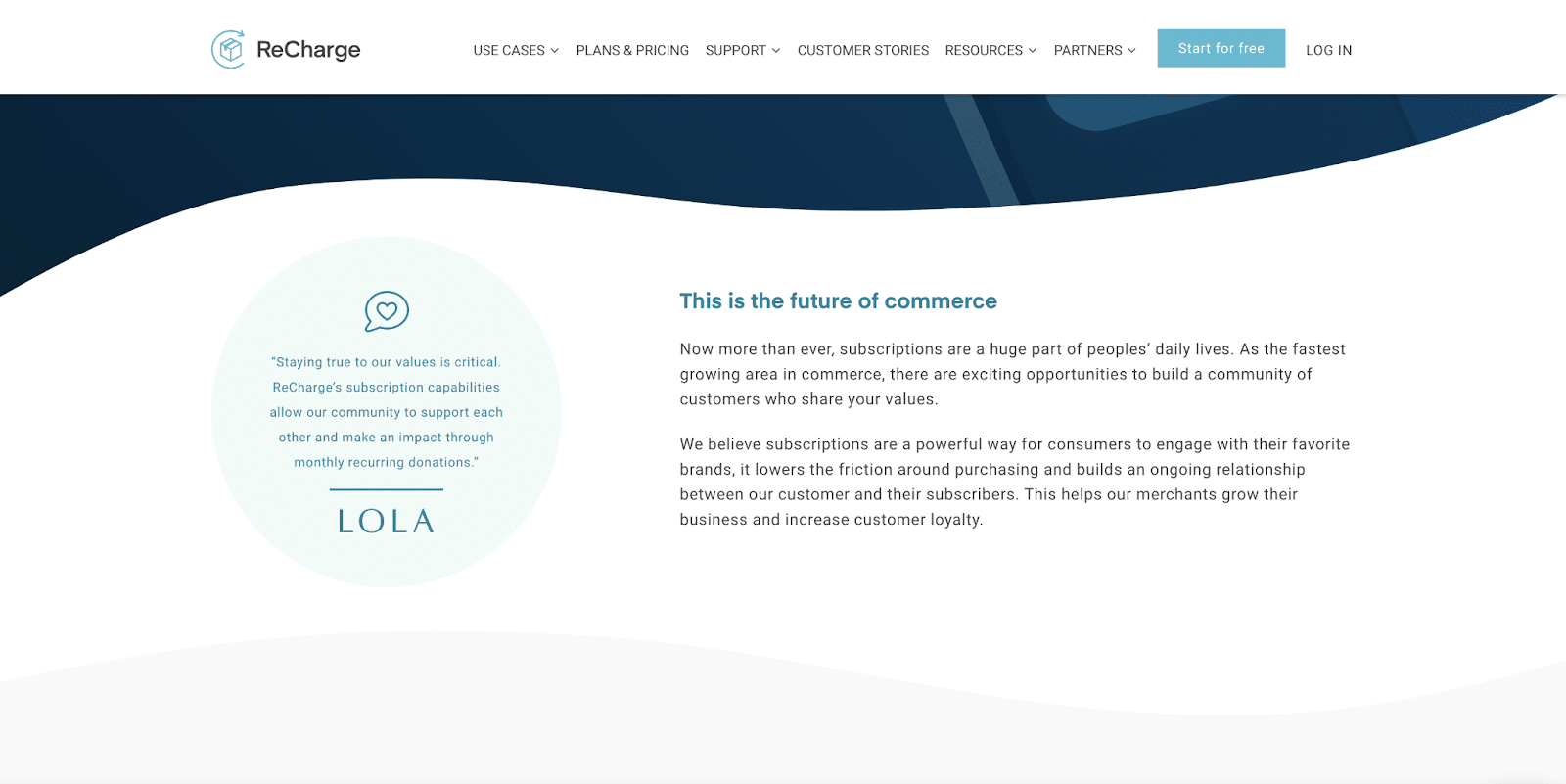
ReCharge features a customer testimonial directly on its About Us page. After all, what more effective way to learn about a company than through an existing customer?
Ask one of your most passionate customers to share a testimonial. Feature it on your About Us page to increase credibility.
Cedar
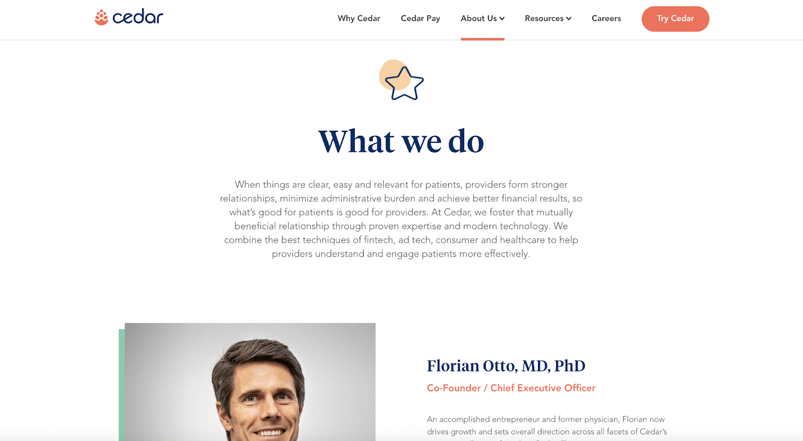
Cedar combines many design elements, including text, illustrations, photos, and contrasting colors on its About Us page. It opens with a company description and immediately introduces the co-founders.
Use as many different design elements as you can on your About Us page that are in line with your brand. Varying elements of different styles can keep the consumer engaged with the content.
Travel
Collective Retreats, Localeaur, and Away lead the travel industry in innovative About Us pages.
Collective Retreats
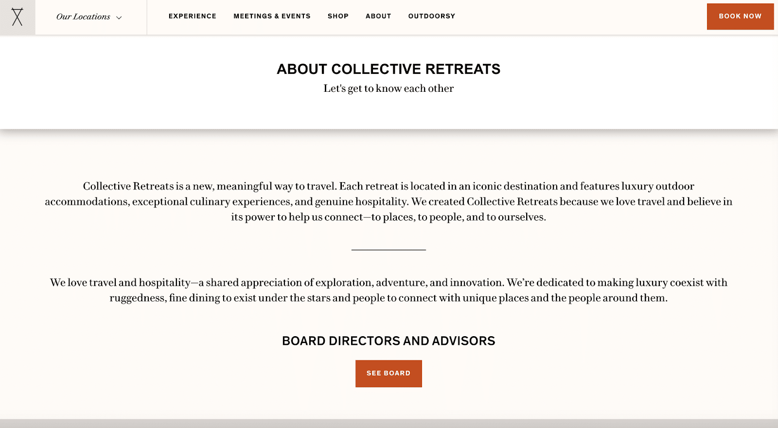
Collective Retreats offers a basic yet effective approach to its About Us page. The page features three sentences covering the business description and a brief overview of the overall approach to its product.
Distill your company down to one or two sentences, and make sure you add that to your About Us page. A simple company description will be helpful on the page.
Localeaur
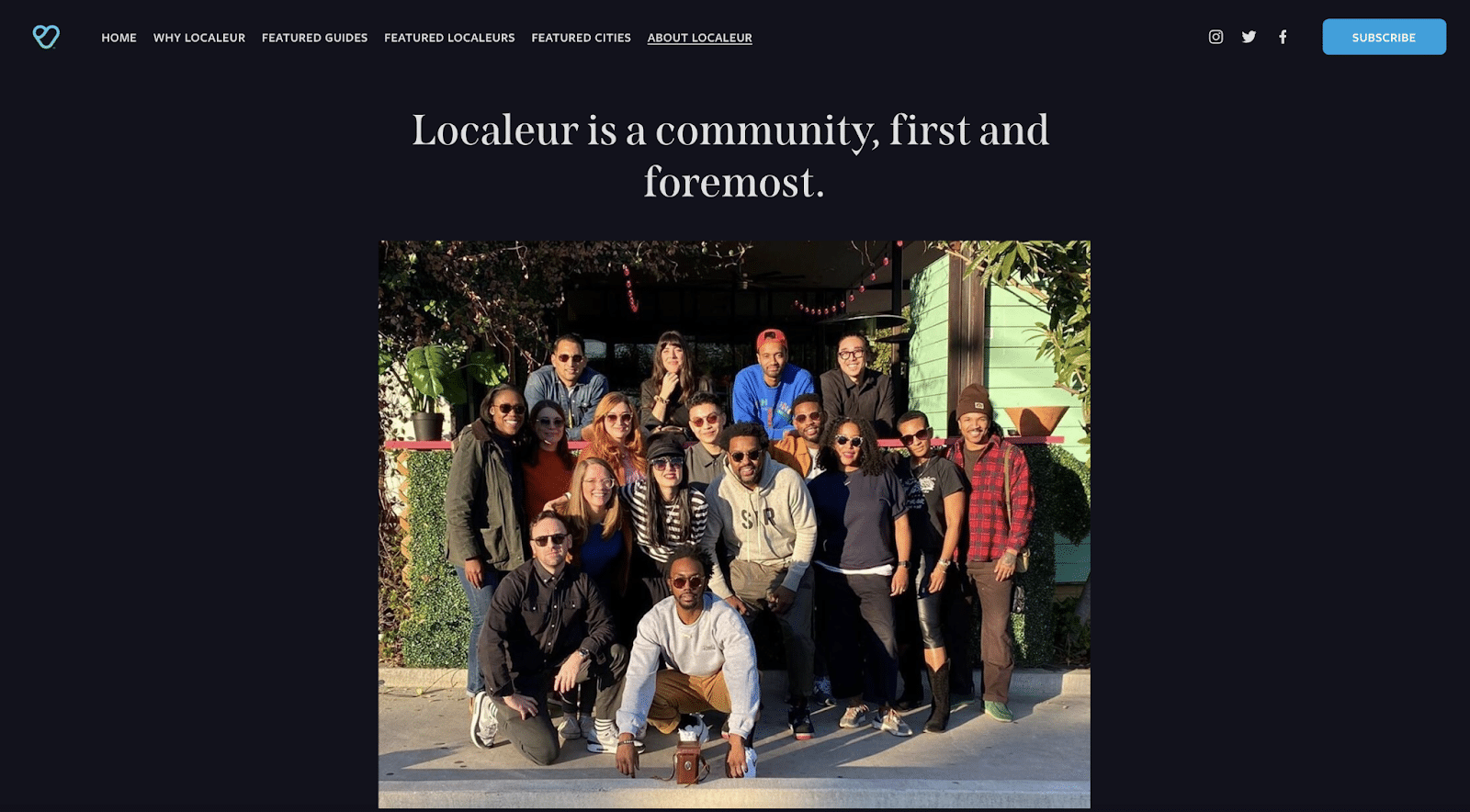
Localeur showcases an employee photo on its About Us page as the main content. This is an obvious choice for the community-focused business.
Consider adding a photo of your team at the top of the page. This shouldn’t be a stock photo but an authentic image at an offsite event or employee bonding experience.
Away
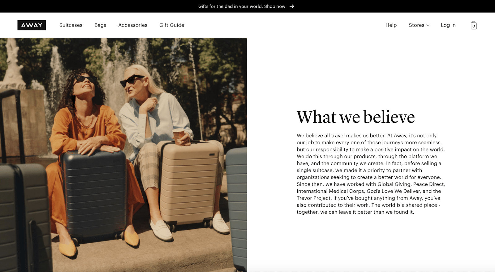
Away’s About Us page is centralized around what the company believes in. This approach is similar to the companies that lead with their values.
Away offers a polished, memorable approach to sharing what its business stands for with high-quality imagery and sharp copy.
Best About Us Page
Dave had the best About Us page due to its simplistic design, straightforward copy, and engaging illustrations.
The page matched the company’s brand and shared the founding story in a fun, light-hearted way.

Conclusion
Your website deserves an amazing About Us page. This is your opportunity to tell your story and the business’s mission and vision.
With a powerful About Us page, you can connect with customers better and build trust. Over time, that trust will turn into recurring revenue from loyal shoppers who continue to support your business.
Want to share your About Us page ideas? Please share them with our community in the comments below!

