Is there any procrastination method more time-honored than the Monday morning email catch up? Or, with 3.7 billion email users in 2017 alone, more widespread?
But email isn’t just good for banishing the Mondays. It’s even better for marketing. Consider this: at a median ROI of 122%, email marketing boasts a return over four times higher than other marketing strategies.
That’s what marketing agency Promodo discovered when they helped Shokosmile, an online retailer of all things chocolate, transform their email into a full-fledged sales channel almost as sweet as their products. Sweet to the tune of a 2100% sales increase and conversion growth between 5-10%, to be precise.
You can cash in on that same candy-coated success. Because like chocolate, successful email marketing is as simple as finding the best ingredients and combining them at just the right time. In other words, it all comes down to building your email list.
But if you’re not sure where to get started, don’t worry. In this post, we’ll provide you with actionable recipes for bulking up your email list fast, including:
- Create User-Friendly Capture Forms
- Use Giveaways For Instant List-Building
- Make Magnetic Content Upgrades
- Leverage Social Media for Community Growth
Without further ado, let’s dive in and talk about capture forms.
Create User-Friendly Capture Forms
Asking for someone’s email address is a lot like asking someone to prom. Come on too strong, and they’ll run for the hills. Make it too subtle, and they won’t notice you’re asking.
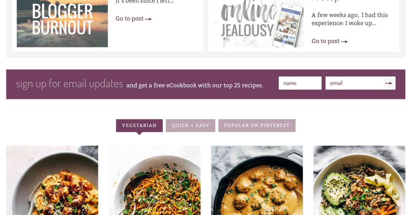
At its most dressed-down, you can use on-page widgets for the ask. Check out how Pinch of Yum sandwiches theirs between content on their homepage.
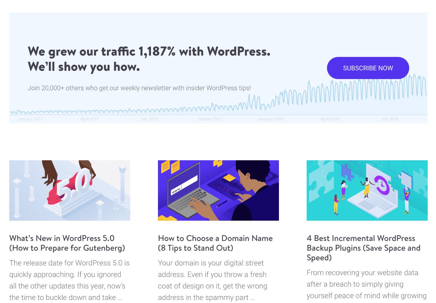
We use a similar method on Kinsta, sprinkling our content with the ask box on our main blog page.
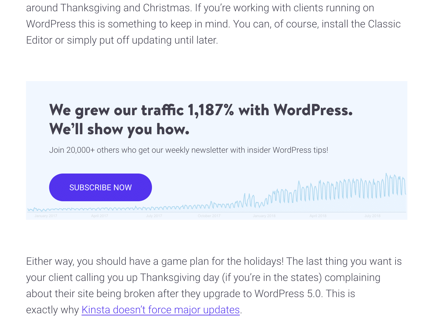
We also plug it inline into our blog posts, as you can see in one of our more recent pieces about what’s new with WordPress 5.0. Our in-house developer programmed it so that it shows up after a certain number of paragraphs. And if you’ve already subscribed, you won’t see the CTA box.
If you prefer a more interactive approach to lead generation than the brick-and-mortar ask box, you can spice things up with pop-ups and header widgets, instead. But for the best results? Consider combining them together.
That’s what Buffer did. Adding multiple sign-up forms to their website helped their subscriber count grow to twice its size — all in a single month.
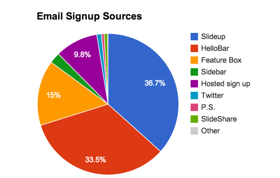
So adding together more than one type of sign-up form is a definite recipe for success. But before we dig into the different types of popups and tools you can use, a quick note about interstitials.
Considered a form of interruption marketing, interstitials are any page or pop-up that forms a roadblock to users’ path to content, either by displaying over the content or interrupting it. Users have no choice but to interact with the display before they can proceed. Forbes was a classic example of the “before” interstitial (also known as a “prestitial”).
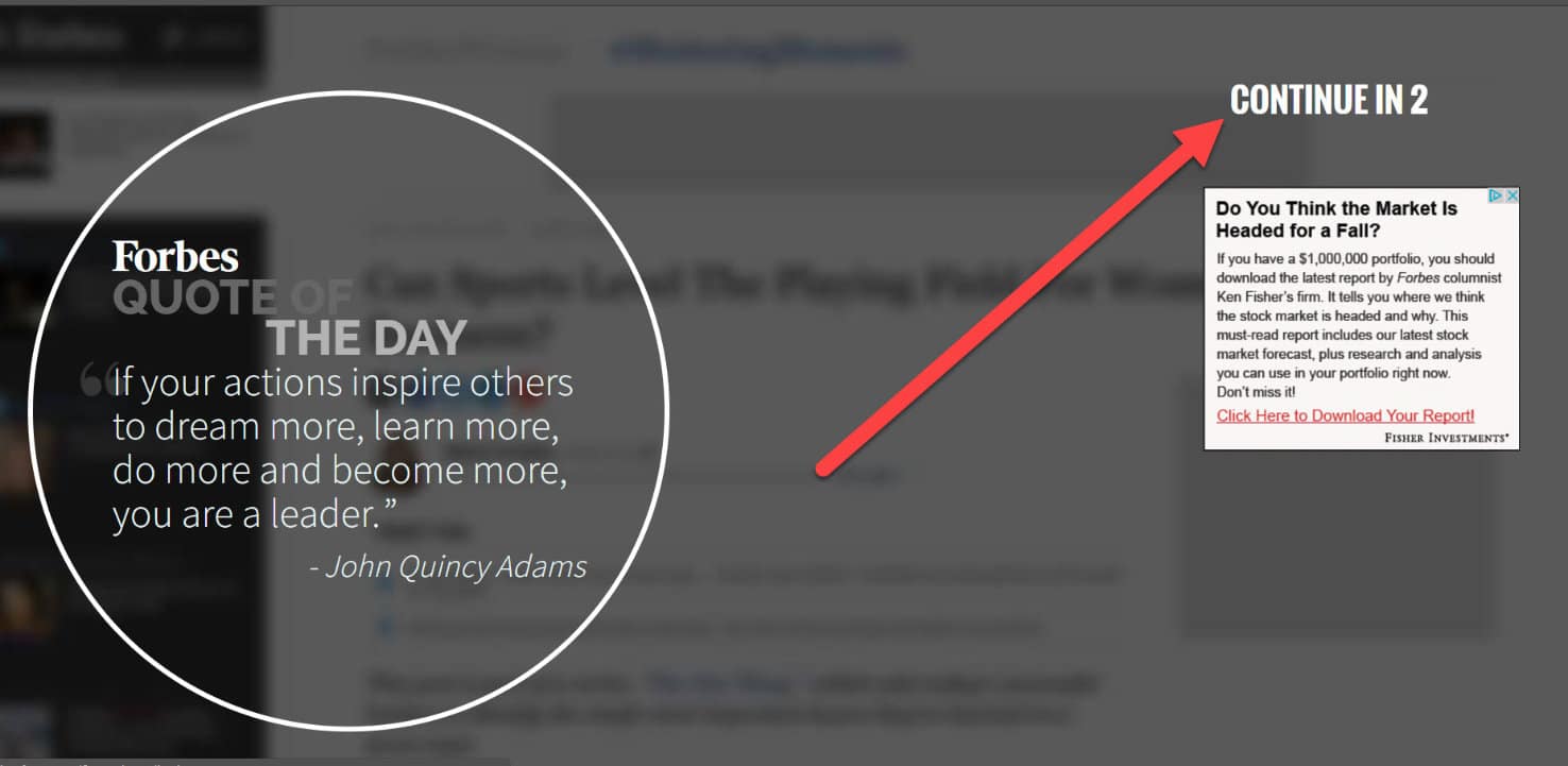
As a best practice, avoid these like the Sunday brunch rush. Google will cripple any website’s ranking that it flags as having these intrusive forms. Which means all of the below is a big no-no for anyone who wants to keep or grow their search engine position.

Note that although this change was specifically rolled out for the mobile version of websites, Google has moved everything to a mobile-first index, so it’s important for all websites.
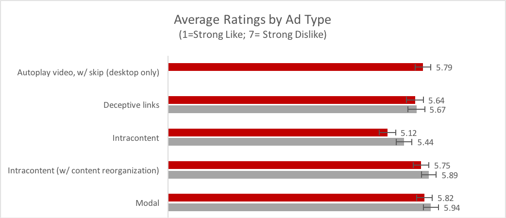
If that’s not enough to convince you to toss interstitials in the bin and never look back, there’s also the fact that users report these interactions as among their most-hated advertising practices (defined as ‘modals’ in this study by the Nielsen Norman Group). On a one to seven scale, modals (interstitials) landed at 5.82 for desktop users and 5.89 for mobile users, beating even autoplaying videos without skip for most-dreaded advertising type.
With that out of the way, let’s take a quick tour of some options for sign-up forms that work really well. First up, the welcome mat.
This can be a controversial topic, as many would consider this an interstitial. And some might not prefer this method as it might not be seen as the most user-friendly. However, if done correctly, they can have some serious sign-up power. Online learning management system Fedora, now rebranded as Teachable, deployed this strategy on their homepage to increase sign-ups for a promotional webinar.

The result was a 70.37% increase in just five days. So if you want to double your email list in less time than it takes for a new Game of Thrones episode to roll out, a welcome mat is definitely an option worth considering. However, if you’re worried about the Google popup penalty, you may want to play it safe and enable this method only for desktop devices.
If you’re interested in setting this up on your website, the Thrive Leads plugin is an excellent option with a one-time license fee of $67.
Now, let’s switch gears and talk about floating bars. These are sign-up forms that hover above or below a webpage and “float” as the user scrolls. American Eagle uses a floating bar at the bottom of their page to create an unobtrusive but omnipresent sign-up point.
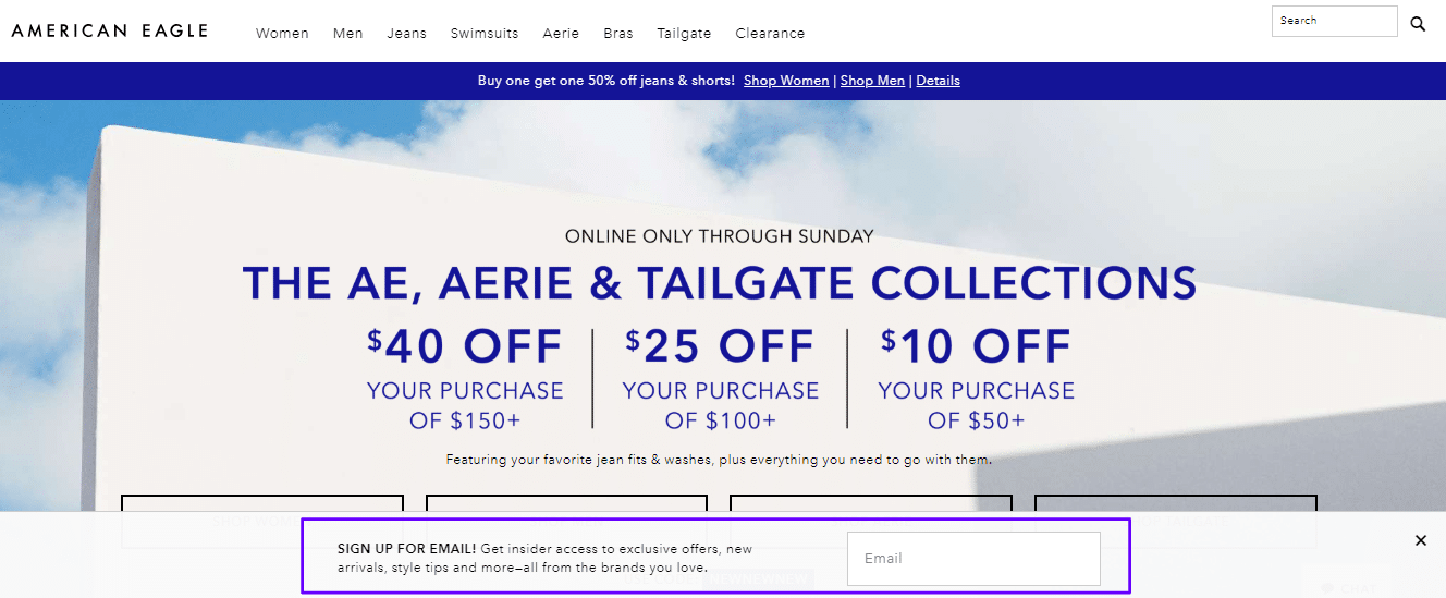
Just how effective are these low-key forms? Using a floating bar rewards ActiveCampaign with 800 new free-trial sign-ups every month.
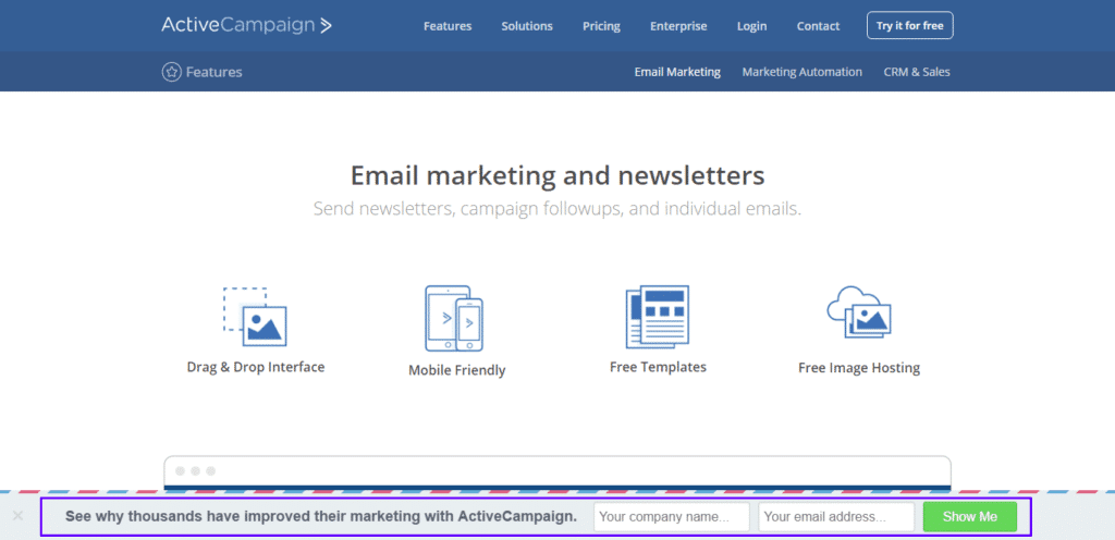
So in short, the answer is “very effective.” To add a floating sign-up bar to your WordPress site for free, check out the Popup Maker plugin.
Appropriately ending our discussion of opt-in forms is the exit-intent popup. As the name implies, these pop-ups show up when users display a behavior indicating their intent to leave the page. Triggers for exit-intents can be rapid mouse movement toward the top right of the screen (where the close button typically is), clicking on off-page links, set on a timer, or activated on scrolling.
Here’s an especially on-the-nose example of an exit intent from one of our own landing page experiments. Note that you can easily use this for email captures. In our case, it made more sense to drive traffic to plans page.
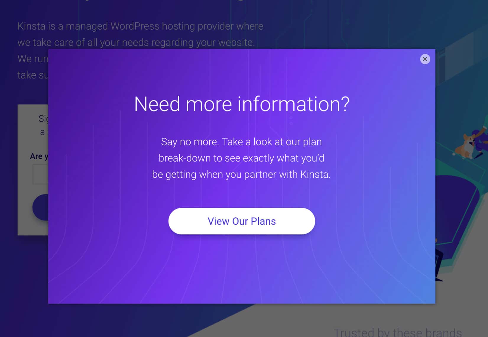
Since these only show up after a user has interacted with their desired content, they’re not as intrusive as other forms of full-page or overlay pop-ups. They’re pretty successful, too.
Case in point, using an exit-intent overlay helped Wall Street increase their newsletter sign-ups by a whopping 279%.
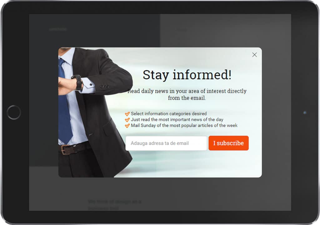
Since Wall Street is an online business publication touted as one of the most read on the globe, that 279% increase is a significant feather in their proverbial — and financial — cap. A tool like Hotjar is great for this.
But if you prefer a more hands-on approach than plugins for building your capture forms, Sleeknote is an excellent solution that’s free to try, intuitive, and easy to integrate with your WordPress site. To get started, pop over (pun intended) to Sleeknote.
Click on one of the two purple buttons to get started and go through the sign-up flow. There isn’t any credit card required, so it should only take you a minute to complete it.
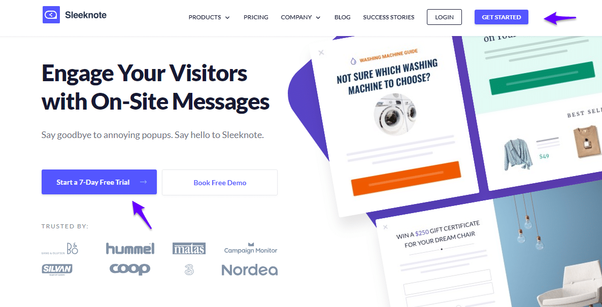
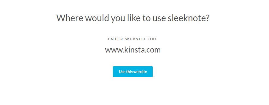
Next, enter the website you want to build an email capture form for and click “Use this website.”
After that, select the option that best fits your needs. For our purposes, choose the first, “collect email addresses,” and hit select.

From there, you’ll be taken to the template page. At present, there are 21 ready-made templates to choose from and four blank templates. Let’s check out the floating bar option, highlighted below.
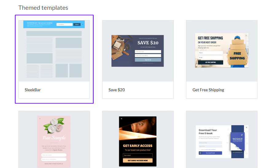
After selecting the template, you’ll be asked to choose the position of your floating bar.
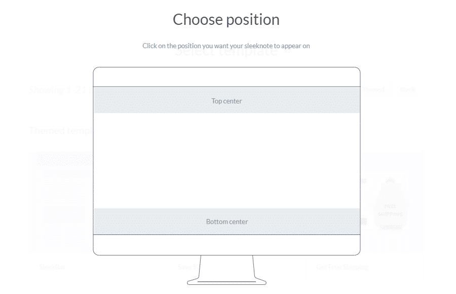
There’s no real right or wrong option here, so choose whatever fits your site best and continue clicking through. Next, you’ll be taken to the editing dashboard.
As you click on individual elements, the side-menu will change and allow you to customize your floating bar.
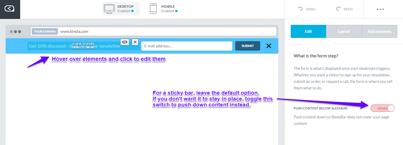
Here’s what it looks like after we’ve done some customizing.
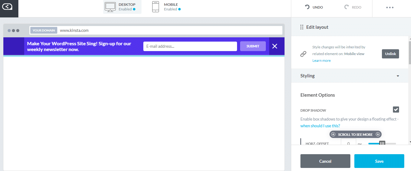
Once you’re satisfied, click “Next step” at the bottom of the page. You’ll be taken to a “success” screen if you want the widget to change after users enter their email addresses. For now, leave it disabled and keep clicking through.
On the last page, you’ll be asked to name your Sleeknote and given options to change display rules, integrate with email software, and set up your goals.
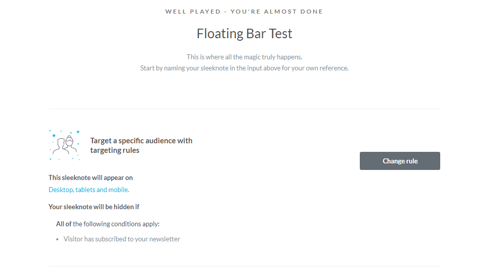
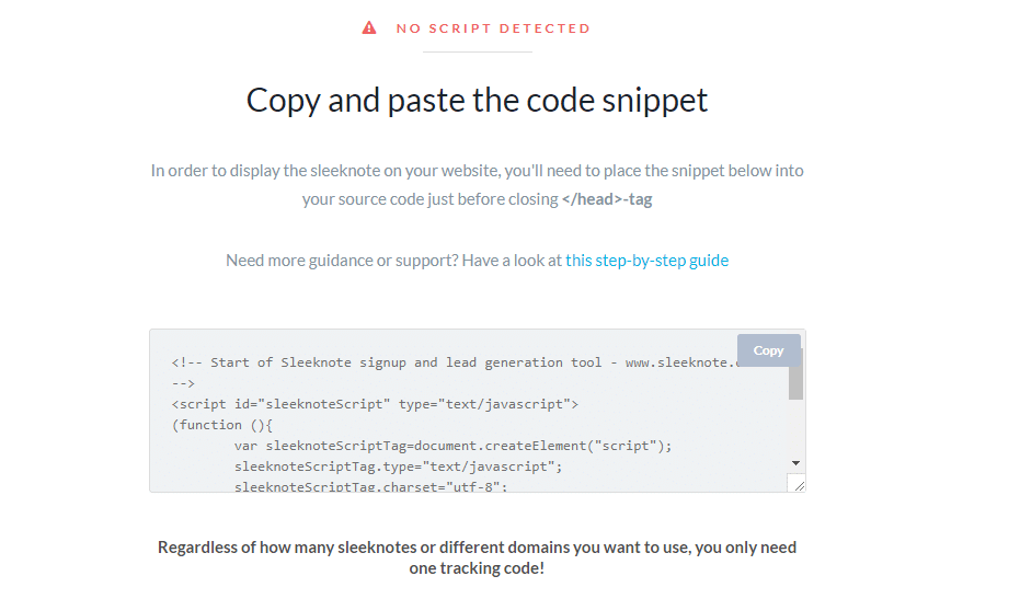
Now all you need to do is click “save” at the bottom and go to the next screen to get a copy-and-paste code for adding your Sleeknote to your website. Check out our step by step tutorial on how to add code to your WordPress header.
Afterward, if you want to edit your floating bar or track its progress, you can access it from the “My Sleeknotes” option.
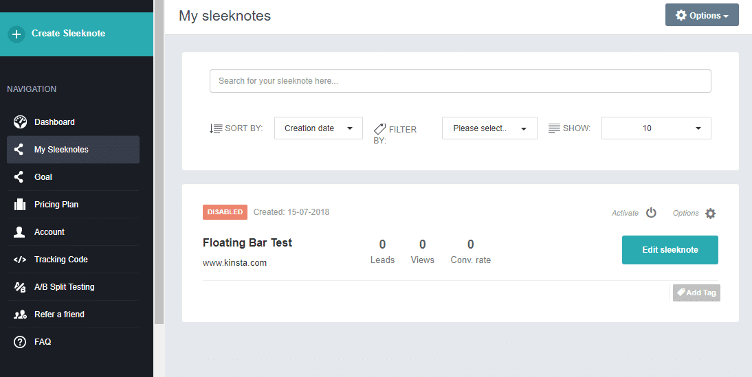
Easy as that. For more great options to integrate sign-up forms into your website, check out the list of our favorite lead-generating plugin powerhouses.
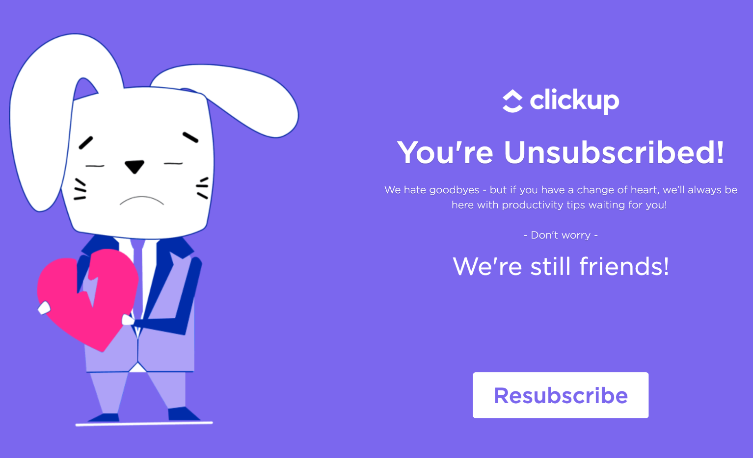
And don’t forget about creating an easy form for resubscribing. If you’re creative (great example from clickup below), you might be able to get back some users that choose to unsubscribe from your email list.
Next, let’s talk about one of the most explosive methods for building up your email list.
Giveaways.
Use Giveaways for Instant List-Building
Is there anything more satisfying than winning a competition? Even if all we have to do is enter our name, or in the case of a website, an email address, the joy of beating other competitors is as sweet as honey.
You can use that joy to rake in the email addresses. While holding giveaways isn’t always the cheapest solution, it’s among one of the most effective for email marketers. Why?
Because online contests all collect one thing universally: the coveted email address.
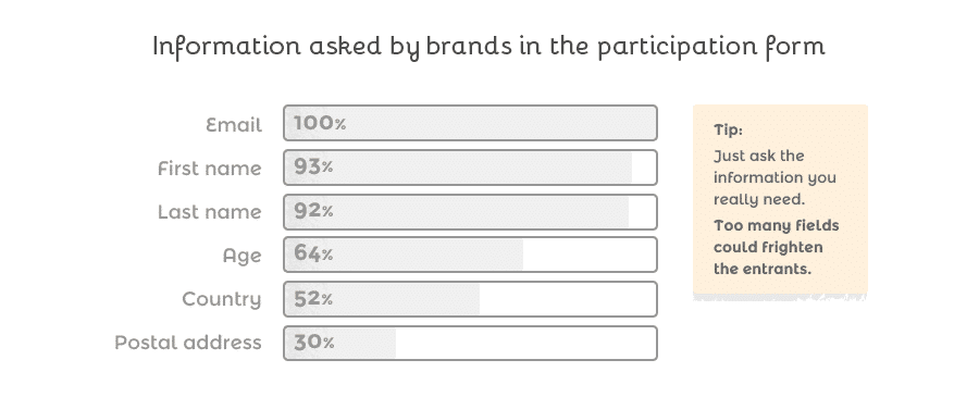
The second most common element collected during a contest is the participants’ first name, which adds to the email marketers’ delight. Having a first name handy gives you the capability to send personalized email campaigns down the road, something 82% of professionals report as increasing their total open rates.
And the benefits are compounding. Automated emails, such as personalized campaigns, have click-through rates over 152% higher than non-automated campaigns. So, all in all, a giveaway is a long-lasting gold mine for someone who wants to build up their list, offering rewards both in the here and now and the there and then.
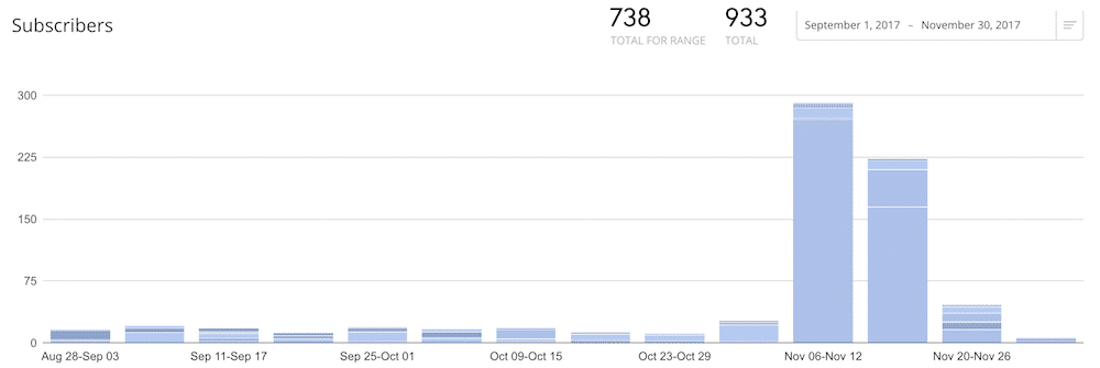
But just how much of a gold mine? Josh Earl hit the equivalent of the California Gold Rush when he offered a premium code editor, Sublime Text, as part of a giveaway. His list exploded by 3,418% in 11 days (suggested reading: 10 Free HTML Editors on the Market for WordPress Developers and Advanced Users).
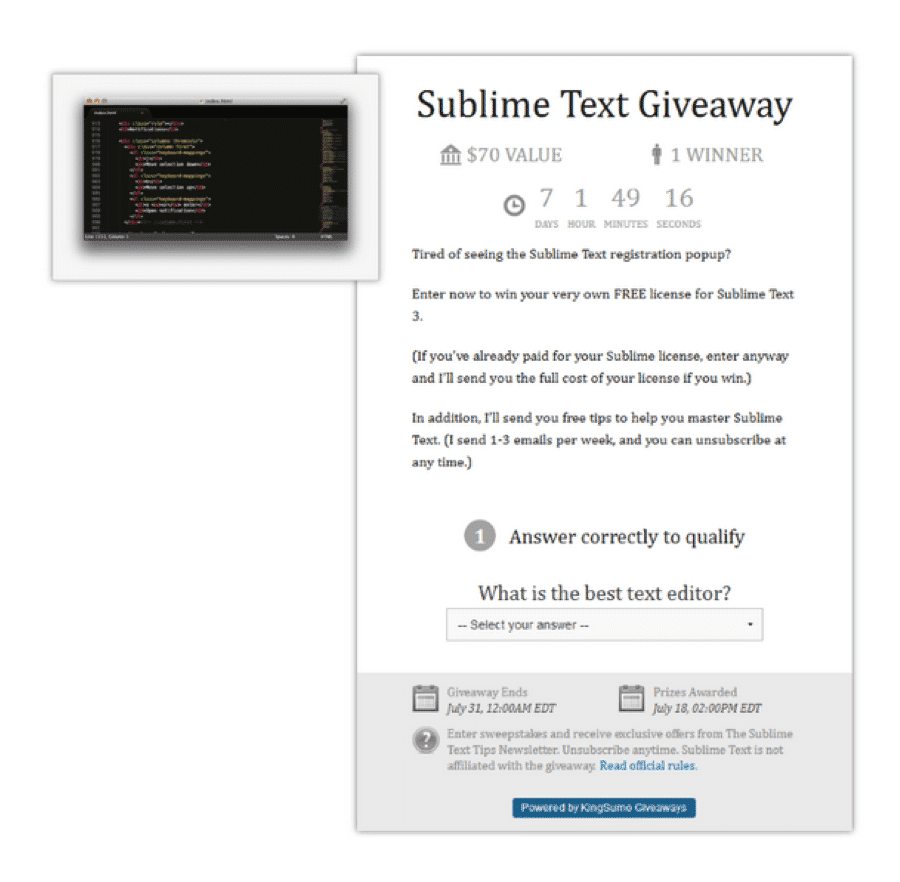
This simple giveaway didn’t just beef up his email list, either. It helped his site bypass over 2,000,000 competitors and claimed the 49,137th slot in Alexa’s global site rankings. Still not convinced? There’s more.
Another entrepreneur used a giveaway on her blog to increase her subscribers. Her efforts resulted in more than double the traffic and subscribers, leading to a very sharp uptick in growth.
One more example. Noah Kagan, Chief “Sumo” of the Sumo Group, has used giveaways to generate over half a million new email subscribers in the last four years. You can see an example of one of his giveaways below.
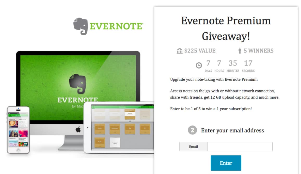
OK, now that we’ve eliminated even a shadow of the doubt, let’s look at what makes a giveaway worth the trouble — for both your new subscribers and your budget. The most important element of a giveaway is making sure you’re offering something useful for your users and not excluding any of your demographics, whether your contest is on social media or directly on your website.
You can offer something with a straight-cut dollar value like InkBox does with a shopping spree on their website.
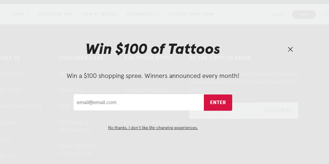
Or, you can give out individual prizes like Noah and Josh used. Here’s an example from a Twitch channel.

Although the prizes are all high-dollar, what makes this giveaway effective is its audience attunement. All of the prizes up on the block are items that the gaming-centric audience will actively want to use.
Consider, for instance, if a KitchenAid stand mixer was being offered instead. Sure, it might compete with the dollar value of a game console, but it’s not as likely to resonate with the user base if they don’t have an affinity for baking.
OK, so giveaways are a great list-builder if you’re giving something audience-relevant away, but how do you set one up for your website?
For that, free tools like WooBox are indispensable. Let’s take it for a spin now. First, swing over to the WooBox homepage. Click on one of the two navy buttons to sign up.
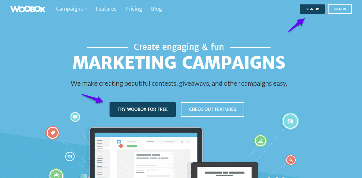
Once you’re done, you’ll land on this dashboard. Make sure the first option, “Microsites,” is selected at the top.

Then, scroll down to view the templates. Select the second option, “Sweepstakes.”

Give your campaign a name. Thinking about stand mixers got me thinking about cookies, so that’s what I’ll go with for this test. If it were a real campaign, something like premium plugins or Kinsta packages would be a better choice for a subject. Remember, audience attunement.
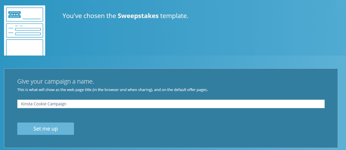
Here are the editing options. From here, you can rename your campaign, add a description, set your start and end dates, and set rules for entries. After you’re done with that, look in the left-hand menu and select “customize.”
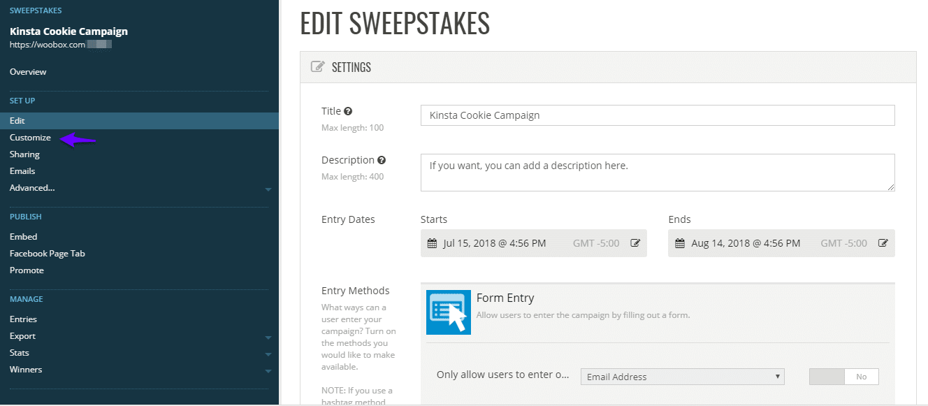
It’s pretty plain-jane without some alterations. Fortunately, customizing your giveaway is super easy.
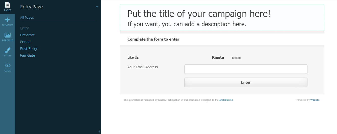
Click on an element to edit it directly and customize each feature. Once you’re done, click the green “save changes” button at the top.
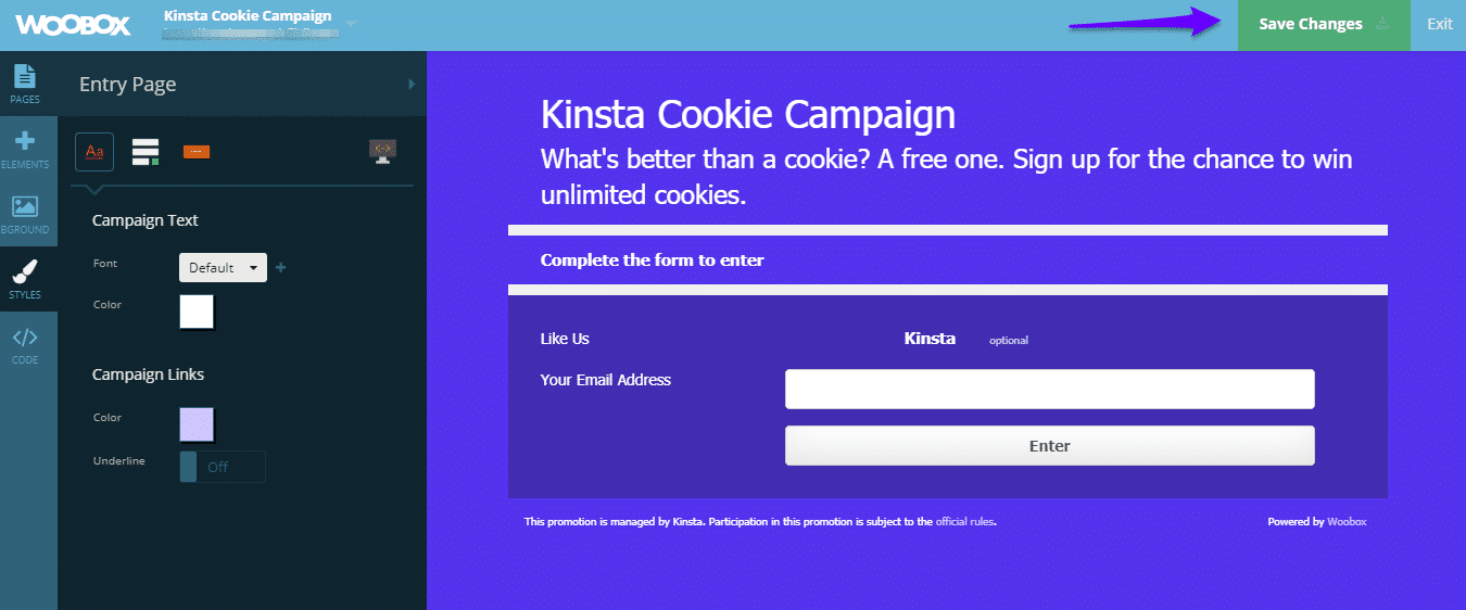
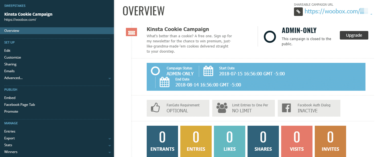
After your campaign has saved, select “exit” to get to your overview page where you can track your progress, grab an embed code to place it directly on your website, set up social sharing, and more.
If you’re looking for a flexible and modern way to run engaging giveaways, Woorise WordPress is a great option.
Giveaways are a powerful way to grow your audience, and Woorise makes it easy to launch them with features like social sharing options, instant win, referral entries, and automatic winner selection. Beyond giveaways, Woorise lets you build landing pages, forms, surveys, quizzes, and popups, so you can run all kinds of lead generation and engagement campaigns from a single platform.
With 2,000+ templates and integrations with platforms like Mailchimp, HubSpot, and Zapier, it helps you create targeted campaigns fast and send your data exactly where it needs to go, without extra steps.
OK, if you’re not ready to commit to a giveaway, what are your other options? If you’ve got your hand in the content cookie jar, it’s time to start thinking about upgrades.
Make Magnetic Content Upgrades
Out of businesses with a blog, only 57% of them have nabbed a customer from their readers. What’s the ticket to making sure you land in that 57%?
Making the right offer at the right time. Specifically, providing content upgrades. If you’re not familiar with the term, a content upgrade is whenever you offer users bonus content to what’s on your site in exchange for their email address. It doesn’t have to be super fancy. It just has to add value for the user.
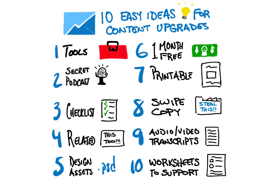
Cheatsheets, checklists, and ebooks are all popular options. The more targeted your upgrade, the better. Using custom content upgrades on their blog posts helps CodeinWP’s content convert better anywhere from 831% to 1613%.
Tim Soulo touts the benefits of content upgrades for email conversion rates, as well. His conversion rate grew by 300% in a single month as a result of adding content upgrades.

Here’s a quick visual summary of potential content upgrades you can offer on your website.
Now, let’s look specifically at how other people are using content upgrades.
Aptly, here’s an example from Wendy Maynard, a marketing specialist who works with small businesses.
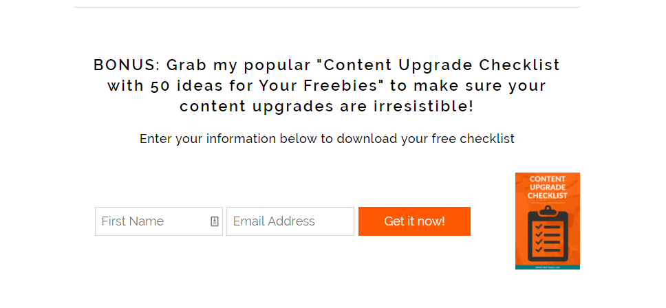
Beyond the appeal of being highly meta, this content upgrade is laser targeted to the page it’s found on. If you’re reading her blog on what a content upgrade is, chances are that an additional, no-fuss list will be a welcome supplement.
NerdWallet takes a slightly more general approach, offering a free ebook on the best industries to start a new business on a page dedicated to writing a business plan.
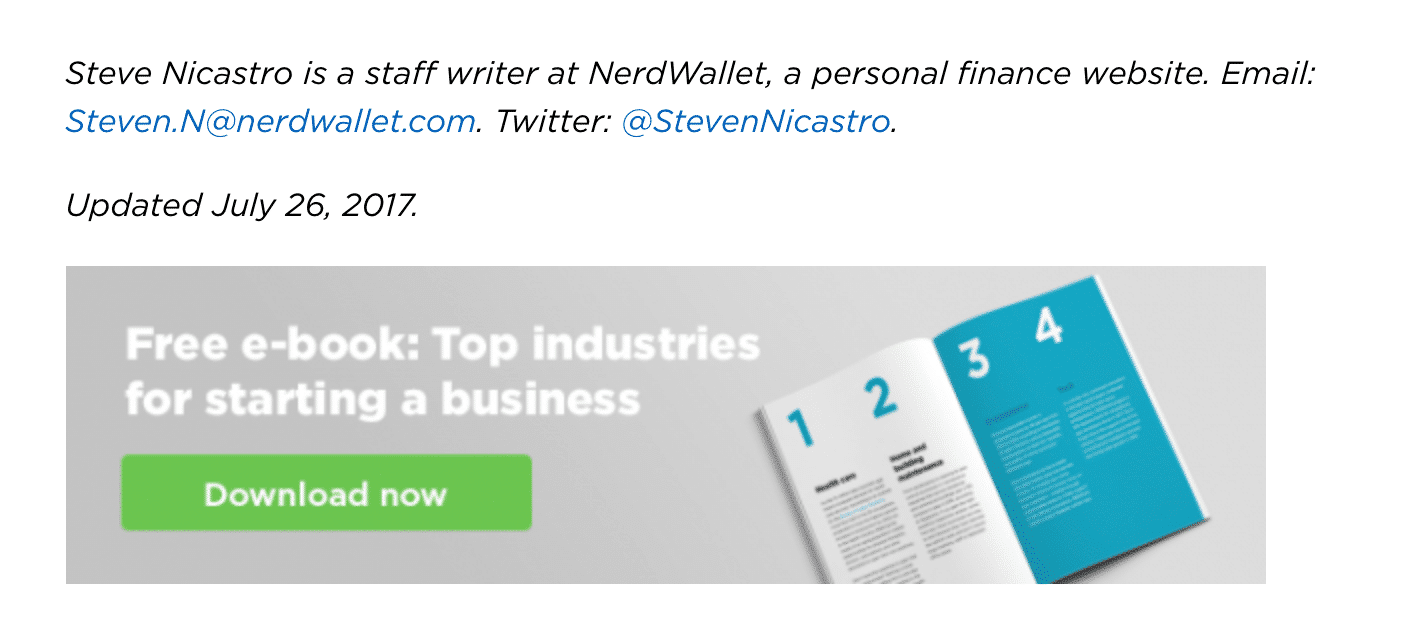
Ultimately, what you offer as a content upgrade will depend on your audience, resources, and specific goals. To set it up, refer back to the first section of this article and use the capture form tools there to build your content upgrade — just make sure it really is an upgrade.
Nothing makes someone hit unsubscribe quite so fast as spammy material, assuming the emails make it through in the first place.
For our last tip, it’s time to go off-site and dive into the party itself. Specifically, it’s time to get social.
Leverage Social Media for Community Growth
Social media can help your list boom with both paid and free methods.
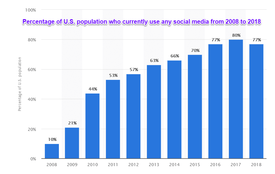
And considering 77% of the US population has a social media profile, it definitely has the reach to find your future subscribers.
Let’s check out the free options first.
Facebook lets brands put CTA buttons directly beneath their cover photo. You can see this in action on our Facebook page.
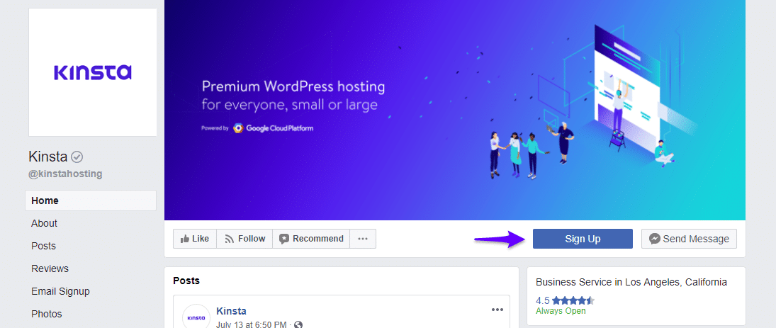
Clicking on the sign-up button takes you directly to a page to login or sign up for Kinsta with an email address.

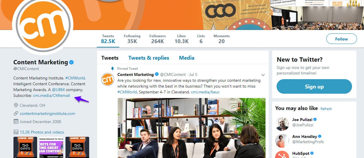
Twitter allows for a similar, albeit slightly less straightforward option. Although you can’t link up a button, you can place your email sign-up page into the bio section. Just be sure to use the word “subscribe” so people know what they’re heading into.
Here’s an example from the Content Marketing Institute Twitter.
Don’t think using online communities will make much difference to your email list? Consider the case of Daniel Ndukwu, who used the social world to grow his subscribers by 339% in just two months.
Greenhouse Software saw similar results when they used split-testing and retargeting on social media, growing their email list by 15% in a month with a bottom-of-the-barrel paid advertisement.

Wee Squeak, an online retailer for kids shoes, likewise saw staggering rewards with low market spend. Spending $90 on Facebook ads yielded them over 600 emails.
So, how can you use these platforms to grow? In addition to linking up your sign-up pages in your bio and business pages, there are two big (and cheap) options available.
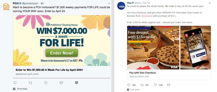
Although Twitter Cards don’t collect email addresses directly anymore, these can be used to ask for subscribers or direct users to a squeeze page where you can offer content upgrades. Or, you can use them with the giveaway from our previous step for even more stellar results. Check out how PCH and Visa use these different combinations below.
The second paid solution is with Facebook Lead Ads. If you’ve never seen them before, here’s a peek from Vets Now. Notice how giveaways are being deployed again.
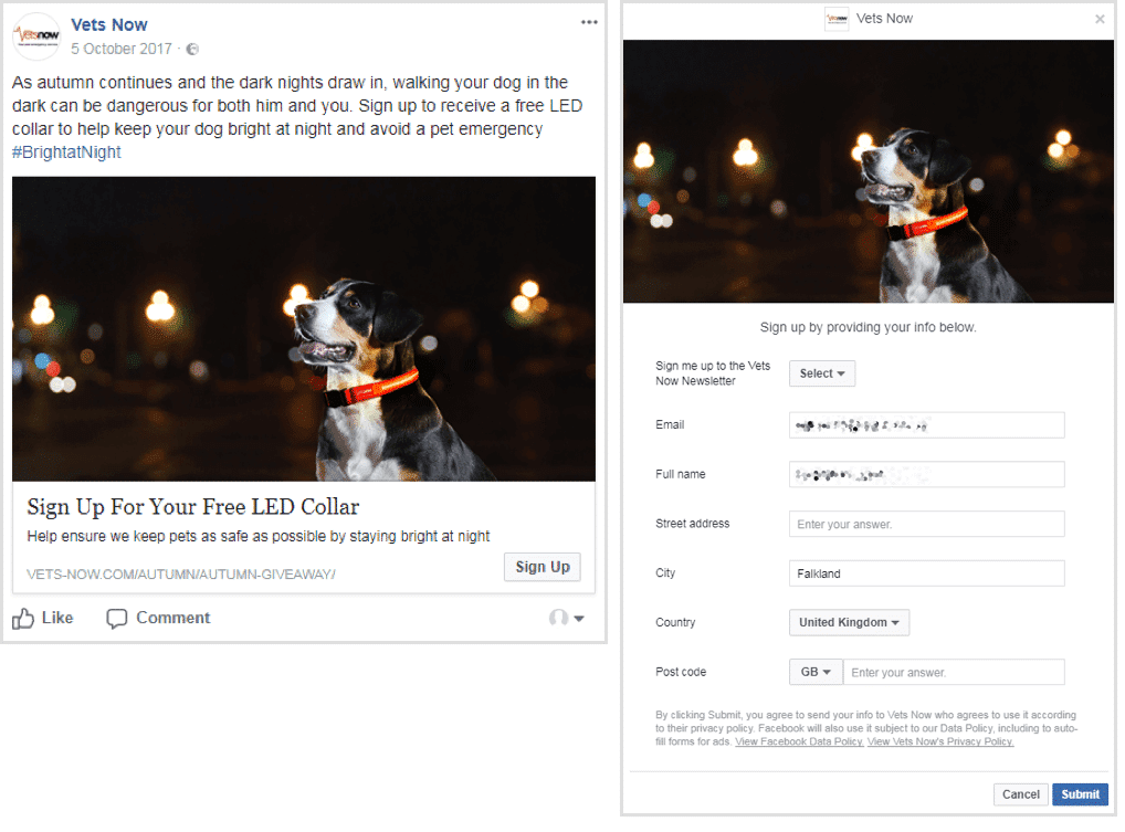
Similar to Twitter Cards, Facebook Lead Ads allow you to work a CTA directly into the post. Unlike Twitter, however, you can use a button that, upon being clicked, will trigger a drop down form for email capture.
Using Facebook Lead Ads helped our earlier example, Wee Squeak, pull off their growth. They were also responsible for Hubble Contacts’ success, generating close to 3,000 new leads for the business at a rock-bottom $2.30 CPL.
Here’s the bottom line:
If you want your email list to blossom, you may have to fertilize the soils off-site with social media. Both free and paid options can help your list hit high tide and get subscribers rolling in.
Conclusion
Email lists are your bread-and-butter for successful marketing and have intensely high ROIs compared to other forms of marketing. And, they’re easy to build. To bulk up your list quickly, start with making sure your capture form is as user-friendly as possible.
Then, share the love: more specifically, host a giveaway to get some instant subscriber growth. After that, turn to your content. Create easy (but targeted) value-adds in the form of content upgrades to rake in even more email addresses.
Finally, don’t forget to turn your sights off your site. Social media communities offer both paid and free opportunities to bulk up your subscriber count.
Although email marketing may be daunting if you’re just dipping your toes in, take heart. This form of marketing is low-effort, high-yield, and with a little elbow grease, may just become your favorite sales channel yet.

