
Website navigation is something that many create as an after-thought after pages and content. In a recent survey, only 50% of internet users were able to predict where relevant content would be based on standard website navigation structure.
If half of your visitors can’t find the page they are looking for, that’s a giant UX problem.
It will lead to higher bounce rates, lower time on site, and lower conversion rates.
If you’re managing an ecommerce store, bad navigation can also negatively affect your bottom line and revenue.
In this post, I cover website navigation from A to Z. This means, you’ll learn best practices, different types of navigation, and precisely what you should do to create the perfect navigation for your site.
Let’s start!
What Is Website Navigation?
Website navigation is the process of navigating pages, apps, and websites on the internet. The technology behind it is called hypertext or hypermedia.
Hypertext or media is text-based web pages that use hyperlinks to connect them to other pages on the internet. A hyperlink is a link that leads your web browser to a URL.
The URL indicates which file the browser should access from the server and it downloads and renders the data so the user can see it.
Internal links lead to different pages on the same domain. External links lead to different pages on another domain, a completely separate website and server.
Website navigation uses menus with internal links that make it easy for visitors to find the page that they are looking for. Good navigation is an essential element of a user-friendly site.
What Is a Website Navigation Menu?
A website navigation menu is a set of links, typically to internal pages, that is organized into a menu. Most websites, including our own, feature a menu at the very top of their website.

This section is called the “header” of a website in web design and development. Some of the most common pages linked to in these menus are:
- About Us.
- Blog.
- Contact.
- Features.
- Plans/Pricing.
The menu can, of course, also include links to other pages.
What Is the Navigation Structure of a Website?
The navigation structure of a website describes how different pages on your site are organized and connected to one another.
For example, some pages and content can only be reached by visiting a specific page. Designers and web developers often plan the navigation structure when making a new website.
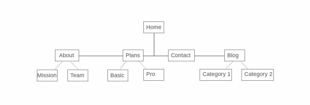
In this example, the About, Plans, Contact, and Blog pages are linked to from the home menu. To access the Mission and Team pages, you need to visit the About page first.
Why Is Navigation Important on a Website?
In the introduction of this post, you learned that 50% of internet users aren’t able to use a standard menu correctly. Imagine how few people would find the right content with no navigation at all.
With the right approach to navigation and menus, you can bring the percentage way below 50%. That will reduce your bounce rates, increase your average time on site, and lead to more traffic, leads, and customers.
Types of Web Navigation
There are three main types of website navigation. They are:
When combined correctly, they help your visitors navigate your website and find their destination without issue. Let’s take a closer look at each one.
1. Global Website Navigation
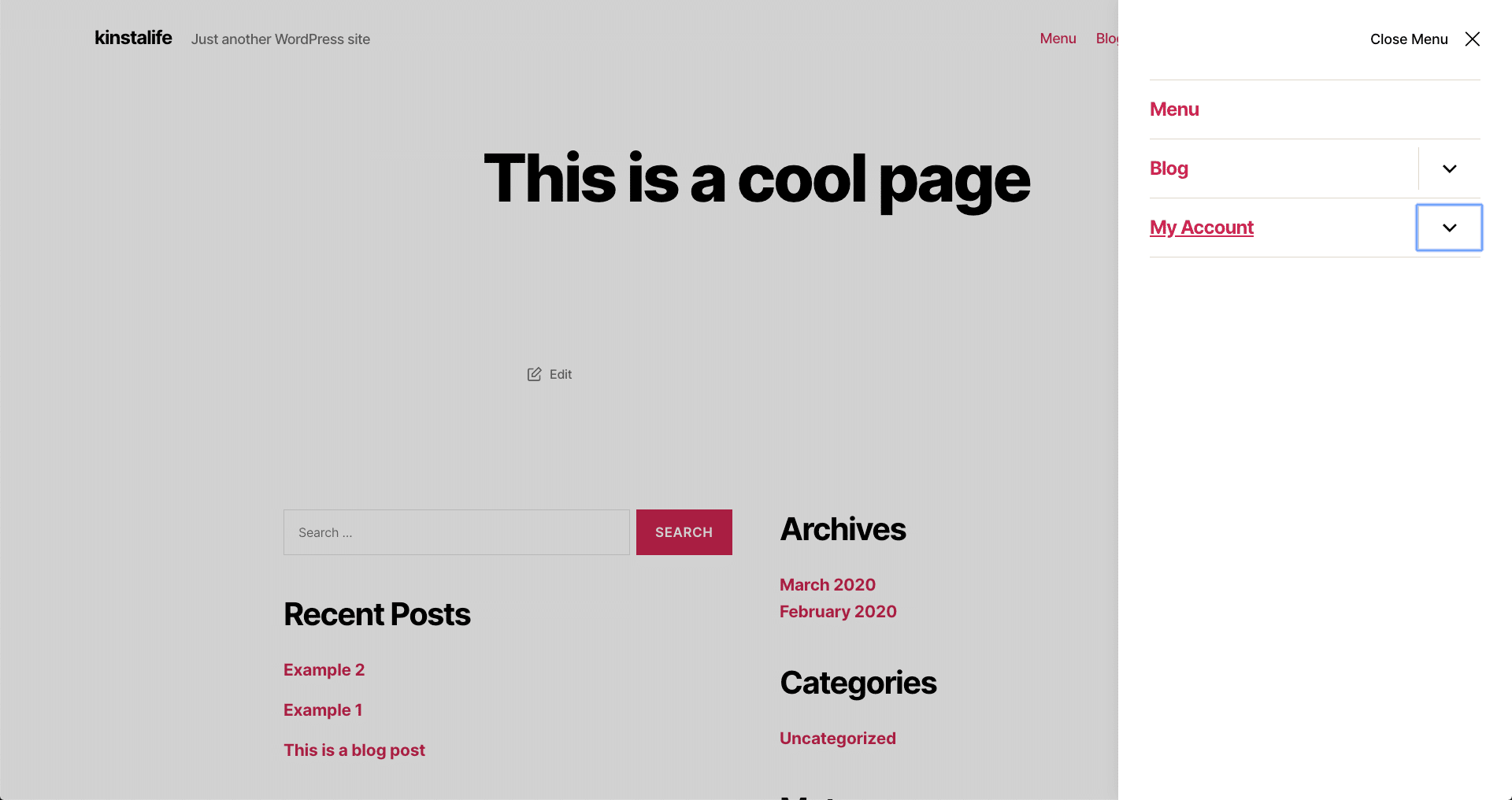
With global website navigation, the menu and the links are identical across all pages of the website. Many modern menus are designed this way, including the menu of our very own site here at Kinsta: if you scroll down the page, the menu “follows”.
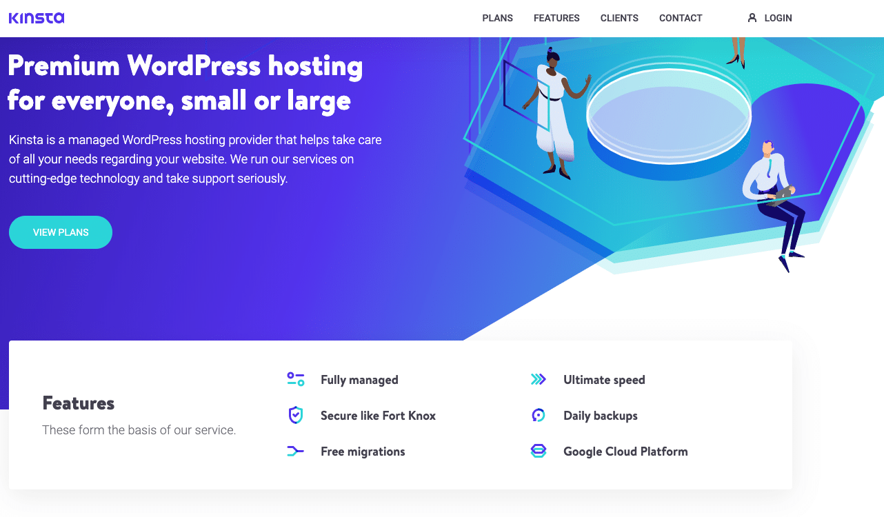
In the screenshot, you can see our simple and easy to understand header menu. It’s the same on all our pages and leads to some of our most important pages and content.
We know the crucial information a prospective customer wants to know about a hosting company before making a decision. That’s why we’ve made it easy for potential customers to find our plans, features, and contact us. And, for existing users, we have the login option to let them log in to their MyKinsta dashboard.
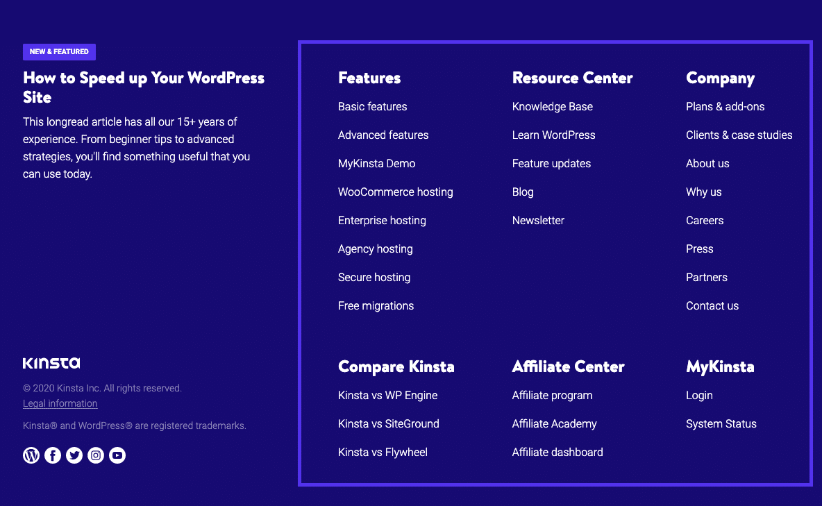
Our footer menu is also global and highlights essential sections of our website and some featured content.
Global menus are the standard for most CMS solutions out of the box.
Every WordPress theme allows you to feature different types and areas for navigation menus. If you need more, you could use a menu plugin to have more options available.
2. Hierarchical Website Navigation
Hierarchical navigation means that the menus change depending on the context of each page.
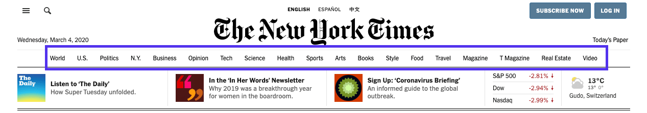
Most newspapers and purely content-based websites feature hierarchical navigation. For example, if you visit the top page of a newspaper, you will typically see links to the top news categories in the header menu.
If the menu were global, it would remain the same after clicking to a different category. But because it’s hierarchical, it reveals new links that lead to subcategories of the category page we visit.
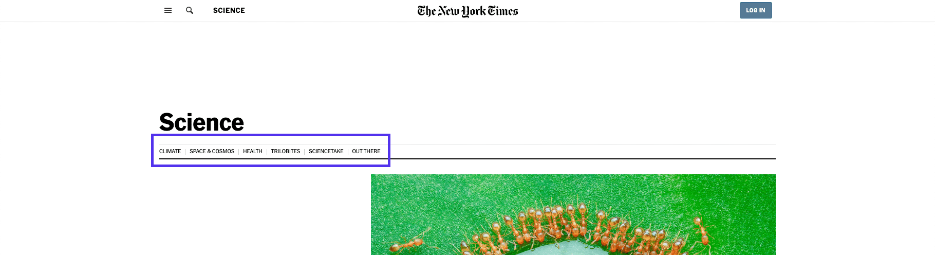
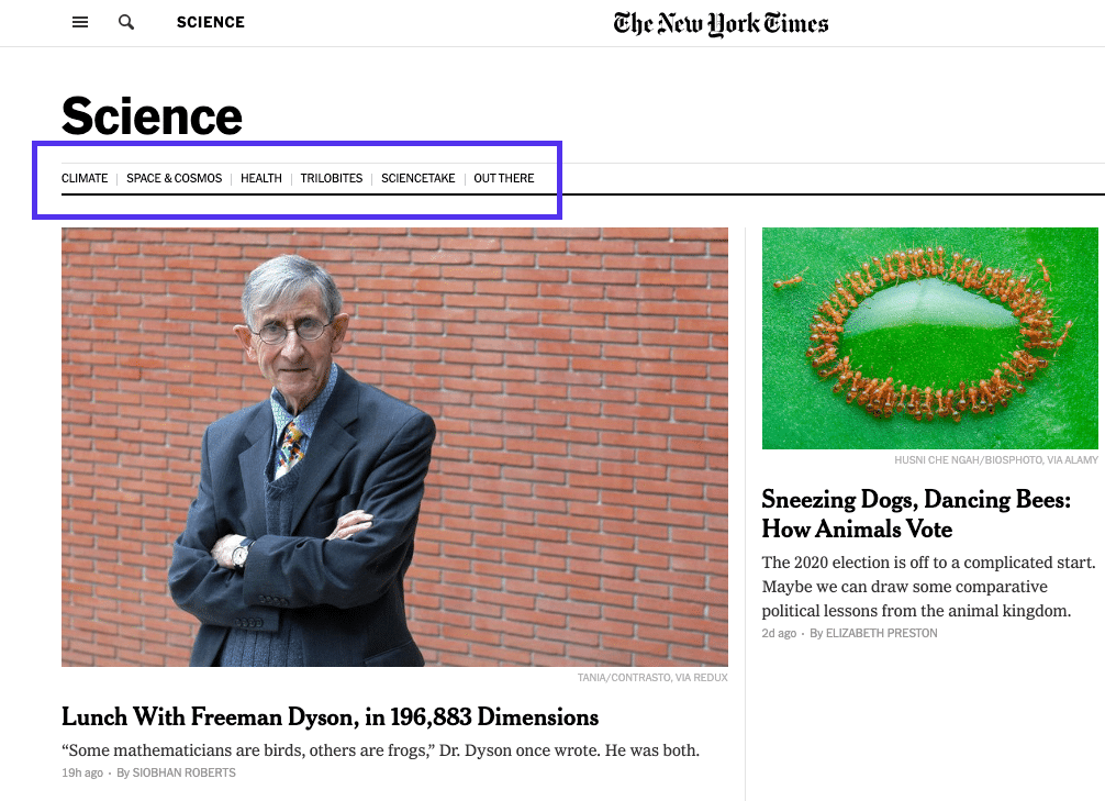
On the New York Times’ Science page, you don’t see the top-level menu at all. Instead, you see links to different sub-sections of science research and articles.
This change is what separates this menu from a regular global one that you find on most smaller sites.
3. Local Website Navigation
In contrast to both hierarchical and global navigation, local website navigation refers to internal links that are included in the content itself. Usually, the user is given options at the same level of a hierarchy or one level deeper, or links to navigate to other relevant pages.
A good example is magazine websites, which often use links to help readers explore the deeper context of a certain article. If they mention an incident they’ve covered in the past, they will link to that article, instead of explaining it in-depth.
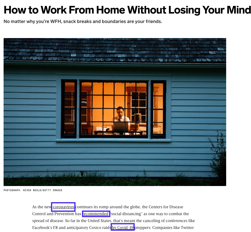
But it’s not just reserved for magazines and news websites. Ecommerce stores rely heavily on this type of navigation menu to showcase products in the same category.
Internal linking is also a crucial aspect of SEO, so it’s now standard practice for anyone who manages a website.
Website Navigation Examples
Instead of droning on about theory, let’s do a deep dive into some examples. I will cover a news website and Twenty Twenty WordPress theme.
News Website: New York Times
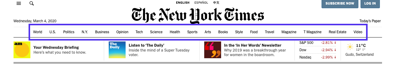
At a glance, it might look like the New York Times is mainly using a single, global header menu of their categories.
But that’s not where it ends. The NYT uses all types of navigation across its hundreds of category pages and millions of articles.
Types of navigation used:
- Hierarchical.
- Global.
- Local.
Let’s look at the different header navigation for each page.
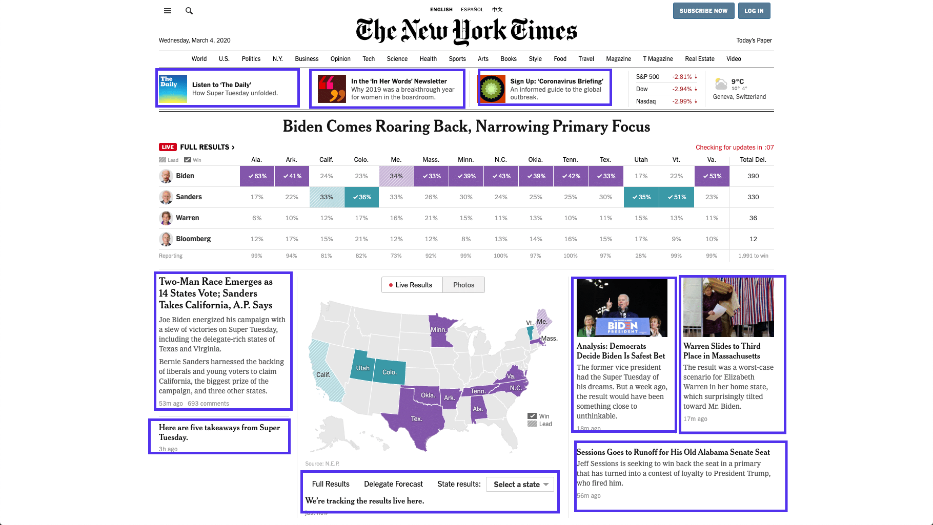
Homepage
In the header section of its website, it includes two menus, one expandable global menu above the logo and a hierarchical menu below the header. In essence, it’s like a header and sub-header menu setup.
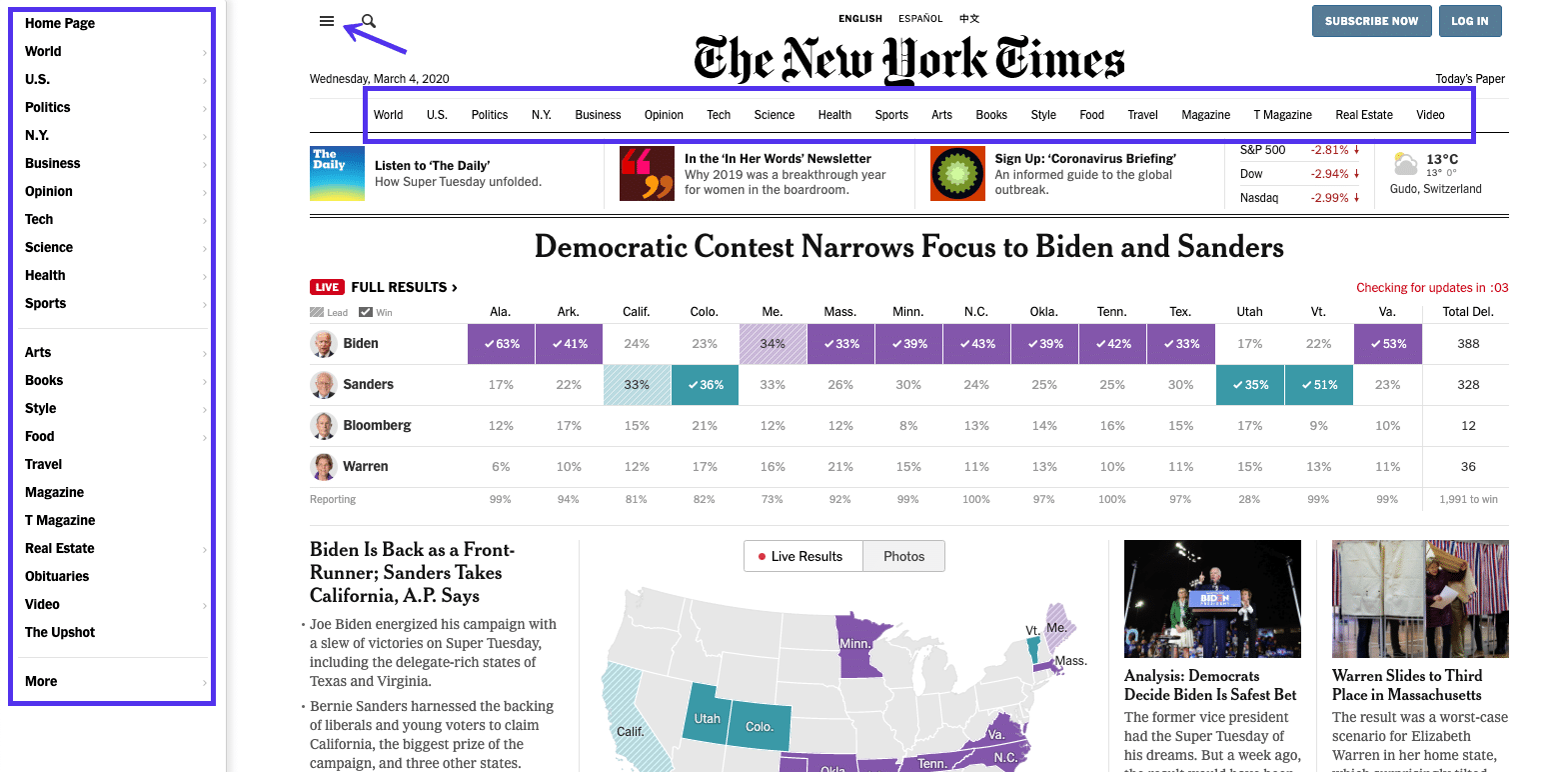
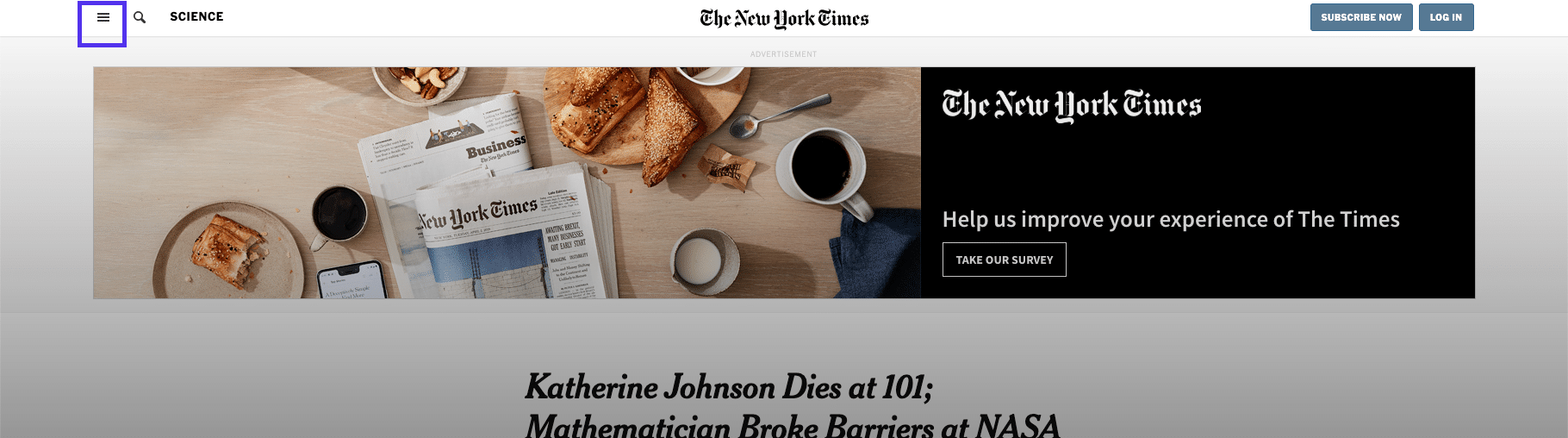
If you expand the header hamburger menu, it turns into a sidebar on the left-hand side, where there is a wide margin with most modern resolutions.
It doesn’t blur out/use an overlay to hide any content on the website.
Homepage (Mobile)
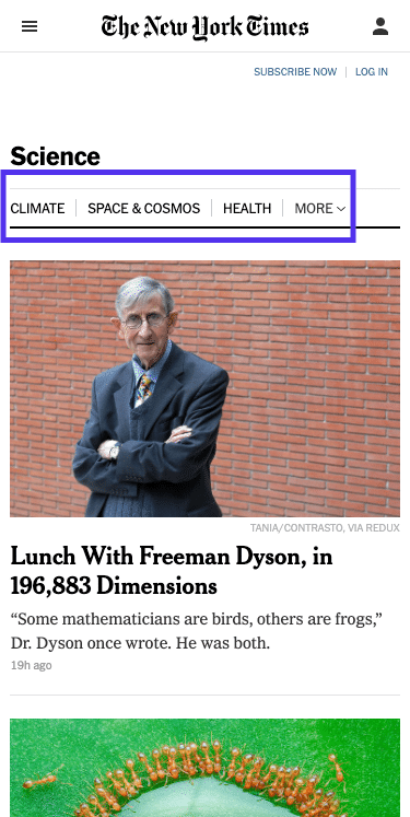
Let’s examine the same header section on mobile. The majority of internet users access news websites through their smartphones, so the mobile experience might be more important than the desktop one.
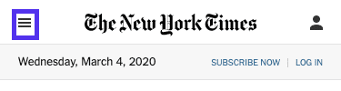
The news category sub-header menu is not part of the homepage on mobile. Instead, you only have the expandable option available.
When expanded, it becomes a full-screen menu and completely covers all the content on the homepage.
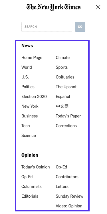
It includes every option from the main menu on desktop computers and the links are neatly organized by category.
Category Page
On the category page, below the header hamburger menu, you see a link to a further subset of categories.
It makes it easier for people who are only interested in a specific area within the broader topic to find articles that might be more aligned with their interests.
Category Page (Mobile)
On mobile, these category pages include the same header hamburger menu and structure as the desktop version. The secondary header menu isn’t hidden at all to make navigation and content discovery easier.
Another reason might be that many mobile experiences start via search or social media, rather than directly visiting the NYT homepage.
Single Article
For single articles, the floating header indicates the section that you are currently in, but it only features the expandable global menu (along with the search box).
Single Article (Mobile)
On mobile, clean navigation is maintained as the only menu is the header hamburger menu.

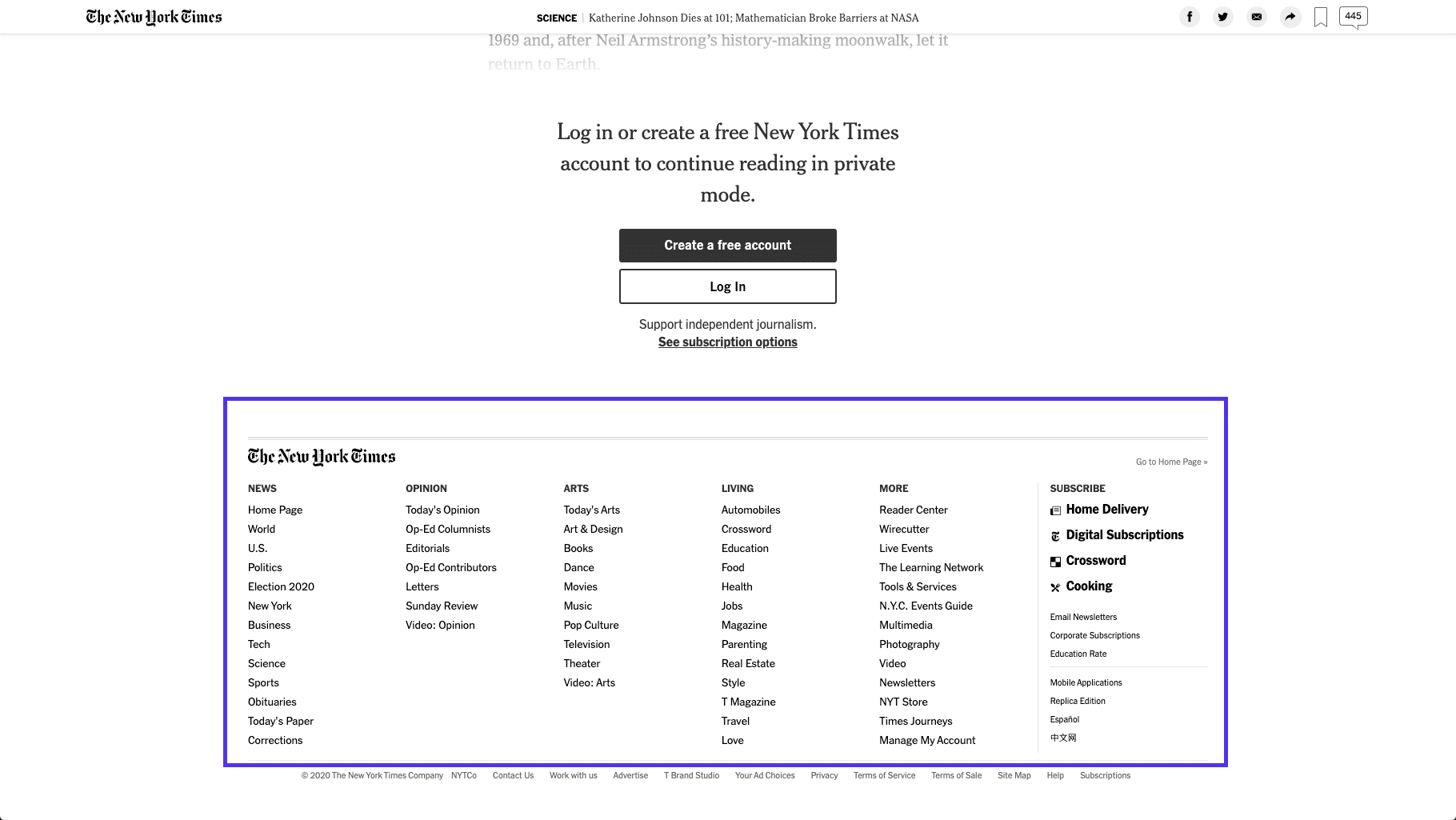
Footer
The NYT footer menu is the same across the homepage, category pages, and single articles.
Footer (Mobile)
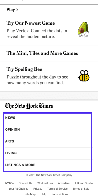
On mobile, the footer menu shows five menu items only, all of which expand into sub-sections once clicked.
For example, if you click the Arts section, you’ll be able to browse through these sub-sections:
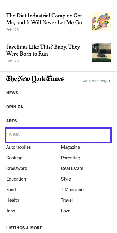
Since the website uses JavaScript to dynamically load more content as you scroll down, it might seem as though the footer doesn’t exist at all.
It is a neat trick that can help with time on site and getting readers to read more articles, but it makes the website a little harder to navigate.
Content Layout
Some could argue that the primary navigation tool online newspapers and blogs use isn’t just the menu. It’s the very newspaper layout itself that provides the navigational backbone for NYT and other similar sites.
All the highlighted elements are clickable and lead to different internal pages within the New York Times’ website.
Content layout is another key element of website navigation that they implement across their homepage and category pages.
The Twenty Twenty WordPress Theme
Another year, another default WordPress theme. This time, it’s Twenty Twenty, and we’re going to dive deep and see what’s changed with the navigation.
I will examine if there’s anything different about how the developers have decided to tackle menus and internal linking with this newest instance of WordPress.
Header Menu
Just like any standard WordPress theme, the new official release has a no-frills menu in the header section. You can select different display locations and this is how the Desktop Horizontal Menu option looks:
On the other hand, the Desktop Expanded Menu option will add the possibility to expand your menu links in a justified bar on the top-right-hand side.
The main content area is tinted with a dark gray, driving the focus of the user to the menu on the links.
Footer

In the footer, there are no links for internal navigation, except a simple “To the top” link that brings you back to the top of the page.
What Makes Good Website Navigation?
Good website navigation is always designed with the user in mind. It uses clear, easy-to-understand language, and links to the most important pages.
It makes use of ample white space, color changes, or other design techniques to separate itself from the main content clearly. Plus, it’s easier to read and use on all devices (mobile and desktop).
User-focused navigation also means that it’s contextual. It takes the user’s experience and expectations into consideration. That could be a reason why online newspapers still can’t get away from their “crowded” design.
Within the context of reading a newspaper, that’s what their users and potential customers expect, which includes their very extensive menus of categories and sub-categories.
In the next section, I will cover the basics of how to create good navigation for your site.
8 Principles for Improved Website Navigation
Even if you’re a complete beginner, you’ll be able to nail the navigation for your website by following the tips below.
1. Plan Your Page Structure and Navigation
Before you even start writing content for your website, plan out how your page structure and navigation will look.
Planning is an essential part of the process of providing your visitors with satisfactory navigation. You can use a sitemap creator to help you quickly create mockups for what you want your website experience to be.
An example of a good sitemap tool is GlooMaps.
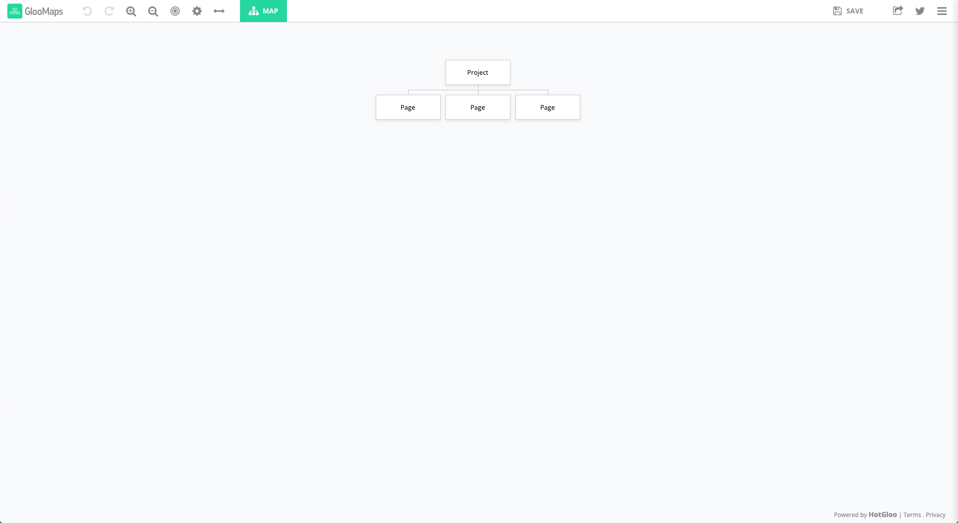
You can create as many documents as you need for free. Each one will have a unique URL you could then share to gather feedback and let others edit it. Once created, your URL will be available for 14 days unless re-visited. Every new visit extends the link life for another 14 days.
GlooMaps isn’t the only tool you could use, there are plenty more like Octopus, VisualSitemaps, Creately, just to name a few.
2. Follow Established Standards
Don’t try to reinvent the wheel. Website navigation is more about usability than creativity.
For essential design elements like where to place your menu, and how to indicate that it is expandable, follow known standards.
Three horizontal stripes, or the “hamburger” ☰ sign, is one of the most recognizable icons for identifying an expandable menu. The other is the three dots creating a horizontal line.
If you try to get creative and develop a custom icon, the chances are that many visitors won’t understand the purpose of your design and will struggle to find your menu.
3. Use Your Users’ Vocabulary
Instead of just linking to the same old pages, using standard web development lingo, or overly creative copy, use language that is closer to what your users use and search for and want.
This approach is beneficial for both SEO and usability. Create pages that reflect what your users are searching for online.
You can then link to those same pages by using the same words and phrases that help users find your website on Google.
4. Use Responsive Menus
Since over 52% of all online traffic is now mobile, responsive/mobile-first design has become an absolute must.
Instead of menus that continue out of the frame in the mobile web browser or too cluttered, make sure that you implement expandable mobile menus.
It’s become an industry standard for a reason. Horizontal menus with tiny text are hard to read, click, and use correctly on mobile.
The good news is that all the best WordPress themes come with responsive design and responsive menus by default. Unless you’re designing your WordPress site from scratch, WordPress has got you covered here.
5. Take Advantage of Your Footer Menu
Readers that keep reading and scrolling to the bottom of your website are more engaged than the average user. Take advantage of that and use the space at the bottom of each page to highlight valuable content.
Since the footer isn’t eating up “above the fold” space, you can get granular and include multiple categories, and even highlight vital cornerstone pages, or articles.
As an example, look at how we handle our footer on this very page. We cover essential feature pages, our company, break down our resources, and more.
The footer allows you to highlight the content you “just couldn’t fit” into your header.
6. Use Color and White Space to Separate Navigation from Other Elements
Use color, fonts, and white space to separate your menus from your main content and your sidebars. Make it clear where the navigation starts and ends.
It doesn’t matter what language you use in your menus, or which pages you link to if your website visitors can’t even find the menu in the first place.
7. Avoid Dropdown Menus
For most websites (not all), dropdown menus aren’t necessary or useful. When users see a link in a menu, the assumption is that it is clickable. Unless the design separates it from clickable links, it can lead to confusion.
Having too many links in your main menu can also negatively impact the usability of your website.
Implementing hierarchical and local navigation in place of dropdown menus can lead to smoother user flow. It also allows users to interact with multiple pages and spend more time on your site, instead of browsing through a giant list of links.
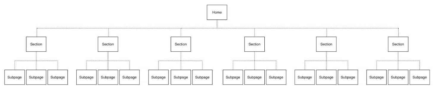
8. Flatten Your Structure
If you want to make it as easy as possible for visitors to explore all pages of your website, maintain as flat a navigation structure as possible.
Instead of linking to a handful of pages from your home page, and then expanding with ever more sub-pages and categories, keep things simple.
Make sure to link to significant categories from your homepage, and link to a single layer of sub-category or single article pages from there.
There is evidence that flattening the structure in this way has a positive effect on SEO and can lead to Google sitelinks. So don’t let your website structure get too messy!
Website Navigation Menu Trends
Although the broader web design trends of recent years include things like 3D design elements and incorporating tailor-made photographs into creative designs, menus didn’t have quite an exciting a year.
But that doesn’t mean nothing has changed. Here’s our quick take at some of the most crucial menu trends over the last couple of years.
Expandable Categories in Full-Screen Mobile Menus
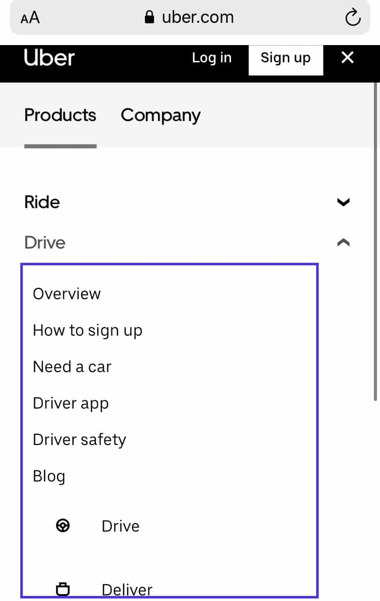
Uber and other giant corporations with revamped, modern design, have updated their menus to be more usable.
An issue for these enterprises is that they have so many different products and categories that it can be impossible to include them in a single menu sensibly.
This leads to clear, categorized expandable mobile menus, instead of just an endless list of links.
Floating Header Menus
Perhaps the universal trend for menus over the last few years is the floating header menu.
A floating header menu is a menu that sticks to the top of your web browser window as you scroll down the page (as the one we use for kinsta.com). Typically it’s part of a header section that includes a small logo and maybe a search bar as well.
It’s hard to argue against it, as having constant access to a menu makes internal navigation that much easier. This type of menu is included in many WordPress themes and the trend is showing no signs of stopping.
Overlay Dropdown Menus on Desktop
Some of the most basic advice on website navigation is to stay away from dropdown menus. And for a reason.
But that doesn’t mean they are inherently terrible. Dropdown menus are just tricky to implement in a way that makes sense on the computer screen.
With a color overlay on the main content, they can force 100% of the user’s attention to the menu. You also have better options for expandable categories than displaying further links on hover.
These factors have come together to make it into a growing trend in 2019. In fact, many innovative websites and templates include overlayed dropdown menus on desktop.
Summary
This post should have given you a clear understanding of what website navigation is and some of its key points.
Website navigation should always be focused on simplicity, clarity, rather than intense colors and creative design. As your site’s navigation and menus need to take into account both desktop and mobile users, things can get trickier and hiring a web developer can be a good call.
Always try to follow website menu design best practices to ensure your visitors and search engines can browse through your content easily.
Usability and clarity will continue to be priorities moving forward. So if you can master your user’s language and create a structure that makes sense for them, you’ll be able to future-proof your menus.

Head of Content at Kinsta and Content Marketing Consultant for WordPress plugin developers. Connect with Matteo on Twitter.