When someone arrives for the first time on your website, color plays a significant role in what they think. Between 62-90% of consumers’ initial impression is based on color choices alone, research says.
Picking colors that match your brand — and what you want your consumers to think about your company and products — can be a powerful branding and marketing tool.
In this article, we’ll cover 25 fantastic website color schemes for landing pages, ecommerce, and personal sites, and how you can pick your own without wasting time.
How to Pick Color Schemes For Your Website
The eyes of a non-color human adult can see over 1,000,000 distinct colors. How do you choose the right color scheme quickly and efficiently with all these options? That’s the challenge facing all web designers trying to create a color scheme or palette for their design from scratch.
With that many choices, you can’t evaluate all the shades and hues individually and pick the most suitable ones without a reference point. You need to narrow down your options. The best way to start is by finding a primary color as your starting point.
Perhaps the best way to do this is to look at the most popular choices by industry. It can help you learn something about the psychology of color and what primary colors might work well for your company or product.
Color Choices By Industry
Different companies and products choose different colors to identify their brand. But why? Color isn’t just a more efficient way to grab the attention of your prospects and consumers. It’s a way to communicate with them on an emotional, almost subconscious level.
In a sense, it’s a way to start building your brand in the mind of the consumer before using a single word or sentence of copy. No color tells the same story to the consumer, so the most popular primary brand colors depend from industry to industry.
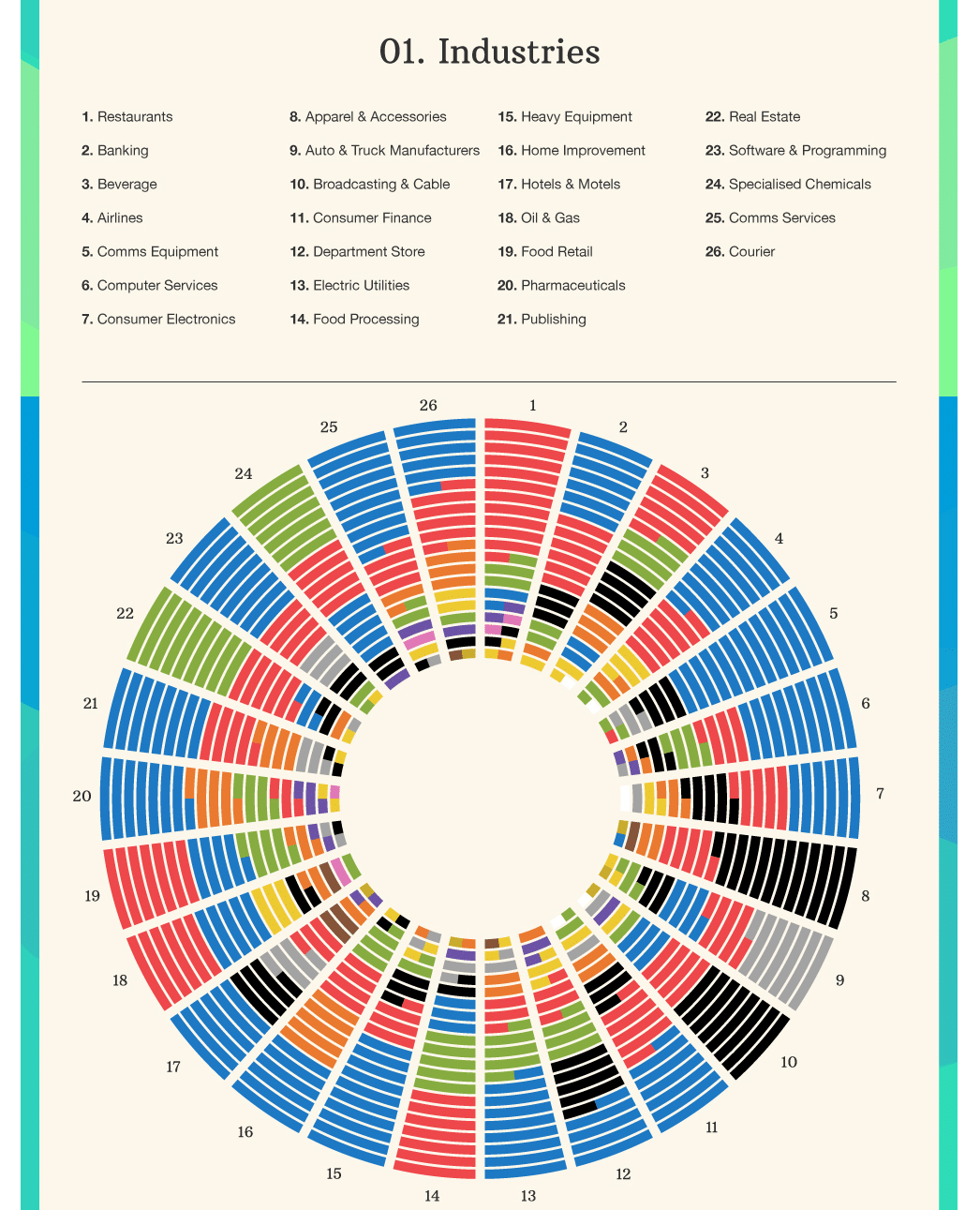
What emotion do you want potential customers to associate with your brand, product, or service?
That’s the guiding question that should help you identify your primary color for your palette.
Blue Conveys:

In industries where consumer trust is more important than any other factor, and professionalism and reliability are key selling points, blue is often used as a primary branding color.
It doesn’t appeal to spontaneity or emotion. Instead, it initiates a calm and logical decision-making process.
Most common in the following industries:
- Banking
- Airlines
- Communications
- Consumer Finance
- Electric Utilities
- Heavy Equipment
- Home Improvement
- Hotels
- Pharmaceuticals
Red Conveys:

Industries that rely on emotions and impulsive decisions (like restaurants and fast food), often use red as a primary color. Red is thought to stimulate hunger, so it’s a favorite choice among international food brands.
Most common in the following industries:
- Restaurants
- Beverages
- Food retail
- Real estate
- Apparel
Green Conveys:

Most people associate the color green with nature, plants, and vibrant, restorative environments. Industries that rely on a promise of better well-being or products with all-natural ingredients, often choose green.
Most common in the following industries:
- Food & beverage
- Department stores
- Real estate
- Chemicals
Black: Confidence, Sophistication
While some companies might default to black instead of making a dedicated color choice, as it feels safe, it’s also a leading choice in industries where the consumer’s confidence or sophistication is a key factor.
Most common in the following industries:
- Apparel
- Accessories
- Internet & mobile service providers
- Department stores
- Hotels
Don’t blindly follow your taste and instincts, consider color theory and color psychology when you make your decision.
How Many Color Schemes Should be Used on a Single Website?
For a standard website color scheme, you might single out anywhere from three to seven separate colors in a single scheme or palette.
But how many different color schemes should you use on a single website?
That depends on the individual circumstances and your goals with your website. If your website is a company website or blog dedicated to a single brand, product, or company, you want to stick to a single color scheme.
On the other hand, if your website is an ecommerce store, you can use different color schemes for different product schemes to evoke different emotional reactions for different product categories.
The problem with using multiple palettes is that you will complicate things for any internal or external content creators, increasing the chance for human error and complications.
When you pick a color scheme for your website, it’s essential to avoid going overboard and spending weeks on the task. It’s an important choice, for sure, but choosing the right colors will not help you drive traffic to your website or boost conversions on your product pages by itself.
How to Get the Exact Color Schemes On a Website
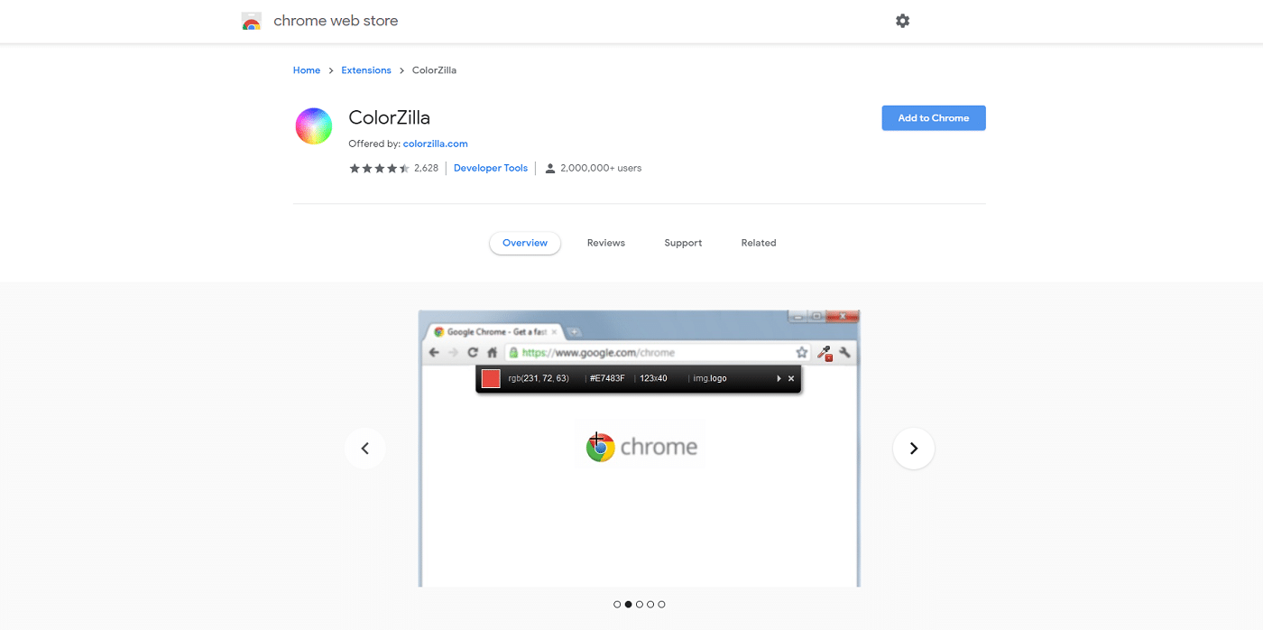
To identify every color used on a website, down to the exact shade and hex code, you can use a Google Chrome extension or Firefox addon like ColorZilla.
With ColorZilla installed, you can simply hover your pointer directly over any design element on any site, logo, or image, and it will show you the exact HTML hex or RGB color codes for that pixel. If you don’t want to identify the colors used one by one, you can also use a color palette generator that will use an image, like Image Picker.
However, it’s not as perfect a solution as it might seem. You have to take a screenshot of the website and upload it and the generated palette won’t necessarily be 100% accurate to the actual shades used in the design. For example, if the website includes a gradient or a picture with colors beyond the main color scheme, the generated palette tends to be inaccurate.
So for now, the best way to identify the exact colors used in web design is still to use a color identifying plugin or extension, or taking a screenshot and doing things manually in a photo editing tool like PhotoShop.
What Website Color Scheme Are We Using at Kinsta?
Like most websites, we at Kinsta follow a basic 3-color or triadic scheme for all our content. Since we are a hosting company focused on WordPress, there’s no need for us to implement multiple palettes throughout our website.
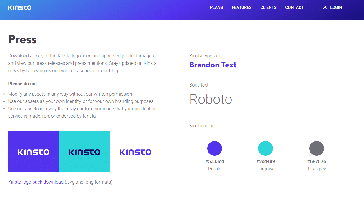
We use a dark purple (#5333ed) as our primary color, turquoise (#2cd4d9) to juxtapose and create catching, yet balanced gradients, and a subdued grey for text (#6E7076).
But what other companies are doing?
Let’s find out!
25 Best Website Color Scheme Examples
We’ve scoured the web for great examples of color schemes and even separated the sites by category, so it will be easy for you to find inspiration from relevant websites.
Great Ecommerce Website Color Schemes
Below we’ll cover excellent ecommerce examples of color schemes that match their brand and industry.
1. Skin Care Product: Bright & Playful
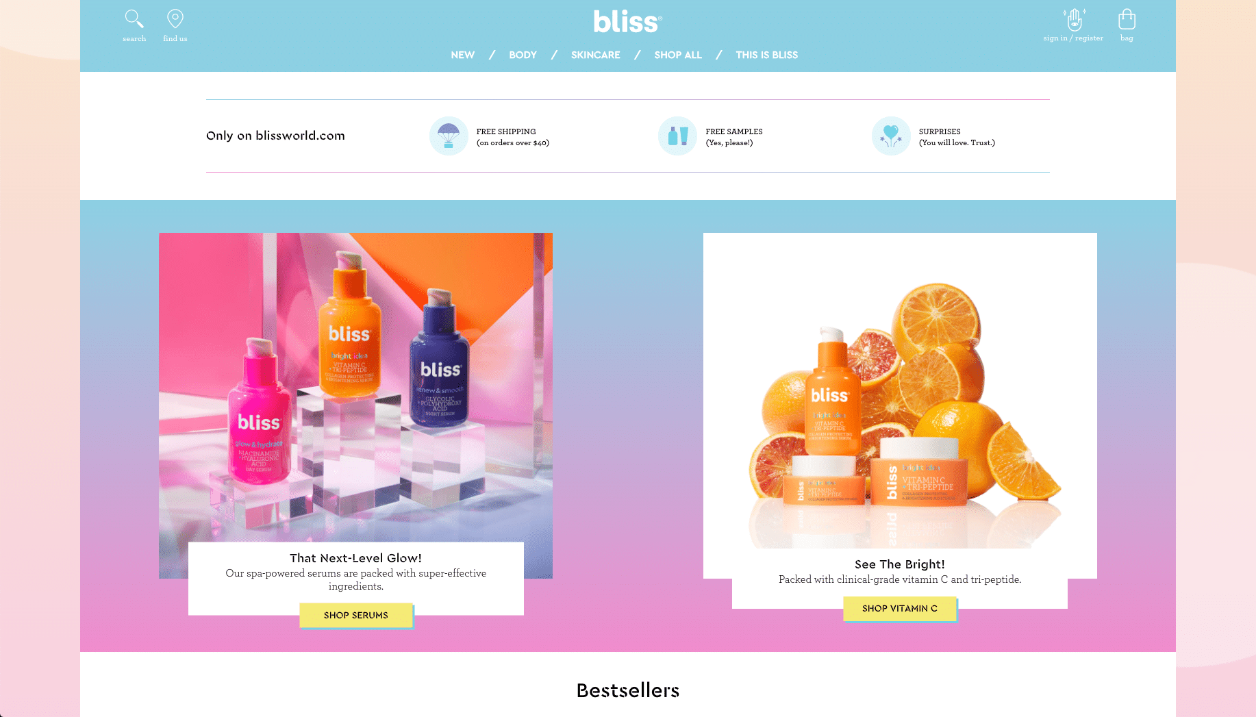
Bliss’ choice of colors is on point when it comes to its brand. The colors are bright and playful, perfectly accompanying the company’s message of body positivity and inner happiness.
2. Clothing Brand: Clear and Concise
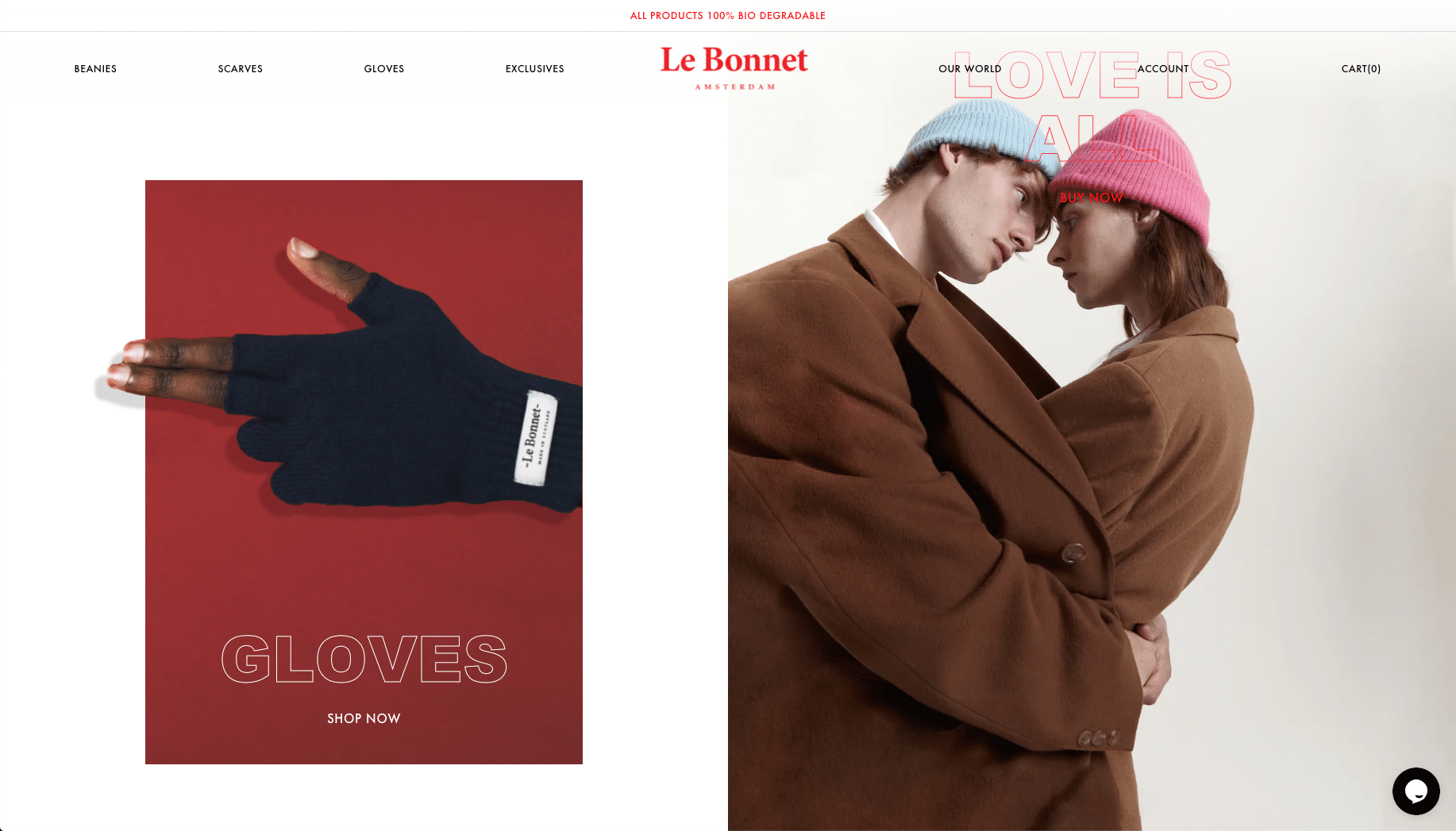
Le Bonnet is a clothing company that focuses on clarity when it comes to the color palette of its website. A few, intense colors, along with an opaque beige background color to separate products, help elevate the simplicity of the design.
3. Apparel Store: Simplicity
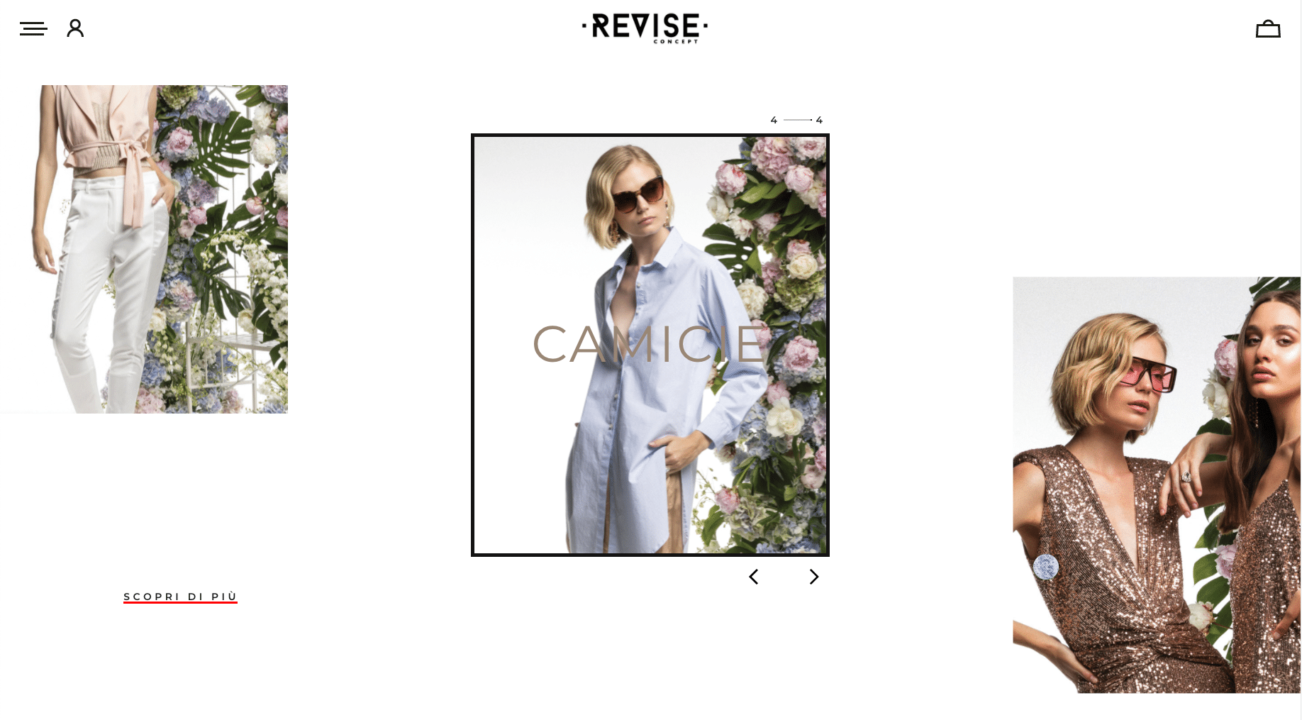
Revise Concept is a clothing brand site, and instead of relying on colors in the website color palette, it uses simple colors and white space to highlight the colors and designs of the clothes themselves.
This approach can be an excellent alternative for ecommerce sites that want to let the product speak for itself, rather than creating a punchy design to tell the story.
4. Tableware: Reliability and professionalism
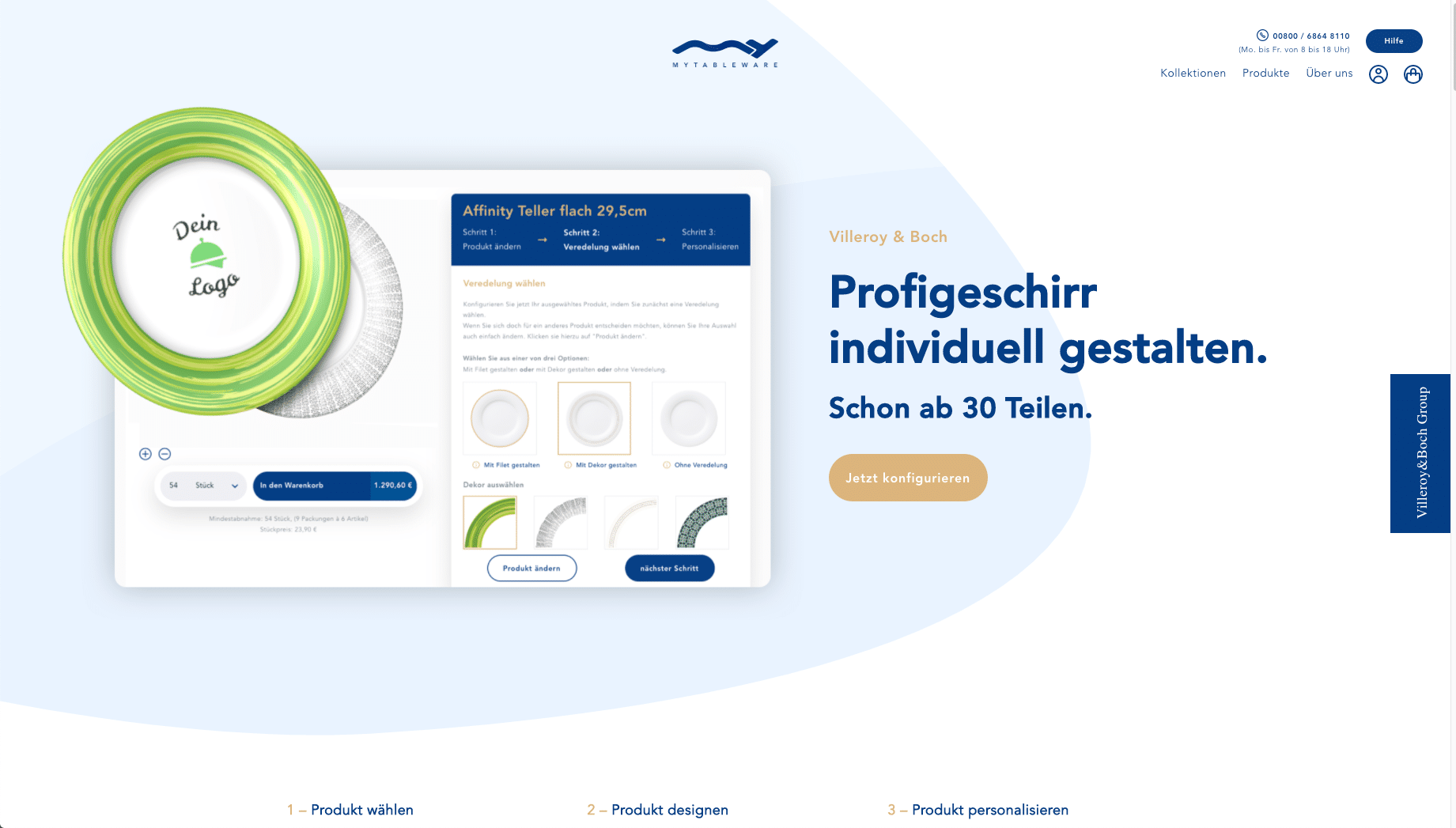
My Tableware is a German ecommerce site for customizable tableware and dishes.
The site uses a simple color scheme of dark blue, light brown, and grey to convey a sense of professionalism and reliability, with notes of sophistication.
5. Gum: Natural and Impulsive
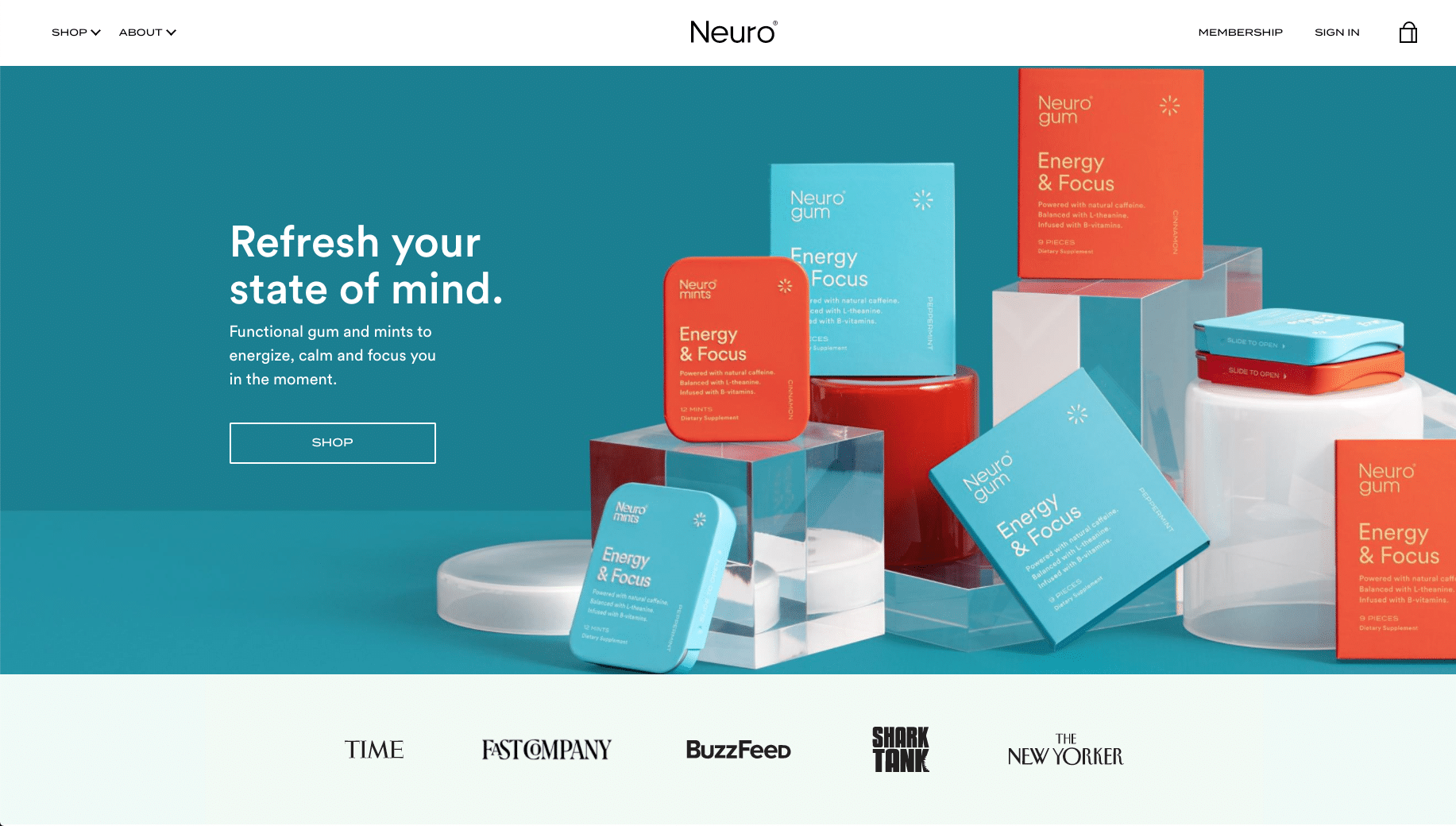
Neuro is a brand of caffeine gum and mints, designed to help people focus. It uses a mix of softer colors like turquoise, light blue, and beige, to instill a sense of natural ingredients.
There’s also an appeal to emotion and impulse decisions with red and orange, excellent use of accent color.
6. Watch: Sophistication and Luxury
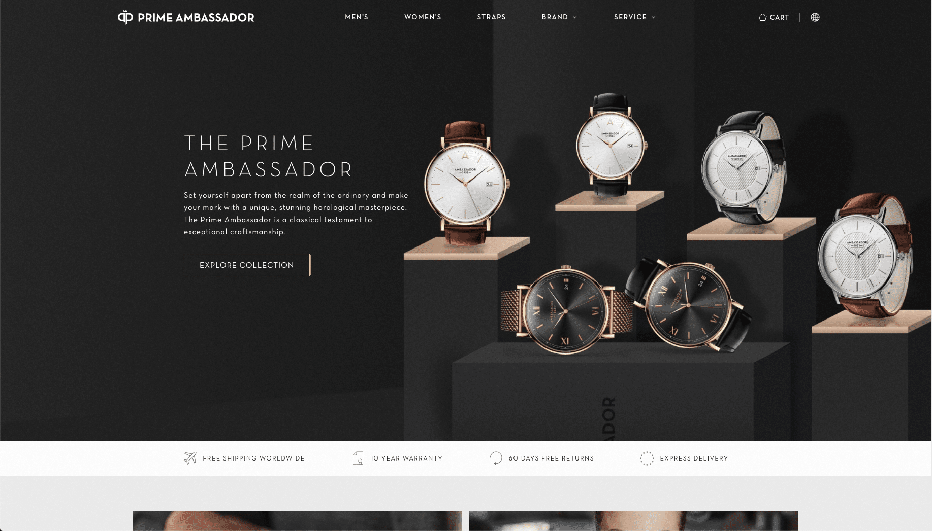
Prime Ambassador is a Swedish brand of timepieces, with a classy ecommerce site designed to highlight the products. The color combinations of an almost golden light brown hue on a dark grey background and wooden accents in the picture bring a sense of sophistication and luxury to the visitor.
The colors are perfect for promoting a high-end product like a bespoke watch but would feel out of place if you were selling regular consumer goods.
7. Pants: Creative & Accessible

Alday is a brand of comfort-first pants designed to fit better than the mass-produced jeans and chinos sold at lower price points.
The website is creative and playful, with vibrant color combinations that make it feel accessible to the visitor and potential customers.
8. Fruit snacks: Elegant and accentuating colors
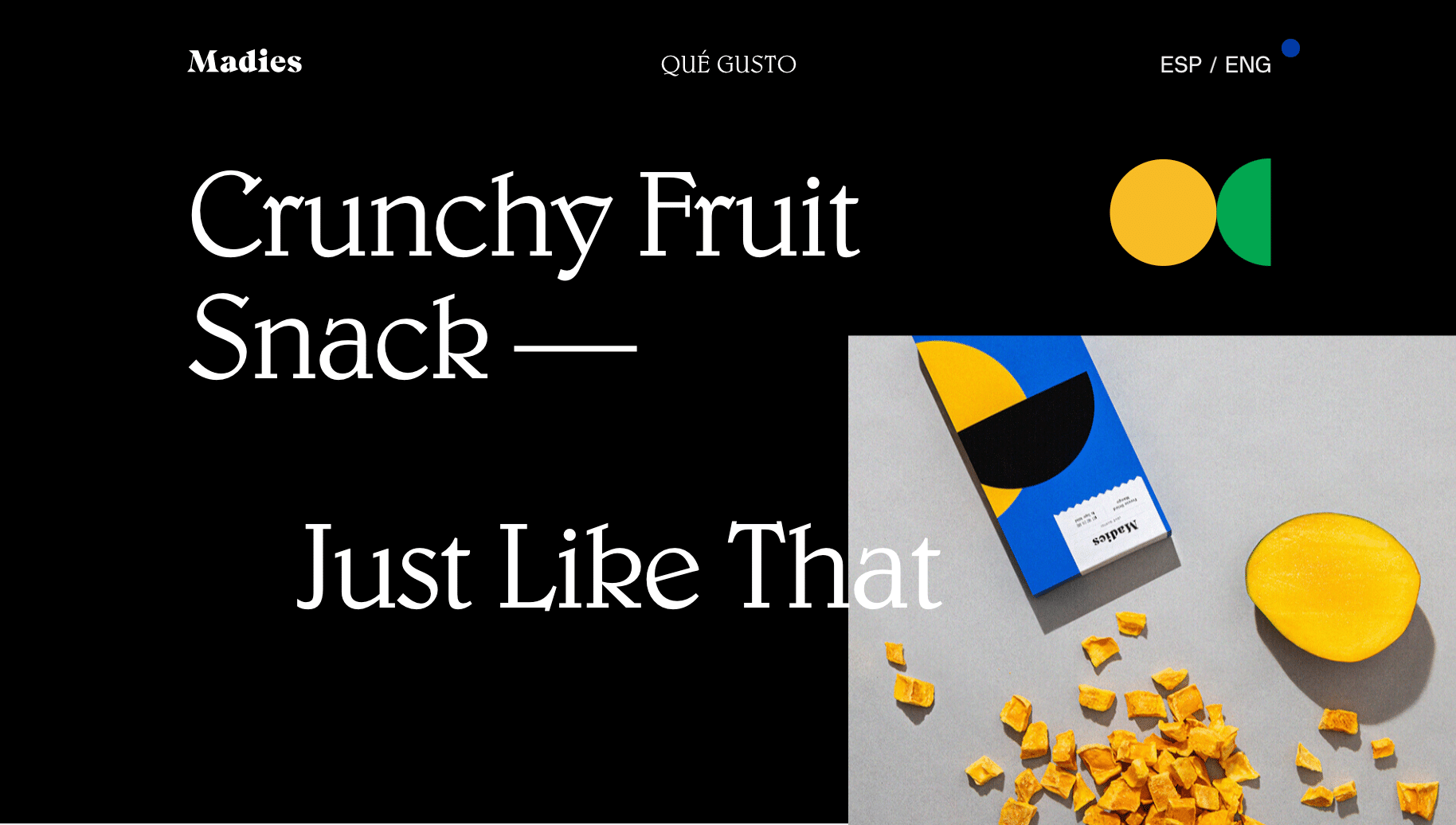
Madies is a line of freeze-dried fruit snacks, aimed at a more fashion-conscious consumer than brandless dried fruits sold by bulk.
The black background and the yellow personification of ripe mango accentuate the simplicity of the design, leading to an elegant final product.
9. Custom Fit Denim: It’s Alive

Unspun uses bright red and orange to bring the website to life. Perfect for communicating with an audience that leads an active and vibrant lifestyle.
Personal and Travel Website Color Schemes
Below, you can find our selection of the best examples of website color schemes for personal and travel websites.
10. Creative Simplicity
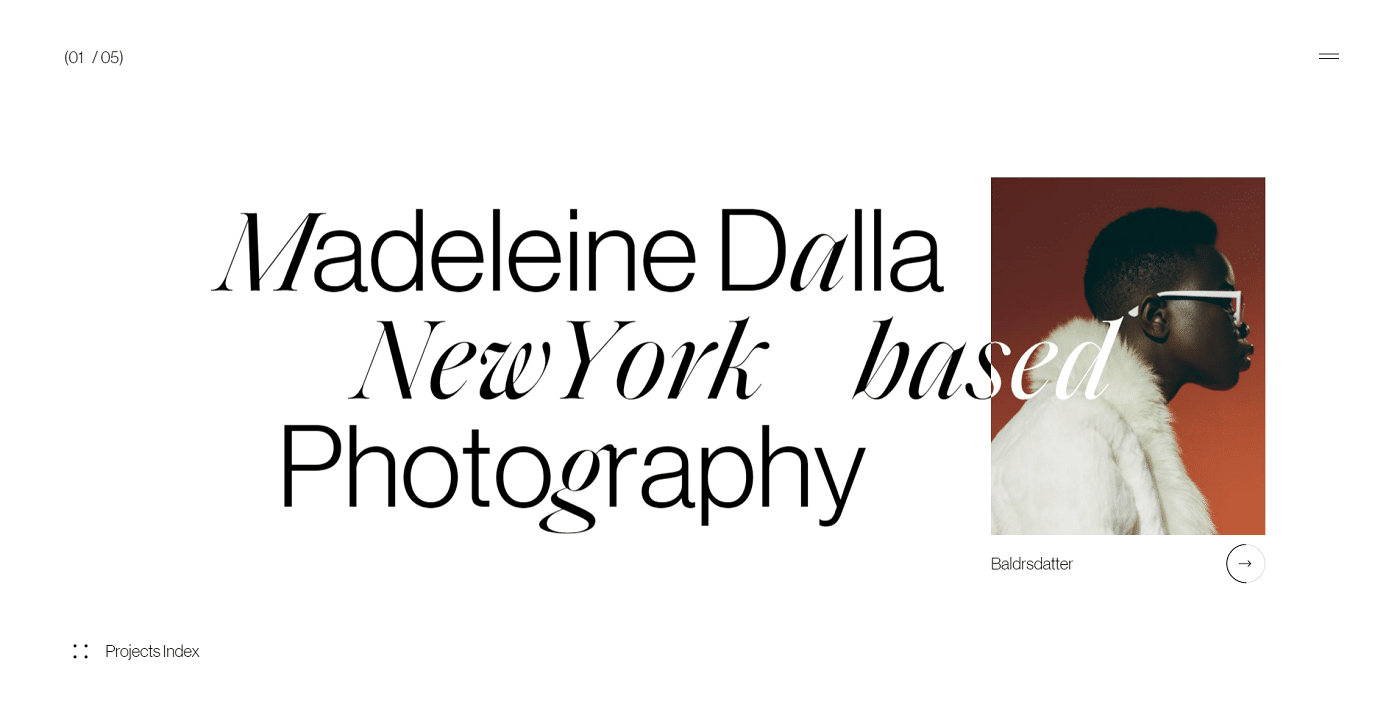
Madeleine Dalla is a New York-based photographer with a keen sense for website design (and an impressive portfolio).
By leaving color out of the equation for the rest of the design, she really highlights the vivid colors of her hand-picked featured photos from each of her highlighted projects. She uses the absence of color as much as the colors themselves.
11. Grayscale with a Splash
 Ali Rifai is a creative art director and it shows in the concept of the website. By using grayscale with only a dash of color, your attention gets drawn to the right keywords and critical areas of the design, the word “original,” and the charming smile.
12. One with Nature

iFly 50 is an online magazine released by KLM to celebrate its 50th anniversary.
By highlighting the blues of the sky and water, and the green grass and forest, it makes any visitor feel at one with nature — perfect approach for any nature or scenic photographer’s website.
13. Clean & Professional
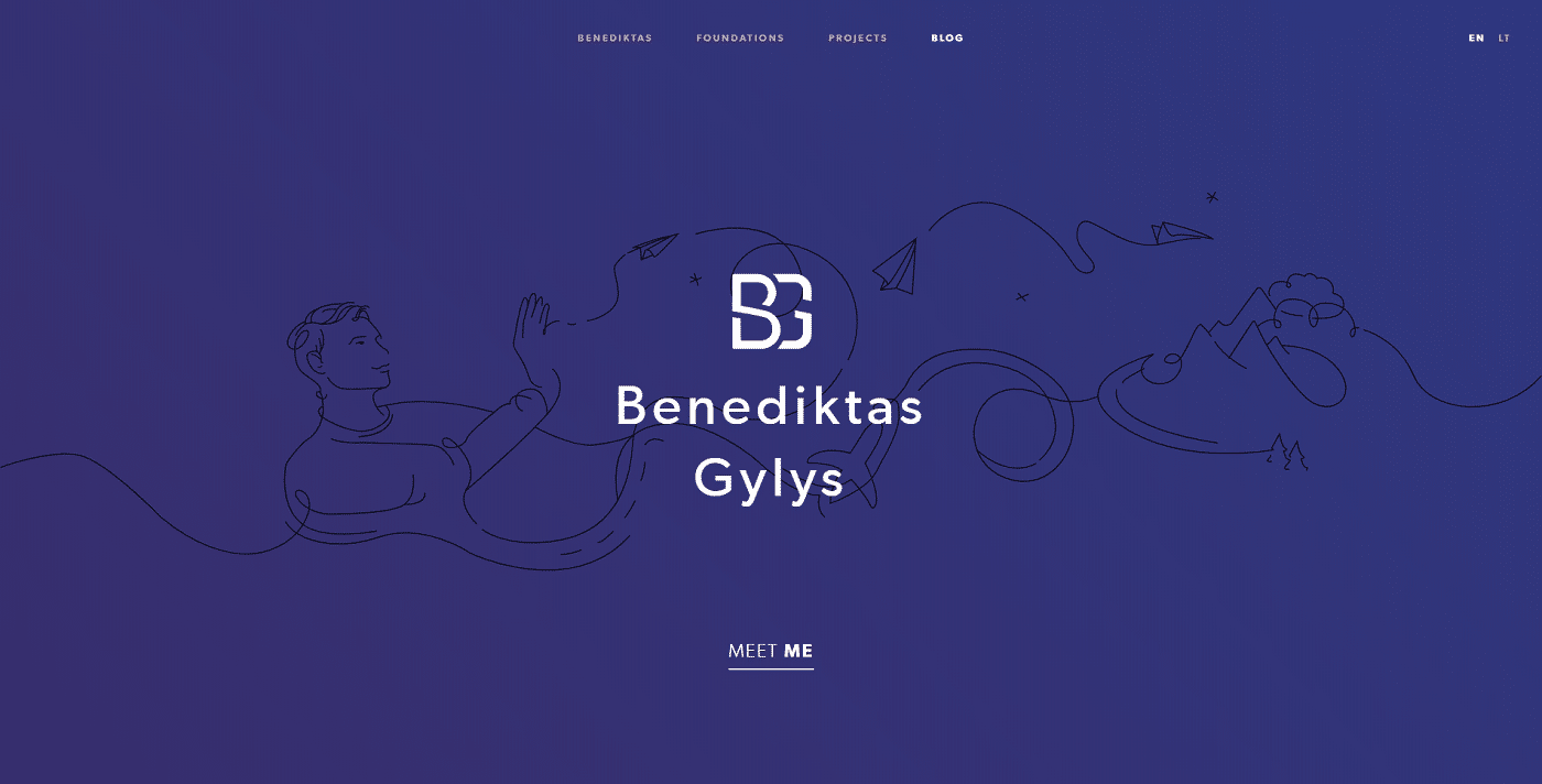
Benediktas Gylys’s site is a masterclass in clean design. There is no clutter and that also goes for color choices.
The primary purple color highlights professionalism, and while there are only a few colors, they all serve to highlight the critical elements, the illustrations.
14. Pragmatic Colors

BucketListly uses colors pragmatically, using the yellow to highlight keywords, CTAs, and countries visited so far.
It shows how much value you can get from a single color in a design when you use it in conjunction with white space and the right concepts.
15. Elegant simplicity

Lars Franzen’s site’s featured image uses a dark background color to bring out the color and individuality of the people in the portrait.
16. Futuristic overlay
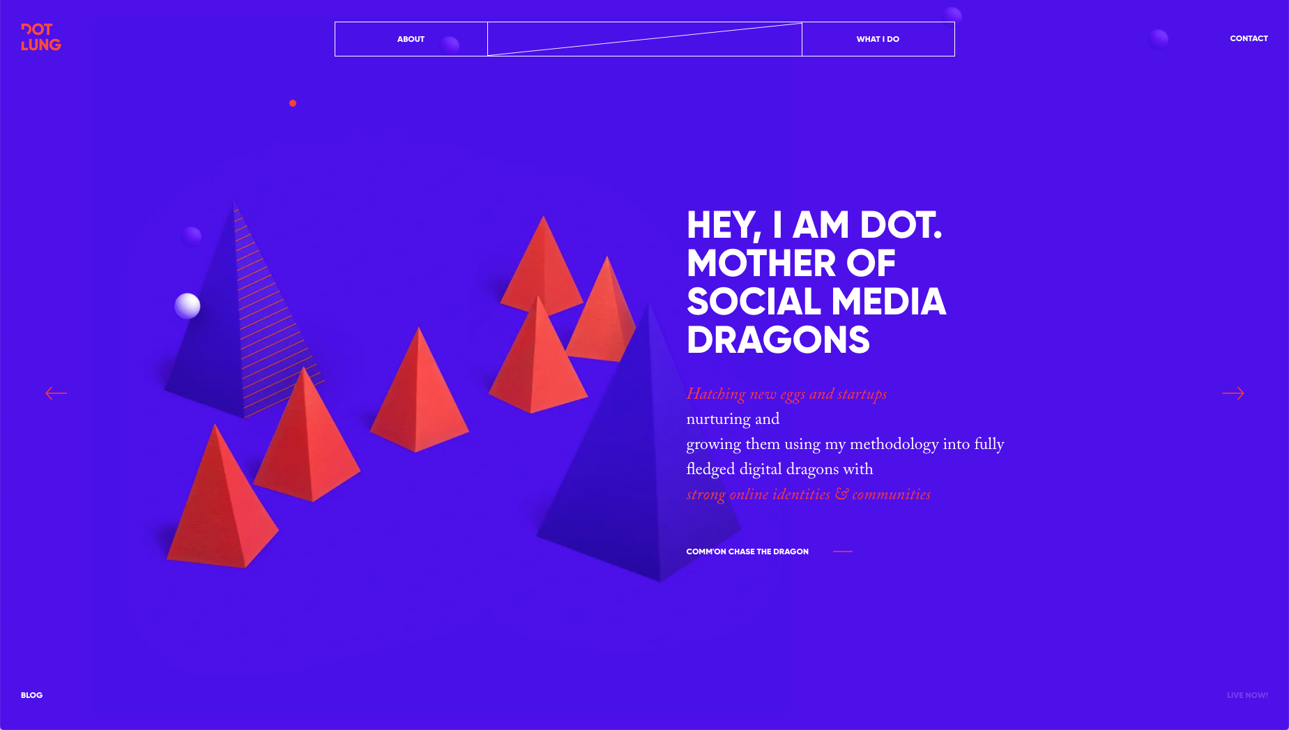
Dot Lung’s personal site does a great job of maximizing the simple color palette with overlays and clean background graphics. The purple in the background creates a cohesive experience from page to page to page.
Landing Page Color Schemes
Below we’ve highlighted different landing pages with unique or effective color schemes.
17. Sharp contrasts

Zenly uses sharply contrasting colors to highlight the actual functionality of the live map app (btw, this how you embed Google Maps on WordPress sites). The backdrop of space makes the globular app design stand out and makes it take on a futuristic flavor.
18. Color to highlight
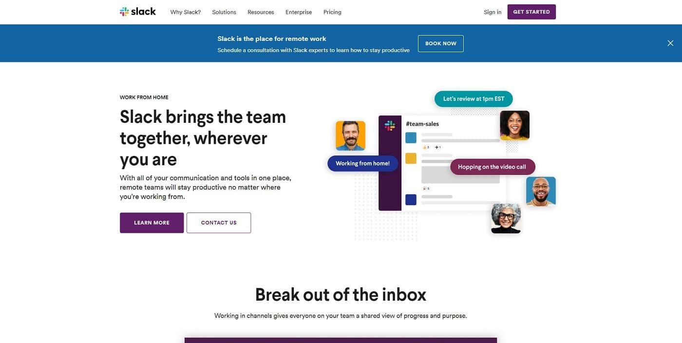
Slack uses a tried-and-true landing page color scheme tactic, where colors are mostly used to highlight important calls to action and other essential elements. For a landing page, you don’t have to overcomplicate the design, and that also applies to colors.
Make sure to check out our Microsoft Teams vs Slack in-depth comparison.
19. Vibrant colors spark emotions
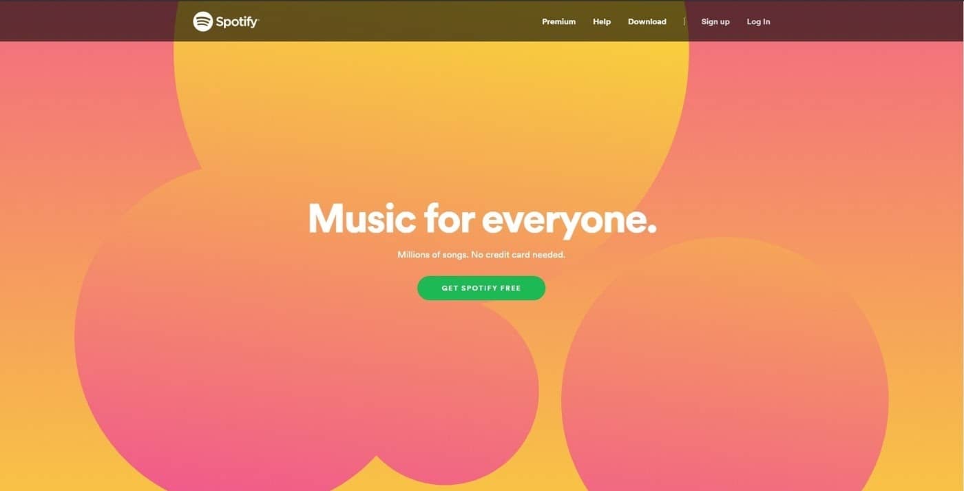
Spotify uses vibrant colors to spark emotions in an audience on its exceedingly simple new landing page. The colors tell more of a story than the subheadline before the CTA button. Check out our guide if you’re thinking about launching a podcast soon.
20. Color contrasts create order in the chaos

Autonomy uses colors and contrast to create order in an otherwise chaotic, animated design. The vibrant yellow cuts through and separates itself from the background and other objects.
21. Futuristic color ensemble
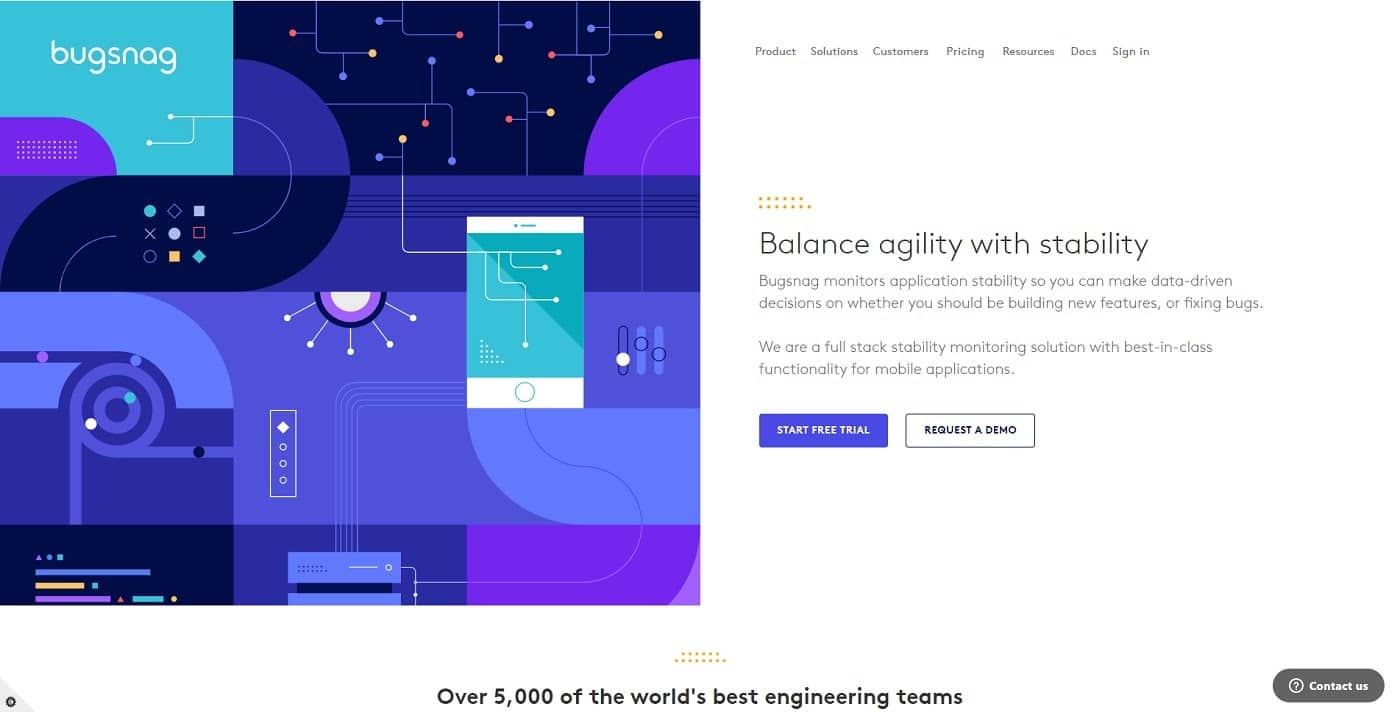
Bugsnag uses a varied collection of colors to impart a futuristic, high-tech feeling with its flat design. The combination of colors and shapes makes the visitor feel like they can trust that the company is at the forefront.
22. Alive with color
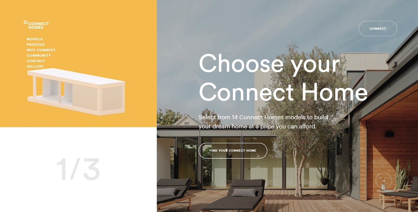
Connect Homes’ landing page comes alive with bright yet mellow colors. The color palette strikes an exciting balance that conveys a modern feel.
23. Conservative colors, playful design

Plink’s landing page is based on a relatively conservative shade of dark blue but balances it out with a playful and fun animation and design in general.
24. Natural vitality
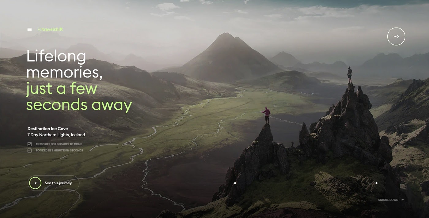
Travelshift relies heavily on the color green to convey a sense of nature and vitality. Instead of highlighting CTAs or key content with an attention-grabbing color like red or orange, the green functions as a promise of rejuvenation instead.
25. Bright colors of hope
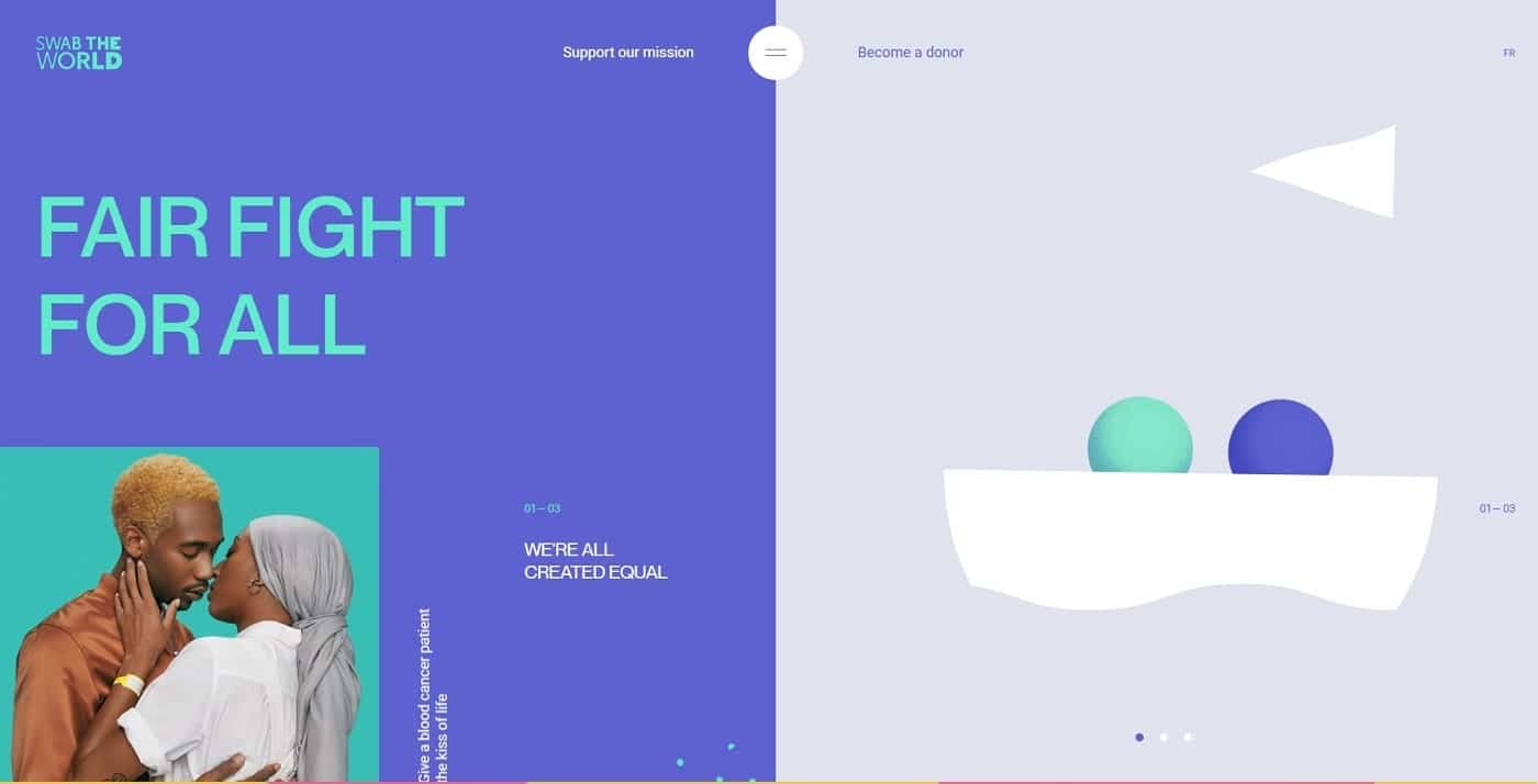
Swab the World uses a color scheme of bright, contrasting colors to convey a sense of hope. That’s a perfect match for the landing page of a nonprofit organization. The color clash works with the shapes to highlight the modern/futuristic approach they use to tackle the challenge.
Website Color Scheme Generators
If you don’t want to manually pick out adjacent colors, gradients, or shades for your scheme or palette, you can use online tools to help. There are a number of free color schemes or palette generators available online. We will take a closer look at some of the best options below.
Colormind
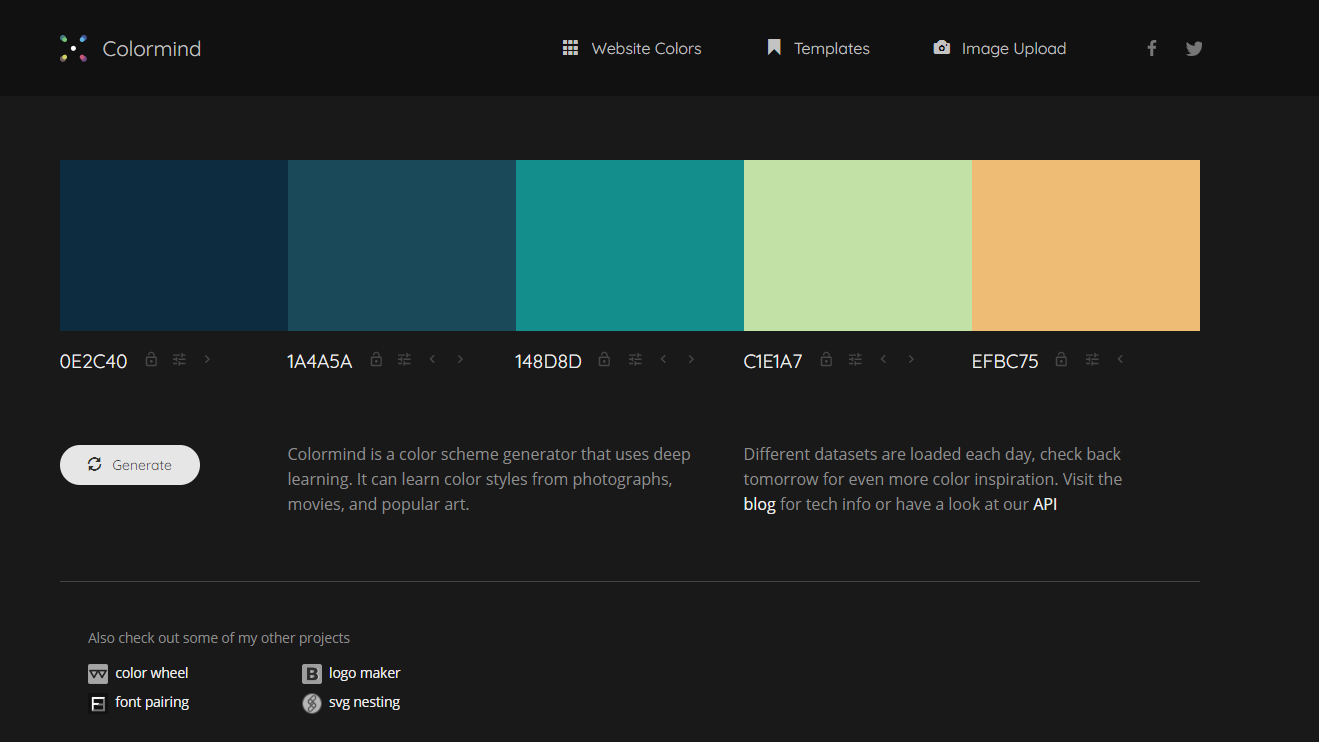
Colormind is an AI-powered color generator that you can use to generate colors for websites, templates, and more instantly. The only issue is that you can’t set a primary color to extrapolate a palette from, you have to randomly generate it every time. It can also extract color palettes from any image you want.
Coolors.co
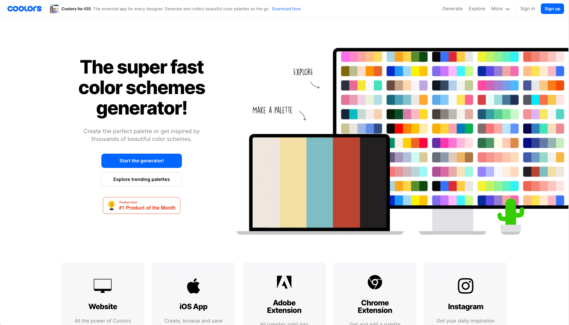
Coolors.co is a web and mobile app that helps you generate palettes from scratch. It has shade alternatives for each color option and other advanced tools that help you make efficient decisions about your color schemes.
Paletton
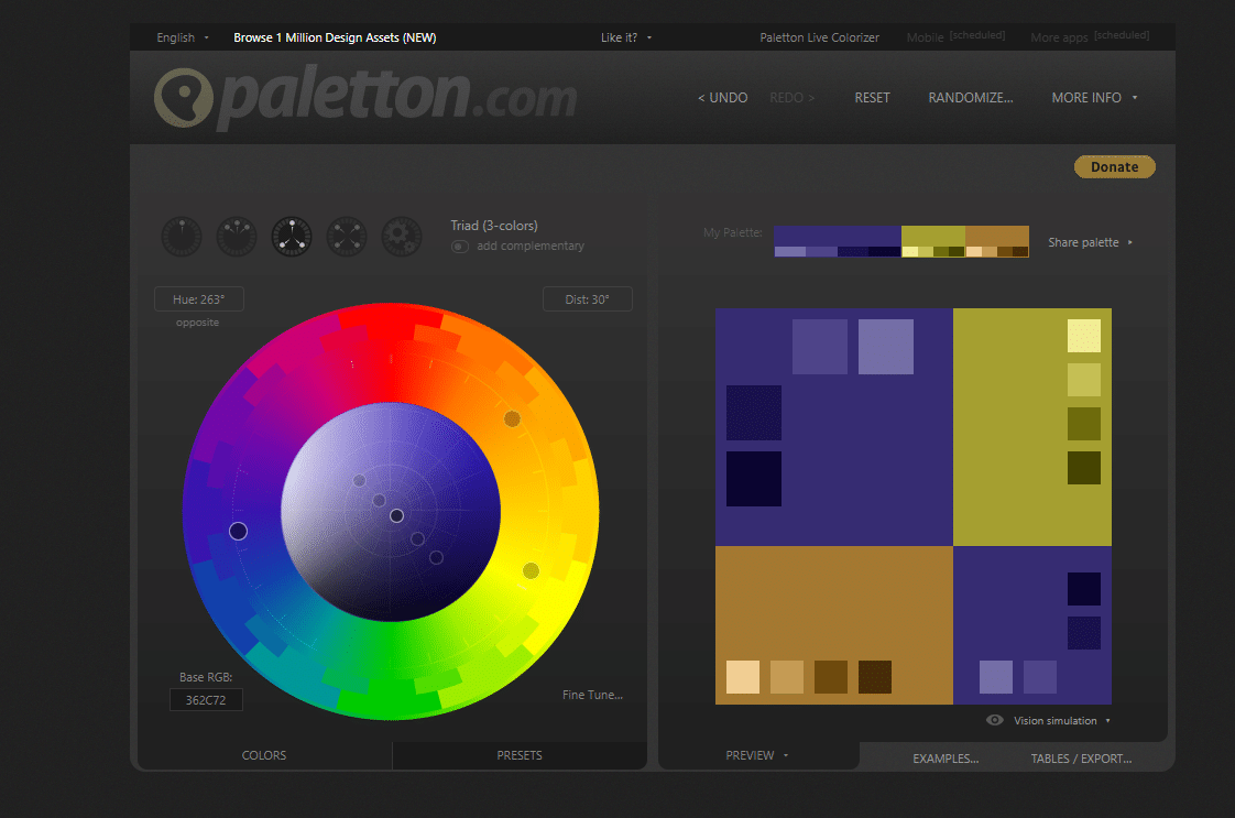
Instead of generating random schemes, Paletton gives you full control over your palette and which color you want to use as your base/primary color. You can choose the type of palette you want, whether adjacent colors, a triadic color scheme, or others. You can select any color from the color wheel.
ColorSpace
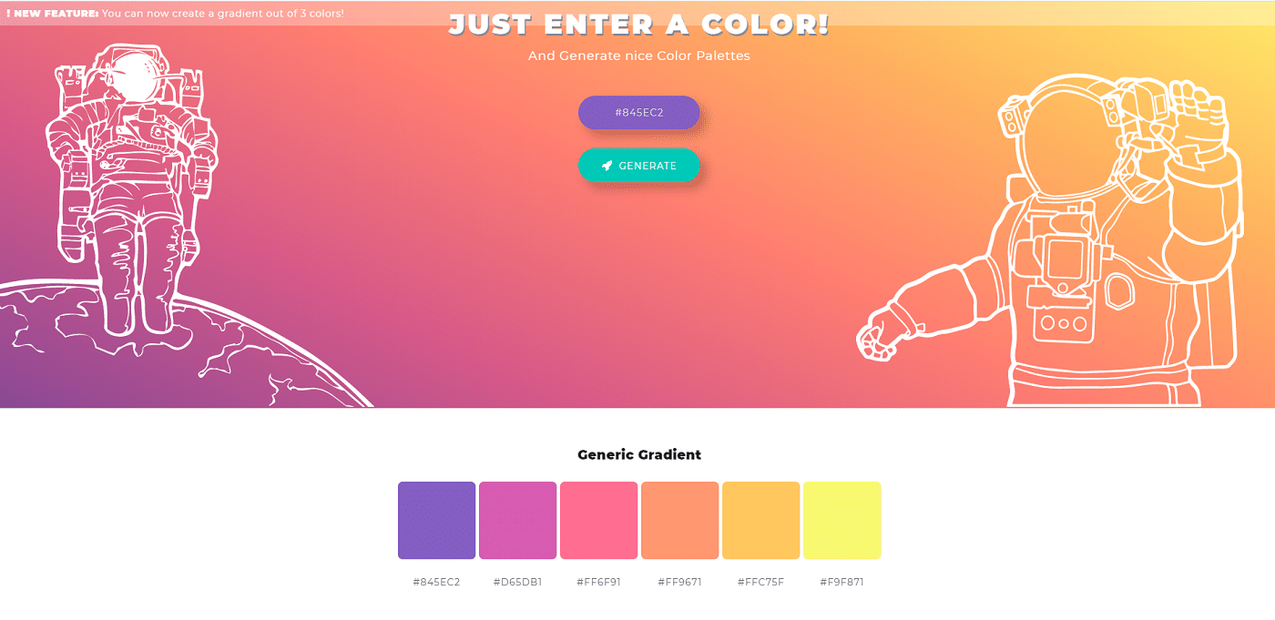
ColorSpace generates color palettes based on a primary color that you input. It offers a wide variety of style options that give you more flexibility.
Color Blindness: How to Pick a Colorblind-Friendly Palette for Your Website
The last thing to consider when creating a website color scheme is how different people will see the colors.
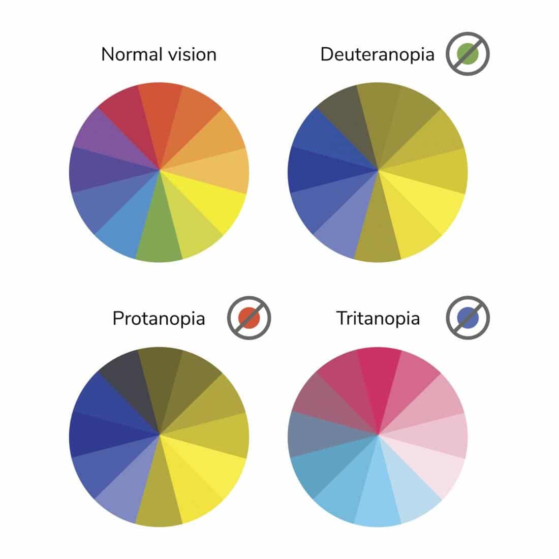
Not everyone sees the “standard” range of colors. There are three different main types of color blindness: deuteranopia, protanopia, and tritanopia.
Red-green color blindness (deuteranopia and protanopia) is the most common form of color blindness. It affects around 1 in 12 of Northern European descent. With such a large number of the population affected by it, it’s worth considering when designing and/choosing a WordPress theme.
Blue-yellow color blindness is much rarer and affects men and women equally.
How to Pick a Colorblind-Friendly Palette for Your Website
Since the number of red-green colorblind people is much higher than any other form of color blindness, it should be your number one priority to address with your design. Because they can’t separate red, green, and purple, but rather see them as different hues of yellow and blue, you want to avoid using contrasting colors that will end up looking too similar.
- Don’t contrast green with yellow or vice versa.
- Don’t contrast yellow with red or orange.
- Don’t contrast purple with similar shades of blue.
When choosing standalone primary colors for your logo or design, you should consider whether it is still on-brand for consumers who are color blind. For example, Kinsta’s purple is still a dark blue to red-green colorblind consumers, conveying a message of reliability and trustworthiness. For us, that’s 100% on-brand, so there is no potential conflict in the mind of our prospects.
Summary
The human eye might be capable of separating millions of different shades of color, but you don’t have to comb through all your options to find a color scheme that works for your site.
By focusing on your brand and your ideal customers, you can narrow down your choices of primary colors. Once you have your choices, you can rely on online palette generators to complete your own color palette, or choose matching colors based on examples and preference.
With the right approach, creating a website color scheme that could be used as a starting point of your design process can be achieved, although hiring the right web developer/designer is oftentimes required if you’d like to get the right professional look and feel your brand needs.
Now, it’s time to choose the fonts, isn’t it?


