In many situations, presenting data in an engaging format that’s easy to digest can offer many benefits. Graphical widgets for WordPress let you transform raw numbers and statistics into a visual and informative display that appeals. Most often, this will come in the form of a plugin, which lets you work with that data within WordPress.
In this post, we’ll explore graphical widgets for WordPress, including the different types you can use, the situations you’d use them, and plenty more. In the second half of the article, we’ll round up some plugins that can help you implement graphical widgets and then show you how to use one for your own needs.
Understanding graphical widgets in WordPress
Websites (including those that use WordPress) use two types of widgets: graphical and text-based. Typical text widgets can be captivating, but graphical widgets will display information in a more engaging format.
These widgets will have dynamic components that use different visual representations—such as charts, graphs, maps, and progress bars—to convey complex information at a glance. This can help you communicate with your readers better, which in turn helps them comprehend and interpret your data quickly. It could also improve your user engagement and retention.
While there are different ways to present your data, graphical widgets have a few elements in common:
- They will display data in a dynamic way.
- You’ll be able to offer interactive elements to help users ‘dig into’ your data.
- Regardless of your site’s design, you’ll be able to customize your widgets to match.
- There are lots of cases where you could offer real-time updates to the data you present.
However, graphical widgets are not all about adding visual flair to your site. They’re a big part of visualizing and interacting with your raw data.
Why graphical widgets can help your on-site data presentation
There are plenty of benefits to using graphics to convey a message. On the whole, visual content is big business and super important to online marketing.
For you and your data, there are lots of other positives to note:
- Enhanced data visualization. Complex datasets can be more accessible, letting users grasp trends and patterns quickly. They can also simplify how you deliver information by using versatile, adaptable, and digestible visual formats.
- Improved user engagement. Interactive elements give users the opportunity to bolster their time on-site and overall engagement metrics.
- Professional aesthetics. If you get the design right, widgets can elevate your site’s visual appeal. This polished and professional look can give your data presentation an edge.
Visual information often has the edge over text in any field, which means you can present key data points in a way that makes them ‘stick.’ As such, using them in the right way on your site is a top priority.
When to use graphical widgets on your WordPress website
Too much of a good thing will become repetitive and saturating. This means you’ll want to use graphical widgets with care and attention.
The good news is there are plenty of situations where you can use graphical widgets. The clearest time to break out the charts is when you need to simplify complex concepts for your readership. However, there are other niche cases:
- Presenting complex data sets, where you need to showcase large amounts of data or intricate relationships between data points.
- Highlighting trends over time and displaying changes or patterns in data across different time periods. You could even represent goals, milestones, or growth metrics.
- Comparing multiple variables to illustrate the relationships or differences between various data categories.
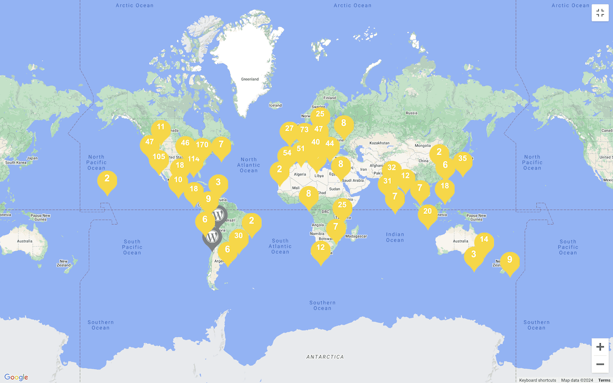
- Showcasing geographic data for specific locations or where your data requires spatial context.
You might even use graphical widgets where you need user interaction, such as for dynamic reports or other dashboards. The key is to decide whether displaying your data visually will enhance its understanding and engagement over other approaches.
In short, if the visual format provides value and clarity to your data, it’s likely going to be a good fit for a graphical widget.
The different types of graphical widgets for WordPress
Data visualization itself comes in various forms, and each display type will suit different data and presentation needs. We won’t go into the nuts and bolts of each way you can present your data here, although there are a few typical and standout options to note.
Typical charts and graphs such as bar charts, pie charts, line graphs, and area graphs are always a good shout for data visualization. These are staples of the approach:
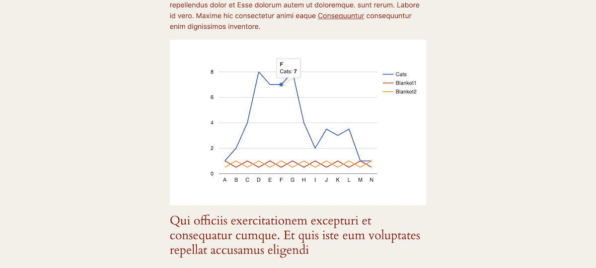
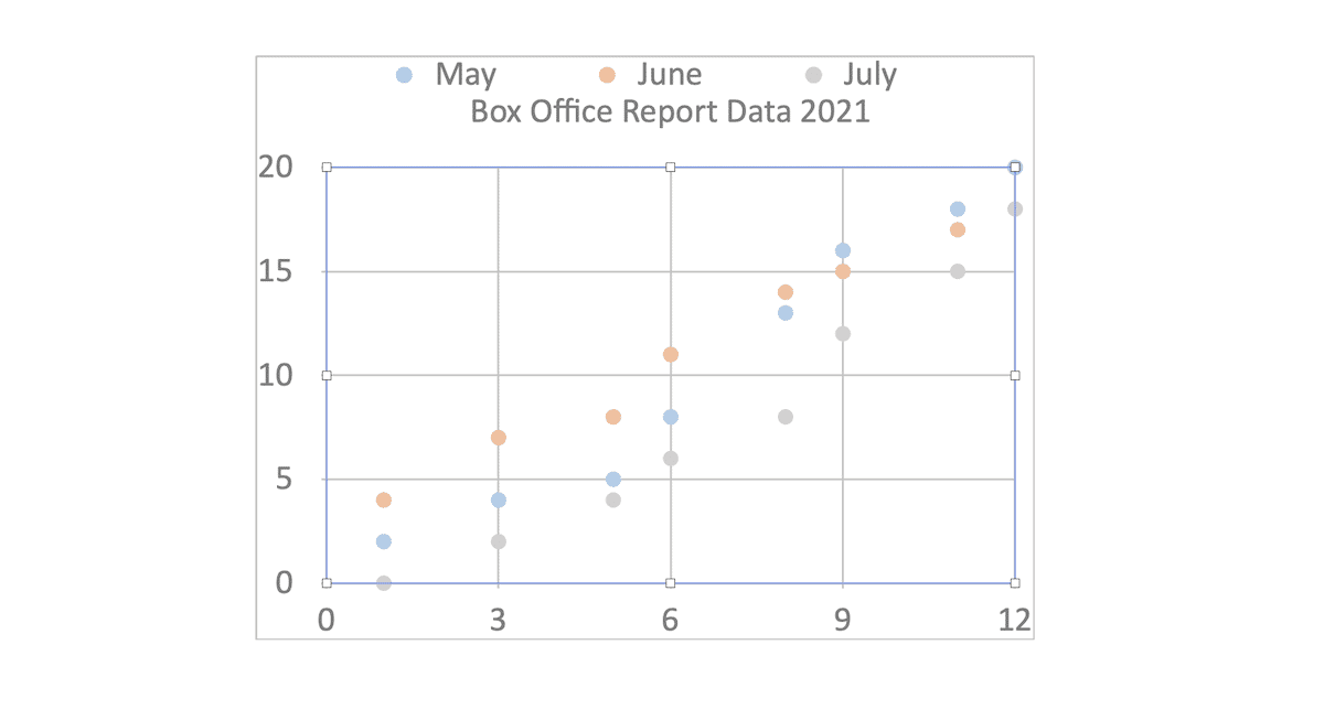
Scatter plots are a little more complex but will let you show the relationship between two variables:
Maps can come in various guises. Heat maps have niche use cases but will use color gradients to display the intensity of datasets. An interactive world map can be good where you need interactivity based on locations:
Counters and progress bars are more for milestone achievements. Here, you’ll turn to number counters that use dynamic counting to a final value. Circular progress bars can help showcase percentage completions. You can also do this with a linear horizontal or vertical bar:
Even image galleries, lightboxes, and sliders can help you present your data in multiple slides, with overlays, or almost as a story-driven event. This is where timeline visualizations can come into play, as can process flows. A data visualization type you’ll see a lot on photography tutorial sites is a ‘Before/After comparison.’
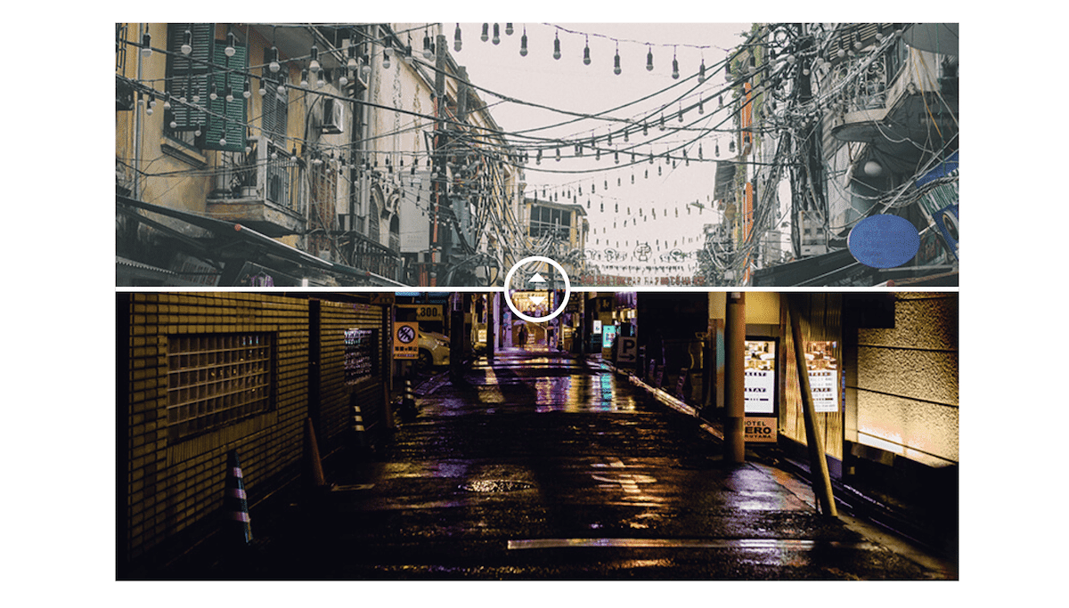
This lets you compare two versions of an image using a dynamic slider that drags across the image, revealing the other. It may not see much action for your use cases, but remember—every visualization type has an ideal application.
Where you’d use graphic widgets (including examples)
The type of visualization you use matters, but how you use it (and where) is also important. That is to say, there are different applications where using graphical widgets will have a great benefit.
You’ll spot that aside from typical use cases, there are also applications that you see often yet don’t associate with data visualization. Over the next few sections, we’ll cover a few of these uses.
Business applications
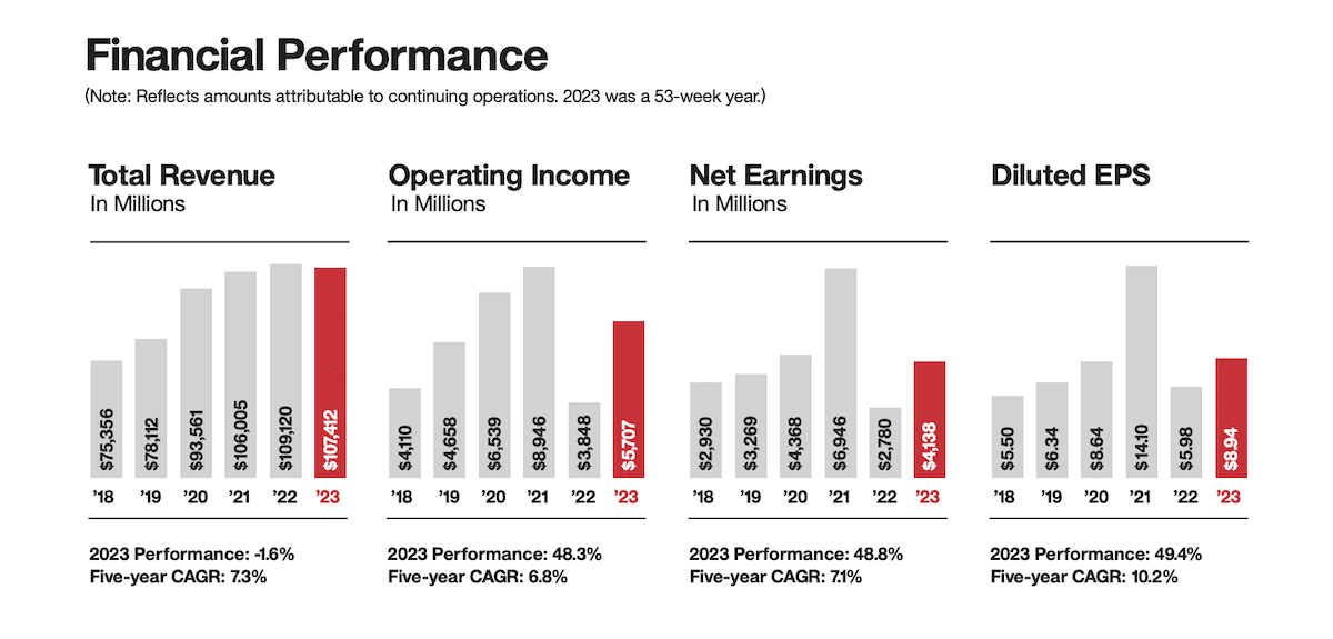
One of the ‘go-to’ implementations of graphical widgets is to essentially show off your key metrics. For businesses, this is a clear win in terms of presenting their data in an appealing way. A bar chart is easy to read with the right axis values and helps visualize sales trends over time or compare different products or services.
Target is one of the likely millions of companies that use this to showcase annual revenue growth:
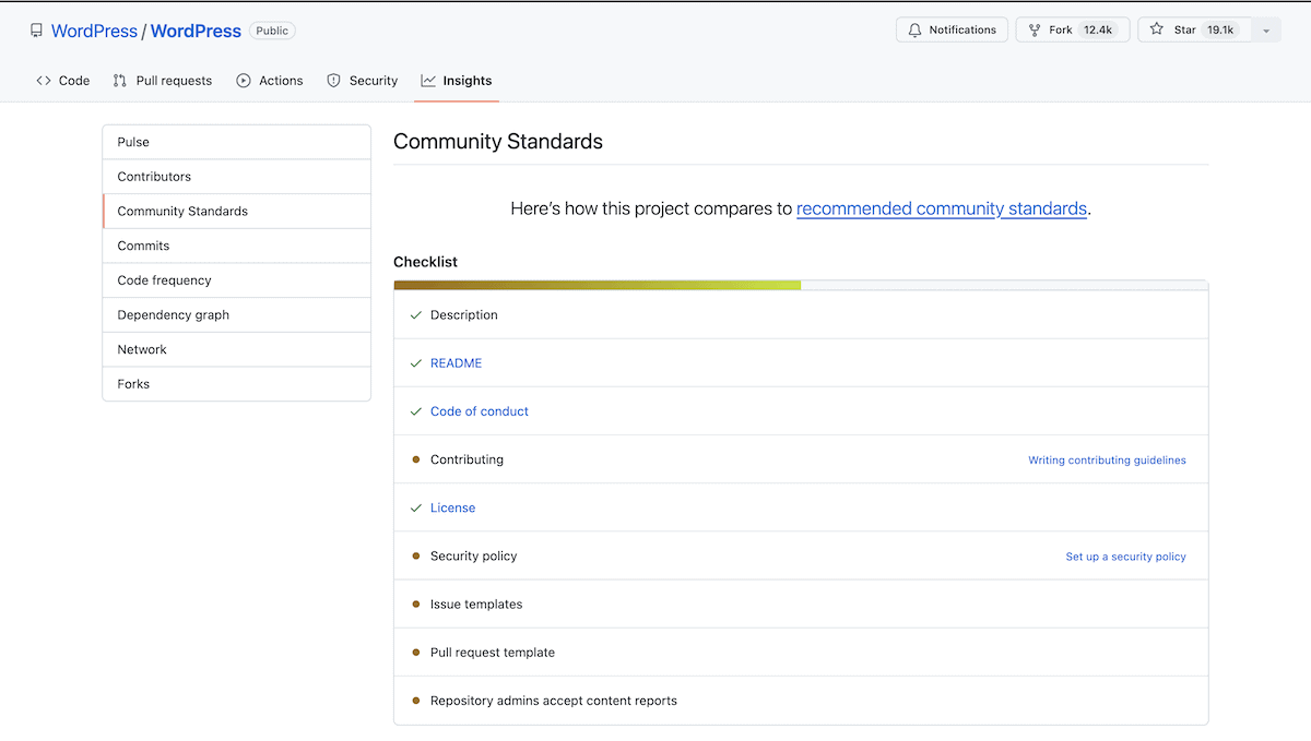
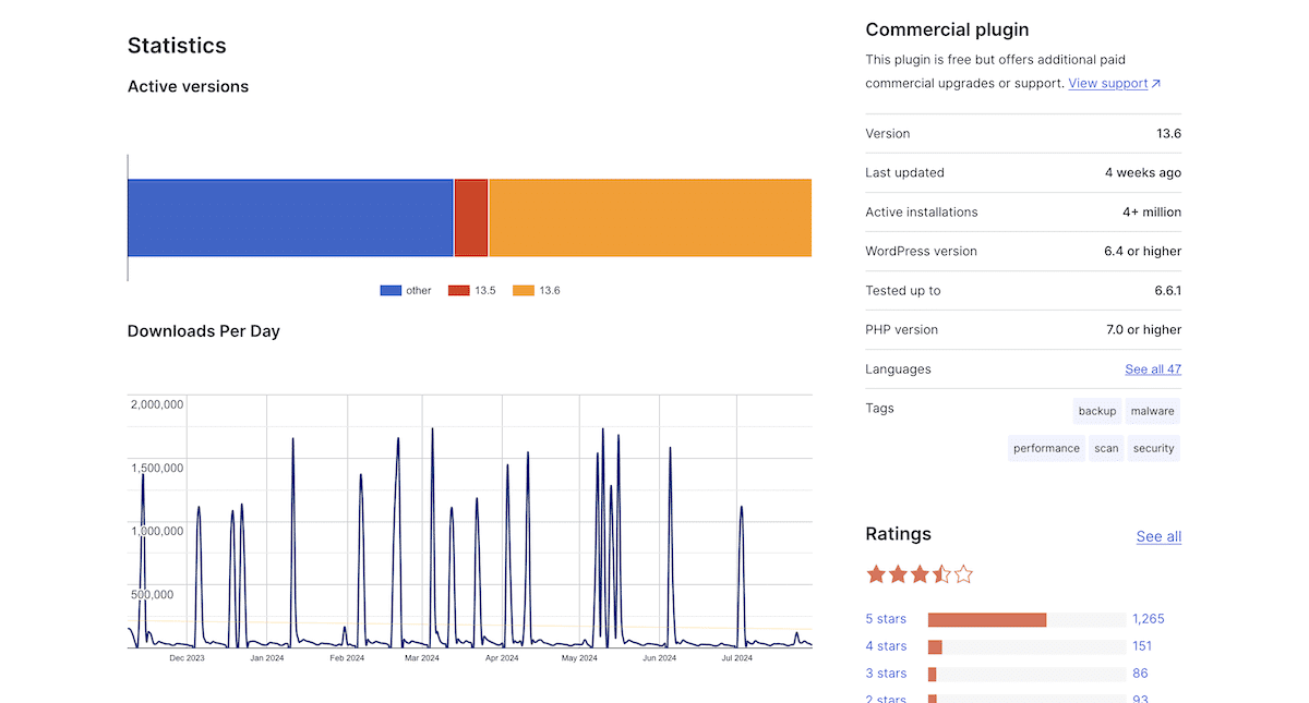
This also showcases how these simple presentations can illustrate the relationship between different metrics, such as customer acquisition cost or lifetime value. Stacked bar charts can also display this type of comparison. WordPress uses this approach on the Plugin Directory to display the breakdown of which version of a plugin users install:
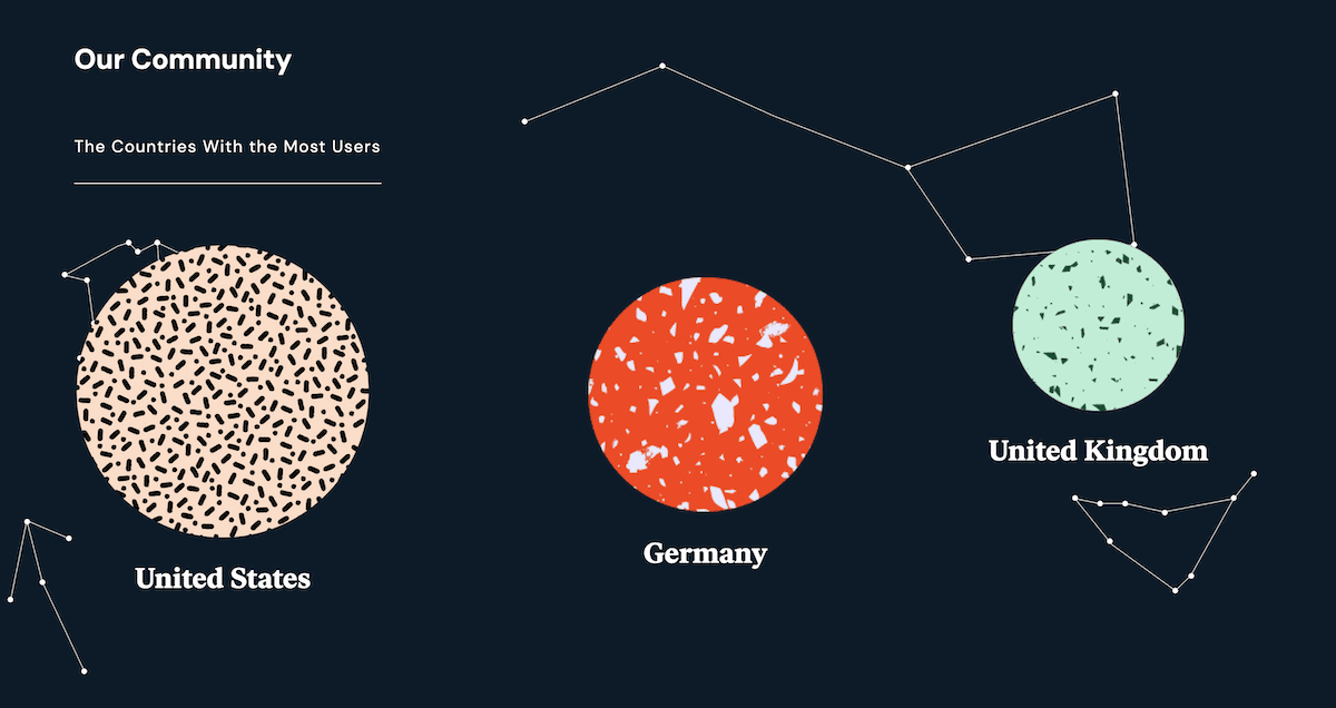
Pie charts and donut charts are great if a business wants to show data about its customer base. Often, this will be segmented by age, location, or another relevant factor. Elementor uses a cool and unique particle visualization to highlight its largest user bases:
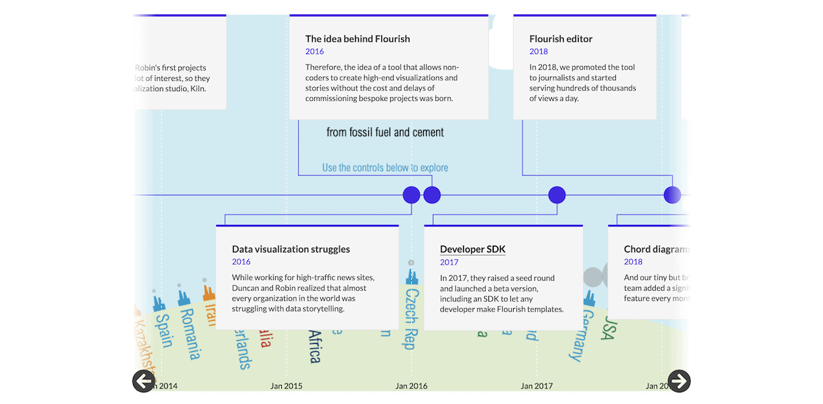
In other cases, you may choose to show off company milestones or project progression. Flourish uses a timeline to showcase its history, which can have an impact on brand loyalty:
In fact, e-commerce runs in parallel to general business applications, so everything here could apply to a store, too. Even so, there are specific ways this industry can visualize data, too.
E-commerce metrics
Purchasing decisions often involve a few seconds of deliberation, so it’s crucial to get the right information to customers quickly. Product comparisons using bar charts or radar charts help you compare features or specifications across different products, but that’s only the start.
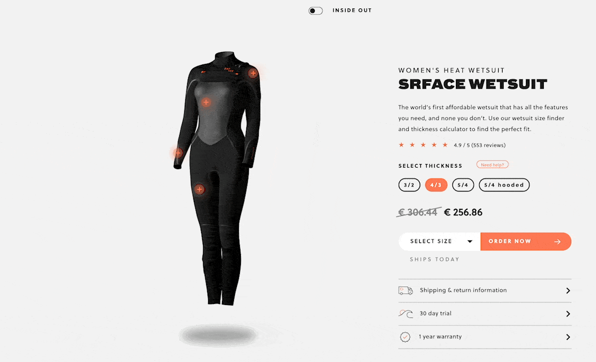
For example, SRFACE uses an interactive style guide to explain the specifications of its wetsuits and visualize the look of each variant:
It’s close to a business application, but you can also use charts and graphs to help visitors understand trends in product adoption. The WordPress Theme Directory does this using bar charts:
You could fit graphical widgets anywhere you’d otherwise use text. For instance, many e-commerce stores use simple contrasting text for stock calculations. However, progress bars might be a better fit here, as it could also increase the urgency of a sale.
Real-time metric tracking
Real-time visualizations have an exciting feel because you see a live progression of the tracked metric. Charities and non-profits use these types of graphical widgets frequently.
GoFundMe is the biggest crowdfunding platform on the planet, and every fundraiser gets a thermometer or progress tracking bar that fills up as a goal nears:

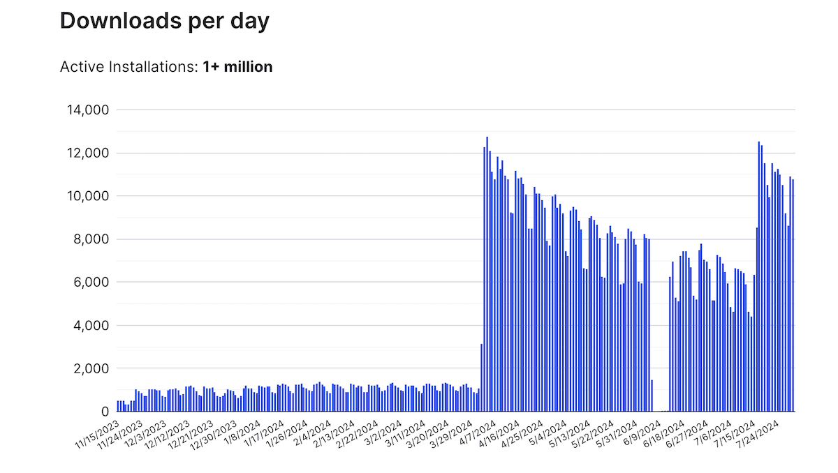
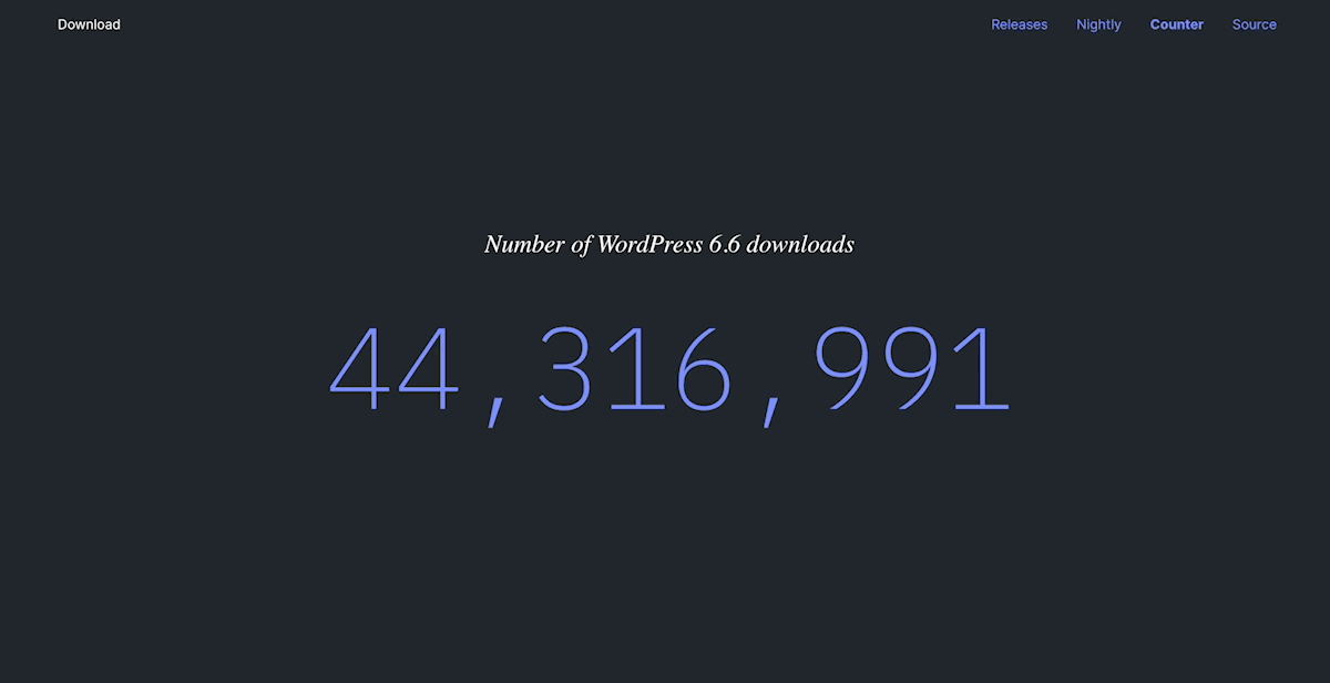
Animated counters or infographics can help to showcase the real-time impact of your products and services. For example, the main WordPress.org website has a dedicated page to display the number of downloads of the core platform that updates every minute:
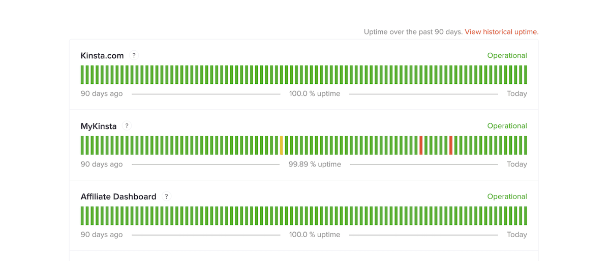
Kinsta even uses a tally chart to help you monitor your site’s uptime across our different services:
This ‘live’ update strategy can have practical applications other than simply showboating and flair. In some cases, you’ll need to have up-to-date knowledge of certain metrics.
Internal analytics
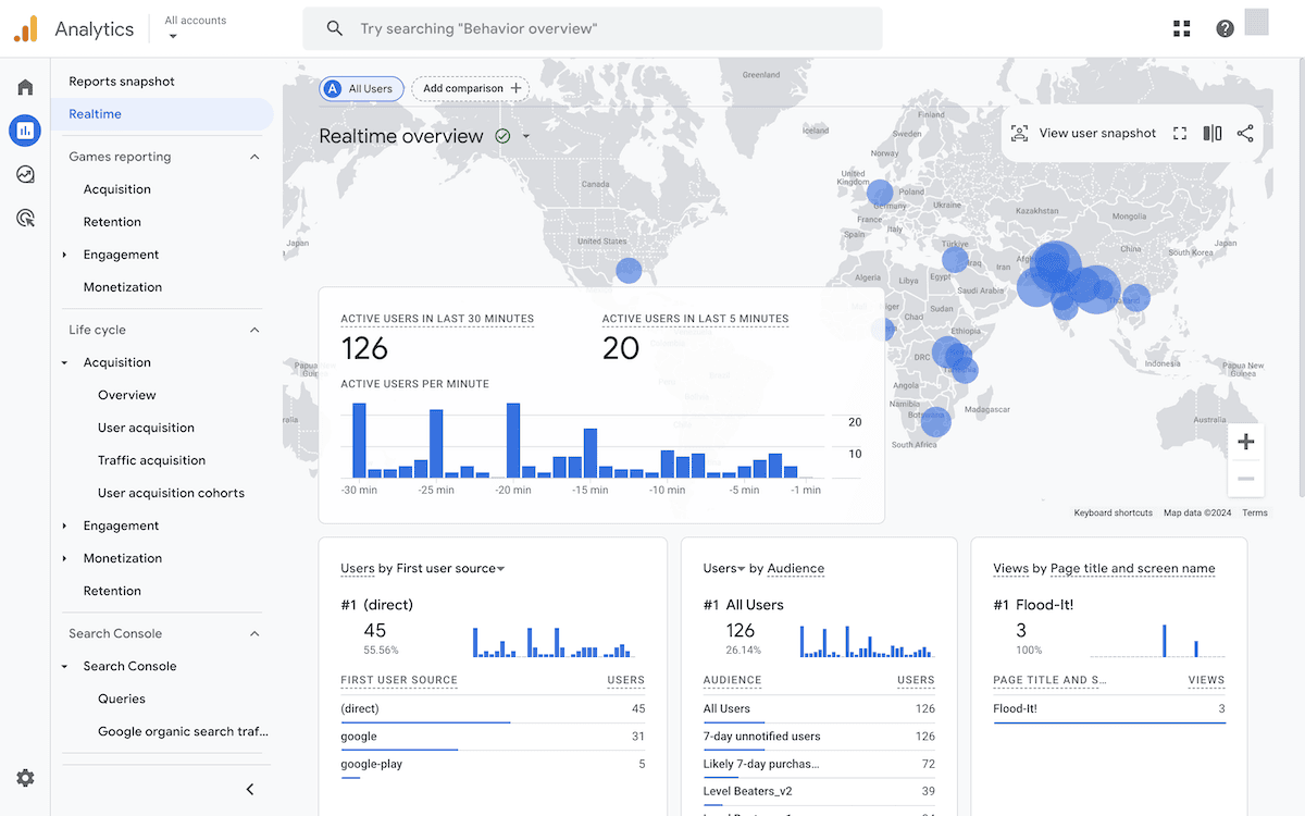
Performance monitoring has a wide scope. It could be a frontline, KPI measurement strategy, or a personalized overview of a particular metric. Google Analytics is a good example of displaying a wealth of niche site data in a captivating way:
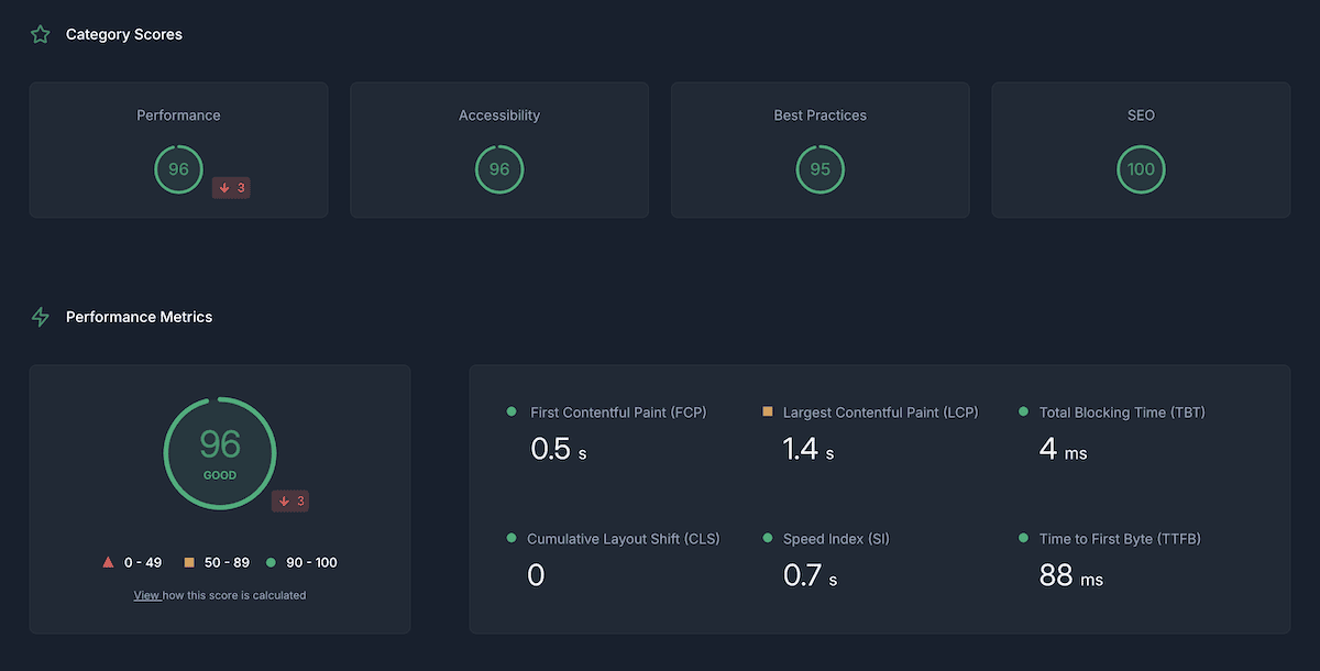
Google Lighthouse auditing app DeploymentHawk uses a number of different charts, graphs, counters, and more to crunch the numbers and visualize the results of a report:
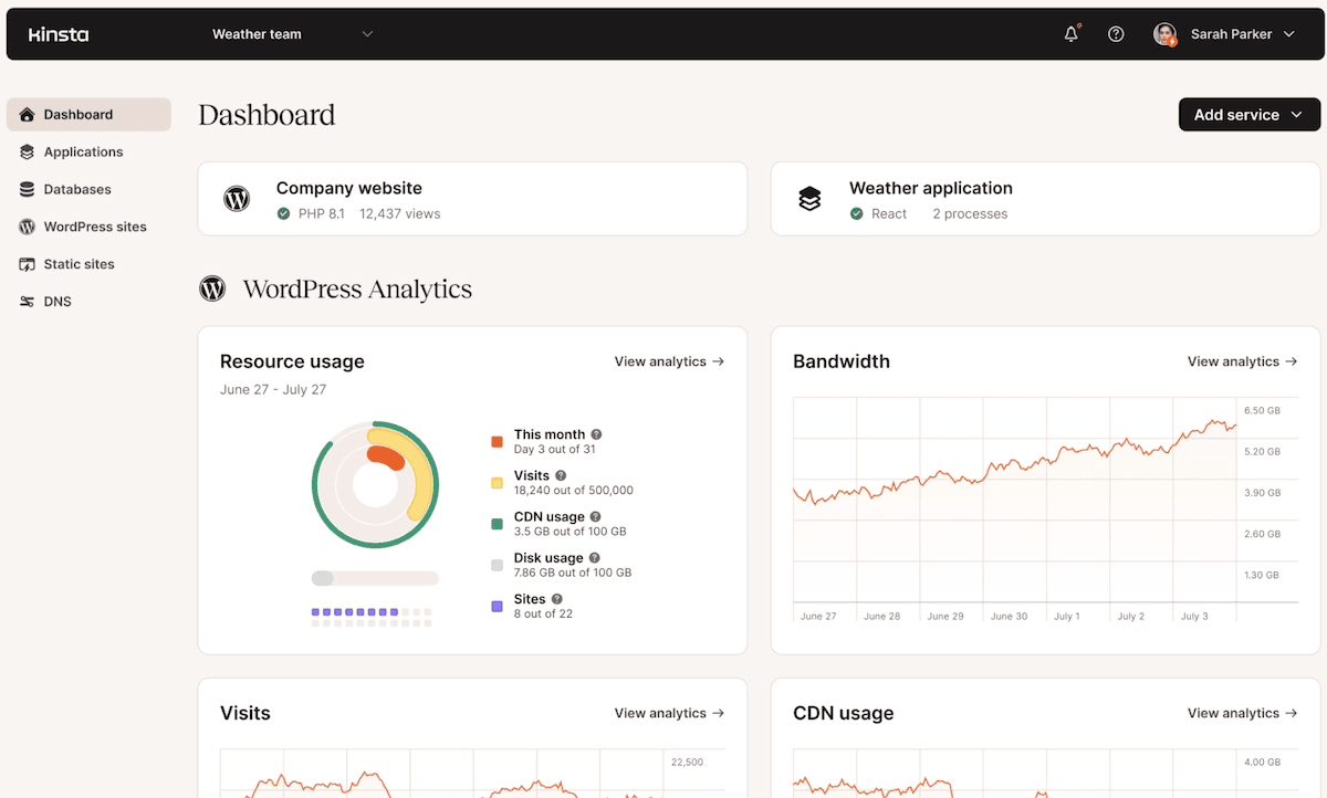
The Kinsta Application Performance Monitoring (APM) tool and MyKinsta dashboard do this also, using lots of different data visualization types depending on the metrics you need to see:
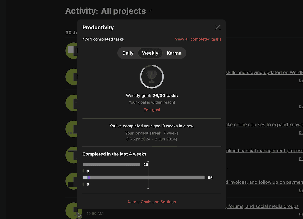
Gamification can always assist if you have completion targets to meet. Todoist does this using basic bar and line charts alongside its ‘karma’ points system:
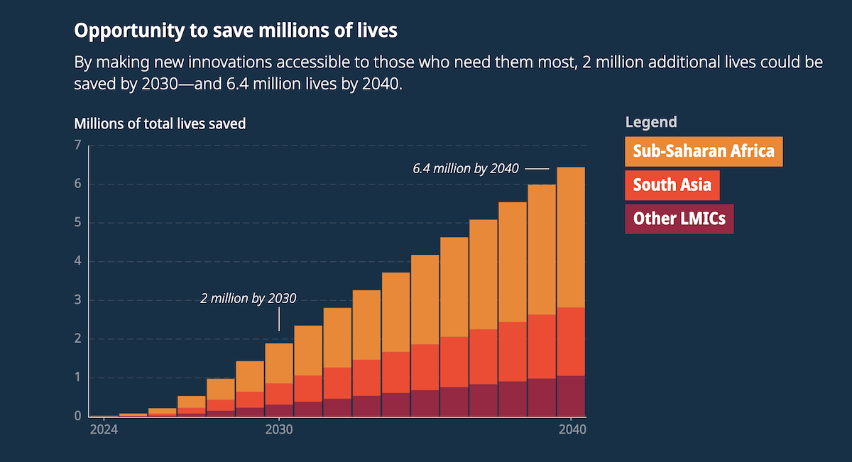
Finally, some nonprofits will publicize their internal findings. This creates a unique dichotomy between public-facing presentation and using data as an internal barometer. For example, The Gates Foundation takes its internal philosophy and vision, applies it to the future, and, in turn, creates an excellent example of predictive statistics:
With this flexibility in visualization type and application, you can also harness the adaptability of graphical widgets. The rest of this post will show you how to do this within WordPress.
Plugins that help you display graphical widgets for WordPress
Of course, to implement graphical widgets for WordPress, you’ll use a plugin. Across the next couple of sections, we’ll look at some of the best options you have – in no particular order.
1. Visualizer: Charts and Graphs
ThemeIsle’s Visualizer is a solid choice for free graphical widget plugins. It supports a variety of chart types and is straightforward to use, as are its other themes and plugins.
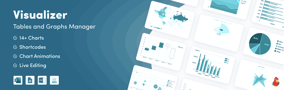
It offers four different chart types, a data editor with a spreadsheet-like interface, and plenty of customization options. The plugin also integrates with Google Charts (and other Google APIs). However, while this plugin does have full functionality, you need to pay for the premium version ($199 per year) to access more chart and editing types.
The free version will suit most users, though, especially for basic yet gorgeous data visualization.
2. Data Tables Generator by Supsystic
At first glance, Data Tables Generator doesn’t seem like it fits this list of graphical widget plugins for WordPress. After all, as its name suggests, you can only create text data tables. This is true for the free version, but the premium edition includes a lot more functionality, including charts and graphs.
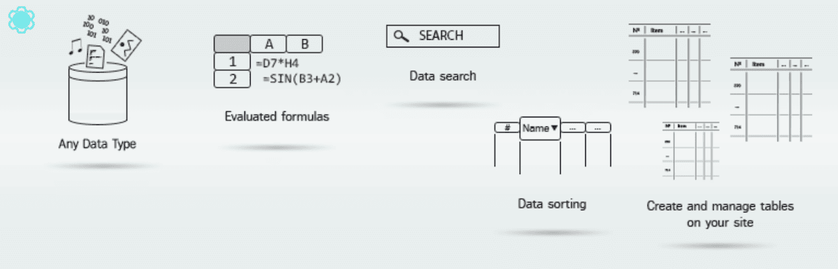
The good news is that your creations can look fantastic out of the box. You have all sorts of visualization options, such as bar and line charts, donut charts, bubble graphs, and more. We also think the sorting and filtering options lead the field.
This means the plugin will be a great fit for sites that need a high level of interactivity, especially if they also need data tables and more visual data representations.
Despite this, there are no charts or graphs available in the free version. With a lifetime license costing $89, though, Data Tables Generator is a steal for the functionality you get.
3. wpDataTables
Much like Data Tables Generator, wpDataTables doesn’t have a primary focus on charts and graphs. You can do it with the plugin though, and the results are quality. Sites that deal with large, complex datasets will want to take a look at this plugin.
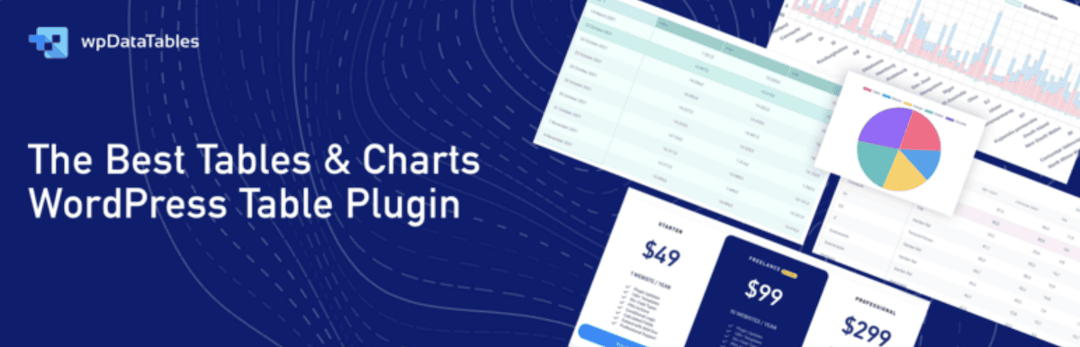
As you’d expect, there are more options to create tables here, but there’s integration with both Google Charts and Charts.js to give you 15 different visualization types. It’s adept at handling large datasets, and the source import options are fantastic. You can bring in data from Excel, XML, CSV files, JSON, and even PHP arrays if you have development experience.
The functionality hidden behind the 70+ chart types in the premium edition (starting from $39 per year) makes it worth learning, even with the learning curve.
4. amCharts: Charts and Maps
The amCharts plugin is unique in that it connects to an external Content Delivery Network (CDN) to deliver its library. As such, the plugin only helps you connect the JavaScript libraries to WordPress rather than create the charts directly.
The functionality of amCharts is extensive, and it comes with a high level of customization. However, you need to use the amCharts interface to create your graphical widgets, which means switching between two platforms.
If you need a diverse set of chart types and are happy using the third-party interface, amCharts could work for you. However, there’s no free tier to access charts or graphs, so you’ll need a premium license that starts from $80 per year.
5. Graphina – Elementor Charts and Graphs
If you use Elementor, you already have some graphical widget options within the page builder. However, Graphina bolsters this with a lot of quality charts, graphs, and other visualization types.
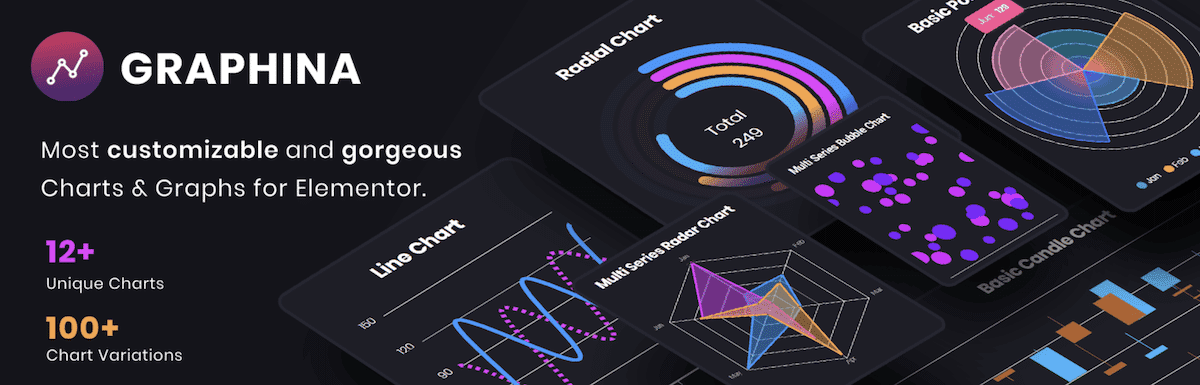
This plugin has the greatest number of chart types and designs in a free graphical widget plugin and has deep integration with Elementor and Divi. You also have some of the most comprehensive customization options available in any plugin, let alone a free one.
It seems unbelievable, but the premium version ramps up the functionality even further to make Graphina the most in-depth graphical widget plugin for WordPress. Of course, you’ll need Elementor (or Divi) to take advantage of the feature set, which could be a roadblock. For $49, though, it might be worth a switch to one of these popular page builders.
6. Ninja Charts
Ninja Charts is a free WordPress chart plugin with no premium tier, built to work alongside Ninja Tables so your existing table data feeds directly into charts without rebuilding anything. Fluent Forms entries and manual data input work as sources, so you can use data you’re already managing. Across all three, you can choose between two rendering engines- Chart.js and Google Charts.

With 12 chart types, you can match the format to what your data is trying to show, like trends, comparisons, and distributions. Colors, labels, axes, and legends are all customizable to fit your site’s look. They also moved the full setup into the Gutenberg block editor, so you can configure and preview without switching screens.
Where it falls short is data aggregation. The plugin renders data as-is, so any grouping or calculation needs handling at the source before the chart sees it. But for standard data visualization needs, you won’t find a free plugin that covers this much ground.
How to add graphical widgets for WordPress using the Visualizer plugin
Let’s quickly walk through the process of adding a graphical widget to your WordPress website. We’ll use Visualizer, given that we liked it enough to make it our favorite.
However, this isn’t meant as a Visualizer tutorial. As such, the steps we take here could differ from those of your chosen solution. With this in mind, install and activate your plugin of choice, and then create a new chart or graph.
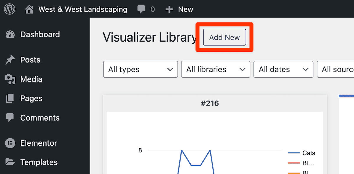
In Visualizer, we get that option upon installation:
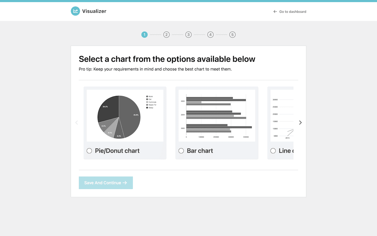
Most likely, there will be an Add New Chart button somewhere within the plugin’s admin panel:
Once you click the button and select your chart type, you’ll need to input your data. The free version of Visualizer only supports manual editing, but your plugin could offer integrations and import options for a variety of tools:
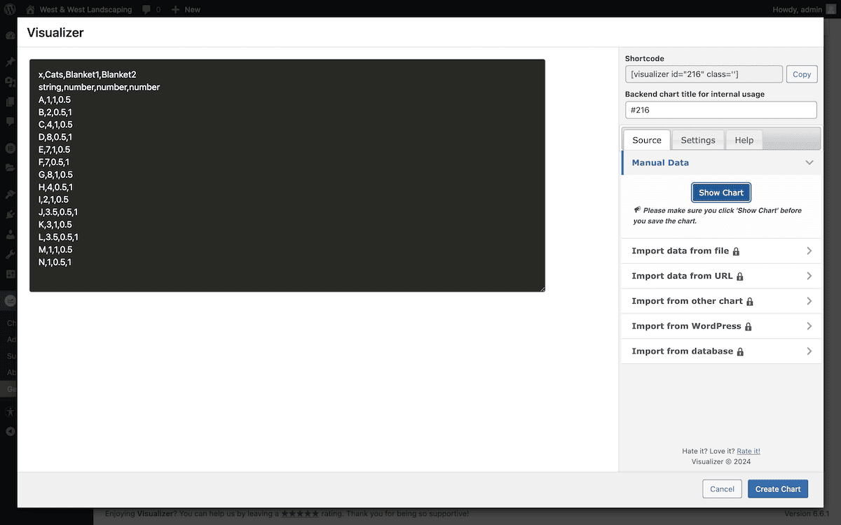
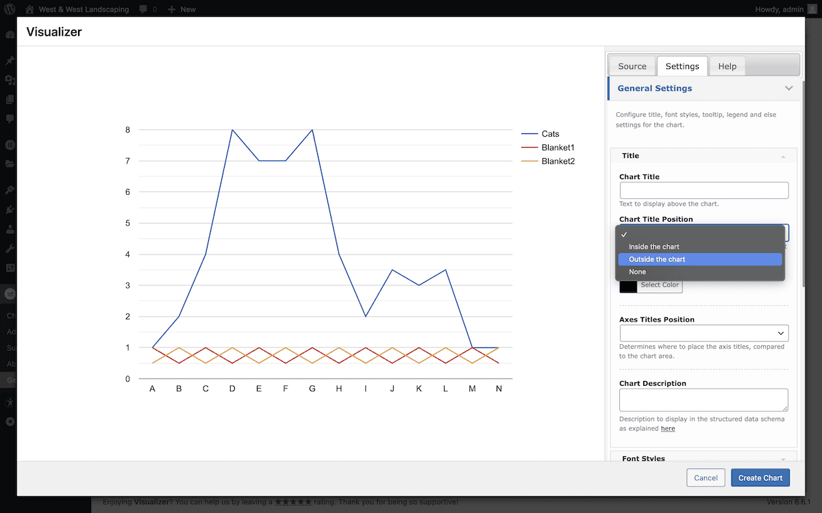
Next, check out the customization options available to you. Visualizer includes these within the chart creation screen. You have settings for all manner of aspects, such as the title position, axis labels, grid lines, chart size and placement, and much more:
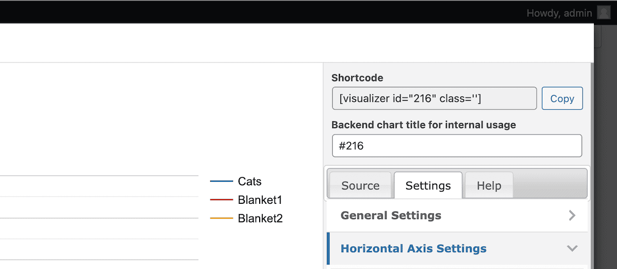
The final step is to embed your chart or graph on your site. Many plugins use shortcodes for this, which means you have a simple copy and paste into your desired post or page:
Visualizer also provides a Block for this, which is handy and in keeping with modern WordPress design.
Typical practices for displaying your graphical widgets
It’s important to consider a few aspects when presenting your charts and graphs. In a nutshell, treat them like the important and impactful content they are, and look to limit how many widgets you display. To get more in-depth, though, consider the following:
- Placement. Your widgets should have a natural fit within your content flow, much like your images and videos do. Graphical widgets often straddle the line between media and content.
- Loading speed. Make sure you monitor your site’s performance after you add widgets. Some could impact your site’s performance.
- Accessibility. Although you are offering visual data, ensure you include appropriate alt text and are navigable via keyboard. This helps all users access your widgets, regardless of sight ability.
When it comes to performance, this is something to be mindful of. There are many facets that can affect your site’s speed, which makes sense, given the load from your additional graphics. Our advice is to use SVGs where possible. They’re more performant than raster images for simple charts and icons, with better scalability.
Lazy loading and caching can help here, too, as both restrict how your charts load in different ways. If you choose to pull data from external sources, ensure you choose efficient connections to minimize the number of HTTP requests you serve. The best and most optimal approach is to host that data on your site’s server, although the decision may not be one you have control over.
Summary
Graphical widgets for WordPress allow you to visualize your typical text data on your site. This method of data presentation and visualization can transform complex information into a more digestible format. You can display this data using charts, graphs, interactive maps, and more.
The right plugin for the job is crucial, and we cover a lot in this post. Visualizer is a great option, as is Graphina. However, the correct tool for the job relies on your own needs. It can undoubtedly have a huge, positive impact on your site and its engagement.
Are graphical widgets for WordPress important enough for you to implement? We’d love to hear your thoughts in the comments section below!