Ecommerce is growing more than ever, but most online stores suffer from an epidemic of abandoned carts.
On average, 70% of online shopping carts get abandoned before the customer finalizes their purchase. So if you have an online store, you could be losing almost eight of ten potential customers during the checkout process.
With an average conversion rate of 18.64%, abandoned cart emails can help win back a significant portion of these customers.
In this guide, we’ll give you everything you need.
We’ll cover what abandoned carts are, how you can win back your customers with emails, and give you the tools you need to do so.
What Are Abandoned Carts?
Abandoned carts occur when your potential customer adds an item to their checkout but fails to complete the purchase.
For example, a potential customer might add an item to their cart on Amazon.
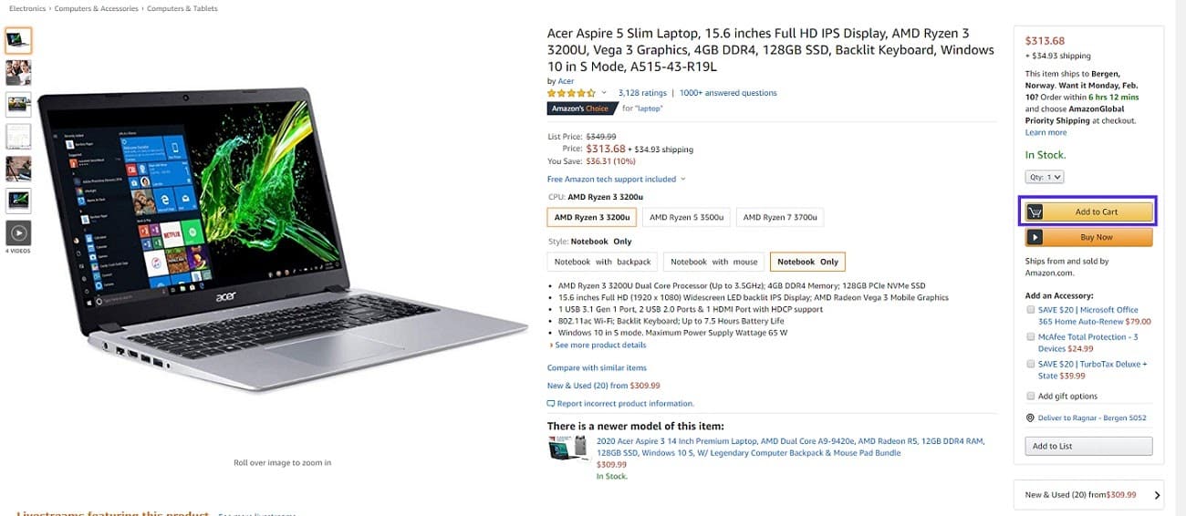
At this point, they’ve created a new online shopping cart with a single item in it. But this isn’t the final step of making a purchase.
When they’re reviewing their cart later, they decide against checking out and buying the items in their cart.

So instead of clicking the checkout button, filling in their billing details, and paying for their items, they just leave the website altogether.
Since they “abandoned” the cart without finishing the transaction, this is called an abandoned cart.
The brick-and-mortar equivalent would be just walking away from a cart you already filled with items and leaving the store, hence the name.
How Do Abandoned Cart Emails Work?
Abandoned cart emails work by tracking user actions on your site. The software records the products they browse, the items in their shopping carts, and their purchases.
If you use an ecommerce platform like Shopify or BigCommerce, they automatically track these actions and metrics without having to custom-develop a tracking system. Plus, chances are, existing customers have already signed up with their email so it is easy to contact them. But you could do mostly the same if you’re using WooCommerce (more on this below).
Once a potential customer adds an item to their cart, and then leaves your website, the ecommerce platform will register this as a lost or abandoned cart.
For example, Shopify includes basic abandoned cart emails in the core, and you can edit the email templates in the Settings > Notifications section.
You can, for example, edit the design through the CSS stylesheet or add a custom message for a particularly high-value customer.
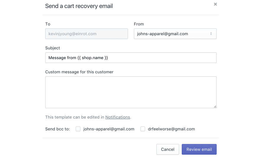
Emails based on this template will be sent automatically as customers abandon their carts.
If you want more control over the content and design of your emails, you can also install and use third-party email marketing tools. That way, you can create fully customizable multi-step email campaigns that send multiple emails a certain amount of time after they’ve abandoned the cart.
How to Send Abandoned Cart Emails With Major Ecommerce Platforms
In this section, we will quickly cover how you can edit and send abandoned cart emails with the industry-leading ecommerce platforms; WooCommerce, Shopify, and BigCommerce.
(Check out our 11 Best Shopify Alternatives).
Cart Abandonment Emails in WooCommerce
WooCommerce doesn’t have any built-in functionality that supports cart abandonment emails. You could use WooCommerce’s official extension Follow-Ups, which for a single-site license costs $99.
Another option is to use the free Abandoned Cart Lite for WooCommerce plugin.

This plugin will add a new section to your WooCommerce dashboard called Abandoned Carts.
By clicking this link in the menu, you can open a section where you can edit your email content, change the email sending settings, check recovered carts, and more.
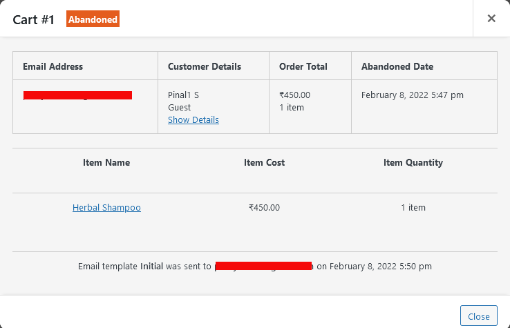
You can use the standard WordPress WYSIWYG editor to create your emails in the Abandoned Carts > Email Templates section by clicking the Add New Template link.
Other Cart Abandonment Email Tools for WooCommerce:
Cart Abandonment Emails in Shopify
With Shopify, you have some basic functionality included in core, which allows you to send a single, simple email, at the time of your choosing.
You can access these settings in the Settings > Checkout section, under Abandoned Checkouts.
However, to control the template and content of your emails, you need to install an app like Abandoned Cart Recovery which costs $19 per month.

With it, you have complete control over the content of your emails, how often to send them, creating popups to capture the emails of prospects, and more.
Other Cart Abandonment Email Tools for Shopify:
Cart Abandonment Emails in BigCommerce
BigCommerce is the only solution that allows you full control over your abandonment emails out-of-the-box.
You can control the design of your emails and what they include such as product images, text, etc., and even how many emails to send/when to send them.
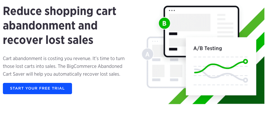
You can edit all settings from the Marketing › Abandoned Cart Notifications section of the dashboard.
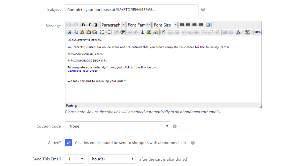
The basic template looks good on both desktops and mobile phones, and you have full control over the HTML.
Other Cart Abandonment Email Tools for Bigcommerce:
Advanced Ecommerce Email Marketing with Third-Party Tools
Third-party email marketing software can help you go beyond basic cart abandonment campaigns. You will get the best results by using specialized tools for ecommerce.
With native integrations, they can help you not just send cart abandonment emails but send reminders and recommendations based on their browsing and shopping history.
The following providers have available apps for the three major platforms, including out of the box cart abandonment campaigns, purchase-based segmentation, and more ecommerce features.
Retainful, MailerLite, ConstantContact have native ecommerce integrations, including cart abandonment campaigns and segmentation for Shopify and WooCommerce.
BigCommerce does offer pretty powerful cart abandonment emails out of the box, so you might think you don’t need a third-party tool, but it does have its limitations.
For example, you can’t use segmentation to deliver personalized drip campaigns, which is one of the best-performing practices for better email marketing.
Abandoned Cart Email Examples
Just jumping in and creating your first abandond cart campaign blind isn’t a great idea. It’s better to learn from what other companies are doing.
Below we’ve covered real examples of abandoned cart emails and highlight what they do right vs wrong.
Boot Barn
What They Did Right
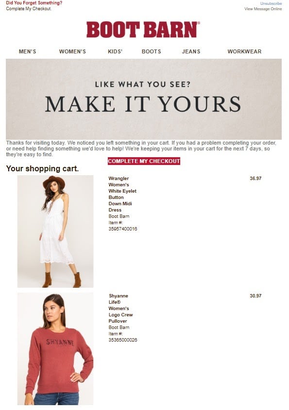
While this isn’t the greatest cart abandonment recovery email of all time, Boot Barn certainly did a few things right here.
The items left in the cart are highlighted with product images. The email was sent on the same day as the customer abandoned the cart.
They let the customer know that they have a limited amount of time left to recover the cart (7 days) before it’s automatically reset.
What Could Be Better
There is also no shortage of areas to improve either. There is no product description or copy related to the products beyond product categories, gender, and size information.
The standard header with menu links takes attention away from the fact that this a reminder email about an abandoned cart.
The complete my checkout link/button is unnecessarily small, as this is an HTML email. They should have included a bigger button for the CTA.
The design isn’t very balanced, with large images on the left, and only a few words of product information on the right.
Design By Humans
What They Did Right
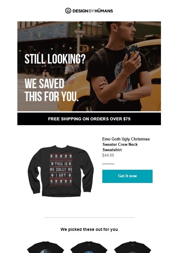
This example is a good-looking cart abandonment email for a single product. Design For Humans opens up with a customized header image that makes the purpose of the email clear.
It also highlights the product in question with a clear image and title, keeping things simple. The call to action is a clear button with the text “Get it now,” so there is no room for confusion.
The design is well-balanced, with good use of white space and color to separate different elements.
Finally, below the original abandoned items, they’ve included a selection of related products. This strategy can be useful when the customer changed their mind about a product at the last minute because of taste, price, size availability, or other factors.
What Could Be Better
But the email is not perfect. They could introduce a sense of urgency by mentioning how long the cart or product in question will be available. For example, “This shirt is part of a limited collection, so we cannot guarantee how long supplies will last. If you want to secure it in your size, you should order it asap.”
They might also want to use some text/copy to clarify the situation and highlight some of their most compelling selling points.
GoPro
What They Did Right
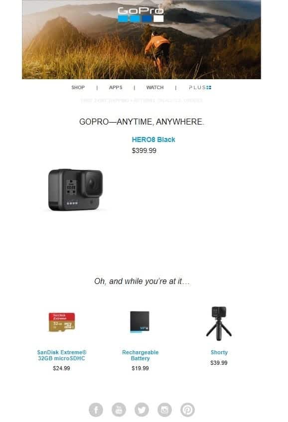
GoPro shows us another example of what an abandoned cart email for a single product could look like.
They highlight the abandoned product at the top of the email with a decent-sized product image. GoPro also recommends relevant products like a spare battery, an SD card, and a tripod.
What Could Be Better
A lot of things could be improved here. There is no customized header or any text that points out why they even sent the email beyond the subject line.
The email almost looks a bit empty and doesn’t take advantage of HTML to create a well-designed email. Apart from the header, it looks almost like a text email with some images thrown in.
There also isn’t any scarcity or appeal to why the customer should change their mind about the product.
Hot Topic
What They Did Right
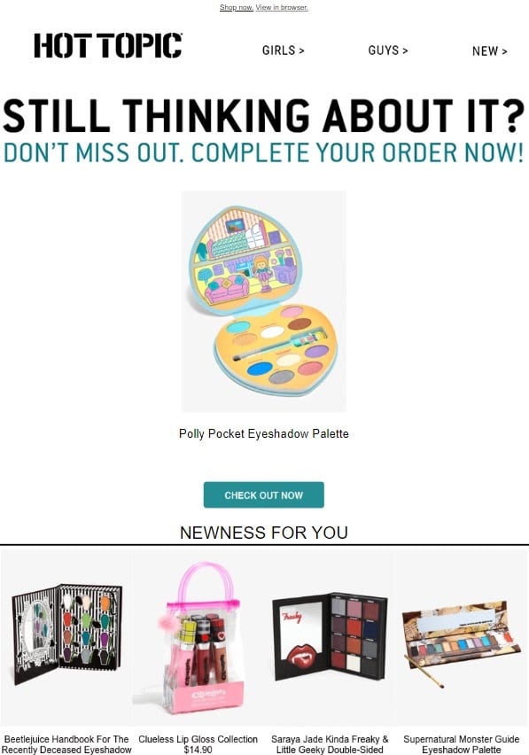
Hot Topic is more known for their brick and mortar experience, but they have a good grasp on the ecommerce side of things as well, as proven by this email.
The email header communicates why the customer is receiving this email and what they should do next with 100% clarity. Further, the email also highlights the product at the top with a product image and title, followed by a clear CTA button.
Lastly, they’ve included a selection of similar products in case the customer changed their mind because of price, taste, or brand.
What Could Be Better
The headline could be improved to be slightly more brand-appropriate and less pushy. They could also include a few lines of copy to either cover the specific product or create a sense of urgency.
The image’s grey background also creates a slightly jarring effect with the rest of the design (you should always invest time when choosing your color schemes).
Snowboards.Com
What They Did Right
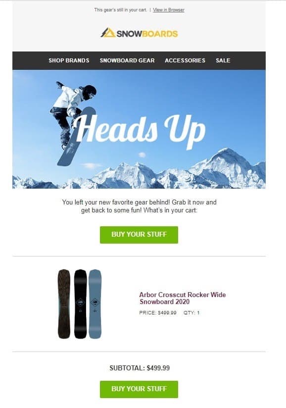
Snowboards.com starts off the email right with a relevant, attention-grabbing header graphic, but it’s all downhill from there.
The design is simple and focuses the reader’s attention on the product image and the CTA buttons.
What Could Be Better
While the “Heads Up” headline does grab the reader’s attention, it doesn’t clearly communicate the content or purpose of the email.
“Buy your stuff” isn’t the button copy of the century, either. The cart abandoner also has no real incentive to take action now.
Amazon
What They Did Right
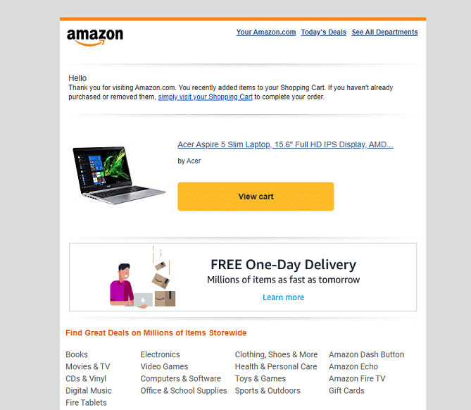
Amazon relies heavily on email as a tool to sell more products. If you have any doubts about that, just do a quick search of your inbox.
The copy is straight and to the point, without being pushy or salesy. The design is simple but focuses the reader’s attention on the abandoned products and the CTA.
The email also highlights Amazon’s competitive advantage (free one-day delivery) for existing or prospective Amazon Prime subscribers.
What Could Be Better
They could include a customized header that communicates the “why” of the email. There is no sense of urgency, and the email isn’t confident about whether or not the customer has completed the purchase yet.
Cufflinks
What They Did Right
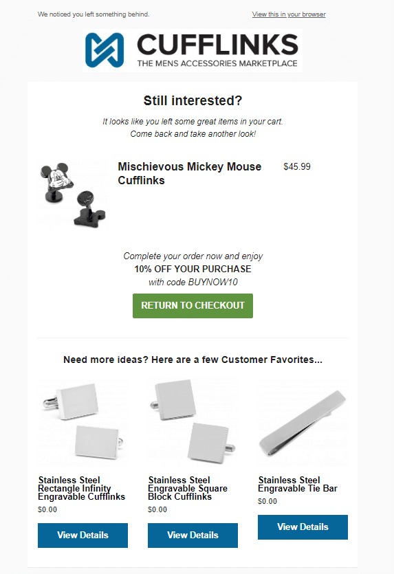
The Cufflinks email starts off the email with a headline and two lines of concise copy that immediately gives the customer context. The product image and title are visible above the fold, helping potential customers remember what they’re missing out on from the second they open the email.
They even include a coupon code to give cart abandoners a sense of urgency and incentive to finish their orders ASAP.
What Could Be Better
The product image is a bit small and pushed to the left, with too much room for the product title and pricing information.
Note: It seems like the prices for their recommended items either are not working or have been filled out incorrectly as $0.00. Always test your emails before you start sending them to your customers.
Figs
What They Did Right
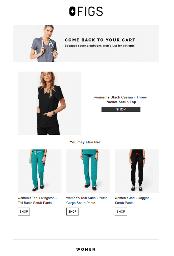
Figs’ email starts strong with a clear headline and a witty sub-headline that makes a case for potential customers to give the product another chance.
The design is simple yet balanced and highlights multiple related products for customers who are on the fence.
What Could Be Better
The call to action button is quite small, with the same color as the text, and it is not as prominent on the email layout as we wished.
There’s no reason for the customer to go back sooner rather than later
Free People
What They Did Right
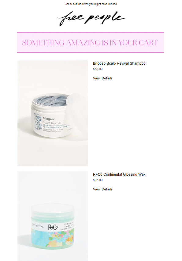
Free People’s mail starts off the email with a straitghforward headline that gives customers clarity and context on why they are receiving the email.
The products in the cart are featured with large, high-quality product images.
What Could Be Better
The call to action is hidden in text links that are the same color as the regular text. There is no copy beyond the headline, and readers have no incentive to take action in the short term.
Paige Denim
What They Did Right
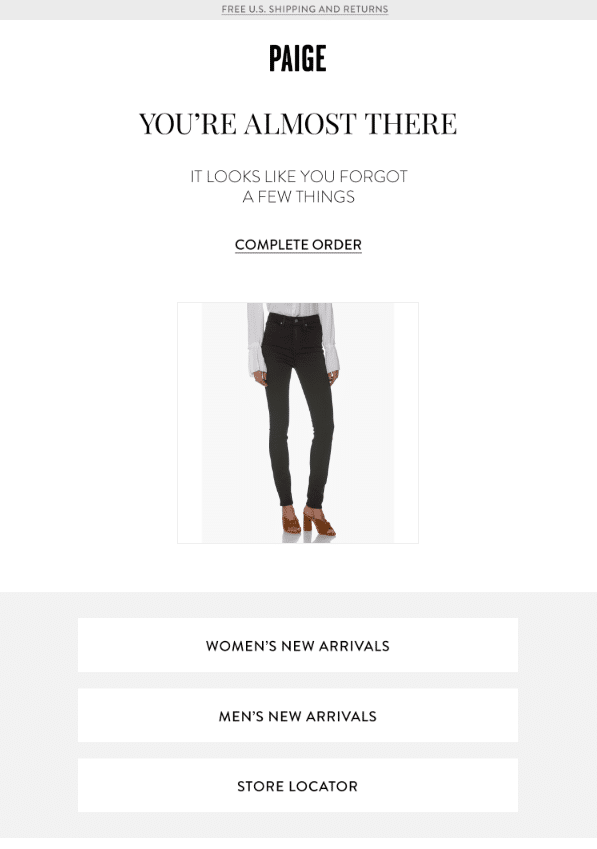
Paige Denim’s email grabs the reader’s attention with the headline and clarifies the purpose with the subheader.
The cart is represented by a single product image that is the center point of the design.
This email is clearly designed for mobile phones, which is the most likely place your customers will be reading your emails.
(Suggested reading: The Beginner’s Guide to Responsive Web Design).
What Could Be Better
The call to action is a link in black, so it doesn’t stand out from the rest of the text. There is no product information beyond a single image in the email, so it’s not 100% clear what the abandoned cart contains.
Roman Originals
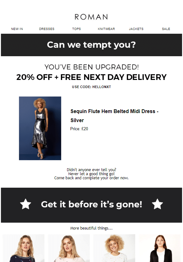
What They Did Right
Roman Originals grab the attention of the reader right away with a special offer. They understand that marketing is a battle of getting someone to take action now, not later, and their copy and call to action reflects that.
What Could Be Better
The design is clean and does highlight the abandoned products with images, but the image size is a bit small, and it might be better not to justify it to the left.
Abandoned Cart Email Templates
Many autoresponders and email automation tools offer different templates that you can quickly edit to create a great-looking abandoned cart email.
MailChimp has a category of dedicated ecommerce templates that you can quickly turn into the right thing. You can reach them by navigating to Campaigns > Email Template > Create Template > Themes:
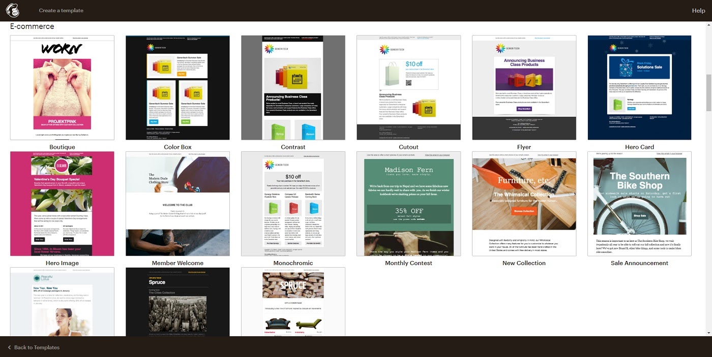
Remember that all a template does is control how your pictures and text look, you control the actual content of the email. So if you choose any of the templates above, you can easily add a headline like “Did You Forget About Us?” and create a relevant email.
Campaign Monitor also has a section of templates designed for deals and offers that you could repurpose.
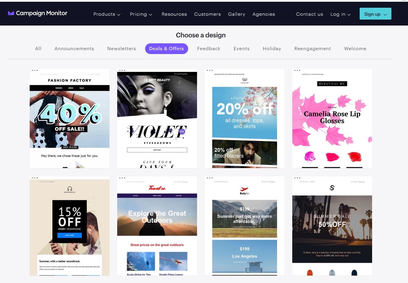
Almost every major email marketing tool out there will provide you with templates suitable for cart abandonment campaigns.
There are also HTML5 email design services where you can pick and use abandoned cart templates, and then integrate it with your email marketing solution.
Litmus offers a series of abandoned cart email templates designed by the Email Monks team.
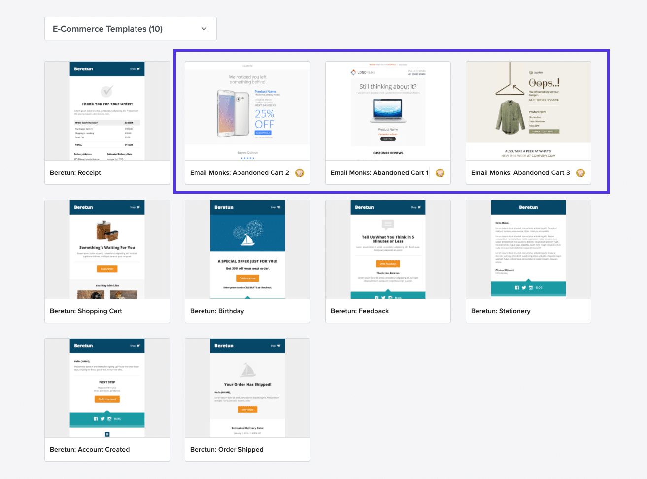
This template series is designed perfectly for abandoned cart emails, but to use it you need a Litmus account. After the free trial, the Litmus email builder will be an extra expense in addition to your autoresponder.
Stripo is another similar service and it offers several templates to help you tackle your cart abandonment issues.
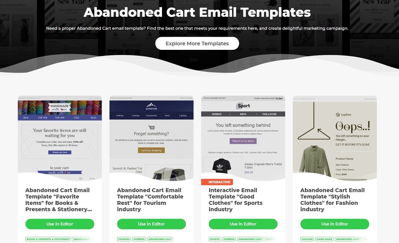
Unlike Litmus, Stripo has a free forever plan, which means you can use the templates and email builder to get set up, although you will be limited to a single project and two templates.
Suggested reading: Email Typography: 8 Best Fonts for Email
Abandoned Cart Email Strategy
There are three pillar tactics for abandoned cart emails. All strategies rely on email automation, as manually matching each cart to an email address would be impossible.
- The first one is to send a simple reminder with a link, which you can set up with all platforms and most autoresponders. But to lower your abandonment rate, it’s not enough to just send a 2-line email with a link.
- The second option is to highlight the actual items in their cart in the email with product images, which might require a plugin or extension. This is an example of segmentation/personalization. The emails are more relevant to each customer because it highlights the actual products they were interested in.
- The third is to send an abandoned cart email sequence over several days, that finishes with a discount code for the item(s) in their cart. You will need a separate email tool or at least an app/extension to implement this strategy.
Abandoned Cart Email Subject Lines
Most abandoned cart email subject lines focus on emotional and time-sensitive words like “forget”, “abandonment”, “hurry up”, “don’t miss this”, and similar ones.
To support this argument, let’s take a look at the subject lines from the emails we examined above as, which weren’t shown earlier:
- Paige Denim: Did You Forget Something?
- DesignByHumans: We saved this for you
- Roman Originals: Don’t forget your basket…
- Boot Barn: Did you forget something?
- GoPro: Don’t forget about Hero8 Black
- Free People: Don’t forget about me :'( xoxo, Your Shopping Bag
- Hot Topic: Your cart has abandonment issues.
- Figs: Abandonment Issues. We Get It.
- Amazon: Acer Aspire 5 Slim Laptop.
As you can see, we can say they all followed the KISS approach (Keep it Simple Stupid).
When it comes to copywriting, this is perhaps the best copywriting rule. Specifically, for abandoned cart subject lines it shows full power through clearness and simplicity.
That’s why you shouldn’t make your subject lines too fancy. Focus on grabbing your almost-customer’s attention, making it about them, and clearly communicating that they left a shopping cart behind.
Abandoned Cart Email Timing: When Should You Trigger Your Emails?
There’s never a set-in-stone-true-for-all answer to these types of questions. Yet data shows that if you just send a single email, the highest ROI you will get will be from sending an email on the same day of the abandonment, with a 1-hour delay. This will likely provide you with the highest conversion rates.
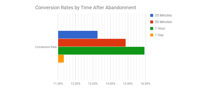
20-30 minutes seemed to be too short/fast, while waiting 24 hours was too distant from the purchasing experience.
The numbers may be inflated by customers who would naturally return and finish their purchase anyway, so instead of sticking to just one email, the best idea is to create a sequence. But how much time apart should your automated emails be sent?
Abandoned Cart Email Sequence
To win-back as many customers as possible, you should create an email sequence that is activated for abandoned carts. For best results, you should space the emails out with 1-hour, 1-day, and 3-days delay.

Instead of just sending the same reminder email every time, you spin up things a bit and follow up with an email featuring social proof or video demonstrations of your product to make your product more appealing.
Here’s an example:
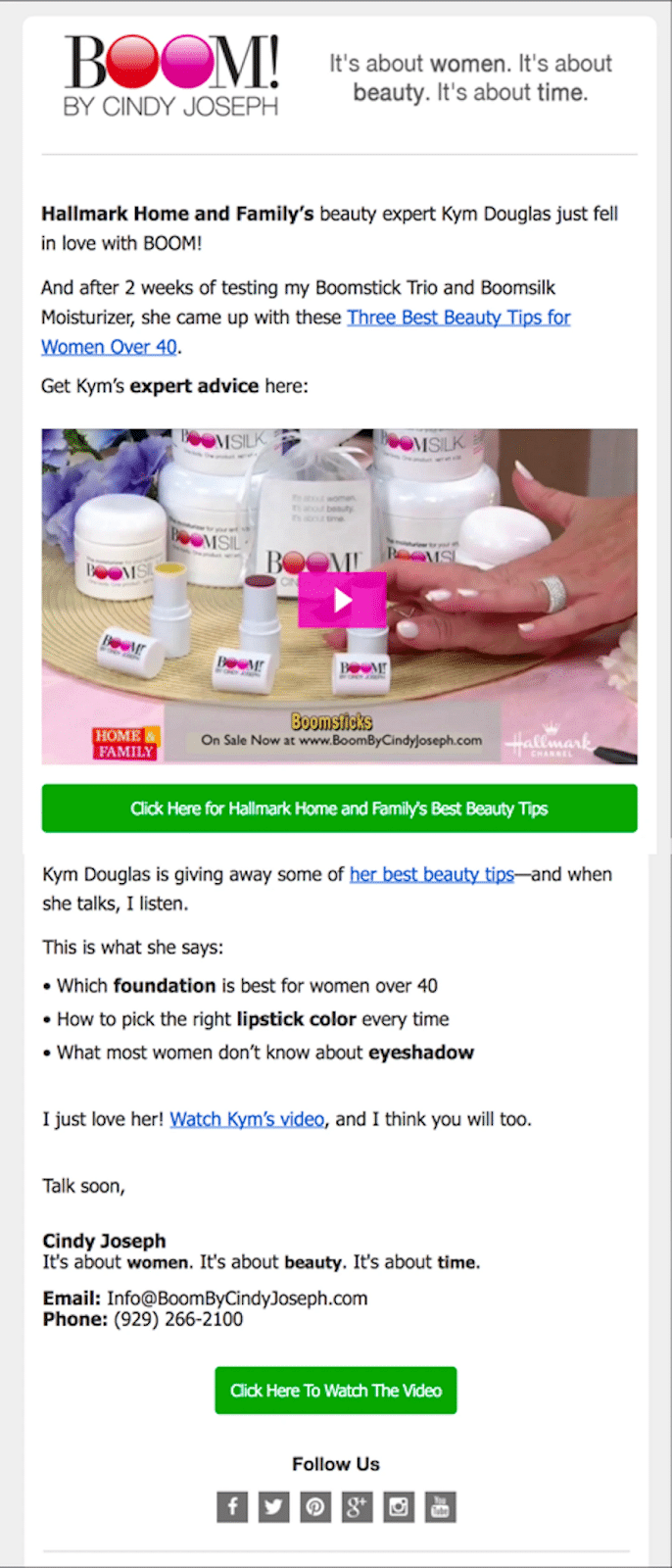
There are a lot of different strategies and tactics you can adopt, but if you implement a solid, personalized campaign with multiple follow-ups at the right time, you’re probably good to go.
After all, abandoned cart recovery is just one of many ecommerce strategies you should tackle if you want to beat your competition.
Are Abandoned Cart Emails GDPR Compliant?
GDPR is all about asking and gaining consent from customers you engage with. Yes, cart abandonment emails are compliant with the EU’s new General Data Protection Regulation (GDPR), provided you have explicit consent from your customers.
Customers need to actively opt-in by checking a box to receive updates/marketing emails. It cannot be pre-checked where they need to “opt-out” during the process of becoming a customer.
As a reminder: for compliance, you also need to include an unsubscribe option and your full business address in all emails you send to your customers/prospects.
Summary
Since many of prospective customers won’t succesffuly complete their checkout, abandoned cart emails can be an incredible sales and marketing tool to help you sell more products.
By using effective subject lines, sending the emails at the right time, and creating an email sequence that converts even the most hesitant consumers, you can significantly grow your revenue.
Closing more customers this way will also help your top-of-funnel campaigns become more profitable, giving you more leeway to experiment with new channels and re-invest in more advertising, branding, or even developing new products.
Are you taking advantage of abandoned cart emails within your strategy? We’d like to hear from you, so share your experience in the comments below!

