
Most businesses with solid followings have fully embraced all that email marketing has to offer by this point. Email newsletters, autoresponders, you name it. Email marketing has been a consistent way to keep your finger on the pulse of your customer’s needs while simultaneously promoting all the latest products or services you have on offer.
The fact that you can reach customers long after they’ve left your website is so powerful. However, any old email just won’t do. How you present your email content is an essential part of capturing attention and encouraging customers to actually read your emails rather than deleting them on sight.
Design plays a crucial role here. But likely one of the most important aspects to attend to is your font choices. Email-safe fonts make it easier for customers to read what you have to say, which means you’ll be more likely to get that conversion.
That’s what we’ll be discussing here today.
What Are Email-Safe Fonts?
It’s tempting to use fancy fonts for your emails. After all, you want to make a positive impression. And you want to make your content stand out. However, special fonts won’t always display correctly in all email clients. In fact, if a font isn’t supported, an email client may end up using a fallback font which could mess up your intended tone at best or obscure the legibility of your content at worst.
That’s why it’s highly recommended you stick to email-safe fonts only when creating email marketing content. We’ll get to the specifics in a moment. But first, let’s briefly discuss how good font choices can actually make a huge impact on your conversion rate.
How Good Fonts Boost Conversions
Most people spend only 11 seconds on email. That means any fonts you choose need to be readable and scannable. They need to offer that “at-a-glance” convenience. Often, this means relying on standard fonts that everyone is familiar with already. Sound boring? The alternative is worse. In fact, people take twice as long to read fancy fonts. And if people are only spending 11 seconds on an email, that’s a ton of time wasted.
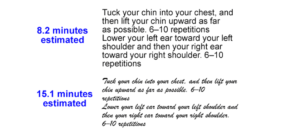
It’s not just the font you choose that has an impact on conversions, however. The size of the font you choose matters, too. In fact, according to research conducted by Click Laboratory, slightly increasing a font’s size can have a huge impact on your conversion rate.
The research involved increasing a block of text set to Arial font from 10pt to 13pt. More space was added between the lines of text as well. The 13pt version of the font performed so much better because the content was now easier on the eyes and more readable.
This small change reduced bounce rate by 10% and increased the conversion rate by a whopping 133%! All because of bumping up the font size two points!
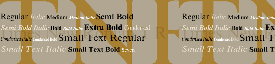
There’s a psychology to your font choices as well. This applies to logos mostly but it would pay to keep this information in mind as you’re selecting email fonts as well. Certain types of fonts have certain “feelings” associated with them. According to Crazy Egg, the five main font types elicit different emotions or associations:
Serif Fonts
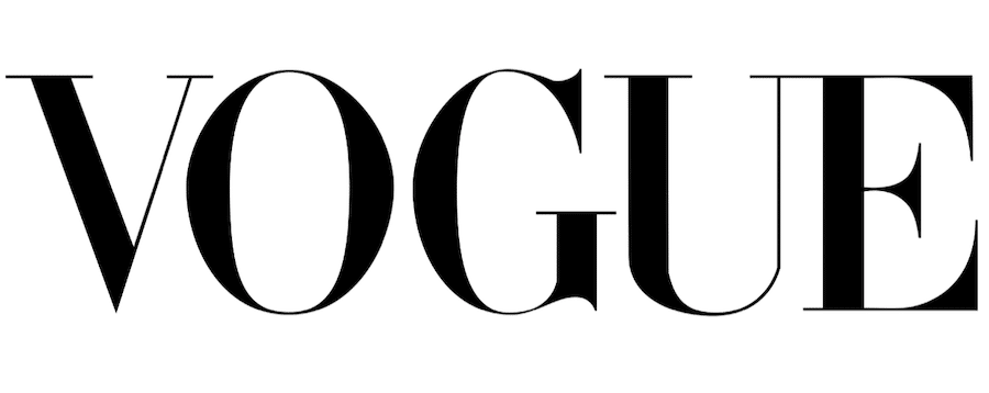
Examples include Times New Roman, Baskerville, and Georgia. Serif fonts exude a sense of respectability, reliability, and tradition. Older brands (or those that want to appear as though they’ve been around for decades) make solid use of these sorts of fonts to instill confidence. The Tiffany & Co logo serves as a solid example.

Vogue, too:
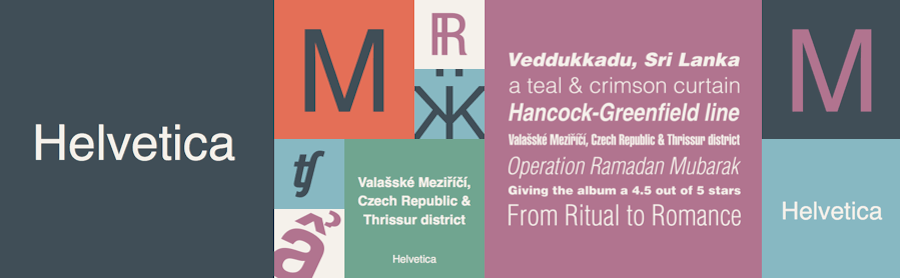
Sans Serif Fonts
Examples include Helvetica, Calibri, and Franklin Gothic. Sans serif fonts give off a modern look that’s clean, simple, and straightforward. These fonts give off the impression of reliability and stability. Sans serif fonts are very corporate-looking. Netflix features a sans serif font:

Modern Fonts
Examples include Futura and Century Gothic. Modern fonts can appear stylish, chic, or give an overall sense of strength. Hulu’s logo is a popular example of one using a modern font:

Script Fonts
Examples include Edwardian Script and Bickham Script. Script fonts will likely not be a wise choice for use in your emails. However, they do make an impact when used in logos and that could work for graphical elements. Coca-Cola is a timeless example of a script font used well:
Display Fonts
Examples include Cooper and Valencia. Words and feelings commonly associated with display fonts include a sense of individuality or uniqueness, friendliness, or expressiveness. For logos (and possibly headers), display fonts can make a real impact and stand out. Disney offers one of the most well-known logos in the world, and it features a display font:

With this information in mind, we can now move onto how you can select the best font for emails.
Email Typography: How to Choose the Best Fonts
You now know the five basic types of fonts that are available (other than symbols, I suppose). And you know that different font types create different emotions in your customers. But how does knowing the type of font Coca-Cola uses translate into picking the right font for your email newsletters?
Let’s dive in.
Any font you pick to use in your company emails needs to include the following 4 qualities:
Quality #1: Readability
We’ve already mentioned this quality but it bears repeating because it’s the most important by far. If your font isn’t legible, no one will be able to read your emails. And if they can’t be read, you certainly can’t expect conversions, now can you?
Quality #2: Clarity
Clean, crisp fonts with precise lines are what’s going to work best in your email copy. Nothing with flourishes or squiggles. And certainly nothing with super thin or light lines. Larger font sizes do better, too. Make your font a pt or two larger than you would typically, ensure the font-weight is decent (but not bold), and aim for a 1.15 line spacing.
Quality #3: Psychologically Appropriate
As mentioned above, certain font types have specific feelings associated with them. Make sure the font(s) you select fit the overall mood you’re trying to convey with your content as well as the purpose of your content. Appearing reliable or as an authority figure might be beneficial if you’re trying to sell something, for instance.
Quality #4: Brand Appropriate
Similarly, any font you choose should make logical sense for use for your industry or niche. If your company has an old-fashioned feel, using a super modern or display style font wouldn’t be suitable. Similarly, if you run a technology-based company, something rustic or formal probably wouldn’t make for the best fit either. It all comes down to what feels right.
8 Best Fonts for Email
We’ve defined email-safe fonts. We’ve also talked about how you can narrow down your font selection. But now it’s time to get to the specifics of which fonts are actually email-safe and how to think outside the box without sacrificing readability or harming your conversion rate.
The Basic Email-Safe Fonts
There is a basic set of readable (albeit, boring) email-safe fonts that most email clients can recognize. Let’s take a look at each of those now.
Arial

Arial is a very commonly used typeface. It was originally created in 1982 by Patricia Saunders and Robin Nicholas of Monotype Imaging. Though originally designed for use in an IBM laser printer, it has since become a web content favorite.
Verdana

Verdana is a font that was designed with screen displays in mind. It was developed by Matthew Carter and features wide characters and large spacing between each character to improve on-screen legibility. It’s another staple choice supported by most email clients.
Helvetica
And then there’s Helvetica, one of the most popular fonts currently in existence. It’s legible, easy-on-the-eyes, and is supported by most word processing programs, email clients, and web browsers.
Georgia
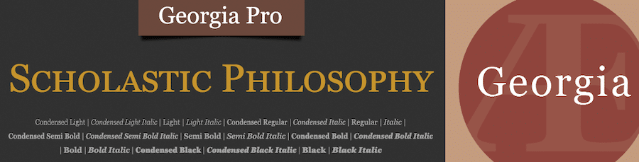
Georgia is another common font to find supported in email clients. It’s inherently legible, features largely-spaced letters, and uses character designs that make each letter distinct to prevent confusion. There’s also a good variance between regular and bold weights that make it useful for added emphasis.
Tahoma

Tahoma is another option that’s supported by most email clients. It’s one of the most popular sans serif font families on Windows operating systems. It was created with on-screen display in mind, with clarity and legibility achievable at even smaller font sizes. It was originally created by Matthew Carter.
Lucida

Or, you could use Lucida, another sans font family that prioritizes clean lines, a clear style, and distinct letterforms. Letter spacing is wider than standard and each character is a bit taller as well, adding more elements of legibility.
Trebuchet

Trebuchet is another option available that you could easily use in your email designs. It was created by Vincent Connare in 1996 and is a sans serif font. It was designed for screen reading and features larger line-heights, rounded edges, and wider character spacing.
Times New Roman
Lastly, there’s Times New Roman, a font that really doesn’t need much of an introduction. It has a traditional look and is often used as the default font choice in word processing programs. It’s legible on-screen and in print.
Your email client may have access to other fonts, but the above are the most readable and the most commonly recognized.
Custom Email Fonts
If the basic font choices aren’t appealing to you, there is another option. You can use HTML fonts instead to create a more custom look. However, it’s important to note that not every email marketing service can or will display web fonts properly.
But first, let’s pause to discuss how web fonts work.
How Web Fonts Work
Web fonts, as their name would suggest, exist on the web only. They’re not included in operating systems, devices, apps, or software. They exist online and can then be added to your projects via code snippets, plugins, and other means. More often than not, you’ll find web fonts being used on websites. Several email clients currently support the use of web fonts, including:
- Android Mail
- Apple Mail
- iOS Mail
- Outlook 2000
- Outlook.com App
- Thunderbird
Web fonts are not supported across all of these email clients in the same ways, however. Some just require a link, while others require a code snippet that imports the web font. More on that in a moment. It’s first important to acknowledge that even if an email client doesn’t support your web font of choice (or its inclusion method), your content won’t necessarily look terrible.
Most email clients include a fallback option. That is, if the web font included in your email fails to load properly, the email client will serve up a fallback font instead. It’s usually one of the generic options we listed above, but the good thing here is a) your content will still be legible, b) your content won’t look half bad because the standard fonts became the standard for reason (they’re plain ol’ easy to read), and c) you can often select which font you’d like to use as your fallback.
To give you an idea of what we mean, Gmail’s default font is Arial while Apple Mail uses Helvetica. Outlook uses Calibri while iOS uses San Francisco (a font Apple created specifically for its devices that was heavily inspired by Helvetica Neue.
If you decide to use web fonts, you should test it across various platforms before launching.
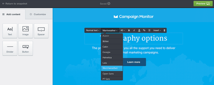
Some email marketing services already include web font support. Campaign Monitor, for instance, includes several web font options in its drag-and-drop email builder and fallback options are automatically set for you with minimal fuss.
If your email marketing platform does not include web font support natively, it’s likely you can add it via code.
There are several code snippets you can use for embedding web fonts in HTML emails.
<link>
Using <link> to add web fonts to your emails is a popular choice. Any web font you select will define the URL for you. So, if you’re hosting the font yourself, change it to your font’s URL on your site. If the font is hosted with the web font seller, use the URL they provide.
You’ll place the code snippet in the <head> section of your email’s code. It should appear right at the beginning. This method is supported by most email clients and loads fairly quickly. You could run into some issues, however, if the web font file is on the larger side.
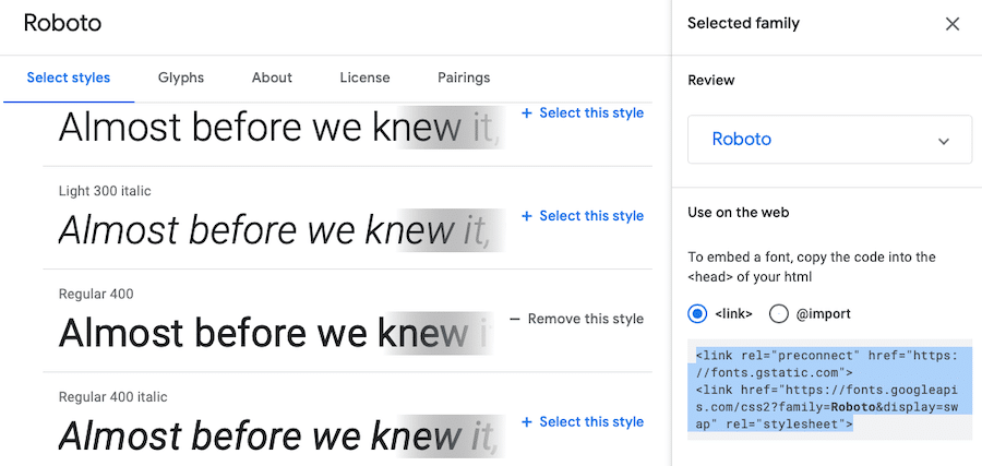
So, if you get your web font from Google Fonts, you’ll see the following after selecting your font’s styles and selecting link as your preferred embed method:
@import
Another way to add web fonts to emails is to use @import. This one is super simple and works well on most email clients as well. The only hiccup is with a few older versions of Android.
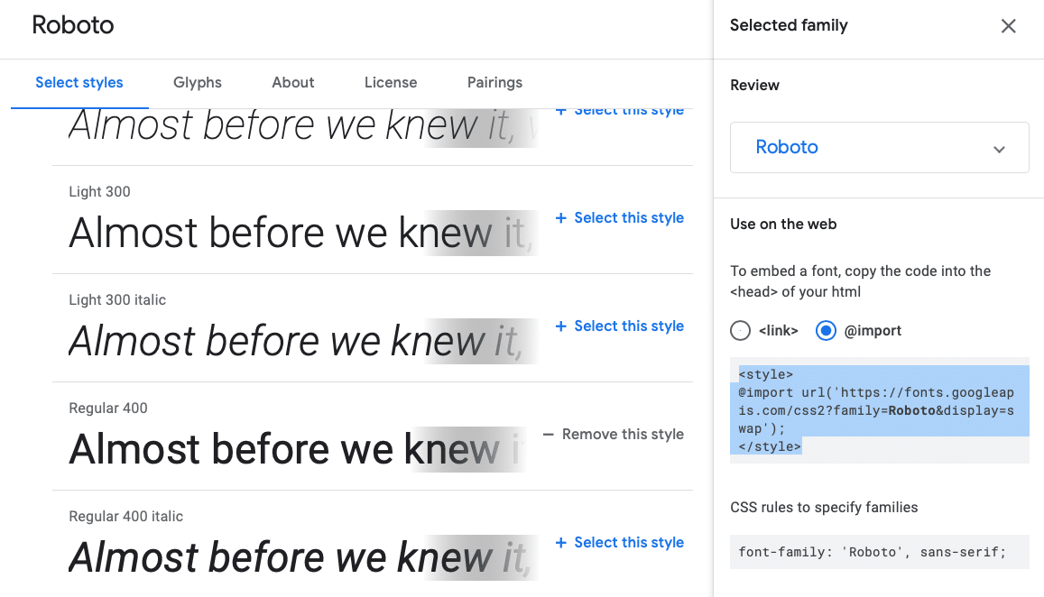
Just as with the <link> code snippet, you’ll insert @import in the <head> section of your email as well. Again, in Google Fonts, this is what you see after selecting a font, its styles, and clicking the bubble next to @import:
If you’re using a different web font service, you may not get an embed code like this, and instead, will need to type out the code snippet yourself. Use the URL your web font service provides you, or if you choose to host the font yourself, use the appropriate link on your server.
@font-face
This rule makes it so you can download a font from a server or host them so they can be used on a website, or in this case, in your emails. It works in a similar way as the previous two methods in that it downloads fonts on the fly so they can be used by your website or your email messages. As with all the other methods discussed here, you paste this code snippet in the <head> section of your email’s HTML.
So, according to Mozilla, if you were going to add the font Open Sans to your emails, you’d use the following code snippet:
@font-face{

font-family:"Open Sans";

src:url("/fonts/OpenSans-Regular-webfont.woff2")format("woff2"),

url("/fonts/OpenSans-Regular-webfont.woff")format("woff");

}
Specifying Web Font Alternatives
While you always want the web font you’ve carefully selected to work, that’s not always going to be the case. Whether due to server error or system compatibility, it’s a good idea to not leave the fallback option selected to chance. So, using @font-face again, you can actually specify which local font you want to be used in case your preferred web font can’t be downloaded.
We can use the same code snippet referenced above and just modify it to include a fallback font option:
@font-face{

font-family:"Open Sans";

src:url("/fonts/OpenSans-Regular-webfont.woff2")format("woff2"),

url("/fonts/OpenSans-Regular-webfont.woff")format("woff");

local("Helvetica")

}
Where to Find Web Fonts to Use in Your Emails
There are several places online where you can source web fonts. Just be mindful of any licensing requirements they have. Each site may have different specifications you need to follow, so keep that in mind.
- Google Fonts: This is one of the most popular places to find web fonts currently, offering an open source library of fonts to use anywhere at any time. It currently features 1,020 font families.
- Fonts.com: This is another fantastic resource for fonts of all kinds, from desktop to web font. It’s actually the Monotype store and features over 150,000 fonts to browse and perhaps purchase.
- Typography.com: This is the storefront for H&Co, a foundry that includes 1,500 typefaces that can be used on the web and for print.
- Font Squirrel: If you’re looking for an all free selection, Font Squirrel might fit the bill. This site features only free fonts that can be used for commercial purposes.
- Adobe Fonts: Formerly known as Typekit, Adobe Fonts includes thousands of fonts to choose from, all of which are available with a Creative Cloud subscription.
- Fontspring: While you do have to buy the web fonts listed on Fontspring, they are available without a subscription and typically include unlimited licenses for added convenience.
- MyFonts: This is another Monotype-owned venture, with listings for tons of fonts for both print and web.
- Village: This is actually a collective of several foundries that all banded together to sell their fonts independently.
- Process Type Foundry: This is a small business that was founded in 2002 by two type designers and they sell the fonts they make to the general public.
- FontShop: Lastly, there’s FontShop, another Monotype storefront and place to browse and purchase web fonts.
High-Quality, Readable Web Fonts
If you need some inspiration, the following are all examples of web fonts that are easy-to-read and could be added to your emails using the methods described above.
Open Sans
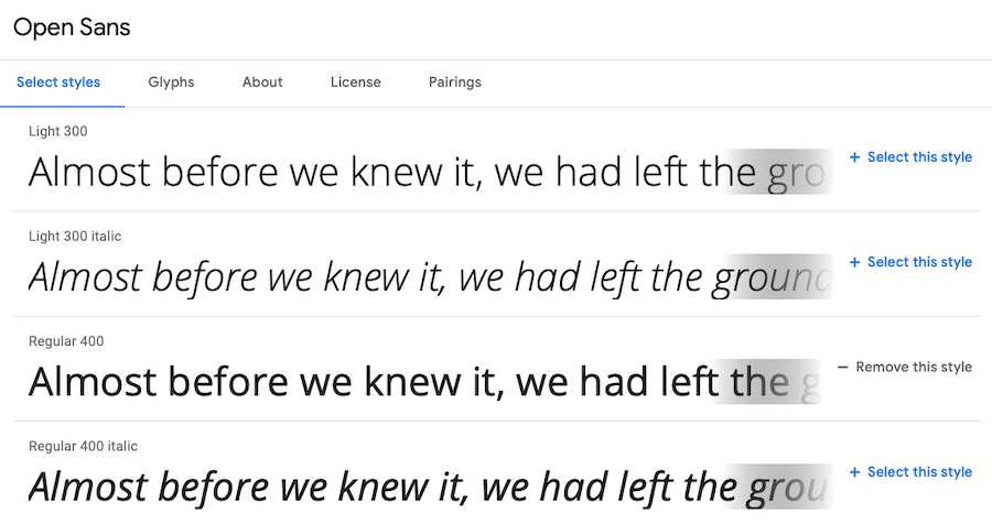
Open Sans is a highly legible sans serif font that’s ideal for on-screen reading. It was designed by Steve Matteson and features open forms. All letters are easy to read and look good at all sizes as well.
Roboto
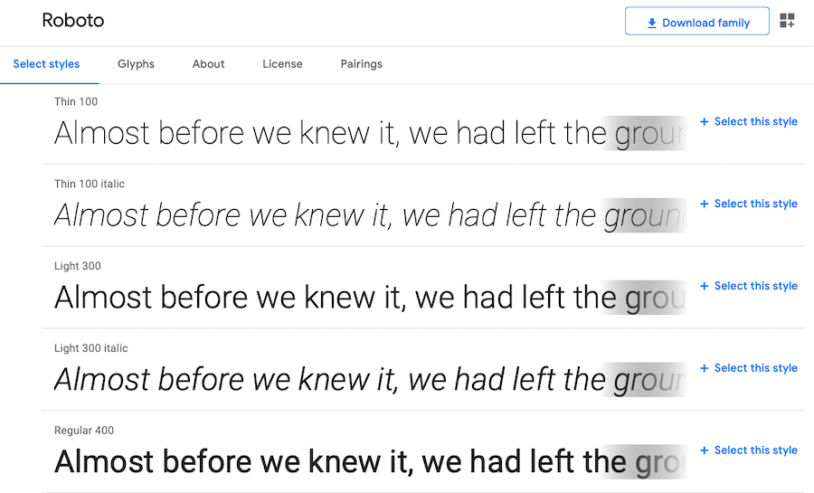
Roboto is another high-quality web font that looks great on screens. It has a geometric design with open curves, creating an appealing dichotomy that just plain works. Each letter maintains a natural width, resisting the typical rigidity of grotesk fonts.
Raleway
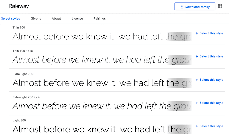
Or, you could opt for Raleway, another sans serif font that offers thinner lines and a more elegant appeal. The typeface family was originally designed by Matt McInerney, then expanded later by Pablo Impallari and Rodrigo Fuenzalida.
Century Gothic
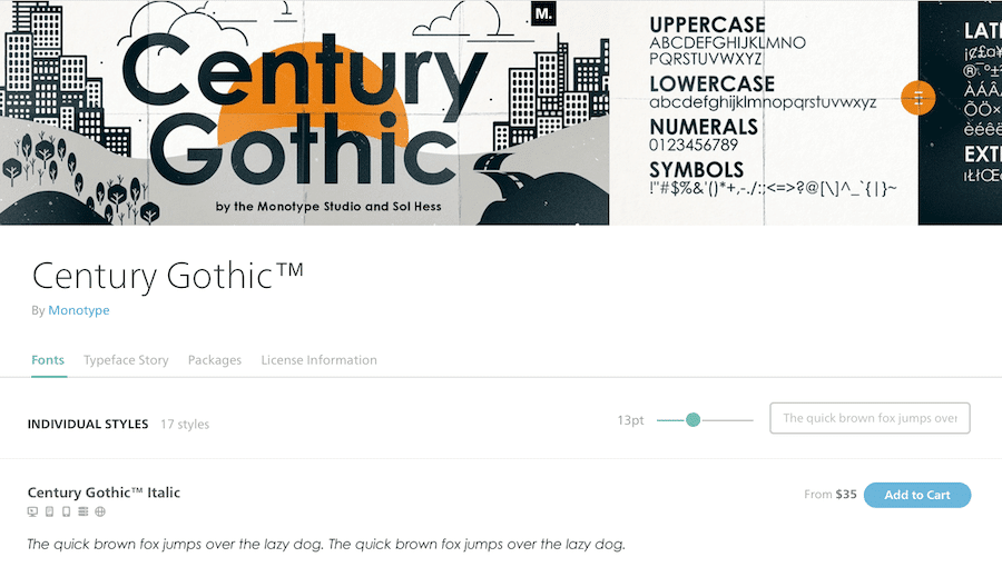
Century Gothic is a web font that offers a classic look. And it makes sense that this is the case since it’s actually a modernized version of older fonts from the 1920s and 30s. It has broad support across browsers and is readable on screens.
Proxima Nova
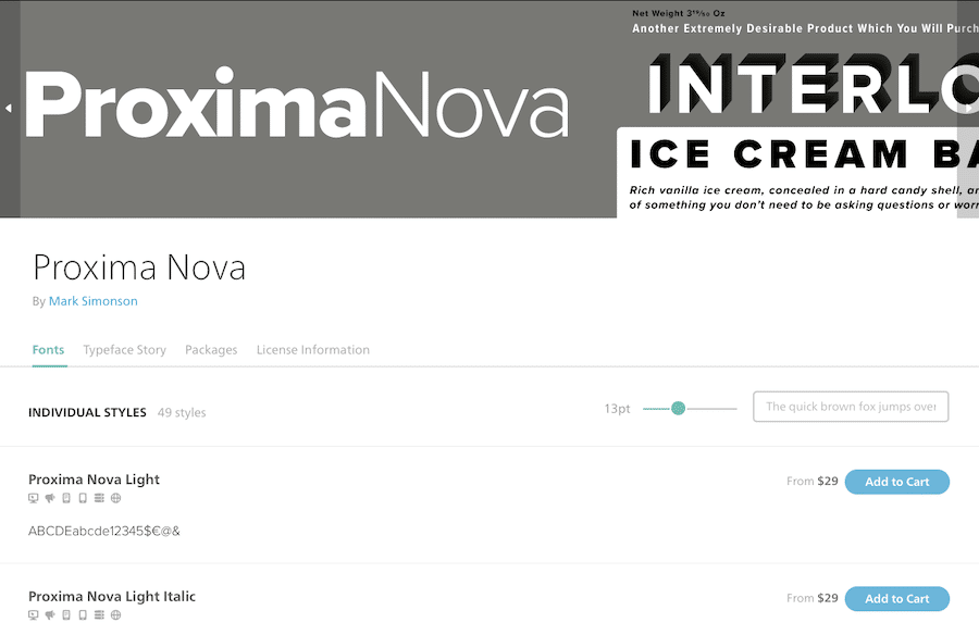
Proxima Nova is another web font option that is actually a re-envisioned version of the Proxima Sans font, which was first created in 1994. The font is slightly geometric but natural as well and would make for an excellent selection for your email copy.
Quasimoda
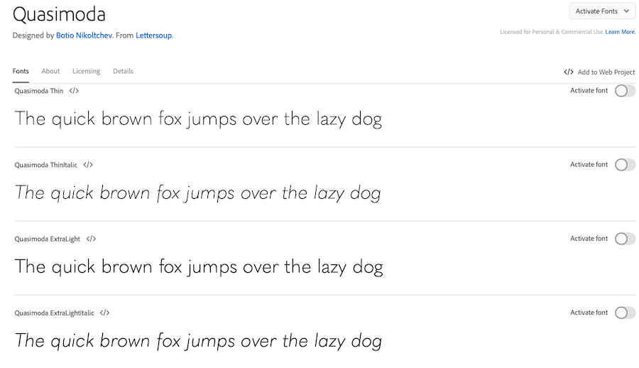
Quasimoda is a stylish web font that’s easy on the eyes and universal in its appeal. It was created by Lettersoup, a type foundry based in Berlin, Germany that was started by Botio Nikoltchev in 2014.
PT Sans Pro
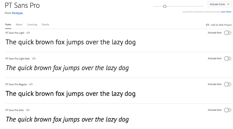
PT Sans Pro might be just what you’re looking for in a web font. It offers rounded letterforms and a natural look. It was designed by Paratype, a digital font company that got its start in the 1980s.
Brandon Grotesque
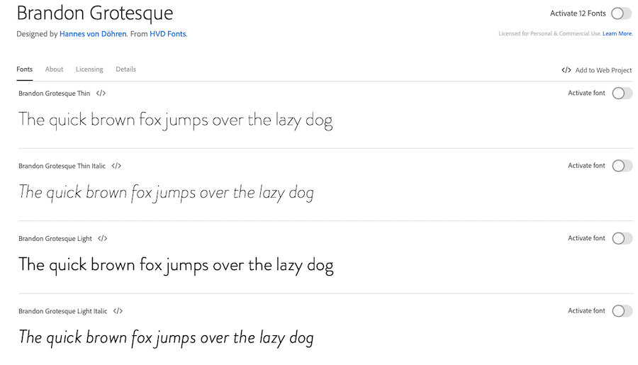
The Brandon Grotesque web font was created by HVD Fonts. HVD was founded by Hannes von Döhren and the company focuses on creating easy-to-read, professional, yet stylish fonts that work for any number of applications.
Sofia Pro
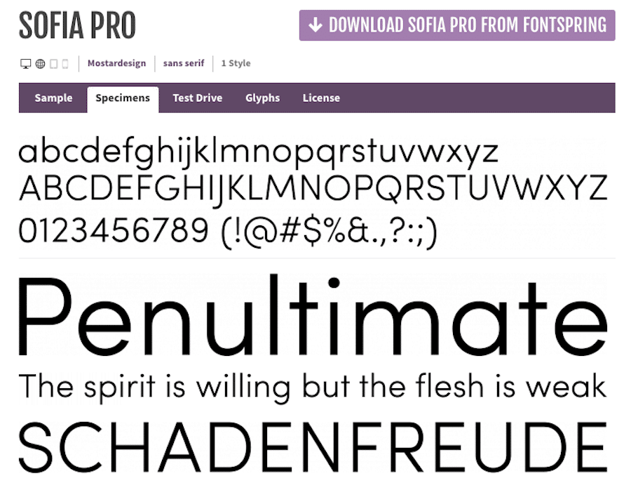
Sofia Pro is a sans serif font that was designed by Mostardesign in 2008. It maintains a sense of modernity while also including rounded shapes. It strikes a solid balance between harmonious designs and geometric ones.
Museo Sans
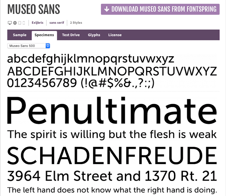
Lastly, there’s Museo Sans, which is a newer take on the popular Museo font. It features a geometric sans serif design that can be used in both headlines and copy text. It’s legible and multipurpose, making it a workhorse for emails. It was designed by Exljbris in 2008.
A Note About Using Images in Email vs. Text
If you embed an image such as a poster or even a screenshot of text written in a pretty font, that can be a way to work around the email-safe fonts issue. This comes with its own problems however as images in emails don’t always display, or may not display correctly on some screens. There’s also the issue of screen readers, which, unless you include alt text, won’t know what the image says.
Be careful when using images in emails and only use them to enhance the content of your message, not to deliver key information. So, if you wanted to announce a special sale on your website, don’t just include an image of your sale poster with the product details listed on it and call it a day.
You, at the very least, need to include the text of the image as plain text, too. Better yet, avoid this redundancy altogether and just use email safe text and save the images for occasional visual interest.
The only text-based exception I can think of that would make the use of text-as-image appropriate is a logo, where the name of the company or brand is already a given.
Summary
Not just any font will do when sending email messages to prospects and customers. In fact, failing to choose a good font can significantly hurt your conversion rate. So, the fonts you choose need to be email safe, make a good impression, and offer superb readability.
In this article, we reviewed the major types of fonts out there and the psychological impact they can have. We showcased examples of fonts that most email clients support. We also talked about web fonts, how you can add them to your site, as well as offered up resources and examples of web fonts you can use to get started.
Hopefully, you now have a better idea as to the impact of email safe fonts. And with this guide in hand, you can make informed choices as you approach your next email campaign.
If you enjoyed this post, check out our guide to 50+ Stunning Retro Fonts From the 50s to the 90s