Getting tons of traffic to your website is always a good thing, and something we all crave for our businesses and blogs. But if the traffic doesn’t convert to something, such as a sale, an eBook download, or signup to your email list, then there really is no point.
There are some exceptions to this rule, such as perhaps a news site generating income from AdSense or a business specifically trying to generate buzz around their brand. But 99% of the time, you need your traffic to convert, otherwise, it is simply a waste of time and effort.
Today we are going to explore 12 different conversion rate optimization tips to help increase your sales and sign-ups.
What’s a Good Conversion Rate?
Some people may wonder what a good conversion rate is, however, this is a very difficult thing to answer as every niche and industry varies. WordStream did an analysis of over 100 of their client’s accounts and they discovered that a good conversion rate generally hovers around 2% to 5%. However, there is also a small portion of advertisers out there getting much higher conversion rates.
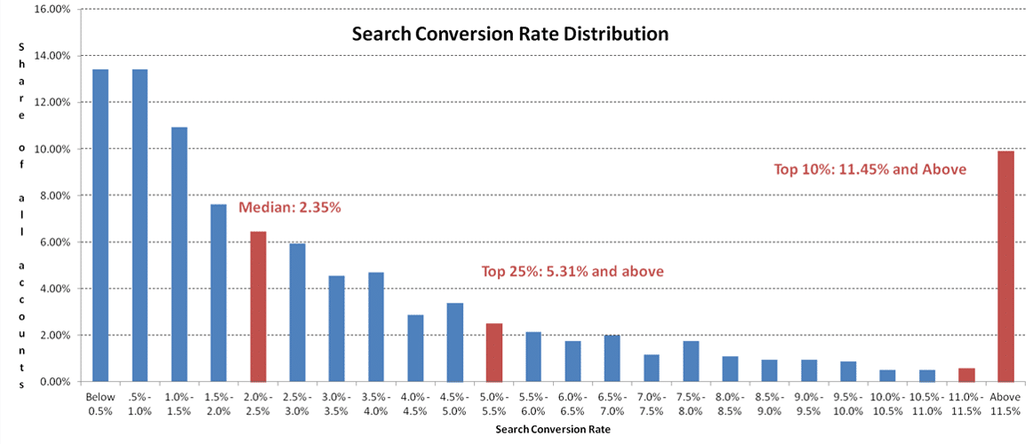
But it is very hard to say what a good conversion rate really is when doing a direct comparison. Those within the same industries have different sources of traffic, different relationships with their customers, and their websites could be night and day from each other. That is why we think Peep Laja, founder of ConversionXL and CXL Institute, probably has the best answer to this question:
The only true answer to “what’s a good conversion rate” is this: a good conversion rate is better than what you had last month.
That’s why it is important to establish a baseline for your business and focus on improving your conversion rates over a period of time.
12 Conversion Rate Optimization Tips
When it comes to conversation rate optimization, you must have a clear vision of your goals and audience. What is the purpose of your site? No matter if you are selling e-books or washing machines, you have to define the objective of what you want to deem as a successful conversion. Tracking these objects are required to check if you’re moving in the right direction.
Here 12 conversion rate optimization tips to help you start improving your objectives. A lot of these examples will be using WordPress of course, but most are applicable to any website.
- Use Effective Headlines
- Strategic CTA’s
- Simplistic Navigation
- Page Load Speed
- Verified Payment Systems, Trust Seals, and Free Shipping
- Time Limit
- Limited Quantity
- Optimize for Mobile
- Display Testimonials and Referrals
- Complementary Colors
- Distraction Free Landing Pages
- Quality Content
1. Use Effective Headlines
Headlines are typically the first thing a visitor sees when landing on your website. A headline is a means of wrapping your entire sales pitch into one bold sentence. It is meant to pique the curiosity of visitors, answer a question, solve a problem or be instructional. On that premise, the following type of headlines has proven to be impactful and promote better lead generation.
- Command Headlines
- Direct Headlines
- Question Headlines
- Problem Solving Headlines
- Instructional & How-to Headlines
It is important to note that without a properly constructed headline, you risk the chance of losing many potential leads. Be wise and make use of the above-mentioned headlines. The style and placement of them are also very important. Signal v. Noise performed a test on the Highrise signup page to see if changing the headlines would affect the conversion rates.
The original: Worst performer
The original headline had the 30-day free trial as a subheader.

The winner: 30% better conversion than the original
Once they moved the 30-day free trial up into the main they saw a 30% increase in sign ups!

So as you can see, little tweaks to your headlines can have a huge effect on your conversion rates. This is something you should be A/B testing all the time! After all, everything stands or falls on the headline: it either encourages visitors to click and read the article or bores them and thus makes them turn back. As writing headlines is a special “art”, sparing a few minutes of brainstorming with your team/ editors about the title of each post is a wise decision. There are some evident requirements just like briefness, clearness, consistency. However, I’m sure we can agree on one more thing: uniqueness is on the top of these.
Here are a few additional stats you might find interesting from an analysis of 150,000 headlines by the Content Marketing Institute:
- A title with eight words performed best. These titles received a 21% higher click-through rate than average.
- A colon or hyphen in the title — indicating a subtitle — performed 9% better than headlines without.
- Headlines that contained odd numbers had a 20% higher click-through rate than headlines with even numbers.
So how do you go about writing unique headlines? Imagine your readers have a field of interest (which is, fortunately, your niche/ product), consequently, they read a lot of this topic. Just think of it, would they click on your article if they read the same standard headline they see everywhere else? No. They’d think they’ve already read about this and they’d simply skip it.
That’s the reason brainstorming on the titles worth the effort: the more versions you write down in a list, the more uncommon ideas you’ll have at the end of your list.
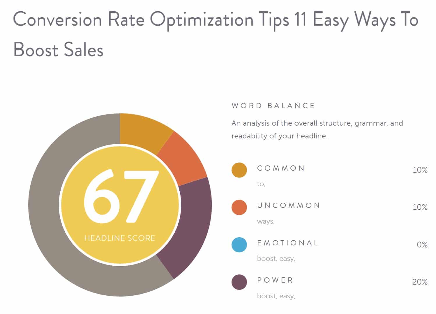
You can also utilize free tools like CoSchedule’s Headline Analyzer tool to quickly improve your headline. We originally had this blog post titled as “11 Highly Impactful Conversion Rate Optimization Tips,” which scored a 46. After a couple of variations, we were able to easily bump this up to a 67 score by adding some more emotional and power words.
This is of course based on their own grading system, however, if you use this tool, you suddenly begin noticing that your headlines instantly become more enticing and you should see better CTRs. A big bonus around forcing yourself to use this tool is that it simply makes you spend time on creating variations, which you might not have done otherwise.
If you get stuck on trying to think of alternative words, a quick tip is to open up thesaurus.com and look up synonyms for the words you are already using.
2. Strategic CTA’s (Button, Popups, Pricing Tables)
A landing page has a purpose – to acquire something from your audience. Be it lead generation or building a list of email subscribers, contact details or more importantly, sales. By using a CTA – Call to Action, you promote such a purpose and instruct your visitors to act in a particular manner. Using strategic CTA’s and positioning them appropriately can be the defining factor as to whether or not you will improve the number of visitors you convert.
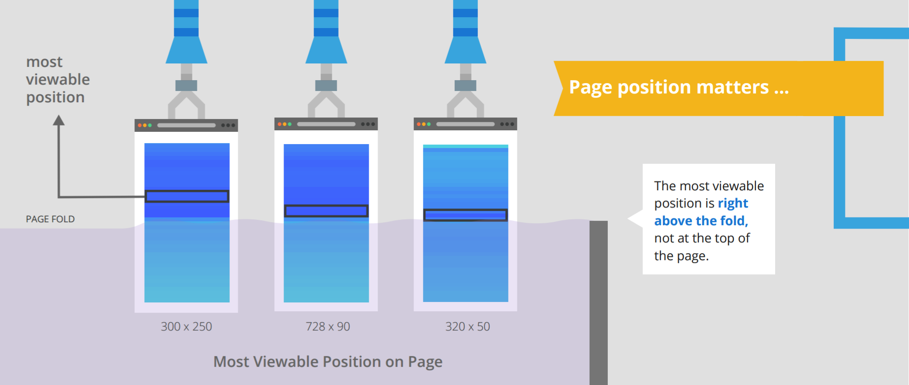
So where should you put CTA’s? Well, according to research from Google, the most viewable position is right above the fold, not at the top of the page.
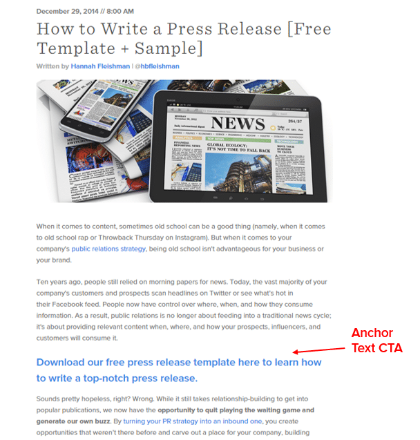
Hubspot also noticed this as well, with their anchor text CTA’s. In every single post they tracked, the anchor text CTA was responsible for the largest percentage of that post’s leads. Between 47% and 93% of a post’s leads came from the anchor text CTA alone. And notice, below that they are right above the fold. It is also important to consider how this affects mobile as well. On a mobile device, a CTA right within the first couple of paragraphs is bound to be seen by most visitors.
Grow & Convert also did some research to try and map out the different areas of a website. They estimated conversion rates for certain CTA locations:
- Sidebar: 0.5 – 1.5%
- Generic, end-of-post: 0.5 – 1.5%
- Pop-ups: 1 – 8%
- Sliders and bars: 1 – 5%
- Welcome gates: 10 – 25%
- Feature box: 3 – 9%
- Navbar: varies
One interesting takeaway is that the sidebar on your WordPress site might not be as important as you think. Impact removed the sidebar on their blog and went with an in-line CTA instead. And guess what? This resulted in a 71% increase in signups. So this is definitely something you should test, as each business and website is different.
When it comes to CTA’s, there are all sorts of different kinds, such as Pop-Ups, Buttons, In-line Anchor Text, Pricing Tables, etc. Below are a couple popular ones you might want to look at.
PopUp Forms
Popups can be controversial when it comes to usability vs effectiveness. You have probably seen them used on popular websites such as QuickSprout, SocialTriggers and IncomeDiary. When a visitor lands on these websites, within a few seconds the form pops up requiring the visitor to act. These popup forms engage visitors and assist in social awareness, subscriber acquisition, promote discounts and upcoming offers.
Most research shows that popups do in fact work very well, and actually don’t affect bounce rate as much as you think. Dan Zarrella, a well known social media strategist, ran tests on his own personal page with and without popups.
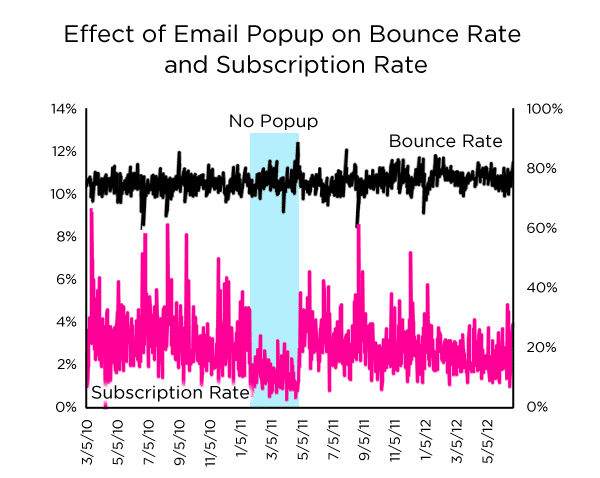
Surprisingly, the version with popups did not have much effect on his bounce rate. However, the version without popups reduced his signups by over 50%. So in this type of scenario, by looking at the data, it would make sense to use a popup. However, each industry could vary and perhaps you don’t want to use popups on your site, as most can probably agree, they are slightly annoying and negate the user experience.
If you do want to use a popup, there are some easy ways to quickly implement one with a WordPress lead generation plugin. Below are some popular ones you might want to consider:
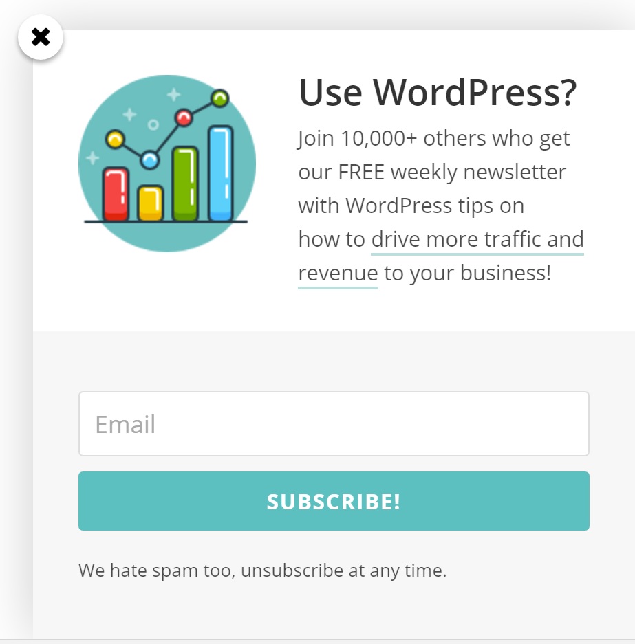
We, in fact, use a fly-in popup from the Bloom plugin on the blog here at Kinsta. If you scroll 50% of the way down this post you can see it in action. This is slightly less annoying on the user experience, and still provides a captivating way to grab the attention of your readers. Remember though that Google basically no longer allows popups on mobile devices, and you could get penalized for doing so.
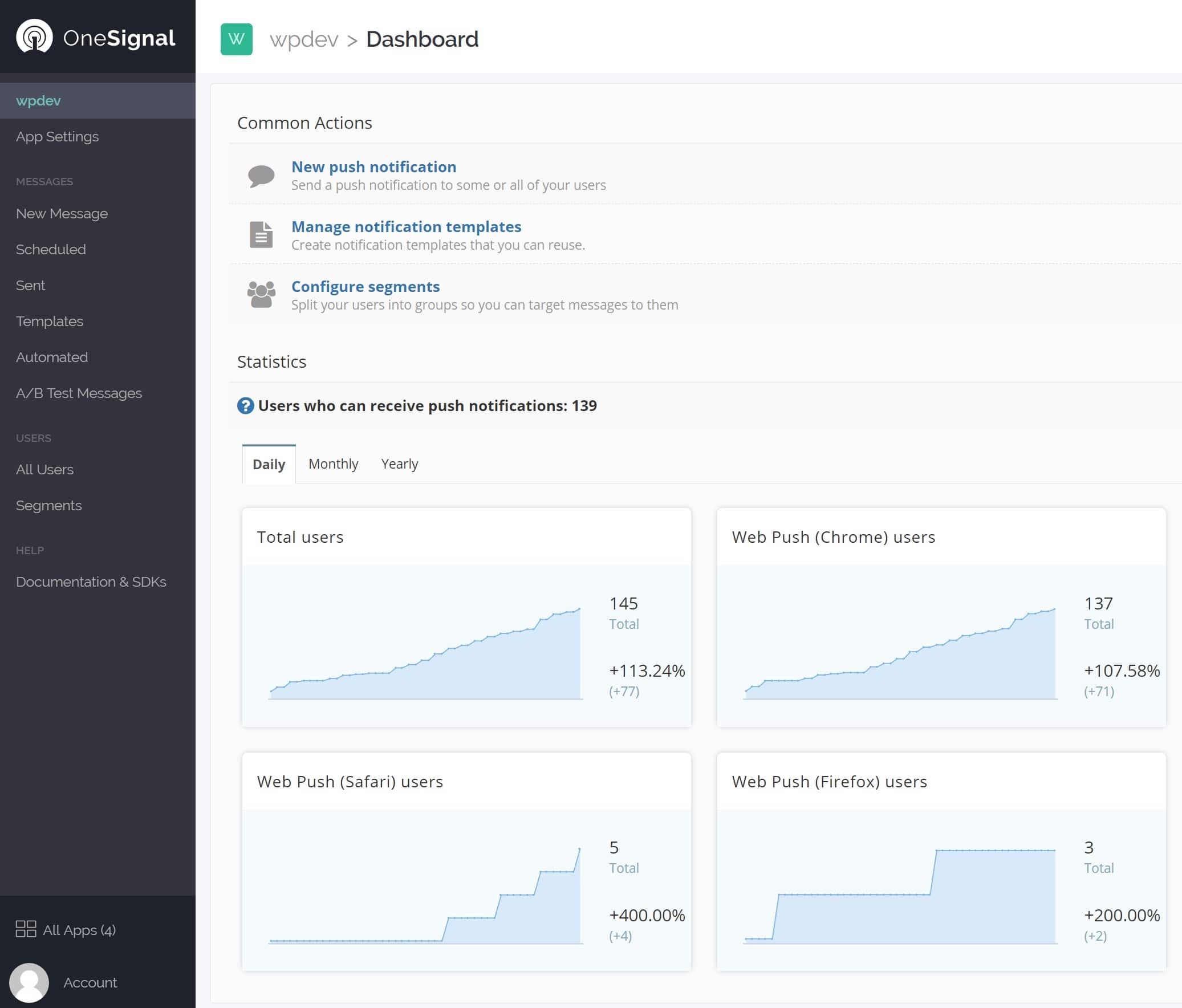
You could also use push notifications. On one site that we added it on, we had over 140 push notification subscribers in under 48 hours (see below). Remember, that even if you don’t personally subscribe to notifications, it doesn’t mean that is how your visitors think. Don’t ever assume when it comes to marketing your WordPress site, testing is the best way to get concrete data.
Buttons
Buttons are also very effective CTA’s. Generally, many landing pages employ the use of Buy Now buttons as their CTA. As great as this is, you ought to experiment and create customized buttons for your particular landing page. It could vary in size, use more appealing CTA texts or contain a combination of colors.
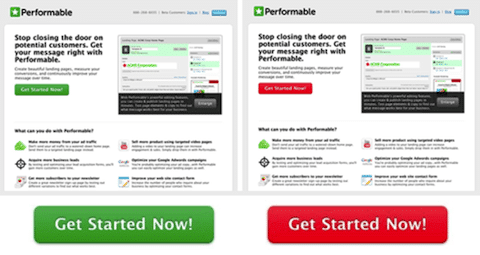
SAP found that the color orange boosted their conversion rate by over 32.5%. And Performable found that the color red boosted their conversion rate by 21%.
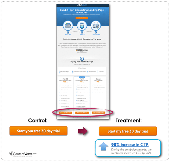
The copy of your button can also drastically affect conversions. Unbounce performed a test by tweaking one word in their button copy. They changed the word “you” to “my.” After running the test for three weeks, they saw an increase in CTR by 90%!
Through trial and error, finding the perfect button can increase your sales and conversion thoroughly.
Pricing Tables
Pricing tables are regarded as CTA’s as they allow you to market different services in a table as well as promote a particular package in comparison to others.
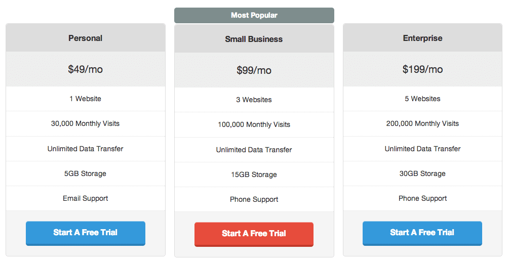
Here are some popular free plugins to get quality looking pricing tables on your WordPress website:
We also highly recommend checking out Neil Patel’s article on additional ways to improve your call to actions.
3. Simplistic Navigation
Navigation is a pivotal aspect for conversions. Though you may not realize it, the direct traffic you receive to your landing page is not the only traffic you should be catering for. On the contrary, the simpler your website navigation is, the likelier it will be for visitors all-around your website to lead back to your landing page and call to actions.
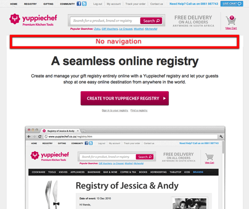
You should also think about whether or not you should using navigation links on your landing pages. VWO ran some tests with yuppiechef. After removing the navigation menu on their landing page, their conversions increased from 3% to 6%, or rather a 100% boost in conversion rate!
- Make use of inbound links in articles to increase traffic to your landing pages.
- Create a custom menu that is distinctive and contains easy to understand navigation terms.
- Add popular links to your sidebar or in-line anchor CTA’s that directs traffic to your important pages.
- Direct your leads to CTA’s through directional arrows and text.
4. Page Load Speed
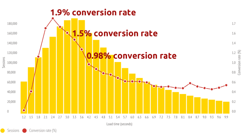
Page Load speed plays an important role in how well your WordPress site converts. It is 2026 folks, and nobody is patient anymore. We all expect things to load at a blink of an eye, and if it doesn’t, the first thing we do is hit that back button. To put it simply, the faster your website is, generally, your conversion rate will follow suit. And don’t just take our word for it, here are some stats:
- Every one-second delay in page load time could lead to $1.6 billion in annual losses for online merchants as big as Amazon.
- When Mozilla increased page speed by 2.2 seconds, Firefox download figures rose by 15.4 percent or 10 million per year!
- Walmart saw 2 percent increase in conversion rates for every 1-second improvement in page load times. The numbers don’t lie!
- According to Kissmetrics, a 1-second delay in page response can result in a 7% reduction in conversions.
Soasta ran a study and discovered on mobile pages that are 1 second faster experience up to 27% increase in conversion rate.
One of the easiest ways to decrease your page load speed is to use a fast WordPress host. Here at Kinsta we specialize in high-performance WordPress sites and can handle any load you throw at us. We have easily dealt with clients who have over 60k+ concurrent connections. Many even see a 45% decrease in page load times simply by migrating!
Thanks @kinsta for all your flexibility helping @DARTdrones prepare for our @ABCSharkTank traffic. Also increased pageload site-wide by 50%+
— Kevin McAloon (@kevinpmcaloon) February 27, 2017
You can easily speed test your website to see how it is currently performing. We also have a lot of additional articles you might want to check out, for those of you trying optimize your WordPress site’s yourselves.
- A Beginner’s Guide to Website Speed Optimization
- How to Understand and Use Pingdom
- How to Reduce TTFB to Improve WordPress Page Load Times
- How to Host Local Fonts in WordPress
- How to Fix the Leverage Browser Caching Warning in WordPress
- How to Optimize Images for Web and Performance
- How to Implement Lazy Load on Images and Videos
- How to Speed up WordPress Comments
- WordPress Revisions: How to Use and Optimize Them on Your Website
- MySQL Storage Engine – How to Convert MyISAM to InnoDB
And if you still aren’t satisfied with your performance, contact us here at Kinsta to let us know how we can help. We specialize in both WooCommerce hosting and Enterprise hosting for sites of any size.
5. Verified Payment Systems, Trust Symbols, and Free Shipping
Rapport building is the principle of distinguishing trust between individuals. It has been a principle implemented in sales and is proven to increase sales both online and offline. A fantastic means of improving conversion rates online is by building trust. One can do this by displaying verification tags and images of their payment systems. This small detail can make a huge difference to building trust with your leads.
There are a number of case studies out there that also highlight the benefits of adding trust symbols, such as VeriSign or Symantec SSLs. People want to feel secure when shopping online. Blue Fountain Media saw a 42% increase in sales simply adding the VeriSign seal to their checkout page.

Shipping can have a huge affect on your conversation rates as well. Forrester conducted a survey and found that high shipping and handling costs are the number one reason for shopping cart abandonment.

Most people are looking for the best buy from the most convenient source, having a free shipping policy will most likely promote convenience to your leads. People nowadays expect to see the total shipping cost when checking out.
6. Time Limit
The longer people take to think about making a decision, the greater the chances are of them changing their mind or becoming distracted by other offers to purchase elsewhere. Your goal for improving conversion rates is to limit the time it takes an individual to make the decision of partaking in your CTA. This creates a sense of urgency. An incredibly successful means of accomplishing such a feat is by instilling a time limit to your offer. For example, “Get 50% Off All Purchases during the Next 48 Hours.”
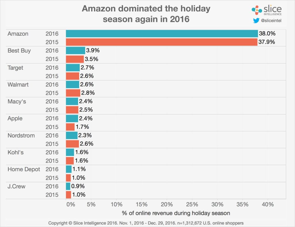
Another good example of this is the eCommerce King, Amazon.com. Amazon’s conversion rate is a whopping 74% and they dominated Q4 sales in 2016. If there is anyone you should be taking hints from, it is them!
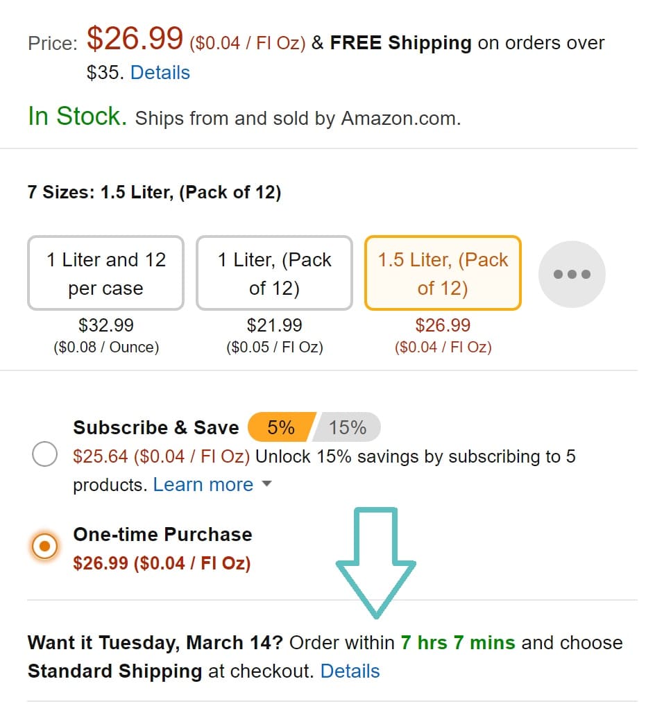
They use the time limit approach to create a sense of urgency on each individual product page. They let you know exactly when you can get your product and even have a countdown for when that expires.
7. Limited Quantity
Another similar approach to the time limit is using limited quantities. The reason for this is that it creates a sense of scarcity. When something isn’t available in abundance, the time it takes people to decide on making the purchase is reduced significantly out of fear of loss. By doing this, your leads feel the need to make a purchase as soon as possible. This small technique can provide a drastic improvement to your sales and conversions.
And get creative with it. Instead of just showing the stock left, create a CTA to go along with it. Tradlands is a great example of this. They have a CTA saying “Quick, only 1 left!”

8. Optimize for Mobile
This should almost go without saying, but optimizing your website for mobile is more important than ever in 2026! This could include things such as ensuring your WordPress site is responsive, and also A/B testing things on mobile vs desktop. It’s fairly common knowledge that more than 50% of internet users currently online are using mobile devices. According to a report from comScore, this tipping point happened way back in 2014.

And according to the latest data from Monetate for their retail clients, you can see that smartphone and tablet conversion rates combined, actually were higher than desktops in Q4 2016.

This is a huge market of individuals who are just waiting to be converted into customers. Simply put, if you aren’t optimizing for mobile, you could be missing out on a lot of conversions. If you don’t have a responsive website, you can always utilize a quick mobile plugin.
9. Display Testimonials and Referrals
Another useful manner of building trust and promoting sales is through testimonials and referrals. These are displayed directly after the details and benefits of a particular offer. The reason being, they prove that everything being pitched is true. According to a research done by Nielsen, 92% of people will trust a recommendation from a peer, and 70% of people will trust a recommendation from someone they don’t even know.
The reason for the significance of client testimonials is the main characteristics of human nature: if others are satisfied with your product/service, your visitors will be more likely to become clients themselves. In most cases, no matter how convincing your website is, your visitor will still hesitate and thus tend to postpone making the final decision. However, when it comes to conviction, showing other customers’ opinions will help you make the argument irresistible: your service or product perfectly meets what they are looking for!
VWO ran an A/B test with Buildium where they tweaked their homepage. By adding a personalized customer testimonial, they saw a whopping 22% increase in conversion rates.

Below are a few reasons why client testimonials work:
1. Turn hesitation into conviction
When you create the content of your website, your goal is to keep sales best practices in order to assure your visitors about the exceptional values of your product. Even if you are an expert in the art of persuasion, visitors are flooded with content aimed to sell them something by all means. Now, the situation can immediately change when, after reading your perfectly written arguments, the hesitating visitor also hears another voice, the voice of other clients, who have already tried what your visitor is yet to try. Social proof can conquer clients’ uncertainty.
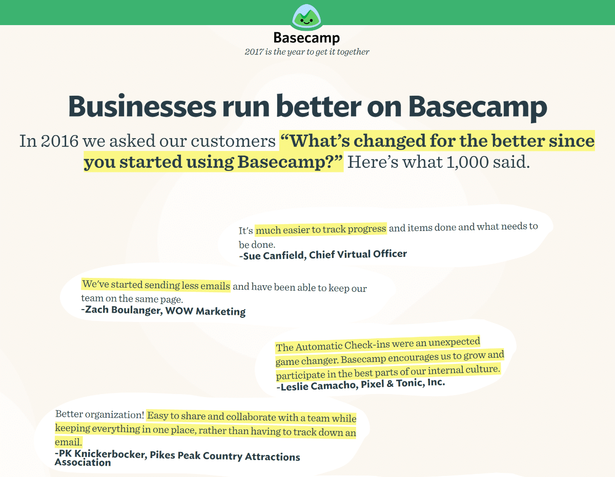
Basecamp has a great example of utilizing social proof.
2. Help them identify themselves with others
Whether you publish three client testimonials on your website or twenty-five, you can be sure that someone will mention a specific value of your service which your visitors recognize as an answer to their own questions. People love to hear and read the “success stories” of the others, and they will feel relieved after reading how another customer was blown away by your service.
3. Experiences set against each other
Most of the customers don’t like changing suppliers too often (or at all), they simply feel it’s too complicated. The change usually happens when they are unsatisfied. They do a lot of research before moving to another supplier to avoid the next possible setback. Reading what other clients of yours experienced with their previous supplier can help them compare their current situation with the values you provide, which is the most practical reason possible when it comes to making a decision.
Some Advice for Variety and Better Conversions
Client testimonials should be placed throughout your website in different ways. Here are a few interesting ways to do that:
- You can showcase them effectively on the main page in a slider.
- You can choose from numerous client testimonial plugins available with all the bells and whistles, if you would like to make the look of your testimonials really special.
- It is highly recommended to add either a photo of your client, or a company logo along with their name, which suggests trustworthiness. It is also useful to include a link to the source so your visitors will be able to check it.
- I also advise everyone to use video testimonials if possible (as an example you can check one of ours here), as they can highly increase conversion rates. Make sure they are really high quality, not like the fake ones from Fiverr.
- Write stories! In addition to the short testimonials displayed on several parts of your website, it is a wise decision to highlight the most significant success stories, and write a case study about the initial problem and how you managed to solve it for your client. Positive stories will affect your buyers’ behavior.
- In case you have well-known clients, it’s reasonable to feature their quotes as a testimonial. Influential people can make your brand/service more authentic.
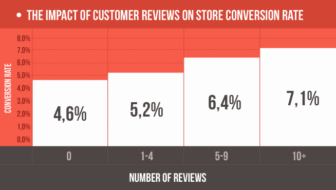
And according to Amasty’s research, the more reviews the better.
Besides taking some of this advice, never forget to have a “Clients” page as one of the most important pages that carry conviction as a whole and visitors consciously search for (you can take a look at our clients page). Before showcasing testimonials from your clients on the site, don’t forget to ask for their permission to link to their website or social profile pages, display their photo, logo or name!
Two Hints to Follow
As the purpose of the client testimonials and case studies is to create credibility and trust, it is recommended to follow the advice below in order to reach the right impact.
1. Be as authentic as possible
Ask your clients to write a detailed quote. By detailed, I don’t necessarily mean long, but it should tell a specific problem or a specific feature of yours that helped them a lot. Never make changes in the quote you asked from your clients. Buyers are extremely skilled in noticing the difference between your client’s tone and yours. Also, they easily recognize fake.
2. Split test your testimonials
Remember, every business is different, so diverse type of testimonials can lead to the expected results in each industry. Also, you cannot predict which one of the testimonials will your target audience identify themselves with. That’s why a simple A/B test will help a lot in increasing conversions.
How to Showcase Testimonials
There are many testimonial WordPress plugins available, here are a few popular ones you might want to check out:
However, you don’t always necessarily need a plugin to do this. There are a lot of WordPress themes that supports client testimonials. Or you can just simply use the quote function on any of your pages with a photo included. It’s that simple. Having testimonials on your website, and on as many pages as possible is a powerful way to increase your conversion rates. If you can make use of this power in a professional way, you’ll definitely spot the difference in your income.
10. Use Complementary Colors
Nich Babich wrote an excellent article guide on colors and conversion rates which we highly recommend checking out. He goes into detail about how using certain colors promote certain emotions and actions from the viewer. For instance, green is the color generally recognized for “peaceful, growth, health”. This is why certain big brands use certain colors, such as why Facebook is blue.
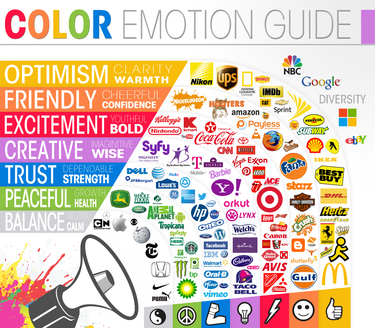
By making use of colors that not only promote specific emotions and actions but complement each other in the design, you will encourage viewers to stay on your website/landing page for much longer. If anything, the longer you hold the attention of your leads, the greater your chances are of turning such potential leads into paying customers and/or subscribers.
Tip: There are some cool nifty tools out there if you are just starting a new project, such as coolors, which can help you generate fast complementary color schemes.
11. Create a Distraction Free Landing Page
And we can’t forget landing pages! The main priority of a landing page with call to actions is to sell your product or service. Anything that distracts your leads from that objective is an absolute no-no. It is preferable to create a landing page that hides the sidebar, does not contain unnecessary text or media and excludes anything that draws attention away from your call to actions. As we mentioned above, removing links from your landing pages can easily increase conversion rates.
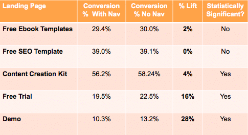
Hubspot ran an A/B test across 5 landing pages in which they removed links. Almost all of them received a lift in conversions, with one seeing a 28% increase in conversions!
You should utilize all the tips we have shared above and apply them to your landing pages. We recommend checking out KlientBoost’s post on 31 Brilliant Landing Page Examples With 71 Takeaways. There are a lot of tools out there which can also help you A/B test your WordPress site.
12. Quality Content
And last but not least, you can’t forget quality content! Even if your aim is to sell your products, your articles in the blog shouldn’t be like promotion flyers. Don’t forget to educate your readers about your products and business instead, and include interesting stories, useful advice, and proof. Also, don’t forget to tell them in each post what you do, some readers might not have the slightest idea, especially when they go straight to a post from somewhere else (and haven’t seen your main page).
According to a study by the Content Marketing Institute, adopters of content marketing have conversion rates that are nearly six times higher than competitors.
Quality and unique content is a must, not to mention that users love it, so Google loves it accordingly. Read a lot of other blogs to collect usable ideas, but when you are about to write, always put your own thoughts and experiences into words, be as authentic as possible.
There’s content you publish to increase your industry standing. Consumers of this type of content are unlikely to be ready to purchase your product immediately. But once they’re ready to buy, they’ll probably be more likely to convert. Unfortunately, an uplift in conversions in relation to this type of content is much harder to prove. But just because something’s difficult to prove, does it make it wrong to focus on? – David Bain, Host at Digital Marketing Radio.
Additional CRO Resources
We recommend checking out the following resources to dive even deeper into conversation rate optimization tips.
How to Boost Conversions on Your WooCommerce Product Pages
Single Grain wrote an excellent post on the anatomy of a successful highly-converting website. Eric Siu and Neil Patel share some insightful data-driven results from case studies in which companies saw drastic increases in conversion rates by making simple changes. For example, did you know that when showing people on your website they should be upbeat? High Rise found that adding a picture of a happy woman increased conversions by 102%.
You should also ensure that you setup Google Analytics on your site. Collecting and analyzing the data of where people are coming from, where they are landing (how/why), means more to your bottom line than most businesses realize. Better conversions = increased revenue.
Summary
Conversation rate optimization is a never-ending game. Hopefully, by implementing all of the conversation rate optimization tips above, you should be able to see a quick increase in sales or leads. One of the best pieces of advice we can give you to is to constantly test new ideas and see which one performs better. Have you used any of the discussed tips or plugins on your WordPress site? Share your greatest conversion rate optimization tips with us in the comment section below and let’s start building WordPress websites that convert!
