Web design is ever-evolving. As technology gets more powerful and designers experiment with new styles, every year presents a unique set of exciting trends in the online world. Drawing from the designs emerging throughout recent years, as well as new tech that’s being developed, it’s possible to predict what’s coming over the course of 2020.
Let’s recap the last few years in web design and examine the emerging styles, so you can know what to expect in the upcoming new year and beyond.
Why Keep Up With the Trends?
Not every web design fad is viable, that much is for certain. There’s a time and place for everything, and overhauling your website for no reason can do more harm than good, especially when it comes at the cost of usability and UX.
But though you shouldn’t go giving your site a facelift without serious consideration, there’s definitely some merit to keeping up with web design trends, especially those based on advancements in technology.
For instance, if you haven’t heard about AI chatbots, progressive web apps, or CSS grid yet, you could be using outdated tech that’s losing you conversions. Think of how revolutionary responsive design was to the internet; you don’t want to be last on board next time a development like that happens again.
And even when the trends are purely aesthetic, there’s still merit to keeping up with them. For instance, a plain white, clean, simple website may be functional. But with the more avant-garde style web design has taken on in the past few years, users are also finding it quite boring.
Even small changes like adding more color, broken grids, or micro-interaction animations can go a long way towards keeping your site relevant.
Plus, as web designers grow, learn, and adapt to new technologies, some of these advancements and trends are very much for the better as far as both beauty and functionality go. Think about how sites looked and worked 20 or even 10 years ago… we’ve come a long way, and have a long way to go yet.
If you see a modern web design trend that fits your brand, and helps or at least doesn’t harm usability, it might be worth it to get on board.
Recap: 2018 Web Design Trends
With 2020 now here, 2018 is seeming further and further away. But its trends still continue to impact the web even as brand new styles emerge, and as many of these are still relevant to modern design, it’s good to look back and see how far we’ve come.
Web design has been moving away from minimalistic simplicity and towards bold individualism for a few years, but it all came to a peak in 2018. We can still feel the effects even now, and the internet will surely continue to populate with original, unique styles.
2D Illustrations, 3D Animation
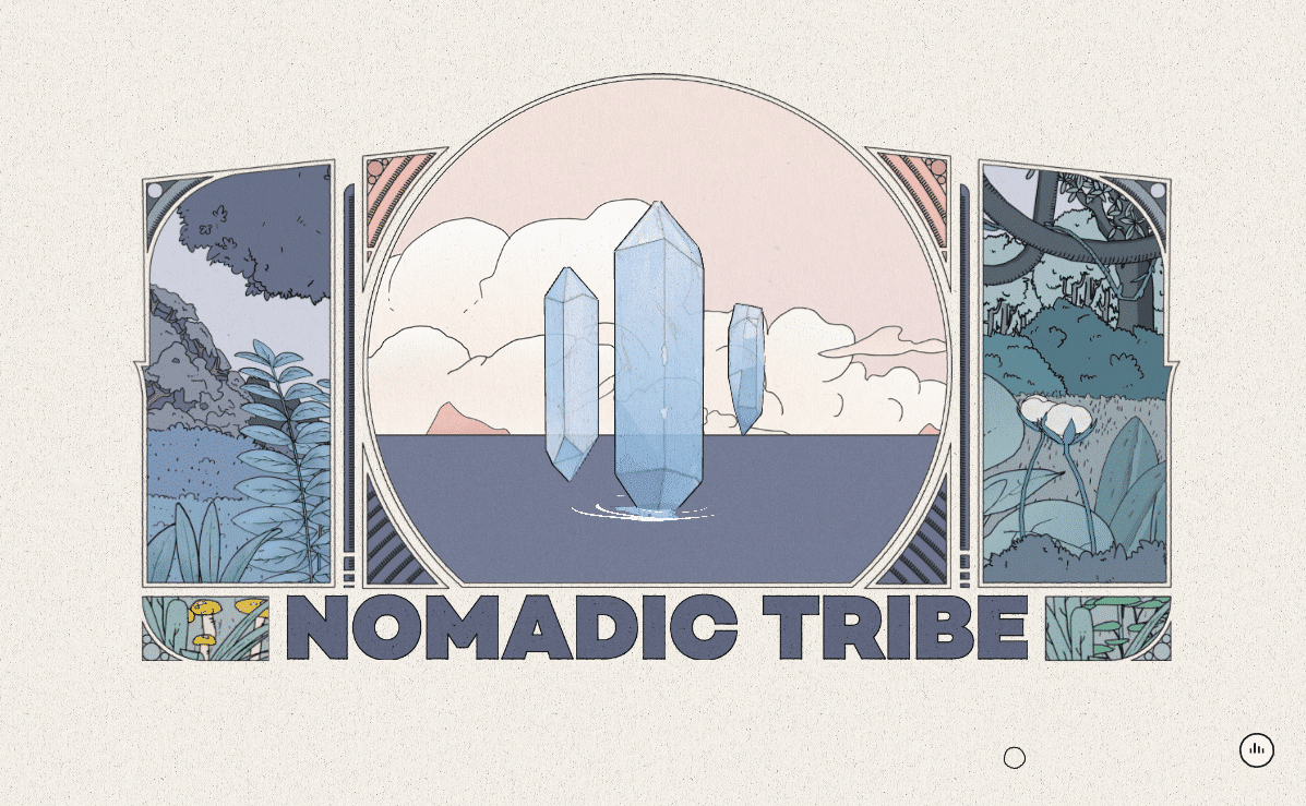
Illustrations are one of the best ways to convey personality and 2D drawings have been popping up more and more. They’re great for branding and make your website a lot more memorable, so it’s no surprise. A website with amazing illustrations isn’t likely to be forgotten.
3D background animation also became more popular, thanks to the increased power of browsers, animation technology, and devices like computers and phones. Especially common on portfolio and agency websites, 3D animations instantly grab attention and provide chances for fun UI interactivity.
In the future, hand-made illustrations and animations will only continue to grow in popularity. They show off your brand’s personality in a way nothing else can (and it proved to work as a strategy).
Subtlety, Flat, and Minimalism
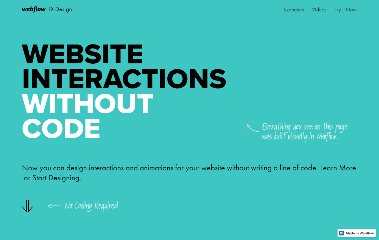
Despite strides towards more original, stand-out styles, minimalism continued to dominate the internet. Clean simplicity is inarguably appealing, and even in sites that featured brighter colors or experimental elements, it was often accompanied by flat design.
However, “Flat 2.0”, or semi-flat design, took stronger root with its use of shadows, gradients, and other slightly more complex elements. As long as minimalism exists, designers will find a way to put a spin on it.
Subtle animations were also a big part of 2018, with slight parallax and gentle hover effects appearing everywhere. These allowed minimalistic websites to retain their simplicity while making the overall design much prettier.
Geometric Design
Most sites include polygons and geometry to some extent, but geometric design was a big part of 2018 trends. Sites were made solely around simple shapes like squares, rectangles, and lines, and they featured in smaller detailing like buttons or decorative boxes too.
One big part of this was organic geometric shapes, or those that are somewhat irregular and imperfect. They often feature soft corners and asymmetry, and their unusual look is rather interesting. The sharp corners of polygons and rounded edges of organic geometry were often combined together to create a visually appealing contrast.
Bright and Bold Colors
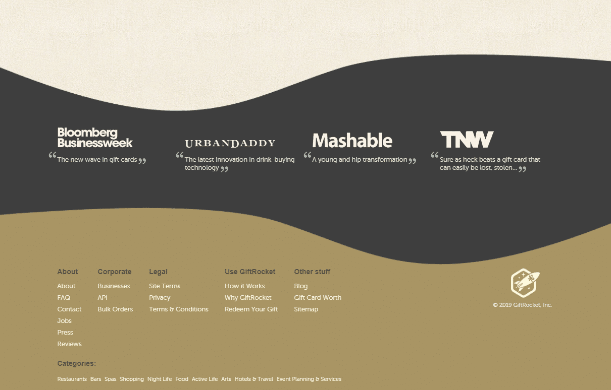
The internet that was once plain and white is now bursting with colors, vibrant and adventurous palettes around every corner. The days of one or two muted hues in each color scheme is fading, bright and bold palettes quickly taking their place.
Gradients appeared everywhere and remain a popular choice even today, their intense and vibrant hues filling the headers of many prominent sites.
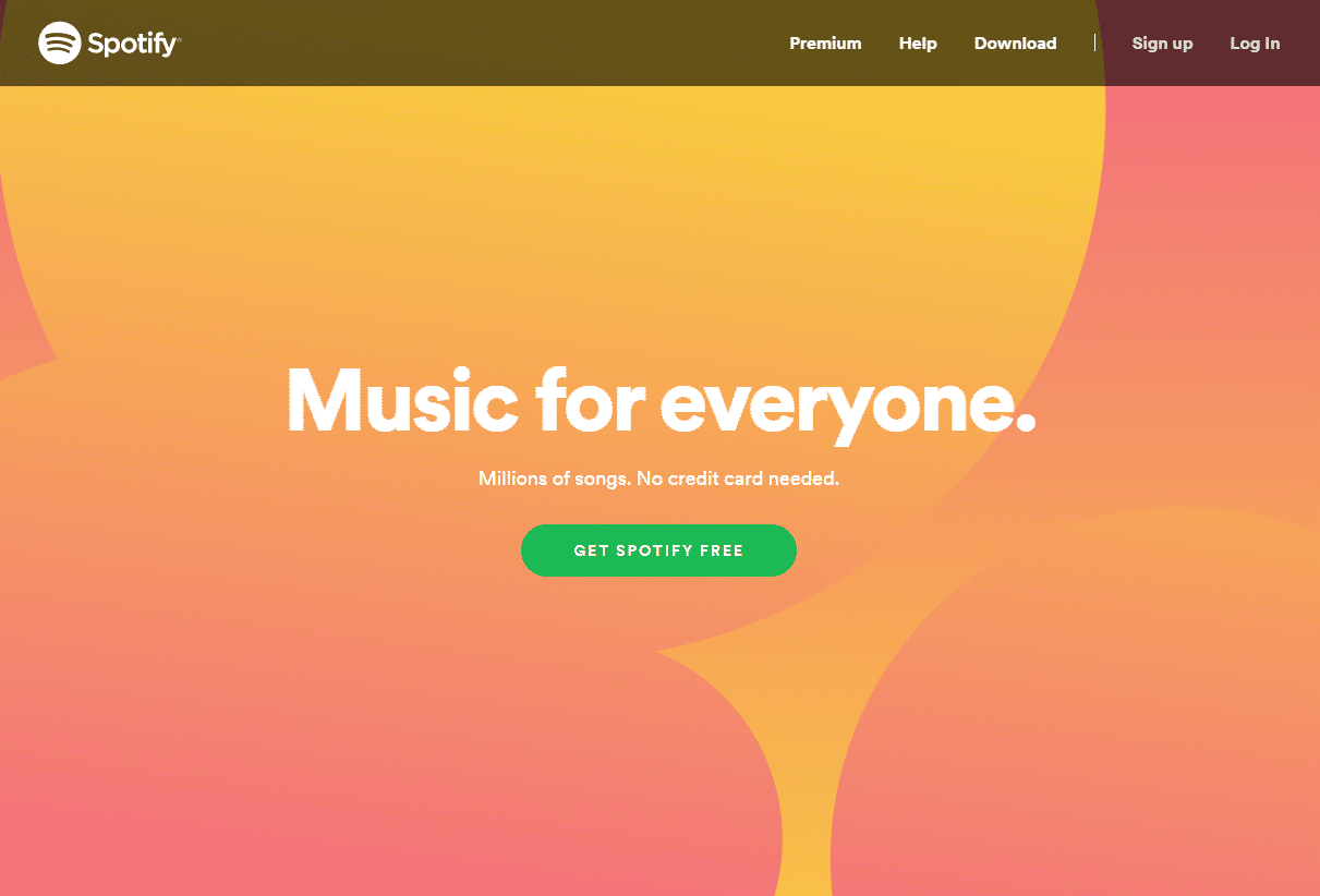
Alongside the lively color schemes came glitch and distortion effects, the bright flickering animations appearing across many a designer or developer’s portfolio. While its popularity has faded somewhat, you can still find them throughout the web.
Broken Grid Design
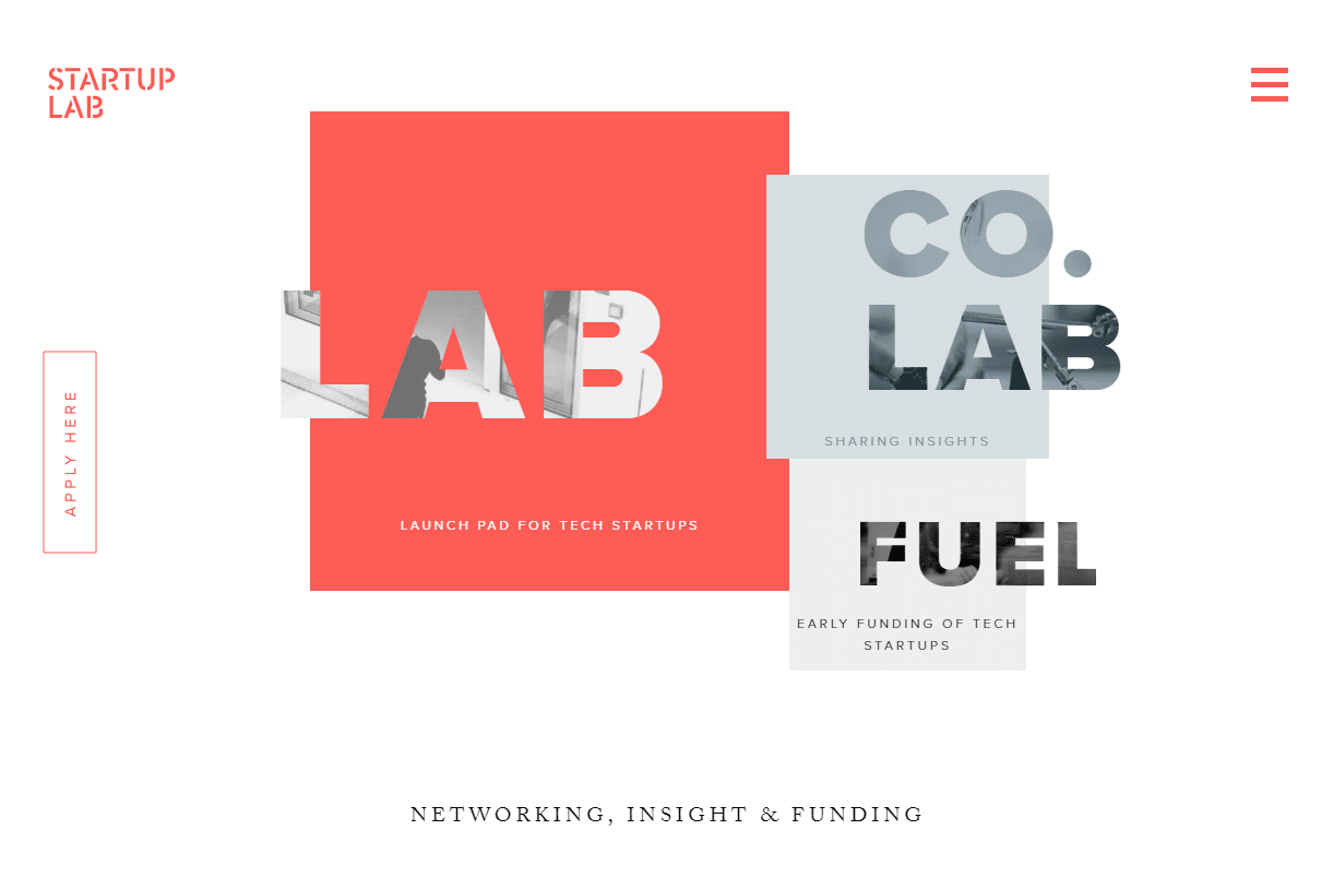
Most websites are built on a simple grid-based layout, with elements divided neatly into sections. Broken grid design shatters that expectation, overlapping elements, and tossing symmetry out the window. This unconventional layout is one of the most noticeable ways to break the mold and stand out.
Another style that got a lot of attention was split-screen design, a technique that divided the screen into two panels, each with their own content. Overall, layouts got a lot more interesting.
AI and Machine Learning
Chatbots are a big deal. These nifty programs respond dynamically customers, partially or completely automating the process of support or purchase. Machine learning allows them to examine data and learn how to respond to questions and comments, and take some of the workload off your human support agents.
But this is just the beginning. As technology continues its strides, AI and machine learning are bound to become even more integrated with online systems.
The Rise of Brutalism
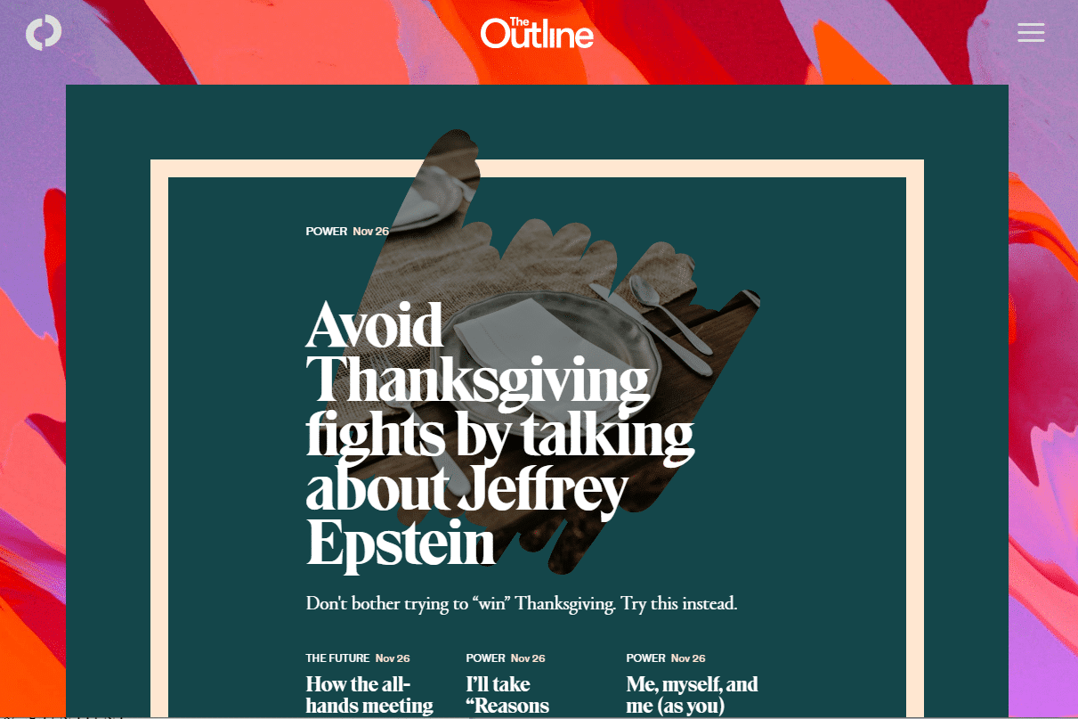
Brutalism isn’t pretty, but its strange appeal has won the hearts of many. Characterized by garish colors, anti-UX choices, and all-over-the-place design, brutalism encourages designers to go crazy and create a site that defies expectations. You should expect to see more of this non-uniform style in the future.
Storytelling with Web Design
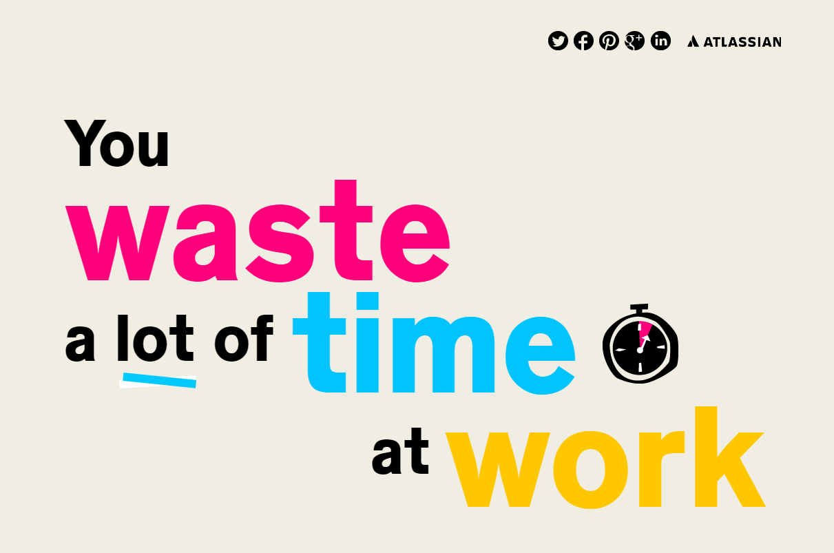
Visuals are one of the best ways to effectively convey information, whether you’re trying to tell a story or make a lot of data human-readable. Web designers are telling their tales through charming illustrations and data visualization, with interactive and visual designs that make their message more engaging and easier to understand.
The Biggest Web Design Trends of 2019
2019 shared many web design trends with 2018, like broken grid design and bold color palettes. But things have gotten even more crazy, with lots of experimentation from daring designers.
The running theme for 2019: rule-bending and breaking. White, flat, grid-based minimalism out, bright and bold asymmetry in. While clean design and white space will always be a big contender, designers are more willing to try new things lately. We are seeing many of these carry on full force in 2020.
Vibrancy and Color Experimentation
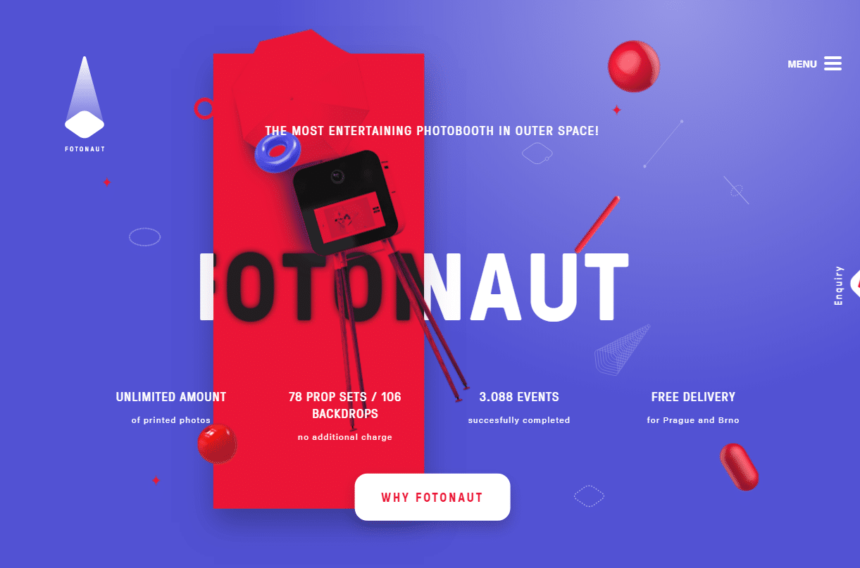
The internet is getting more colorful. Gradients are commonplace now, and websites often sport bright and flashy palettes that were unheard of a few years ago. Palettes themselves are more experimental, breaking from the usual mold of complementary or contrasting colors and going all over the place.
Sites no longer sport the same one or two simple, muted colors. Soft pastels, bright-tinted hues, and palettes of any size are taking over. Sharp contrast, soft subtlety, and palettes packed with personality mix together to make the internet much more diverse.
Monochrome is also a big fad right now. This often takes the form of totally black and white or grayscale websites with a dark aesthetic, but you can also find sites made solely around a single color.
More Illustrations
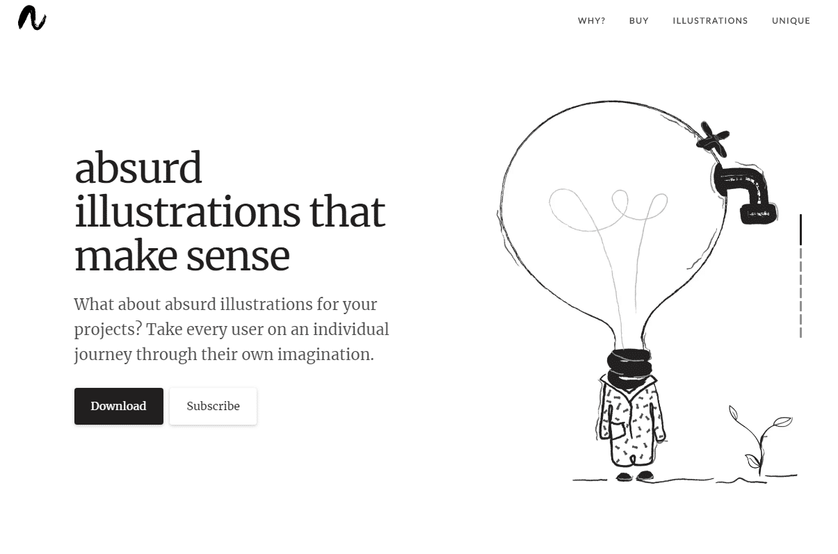
Illustrations and visual content were big in 2018 as well, but they’ve continued to evolve. Artists are taking steps away from the typical, simplistic style of illustration most sites are employing, and trying something a little different.
An emerging trend is eccentric, playful art that deviates from normalcy and tries out a more abstract, random style. These illustrations ignore typical boundaries and are completely unafraid to show off their creators’ personalities.
3D illustrations are also quite popular. It’s only a small spin on the trend of mostly flat artwork, but it breathes a lot of new life into it. Some of these are 2D artworks drawn to look 3D, while others are actual three-dimensional renders. Either way, they’re gaining traction fast alongside 3D web animations.
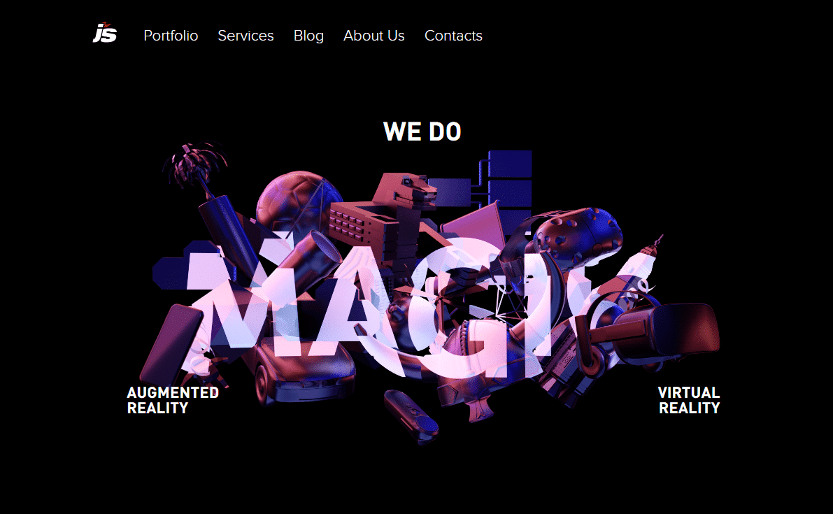
Last but not least in the illustrated trend is animation. Animated art is instantly attention-grabbing, and adds an extra layer of personality to an artform that’s already quite expressive. Both 2D and 3D animated art will continue to grow as this fad gains attention.
Bold Design
2019 web design can be encapsulated in three words: big and bold. The larger and more experimental the better, especially when the end result is flashy and demands instant attention.
Brutalist web design is still going strong, with entire websites dedicated to collecting the best in brutalism. The stark, ugly, anti-user artform certainly makes a statement: web design has always been solely about creating a good user experience, but brutalism seeks to turn it into an art piece. It’s not clear how long brutalism will last, but the trend still has an avid following.
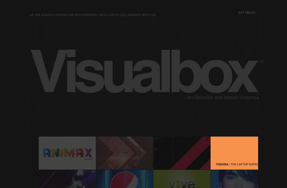
It seems like everything is getting bigger, but the largest impact of this has been on typography and navigation. It’s not uncommon to see text that almost entirely fills the screen, or even designs made solely around typography, with few to no images at all.
Fonts are getting more creative too, especially thanks to color fonts, which make customizing and rendering fonts that look like they were enhanced in Photoshop finally a possibility. Typography as a focus point is now a viable method of web design.
Navigation is also expanding. Dainty header navs and elegant dropdowns or hamburger menus are being replaced with dominating displays, with entire screens dedicated to navigation, again often focused around huge typography. In this detailed guide, you can learn more about website navigation best practices.
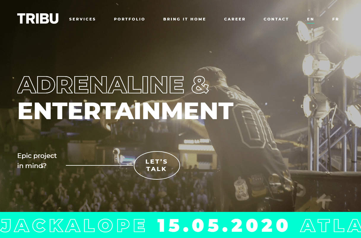
Look out also for lively hero video headers, animated backgrounds, and overall more video content on webpages. Video elements used to be a concern since they were slow to load and ate up limited mobile data, but stronger hardware and fallback images means you can now use videos anywhere. That gorgeous website with a fullscreen animated background, once a rarity, is about to become more common.
Asymmetry
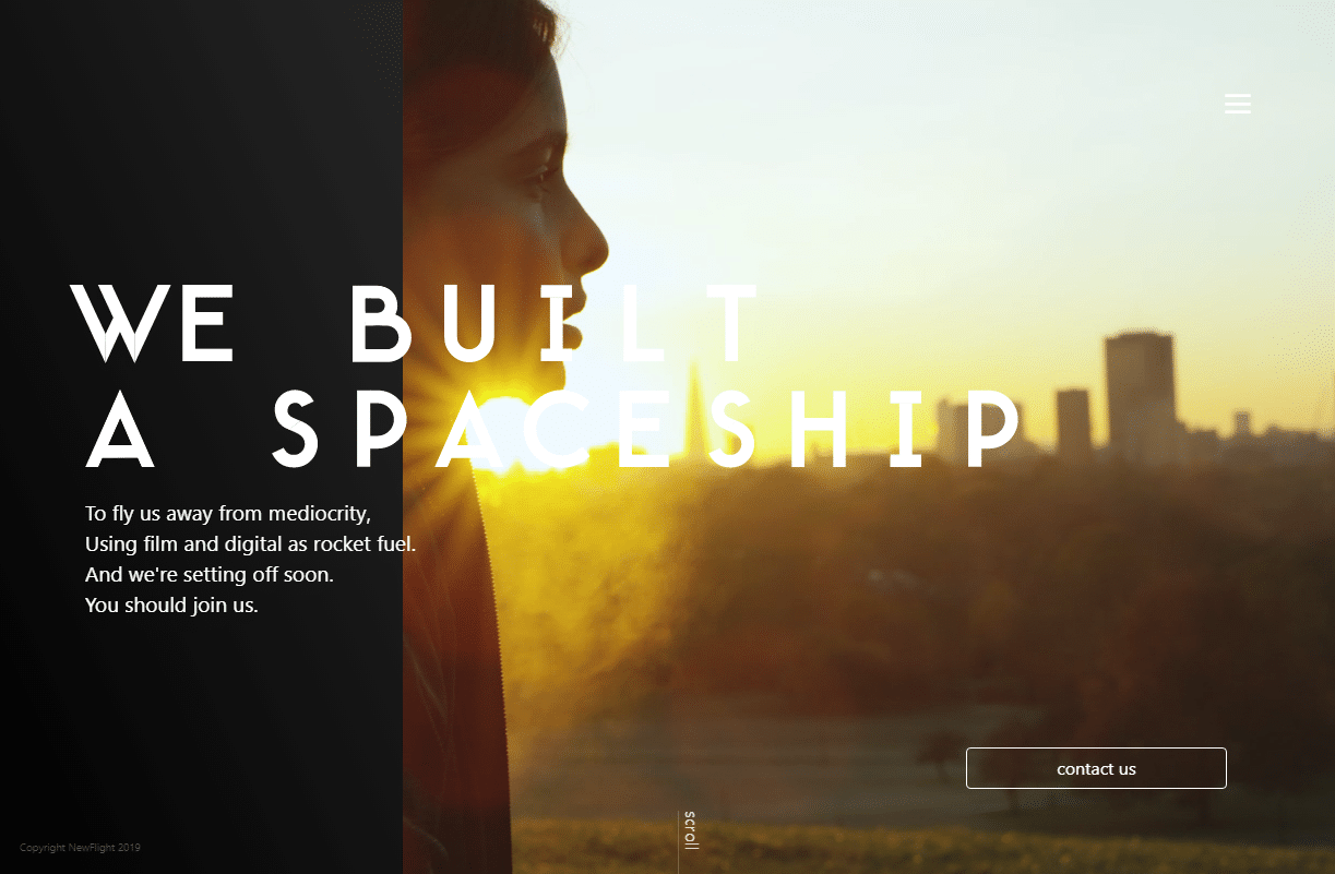
Broken grid design remains very popular. Websites are often choosing to avoid typical layouts and opt for something more artistic, with plenty of overlapping pieces and elements all over the screen. It’s a style that’s hard to pull off, but it looks amazing once you nail it.
But for those who aren’t interested in entirely breaking the mold, a little bit of asymmetry is an acceptable alternative. Asymmetrical split screen designs are especially popular, even if these sites still do stick to a grid.
Speaking of grids, CSS grid is a super powerful addition to CSS that works in two dimensions, columns, and rows, and allows you to easily create website layouts from scratch. With a little CSS magic you can also create a broken grid layout, so anything is possible. Web designers and developers are starting to pick up on CSS grid, so don’t miss out.
More Effects and Animations
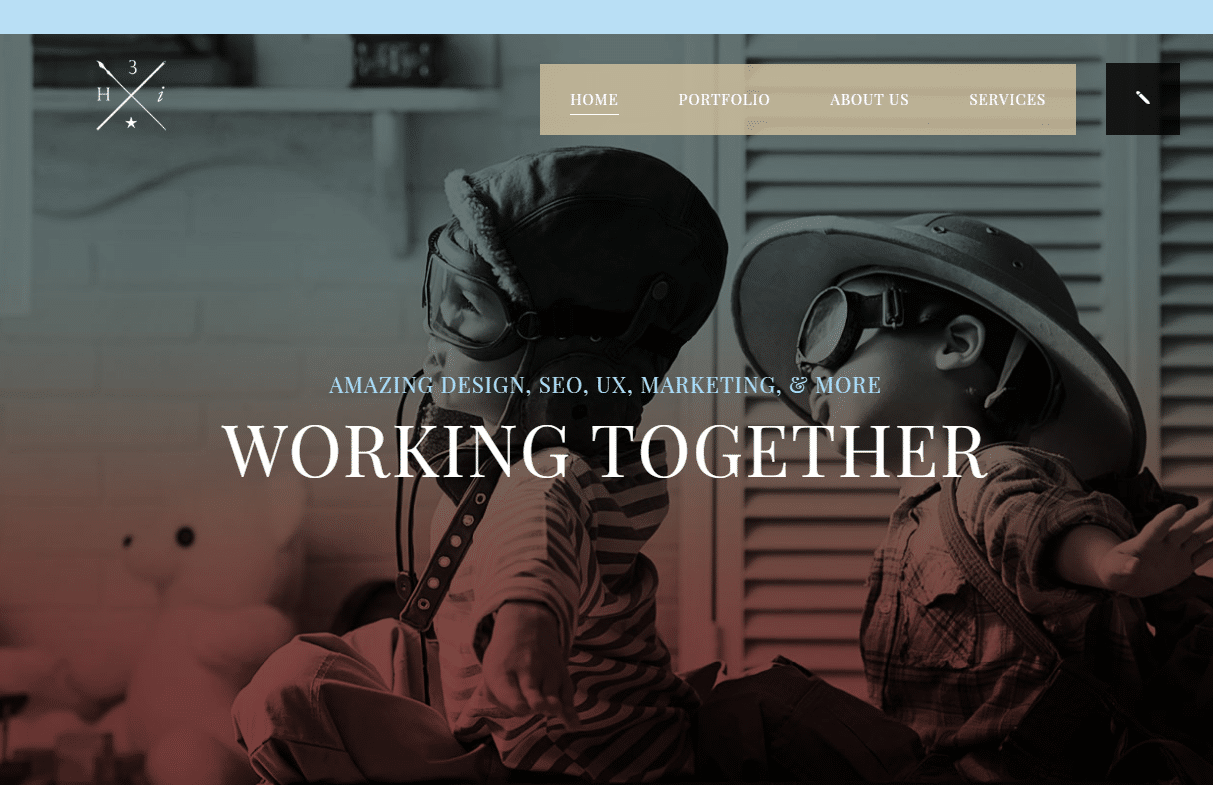
Though brutalism is becoming commonplace in some corners of the web, the rest of it is focusing on UI/UX design: creating a more beautiful interface while simultaneously improving user experience.
A huge part of this is in micro-interactions. Think hovering over a product on a store or playing with an interactive, animated background. These tiny animations make a website more entertaining to navigate and bring joy to small interactions like clicking and hovering. Some sites have even gone as far as implementing cute minigames.
But it’s not all just for fun. Micro-interactions often serve the same purpose as the common subtle animation: they direct user attention towards important UI elements. And over-implementation can get stale fast, so it’s a game of figuring out the ideal number of animations to include on your website.
Scrolling and parallax effects are of course just as popular as ever and can add a dynamic layered look to a page and make it a lot more interesting.
Also, look out for custom cursors. These were once rarely seen outside of small blogs or sites for children, but they’re now a popular choice, especially for sites built around 3D animated backgrounds or navigation. An elegant custom cursor can really enhance your aesthetic.
White Space
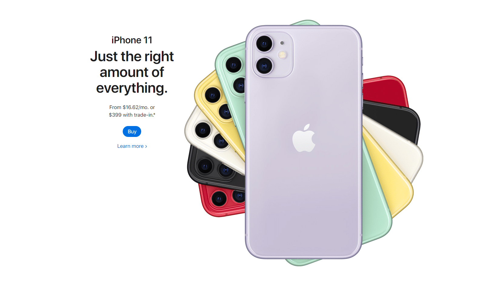
As always, white space and clean design will continue to have a place in web design trends. Simple and clean is a safe choice: there’s a reason this style is present on almost every modern website.
But even if you’re aiming for a bolder, more unique approach, white space is still something you need to work around. Every site needs breathing room, and white space can be used to carefully highlight and emphasize images or other content.
Lots of white space can be used to great effect, with entire portions of the screen left empty to give important elements plenty of room. Maximum white space is a style that will likely continue throughout the next few years.
Progressive Web Apps
The next big thing in mobile design: progressive web apps. These web-based platforms are built on code like HTML and JavaScript, but they function and act like mini-apps for mobile users. They’re made to offer the experience of an app without needing to actually be built on mobile technology or released on the app store.
PWAs work offline, can send notifications, and be pinned to the home screen, but you don’t need to download or distribute anything. They’re lightweight and load fast too, so they don’t take up too much bandwidth.
Even Twitter has gotten into PWAs, developing Twitter Lite as a solution for those with slow internet speeds. And they ended up integrating the system right into their main interface. That’s a testament to how well this technology works.
If you haven’t heard of progressive web apps yet, you should definitely do some research. Building one could make your mobile users’ experiences a lot smoother.
Summary
2018 and 2019 have been an exciting few years for the online world. 2020 is already bringing even more adventurous designs. Rule-breaking elements like asymmetry, bright colors, brutalism, and eye-catching animations will continue to grow in popularity throughout the next few years.
Who knows what might come next? We’re surely in store for even more unconventional new art styles.
If you haven’t caught on yet, it might be time to reimagine some of your designs and catch these hot new trends. Expect to see brands and designers truly start to express themselves and the internet to become much more vibrant and interesting.
The next decade of web design is likely to feature risk-taking and innovation, so make sure you’re ready to keep up.

