React UI component libraries are useful tools to help you create stunning interfaces for your React-based software applications and websites.
Although you can write your own code for each feature or functionality you want to include in your design, using a UI component library makes the entire task easier and faster.
So, if you are developing React-based software, using a React UI component library will be highly beneficial to you. This article will cover the 23 best React UI component libraries that you can use in your next project.
Check Out Our Video Guide on Top React UI Components Libraries:
Top 23 React UI Component Libraries
Here are the 23 best React UI component libraries so you can pick the most suitable one for your project.
1. Material-UI
Material-UI (MUI) is a fully loaded UI component library that offers a comprehensive set of UI tools to create and deploy new features at speed. It is one of the most powerful and popular UI component libraries out there with over 3.2 million downloads on npm a week, 78k stars on GitHub, 17k+ followers on Twitter, and 2.4k+ open-source contributors.
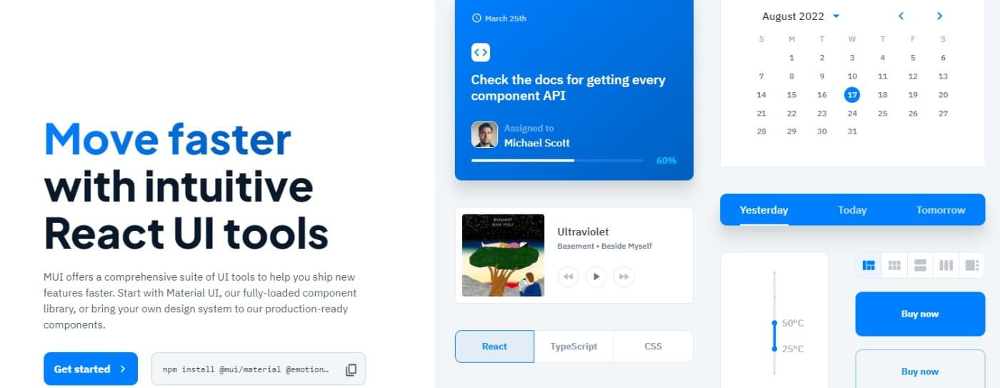
There are two ways to go about it – you can either use this component library directly or bring your design system to their production-ready components. This platform will enable you to design faster without sacrificing control or flexibility. It will help you deliver excellent designs in order to delight the end-users.
Features and benefits include:
- Timeless aesthetics: you can build exquisite UIs easily using MUI. You can either get started with Material Design by Google or create your advanced theme by yourself from scratch.
- Intuitive customization: this tool offers powerful and flexible components to offer you complete control over your project’s look and feel.
- Production-ready beautiful components: Create the best design of your dreams using the beautiful and powerful material design components such as buttons, text, menus, alerts, tables, and more. You can also customize them however you like.
- Better accessibility: Improving accessibility is one of the core priorities of this tool. Hence, any feature your build will be accessible quickly for the users to enhance their user experience.
- Unparalleled documentation: MUI comes with comprehensive documentation created and managed by 2000+ contributors. Here, you can easily understand this tool and how to use it. If you come across any doubt, this documentation will be there to help you.
The best thing is that you can use MUI for free, forever with basic features. For advanced features, you can choose a paid plan starting at $15/month/developer.
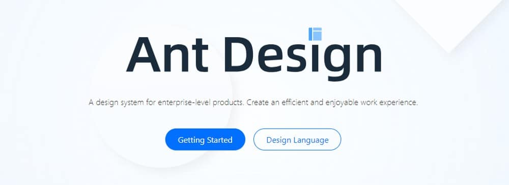
2. Ant Design (AntD)
If you are looking for a react based UI component library to build enterprise-grade products, Ant Design is an excellent option. It will help you create an enjoyable yet productive work experience.
This tool is used by companies like Alibaba, Baidu, Tencent, and many more. Ant Design offers multiple UI components to help enrich your application and software systems.
Features and benefits include:
- Components: You can use 50+ pre-made components directly on your projects instead of creating them from scratch. These components include buttons, icons, typography, layouts, navigation, data entry, data display, feedback, etc.
- Ant design packages: These packages are useful for mobile, data visualization, graphic solutions, etc.
- Ant Design Pro: AntD’s other variant Ant Design Pro comes with features like templates and a design kit apart from components to help you design your applications.
Furthermore, Ant Design also recommends you use other React-based third-party component libraries like React JSON View, React Hooks Library, and more. It does maintain documentation and supports community discussions through GitHub, Segmentfault, and Stack Overflow.
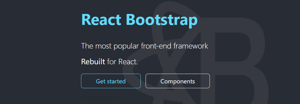
3. React Bootstrap
Another popular front end framework – React Bootstrap, is rebuilt for React-based applications and systems. It has replaced Bootstrap JavaScript, where each component is developed from scratch as native React components with no need for dependencies such as jQuery.
React-Bootstrap, despite being one of the earliest React libraries, has evolved to become an excellent option for building effortless user interfaces. It includes amazing UI elements for your mobile and web applications.
Features and benefits include:
- Compatibility: React-Bootstrap is designed to be compatible with a wide range of UIs. It relies completely on the Bootstrap stylesheet and works with multiple Bootstrap themes that you might like.
- Accessibility: all the components included are developed to be easily accessible to any user or device. Hence, the user will also get better control over each component’s function and form.
- Lightweight: You can minimize the volume of code in your applications by importing just the components you need individually instead of importing the complete library. It will be less time-consuming as well.
- Themes: Since Bootstrap is used widely for web development, you will find thousands of paid and free themes available.
There’s no official support for React-Bootstrap but it has plenty of useful resources available on the web along with an active community. If you seek any help, you can go to Stack Overflow, Reactiflux Discord, and GitHub Issues.
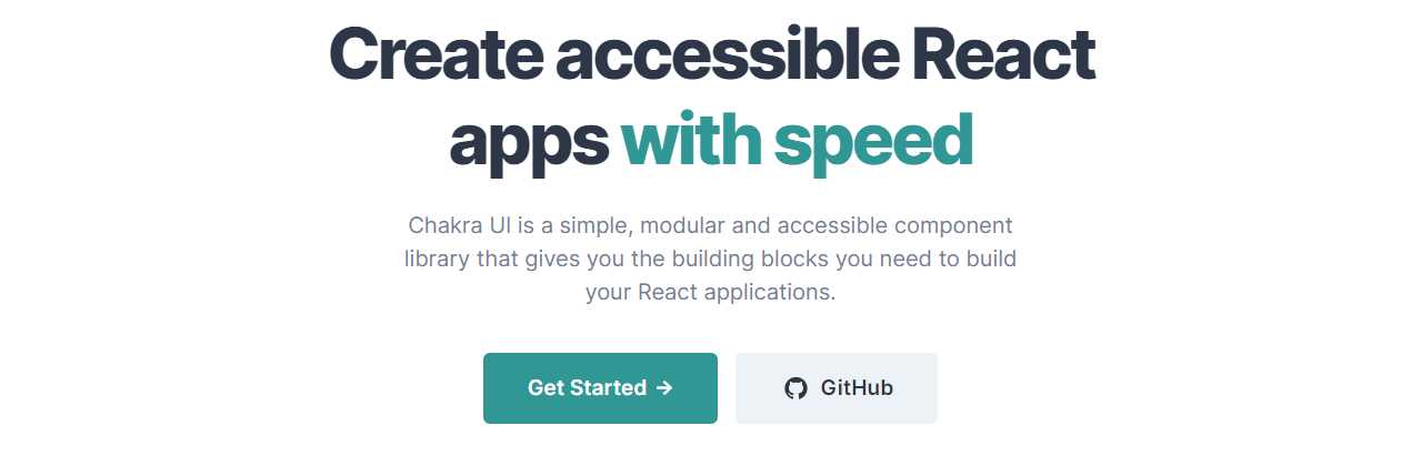
4. Chakra UI
Create react applications with Chakra UI, which is a simple, accessible, and modular component library. It offers useful building blocks to help you build valuable features in your applications and delight users.
Chakra’s popularity is growing due to its awesome offerings and performance. Currently, it has 1.3 million downloads a month, 19.7k GitHub stars, 7.4k Discord members, and 10k core contributors.
With this tool by your side, you will spend less time coding and more time creating wonderful experiences for the end users. Chakra UI is designed to make it easier for developers to add features faster without creating everything from scratch.
Features and benefits include:
- Accessibility: Chakra UI follows WAI-ARIA standards in its components, making your applications easily accessible.
- Customization: You can easily customize any part of the components it provides to complement your design requirements. Whether it’s theming, templates, settings, or anything else, you can make the best use of this design tool.
- Composable: it’s effortless to compose new elements with Chakra UI due to its easy-to-use interface and navigation. You can find each feature easily and play with them to create your design elements without hassles.
- Dark and light UI: Chakra UI is optimized for different color modes that you can use based on your design needs. You can use dark or light mode wherever you feel suitable and build amazing UIs for your applications.
- Developer experience: with all the options available along with the freedom of customization and composability, the developer’s productivity will increase significantly while creating a website or application.
As a result, they will have to write fewer codes and can choose a component directly in their design without having to write code for each component from scratch. It not only saves them time but also effort so that they can invest their valuable time in innovation.
In case you come across any issues, you can approach Chakra’s active maintenance team to ask questions and clear your doubts.
5. Blueprint
Blueprint is a React-based UI toolkit that you can use to build your web applications. It’s an open-source project created at Palantir, an organization with practical experience in enhancing customer experience by interacting with data via applications.
If you are building data-dense and complex interfaces, this tool will be highly suitable for you. It’s also majorly used for desktop apps. This component library has over a thousand stars on GitHub.

Features and benefits include:
- Developer-friendly: Blueprint offers a complex UI to allow developers easily build heavy, feature-rich web interfaces having several components and modules. It’s loved by developers and one of the reasons for this is that Blueprint offers 25+ standard components.
- Components: It offers bits of code to create and display buttons and 300+ modifiable icons, interact with time and date, choose timezones, etc. Apart from this, you will get options like breadcrumbs, callouts, dividers, buttons, navbars, cards, tags, tabs, and more.
- Customization: Developers can use CSS and customer each component to suit their project needs with ease.
- Themes: It doesn’t have different varieties of themes but you will get unique dark and light mode themes along with design elements such as color schemes, classes, typography, etc.
- Accessibility: many users find Blueprint as one of the most accessible libraries out there. You can easily install it through npm in the command prompt.
- Real-time compositing: Using a tool, Composer, will help you perform compositing in real time and improve your application’s user interface.
- Other features: It has other useful features such as pixel streaming, capturing mixed realities, creating magic leaps, multi-user editing, panoramic capture, chaos destruction, and more.
Blueprint’s documentation is excellent and includes in-depth tutorials that developers can go through and master this library. Since it lacks support options, you can see help on Stack Overflow and Blueprint’s GitHub repository, which is active with contributors.
6. visx
Created by Airbnb, visx is a collection of multiple low-level, expressive visualization primitives built for React applications. It was developed to unify a complete visualization stack throughout the company, bringing together the delight of React with the robustness of D3 for calculations.
With visx by your side, you will get a native experience in any React-based codebase as it has the same patterns and standard APIs. This way, it solves the problems of copying-pasting various React hooks. Instead, it can abstract D3 details and offer utilities and components in standard formats. If you like customizable and performing charts, visx is a great tool.

Features and benefits include:
- Multiple layouts: layouts included in it are heatmaps, networks, word clouds, stats, geographic projections, and more.
- Utilities: visx offers SVG utilities to build interactive, complex SVGs. You will also get data utilities like mock data to help create visualizations. You can also create a chart of your own with utilities like tooltip and axis.
- Interactions: you can use primitives such as brush, zoom, drag, etc., to improve the user experience.
- Lightweight: you can split visx into several packages and reduce the bundle size. Hence, you can start small, using only the components you need without having to use the entire library. This will also consume less time and space and you can complete your work faster.
- Customization: visx allows you to easily customize your components. You can bring your animation library, state management, CSS-in-JS solution, etc., and start creating interesting UIs. This way, it becomes effortless for you to design your styling, theming, animation, etc.
- Charting library: when you start to use visx’s visualization primitives, you will be able to build a charting library of your own. In addition, it can be optimized for your specific use cases and offer better control of your design.
visx offers detailed documentation with complete instructions for installation, description, and integration, along with an API list with some examples for each. Apart from a comprehensive gallery of useful examples for visualizations, visx provides you with many useful blog posts and a Getting Started tutorial to help you start and use this tool.
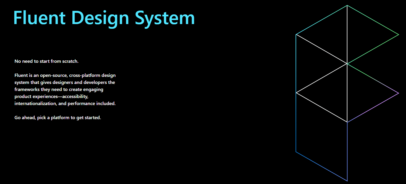
7. Fluent
Fluent is a cross-platform, open-source design tool to help you create an engaging user experience. It was previously named Fabric React and is an excellent UI library created by Microsoft.
Developers and designers can benefit from its useful tools to add design elements to their applications without having to create them from scratch. This tool is powerful and intuitive and is built to adjust as per user intent and behavior. No matter what device you use, working with Fluent feels natural, be it PCs, laptops, or tablets.
Fluent is one of the best tools if you are creating cross-platform applications. However, it’s also great for other projects.
Features and benefits include:
- Pre-built components: Fluent offers multiple pre-built components to help you develop your application’s different parts in the design language of Microsoft Office. It includes components like buttons, grids, checkboxes, notifications, menus, essential inputs, toolboxes, and more. You can also customize them easily to suit your use case.
- Controls: you can get better control of your designs with tools like Datepickers, people pickers, persona, etc.
- Accessibility: Fluent is created with easy accessibility in mind so that any user can access and use it without any hassle.
- Cross-platform: It works on all platforms, whether it’s the web, iOS, macOS, Android, or Windows. It’s also compatible with Microsoft products such as Office 365, OneNote, Azure DevOps, etc.
- Performance: Each component you use from Fluent to build your application parts will perform optimally. It will provide a professional yet user-friendly look and feel to your applications. In addition, it takes a straightforward approach by applying CSS to each of its elements. Therefore, even if you change an element, it won’t impact your style.
Since it’s open source, you can use the code and modify it based on your needs. However, it may lack in-depth documentation. But if you need help, there are other resources and blog posts available on the internet. Therefore, it’s best for developers and designs with some prior experience.
8. Semantic UI React
Integrating React with Semantic UI can be an excellent strategy to get a customized UI component library for your projects. Semantic UI React helps you build your sites and applications with concise and easy HTML. It has 12k+ stars on GitHub.
With this tool, you can load any CSS theme you want on the app you are building. It also has human-friendly HTML to develop software products. It’s a declarative API that offers powerful prop validation and features.

Features and benefits include:
- jQuery Free: Semantic UI React is free from jQuery as it lacks virtual DOM.
- Pre-built components: this library offers many components, including buttons, header, containers, and icons. In addition, you will get shorthand props to help create markup automatically.
- Easy debugging: With Semantic React UI used on an app, developers find it easier to debug applications. You can easily track issues without keeping on digging through your stack traces.
- Theming: Semantic UI has high-level themes along with a smart inheritance system to provide you with complete design flexibility. It offers 3000+ theming variables. So, just develop the UI once and use it as many times as you want.
- UI components: You get 50+ UI components to develop your complete site using just a single UI stack. In addition, you can share the UI in different projects and reduce your efforts in creating each from scratch for every project. You get a wide variety of components from buttons to collections, views, elements, behaviors, and modules, covering a large area of interface design.
- Responsiveness: The tool is designed to make your interface responsive, giving you options to figure out the best design for your content and design elements on both mobile and tablet.
- Integrations: The tool has integration with Angular, Ember, Meteor, etc., apart from React. This lets you organize your user interface layer alongside the application logic.
This free and open-source tool is used in several large-scale software production environments.
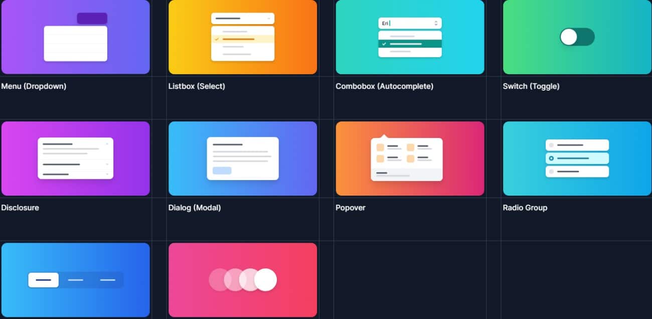
9. Headless UI
Created by Tailwind Labs, Headless UI offers fully-accessible and unstyled UI components designed to be easily compatible with Tailwind CSS. It is one of the best UI libraries for all your React-based projects. It also is popular with 54.5k+ stars on GitHub.
Since this tool can separate the app logic from the visual components, it’s an excellent option if you are building a UI for your application. It enables you to create applications easily without leaving your HTML. Also, it’s a utility focussed CSS library full of classes such as rotate-90, text-center, pt-4, and flex.
Features and benefits include:
- UI components: You get many UI components such as a menu, list box, switch, combo box, dialog, disclosure, dialog, radio group, popover, transition, tabs, auto-complete, toggle switch, and more.
- Customization: customizing each component is simple as you will get easy-to-understand examples and styling guidance for each component. This way, you can build your features suitable to your specific app needs.
- Accessibility and transitions: Headless UI offers complete accessibility and transition information so that users won’t find it a headache to access and use the tool in their applications. For this, you will get an extensive API as well.
Regarding the support and documentation, Headless UI is good. It has a strong community on GitHub. You can also connect with other users of Headless UI on the Tailwind CSS discord server and seek help. In addition, Headless UI’s discussions page stays active with general help, interactions, and feature requests.
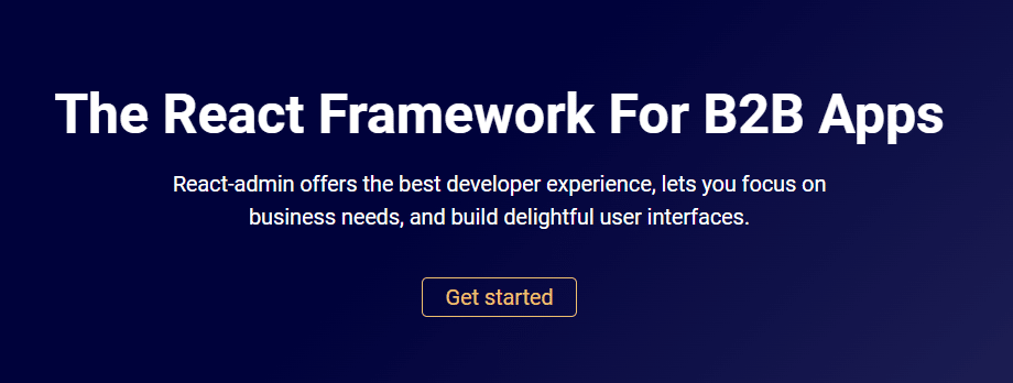
10. React-admin
If you are looking for a React framework to build your B2B applications, React-admin is a good option. It aims to provide the best experiences to developers and enables you to focus more on fulfilling your business needs.
This is an open-source tool with an MIT license and is robust, stable, easy to learn, and a joy to work with. This is why 10k+ companies across the world have used React-admin on their projects.
With React-admin, you can create delightful UIs, whether you are building your internal tools, B2B apps, CRMs, or ERPs. It aims at increasing the maintainability and productivity of developers by allowing them to design faster.
Features and benefits include:
- Faster: This tool has the capability of accelerating your work speed. In as little as 13 lines of coding, you can get started with it.
- Modern design: You can create API based apps with this tool that comes with modern material designs.
- A vast library of components: React-admin can be used to create common features instead of creating each from the start. It has a vast library of components and hooks that can cover most of the use cases so that you can focus on your business logic. It has components, including forms and validation, search and filter, notifications, routing, fully-featured Datagrid, and more apart from common ones.
- Accessibility and responsiveness: React-admin is built to be accessible and responsive to anyone using different devices. This way, it aims to enhance the user experience of what device they use and where they are located globally.
- Role and permissions: Make your application secure with suitable roles and permissions for the users.
- Theming: you will get different options for theming to make your user interface attractive yet useful.
- Integration: React-admin can work with any API. It is backend agnostic. You can also find adapters compatible with most GraphQL and REST dialects or write the code yourself in a few minutes. It can integrate seamlessly with OpenAPI, Django, Firebase, Prisma, and more.
There are two editions of React-admin:
- Community Edition: It’s completely free so you can access its code and documentation without paying anything. For support, you can refer to its Stack Overflow community.
- Enterprise Edition: If you want to leverage more options and freedom, you can buy the Enterprise Edition which starts from 125 Euros per month or 127.10 USD per month.
Besides accessing code and documentation, you will get professional support from marmelab, a 50 percent discount on the Professional Service you choose, and access to advanced features such as a calendar, audit log, many-to-many, real time, editable data grids, role-based access controls (RBAC), etc.
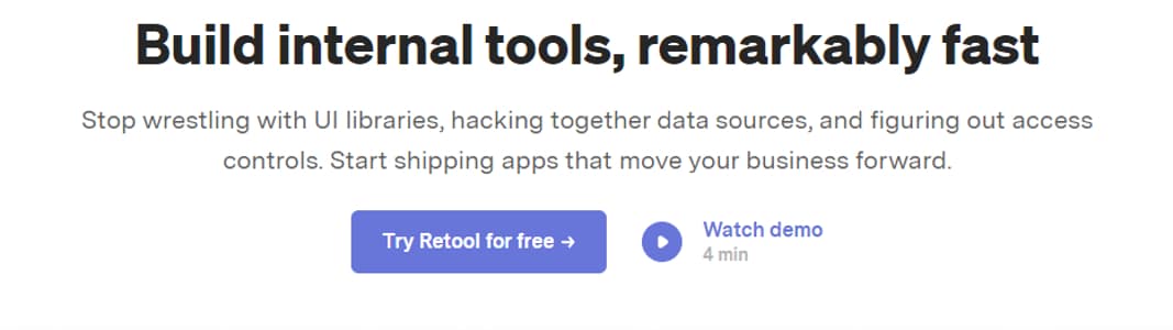
11. Retool
If you are building internal applications, Retool is an excellent option. It will eliminate the struggle with UI libraries, data sources, and access controls. You will get a streamlined way to handle everything and produce apps that customers would love to use.
This tool has been used by businesses of all sizes, from Fortune 500s to start-ups for creating awesome internal applications.
Features and benefits include:
- Robust building blocks: You will get 90+ useful and robust building blocks such as tables, charts, forms, lists, maps, wizards, and so on. Retool offers these components out of the box to help you spend more time assembling and optimizing your UI and not writing code for them separately.
- Saves effort and time: instead of finding the best React library for a component (say table), you can use Retool to get everything in a single place. It has options like drag and drop to enable you to arrange components and put together an application’s features and parts quickly. This way, you can save plenty of your time and move on to the next project faster while accomplishing the current one with better efficiency.
- Visualization: Adding features like maps, tables, etc. to your applications allows users to visualize important data easily. This helps them take suitable actions even in crucial hours.
- Integration: you can connect to any database through GraphQL, gRPC API, and REST. This way, you can get all your data in a single application and work seamlessly. It integrates with tools like MongoDB, MySQL, Google Sheets, Stripe, Snowflake, Slack, Salesforce, Twilio, Google Cloud Storage, GitHub, AWS Lambda, Sendgrid, Redis, and many more.
- Error handling: With Retool, you don’t need to worry about error handling from the backend. This tool can handle everything, from READing data from MongoDB and JOINing it to Postgres to POSTing its result directly to the Stripe API.
- Developer-friendly: Retool is a developer-friendly tool that allows your developers to do much more than what’s available. A developer can write code using JavaScript and develop the app in Retool. It accepts JavaScript everywhere and helps you easily execute your code. In addition, you can use Transformers to write reusable code and manipulate data.
- Native API: You will get to use a native API in Retool to interact with queries and components via JS.
- Customizing, importing, debugging: it’s easy to customize any component you want to make it suitable for your use case. You can also import a JavaScript library through URLs for different uses. Retool comes installed with tools like Lodash, Numbro, and Moment. In addition, it’s easy to debug. You can view all the available components, environments, and queries along with query dependencies and start debugging.
- Secure deployment: Retool offers built-in security, permissions, and reliability to help you deploy your products with privacy and security. You can either host Retool in your Virtual Private Cloud (VPC), Virtual Private Network (VPN), or on-premises. You can also deploy via Kubernetes or Docker.
Furthermore, you can view revision history with the help of Git and sign in securely using Two-Factor Authentication (2FA), Single Sign-On (SSO), or Security Assertion Markup Language (SAML). In addition, it offers audit logs and fine-grained access controls to allow only permitted individuals to access your applications.
Retool offers extensive documentation and support. Its support is available on its Discourse forum, Slack (if you are a Retool power user), Intercom for live chat, and dedicated support for enterprise customers.
There’s a free trial available for Retool. You can also watch the demo available on its official site to know how the tool works.
12. Grommet
Grommet is an all-around React framework with a tidy package that contains responsiveness, theming, accessibility, and modularity. It will help you streamline your software development with an effortless UI component library.
This tool is an outstanding option if you are looking for a comprehensive design system to build accessible and responsive mobile-first web projects. It’s created by HPE and provides a vibrant experience while designing.
Features and benefits include:
- UI components: Grommet offers robust and bold component designs and is lightweight to keep your app size in check. You will get multiple categories of components, such as layouts (footers, headers, cards, sidebars, grids, etc.), type (headings, text, paragraph, and markdown), color (branding, status, neutral colors, and accents), controls (buttons, navigation bars, menus, etc.), inputs (text, file uploads, checkboxes, etc.), media (video, carousels, and images), utilities to enhance user experience (responsive elements, keyboard shortcuts, infinite scroll, etc.), visualizations (calendars, avatars, charts, etc.)
- Theming: There are plenty of pre-packaged themes available on Grommet – Grommet theme designer and Grommet designer. The former is a demo admin panel that lets you develop customized Grommet themes by adjusting elements. The latter is a canvas to create and save your design experiences with the components.
- User-friendly interface: It is an easy to access UI library with tools like keyboard navigation and screen reader tags. It also supports Web Content Accessibility Guidelines (WCAG). It’s a great tool for beginners.
Grommet has extensive comprehensive documentation but lacks hands-on support, but you can seek help in different ways. You can talk to the Grommet team on Slack, share feedback on this tool on GitHub, and stay updated with recent news by following Grommet on Twitter. You can access a template library and read resources on codesandbox and Storybook.
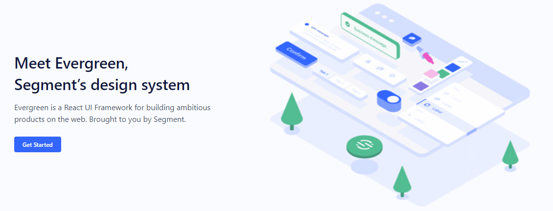
13. Evergreen
Offered by Segment, Evergreen is an amazing React UI library to help you create delightful software products. It’s also a design system that offers you flexibility and does not limit you to a particular configuration or needs obsolete integration.
Evergreen facilitates building software products that can adapt to changing design needs. It offers a lot of features, components, and many benefits to help you create user-friendly and powerful interfaces. If you want to build enterprise-grade web applications, this will be a good option for you.
Features and benefits include:
- Components: Evergreen has 30+ polished components that allow you to work out of the box. It includes typography, colors, buttons, badges, pills, patterns, layouts, and more. These are created on top of React-based UI primitives to enable endless composability.
- Quick installation: installing Evergreen’s UI package is quick and easy. Thus, you can get started with this tool without any hassle and start building the apps.
- Theming: Evergreen offers two themes – default and classic. The default theme reflects the current brand of Segment, while the classic theme originates from Evergreen’s first version. Although Evergreen lacks a theme builder, you will get a comprehensive theming system to customize the components as per the design requirements.
Evergreen has a rich collection of guides, plugins, kits, and tools to simplify designing your systems. You can also go to Evergreen’s Figma library and get the help you require.
14. Rebass
Rebass is a React-based UI component library that comes with a styled system. It’s scalable, systematic, and responsive, which businesses need. It was created by a front end developer Brent Jackson at Gatsby.
This tool works with CSS-in-JavaScript libraries and doesn’t require you to write CSS on your own into an app using a style object rather than an embedded CSS string. Therefore, you can develop code faster while adding your design elements and themes over Rebass primitives.

Features and benefits include:
- Lightweight: Rebass consumes only about 4 KB and is very lightweight. This keeps the size of your application in check.
- Components: It comes with a foundational list of primitive UI components that you can extend easily and create a component library. It will also have a consistent style and API defined in a chosen design theme. You will get components like app structure (boxes. Layouts, etc.), images, text, cards, forms, and more. Forms also consist of sub-components such as sliders, switches, text areas, checkboxes, inputs, etc. Apart from this, you will get other common components like image cards, nav bars, grids, etc.
- Theming: Rebass provides theming flexibility and themes are implemented using ThemeProvider. You can also customize the themes based on your usage. In addition, Rebass has a Theme Specification to define design tokens and theme objects with the components. Furthermore, Rebass supports Styled System and Theme UI without any extra configuration settings.
Rebass offers detailed documentation on how to start the tool and use it. It also acts as a guide to help developers extend and customize the components. When it comes to support, Rebass doesn’t have any paid support.
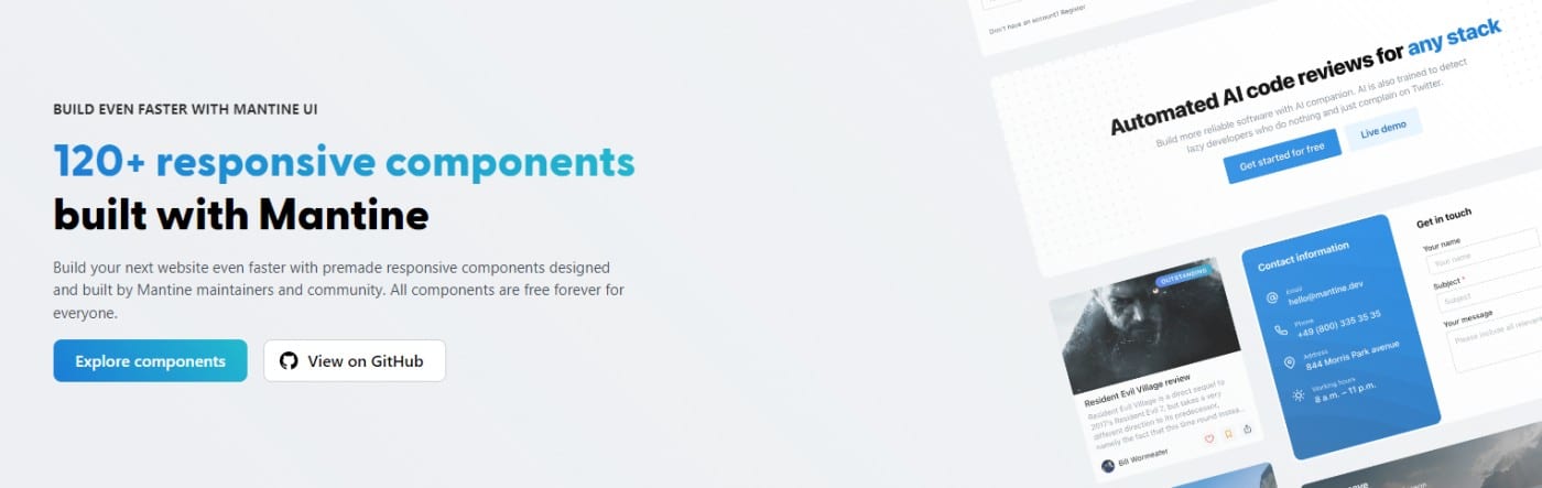
15. Mantine
Mantine is a fully featured React UI components library that you can use to develop your web applications and sites at quick turnaround times. It’s built to make your app accessible and flexible and comes with 40+ hooks and 100+ customizable components.
This tool is open source and free with its packages having the MIT license. It’s based on TypeScript and supports several frameworks.
Features and benefits include:
- Components: Mantine has 100+ components, including over 20 input components, carousels, text editor, date pickers, overlays, and navigation. It supports Embla based carousels, Quill based text editor, and lets you adjust your content easily. You also can change colors, search items, use autocomplete, and many more.
- Dark color scheme: You can add a dark theme to the app you are building with a little coding. Mantine can export global styles for dark and light themes alike.
- Customization: Each component in Mantine can be customized visually with props. This helps you quickly build a prototype and keep experimenting by modifying the props.
- Style overriding: Mantine allows style overriding for each internal element with the help of inline styles or classes. When you can use this feature along with other customization flexibility, you can apply any visual changes you want and fit your design needs.
- Flexible theming: You don’t have to limit yourself to the default theme; you can extend it with additional colors, radius, spacing, fonts, etc., to complement your designs.
- Additional features: Other important features included in Mantine are auto-vendor prefixing, lazy evaluation, extracting critical CSS during server-side rendering, dynamic theming, and more.
- Integration: Mantine works with modern environments, including Gatsby.js, Next.js, Remix, create-react-app, or Vite.
Mantine has a Discord community that you can join to ask questions, view the recent developments, and participate in feature discussions. It’s also available on GitHub for discussions and sharing feedback. You can also follow Mantine on Twitter to stay notified of updates.
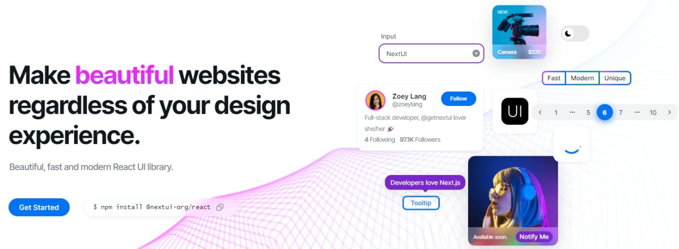
16. Next UI
Whether you are a beginner or an experienced developer, you can easily build sites and apps with the help of NextUI. It is a modern, fast, and beautiful React UI library that you can get started in no time.
This tool looks promising with all its features, offerings, and interface. Its components support server-side rendering across different browsers.
Features and benefits include:
- Faster: NextUI eliminates unwanted style props during runtime. This makes the tool better performing than other React UI libraries.
- Unique DX: NextUI is fully typed, which helps reduce the learning curve while providing better developer experiences. Also, developers don’t need to import several components in order to showcase just one. Hence, you can do more by writing less code.
- Light and dark UI: You will get automatic recognition for dark mode. NextUI can automatically change your theme by detecting prop changes in the HTML theme. Its default dark theme is well scaled and easy to apply with less coding.
- Themeable: It offers an easy way to customize the default themes available. You can easily modify the fonts, color, breakpoints, etc.
- Customization: Since NextUI is developed on top of CSS-in-JS library Stitches, it’s easy to customize the components either through the CSS prop, native CSS selectors, or styled function. In addition, you will get a set of Stitches utilities out of the box to accelerate your workflow by grouping CSS properties together, shortening CSS properties, or simplifying a complex syntax.
- Server-side rendering: NextUI’s components facilitate cross-browser server-side rendering that you can easily apply to your applications.
- Accessibility: All the components by NextUI follow the WAI-ARIA guidelines and offer keyboard support. Users can also view a focus ring when they navigate using a screen reader or a keyboard. It’s also compatible with Next.js.
NextUI has a wide community on GitHub, Twitter, and Discord that you can join and seek help and share your feedback and tips.
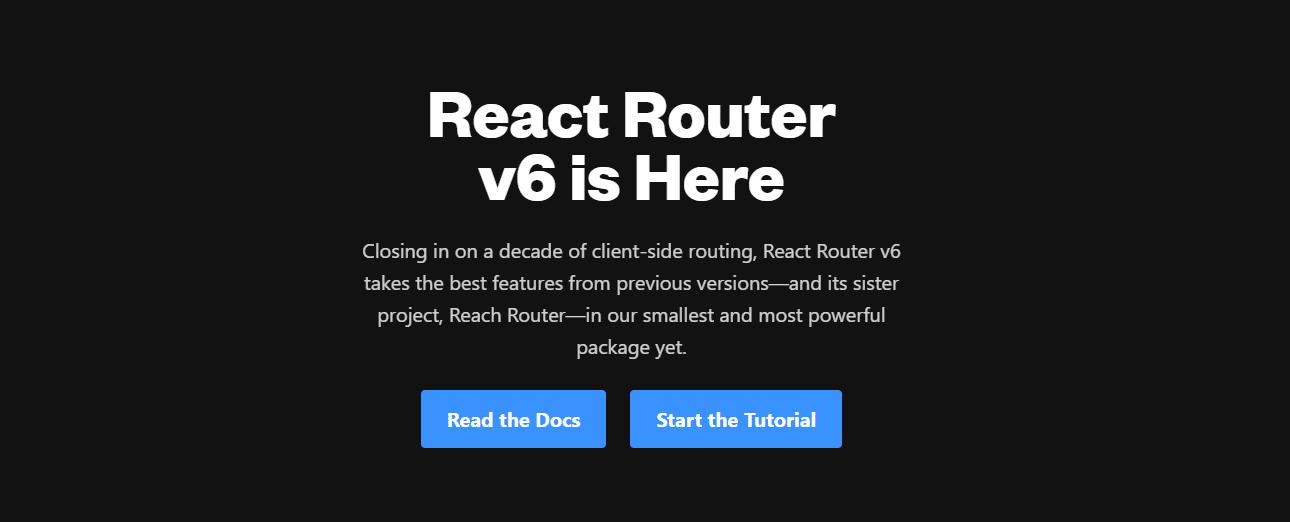
17. React Router
Developed and maintained by the Remix team and its contributors, React Router is an impressive React UI component library. Its recent version is v6 which uses the best features from its previous versions and features some improvements as well.
Development teams from reputed companies such as Airbnb, Discord, Microsoft, and Twitter have used this tool in their projects. It’s best if you are searching for a router user interface that can work with a different interface. It can match your app components with corresponding URLs to ensure a better user experience.
Features and benefits include:
- Nested interfaces: The tool allows you to use multiple interfaces in a single application.
- Time saver: React Router is an efficient tool that can help accelerate your application. It can automatically change the URLs and layouts; hence, you can create fewer routes and save time and effort.
- Optimized routing: This tool can choose the best routers for the site or app you are building. For this, it will evaluate several possibilities, give each one of them a rank, and render the best route. This also reduces the need for creating route ordering on your own.
- Additional features: It has a declarative programming architecture. Hence, it’s useful while creating React-based applications using some elements and components that are ready to be composed declaratively.
React Router comes with documentation that you can refer to know how to get started with this tool. You can also access the tutorial available on the official home page to learn more. It has 2.4 million GitHub users, 3..6 million npm downloads, and boasts 600+ contributors from across the world.
18. Theme UI
If you are creating a themeable React-based UIs, using Theme UI is a good choice. It will help you build web applications, design systems, custom component libraries, Gatsby themes, etc., with greater flexibility.
Theme UI offers top-notch developer ergonomics and follows constraint-based design principles. Designing with this tool involves two primary steps:
- Building the theme by defining colors and fonts
- Styling each component to have better control over your application or site
Features and benefits include:
- Ergonomic: You can style your software products quickly as per your theme with excellent developer ergonomics.
- Constraint-based: You can use typography, colors, layout scales, etc., by following a constraint-based design.
- Themeable: Reference values out of your themes effortlessly through your complete site or app on any component you want. It has a Theme Specification and a Theme aware sx prop for CSS.
- Components: You will get over 30 built-in React UI components to choose from and make your designs attractive and responsive.
- Styling: You can style with/without creating components. Theme UI offers mobile-first, easy, and responsive styles. In addition, it follows an expressive and simple MDX styling.
- Dark mode: This tool has a built-in dark mode and a powerful theming API. It also includes plugins for themes and Gatsby sites. This enables you to design static sites.
Theme UI comes with a detailed document that you can refer to in case of doubts or explore the usage. It includes instructions for styling MDX, theming, custom hooks, and more.
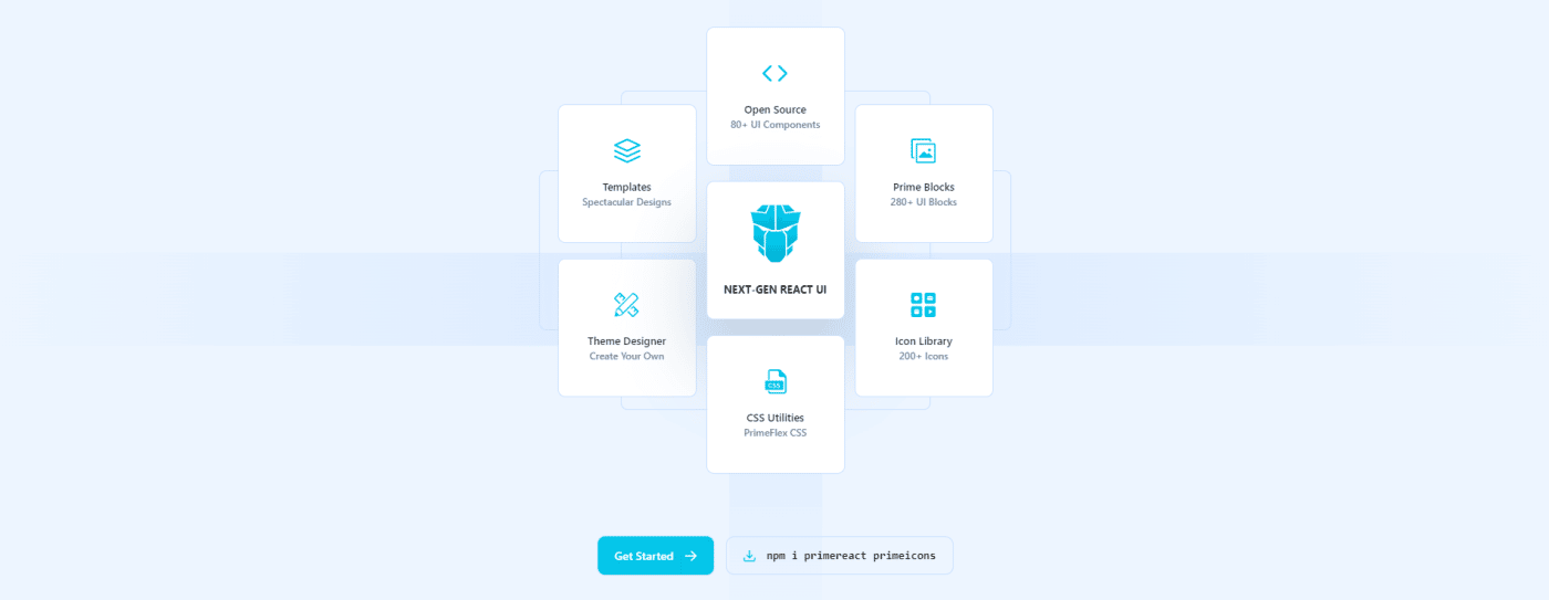
19. PrimeReact
PrimeReact is another React UI component library that enterprises and developers across the world have used. Some of the notable companies include Mercedes, Airbus, Ford, Fox, Volkswagen, eBay, Intel, Nvidia, Verizon, and American Express.
This tool has 39.5k+ weekly downloads and 2.6k+ GitHub stars. It has an impressive list of features and components to make your UI design adventurous.
Features and benefits include:
- Components: PrimeReact has 80+ awesome React components to use directly on your designs. Some of the unique ones include captcha, terminal, organization chart, and TreeSelect.
- Templates: You will get customizable templates and 280+ UI blocks that you can copy and paste directly while developing your interface. In addition, it has an icon library consisting of over 200 icons.
- Design agnostic: PrimeReact has a design-agnostic infrastructure that lets you select the look and feel of existing libraries such as Bootstrap and Material UI. However, you are totally free to create one by yourself.
- Theme Designer: The tool features the GUI based Theme Designer with a Visual Designer and over 500 variables that you can modify as per your needs. It will allow you to modify color, font, size, input style, buttons, etc.
PrimeReact does offer support and you can expect a response within one business day regarding improvement or feature requests.
20. React Redux
React Redux is a UI component library maintained by Redux and is updated frequently with the latest APIs from React and Redux. It’s famous for attributes like predictability, straightforward interface, and accuracy. It’s suitable for lighter projects than complex ones.
Features and benefits include:
- Encapsulated: You will get APIs to allow the components to interact directly with the Redux store. This prevents you from writing the code yourself.
- Performance optimization: React Redux can automatically apply performance optimizations to enable the component to re-render during changing data needs.
- Predictability: This tool is designed to be compatible with the component model of React. Here, you can specify how to extract the required values for your components from Redux. Your component will also automatically update when something changes.
- Straightforward interface: The tool has a straightforward interface to allow testing the code in several environments and comparing the result precisely.
- Debugging: React Redux has DevTools that allow you to detect changes in the app state, log each change, and forward error reports. This enables a streamlined debugging process.
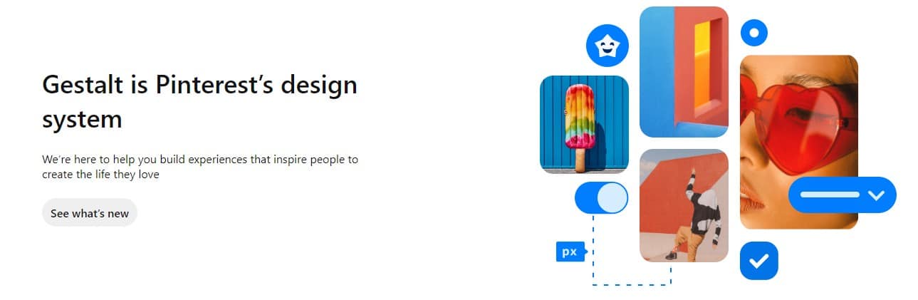
21. Gestalt
Gestalt is a UI library that helps you create amazing user interfaces that people love using. It’s Pinterest’s design tool as well and comes with many features and components. Its interface is also smooth to allow developers quickly get started with the tool.
Features and benefits include:
- Easy to adapt: Getting started with this tool is easy for designers by following their brand-new guide. They can also read how to configure the tool and pull requests.
- Components: You will get a comprehensive set of UI utilities and controls to create great user experiences.
- Foundations: While designing, you can play with elements such as color palettes, icons, typography, etc.
- Other features: It supports dark mode, internationalization, right-to-left, automatic code updating, etc. It also needs low maintenance due to the automatic design. The upgrade process also gets easier with codemode that can detect code breaking.
You can also connect to the Gestalt team and engage with them to contribute. In addition, you can follow their Road map to stay updated with the latest developments.
22. React Motion
If you are looking for a solution to animate components in React, you can consider React Motion. It is an excellent React library that will help you create realistic animations. It’s easy to get started with this tool and use it.
Features and benefits include:
- Specifying stiffness values: The thing that makes this tool even more attractive is you can specify values for stiffness. You can also define damping parameters. This way, your components will look more realistic as you can control the stiffness.
- Styling: You can use React Motion to easily animate a simple card component’s scaling. For this, you will need to utilize styled components.
React Motion has simple, easy-to-understand documentation. You can also stay connected with its GitHub community for feedback and the latest developments.
23. React Virtualized
If you are building a complex front end with heavy data, you may want to use React Virtualized. Whether it’s components or customizations, you can perform everything with ease in this tool.
Features and benefits include:
- Efficient rendering: The tool can efficiently render large tabular and list data. Hence, it’s useful if you want to render multiple columns in one table or if you have a large list having hundreds and thousands of elements.
- Components: You will get many components, including an auto-sizer, a columnsizer, a cellmeasurer, a multigrid, an arrowkeeper, direction sorters, etc., apart from the common ones. This versatile library can meet your growing tabular needs. You can also customize your table by adjusting its row heights.
- Browser support: React Virtualized supports standard web browsers for Android and iOS.
It has a GitHub community that you can follow to request features and stay updated with the tool.
FAQ
Before we wrap things up, let’s go over some basic concepts so you have a better understanding of React UI component libraries.
1. What Are React UI Component Libraries?
A React UI component library is a tool or software system that comes with ready-to-use components to use in React-based applications and sites. These component libraries help accelerate the software development speed while offering tons of benefits to developers and businesses.
The components in a component library can be tables, charts, buttons, maps, colors, and so on. In addition, many tools allow you to customize them and use them in your applications based on their design or style.
The usage of these React UI component libraries is increasing since there is an increased number of React-based software systems on the web. React is a JavaScript library that helps you develop user interfaces for mobile and web applications without any hassle.
According to Statista, React is the second most used web framework in the world as of 2022. This front end JS framework allows the creation of applications faster and with ease. You can use it to build dynamic web applications since the data on its user interface keeps on updating constantly.
Given its benefits and features, React is used by companies and developers across the world. To make the app development simpler, UI component libraries are created. So, if you want to add a component such as a grid, you don’t have to write the code for it. Instead, you can use a component library, find the grid you want, customize it as per your needs, and add it directly.
And you are done!
Moving on, let’s look at some of the main benefits of using a React UI component library.
2. Advantages of Using a React UI Components Library
The advantages of using a React UI component library are:
Faster development
Instead of creating the code for every component, you can use a React UI component library such as MUI, Chakra UI, React Bootstrap, etc. They will expose you to multiple, ready to use components suitable for your design. This way, you can save time and develop software faster.

Beautiful UI
Building faster doesn’t mean you will have to compromise on the look of your website or application. Beautiful and purposeful design attracts customers, and hence, you can use the aesthetically-pleasing UI components of your choice in your design and customize them to suit the look and feel of your app.
Less Coding, more time developing
Using pre-built components, you can code faster. Instead of spending time on coding for common elements, you can focus on the more important task – to make the application functional. The more time spent in development will produce the better app.Development involves thinking about your website’s problem or logic, actual development, debugging, and creating new features repeatedly. Using libraries can simplify your complete design process and provide you with more relief.Also, if you are looking for a reliable, high-performing, and always available hosting platform, Kinsta’s WordPress hosting is a great option. It provides faster servers, top class hardware, global CDNs, and expert support.
Easy to use
If you are a beginner or don’t have a great command of the language, using CSS can sometimes be difficult and boring, especially if you are building complex designs and layouts.But if you use a component library, it becomes easier to create beautiful and complex layouts and designs even for beginners. However, you still need basic knowledge of CSS. This also eliminates CSS maintenance, which is a tough task. Hence, developers will get a huge relief.If you are struggling with a slower site, you can use the Kinsta APM tool. It provides performance monitoring for WordPress websites hosted on Kinsta, allowing you to spot performance issues and fix them faster.
Cross-browser compatible
Developing CSS that can work with all browsers can be tricky. If not done well, it can impact the user experience. To this, UI component libraries can be an effective solution. Most UI libraries are cross-browser compatible so that your application world on all browsers. This enhances user experience since they can use any browser of their choice.
Summary
React is a popular JavaScript library that offers a lot of components to help you build applications and sites. Instead of creating every component or feature from scratch, you can use the above mentioned React UI component libraries and choose the components you want.
This way, it will become easier for you to create features and designs without having to spend time coding for the common components. Using a React UI component library is also useful for beginners to get started easily and create their apps.
And if you are an experienced developer, you can customize the components you want and add them to your app design. When it comes to choosing a React UI component from the above list, it totally depends on your design needs.
You can go through the above tools and their features, benefits, and components to decide which among them will be suitable for your project.