With an internet increasingly accessed from mobile devices, it’s no longer enough to have a static website design that only looks good on a computer screen.
Not to mention, you also have to consider tablets, 2-in-1 laptops, and different smartphone models with different screen dimensions when coming up with a design. So slapping your content into a single column and calling it quits isn’t going to cut it.
With responsive web design, you can make sure your website looks its best on cell phones, tablets, laptops, and desktop screens.
And that improvement in user experience means higher conversions and business growth.
This guide will give you everything you need to know about responsive website design, including definitions, a step-by-step walkthrough, examples, and more.
What Is Responsive Web Design?
Responsive design is an approach to web design that makes your web content adapt to the different screen and window sizes of a variety of devices.
For example, your content might be separated into different columns on desktop screens, because they are wide enough to accommodate that design.
If you separate your content into multiple columns on a mobile device, it will be hard for users to read and interact with.
Responsive design makes it possible to deliver multiple, separate layouts of your content and design to different devices depending on screen size.
Responsive Web Design vs Adaptive Design
The difference between responsive design and adaptive design is that responsive design adapts the rendering of a single page version. In contrast, adaptive design delivers multiple completely different versions of the same page.
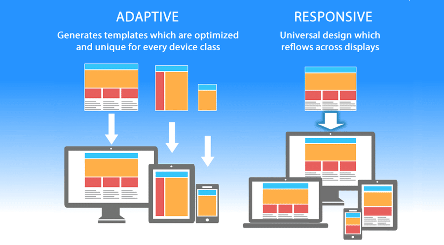
They are both crucial web design trends that help webmasters control how their site looks on different screens, but the approach is different.
With responsive design, users will access the same basic file through their browser, regardless of device, but CSS code will control the layout and render it differently based on screen size. With adaptive design, there is a script that checks for the screen size, and then accesses the template designed for that device.
Why Responsive Design Matters
If you’re new to web design, development, or blogging, you might wonder why responsive design matters in the first place.
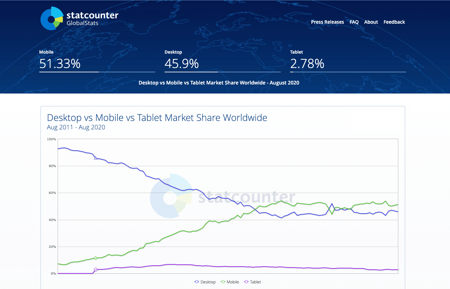
The answer is simple. It’s no longer enough to design for a single device. Mobile web traffic has overtaken desktop and now makes up the majority of website traffic, accounting for more than 51%.
When over half of your potential visitors are using a mobile device to browse the internet, you can’t just serve them a page designed for desktop. It would be hard to read and use, and lead to bad user experience.
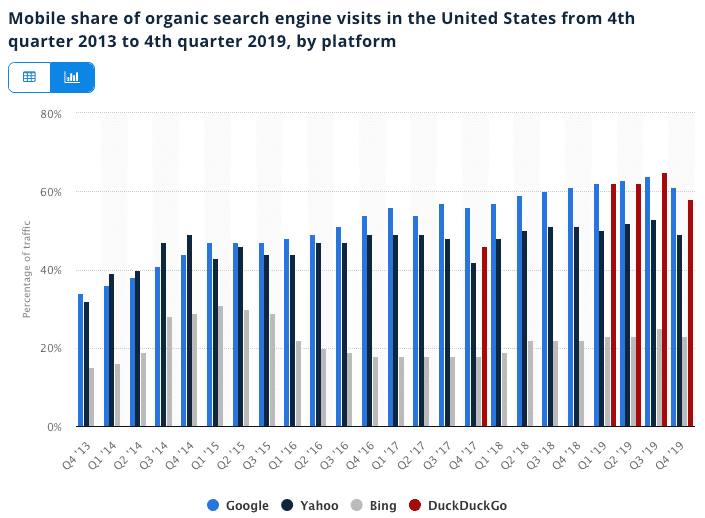
But that’s not all. Users on mobile devices also make up the majority of search engine visits.
Finally, over the last few years, mobile has become one of the most important advertising channels. Even in a post-pandemic market, mobile ad spending is growing 4.8% to $91.52 billion.
Whether you choose to advertise on social media or use an organic approach like YouTube SEO, the vast majority of your traffic will come from mobile users.
If your landing pages aren’t optimized for mobile and easy to use, you won’t be able to maximize the ROI of your marketing efforts. Bad conversion rates will lead to fewer leads and wasted ad spend.
Are WordPress Sites Responsive?
Whether or not WordPress sites are responsive depends on the theme of your WP site. A WordPress theme is the equivalent of a template for a static website and controls the design and layout of your content.
If you use a default WordPress theme, like Twenty Twenty, the design is responsive, but since it’s a single-column design, you might not realize it when looking at it on different screens.
If you use another WordPress theme, you can test if it’s responsive or not by comparing how it looks on different devices or using Chrome Developer Tools.
The Building Blocks of Responsive Web Design
In this section, we’ll cover the underlying foundation for responsive website design and its different building blocks.
1. CSS and HTML
The foundation of responsive design is the combination of HTML and CSS, two languages that control the content and layout of a page in any given web browser.
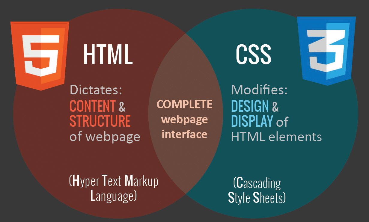
HTML mainly controls the structure, elements, and content of a webpage. For example, to add an image to a website, you have to use HTML code like this:
<img src="image.gif" alt="image" class=”full-width-img”>You can set a “class” or “id” that you can later target with CSS code.
You could also control primary attributes such as height and width within your HTML, but this is no longer considered best practice.
Instead, CSS is used to edit the design and layout of the elements you include on a page with HTML. CSS code can be included in a <style> section of a HTML document, or as a separate stylesheet file.
For example, we could edit the width of all HTML images at the element level like this:
img {
width: 100%;
}
Or we could target the specific class “full-width-img” by adding a period in front.
.full-width-img {
width: 100%;
}
You can also control the design beyond just height, width, and color. Using CSS like this is how you make a design responsive when you combine it with a technique called media query.
2. Media Queries
A media query is a fundamental part of CSS3 that lets you render content to adapt to different factors like screen size or resolution.
It works in a similar way to an “if clause” in some programming languages, basically checking if a screen’s viewport is wide enough or too wide before executing the appropriate code.
@media screen and (min-width: 780px) {
.full-width-img {
margin: auto;
width: 90%;
}
If the screen is at least 780 pixels wide, “full-width-img” class images will take up 90% of the screen and be automatically centered by equally wide margins.
3. Fluid Layouts
A fluid layout is an essential part of modern responsive design. In the good old days, you would set a static value for every HTML element, like 600 pixels.
A fluid layout relies instead on dynamic values like a percentage of the viewport width.
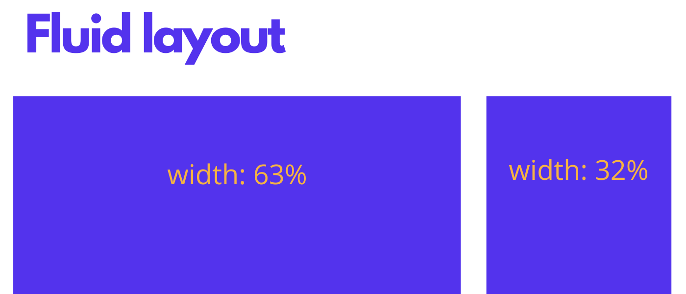
This approach will dynamically increase or decrease the different container element sizes based on the size of the screen.
4. Flexbox Layout
While a percentage-based layout is fluid, many designers and web developers felt it was not dynamic or flexible enough. Flexbox is a CSS module designed as a more efficient way to lay out multiple elements, even when the size of the contents inside the container is unknown.
A flex container expands items to fill available free space or shrinks them to prevent overflow. These flex containers have a number of unique properties, like justify-content, that you can’t edit with a regular HTML element.
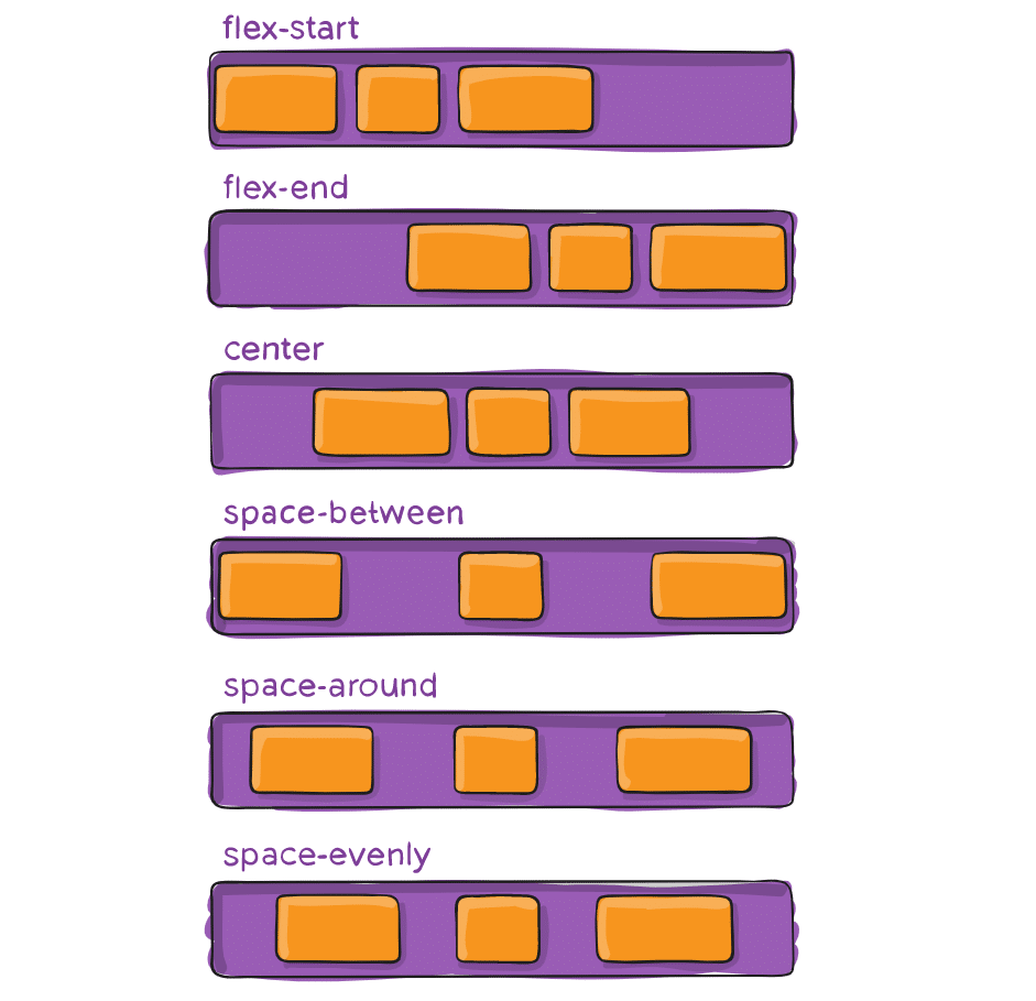
It’s a complicated topic, so if you want to use it in your design, you should read CSS Tricks’ flexbox guide.
5. Responsive Images
The most basic iteration of responsive images follows the same concept as a fluid layout, using a dynamic unit to control the width or height. The sample CSS code we covered earlier already accomplishes this:
img {
width: 100%;
}
The % unit approximates to a single percentage of the width or height of the viewport and makes sure the image remains in proportion to the screen.
The problem with this approach is that every user has to download the full-sized image, even on mobile.
To serve different versions scaled for different devices, you need to use the HTML srcset attribute in your img tags, to specify more than one image size to choose from.
<img srcset="large-img.jpg 1024w,
middle-img.jpg 640w,
small-img.jpg  320w"
src="small.jpg"
/>
WordPress automatically uses this functionality for images included in posts or pages.
6. Speed
When you’re attempting to create a responsive design for your website, the loading speed should be a top priority.
Pages that load in 2 seconds have an average 9% bounce rate, while pages that take 5 seconds lead to a 38% bounce rate.
Your approach to responsiveness must not block or delay your page’s first render any more than it needs to.
There are several ways you could make your pages faster. Optimizing your images, implementing caching, minification, using a more efficient CSS layout, avoiding render-blocking JS, and improving your critical rendering path are all great ideas you should consider.
Kinsta customers have access to a quick and easy way to accomplish this by using the code minification feature that is built right into the MyKinsta dashboard, allowing customers to enable automatic CSS and JavaScript minification with a simple click.
You could also try to implement Google AMP for your mobile pages, but in our Google AMP case study, our mobile leads dropped by a whopping 59%.
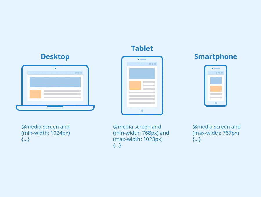
Common Responsive Breakpoints
To work with media queries, you need to decide on the “responsive breakpoints” or screen size breakpoints. A breakpoint is the width of the screen where you use a media query to implement new CSS styles.
Common screen sizes
- Mobile: 360 x 640
- Mobile: 375 x 667
- Mobile: 360 x 720
- iPhone X: 375 x 812
- Pixel 2: 411 x 731
- Tablet: 768 x 1024
- Laptop: 1366 x 768
- High-res laptop or desktop: 1920 x 1080
If you choose a mobile-first approach to design, with a single column and smaller font sizes as the basis, you don’t need to include mobile breakpoints — unless you want to optimize the design for specific models.
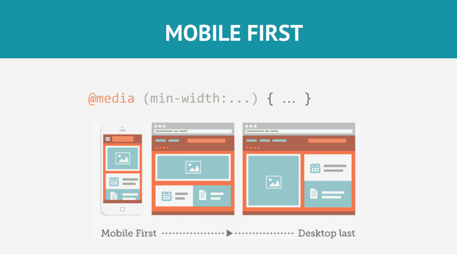
So you can create a basic responsive design with just two breakpoints, one for tablets and one for laptops and desktop computers.
Bootstrap’s Responsive Breakpoints
As one of the first, and most popular, responsive frameworks, Bootstrap led the assault on static web design and helped establish mobile-first design as an industry standard.
As a result, many designers to this day still follow Bootstrap’s screen-width breakpoints.
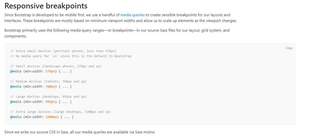
They use media queries to target landscape phones (576px), tablets (768px), laptops (992px) and extra large desktop screens (1200px).
How to Make Your Website Responsive
Now that you’re familiar with the building blocks, it’s time to make your website responsive.
1. Set Your Media Query Ranges (Responsive Breakpoints)
Set your media query ranges based on the unique needs of your design. For example, if we wanted to follow the Bootstrap standards for our design, we would use the following media queries:
- 576px for portrait phones
- 768px for tablets
- 992px for laptops
- 1200px for large devices
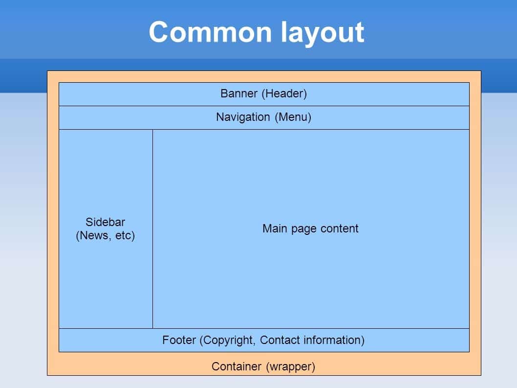
2. Size Layout Elements with Percentages or Create a CSS Grid Layout
The first and most important step is to set up different sizes for different layout elements depending on the media query or screen breakpoint.
The number of layout containers you have will depend on the design, but most websites focus on the elements listed below:
Using a mobile-first approach, you can style the main layout elements like this (with no media query for the basic styles for mobile phones):
#wrapper {width:95%;  margin: 0 auto; }

#header {width:100%; }

#content {width:100%; }

#sidebar {width:100%; }

#footer {width:100%; }

// Small devices (landscape phones, 576px and up)

@media (min-width: 576px) {

// Medium devices (tablets, 768px and up)

@media (min-width: 768px) {

#wrapper {width:90%;  margin: 0 auto; }

#content {width:70%; float:left; }

#sidebar {width:30%; float:right; }

// Large devices (desktops, 992px and up)

@media (min-width: 992px) { ... }

}

// Extra large devices (large desktops, 1200px and up)

@media (min-width: 1200px) {

#wrapper {width:90%;  margin: 0 auto; }

}
In a percentage-based approach, the “float” attribute controls which side of the screen an element will appear on, left, or right.
If you want to go beyond the basics and create a cutting-edge responsive design, you need to familiarize yourself with the CSS flexbox layout and its attributes like box-sizing and flex.
3. Implement Responsive Images
One way to make sure that your images don’t break is merely using a dynamic value for all pictures, as we covered earlier.
img {
width: 100%;
}
But that won’t reduce the load placed on your mobile visitors when they access your website.
Make sure you always include a srcset that with different sizes of your photo when you add images to your pages.
Doing this manually can be quite time-consuming, but with a CMS like WordPress, it automatically happens when you upload media files.
4. Use Responsive Typography For Your Website Text
The main focus of responsive web design is on the responsiveness of the layout blocks, elements, and media. Text is often treated as an afterthought.
But for a truly responsive design, you should also adjust your font-sizes appropriately to match screen size.
The easiest way to do so is to set a static value for font-size, like 22 px, and adapt it in each media query.
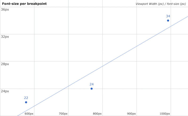
You can target multiple text elements at the same time by using a comma to separate each one.
@media (min-width: 992px) {

body, p, a, h4 {

font-size: 14px;

}

}
5. Test Responsiveness
First, you want to test whether your site is mobile-friendly with Google’s mobile-friendly test. Simply enter the URL of your website and click the “test URL” button to get the results.
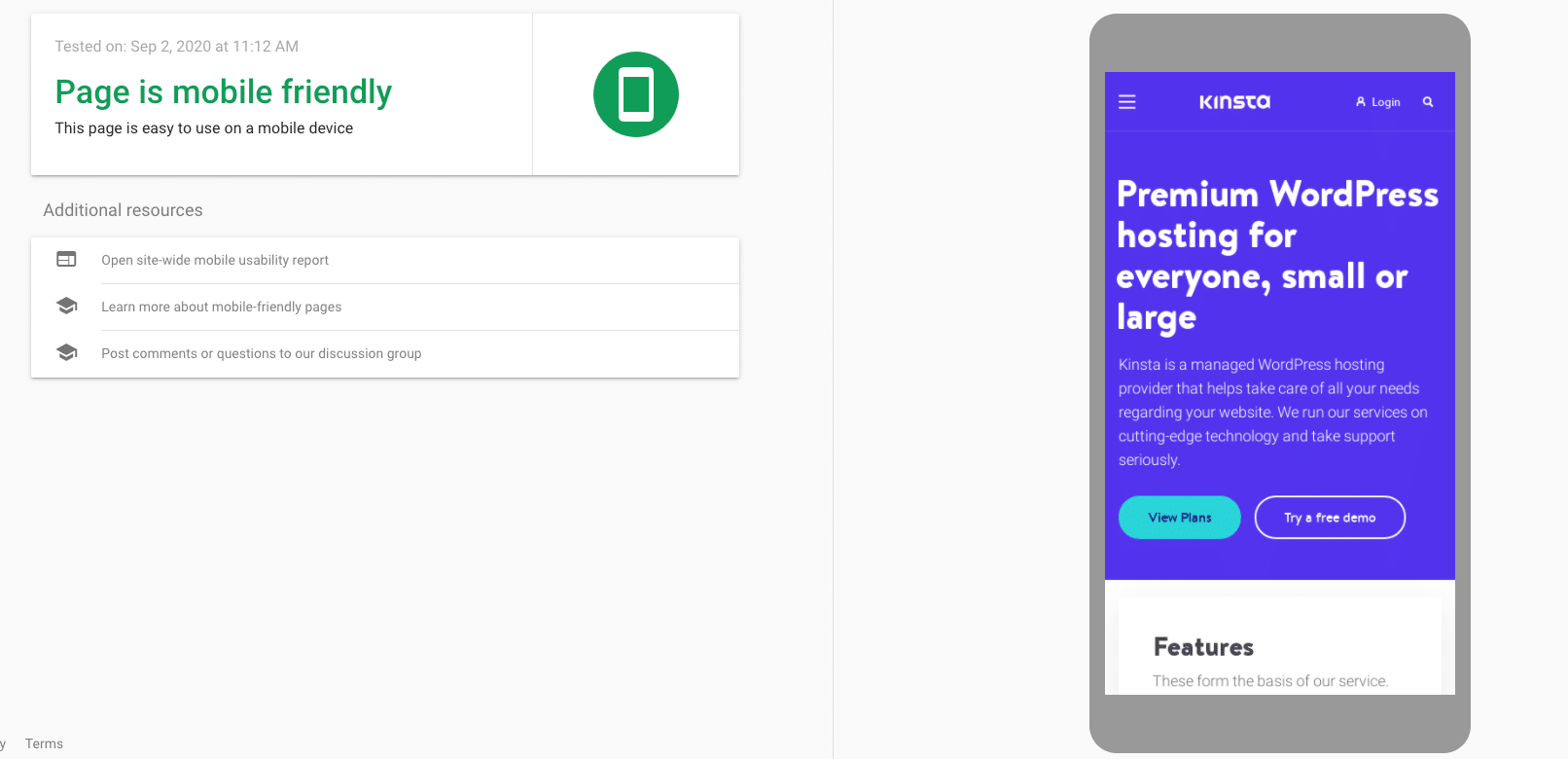
Don’t worry if it takes a while to fetch your site. That doesn’t reflect your page loading speed.
If you followed the steps outlined in this article, it should say that you have a mobile-friendly website.
Then you want to test your site on multiple screen sizes with a tool like Chrome developer tools.
Press CTRL + Shift + I on Windows computers, or Command + Option + I on Macs to open the relevant device view. From here, you can select the mobile device or tablet of your choice to test the responsiveness of your design.
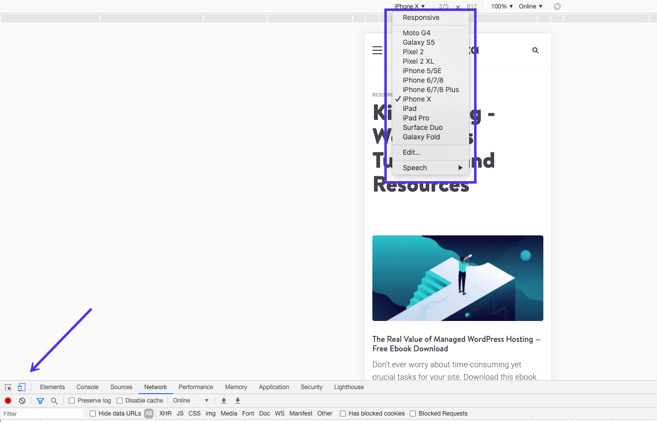
There are a couple of questions you want to answer when going through this process.
- Does the layout adjust to the correct amount of columns?
- Does the content fit well inside the layout elements and containers on different screens?
- Do the font sizes fit each screen?
CSS Units and Values for Responsive Design
CSS has both absolute and relative units of measurement. An example of an absolute unit of length is a cm or a px. Relative units or dynamic values depend on the size and resolution of the screen or the font sizes of the root element.
PX vs EM vs REM vs Viewport Units for responsive design
- PX – a single pixel
- EM – relative unit based on the font-size of the element.
- REM – relative unit based on the font-size of the element.
- VH, VW – % of the viewport’s height or width.
- % – the percentage of the parent element.
A new web designer or developer should probably stick with pixels for text because they are the most straight-forward unit of length in CSS.
But when setting the width and max-width of images and other elements, using % is the best solution. This approach will make sure the components adjust to the screen size of every device.
5 Responsive Design Examples
Below we will cover a few examples of responsive web design from different industries — and learn from what they do right and wrong.
1. Online Newspaper: New York Times
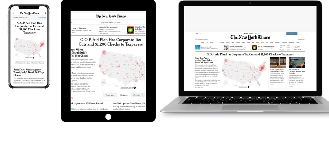
On desktop, the NYT layout reminds you of a traditional newspaper, crowded with visuals and different rows and columns of content. There seems to be a separate column or row for every category of news.
On mobile, it conforms to the single-column standard and also adjusts the menu to be in the accordion format to be easier to use.
2. Blog: The Art of Non-Conformity
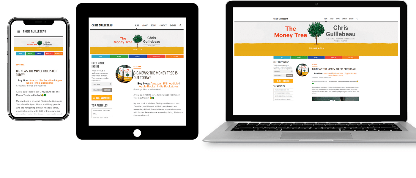
Chris Guillebeau’s blog “The Art of Non-Conformity” has been going strong for over a decade. While the design isn’t the most cutting edge, it’s responsive and adapts the two-column sidebar and main content layout to a single-column design on mobile devices.
3. Ecommerce: Amazon
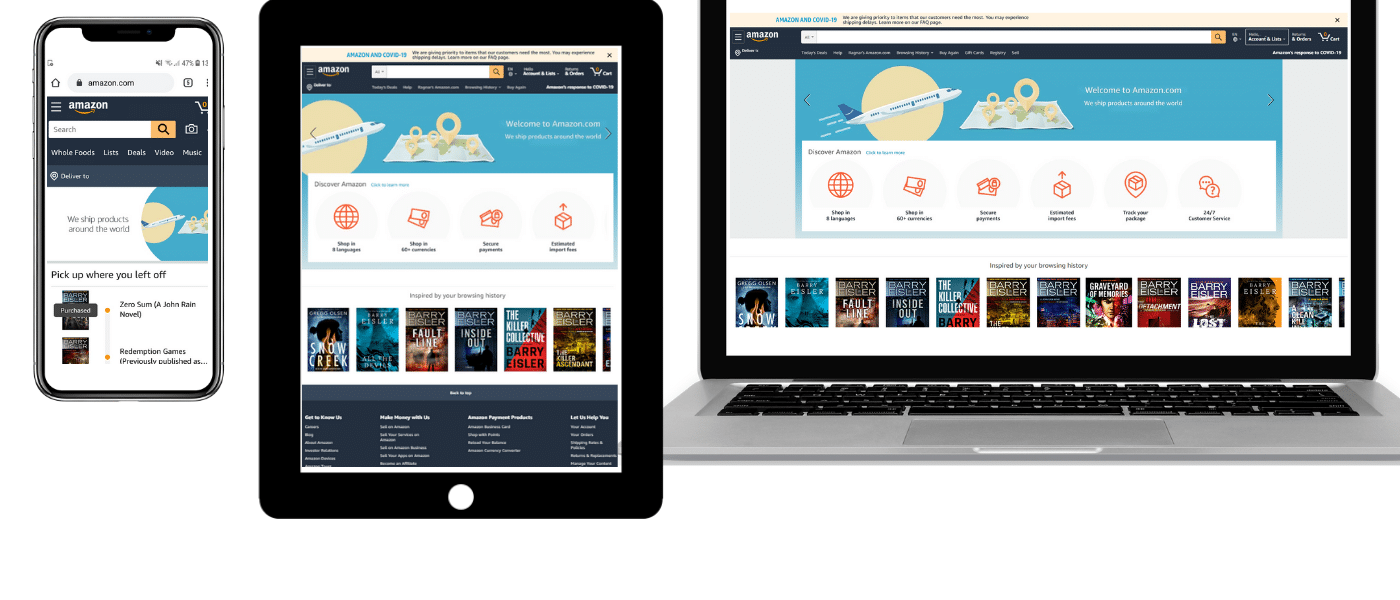
Amazon is a global leader in ecommerce for a reason, their user interface is perfectly fluid across all devices.
Their tablet layout simply removes some of the white space and adds a scrollable section of icons to fit more content into a smaller package.
Their mobile layout brings it into a single column, focusing on the essentials, like recent purchase history, rather than the different section link icons from their main homepage.
4. Video Site: YouTube
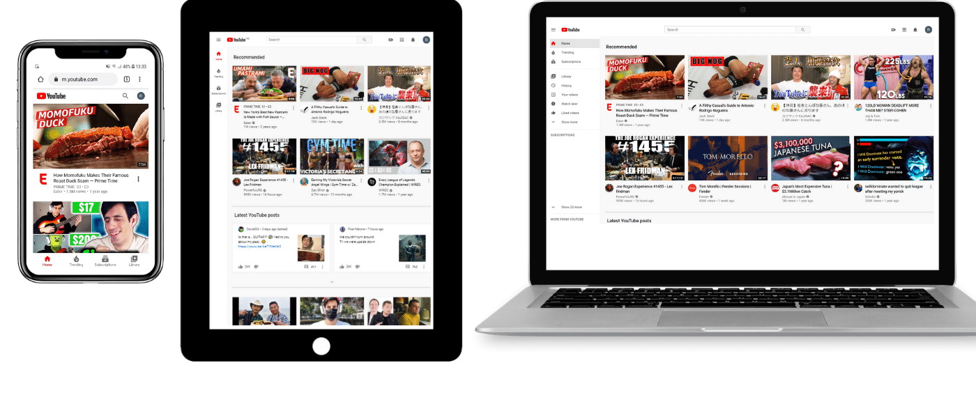
YouTube on mobile, tablet, and laptop
The core of YouTube’s homepage design is a flexible grid of videos that are relevant to each user. On tablets, the number of columns in each row goes down to three. On mobile, it’s reduced to a single-column design.
The mobile version also moves the main menu to the bottom of the screen, closer to the thumbs of their smartphone users. This simple move improves navigation and UX.
5. Online Magazine: Wired
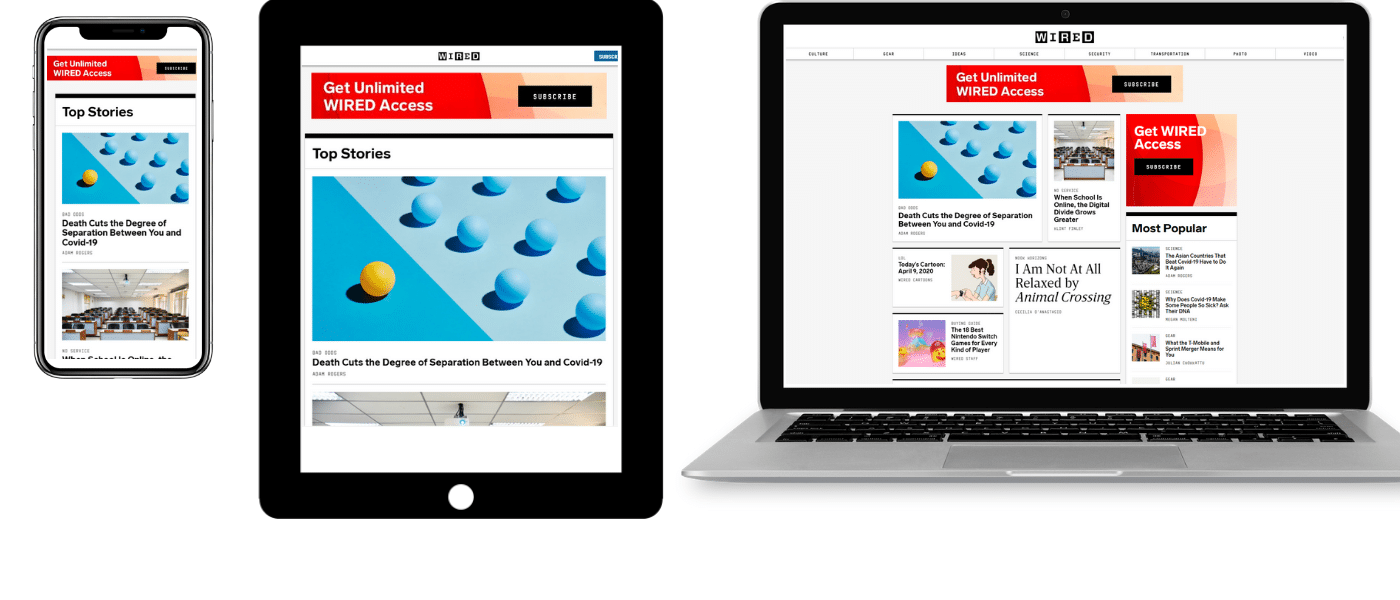
Wired’s approach to responsive web design is focused on implementing a single-column layout on all smaller screens, starting with tablets.
It’s a basic layout but makes it easier to draw user attention to top stories and their CTA to subscribe.
Summary
There are a lot of different elements that go into responsive web design. Without a basic understanding of HTML and CSS, it can be easy to make mistakes.
But through familiarizing yourself with the different building blocks, analyzing the examples with web dev tools, and testing as you go using the sample code, you should be able to make your website responsive without any major issue.
If that sounds too much to achieve, you can always either hire a WordPress developer or simply make sure your theme is already responsive.

Head of Content at Kinsta and Content Marketing Consultant for WordPress plugin developers. Connect with Matteo on Twitter.

I like to design my responsive websites with breakpoints that are based on the content of the website rather than on device sizes. For example, sometimes 4 columns need to change to 2 columns at a width when the 4 columns become too narrow to read. That width may not correspond to a specific device breakpoint. This is also true of font sizes. Sometimes you need to adjust a font size when it starts being unreadable which may be at a width that is not based on a device breakpoint. Creating breakpoints based on design/content rather than devices gives the reader, the consumer of the content, a better experience.
Thanks a lot for this awesome article. Your ideas are absolutely fantastic. Really helpful for the beginners for web design .
Great examples have been mentioned here..!! Mobile responsive design… Its became a new trend as mobile users are increasing day-by-day. Yes it is good to optimize our site for mobile users for better user experience..
Very enriching article! Just want I was looking for!
Wow one clear, near and on point article about responsive design. Thank you so much
Unfortunately Chrome DEV tools doesn’t account for viewport size, but only for screen size. So if the simulated mobile screen in the DEV tools is using “pixel merging”, say it simulates 1 pixel out of 4 real device pixels, setting the real device pixel size in the Chrome DEV tools will not give you the real view on that mobile screen.
So before testing for a phone with a certain resolution, you should check what is the viewport size for that phone screen, and use it instead of the device resolution, to be able to simulate that screen accurately in the Chrome DEV tools.