You don’t need thousands of fonts to create a great-looking website. But you do need to make sure that the fonts you use are visible to everyone who visits your website. And that’s where web safe fonts come in.
And if you could find web safe fonts which are a) 100% free to use and b) don’t need to be hosted anywhere else for your visitors to see them, it’d be a homerun for you.
That’s exactly what this post has been written for: we’ll cover the 31 best-looking web safe fonts and show you exactly how to implement them into your WordPress site.
Use the links on the side to navigate to the section that interests you the most, or jump directly to our list of web safe fonts.
What Fonts are Web Safe?
Including variations, there are over 650,000 different fonts available online. Fonts that are supported by the majority of web browsers and operating systems are considered to be web safe. The operating system automatically includes the font files, so visitors don’t have to download fonts from your servers.
An example is the ubiquitous Arial font that birthed thousands of “spin-offs”.
Are Web Safe Fonts Necessary?

Sure, the vast majority of users now use Google Chrome, both on mobile and desktop. But that doesn’t mean web safe fonts are a thing of the past.
In fact, supported fonts vary based on the operating systems, including the current version a user has. So if you design a website with a font only supported by the newest version of Windows 10, most users will see something else.
In addition, if you choose to use and host a custom local font, or font hosted by a third party, it can slow down your website. So, switching to web safe fonts can speed up your website. And that’s a great thing. Because nearly 70% of consumers say page speed influences their purchasing decisions.
Are Google Fonts Web Safe?
Google Fonts aren’t inherently supported by your operating system, so by definition, they aren’t web safe fonts. Rather, since Google, a third-party, hosts them, a Google Font is called a web font. Confusing, we know, but the difference is that your browser needs to load a file before it can show Google fonts.
Web safe fonts already have font files ready on the majority of devices. But, don’t worry about the lack of the word safe. Google Fonts are completely safe to use to enhance the design of your website. But, the extra HTTP requests to an outside server could slow down your page loading speed.
31+ Best Web Safe Fonts
We’ve compiled a list of over thirty different great-looking web safe fonts you can use to design your website.
Let’s jump right into it.
1. Arial
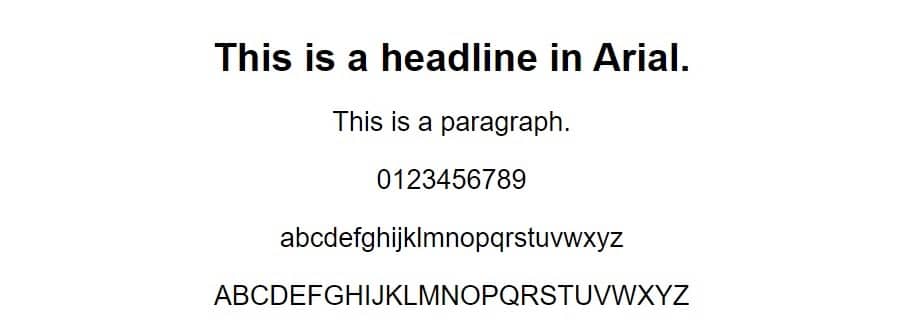
Arial is a classic sans serif font, suitable for both paragraphs and headlines. It’s long been a staple in web design. Although in recent years, it’s often used as a fallback in a font stack, rather than as the main font-family.
Recommended Font Stack
Font-family: Arial, Helvetica Neue, Helvetica, sans-serif.
2. Baskerville
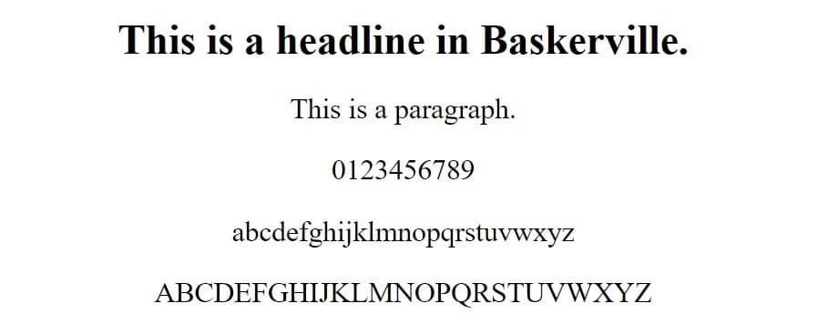
Baskerville is a relatively thick serif font, originally developed as a typeface by John Baskerville in 1750. The design is well-balanced, using a mix of thick and thin strokes to soften the hard edges of a typical serif typeface. It’s well supported by newer Apple and Microsoft OS versions.
Recommended Font Stack
Font-family: Baskerville, Baskerville Old Face, Garamond, Times New Roman, serif.
3. Bodoni MT / Bodoni 72

Bodoni MT is a serif font, like Times New Roman, more suitable for paragraph text than headlines for most websites. Bodoni MT is available by default with Microsoft 10 and some older versions. Bodoni 72 is included with macOS Sierra and newer versions.
Recommended Font Stack
Font-family: Bodoni MT, Bodoni 72, Didot, Didot LT STD, Hoefler Text, Garamond, Times New Roman, serif.
4. Calibri

Calibri is Microsoft’s standard sans serif font and has been since its release with Microsoft Office 2007. It has a soft, modern look, with rounded edges to elevate the typical sans serif feel, making it more warm than robotic.
Recommended Font Stack
Font-family: Calibri, Candara, Segoe, Segoe UI, Optima, Arial, sans-serif.
5. Calisto MT

Calisto MT is a serif font with slightly softer and less pronounced serifs than most similar typefaces. It’s a standard Microsoft font, included with most newer versions of Windows. The macOS or iOS equivalent is the Bookman Old Style font.
Recommended Font Stack
Font-family: Calisto MT, Bookman Old Style, Bookman, Goudy Old Style, Garamond, Hoefler Text, Bitstream Charter, Georgia, serif.
6. Cambria

Cambria is an even softer serif font, with, in many cases, barely noticeable serifs even for capital letters. This gives it a more modern feel and also maintains a high level of readability on screens.
Recommended Font Stack
Font-family: Cambria, Georgia, serif.
7. Candara

Candara is a sans serif font. It’s part of Microsoft’s ClearType font collection. The macOS and iOS equivalent is Optima Regular. The uneven stroke weights make it feel a bit less modern and corporate than other sans serif fonts.
Recommended Font Stack
Font-family: Candara, Calibri, Segoe, Segoe UI, Optima, Arial, sans-serif.
8. Century Gothic
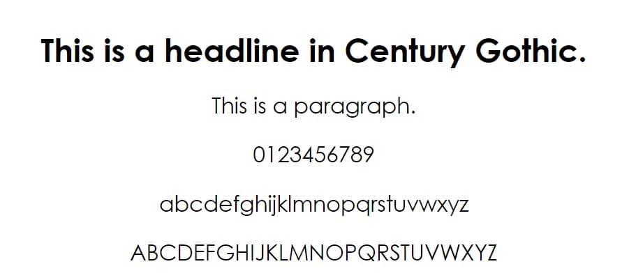
Century Gothic is a geometric sans serif font, with a very clean and balanced look. It’s a great font for the web, especially for headings and subheadings. It was originally designed to compete with the font Futura. It’s included with most Microsoft and Apple operating systems.
Recommended Font Stack
Font-family: Century Gothic, CenturyGothic, AppleGothic, sans-serif.
9. Consolas

Consolas is a sans serif font with a unique approach to design. All characters have the same width, which is why it uses serifs only for the letter “I” and the lowercase “l”. It’s part of the ClearType collection.
Recommended Font Stack
Font-family: Consolas, monaco, monospace.
10. Copperplate Gothic

Copperplate Gothic is a gothic-inspired font, with slight glyphic serifs on certain letters. As it’s inspired by gothic runes, there’s no lowercase font available.
Recommended Font Stack
Font-family: Copperplate, Copperplate Gothic Light, fantasy.
11. Courier New

Courier New is a monospaced slab serif font, with much thinner regular text than most other serif and sans serif fonts. It has almost perfect coverage by both Microsoft and Apple on both computers and mobile devices.
Recommended Font Stack
Font-family: Courier New, Courier, Lucida Sans Typewriter, Lucida Typewriter, monospace.
12. Dejavu Sans

Dejavu Sans is a sans serif font with clean, straight lines, almost a throwback to the classic sans fonts like Arial and Verdana.
Recommended Font Stack
Font-family: Dejavu Sans, Arial, Verdana, sans-serif.
13. Didot

Didot is a font inspired by the original Didot typefaces, used by 19th-century French printing business, the Didot family. It’s an Apple mainstay, supported by the majority of their OS and devices.
Recommended Font Stack
Font-family: Didot, Didot LT STD, Hoefler Text, Garamond, Calisto MT, Times New Roman, serif.
14. Franklin Gothic
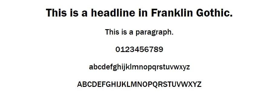
Franklin Gothic is a sans serif font with unusually thick letters, almost as if the bold version of another font. The original typeface was developed in the early 20th century by American Type Founders. It’s a good font choice for headlines, but might not be a great choice for body text.
Recommended Font Stack
Font-family: Franklin Gothic, Arial Bold.
15. Garamond

Garamond is a serif font, inspired by typefaces made by the 16th-century Parisian engraver, Claude Garamond. It has softer, rounder edges than some of the more standard serif fonts, like Times New Roman. Modern versions of Microsoft and Apple OS include their own versions of the Garamond font.
Recommended Font Stack
Font-family: Garamond, Baskerville, Baskerville Old Face, Hoefler Text, Times New Roman, serif.
16. Georgia

A close relative of Garamond, Georgia is another serif font with mostly rounded edges and a fairly warm feel. It was developed for Microsoft in 1996 and is still one of the most widespread MS fonts. It’s supported by virtually all Windows and macOS versions.
Recommended Font Stack
Font-family: Georgia, Times, Times New Roman, serif.
17. Gill Sans
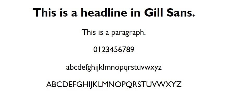
Gill Sans is a sans serif font, with sharp, clean lines that give it a modern look. It’s not ideal for paragraph text out of the box, because of its lack of contrast between letters, and close spacing. But as you can see in the example text, it makes a great-looking headline. Most iOS, macOS, and Windows-powered devices support it.
Recommended Font Stack
Font-family: Gill Sans, Gill Sans MT, Calibri, sans-serif.
18. Goudy Old Style

Goudy Old Style is a soft old-style serif font, with strong serifs and an old-fashioned look and feel. The periods are diamond-shaped rather than the regular perfect, round circles of most serif fonts. It’s included with most newer versions of Windows.
Recommended Font Stack
Font-family: Goudy Old Style, Garamond, Big Caslon, Times New Roman, serif.
19. Helvetica

Helvetica is perhaps the most famous font of all time, and definitely one of the only fonts to have its own dedicated documentary. It’s a modern sans serif font, inspired by other modern Swiss and German fonts from the late 19th and early 20th centuries.
Rather than a soft, rounded, and warm design, it’s balanced and focused on clean lines and shapes. This makes it one of the few fonts suitable for both body copy and headlines. All Apple devices include Helvetica fonts, while Microsoft defaults to Arial, its MS equivalent.
Recommended Font Stack
Font-family: Helvetica Neue, Helvetica, Arial, sans-serif.
20. Impact

Impact is a realist sans-serif font, with a very thick bolded look as its default for all text, capital, and lowercase alike. The boldness makes it stand out from regular text and makes it perfect for headlines or CTAs (calls to action), but it’s not ideal for body copy.
It was part of the original core fonts for the web package in 1998. It’s still widely included and supported by both Apple and Windows computers and phones to this day.
Recommended Font Stack
Font-family: Impact, Charcoal, Helvetica Inserat, Bitstream Vera Sans Bold, Arial Black, sans serif.
21. Lucida Bright

Lucida Bright is the serif font in Microsoft’s line of Lucida fonts, developed for MS in 1991. One of the things that makes it stand out is the use of more square, sturdier serifs, for example on the capital “T” and “L”. It’s included by default in most newer versions of Windows, whereas macOS typically only includes the sans serif font Lucida Grande, making Georgia a logical fallback font.
Recommended Font Stack
Font-family: Lucida Bright, Georgia, serif.
22. Lucida Sans
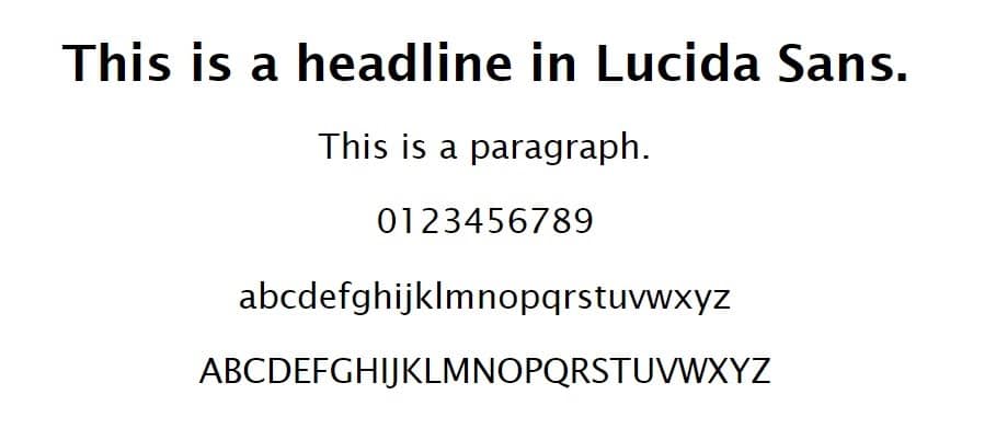
Lucida Sans is a clean-cut humanist sans serif font, designed specifically to complement the serif fonts in the Lucida line. There’s a greater variation in the stroke weight than with the cleaner sans fonts like Helvetica or Arial. This makes it feel a bit less futuristic or robotic, and more playful. Out of the box, it’s a great font for headlines and CTAs.
Recommended Font Stack
Font-family: Lucida Sans, Helvetica, Arial, sans-serif.
23. Microsoft Sans Serif
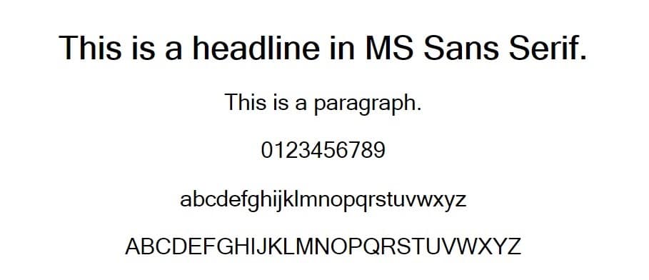
Microsoft Sans Serif is a sans serif font first introduced with Windows 2000. It’s the successor to the MS Sans Serif font, which was also known as Helv (short for Helvetica). It’s inspired by and based on Helvetica, the leading sans serif typeface in modern times.
It’s a clean font with even stroke weight, leading to a clean, professional look. Perfect for headlines and corporate websites. It was included as one of the original fonts for the web and is still standard for all Microsoft devices.
Recommended Font Stack
Font-family: MS Sans Serif, sans-serif.
24. Optima

Optima is a humanist sans serif font, with varying stroke weight and varying symmetry. This makes it look almost done by hand, which combats the typical mass-produced feel of a sans serif font. It’s one of the standard Apple sans serif fonts and supported by most iOS and macOS devices. The Microsoft equivalent is Segoe.
Recommended Font Stack
Font-family: Optima, Segoe, Segoe UI, Candara, Calibri, Arial, sans-serif.
25. Palatino
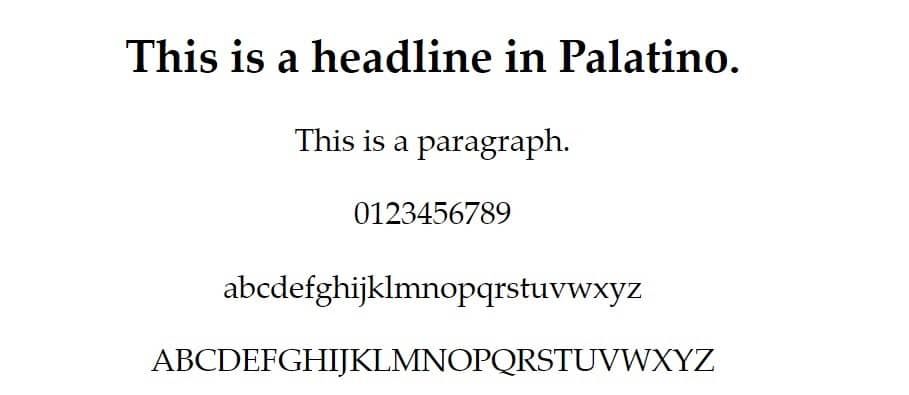
Palatino is another old-style serif and would feel right at home in any online newspaper or magazine. But it’s less uniform than something like a Georgia or Times New Roman, with varying stroke weights and shapes.
The design approach helps to soften sharp letters like k, l, x, y, and z. It’s also slightly bolder than other serif fonts. These two factors help it feel a bit warmer. Palatino is included with the majority of Windows and Apple devices.
Recommended Font Stack
Font-family: Palatino, Palatino Linotype, Palatino LT STD, Book Antiqua, Georgia, serif.
26. Perpetua

Perpetua is a serif font with a unique design, originally created by English sculptor Eric Gill. There’s a sharp contrast in the stroke weight, for example, look at the lowercase “e” or the number “3”. This gives the font a creative, almost playful quality. It’s typically a Windows font, but Baskerville, a close relative, is standard on most Apple devices.
Recommended Font Stack
Font-family: Perpetua, Baskerville, Big Caslon, Palatino Linotype, Palatino, serif.
27. Rockwell

Rockwell is a square or slab serif font with very bold, nearly monoweight lettering. It’s suitable for headlines or CTAs, but the added font-weight isn’t great for body text. It’s included in most newer versions of MS Windows.
Recommended Font Stack
Font-family: Rockwell, Courier Bold, Courier, Georgia, Times, Times New Roman, serif.
28. Segoe UI

Segoe UI is the leading sans serif font of the Segoe font family. Microsoft not only uses it in many applications but also in various marketing materials for its products.
It’s a modern font, with symmetrical letters and little variation in stroke weight. The font isn’t included with Apple computers, but the equivalent Helvetica Neue is similar in look and feel.
Recommended Font Stack
Font-family: Segoe UI, Frutiger, Dejavu Sans, Helvetica Neue, Arial, sans-serif.
29. Tahoma

Tahoma is another Microsoft-developed sans serif font. It has slightly bolder letters than Segoe UI and uses square dots for its lowercase letters, periods, and other marks.
It’s a clean, uniform font, and wouldn’t feel out of place in content or headings. It’s included in all Microsoft devices, and virtually all Apple devices.
Recommended Font Stack
Font-family: Tahoma, Verdana, Segoe, sans-serif.
30. Trebuchet MS

Trebuchet MS is another sans serif font developed by Microsoft. It was one of the original fonts included in the core fonts for the web package by Microsoft. It’s still supported by virtually all Microsoft and Apple devices. The letters are slimmer than many other sans serif fonts, making it an option for paragraphs and body text.
Recommended Font Stack
Font-family: Trebuchet MS, Lucida Grande, Lucida Sans Unicode, Lucida Sans, sans-serif.
31. Verdana

Verdana, a clean sans serif font, is another Microsoft staple that’s been around since 1996. The stroke weight is fairly low for a sans serif, leading to slim, easy to read letters. You can use it for both paragraph text and headlines without issue. It’s supported by virtually all Apple and Windows devices.
Recommended Font Stack
Font-family: Verdana, Geneva, sans-serif.
Web Safe Cursive Fonts
If you want to use a web safe cursive font, you don’t have too many options to choose from. Specifically:
- Segoe script
- Rage
- Script MT
- Snell Roundhand
- Lucida Handwriting
There aren’t any cursive fonts that are universally supported across Apple and Microsoft devices. You should consider that using a cursive font for your body text may not be a great idea, as readability is a huge part of website usability.
You should always use highly readable text for your paragraphs otherwise visitors with impaired vision will have a hard time reading the text on your site. This can lead to high bounce rates and a general lack of engagement with your content.
Web Safe Sans Serif Fonts
Sans means “without” in French, so sans serif essentially means “without serif”. A serif is a line or stroke added to a longer stroke in a letter. For example, the small vertical lines under the top stroke in a capital “T”, common in newspaper or magazine headlines. Sans serif fonts are the most common and popular on the web, so you have a lot of options to choose from:
- Arial
- Calibri
- Candara
- Century Gothic
- Consolas
- Dejavu Sans
- Franklin Gothic
- Gill Sans
- Helvetica
- Lucida Sans
- MS Sans Serif
- Neue Helvetica
- Optima
- Segoe UI
- Tahoma
- Trebuchet MS
- Verdana
Where to Download Web Safe Fonts?
The great thing about web safe fonts is that you don’t have to worry about downloading them. They’re already supported by every visitor’s operating system, so you just need to code it in with CSS. If you don’t know anything about HTML and CSS or coding for the web, this might seem a bit overwhelming.
But trust us, it’s not as hard as you might think it is. We’ll walk you through the process step-by-step in our next section.
How to Add Web Safe Fonts to Your WordPress Website
If you have a WordPress site with the latest Twenty Twenty theme, you can edit the HTML fonts by adding custom CSS in the WordPress customizer.
Access it by clicking the Appearance > Customize link in the menu, and then expanding the additional CSS tab.

Then you need to use Chrome Dev Tools (or a similar tool for another browser) to identify the selectors of the text you want to change.
For example, you can inspect the headline of your blog post:

We can see that the theme uses the standard “entry-title” selector for the headline. You can also search for the “font-family” attribute to see how the theme is styling the text, and at what level.
Since Twenty Twenty doesn’t use a specific font for headlines, you can easily modify the headline’s font by targeting the “font-family” selector.
For example, if we want to change the headline to the Impact font, we can use the following code:
h1.entry-title { font-family: Impact, Charcoal, "Helvetica Inserat", "Bitstream Vera Sans Bold", "Arial Black", sans-serif; }Simply add it to the additional CSS and click “Publish” to push your changes live.

We cover this and much more in our guide on how to change fonts in WordPress. If you built your website using HTML and CSS, you can edit the font directly in the source code.
For example, if you use the style tag in the HTML documents to apply CSS code to each page, you can edit the font-family attribute there.

If you want to change the font for all text on the page, you should target the “body” selector. If you want to change the font for specific text, you need to use a specific selector.
If you used a template to build your website, your CSS is most likely located in a separate stylesheet. This is great because it means you can change the font for your whole site by editing just one file.
In that case, you need to find your stylesheet file (typically named style.css or some variation of that). Then you need to find the section that controls the fonts and typefaces of your site.

Usually, this is done towards the top. If not, you can search for “font-family” using your code editor of choice.
Summary
Just like with themes and plugins, there’s no shortage of options for you when it comes to font ideas.
With a variety of serif, sans serif, monospace, and even cursive fonts available for free, web safe fonts are a great place to start when creating a site.
The perfect fonts make your brand stand out, improve readability, and support your message. Choose wisely!
If you liked this post, check out our guide to the top 50 Retro Fonts to give your website or graphic design project a nostalgic feel.


