Struggling with Cumulative Layout Shift issues on your website? Or not sure what Cumulative Layout Shift even means?
Cumulative Layout Shift, or CLS for short, is a metric that’s part of Google’s Core Web Vitals initiative.
In a nutshell, it measures how much of a webpage’s content shifts “unexpectedly”. A high CLS score can indicate a poor user experience and can also be a drag on your site’s SEO.
In this post, you’ll learn everything that you need to know about Cumulative Layout Shift and how it affects WordPress sites (and the web in general).
What Is Cumulative Layout Shift (CLS)? Explaining the Cumulative Layout Shift Meaning
Cumulative Layout Shift is the measure of how much a page on your site unexpectedly moves around during a user’s visit, as measured by the Layout Instability API, a standardized performance testing API.
Cumulative Layout Shift (CLS) is one of the three metrics in Google’s Core Web Vitals initiative, along with Largest Contentful Paint (LCP) and First Input Delay (FID).
In order to understand the Cumulative Layout Shift meaning, it’s important to discuss layout shift in general.
A layout shift occurs when content on your site “moves” or “shifts” unexpectedly.
Or, in technical terms, it’s when any element that is visible in the viewport changes its start position between two frames.
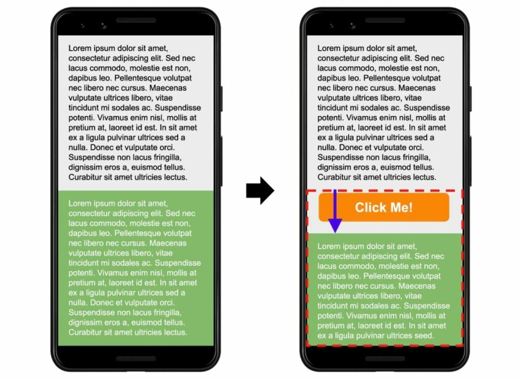
One common example would be that you’re in the middle of reading a block of text…but then a late-loading ad suddenly appears and pushes the text content down the page.
Here’s another example image from Google that showcases this happening:
You’ve almost certainly encountered layout shifts when browsing around the web, even if you don’t know them by that name.
A single visit could have multiple separate layout shift events. As such, the Cumulative Layout Shift metric aims to capture the entire picture by measuring the total amount of unexpected layout shifts on a page*.
*The exact measure is a little more technical after some changes by Google, but that’s still the basic idea. If you’re interested in the nitty-gritty details, you can read about it here.
Why Is Cumulative Layout Shift Bad?
The main reason that Cumulative Layout Shift is bad is that it creates a poor user experience on your site.
At best, it’s mildly annoying for your visitors. At worst, it can cause visitors to perform actions that they don’t want to take.
For example, imagine if a user wants to click “Cancel” but accidentally clicks “Confirm” because a layout shift moved the position of the buttons right as the person was clicking.
Beyond affecting your human visitors’ experiences, having bad Cumulative Layout Shift scores can also be a drag on your site’s search engine rankings.
As of Google’s Page Experience update (which finished rolling out in August 2021), Google uses Core Web Vitals as one of its SEO ranking factors. Because Cumulative Layout Shift is part of Core Web Vitals, that means that it can affect your site’s search performance.
Basically, fixing any Cumulative Layout Shift issues on your site will help make it better for both human visitors and search engines.
So – what could be causing Cumulative Layout Shift? Let’s cover that next…
What Causes Cumulative Layout Shift?
Here’s a quick rundown on the most common causes of layout shift:
- Not setting dimensions for images, iframes, videos, or other embeds.
- Issues with custom font loading, which can cause text to be invisible or change size as custom fonts load in.
- Serving responsive ads (e.g, AdSense) with different sizes (and not reserving space for those ads).
- Dynamically injecting content with plugins (cookie consent notices, lead generation forms, etc.).
- Using animations without the CSS Transform property.
We’ll go into these issues in much more depth later in this post as we show you how to fix each common problem.
How To Measure Cumulative Layout Shift: Best Testing Tools
There are a number of tools that you can use to test your site’s Cumulative Layout Shift score.
Cumulative Layout Shift is part of the Lighthouse audit, so any speed test tool that uses Lighthouse as part of its audit will include CLS data – this includes PageSpeed Insights, GTmetrix, Chrome Developer Tools, and many other popular testing tools.
Here are some of the top Cumulative Layout Shift testing tools that stand out for their usefulness…
PageSpeed Insights
PageSpeed Insights is one of the most useful tools for assessing the state of your site’s layout shift because it provides you with two sources of data:
- Field data – real user data from the Chrome UX report (assuming your site has enough traffic to be included in the report). This lets you see the actual Cumulative Layout Shift data for your real human visitors. This is also the data that Google uses as a ranking signal.
- Lab data – simulated test data that’s collected by Lighthouse (which is what PageSpeed Insights uses to generate its performance analysis reports).
You can also view data for both desktop and mobile by switching between the tabs.
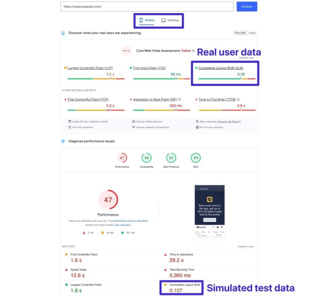
Note – the lab data is only able to measure layout shifts that occur during the page load, so your real-user results might be slightly higher if you have layout shifts that occur after the page load.
Chrome Developer Tools
Chrome Developer Tools offers some useful resources for both measuring CLS and debugging the individual layout shifts that are occurring on your site.
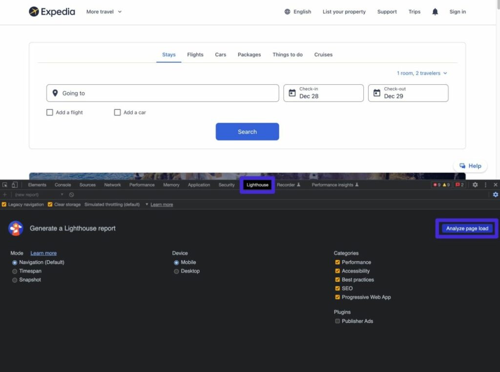
First, you can run a Lighthouse audit to see your site’s CLS score. Here’s how:
- Open Chrome Developer Tools.
- Go to the Lighthouse tab.
- Configure your test.
- Click the Analyze page load button to run the test.
After a short wait, you should then see the regular Lighthouse audit interface (which looks a lot like PageSpeed Insights).
However, Chrome Developer Tools also lets you dig deeper into CLS with its Rendering analysis. This will let you highlight individual layout shift regions in your site, which helps you debug them.
Here’s how:
- Click the “three dots” icon in the top-right corner of the Chrome Developer Tools interface.
- Select More Tools → Rendering, which should open a new interface at the bottom.
- Check the box for Layout Shift Regions.
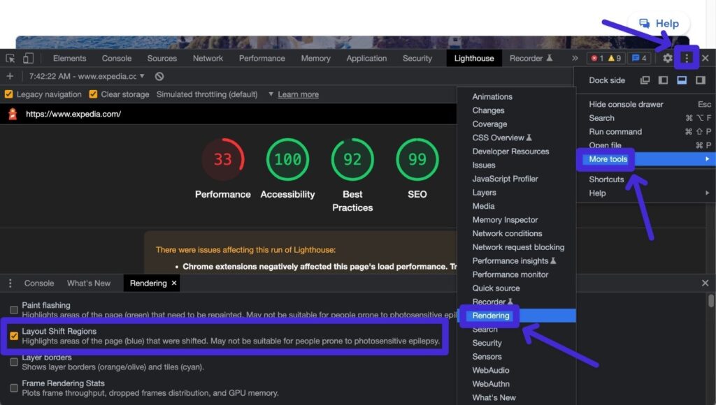
Now, reload the page that you want to test and Chrome should highlight any areas with layout shifts using a blue box. These highlights will appear on the actual page as the content is loading and disappear after the shift is finished.
If the highlights occur too quickly for you to follow, you can slow down your site and watch it load frame by frame using the Performance tab.
Google Search Console
While Google Search Console doesn’t let you run lab tests to determine Cumulative Layout Shift, it does give you an easy way to see issues with Cumulative Layout Shift on your site, as measured by the Chrome UX report.
The advantage of using Google Search Console over other tools is that it lets you quickly see issues across your entire site rather than testing page-by-page.
Here’s how to view potential issues on your site:
- Go to Google Search Console. If you haven’t verified your site yet, you can follow our guide on how to verify Google Search Console.
- Open the Core Web Vitals report under Experience.
- Click Open Report next to Mobile or Desktop, depending on what you want to analyze.
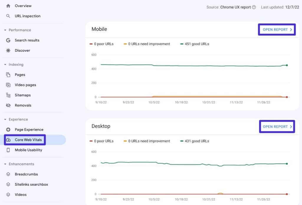
If applicable, Google will highlight URLs with problematic Cumulative Layout Shift scores.
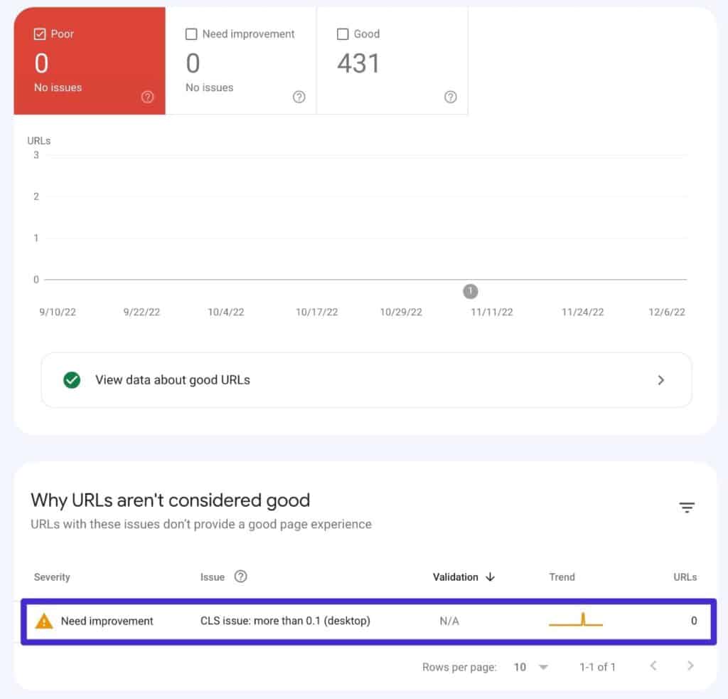
Note – you’ll only see data here if your site has enough monthly traffic to be included in the Chrome UX report.
Layout Shift GIF Generator
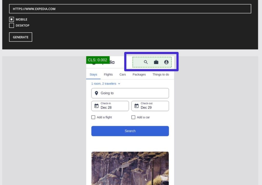
As the name suggests, Layout Shift GIF Generator generates a GIF of the layout shifts on your site so that you can see exactly what content is causing issues. It will also give you your score, though that’s not the main focus of the tool.
All you do is add the URL that you want to test and choose between mobile or desktop. Then, it will generate a GIF of your site with green highlights showing the exact elements that are shifting.
By seeing which elements are shifting around and contributing to your Cumulative Layout Shift score, you can know exactly where to focus when it comes to improving your site’s scores.
What Is a Good Cumulative Layout Score?
According to Google’s Core Web Vitals initiative, a good Cumulative Layout Shift score is 0.1 or less.
If your Cumulative Layout Shift score is between 0.1 and 0.25, Google defines that as “Needs Improvement”.
And if your Cumulative Layout Shift score is above 0.25, Google defines that as “Poor”.
Here’s a graphic from Google’s Core Web Vitals website that showcases these scores visually:

How To Fix Cumulative Layout Shift in WordPress (or Other Platforms)
Now that you understand what’s happening with Cumulative Layout Shift, it’s time to shift into some actionable tips on how to fix Cumulative Layout Shift in WordPress.
While these tips do come from a WordPress angle, all of them are universal, and you can apply them to other website-building tools.
Always Specify Dimensions for Images
One of the most common causes of layout shift is late-loading images moving content around, especially if you’re using tactics such as lazy loading.
To avoid this, you can specify an image’s dimensions in the code when you embed it. That way, the visitor’s browser will reserve that space even if the image hasn’t been loaded yet, which means the image won’t need to move content around.
If you’re embedding images via the WordPress editor (either the Gutenberg block editor or the classic TinyMCE editor), there’s no need to manually specify image dimensions because WordPress will do this for you automatically.
The same is true of popular page builder plugins such as Elementor, Divi, Beaver Builder, and so on.
However, issues can arise if you’re manually embedding images using your own code, which might happen if you’re adding content to a plugin, editing your child theme’s template files, and so on.
The HTML code for a basic image embed looks like this:
<img src="https://kinsta.com/example-image.jpg" alt="An example image">
To specify its dimensions, you can add height and width parameters. Here’s an example of what that might look like for a 600x300px image:
<img src="https://kinsta.com/example-image.jpg" alt="An example image" width="600" height="300">
Many WordPress performance plugins also include features to automate this, such as the Add Missing Image Dimensions features in WP Rocket or Perfmatters.
Always Specify Dimensions for Videos, iframes, and Other Embeds
Just as with images, you’ll also want to specify dimensions whenever you’re adding videos, iframes, or other embeds.
Most websites’ embed tools should automatically specify dimensions for the embed.
For example, if you look at the YouTube embed code, you’ll see that it includes dimensions:
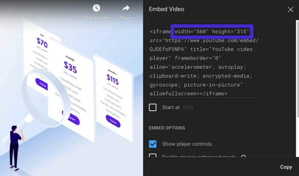
The same is true of many other services.
However, if your embed code doesn’t specify the height and width, you can manually add these dimensions to the embed code.
Fix and Optimize Font Loading
Issues with font loading and optimization can be another common source of layout shifts via two potential issues:
- Flash of invisible text (FOIT) – the page initially loads without any text content appearing at all. Once the custom font loads, the text suddenly appears (which can cause existing content to shift).
- Flash of unstyled text (FOUT) – the text content loads using a system font (unstyled). Once the custom font loads, the text changes to that custom font, which can cause content to shift because the text size and spacing might be different.
To avoid these issues, you need to optimize how you load fonts on your site (which can also have some benefits to your site’s performance).
Host Fonts Locally and Preload Fonts
By hosting fonts locally and using preloading, you tell visitors’ browsers to put a higher priority on loading custom font files.
By loading font files before other resources, you can ensure that the font files are already loaded when the browser starts rendering your content, which can prevent issues with FOUT and FOIT.
To learn how to host fonts locally in WordPress, you can read our complete guide to hosting fonts locally in WordPress.
From there, you can set up font preloading manually or using a plugin. Most performance plugins include options to preload fonts, including WP Rocket, Perfmatters, Autoptimize, and others.
If you’re using Google Fonts, you can also use the free OMGF plugin to host the fonts locally and preload them.
You can also manually preload fonts by adding the code to the <head> section of your site.
Here’s an example of the code – make sure to replace it with the actual name/location of the font file that you want to preload:
<link rel="preload" href="https://kinsta.com/fonts/roboto.woff2" as="font/woff2" crossorigin>
You can add it directly using a WordPress child theme or inject it with the wp_head hook and a plugin like Code Snippets.
Set Font-Display to Optional or Swap
The CSS Font-Display property lets you control the rendering behavior of the fonts on your site and avoid FOIT.
Essentially, it lets you use a fallback font in situations where your custom font hasn’t loaded yet.
There are two main options that you can use to address CLS:
- Swap – uses a fallback font while the custom font is loading and then changes it to your custom font once the font is loaded.
- Optional – lets the browser determine whether or not to use a custom font based on the connection speed of a visitor.
With Swap, the browser will always change to the custom font once it loads.
While Swap completely solves FOIT, it can lead to FOUT. To minimize this, you should make sure that the fallback font uses identical spacing as the custom font (at least as much as possible). That way, even if the font style changes, it won’t lead to layout shifts because the spacing will be the same.
With Optional, the browser will give the custom font 100 ms to load. However, if the custom font isn’t available by then, the browser will just stick with the fallback font and never change it to the custom font for that pageview (it will use the custom font for subsequent pageviews, as it’s likely that the font file has been downloaded and cached by then).
While Optional can solve both FOIT and FOUT, the downside is that the visitor might be stuck with the fallback font for their first pageview.
If you feel comfortable working with CSS, you can manually edit the Font-Display property in your child theme’s stylesheet.
If you don’t feel comfortable doing that, you can also find some plugins that will help:
- Swap Google Fonts Display – easily enables Font-Display Swap for Google Fonts.
- Asset CleanUp – supports Google Fonts for free and custom local fonts with the Pro version.
- Perfmatters – offers a feature for Google Fonts.
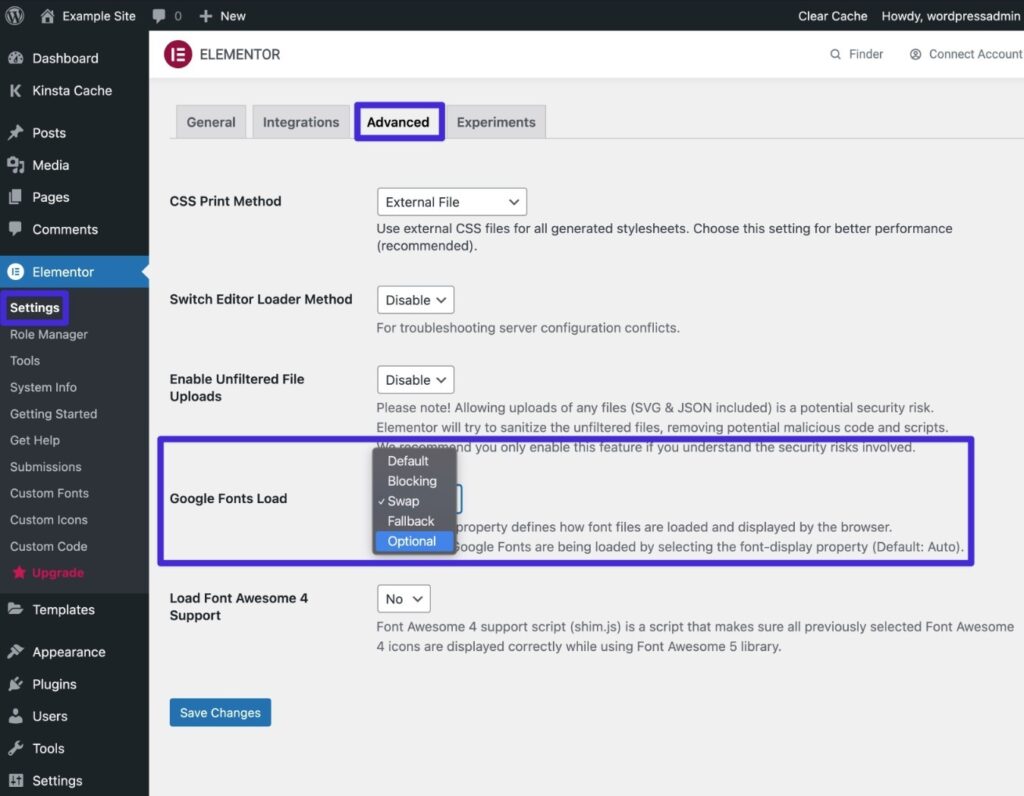
If you’re using Elementor, Elementor also includes a built-in option to do this. Go to Elementor → Settings → Advanced. You can then set the Google Fonts Load drop-down equal to Swap or Optional according to your preferences:
Too Complex? Consider a System Font Stack!
If all this talk of preloading and Font-Display is a bit confusing, one easy fix is to just use a system font stack instead of a custom font stack.
While this does limit your design options, it will completely solve Cumulative Layout Shift font issues, FOIT, and FOUT. Plus, it will also help your site load a lot faster.
If you’re interested in this, check out Brian’s guide to using a system font stack on WordPress.
Reserve Space for Ads (if Using Display Ads)
If you’re using display ads, it’s important that you reserve space for those ads in your site’s code. This follows the same idea as reserving space for images, videos, and embeds.
However, display ads deserve a special mention because it’s very common to have late-loading display ads if you’re using any type of bidding technology. This is because the bidding technology needs time to work and figure out which ad to display.
It can also be an issue with AdSense auto ads if you have dynamic ad slots, because, in addition to the bidding issue, AdSense will also load ads of different sizes (so you might not know the size of the ad in advance).
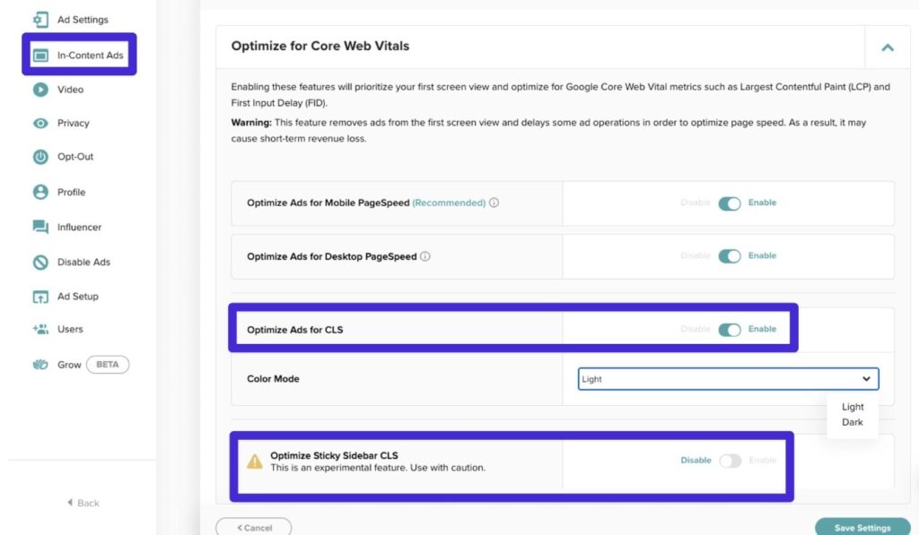
If you’re using one of the popular display ad networks such as Mediavine or AdThrive, they should already offer tools to help you avoid layout shifts with your ads. For example, if you open Mediavine’s Ad Settings area, you can enable a toggle to Optimize Ads for CLS:
To optimize AdSense for Cumulative Layout Shift, it’s a little trickier.
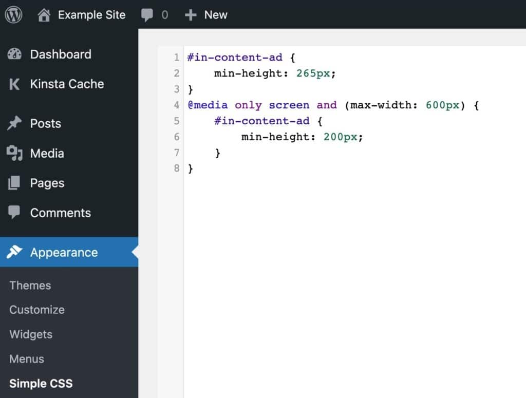
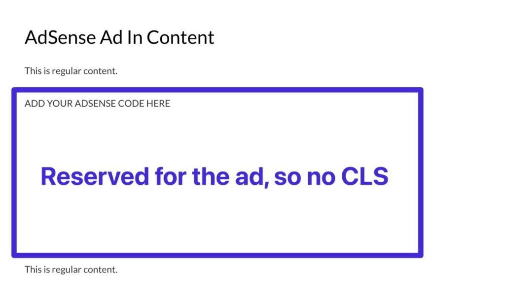
One common fix is to add a <div> wrapper element around each ad unit that specifies a minimum height using the min-height CSS property. You can also use media queries to change the minimum height based on a user’s device.
Google recommends setting the min-height equal to the largest possible ad size. While this might result in wasted space if a smaller ad is served, it’s the best option for eliminating any chance of a layout shift occurring.
When setting up this wrapper element, make sure to use a CSS ID rather than a class, as AdSense will often strip the CSS class from parent objects.
Here’s what the CSS might look like:
And then here’s what the AdSense embed might look like:
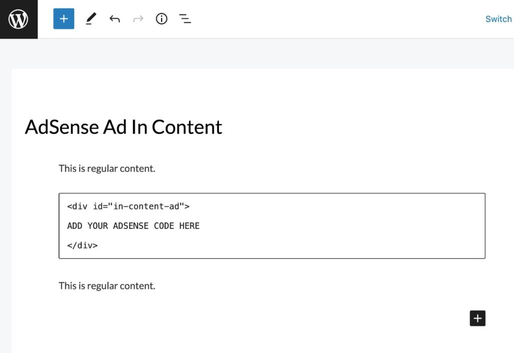
On the frontend, you’ll now see that your site reserves space for that ad, even if it’s empty:
Be Smart When Dynamically Injecting Content With Plugins
A lot of WordPress sites will dynamically inject content for functions such as cookie consent notices, related content, email opt-in forms, and so on.
While this is fine to do, you’ll want to be careful to avoid doing so in a way that causes layout shifts.
A good web design best practice here is to never inject content above existing content unless the user specifically made an interaction (e.g. clicking a button).
For example, if you’re adding a cookie consent notice, you don’t want to inject it at the top of your page because that would cause content to get pushed down (unless you’re already reserving space for the cookie consent banner).
Instead, you should display the notice at the bottom of the page, which will avoid shifting down visible content.
To see if dynamic content is causing the issue, you can use the visualization tools from above (e.g. Layout Shift GIF Generator).
If you see that content from a specific plugin is triggering layout shifts, you can consider adjusting that plugin’s settings or switching to a different plugin.
For example, some cookie consent plugins are better than others when it comes to layout shifts, so it’s worth experimenting with different plugins if you’re having problems.
If you want to dig even deeper into plugin behavior, you can use an application performance monitoring tool. If you host with Kinsta, Kinsta’s APM tool is available for free in your MyKinsta dashboard, or you can find other APM tools.
To help you test plugins, you can also use Kinsta’s staging sites or the DevKinsta local development tool.
Use the CSS Transform Property for Animations Whenever Possible
If you’re using animations on your site, these can be another common culprit for layout shifts.
To avoid issues with animations causing layout shifts, you should use the CSS Transform function for animations rather than other tactics:
- Rather than using the height and width properties, use transform: scale()
- If you want to move elements around, use transform: translate() instead of top, bottom, right, or left
This is more of a technical tip, so it’s unlikely that you’ll need to do this unless you’re adding your own CSS. To learn more, you can read Google’s page on CLS and animations/transitions.
Summary
If your website has a high Cumulative Layout Shift score, it’s important to fix it both to create a better experience for your human visitors and to maximize your site’s performance in Google’s search results.
Two of the most common issues are missing dimensions for images/embeds and issues with font loading. If you fix those, you should be on your way to a much better score.
Other sites might need to go further and dig into ad loading, dynamic content, and animations. If you’re struggling with implementing these types of optimizations yourself, you can consider working with a WordPress agency or freelancer.
To learn more about Core Web Vitals in general, you can read the full Kinsta guide to Core Web Vitals.
And if you want a WordPress host that can help you create a high-performing site that does well in Core Web Vitals, consider using Kinsta’s managed WordPress hosting – we’ll migrate your WordPress sites for free!

