Understanding and properly utilizing WordPress accessibility is vital to your site’s usability. If you’re new to this topic, accessibility is just what it sounds like: the degree to which anyone can access and fully use something.
“Accessibility is the practice of making your websites usable by as many people as possible. We traditionally think of this as being about people with disabilities, but the practice of making sites accessible also benefits other groups such as those using mobile devices, or those with slow network connections.” (source)
The more accessible your site is, the more people can use it. When a site is less accessible, or when accessibility isn’t prioritized, a portion of your audience is deterred or completely barred from getting all the information your site has to offer.
In this post, we’ll discuss why accessibility matters, what it means, the degree to which WordPress is already accessible, how site builders can make sites accessible, and how to test a site’s accessibility.
Let’s get started!
Check Out Our Video Guide to Website Accessibility
What Web Accessibility Means
Web accessibility means that a website is designed and developed so that all people can use it. This includes how they understand, navigate, interact with, and contribute to the website.
A good way to fully define and understand web accessibility is to bust some of its myths.
Myth One: It’s Just for the Blind
A fully accessible website should be usable by people with auditory, cognitive, neurological, physical, speech, and visual disabilities. People with disabilities are a prime focus for accessibility efforts. However, they’re not the only people who benefit from an accessible website.
Web accessibility improves the user experience for all the following kinds of people and situations:
- Someone using mobile devices with smaller screens and varying input modes.
- People with limited abilities, vision, or mobility due to aging.
- Someone with a temporary difficulty like an injured hand.
- A person using the site in an area with lighting that may change the contrast on their screen.
- Someone accessing the site with limited Internet connection or bandwidth.
Myth Two: It’s a Fad or Trend
Chances are, you have heard more and more about web accessibility in recent years. As the web is growing and more and more people rely upon it, web accessibility is becoming a more urgent issue. But it isn’t just a fad.
“Digital accessibility is a civil right and a human right of disabled people around the globe.”
Lainey Feingold, disability rights lawyer and author
As time passes and the use of the web becomes more ubiquitous, so does the need for widespread web accessibility. When a website isn’t fully accessible according to WCAG guidelines, individuals can take legal action against the website developer or owner.
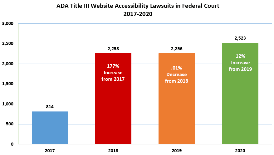
It just takes a look at the number of lawsuits around web accessibility to understand how seriously people are taking this. The number of lawsuits from 2017 to 2018 has nearly tripled. Since then, that number has averaged 2,345 lawsuits per year. Even during the COVID-19 pandemic throughout 2020, the number of ADA Title III Website accessibility lawsuits in federal court increased to 12% from the previous year.
Web accessibility is here to stay. As we develop software and websites, we need to incorporate web accessibility into our processes moving forward. This is necessary not just because no one likes being sued, but because the internet needs to meet the needs of all individuals, no matter what those needs are.
Myth Three: You Can Fully Automate Accessibility
Once you understand why accessibility is important — and that there can be consequences for not prioritizing it — you might be in a hurry to make sure your website is WCAG-compliant.
One of the most popular myths about web accessibility is that you can download a simple plugin or install a piece of software that, with the snap of your fingers, makes your site fully accessible. This is simply impossible.
According to a11yproject.com, accessibility issues are either objective or subjective. Objective issues can be detected by code, and subjective ones require human judgment. Code can never accurately resolve issues that fall into the latter category, and attempts to do so often cause more harm than good in the process.
“Overlay solutions are automated software solutions, which as we know, can only detect ~30% of WCAG issues in the first place. This is because the WCAG is nuanced and interpretive. Machines are not good at this.” (source)
Remember that accessibility isn’t about risk avoidance, but about providing optimized experiences for all users.
Web Content Accessibility Guidelines
The Web Accessibility Initiative has developed a set of Web Content Accessibility Guidelines (WCAG) that can help you ensure that your site is compliant and fully accessible. If you design, develop, or support a website, you should be very familiar with these guidelines.
Accessibility isn’t just a focus for developers but also designers, marketers, content writers, project managers, and more. Accessibility should be a priority throughout the entire site-building process from planning to launch. You should also continuously improve the accessibility of a website after it’s gone live.
How Accessible WordPress Is Out of the Box
This is one of the big questions that many people ask when considering WordPress as a site-building option: How accessible is it already, and how much work does one have to do to make WordPress accessible? Since there isn’t a black-and-white answer for this, let’s look at the degree to which WordPress is already accessible.
Where WordPress Does Accessibility Well
The good news is that over time, WordPress has become more and more accessible. Each release makes small steps and advancements with accessibility in mind. As accessibility becomes a larger topic in more people’s minds, more people can prioritize it.
Additionally, many people in the WordPress community are passionate and vocal about these topics. Each new default WordPress theme takes additional steps toward becoming more accessible. Developers are coming up with new assistive tools and writing guides and articles about WordPress accessibility all the time. As a result, you’ll never be alone in your WordPress accessibility journey.
If you’re interested in learning more about WordPress and accessibility directly from community members, visit WordPress.tv and watch these talks on accessibility.
Where WordPress Misses the Mark
Despite recent advancements, WordPress isn’t always 100% accessible out of the box. Each WordPress release faces some criticism in terms of where it falls short. In early 2019, WPCampus performed an extensive audit of the newest Gutenberg release at the time. Work like this is incredibly important; since that audit, 116 issues related to accessibility have been closed.
It can be difficult for disabled content creators to publish with WordPress. Because it is impossible to automate all accessible design and development facets, anyone can create inaccessible web pages with WordPress.
“The front-end of WordPress is pretty much in the same place it’s been for years: perfectly capable of being accessible, but it entirely depends on the developer building the site. A poor theme or inaccessible plug-ins make all the difference. The admin has continued to improve—it’s been a hard road to move the Gutenberg editor along towards better accessibility, but progress is being made. That said, it’s a constant battle to avoid accessibility regressions with any new interface component.” (source)
So what does this mean for you as a WordPress developer or designer? Your journey to a fully accessible website is a bit shorter when you start with WordPress. However, there’s still some distance to go before reaching the finish line.
How To Make an Accessible WordPress Website
Now, let’s get into the steps you can take to ensure that a WordPress website is accessible to all users.
No matter what, never leave accessibility as a task to tackle at the end of the project. It should be a priority that’s integrated from the very beginning of your process. And it should be a continuous goal once the site is launched.
There is no single checklist that one can follow or automate to ensure 100% accessibility. Much of the work depends on your plugins, theme, and content.
Creating an accessible website is like constructing a safe building — sure, there are guidelines, but individual attention, upkeep, and thoughtful renovations are essential to ensure you reach the goal.
Best Practices of Accessible Design
Let’s start with some best practices of accessible design for WordPress websites, broken down by type. This information should serve as a solid foundation for your accessibility education.
Images
All images on your site need to be accessible to all users. Given that not all users can see images, some may use assistive technology to understand visual elements, and your site should therefore be ready to work with that technology.
Alternative (or “alt”) text is a written description that you attach to an image. Screen readers will read that description aloud to any guest who may not see the image. Alt text should be used for any images that provide helpful information on the page. This includes everything from photos to icons to infographics.
The only exception is if an image is considered purely “decorative.” Background images, dividers, or images that show text presented on the page itself won’t necessarily need alt text.
When writing alt text, remember not to describe the image as it is. Instead, communicate what the image means within the context on the page. Here are some good guidelines to help you write excellent alternative text:
- Short and simple is best.
- Screen readers will communicate that this is an image, so avoid saying “This is an image of…” in your alt text.
- If the image is a link, the alt text should explain what will happen if the user selects that image.
- The alt text should include any text that appears on the image. The exception is when that same text also appears near the image, like in a caption.
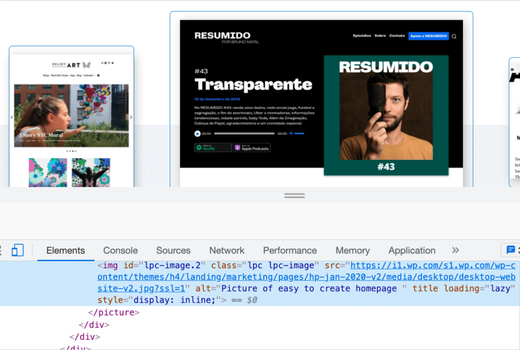
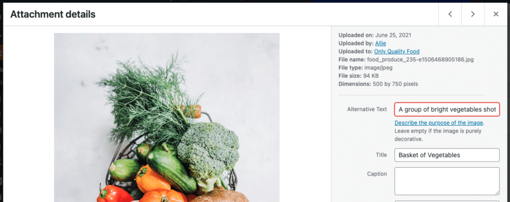
Adding alt text to the images on your WordPress website is easier than you may think. You can add this text in the same place you’d add an image’s caption.
Open up your Media Library and select the image you want to edit. The Settings screen for that image will open up. In the Alternative Text field, add your alt text, then click Save:
Colors
When designing an accessible site, providing adequate color contrast is essential. Poor color contrast can affect the readability of your sites in numerous cases, such as for users with poor vision, color-blind users, or people using certain devices. Images, text, and elements like buttons all need proper color contrast.
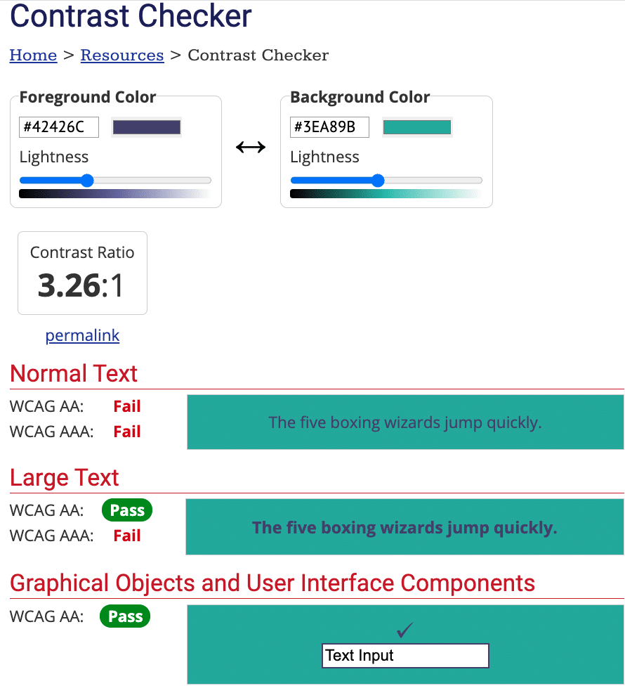
Color contrast refers to how bright or dark colors appear when placed against or very near each other. For example, black text on a white background has a much higher color contrast (21:1) than yellow text on a white background (1.08:1). WCAG 2.0 AA requires a minimum of a 4.5:1 ratio for normal text and 3:1 for larger text (bold 18px or standard 24px and larger).
What exactly does that mean? The simplest way to determine whether your colors work well together is to insert them into a contrast testing tool, like the WebAIM Contrast Checker. There are tons of free checker tools online.
Check out our testing section to learn more about testing colors.
As you test more and more color combinations, you’ll get better at determining by sight alone what color combinations work and which ones don’t.
You also need to make sure that you avoid using color as a main distinguishing factor. For example, many sites have links that are a different color than the surrounding body text. However, if color is difficult for a user to see for some reason, it could be impossible for them to differentiate between a linked word and a non-linked word. Use color to embellish a link, but add an underline below the text to make the link accessible.
Text
Much of what we experience on the web is text. We use websites to read articles, recipes, stories, and so much more. You’re reading this post right now! As a result, the text needs to be optimized for all readers — whether they’re reading with their eyes or ears.
There are two main ways to discuss text when talking about accessibility: fonts and sizes.
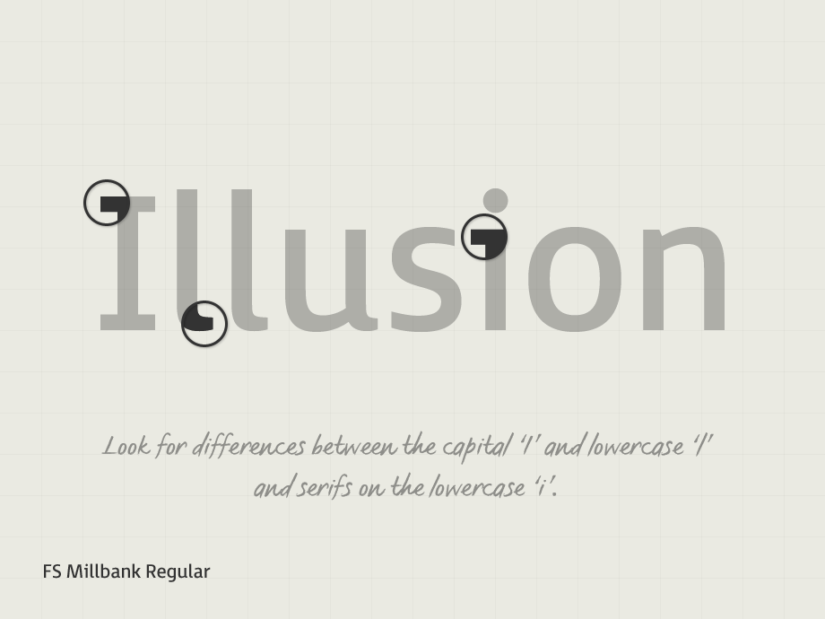
An accessible font is easy to read at small and large sizes. Fonts like Tahoma, Calibri, Helvetica, Arial, Verdana, Times New Roman, Arvo, Museo Slab, and Rockwell are all accessible choices. Readers with dyslexia may find it challenging to read certain fonts, including many serif fonts. Sans-serif fonts for body text tend to be a safer choice. It’s best to avoid display fonts — like handwriting styles or cursive — unless the text is large, sparse, and mostly decorative.
Font sizing is incredibly important to accessibility. Let’s discuss some rules of thumb when it comes to accessible font sizing.
Default fonts should be at least 9pt or 12px. 12pt or 16px is recommended. According to WCAG Guidelines, the text should be able to be read when zoomed to 200%. Using percentages or em instead of pixels or points to set font size is recommended. Utilizing varying font weights is just fine, but make sure that if your text uses a lightweight, it’s large enough to see.
This is not the end-all, be-all of how to design with accessibility in mind. But it’s vital to know where to start. If you want to do some deeper reading on designing for accessibility, check out these resources:
- W3C Web Design and Applications
- A Primer to Web Accessibility for Designers
- Designing for accessibility is not that hard
- 10 Examples of ADA Compliant Accessible Web Design
- Accessibility in Design
Best Practices of Accessible Development
When building a website or its complementary software (like themes and plugins), there are important things to keep in mind for accessibility. Some of this overlaps with design, but this next section mainly focuses on how your site works and how your user will interact with it.
Interactive Elements
Users should be able to interact with and use your website with relative ease, no matter what. This doesn’t just include enjoying images and reading text but interacting with menus, forms, buttons, and videos.
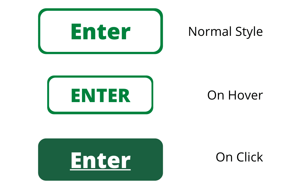
When building your site, make sure that all interactive elements can be identified easily. All navigation menus — from header to footer — should be usable with keyboard controls. The appearance of links and buttons on hover, focus, and click should change.
Navigation across the pages of your site should be consistent and clear. How you name, style, and position navigation links are incredibly important. Thoughtful breadcrumbs and clear headings will allow users to interact with your content confidently.
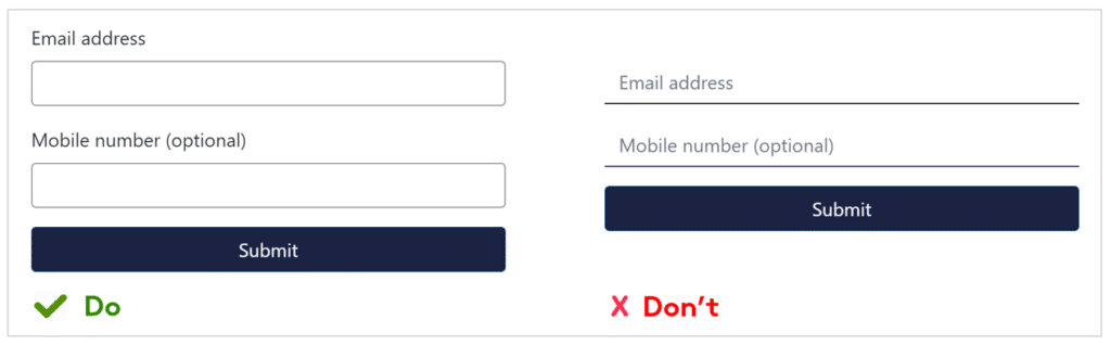
Chances are, you have a form or two on your website. You might be surprised to find out how many forms are inaccessible. Your form elements must include associated labels, either to the left or above the field. (Checkboxes and radio boxes can go on the right.) It should be crystal clear to users what each form field is for.
If you have any content on your site that plays automatically, like a GIF, slider, carousel, video, or music, there should be visible controls that allow the user to stop the animation or sound. It’s best to provide options to stop, pause, or hide the element altogether.
If you’re a developer who wants to take a deep dive into developing for web accessibility, check out these tips directly from W3C.
WordPress Themes
If you’re a DIY website builder, you can accomplish a lot of what this post discusses by choosing an accessible theme. It’s important for developers to understand what makes a theme accessible to prioritize it in their projects.
WordPress themes control how your website looks. Many themes come pre-packaged with color schemes and font families. It’s imperative to make sure that those colors and fonts meet the requirements outlined above. Many themes market themselves as “fully accessible,” but this isn’t always true. Use your own testing to determine whether or not a theme is accessible.
The accessibility team at WordPress.com has prepared a list of 92 free themes in the WordPress repository that you can start using right now.
When building an accessible theme, ensure that you’re familiar with the WCAG requirements from the very beginning. Common areas to be addressed during development include:
- Adequate color contrast within preset color palettes
- The ability to navigate the website easily with a keyboard
- Using proper ARIA roles and/or HTML5 landmarks to ensure a screen-reader ready experience
- Proper HTML semantic markup
- Avoiding repeating IDs on a page
- Allowing users to stop or control any auto-motion
Be sure to bookmark the WordPress accessibility guidelines for easy reference when you begin creating your theme.
WordPress Plugins
WordPress plugins allow you to add plug-and-play functionality to your WordPress website. There are two types of WordPress accessibility plugins: those that help you build an accessible website and make an existing site accessible for users.
Be aware of WordPress plugins that provide you with guarantees like “one-click accessibility” or “automatically accessible.” These things are impossible. Plugins are tools that can help you achieve your accessibility goals, not magic wands that do all the work for you. Sometimes, plugins can even hinder your accessibility efforts — so proceed with a degree of caution!
There are tons of accessibility-focused plugins out there that promise to improve, monitor, or remediate accessibility issues. They might audit the site and let you know where to make improvements. Or they may provide frontend tools to make creating an accessible experience on your site easier.
Some of these are very helpful. Others, however, provide false promises. Always make sure to thoroughly vet a plugin like this before committing to it.
Some plugins create interactive content, like quizzes and sliders. As discussed earlier, these elements need special attention and testing to ensure that they’re fully accessible. Always thoroughly test an interactive plugin on a staging or development site prior to pushing it live.
The same can be said for form plugins. Unfortunately, many have accessibility issues. If you find this the case, custom-coded forms are a good alternative.
A popular category of plugins is page builder plugins. These are great for allowing you to build robust and sophisticated drag-and-drop designs quickly. However, they can often introduce more accessibility problems than they solve. There isn’t a single fix to this problem, so keep your design simple and make sure you test all elements to confirm accessibility.
Accessibility Statements
An accessibility statement is a page on your website where you communicate your internal policies, accessibility goals, and past successes regarding working with people who have disabilities.
You should generate and publish an accessibility statement on your WordPress website for the following reasons:
- To show your users that you care about accessibility and them
- To provide information about the accessibility of your content
- To demonstrate commitment to accessibility and social responsibility
You can write your own accessibility statement following these guidelines provided by W3C or by using an accessibility statement generator.
How To Test WordPress Site Accessibility
Accessibility isn’t about pressing the right buttons, then walking away. Testing is a vital part of ensuring that a site is fully accessible. Both automated and manual tests can help make sure you have all your bases covered.
How To Conduct Automated Tests
Automated tests are helpful to gauge where to start. If you’re new to accessibility or are uncertain where to begin, start with automatic tests and evaluations.
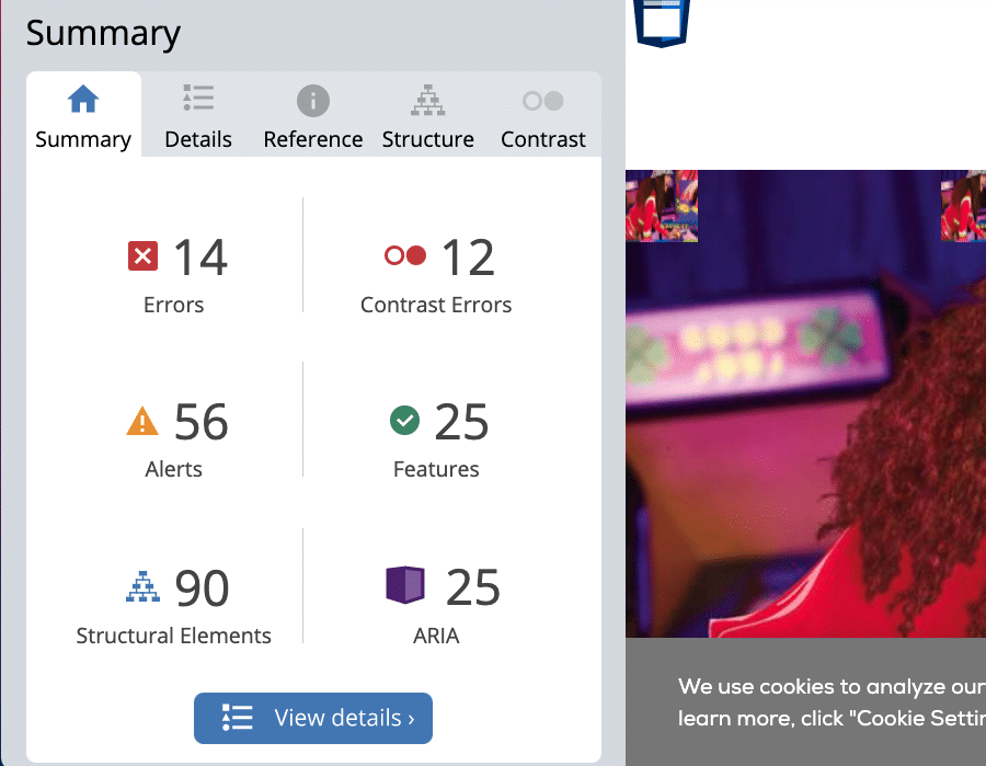
Most automated tests will identify things like poor color contrast, missing alt text, empty links, problems with structural elements, and so on. You can use these tests to generate a list of problems to tackle. Tests like these are especially helpful for finding code-based errors that may be less visible to the naked eye, but will matter significantly to some of your users.
One example of a free accessibility test you can use is the WebAim tool. It examines your entire webpage and generates a list of errors. It will even show you exactly where on the page those errors occur.
You can find tons of individual accessibility tools to help with specific issues. For example, use a contrast checker before you even begin designing to make sure that the colors in your palette will play nicely together.
Just remember that no automated test is perfect, foolproof, or a substitute for manual testing.
How To Conduct Manual Tests
Because WordPress accessibility is about real human use cases, real humans must be the ones to make the final say about whether a site is accessible or not. Consequently, reserving time and resources for manual testing is incredibly important.
So, how do you perform a manual test? Here are a few things you can do to test how accessible a site is without fancy or expensive tools or programs:
- Ditch the mouse: Make sure that you can reasonably and easily navigate all of your website’s functions using only your keyboard keys. This includes moving between sections, accessing menus, going from page to page, skipping down the page, and interacting with links and forms.
- Use a screen reader: Put yourself in the shoes of someone who has low or poor visibility. Use a screen reader app or website and review the content on your site to ensure it still makes sense and sounds smooth when read aloud.
- Test the site in different environments: Go somewhere with public WiFi to make sure that your site loads properly without a high-quality internet connection. Take note of the areas of the site that lag or disappear altogether with a poor connection.
- Increase the zoom: Open up your site in a browser and use the browser settings to zoom in 200%. Can you still use, navigate, and engage with the site in this setting? Is there content that disappears or gets cut off?
- Focus on interactivity: Make sure to spend plenty of time testing interactive elements like videos, forms, and buttons. Links and form fields should always be brought into focus with an outline, underline, special cursor.
- Double-check your alt tags: If you’re unsure whether or not an image has an attached alternative image, use the Inspect Element tool to confirm.
- Think differently: If all the images on your site disappeared, would someone still be able to use it? If all the colors on your site suddenly turned black and white, how would that affect usability? Make sure that the essential parts of your site will still work if the decorative elements are somehow affected.
When in doubt, contact a company that provides manual accessibility testing. Experts in accessibility and web design and development can make quick work of a manual review and tell you exactly which areas need work.
Don’t forget that your real-life audience is one of your best resources. Have a clear area on your site where users can provide accessibility feedback. If someone is having difficulty using your site, it should be clear from your efforts at feedback collection that you’re open to hearing about that experience and rectifying the issue.
Summary
The internet has become one of the single most important tools in our daily life. Everyone needs to have the freedom to access it, whether browsing for entertainment or essential information. Your site has a responsibility to meet the standards set out for equity on the web.
Understanding the need for those guidelines is the first step toward making significant and lasting change. Building an accessible site means more people benefit from what your website has to offer in the long run.
Do you have any questions left about WordPress accessibility? Let us know in the comments section!

Allie Nimmons is a WordPress content writer and producer with 6 years of site building experience. She has published WordPress-focused educational content with Automattic, LinkedIn Learning, GiveWP, GoDaddy, WP Buffs, and iThemes.